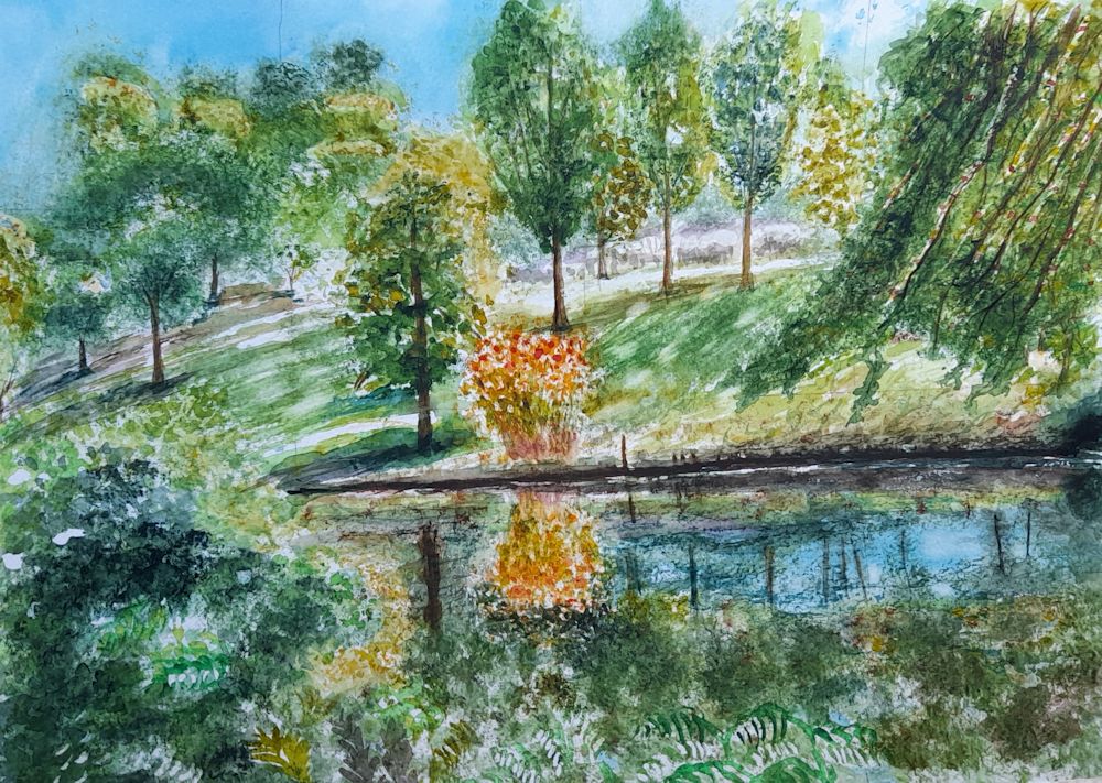
Category Archive: Landscape Challenges
Inspired by Words: Autumn Poetry
November 15, 2024

by Jo Hall
Acrylic and Ink
Many of us will know the poem “To Autumn” by John Keats that begins “Season of mists and mellow fruitfulness”. Written in 1819 and first published in 1820 I took my cue from
“To bend with apples the moss’d cottage-trees,
And fill all fruit with ripeness to the core;”
The little painting above was a demonstration piece from a short course I am presently tutoring at Norden Farm Centre for the Arts, Maidenhead, where participants are invited to make artworks inspired by poetry. The work could be representational and narrative or much more abstract and we talked about how decisions on the approach could be made according to the nature of the words referenced. We started with poetry about Autumn and found works ranging from the highly descriptive, to poetry that is more concerned with emotions concerning decay and death as in Shakespeare’s Sonnet No. 73.
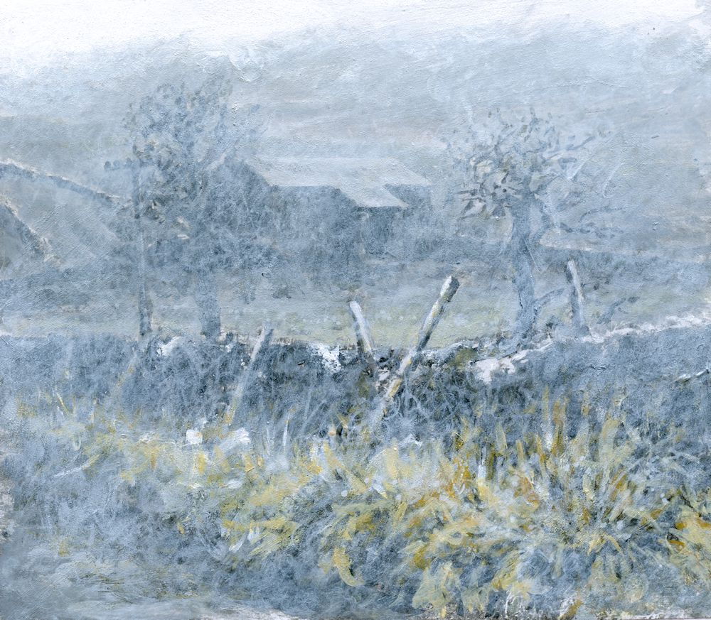
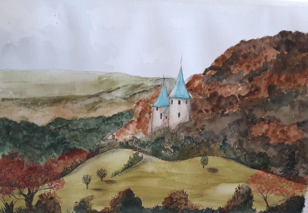
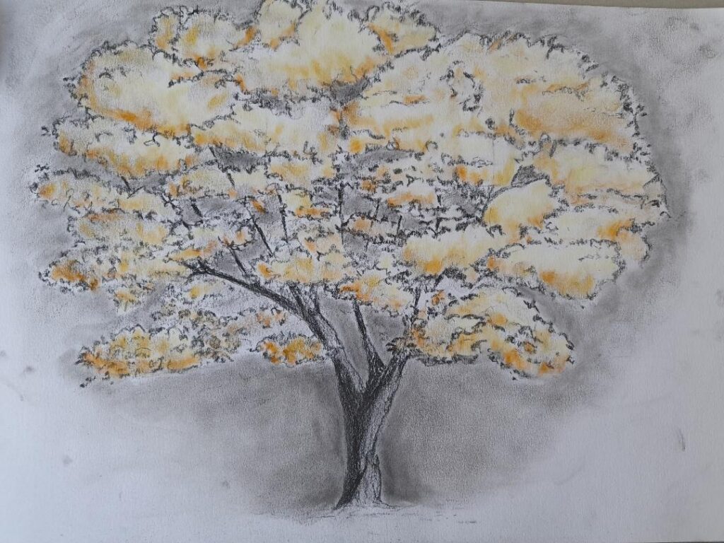
The imagined landscape above has fruit laden trees and mists with a clearer view to sunlight on red roofed cottages in the middle-ground. Beyond them golden fields and more mists merge into a clouded sky that looks blustery enough to blow the mists away. Mist is so frequently referenced in connection with autumn that it is useful to find ways of portraying it. In the painting above this was simply achieved by applying white and pale blue-grey pastel over the acrylic paint and ink line work. The middle-ground cottages were left in their original colourful state so the difference is clear. To achieve misty effects, pastel dust can be ground from a regular pastel stick and applied with a finger or cloth dabber, or Pan pastel can be applied with a soft rubber sponge.

A similar effect can be produced by scumbling thin veils of pale blue-gey or white acrylic using a stiff brush. Do ensure the painting is completely dry before scumbling.

Another poem I was attracted to was “The Burning of Leaves” by Laurence Binyon. It begins
“Now is the time for the burning of the leaves,
They go to the fire; the nostril pricks with smoke
Wandering slowly into a weeping mist.”
Then the later line appears:
“Fingers of fire are making corruption clean.”

by Jo Hall
Inspired by the poem by Laurence Binyon
Mixed media

Stages showing how this painting was built up in layers of mixed media
1. acrylic
2. ink and some oil pastel scratched into for texture (sgraffito) soft pastel rubbed over to soften blue areas
3. Pale Posca pen, more black ink, further layer of pale pastel over blue and gray areas for smoke
Another two lines from the same poem inspired the painting below:

by Jo Hall
Acrylic and pastel
“All the spices of June are a bitter reek
All the extravagant riches spent and mean,”
Here I imagine the rich blocks of colour representing the rich flowers and smells of June heavy with roses, are being consumed by the fire. The comparison with our personal earthly riches and their destiny is clear.
The poem’s end bleakly reminds us of our own mortality, but also hope for those who follow us who will see the Spring, and there is an inference that the decay and purification process is necessary for this renewal.
My personal view on mortality is that for those with faith the outlook is not bleak, but as a former scientist I know decay is certainly vital for the renewal of life in Spring! So glad tutoring this course has rekindled my interest in poetry.
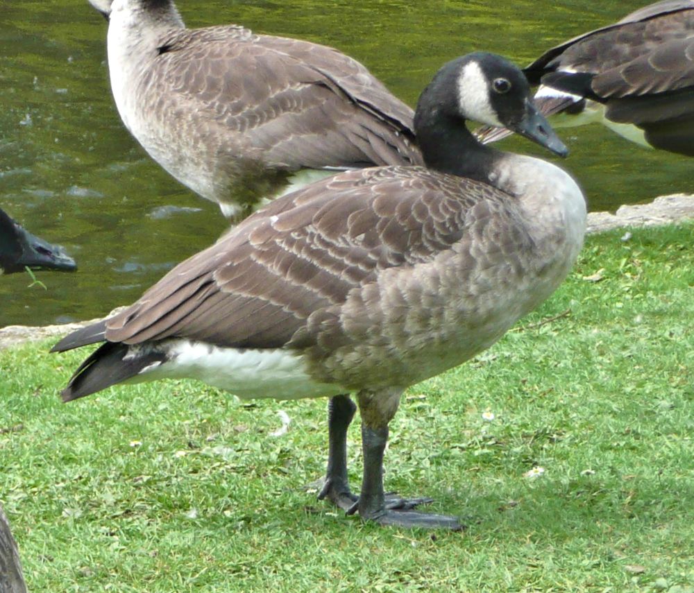
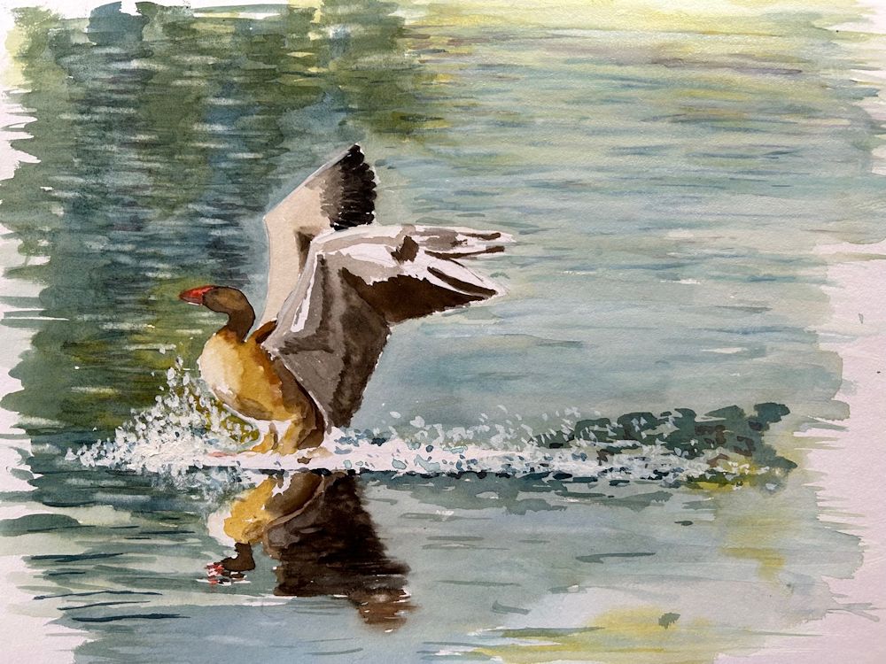
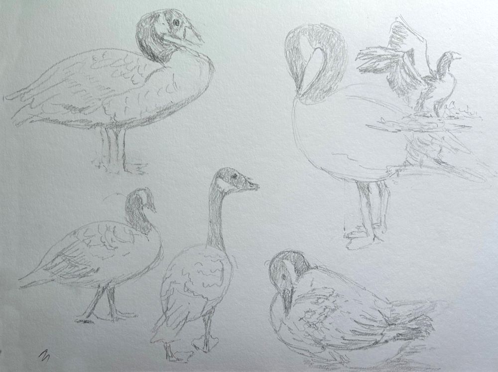
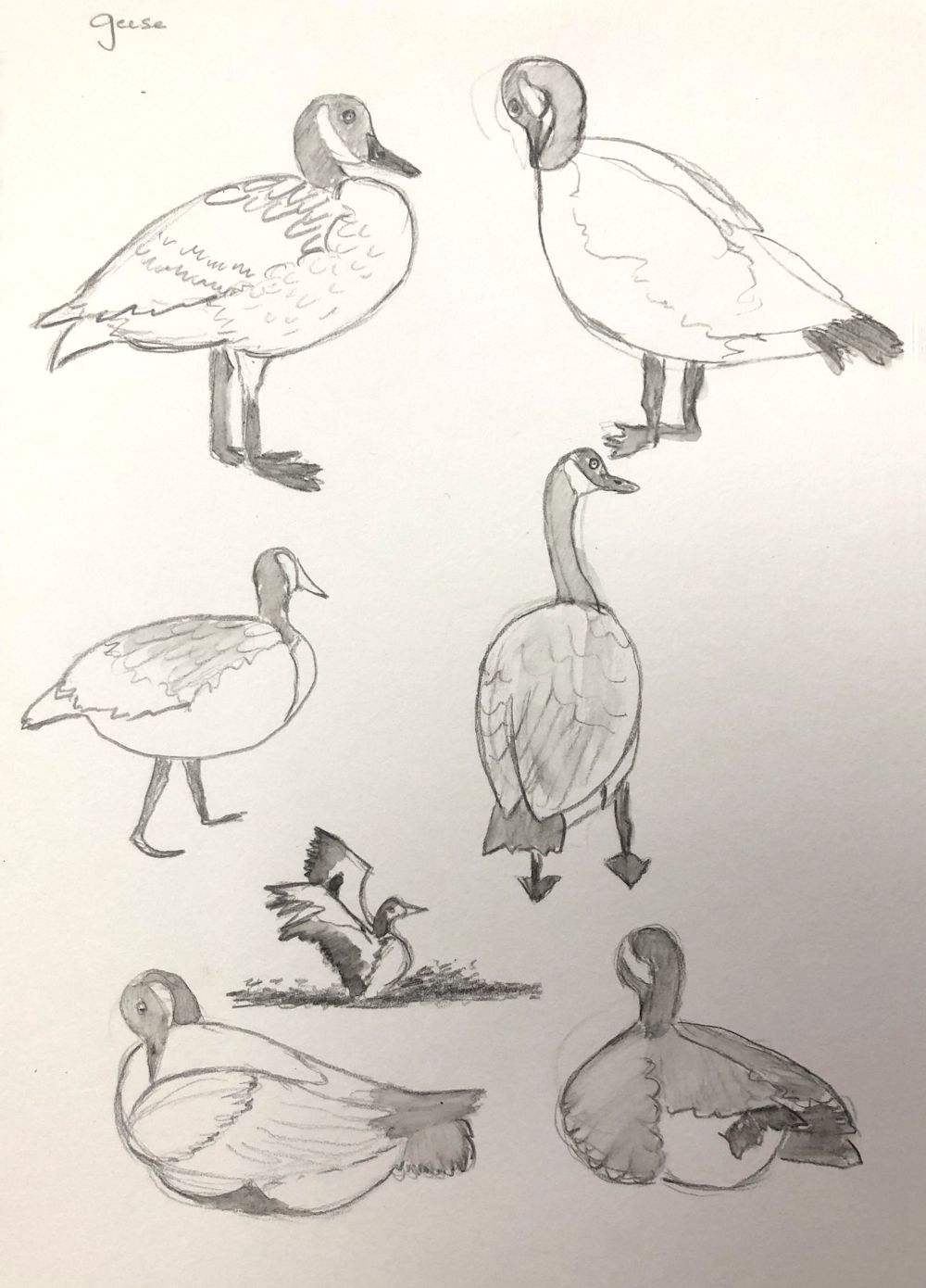
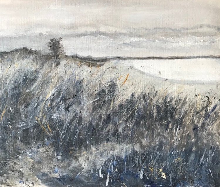
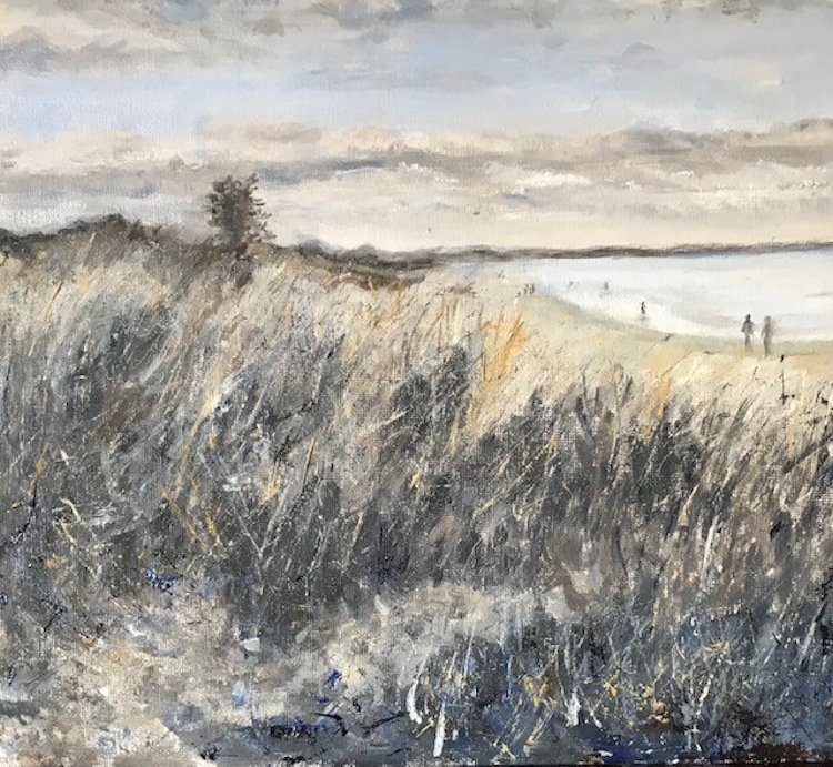
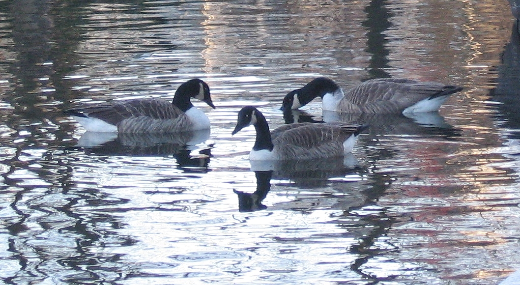
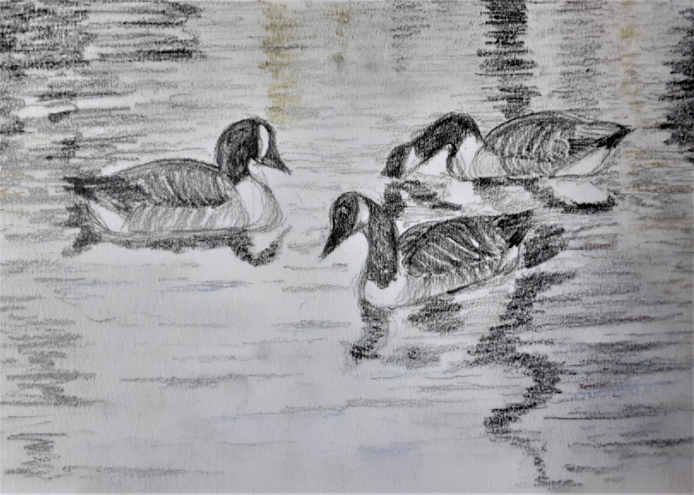
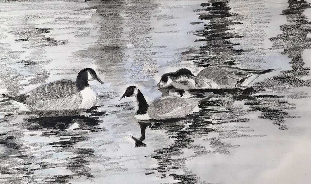
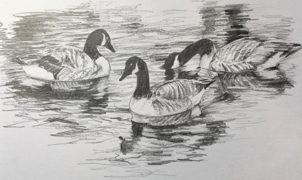
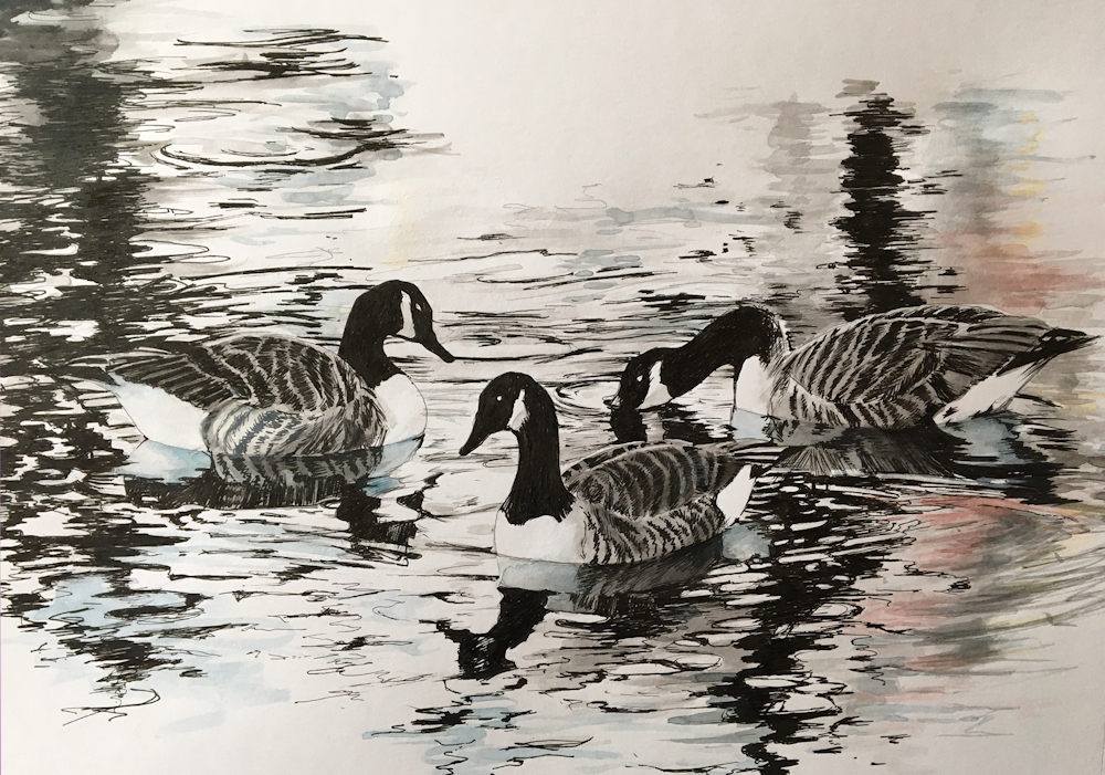
Waterbirds in the Landscape Week 3: Geese
September 14, 2023
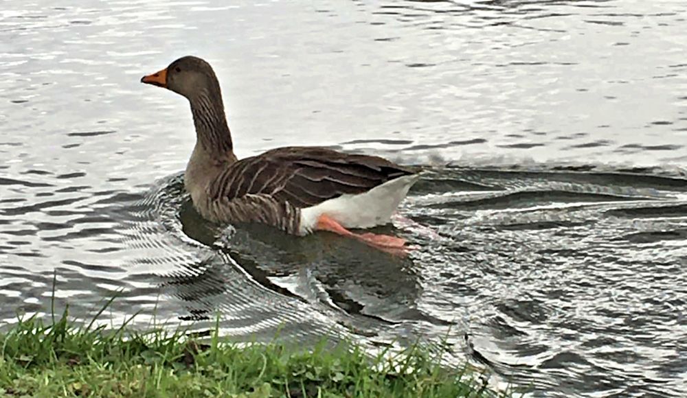
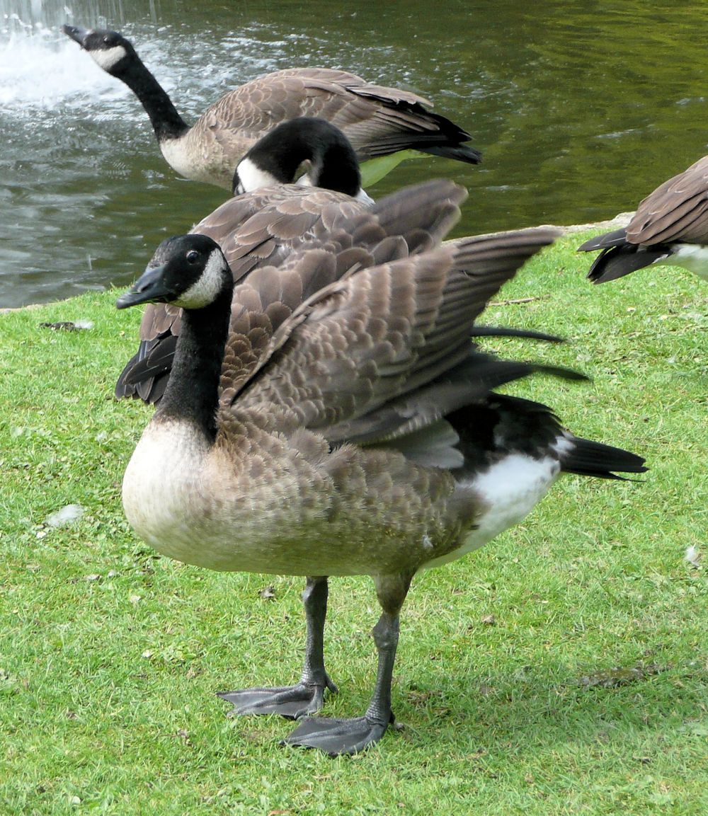
Geese are like ducks with longer necks and can be seen as often out of the water as in it. This post includes photos of the Greylag Goose and the Canada Goose we are all familiar with. Take some time just to look at the various “poses”.
Body shape of the goose above is very much like a duck. Come to grips with this before adding the neck, head and leg as it paddles through the water. The Greylag Goose has a heavy orange beak, mottled mid and dark grey plumage on its neck, paler grey on its upper body and white below.
Below are photos of a Greylag landing, using its feet like water skis. Below the second photo is a version that has been flipped horizontally so you can practice drawing a landing from a different direction. Note the shadow areas under the wing as well as their shape and include the reflection as well as the splash!

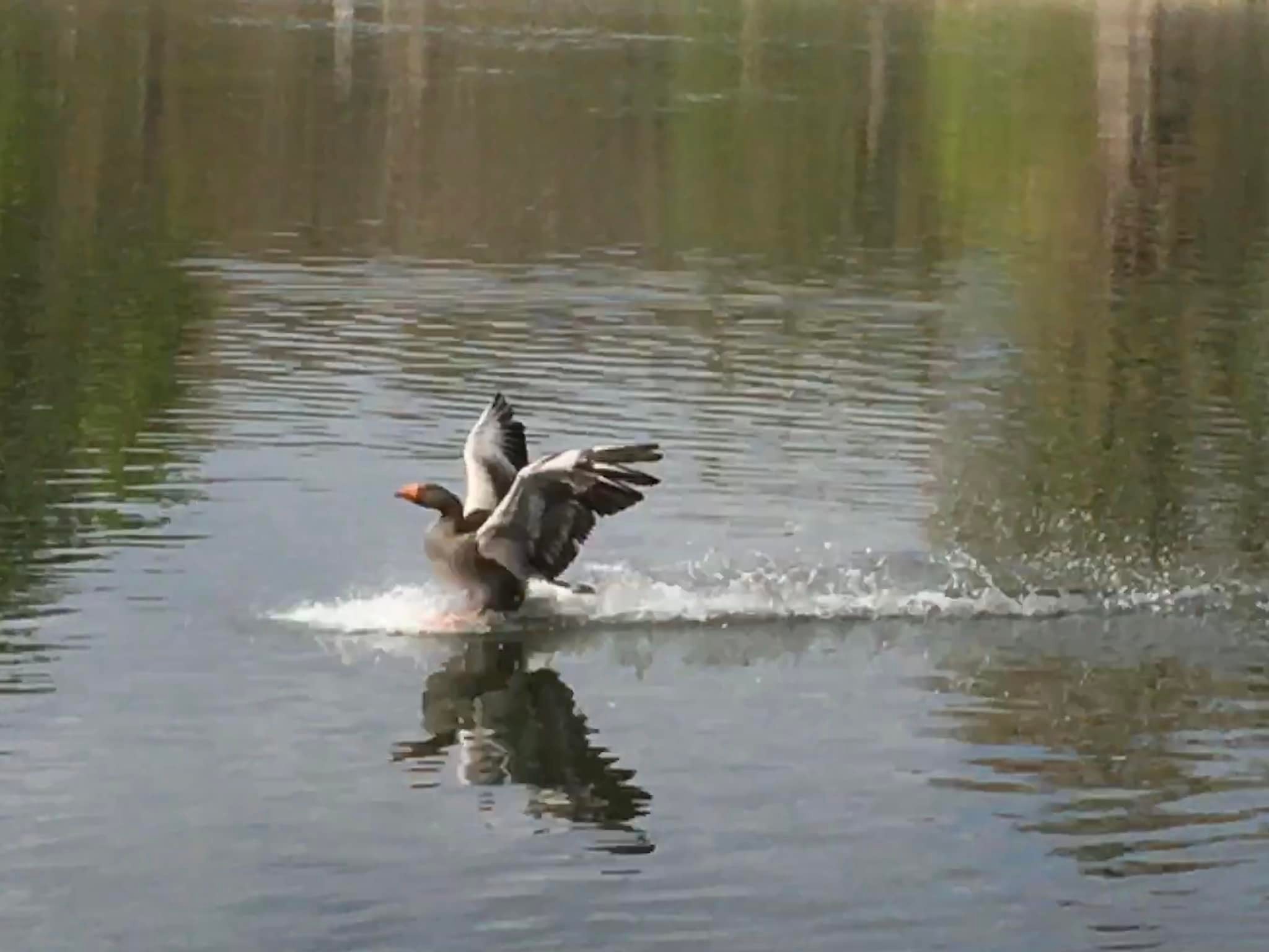
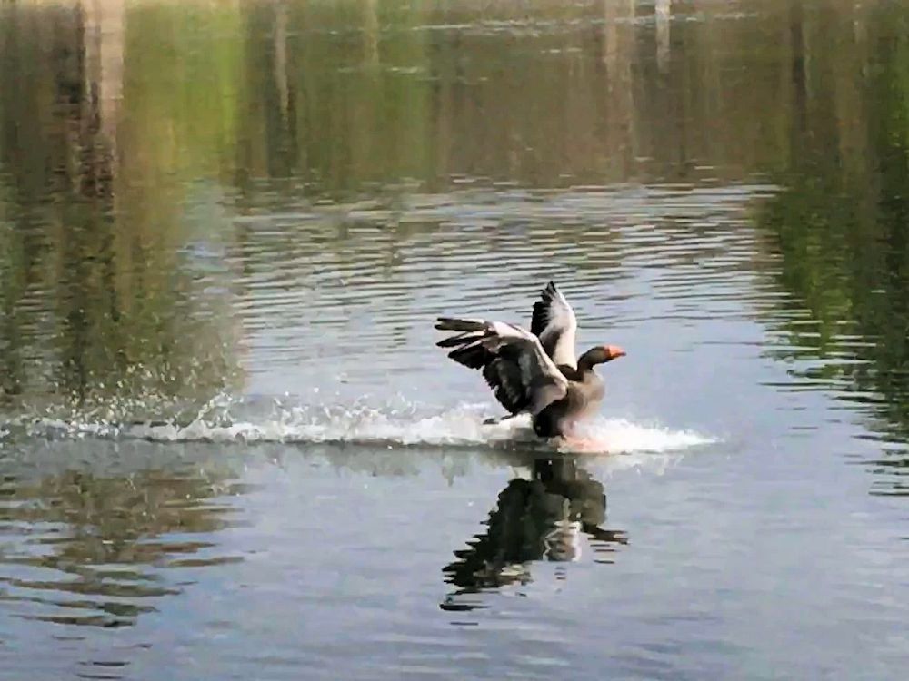
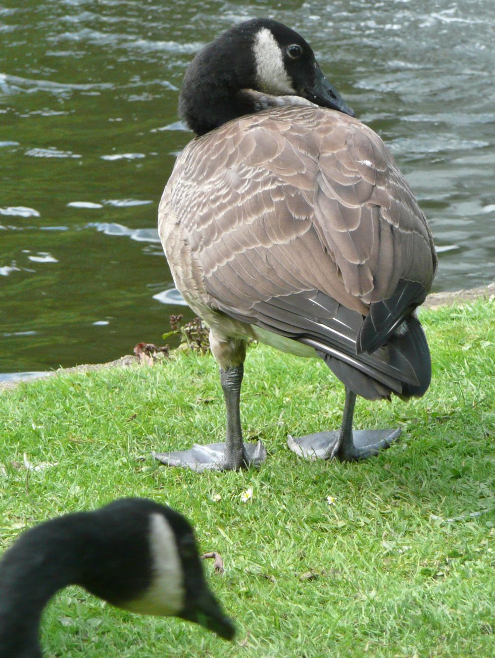
Photo below is of a Canada Goose standing with its neck and head pulled back against its body. Note the position of the legs, about halfway down the body so it appears perfectly balanced. If seen directly from the front the neck would be directly above both legs. If the goose was moving forward the neck would tend to be directly above the leg that was doing most of the load bearing and would shift from side to side as the goose moves forward. This together with the plump appearance of the well feathered body creates the familiar waddling gait of geese and ducks.

A long flexible neck is a great aid to preening.
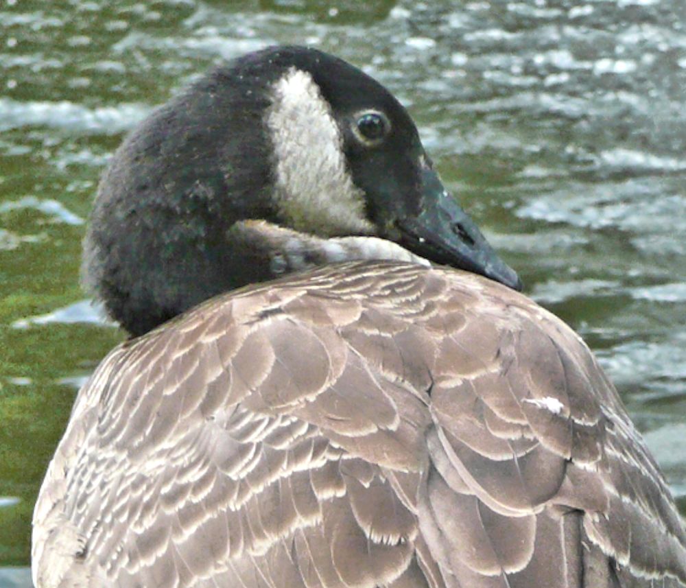
Note the shape from the rear and the well balanced form, and also the rather round dark eye.


We’ll make some rapid sketches during the session using a slide show of the photos above. If you have several photos of a particular goose in several different positions feel free to use your own; after all that is a bird you will have already observed. The choose one image and make a more considered bird portrait or composition of a goose in a landscape setting taking special note of movement of the water, reflections and of balance where the bird is standing.
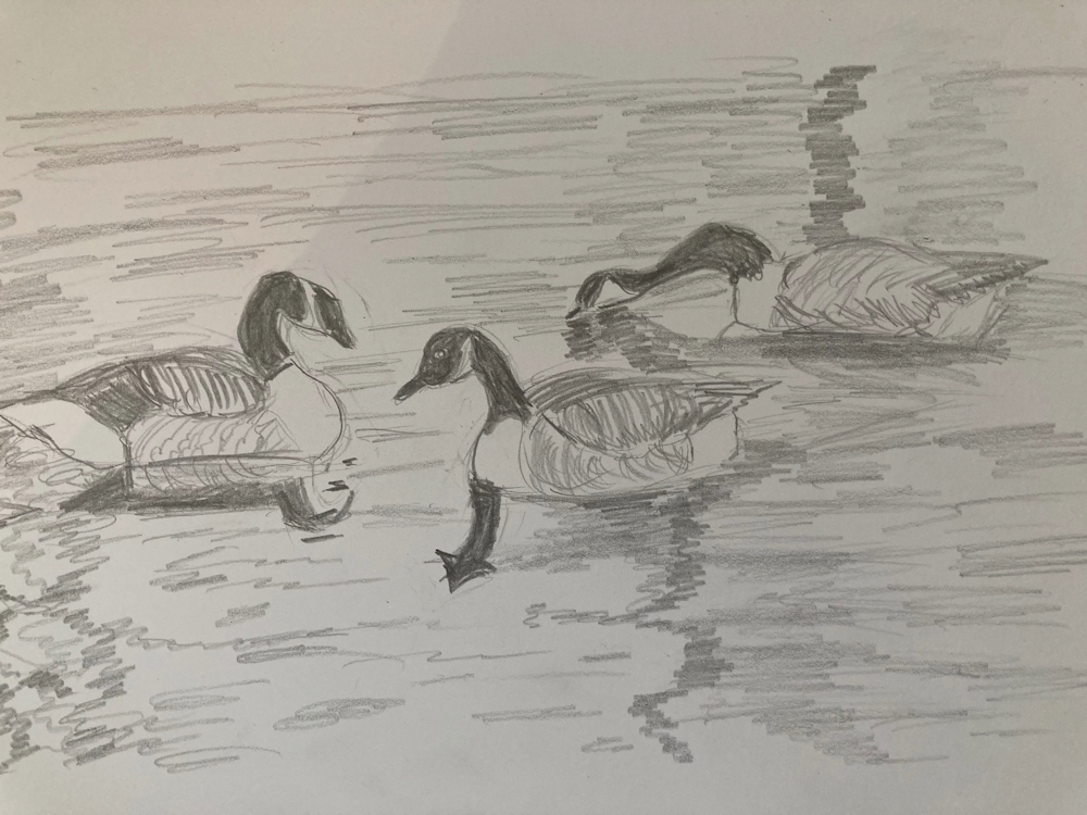
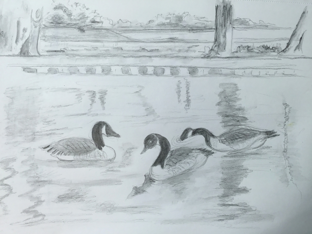
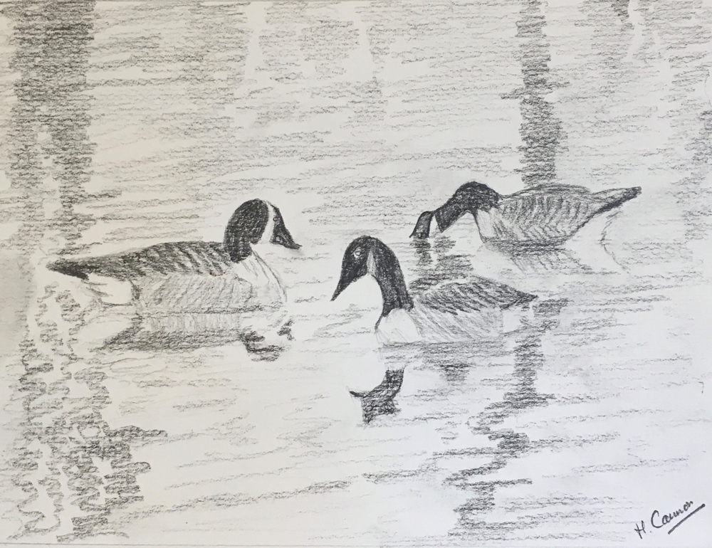
Your drawings and paintings:

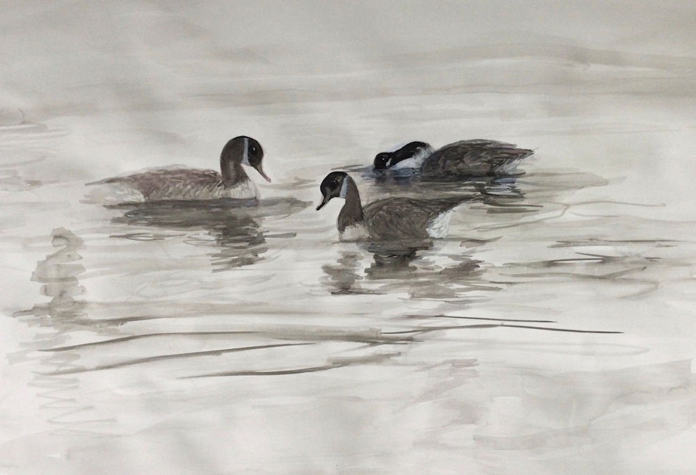
Watercolour by Mali
Watercolour by Mali
Watercolour by Mali
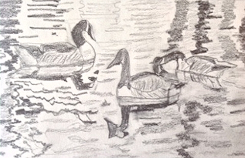
Sketches by Mali
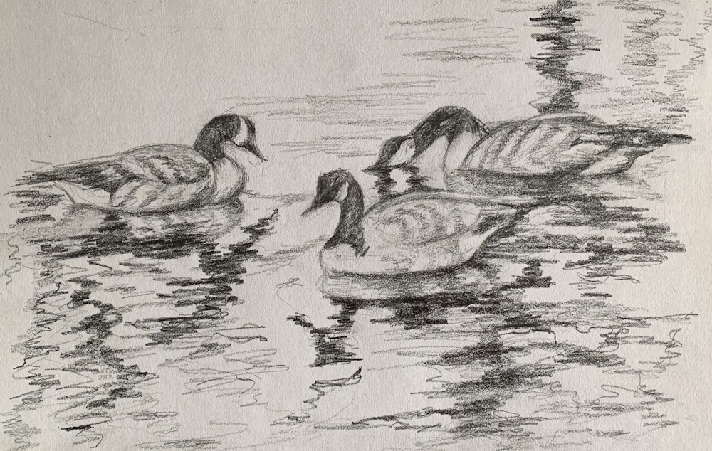
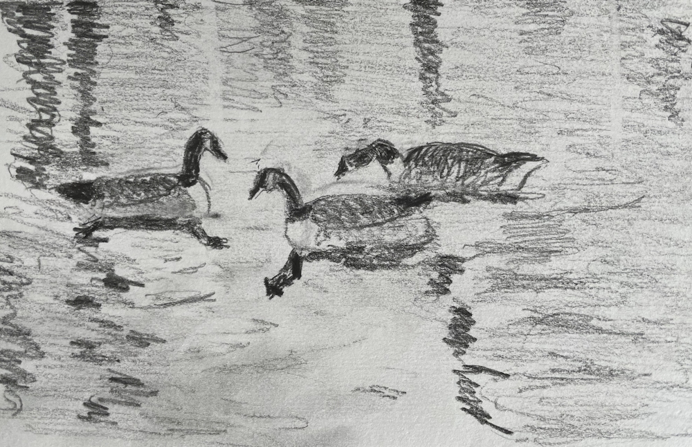
Quick Sketches by Pamela
Watercolour by Pamela
Sketches by Kate

Mixed media by Virginia
Sketches by Maricarmen
Watercolour by Maricarmen
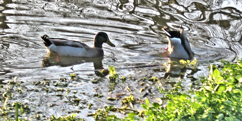
Waterbirds in the Landscape Week 2: Ducks
September 7, 2023


Having looked at the heron last week standing upright on the river bank, with its long neck and head turned toward the water intently looking for prey, this week our attention turns to the ducks who more often than not are found with their body mass in a much more horizontal position. That is till they amuse us by upending and diving for a tasty morsel of weed or start waddling around on the bank.


The UK is home to many kinds of duck from the teal and eider to the exotic mandarin. They share several common features including a broad flat keel and short neck and legs.

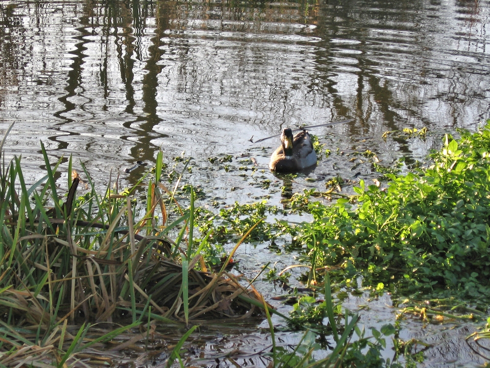
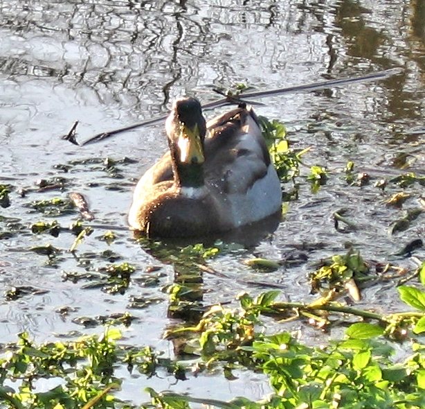
Take note of the body shape; in the water you can see its broad flat keel if its front is facing you when diving. Its neck is short and so are the legs with their webbed feet. Try drawing the duck itself in several different “poses” then look out for what happens to the water as it swims. Perhaps this week you could make a drawing or painting that includes the reflection of the duck in the water and how the water moves around it.


see the wider view below.

You may even find a situation where the ducks seem to be playfully swimming around while in the background, an ever-watchful heron is poised ready to fish.

During the session we’ll make some rapid duck and water sketches and discuss and start a composition where ducks feature either close up or animating the landscape.
Your paintings:

Watercolour by Maricarmen

Watercolour by Maricarmen

Chalk and pastel by Virginia

Graphite, Aquarelle and pastel by Virginia

Watercolour by Virginia

Watercolour by Mali

Acrylic by Kate

by Kate

by Kate

Acrylic by Kate

by Pamela

Acrylic by Pamela
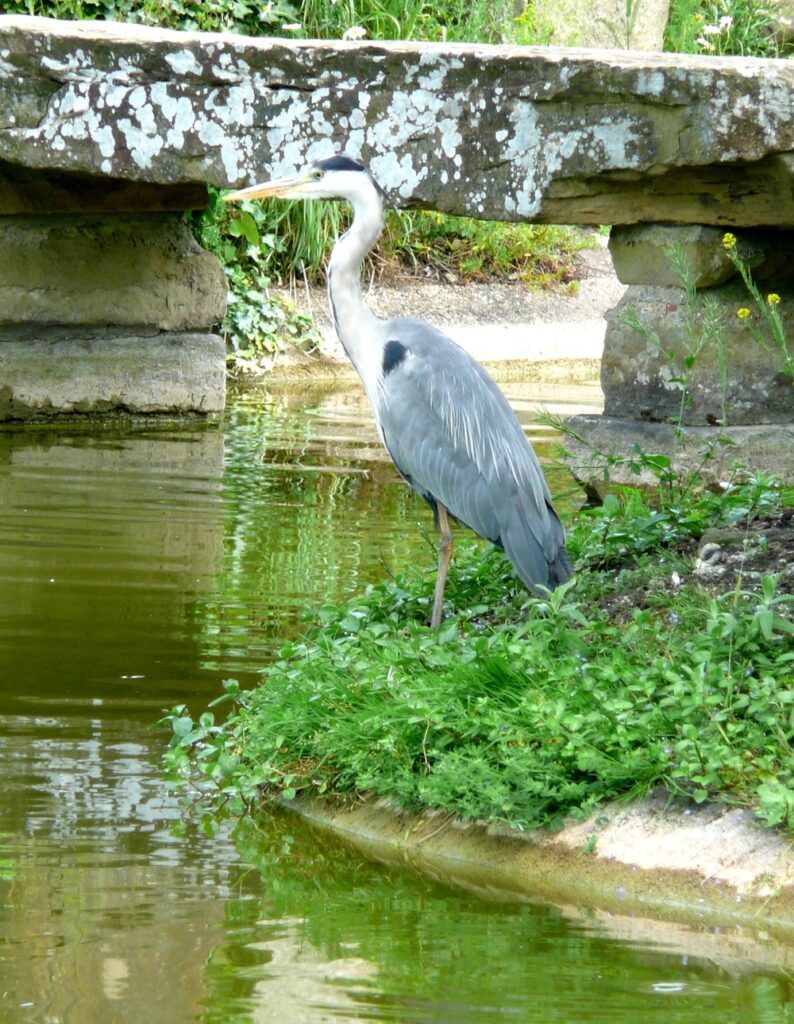
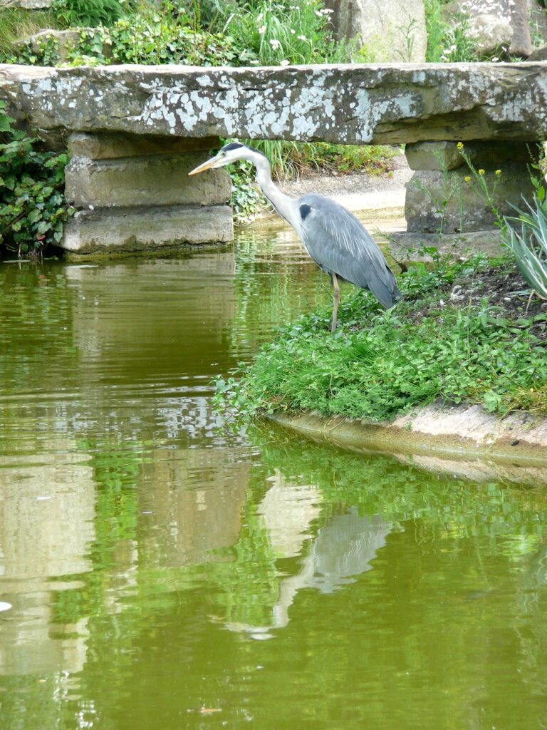
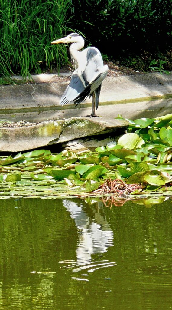
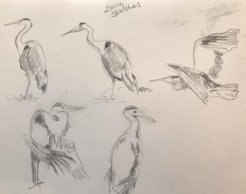
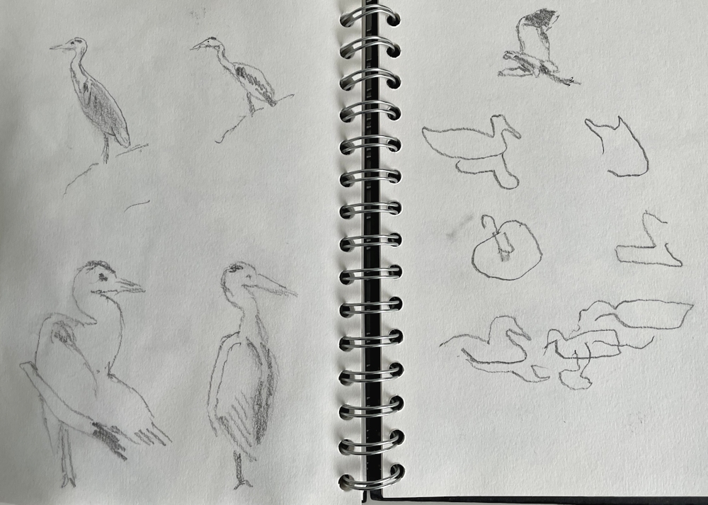
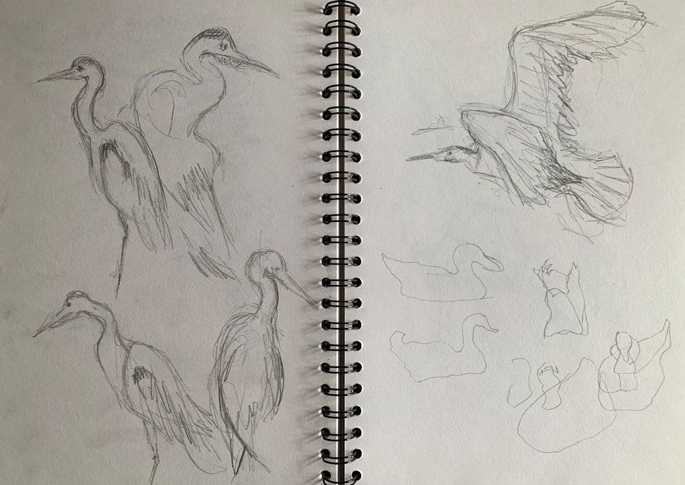
Waterbirds in the landscape: Week 1 Herons and Egrets
August 31, 2023

Watercolour by Jo
I sketched the arrival of the first few white egrets on a salt-marsh in New England and later painted this small watercolour evoking the birds, and the colours of the early autumn landscape.
Standing on a river bank watching birds, wondering at their movement and the patterns of water when a swan takes flight or a duck simply swims by, is exactly what we’ll be considering over the next few weeks.
We are starting with the heron and the related group of birds, the egrets. I chose the heron because of all the birds of the river bank, it is the heron that stays still the longest while watching for a tasty meal of fish so offers one less challenge when sketching from life. The heron will even shade the water arching his wings over like a living parasol so that the reflective surface of the water does not interfere with fishing!
Here are a few photos of herons and their relatives the egrets. Do some fast sketches preferably from life or from these or your own reference before launching into a more considered drawing or painting. These sketches should show the bird in various positions and flying if you can.


Before starting to draw look at;
The main body shape
Length of legs, neck head and bill in relation to the body
The angles made by legs neck and head in relation to the body
How the heron and the egrets hold and move their long necks
How the wings are folded over the body
Head and neck; the heron flies with its neck curved back into its body but egrets like swans and geese fly with their necks stretched forward in the direction of travel.
Observe how when the heron is about to skewer a fish its head moves forward and its whole body tenses ready to dive in. You can almost feel the anticipation of the hungry heron.
Colour
Composition
When considering how to paint a more finished work, decide exactly what you want to “say” about the subject, and then which references to use to show how the bird relates to the landscape. Also decide whether your painting is more like a portrait in a landscape setting; in the way that Gainsborough’s painting of Mr. and Mrs. Andrews is a portrait of the couple in their country estate setting, requiring a lot of detail, or whether it is the landscape that is of prime importance even if a flying heron in the distance forms the focal point. I have seen egrets in numbers together but herons tend to be solitary so this is an aspect that you could build into the feeling of your painting.
Looking forward to seeing the results and exploring the subject further on Wednesday.
Your paintings;

Pastel by Mali


Watercolour by Maricarmen

Watercolour by Maricarmen

Acrylic and watercolour by Pam

Acrylic by Kate
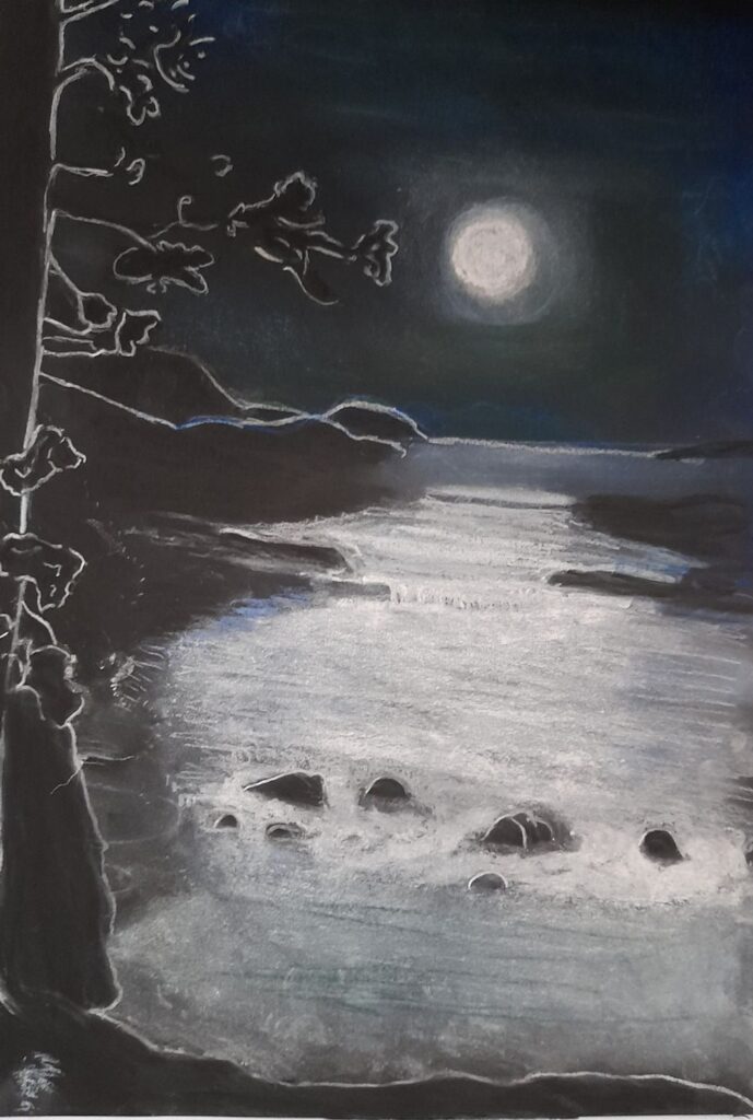
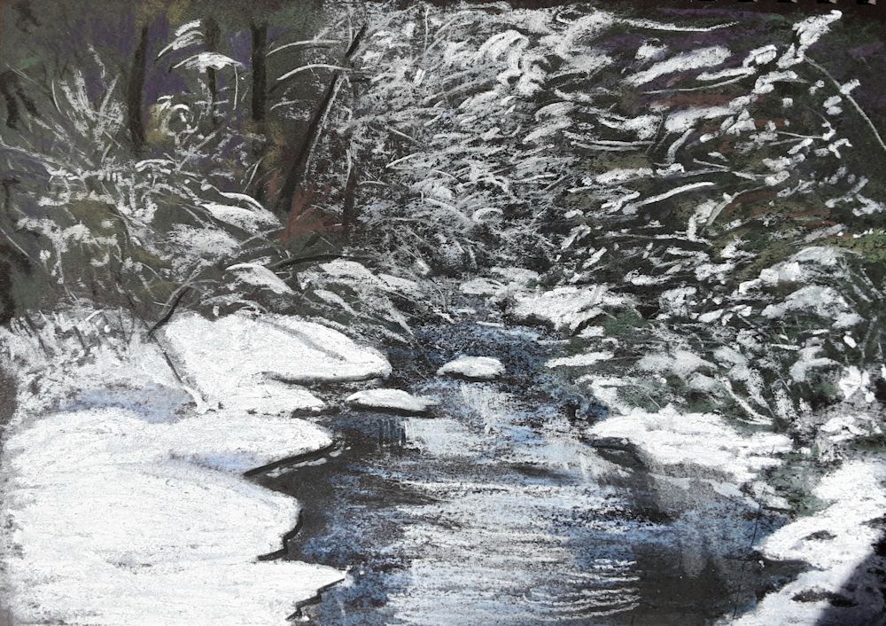
Magic of Black Week 3: Night Scene
March 8, 2023

Pastel on Black paper by Jo
Note how the tree trunks are “not drawn or painted”.
All the drawing is in the spaces between.
Working on black paper lends itself well to drawing and painting night scenes just because they are DARK. Lights from street lamps, moon and stars can be depicted simply and dramatically.

Watercolour by Jo (unfinished)
The main lines were lightly marked with pastel pencil. Masking fluid was applied to all areas that were to remain black. The paper was dampened then washed with layers of blue and green interference watercolours using a large mop brush. These washes were modified with smaller brushes. The painting was allowed to dry thoroughly before removing the masking fluid.
Pastel and pastel pencil, or gouache or acrylic would work well. Paint pens could be useful for the odd bright pop of colour. Happy for you to experiment and mix the media. When working with pastel white gouache can be used to accentuate highlights. Pastel can also be applied as over gouache or paint pens where a softer effect is needed. Most watercolours are too transparent for effective work on black paper but mixing with a little permanent white increases opacity and the effect is similar to working in gouache.
Work from a reference or your imagination. In either case think very carefully about which areas you wish to leave as untouched paper or with a thin veil of colour and which areas need to stand out brightly. Whether working in pastel or gouache it can be useful to mark out the major areas of the composition very lightly in pale pastel pencil just to give a road map. Deal with the mid tone areas and then add the brightest areas of light as the finishing touches.

Tiny pastel by Jo 4 x 5 inches
Here the tower is left as mainly untouched paper.

Pastel and Pastel Pencil by Jo about 4 x 5 inches
Note the arrangement of light and dark areas, use of line and use of broken colour. In this drawing the trees trunks and branches were drawn first before laying in the misty areas. The leaves were then added as bright dots and dashes of white and near white broken colour.

Pastel by Jo
This red cloud is an imagined galaxy full of white stars. Each star is made to look luminous by making its immediate surround dark giving a huge contrast with the star embedded in the light to mid tone dust cloud.

Pastel and Pastel Pencil by Jo
Here the moon is made to look luminous in the same way as in the previous image except the full moon is surrounded by a small ring of untouched paper then a halo of mid tone. Note the reflected light on the cloud, the reflection in the water and the moonbeams lighting up the landscape.

Photo by Jo
Imagine how it would be to use this photo as a reference and how all black areas could be represented as untouched black paper, while making the lights brilliant.
Also identify the main areas of mid-tone.

Photo by Jo
This could also be painted on black paper reserving the black of the paper for the palm trees and telegraph pole. How could you deal with the wires? Night scenes like this and the photo above could be painted in pastel or gouache.
This week is really an introduction to painting the negative spaces between the trees and other objects that block the light. it’s also a great opportunity to make lights that appear truly luminous in your paintings. Happy for you to work from the photos above, from your own reference or from your imagination using any medium.
Practical
1.Choose a night scene photo reference or work from imagination.
2.Work our your composition on a small piece of black paper and do some experiments to find which medium or media will suit your subject best. Mixing the media may produce an exciting result.
3.Map out the composition very lightly with a pastel pencil on the paper selected for the final work and then create a work where some of the paper is left untouched or is visible beneath translucent layers of colour.
Your Paintings:

Acrylic over Black Gesso
by Pam

Pastel
by Liz

Gouache
by Liz

Gouache on Black paper
by Heather

by Kate

Gouache by
Mali

Pastel
by Mali

by Mali
Almost Monochrome Week 4
September 21, 2022
Every stage of a painting has its merits. Often as in the monochrome painting below, the initial rapid response to the landscape is more exciting than the finished painting.
Starting with a cool colour
The initial acrylic sketch was made with a cold blue grey made from Cadmium Red Hue and Phthalo Blue, mixed with white. The painting was completed with purplish reds made with Cadmium Red and Phthalo Blue, almost pure Phthalo Blue and white form much of the water and adding Yellow Ochre into the mix for some of the vegetation.
Stage 1: A large amount of a mix of Phthalo Blue and Cadmium Red Hue was made to make a cool blue grey and a basic monochrome sketch made in acrylic. Some further Phthalo Blue mixed with a little white was added in places. This will form a monochrome structure for a more colourful painting.
Acrylic by Jo
Completed with additions of mixes of Phthalo Blue and cadmium Red plus some Yellow Ochre
Starting with a warm colour
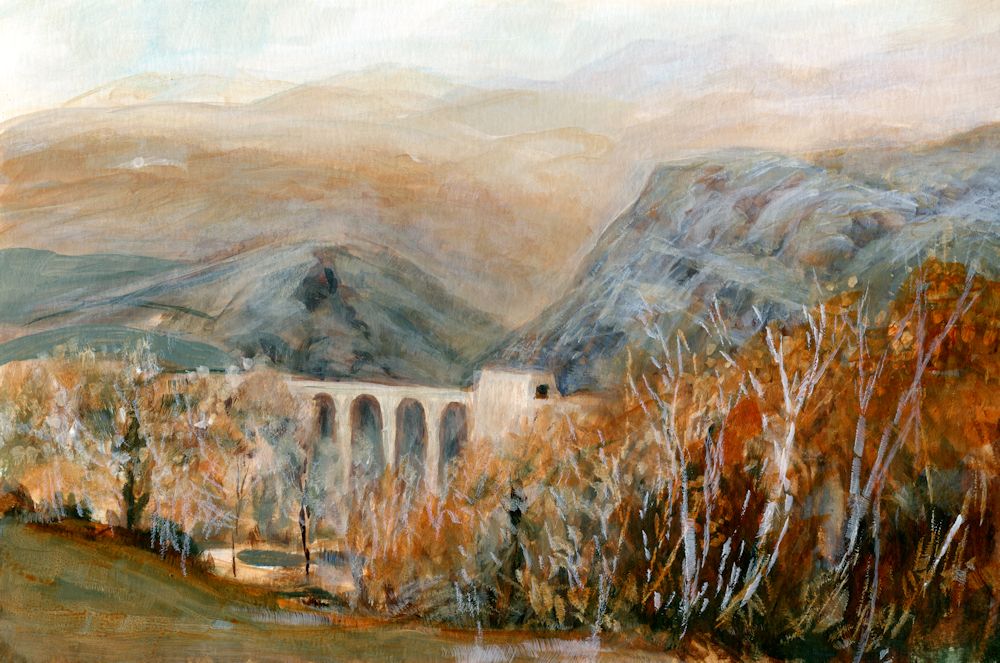
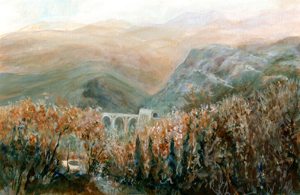
Burnt Umber and white was used for most of the first stages of the painting below, with added mixes of Phthalo Blue. The result was a much warmer sketch. I wanted the bridge to appear set into the landscape more and to show the green colour of the nearer hills. The bridge and tunnel are exactly the same size at each stage shown but note the illusion of the bridge looking smaller when painted closer in tone to its surroundings and the trees painted to cover more of the lower part of the bridge. In the final painting the tiny patch of pale riverbed/path/water, near the bottom left is the point of most contrast and appears much nearer to us than the bridge, reinforcing the illusion of depth in the painting.
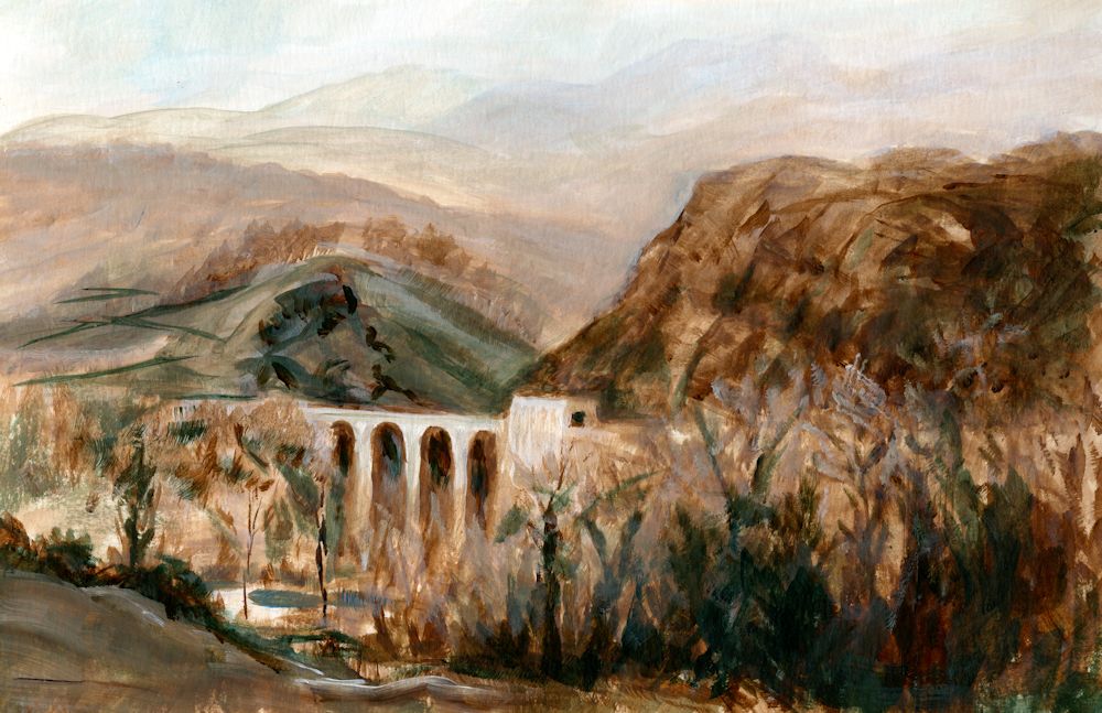
Stage 1: monochrome painting in Burnt Umber and white to
which mixes of Phthalo Blue with Burnt Umber have been added.
Acrylic by Jo
The completed painting. Although I liked the freshness of the initial colour sketch I wanted the bridge to appear more set into the landscape and to show the greenish tinge of the rocks in that part of the Parma Apennines. The foreground hills were reworked a little and the bridge and tunnel made very slightly darker so that it receded. The foreground and middle distance trees were also worked on and at some stage the bright Sienna foliage on the nearer trees may be reinstated.
Although not as exciting as the initial sketch the finished painting does remind me of a hazy day with the last remnant of Autumn colour in the trees rather than the brightly lit bridge of the first stage. Note how using a cool or warm colour can alter the atmosphere. The cold Phthalo Blue mixed with the warmth of Burnt Umber meant I could choose between keeping the painting warm as in the initial sketch or making it far colder in appearance.
This week I would like you to complete any unfinished work and to make a tonal painting in a rather different way. The challenge is to paint a contre jour subject. This could be a landscape against a bright sky or sunset, or a simple still life in front of a bright window. The subject will not be a completely stark silhouette but may appear dark and with subdued tones against the light.
I have put a few examples of contre jour works on the following Pinterest board, which includes some delightful paintings by Anton Mauve, link below:
https://www.pinterest.co.uk/jhall1282/limited-palettes/contre-jour/
Think carefully about how you would like to start the painting. If it is a sunset landscape it may be good to start by painting the sky especially in a work with trees and a low horizon. If it is a still life in front of a window you may like to paint the dark of the window frame and the objects before painting the light through the window. In either case think carefully about the pigments for the main tonal areas and whether your finished painting will have dark tones that tend toward warm browns or dark tones that tend toward cool blues and greens. Keeping to a restricted palette as we have done over the past few weeks, make a mainly tonal painting of a contre jour subject.
Your paintings:
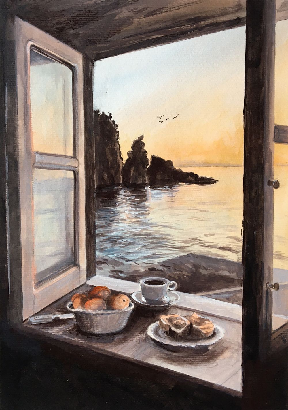
Acrylic by Maryon
The still life in the window, the window frame and the rocks in the water are all seen against the light, but the panes of the open window reflect the light.
Colours used are black with burnt umber and white for the greys, plus orange and blue lake.
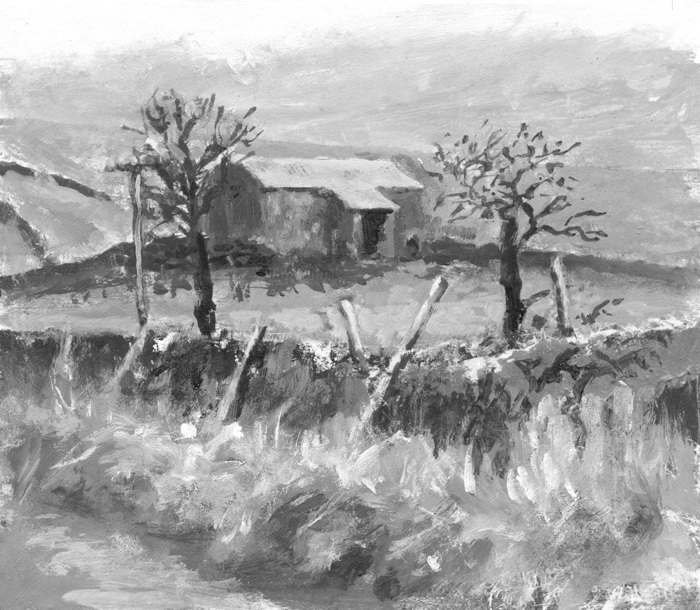
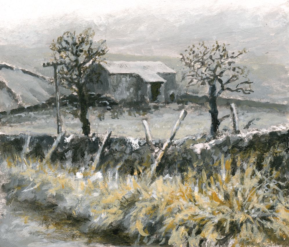
Almost Monochrome: Week 3
September 14, 2022
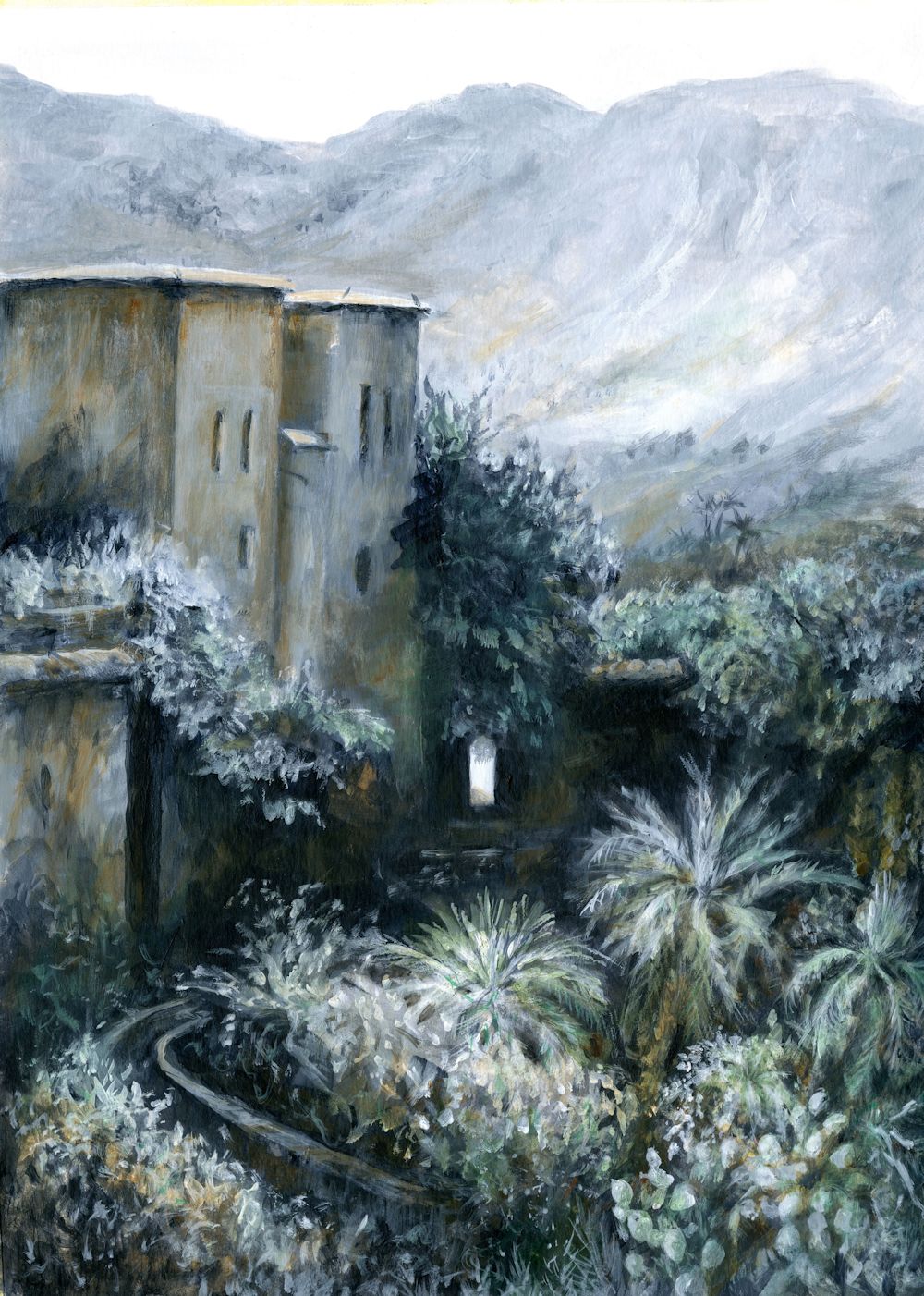
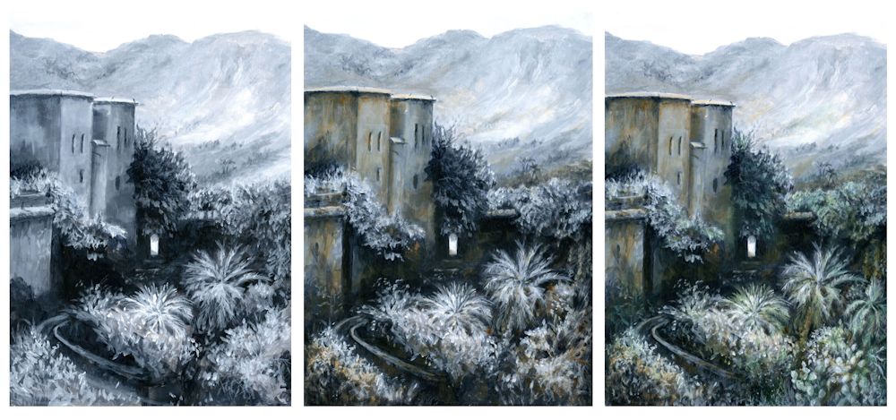
Acrylic by Jo
Painted in Indigo, White, Burnt Sienna and Phthalo Green
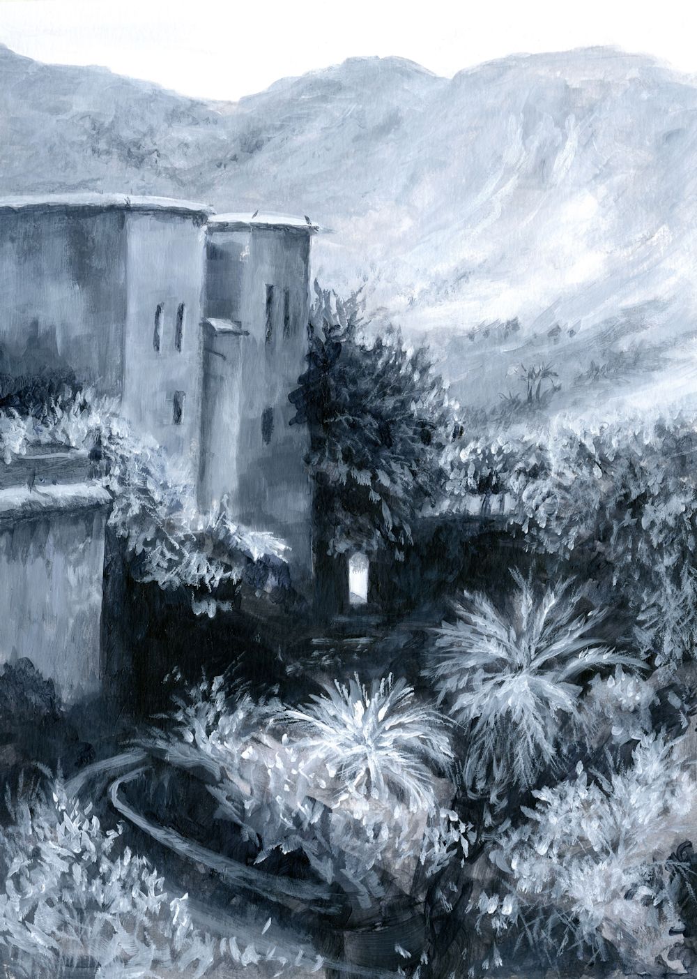
This week I chose to complete the painting of Oumesnat by adding Phthalo Green, alone and in mixes with the Indigo and Burnt Sienna already used. Only small amounts were used so the painting remains largely tonal. It is very different from the study of the barn in Yorkshire where the misty feel was added with opaque scumbles of white, Here everything remains relatively clear and with huge tonal shifts. I did alter some of the foreground vegetation but kept to the chosen pigments.
Choosing the Pigments to suit Your Painting
This can only be done by experiment and can be done as shown in the last post, or less formally as below where I have painted Indigo, Burnt Sienna and Phthalo Green unmixed to see how they would look together as saturated colours; mixed with white; and lastly by mixing any or all of these pigments together in varying proportions. Phthalo Green is a very strong pigment so only minute amounts were needed to effect the subtle changes I wanted to make in the painting above.
I like this way of working because you end up with little abstract paintings which can be quite fun in their own right. You may of course choose very different pigments to work with your monochrome base colour. It is also evident that I could have chosen to work in a much brighter way while still maintaining strong tonal contrasts.
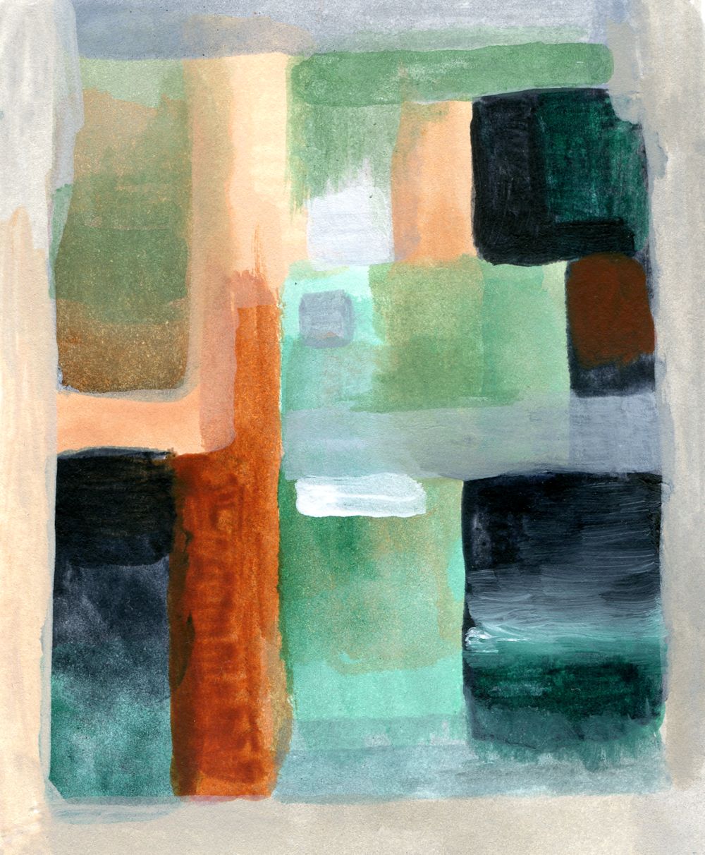
Indigo, White, Burnt Sienna, Phthalo Green
This week the challenge will be to either add another hue to the painting or to start a new work. This time choose your main tonal colour but instead of adding the colour after making a purely monochrome work try and incorporate one or two more pigments in a subtle way as you progress. This painting should still rely heavily on tone for its impact but may end up being more colourful than the painting featured in this post. Have a look at the two Pinterest board links below for ideas or look at paintings by Andrew Wyeth, Victor Mirabelli, Alexandre-Louis Jacob or some of the sunset scenes painted by Anton Mauve.
https://www.pinterest.co.uk/jhall1282/limited-palettes/more-colour-subtle/
https://www.pinterest.co.uk/jhall1282/limited-palettes/more-colour-bright/
Choose to work entirely from your own reference or work in the spirit of one of these artists.
Your Paintings:
Acrylic by Maryon
Acrylic by Norma
Acrylic by Kate
Oil by Virginia
Almost Monochrome: Week 2
September 7, 2022
Acrylic by Jo
Pigments: Titanium White, Ivory Black, Yellow Ochre
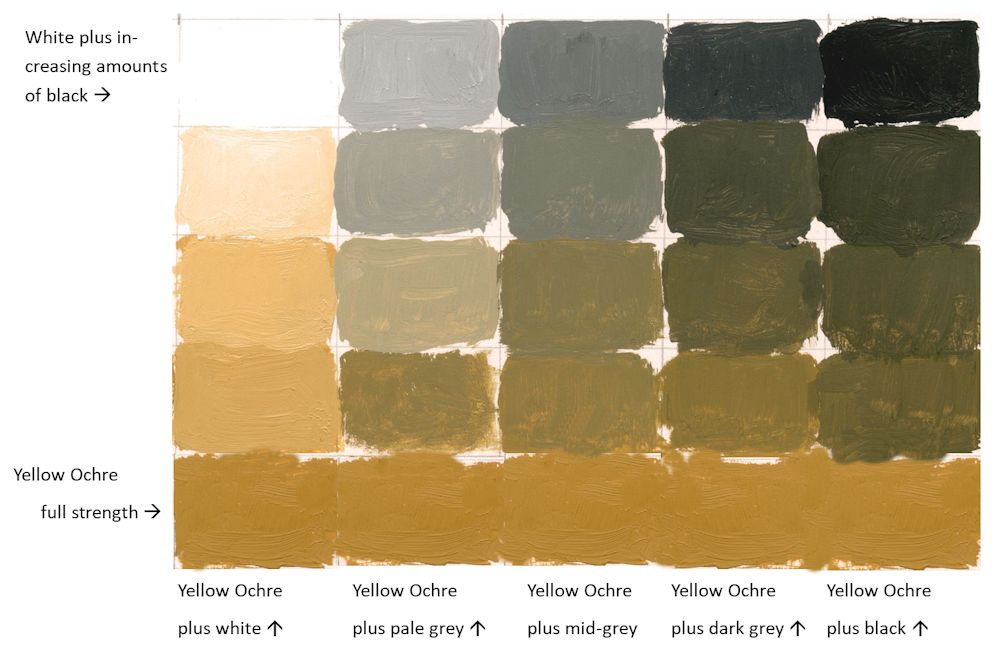
The image above is of the same painting that featured in last week’s post but with white paint “scribbled” rather than scumbled over the surface. The coloured greys took on a greenish tinge as in the chart below.
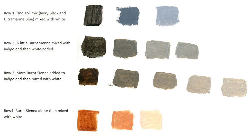
This week I made a large mix of Ivory Black and Ultramarine Blue to make an indigo like colour.
This was then mixed with White and burnt Sienna as in the chart above. Note how much bluer the greys are when indigo is mixed with white. Also note that because Burnt Sienna is much redder than Yellow Ochre their is no greenish tinge to the coloured greys, they just get warmer as more Sienna is added.
Acrylic by Jo
For this painting a large amount of an Ivory Black and Ultramarine Blue mix was made, then a monochrome painting created using this mix with varying amounts of Titanium White
This week we chose a dark pigment; black, burnt umber, Indigo or similar and added varying amounts of white to paint a monochrome picture.
Please photograph your painting at this stage then go on to identify another colour to enrich your painting. Explore a few colour mixes before homing in on the pigment you will use. Then think about how subtle or vibrant you want to make the added colour and make some colour swatches of mixes with white and the dark pigment used for the monochrome study. Last week I added Yellow Ochre; this week I will be adding Burnt Sienna and will post the result in a few days.
Either complete your painting during the week or at next week’s session when we will discuss adding a third colour into the mix. In any event please send an image of your colour mixes and a photo of the monochrome painting.
Your paintings:
Acrylic by Maryon
Pigments: Indigo, Yellow Ochre, Viridian
Acrylic by Kate
Acrylic by Norma
Acrylic by Virginia
Mix of French Ultramarine and Burnt Umber with Zinc White to give a monochrome painting albeit with a rogue brushstroke of Burnt Sienna
Acrylic by Virginia
The painting completed with some French Ultramarine with Zinc White, and Yellow Ochre
Almost Monochrome: Week 1
September 1, 2022
Week 1: Monochrome mixes; plus a colour
Alone or in mixes with white the Yellow Ochre appears bright and warm, bringing the foreground forward. Where small amounts of Yellow Ochre have been added to pale grey mixes a coloured grey with a greenish tinge resulted. Because the mixes were opaque I was able to modify the tones as well as the colour.
The roof of the barn was left untouched.
See further on in this post for making colour mixes to suit your composition.
Working in monochrome alone can be very dramatic. Introducing a subtle colour can soften this and alter the atmosphere of a painting. Over the next four weeks we will explore some of the possibilities.
Monochrome paintings rely on tone, shape, line and mark making for their impact, and although it is easy always to think of monochrome as a work constructed of black and white plus greys mixed from black and white, artists have used other colours such as Burnt Umber and Prussian Blue in mixes with white as a tonal bases for their work.
All paint hues can be muted either by adding black or by adding small amounts of their complementary colours. For these sessions we will work exclusively with tone and adding colour to black, white and grey mixes rather than using complementary colours, although you may like to work a composition using Neutral Tint/white, sepia or bunt Umber/white, or even Prussian Blue/white mixes as a tonal base.
Have at the ready; titanium White, Black and a few colours; yellow , Yellow Ochre or Raw Sienna, a red, a blue and a lemon yellow or similar pale yellow.
Shades, Muted Colours and Tints
Colours can be muted by adding black to make shades or by adding white to make tints. This range can be extended by adding the colour to greys made with mixes of black and white as below. It is useful to make a range of greys and try adding increasing amounts of a colour to each mix. It is very much the artist’s choice to decide on which parts of a composition will include some colour and which to leave as monochrome.
1.Reference the haunting works of Victor Mirabelli who uses limited amounts of subtle colour in largely tonal paintings of old farm buildings and barns. Google the artist or see a couple of his works and a couple of works by other contemporary artists on the following Pinterest board.
https://www.pinterest.co.uk/jhall1282/limited-palettes/almost-monochrome/
2.Find a landscape reference with an interesting tonal structure.
3.Then make up some colour swatches from black to white and experiment to find what happens when amounts of a different of a colour are added. It may be useful to make a formal grid for at least one colour and a few less formal experiments to home in on the colour that will suit your composition best. An example of how this could be set out is below.
| Monochrome base plus white in this case black | White | Pale Grey | Mid Grey | Dark Grey | Black |
| more white | more grey | more black | |||
| more white | more grey | more black | |||
| more white | more grey | more black | |||
| +white | +grey | +black | |||
| Pure colour e.g. yellow Ochre (YO) | YO | YO | YO | YO | YO |
My attempt this week wasn’t great. The dark grey was too dark! But it will give you the idea:
4.Make your own painting working in monochrome initially, and then working your chosen colour into the mix as appropriate.
During the session I’ll start a painting with a different monochrome base, perhaps using burnt umber or either indigo or a Payne’s Grey (blue shade).
Your paintings:

Monochrome Painting in Acrylic

with added colour

Acrylic by Norma

The next three images are different stages in the development of an oil painting by Virginia


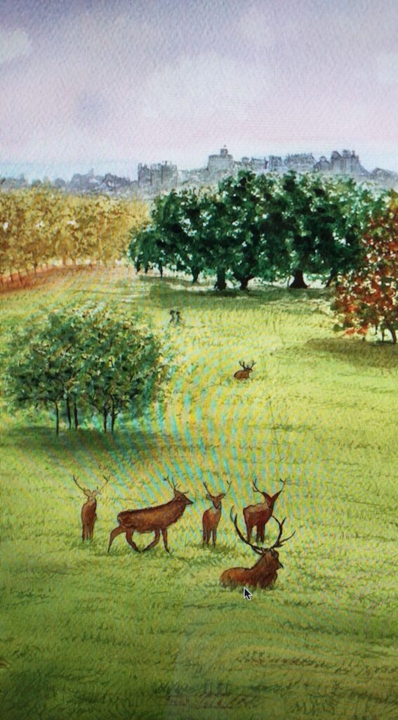
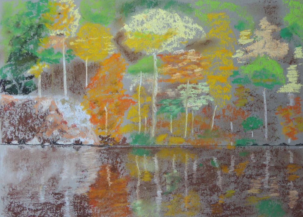
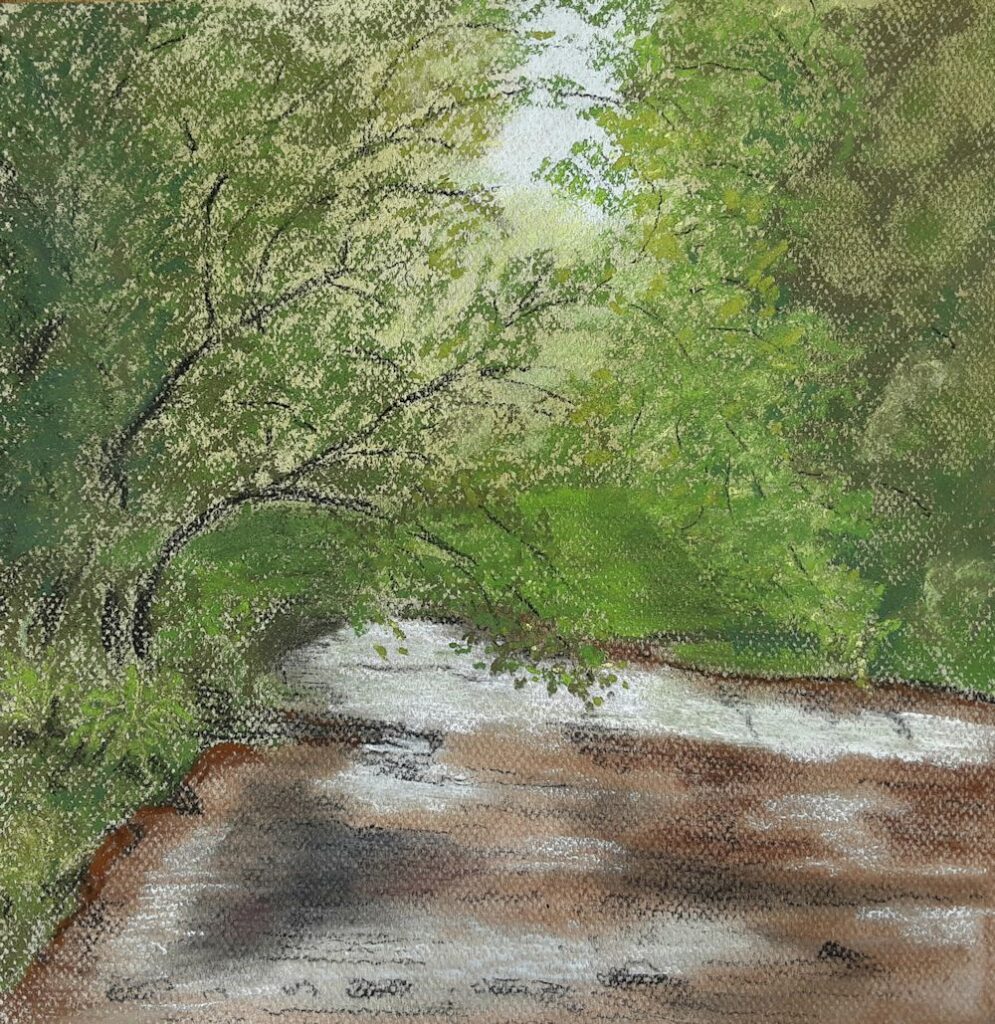
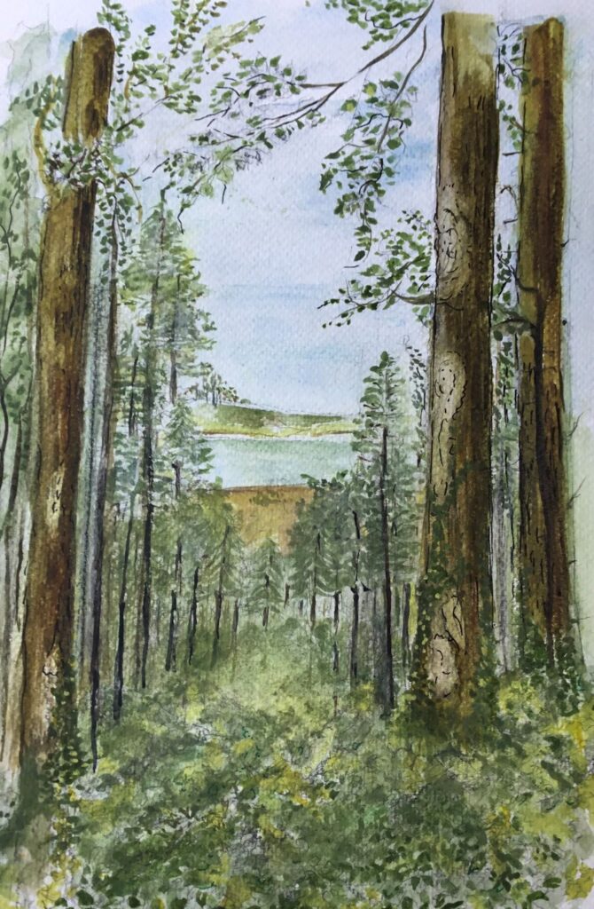
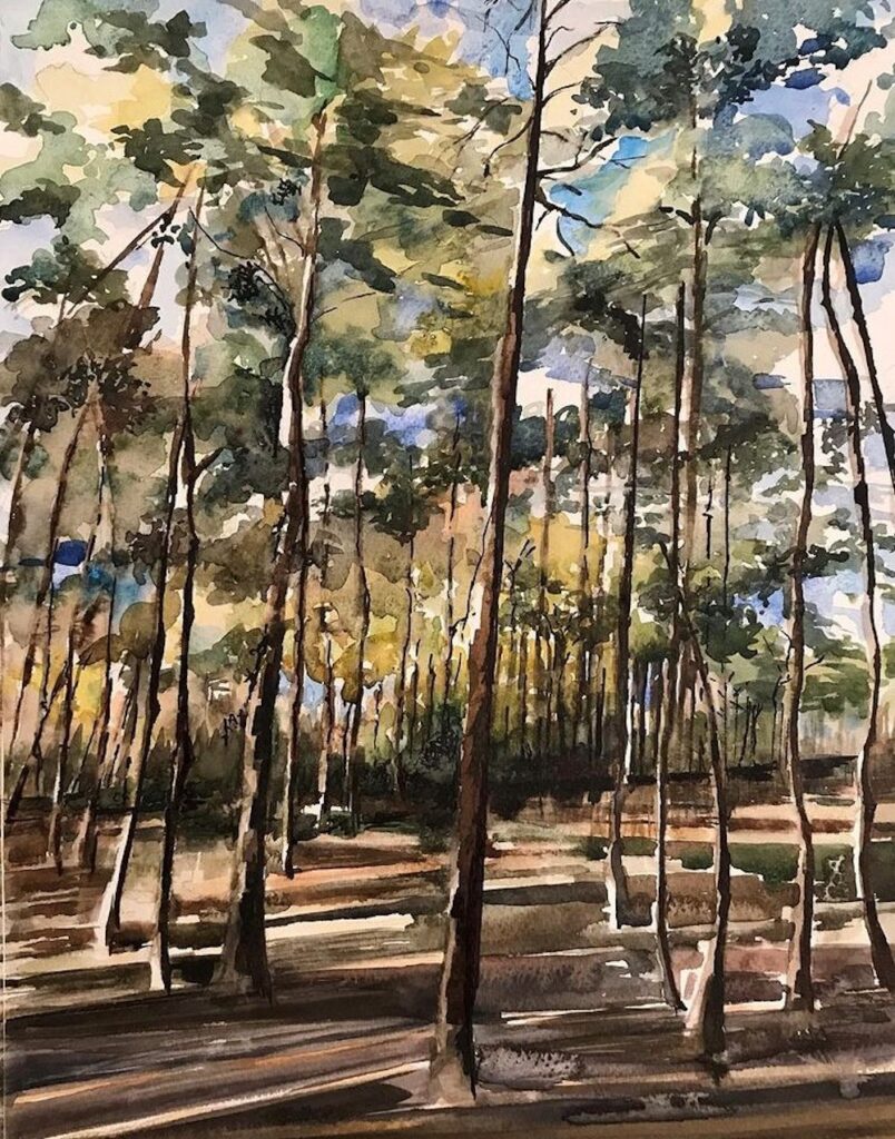
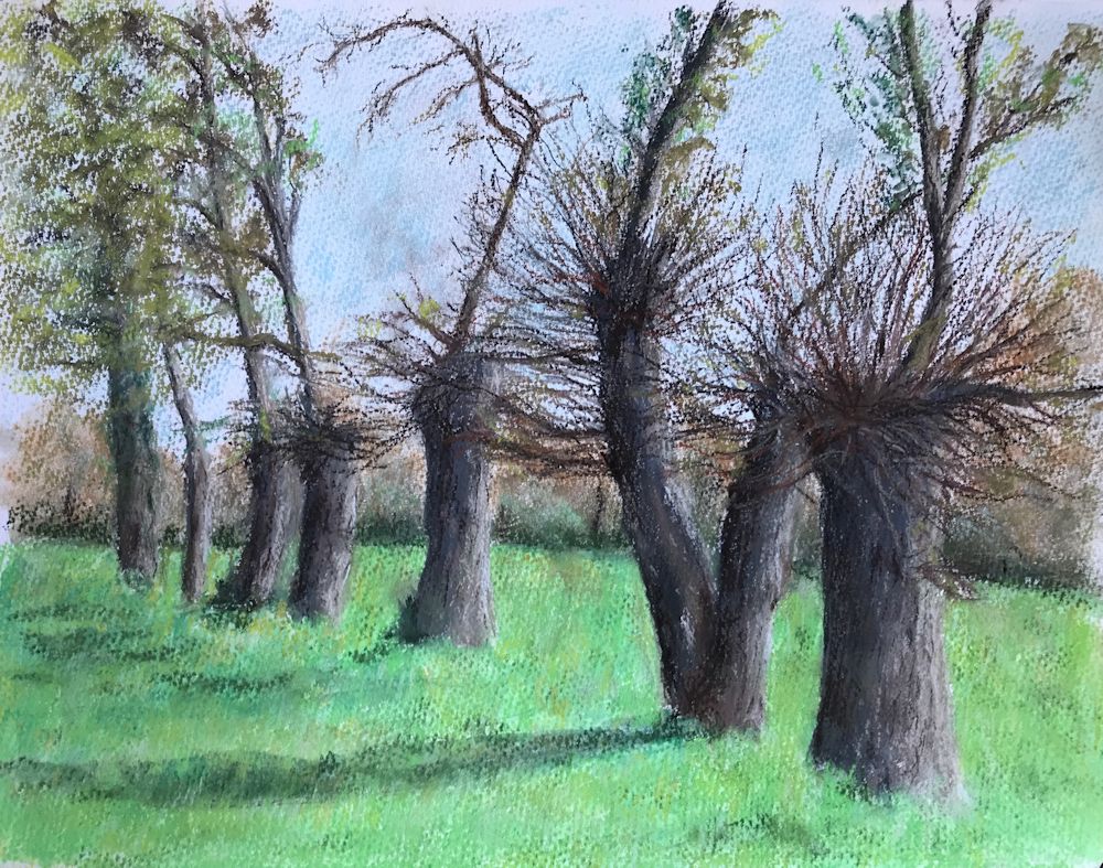
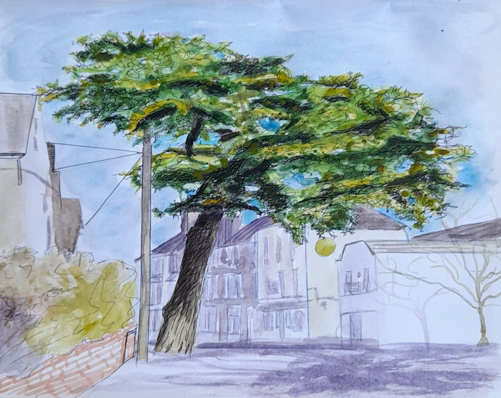
Drawing Trees Week 6: In Open Countryside
March 30, 2022
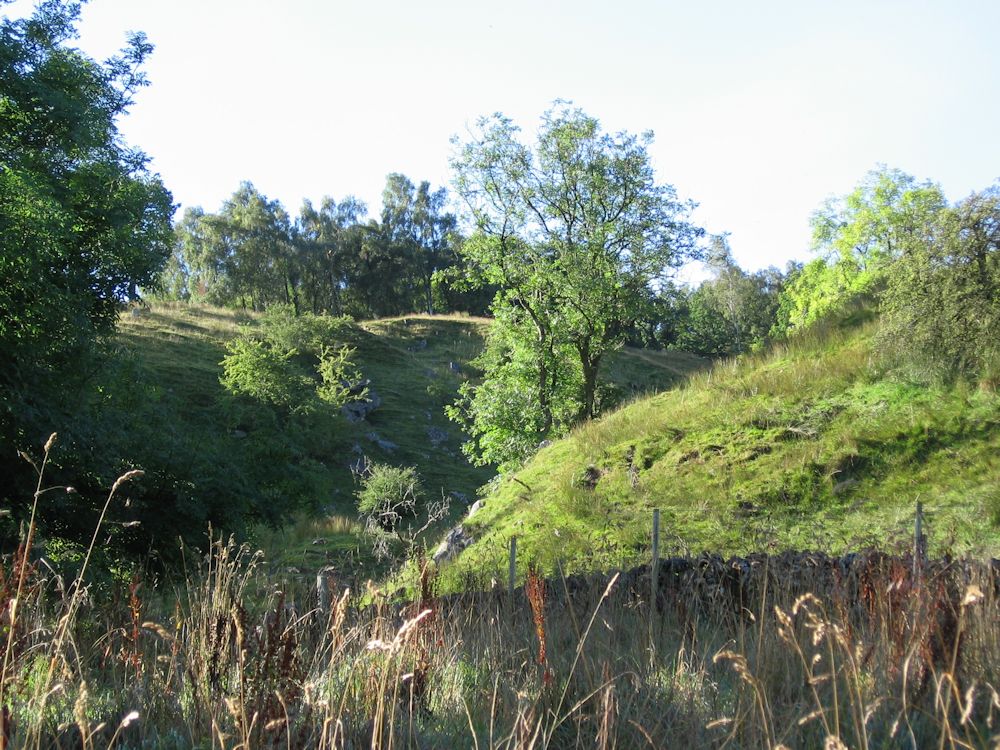
Photo by Jo
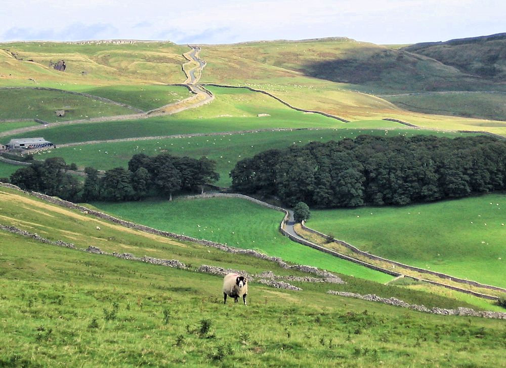
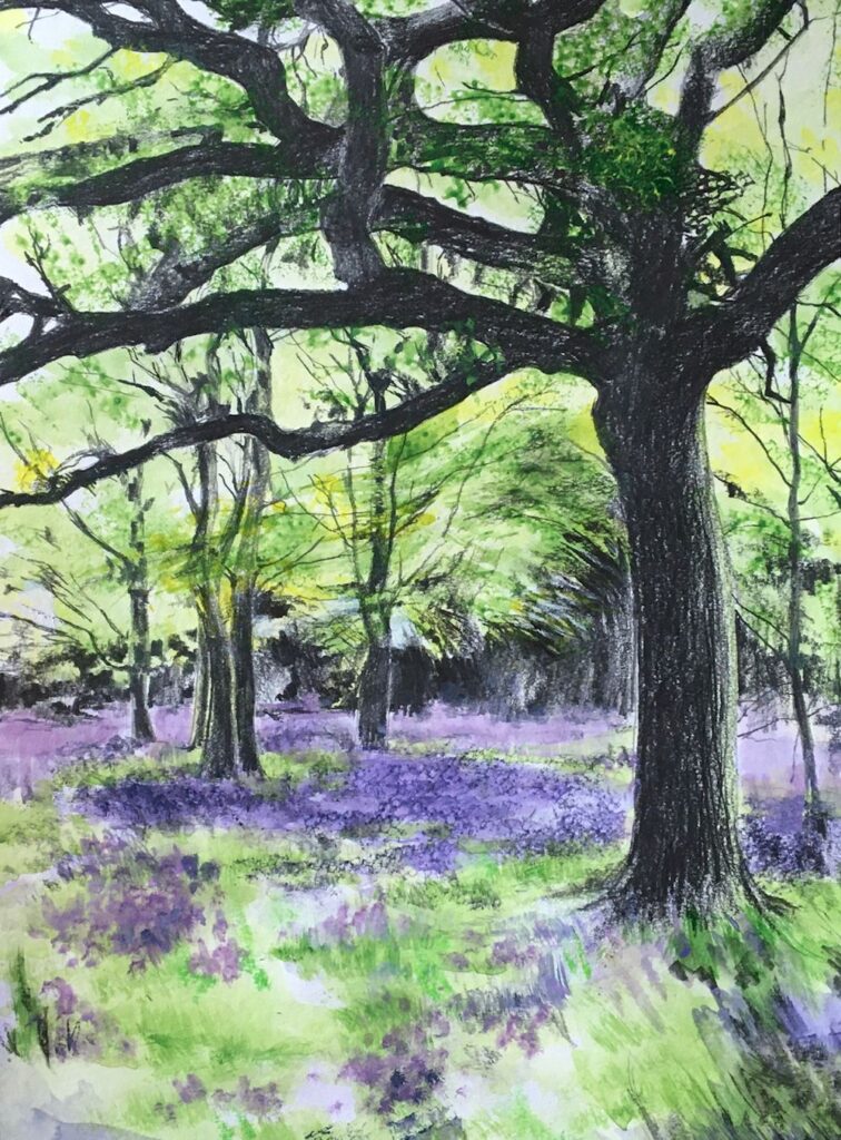
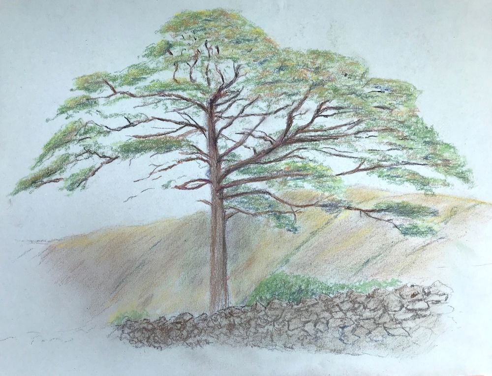
This week we are painting trees from a distance, perhaps a view from a window or from the ridge of a hill looking down on a wooded valley. Instead of being in a wood we are out in the open, looking down or up, to a wooded area or group of trees. The sides of the hills in the photo above are well grazed by sheep and the group of tall ash trees takes centre stage.
The challenge this week is to make a painting of trees in the landscape. Although the word is land-scape I prefer to split it rather differently to labour an important point. I like to think of the vegetation including trees becoming the cape or mantle clothing the lands, hence it is a good idea to establish the topography of the land before clothing it with forests or groups of trees.
It is also essential to make a note of the light conditions. In the example above light is falling very strongly from the left lighting up the slope on the right. The steep sided slopes would look entirely different if the light were from a different direction or on a dull day when the light is more diffuse. The most challenging weather, especially when painting outside, is a bright breezy day when clouds are scudding across the sky casting fast moving shadows as they pass.
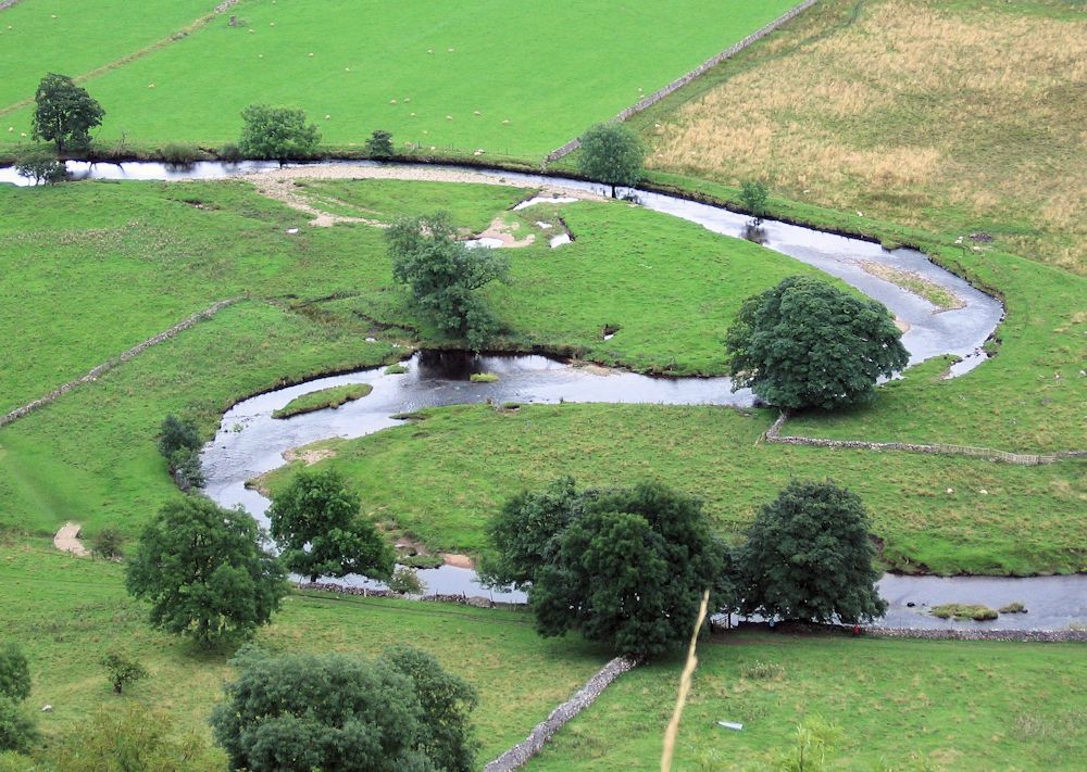
Below are a few more of Jo’s photos giving examples of the sort of reference you may like to work from.
See how the cloud shadows are falling on the land, and how dark in tone the area of woodland appears.
Note the diffuse light and soft shadows under the trees.

See how individual trees can be seen in the foreground and those in the distance become more of a texture. Here it is very clear to see the importance of establishing the land forms first before working on the groups of trees in the foreground.
Seen early morning from my window.
A slightly different view; the misty effects in both could be achieved by gentle washes and lifting out in watercolour.
Fresh greens and the last of the cherry blossom
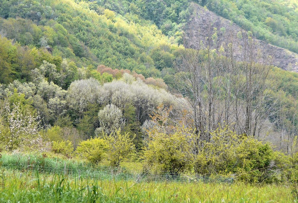
Coming to grips with the underlying slope into the valley here is more difficult so here I would concentrate on the rich textures and different hues and tones of this wonderfully mixed woodland. Greens dominate, but there is also yellow, russet, silvery and greenish grays, and slightly lilac tints with deep contrasts of dark trunks and spangled white; another tapestry of vegetation.
The images above should provide ideas for working from your own reference. Best would be from a place you have walked in or visited.
Your paintings;
Pastel by Maryon
Acrylic by Mali
Watercolour by Heather
Watercolour by Maricarmen
Watercolour by Sarah
Watercolour by Ann
Pastel by Anne C
by Kate
Watercolour by Liz
Watercolour by Virginia
Watercolour by Virginia
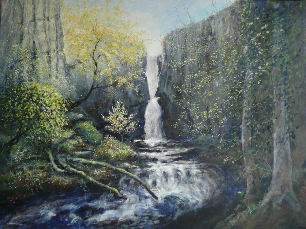
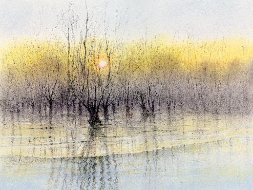
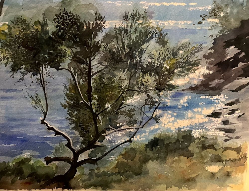
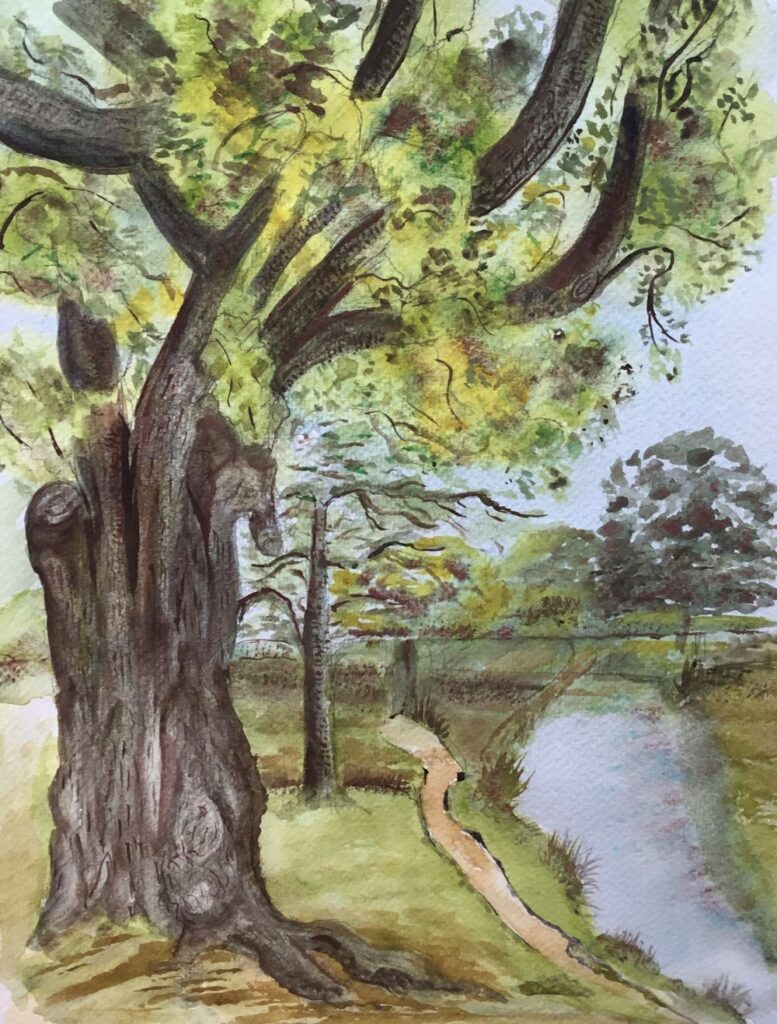
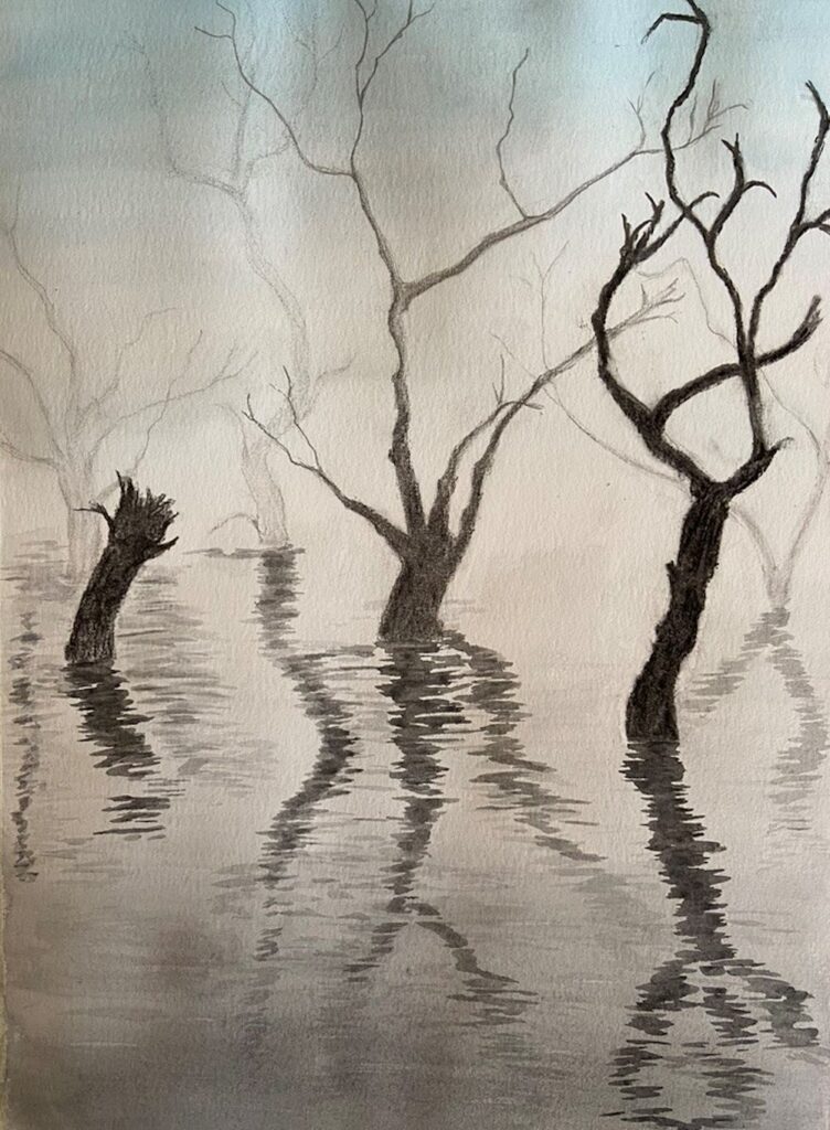
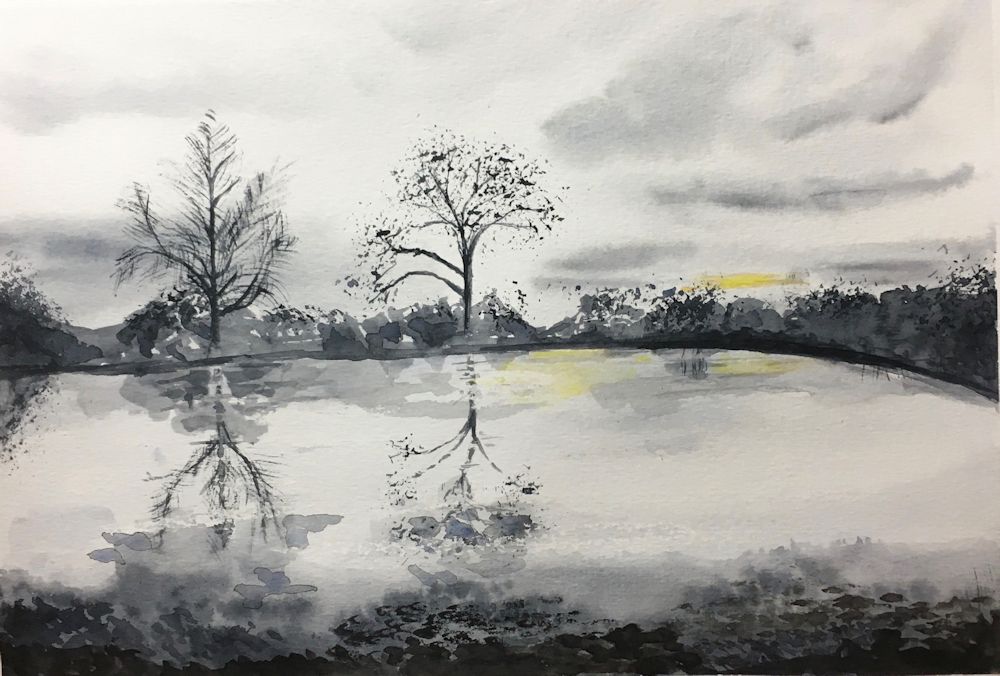
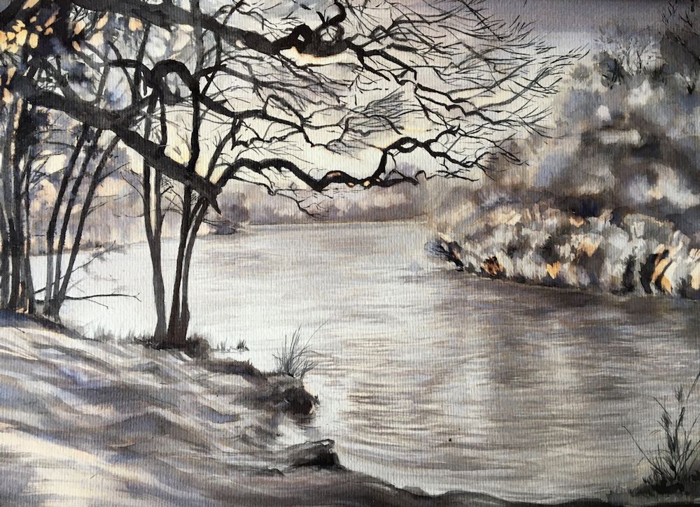
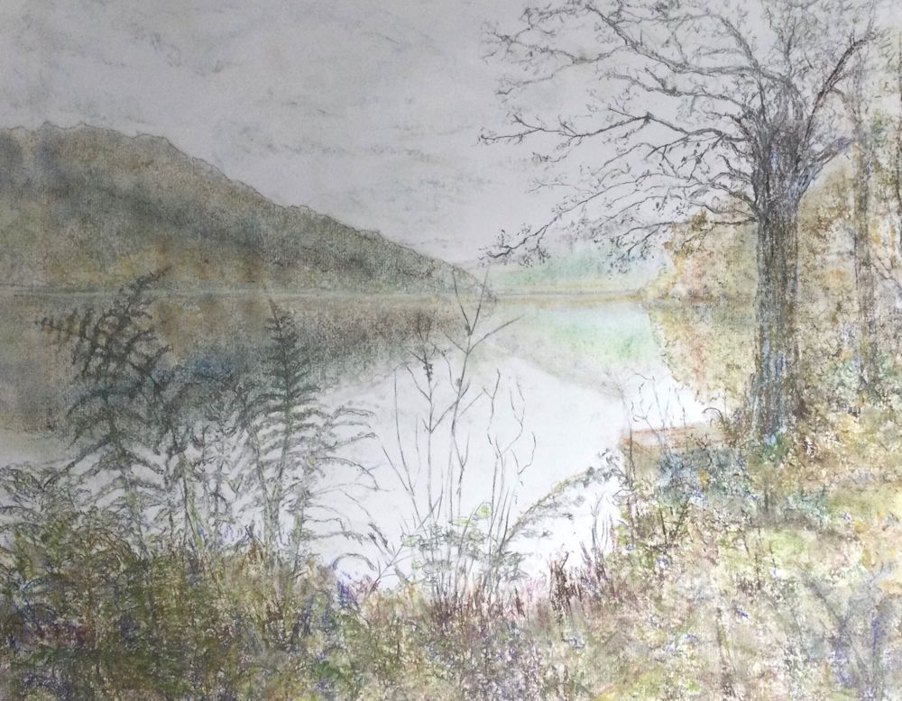
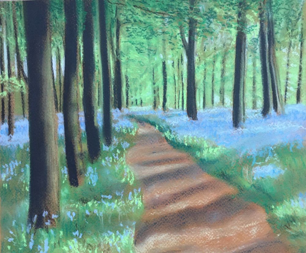
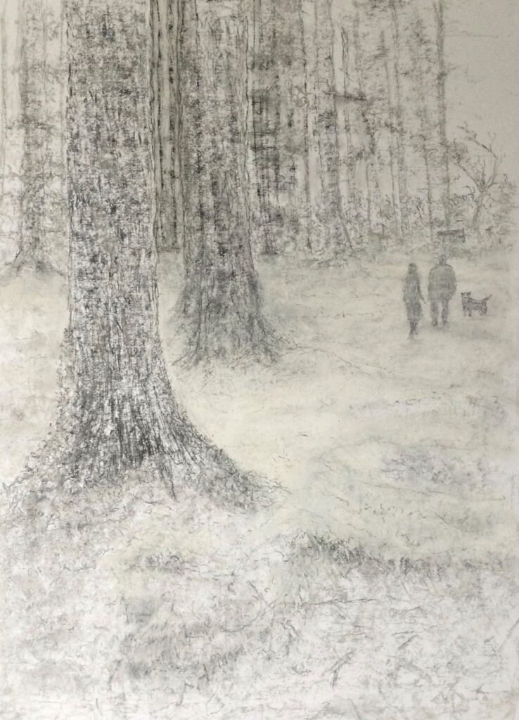
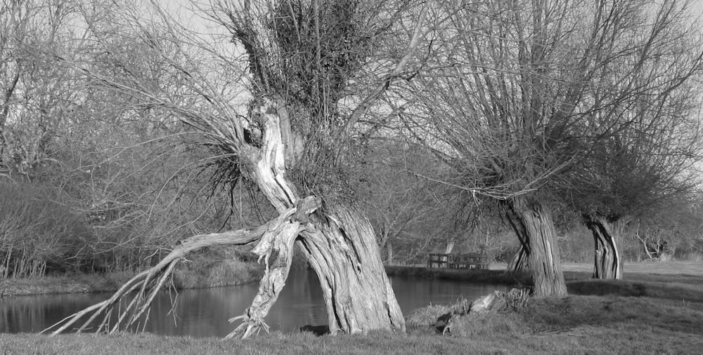
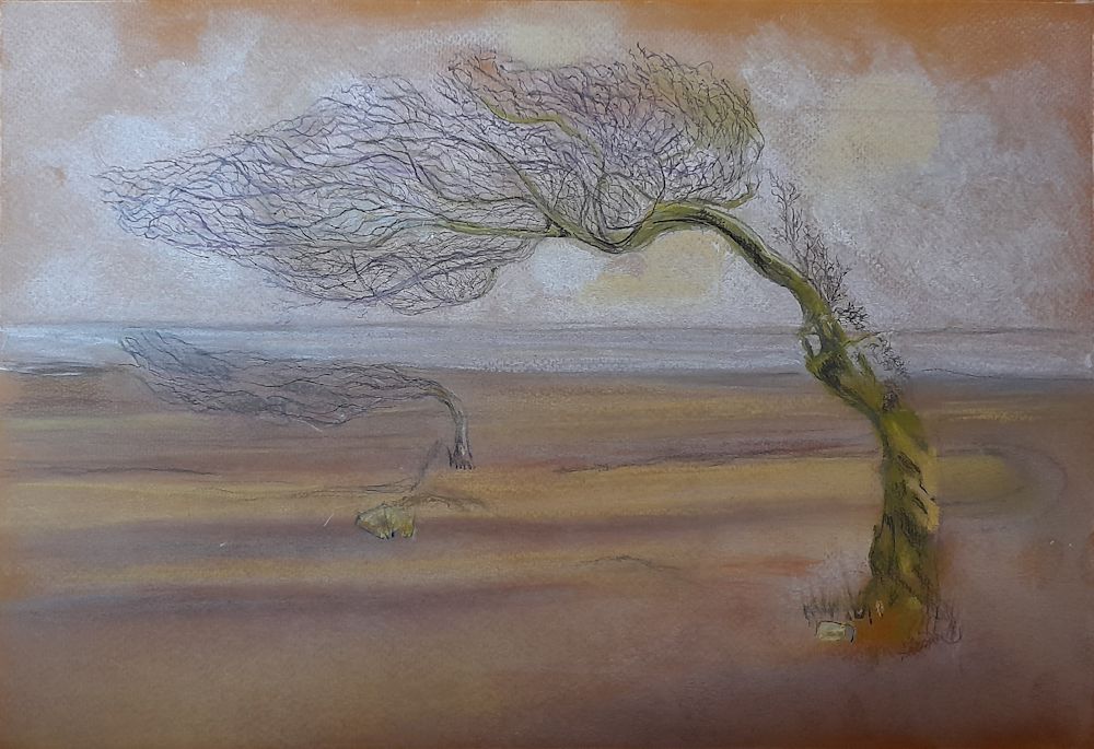
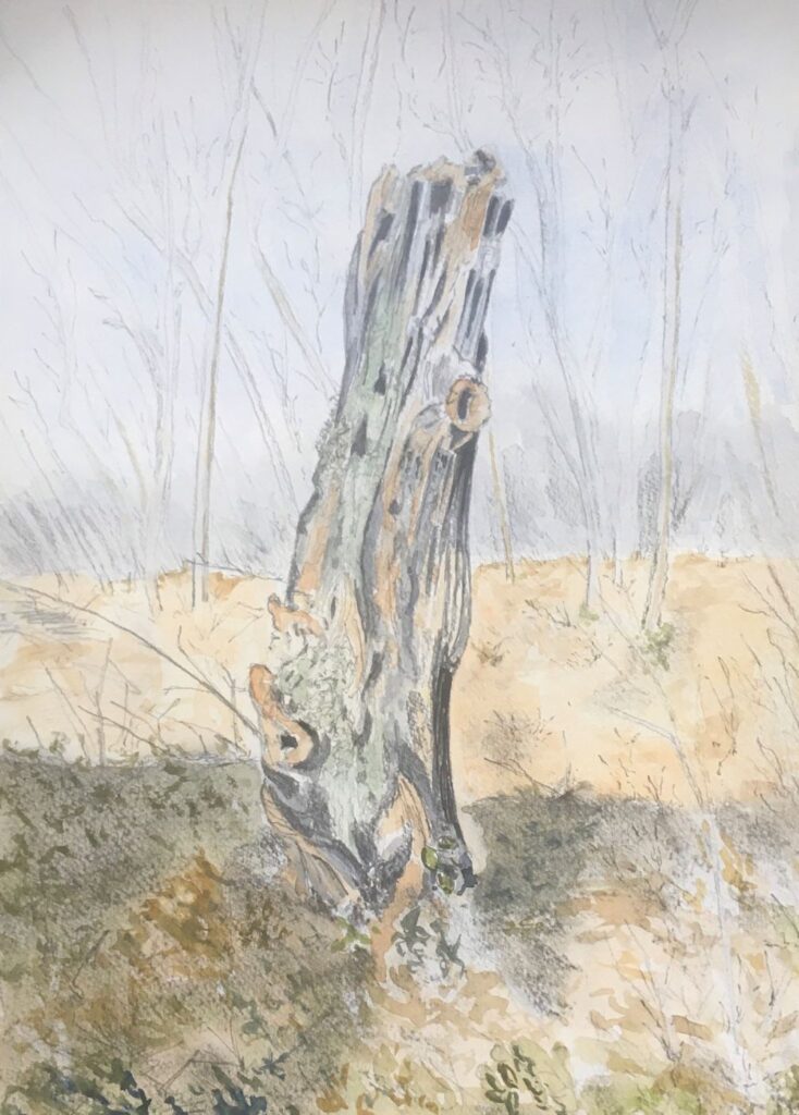
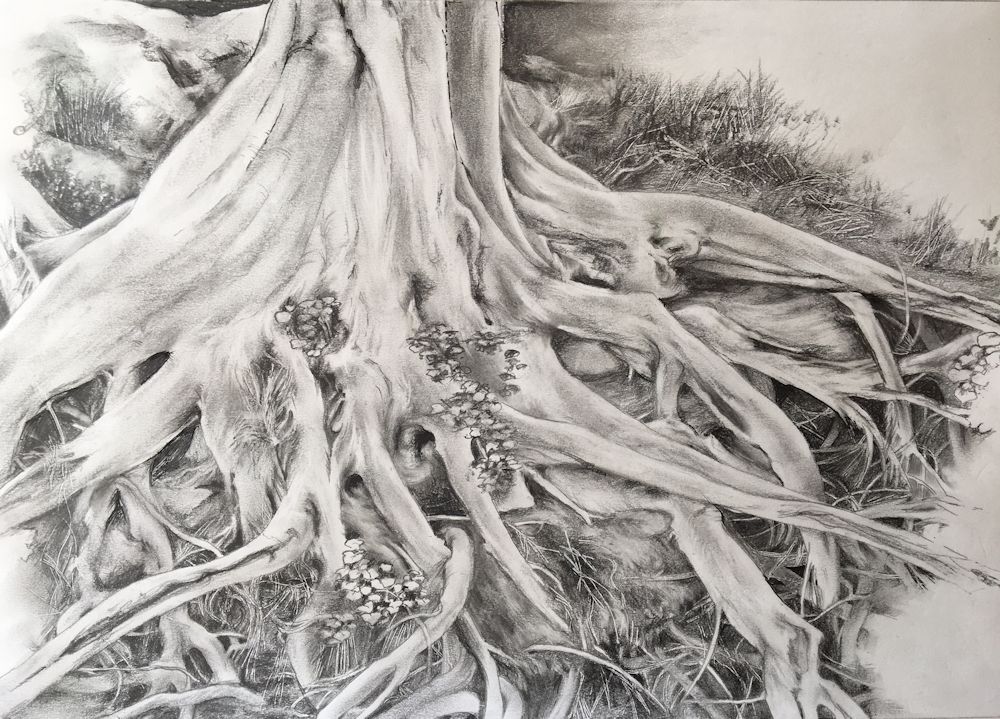
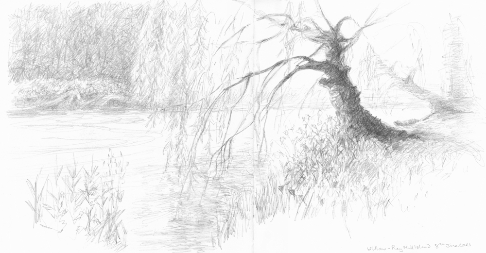
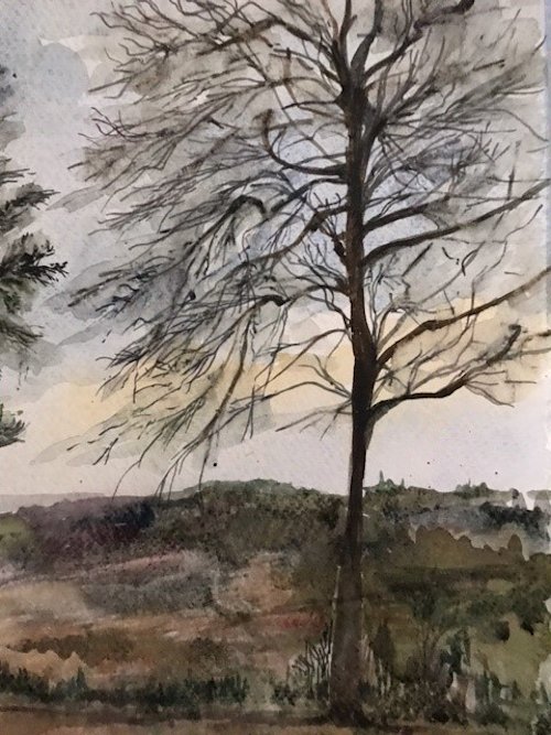
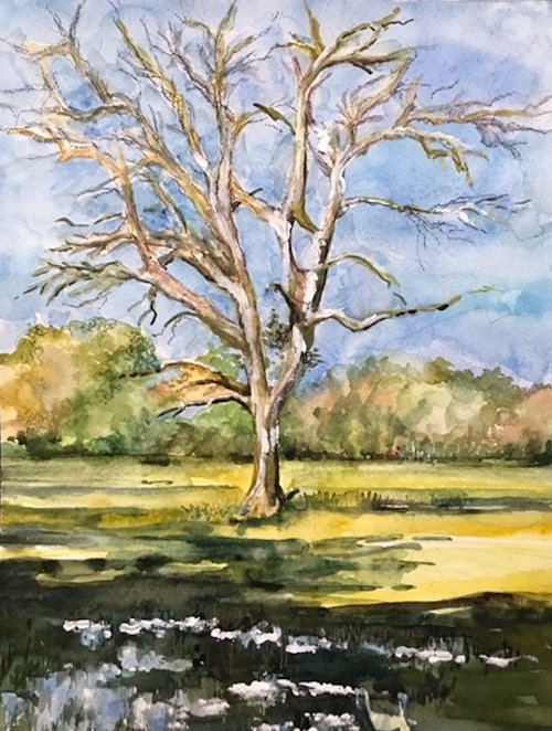
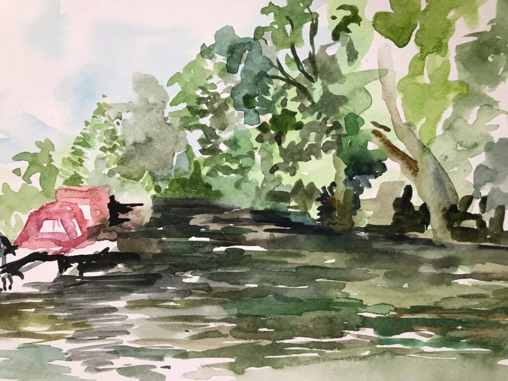
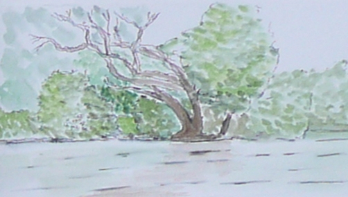
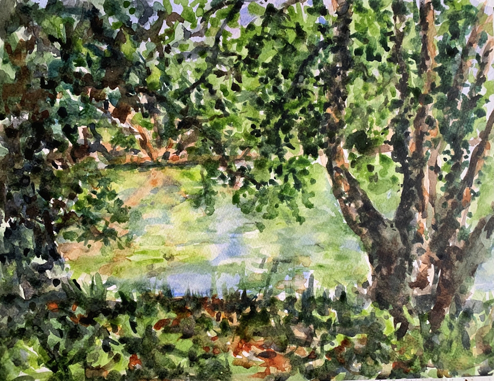
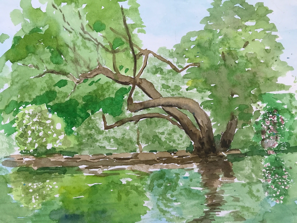
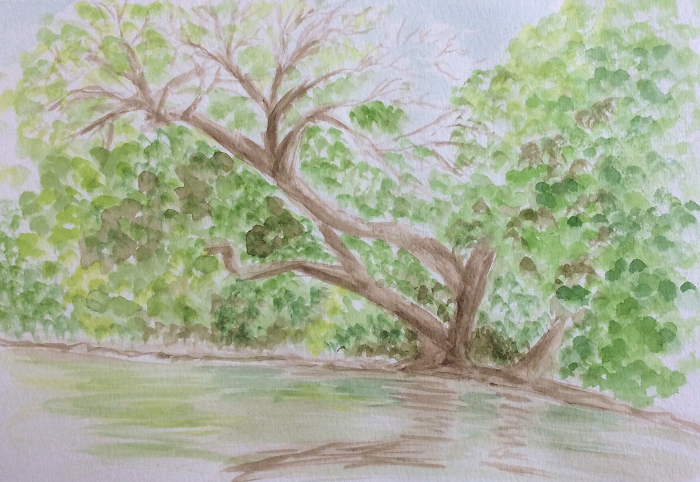
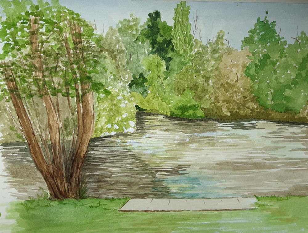
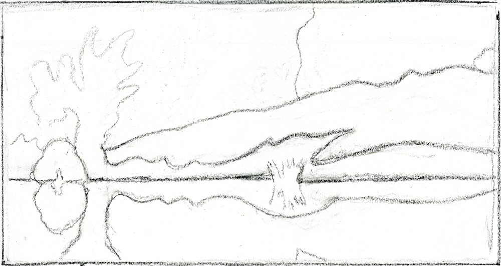
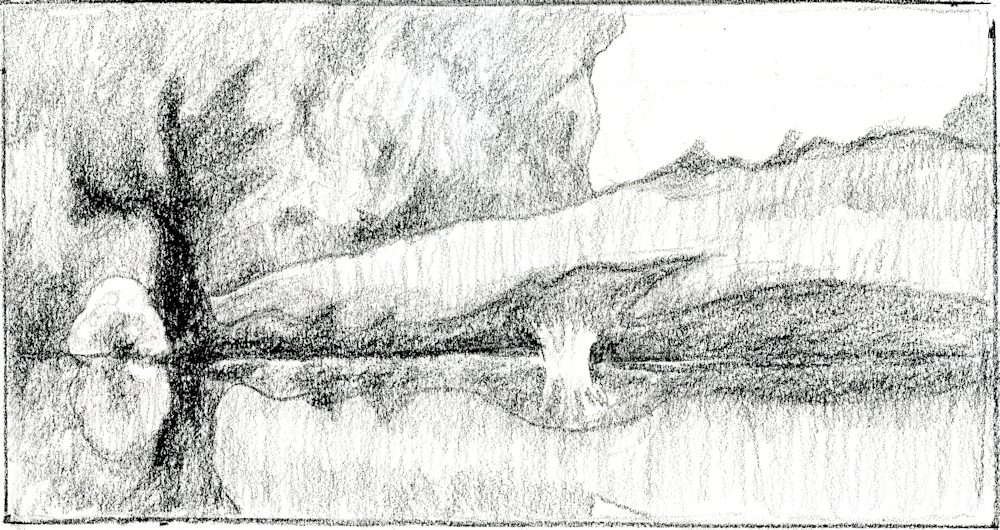
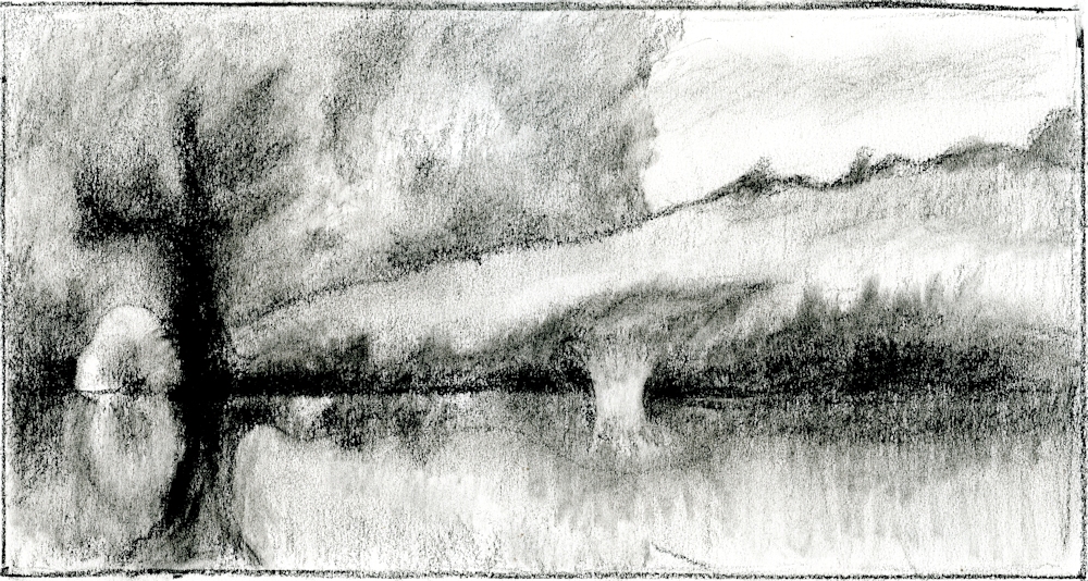
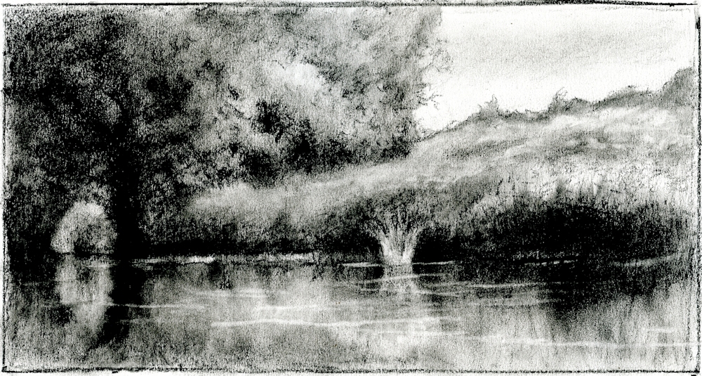
Drawing Trees Week 5: At the Water’s Edge
March 23, 2022
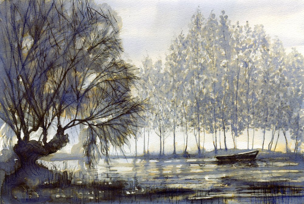
Quink ink by Jo
This week’s challenge is to paint a picture of a tree or trees at the water’s edge or even standing in water. Look for reflections and also how the tree is physically related to the land and the water. Are it’s roots exposed at the shoreline? And is it by a stream, a lake or on the coast?
The ferocity of the current caused by a flash flood may uproot and drag trees downstream, especially in a narrow gorge. Branches or whole trees may remain lodged on the banks. The picture below is of Catrigg Force in North Yorkshire where a tree has been tossed across the stream below the fall. The gorge itself is full of tall beech trees reaching for the light above.
Acrylic by Jo
The drawing below shows the ravages of winter storms on the Suffolk coast. Tree trunks roll around on the beach at Covehythe where whole roads lined with trees have fallen into the sea. The trunks are often sawn off as here and only the lower part and roots remain. Seeing these on a misty February morning was an eerie experience.
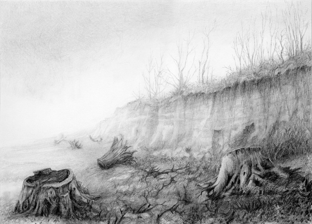
Pencil by Jo
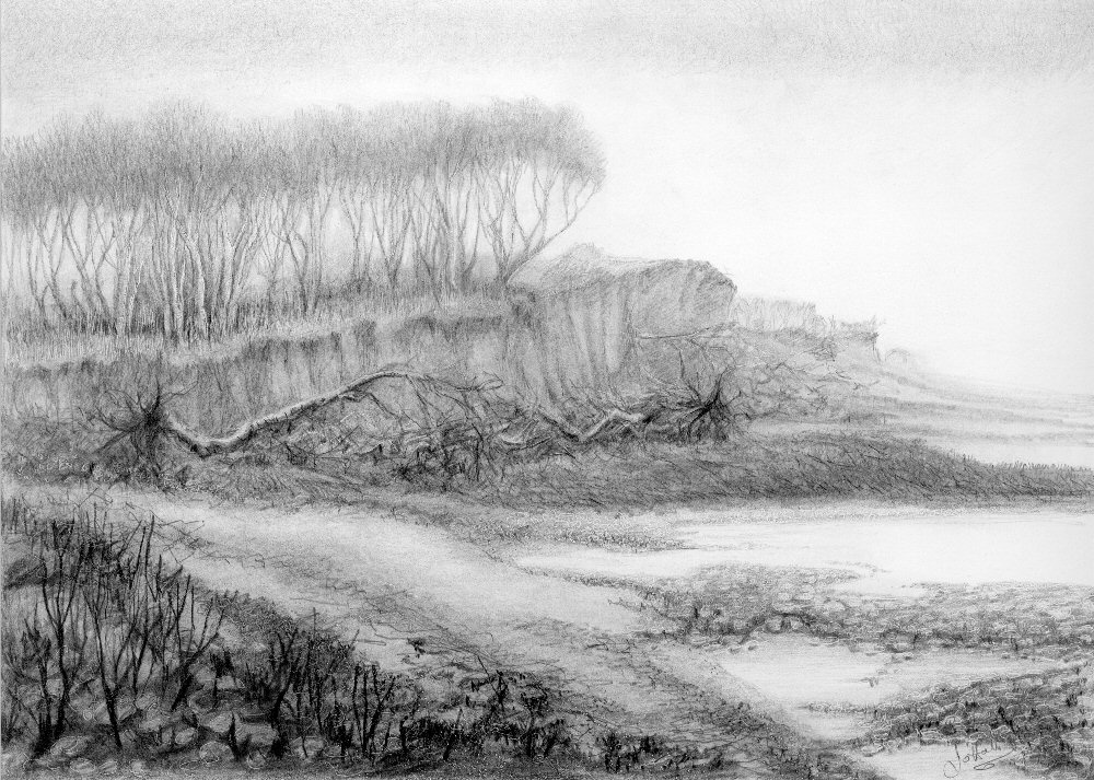
Looking North there were whole trees strewn on the shingles below the cliff and more trees can be seen clinging on before meeting the same watery fate.
Pencil by Jo
I would like to see your paintings the reflect the mood of the place which will be related to the weather and time of day as well as to the landscape. This may be much more successful if it is a place you know well or have at least visited. A lakeside tree in calm weather may suggest peace, or if their is a breeze and a dancing in the trees perhaps a playful atmosphere. However, if the sky is dark and storms are raging you may be depicting a more dramatic scene.
If you are feeling particularly adventurous don’t be afraid to use your imagination. If you want to depict a storm with a flash flood and branches flying I suspect there will be few references in your photo collection or sketchbook, but you may have recorded the aftermath, so you could think about how it would have been during the storm.
Pastel and graphite pencil by Jo
This was an exceptionally cold first weekend in December a few days after the after the Stour had been in flood. This was the calm after the storm. Areas of thin ice glazed the river surface. Note how different the reflections look on the ice compared with their appearance on the flowing water.
Decide first on your subject and think about the aspect you wish to convey, then try out some rough sketches from your reference pictures before embarking on the final composition.
Your Paintings:
Watercolour by Sarah
Pastel by Anne C
Ink and Watercoloour by Kate
Watercolour by Maricarmen
Watercolour by Ann
Watercolour and pastel by Mali
Watecolour by Anne H
by Heather
by Liz
Pastel by Liz
Quink by Maryon
Charcoal and pastel by Virginia
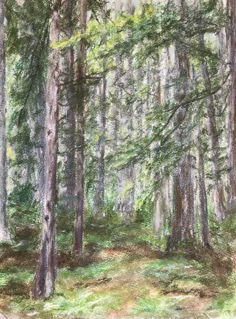
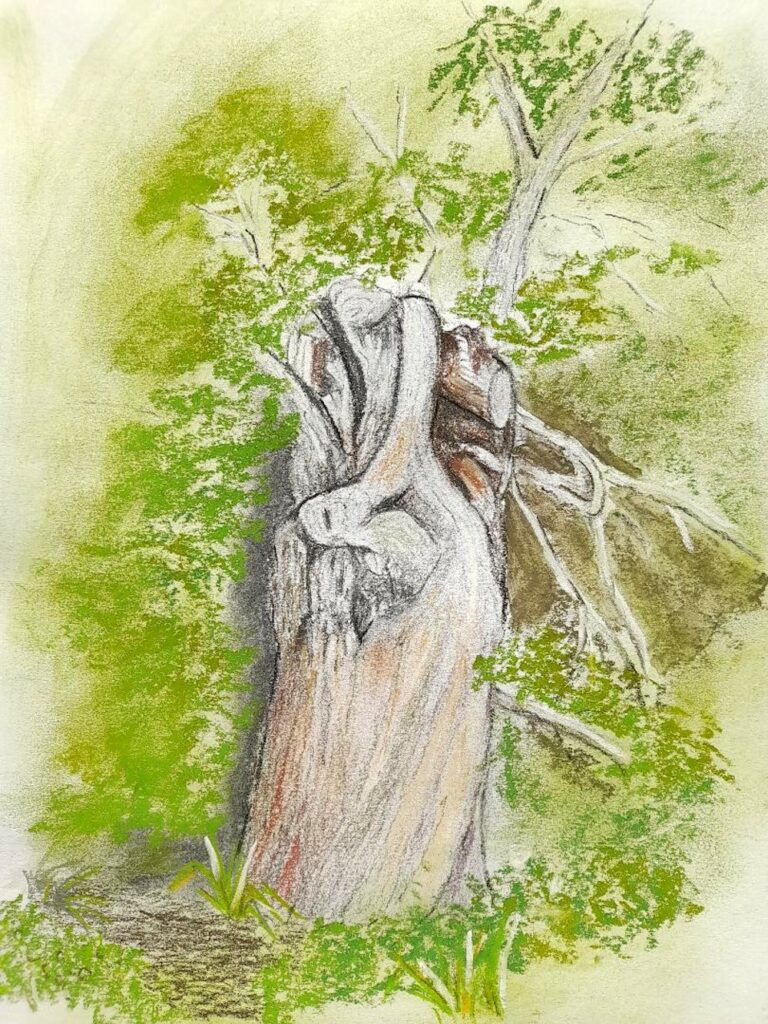
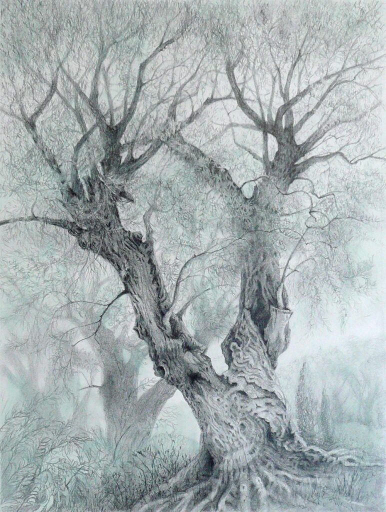
Drawing Trees Week 4: Woodlands
March 16, 2022

Pastel
This week’s challenge is to paint or draw trees in a woodland setting. The woodland floor may be a significant part of the painting as in the pastel painting of Judy Woods above. This is a mainly beech wood on a slope, with many ancient trees with haunting shapes and and exposed roots. It seems to breathe mystery.
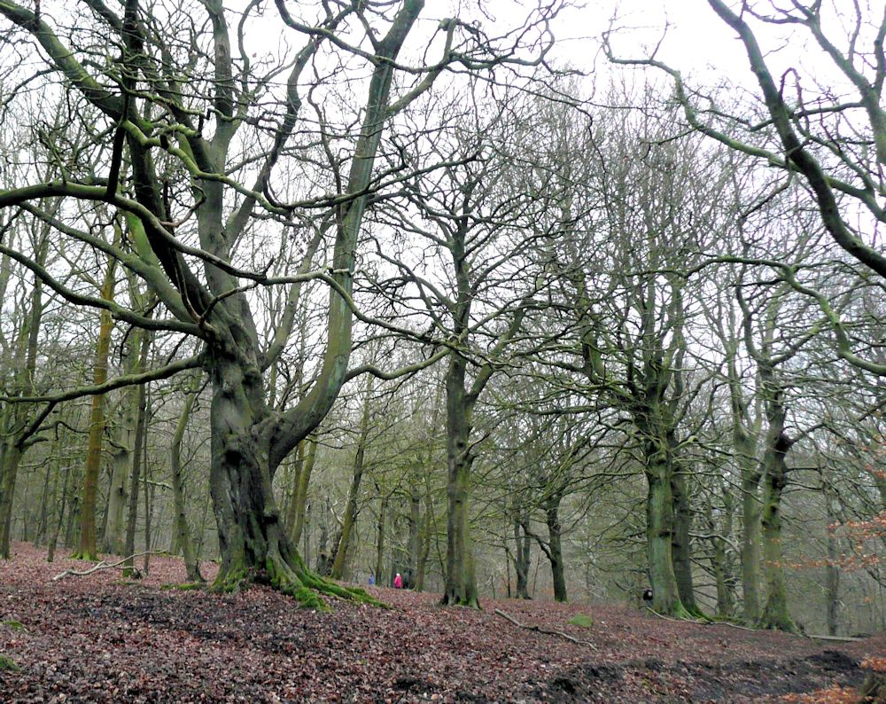
Photo by Jo
Another mysterious wood with an entirely different character is Wistman’s Wood on Dartmoor. Here stunted oaks encrusted with moss and ferns emerge from boulders of granite.
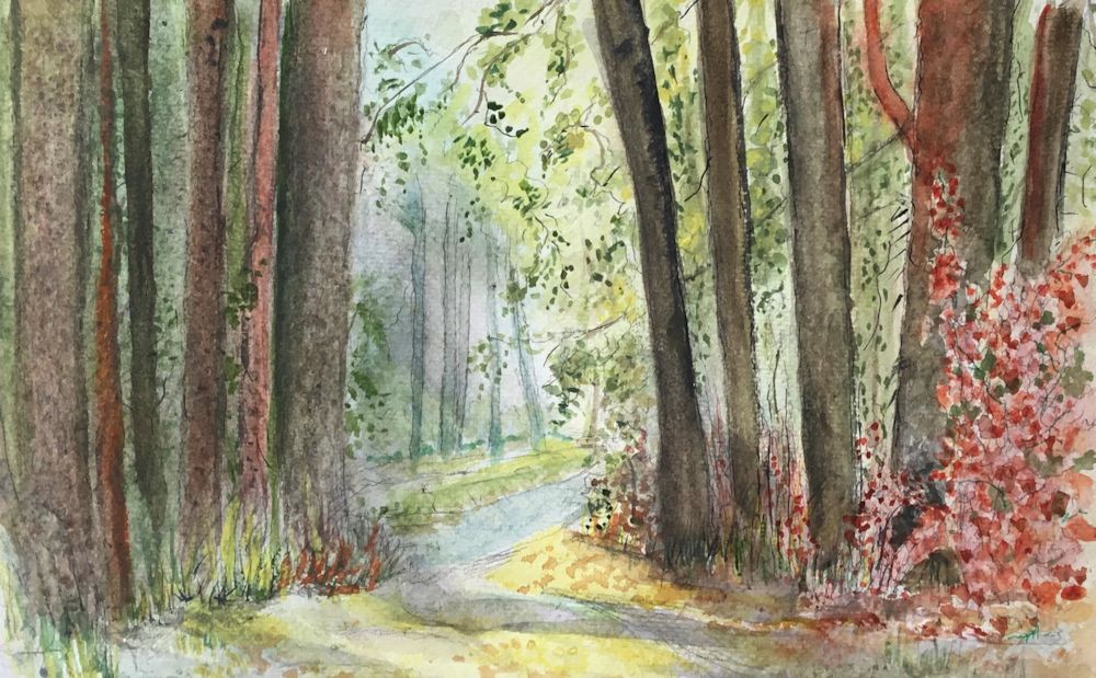
Over the last three weeks we have been exploring the shape and structures associated with a variety of trees. In a woodland there will be other considerations as the background may be full of the myriad twigs and small branches of more distant trees. There may be an under-layer of shrubby plants and the floor of the wood is often far from featureless, so part of this week’s challenge will be finding a way to describe the backdrop for the main trees in the composition.

Pastel on reddish brown paper
This painting spotlights a single tree with a backdrop of the other trees near the Suffolk coast North of Southwold. The most distant trees are almost a texture of overlapping strokes of pastel pencil. This is a small scale work about A4 size.
Your work may have a single tree or a group of trees as it’s main focus or as in the two examples below be a tapestry of the tree shapes and colours.

In the valley of the Nuns outside Funchal, Madeira a tapestry of blackened Pines and fire bleached Eucalyptus was seen against red rocks about a year after the event. Below a green layer of he undergrowth was already returning.
Charcoal and pastel on terracotta coloured paper 50 x 70cm

Another tapestry of trees, this time Pines and Birches
Pastel on brown/grey paper
Perhaps start by coming to grips with the shapes of your chosen woodland, by doing some small preliminary sketches. Think about the composition possibilities at the same time, then plan out your final composition. Think about which medium would suit your purpose and how you are going to use the medium. Also look at the tonal range; is it generally light and airy or dark and mysterious. Then think about the colour. Ask questions; which colours predominate and are there any small areas of colour that add to the composition by their purity, or by their contrast in tone and hue to their surroundings. In the photo of Judy Woods the little speck of a red anorak draws our attention and at the same time gives a sense of scale!
Your paintings;
Watercolour by Ann
Watercolour by Ann

Watercolour by Anne H
Pastel by Heather

(detail)
Watercolour by Maricarmen
by Kate

by Anne C
Watercolour and Pastel by Mali

Watercolour and pastel by Mali

Ink drawing by Sarah
Watercolour by Sarah

Pastel by Liz
(unfinished)
Mixed media by Maryon
by Virginia
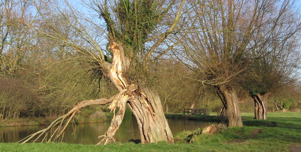
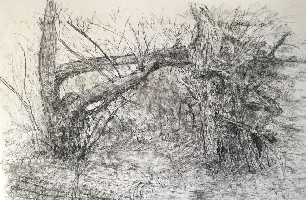
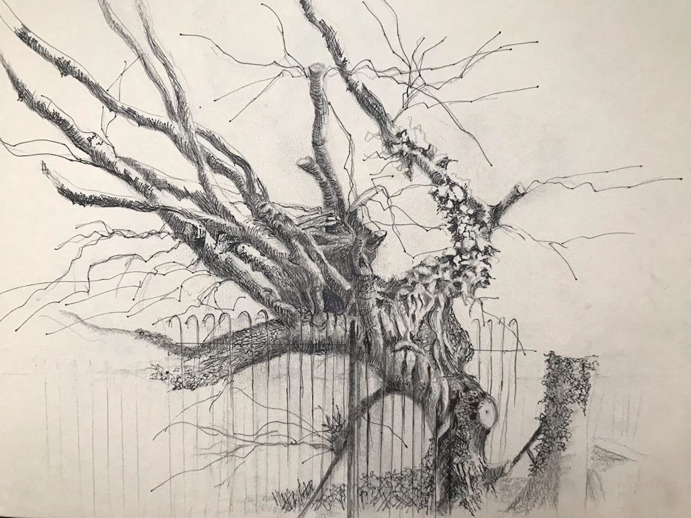
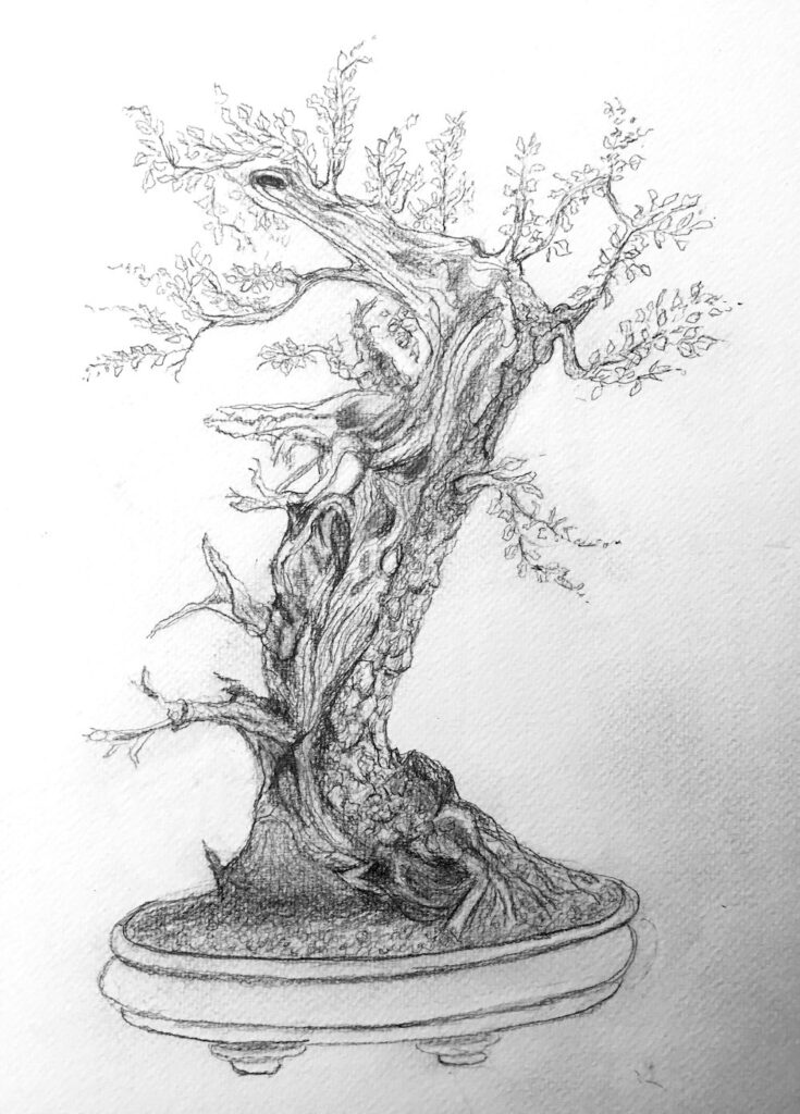
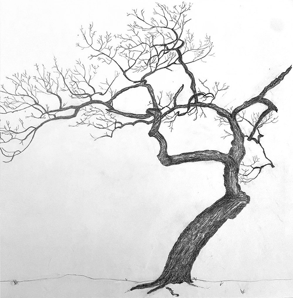
Drawing Trees Week 3: The Struggle for Life
March 9, 2022
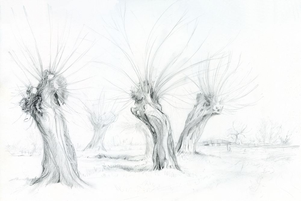
becoming twisted and split as in the photo below.
Note the sense of movement in these forms.
Sketched by Jo near Flatford Mill on the Stour
Storms, Lopping and other Struggles for Survival
Very few trees reach their perfect natural form. They are either hemmed in by others, damaged by storms and animals and of course, lopped, pruned, and coppiced by people.
Part of the same walk as the sketch above
Photo by Jo
Whether you are drawing or painting in colour, remember that the tones are vitally important to the composition. Note the palest and darkest parts of this image.
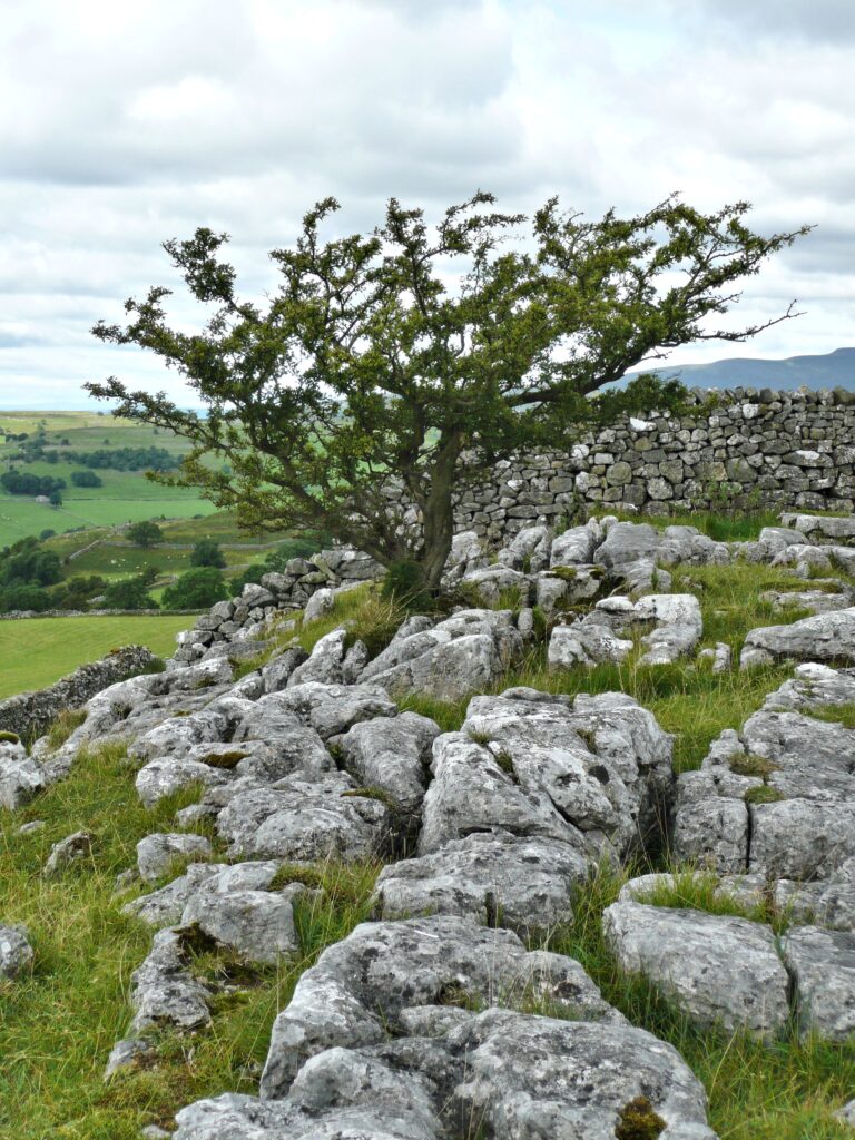
Photo by Jo
Ink and Watercolour
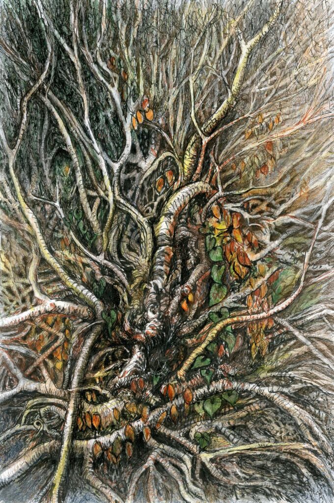
This is a tangle of overgrown ivy roots rather than the aftermath of a storm uprooting a tree. The challenge of depicting overlapping is much the same though.
Project : Draw a tree that has been caused to struggle for survival by; a challenging environment, lopping, a harsh prevailing wind, lightning damage, being uprooted etc.
Trees stuck by lightning can literally be torn apart but wind damage can be just as severe and result in the tree being uprooted and the tangle of roots made visible. Like branches these root tangles overlap and thread through each other even more so than branches above ground.If a tree near you has come down do get out with your sketchbook and a camera. Make sketches and/or photograph from several viewpoints before homing in on a composition for your final drawing.
The drawing may be a whole or part of a tree but should tell something of its history; probably a whole tree where it has grown with a distinct list to one side because of a prevailing high wind, but in the case of a fallen tree, perhaps just the exposed roots. Either way try to make an interesting composition.
Other suitable subjects would be stunted trees growing out of stoney ground, or choked by Ivy.
Your drawings:
by Virginia
by Kate
by Mali
Pencil by Sarah
Pencil and Watercolour by Heather
Pencil by Ann
by Maricarmen
Seen by a dry river bed, Umfolsoi Game Reserve, South Africa
by Maryon
Soft charcoal, graphite sticks and embossing tool
pencil by Anne C
by Liz
by Anne H
by Anne H
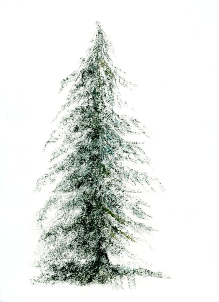
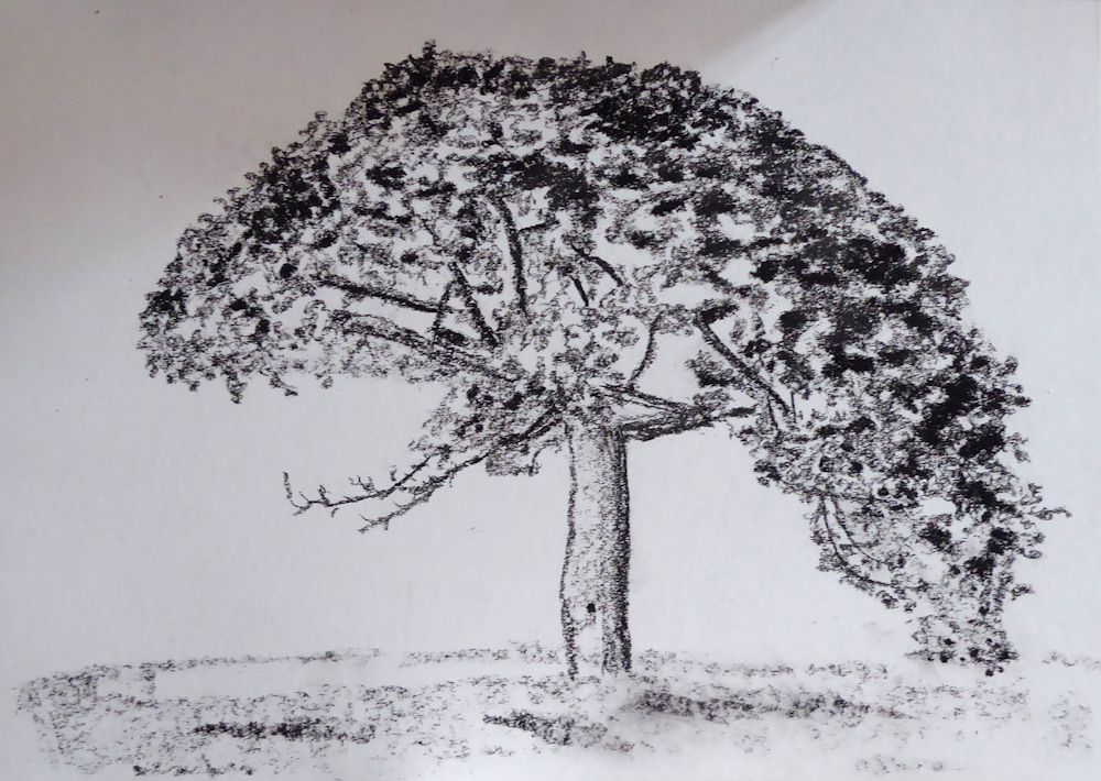
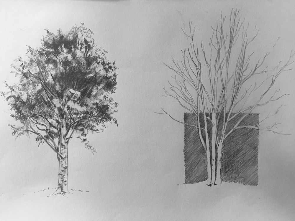
Drawing Trees Week 1: The Whole Tree
February 23, 2022
Pencil and Pan Pastel by Jo
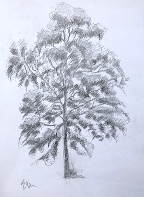
Drawing and painting trees is a huge topic but as trees are very often featured in landscape painting as well as being exciting subjects in their own right, it seemed a good idea to explore depicting their structure and character.

Sketch by Jo
Leaf masses drawn with side strokes of pastel
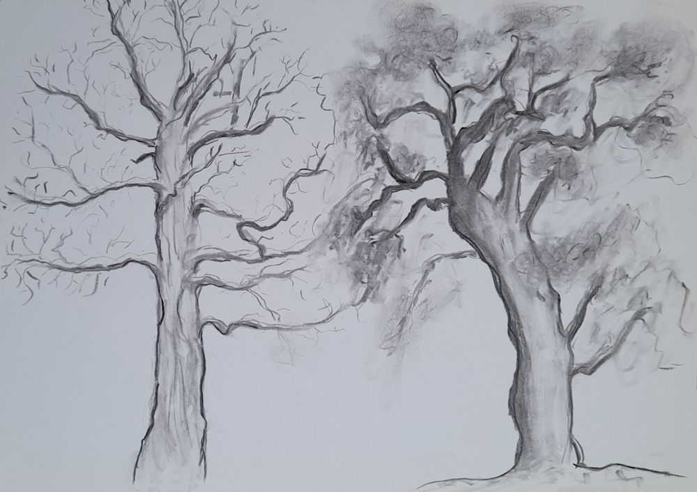
The first session will focus on strategies for beginning to draw whole trees. In week 2 we will take a closer look at; bark, burrs, and branching, then in week 3 draw lopped or fallen trees and exposed root tangles. For the three remaining weeks we will explore trees and their landscape settings for which you may continue with drawing materials or work in colour with pastel or water-based media.
Do look at the following Pinterest board, link below, for some inspirational ideas for drawing trees in literal, atmospheric and more abstract ways.
https://www.pinterest.co.uk/jhall1282/trees-in-art/
Some very basic notes on drawing trees are below followed by a list of the exercises for the first session. If you are already experienced in drawing trees just make a quick composition sketch and launch into a tree portrait using your choice of drawing medium.
Pastel and charcoal by Jo
Memory drawing
We’ll start by looking at the overall shape of different trees and the first challenge will be to see how much you have already observed. Take a piece of paper, and from memory make small drawings of any kind of tree you can think of; e. g. cypress, oak, palm, fir etc. Do this rapidly then think about what gives each individual tree its character.
This may be;
The overall shape and symmetry (fir trees)
Angle at which the branches spread out (oak)
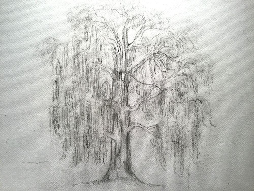
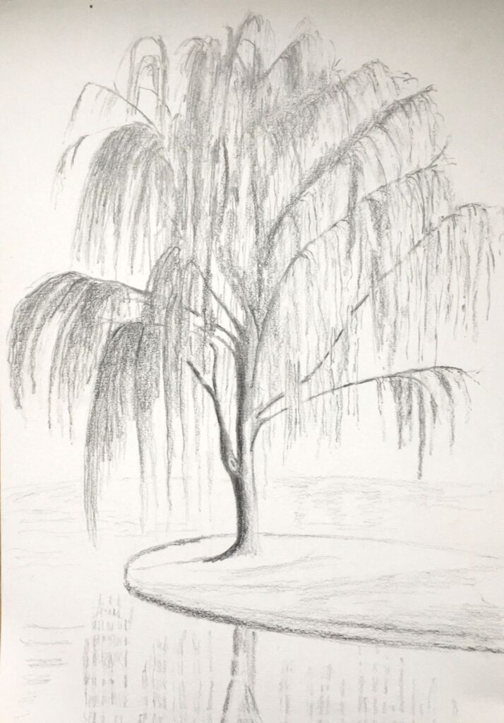
How branches are so flexible and long they bend downwards (weeping willow)
Way in which individual leaves fan out from the trunk (palm trees)
Or
A mixture of some of the above characteristics and many more.
See practical session for materials and paper size.
Pencil sketch
Now look at a real tree, outside or from a photo, and observe it, questioning what gives this tree its particular character. The notes below don’t describe the only way to start a drawing but give a very straightforward method for coming to grips with a variety of tree forms.
Starting to draw
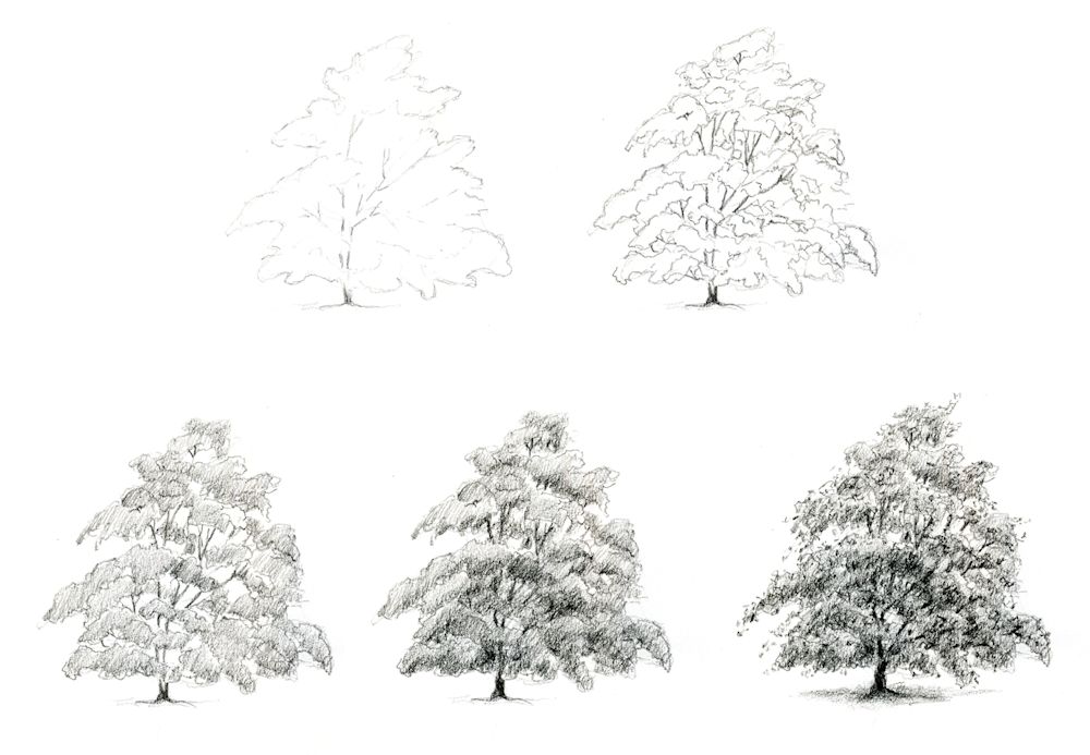
It can be useful to mark where the trunk is and indicate the main branches lightly and then mark out the general outline of the whole tree by a series of light dots and dashes. In this way you will ensure the overall proportions are right and the girth of the main trunk can be drawn the correct width.
When drawing a deciduous tree in Summer or an evergreen the next stage is to indicate the shapes of the main masses of leaves. These can then all be shaded lightly and more densely shaded on parts of each leaf mass that is in shadow. In the example below light is mainly from above. The lower parts of each leaf mas is darker than the upper side and the whole of the lower part of the tree is darker than the top. Look out for the differences in tone when one side of a tree is in direct sunlight.
Drawn with an HB pencil
Think about how you might draw a palm tree or a fir tree
Adding texture and detail
After that you may like to texture the foliage suggesting rather than drawing leaf shapes, and also texturing and drawing any useful detail on the main trunk and branches. For instance, when drawing a silver birch tree, it would be essential to add the distinctive dark marks on the main trunk and branches but may look fussy if similar marks were added to all the branches.
Only if you choose to draw a tree with really large leaves like a palm or banana tree will you be drawing individual leaves and associated structures such as dead leaf bases in any detail, so although the strategy will be similar you will be looking at the overall shapes of large leaves instead of clouds of leaf masses.

Ink sketch by Jo
The best way to familiarise yourself with trees is to have a small sketchbook A5 or even A6 that will tuck into a pocket or handbag and draw with a pencil or ball point pen on every occasion you meet a tree, whether you only have two or the luxury of twenty minutes to sketch!
Practical
Use cartridge paper A4 or A3 and any drawing medium; pencil, ball point, pen and ink, conté crayon, thin charcoal stick or charcoal pencil,
1.Memory drawing: use an A4 or A3 paper and make several drawings of as many different kinds of tree as you can from memory. These should be tiny, two or three inch high thumbnail sketches, all to be made within about 15 minutes.
2. Drawings of two different trees or the same deciduous tree in winter and summer. This time work from observation, direct or from a photo reference. Take each drawing to the stage where the masses of foliage have been blocked in with directional shading or the tiny branch ends have been suggested. Both drawings to be made on the same sheet but still fairly small, between five and eight inches high. Take about 20 minutes for this
3. Make a tree portrait of the tree of your choice at a much larger scale to fill an A3 or larger sheet. The size may partly depend on the drawing medium i.e. smaller for pencil work A4 to A3 and larger A3 to A2 for a study in charcoal or conté crayon. If toned paper is used white may be used for the lightest areas. Working larger and for longer will enable you to draw more details. Add only what helps to communicate the character of the tree and strengthens the composition. Make sure the overall proportions and structure are in place before adding texture and detail, and constantly review the tonal balance of the drawing as you work. Larger paper may be used for a pencil drawing if you are working with very soft pencil in a loose way or have a lot of time to spend on a detailed study.
Spend between an hour to an hour and a half on this or longer if you are producing a highly detailed work.
Your drawings:

by Anne H
Pastel by Mali
Charcoal and white pastel by Mali
Charcoal by Anne C

by Maricarmen
Charcoal by Maricarmen
Charcoal and pastel by Liz

Charcoal by Ann


by Virginia

HB pencil on A4 paper by Maryon
HB pencil on A3 paper by Maryon

Charcoal and graphite sticks on A3 paper
by Maryon
Charcoal by Heather

Charcoal by Heather
Pencil by Sarah (before session)

pencil by Sarah
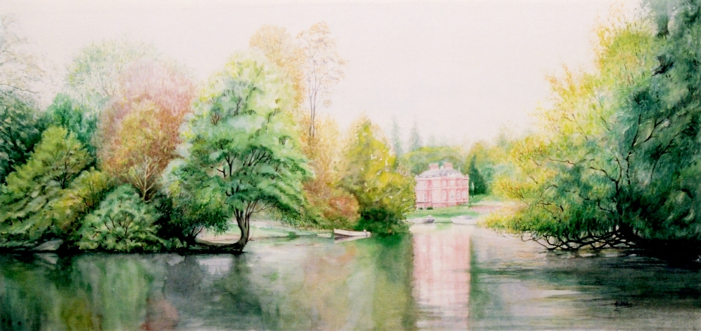
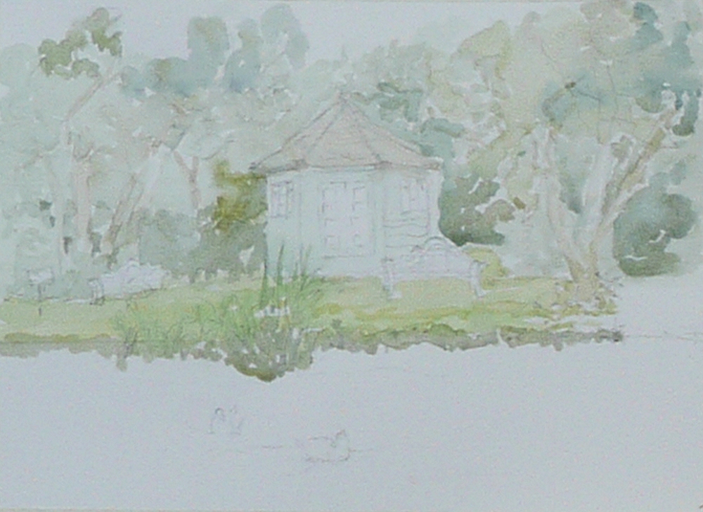
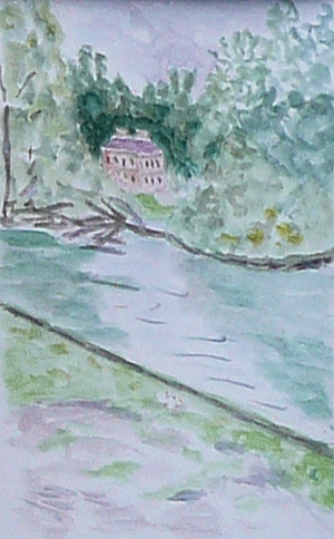
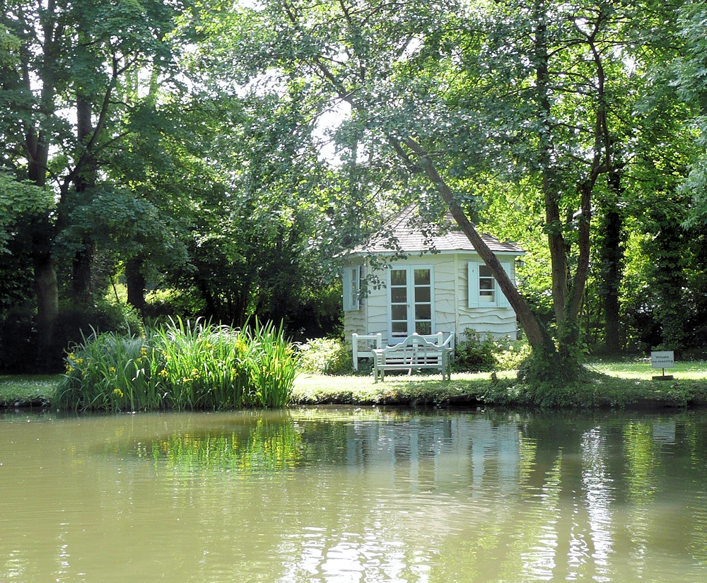
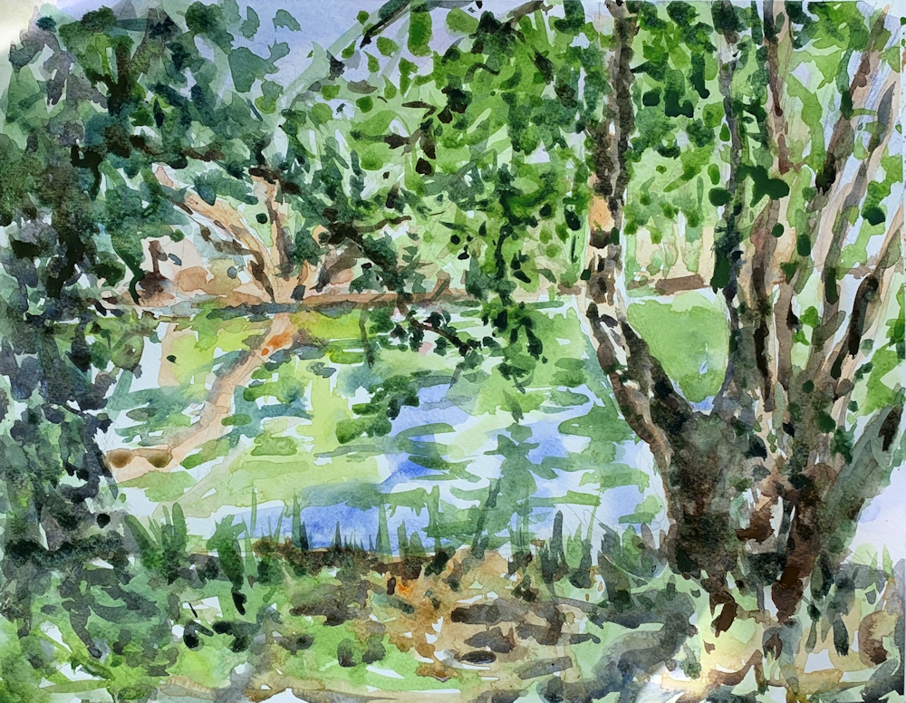
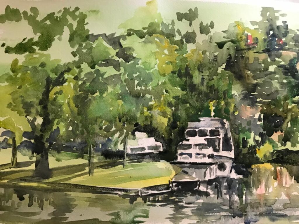
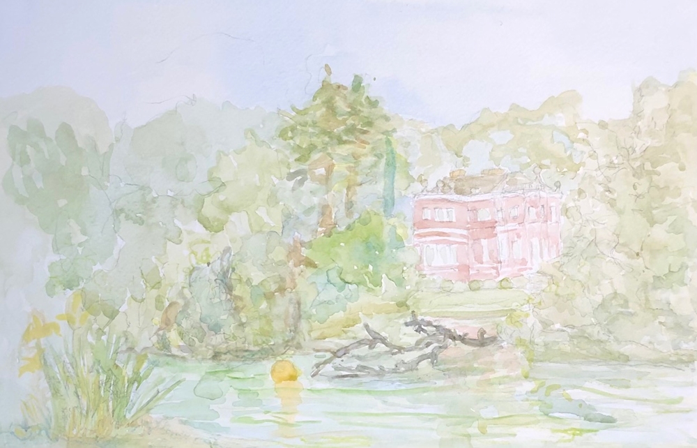
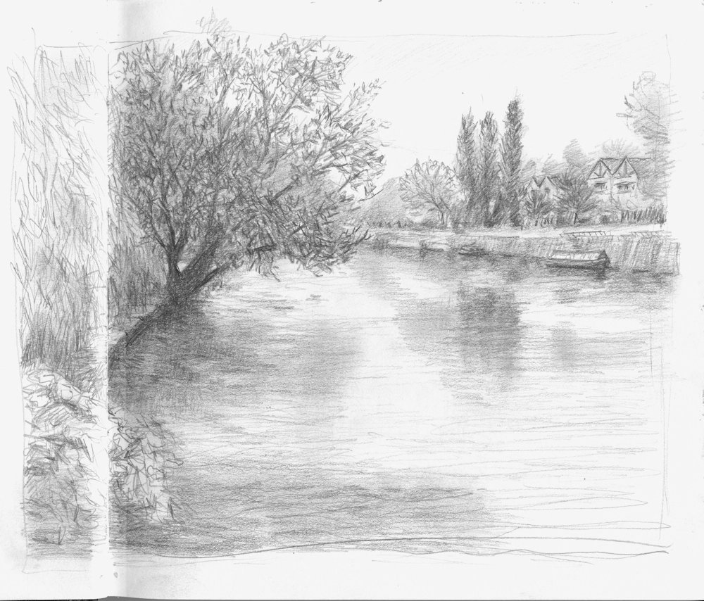
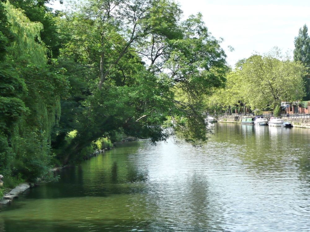
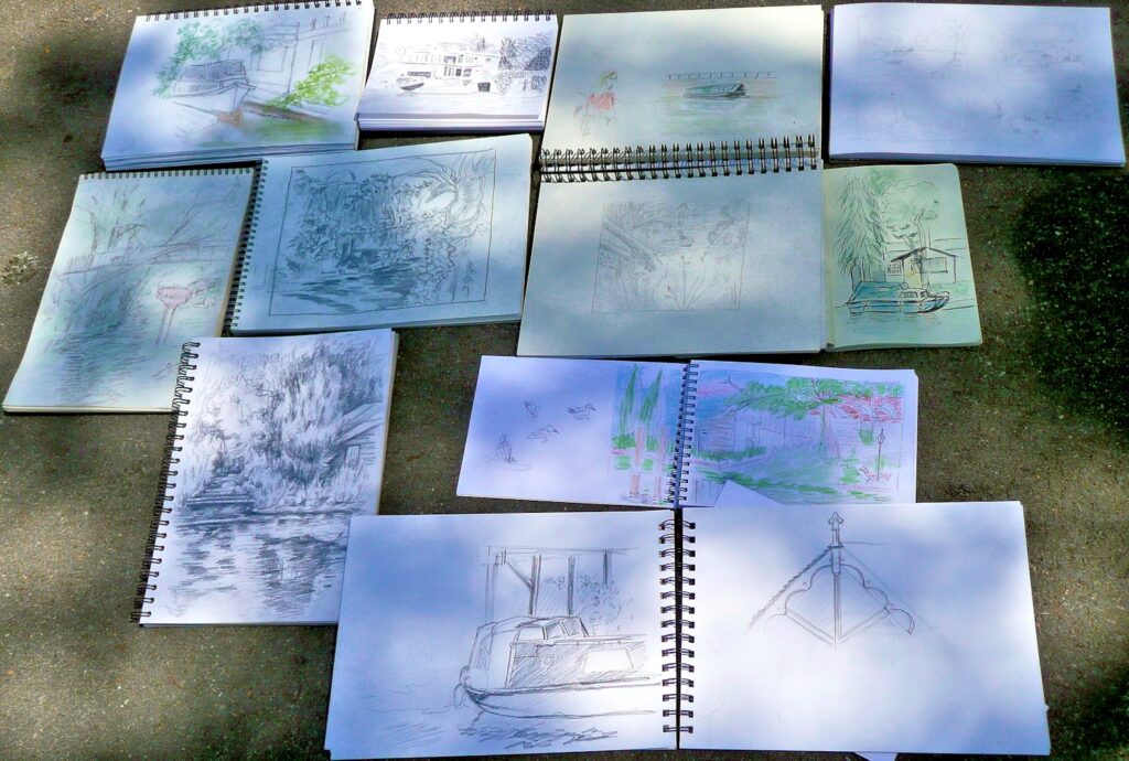
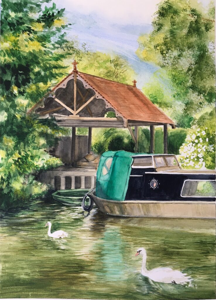
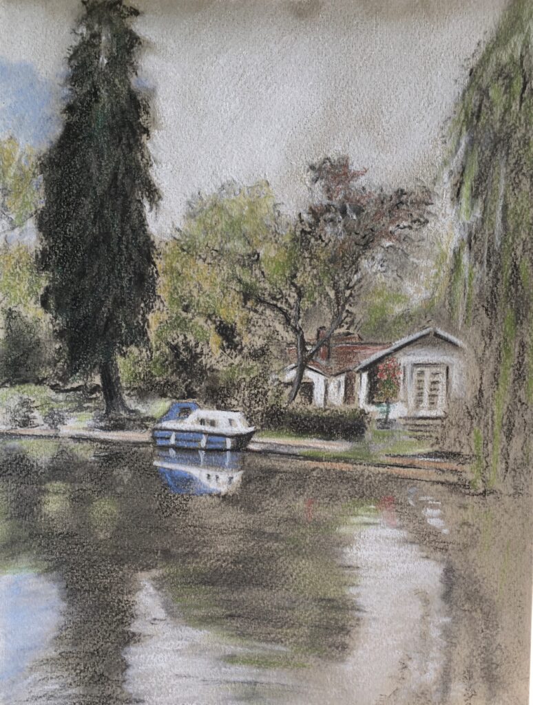
From the Riverbank: Week 6 Hurley
June 28, 2021
Watercolour
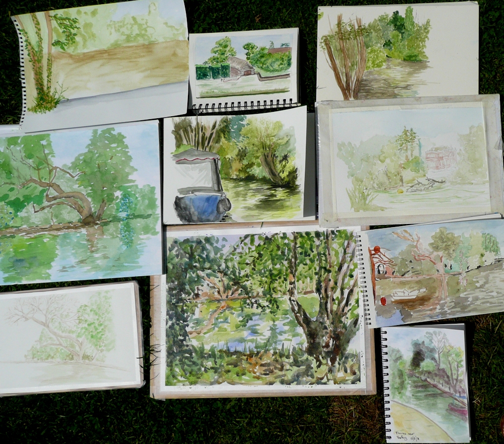
These are the results from everyone painting or drawing at Hurley in very different weather conditions from the previous week, while I visited all the drawing locations and took a few photos plus made the briefest of sketches. The view of Harleyford Manor was painted in 2000 from location sketches and was about 27 inches wide so a bit large to paint on site!
Your paintings:
Watercolour by Sarah
Watercolour by Sarah
Watercolour by Elizabeth
Watercolour by Elizabeth
Watercolour by Jan
Watercolour by Virginia
Watercolour by John

Watercolour by Liz
From the Riverbank: Week 5 Hurley
June 20, 2021
With just an hour till coffee time everyone set about painting a watercolour sketch of the Thames at Hurley. This is a challenging task at this time of year, busy with all sorts of boats from motor cruisers to kayaks. There was always the option to finish at home or stay a little longer to complete the work or make another painting.
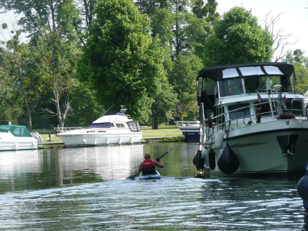
Because of the complexities of boat shapes this challenge necessitated considerable simplification of the shapes and a critical view of the tones. When you add in the fact that many of the boats were moving one can understand wanting to finish at home perhaps referencing a ‘photo. This is OK but there are a few pitfalls.
1.Always take the shot at the eye height you were drawing at. There is often the temptation to stand up if you have been working sitting down and the view will not be the same.
2. Photographs taken in the high light conditions we were on Tuesday, can have too much contrast. The shade areas often looking very dark and very pale areas being ultra white. No worries in your painting to leave the white of the paper for the palest areas. This will give your work a really sunny appearance. If you copy the darkness of your reference in the shade areas you should ensure the differences in tone have sharper cut off points than on a dull day. In sun all shadows will be crisper..
If you need to lower the tone of a whole area this is usually best achieved by putting a wash over the whole of the darker area, leaving just a few tiny paler areas rather than doing it by dabbing away with small brush strokes. Sometimes by referencing your photo and on site watercolour, it can be better to to work another picture taking these tones into account with the first washes as this can be difficult on site in very sunny conditions.
Exactly how dark to make your shadows can also be greatly governed by your intention. The reality as in the first photo below was that the shadow area behind the canoes was so dark it was hardly even textured. You may choose the dark to offset the colour of the canoes for a dramatic effect, or you may choose the softer effect of seeing more of the texture and colour of the background as in the modified second photo below .
3. There is also a temptation to add washes to the water that soften the edges too much. Last Tuesday the weather made for very clear reflections and waves and that should be reflected in your paintings. Again this was made difficult as in places the water appeared very green. Where a paddle hits the water you can always give a little sparkle to the splash by scratching out with a sharp point. Wait till the rest of the painting is complete before attacking the paper in this way.
This week we’ll be at Hurley again and probably in very different light conditions. Notice any differences especially if you visit the same spot to paint. We’ll also talk about colour, especially the water and reflections.
Your paintings;
On Site at Hurley
Completed Afterwards
Jan has left some light spots in the foreground and on the tree foliage and trunk so the painting is still lively. The darker than original foreground and trees/foliage, has made a good contrast with water. A little of the freshness of the first painting has been lost but I can see the reasons for making adjustments.
Watercolour by Mali
Ink and wash by Barbara from a photograph
Watercolour by Elizabeth
Watercolour by Sarah from Photograph
Watercolour by Liz
by Virginia
From the Riverbank Week 4: Sketching near Boulter’s Lock
June 8, 2021

Such a treat today to be sitting outside drawing subjects we have become familiar with using photo reference. Before publishing I added more tone to these sketches from memory.
Have already spotted a couple of areas that need adjusting.
The heightened contrast reflects the very bright sunlight we worked in. I’m now going to discover the ‘photos taken at the same venues which I know will have too much contrast, so no good as photos but a very good reminder of the importance of tone in composition.
Your Sketches and Paintings from Sunny Maidenhead;
Watercolour by Maryon
by Ann
by Barbara
by Jan
by Mali
Watercolour by Virginia
Pencil and Coloured Pencil by Elizabeth
by Sarah
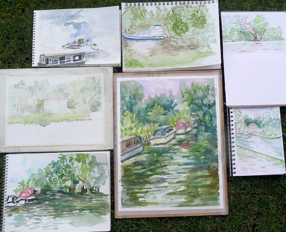
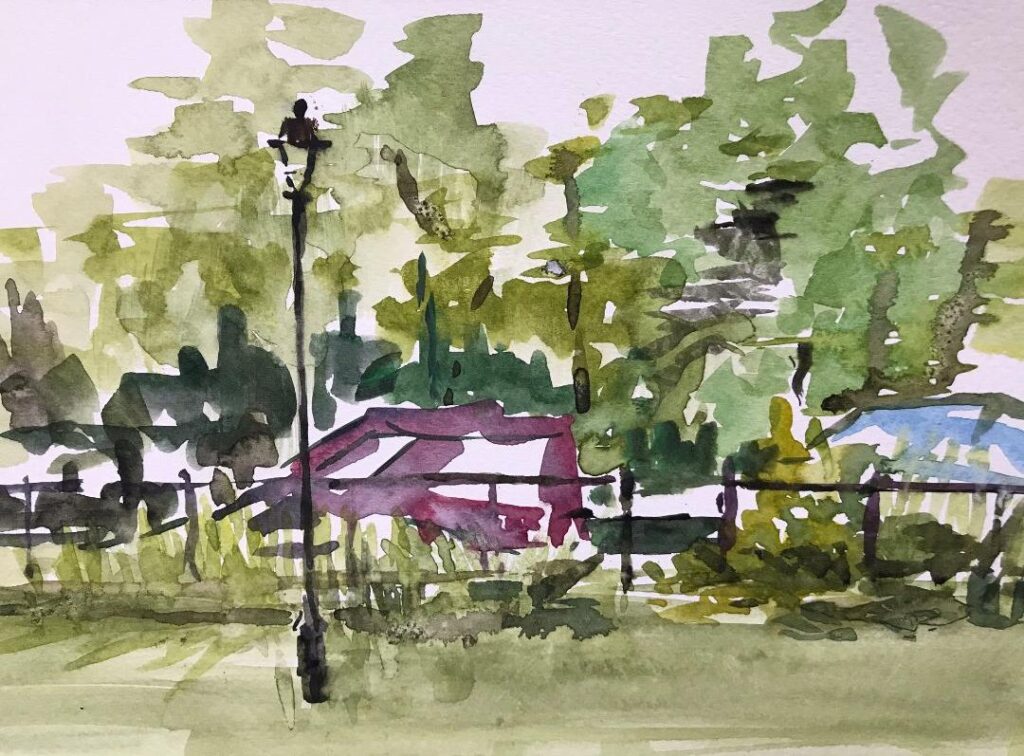
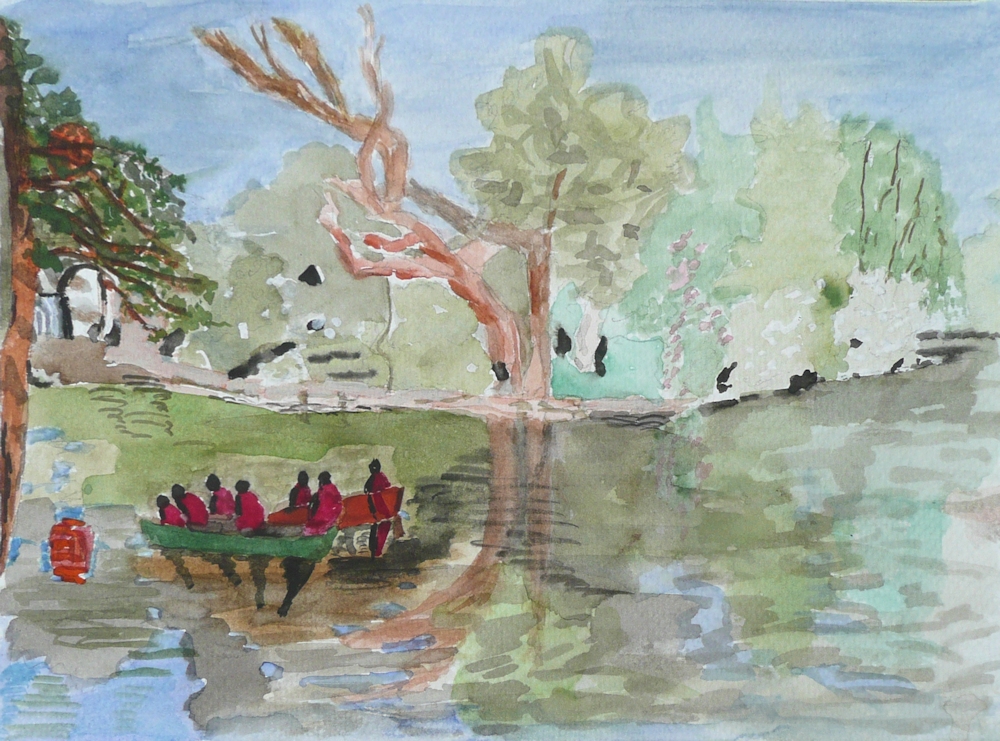
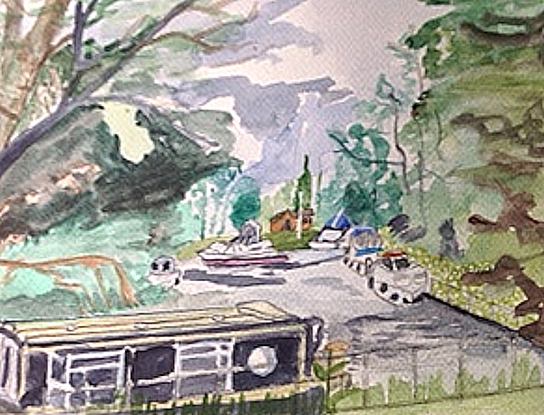
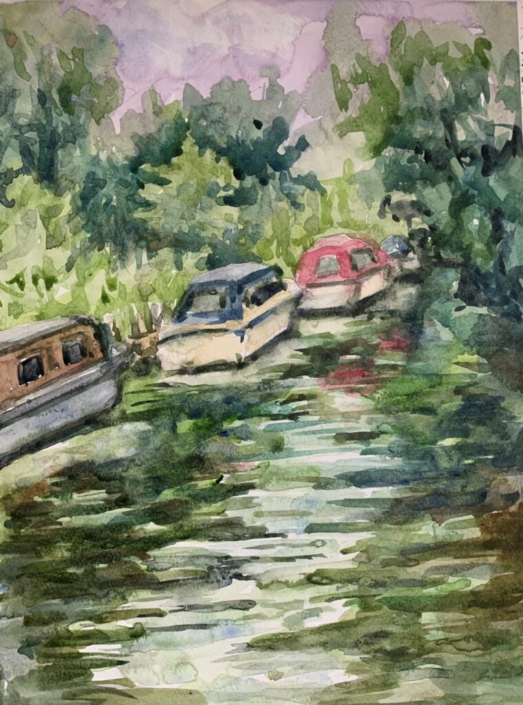
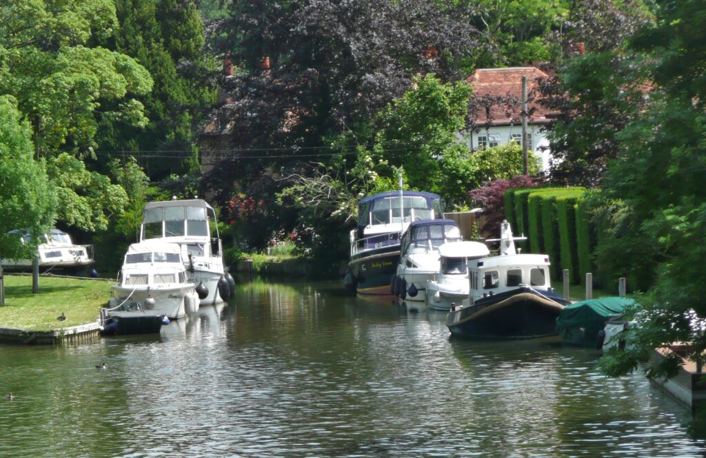
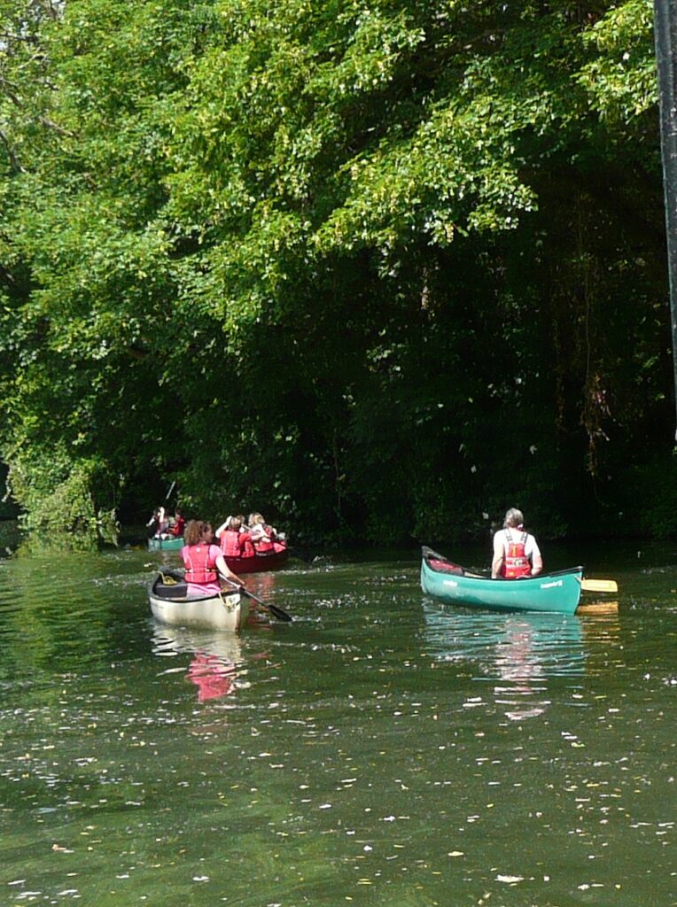
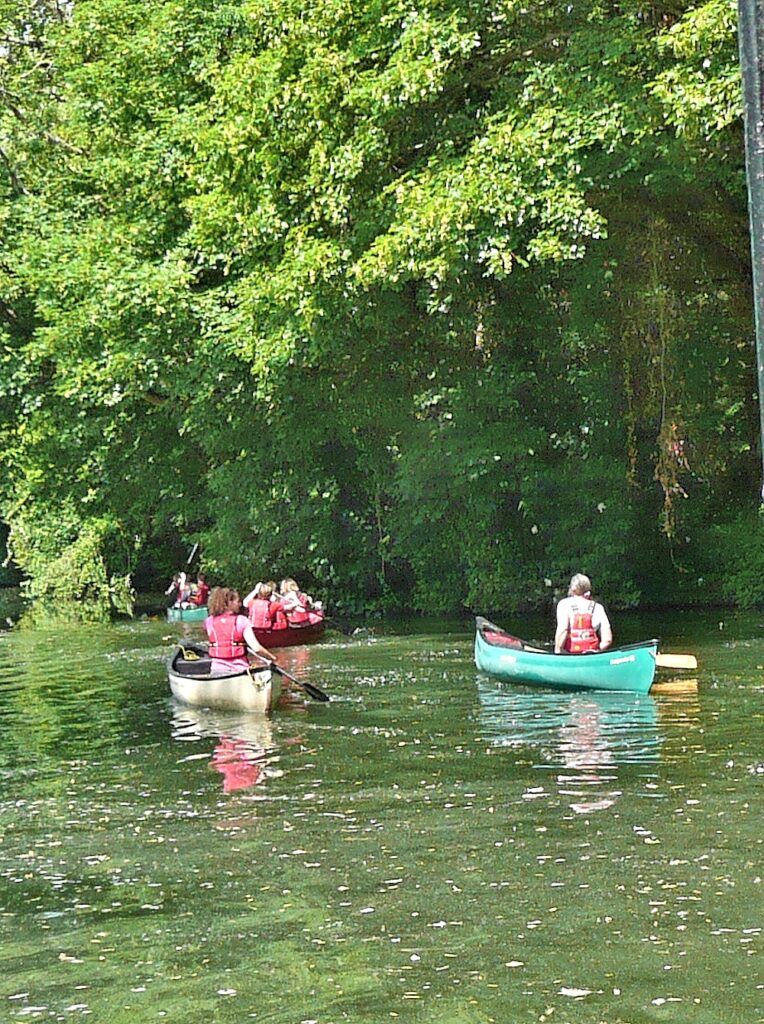
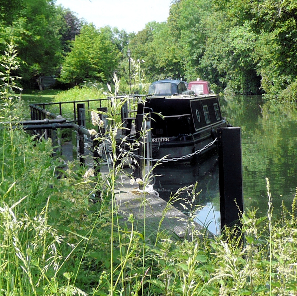
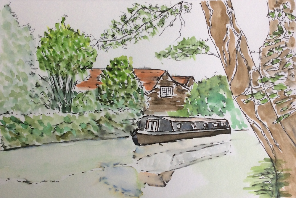
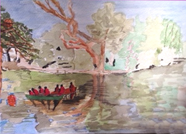
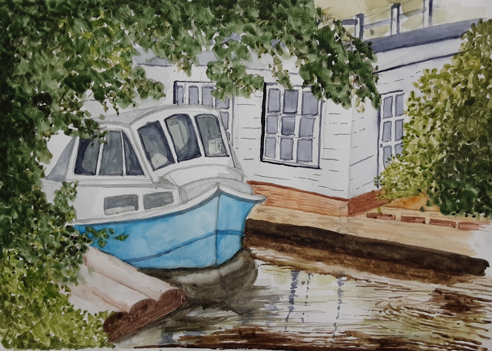
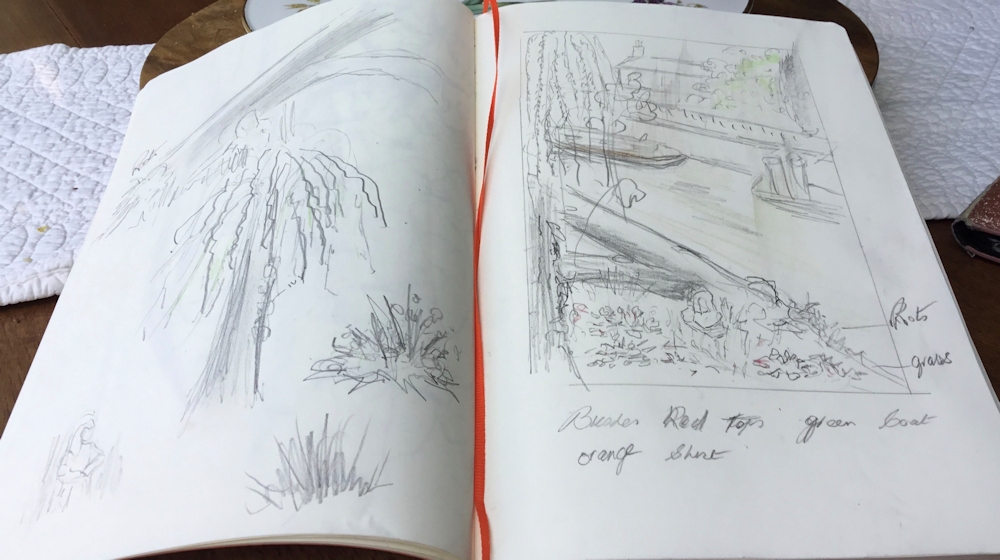
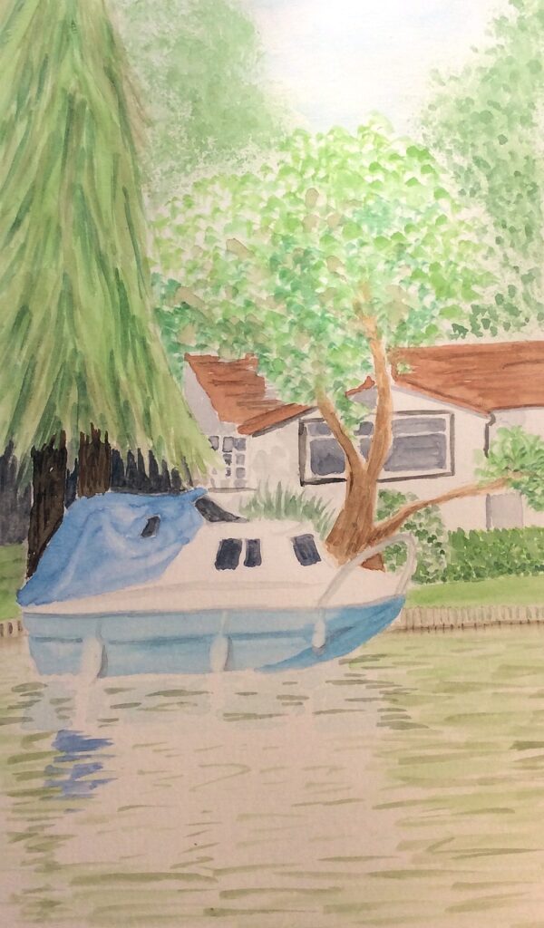
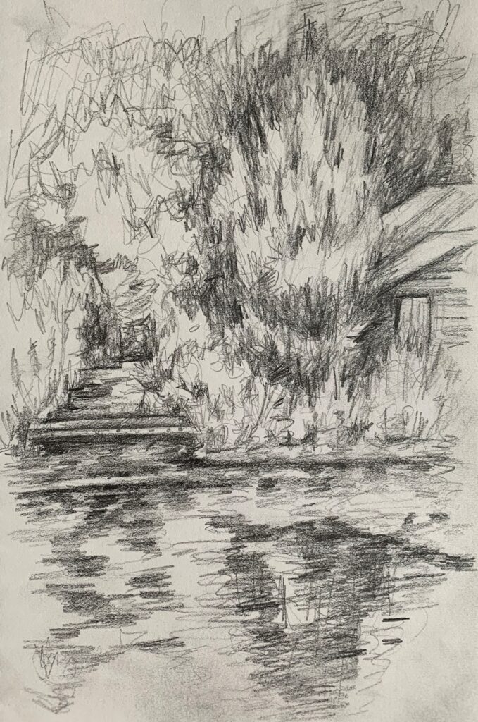
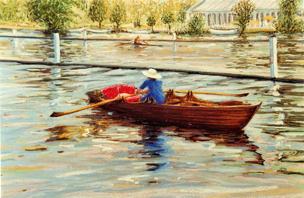
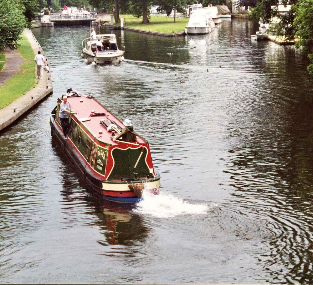
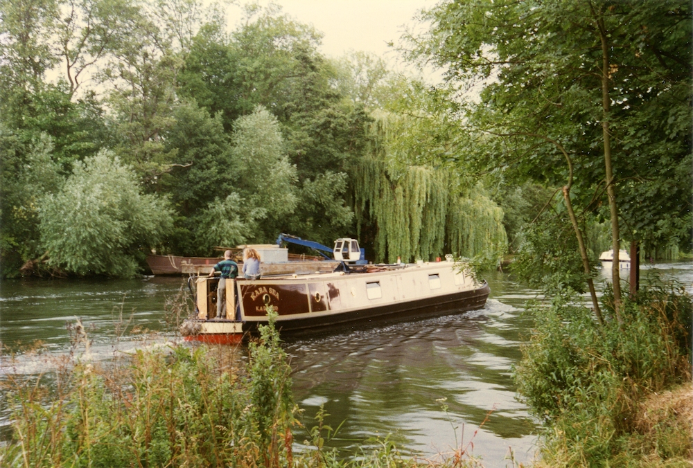
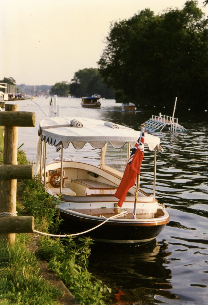
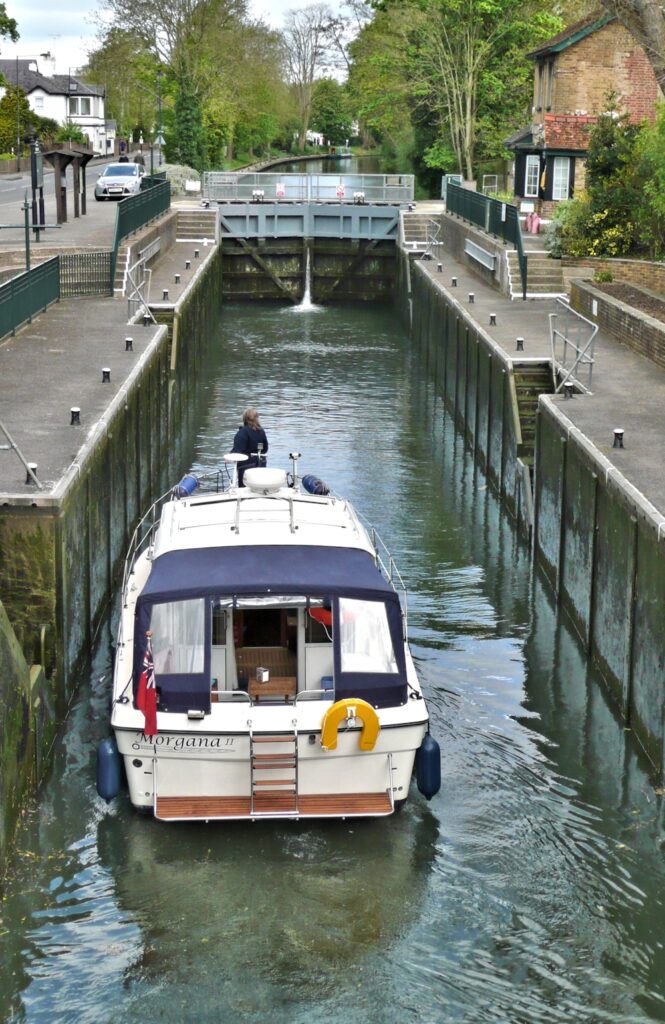
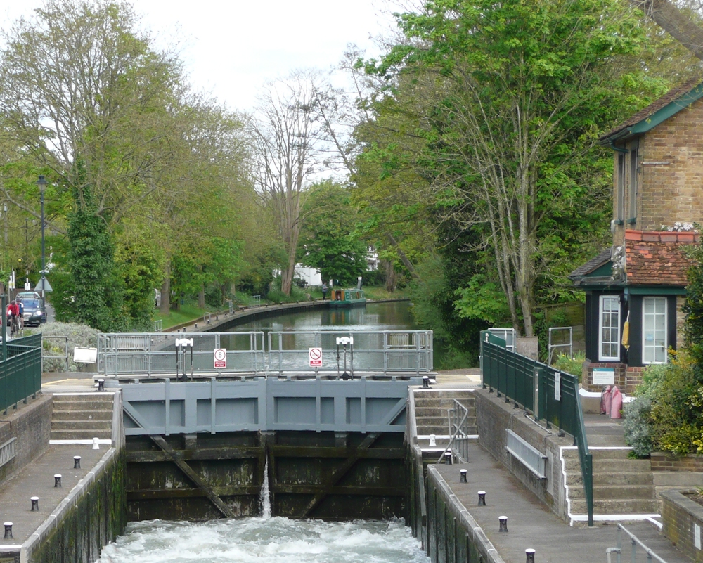
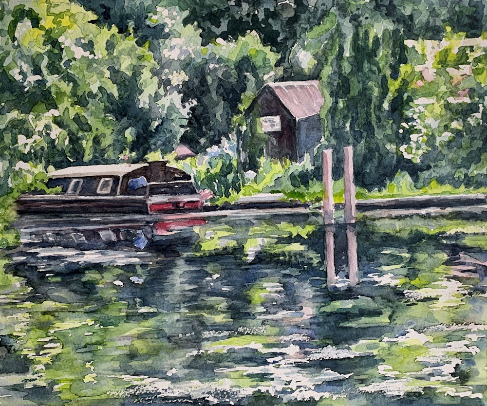
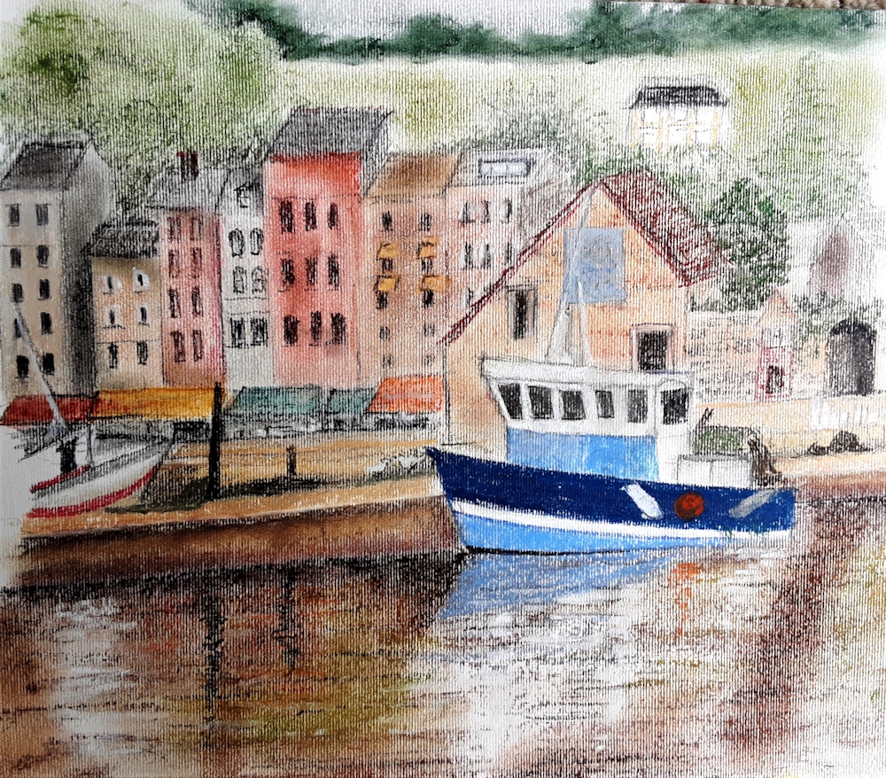
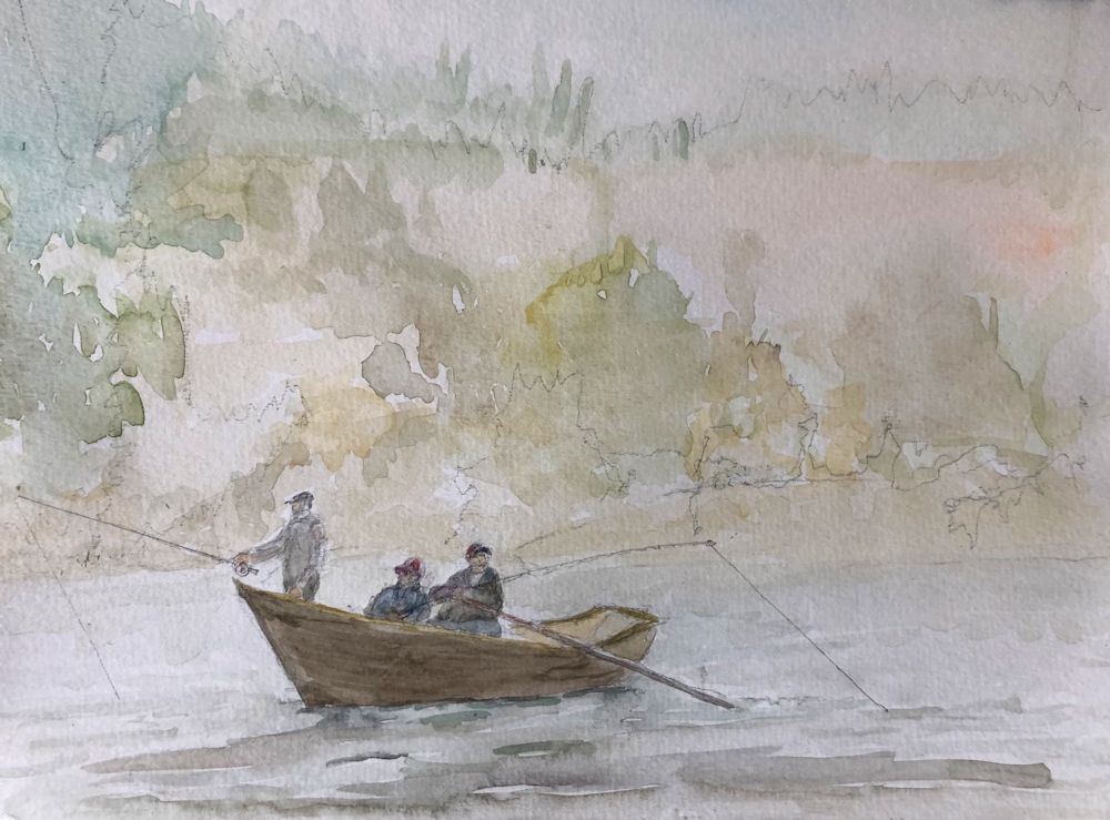
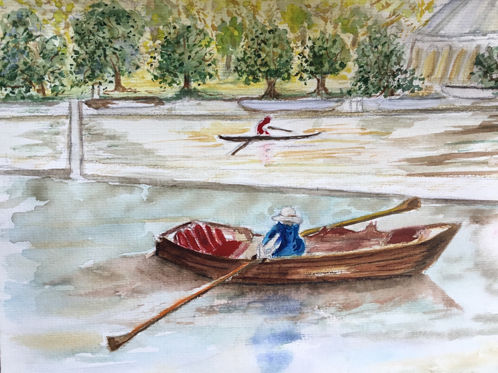
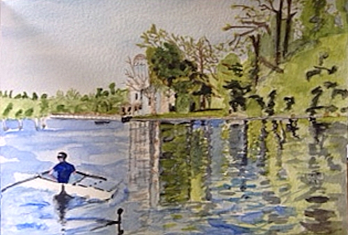
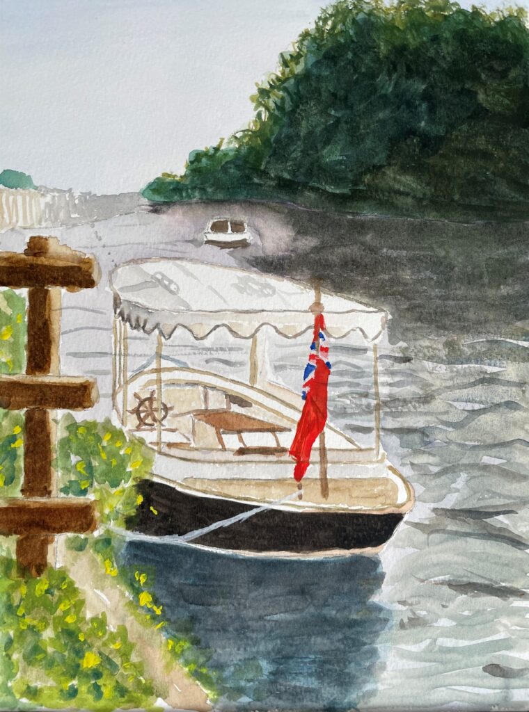
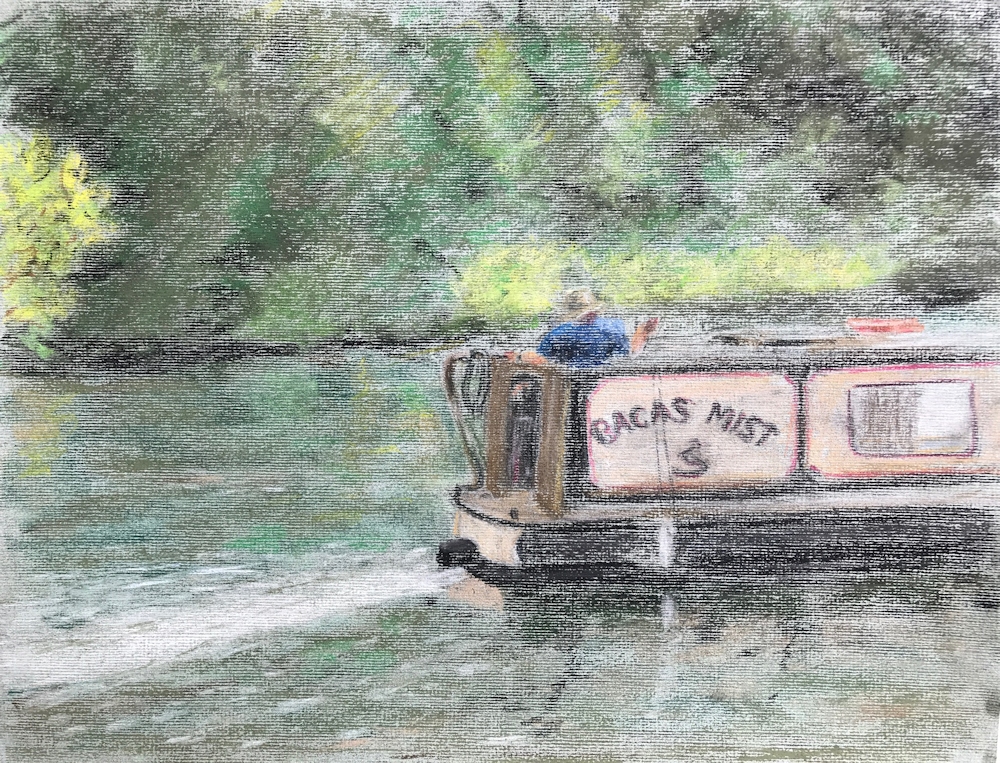
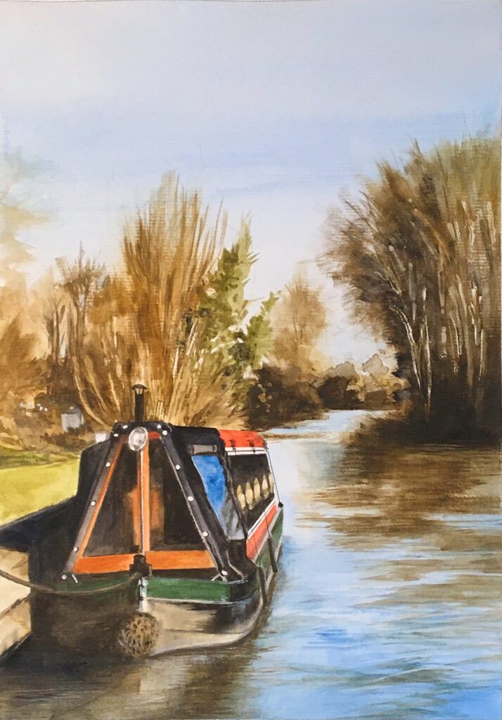
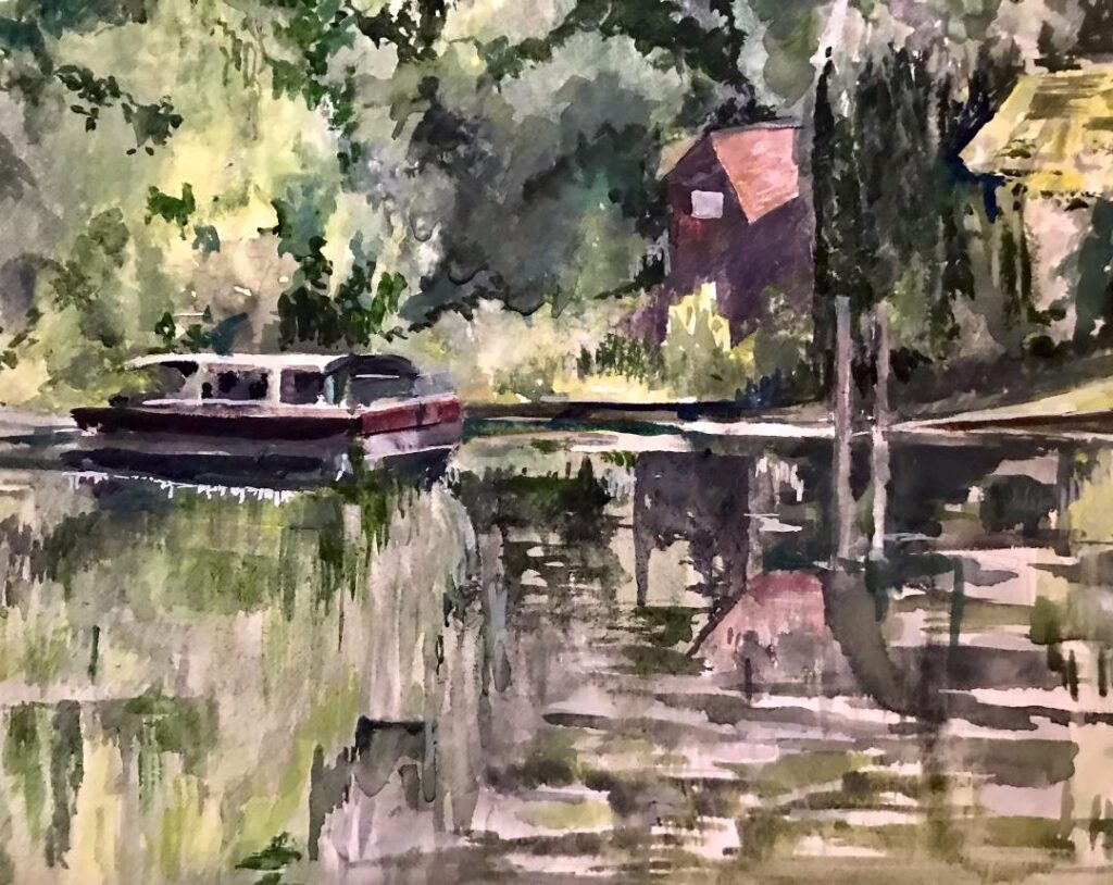
From the Riverbank Week 3: Boats, Boathouses and other Structures
May 23, 2021
Pastel
The challenge this week is to make a painting of boats and/or constructions on the river including weirs, locks, boathouses from sketches made from the riverbank. If the weather makes working by the river difficult why not look at any photos you may have of boats threading their way through the twists and turns of the Thames. It’s more difficult to draw a moving target from life so becoming familiar with the structure of boats and their effects on the water surface is easier from photographs.
However if you have the opportunity, it’s much more rewarding to work outside with a sketchbook. Start with the static objects and develop your confidence, and then try drawing the main shapes of boats and their wakes as they pass by,as swiftly as you can. With a little practice a real notion of movement can be achieved.
Pastel
A few photographs of local parts of the Thames with moored and moving craft are below.
Photo
Think about the river and its banks, the relation of the boat to the water surface (the waterline, reflections and if moving the bow wave and wake, or if a motor boat how the water may be churned up by a propeller at the stern). The patterns of waves may extend far beyond the immediate vicinity of the boat.
If you attempt to draw or paint a lock, perhaps looking down from a bridge as you can at Maidenhead. Try drawing the large shapes of the lock first so that you get a feel for for its structure and aim to show its perspective. That will help you when you place a boat in it. Think of the lock as a big rather long box so the end away from you appears smaller. Then look at the water level in the lock and how the boat sits in it.
Photo
Photo
There are also occasions where boats are included as only a small element in a river landscape work so just as observing and drawing from human forms, observing and drawing boat forms will help you to be able to just ‘drop in a boat’ to enliven a composition.
Photo
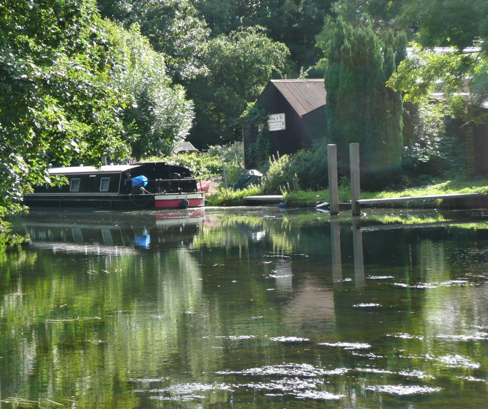
Photo
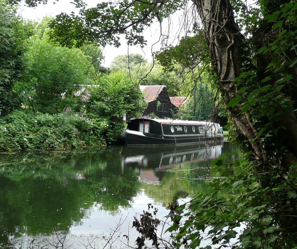
Photo
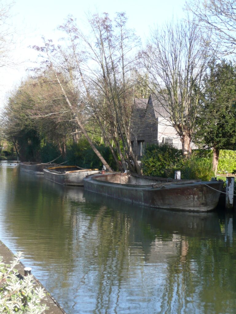
Photo
Also included are boathouses and a couple of old rather abandoned looking dredgers and the turbulent water of the weir at Maidenhead.
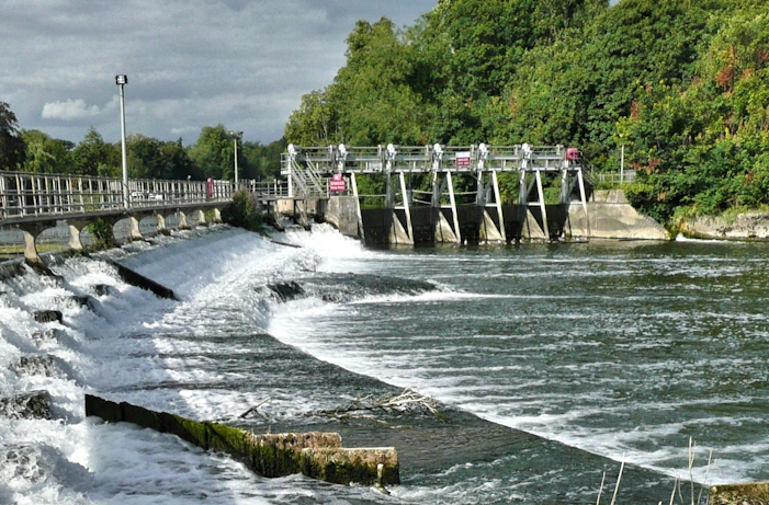
Photo
With the weir draw its underlying structure lightly before indicating the frothy water tumbling over it. Hopefully we’ll be sketching outside but if not feel free to use any of these references or find a boat scene you would like to paint.
Some examples of paintings of boats and locks etc can be found on Jo’s Pinterest board using the link below:
https://www.pinterest.co.uk/jhall1282/from-the-riverbank/boats-locks-weirs-and-buildings/
Your Sketches and Paintings:
Watercolour by Jan
by Liz
Watercolour by Virginia
almost finished
Watercolour by Ann
Watercolour by Ann
by Elizabeth

Pastel by Barbara
by John
Pastel by Mali
Watercolour by Sarah
From the Riverbank Week 2a: Some Photo reference in case of rain!
May 16, 2021
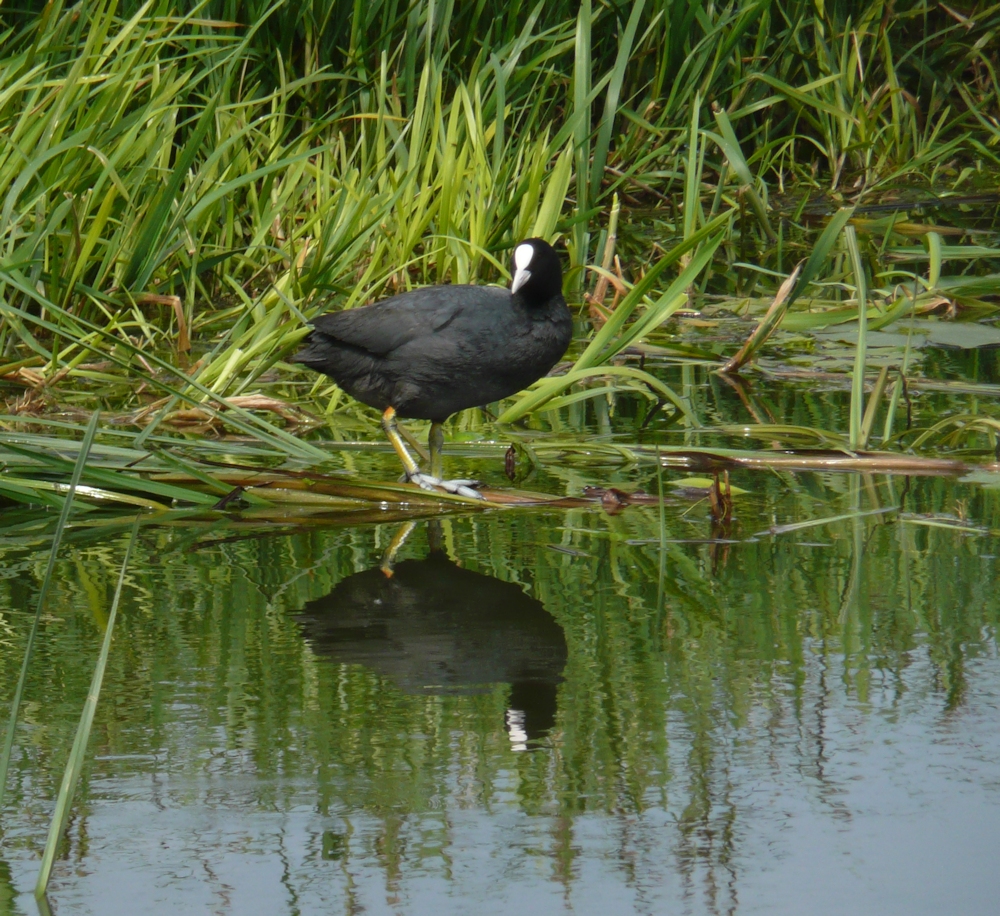
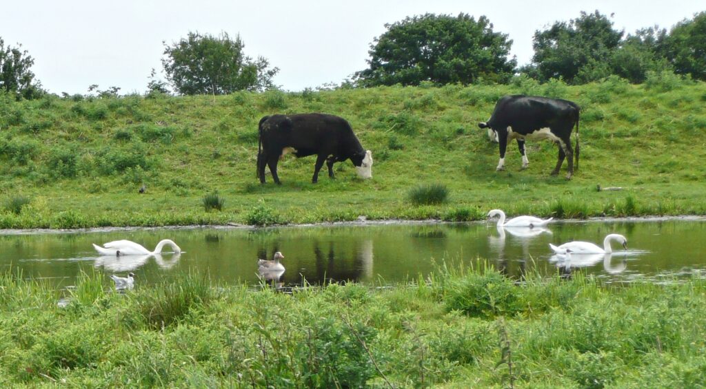
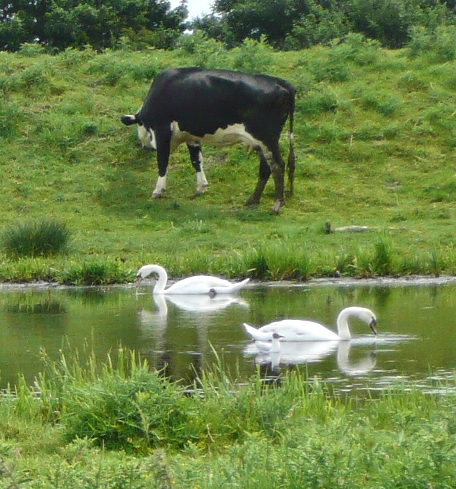
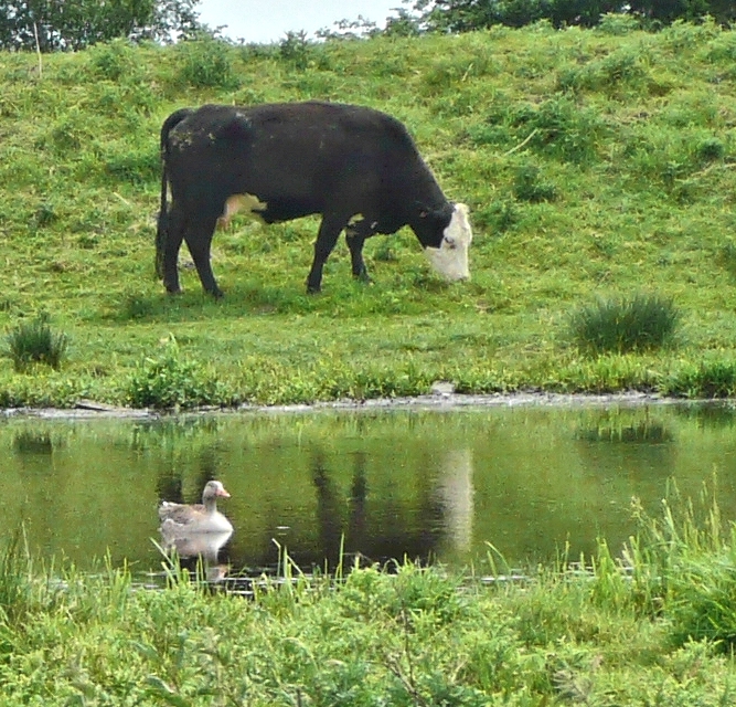
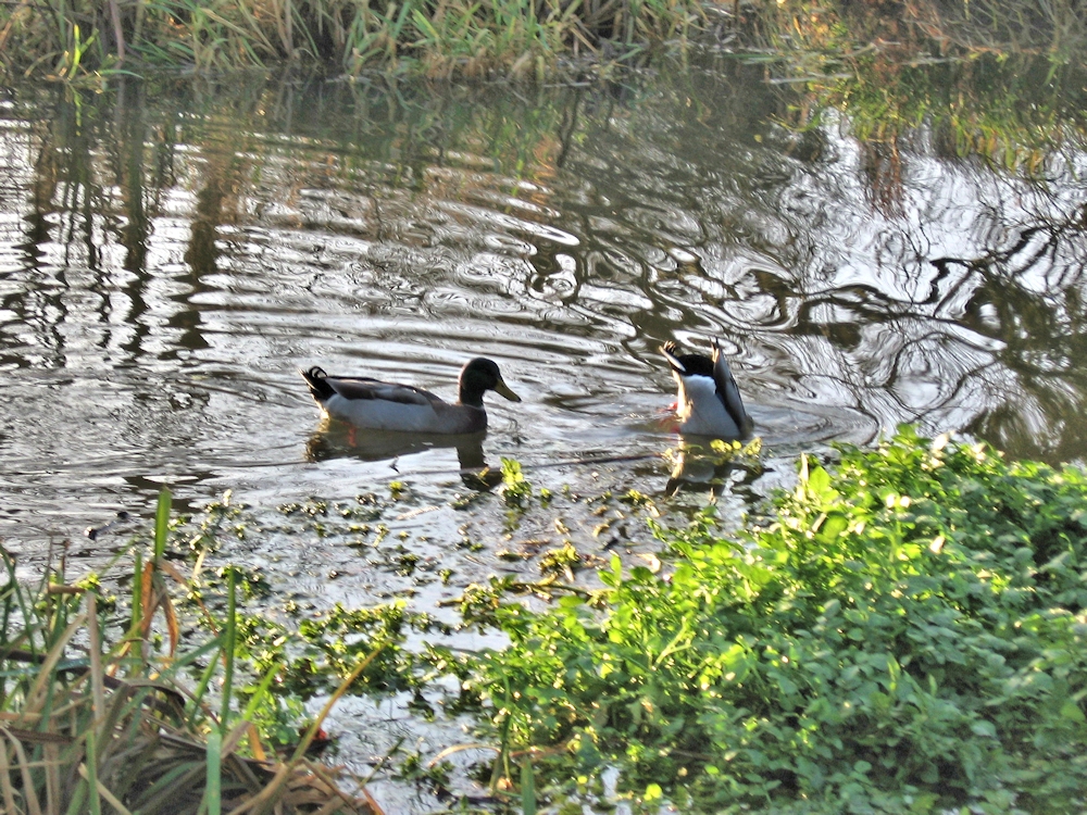
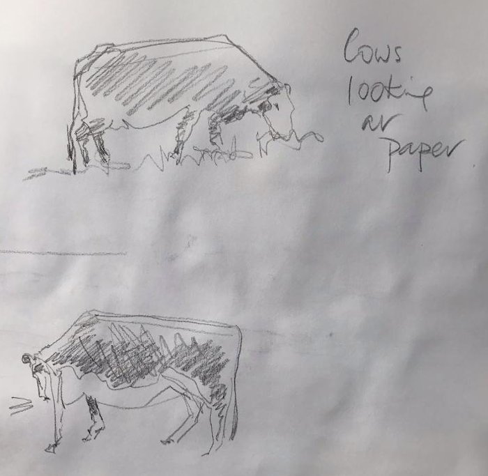
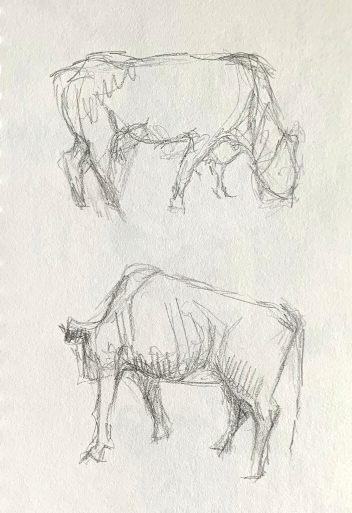
The Weather forecast is miserable for this week so here are some photographs of river birds and a few cows for inspiration, a contingency in case of rain on Tuesday.
As anything that moves is a challenge in real life, becoming familiar with bird and animal shapes will be helpful before sketching them outside. We can work in real time together either from the following references or using your own. We’ll choose a bird or a cow and make rapid thumbnail sketches in real time; four or five to a sketchbook page so don’t think too large. I will be using a stopwatch! You will see from the reference that you should be able to make several sketches of the same or a similar bird in different poses.
Where birds in groups overlap each other, as in the cygnet photos it can be useful to treat them as a single shape and then sort out the individuals. They move in amazing ways, with mother swan looking out for them all the time.
After a few warm up sketches we can move on to a more considered drawing or painting, making a good start that can be finished during the session or in your own time afterwards. This work may either be a painting that has the creature as the main subject, or a work where the beast or bird is placed in its landscape setting.
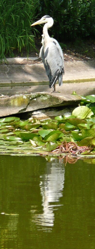
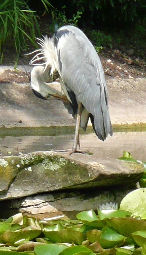
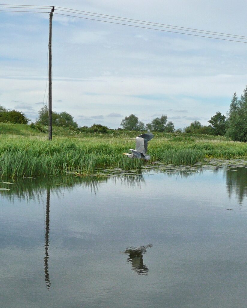
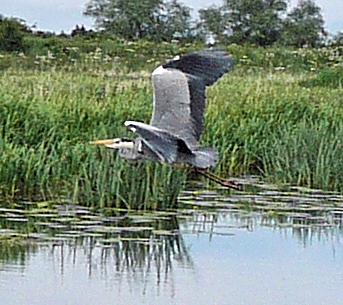
Most of the heron images are from the water garden at Cliveden where the carp fry are easy prey for a hungry bird. I watched and sketched this one before resorting to record his antics on camera. but sadly never caught him actually catching a fish.
Your paintings and sketches:
This week’s drawings include two minute drawings and two minute blind contour drawings, where looking at the image but not the paper was permitted. There are also 30 minute or longer drawings from the Canada Goose image posted just before them.
Drawings below were 30 minute drawings from the image above
by Virginia
by Elizabeth
by Jan
by John
by Liz
by Shane
by Ann
by Heather
by Sarah
Pencil by Maryon
Acrylic and Ink by Maryon
Two minute drawings and blind contour drawings:
by Sarah
by Jan
by Sarah
by Jan
From the Riverbank 2: Out in the Open
May 11, 2021
This week we’ll think about working outside, developing work from sketches or diving into a painting if you are feeling brave. The world outside can seem quite daunting if you are not used to working in the open and the complexity of some scenes can be overwhelming unless ways can be found to home in on a subject and isolate it from the surrounding “noise”.
Using a camera as a view finder is one way but limits you to composing with one shape. A better way is to take two L-shaped pieces of card which you can view the landscape in endlessly varied formats. Quite a good idea to tape these together once the desired subject and format has been found, preferably with a removable masking tape or similar.
To home in on a suitable composition it’s a good idea to make a few composition and tonal sketches first. Exploring a scene in this way focuses the mind on what most interests you and aids observation and drawing skills enormously. Last week we explored photographs in a similar way.
Below is a way of recording shape and tone in a sketchbook. Charcoal pencil was used in this case but if I had used pencil three or four small sketches could be made on a sketch book page.
This time make small sketches not worked up drawings to decide on the composition. This is a good exercise whether working directly from the landscape or preparing for a work to be completed in the studio. There is a good case for making both tonal sketches and making colour notes, not necessarily in the same sketch. If there is time separate sketches of any details you may need for the final work can be made. A camera of course is useful but because nature does not always arrange itself in the most interesting or pleasing way, small personal sketches are often a good guide to what should and should not be included.
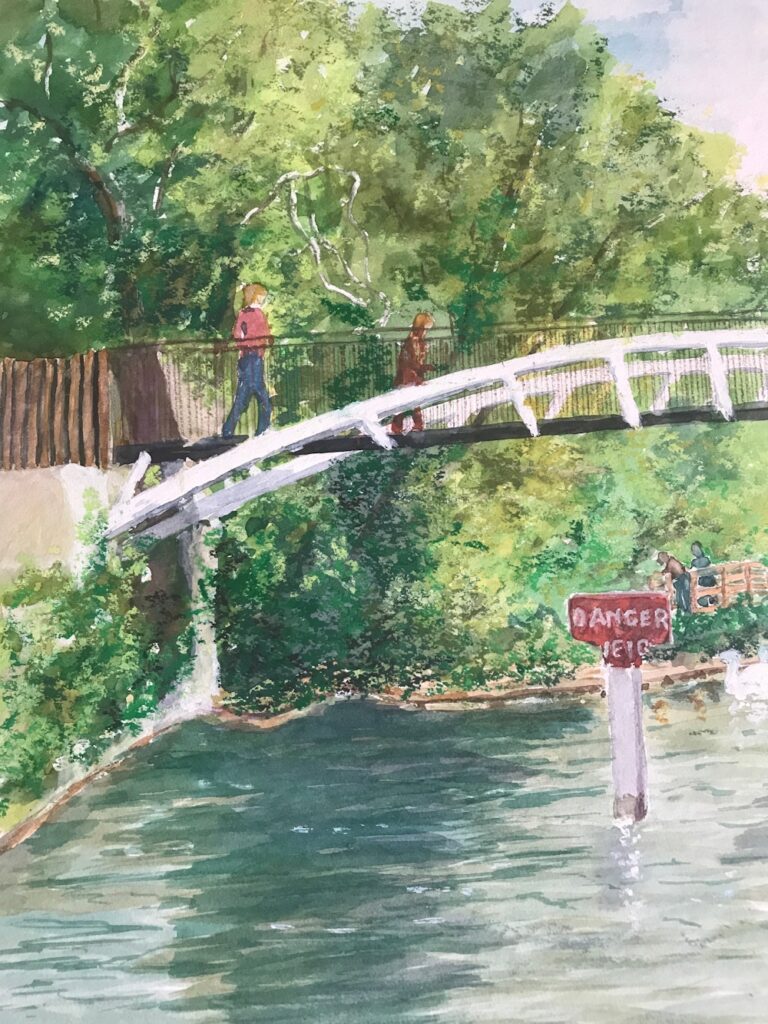
A silly example would be if I wanted to make a picture of a coot with its reflection. I would think very hard before including or excluding a sign in red paint behind the bird saying DANGER WEIR which was only slightly camouflaged by a nest in front of the sign. If the sign and its reflection was making the painting much more exciting than just the bird, putting the bird in context with that part of the river, it may be good to include. If it did no more than draw attention away from my principal subject or led the eye out of the picture the sign would have to go. Then again I would have the same problem with the coot if my focus was river signage.
1. Equipment for working outside; minimum for preparatory sketches
Sketchbook, drawing implements: pencil, pen, eraser, small camera and view finder, light weight folding stool
Optional: a few of any kind of coloured pencils or a small box of watercolours , brush, water, water pot; for making colour notes
2. Equipment for working outside; for painting directly from the landscape
Sketchbook, drawing implements: pencil, pen, eraser, small camera, light weight folding stool;
Watercolour painters: Watercolours, pan box useful if working at a fairly small scale as usually have an integral palette, water and water pot, brushes, paper towel (few sheets), small natural sponge (if you have one), drawing board with stretched paper/ heavy weight paper well taped down or small block of paper
Pastel painters: small box of landscape colours (Sienna, green dark, green bright, ultramarine blue dark and light, white, yellow, yellow ochre, crimson, cadmium red middle tone, dark grey or black, purple. These colours are only a suggestion. Handful of pastel pencils if you have any), pastel paper and a board, clips or tape to attach your paper, small can fixative spray, craft knife, pencil sharpener, Blu-tac or putty eraser, few sheets paper towel
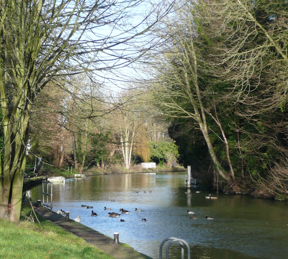
If the weather is stormy the challenge will be to paint wildlife or agricultural scene from the riverbank. This could include willows, cows birds, nests waterlilies, reed banks.
Outside the challenge will be to make a composition including one or more of the following; trees, boats and boathouses, lock gates and their reflections, or a weir for the fearless! Be selective; one well painted boat or tree is better than a scribble of a fleet or forest! It would be good to take on board the tonal balance of reflections and objects. Reflections are not always darker than the real object but often are. See how the sky is reflected and how ripples catch the sun, as we will see next week sometimes very literally.
For inspiration visit my as yet unsorted Pinterest Boards at:
https://www.pinterest.co.uk/jhall1282/from-the-riverbank/
Your paintings: