Monthly Archives: October 2020
Lights in the Sky, Lights from the Land: Moonlight
October 27, 2020

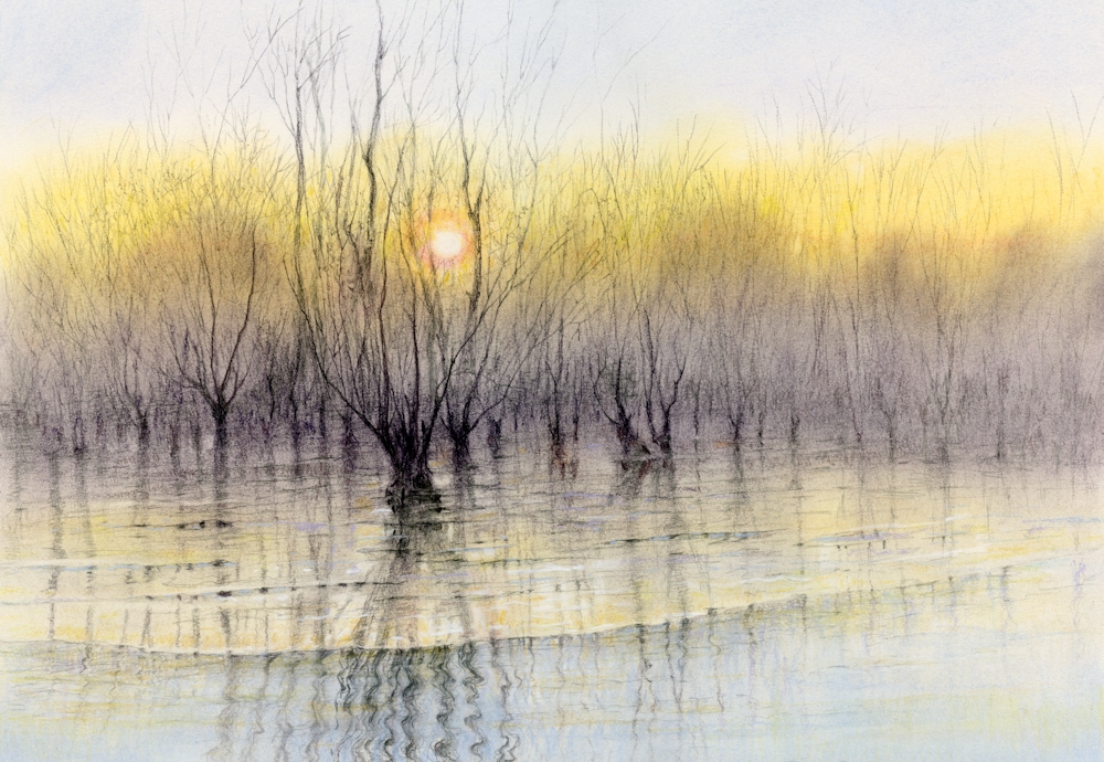
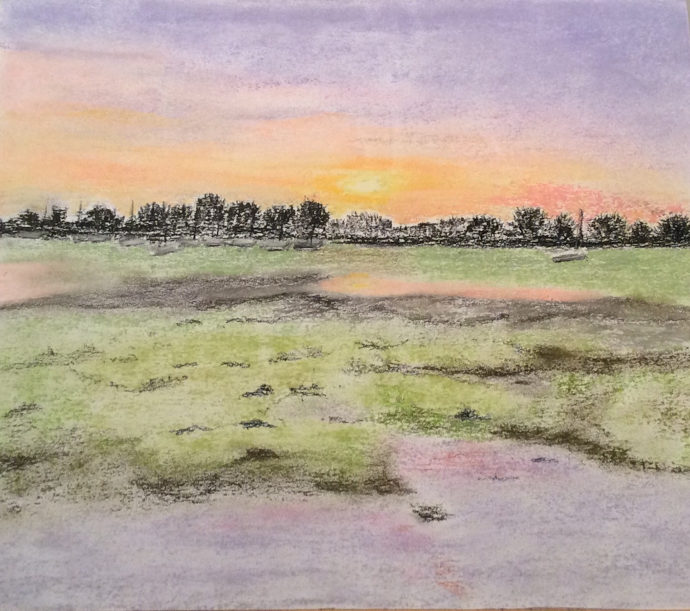
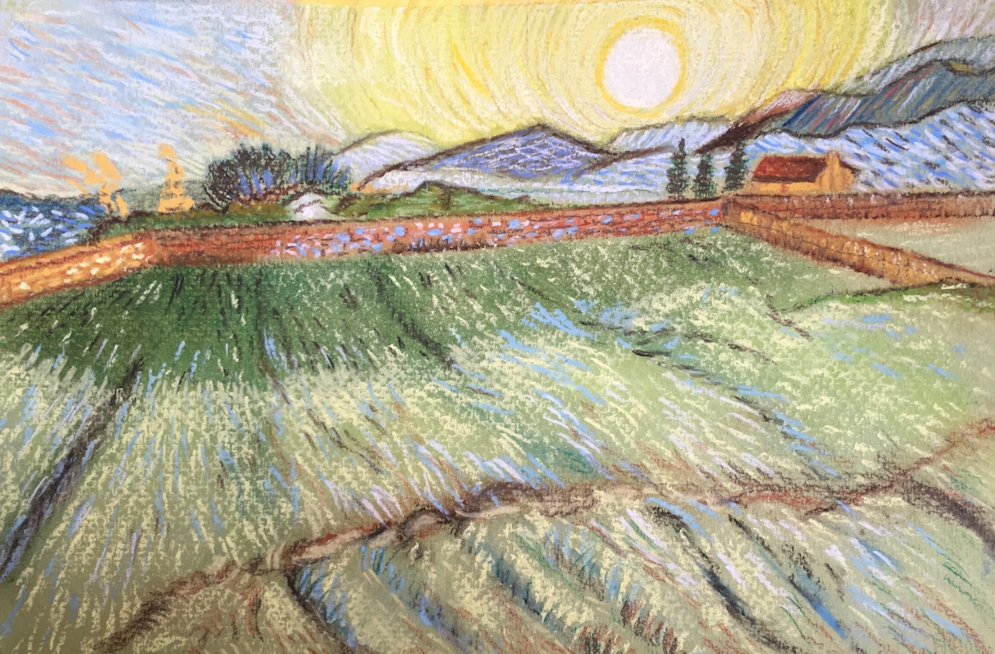
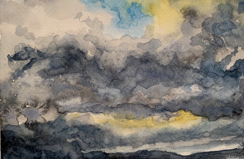
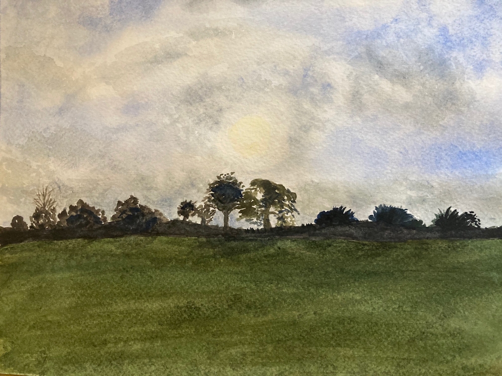
These fields seemed like a magic staircase in the landscape so I transformed this very green daytime scene into the pale yellows and dark blue of moonlight
This week’s challenge is the moon and its effects on the landscape. You may paint an observed scene or introduce something more imaginative. The works of Turner and Samuel Palmer combine large elements of observation with imagination. Much smaller than the sun its size is often exaggerated in paintings; look at Turner’s watercolour sketch of Shields Lighthouse, 1823-26.
Several of Turner’s works together with works by Samuel Palmer and the contemporary artists John Caple and Richard Cartwright and others feature on the Pinterest Board titled Lights in the Sky, Lights from the Land, section: Moon and Stars, Link below;
https://www.pinterest.co.uk/jhall1282/lights-in-art/moon-and-stars/
Another featured artist is the Victorian artist, John Atkinson Grimshaw of whom Whistler famously remarked “I considered myself the inventor of nocturnes until I saw Grimmy’s moonlit pictures.” This is unbelievably arrogant in the face of moonlit paintings by Turner, Palmer etc. years earlier. However it is really worth studying Whistler’s nocturnes of the Thames which we’ll look at in a couple of weeks time.
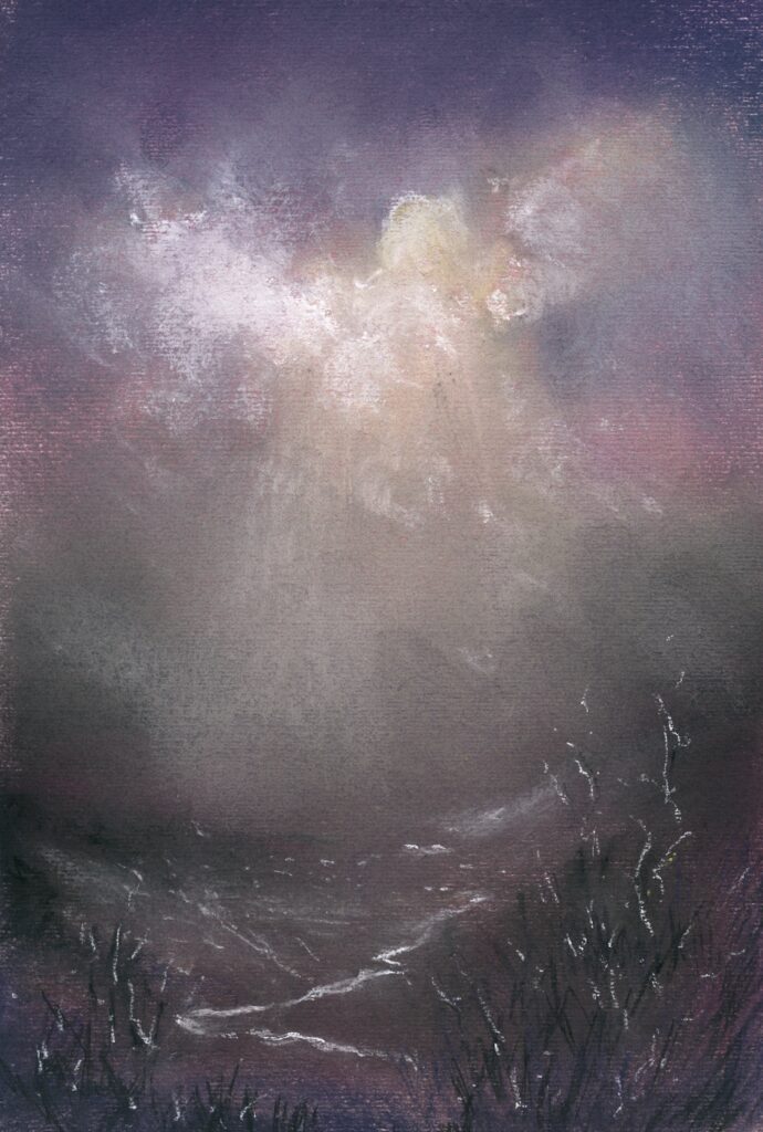
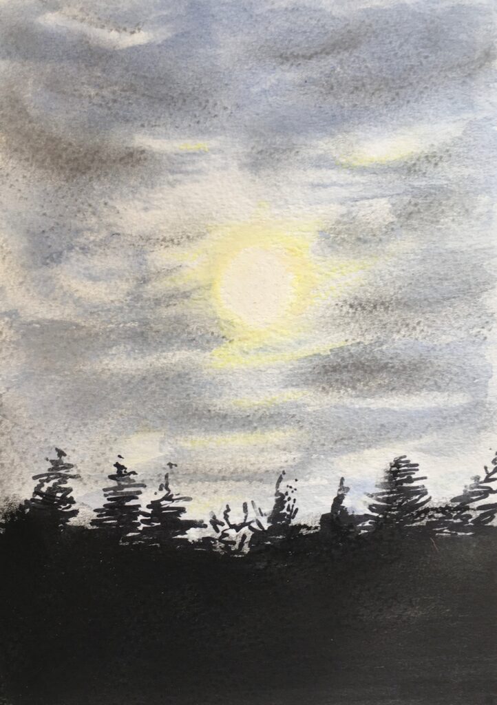
The moon’s light being a mere reflection of the sun’s light is less bright, but is most often depicted during the hours of darkness, so affords huge contrasts with the darkened skies. Because of the darkness the palette used for painting moonlit scenes is generally less colourful and may be depicted in near monochrome.
This week you may work in pastel which will work very well on a dark paper, perhaps a very dark blue or even a dark burgundy colour as in the demonstration piece below. If you are working in watercolour you may choose a white paper as in the illustration above, or if you consider working in gouache, or white added to your watercolours, again you may like to choose a dark paper. Pastel papers can be stretched in the same way as watercolour paper, or you could work in gouache on an off cut of mount board.
The images below show stages in creating a moonlit landscape based loosely on the Eden valley in Northumberland.


Below are a few suggestions for painting the moon in watercolour.


Whatever your medium, compared with the sun the moon is a tiny object though it appears a good size from earth because of its proximity. It sheds a much paler silvery light on the landscape which is very different from the vast range of hues revealed by direct sunlight.
Your challenge for this week is to paint a picture of a moonlit landscape with the moon visible in the night sky. This may take the form of a very imaginative scene as in the works of John Caple or Richard Cartwight or something more literal. Have fun!
Your paintings:

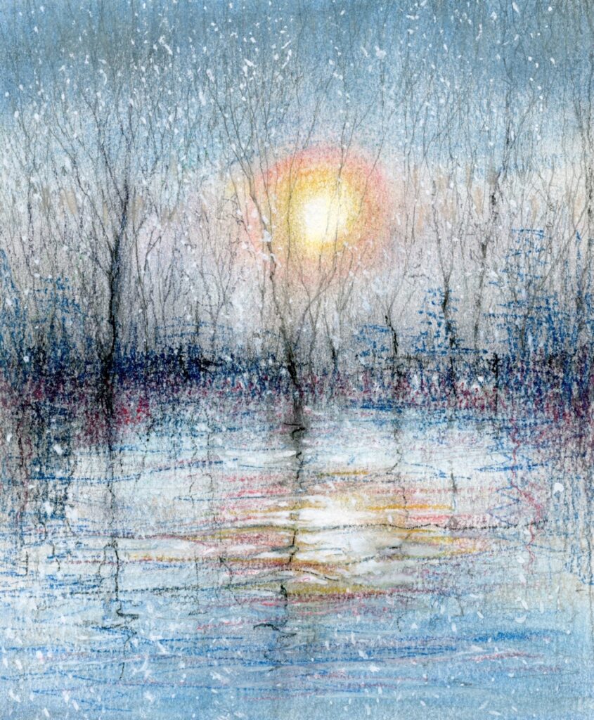
Pastel by Barbara

Soft pastel and oil pastel on dark blue pastel paper
Oil pastel touches were added for the snow in the foreground.

Pastel on dark grey Pastelmat

Pastel

Pastel by Heather

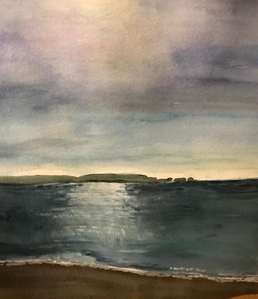
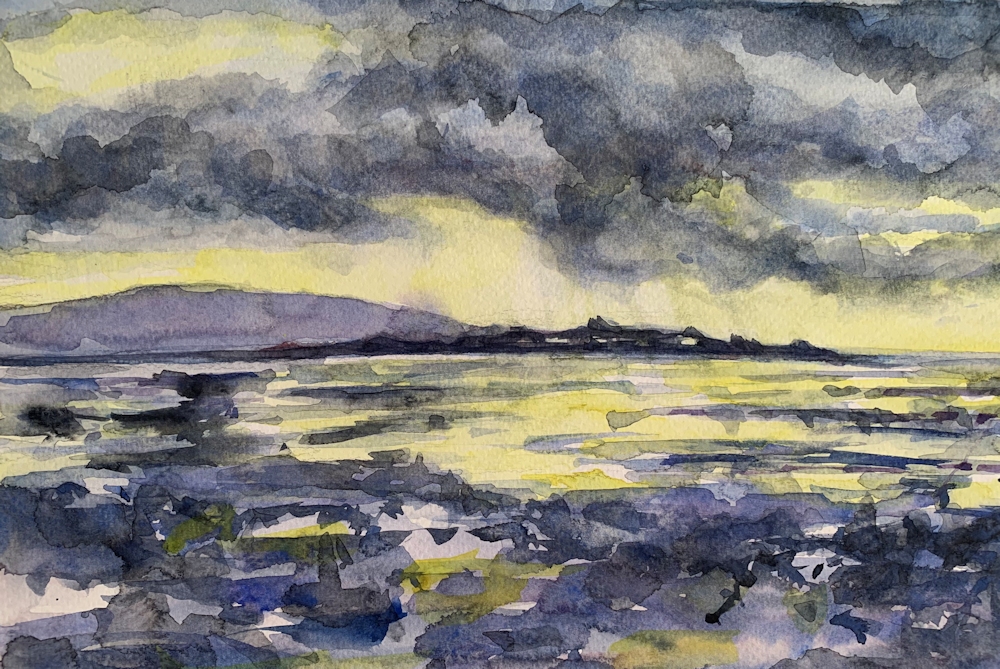
Watercolour by Heather

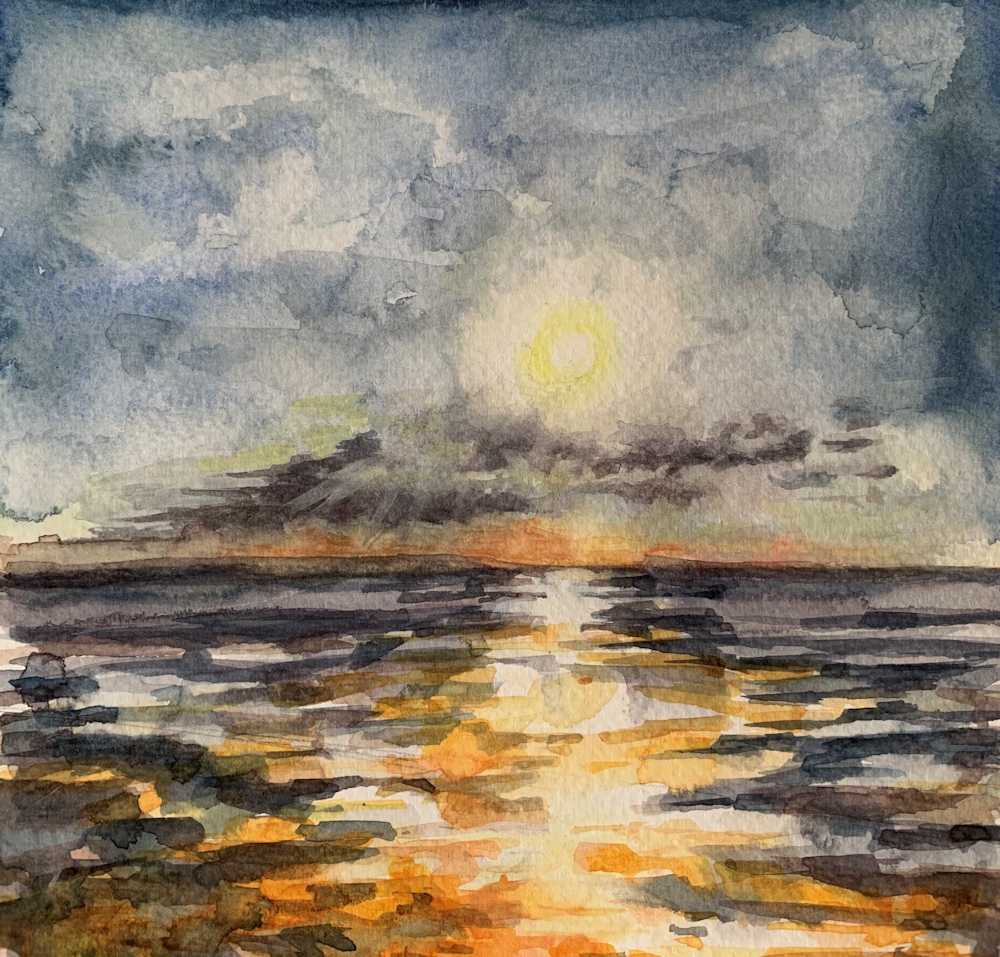
Watercolour

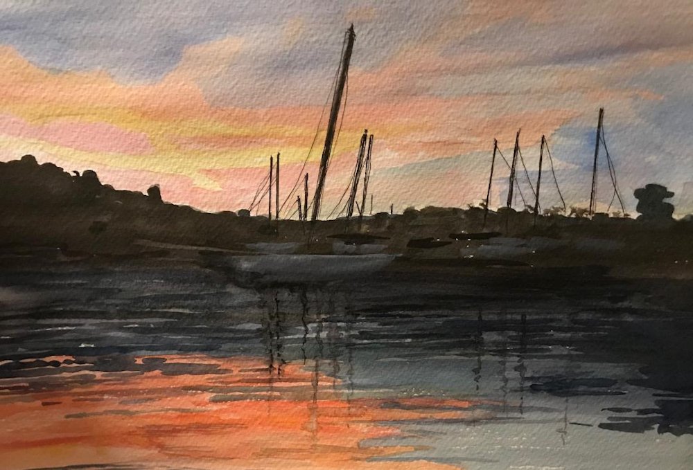
Watercolour by Jan

Watercolour by Jan

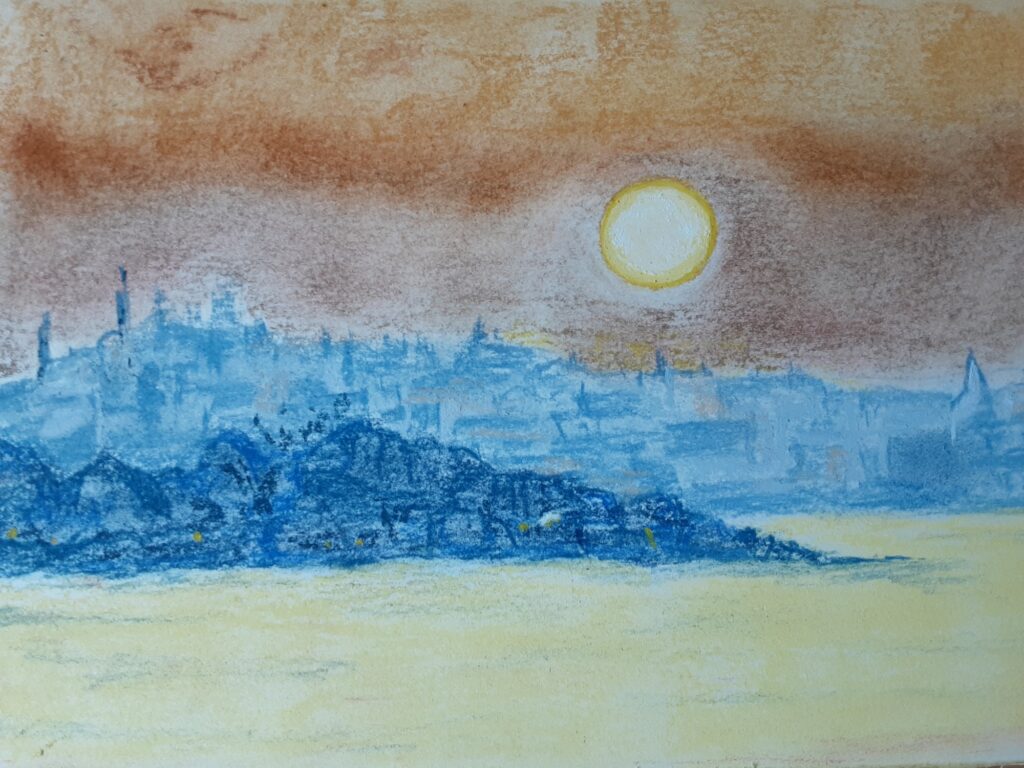
Pastel by Jan

Pastel on buff paper by Shirley

Pastel on print making paper by Shirley

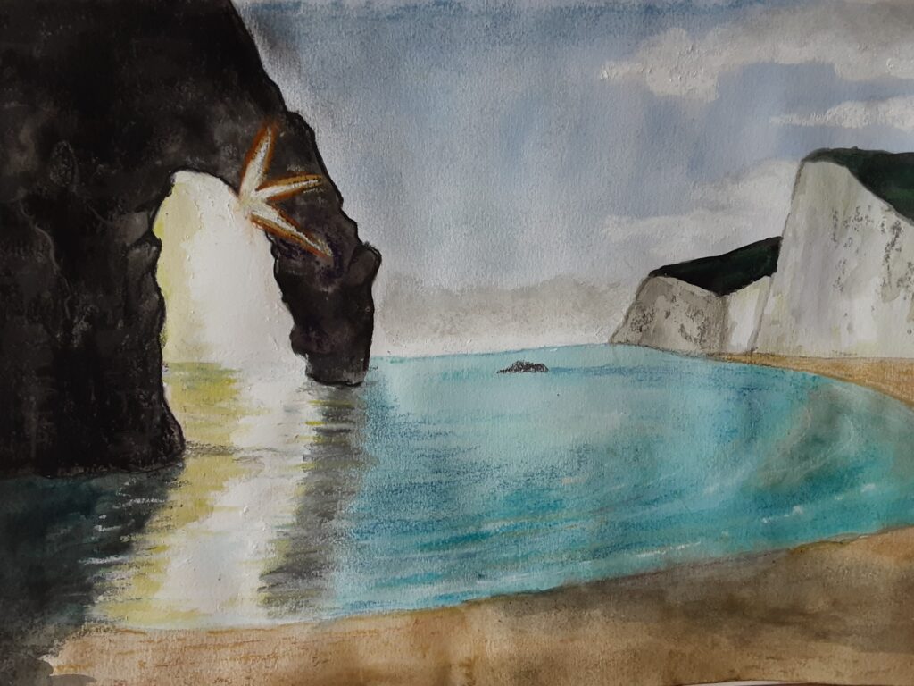
Watercolour by Maricarmen

Gouache on black paper by Maricarmen

Acrylic and pastel

Pastel pencil and pastel

Watercolour and pastel

Watercolour and pastel
Lights from the Sky, Lights from the Land: The Sun
October 20, 2020
This week’s project is to depict the sun and effects of its luminosity on the landscape. As light sources, natural and manufactured are the topics for the next few weeks, I thought it would be useful to consider some general aspects of depicting luminosity.
Light sources vary in the colours they emit; some have haloes of different colours surrounding a white or paler coloured centre and others are single hued with a near white highlight at the centre. During the next few weeks we will discover some of these differences in more detail.
Guidelines for creating luminosity in a composition
(Some of this is rather obvious but here goes!)
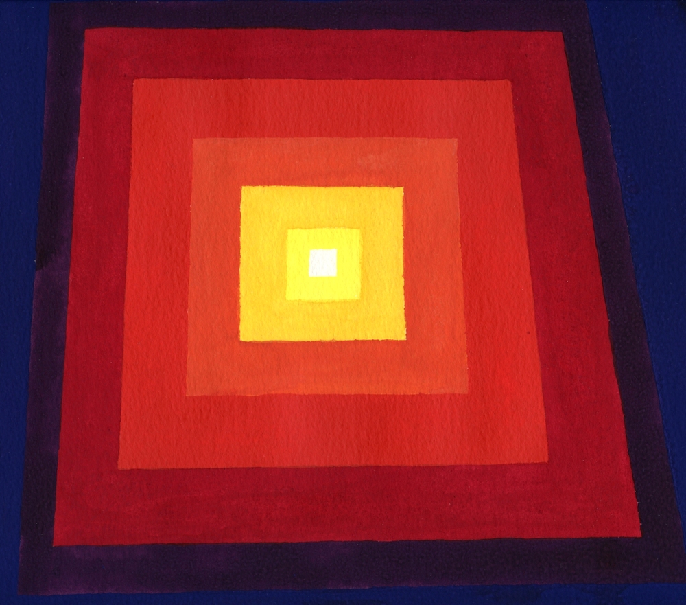
1. The luminous area should be smaller than its surroundings.
2. The luminous area should be painted in paler tones than its surroundings and the highlight will be the palest tone.
3. Within the brightest part of the luminous area none of the tonal values should contrast with each other greatly. Deeper values should be painted outside this area although there may be different colours of medium tonal value outside the brightest part of the luminous area.
4. A sheen of the colours within and just outside the luminous area often pervades the entire composition. The Impressionists made great use of these effects. This can be seen in Monet’s paintings of the Houses of Parliament and the Waterloo Bridge series. The hues just outside the main illuminated feature and to a lesser extent those within the illuminated area are seen as echoes in streaks and dashes of paint, the colours that create a sheen over the surroundings area, giving the work colour unity as in the rather rough illustration below.
A link to the Pinterest board “Lights in Art” is below and you will find images of the works referenced as well as several other examples of how artists have depicted the sun and sunlight.
https://www.pinterest.co.uk/jhall1282/lights-in-art/sun/
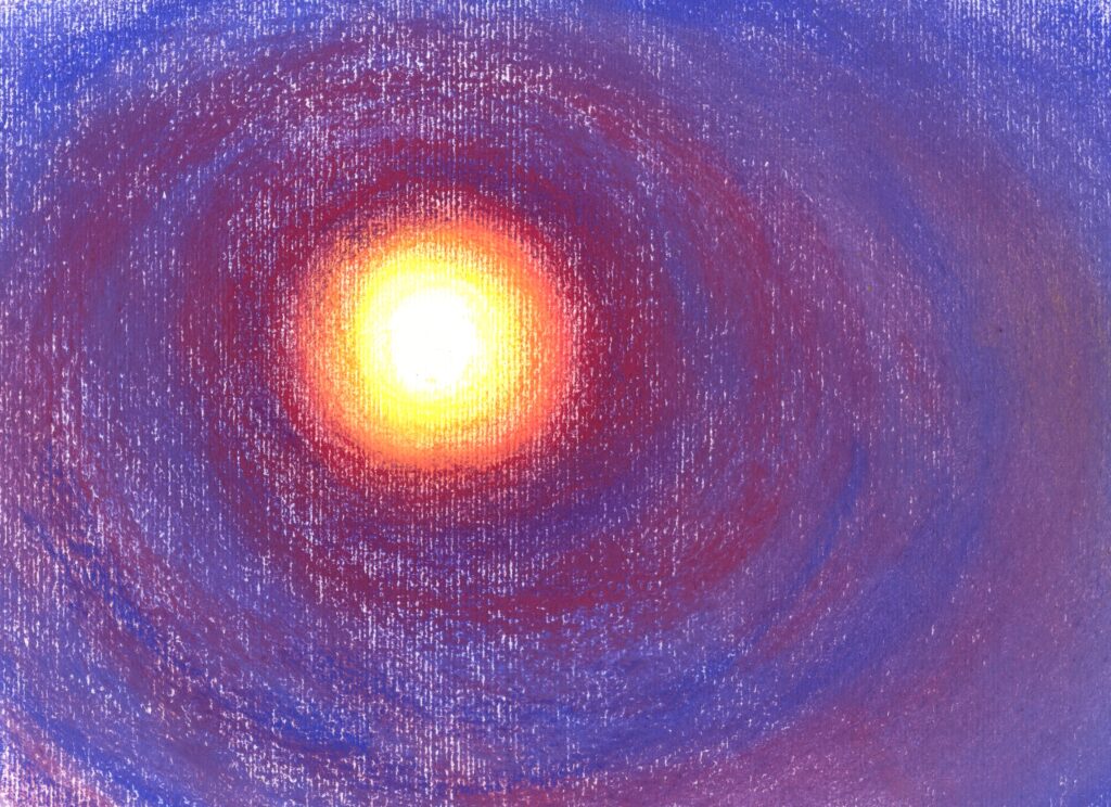
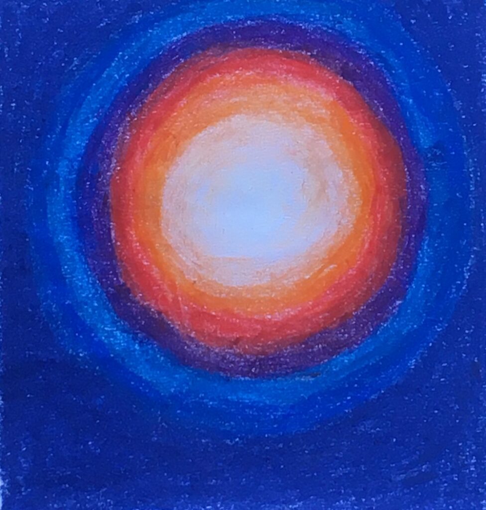
White surrounded by yellow, orange, red and purple rings; the blue surround has been streaked with mixes of the purplish red. Compare with how Monet used orange/red/purple hues in his Houses of Parliament paintings of around 1904.
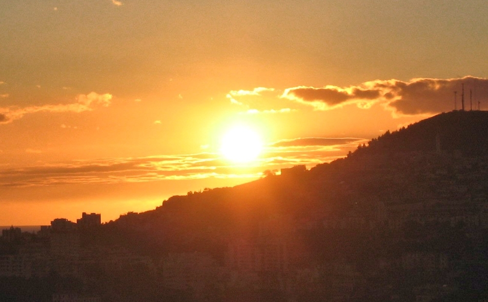
Note: white centre surrounded by less saturated (less pure) yellows and oranges than in the sunset photograph.
This sun is more like the sun in Martin Johnson Heade’s painting of “Sun over York Harbour, Maine USA”.
Colours
Luminosity may be achieved with neutral greys simply by surrounding a small white circle with rings of increasingly darker pale greys on a background of a much darker grey, or with single hue by doing the same but with a colour instead of grey.
Luminosity can also be achieved by using several hues e.g. white surrounded by yellow, then red and other colours but again choosing a darker hue for the wider area surrounding the light source.
Even a white square can appear luminous!
Look at the other colours and whether they appear more or less luminous against each other.
Another way of using colour is to surround a saturated colour (pure hue) with less saturated colours or the complement of the pure hue at the centre. Again it usually works best if the surrounding hues are similar tonally or darker than the luminous area.
A good example of a pure colour being surrounded by a less saturated near complementary colour is afforded by “Impression Sunrise”, 1872 by Monet. The sun is painted as a small disc of a rather pure orange against a rather desaturated(less pure) purple cloud. The reflection of the sun is painted clearly in the water and throughout the work echoes of the orange can be seen among the purples and chromatic(coloured) grays of the rest of the composition giving the impression of the sun’s light giving a sheen over the whole work.
Note rather monochrome sparkle
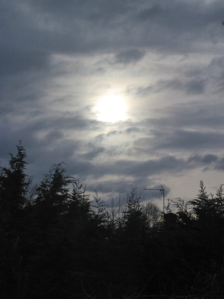
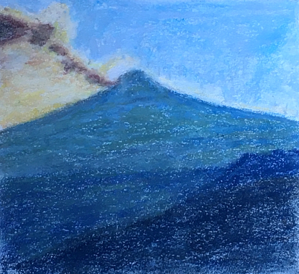
Sunlight bursting through a gap in the cloud cover and illuminating the river below.
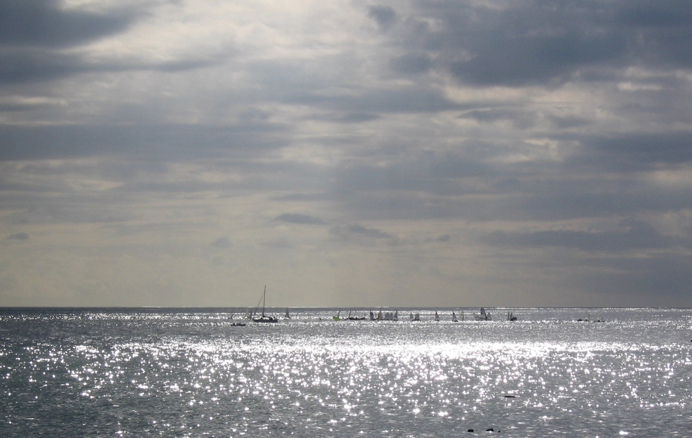
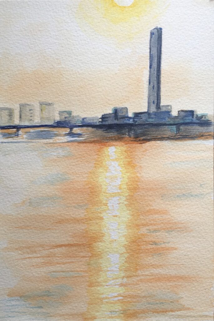
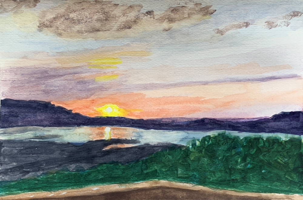
It is of course almost impossible to depict the sun on a bright day with hardly a cloud in the sky. This is probably why most paintings of the sun involve sunsets and sunrises, or the sun in overcast conditions; its light pouring through the gaps between the clouds. Another way in which the brightness of the sun is depicted is it’s reflection in water; either as a sparkle or as a reflection of the whole sun.
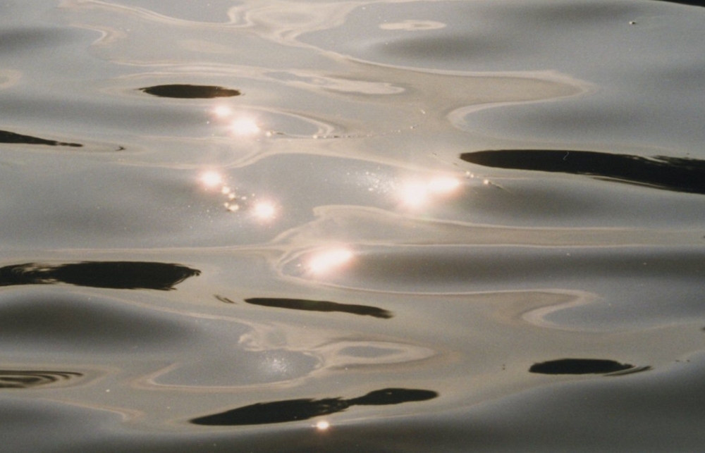
Each sparkle appears as a miniature reflection of the sun
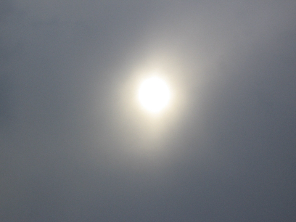
Even on the dullest day the sun appears white at the centre surrounded by a ring of pale yellow. At sunset the sun may appear white or yellow at the centre and surrounded by red orange colours or the whole sun may appear bright orange/red. The duller the day the more monochrome it appears and the sun’s reflection in water behaves in the same way.
For more ideas do visit the Pinterest Board link below.
https://www.pinterest.co.uk/jhall1282/lights-in-art/sun/
Practical
1. Experiment with making a small area look luminous using one hue and then with several hues.
2. Using pastel or watercolour or a watercolour/pastel combination make a painting where the sun is evident in the sky and may also include a reflection of the sun. The reflection may appear as the reflection of the whole sun or as a sparkle on the water.
The weather is up to you!
You may like to work your own version of one of the images on the Pinterest board, or use your own reference/imagination.
Have fun!
Your paintings:
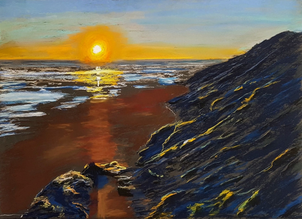
Pastel and pastel pencils on black emery paper P800 grit
Pastel by Barbara
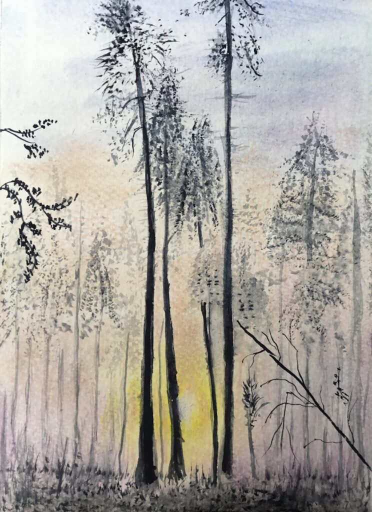
Pastel
Pastel by Shirley
Watercolour, Sharpie Pen and Pastel
Pastel and a little Coloured Pencil
Watercolour
Watercolour
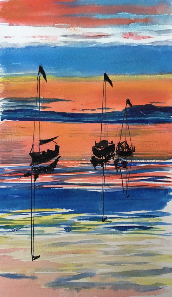
Watercolour by Sarah
Watercolour by Sarah
Pastel by Liz
Watercolour, Pastel and Pastel Pencil
Watercolour
Watercolour
Watercolour
Watercolour
Watercolour
Limited Palettes 4: warm and cool primaries together
October 2, 2020

Painted with; Lemon yellow, Alizarin Crimson, Ultramarine Blue
This week we will still be working with just three primary colours but you may choose to use any two warm primaries with one cool primary or any two cool primaries with any one warm primary.
Palettes with a cool bias;
One that gives good mixing opportunities is;
Alizarin Crimson: cool red
Ultramarine: warm blue
Lemon yellow or Cadmium lemon: cool yellows
Reasonable green colours can be mixed and purple and orange hues, as well as near black neutral greys using the red plus blue plus a tiny amount of yellow. By substituting Alizarin with Permanent Rose or Magenta some great violet /purple colours can be made but cooler orange hues.
Another interesting choice with a cool bias would be
Cadmium Red Pale: warm red
Cerulean Blue or Phthalocyanine Blue: cool blues
Lemon Yellow or Cadmium Lemon: cool yellows
This will give very fresh and may give rather acid looking greens which can always be knocked down by adding the tiniest amount of red (more if you need a rather olive green/brown). You will not be able to mix a good purple.
Two Palettes with a warm bias would be;
Cadmium Red Pale: warm red
Ultramarine: warm blue
Lemon yellow or Cadmium lemon: cool yellows
and
Alizarin crimson or permanent rose: cool reds
Ultramarine Blue blue: warm blue
Indian Yellow: warm yellow
Remember that the overall look, cool or warm, will depend not only on the pigments used but the proportions in which they are used. If blue is predominant the whole may have a cooler appearance than if red dominates. Also where colours are diluted or made paler in tone by mixing with white this also has a ‘cooling’ effect, as does working with muted colours and coloured grays mixed from the primaries.
The Pinterest link below references a variety of works that could be interpreted with a limited mix of primary colours. There are a handful of still lives, some Impressionist and American landscapes including a couple by Thomas Moran, whose paintings I have seen at first hand with other amazing landscapes painted in America over the same period around 1870 to 1900. There are also a couple of delightful posies by Fred Cuming. Other artists represented are even better known, and a few sunsets and sunrises that I am sure you will know.
Hope you enjoy them!
https://www.pinterest.co.uk/jhall1282/limited-palettes/warm-and-cool-together/
Practical
1. The only rule this week is that your three primaries should include at least one cool and one warm primary colour, so investigate what you have in the paint box, and try some mixes out. If working in any opaque way you may use white but not black!
2. Paint a picture, perhaps a still life with flowers or a landscape with an architectural feature or a dramatic sky. The ‘architectural feature could be anything from a garden shed to a distant ruin. The palette used is more important than the subject but try to choose the combination of primaries that best suit the mood of your painting, and please list the pigments used when you send an image.
Your paintings:

Cool bias: Lemon Yellow, Permanent Rose, Ultramarine Blue

Warm bias: Lemon Yellow, Scarlet Red Ultramarine Blue

Indian Yellow, Alizarin Crimson, Ultramarine Blue, Chinese White

Indian Yellow, Alizarin Crimson, Ultramarine Blue, Chinese White
Zinc White Gouache

Cadmium Yellow, Cadmium Red, Prussian Blue

Cadmium Yellow, Alizarin Crimson, Ultramarine Blue

One that escaped last week’s post!

Left warm bias: Cadmium Yellow, Alizarin crimson, Ultramarine Blue
Right cool bias: Cadmium Red, Lemon Yellow, Cerulean Blue

Cadmium Yellow, Alizarin Crimson, Ultramarine Blue

Cadmium Red, Lemon yellow, Cerulean Blue

Lemon Yellow, Permanent Rose, French Ultramarine
and Grey pen

Lemon Yellow, Alizarin Crimson, French Ultramarine

Cadmium Yellow, Quinacridone Magenta, Ultramarine dark, Titanium White
Painted in acrylic with Cadmium Yellow Medium,
Quinacridone Magenta, Ultramarine Blue and White
Malcolm used a palette of warm blue, cool red, warm yellow: Ultramarine B29, Quinacridone Magenta R122, Cadmium Yellow Medium Y37. Plus white.
The reference was a black and white photo b&w photo of a vintage original which took his eye on a hotel staircase in the Cinque Terre; something about the light and dark composition. So Malcolm gave himself the challenge of relating the original tones to the colours achievable with the palette.
Starting with a reddish-purple monochrome underpainting of the darks only, everything except the sky was covered with a with a transparent glaze of the opaque yellow, using glazing medium. This turned the grisaille brown as in the basic building shadows. Malcolm deliberately left some yellow imperfectly covered to get a warm afternoon feel to the painting.

Lemon Yellow, Cadmium Red, Ultramarine Blue

Lemon Yellow, Cadmium Red Pale, Cerulean Blue

Lemon Yellow, Alizarin Crimson, Ultramarine Blue

Cadmium Yellow, Cadmium Red Hue, Cerulean Blue

Cadmium Yellow, Cadmium Red Hue, Cerulean Blue

Cool bias: Lemon yellow, Alizarin Crimson, Ultramarine Blue

Warm bias: Permanent Yellow Deep,
Permanent Rose, Ultramarine Blue

Cool bias: Lemon Yellow, Magenta, Ultramarine Blue

Warm bias: Cadmium Lemon, Cadmium Red Light, Ultramarine Blue

Lemon Yellow, Alizarin Crimson, Ultramarine Blue, White

Acrylic: Cadmium Yellow Hue, Cadmium Red Light,
Phthalo Blue Green Shade and White

Hansa Yellow, Cadmium Red, Ultramarine Blue

Cadmium Yellow, Alizarin Crimson, Cobalt Blue

Deep Yellow, Alizarin Crimson, Phthalo Blue