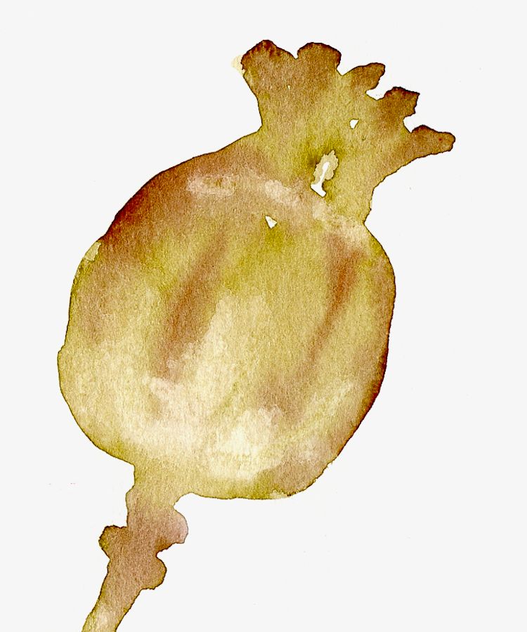
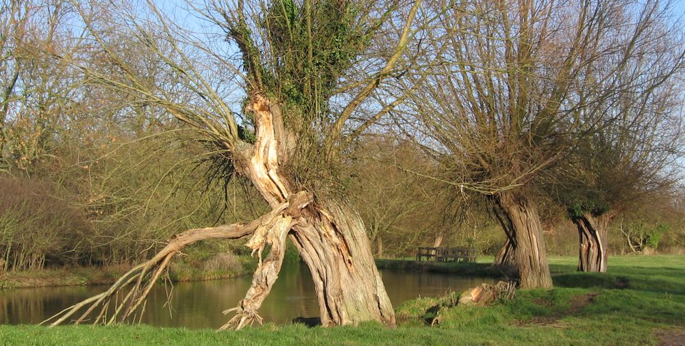
Category Archive: Natural Forms
Waterbirds in the landscape Week 6: Coots and Moorhens
October 8, 2023

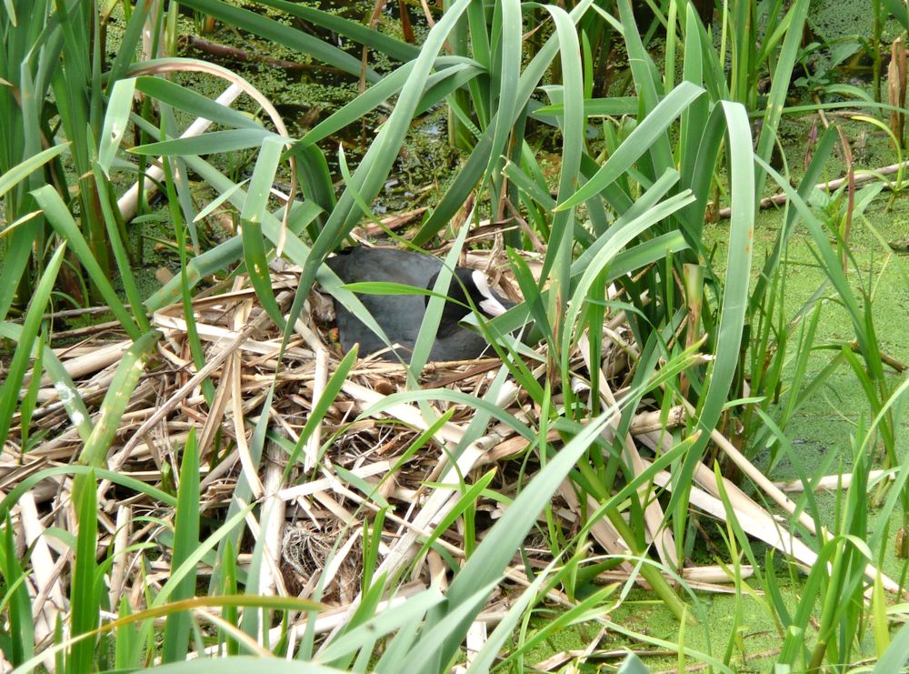
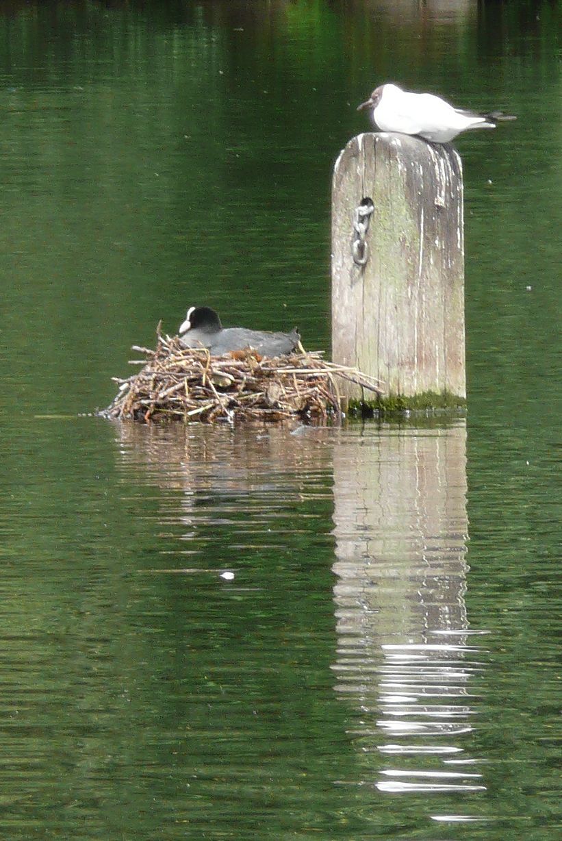
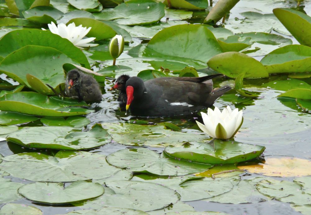
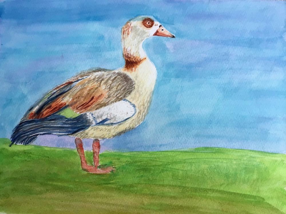
This week we have moved back to birds that definitely spend very little time flying, the coots and moorhens. Both inhabit similar riverbank situations nesting among reeds and waterlilies, however the coot prefers more open areas of water then the moorhen. Coots are the birds with a white oval shield which extends from the pale beak to the forehead. They have large feet with pale grey lobes rather than webbed feet like ducks and geese.
Try painting this bird either relatively close up with its reflection or as part of the wider landscape. Alternatively you may like the challenge of painting a coot on its nest among a calligraphic pattern of reeds; the pale straw colour of the dead leaves used for the nest contrasting with the green of the live leaves.


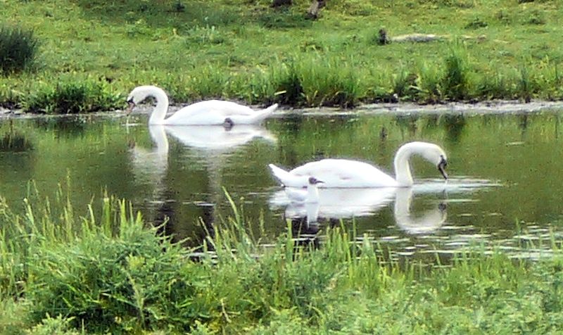
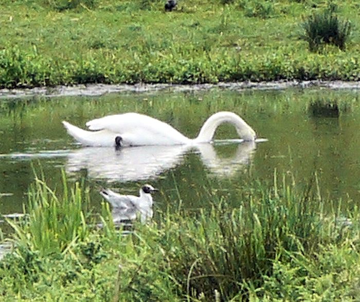
this coot swims along at the edge of the Great Ouse

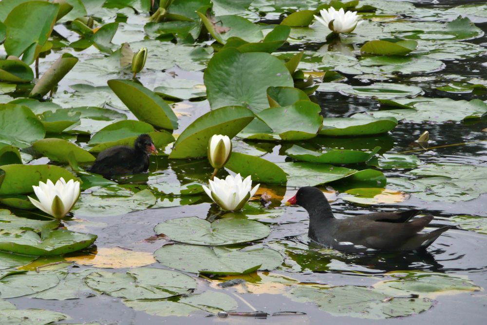
The Moorhen is also black but with a red and yellow beak, white under-tail coverts and some white wing feathers; see below.

This week make a painting that is as much about the habitat of one of these birds as about the bird itself. We’ll discuss this during the session.
Your paintings;

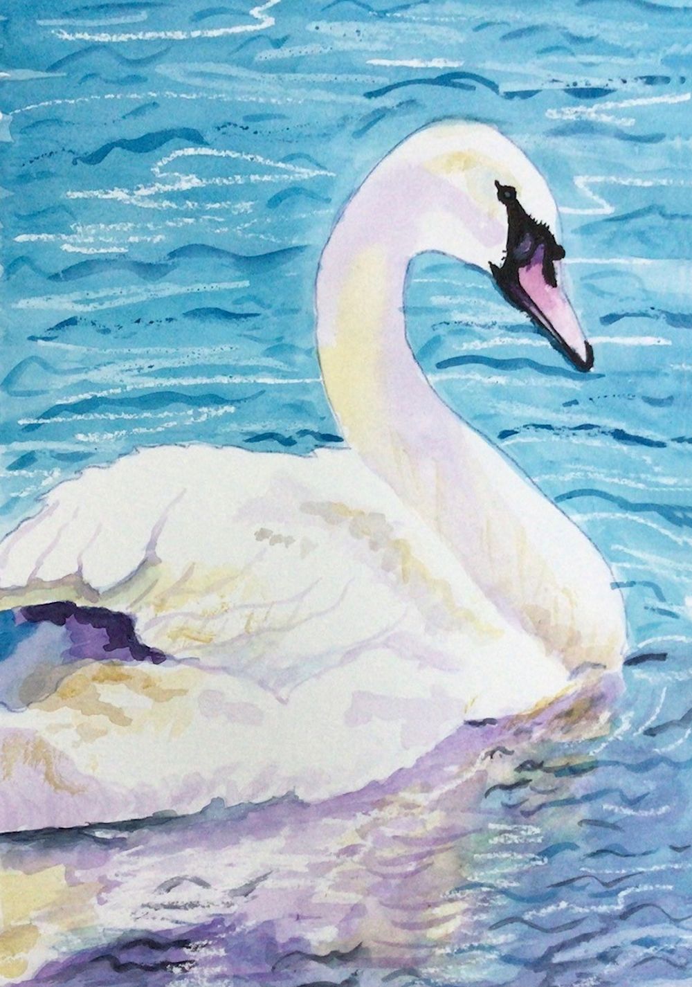
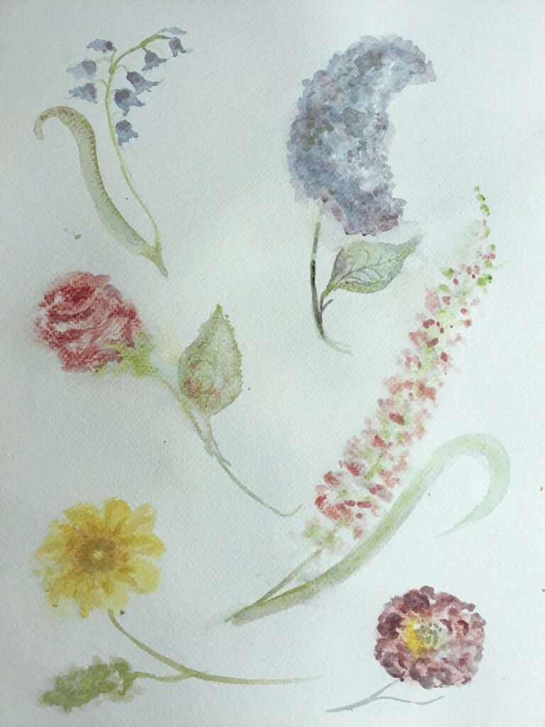
Watercolour by Maricarmen
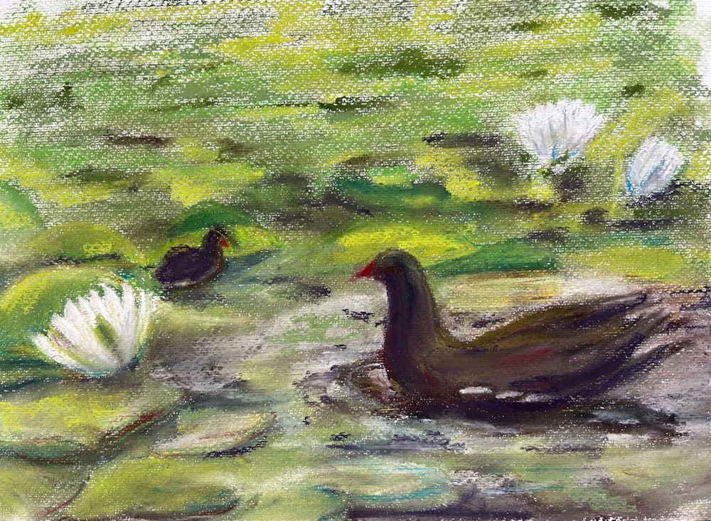
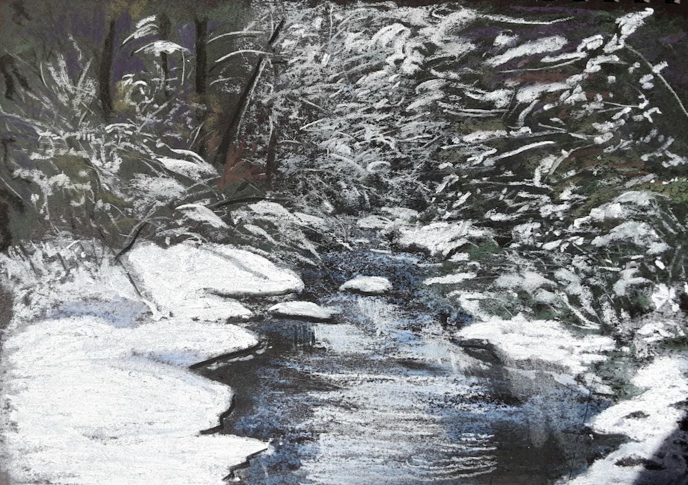
Pastel by Mali
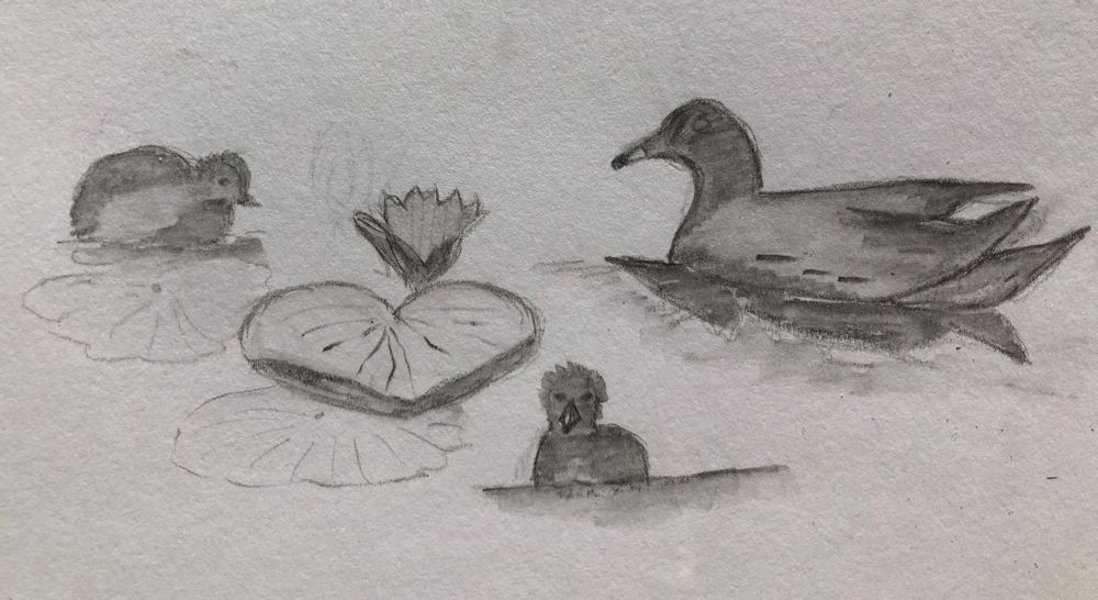
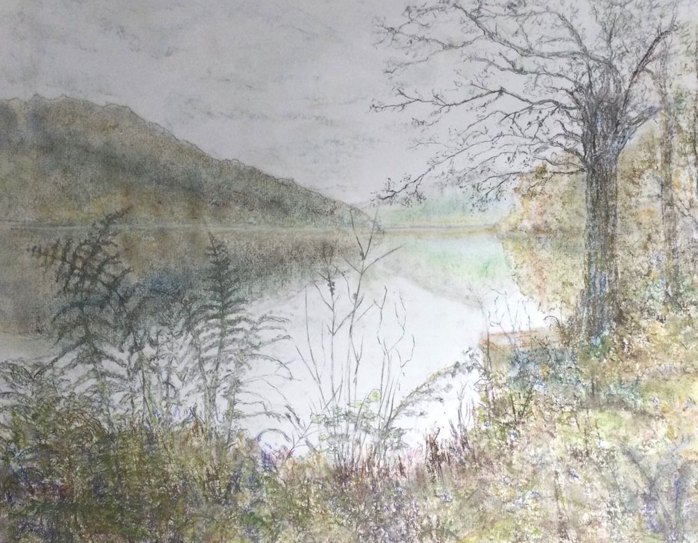
Sketch by Pamela

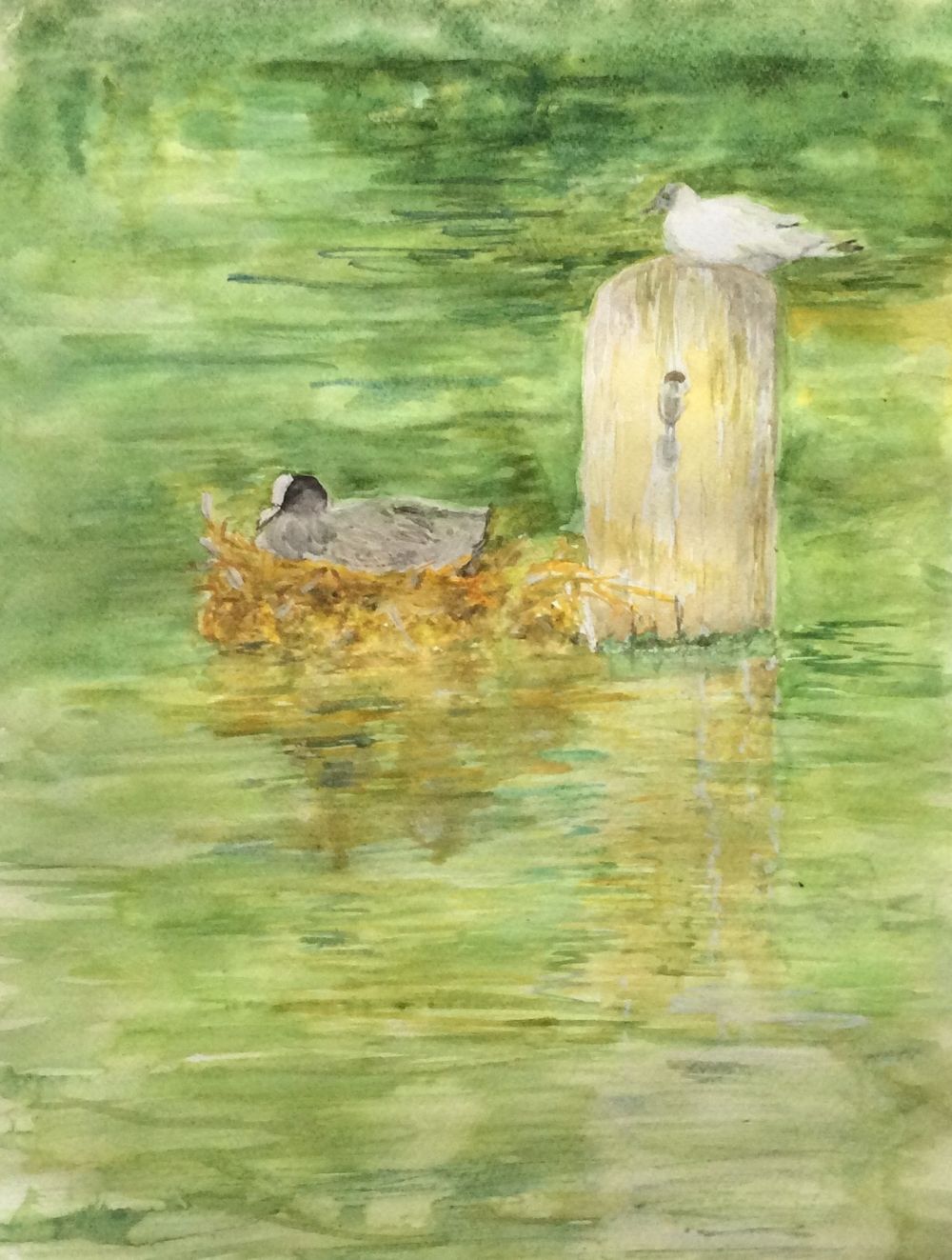
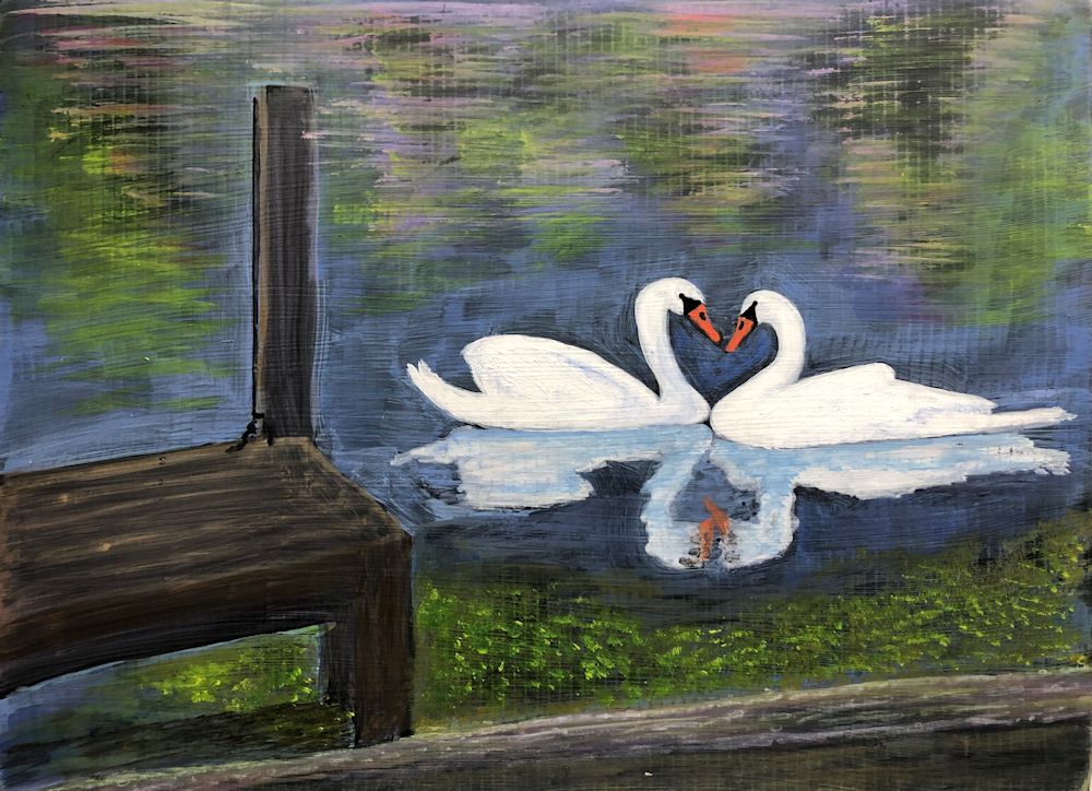
Acrylic by Pamela
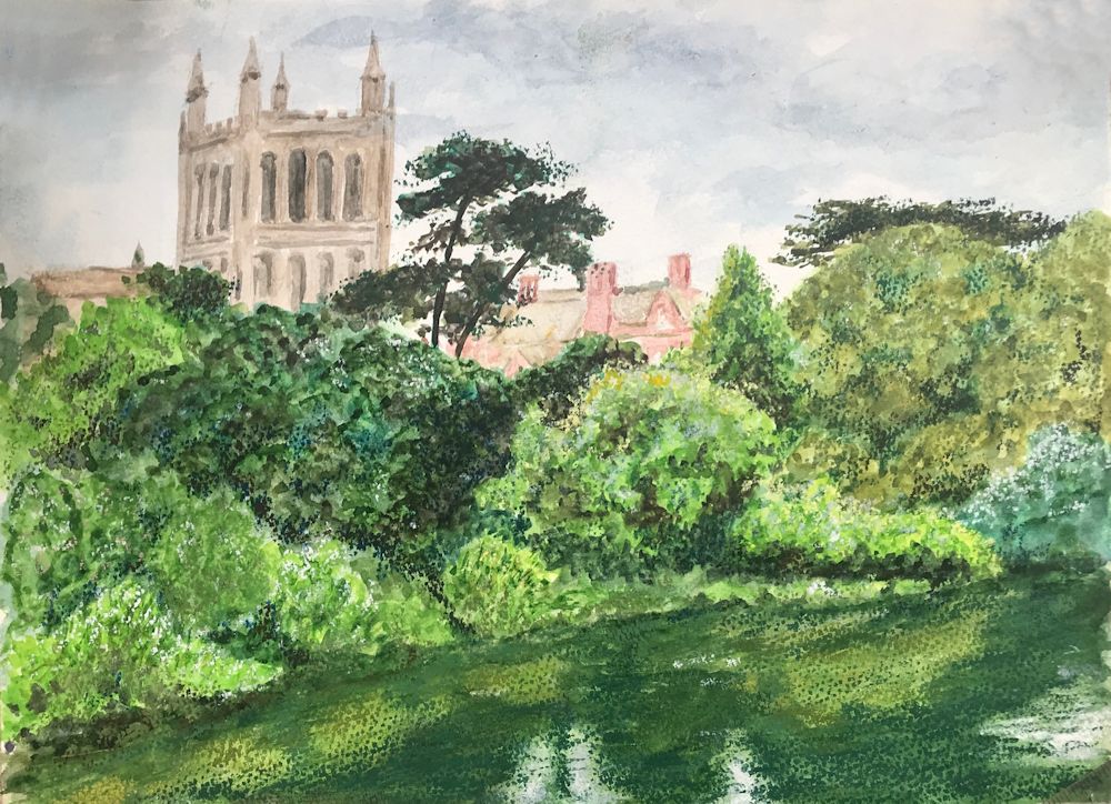
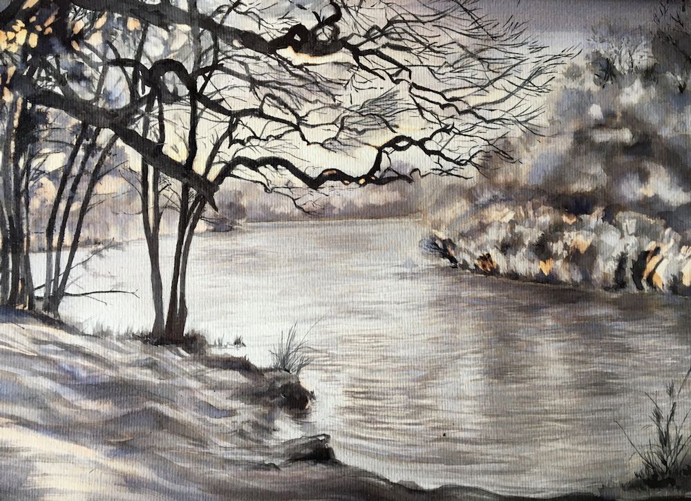
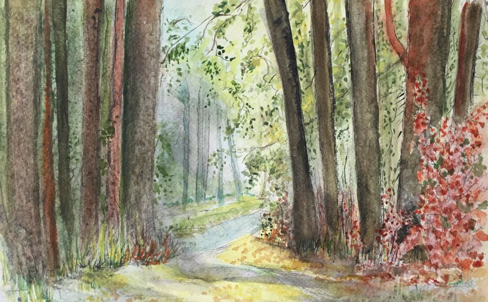
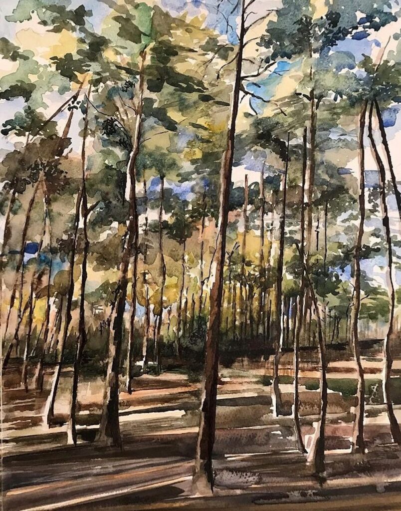
Watercolour by Virginia
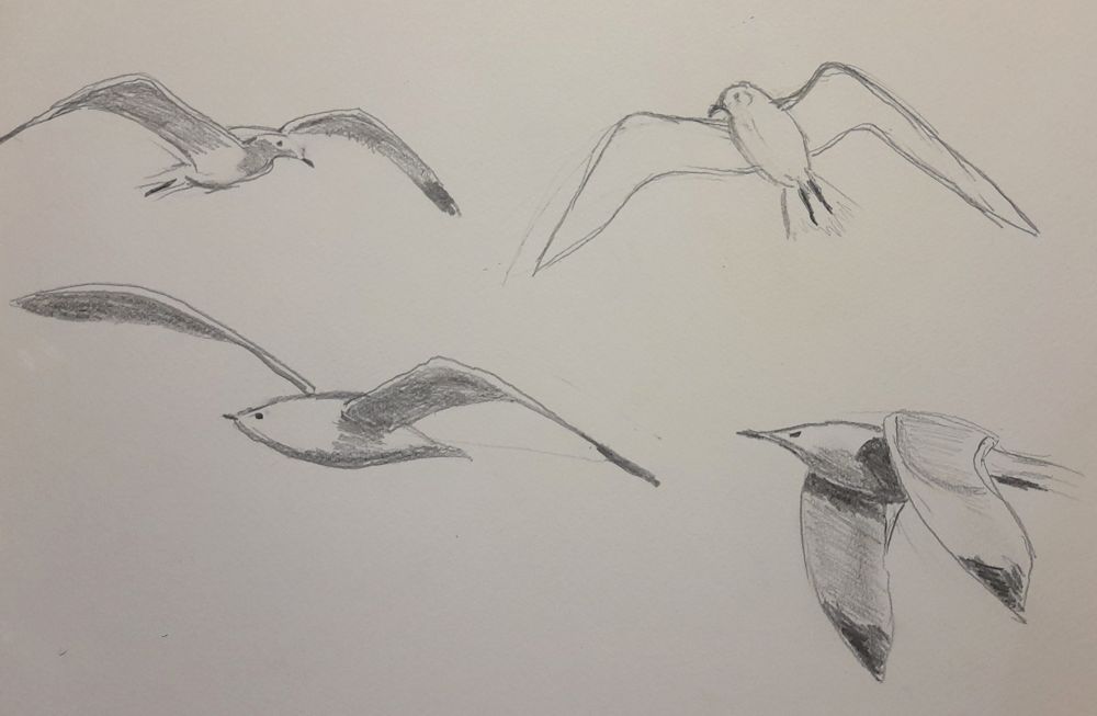
Waterbirds in the landscape Week 5: Gulls
October 2, 2023
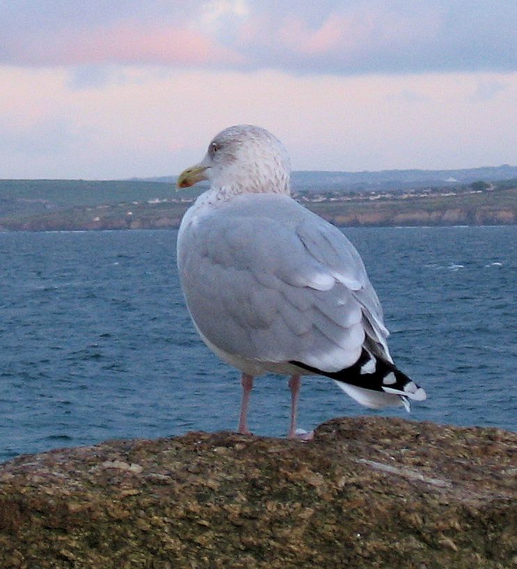
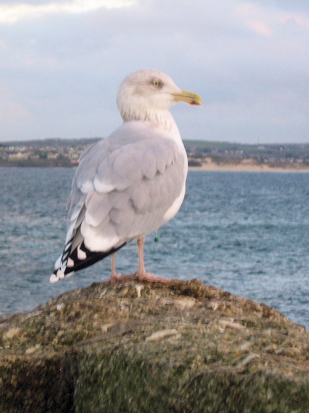
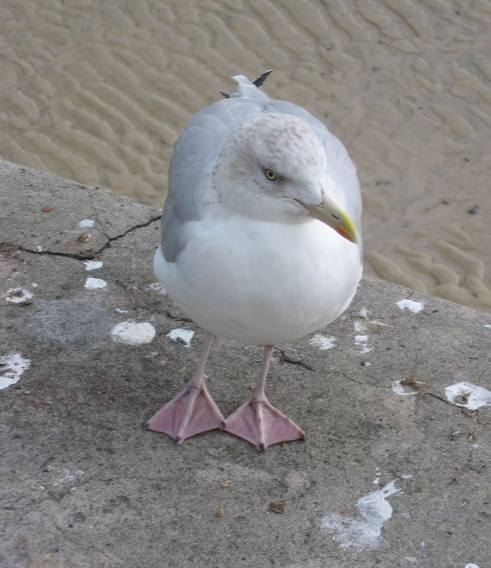
This week we’ll be looking at gulls, on the coast and further inland. Gulls spend a lot of time in the air and during the session we’ll be sketching birds in flight, on the water, and standing, before planning a painting. The herring gull above is probably one of the most familiar. It’s neck is quite stocky, head and front are pale/white, wings a slate grey with black and white wing tips and its legs are pink.
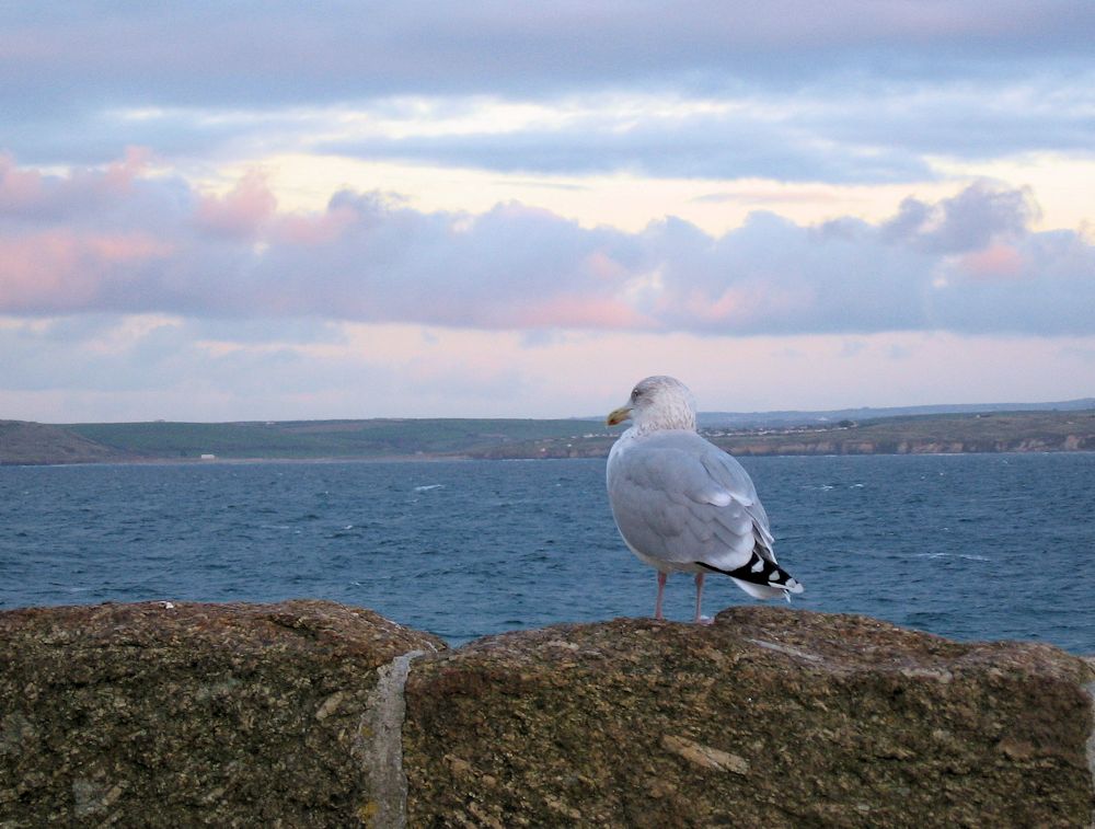
You may like to start drawing with the head, but another way is to look at the body shape as it appears from the angle the bird is being viewed. From the side the body and wings when folded form an almond shape, flatter along its back and with an added point for the wing tips. The thick neck and head shape scan then be worked on, the beak added and then the legs positioned. To ensure the bird is well positioned with relation to what it is standing on, it’s a good idea to draw this in early on and then draft the main shapes tentatively at first so that adjustments can be easily made before adding more definite marks. As you become more accustomed to the shapes, accurate observation will allow more confident and accurate lines to be made earlier on in the work.
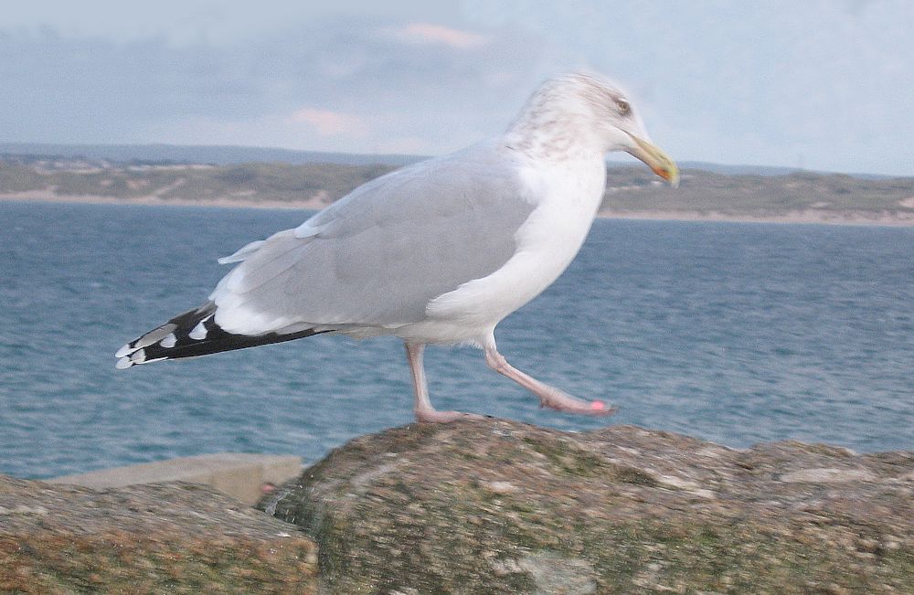
Remember to look at the overall length and breadth of the bird and where it is to be placed on the page. If much of the landscape is included think about the scale of the bird in relation to its surroundings.

You may like to consider a painting with more than one bird and/or different kinds of bird.
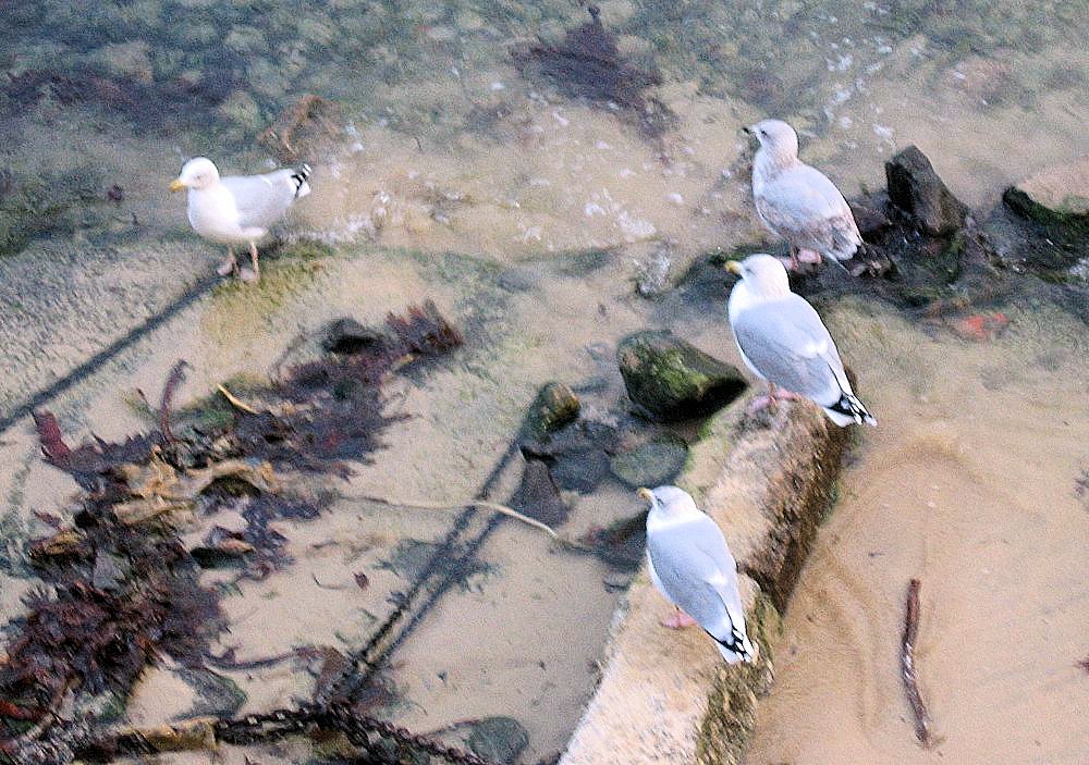
The photos below were taken in Kensington Gardens where there were herring gulls, great black backed gulls and black-headed gulls; some of which looked distinctly brown headed!


As in previous weeks think about the composition of your painting.


The image above gives a good clue to next week’s session when we’ll be looking at Coots and Moorhens.
Your Drawings and Paintings:

Acrylic by Mali
Sketch by Mali
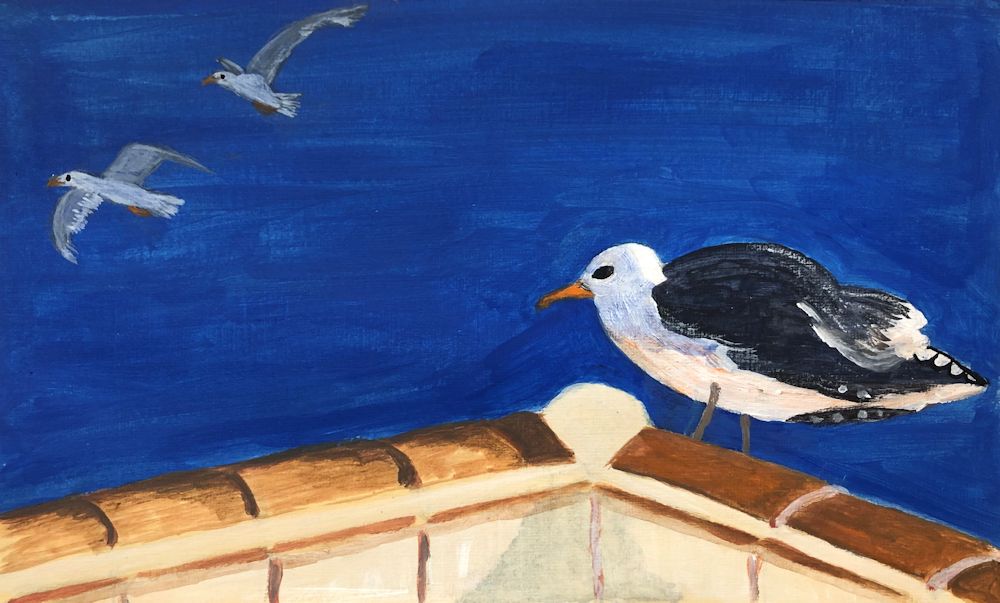
Watercolour by Maricarmen

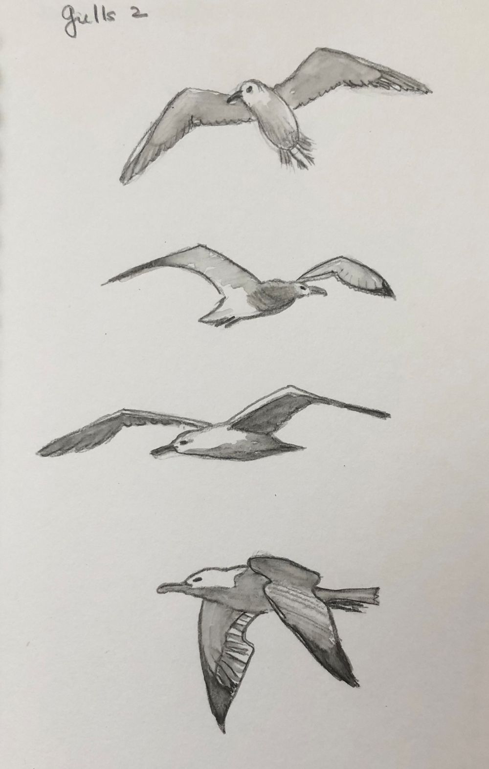
Sketches by Maricarmen
Acrylic by Pamela

by Pamela
by Pamela

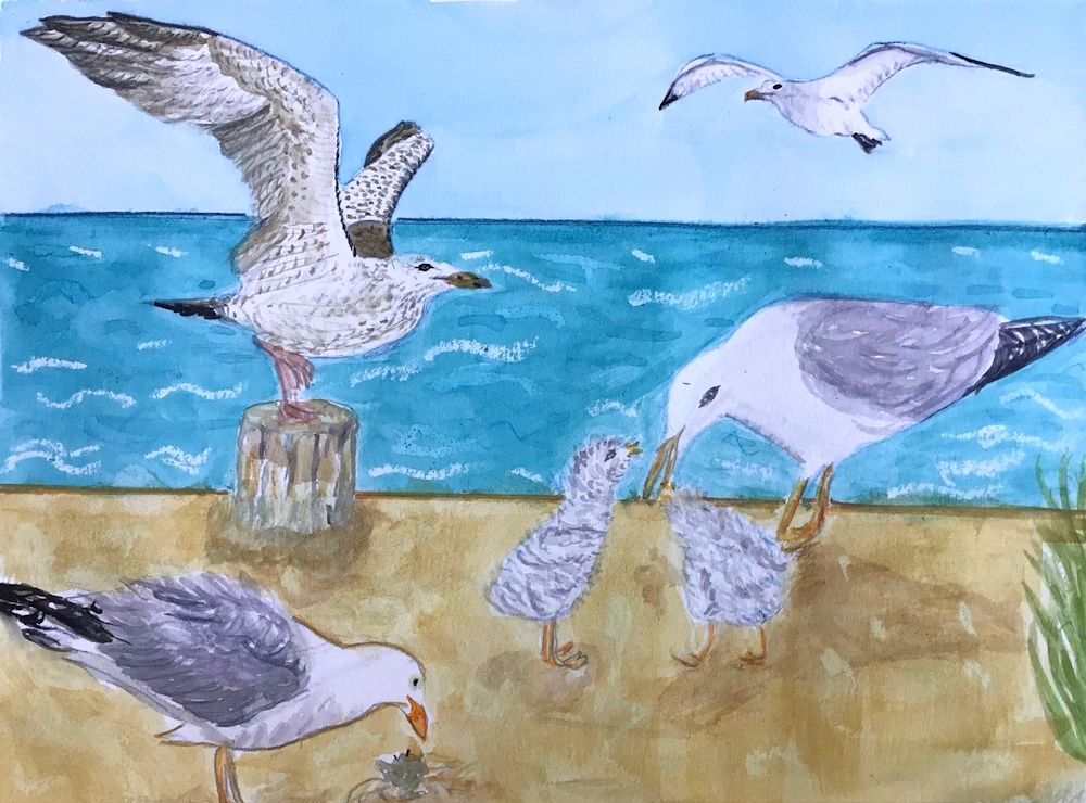
Watercolour by Virginia

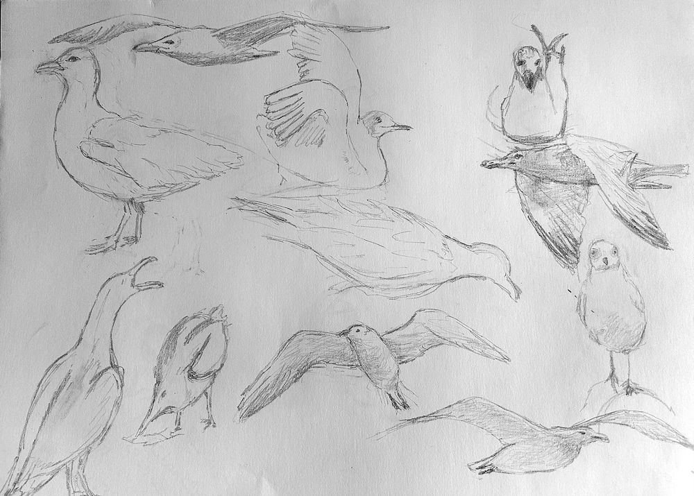
Sketch 1 by Kate
Sketch 2 by Kate
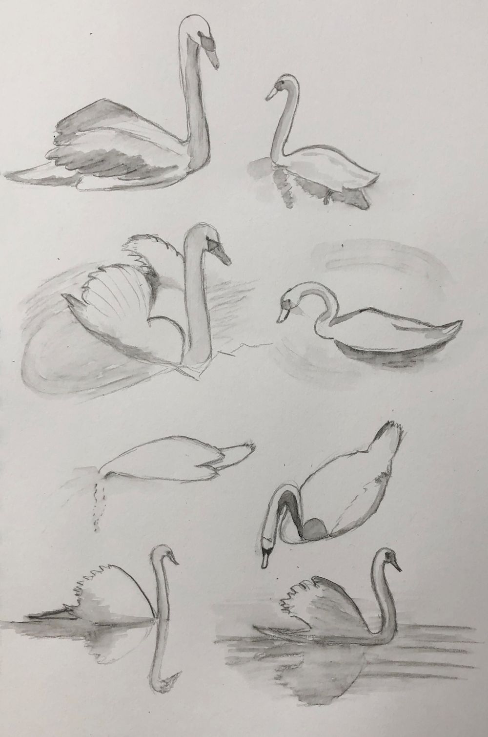
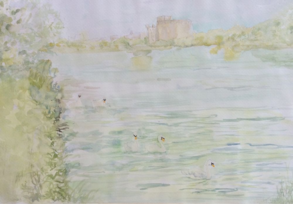
Waterbirds in the Landscape Week 4: Swans
September 24, 2023
Photos in this post are taken by me or my younger son and we are happy for you to sketch from them.
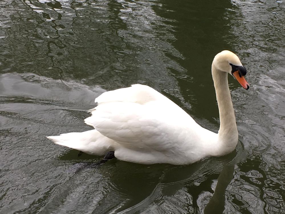
This week we are looking at the Mute Swan. It is the one you will all be familiar with and is easily distinguished from Bewick’s and Whooper swans by its orange beak and the bump above its beak. The other two swans are mainly winter visitors and have black beaks with a yellow patch. They also hold their necks more stiffly upright than the mute swan.
We’ll start by looking at the general form of the swan, mainly in the water, but I would also like you to consider the surrounding landscape paying particular attention to how much of the wider stretch of water and riverbank you would like to include in your painting.
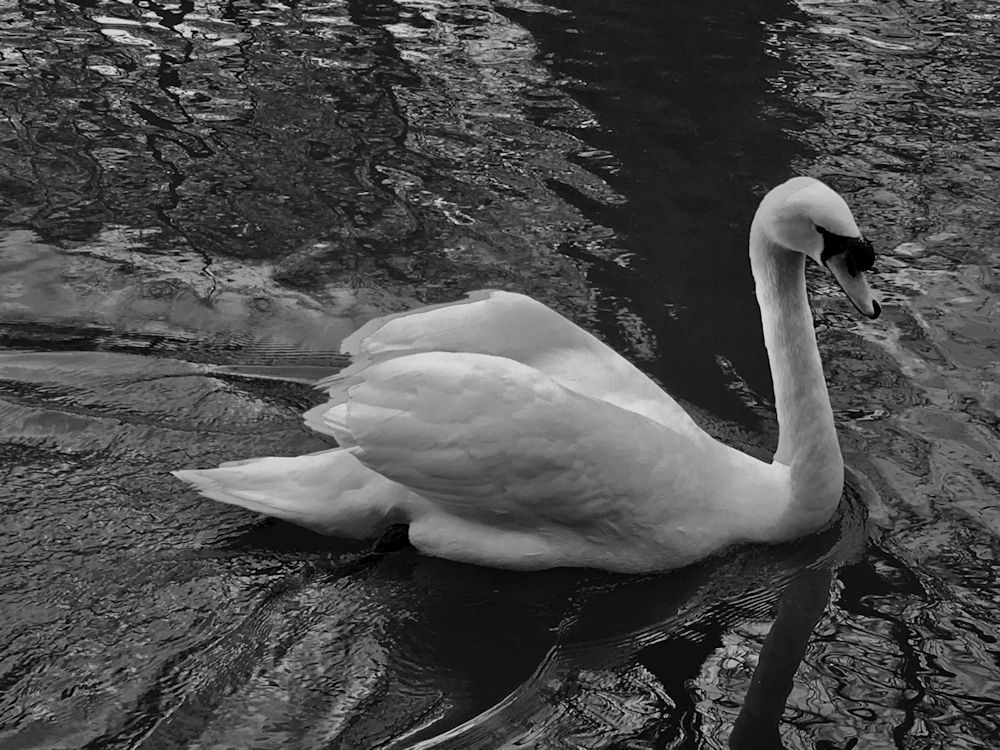
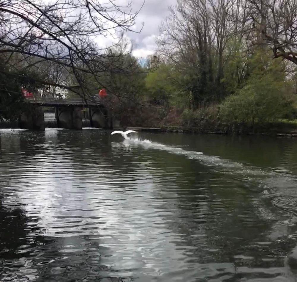
Unlike the geese and ducks swans often swim with their wings slightly elevated as in the photo above but as you will see from photos later in the post they are just as happy to have them closely folded. Take some time to look at the grey-scale image above. The body is lying fairly flat in the water. Its tail feathers when down come to a graceful point and it is easy to see the form of the wings and their relation to the body and neck. Look at the angle of the neck and how it curves to join the body. Also look at the angle the head makes with the neck. If you are working from a photograph it is easy to measure to check overall widths and height and perhaps make a note of what proportions a rectangle just enclosing the whole bird makes. This will help you check its overall shape. Drawing the rectangle will also help you check the angles of the swan’s form in whatever “pose” it is taking up. The swan has 25 vertebrae in its neck whereas all mammals have only seven so it is no wonder the swan has such a mobile neck.
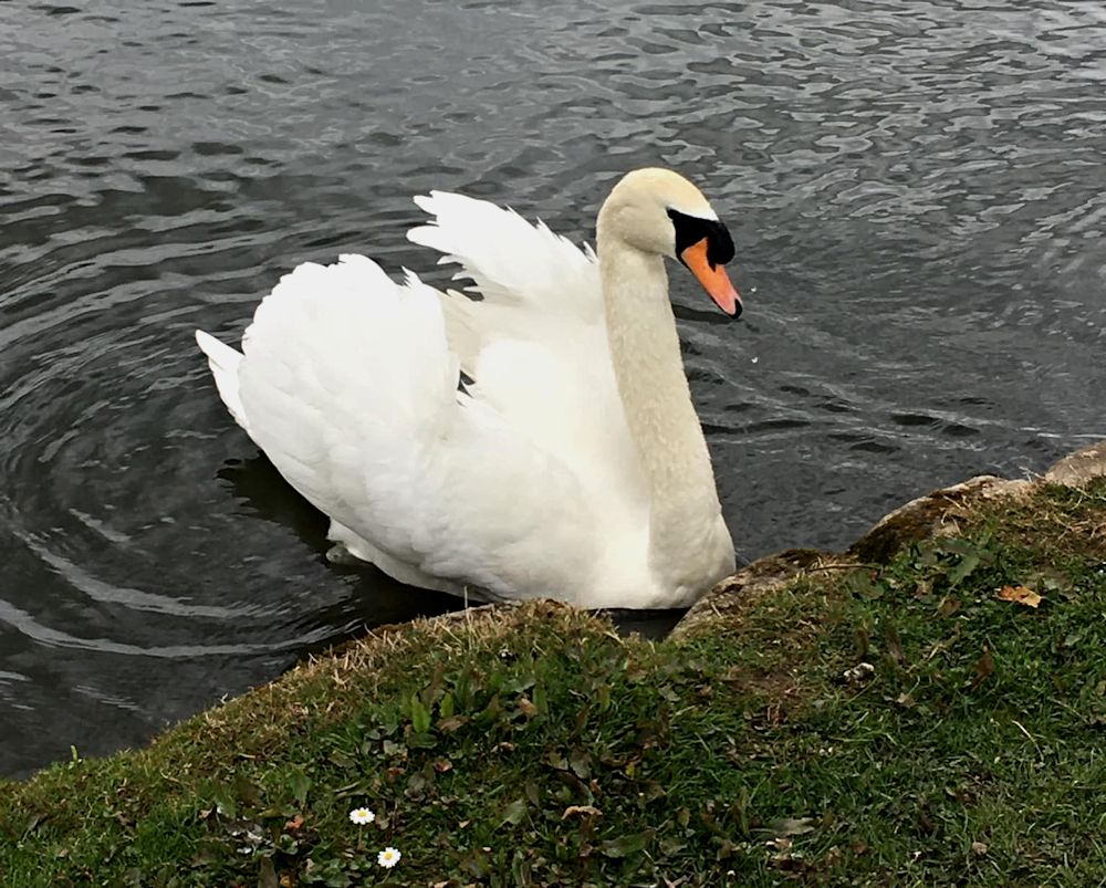

The photos immediately above and below show a swan taking flight from the water. The riverbank and the river and reflections give the bird its context. There is also the excitement of the disturbed water and reflections. If working in watercolour you will have to decide on whether to mask the swan, or paint around its pale form, or to use white gouache. You will also have to decide on how to represent the splashes of water; with spattering (white gouache or masking fluid or whether to scrape out with the tip of a craft knife as a final touch. If you are using pastel on toned paper you may be able to draw all with pastel but it is fine to add any small white highlights with gouache. Alternatively you may like to work in acrylic or a mixed media approach. Whatever media are used remember to experiment a little first on a separate piece of paper.
The two images below are the same photo’ cropped differently; the first gives a much better idea of the wider expanse of water and of the trees reflected in the water. Look at the tonal shift in the water as well as the high contrast of the swans against the water
If you don’t like the harsh line at water’s edge you may consider painting vegetation there instead or continuing with water. The photograph does not have to be followed completely; it is only a starting point. Within that do try to make the birds appear convincing though.


In the images above and below, elements other than the swan are important to the composition. Above we see the boat beyond the swan and also the swan moving through the reflection of the boat. There is a colourful interplay of shapes including the swan’s reflection and that of various parts of the boat.
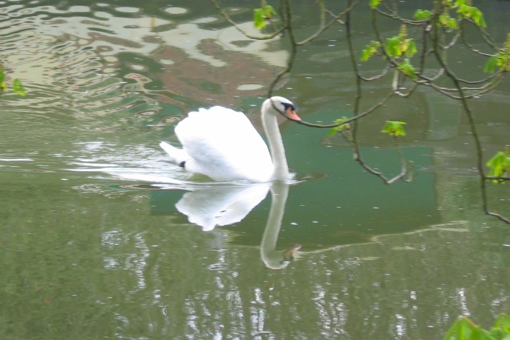
In the more closely cropped image below, the swan takes centre stage but is still moving through an interesting pattern of tone and colour, in water only disturbed by the movement of the swan. Whether the branches hanging down from the top of the photo should be included is a decision for the artist but it would be a good idea to alter the position of the branch that cuts across the back of the swan’s head and follows the line of its beak. Always look out for objects causing similar difficulties in reference photos.

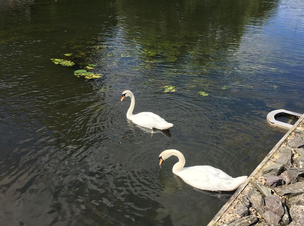
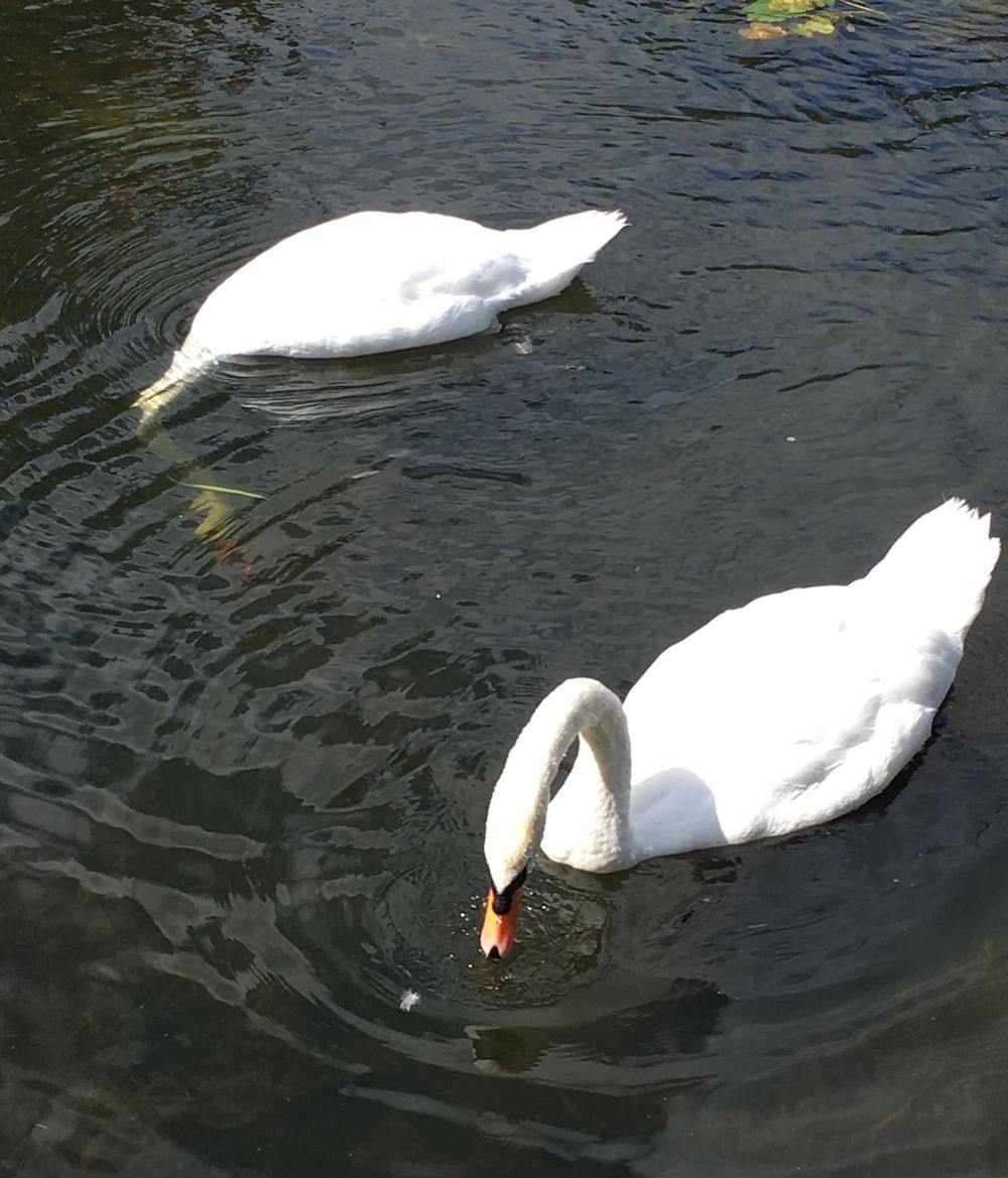
I was interested to see this rather disorderly brood of cygnets swimming ashore. Observe how the swan’s reflection is broken by the ripples in the photo above and how much more of the swan’s form is reflected in the calmer water of the image below.

Lastly, two images from a still water lagoon on the Great Ouse; I was intrigued by the shapes made by the swans and their reflections.
During the session we will make rapid sketches from some of these photos as a prelude to working up a more considered composition including more of the landscape/surrounding water. Hope you have enjoyed looking at these photos and looking forward to seeing work inspired by these photos, or your own reference, or better still from your own sketches made from the riverbank.
Your Paintings:
Watercolour by Maricarmen

by Maricarmen
Acrylic by Pamela
Sketches by Pamela

by Mali
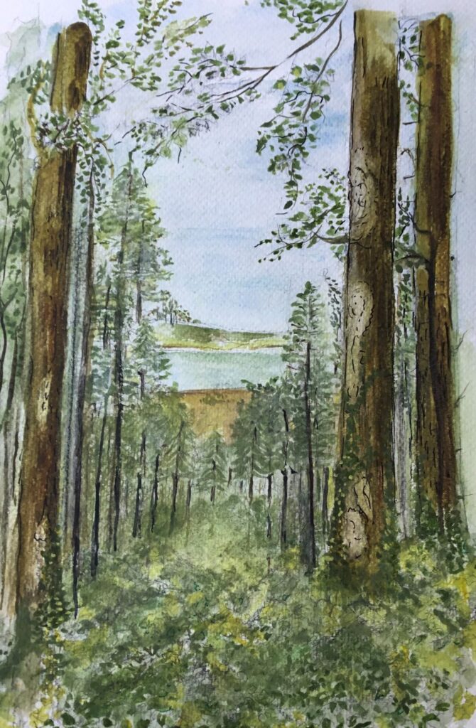
Watercolour by Virginia

by Kate

Acrylic by Kate
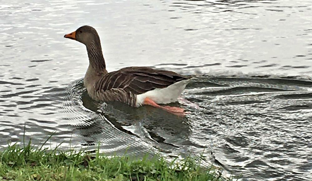
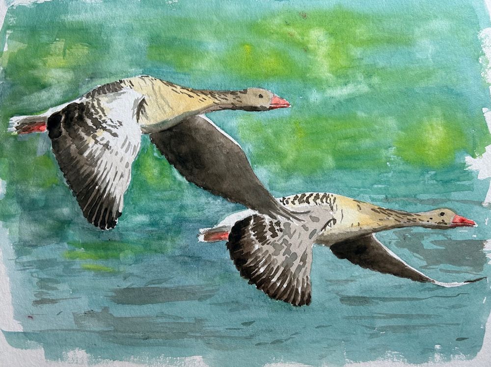
Waterbirds in the Landscape Week 3: Geese
September 14, 2023
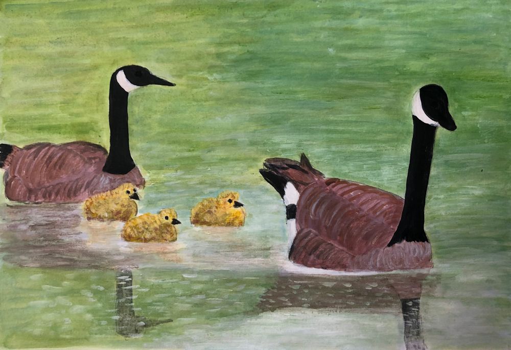
Geese are like ducks with longer necks and can be seen as often out of the water as in it. This post includes photos of the Greylag Goose and the Canada Goose we are all familiar with. Take some time just to look at the various “poses”.
Body shape of the goose above is very much like a duck. Come to grips with this before adding the neck, head and leg as it paddles through the water. The Greylag Goose has a heavy orange beak, mottled mid and dark grey plumage on its neck, paler grey on its upper body and white below.
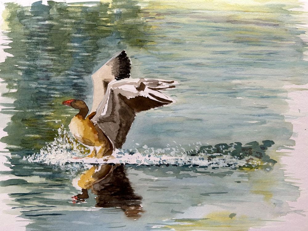
Below are photos of a Greylag landing, using its feet like water skis. Below the second photo is a version that has been flipped horizontally so you can practice drawing a landing from a different direction. Note the shadow areas under the wing as well as their shape and include the reflection as well as the splash!

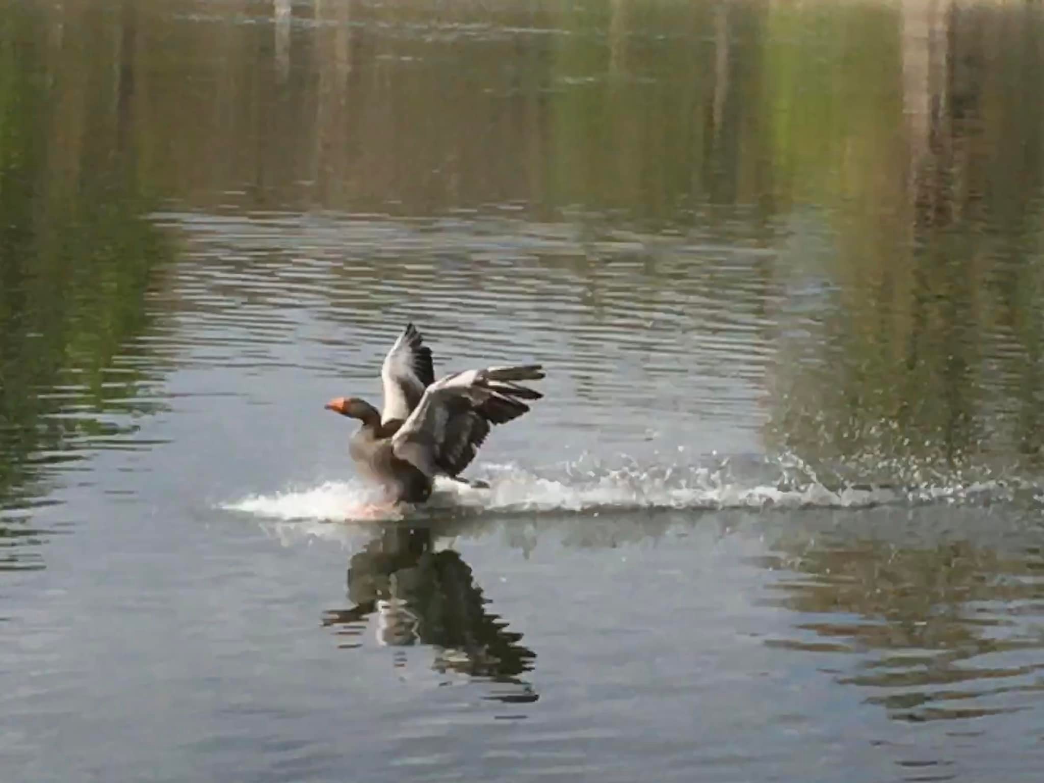
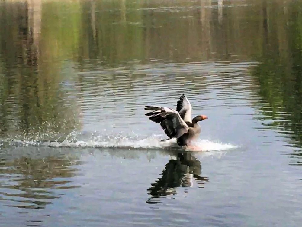
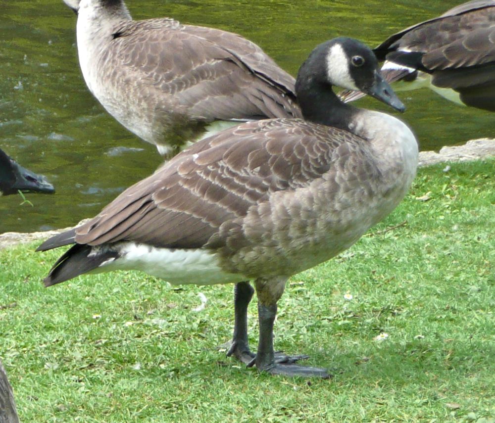
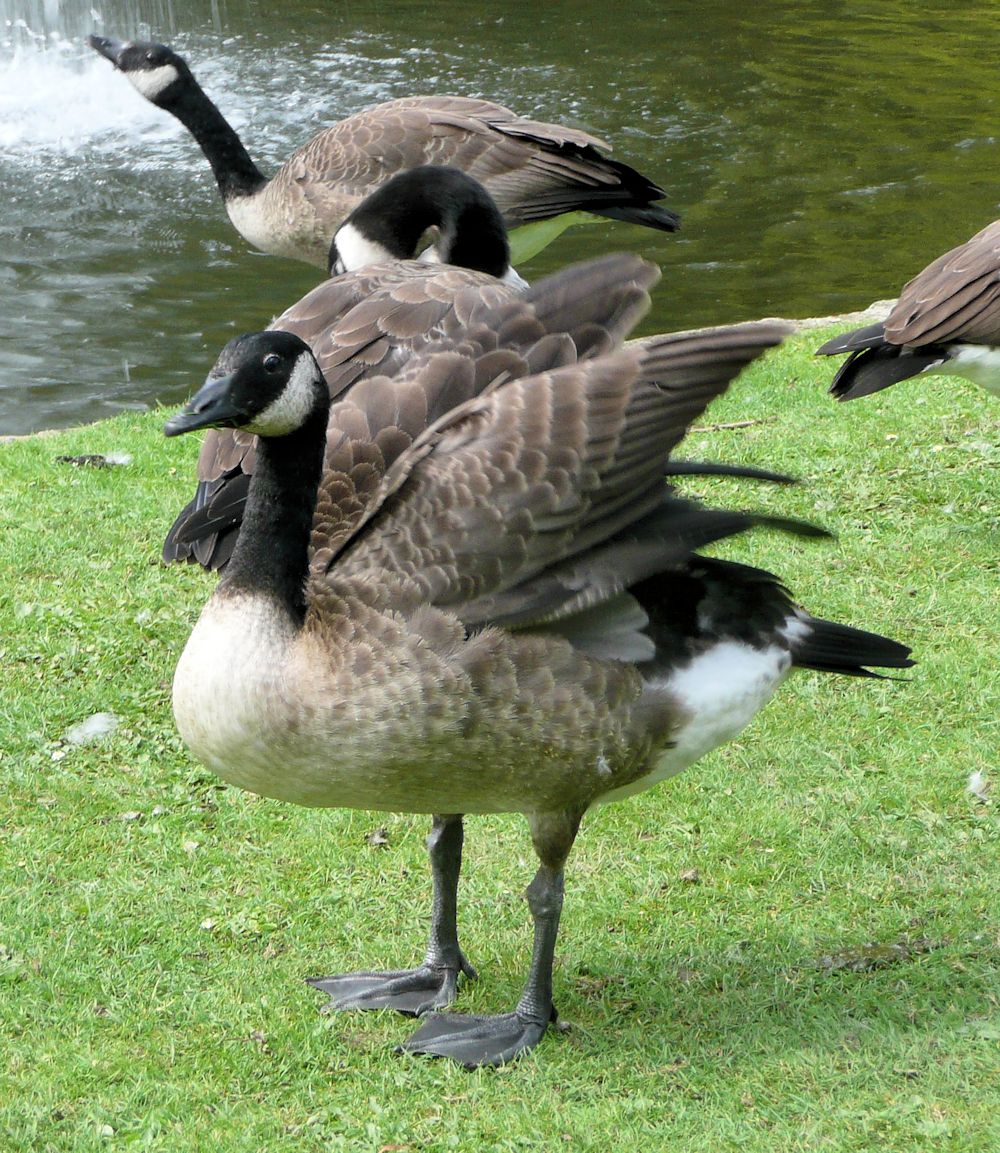
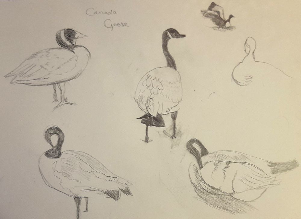
Photo below is of a Canada Goose standing with its neck and head pulled back against its body. Note the position of the legs, about halfway down the body so it appears perfectly balanced. If seen directly from the front the neck would be directly above both legs. If the goose was moving forward the neck would tend to be directly above the leg that was doing most of the load bearing and would shift from side to side as the goose moves forward. This together with the plump appearance of the well feathered body creates the familiar waddling gait of geese and ducks.

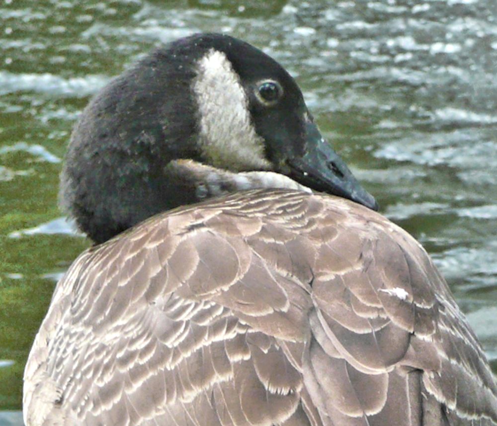
A long flexible neck is a great aid to preening.
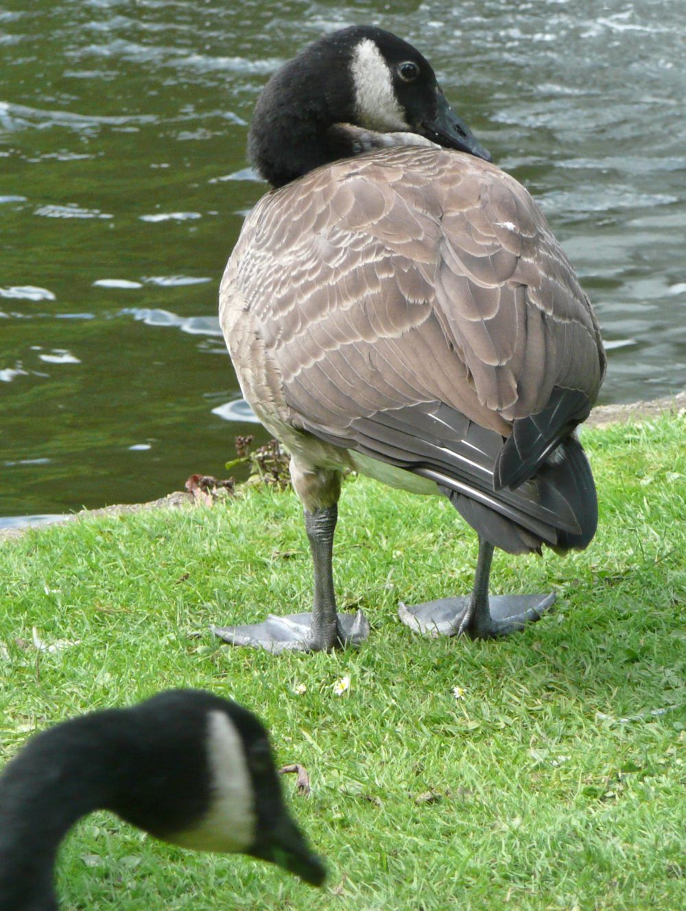
Note the shape from the rear and the well balanced form, and also the rather round dark eye.


We’ll make some rapid sketches during the session using a slide show of the photos above. If you have several photos of a particular goose in several different positions feel free to use your own; after all that is a bird you will have already observed. The choose one image and make a more considered bird portrait or composition of a goose in a landscape setting taking special note of movement of the water, reflections and of balance where the bird is standing.
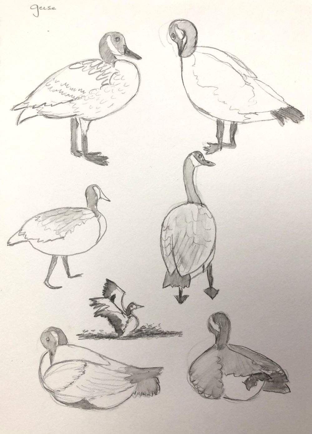
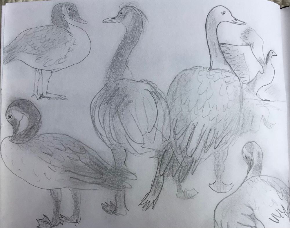
Your drawings and paintings:

Watercolour by Mali
Watercolour by Mali
Watercolour by Mali
Sketches by Mali
Quick Sketches by Pamela
Watercolour by Pamela
Sketches by Kate

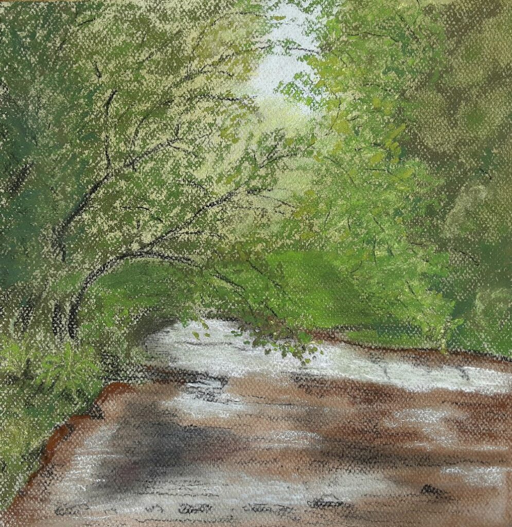
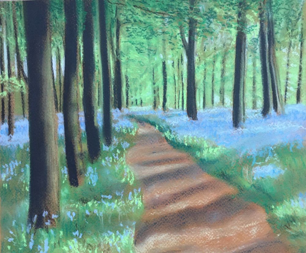
Mixed media by Virginia
Sketches by Maricarmen
Watercolour by Maricarmen
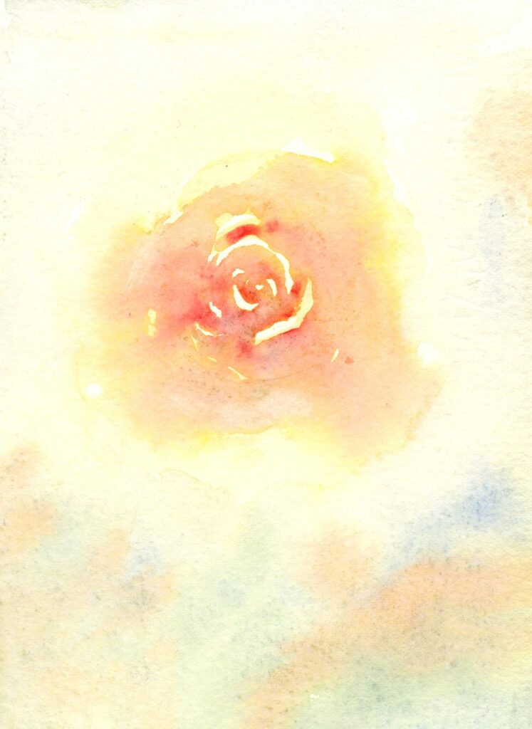
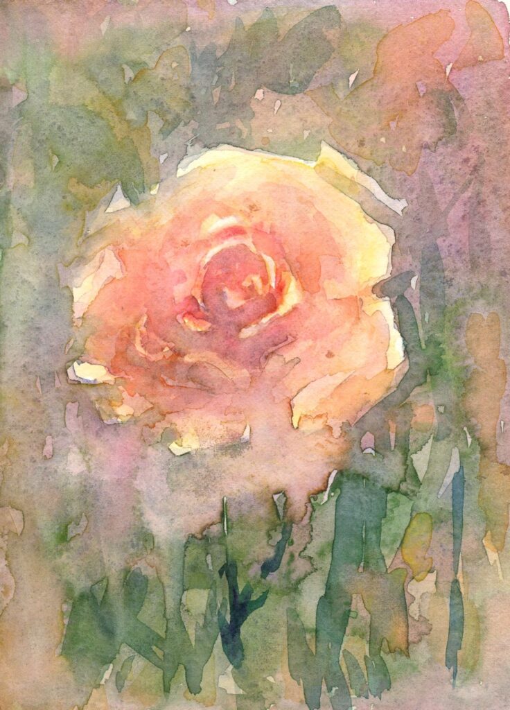
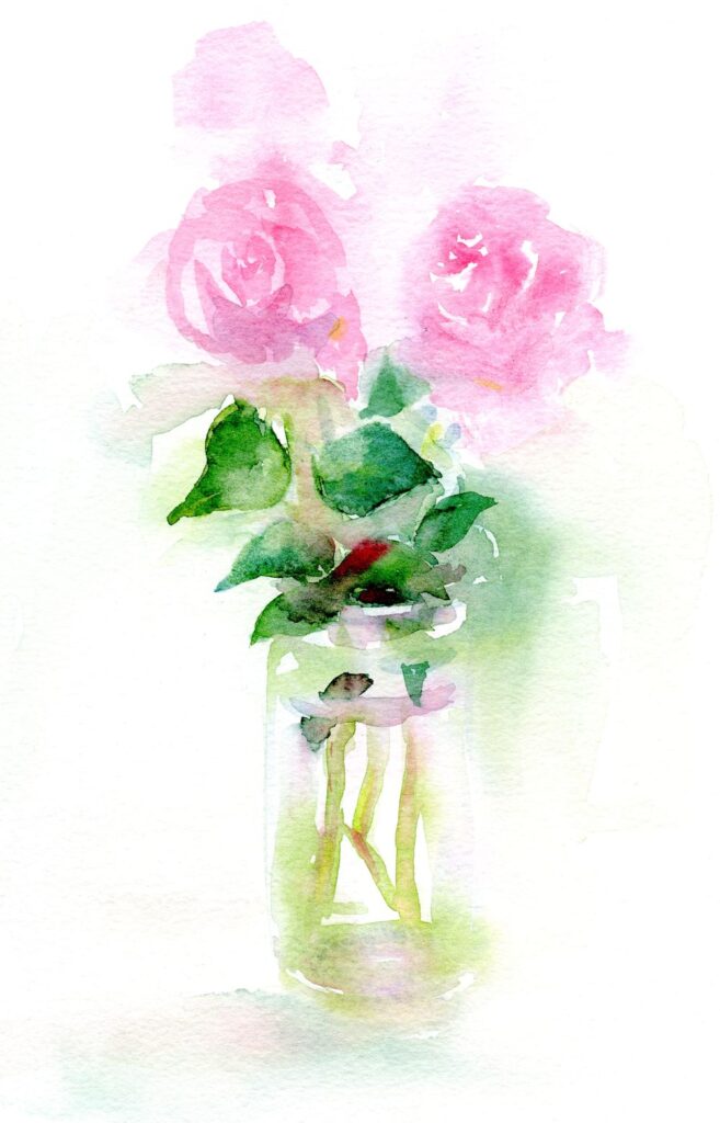
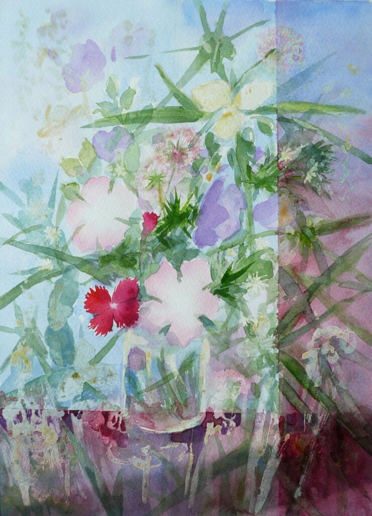
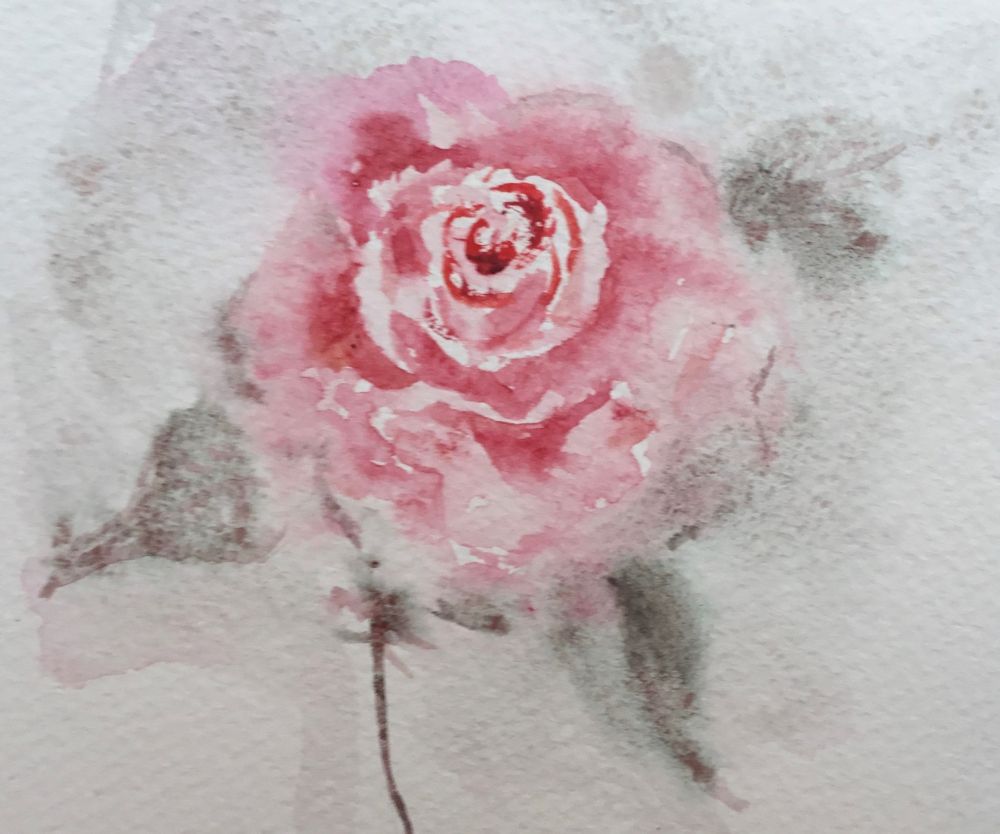
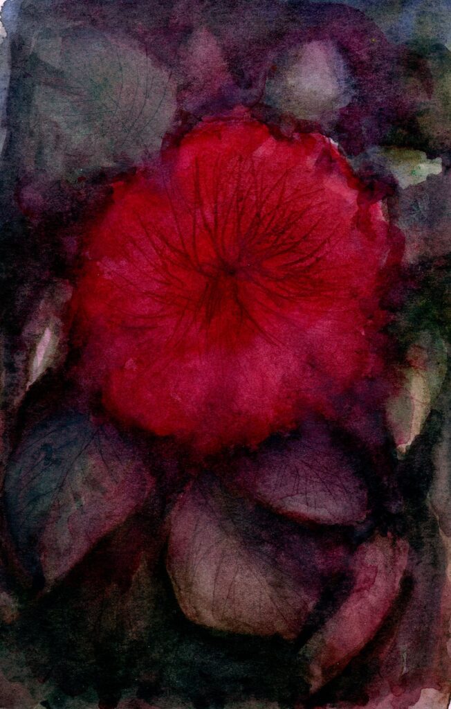
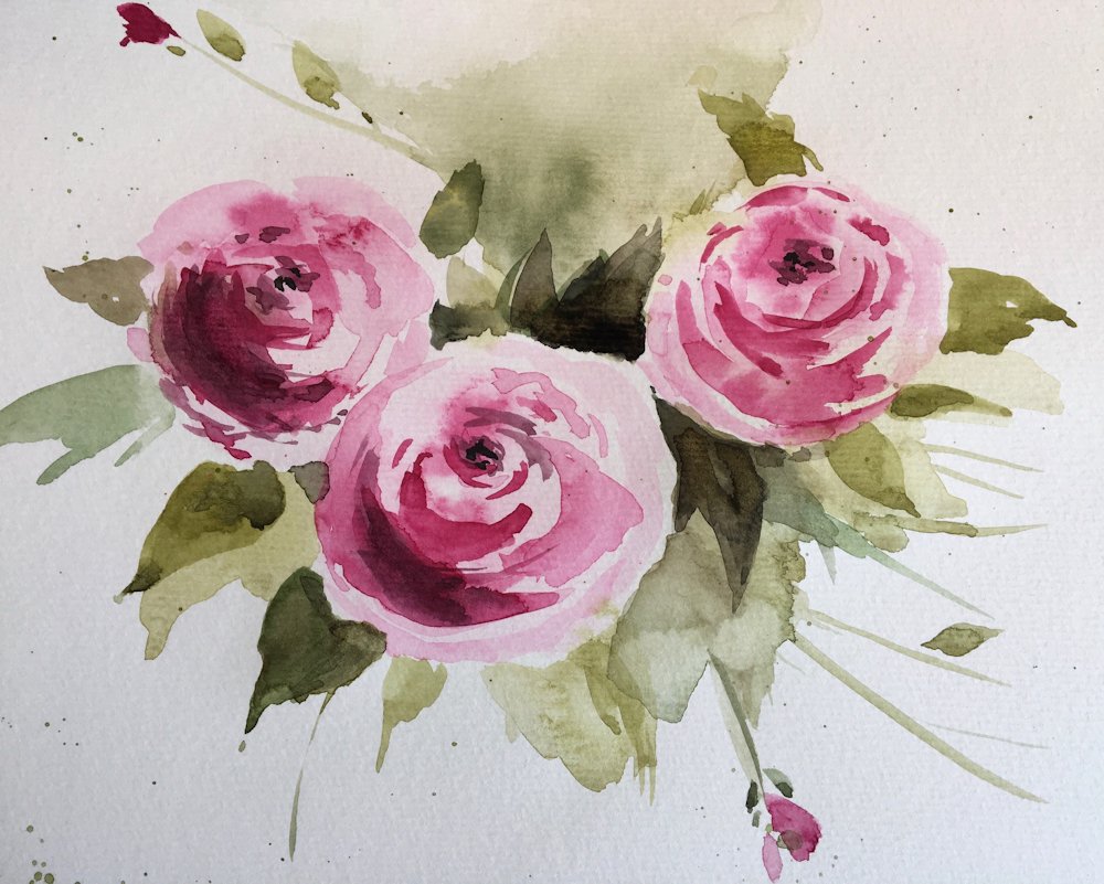
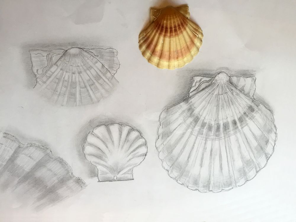
Watercolour Flowers Week 5: Rose
May 27, 2022
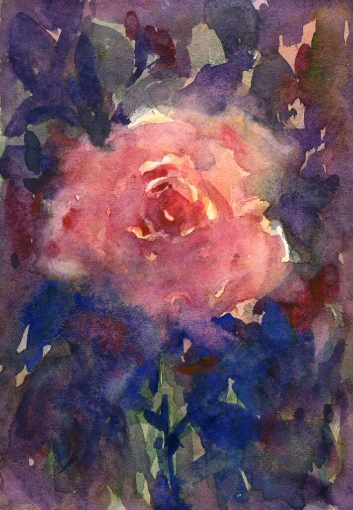
Painted mainly wet in wet
This week’s challenge is to paint a single rose or small group up to two and a bud. We’ll try two ways of working one largely wet in wet and also perhaps look at the use of masking tape in addition to the masking fluid used last week to make some interesting textures and compositions.
I could have stopped there.
Much of the time will be spent looking and choosing the pigments best suited to your particular rose, thinking in terms of using no more than three pigments.
1. Look at tone;
Thinking tonally becomes even more important when painting single flowers so it is important to take note of how light falls on the bloom. In strongly directional light the darker side of even the palest rose may appear quite dark. Conversely the better lit side of the deepest rose may appear surprisingly light in colour. Observe how the light affects each individual petal revealing their spiral arrangement. If a flower is seen against the light as when placed in a window with the light behind it, the whole form may appear dark and almost silhouetted against the incoming light.
2. Look at the form and shapes;
Try turning your rose so that you are looking straight down at the flower and take note of the spiral arrangement of its petals. Then turn it slightly away from you and notice how different it looks, finally turn the flower so you are looking at it from the side. It may be helpful to make rapid sketches of your rose at these different angles to familiarise yourself with the shapes.
3. Choose pigments
Decide on the pigments best suited to paint your rose. Try to limit this to three. This will help unify the study and help prevent muddy mixes especially if you are able to use transparent colours for most of the painting. Try out mixing colours in the palette as well as seeing what happens when one colour is dropped into another while it is still wet.
4. Background;
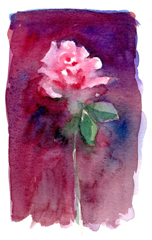
Rich dark background
Pale background giving a much cooler look.
The background may be composed of the foliage surrounding the bloom, a colour and tone which is observed or may be your choice. The hue and tone of the background will greatly affect the mood of the study. Another important element will be to decide on the tone and hue of the background which can greatly affect the mood of the painting.
Another interesting approach to have fun with the composition and the background is to apply some initial washes and allow them to dry and then apply low tack masking tape. The demonstration below is how last week’s composition has developed so far. This could easily be done with a much simpler study and can be very useful if your background is a window or edge of a wall.
This was painted into in places, allowed to dry thoroughly before carefully removing the tape.
Further washes were then applied.
In this week’s session I will start a wet in wet rose and while the first washes dry I’ll progress the posy, adding more washes, a few details and a little gouache. Some of the masking fluid was very free mark making so now it has been removed I have a rather different painting to develop!
Do take a look at Trevor Waugh’s roses, Pinterest link below: https://www.pinterest.co.uk/jhall1282/flower-painting-in-watercolour/trevor-waugh/
and another look at Shirley Trevena’s work at
https://www.pinterest.co.uk/jhall1282/flower-painting-in-watercolour/shirley-trevena/
Have some small pieces of cold pressed watercolour paper at the ready or tape off some areas on a larger sheet for your wet in wet studies of a single rose. There is then scope for allowing washes to dry while another study is started.
A hair dryer greatly speeds the process!
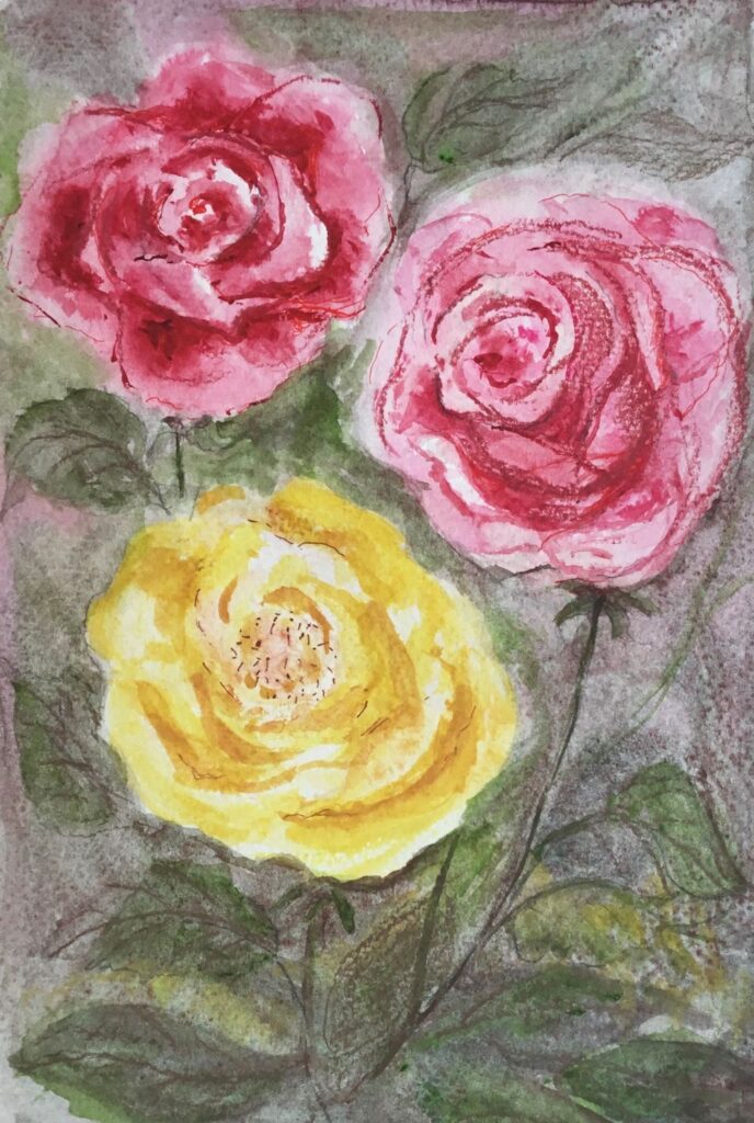
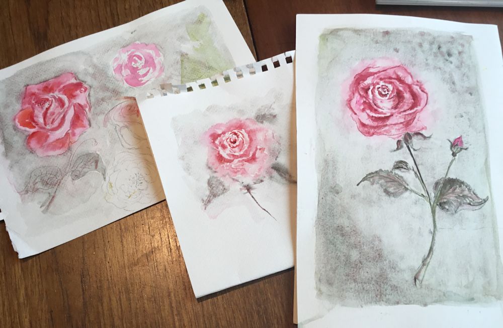
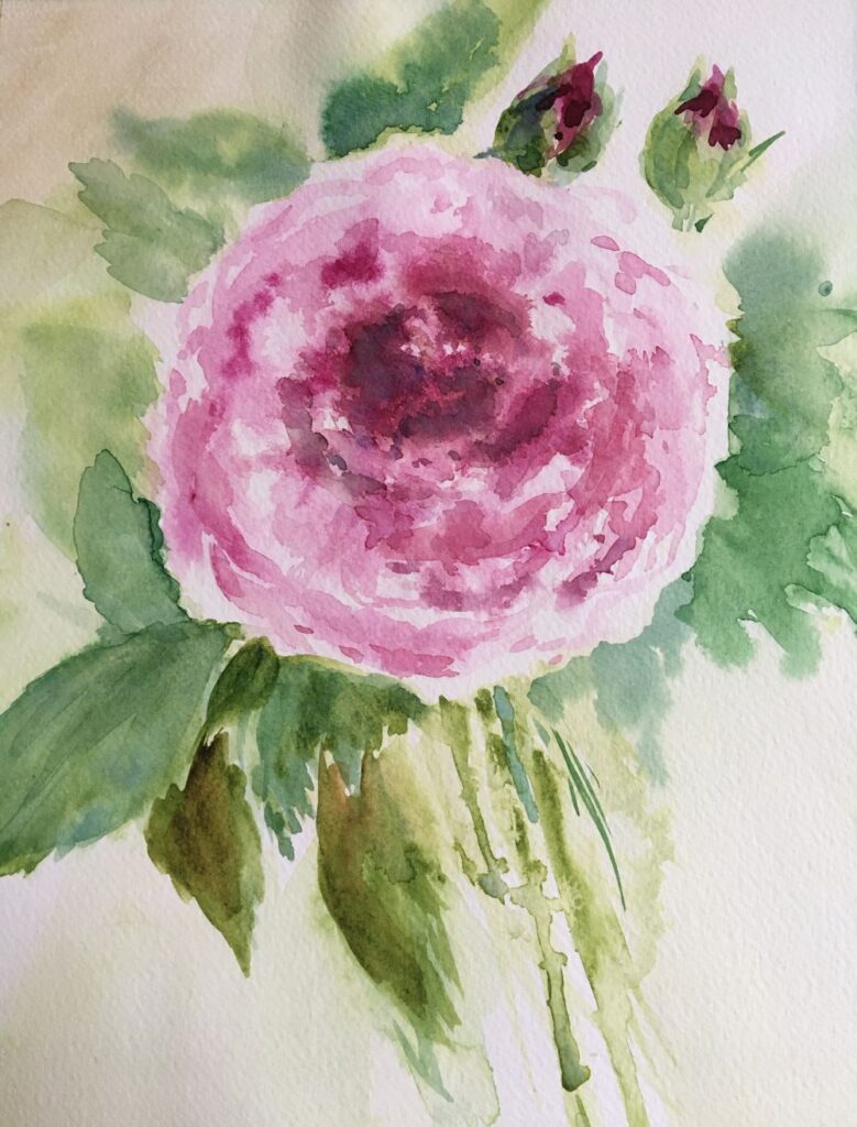
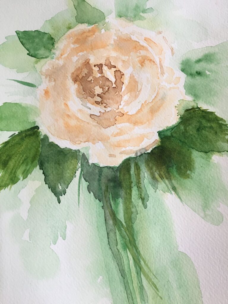
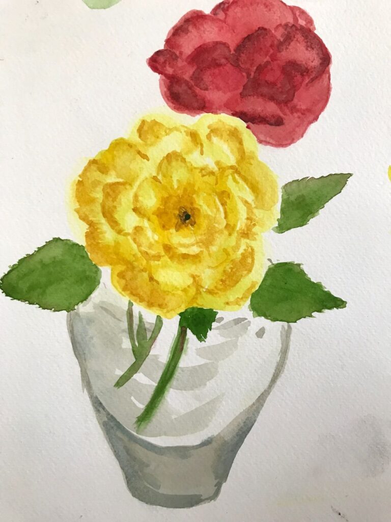
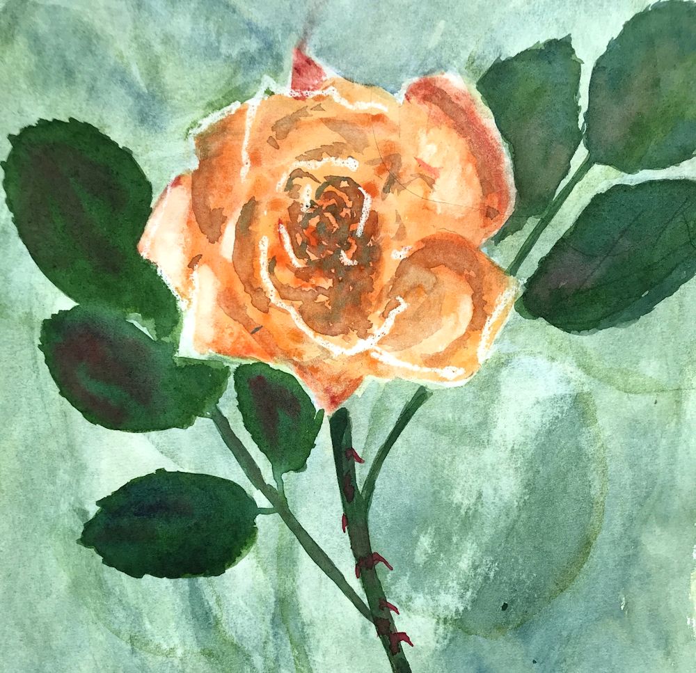
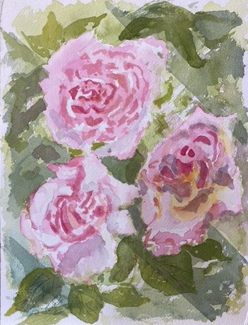
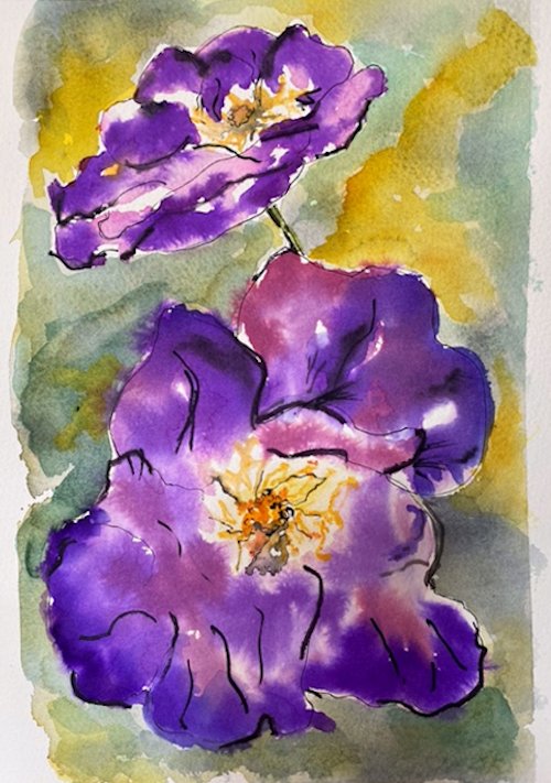
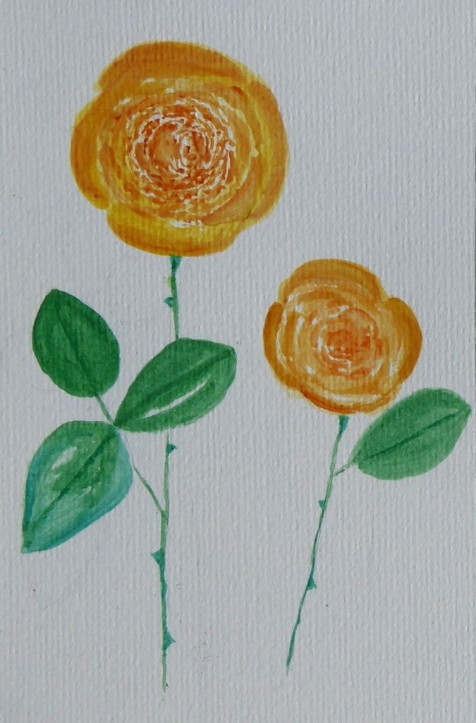
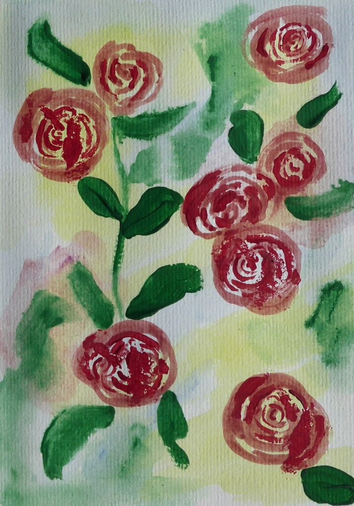
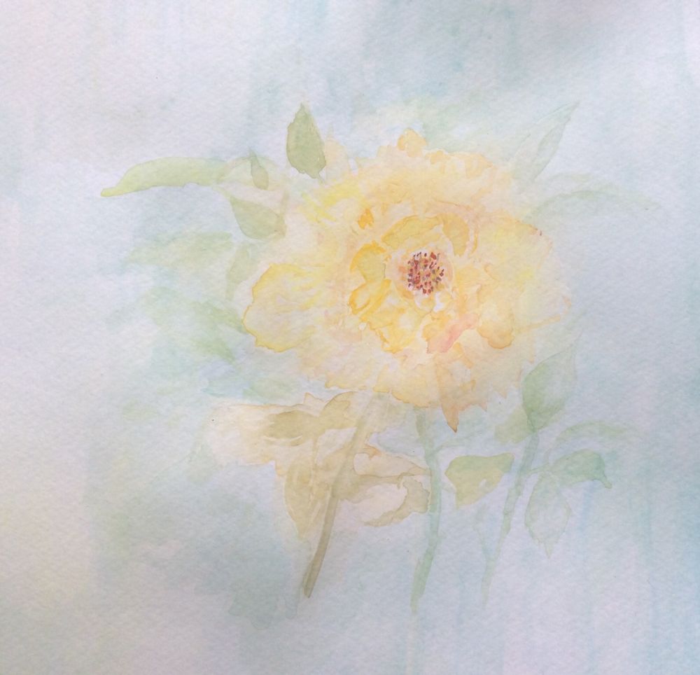
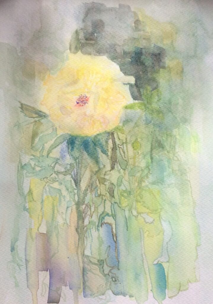
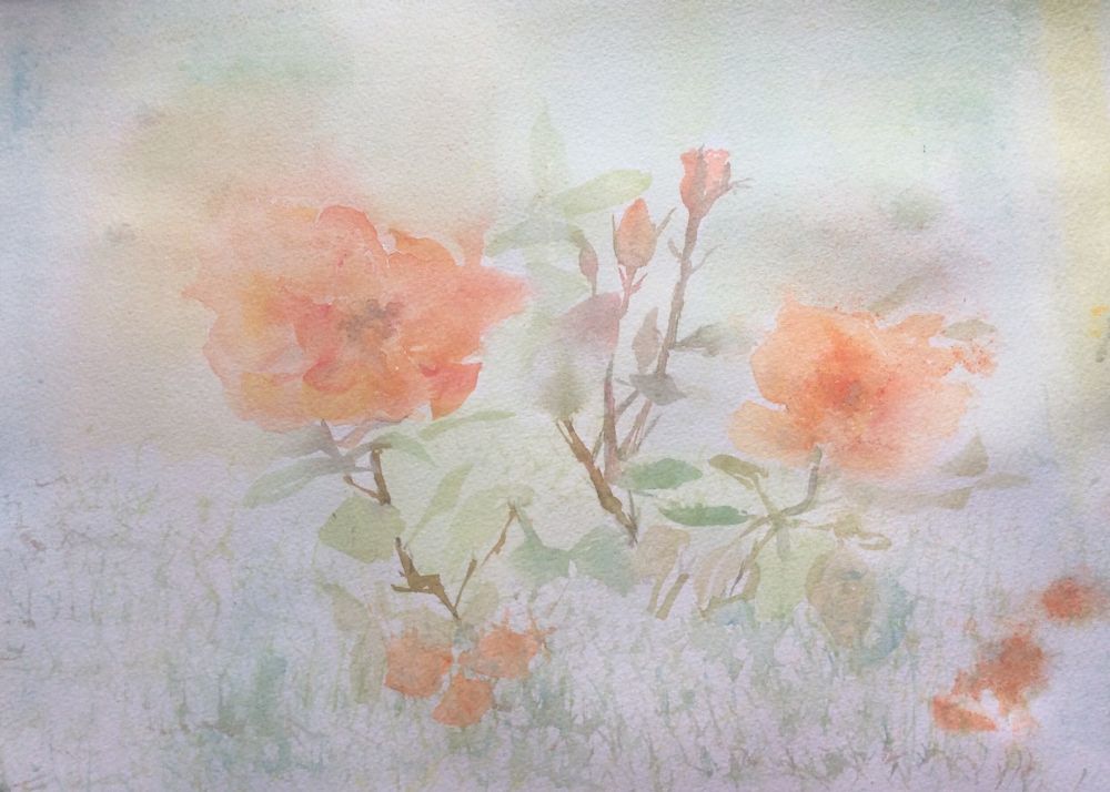
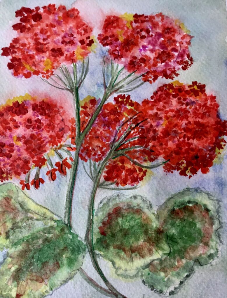
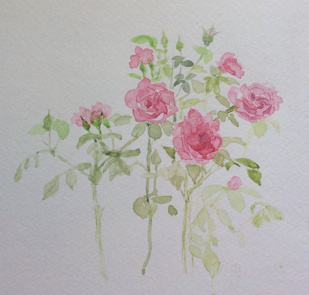
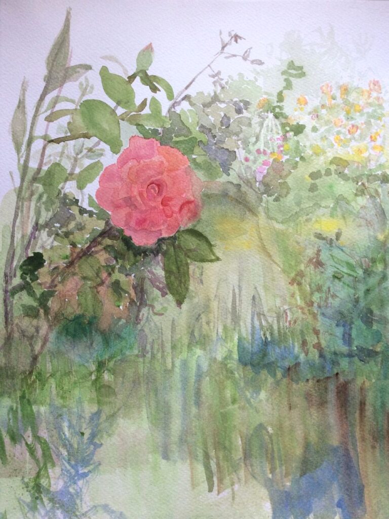
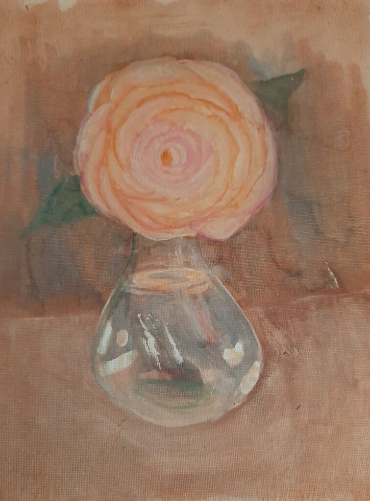
Your Paintings;
Painted wet in wet by Ann
by Ann
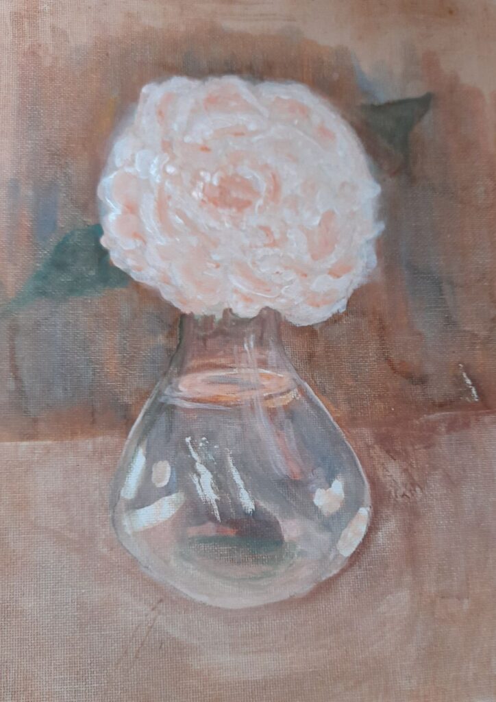
Started with wet in wet washes and then developed with drawing media
by Ann
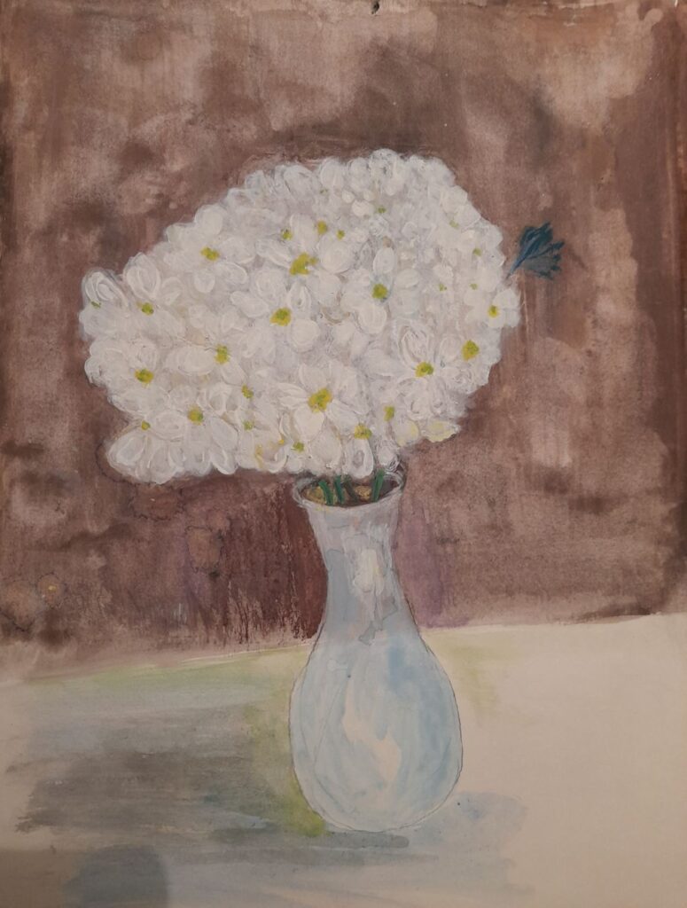
by Maryon
by Maryon
by Mali
by Mali
by Sandra
by Sandra
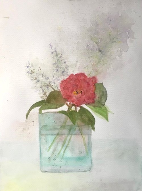
by Anne
by Anne
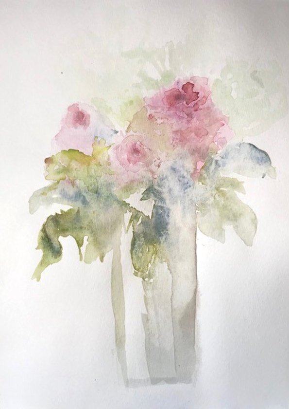
by Virginia
by Virginia
by Virginia
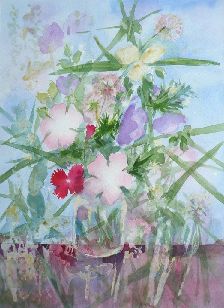
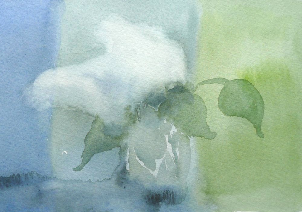
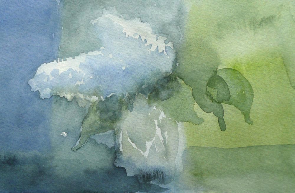
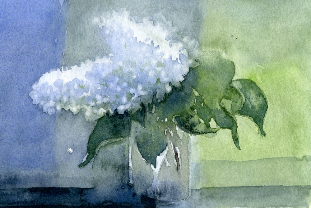
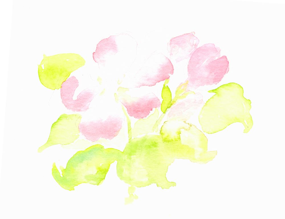
Flowers in Watercolour Week 3: From dark Backgrounds to Colourful Blooms
May 13, 2022
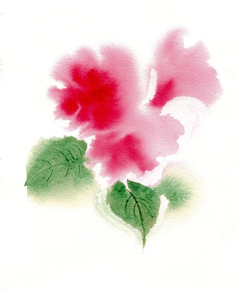
As the lilacs are pretty much ended I was delighted to find a couple of headily perfumed blooms left to paint. The painting above was on a quarter sheet of Bockingford cold pressed watercolour paper which stood up to very wet washes, indenting wet paint to make veins in the leaves and lifting out areas to soften them and give and indication of petals.
The white of untouched paper shines through in the glass jar. This time I decided against masking fluid as I hoped for a soft look to the painting.
The three images below show how a smaller study was made on very damp paper working wet in wet then leaving the paper to dry before re-wetting the paper and adding further washes. Some lifting out was done while the paint was wet but the petal shapes were lifted out when the paper was dry.
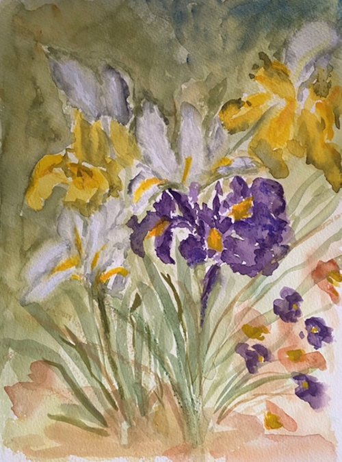
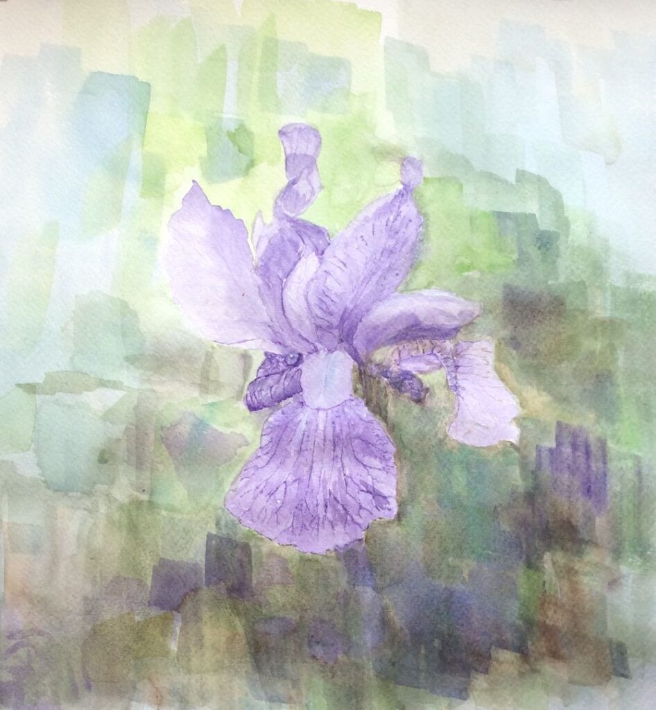
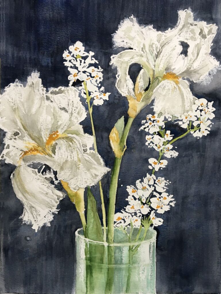
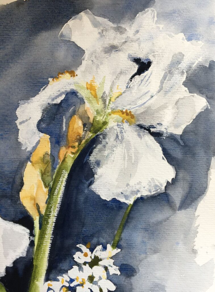
This week’s challenge is to paint flowers as they grow in the garden using any of the watercolour techniques used so far and with the aim of capturing an impression of their character; how they look up at you as the pansies and little pink geraniums or how they point toward the sky like the iris in the photo below..
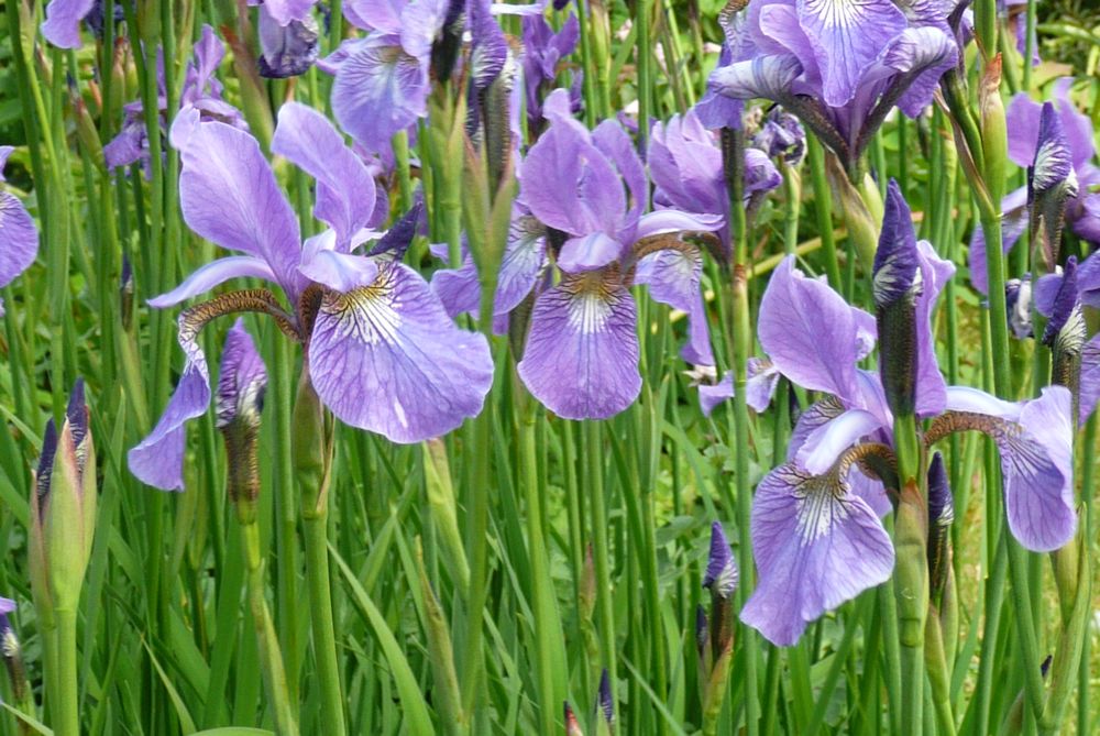
Photo by Jo
If you have time try to get out into the garden and sketch and photograph your favourite flowers. Make sketches of individual blooms, buds, stems and leaves to familiarise yourself with the shapes, and small composition sketches to explore the arrangement you may choose to paint. Iris and Weigela are blooming as are geraniums and Aquilegia so there should be plenty of colour around.
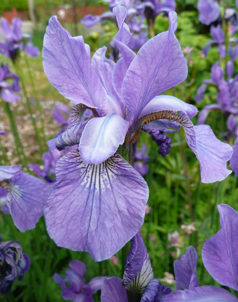
Photo by Jo
Before starting to paint explore the colours and brush strokes which will help depict the plant’s character and then review the composition sketchesmade outside and home in on one idea for the final painting. This may include just one or two plant stems relatively close up or with a backdrop of the same flowers or different plants giving an impression of a massed planting.
Experiment with colours and how they interact when mixed to find the hues and strength of washes you will need, erring on the side of making more wash and stronger washes than you think you may need. It is easy and quick to add water, not so easy to “drop in ” strong colour if it isn’t already mixed.
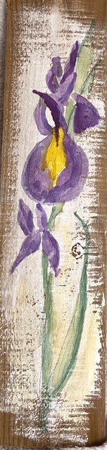
You may like to look at the following Pinterest board for some ideas on painting iris, link below:
https://www.pinterest.co.uk/jhall1282/flower-painting-in-watercolour/iris/
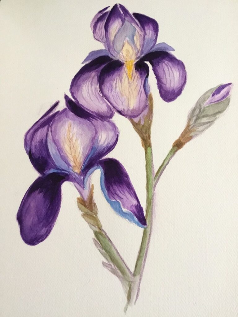
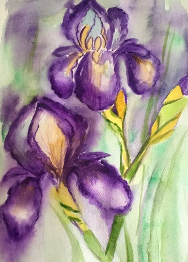
Your paintings:
by Ann
by Ann
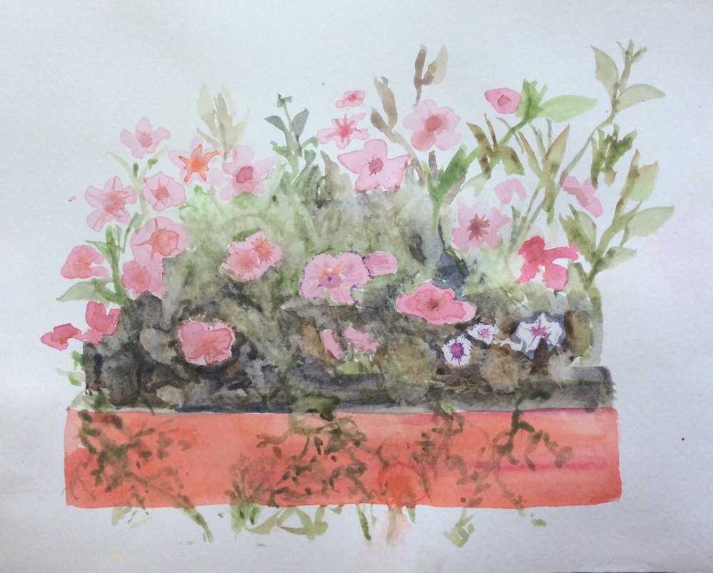
by Maryon
by Maryon
Watercolour and Oil Pastel by Mali
by Mali
by Sandra
Watercolour by Sandra
by Anne
by Kate
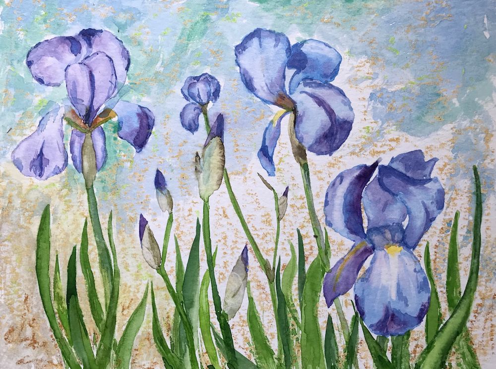
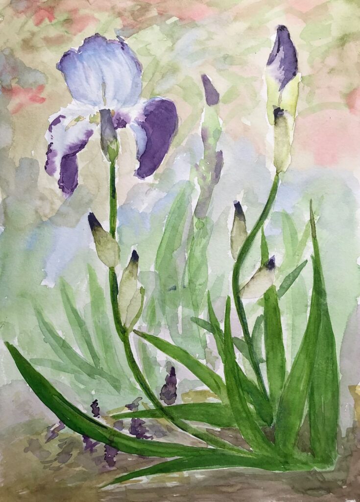
by Vitginia
by Virginia
by Virginia
Watercolour Flowers, a Free Approach: Week 2
May 6, 2022
The first part of this post is a recap of what we did in the last session. The second part explores painting pale flowers and backgrounds.
The much larger squirrel mop below these brushes has an excellent point so although I usually use it when when working at a larger scale it is a versatile brush capable of making fine lines and adding small marks for detail.
By increasing the pressure as the stroke is made and then decreasing the pressure as the stroke is ended and the brush lifted from the paper leaf shapes both thin and broader can be made with round brushes. We also used flat brushes to make a variety of marks resembling leaf shapes by twisting the brush as the stroke is made. Depending on whether the broad or thin edge of the brush is presented to the paper a variety of line widths can be made with flat brushes. Some of the best fun can be had by loading a brush; any variety and using it sideways as a printer on to dry or damp paper.
Below is a demonstration of a cornflower where flat and round brushes were used on wet and dry paper.
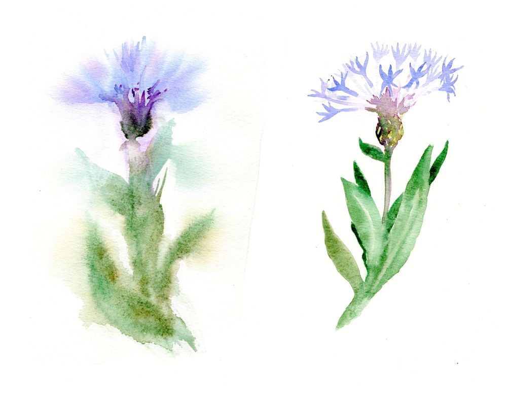
Painted on damp paper on the left and on dry paper on the right.
A wash of water was applied to half the sheet with a large brush and allowed to dry just a little. Colour was added as the paper slowly dried. Defined shapes occurred where the wash has been mopped with a “dry brush”, tissue or sponge.
When working in watercolour, especially when working on wet paper it is essential to have your colour washes mixed and at the ready, together with a sponge, tissue paper or to pick up excess paint as you proceed or to remove moisture from your brush so that the brush can be used to control very wet washes.
While the paint was wet a blunt tool was used to score the paper so that paint filled the troughs to indicate veins on the leaves.
Now it is time to consider backgrounds both for dark and especially for pale paintings of pale flowers.
It was then allowed to dry. Dark washes were added mostly wet in wet and with indenting to suggest marks on the flower as well as leaf veins. The dark leaf mixes were made using Viridian mixes with Alizarin and Purple and also Viridian with Burnt Sienna. The result of perhaps too many layers is a very dark painting of an azalea like flower.
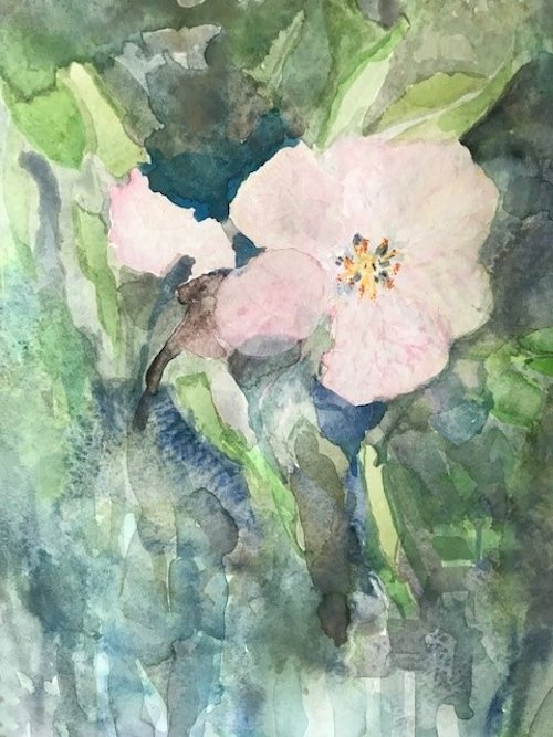
With a lighter touch a dark background to pale flowers can preserve a feeling of freshness as in the watercolour sketch of some apple blossom below. Here I did have a model in front of me and applied some colours using a round brush and very fluid washes on dry paper.
This was allowed to dry before dampening large areas of the sketch and dropping in colour. the shapes were refined using a small brush while the paint was still wet. Washes were allowed over the leaves in places refining their shapes. This time I stopped before the whole thing got too heavy and finally added some very pale yellow at the flower centre and a couple of pencil marks to indicate stamens. The result was lively and playful rather than accurate reflecting the joy apple blossom brings.
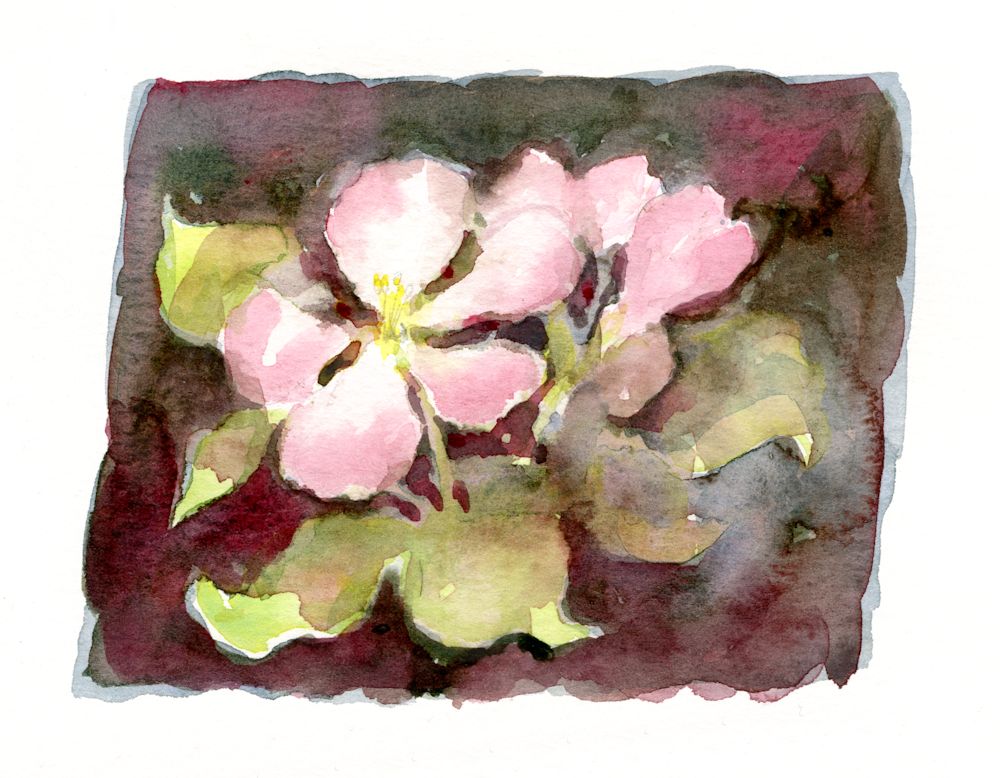
The point is that the background can often determine the mood of the painting and it is important that the way the subject is treated should be complemented by its background.
Left: painted around
Centre: masked
Right: wax resist
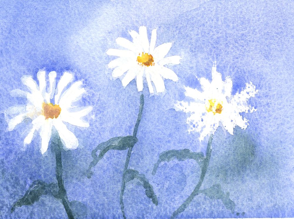
This week’s challenge is to paint pale or white flowers. Painting a background reveals the shapes of white flowers and is easier than painting pale blooms with no background. Colour, tone and how much to simplify backgrounds are all important factors to consider as well as deciding how free and loose you approach should be.
Inevitably you may question whether to mask or not to mask parts of the composition. Masking fluid can free you up to be more adventurous with the background but may make your flowers appear more graphic and less painterly. Painting around the subject may make you simplify more than was the original intention but that is not always a bad thing.
At the end of the day the only way is to experiment.
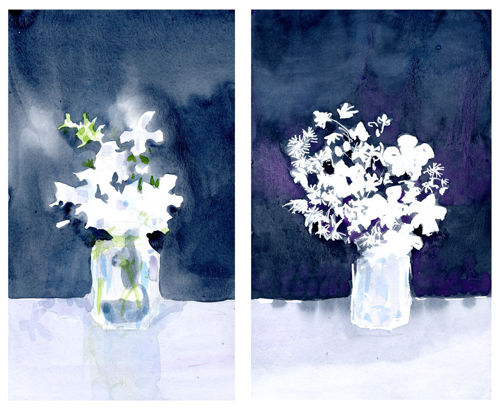
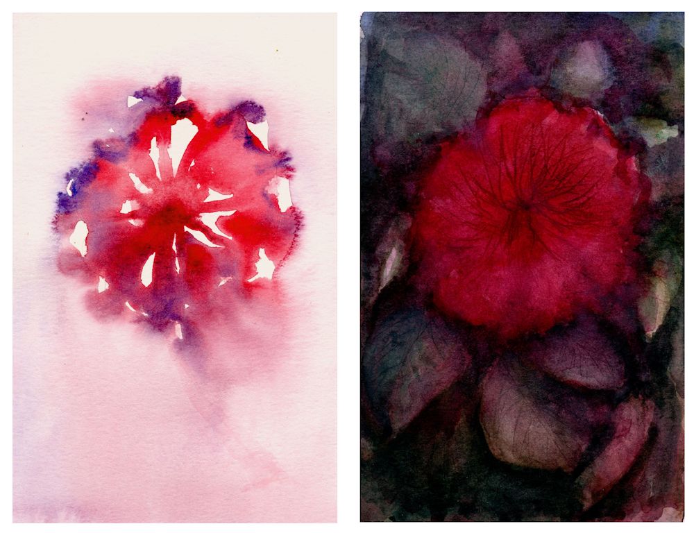
Left: background painted around the flowers
Right: masking fluid used on the flowers and the jar
The study on the left was of the same jam jar of flowers as on the right. The objects are more simplified and less accurate. Hints of colour have already been added.
The study on the right was carefully masked with masking fluid and washes applied when the masking had dried. Because the background was applied more uniformly and quite dark every detail of the marks made with the masking fluid are visible giving it a much more graphic quality. I was quite pleased with both and had I developed them further would have ended up with two paintings of the same subject but with a very different feel to to them.
Some more ideas for painting white or pale flowers can be found on my Pinterest Board, Link below:
https://www.pinterest.co.uk/jhall1282/flower-painting-in-watercolour/white-and-pale-flowers/
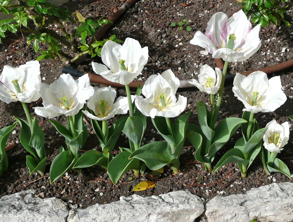
Photo by Jo
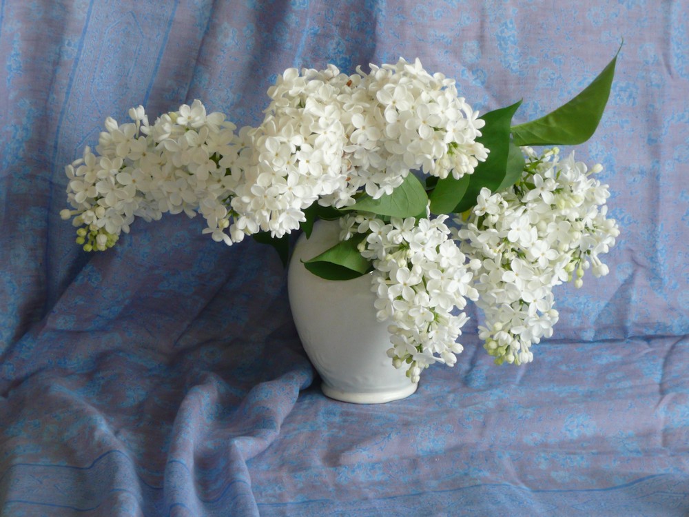
Photo by Jo
So first find some white flowers for the session and we’ll investigate ways to paint them in a way that has enough structure but still feels free and lively.
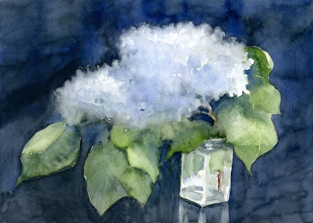
Your Paintings;
by Maryon
by Maryon
by Sandra
by Ann
by Ann
Flowers masked before painting the wet in wet background
by Anne
by Kate
by Kate
by Kate
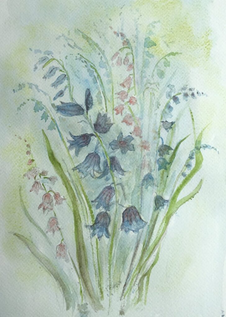
by Virginia
by Virginia
by Mali
by Mali
Watercolour Flowers a Free Approach: Week 1
April 27, 2022
Wet in wet followed by dropping in more colour as the paint slowly dried. Final brush strokes applied when dry.
In this course the challenge will be to paint flowers freely in watercolour, using the brush for shapes and some really wet washes. Any under drawing in pencil will be kept to a minimum and the aim is to create some very expressive flower paintings rather than botanical illustrations.
The first two weeks will be spent on gaining confidence in drawing with the brush, suggesting plant structures with different brush strokes, applying washes either to to fill shapes or to paint around shapes. There will be a lot of dropping colours into wet paint or water and finding ways of controlling very wet washes and/or coping with and taking advantage of some of the happy accidents that occur on the way.
Bottom: leaves “printed on with a large round brush, brown stem/twig painted while the leaves were a little damp; berries added with the same small round brush when all was dry
Left: poppy seed head shape wetted with clear water, pale olive green added; brown dropped in when a little drier and pale parts lifted before all was completely dry
Complicated shapes may need a pencil guideline and we’ll practise filling shapes with water before flooding them with colour and also painting around shapes and making wet in wet backgrounds. This means it’s a good idea to think in advance about the overall composition, the colours you need and the tonal range. Keep the number of pigments you use low and experiment to find which mixes will suit the work best.
Your washes should be ready in sufficient quantity and in the concentration needed for the painting, before the first wash is delivered to the paper. Always mix stronger than you think you will need as the colours will often be added to wet paper and they dry paler than they appear when wet.
The execution may be quite fast and spontaneous but a bit of thought and planning ahead will be invaluable.
Think it’s finished?
The three artists chosen for inspiration have different styles and by no means limit themselves to flower painting. One can learn a lot from studying their work so I have put together a Pinterest Board, link below referencing their work and techniques so do have a look. Each artist has a section within this board.
https://www.pinterest.co.uk/jhall1282/flower-painting-techniques/
Trevor Waugh has a magical way of working with washes and has produced books on watercolour roses in conjunction with the RHS at Kew Gardens. Paul Riley‘s compositions of floral still life subjects are sometimes quite complicated, but a lot the techniques can be used in much simpler studies and one can learn a lot about drawing with the brush as well as working in broader wetter passages from his works. He enjoys using oriental brushes for linear work and mark making. I am sure many of you will know Shirley Trevena‘s imaginative compositions, rooted in observation but often with an unreal and exciting twist.
For this course it will be useful to have;
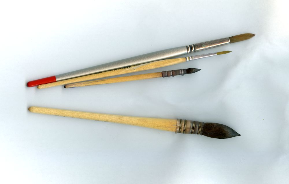
Brushes: One large round, one small round brush, a rigger brush and a flat (half inch or larger). If you have other kinds of brushes, great! They will all be useful.
Watercolour paper 300gsm or heavier: 300gsm will cockle a little when very wet so may be a good idea to stretch your paper or use a block for the more considered paintings but this is not necessary for the exercises.
A block to tilt your drawing board. This will be better than a table easel and we will be working flat some of the time and/or turning the paper round so this is much easier to arrange if a block of wood about six inches long and about 2 1/2 inches in cross section.
Watercolour paints and a palette with deep wells. If you intend to work large a daisy palette or a plastic bun tin palette will be useful, although for most purposes and up to A3 size I find my usual folding palette adequate. Tubes are easier than pans to work at a large scale and if using pans remember to flood your paintbox with water so the pans are moist and the colours can be lifted easily without scrubbing the pan with the brush. Some artists use a different hardy brush like an acrylic brush for lifting paint from pan to palette to lessen the wear on their watercolour brushes.
Also: water pots, paper towel, small natural sponge
A couple of flowers to inspire your brush marks and washes.
This first session we’ll make a lot of brush marks on to dry paper and on to paper that is damp or randomly spattered with water. When making these marks we will have flower structures in mind but the purpose will be to find ways of making marks and controlling washes that will give a lively and free way of expressing these forms in watercolour.
After the exercises an expressive study of your chosen flowers should be attempted. The exercises will be done in real time as they are demonstrated at the class session. Hope the illustrations will give you a few ideas for the session.
Your Paintings;
by Sandra
by Ann
by Ann
Watercolour painted wet on dry by Virginia
Watercolour painted wet in wet by Virginia
by Mali
by Mali
Watercolour by Kate
by Maryon
by Maryon
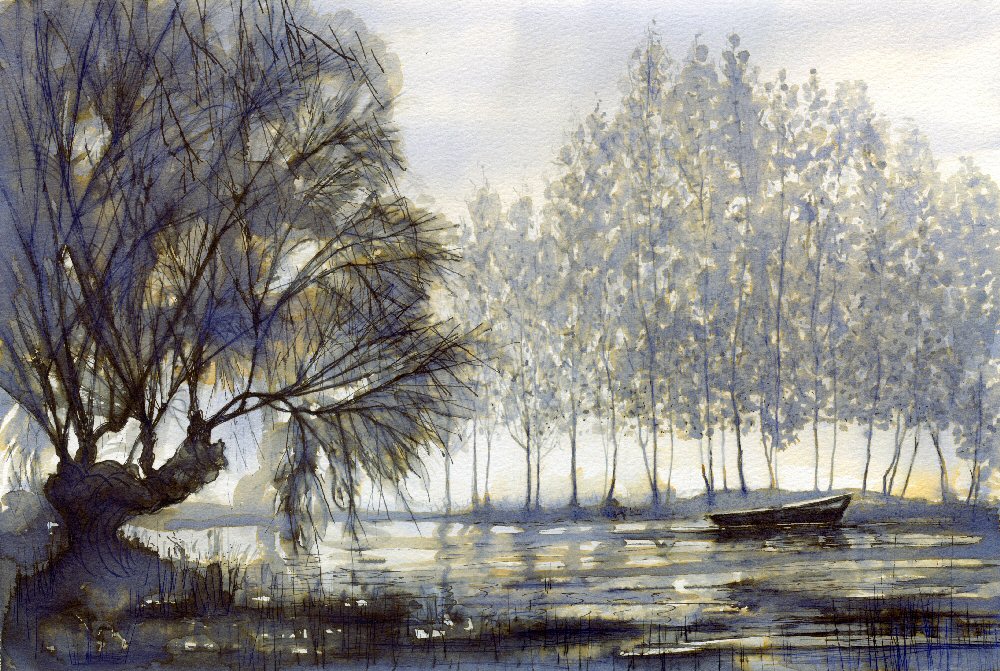
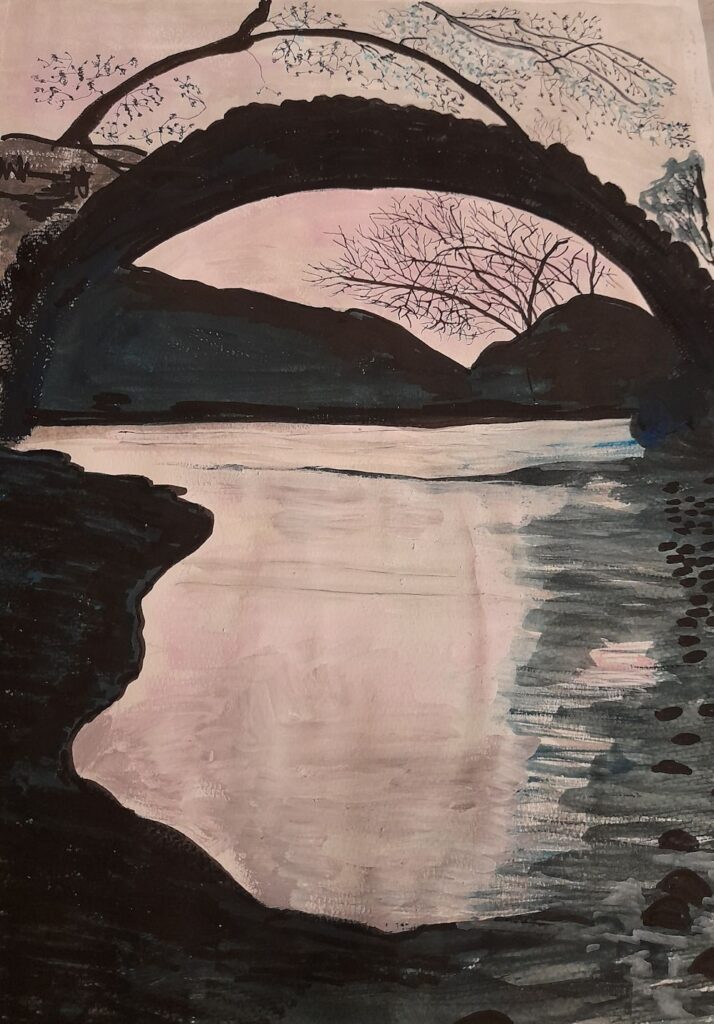
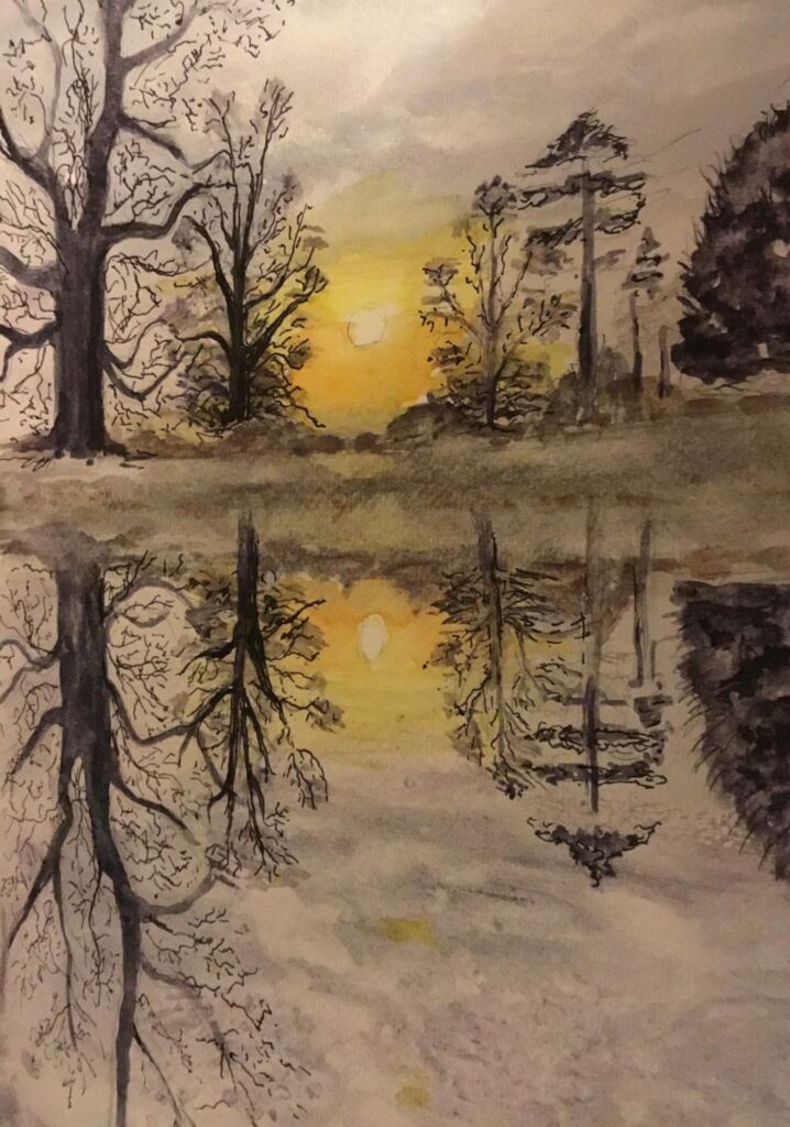
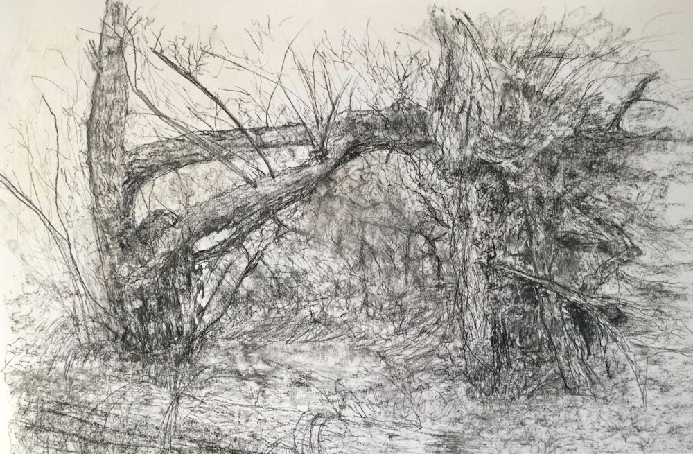
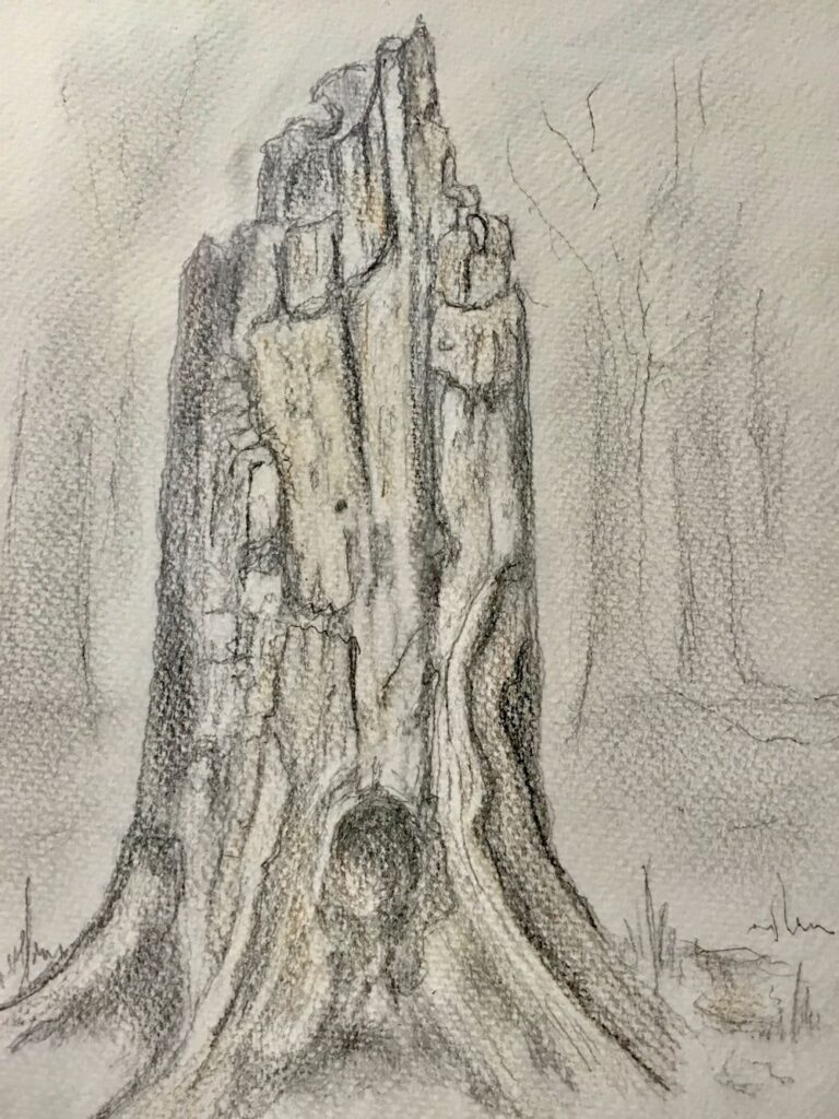
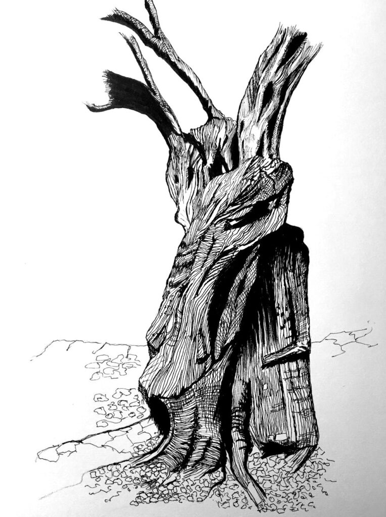
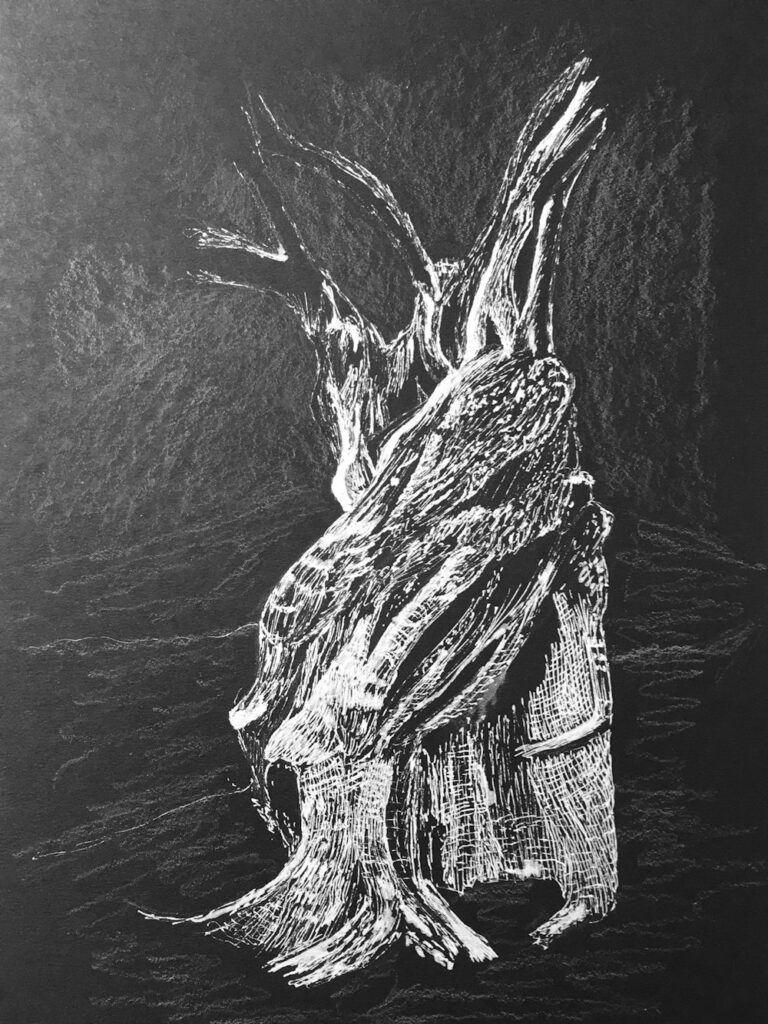
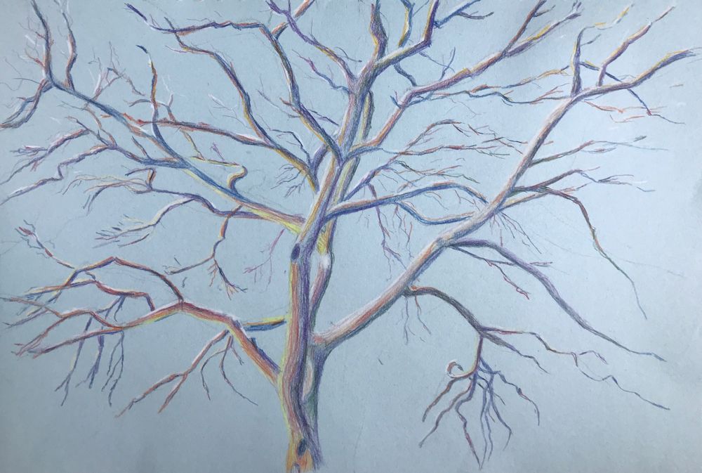
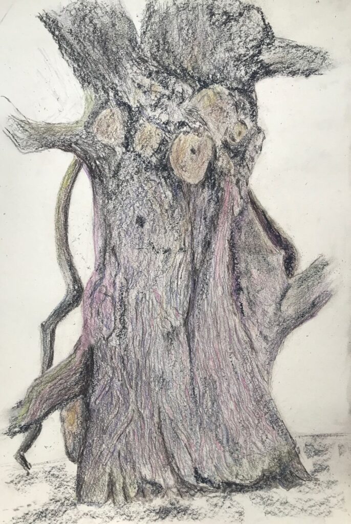
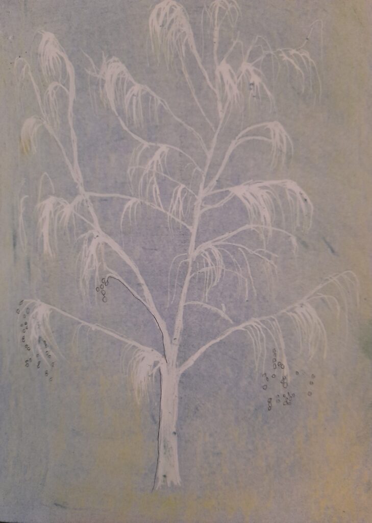
Drawing Trees Week 5: At the Water’s Edge
March 23, 2022
Quink ink by Jo
This week’s challenge is to paint a picture of a tree or trees at the water’s edge or even standing in water. Look for reflections and also how the tree is physically related to the land and the water. Are it’s roots exposed at the shoreline? And is it by a stream, a lake or on the coast?
The ferocity of the current caused by a flash flood may uproot and drag trees downstream, especially in a narrow gorge. Branches or whole trees may remain lodged on the banks. The picture below is of Catrigg Force in North Yorkshire where a tree has been tossed across the stream below the fall. The gorge itself is full of tall beech trees reaching for the light above.
Acrylic by Jo
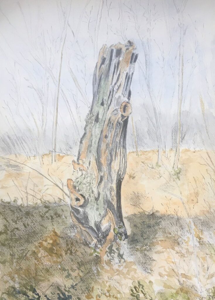
The drawing below shows the ravages of winter storms on the Suffolk coast. Tree trunks roll around on the beach at Covehythe where whole roads lined with trees have fallen into the sea. The trunks are often sawn off as here and only the lower part and roots remain. Seeing these on a misty February morning was an eerie experience.
Pencil by Jo
Looking North there were whole trees strewn on the shingles below the cliff and more trees can be seen clinging on before meeting the same watery fate.
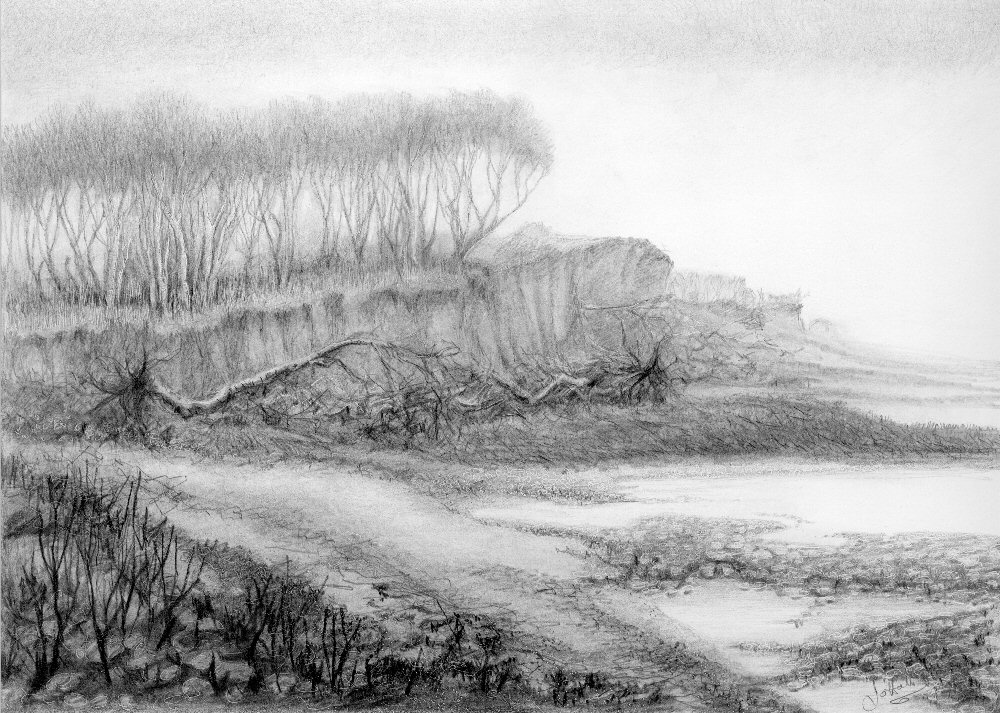
Pencil by Jo
I would like to see your paintings the reflect the mood of the place which will be related to the weather and time of day as well as to the landscape. This may be much more successful if it is a place you know well or have at least visited. A lakeside tree in calm weather may suggest peace, or if their is a breeze and a dancing in the trees perhaps a playful atmosphere. However, if the sky is dark and storms are raging you may be depicting a more dramatic scene.
If you are feeling particularly adventurous don’t be afraid to use your imagination. If you want to depict a storm with a flash flood and branches flying I suspect there will be few references in your photo collection or sketchbook, but you may have recorded the aftermath, so you could think about how it would have been during the storm.
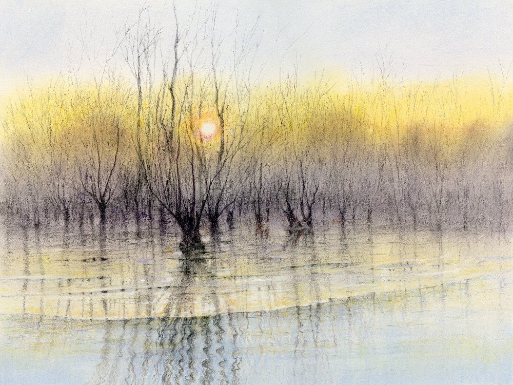
Pastel and graphite pencil by Jo
This was an exceptionally cold first weekend in December a few days after the after the Stour had been in flood. This was the calm after the storm. Areas of thin ice glazed the river surface. Note how different the reflections look on the ice compared with their appearance on the flowing water.
Decide first on your subject and think about the aspect you wish to convey, then try out some rough sketches from your reference pictures before embarking on the final composition.
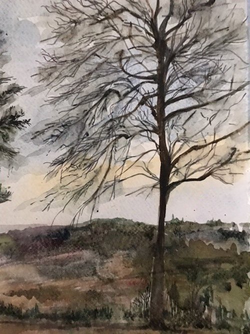
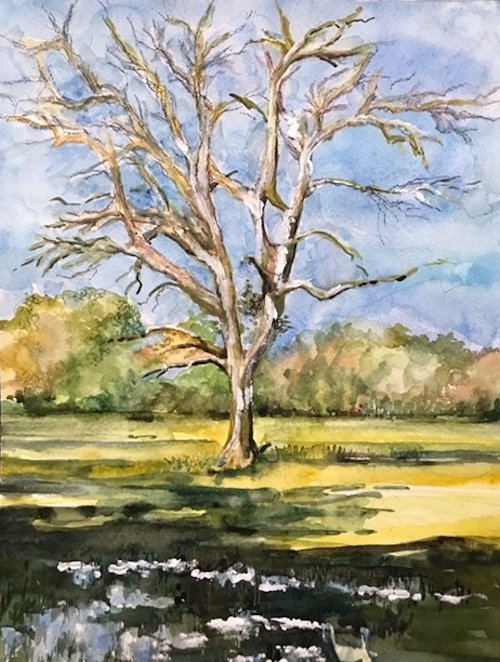
Your Paintings:
Watercolour by Sarah
Pastel by Anne C
Ink and Watercoloour by Kate
Watercolour by Maricarmen
Watercolour by Ann
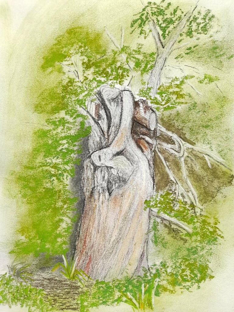
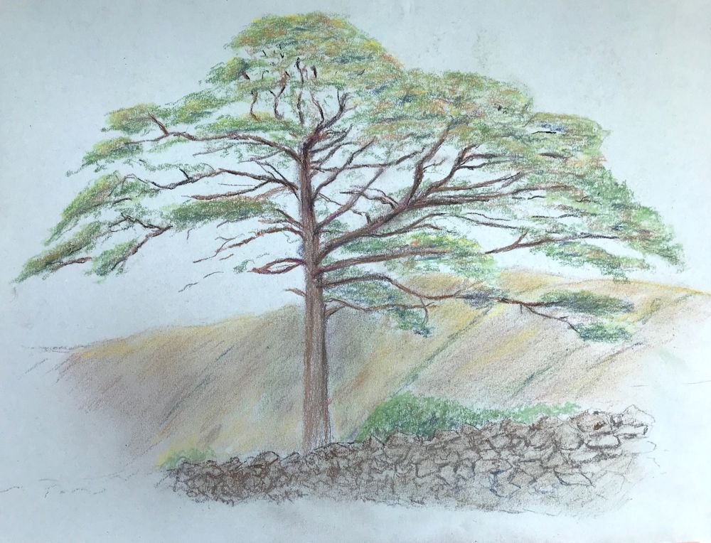
Watercolour and pastel by Mali
Watecolour by Anne H
by Heather
by Liz
Pastel by Liz
Quink by Maryon
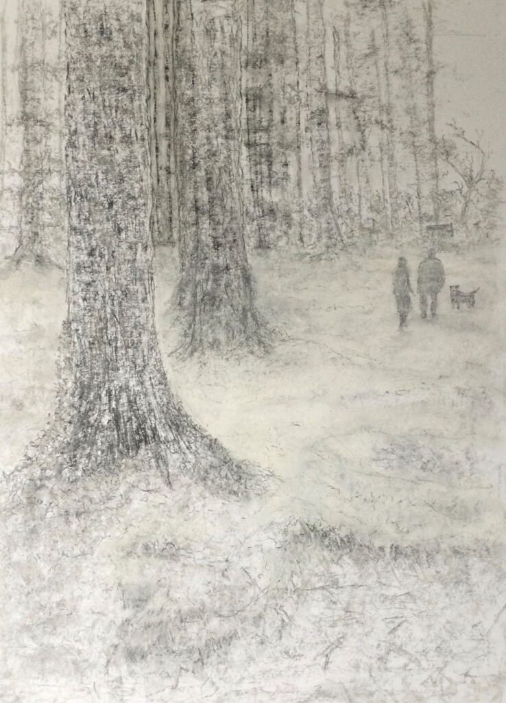
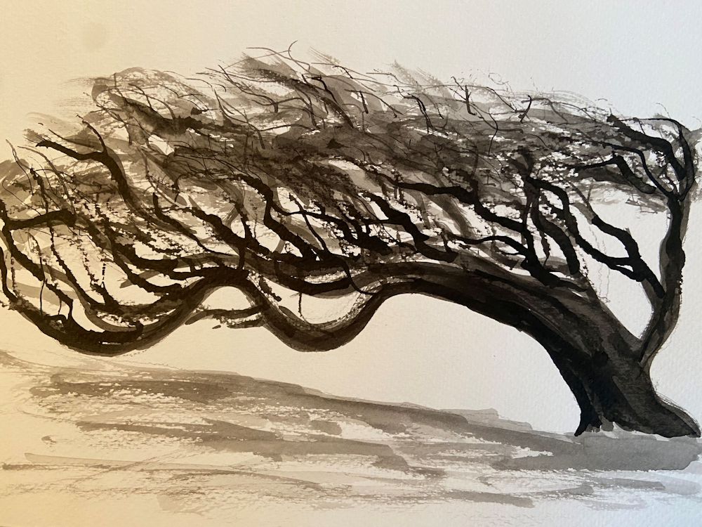
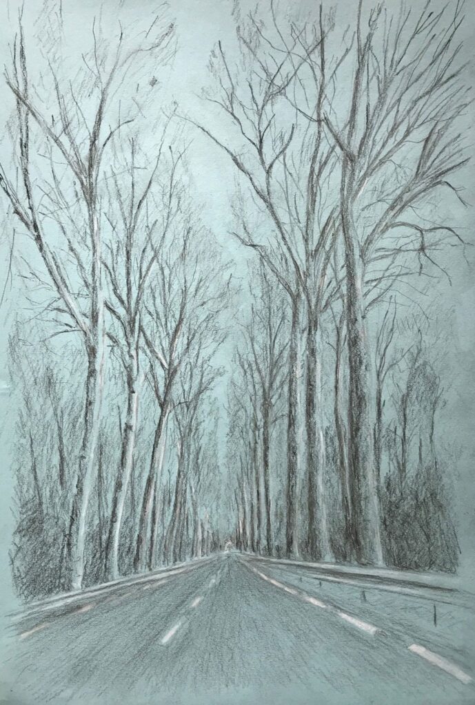
Charcoal and pastel by Virginia
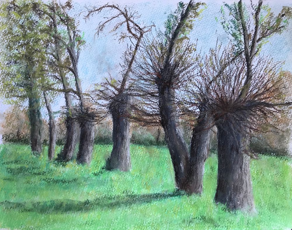
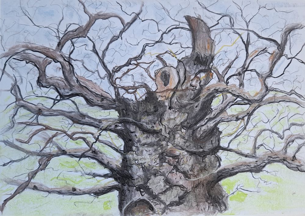
Drawing Trees Week 4: Woodlands
March 16, 2022

Pastel
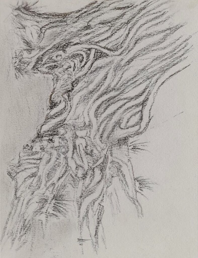
This week’s challenge is to paint or draw trees in a woodland setting. The woodland floor may be a significant part of the painting as in the pastel painting of Judy Woods above. This is a mainly beech wood on a slope, with many ancient trees with haunting shapes and and exposed roots. It seems to breathe mystery.
Photo by Jo
Another mysterious wood with an entirely different character is Wistman’s Wood on Dartmoor. Here stunted oaks encrusted with moss and ferns emerge from boulders of granite.
Over the last three weeks we have been exploring the shape and structures associated with a variety of trees. In a woodland there will be other considerations as the background may be full of the myriad twigs and small branches of more distant trees. There may be an under-layer of shrubby plants and the floor of the wood is often far from featureless, so part of this week’s challenge will be finding a way to describe the backdrop for the main trees in the composition.

Pastel on reddish brown paper
This painting spotlights a single tree with a backdrop of the other trees near the Suffolk coast North of Southwold. The most distant trees are almost a texture of overlapping strokes of pastel pencil. This is a small scale work about A4 size.
Your work may have a single tree or a group of trees as it’s main focus or as in the two examples below be a tapestry of the tree shapes and colours.

In the valley of the Nuns outside Funchal, Madeira a tapestry of blackened Pines and fire bleached Eucalyptus was seen against red rocks about a year after the event. Below a green layer of he undergrowth was already returning.
Charcoal and pastel on terracotta coloured paper 50 x 70cm

Another tapestry of trees, this time Pines and Birches
Pastel on brown/grey paper
Perhaps start by coming to grips with the shapes of your chosen woodland, by doing some small preliminary sketches. Think about the composition possibilities at the same time, then plan out your final composition. Think about which medium would suit your purpose and how you are going to use the medium. Also look at the tonal range; is it generally light and airy or dark and mysterious. Then think about the colour. Ask questions; which colours predominate and are there any small areas of colour that add to the composition by their purity, or by their contrast in tone and hue to their surroundings. In the photo of Judy Woods the little speck of a red anorak draws our attention and at the same time gives a sense of scale!
Your paintings;
Watercolour by Ann
Watercolour by Ann

Watercolour by Anne H
Pastel by Heather

(detail)
Watercolour by Maricarmen
by Kate

by Anne C
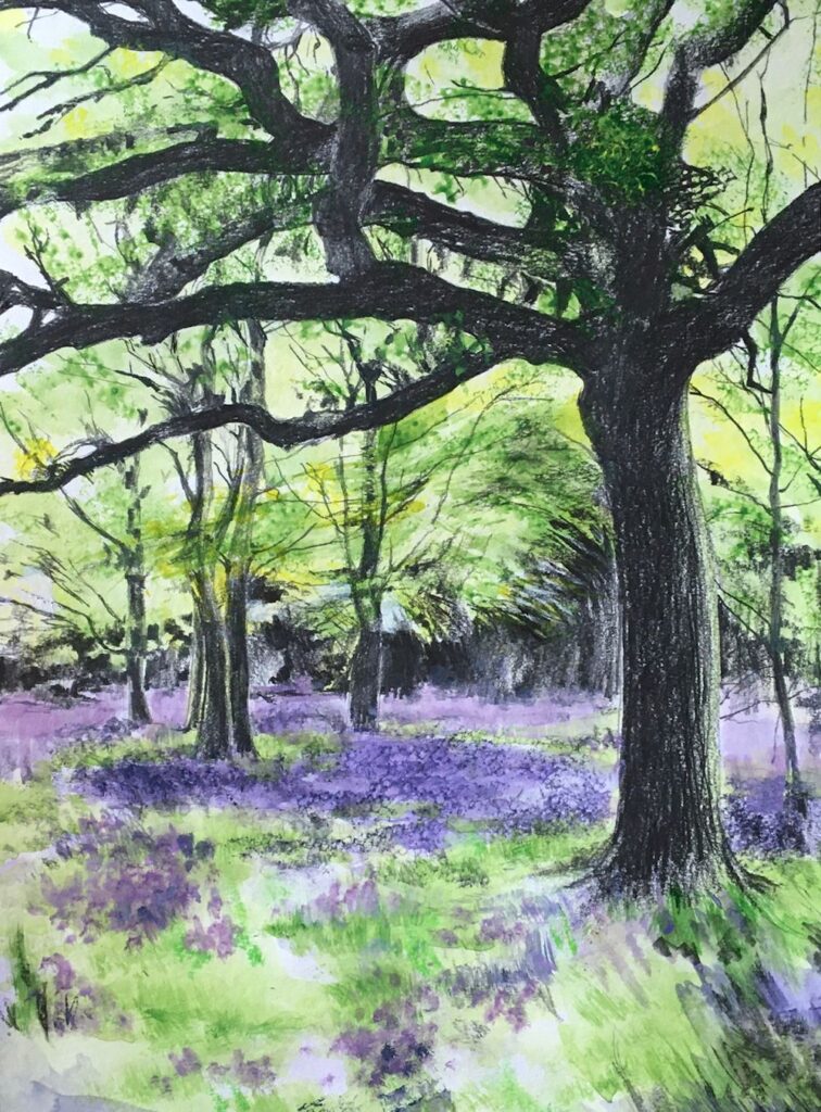
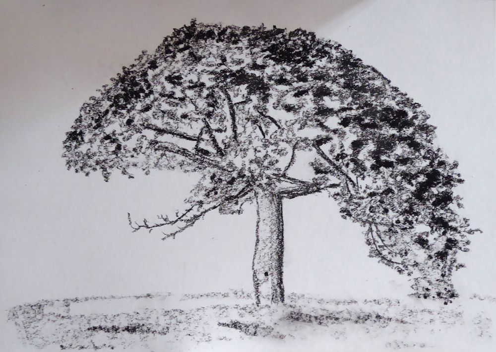
Watercolour and Pastel by Mali

Watercolour and pastel by Mali

Ink drawing by Sarah
Watercolour by Sarah

Pastel by Liz
(unfinished)
Mixed media by Maryon
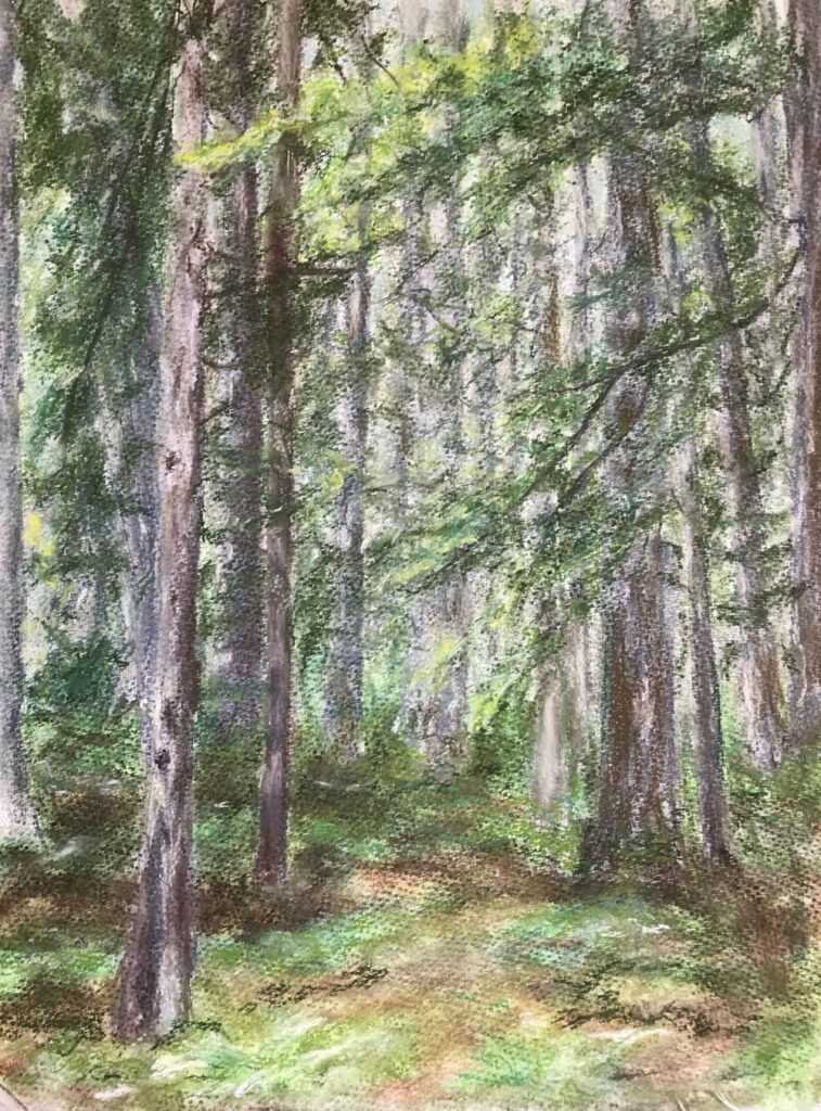
by Virginia
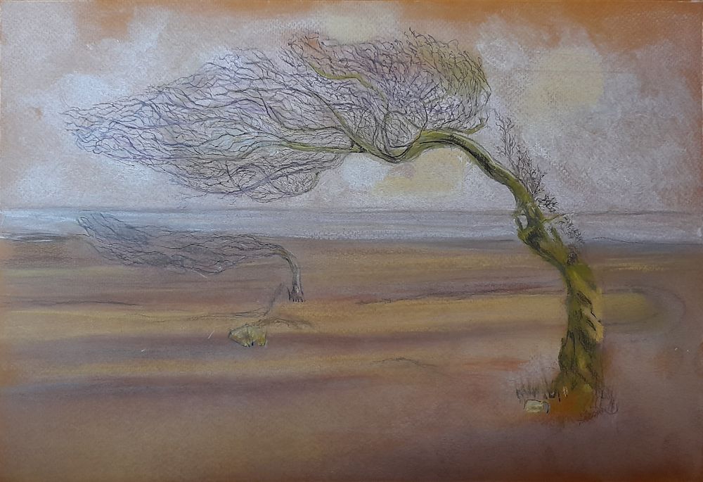
Drawing Trees Week 3: The Struggle for Life
March 9, 2022
becoming twisted and split as in the photo below.
Note the sense of movement in these forms.
Sketched by Jo near Flatford Mill on the Stour
Storms, Lopping and other Struggles for Survival
Very few trees reach their perfect natural form. They are either hemmed in by others, damaged by storms and animals and of course, lopped, pruned, and coppiced by people.
Part of the same walk as the sketch above
Photo by Jo
Whether you are drawing or painting in colour, remember that the tones are vitally important to the composition. Note the palest and darkest parts of this image.
Photo by Jo
Ink and Watercolour
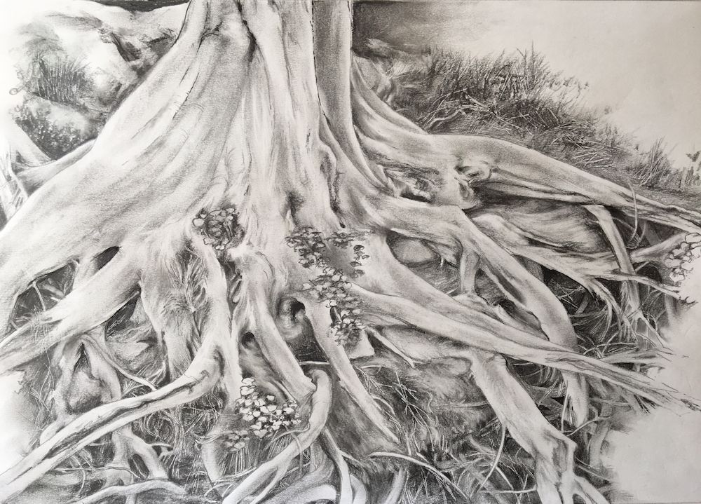
This is a tangle of overgrown ivy roots rather than the aftermath of a storm uprooting a tree. The challenge of depicting overlapping is much the same though.
Project : Draw a tree that has been caused to struggle for survival by; a challenging environment, lopping, a harsh prevailing wind, lightning damage, being uprooted etc.
Trees stuck by lightning can literally be torn apart but wind damage can be just as severe and result in the tree being uprooted and the tangle of roots made visible. Like branches these root tangles overlap and thread through each other even more so than branches above ground.If a tree near you has come down do get out with your sketchbook and a camera. Make sketches and/or photograph from several viewpoints before homing in on a composition for your final drawing.
The drawing may be a whole or part of a tree but should tell something of its history; probably a whole tree where it has grown with a distinct list to one side because of a prevailing high wind, but in the case of a fallen tree, perhaps just the exposed roots. Either way try to make an interesting composition.
Other suitable subjects would be stunted trees growing out of stoney ground, or choked by Ivy.
Your drawings:
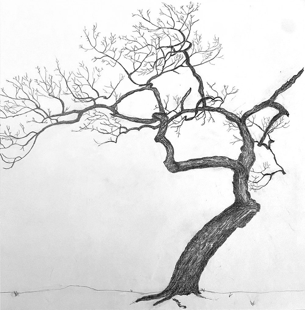
by Virginia
by Kate
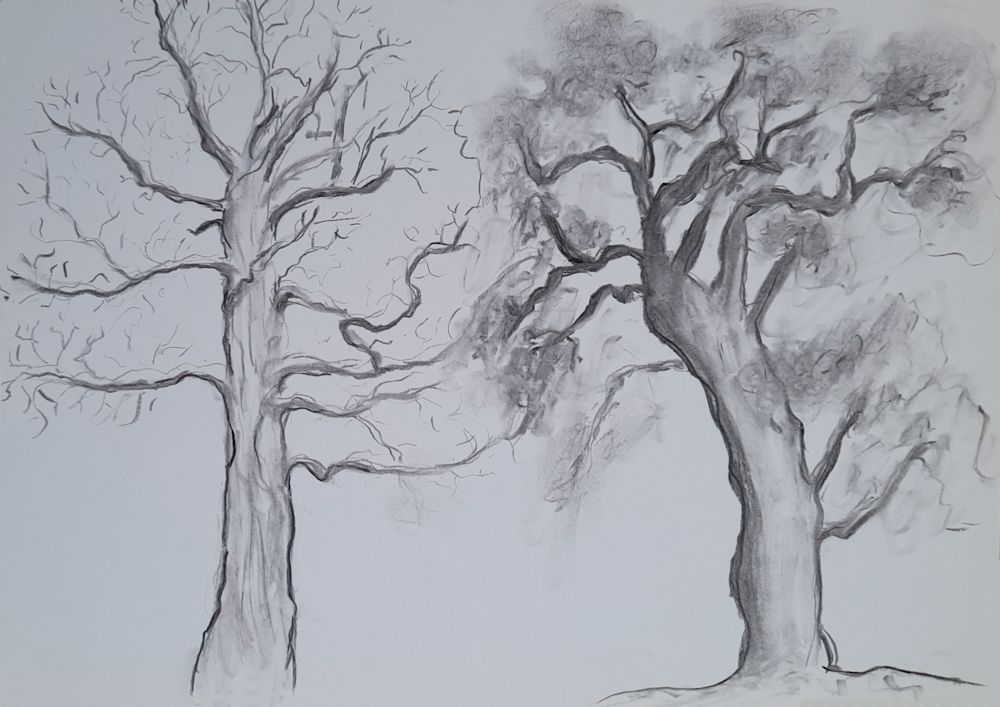
by Mali
Pencil by Sarah
Pencil and Watercolour by Heather
Pencil by Ann
by Maricarmen
Seen by a dry river bed, Umfolsoi Game Reserve, South Africa
by Maryon
Soft charcoal, graphite sticks and embossing tool
pencil by Anne C
by Liz
by Anne H
by Anne H
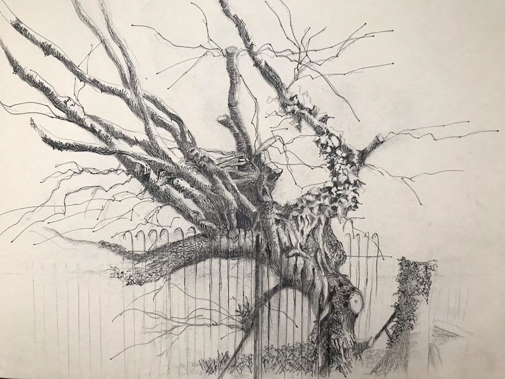
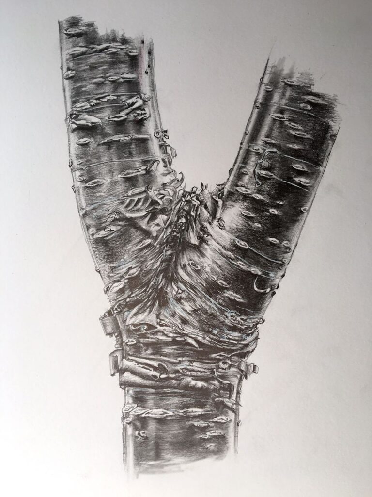
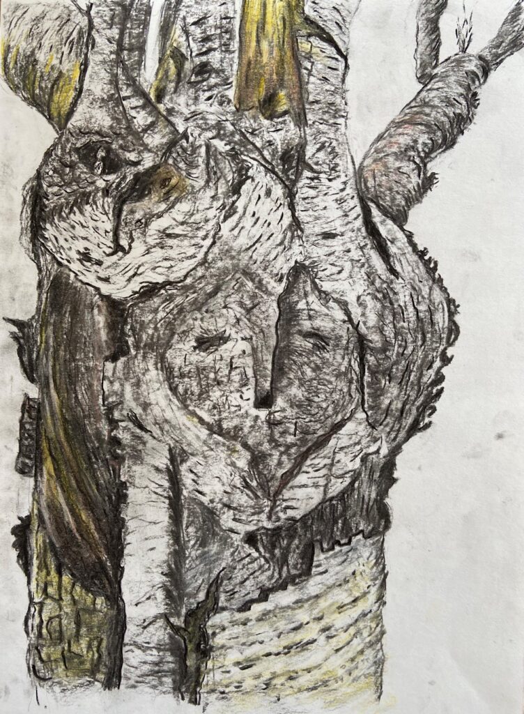
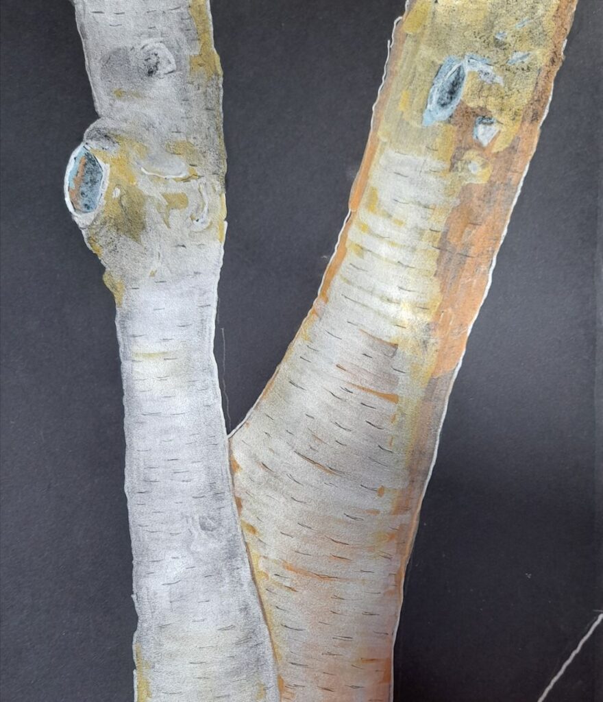
Drawing Trees Week 2: Scars, Bark and Branching
March 3, 2022

Ink, pastel and white gouache on green paper
This week we’ll get close up and look at more of the textures and structural details of trees. So we’ll look at their natural marks, bark patterns and branches, and also at healed wounds.
If you are fortunate enough to have a garden with trees you may like to embark on a project discovering its marks and structures. Perhaps start with the trunk and it’s bark and any scars from lopping or pruning, and observe how the patterns of bark change where a branch develops.
See how many small branches emanate from the stubs left behind when a branch is cut off. Sometimes this leads to huge thickenings as in the drawing of the Spanish Chestnut trunk above.
If you don’t have a garden try finding a tree nearby or work from photographic reference.
Ink and coloured pencil
Years before this became our apple tree, a major limb had been excised and the scar overgrown with lichen and moss.
A feast of texture!
Project : Make visual notes of at least two of the following in your sketchbook and then make a considered drawing of a part of the tree that sustains your interest. It’s not a comprehensive list so feel free to add your own ideas.
1.Branches: observe whether these follow any sort of pattern, or in the case of palm or banana trees how do the leaves emerge and what happens to the dead leaf bases?
Photo by Jo
2.Bark patterns and marks as they appear on the main trunk and branches; also some trees shed bark pieces, some of the pines do and pieces can be gathered and drawn indoors. More detailed studies of these can appear quite abstract.
Photo by Jo
3.At branch points sketch how the pattern of the bark changes where new growth emerges
4.Scars and new growth
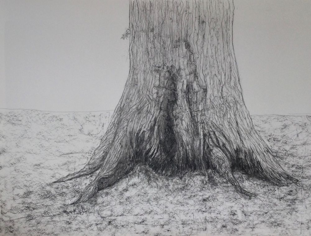
5.Exposed roots at the base of the trunk
6.Make notes of other life like lichens and moss that cover the bark in places introducing different textures or patterns.
You will have gained a huge amount of information about the tree in this drawing exercise and have found mark making equivalents for some of the patterns and textures observed on the way. Finally make a drawing of a tree, choosing not to draw the whole tree this time, but a part you find particularly interesting.
Your drawings:
Mixed media drawing by Sarah
6B pencil, black ink and walnut ink, pastel pencil

Pencil by Sarah
Pencil by Ann
Pencil by Ann
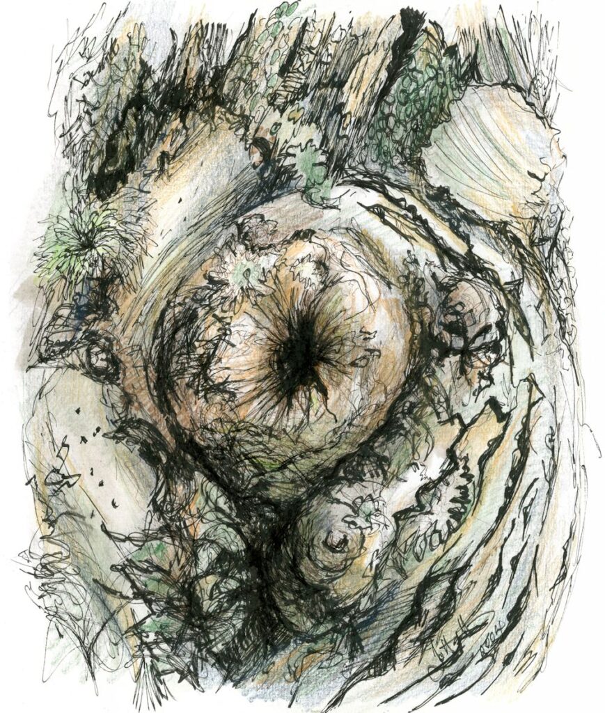
by Maricarmen
How surreal: I feel the oak is watching us!
Graphite on A3 paper by Maryon

Pencil by Anne C
Heather has drawn from the same reference in three different media!
See below;
Pencil by Heather
Black ink on white paper by heather
White ink on black paper by Heather
by Mali
by Mali
by Mali
by Anne H
by Kate
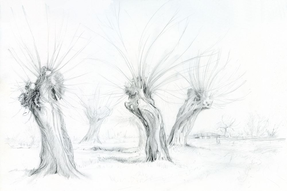
by Virginia
by Liz
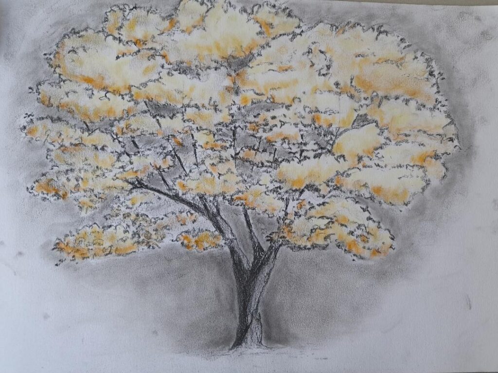
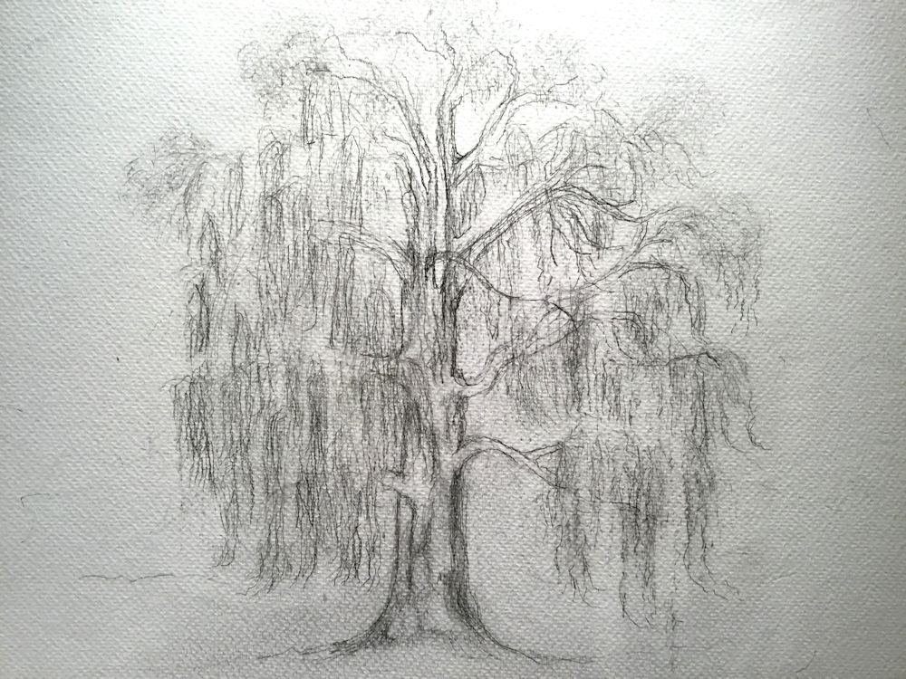
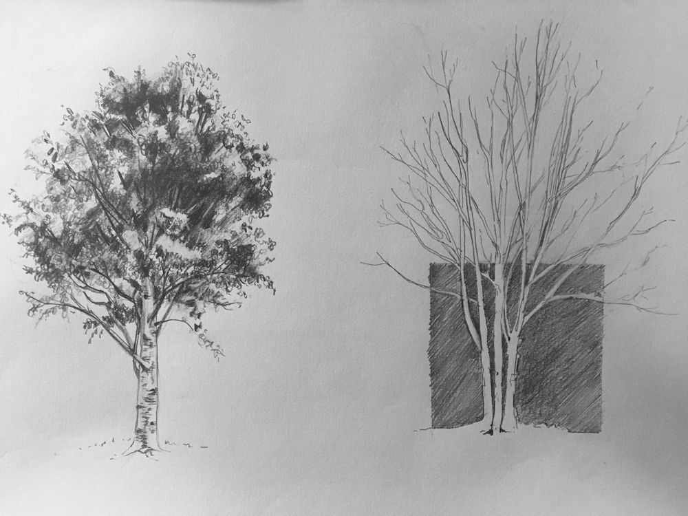
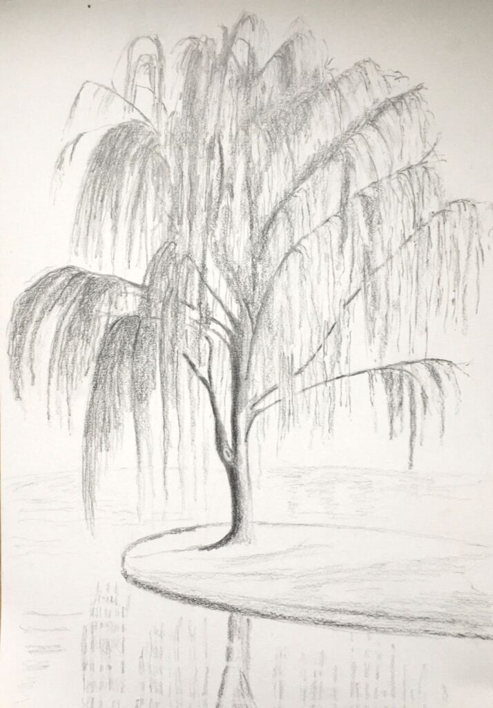
Drawing Trees Week 1: The Whole Tree
February 23, 2022
Pencil and Pan Pastel by Jo
Drawing and painting trees is a huge topic but as trees are very often featured in landscape painting as well as being exciting subjects in their own right, it seemed a good idea to explore depicting their structure and character.

Sketch by Jo
Leaf masses drawn with side strokes of pastel
The first session will focus on strategies for beginning to draw whole trees. In week 2 we will take a closer look at; bark, burrs, and branching, then in week 3 draw lopped or fallen trees and exposed root tangles. For the three remaining weeks we will explore trees and their landscape settings for which you may continue with drawing materials or work in colour with pastel or water-based media.
Do look at the following Pinterest board, link below, for some inspirational ideas for drawing trees in literal, atmospheric and more abstract ways.
https://www.pinterest.co.uk/jhall1282/trees-in-art/
Some very basic notes on drawing trees are below followed by a list of the exercises for the first session. If you are already experienced in drawing trees just make a quick composition sketch and launch into a tree portrait using your choice of drawing medium.
Pastel and charcoal by Jo
Memory drawing
We’ll start by looking at the overall shape of different trees and the first challenge will be to see how much you have already observed. Take a piece of paper, and from memory make small drawings of any kind of tree you can think of; e. g. cypress, oak, palm, fir etc. Do this rapidly then think about what gives each individual tree its character.
This may be;
The overall shape and symmetry (fir trees)
Angle at which the branches spread out (oak)
How branches are so flexible and long they bend downwards (weeping willow)
Way in which individual leaves fan out from the trunk (palm trees)
Or
A mixture of some of the above characteristics and many more.
See practical session for materials and paper size.
Pencil sketch
Now look at a real tree, outside or from a photo, and observe it, questioning what gives this tree its particular character. The notes below don’t describe the only way to start a drawing but give a very straightforward method for coming to grips with a variety of tree forms.
Starting to draw
It can be useful to mark where the trunk is and indicate the main branches lightly and then mark out the general outline of the whole tree by a series of light dots and dashes. In this way you will ensure the overall proportions are right and the girth of the main trunk can be drawn the correct width.
When drawing a deciduous tree in Summer or an evergreen the next stage is to indicate the shapes of the main masses of leaves. These can then all be shaded lightly and more densely shaded on parts of each leaf mass that is in shadow. In the example below light is mainly from above. The lower parts of each leaf mas is darker than the upper side and the whole of the lower part of the tree is darker than the top. Look out for the differences in tone when one side of a tree is in direct sunlight.
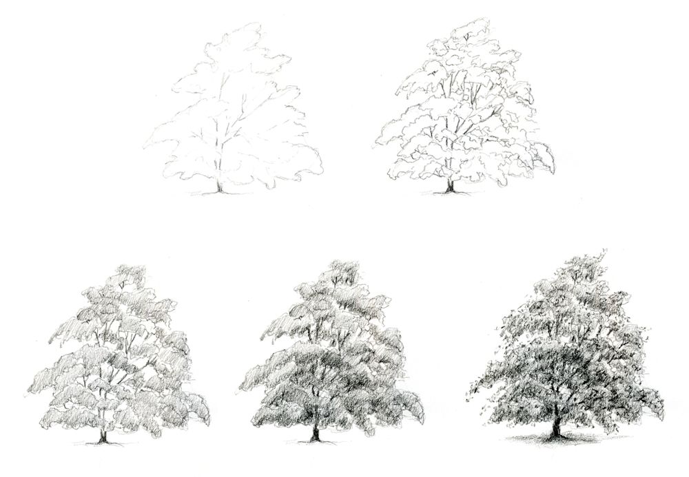
Drawn with an HB pencil
Think about how you might draw a palm tree or a fir tree
Adding texture and detail
After that you may like to texture the foliage suggesting rather than drawing leaf shapes, and also texturing and drawing any useful detail on the main trunk and branches. For instance, when drawing a silver birch tree, it would be essential to add the distinctive dark marks on the main trunk and branches but may look fussy if similar marks were added to all the branches.
Only if you choose to draw a tree with really large leaves like a palm or banana tree will you be drawing individual leaves and associated structures such as dead leaf bases in any detail, so although the strategy will be similar you will be looking at the overall shapes of large leaves instead of clouds of leaf masses.

Ink sketch by Jo
The best way to familiarise yourself with trees is to have a small sketchbook A5 or even A6 that will tuck into a pocket or handbag and draw with a pencil or ball point pen on every occasion you meet a tree, whether you only have two or the luxury of twenty minutes to sketch!
Practical
Use cartridge paper A4 or A3 and any drawing medium; pencil, ball point, pen and ink, conté crayon, thin charcoal stick or charcoal pencil,
1.Memory drawing: use an A4 or A3 paper and make several drawings of as many different kinds of tree as you can from memory. These should be tiny, two or three inch high thumbnail sketches, all to be made within about 15 minutes.
2. Drawings of two different trees or the same deciduous tree in winter and summer. This time work from observation, direct or from a photo reference. Take each drawing to the stage where the masses of foliage have been blocked in with directional shading or the tiny branch ends have been suggested. Both drawings to be made on the same sheet but still fairly small, between five and eight inches high. Take about 20 minutes for this
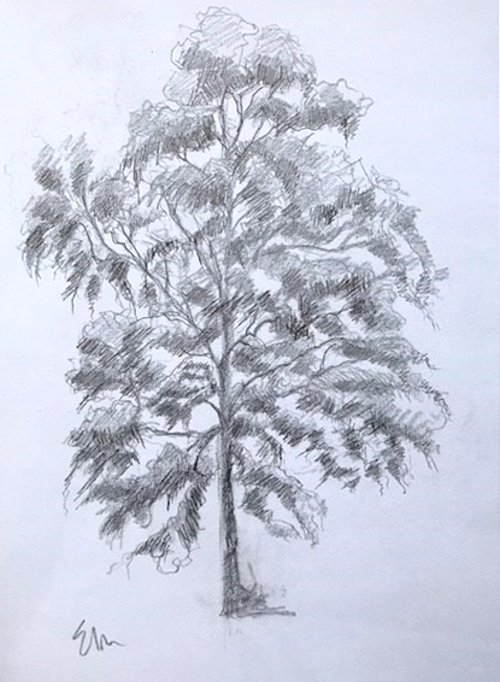
3. Make a tree portrait of the tree of your choice at a much larger scale to fill an A3 or larger sheet. The size may partly depend on the drawing medium i.e. smaller for pencil work A4 to A3 and larger A3 to A2 for a study in charcoal or conté crayon. If toned paper is used white may be used for the lightest areas. Working larger and for longer will enable you to draw more details. Add only what helps to communicate the character of the tree and strengthens the composition. Make sure the overall proportions and structure are in place before adding texture and detail, and constantly review the tonal balance of the drawing as you work. Larger paper may be used for a pencil drawing if you are working with very soft pencil in a loose way or have a lot of time to spend on a detailed study.
Spend between an hour to an hour and a half on this or longer if you are producing a highly detailed work.
Your drawings:

by Anne H
Pastel by Mali
Charcoal and white pastel by Mali
Charcoal by Anne C

by Maricarmen
Charcoal by Maricarmen
Charcoal and pastel by Liz

Charcoal by Ann


by Virginia

HB pencil on A4 paper by Maryon
HB pencil on A3 paper by Maryon

Charcoal and graphite sticks on A3 paper
by Maryon
Charcoal by Heather

Charcoal by Heather
Pencil by Sarah (before session)

pencil by Sarah
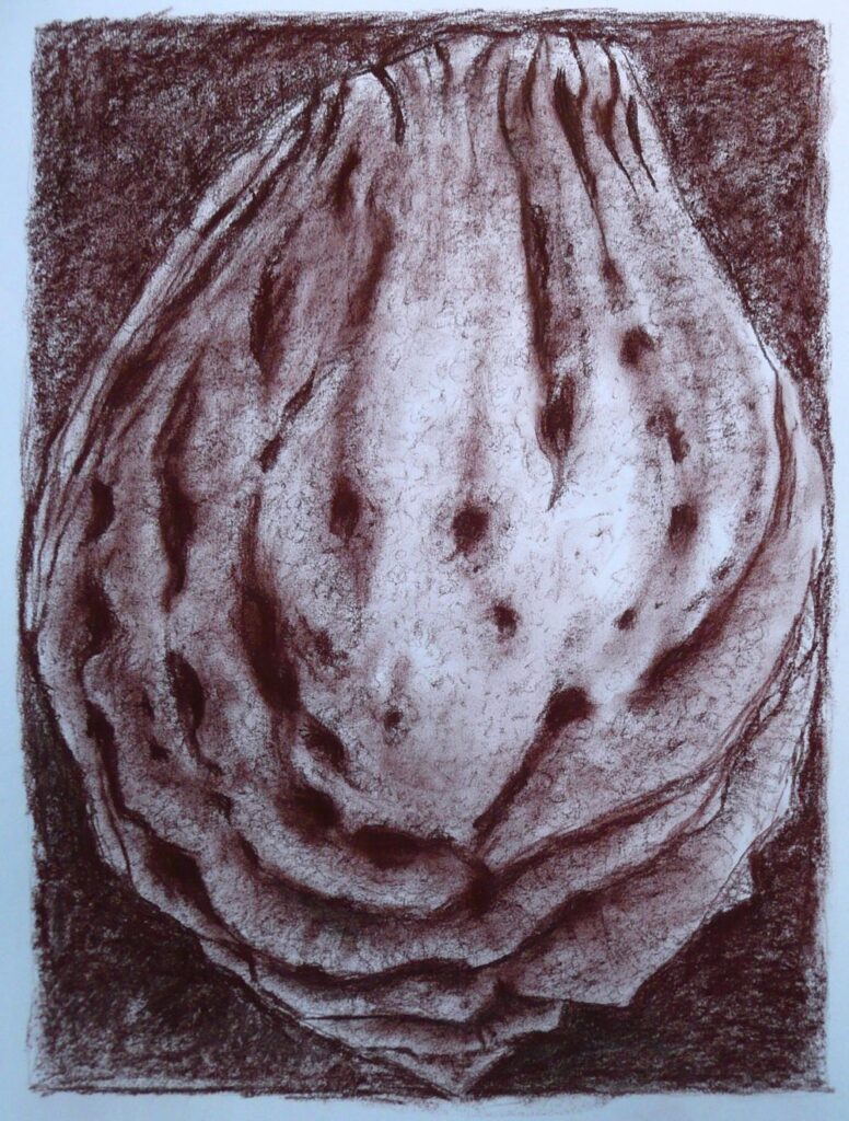
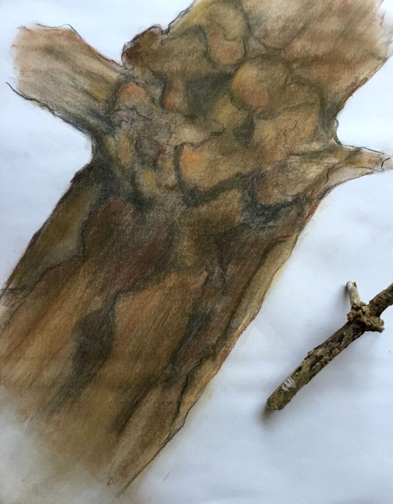
Drawing Larger than Life: Week 4 Toned ground or different medium
November 27, 2021
Dry and decaying: drawn on A2 medium grey paper in charcoal and white conte crayon
This week I ‘m encouraging everyone to use a coloured or grey A2 paper or to pick up a different drawing medium to that used so far. There are plenty to choose from; charcoal, ink, pastel or conte crayon etc. Coloured, grey or even black paper can help you think in different ways about tone; using the paper as a mid tone for example or working on black paper where the artist supplies the mid and pale tones.
The following images were all drawn on white paper using a variety of media.
Charcoal

Graphite and tinted graphite blocks and pastel pencil
Brown conte crayon
The subject is the same as last week, any small natural form that has to be greatly enlarged to fill an A2 or even A1 sized paper.
Your Drawings;

On green paper by Sarah

Blue-black Quink, bleach and pastel by Heather
by Ann
Quink, masking fluid and a touch of white pastel
Quink, masking fluid and white pastel
By Sandra
by Maricarmen
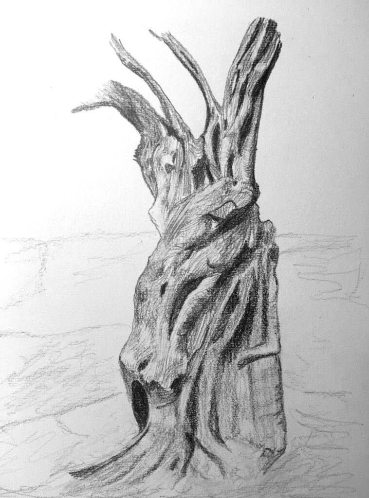
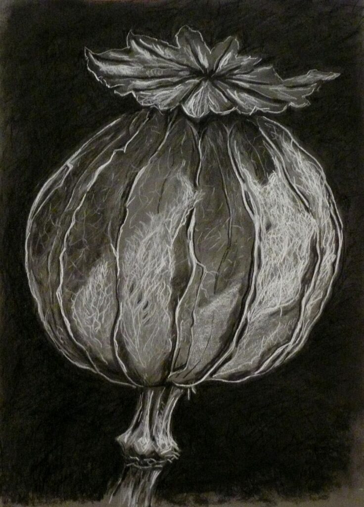
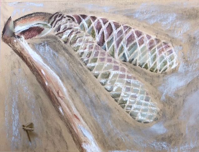
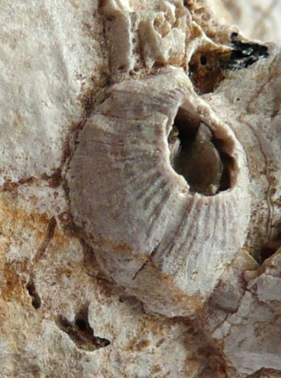
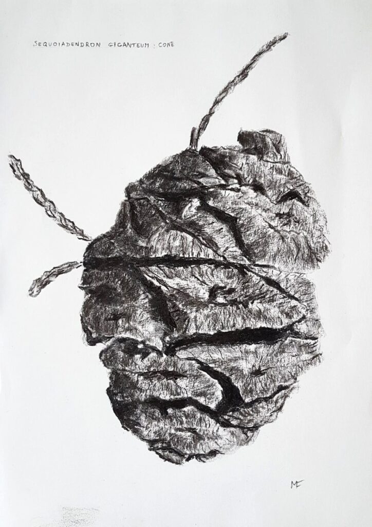
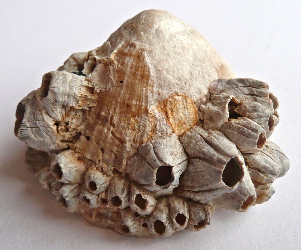
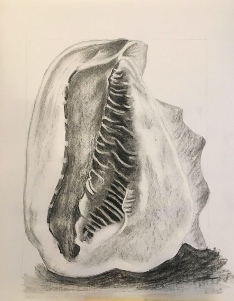
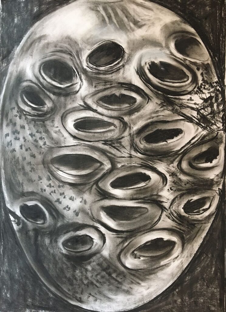
Drawing Larger than Life Week 3: More Challenging Sculptural Forms
November 18, 2021
This weeks challenge will be to draw a more challenging form. The drawings should show the three dimensional form of your chosen object and also communicate surface structures and patterns with mark making.
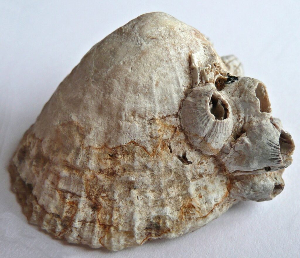
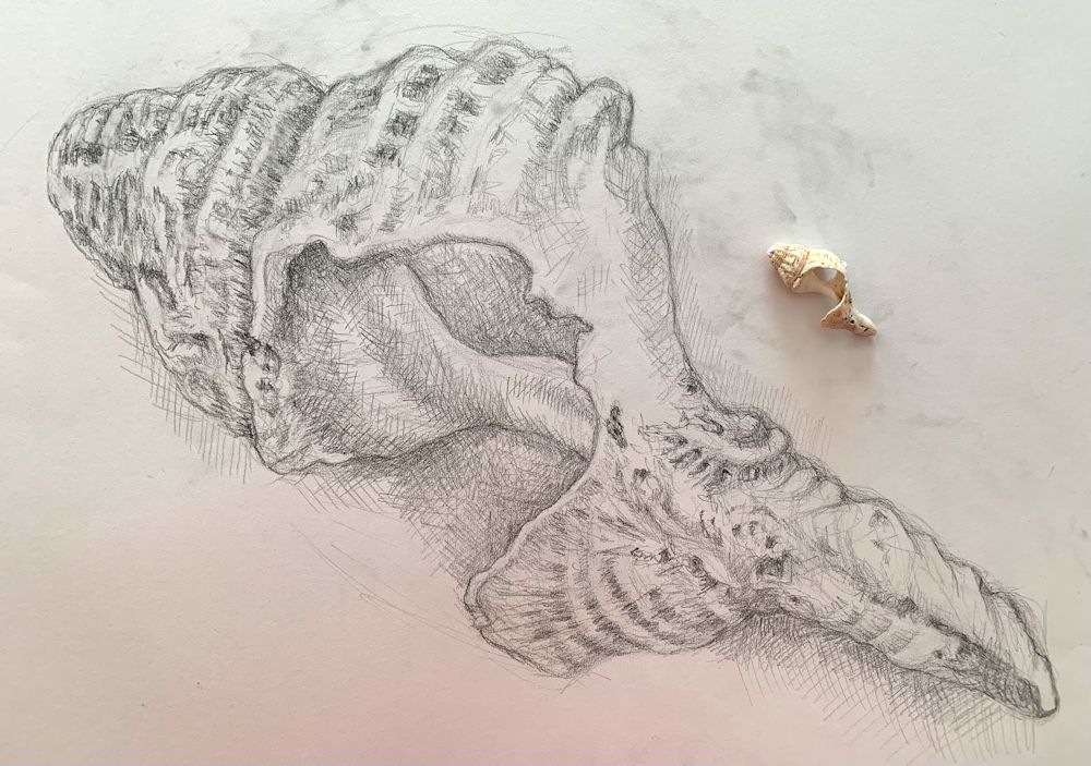
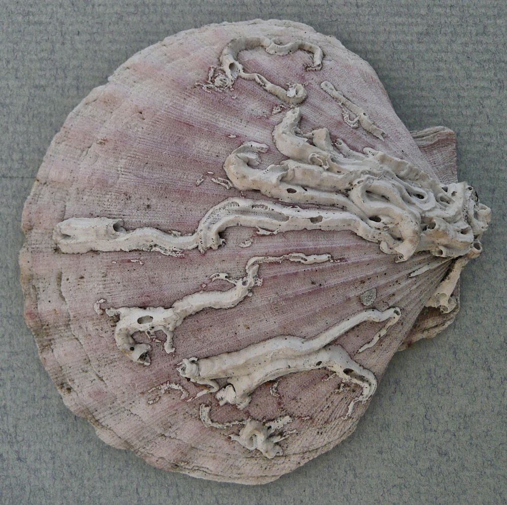
Barnacles on a simple sea shell like a limpet as in the photos above and below would be an interesting choice as you can home in on just one barnacle or the whole limpet shell with it’s whole population of barnacles.
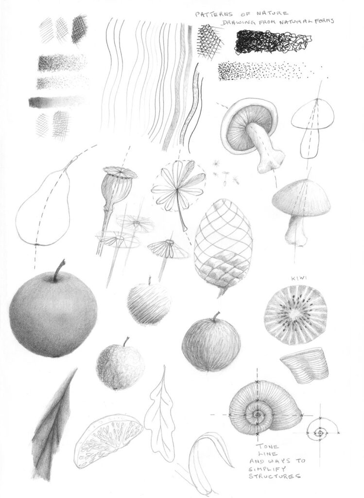
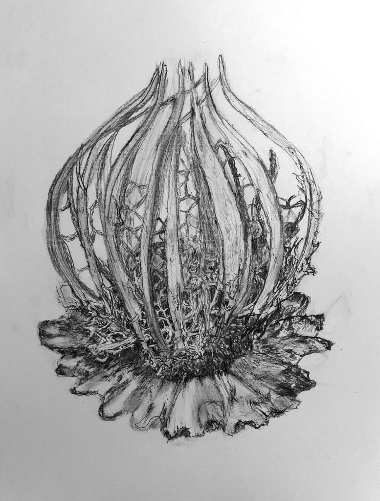
Another choice might be a small pine cone or a detail of a large one. I have included my crib sheet to help with drawing various natural forms at the end of this post. They are all drawn at a tiny scale and your challenge as last week is to fill a sheet at least A2 in size with your tiny object.
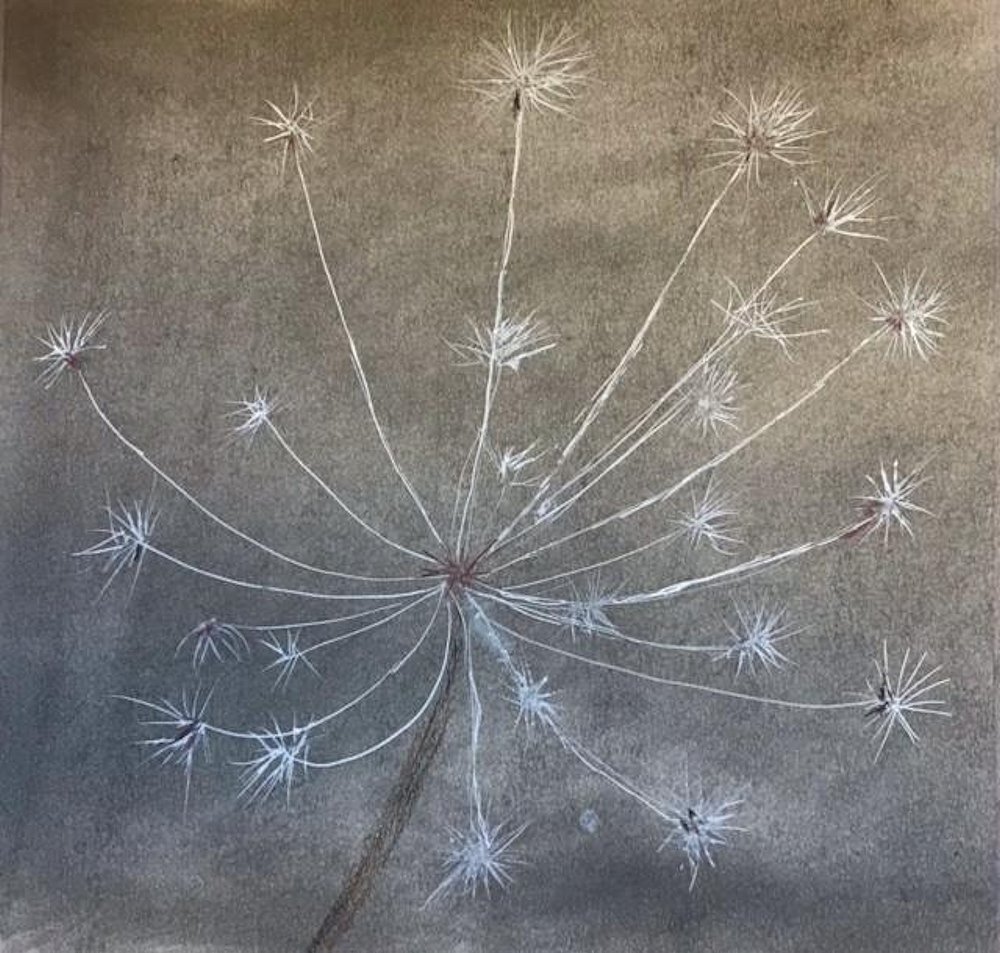
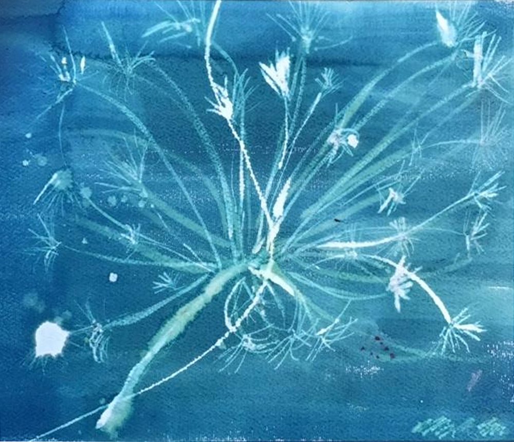
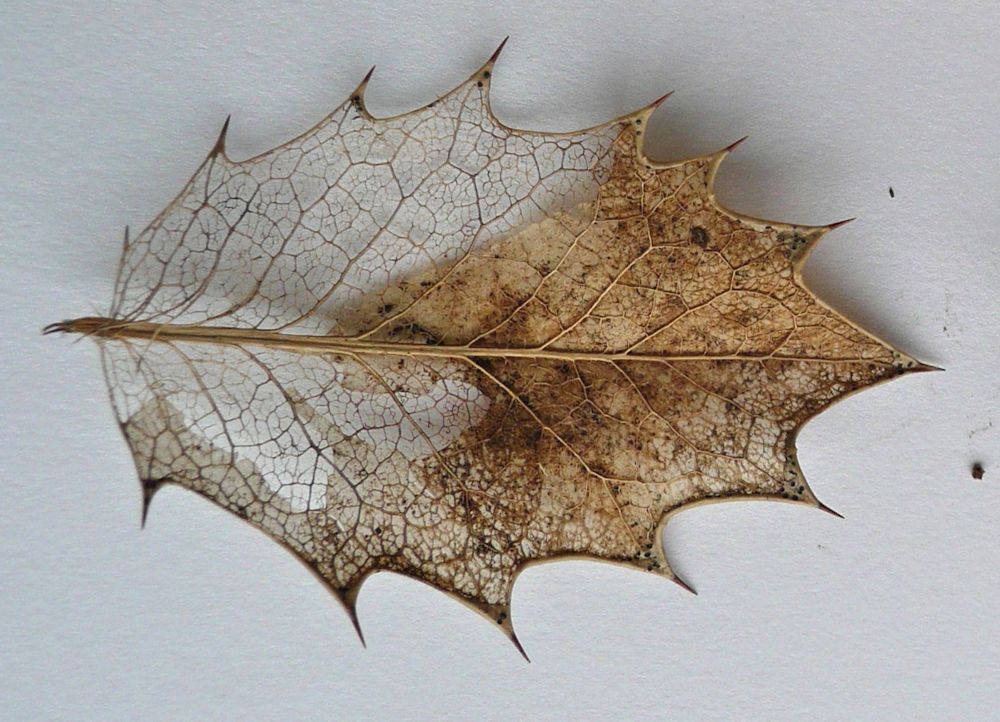
Another idea would be a skeletonised seed head or twig where the structures usually hidden below the surface are revealed.
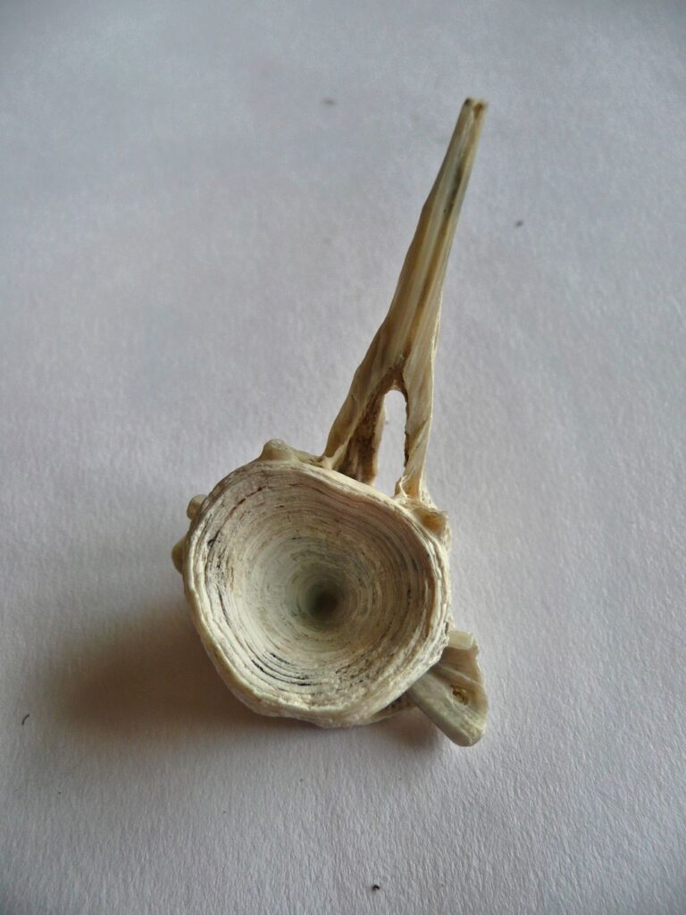
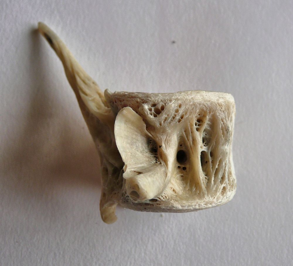
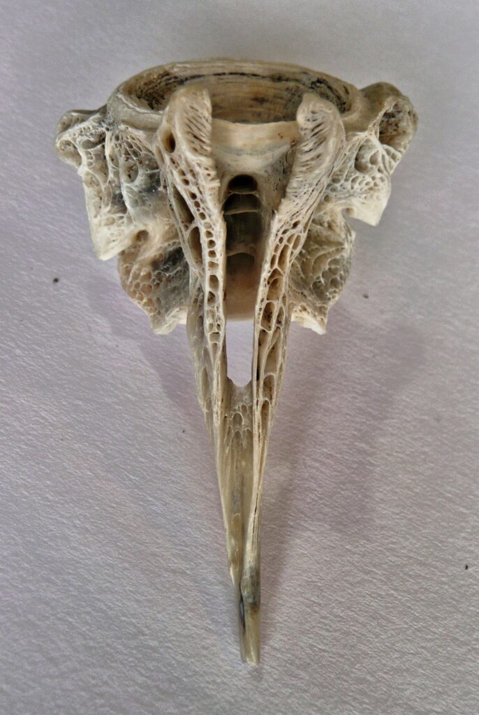
Lastly, bones can also make very interesting subjects and the series of photos below show the same vertebra from a species of fish with dorsal spines seen from different angles. Information on the fish would be much appreciated! The viewpoint of the object you choose to draw will be very important this week. You may even like to do a series of drawings of the same object over the next two weeks.
I’m sure you can make up some of your own.
There is one error at least! The axis of a pear is usually pretty straight even if the stalk bends!
Your Drawings;
All on A2 paper
Grey pastel ground,white acrylic ink, gel pen and brown pencil
by Sandra
Black Quink ink and bleach
by Sandra
Graphite pencil by Jan
Graphite stick 9 and 6B pencil by Jan
Reference for scale, together with graphite and ink drawings
by Jan
Charcoal and pastel by Ann
Charcoal by malcolm
Charcoal and graphite by Maryon
Charcoal by Heather
by Sarah
by Sarah
Watercolour by Maricarmen
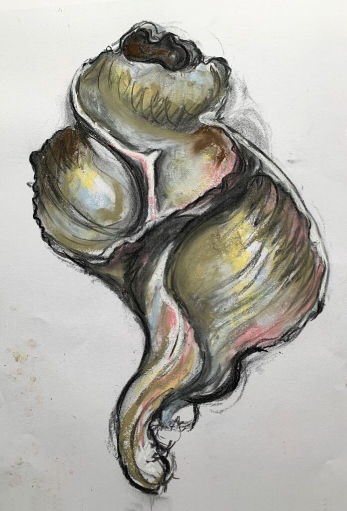
Charcoal by Virginia
Drawing larger than Life Week 2: Flatter forms and Mark Making
November 10, 2021

Photo
Last week we looked at small but sculptural forms and how to make them look three dimensional. This week we’ll look at flatter or low relief forms with a view to depicting their character by mark making and line.
Look for an axis or a point from which a pattern of lines or curves radiate outwards and indicate this on your paper. Look for, in the case of a leaf as above, the point from which the veins radiate and draw them with regard for the angles between them.
To ensure your drawing is large enough make sure that at its widest and highest points these touch the sides of the imaginary rectangle enclosing the whole form. Best to do as last week and draw this rectangle feintly on your paper. Most natural forms are not completely symmetrical, nor will the point from which, as in the Ivy leaf above, will the point from which the veins radiate be necessarily the lowest point of your drawing even if the stalk is missing.
Leaves of course take many shapes, and the arrangement of veins may be along a central axis as in the holly leaf at the end of this post. Once you have drawn the main shapes of you object and added some tone where needed, you can then come to grips with the fun part, hopefully loads of interesting mark making. As ever practice various marks on some spare paper, on the bare paper and over areas of tone. Sometimes it can give a soft effect to tone the paper by light hatching over marks.
Try making dull marks with a blunt or rounded stick or pencil. Also try making well defined marks with a very sharp pencil or by either sharpening a stick of your medium to give a sharp edge. Keep a small piece of sandpaper handy for this. How much you suggest surface textures and patterns and how much you copy faithfully from the object is very much your choice and will depend on whether you wish to create an impression of the object’s character or go for ultimate realism.
Here are a few more photos of the sort of reference suitable for this week’s challenge.

Note its weathered surface and how different it appears to its lower surface. You may like to try drawing both surfaces of similar objects.

Your Drawings: All on A2 paper

Charcoal by Sarah
by Ann
by Ann

by Maricarmen

in carpenters’ pencils and graphite stick
by Maryon

Graphite, charcoal and sienna pencil by Jan

Graphite by Jan

by Virginia
Charcoal by Sandra
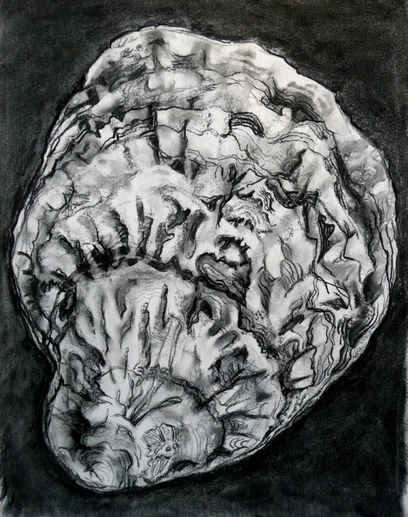
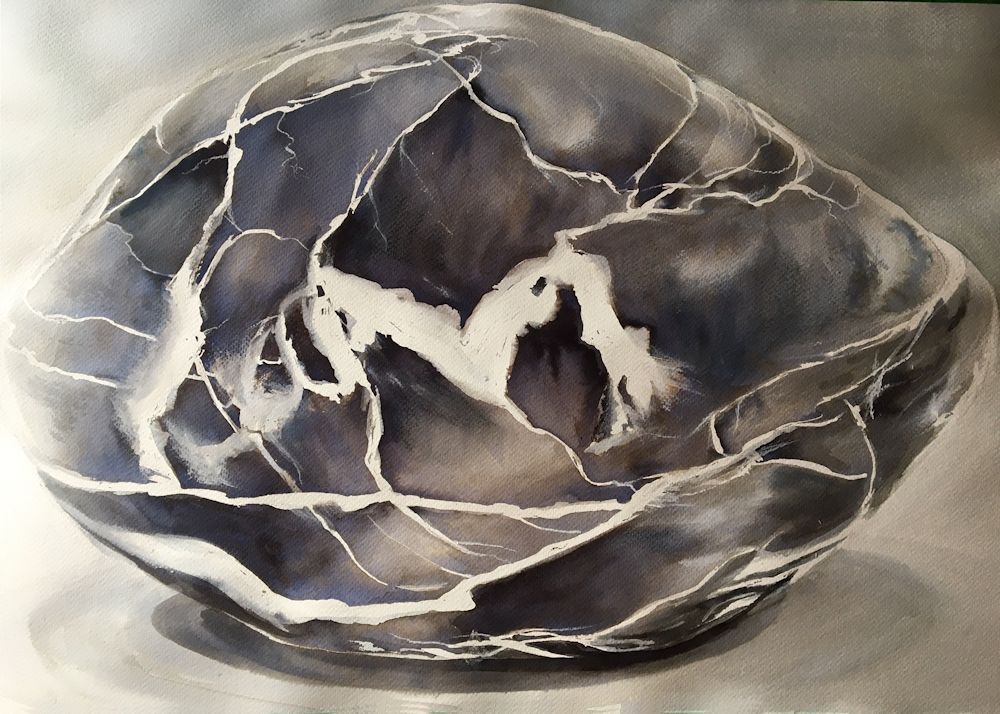
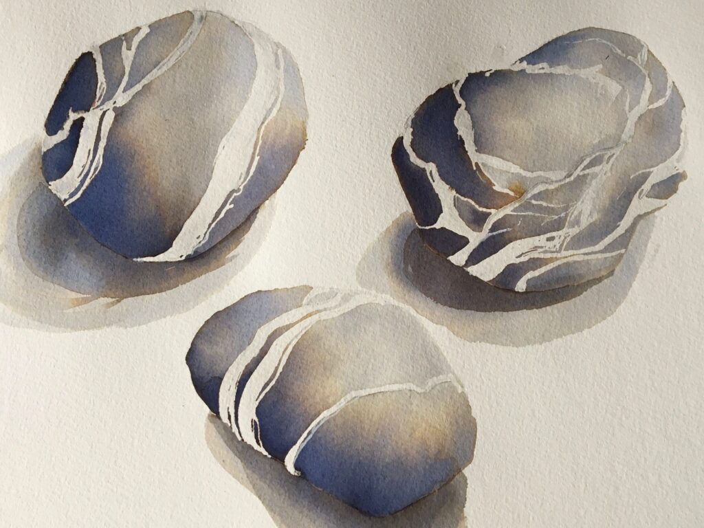
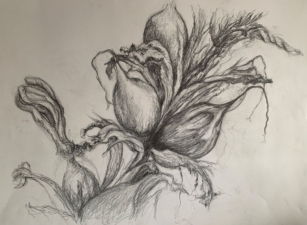
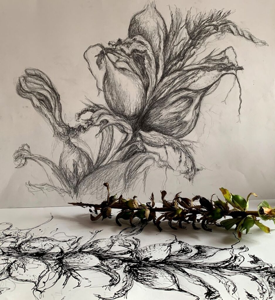
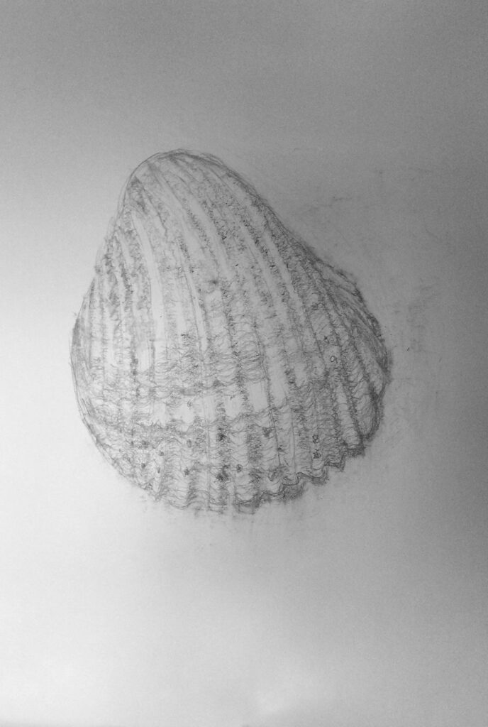
Drawing Larger than Life: Week 1, Natural Forms Sculptural
November 4, 2021
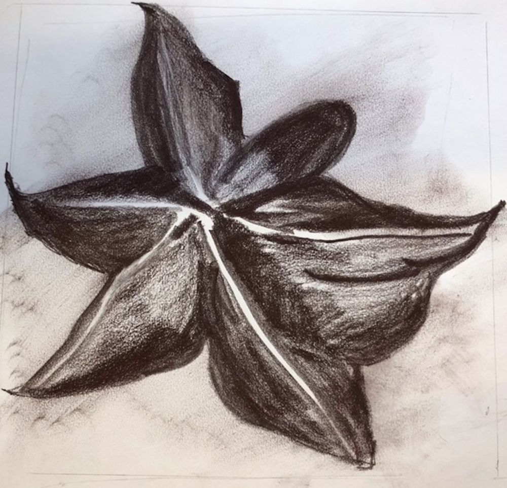
This is the first of four posts about drawing objects larger than life. As a former biologist I have always been amazed at the variety of structures and textures to be found in the natural world and had the opportunity to study their fine detail. However it is just as important with small things to start drawing their general shape and form in the same way as you might begin a drawing of a much larger object. I have chosen four examples see photographs below, which would lend themselves to being drawn much larger than life size. This week they are forms that have a very sculptural feel to them and the aim will be to depict their three dimensional form.
It may be helpful to reference the drawings of walnut halves by the sculptor Peter Randall Page link to his website below;
https://www.peterrandall-page.com/drawings/walnut-i-xii-2/
Many of his drawings are over 1 metre in size.
We are so used to scaling down to draw from the landscape or whole human form that it is quite a challenge to draw something tiny between about 2 and 10 cm on its longest side on a large sheet of paper. Ideally I would like you to work on an A2 sheet but absolutely no smaller than A3.
Once an object has been chosen, spend some time examining it from several angles. Think about its overall dimensions and when you have decided on a view to draw mark out a rectangle on the paper that its sides will just touch. This will help you place the object on the page and also indicate the size at which you will be drawing.
You may like to hold the object in your hand but if working at an easel I generally prefer to attach the object to a piece of paper and work with it on or beside my drawing paper. Try to ensure this is at a comfortable place for you to observe and then draw and minimise any change of direction of your gaze every time you look back from your drawing to the object and back again. You should, especially in the early stages of the drawing spend mire time looking than drawing. Masking tape or Blu-tak is usually sufficient to anchor a small object unless it is very heavy like a fossil or stone.
Choose drawing media according to the size of the paper support and the kinds of mark you wish to make. For instance you may like to start drawing very broadly with a graphite stick or chunky charcoal for the overall shape and tone and then go in with a smaller form of the medium, graphite pencil or thinner charcoal or charcoal pencil for more detailed work. If you have any you could also experiment with coloured graphite and/or coloured charcoal sticks and pencils. Another good choice would be conte crayon that you can use on its side like a pastel or make strokes with the end. Conte crayon is harder than most pastels but is chalky and can be moved a little on the support. All these media can also be brushed with water but as always, it is advisable to experiment first on a separate paper before using on the final drawing.
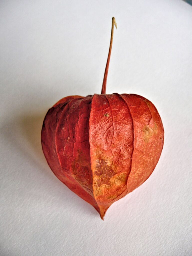
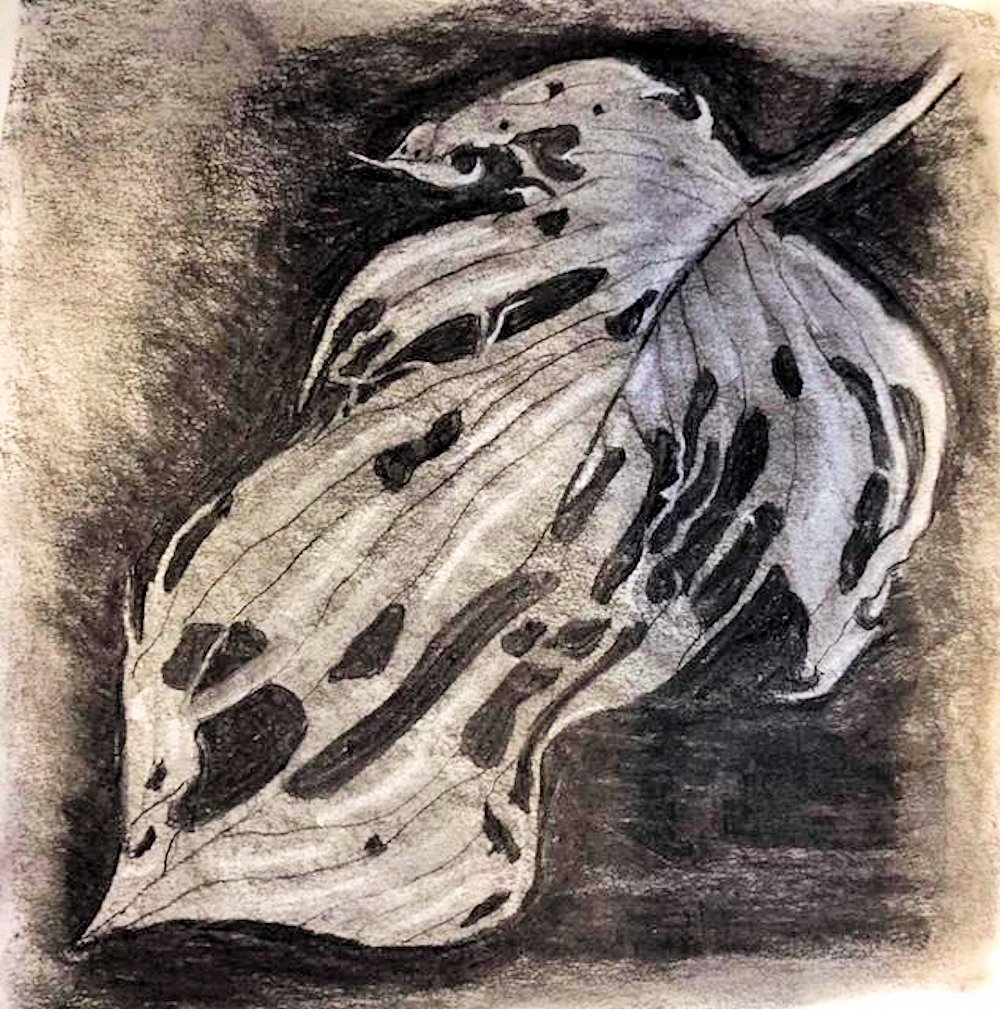
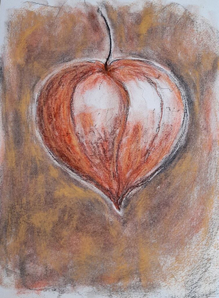
Some forms will have a definite axis as in the Physalis above. In this case the axis of stalk to tip is curved and proves a useful anchor for your drawing. The nectarine also has an axis but it is much more asymmetrical. However all the pits and furrows relate to this axis.
Once you have established the general shape and form of the object you can start to home in on some of its detail. In the nectarine stone this may be the contours of the pits and furrows on its surface. With the Physalis lantern, after establishing the main shape and tones between the main veins, this will probably be indicating the smaller veins with more linear marks and looking at some of the smaller changes in tone within each section.

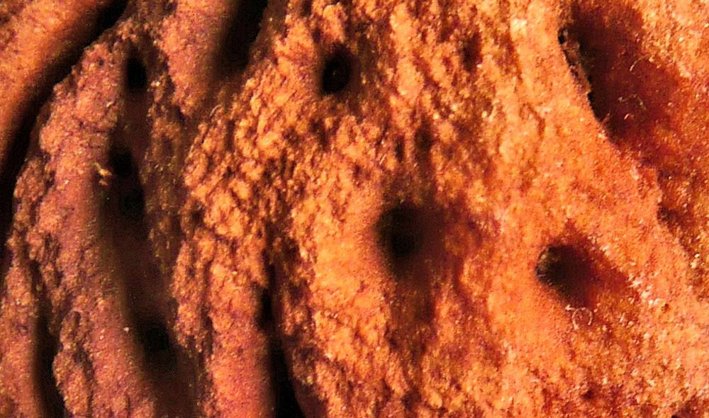
With other objects like the shell with barnacles below, try sketching in the main shape and then look for the curved ridges on this little oyster’s weathered shell. Many of these are hidden by the barnacles that populate its surface. These ridges represent growth spurts and centre on the narrower end of the shell where it is covered by the pot shaped barnacles. Where there are few clues to the underlying structure just map out the main areas and work tonally. In the case of the shell below imagine or even draw in lightly the surface the barnacles are sitting on before drawing them. Note the other textures and structures on the surface and decide whether or not they are relevant to the drawing. The amount of detail as in every drawing is the artist’s decision.
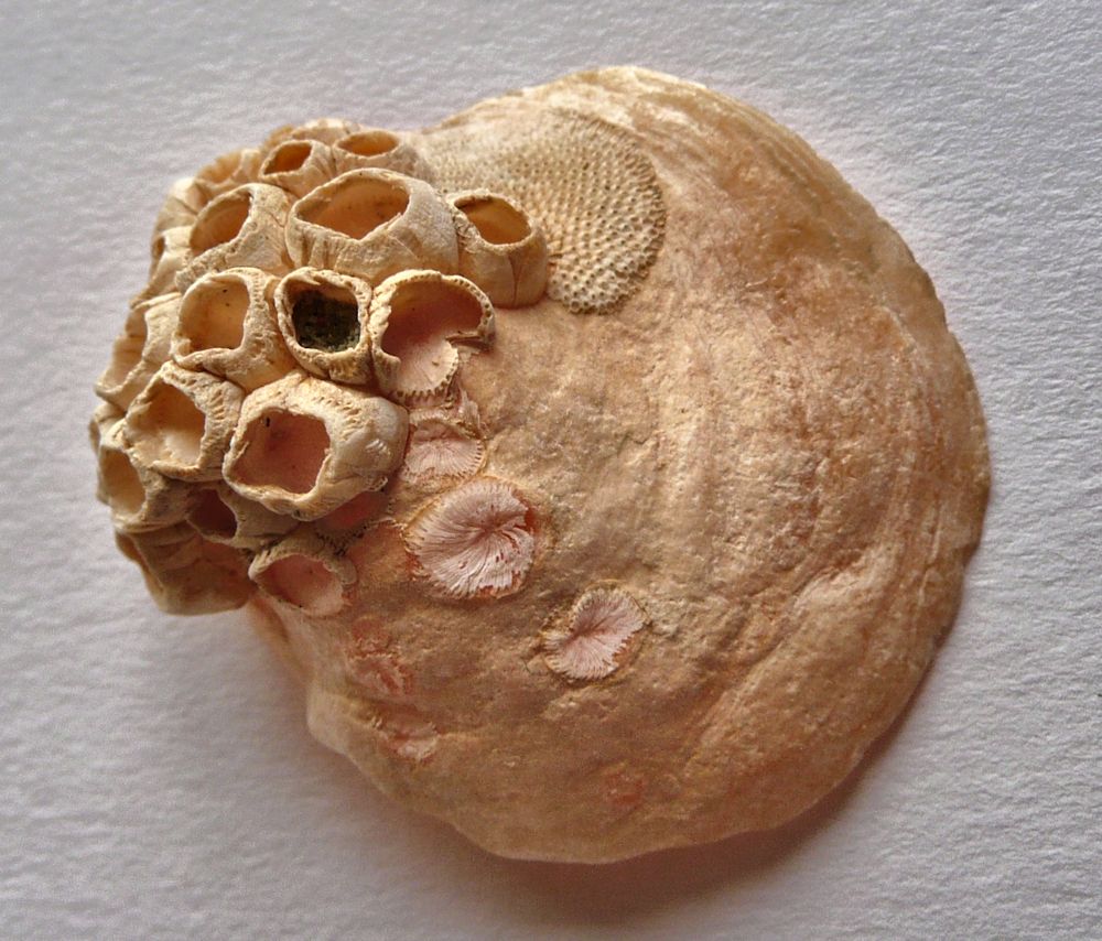

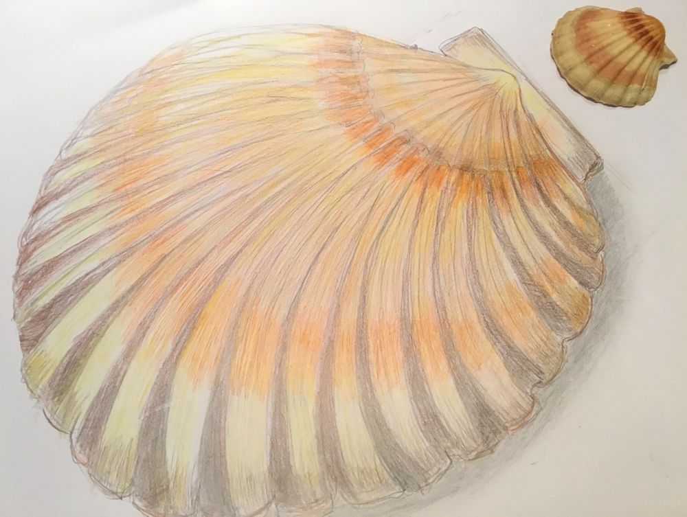
Size about 5cm across
Your Drawings: All drawings on A2 paper unless caption reads differently

4cm long flower-head with bracts
Charcoal and pastel pencil by Malcolm

Charcoal and pastel by Sarah

Coloured crayon and charcoal pencil by Sarah

Coloured crayon and charcoal pencil by Sarah
by Heather

by Sandra
by Sandra
Turned on a lathe to a smooth egg shaped form
Charcoal on A1 paper by Maryon

by Ann

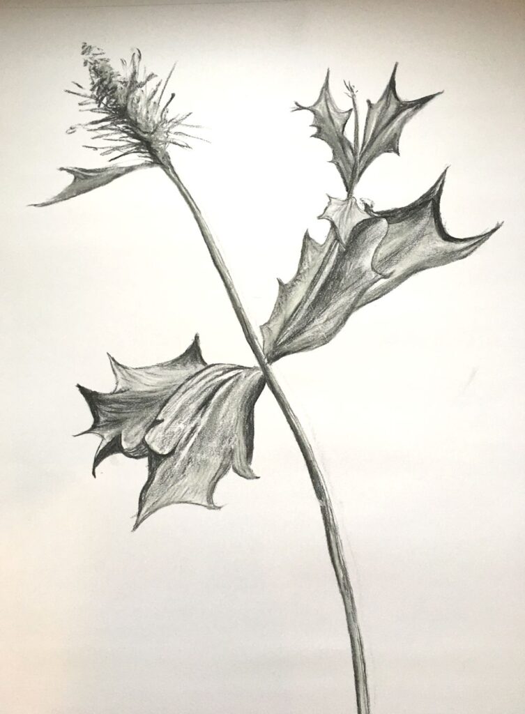
Charcoal by Virginia
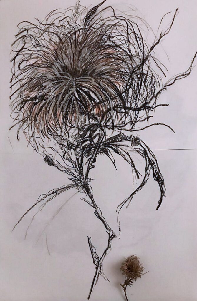
Graphite by Virginia

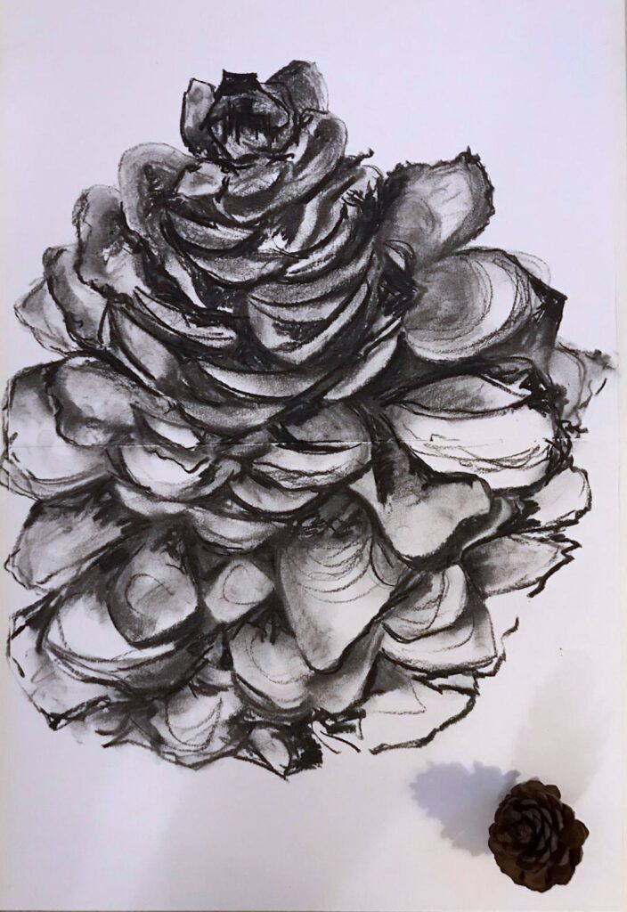
Pastel, pastel and conte pencil and charcoal by Virginia
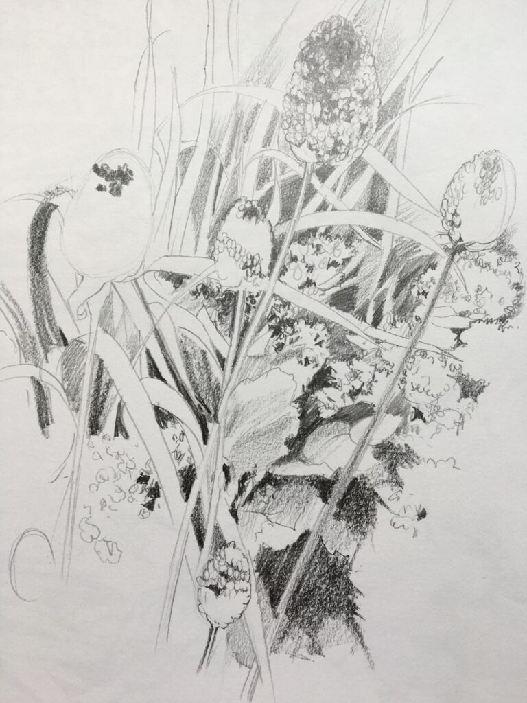
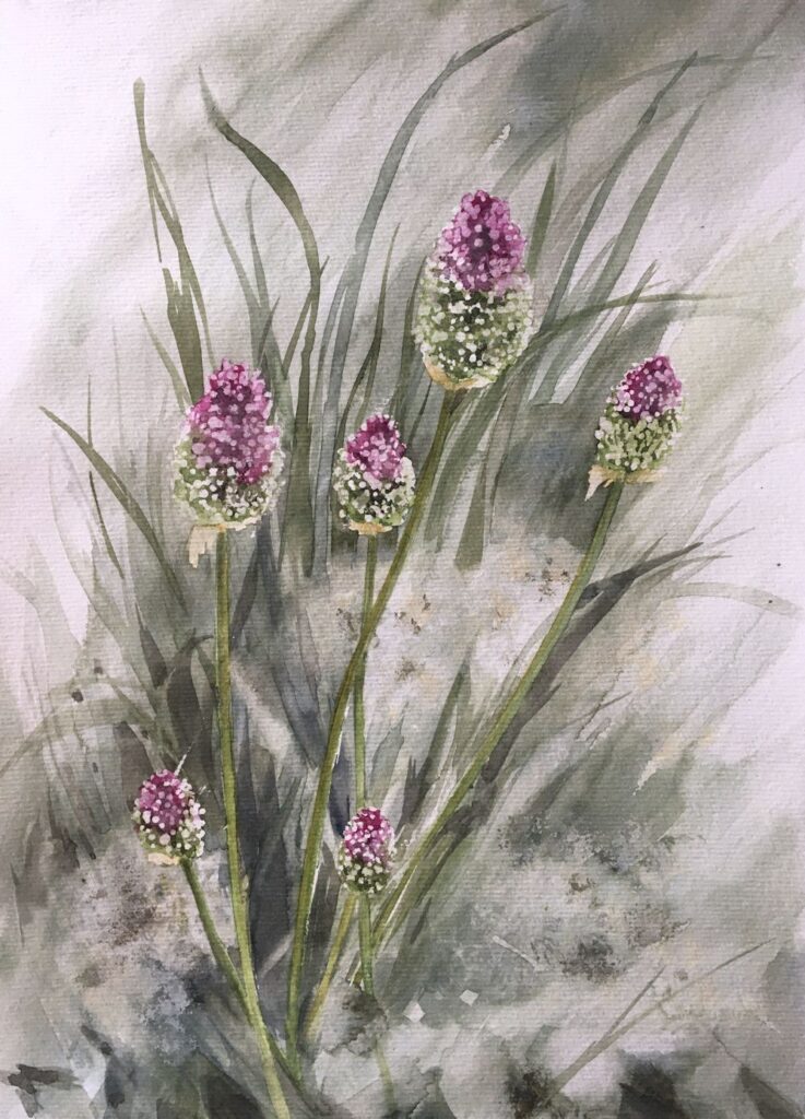
by Maricarmen
by Maricarmen
Charcoal and pastel by Jan
Charcoal and pastel by Jan