Category Archive: Portrait Challenges
Portrait Drawing Week 6: Putting it all Together and Hair
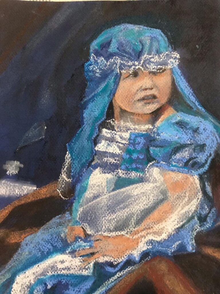
July 19, 2023

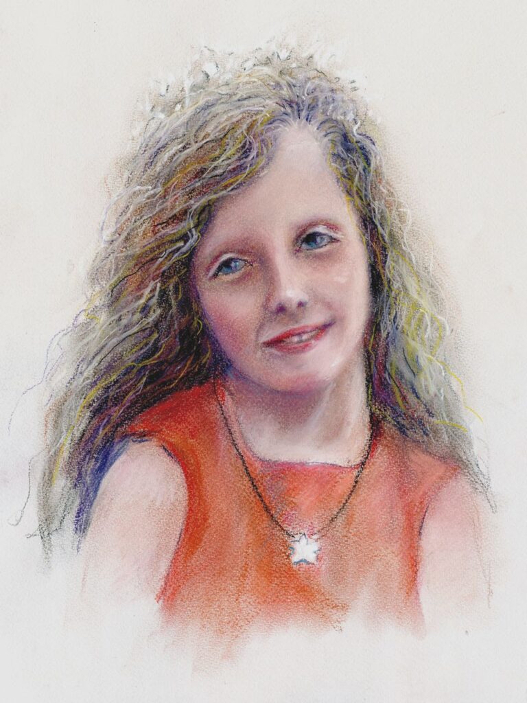
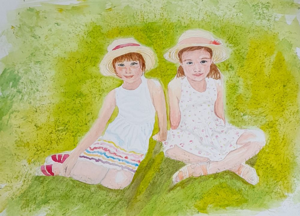
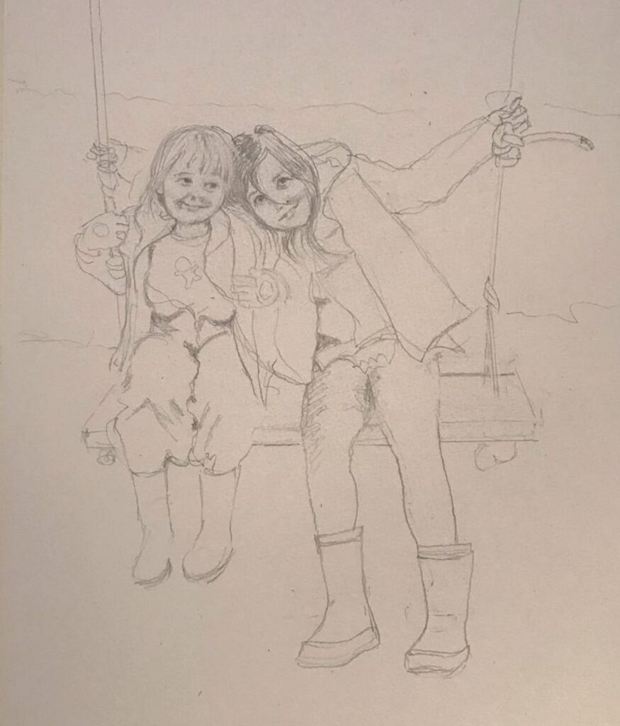
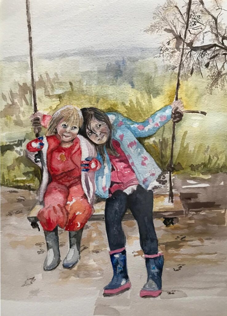
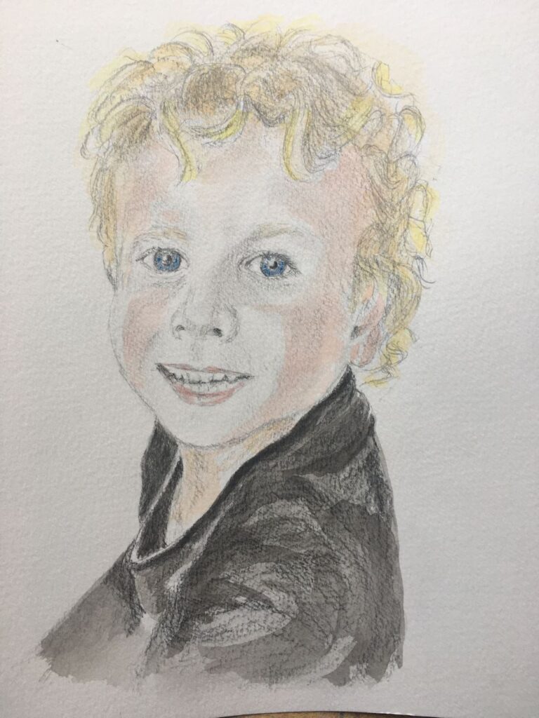
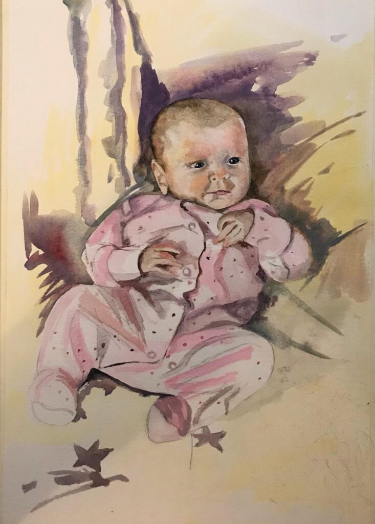
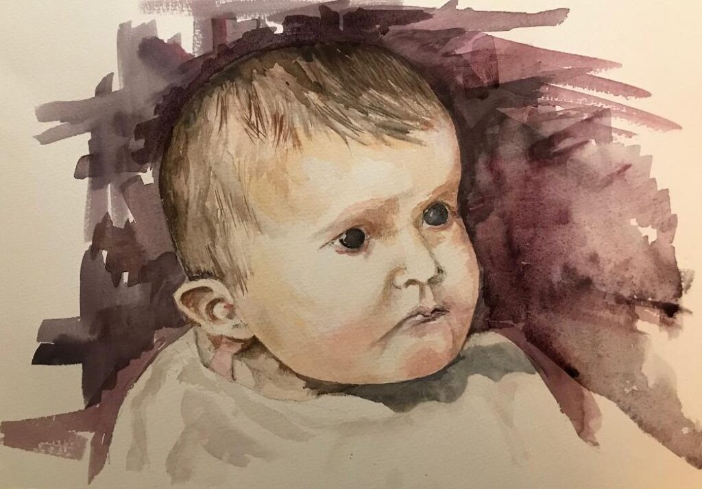
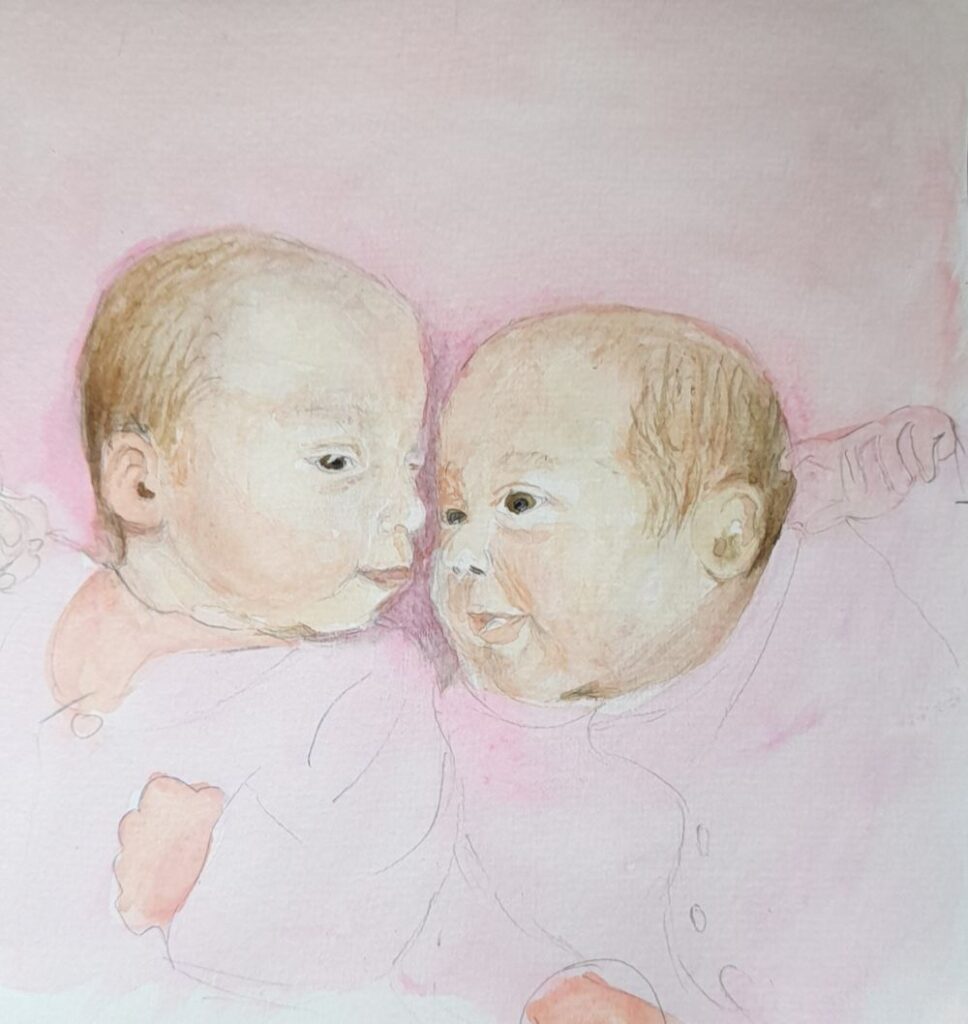
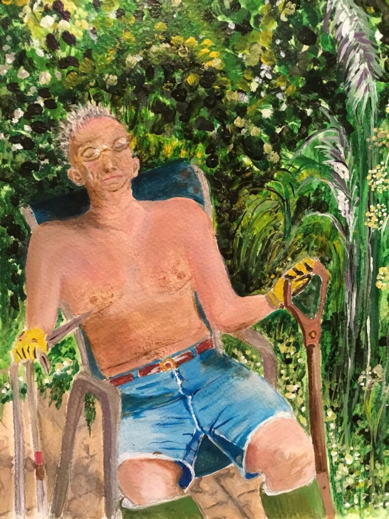
Watercolour by Jo
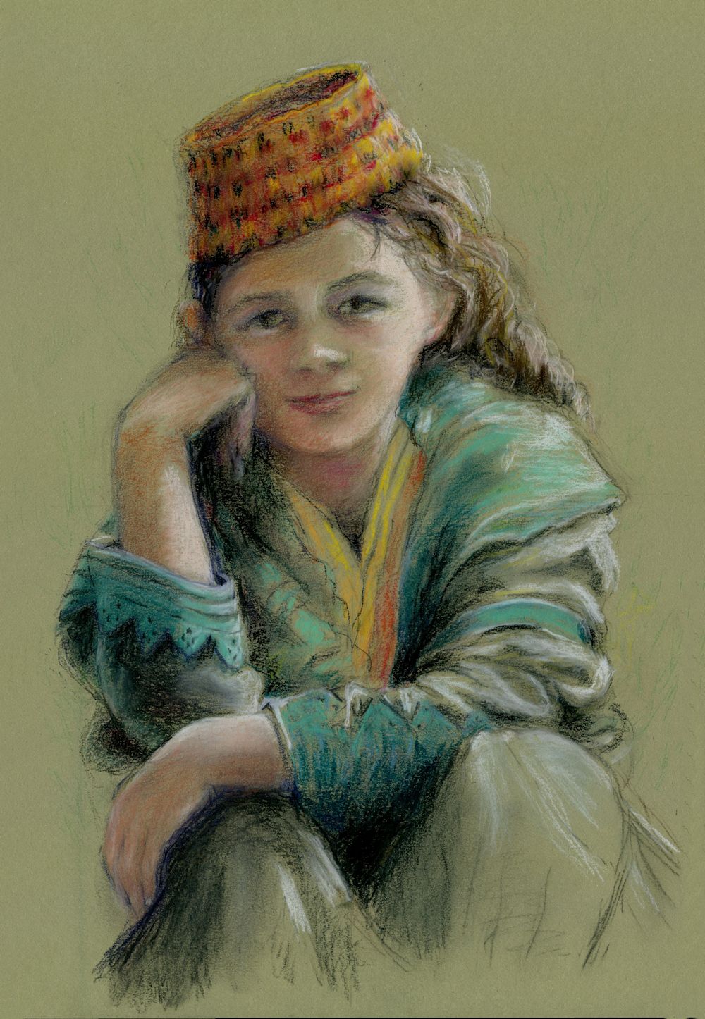
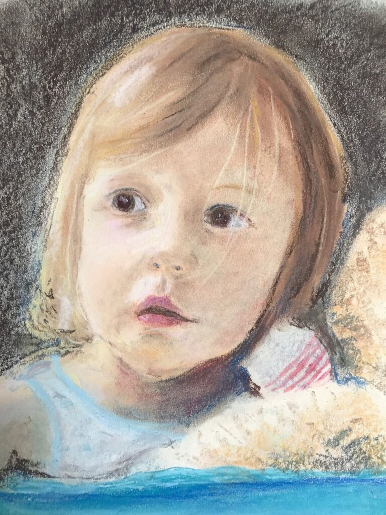
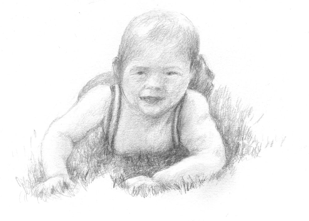
This week we’ll put it all together with an accent on hair. Just as vegetation clothes the underlying topology of the landscape, hair clothes the head, so it’s important not to lose track of the underlying structures of the head. In the portrait above the hair was depicted largely as masses of tone with linear marks showing the direction in which individual hairs lay. I drew several studies of Lucy and photographed her before painting the final portrait in watercolour.
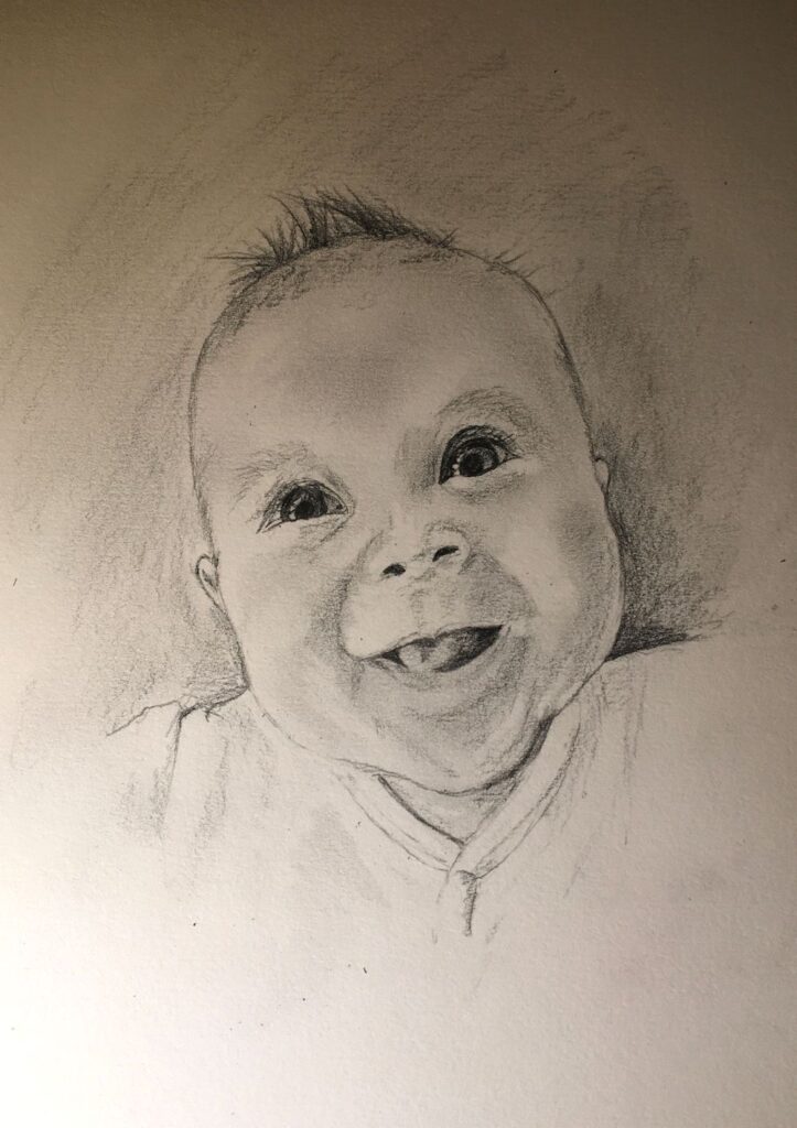
Except for Lucy, above, and the drawing of the young redhead further on in this post, all of these portraits were drawn directly from life.

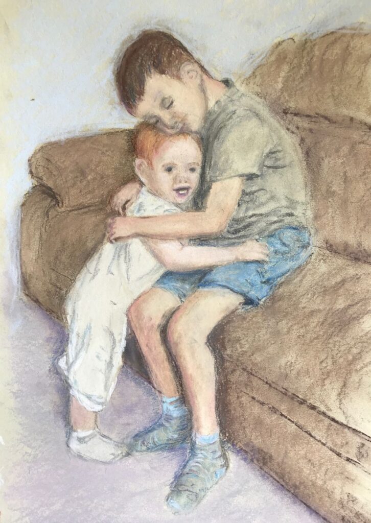
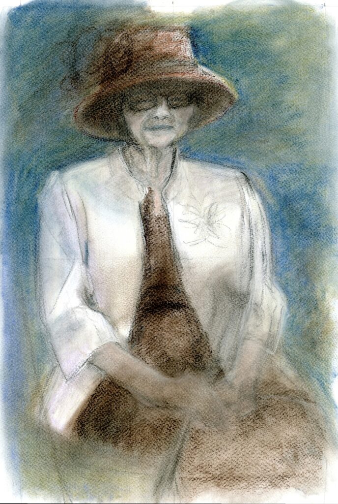
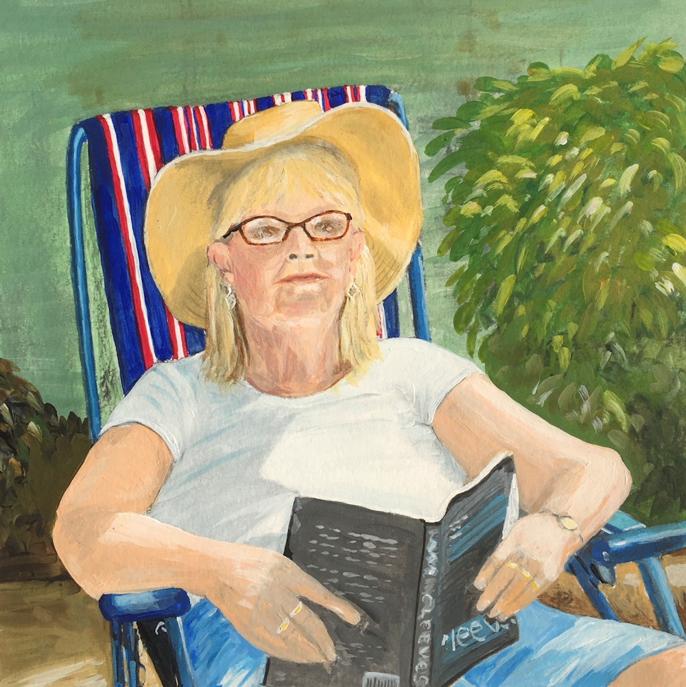
Pastel by Jo
For a moustache to look convincing make sure the underlying shape of the upper jaw is drawn correctly.

Charcoal by Jo
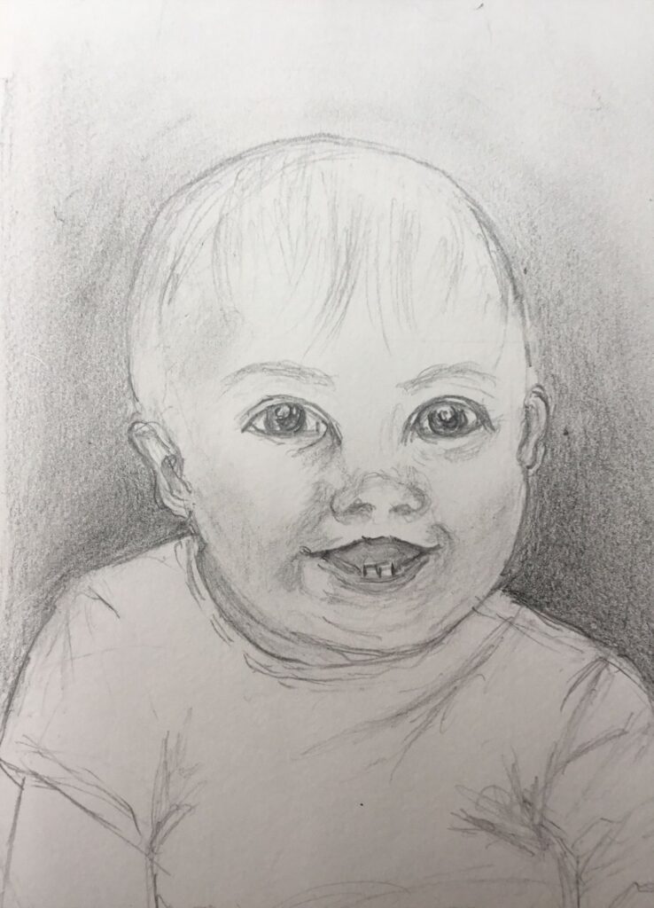
Similarly with a beard, draft in the jaw line and position the ears correctly, before overlaying the beard. With a particularly dense beard you may just have to draw the beard in relation to the mouth and ears. Getting the tones of the main masses of hair in will help to make it look convincing.

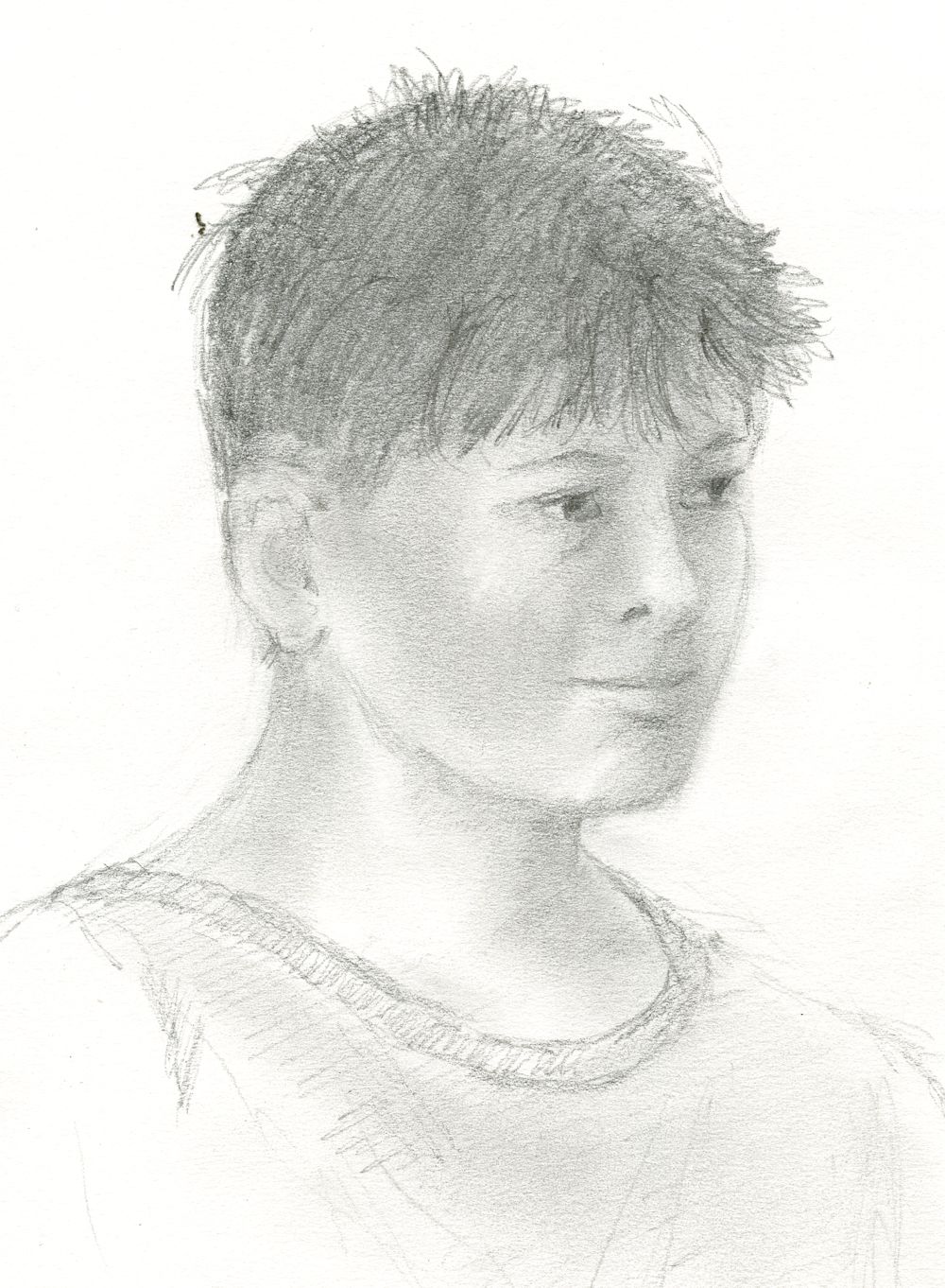
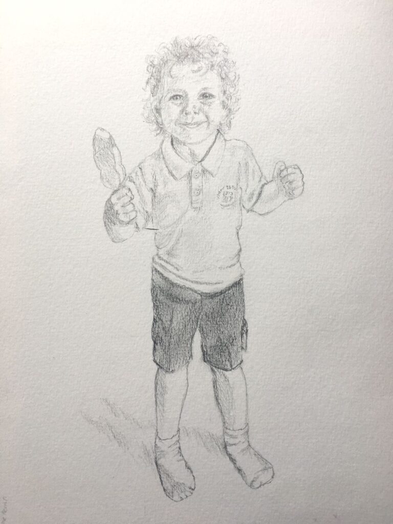
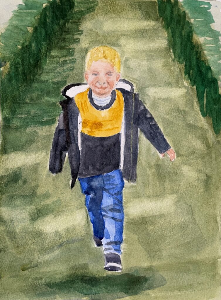
Pencil sketch by Jo
This young woman was drawn rapidly on the Jubilee Line on my way to North Greenwich. Here the head shape was drawn before adding the hair and headset.

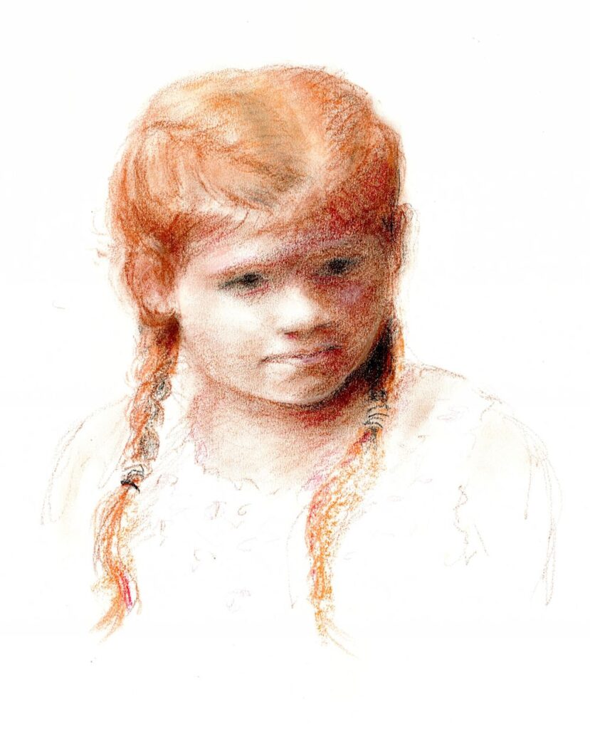
Sanguine and sepia conte crayon by Jo
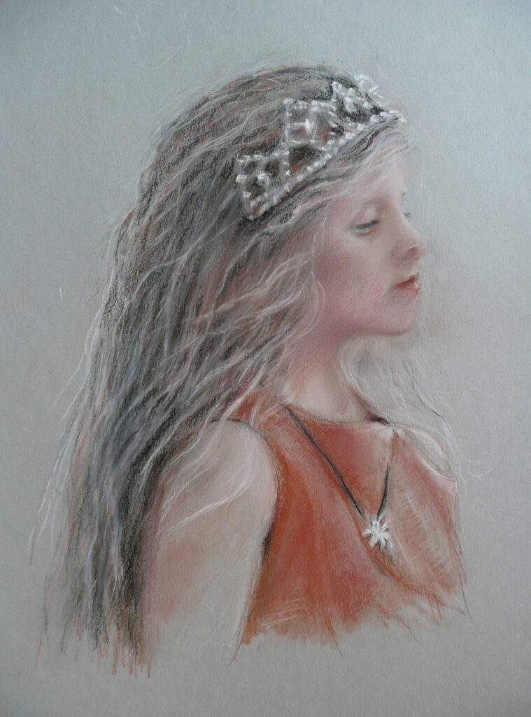
This young girl has featured in a previous blog. I decided to just suggest her plaits rather than draw them in great detail. Again it was important to establish the overall head shape and position the ears before adding the hair. The hair was worked tonally before adding a suggestion of individual hairs in a fairly loose manner.

Pastel by Jo
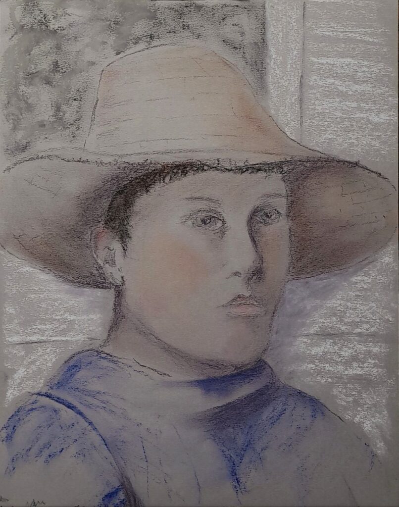
Note how in this portrait the facial features are framed by the hair, earrings and blouse collar. Also I have been fairly adventurous with colour, accentuating the blueness of the shadow areas. Have fun with your portraits this week! Use whatever medium you like and concentrate on hair, or a head with a covering hat, cap, headset or other!
Your drawings:

Three crayon technique by Roger

Sanguine by Virginia

Three crayon technique by Vivienne

by Kate

Pastel by Mali
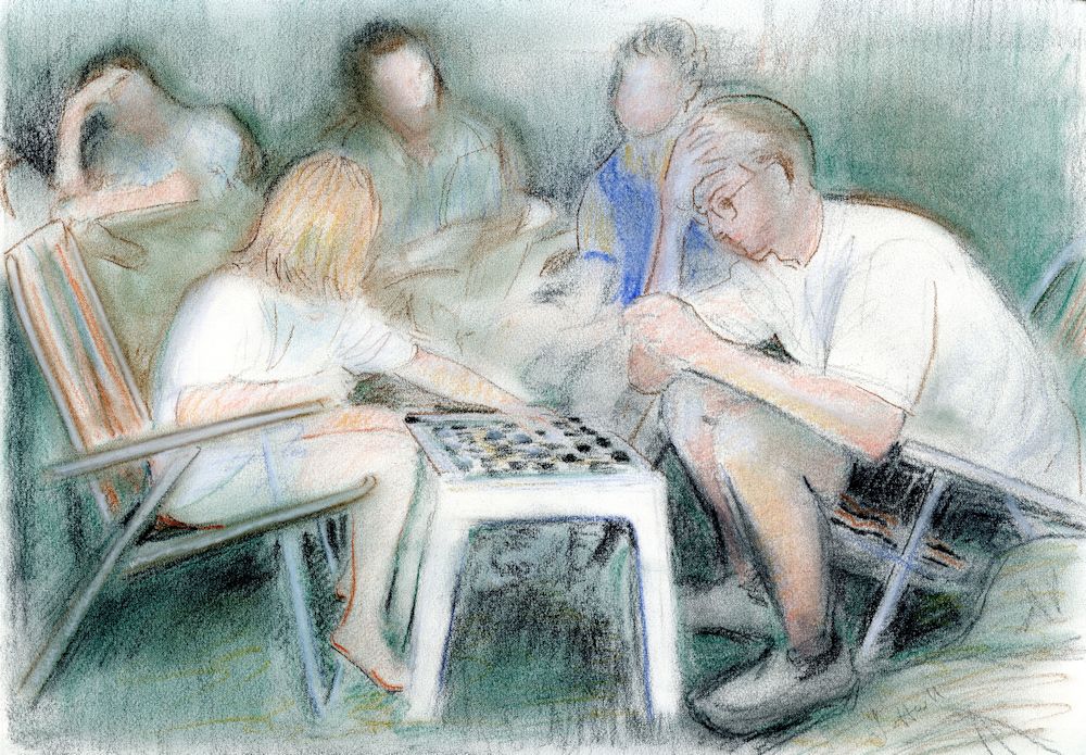
Everyone was allowed to spend up to 15 minutes on each of the sketches on the sheets below;
Very well done as there were some challenging angles and head gear!


Portrait Drawing Week 5: Mouth and Chin
July 13, 2023

Pastel by Jo
This week we’ll look at the mouth and chin. The first thing to note is that the upper jaw is fixed so when the mouth is closed it is the muscles alone that enable us to smile and also to appear relaxed or concentrating. Fred in the drawing above looks as though his interest has been caught by something, he’s concentrating rather than smiling or looking sad. Notice the curve where the lips meet and the shadows below the lower lip and on the chin. This curve between the lips appears very different on the smiling lady below, as the muscles of her face pull the corners of her mouth up.

Pastel by Jo
To understand what happens when we let out a yell or sing have a look at the link below where you will find an excellent drawing of the skull with jaw closed and with it dropped, and also shows the appearance of the face in these two positions.
https://www.pinterest.co.uk/pin/448248969177542053/

Pencil by Jo
See how when the jaw drops it hinges
backwards and down toward the neck.
Below is a link to another rather more fun image showing the hinging of the jaw and various facial expressions.
https://www.pinterest.co.uk/pin/663155113905951759/
In the pastel portrait of Beth below, her mouth is slightly open. Do resist the temptation to try to draw every tooth you can see, very often just a suggestion of teeth and of the dark areas at the sides of the mouth is much more effective than the hard look of teeth drawn in full detail. This looks especially bad if the rest of the face is treated in a softly drawn manner to convey the smooth softness of a child’s face.

Pastel by Jo
So this week I would like you to make at least one study of a closed mouth and one of an open mouth.Then produce a portrait painting or a three crayon study where the mouth is a little open or wide open. You may choose to work in any medium but do pay particular attention to the teeth and go very gently, especially if you are drawing a young person.
There are instances of course, where you may want to depict a real grimace in which case you can afford to be as bold as you like!
Your Paintings/Drawings:

Pastel by Mali

Studies by Mali

Pastel by Mali

Studies by Vivienne

Three crayon portrait by Vivienne

by Virginia

by Roger

Portrait Drawing Week 4: Nose
July 5, 2023

Three crayon technique on grey paper
by Jo
This week we tackle the nose. Several of you will have tackled the nose in profile view last week. That is possibly the easiest view, so this week after making a few studies of noses I suggest you make a portrait where you are directly facing the model or a three quarter view.

Red chalk by Jo
First of all it may be useful to consider the structure and anatomy of the nose. As with ears noses vary a good deal but all have the same basic anatomy. Only the upper part is bone, the nasal bone, which connects with the skull at its upper end at the glabella, and at each side with the maxilla (don’t even try to remember the names unless you are into crosswords, Trivial Pursuit and the like). The rest of the nose consists of cartilages which form the lower part of the nose and the “ball” of the nose. Two wings of fatty tissue connect with the cartilage on either side of the nose ball, and wrap around the base of the nose forming the nostrils.
In many adults a bump part way down the nose can be seen where the bone meets the cartilage. As with other features this is usually a much smoother transition in young children.
A good picture of the anatomy of the nose can be found at
https://www.pinterest.co.uk/pin/448248969177398119/
There is a six minute video at the start of this post by Stan Prokopenko explaining how to simplify the nose into four main planes sides, top and base and how the nose appears in relation to the rest of the head when the head moves from side to side and up and down.

Charcoal sketch by Jo
Not a perfect drawing but dramatically lit

Pencil drawing by Jo
Note the very different nose shape and the lighting.
Make several studies of noses and how they appear from directly in front and in three quarter view. Note how the nose protrudes from the general mid-line of the head. Then draw a nose when the head is tilted up so that the nostrils are visible and down with the chin tucked in. If possible draw from the same person, otherwise work from whatever reference you can find. These should be sketches that show the structure so no need to work them up. Lastly make a portrait drawing where the nose is dramatically lit from the side or at least from an angle that produces strong areas of light and dark on the nose in question.
For inspiration on how other artists have tackled the nose look at my Pinterest Portrait board at https://www.pinterest.co.uk/jhall1282/portraits/
Hope you enjoy the nose!
Your Drawings:

by Virginia

by Virginia

by Mali

by Mali

by Vivienne

by Roger

by Roger
Portrait Drawing Week 3: Ears
June 28, 2023

Three crayon technique by Jo
Note how far back the ear is and its
relation to the line of the jaw.
Curiously our ears are not as symmetrical as all that. The ears below are from the same person. There is a general pattern but they are different. If you have a friend who will sit for you or will allow you to photograph such a delicate part of their anatomy that would be great. Not only will you spot the differences but you will get used to drawing ears of both sides of the head.

Many people find it easier to draw faces in profile facing one way than facing in the opposite direction. It’s the same with ears!
Also because we don’t peer directly at our ears in the mirror we are not nearly as familiar with the strange contours we will discover this week!
This week the challenge is to draw a pair of ears and then to draw a portrait head in profile where the ear is totally exposed so earrings are in, but covering locks are not. If you have time do some quick sketches where the ear is only glimpsed or draw what you can see of them when the head is straight toward you or in three quarter view.

Pencil by Jo
When drawing the ear you may like to think of it as two curves traveling in opposite directions.

Pencil and ball point pen by Jo
Start by drawing the main outer curved shape and a straight line to indicate where the ear meets the skull. You may find the arrows help you sort out the main structures.
I tend to draw the outer round shape lightly and then indicate the straighter line where the ear joins the head. The ear is usually at a slight angle and the lower part of the ear attaches the head just above the hinge of the lower jaw. You can feel this by placing your fingers just below the ear and lowering your jaw.
There are some ear references in the “Portrait Techniques” section of my “Portraits” Pinterest board at
https://www.pinterest.co.uk/jhall1282/portraits/portrait-techniques/
Do look at some of the other portrait sections and note how artists have depicted ears when the head is in different positions.
Your Drawings:

by Virginia

by Virginia

by Vivienne

by Vivienne

by Roger

by Mali

by Mali
Portrait Drawing Week 2: Eyes
June 21, 2023

This week we are looking at the eyes, their structure, how they lie shadowed in their sockets and how they appear when the head is seen from varying angles. Look back especially at the drawings of Watteau, Sometimes the eyes are just marks suggesting the eyes and at other times in more refined drawings much of the structure can be seen. Also look at other portrait heads and note the difference in appearance of eyes of children and older people.

From the front you are not so aware that the eye is ball shaped and lying in a socket. However the eyelid, especially when the eye is closed does look curved to fit the eye. This is seen even more clearly when the eye is seen in profile view as below, as can the spherical form of the eyeball.

Practical:
1.Firstly draw an eye and its surrounding socket when you are looking at the face almost straight on. Then try the same when the head is in profile view. Try both when the head is looking up and down.
2.Draw both eyes when the head is looking up, and down. Notice that there is approximately one eye width between the eyes when the face is viewed directly from the front. For your model, best would be to draw from life. If not work from photos of the same or different people. If you have time draw both eyes and how they track what they are looking at when the head is relatively still. How do the eyes appear when looking from side to side and up and down?
You may use any drawing medium and the aim will be to fill a sheet of A3 size with eye sketches.
3.After this warm up you may like to paint or draw a portrait, using your knowledge to place the eyes well, and give particular care to the fact that as the eyes are sunk into the eye sockets they are often shaded relative to the rest of the face. Some of your sketches may be quite detailed. This does not mean they need to be detailed in your portrait choose to work them in the same style as the rest of the drawing or painting.
Your Drawings:

by Vivienne

by Roger

by Virginia

by Kate

by Kate

by Mali

by Mali

by Mali
Portrait Drawing Week 1: Three Crayons
June 14, 2023

by Jo
Using black, white and sanguine on grey paper.
Starting by drawing a portrait head or head and shoulders, over the next few weeks we’ll go on to look at different parts of the face and depicting hair, in more detail. Firstly, do remind yourself of the general proportions of the head and placement of the features. This week we’ll use the head to explore the three-crayon technique. Historically this has been used for preparatory drawings for oil portraits and also for finished works in their own right. Some examples can be found on the following Pinterest board, link below:
https://www.pinterest.co.uk/jhall1282/coloured-grounds-drawing/three-crayon-technique/
Here you will find works by Antoine Watteau, Peter Paul Rubens, Jacob Jordaens and others you may not be so familiar with like Frederico Barocci and Jean-Baptiste Greuze. Much later artists working in this medium are Elizabeth Sonrel (1874 to 1953) and the portrait drawings of the contemporary artist Weillie Wu especially his portraits of Tibetan women and girls.
Also well worth a look is the article below about Holbein’s drawings, link below. Holbein often combined different drawing media within the same work, ink, charcoal, red chalk, etc.
For these studies you will need just three “crayons” in black, terracotta or sanguine, and white. The “crayons” may be conté crayon, hard pastel, pastel pencil or pastel. The black may be charcoal.
You will also need a coloured ground with a tooth (pastel paper or board, or a board painted with a tinted gesso). Traditionally this has usually been a warm grey or sometimes a pale green. You can make surprisingly realistic skin tones using these three colours on a warm grey. The black serves as the deepest tone but can also look quite blue when mixed with white and contrasts well with the redder chalk/pastel.
You may start with the red first or the black and hold back with the white till you are ready to add some pale areas. However there are no rules. I would advise making your initial marks with a light touch till you are happy with the main shapes. Then add stronger tones and lines.

Practical:
1. To get an idea of how the materials work together make some swatches of the colours alone and mixing by layering, hatching or blending. Each method will give a slightly different result. An important thing to notice is that the reddish chalk and white give very warm tints and the black with white gives very cool almost blue tints, so together with using the paper as a colour you have a limited but useful palette.

2. Then try drawing an oval and use the chalks to make it look as three dimensional as an egg. You could do worse than choose an egg as your first model as you can draw in the shadow as well.

by Jo
3. Draw an imagined head using the three chalks. Start with either the sanguine or black; I have a preference for using the red first and limiting the amount of black. Look at the Pinterest board see how some artists work by blending the materials and others by making distinct marks with each colour and use line, hatching and overlaying. Also note how the paper is used as a tone/colour.

by Jo
This doodled head could have been developed further. The eyes could have been marginally lower unless this character’s hair was flat against her skull!
This is also a good exercise to recall the basic proportions of the head.
4. Choose a reference, perhaps a young woman and make your own three crayon study. Note that in making these drawings you will be leaving some of the paper untouched. If you find it a bit difficult, try just making a black and white, or sanguine and white study this week, and using all three crayons together the following week.
Your Drawings:

by Mali
Three crayon technique

by Roger
Three crayon technique


Charcoal and white chalk
by Virginia

Charcoal
by Virginia
Portraits of Older Children: Week 6
July 20, 2022
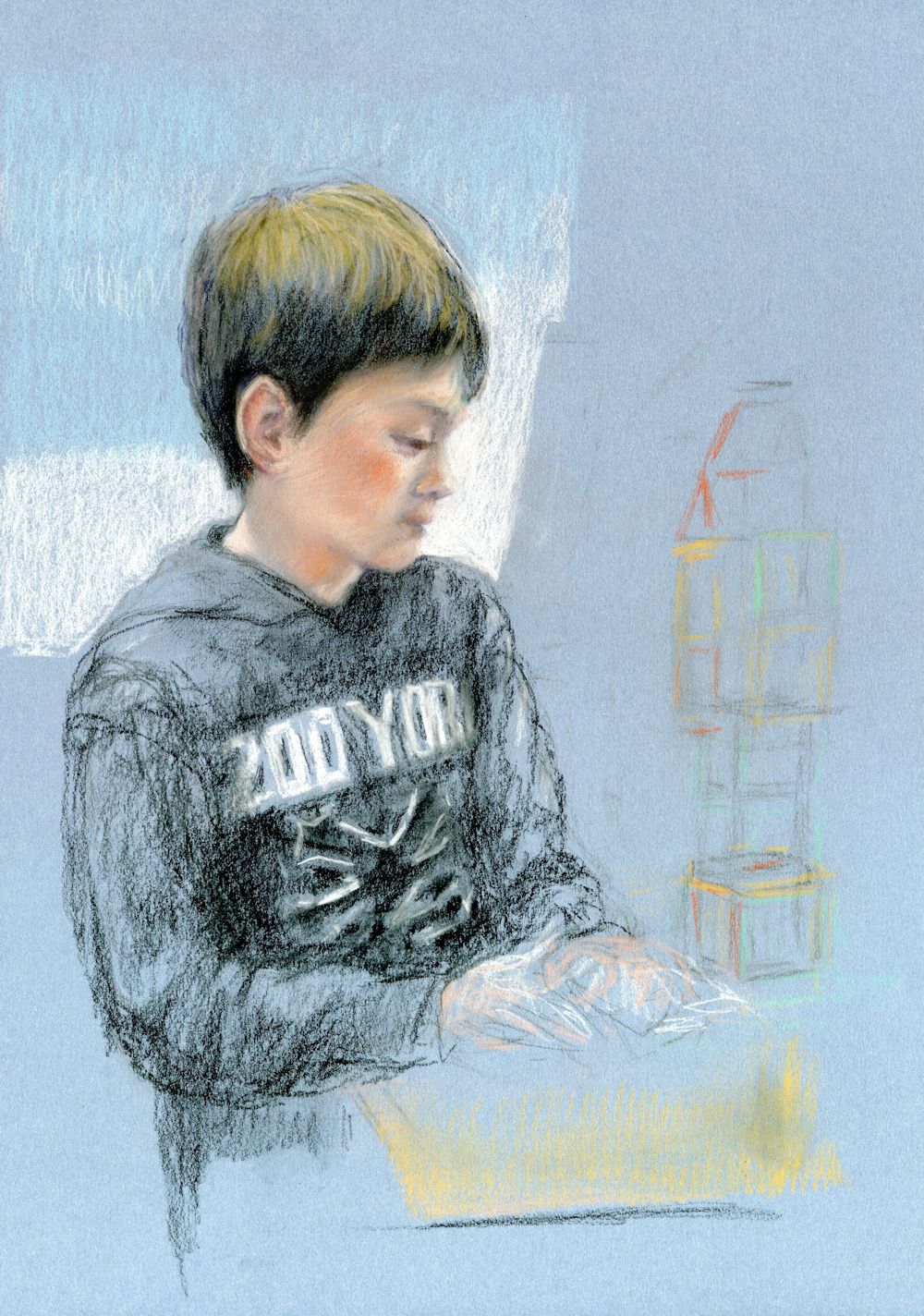
Charcoal and pastel pencil by Jo
Note the simple treatment of the hands
In this final week, after reviewing the work it would be good to finish any outstanding projects, complete last week’s portrait or start a new portrait with more than head and shoulders.
Charcoal and pastel pencil by Jo
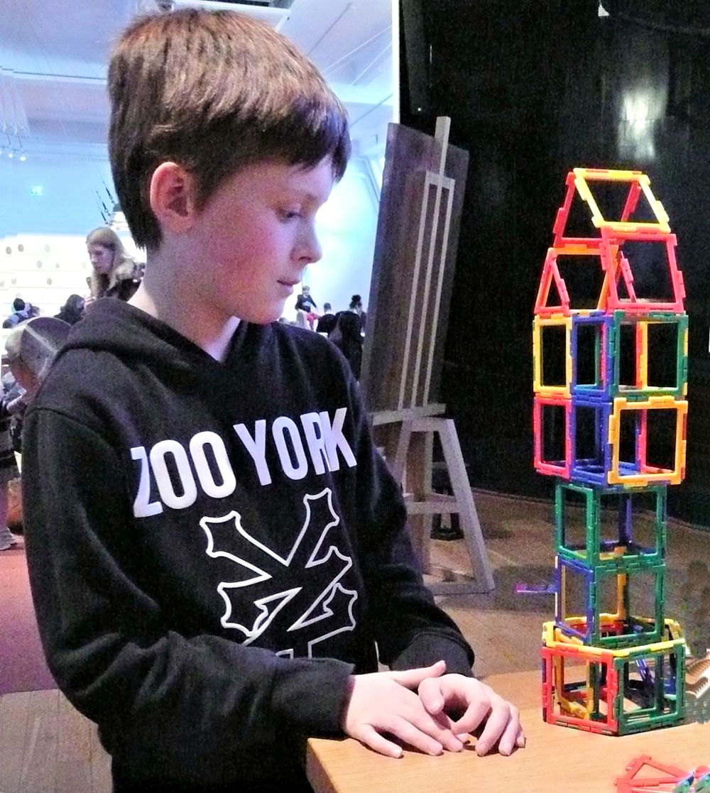
Here the hands have been very freely sketched in. I am still deciding whether to work further on them or leave them suggesting movement. I may add a few more of the magnetic building blocks in the foreground instead.
You may like to work a portrait of a child engaged with a particular activity or in costume for a school play. If so aim to include some relevant objects. We haven’t talked much about backgrounds but look how effective it is to use the background colour and tone as part of the composition as in Toby at 9.
If you attempt a full length portrait you may like to work at a larger scale.
With the standing figure remember that the neck is always directly above the foot which is bearing most of the weight and central if the load is being equally shared by both feet. It can be useful to use a grid as last week or especially in the case of a standing figure drop a vertical on your reference and your support and measure heights and widths from that.
Your Paintings:

by Vivienne

Oil by Virginia
Portraits of Older Children: Week 5
July 13, 2022
This week you may like to work a profile view or include more of the figure.
First, a recap on useful mixes for flesh tones from a basic palette:
Two earth colours that are useful both for skin tones and hair are Burnt Sienna and Burnt Umber.
Burnt Umber makes great darks when mixed with Ultramarine Blue. When mixed with varying amounts of primary colours and white a great variety of skin colours can be mixed using Burnt Sienna and for darker complexions with Burnt Umber. A few of these mixes are illustrated below:
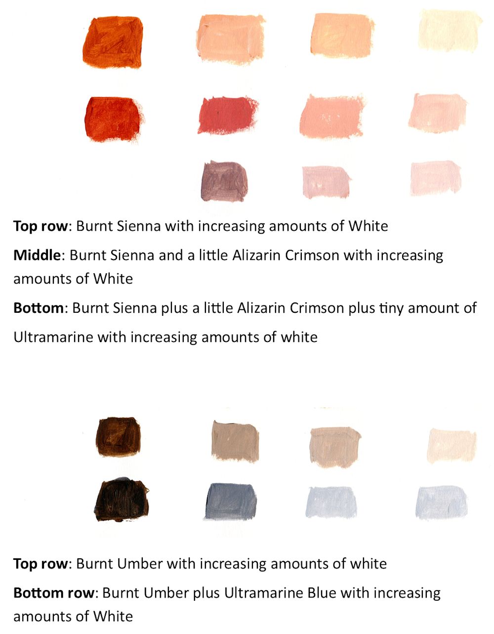
Try mixing other combinations of primary colours with Burnt Sienna and Burnt Umber and you will be able to make lively muted and coloured grays for shadow areas as well as much warmer and cooler skin colours.
In a way the above is a short cut as similar colours can be mixed from primary colours.
Below is a tiny sample of some of the colours that can be made with Alizarin Crimson, Ultramarine Blue and a pale yellow like Cadmium Yellow Pale or similar.
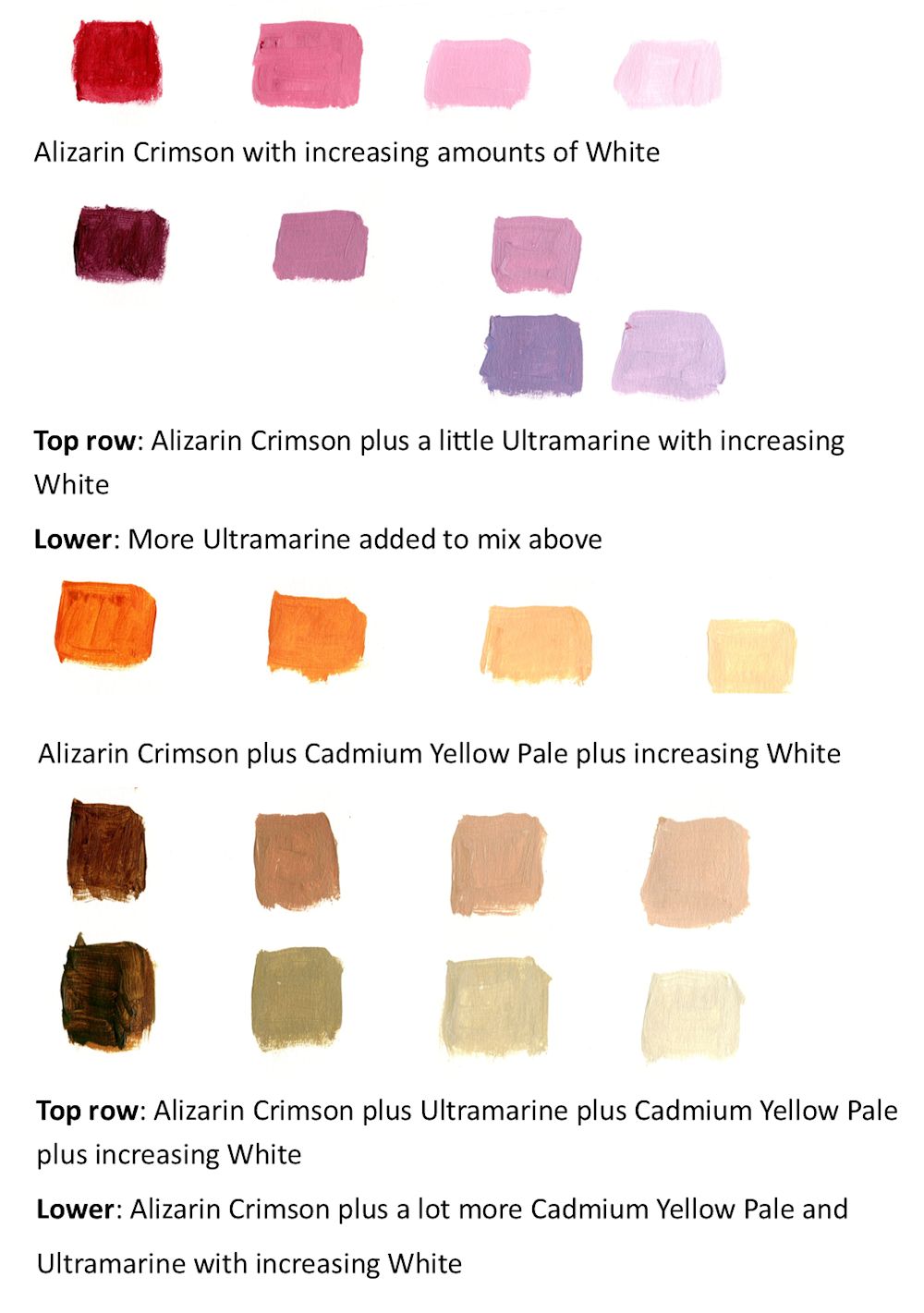
By adjusting the amounts of each pigment you can mix suitable skin colours just from these three plus white. Skin is NOT always a “flesh tint” hue; in the shadows you will find muted purples, greens and blues and coloured greys. As a general rule paint the mid tone areas first then at least one of the darkest and one of the palest areas to set the range of tones within which you are going to work. Also as with drawing, work on the largest shapes first before moving on to the detail.
This week’s challenge:
Arms and the way a person sits can reveal a lot of their character. With the head studies so far we generally included the shoulders and looked at their relation to the neck and head. This week we may include arms and shock horror, hands which I know are generally believed to be difficult. Well they are complicated and they are a challenge for everyone but one that can be overcome by understanding their structure. Also hands do not always need to be depicted in great detail. Sometimes all that is needed is an indication of their general form as revealed by the light.
If you can look at how arms and hands are depicted by other artists. Some examples are on one of my Pinterest boards, link below:
https://www.pinterest.co.uk/jhall1282/portraits/older-children-portraits-including-hands/
Perhaps try drawing your own hand to familiarise yourself with the way in which the finger joints and finger ends lie on a curve. Sit yourself in front of a mirror and observe how your shoulders and arms look when you have your hands on your knees, when one hand clasps the other in your lap, and when you fold your arms, and any other natural looking pose you can think of. If possible do a few quick sketchbook studies of the way your own head, shoulders arms and hands arrange themselves in these various positions.
I know you are not the same as a 9 to 14 year old BUT this will help you look at your reference photograph in a constructive way.
Below are two photos of children; look at them objectively in the same way, relating the sizes and angles of the various parts to each other. Then find a reference of your own and decide on how much you want to include in your portrait study and then work out the composition taking on board the structures and the lighting.
Think hard about the overall width and breadth of your figure; this will be very different in the case of standing and sitting figures. Make sure you plan the composition well and think about how the figure will be placed on the support. Similarly make sure that if you are transferring your photo reference to your support that the figure maintains the same aspect ratio i.e. the overall height and width of the figure in your reference is in the same proportion on the support.
You may like to use the grid method for this, even a simple four squares by three square grid drawn on the reference and a larger grid drawn in the same proportion on the support will help and allow you to check angles and lengths especially in complicated poses.
On your canvas or board either
1.Mark out the main lines of the composition and then work in paint or pastel
or
2.Make a tonal study in paint this week to which thin glazes of colour can be used to finish the portrait next week.
Your drawings and paintings:

by Vivienne (unfinished: minor adjustments are being decided)

Pastel by Liz (unfinished)

Under drawing by John
See the completed painting next week next week

Pastel by Norma

Oil by Virginia

Oil by Virginia
Portraits of Older Children: Week 4
July 7, 2022
Pencil by Jo
This week we will look at faces of older children in three quarter view. This is a different challenge as most of the front of the face can be seen but of course a lot of the side too.
If you have time practise drawing a few heads in three quarter view, and then mark out the board with a few useful lines ready to paint in pastel or acrylic.
Drawing a three quarter view; a few considerations
Try starting by getting the general head shape right and marking its relation to the neck and shoulders.
Make sure you get the overall width and height of your head correct and the width of the shoulders which are usually narrower than adult shoulders. Place the jaw line and suggest the position of the ear which you may have to adjust so go gently.
The features of the face can be thought of as lying on a curved plane on the front of the head. The sides of the head can be thought of as beginning where the forehead changes direction going back towards the ears. The visible width of this will vary enormously depending on whether the view is nearer to full face or nearer to profile.
Next try placing the features noting how the eyes are very different in shape than when seen full face. It will still help to put a feint construction line through them. The features lie symmetrically (more or less) on a slight curve rather than about a straight line as in the the full face view. Again it may be helpful to mark this faintly. The nose will project beyond this line i. e. stick out more!
Other useful markers are the base of the nose, the distance between the base of the nose and the upper lip and the distance from the base of the nose to the tip of the chin so measure and mark them. Then mass in the hair and Toby has masses of it! Then go back refine the shapes and show the form by hatching or shading all the toned areas you can see.
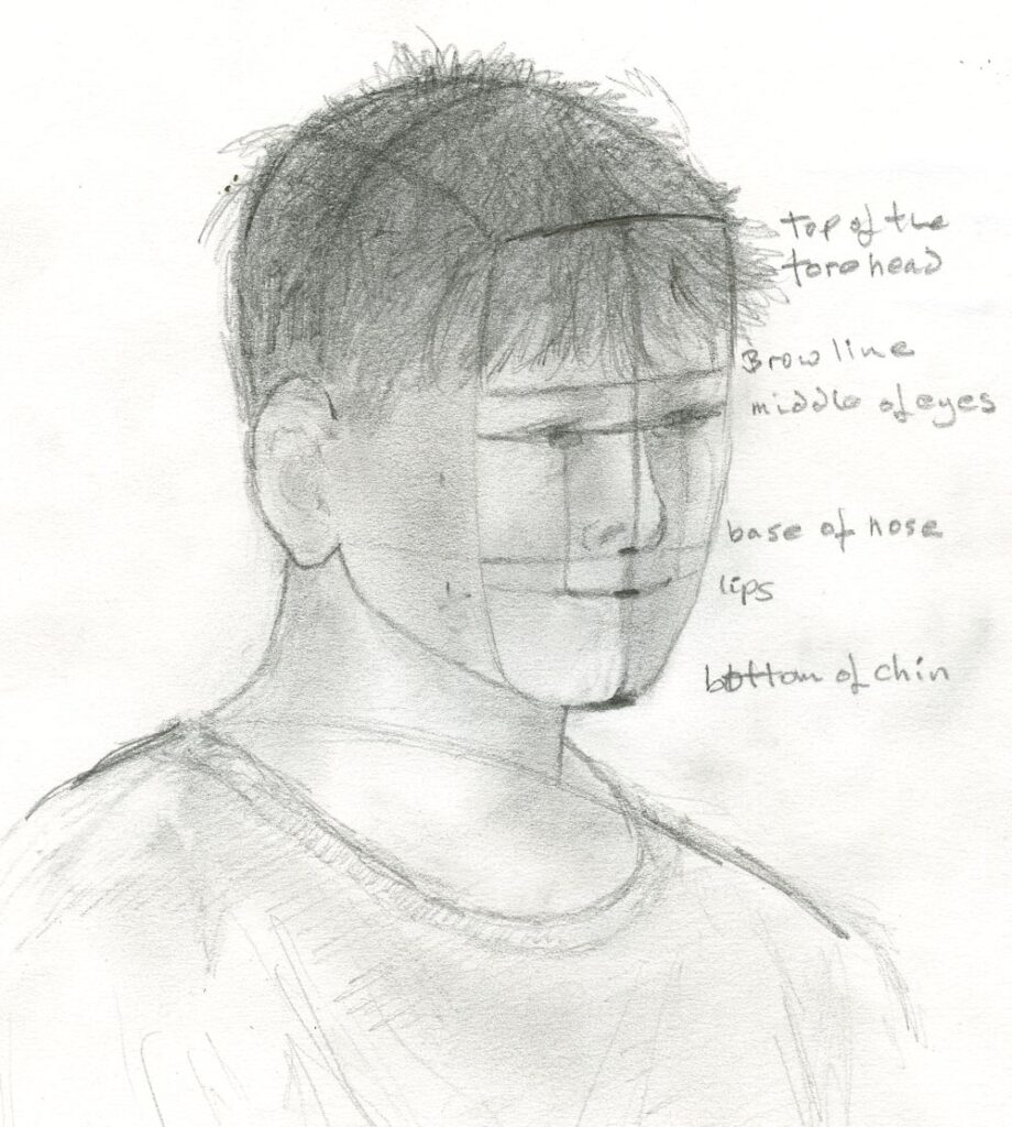
Some people like to think of the face as divided into three (approximately) equal parts; chin to base of nose, base of nose to brow line and brow line to the top of the forehead. Always remember to look though, as it is the small differences that make us unique!
Really looking is the most important way, but your looking should always be questioning; widths; angles; relative sizes; tones and of course colour. Have fun with the drawing and then enjoy the painting!
Your drawings and paintings:

by John

Acrylic by Norma

Acrylic by Liz

Graphite pencil by Virginia

Acrylic by Vivienne
Portraits of Older Children: Week 3
June 30, 2022
This week’s challenge is to start a portrait painting in colour. The notes below suggest ways of starting a portrait study in pastel and also in acrylic.
1. Pastel
If your chosen medium is pastel you may like to start by drawing in the main shapes quite loosely with charcoal or a pastel stick. Remember to draw the axis of symmetry of the face if working a front view and also a line through the eyes from which you can measure the positions of the other features.
When seen in three quarter view the axis of symmetry through the face will be on a curve. If looking at a profile view look carefully at the position of the ear and take note of the shape of the whole head. Then look at the forehead in relation to the nose and the jawline and chin in relation to the nose. Ask yourself questions like does the chin recede slightly?
As a general principle work the large shapes first before homing in on the smaller ones.
When you are happy with the main shapes start to work in colour. Block in the main areas of shadow with a light touch using the stick on its side for these larger areas. You will define these as the work progresses so don’t apply the pastel too densely at first. Then draw in the mid tones and finally the palest tones and details.
I have talked about tone but your work will be in colour and working out flesh tones in pastel can be challenging. One reason I used conte crayon in white, black and sanguine on toned paper last week is that it is a half way house between working totally in tone and working in colour. With small additions of blue, red and ochre these drawings can depict flesh tones quite convincingly. Experiment with the colours in your box, cross hatching, overlaying (layering) and blending to find suitable colours for your portrait.
You may like to fix the work after the main areas have been drawn and again when the mid-tone colours have been established. When working on the brightest and lightest colours as the portrait nears completion either fix very sparingly or not at all especially if working on a dark toned support.
2. Acrylic
There are several ways of starting to paint a portrait, three of which are outlined below..
1.Under drawing in charcoal developed with transparent and opaque paint.
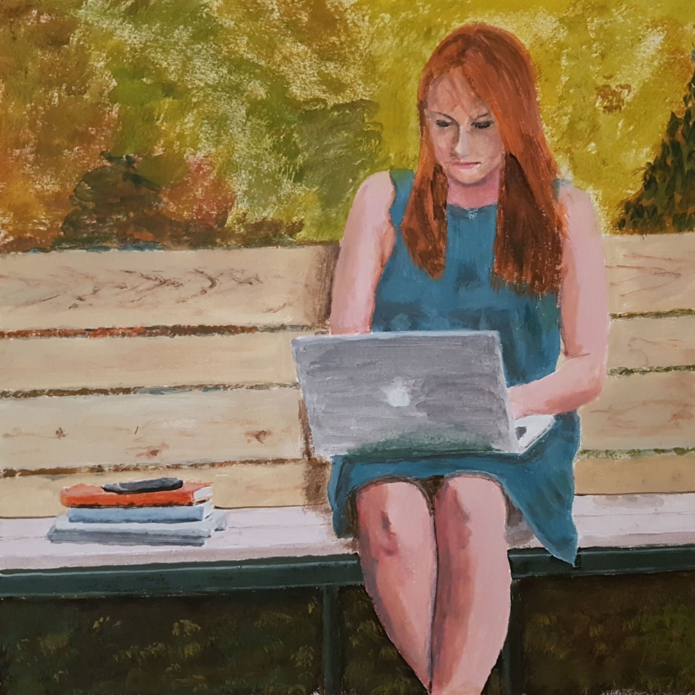
This is described in a previous post; link below. The example is of a young woman rather than a child but a similar method and palette could be used. I like to work with a relatively limited palette and this will give your work unity.
https://www.jo-hall.co.uk/2021/03/03/painting-portraits-from-photographs-week-2-colours/
The following palette makes a good starting point and some mixes made with the colours below is illustrated in the blog post referred to above..
White, Crimson Alizarin, Cadmium Yellow pale, Ultramarine Blue, Burnt Sienna and Burnt Umber. (or similar)
Other primary colours, plus white and a couple of earth colours will also work well. The Burnt Umber was included as it gives excellent darks when combined with ultramarine. With portraits of young people you will need to keep the colours fresh and make smooth transitions of tone and colour over the face.
2. Tone the background then use paint and a brush to draw the basic shape of the head and place the features. Then develop the painting with transparent and opaque paint working from light to dark and on the large shapes first before tackling the smaller areas and detail..
3. Make a detailed monochrome under painting making all the tones a little lighter than as seen. Develop the painting by adding colour as layers of transparent glazes. The palest and brightest areas should be left till last and if necessary executed in opaque paint. This can be knocked back a bit with further glazes where necessary.
For this session we will concentrate on the first way of working. So have at the ready, a board or canvas support, charcoal, some acrylic medium and of course paints, palette, brushes and water pots.
Your paintings;


Acrylic by Vivienne

Pastel by Liz

Acrylic by Liz

Oil by Virginia
Portraits of Older Children Week 2
June 24, 2022
Conte crayon: black, sanguine, white
Plus small additions of blue and crimson pastel pencil
on Rembrandt toned paper; Industrial grey
This week is another drawing session.
To start with this week I’ll screen share some references and we’ll do a few warm up sketches before launching into a more considered drawing for the rest of the morning.Maximum time 5 minutes for each. I will share my screen with you so we can work from the same image.
Probably best to work in soft pencil or charcoal for this and do all four studies on the same sheet (A3 cartridge would be ideal).
For the more considered drawing perhaps try drawing a boy if you chose a girl last week and vice versa. Girls may seem easier because the ear is often hidden by hair. If drawing a profile take time to look at the position of the ear in your reference; it may appear further back than you think.
I mentioned the proportions of the head last week and that in older children these proportions are close to that of an adult. Quite often noses may be slightly shorter and less developed and the only way is to observe the particular reference photo or the sitter closely. Also even in adults these measurements vary a lot between individuals.
Just to recap;
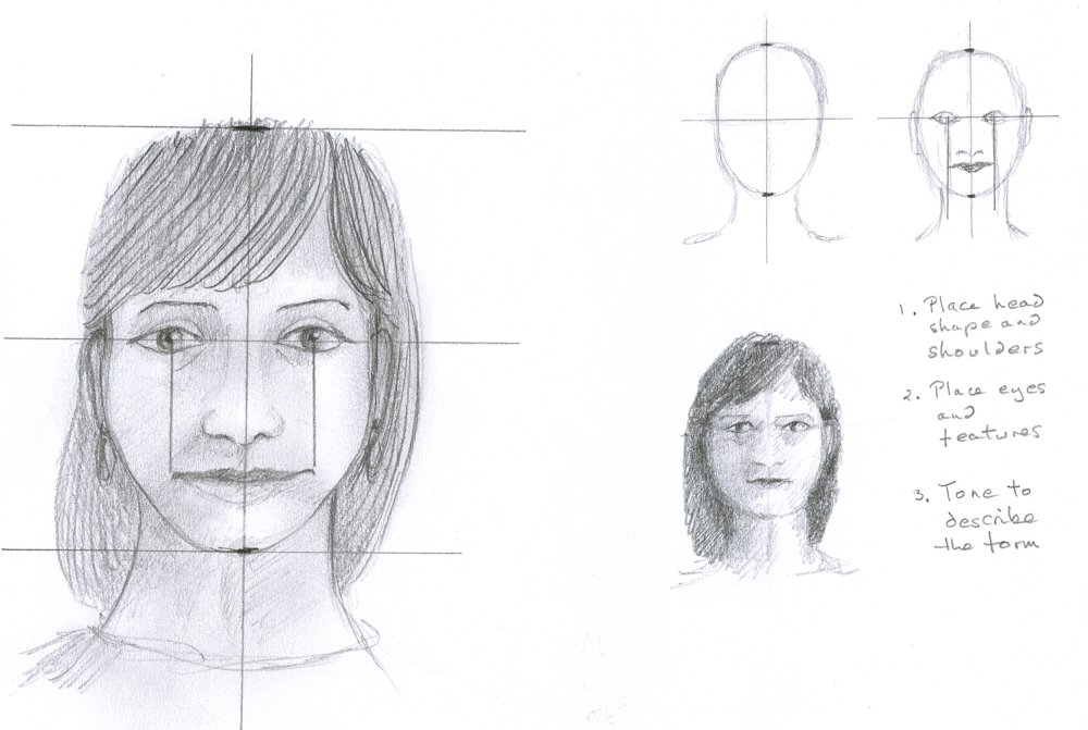
When looking at the full face;
1. look at the over all proportion of the head; i.e. how wide is it compared to its height then draw the head shape, tilted if the head is tilted.
2. draw in the vertical axis of the head and note how this axis changes direction for the neck if the head is on the tilt.
3. Show how the head connects to the body looking carefully at the width of the neck
4. Draw a line through the eyes; this will help with proportions as about half the head will be above and half below when the sitter is looking straight at you and you are at the same height.
5. For the fast sketches place the features roughly then use tone to reveal the form of the head and features. This will be greatly influenced by the lighting.
With the profile face the vertical proportions will be the same but do look at the overall shapes you are presented with first, and then place the ear correctly with noting far back it appears and its relation to the hinge point of the jaw which is just below the lower point of the attachment of the ear.
The three quarter view is beloved by portrait artists as it gives some idea of both profile and full face views. The amount of information on the full face is miniscule if the view is almost profile and likewise information on the profile is short if the face is viewed almost from the front. the axis for three quarter views is best drawn as a curve which we will discuss. If you think of portraiture as another kind of still life you will understand that perspective is every bit as important in portraiture, unless you are going for a cubist style but that is a different course!
For the more considered drawing you may continue with pencil, three crayons on a toned paper or work in colour. Working in monochrome or a with very limited range of colour will help you depict the structures of the head and tonal studies will form the basis for colour work in the following weeks.
Your Drawings;

by Norma

Black conte crayon on pale grey paper by Vivienne

Conte crayon and pastel by Vivienne

Tonal study by Liz

Pastel by Liz

by Virginia

by Virginia
Portraits of Older Children: Week 1
June 13, 2022
Sanguine and Sepia Conte Crayon
by Jo
I find the age group between about eight and thirteen or fourteen is incredibly interesting. Facial features develop so that the adult in waiting can be glimpsed. All the facial features become larger and take up a greater proportion of the head. Baby noses begin to take on their adult form and facial expressions become more subtle, whether of wonder and delight or perhaps moody, dreamy or slightly rebellious!
In this first session we’ll remind ourselves of the proportions of the head, using conte crayon, pastel pencil or charcoal for some initial sketches before moving on to a more considered drawing. I would strongly advise drawing from a reference of someone you know and meet often. Even when working from a photograph your mind will fill in remembering the forms you have observed in real life that the photographic image may flatten. Try to work as if the subject is really with you as you draw.
in my Mother’s Garden
(and nine is winning!)
Conte crayon and pastel
by Jo
I give the same advice to anyone working on a landscape from photographic reference; try to draw as if you are immersed in the landscape again!
For this first week we’ll draw a head and shoulders portrait that is three quarter view or almost full face as in the drawing heading this post. It will also be useful to have a reference that is strongly lit from one side revealing the forms of the head and facial features.
If you would also like to make a profile view drawing of the same young person, that will really help you understand the form of the head. And what about the view of the back of the head? In a live portrait session I would encourage you to make several warm up drawings looking at the sitter from different viewpoints, so that literally all round knowledge of the head is gained.
I have prepared a Pinterest board of portraits of older children. The link is
https://www.pinterest.co.uk/jhall1282/portraits/older-children/
Look at some of these examples in detail and imagine an axis running through the centre of the head and whether this is tilted. Note the position of the eyes relative to the top of the head and the chin. Also look at how the artist has shown how the light falls across the head. There are a couple of photographic works among the paintings and drawings. Observe these in the same way. In addition a few profile views are included. Again observe the lighting and the tonal values as well as the proportions and placement of the features. Measure the width of the head in front and behind the ear. This will vary significantly with even a slight turn of the head. Getting the ear placement right will help you make a convincing drawing.
As the first session will be drawing, observing the major areas of tone in your reference will be essential and should be roughly indicated at the earliest opportunity working from the large shapes before homing in on the detail. Indicate the masses of hair in a similar way before indicating a few strands of hair.
Learn to enjoy looking and assessing as much as drawing!
Make sure you have; cartridge paper, some toned paper like a warm fairly pale grey, some conte crayon, pastel pencils or pastel in white, black and sanguine, table easel and drawing board and lastly a good photo reference of your subject.
Your Drawings:
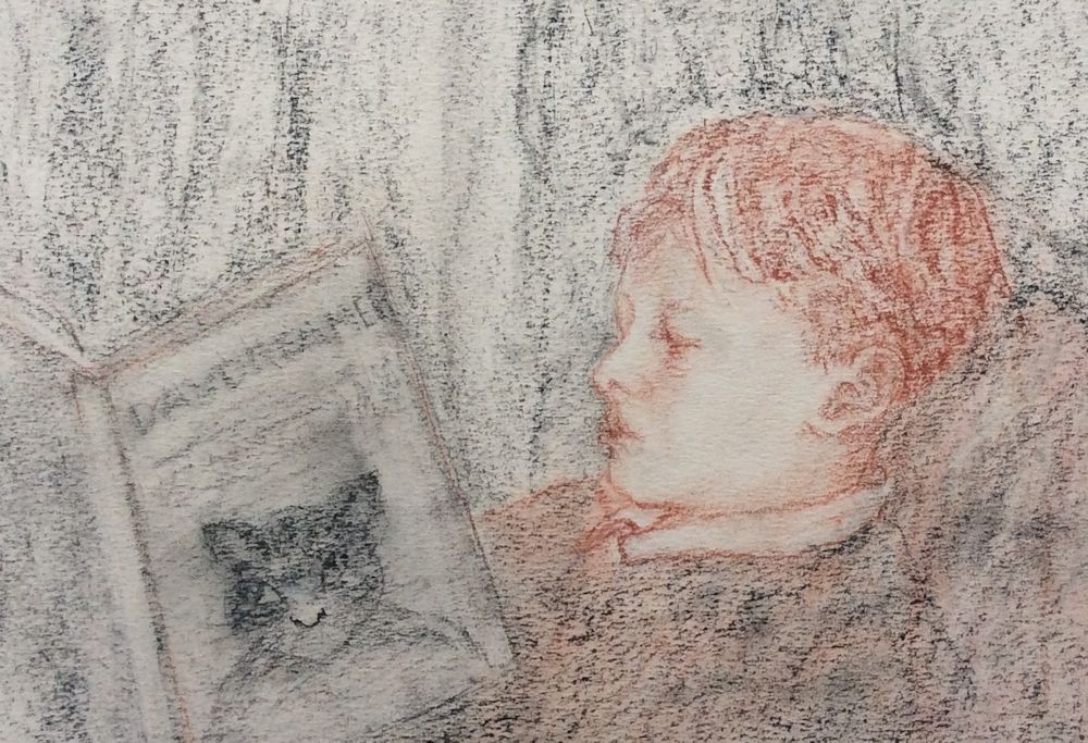
Pastel drawing by Virginia
This is a sensitive portrait showing us Tom’s complete involvement with the book he is reading. Virginia made two subsequent studies one of which was a better likeness, but I didn’t feel the connection between the boy and the book in the same way. A very hard choice to decide which of the two good drawings to include!
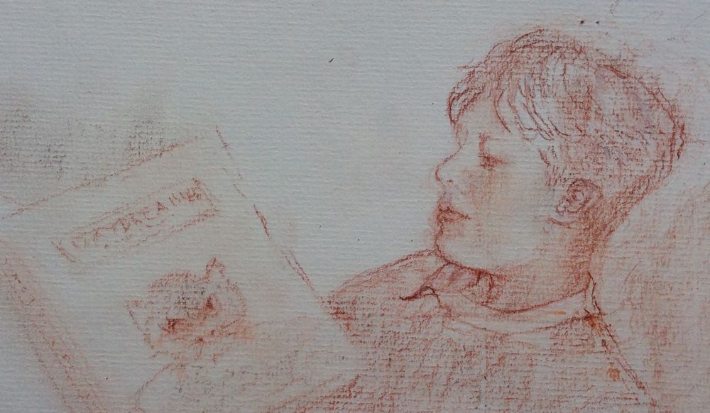
Conte crayon drawing by Virginia
So I decided to include both!
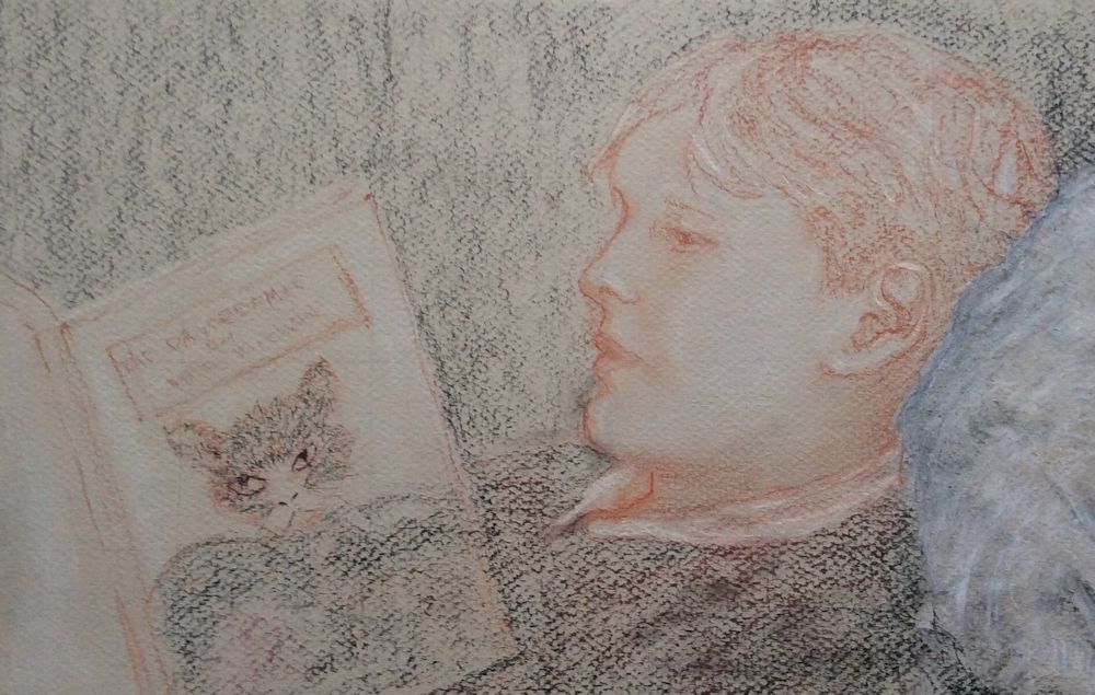
Pastel drawing by Virginia
Conte crayon on grey paper by Vivienne
by Vivienne
Charcoal and pastel by liz
Charcoal and pastel
by Liz
Babies and Young Children : Week 4
September 17, 2021
Pencil
This week’s challenge is to draw or paint the whole figure of a child, a child with another child, or a parent and child study. If you are fairly new to drawing I would advise drawing a single figure for your painting and to practice making as many small sketches of children whether from life or from photographs as you can, to train your eye to be accustomed to the fact that children’s heads are larger in proportion to their height than adult heads.
Watercolour
Not a whole figure but put into a context.
When painting young children either standing or involved with some activity it is useful to drop a perpendicular line from the highest point on your reference to work out the proportions of the body and the angles that the shoulders, hips and limbs and their relative lengths. Also put a perpendicular on your drawing paper. Some measuring will help you to see and draw taking into account any foreshortening that may occur as when an arm is pointing directly at you! If you prefer to draw completely freehand before painting, check the accuracy of your drawing by dropping a perpendicular from the same point as done for your reference.
As always also look for any clues from negative spaces that will help you get the proportions and lengths right.
With clothed figures, especially full skirts and baggy trousers try to imagine the limbs beneath them and their relation to the spine. Look at whether one shoulder is higher than the other and how this works in relation to the neck.
Pencil
The little sketch above is of six year old Toby balancing on a wobble board. Note how in the figure on the left both feet are bearing some of his weight and if a line is dropped from his neck it would fall between the two feet. In the figure on the right most of his weight is on his right foot (left in the image) and a line dropped from his neck shows the neck to be positioned directly above the load bearing foot. Try to draw simple line drawings from life or ‘photos of standing children standing with the load shared between their feet, and also where the load is mainly on one foot. Then try to draw some children in the same way when they are actively engaged in a sporting or other activity where they are in motion.
If you have the opportunity and wish to draw a group of children together especially where their forms overlap, treat the group as one whole shape before homing in on the individuals. Work lightly at first so that you can adjust as you look at your subject more critically as the drawing progresses. Lastly make sure you take more time looking than drawing so that all the main shapes are correct before committing yourself to painting.
In the initial stages of painting look very critically at the direction of the light and how this affects the tones that reveal the form of the child. Look also at how light can affect the darkest local colours, for example even a black T-shirt can appear quite pale on the side that is turned toward the light but retain its dark appearance where turned away from the light source.
Lastly look at shadows cast by the child’s form; e.g. a shadow of the head falling on to the child’s neck and shoulder; shadows below the feet which will help anchor the figure to the ground; and in some cases the shadow of the whole figure against the ground or cast on a wall etc.
For examples of drawing and painting children look at the Pinterest Board below:
https://www.pinterest.co.uk/jhall1282/portraits/babies-and-young-children/
Your Paintings:
Watercolour by Maricarmen
Charcoal by Heather
Pastel by Mali
Pencil by Heather
Pencil finished with Watercolour washes by Heather
Pencil by Sarah
Watercolour by Sarah
Watercolour by Ann
Babies and Young Children: Week 3
September 8, 2021
Pencil
This week the challenge is to draw or paint a young child’s head in profile and/or full face. The features especially the chin and nose begin to show the character they will gradually develop into later. While it is often very difficult to identify and adult from a new baby photo it becomes slightly easier from the age of two or three.
Some wonderful examples can be seen on Jo’s Pinterest board at;
https://www.pinterest.co.uk/jhall1282/portraits/young-children-heads/
Your drawings and paintings:
Pastel by Mali
Sketch by Sarah
Watercolour by Sarah
Watercolour by Maricarmen
Pencil and Watercolour by Heather
Pencil by Ann
Babies and Young Children: Week 2
September 1, 2021
Demonstration from week 1.
The medium is pastel pencil and Pan Pastel. Last week the head was drawn and the main body shapes and clothes indicated. At the next session the rest will be completed. Note how lightly the initial drawing was made to allow for alterations.
I usually start with the head shape then add the other main shapes of body and limbs. Make a note of the general shape of the whole form and any useful negative shapes.
It is often useful to drop a vertical line through the whole form to help you place the head and limbs at the correct angles to each other. For this study a vertical from the widest point of the head (skull not the ears) on each side would give a guide to how the limbs should be placed. These verticals would also aid checking the drawing by measuring the heights of the various main parts..
This week we’ll consider making a painting or drawing a whole baby and suggest your subject is no more than one year old, or perhaps a better guideline would be between newborn and crawling, but not yet walking.
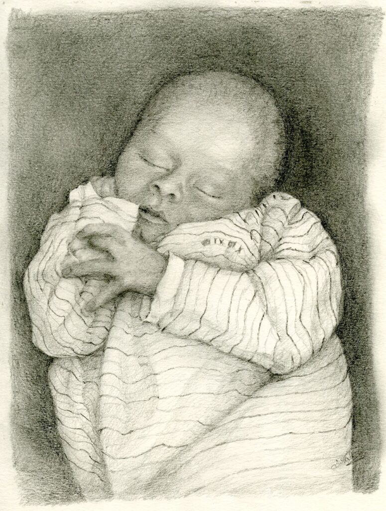
Pencil
Pencil
Babies have a tendency to thrash their limbs about when awake so it is often easier to work from photos but if you have a resident crawler, or baby that is starting to support himself do try and sketch from life, even if all that is achieved is a few hasty lines. This will help your observation and visual memory enormously. It will also help you to identify errors in more considered drawings at a very early stage.
However the easiest way with babies is to draw them while sleeping!
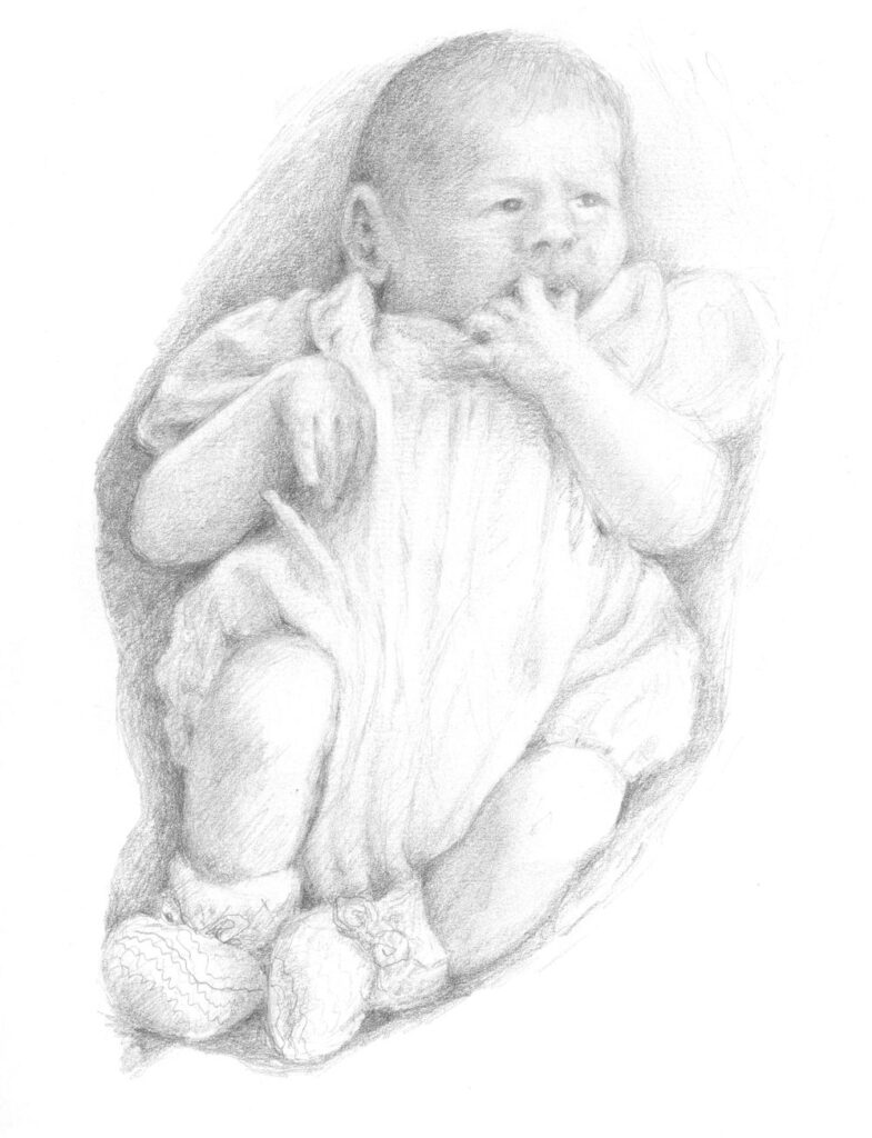
Pencil
Note how you can imagine the baby’s form beneath the blanket.
Do have a look at some of last week’s references again and perhaps practise drawing a few baby feet!
https://www.pinterest.co.uk/jhall1282/portraits/babies-and-infants-drawing-tips/
https://www.pinterest.co.uk/jhall1282/portraits/babies-and-young-children/
If you you would like to why not try a parent or even a grandparent and baby painting. Mary Cassatt painted many of these and a few examples can be found at:
https://www.pinterest.co.uk/jhall1282/portraits/baby-and-parent/
Your paintings:

Watercolour by Sarah
Watercolour by Sarah
Watercolour by Ann
Sketch by Ann
Pastel by Heather
Babies and Young Children: Week 1
August 26, 2021
Pencil
Over the next four weeks we’ll look at drawing and painting babies and young children, looking at infant heads the first week then whole baby forms and go on to consider toddlers and young children to about four years old for the second two sessions. With drawing and painting babies and children the structures and tones need the same attention as in other portrait studies but an additional challenge is the soft touch needed to convey the softness and delicacy of children’s skin both with the tones and the colour.
Pastel, pencil, charcoal and watercolour will be used for the demonstrations but you are welcome to work in your preferred medium.
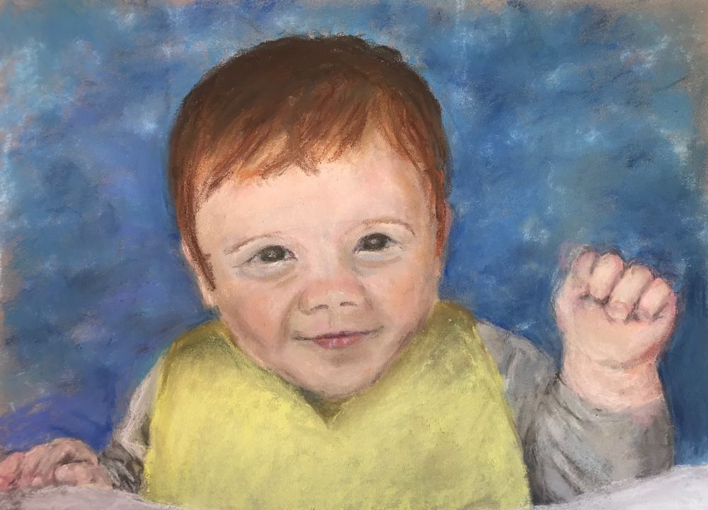
Pencil
Note Toby had long spindly fingers that soon fleshed out into plump little baby ones!
Drawing baby heads.
The facial features and skulls of babies are not fully developed and their proportions are different from adult heads. The facial features are smaller in regard to the space they occupy and only the iris of the eye is fully developed giving many babies that cute large eyed look. The nose being of cartilage grows at a different rate to the bone of most of the skull and at the baby stage the nose is often slightly upturned. The eyebrows are relatively lower than for an adult and the chin is smaller and tucked in so that it protrudes rather less than the lips.
1. Find a photograph of a baby’s face that is looking straight toward the camera and work out the proportions of the face from the tip of the chin to the top of the head. If you can see them also note the position of the top and bottom of the ears.
2. Do the same for a baby’s head seen in profile and also work out how the ears are positioned.
3. Draw and/or paint a baby’s head from your own reference. Note whether the features lie on a curve if the head is looking up or down and pay special attention to how the proportions of the various elements change. For example if the head is viewed from slightly below, more of the chin will be seen compared to the forehead and top of the head.
As with adults the eyes will be about one eye width apart. Unlike adults the baby nose and chin are shorter. As with everything when you are making a representative drawing draw what you see not what you believe to be there.
Next week we will consider the whole baby figure. However babies often play with their hands, sucking thumbs and chewing fingers, so also try to have a look at baby hands for this week’s session.
Some useful references can be found on the following Pinterest boards.
The first board (below) has useful guides to the proportions of infant to adult figures and also to drawing baby and toddler heads, hands and feet.
https://www.pinterest.co.uk/jhall1282/portraits/babies-and-infants-drawing-tips/.
The second board (below) has a large collection of paintings and drawings of babies and young children. Some of these are simply beautiful studies. Others as in the Leonardo references at the end give information on the foetus before birth, and the drawings by Kathe Kollwitz give an idea of the plight of mothers and young children dispossessed by war and deprivation. Think about the study you wish to make, the character and mood of the child and circumstance. This will lead you to create a very personal work.
/https://www.pinterest.co.uk/jhall1282/portraits/babies-and-young-children/
First it is good to make as many drawings as you can from life and photographs to give you a good understanding of the structures and enable you to be more credibly creative. The blog posts will mainly feature drawing and colour will be demonstrated during the practical sessions. Do send a drawing or finished painting for review this week, and any work made during the session will be posted for review the following week.
Your finished drawings or paintings:
pastel by Mali
by Sarah
Watercolour by Sarah
by Heather
by Ann
by Ann
Watercolour by Maricarmen
More than head and Shoulders:Week 4
April 27, 2021
The Three Quarter Portrait
This is a very popular portrait crop where the figure is cropped substantially below the waist and down to about mid-calf. It is an easier shape to fit to a canvas than an elongated whole standing figure and works especially well for women with long skirts.
Find a suitable reference or crop a whole figure reference to produce a three quarter length portrait. As you include more and more of the figure the head will be relatively smaller and the features will have to be painted rather differently; not so differently if you are working at a large scale but significantly less detailed at a smaller scale. The head is usually still the focal point of a portrait study so a good structure for the head and an indication of the main facial features are still essential.
Points where the figure crossed the lines could be marked and distances and angles checked making scaling up of all the main shapes easier.
This initial stage has been fixed quite heavily and more layers of pastel will be added. The final layer of pastel will be fixed only very lightly.
The amount of detail with which the facial features are painted depends on several things;
- The size at which the work is being painted, obviously the larger scale the more detail that is possible
- The head should not usually be very much more detailed than the rest of the figure despite its role as the focal point. If the head is worked to a high degree of finish and the rest of the figure is not there is a risk that the painting will have no unity. In the worst case the head may appear so differently treated it may look as though it has come from a different painting
- The over all look of your finished work; this is related to 2. If you wish your work to have a highly finished and detailed look, it should all be treated in that way. At the same time as in all paintings some areas should have more emphasis than others and there should be a focal point, in the case of portraiture usually the head. This may be achieved by more detail or greater tonal contrasts in certain areas but each area should relate to the rest of the painting to give the work unity. Look at how Modigliani achieves this and compare his works with those of Rembrandt.
Some portraits concentrate on the likeness and character of the sitter, while others may be more simplified or abstract. A glance at portraits by Rembrandt, Goya, Sargent, Matisse and Modigliani will give you an idea of just how varied the ways of depicting the clothed human figure are. Some examples can be found on the following Pinterest board:
https://www.pinterest.co.uk/jhall1282/portraits/three-quarter-portraits/
Your paintings:

Acrylic by Mali
Acrylic by Malcolm
by Angela
Acrylic by Heather
Watercolour by John

Watercolour by Liz
Soft Pastel and Oil Pastel by Elizabeth
Pastel by Sarah
More than Head and Shoulders: Week 3
April 19, 2021
The Half Figure: selecting and cropping

This image needs no cropping but I would omit the shoulder and arm of the other boy on the right.
This week you are invited to paint a figure including arms and hands but extending no further down the figure than about the waist. You may already have a suitable reference that needs no cropping or you may have a whole figure reference which needs cropping to carry out this week’s challenge. As a rough guide cropping works when it is not exactly at the elbow or cutting through part of a hand or foot. I have tried to show this in the illustration below.


You will however, always find notable exceptions from well known artists who perhaps have enough magic and experience to make the seemingly impossible work. Some great examples can be found on Jo’s Pinterest board, link below.
https://www.pinterest.co.uk/jhall1282/portraits/to-about-the-waist-or-including-a-hand/


Photographed in Afghanistan by Alisha
Week 3 Project
Choose a photo reference. Try to find a reference that illustrates the persons character or situation. You should feel something about the image. Decide by making thumbnail sketches, whether and what cropping would result in a good composition for a portrait that references the figure to about the waist. Try to include at least one hand. Some paintings of half figures have the subject at a table, sewing, drinking or reading. Make careful decisions about the background including only what is necessary or relevant.
As with the whole figure, work out the sizes of the dominant shapes and how they relate to each other. Look at the negative spaces. Either use a grid or at least a vertical and horizontal line across your image and your drawing so that you can check measurements and angles; making sure that your picture space is in the same proportion as the part of the image included in your work.
Really look at the posture of the person and ask questions.
Is the head at an angle?
Is the person looking to one side?
How does this affect the neck?
Can you imagine how the head connects to the spine?
Are the shoulders at the same height?
What are the arms and hands doing?
Are there negative spaces related to the position of the arms?
What angles are made by the arms and hands?
Are the arms bearing any weight as when leaning on a table?
Looking and answering these questions will inform your work.
Your Paintings:

Acrylic by Malcolm

Watercolour by Sarah


Acrylic by Heather

Acrylic by Elizabeth

Watercolour by John

Acrylic by Liz, unfinished


Pastel by Angela
More than Head and Shoulders: Week 2
April 13, 2021

Try a Different whole Figure:
This week try a different figure. If you tried a standing figure this week try someone sitting and perhaps choose someone wearing different clothes; perhaps a more flowing dress or someone in uniform. You may like to paint a child holding a doll or someone with a guitar. There are a few photo references here and ways in which other artists have painted similar figures can be found in the same Pinterest boards as last week.
For the seated figure:
https://www.pinterest.co.uk/jhall1282/portraits/the-whole-figure-seated/
and for the standing figure:
https://www.pinterest.co.uk/jhall1282/portraits/the-whole-figure-standing/


If I were painting this subject I would include the whole of the foot by extending the space at the bottom of the photo, NOT by trying to cram the foot into the existing space!
After next week’s review session we’ll discuss composition choices when working from only part of the figure and how to crop references to provide an interesting picture. For week three we will choose to include the figure down to about the waist and look at the ways arms and hands may be arranged. For week 4 we’ll be considering the three quarter length portrait so you may like to start looking for suitable references for these weeks.
The Project for week 2:
So for the Week 2 challenge find a significantly different kind of whole figure reference to your choice for last week, possibly uniformed, sitting or standing, perhaps holding a doll or musical instrument.
Check the overall height and width of your figure at the widest points. You may like to construct a rectangle around the figure so that you can transfer that rectangle to a space within your support. This will help you not only to get the proportions right but help you decide exactly how much of the total area you wish the figure to take up to make a pleasing composition. It will also help to avoid the situation of cropping an extremity at an unintended point or worse trying to shorten something artificially.

You will have to measure the height and width of your figure in the reference photo and then multiply each length by the same amount to transfer the figure to your support at the size you wish while maintaining the correct proportions. You may also use a grid as we did for the portrait heads. This method allows a good check for the proportions and is a good starting point if you would like to work with the negative spaces.
Also consider the negative spaces, for example between the legs if they are apart. Think hard about what items should be included in the background. An artisan carpenter might have his tools or an academic his books for example. Try to show the person’s character and age by the way they stand or sit and their interests by the surrounding props.
Your Paintings:

Watercolour by Sarah


Pastel by Heather

Watercolour by Ann

Pastel by Liz


Acrylic by Elizabeth

Pencil and coloured pencil by Mali

Watercolour by Mali

Acrylic by Malcolm

Watercolour and wax resist by Angela

Watercolour by Sarah
I included this one as it’s a good example of how the figure can be cropped successfully to give an exciting composition of less than the whole figure, which will be the challenge for next week.
Painting Portraits from Photographs 2: More than Head and Shoulders
April 6, 2021
Week 1:The Whole figure

Over the next four weeks we’ll consider painting rather more of the clothed figure than just the head and shoulders. Choosing reference photo is the first challenge. You may have one of a complete stranger or you may have or can take a picture of a family member reading a book or even asleep. At least they won’t be giving you a great big beaming smile. For this week include the whole figure either seated or standing in your reference. The aim will be to get really used to looking at the various elements of the figure because understanding figure itself will help us understand how clothing drapes across the body. Usually there are a lot of clues especially with more tailored and tight fitting garments but the particular pose that presents itself can also give invaluable clues that will help you make a believable portrait.
In subsequent weeks we’ll look at suitable cropping points so that successful compositions can be made of to the waist and also three quarter length studies. We’ll also consider figures wearing uniform, formal regalia or traditional costume less familiar to us, but for all of these a general understanding of the figure, its proportions and the way it moves will inform all the work done.

Look at the standing reference first; in an adult the head is about one seventh of the total height but in a child this ratio is considerably more. In the photo above it is between one sixth and one fifth.
Follow an imaginary line from the top of the head down the spine to the pelvis and think about what happens when you get to the legs. With a standing figure the neck will be directly above the foot bearing most of the weight and if the weight is being evenly shared between both feet will be directly above a point between the feet. If your figure is leaning against a wall notice if this changes anything.


Look at how far the arms extend down the body if they are down and how far again if they are folded or the angles made if they are on the hips or if one arm is on the hip what is happening with the other arm.

Look at the tilt of the shoulders and the hips if these can be identified. Thinking about how the body moves will help. Look at the knee in relation to the direction in which the foot points. If you stand fairly upright with your feet together and then turn one foot out a bit the knee follows it and so the knee points in the same direction as the foot. When sitting this is also the most relaxed position for the foot, but of course if you cross your legs you will find the foot has far more freedom but still feels more comfortable when pointing the same way as the knee.
Try to find out how your own joints limbs and back behave, then look at your reference again and think through what is going on.

With the sitting reference, look at the relation of the sitter’s form to the form of what they are sitting on whether it’s flat ground, a grassy slope as for the Afhan girl heading this post, or some kind of seat. It can be useful to make a sketch of the chair, bench or stool, but remembering that the soft parts of some chairs will be altered by the sitter as above. The appearance of the figure, especially the fore-shortening of the upper leg will be very different depending on whether you are viewing the person from the side or the front. The height of the chair in relation to the person’s leg length will also result in a very different posture for the sitter. If a tall person sits on a low bench they will either stretch their legs out or bend their knees up bringing the feet closer to the chair. Just think about things like this when looking.
You may like to look at how other artists have portrayed standing and sitting figures so do have a look at the following Pinterest boards.
For the seated figure:
https://www.pinterest.co.uk/jhall1282/portraits/the-whole-figure-seated/
and for the standing figure:
https://www.pinterest.co.uk/jhall1282/portraits/the-whole-figure-standing/
Then it’s high time to have a go!
Choose to work either from a standing or a seated figure and make a few thumbnail sketches first, before launching into your first painting. Work so that you make note of the tones in the composition as well as the shapes of the forms. Try to imagine you are in the presence of the sitter and that the figure actually exists in three dimensions rather than the two dimensional image you are referring to.
Composition
After that decide how much space your figure will occupy in your painting. Look at the overall height and width of the figure and how much of the background and what of its features you wish to include or exclude. Sometimes an indication of the space around the figure and the objects within that space helps the composition while at other times there are things in the background which are irrelevant and may detract from the main focus: the figure being portrayed.

The medium is up to you; pastel and acrylic are possibly more forgiving than watercolour but whichever medium you choose once you have established the main shapes, take note of the tonal balance as well as the colour. If you choose to work in watercolour you may like to Google the portrait watercolours of Charles Reid, and Hans Schwarz, and of course Singer Sargent also produced some wonderful watercolour portraits.
Your paintings:


Watercolour by Sarah

Acrylic by Ann

Soft pastel by Elizabeth

Watercolour by Elizabeth

Mixed media by Liz

Acrylic by Malcolm

Acrylic by Heather

Pastel by John

Coloured pencil on cartridge paper by Angela

by Mali