Monthly Archives: September 2020
Limited palettes 3: Cool or Warm
September 26, 2020

The challenge this week is to work with either a cool palette or a warm palette, still using only three colours.
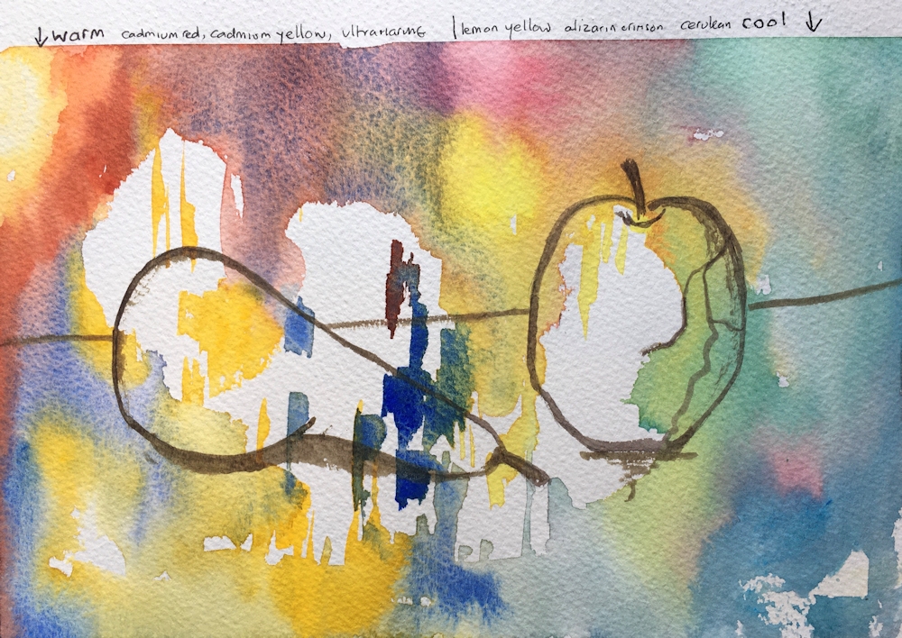
Warm palette: Indian Yellow, Cadmium Red Pale, Ultramarine Blue
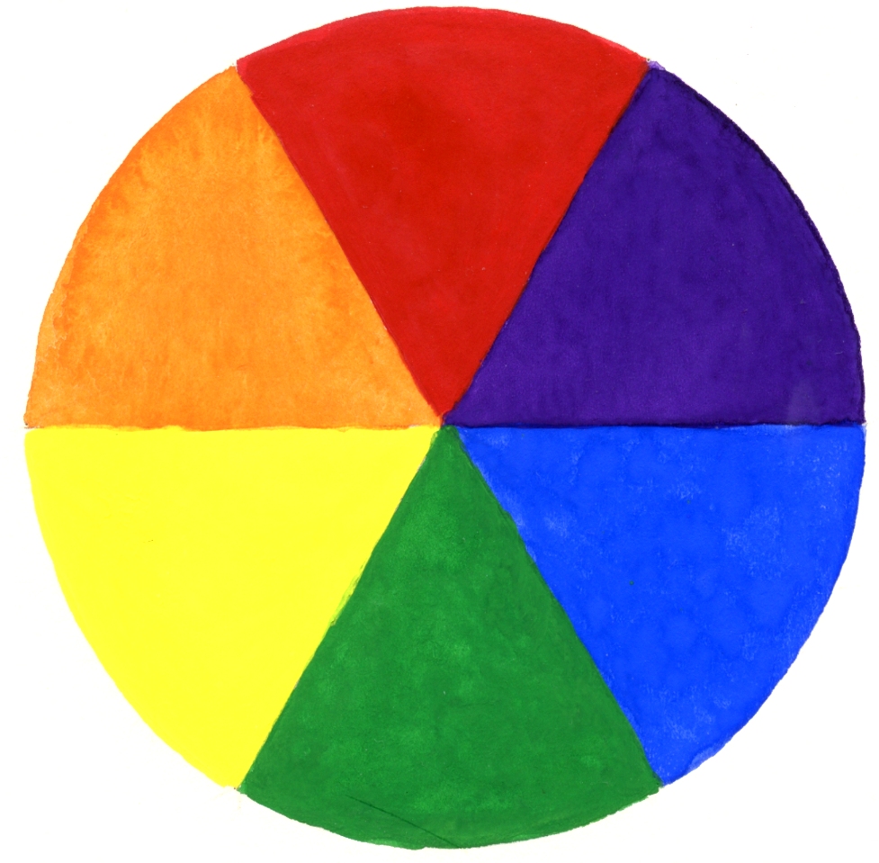
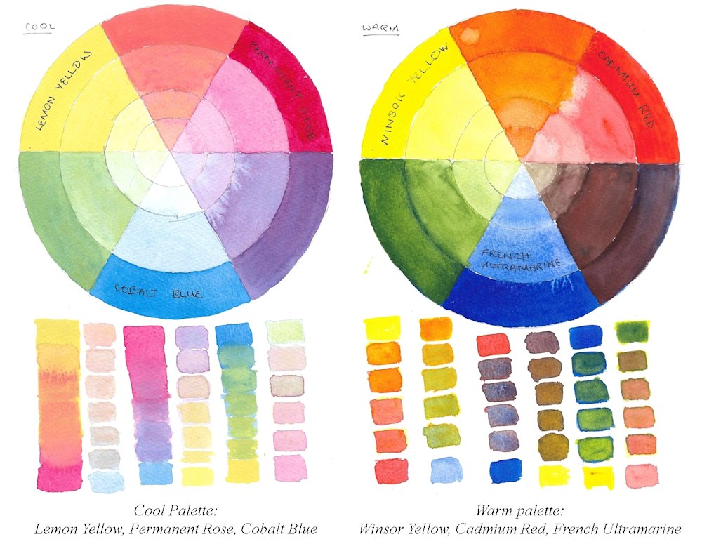
Most people are aware of what constitutes a cool or a warm primary colour but for reference a basic colour wheel is shown below, which used primaries that are neither cool nor warm. These are colours designed to emulate printing colours and in theory you should be able to mix any hue from them.
However in practise, a much wider and richer range of colours can be mixed if you have the following;
A cool red; one that is nearer to purple
e.g. Alizarin Crimson, Permanent Rose
A warm red: one that is nearer to orange
e.g. Cadmium Red Pale, Vermilion, Scarlet Vermilion
A cool yellow; one that is nearer to green
e.g. cadmium lemon, cadmium yellow pale, lemon yellow
A warm yellow; one that is nearer to orange
e.g. cadmium Yellow Deep, Chrome Yellow Deep, Indian Yellow
A warm blue; one that is nearer to purple
e.g. French Ultramarine, Ultramarine red shade, Cobalt blue
A cool blue; one that is nearer to green
e.g. Cerulean Blue, Phthalo Blue, Phthalo Blue Green Shade
The cool palette will consist of a cool red, a cool yellow and a cool blue
The warm palette will consist of a warm red, a warm yellow and a warm blue
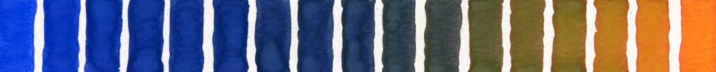
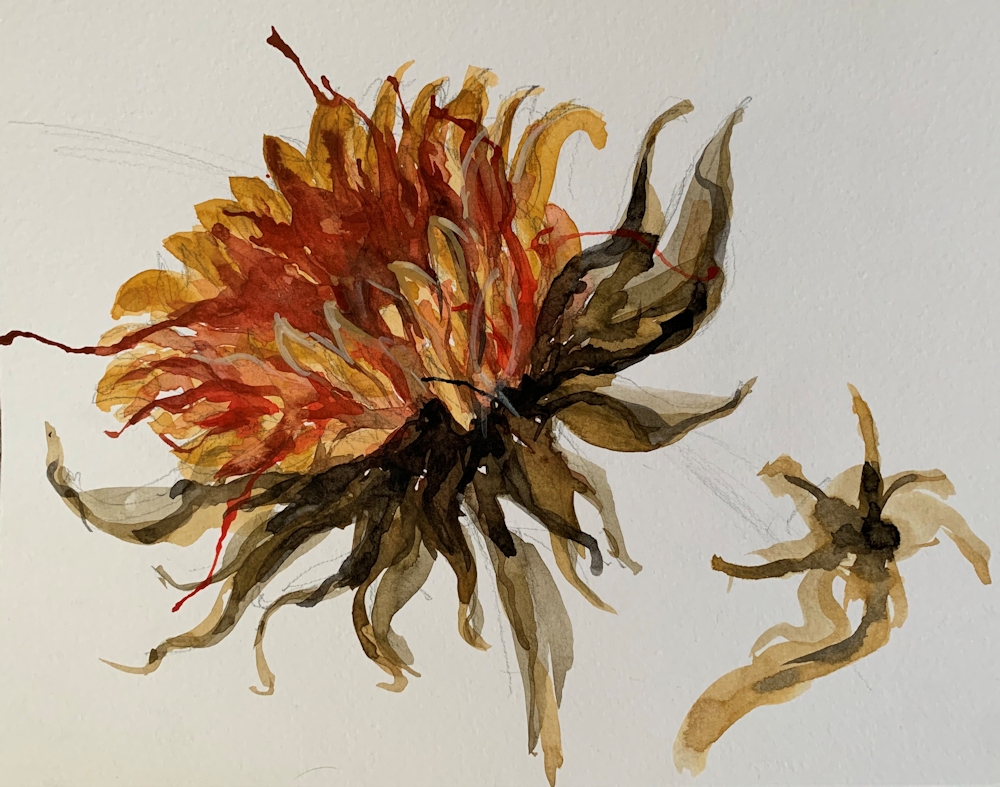
Working with only three primaries is still a restricted palette and some colours are difficult to mix with exclusively warm or cool palettes. Purple and violet shades are difficult with both but easier with some cool palettes. The freshest greens can be made with the cool palette and the hottest oranges with the warm palette as you can see from the chart below.
This chart was made with gouache but the result would be very similar for watercolour or acrylic.
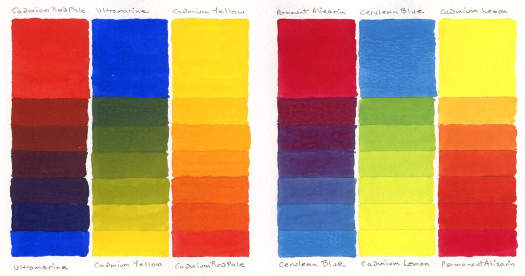
Left: Warm palette; Ultramarine, Cadmium Yellow, Cadmium Red
Right: Cool palette; Cerulean Blue, Cadmium lemon, Permanent Alizarin
Next week we will still work with just three primary pigments but with a mixed palette that includes at least one cool and one warm primary.
Practical
1. Identify which cool and warm primary colours you have and make colour swatches to check them out. The pigments may be different to those I have suggested.
2a. Choose a set of three cool primaries and find what colours you can make with them either by mixing or overlaying them or letting them mingle wet in wet.
2b. Do the same with a set of three warm primaries.
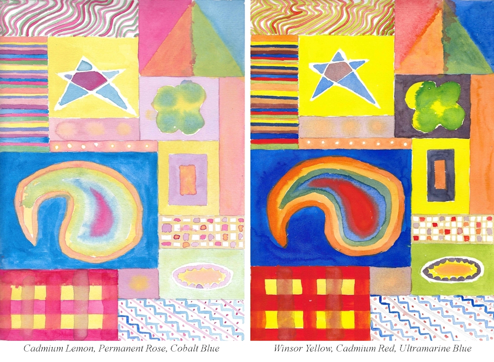
3. Paint a picture, representational or more abstract using only three cool primary colours or three warm primaries. Still life subjects or landscape would be suitable. Hopefully you can find a reference which is a place you have visited or set up your own still life.
Think very carefully whether a warm or cool palette would suit your subject best. Remember that you may use white which will always “cool” all colours. Because it is possible to mix to mix greys and muted colours using both palettes you will be able to make very subtle colours from mixes of even the brightest of pigments. These can be incredibly beautiful.
Try making muted colours and chromatic greys by adding a little of a primary colour to its complementary colour. Complementary colours are opposite each other on the basic colour wheel.
e.g. Mix an orange and add a little of its complementary, blue.
The more blue that is added the duller the orange will become till a grey is achieved. From that point if more blue is added the grey will become a muted blue.
Small increments of blue are added to the orange on the right. About midway between orange and blue a neutral grey can be mixed and on either side hues that are slightly more blue or more orange. These are known as chromatic greys. Toward each end are muted colours which are still recognisably blue or orange but not as pure. These colours are often referred to as desaturated in various degrees. All pure hues can be desaturated by adding their complementary colour.
If, as above the mixes are very dark and it is difficult to see whether they (in this case) are slightly more orange or slightly more blue this will become evident by diluting the mix with water or by adding white.
I have tried to illustrate the differences in using a cool and warm palette in the choice of works for reference on this week’s Pinterest Board. The link is below and the sections called Cool Palettes and Warm Palettes are the ones to look at. The paintings all have either a cool palette or a warm palette feel to them and could be interpreted in that way.
https://www.pinterest.co.uk/jhall1282/limited-palettes/
4. If you have time it would be a real challenge to make a similar painting to your first using the alternative palette that you chose for your colour mixing at 2.
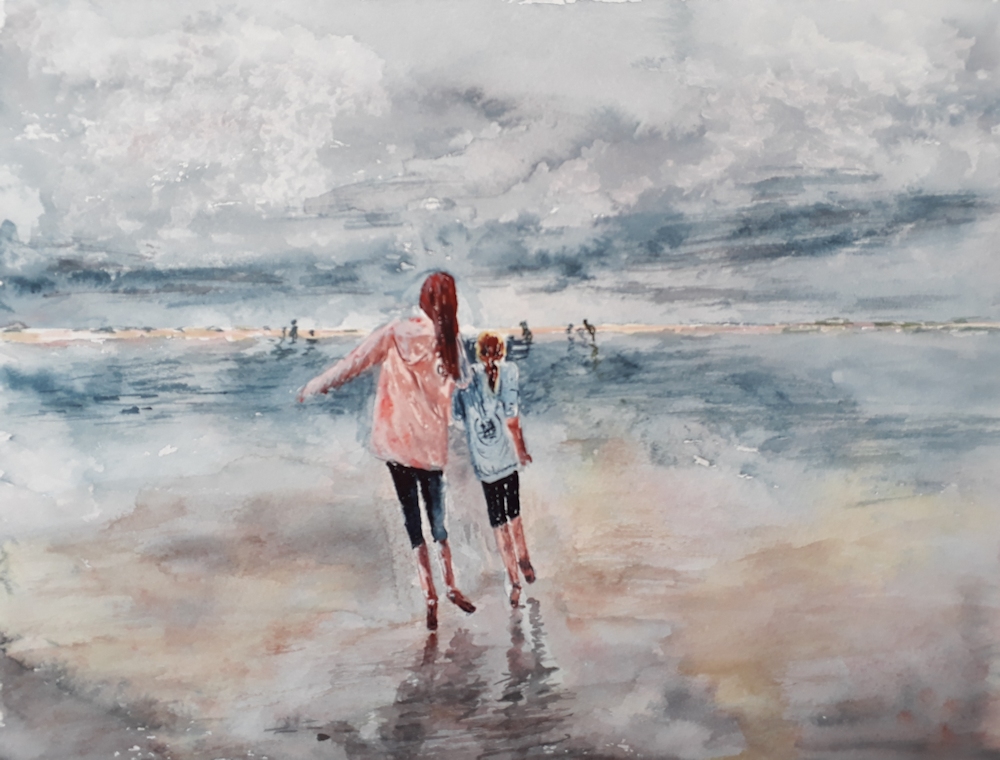
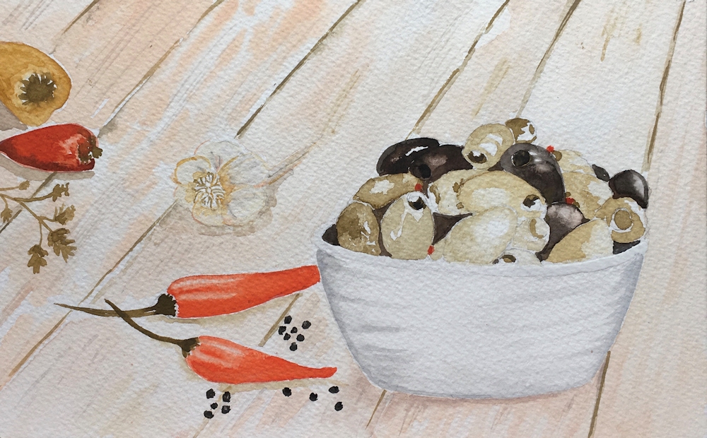
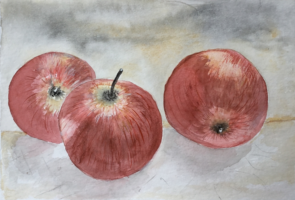
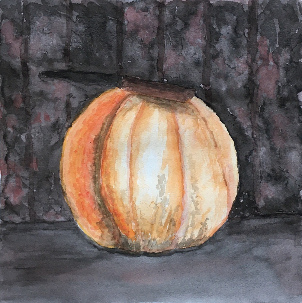
Your Paintings:
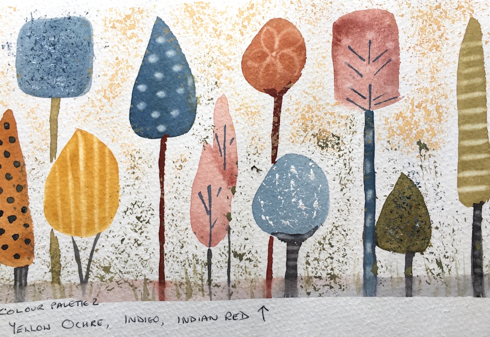
Cool palette: Lemon Yellow, Alizarin Crimson, Cerulean Blue
Warm palette: Cadmium yellow, Vermilion, Ultramarine blue
Lemon Yellow, Crimson, Phthalocyanine Blue
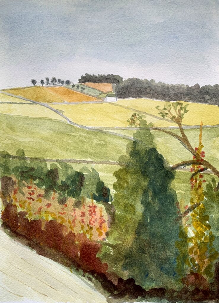
Left warm: Cadmium yellow, Cadmium Red, Ultramarine Blue
Right cool: Lemon Yellow, Alizarin Crimson, Cerulean Blue
Warm palette: Cadmium Yellow, Cadmium Red, Ultramarine Blue
Cool palette: Lemon Yellow, Alizarin Crimson, Cerulean Blue

Cool palette: Lemon Yellow, Alizarin Crimson, Cerulean Blue

Warm palette: Medium Yellow, Scarlet, Ultramarine Blue
Cadmium lemon, Alizarin Crimson, Cerulean Blue Hue

Cadmium Yellow Medium, Cadmium Red Pale, Ultramarine blue
Warm palette: Cadmium Yellow, Cadmium Red, Ultramarine Blue

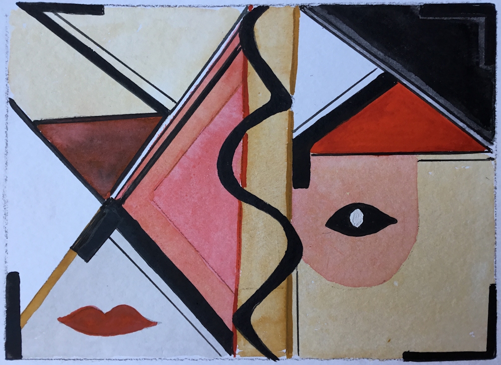
Design inspired by a woodcut.
White of the paper is reserved and the grays are the only mixed colours.

Warm palette: Cadmium Yellow Medium, Napthol Red light, French Ultramarine Blue
America 2020 notes from Malcolm
The composition was fun, based on the Golden Ratio and “no two intervals the same”. So too was the physicality – “mad artist attacks easel”.
I first laid down a complete underpainting of yellow-orange. All of the darks are simply red dulled by blue, avoiding the purple side to preserve the sense of heat. There are a few dark greens and a few darker triple mixes. I couldn’t resist some tongues of pure red, and got the toothbrush out for yellow and orange sparks. It was all incredibly quick and hugely enjoyable.

Warm palette: Cadmium Yellow, Cadmium Red, Ultramarine Blue
Cool palette: Lemon Yellow, Alizarin Crimson, Cerulean Blue

Cool palette: Yellow Light (Sennelier),Phthalo Turquoise (Sennelier)
Permanent Rose (Winsor and Newton)
Cool palette: Lemon Yellow, Permanent Alizarin Crimson, Cerulean Blue
Cool palette: Lemon Yellow, Permanent Alizarin Crimson, Cerulean Blue
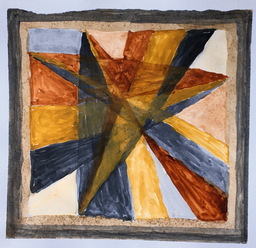
Note on Angela’s palettes;
Lemon yellow and Winsor yellow are not sufficiently different to cause much shift in the temperature of these palettes, however the Cobalt blue used in the left palette is significantly cooler than the ultramarine used on the left. Usually cobalt blue is a warm blue but does vary.
Here fresher green mixes are produced on the left in addition to good purple mixes which should definitely be possible with cobalt and permanent rose and is why in flower painting if a pan of purple or violet is not available, cobalt blue and permanent rose or ultramarine and permanent rose can make successful mixes.
The difficulties of mixing fairly pure purple or violet hues from the warm primaries cadmium red and Ultramarine blue can be clearly seen, in the palette on the right above and in Angela’s abstract studies below.
In the warmer study on the on the right below some fairly fresh looking greens have been mixed. This would not have been possible with a warm yellow like; Cadmium Yellow Deep, Indian Yellow or Gamboge which are much nearer to orange in hue and would have only allowed rather duller greens.

Warm palette: Cadmium Yellow, Cadmium red pale, Cobalt blue

Cool palette: Lemon Yellow, Alizarin Crimson, Winsor Blue

Almost cool palette: Cadmium Yellow Medium,
Alizarin Crimson, Phthalo Blue Green Shade

Almost warm palette: Cadmium Yellow Light,
Cadmium Red Pale, Ultramarine Blue
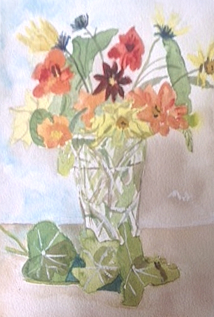
Indian Yellow, Cadmium Red, Cobalt Blue
Lemon Yellow, Permanent Red Medium, Ultramarine blue
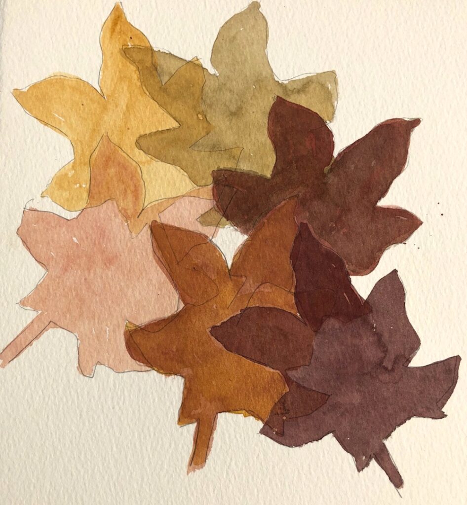
Limited Palettes 2: Earth Pigments, a Link with Ancient Times
September 18, 2020
The purest definition of an earth pigment is that it derives from a naturally occurring mineral source. However the term seems to be more loosely applied today to include some pigments derived from plant extracts such as Indigo, and even a few synthetically produced pigments some of which now replace their less stable naturally occurring counterparts. For our purposes earth pigments will include most of the less saturated pigments i.e. the ochres and reddish browns etc.
The first pigments were discovered and extracted from minerals over forty thousand years ago and very soon Palaeolithic artists not only ground existing ochres from rocks but fired them to make other colours. They made crayons using ground pigment and spittle or vegetable gum binders and had a great variety of ochres from yellow to dark reds and browns at their disposal, together with carbon black from charcoal. If you are interested in how they made pigments and the chemical constituents of earth colours try the link below:
https://edu.rsc.org/resources/prehistoric-pigments/1540.article
It is a sobering thought that we still use pigments from the same mineral sources today although some have been superseded by synthetic equivalents.
Since the time of ancient Egypt many blue colours were obtained from azurite a copper carbonate mineral, which is unstable and becomes greener as it weathers. It was widely used in Europe in the twelfth and thirteenth centuries and was used by Holbein to paint the background of Lady with a Squirrel. Less expensive than lapis, azurite was a precursor to cerulean blue and is the only reason I can think that cerulean is included in some earth triads.
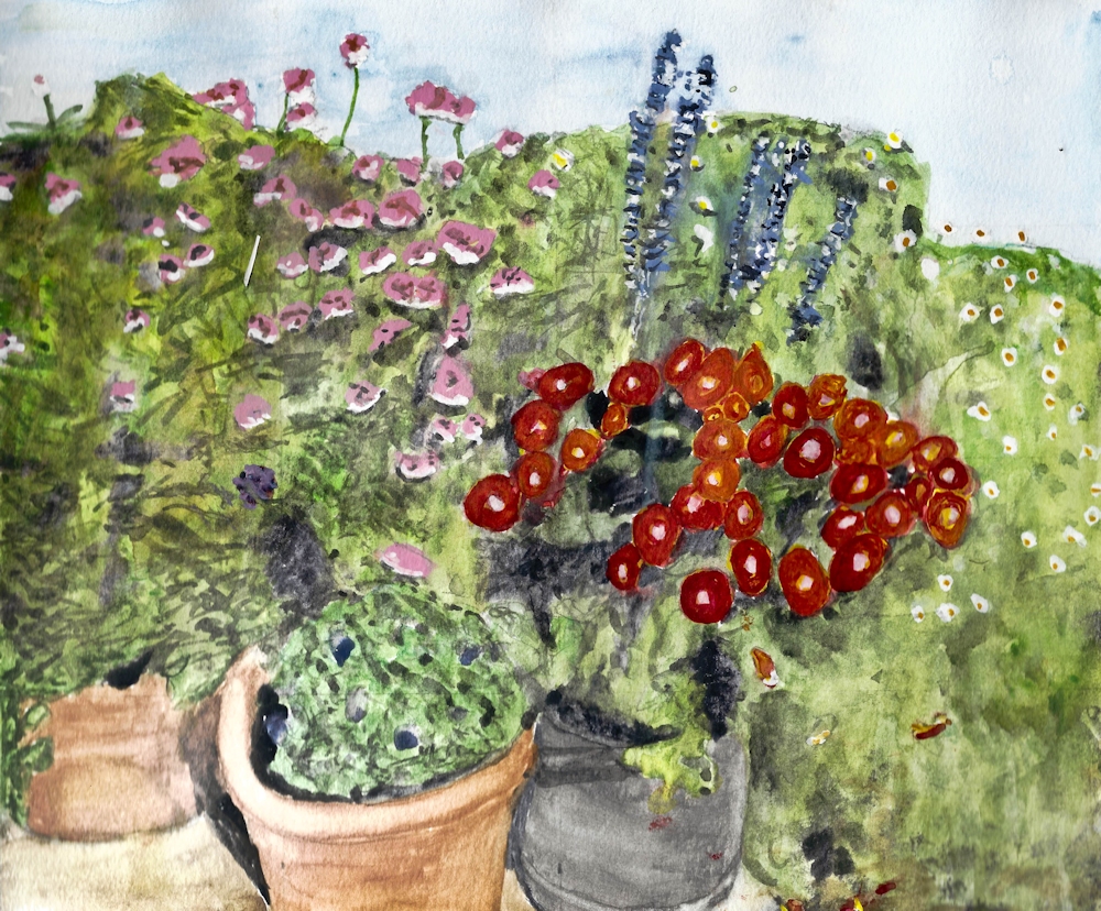
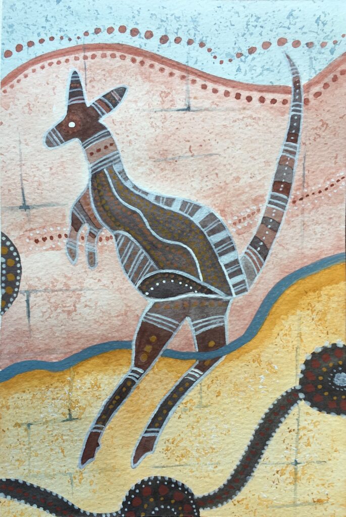
The Pinterest board for this week’s challenge is a collection of art works that are either painted or made with earth pigments or could easily be interpreted in those colours. There is rather a large content from the Palaeolithic ages which may fire your imagination and other art forms including mosaics and frescoes, finishing with several landscapes. This week the challenge will be to choose an earth palette and make a painting of a landscape, natural form or inspired by rock art, just with three earth pigments that approximate a yellow, a red and a blue.
https://www.pinterest.co.uk/jhall1282/limited-palettes/earth-palettes/
Practical
1. Collect the earth colours in your box and make swatches of each labelling them as you go.
2. Select an earth triad you would like to work with plus white This should contain one yellow, one red, and one blue equivalent plus white if wished.
Below are a few suggestions of earth triads you may experiment with. If you don’t have the exact pigment use the closest you have and you are quite free to make your own combinations of earth pigments. The following are triads ancient and modern!
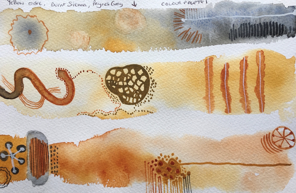
a) Raw Sienna (or Transparent Yellow Ochre), Burnt Sienna, Paynes Grey
Second row pale
This is sometimes called the old masters earth triad and was a very useful combination of inexpensive pigments both for portrait and landscape studies. I prefer if possible to use the blue shade of Payne’s grey just because it allows mixing more definite green secondaries, albeit very desaturated greens. For this post I used a transparent Yellow Ochre. Raw Sienna is usually transparent and yellow ochre often opaque but is very slightly brighter than Raw Sienna.
b) Transparent Yellow Ochre, Light Red, Indigo
Second row pale

Red Oxide is a very opaque pigment and slightly redder but cooler than burnt Sienna. Indigo is usually semi-opaque and most often a mixture of pigments of including black, blue and sometimes violet or red constituents. Because of the greater blue content than Payne’s Grey a greater variety of greens can be mixed and because of the redness of the light red rather purplish browns can be achieved.
c) Quinacridone Gold, Brown madder, Indigo (bright earth, transparent)
I don’t have the first two pigments so would substitute a transparent Raw Sienna and a Permanent Madder Brownish. This should be an approximation as all the pigments are transparent and the brownish madder should allow some interesting shades.
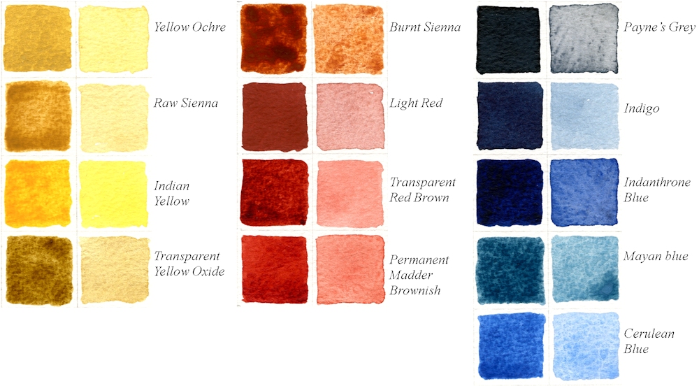
Some of the triads below have some pigments you may not have and are listed for interest but if you do have a tube or pan of for example Perylene Maroon and haven’t used it perhaps now is the time to try.
d) Raw Sienna, Transparent Red oxide, Cerulean: you won’t be able to make real darks with this triad but you could try substituting Indigo or Indanthrone Blue for the Cerulean. Red oxide is similar in appearance to Light Red and is available in opaque and transparent forms.
e) Yellow Ochre, Indian Red, Cerulean: another opaque and pale combination
f) Yellow Ochre, Red Ochre, Mayan Blue
g) Quinacridone Gold, Perylene Maroon, Indanthrone Blue: modern transparent
h) Raw Sienna, Quinacridone Burnt Scarlet, Indigo

Painted with Indigo, Light Red and Transparent Yellow Ochre
3. Paint your picture: landscape, natural form or inspired by ancient art
Having selected your colours and experimented with a few mixes, paint either a landscape or natural form or be inspired by a more ancient art form using some of the motifs from mosaics or even Palaeolithic cave paintings.
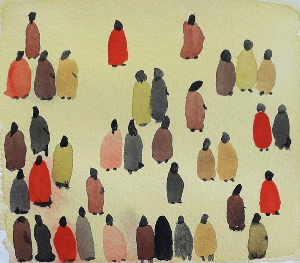
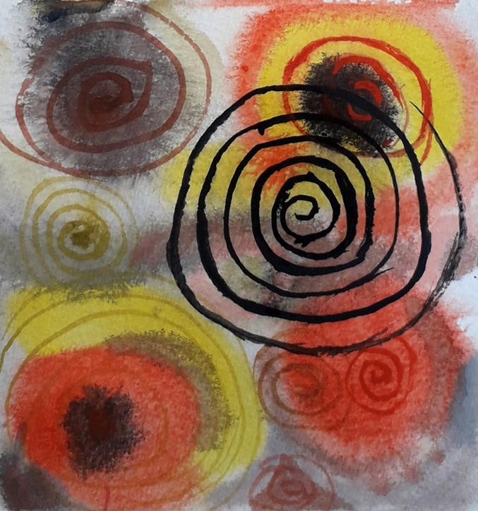
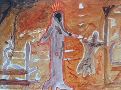
Your Paintings;
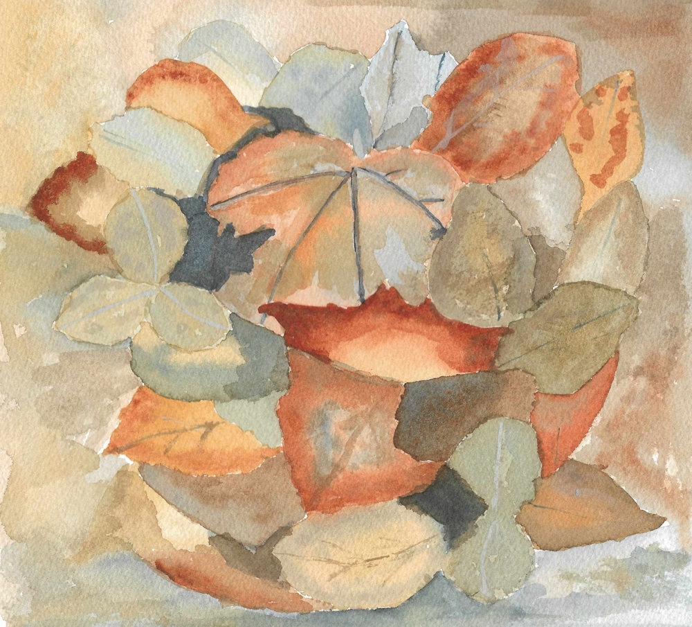
Yellow Ochre, Burnt Sienna, Payne’s Grey and Chinese White
Yellow Ochre, Burnt Sienna, Payne’s Grey and Titanium White
Yellow Ochre, Burnt Sienna, Payne’s Grey
Yellow Ochre, Indian Red, Indigo
Yellow Ochre, Indian Red, Indigo

Inspired by art in Kakadu National Park
Yellow Ochre, Burnt Sienna, Paynes Gray

Yellow Ochre, Burnt Sienna, Payne’s Gray
Yellow Ochre, Burnt Sienna, Indigo
Yellow Ochre, Burnt Sienna, Indigo

Yellow Ochre, Burnt Sienna, Indigo

Yellow Ochre, Burnt Sienna, Indigo, White
Yellow Ochre, Light Red,Indigo, Black Ink line

Yellow Ochre, Light Red, Intense Blue (Phthalocyanine Blue)
Left: colours mixed on a palette
Right: colours and secondary mixes mingling on the paper
Yellow Ochre, Indian Red, Intense Blue (Phthalocyanine Blue)

Yellow Ochre, Rose Madder Hue, Prussian Blue
Yellow Ochre, Burnt Sienna, Payne’s Gray

Yellow Ochre, Burnt Sienna, Payne’s Gray
Yellow Ochre, Indian Red, Indigo
Yellow Ochre, Indian Red, Indigo

Yellow Ochre, Indian Red, Indigo
Quinacridone gold, Rose Madder, Indigo
Quinacridone Gold, Rose Madder, Indigo
Quinacridone Gold, Indian Red, Indigo
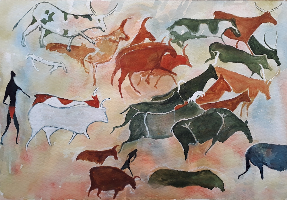
after a cave painting in the Tassili n’Ajjer mountains on the border of the Sahara
Quinacridone Gold, Titian Red, Indigo
Quinacridone Gold, Titian Red, Indigo

Yellow Ochre, Burnt Sienna, Payne’s Gray
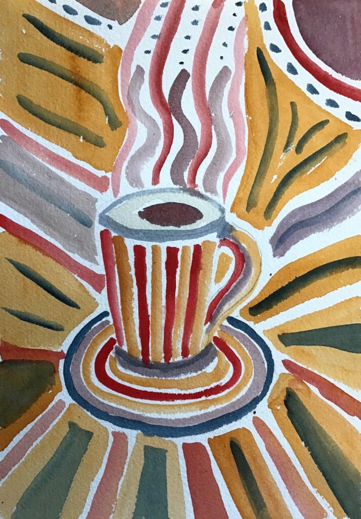
adapted from one of her silk scarf designs
Yellow Ochre, Burnt Sienna, Payne’s Gray

Yellow Ochre, Burnt Sienna, Payne’s Gray

Yellow Ochre, Vermillion, Indigo
Gold Ochre, Madder Red Lake, Indigo

Gold Ochre, Madder Red Lake, Indigo
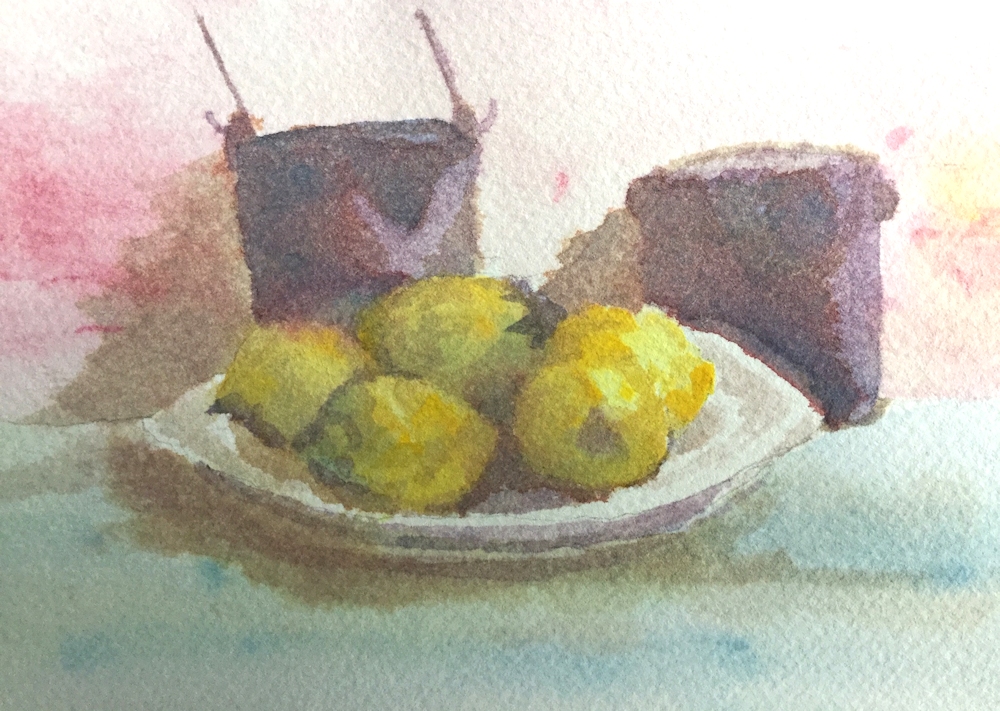
Transparent Red Oxide, Burnt Sienna, Payne’s Gray, White
Limited Palettes 1: the Zorn Palette
September 9, 2020
Working with just a triad of colours (plus white if not working in pure watercolour) may be a challenge, but also gives unity to a painting. The first triad we will try is known today as the Zorn palette.
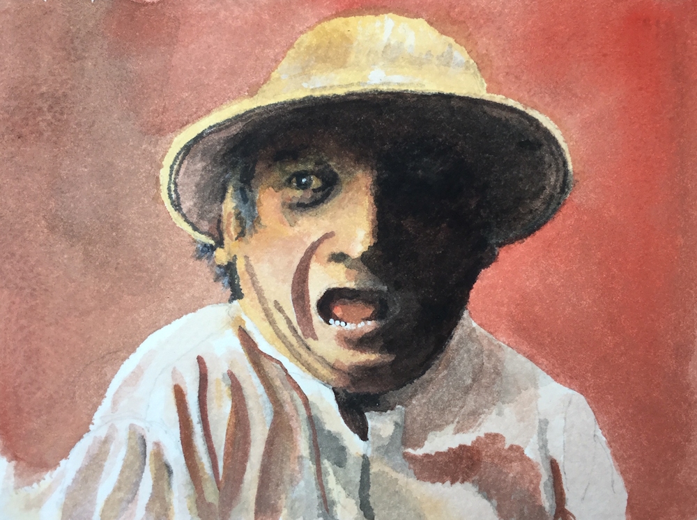
Anders Leonard Zorn (1860 to 1920) a Swedish artist greatly acclaimed internationally for his portraits, including those of several American presidents, was also famous for frequently using a limited palette of just four pigments: Yellow Ochre, Vermillion, Ivory Black and Flake White. Now we may prefer to use Yellow Ochre, Cadmium red Pale, Ivory Black and Titanium White. Flake white is warmer than Titanium White but is made from lead oxide, so rather a health and safety hazard.

Many old masters including Rembrandt, frequently used a similar limited palette partly due to the expense of blue pigments and also due to the fact that many of the pigments we use today were not known or manufactured then. Zorn used this limited palette when working in oil but it is perfectly feasible to use the same palette when working in acrylic, gouache, watercolour or even pastel.
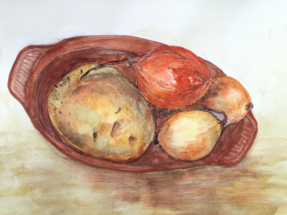
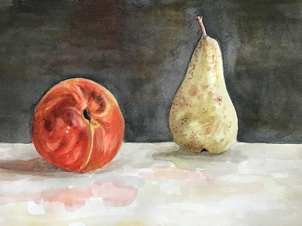
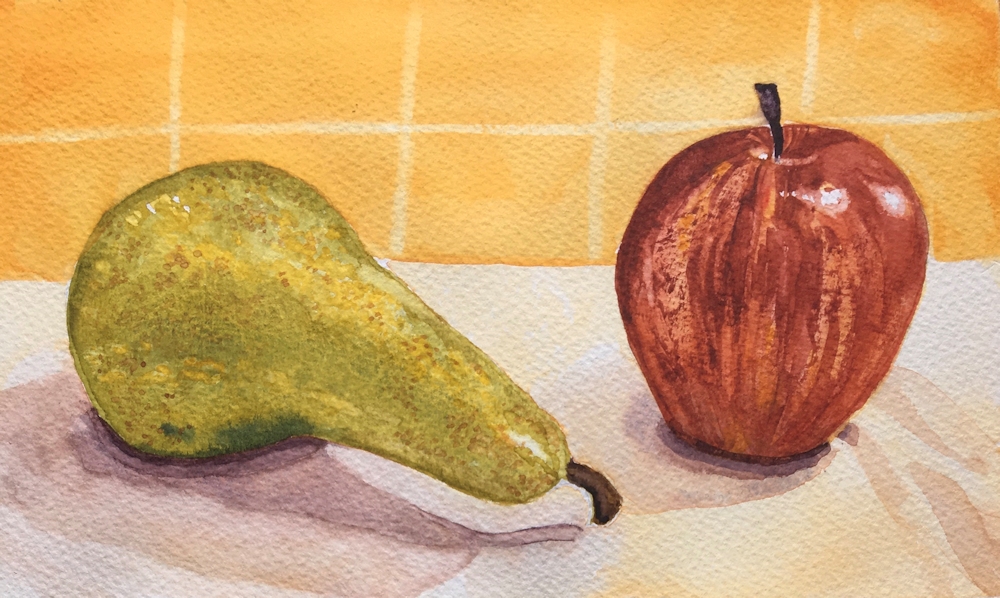
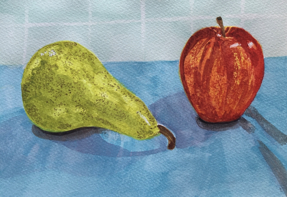
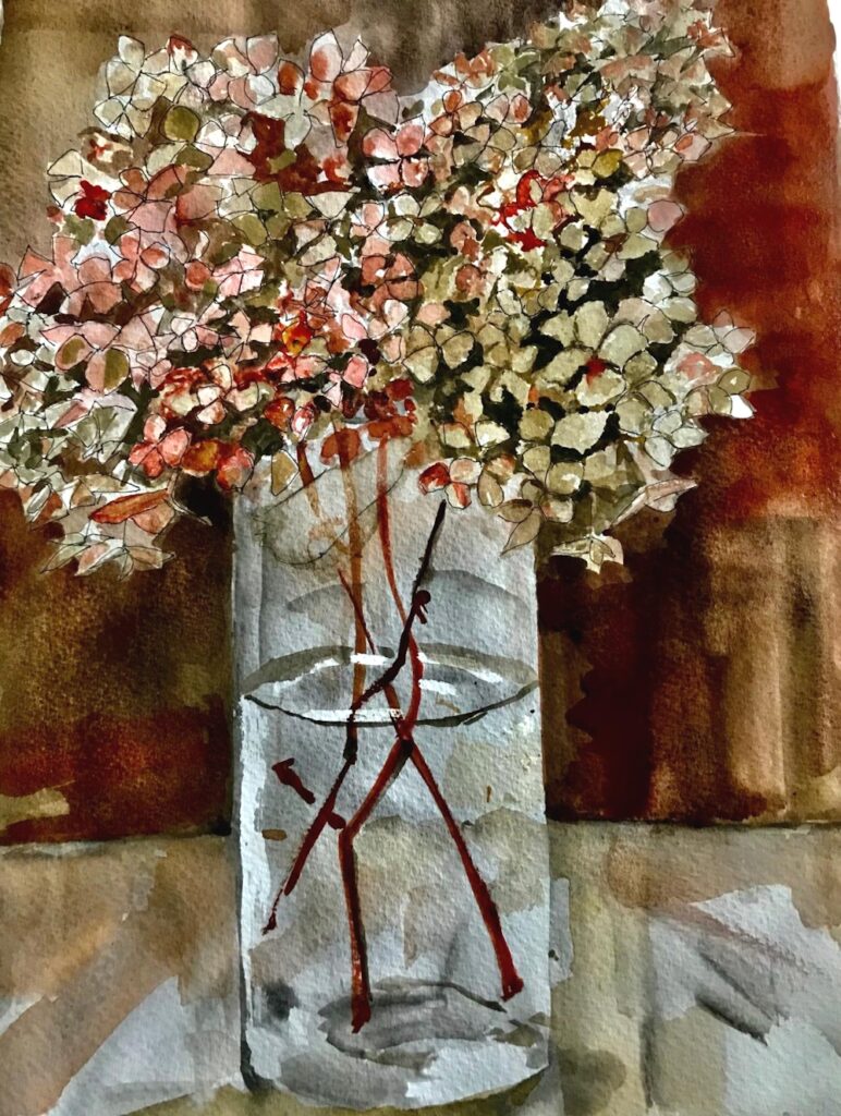
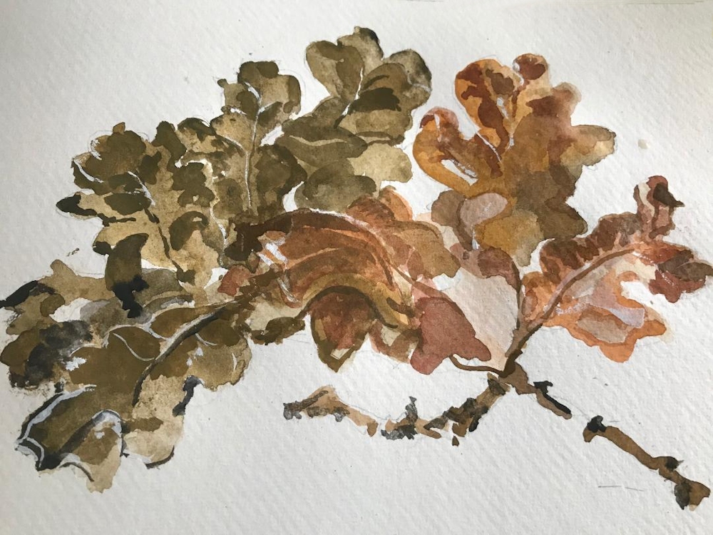
It is a very suitable palette for mixing skin tones, hence the many Zorn portraits using this limited palette, but can also be successfully used for other subjects; still life studies, some natural forms and city-scapes. It is more of a challenge for landscapes but could work for Autumn trees against a leaden sky. The black becomes a substitute for blue and both black and white (or water if using watercolour) contribute to the tonal and saturation range in the composition.
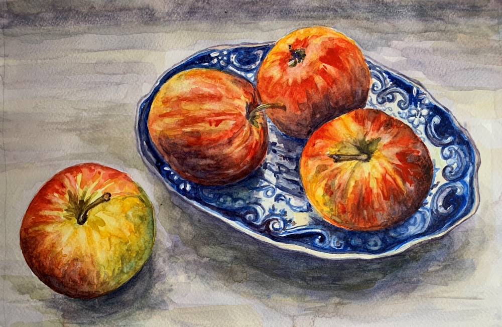
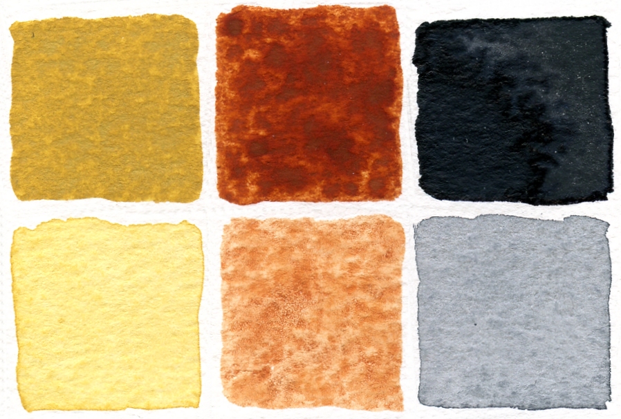
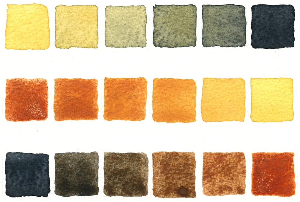
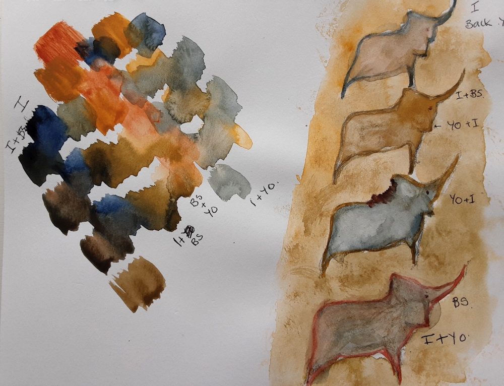
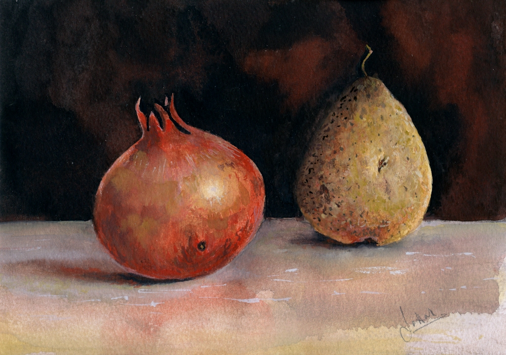
My “Pomegranate and Pear” study uses watercolour and titanium white gouache, but I could have used just watercolour without the white pigment or all gouache or acrylic. I decided to find what mixing the pigments would look like before starting to paint the still life. This was a chart of mixing the pairs of colours to make secondary colours. This could have been extended by mixing any of the squares with the missing pigment e.g. mixing a little black into the orange mix. I could have also extended the tonal range by diluting with water or adding titanium white.
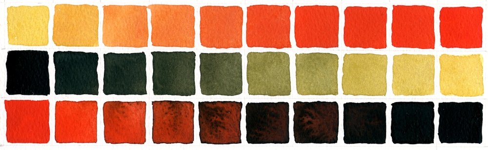
First row: Yellow Ochre with increasing amounts of Cadmium Red Pale
Second row: Ivory Black with increasing amounts of Yellow Ochre
Third row: Cadmium Red Pale with increasing amounts of Ivory Black
You will see that some rather olive green colours were created when Yellow Ochre was mixed with Ivory Black. This is because Ivory Black is very slightly blue and will make very cool (tending toward blue) greys when mixed with Titanium White or water. It is often difficult to see exactly what hues are in very dark colours but by diluting the colour with white or water the inherent colour can be more easily seen.
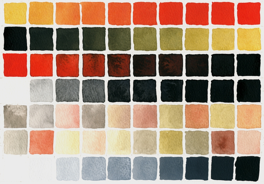
Added a few more rows, first three as previous colour chart. Row 4 added black to water, should have added less initially to make a smoother transition through loads of grey shades! Rows 5,6,7, various pale mixes; some with red, yellow and black; no system to them! Row 8 Permanent White (Titanium Oxide White) with increasing additions of Ivory Black.
On a general note when colours are mixed it is always best to add a little of the darker pigment to the paler one, as much more pigment is needed to change the appearance of a dark colour by adding a paler one, so you risk wasting paint.
- Indicated where cloth meets wall and shapes of fruit in pencil
- Made sure I had some strong washes of all colours except the white ready for mixing.
- Mixed and applied washes wet in wet on the fruit, reserving highlight on the pomegranate and lifting out the highlight on the pear. Dropped in some reddish yellow mix on the pear as it reflected some colour from the pomegranate. Adjusted washes when dry especially with regard to tone. Left to dry again then painted some of the markings on the pear and pomegranate wet on dry.
- Turned the paper upside down and applied a wash of black with a little red all over the background, dropping in a more reddish back mix wet in wet and left to dry.
- Decided the table needed to look as though it had more substance/texture to balance the dark background so used white mixed with the colours; mixes for shadows were of all three pigments and mixes made with varying amounts of red and yellow were used to suggest colour reflected on to the table from the fruit.
- Finally the highlights, markings and colour on the fruit were adjusted; in places just with watercolour and in other areas using watercolour mixed with white.
Practical
Have at the ready;
Yellow Ochre
Cadmium Red Pale (or any other bright warm red like Vermilion)
Ivory Black
Titanium White gouache if not using pure watercolour. This is usually labelled Permanent White. Zinc white is more transparent.
You will also need watercolour paper, a deep welled palette for making washes and your usual brushes and equipment. I would experiment a bit with mixing but if time is limited don’t be too precise just make sure you understand the possibilities.
1. Make a colour chart of mixes of each colour
2. Try extending the black with water and with white. You will notice a difference.
3. Try mixing the secondary colours with the missing (complementary) colour e.g. add a little black into a mixed orange.
4. Allow your colours to mingle wet in wet on the paper. Allow to dry then add other colours over them.
5. Make an abstract or a representational painting; a simple still life, natural form or a portrait study either from your own reference or referencing one of Zorn’s paintings.
Ensure you understand the tonal composition of your reference. If working in watercolour start with the palest tones and colour and build up to the darker washes. In acrylic and gouache the darks may be established earlier on and over painted with paler tones mixed with white where appropriate.
Reference Pinterest Board “Limited Palettes”
https://www.pinterest.co.uk/jhall1282/limited-palettes/
Some of Anders Zorn’s works are referenced on my Limited Palette Pinterest board together with a gouache demonstration of the Zorn palette used with gouache by James Gurney. It has an unusual setting but is very useful. He does talk about using additional browns but you should be able to mix all of these from your red, yellow and black. He also used a paper primed with an Ochre or Raw Sienna casein paint; you could always apply a dilute acrylic wash of a similar hue. At one stage he removes paint to let the background casein colour show through. That should also work with an acrylic wash. However as you can see from the still life at the beginning of the post you can see that it is perfectly possible just to paint on white watercolour paper.
Alvaro Castagnet
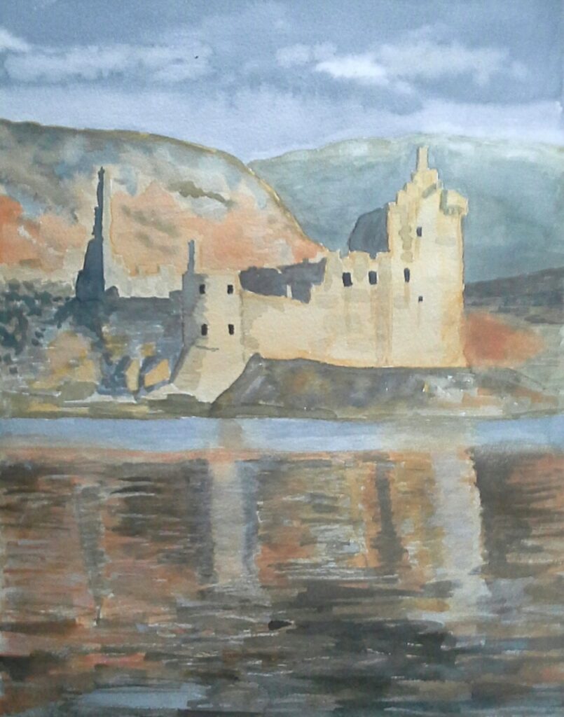
Castagnet works in watercolour and I have included one of his cityscape works which could be reinterpreted using the pigments of the Zorn palette.
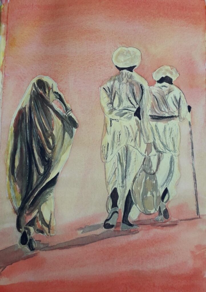
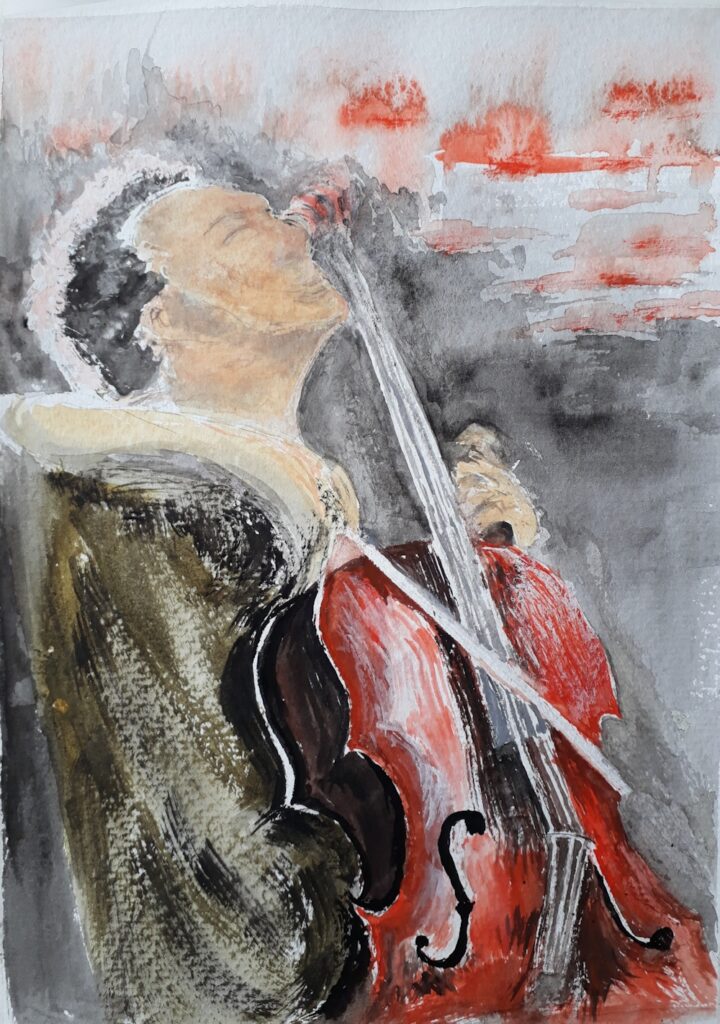
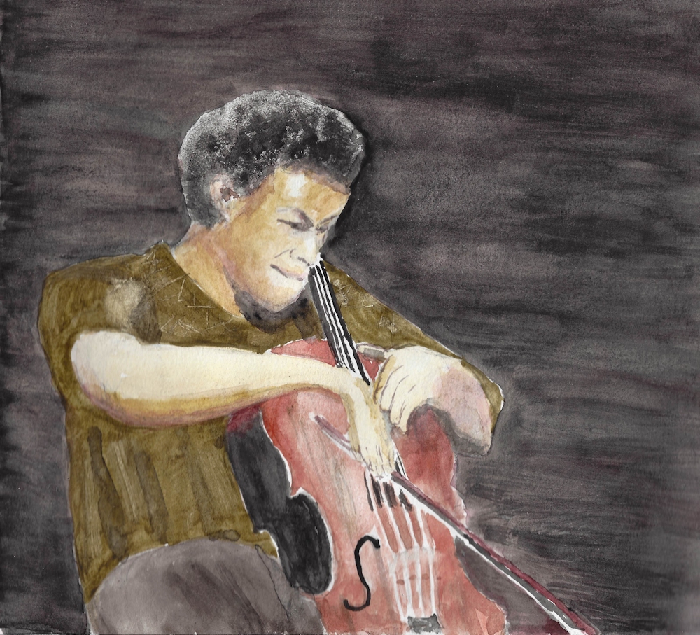
Your Zorn Palette Paintings:


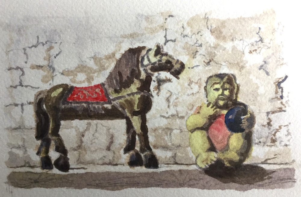
Both of Sandra’s works were painted with Cadmium Red Deep instead of a brighter red like Cadmium Red Pale, Vermilion or Scarlet Lake.