Category Archive: Landscape Challenges
From the Riverbank Week 1: A Challenging Surface
May 4, 2021
Watercolour
Over the next six weeks we’ll be drawing and painting anything that can be seen from a riverbank. The first session will be online but if you do have the opportunity to sketch your subject by the river and paint afterwards that would be brilliant. We’ll start by considering water, waves and reflections and go on to explore the riverbank vegetation, birdlife, bridges, weirs and locks that can be seen locally.
Watercolour
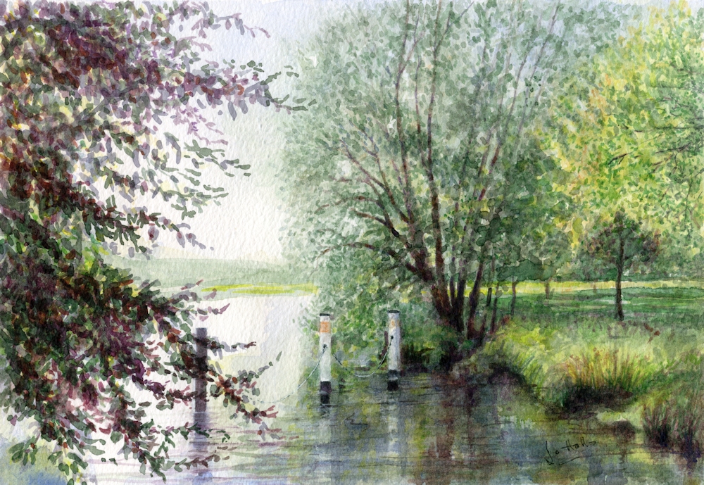
Some words that sprang to mind when thinking about water were flowing, calm, reflection, spray, fierce, roar, crash, wet, wave, ripple, current, whirlpool, eddy. By the Thames locally, the extremes in appearance of water going over the weir at Maidenhead and the wonderful reflections of trees in the very calm water that can be seen from the towpath just a couple of hundred yards upstream, reveal what a varied and challenging subject this is.
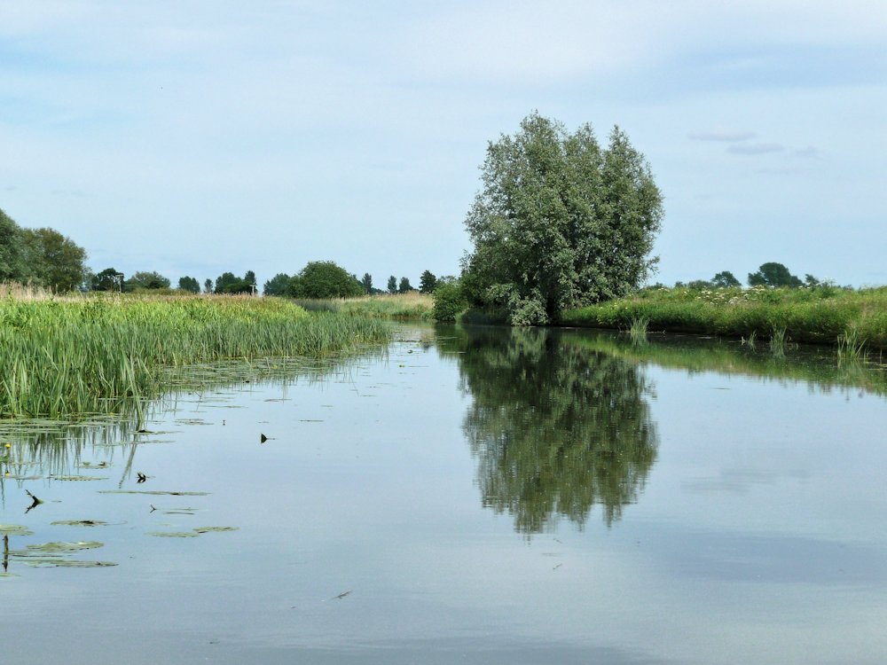
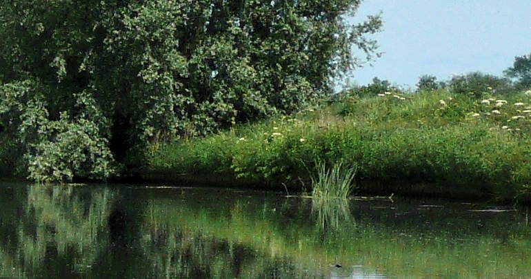
Photo
Large ripples in foreground give very distorted reflections.
See how little patches of sky are reflected and the large tonal differences in this picture: the palest areas are the small poles in the middle distance and the darkest are in the trees and their reflections.
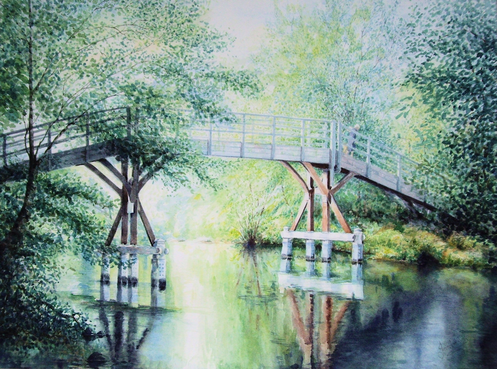
We may often notice the reflections of boats, trees, poles etc. in and on the water but the sky is perhaps the most important element, being reflected not only in calm water but in every ripple and almost always brings an element of fleeting and shimmering light to the surface. The Impressionists found good ways of depicting this, using strokes of different colours and tones alongside each other to create shimmering effects.
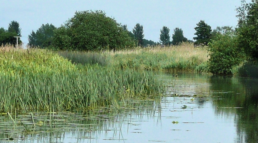
Photo
Criss cross ripple patterns in the wake of the ducks.
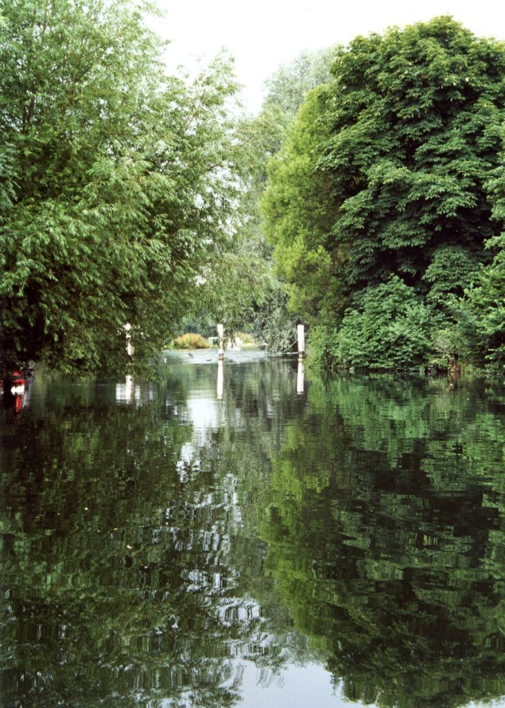
Ripples appear smaller in the distance and eventually look like a shimmering tone on the water.
If you can, get to a riverbank and watch the water. Better still make some sketches of what you see. Take two L-shaped pieces of card with you so you can use them as a view finder. These are more versatile than a camera as they enable the isolation of very tall thin slithers of the landscape or extreme panoramic views, as well as squarer and more conventional landscape shapes for your composition. In the sketchbook try several small sketches in different formats concentrating on the shape and tones of what you see.
If you can’t get out this week try exploring different compositions within one photo reference.
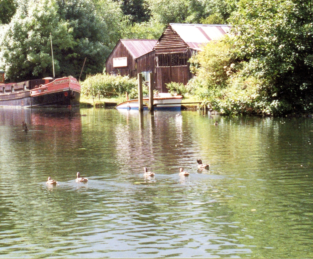
Photo
The following images were all cropped from this one photo. You may like to do something similar; crop a reference photo in different ways and make a tonal sketch of each. Choose the most successful for your painting. Choosing and isolating the elements you wish to paint is an important part of painting outside and why a sketchbook is invaluable to try out different composition ideas. I was amazed at what lay hidden in this reference taken mainly for the very subtle cloud cover and its reflection.
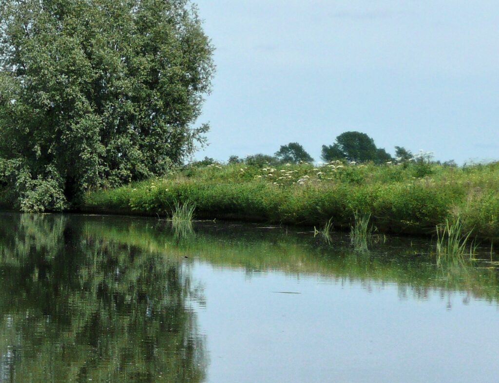
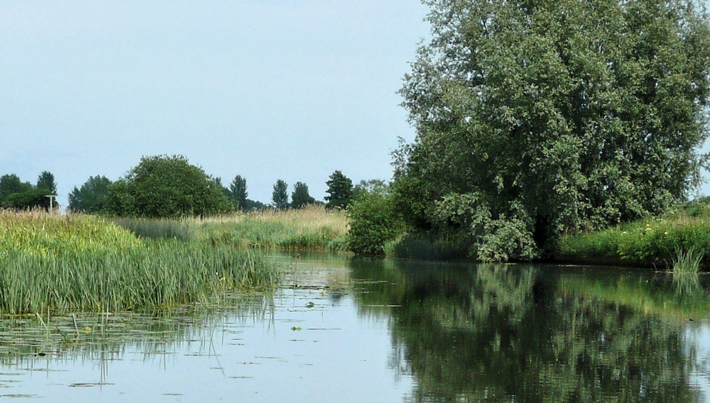
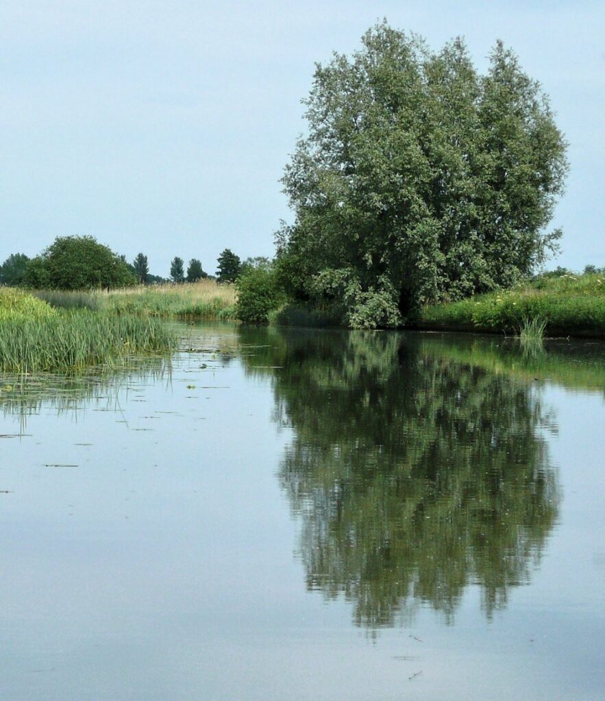
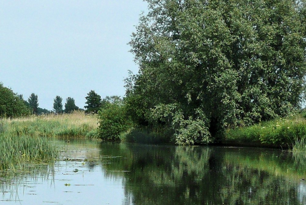
I am forced to admit this photo was taken from a boat and not the bank but the various crops show the great choice we have from the quite dark composition of crop 4 to the light airy feel of the original photograph.
Start to think in terms of shape and tone. Instead of thinking I am drawing a tree and its reflection say to yourself,” I can see a large dark oval shape. Below it is a similar dark shape that fragments into elongated light and dark shapes when the wind blows.” If you can stay long enough, observe different patterns on the water surface as a boat passes, and when there is wind or no wind. Try to translate these into drawing. Can you observe differences in size between ripples near you and those further away?
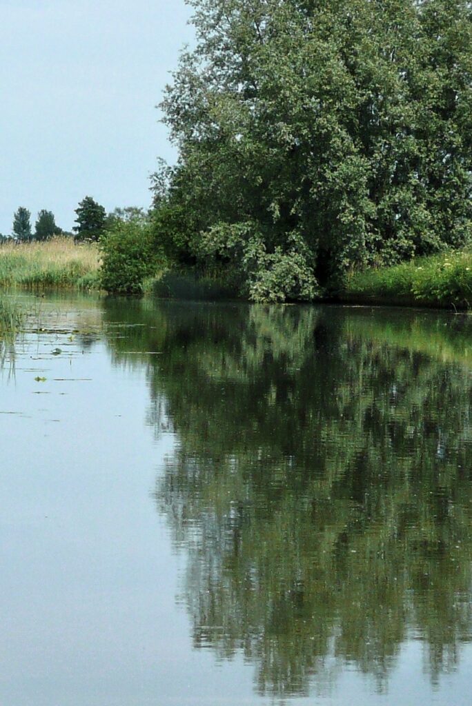
Observe and note whether there is a difference in tone between the sky and its reflection and do the same for reflected objects. As you can see from the photo taken on the Cam, the sky there was almost the same tone as its reflection but this is not always the case.
When you have found a composition that pleases you either paint or make a more considered drawing. Both the observation of the water surface and the composition exercise will be good preparation for the outside drawing/painting sessions.
Have fun and experiment!
Perhaps look at a few Impressionist paintings!
Your Drawings and Paintings:
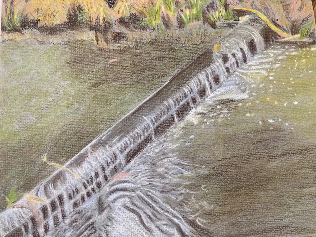
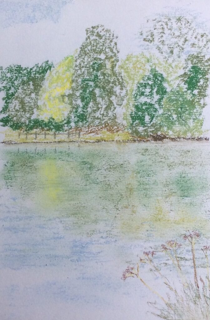
Pastel by Shane
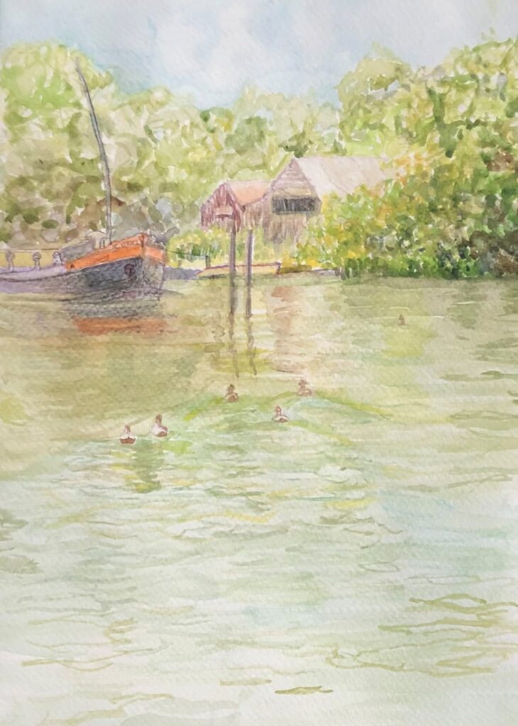
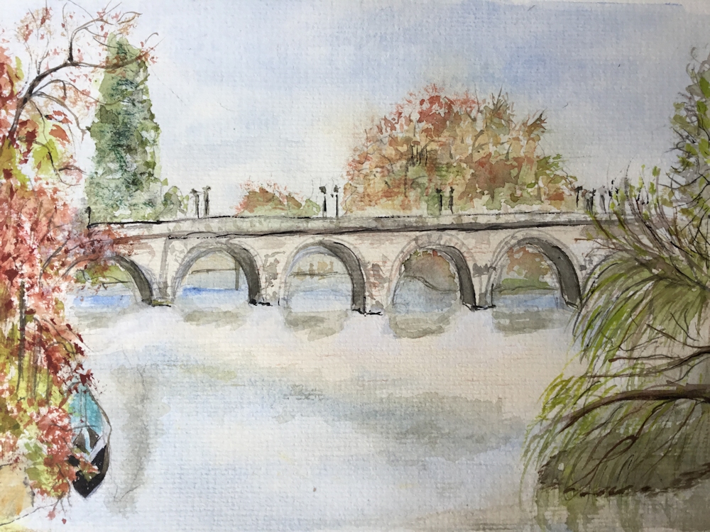
Watercolour by Virginia
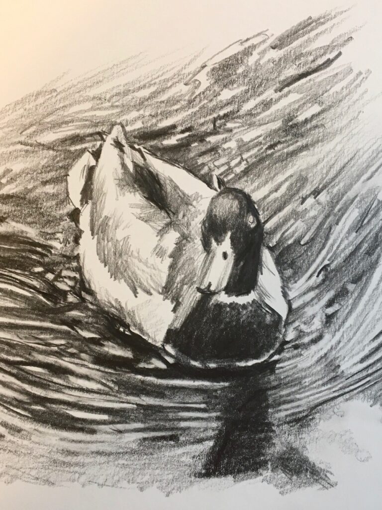
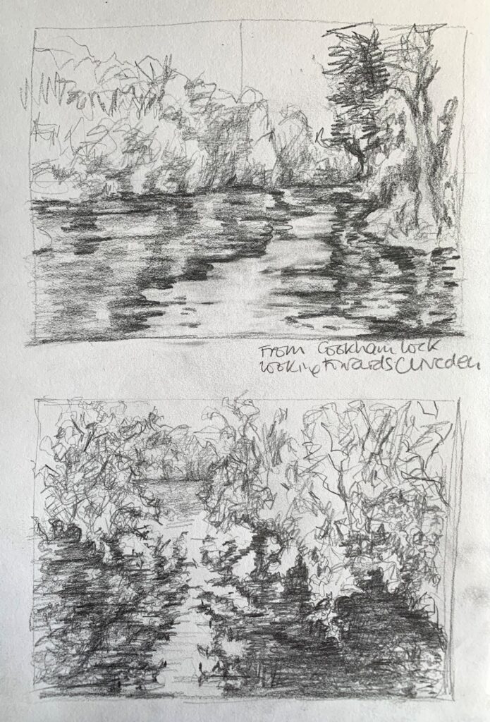
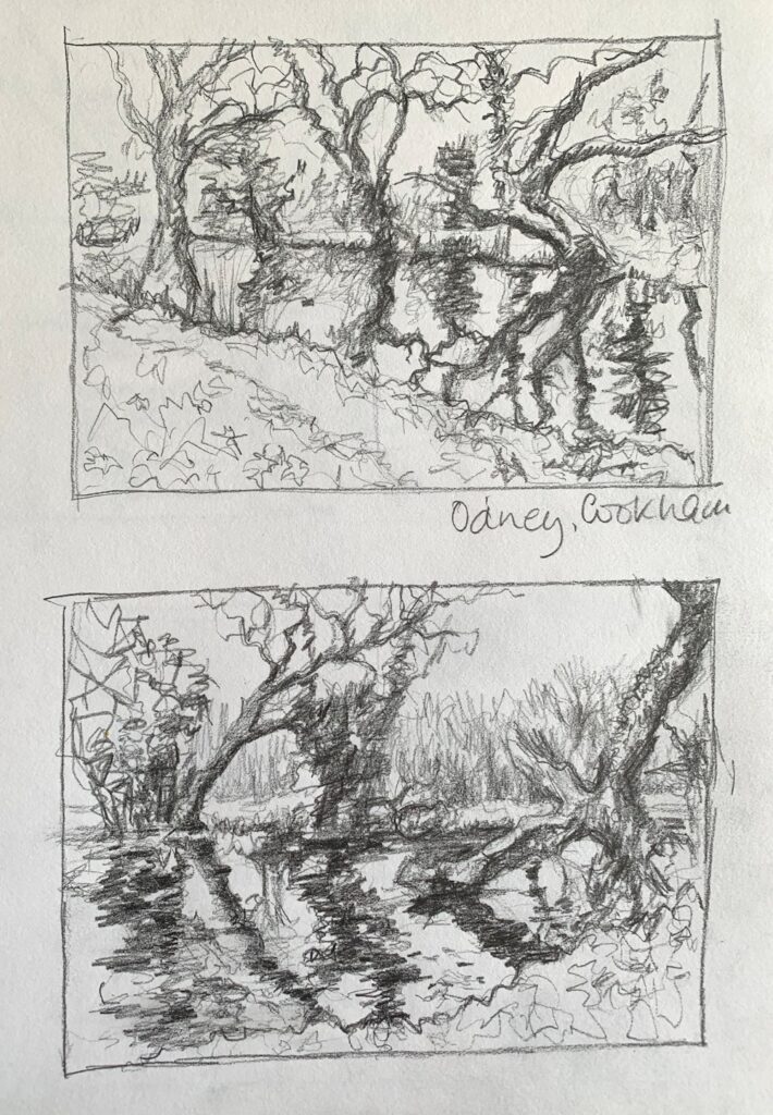
Drawing by Maryon
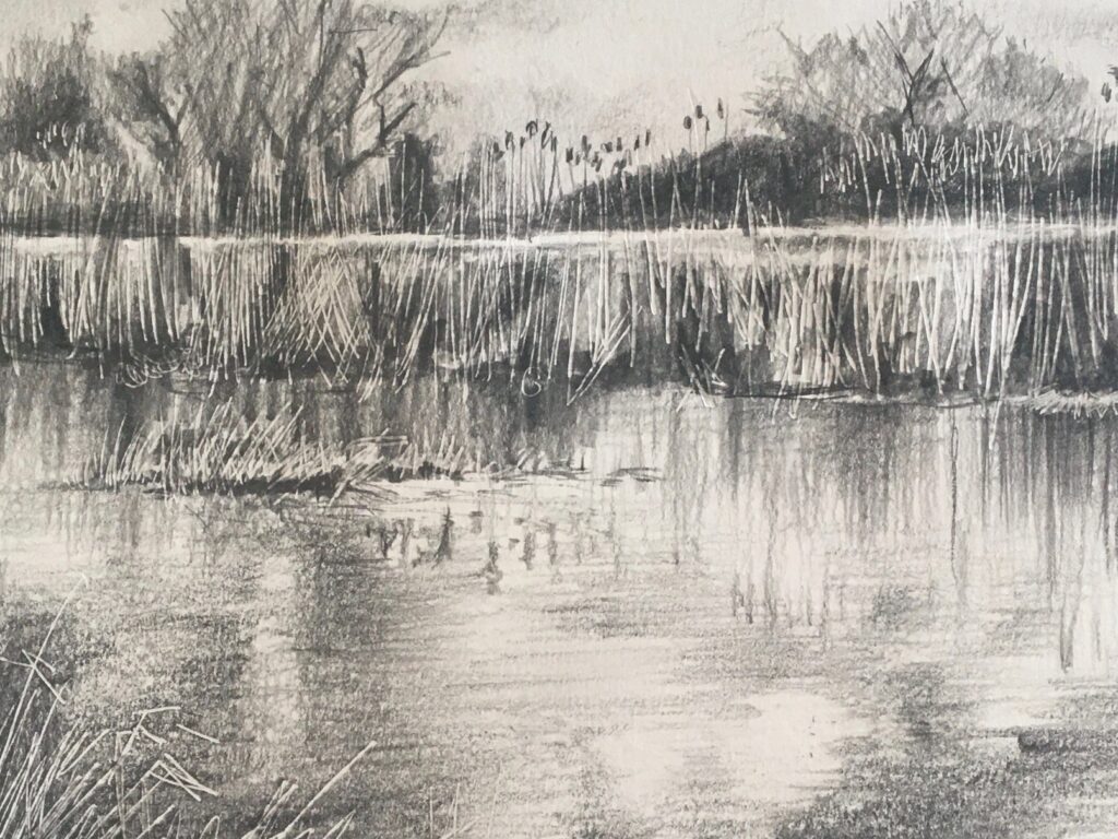
Drawing by maryon
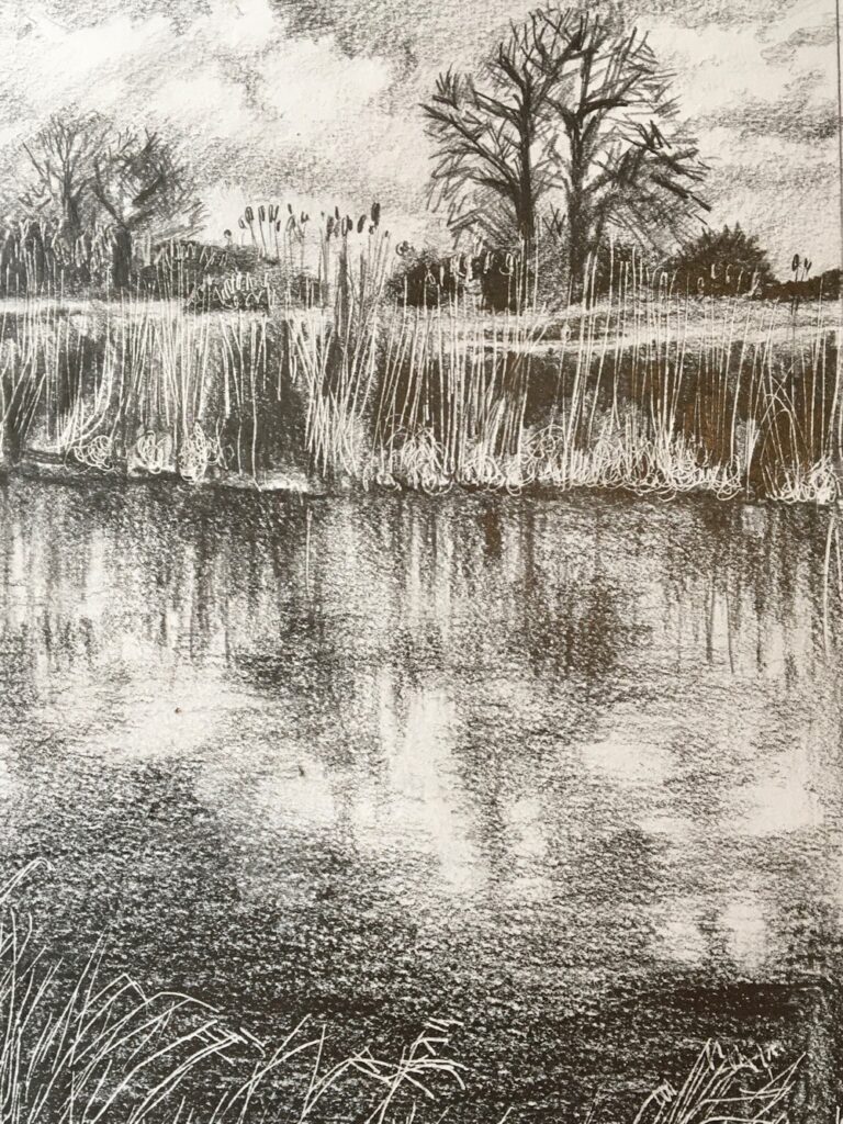
Drawing by Maryon
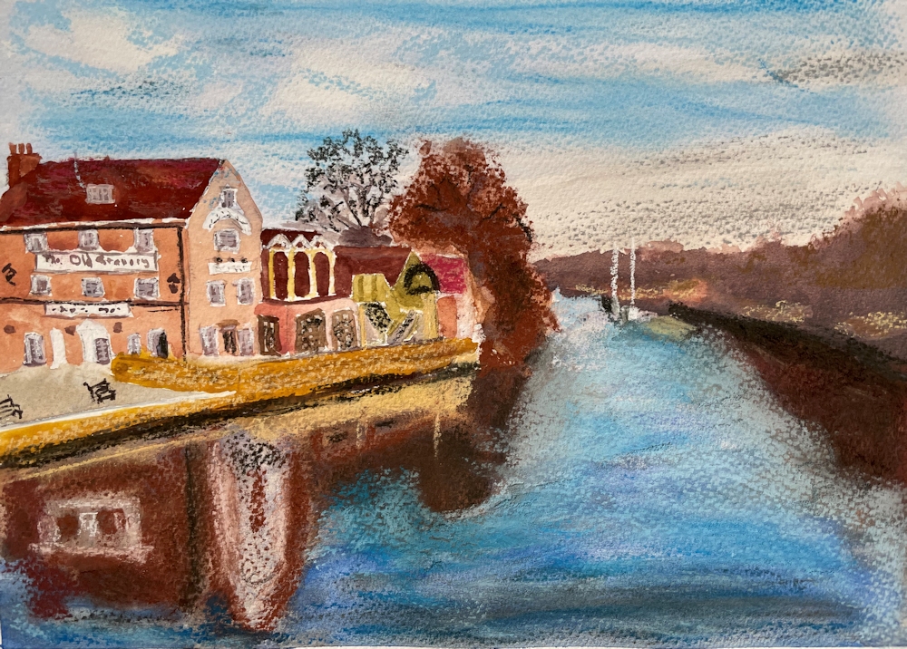
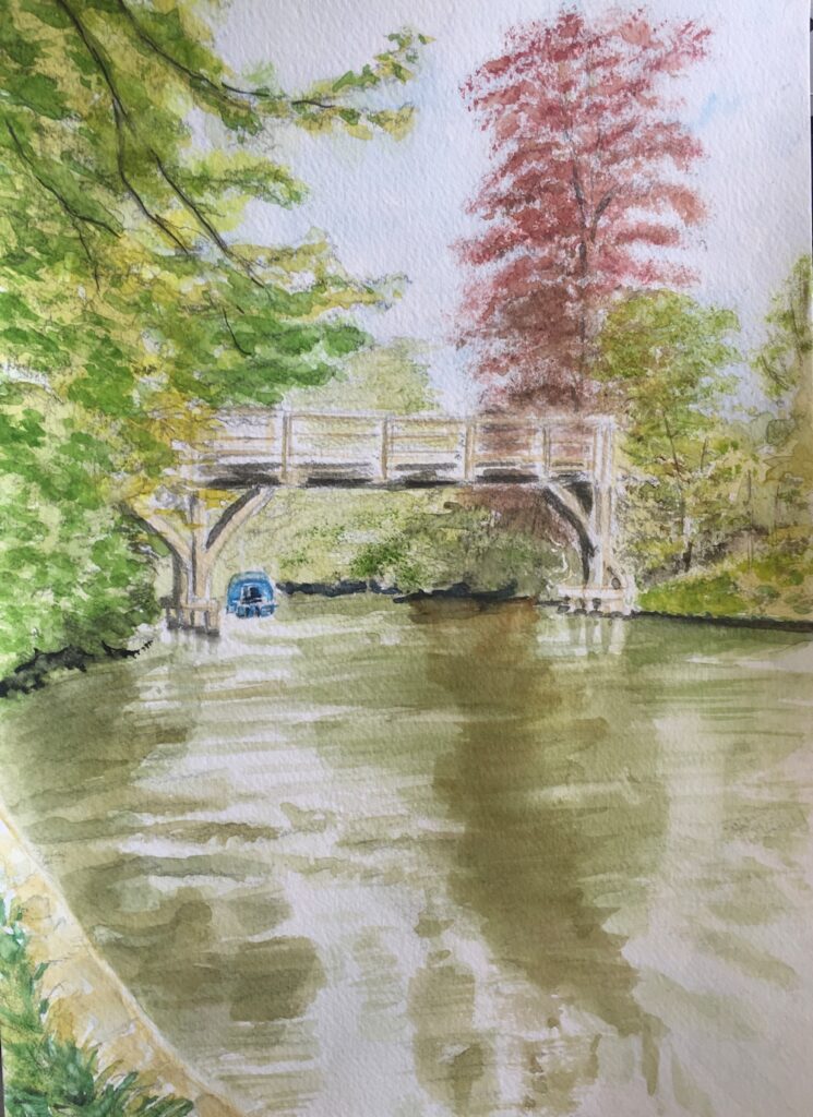
Watercolour by Ann
Pastel by Barbara
Watercolour and Pastel by John
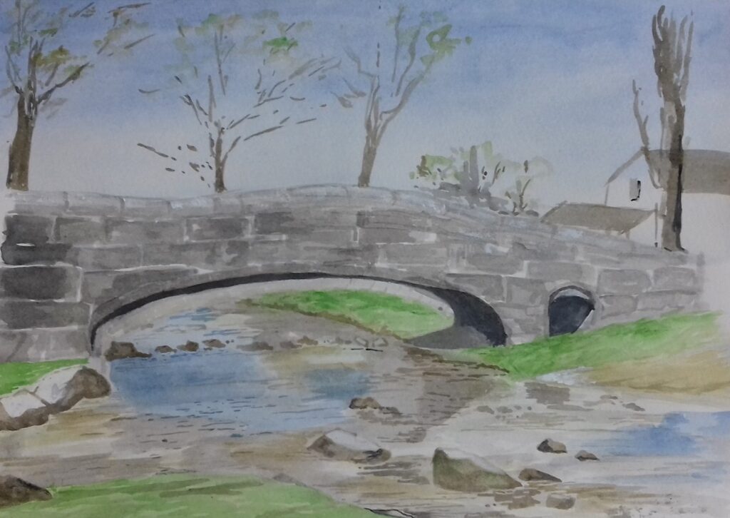
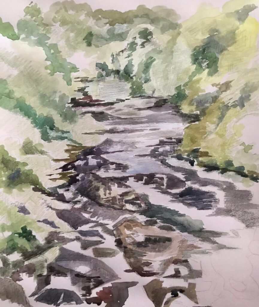
Watercolour by Liz
Watercolour by Jan
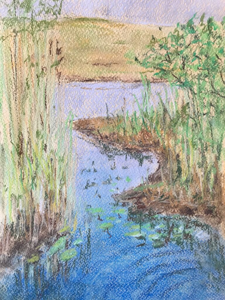
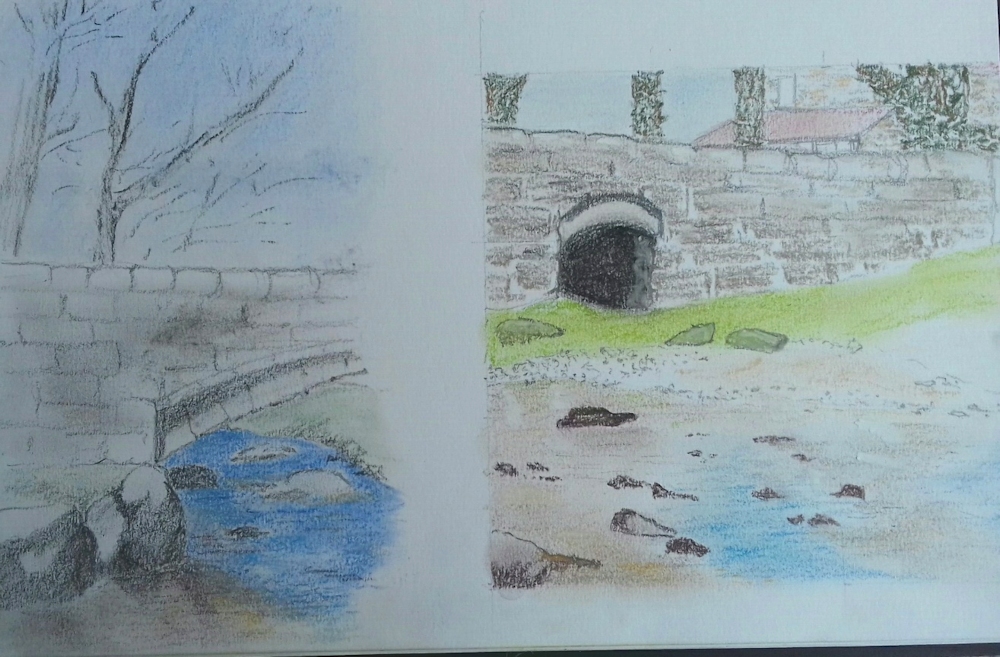
Coloured pencil and watercolour by Sarah

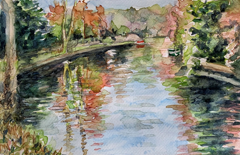
Watercolour by Sarah
Ink and Wash 2: Into the Landscape
August 9, 2020

In last week’s post the accent was on mark and line making and different techniques for drawing in ink and adding washes of more ink and/or watercolour or pastel and our aim was to produce an ink and wash drawing of a natural form. This week we are operating on a larger scale and moving out into the landscape. You have many techniques at your disposal and I would like to see you try a landscape from your own reference material; somewhere you know and either love or find interesting. Best of all would be to work from life at a landscape near you!

Think about how your subject will be best depicted; whether the accent should be more on line or mark making or whether only an indication of line is needed and most of the “work” will be left to the wash to supply tone and colour.

Also think about how you will provide a sense of space and distance. This may be important or not as we shall see from the rather eclectic group of images chosen for the Ink and Wash Pinterest board at
https://www.pinterest.co.uk/jhall1282/ink-and-wash/
Claude Lorrain
Claude Lorrain’s Study of an Oak Tree ca. 1638 is rich in pen marks on the trunk and foliage but many of his ink wash drawings were almost solely wash as in his View from Monte Mario, where a river winds its way through dark trees against a backdrop of distant mountains. The paper is white where the water reflects light most strongly and the composition relies almost completely for changes in tone for its effect. In Trees and Rocks by a Stream ca.1635 there are beautiful calligraphic lines as well as washes where the tone of the wash varies from a very weak tea stain to something much darker. I find his work has a timeless quality and he has much to teach us today.
Samuel Palmer
Moving forward Samuel Palmer’s work is equally dramatic tonally but rather more graphically defined. In Drawing for the Bright Cloud ca. 1831-2 look at how Palmer’s clouds depend on line as well as tone, how the middle ground is very dark and the tree trunks white against the dark and how carefully the sheep have been washed with different tones so we know exactly how the light is falling on them. There is also an abundance of mark making on their wool and much patterning of foliage.
There are several ways you can produce light against dark;
Reserve the white of the paper; draw/brush round anything you wish to remain white.
Add White: When the work is almost complete add white gouache or even acrylic or white pastel/pastel pencil.
Scratching with a sharp implement taking care not to put a hole in the paper-always best done at the very end and only if the paper is heavy enough to take harsh treatment
Wax: At the very beginning either a line of candle wax which cannot be removed; experiment first on a small piece of the paper you will use to see how much pressure is needed when you add a wash and the wax acts as a resist.
Masking fluid; apply at the beginning with a ruling pen or old brush which must be cleaned immediately afterwards. Make sure the masking fluid is completely dry before removing by rubbing with a finger or soft eraser; not suitable for rough papers so again experiment first
PLEASE NOTE: Wax resist, or adding chalk pastel when a work is almost complete will work with waterproof ink, non-waterproof ink or watercolour.
Non-waterproof ink may lift when you add wet gouache or acrylic. You may lighten areas of non-waterproof ink or watercolour by lifting out with a damp brush and clean tissue. You can wet the paper repeatedly to lift out but do not rub the surface or it wil become damaged. Paper is at its most fragile when wet.
The other reference artists chosen are :
John Piper; images of rocky landscapes
Paul Nash; trees and woods in the landscape, carefully considered compositions and delicate lines The Pin labelled Paul Nash at Tate Britain has an image of The Wanderer. Do look at how the line and colour work together producing a magical narrative landscape where the distant figure has trodden a path through the field.
Ceri Richards; trees and foliage full of wonderful lines and marks evoking a strong sesne of movement
Wu Gannzhong
Lastly I have included the Chinese artist Wu Guanzhong, who died in 2010 and is often thought of as the father of modern Chinese brush painting. Like Lorrain he has made wash drawings that wholly depend on wash but also those where line is the key element. The contour of the land is well established so that however abstract his work becomes, it still convinces us. We are still travelling the path with him and I think his work also has that timeless quality.
Aim to produce;
One considered drawing of a landscape with rocks, trees or both.
Foliage of trees may be suggested with ink but always remember the side of your brush can be very useful whether in strokes or “printed” against the paper.
Remember to mix some washes up in advance of starting the pen/brush drawing as you may wish to add some wash while the ink is still wet, if you are using waterproof ink. Also ensure that all your equipment like brushes and a sponge or paper towel are to hand.
If you have time for a second drawing, try to make one that is different in nature to the first. For example the first may be a calm day and the second blowing a hurricane or at least windy. The first may be monochrome and the second very vibrant.
Enjoy drawing!
Your Drawings:


Fruit Tree Blossom in Pastel
April 20, 2020
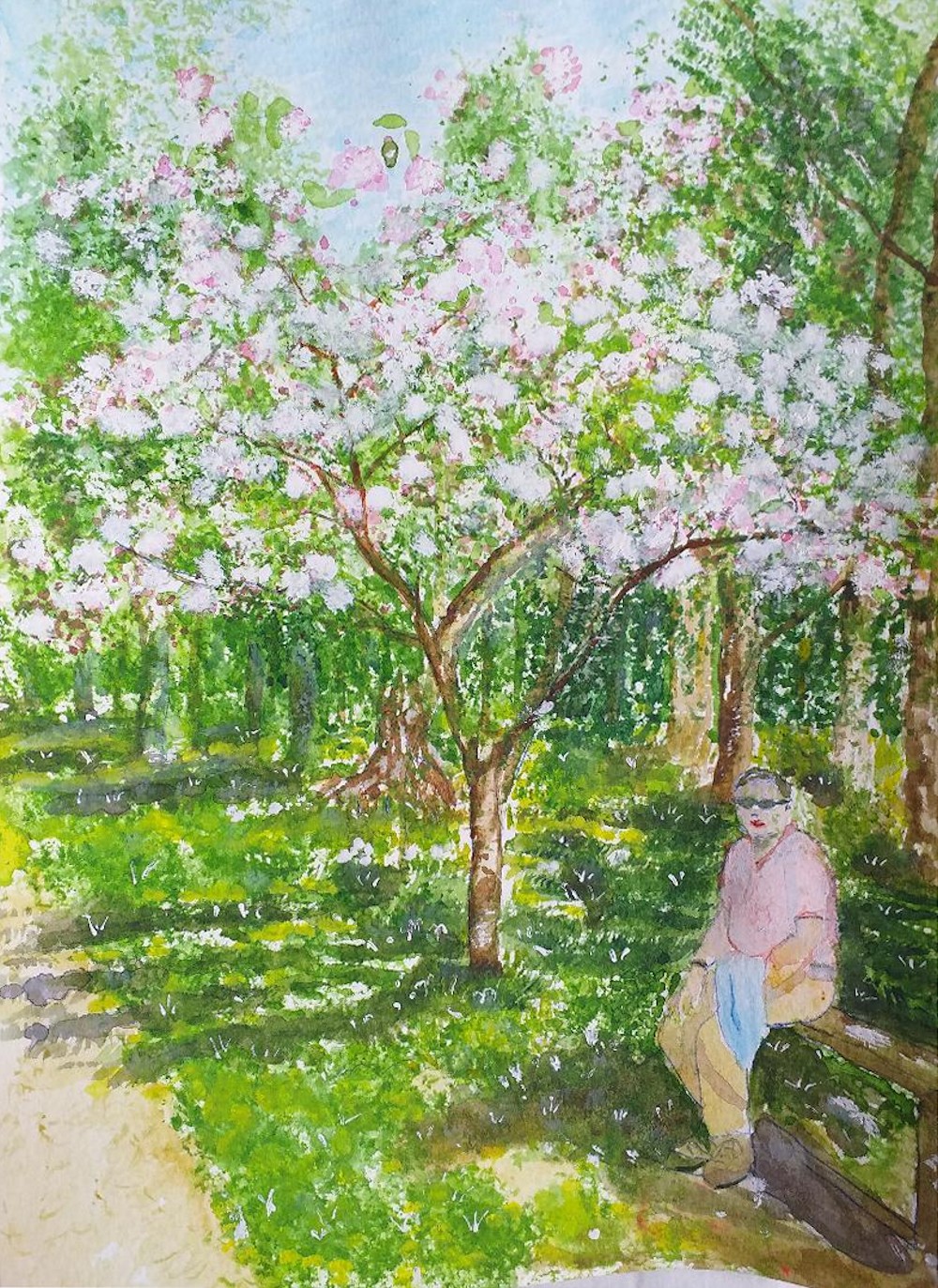
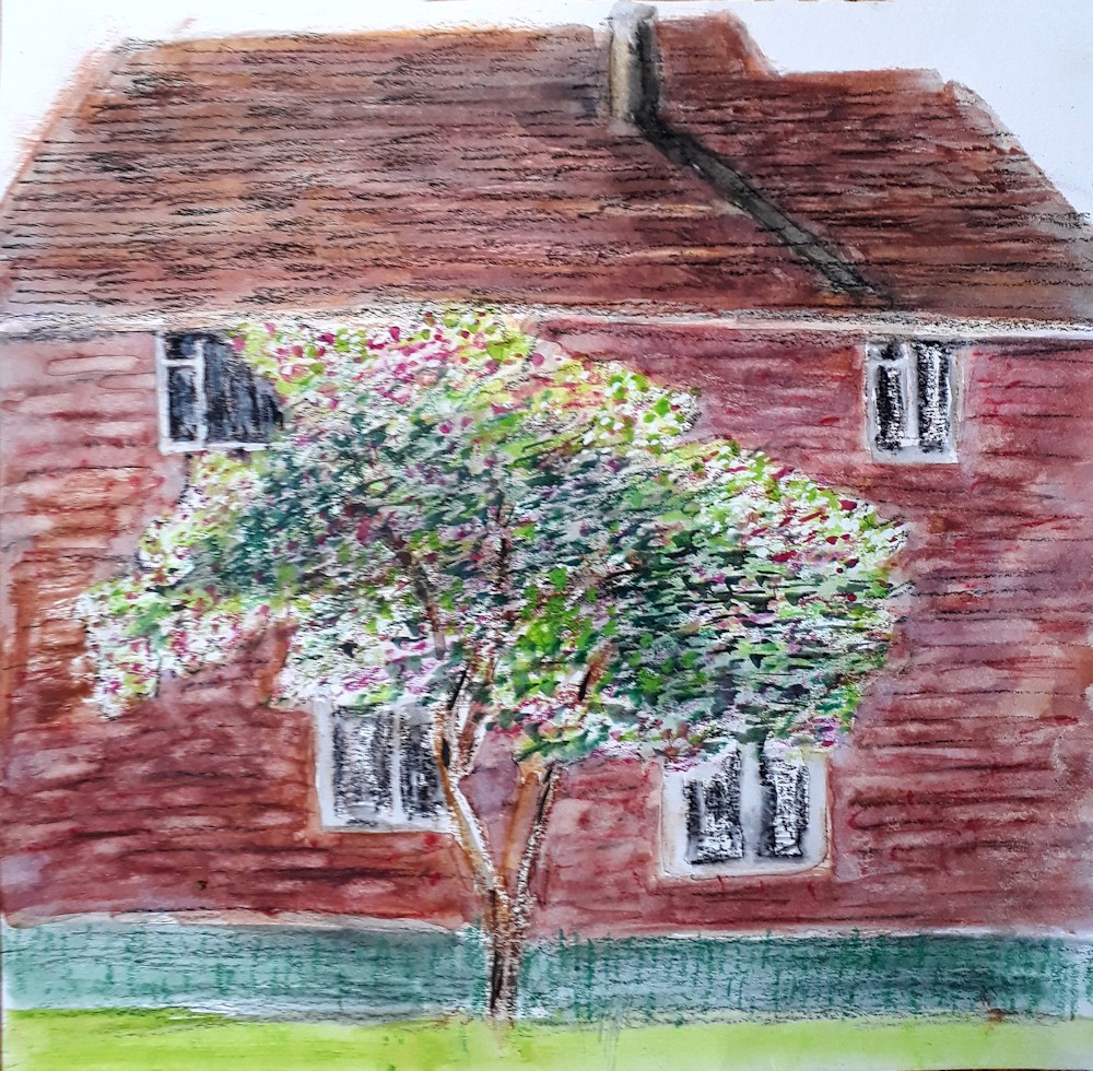
At this time of year those of us with a garden and an apple tree have the perfect model for this week’s painting challenge. Start by looking at Vincent van Gogh’s paintings of peach and almond trees in bloom. Also look at blossom trees painted by Monet, Pissarro or Sisley. If you don’t have a live model in full bloom, use a photographic reference or make your own version of a Van Gogh or Impressionist work.
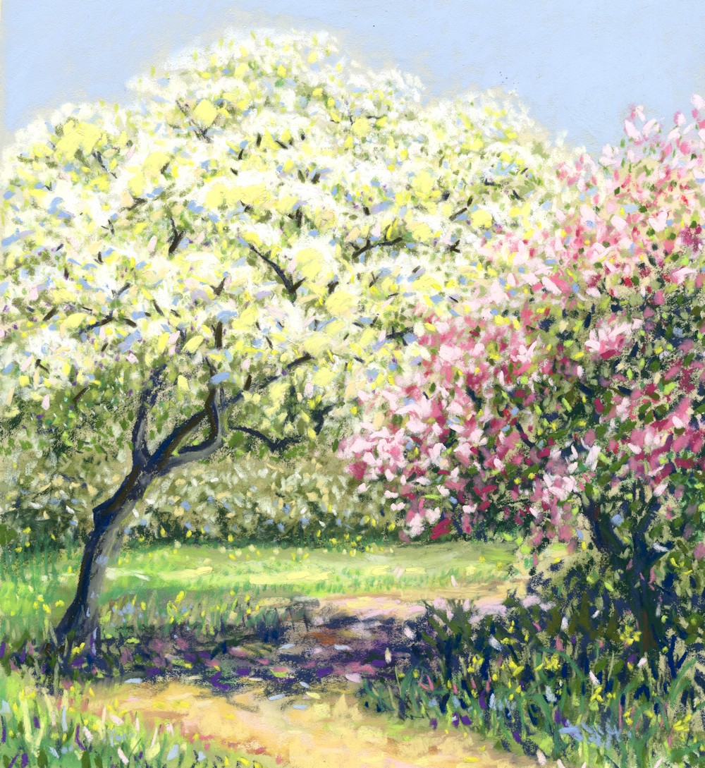
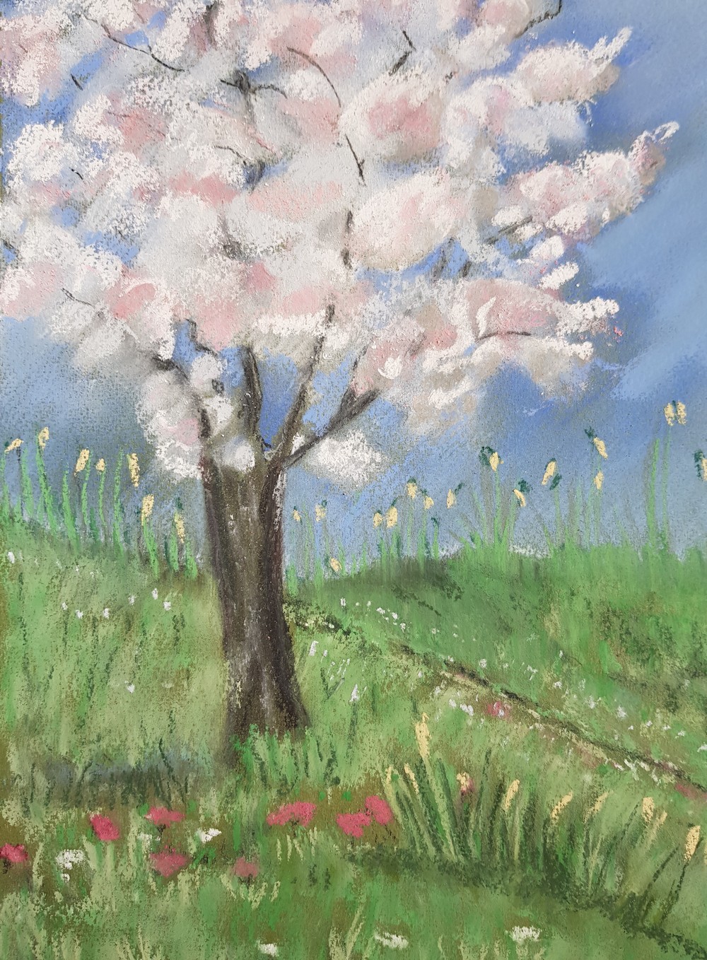
Crab Apple and Cherry Blossom
There is a fine balance between getting the essential character of the tree by getting the angles of the main trunks and branches right and the challenge of overlaying it with blossom and leaves in a way that does not appear overly detailed or fussy, but does give an idea of the tree’s character. If the blossom is all the same tone it can appear quite flat so look at where the light is coming from and observe the shadow areas well.
Composition: You may like to make a tiny tonal sketch or even two or three to work out a successful composition and to observe the overall shapes and tones. These should made in pencil and be no more than about 2 inches by 3 inches. Remember to include suggestions of where background objects you wish to include, garden sheds, fences etc. Also start to think about what you may leave out.
Paper: Choose a pastel paper that has a good enough tooth to take several layers of pastel. This may be white or coloured. I used a sandy coloured paper for the example above.
Making a Start: When ready to start on the final work I find it useful to start with the trunk and main branches, delineating them with a very light touch at first and observing the girth of the main trunk and the angles formed by the main branches. I then like to indicate the outline of the whole mass of the tree with a broken fine line and mark out any other features I wish to include like fences, shrubs, a garden shed etc., again with a light touch.
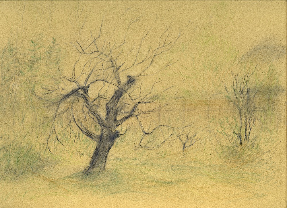
Apple Tree: Early stage basic shapes drawn in, and first suggestions of colour.
When indicating indicate these first shapes it is sometimes useful to indicate these areas with colours and tones close to the colours and tones you see for each shape especially in the palest areas. Whether working in a rather impressionist style with short strokes of broken colour or you decide on a blocking in approach after your initial drawing, try to keep the work fairly open by continuing with a light touch. This gives far more scope for modifying shapes and forms as you develop the painting.
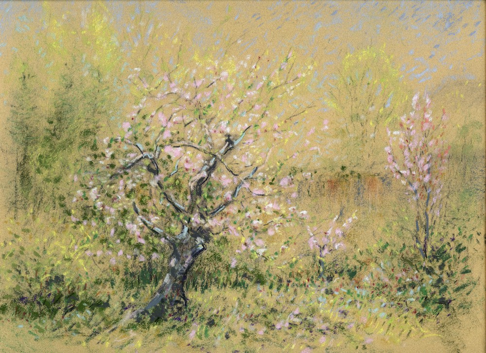
Apple Tree: colours and tones developed further
Develop the Painting: Look for colours and how they are modified across the form. Shadow areas of blossom may reflect some of the colour in the sky. Look out continuously for colours that are reflected from one object to another. At some stage you will want to go in with much stronger colour in some areas. The palest colours and vivid colour accents are best added last as then they will remain fresh and undisturbed. As you can see from my middle stage of the ‘Apple Tree’ I don’t always follow this advice, sometimes preferring to add touches of the palest tones so that a balance can be worked between extremes of light and dark.
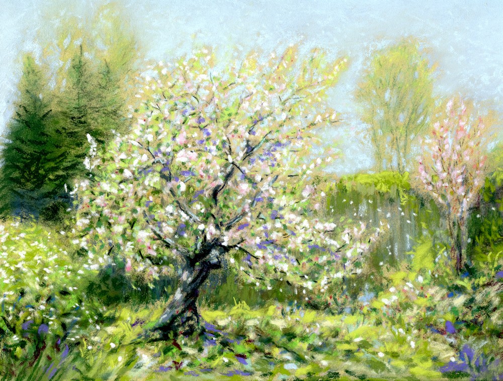
Apple Tree : final image
Do fix your work as you add layers of pastel, but after your last touches of bright pastel are added, fix very sparingly or leave the work out for a few days. In our fairly humid climate the pastel will become somewhat fixed just by the moisture in the air. However if your work has to travel, a light spray is advisable with the nozzle no nearer to the work than 2 feet.
A complex branching system can be daunting but as you can see from the finished work at the beginning of this post it can be reduced to little dots and dashes of pastel. I hope to finish the ‘Apple Tree in progress’ tomorrow or Wednesday and will insert the final stage sometime this week.
Enjoy the colours and hopefully some sunshine!
Your Paintings:

In Windsor Great Park near Cow Pond
Apple Tree: mixed media