Category Archive: Abstract Challenges
Magic of Black: Week 2 Dots Lines and Shapes
March 2, 2023
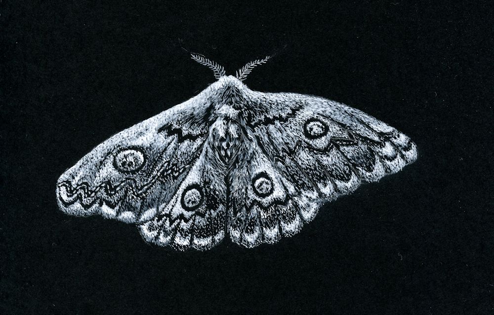
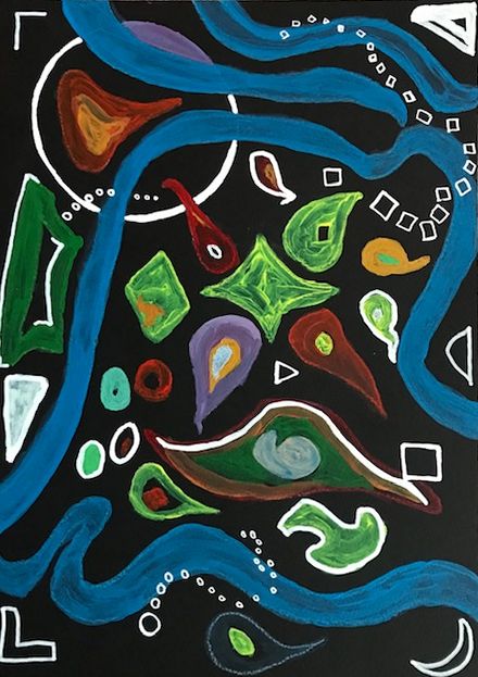
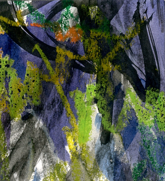
White gouache on black paper by Jo
This painting is entirely made up of tiny dots and dashes
This week we’ll explore making patterns of dots, lines and shapes to create texture or to make illustrative or imaginative drawings. If you are working with very small marks don’t attempt a large piece. The moth drawing above was only about five inches by 3 1/2 inches. If you decide on exploring shapes this can be as large or small as you like but for a large piece use large brushes or chunky materials to suit the scale.
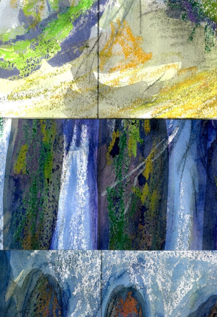
Happy for you to experiment with seeing a scene in plan view. As in the drawing below.

Gouache by Jo
Note how the dots have been used to make patterns of eddies in the river. The scene is as if in plan view so the green circles are trees. The palest dots have been used to mark out the main areas.
The composition relies on the shapes; the arrangement of the large areas and the arrangement of the colours and tones of the dots. There is no attempt to create an illusion of three dimensions but there is a sense of movement.
Dots
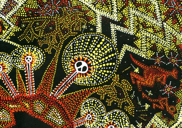
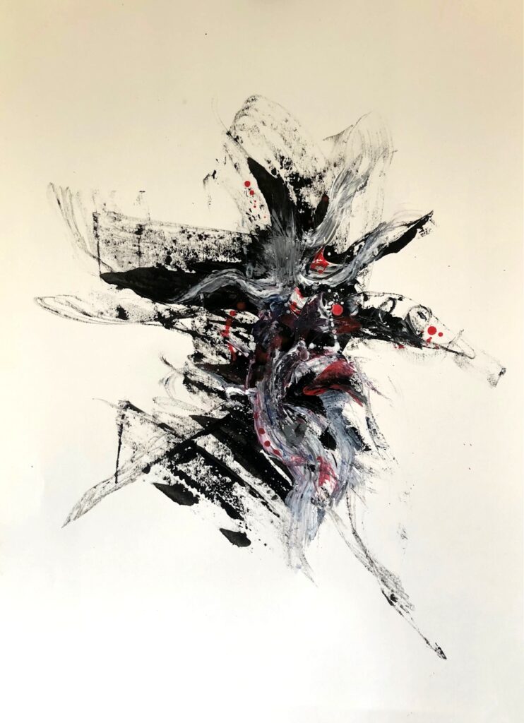
Shapes, dots and lines have been used in very ancient rock art and also the more recent and intriguing dot paintings of aboriginal artists in Australia. I took inspiration from both rock art and dot paintings for the “Ring of Fire” drawing below. The dots are used in two main ways; firstly to fill shapes and secondly to form lines to mark out the main areas/motifs of the composition. They can also be arranged in lines making decorative patterns as in the haloes of the lightning spirits below which are filled with radiating lines of dots. Unlike the Meander drawing where the dots are placed close to each other over the whole work, in the drawing below the black paper between the dot motifs plays a much more significant role in the composition.

Gouache by Jo
This dot painting combines ancient cave painting motifs of lightning spirits with a dot technique. Gouache was used and applied with a small round brush held vertically to make each dot.
Note how the colours are used to produce pale and mid tones on the black paper.
Gouache by Jo
Note how the spaces between the dots play a significant role.
Patterns of lines
Similarly lines can be used to form patterns within a composition or as the basis for its structure separating one area from another. By altering the density of marks across a shape both lines and dots can also describe form as we saw from the scribbling marks in the previous post.
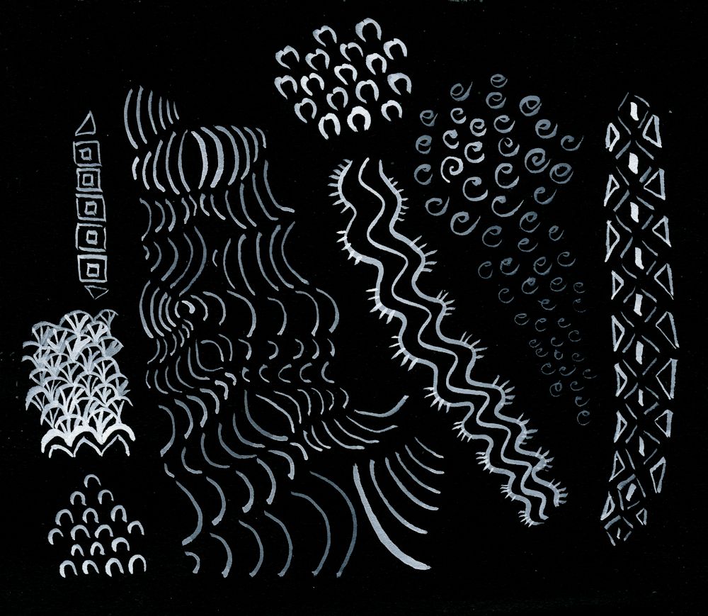
These can be free and organic or more geometric: experiment!
Another consideration is perspective and acuity. If you reduce the size of marks so that those at the bottom of the paper are large and gradually become smaller the further up the paper they occur they usually read as being more distant rather than smaller in size. Imagine a long shingle beach. The stones closest to you are seen as distinct individuals; further away they form an irregular pattern, further still they are seen as a texture but can no longer be sees as distinct entities; yet further away they will just be a colour in the distance.
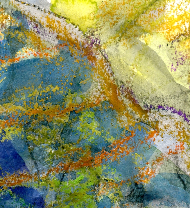
Decide whether you would like the marks to speak for themselves or whether you would like to add thin veils of watercolour or pastel as in the image below.
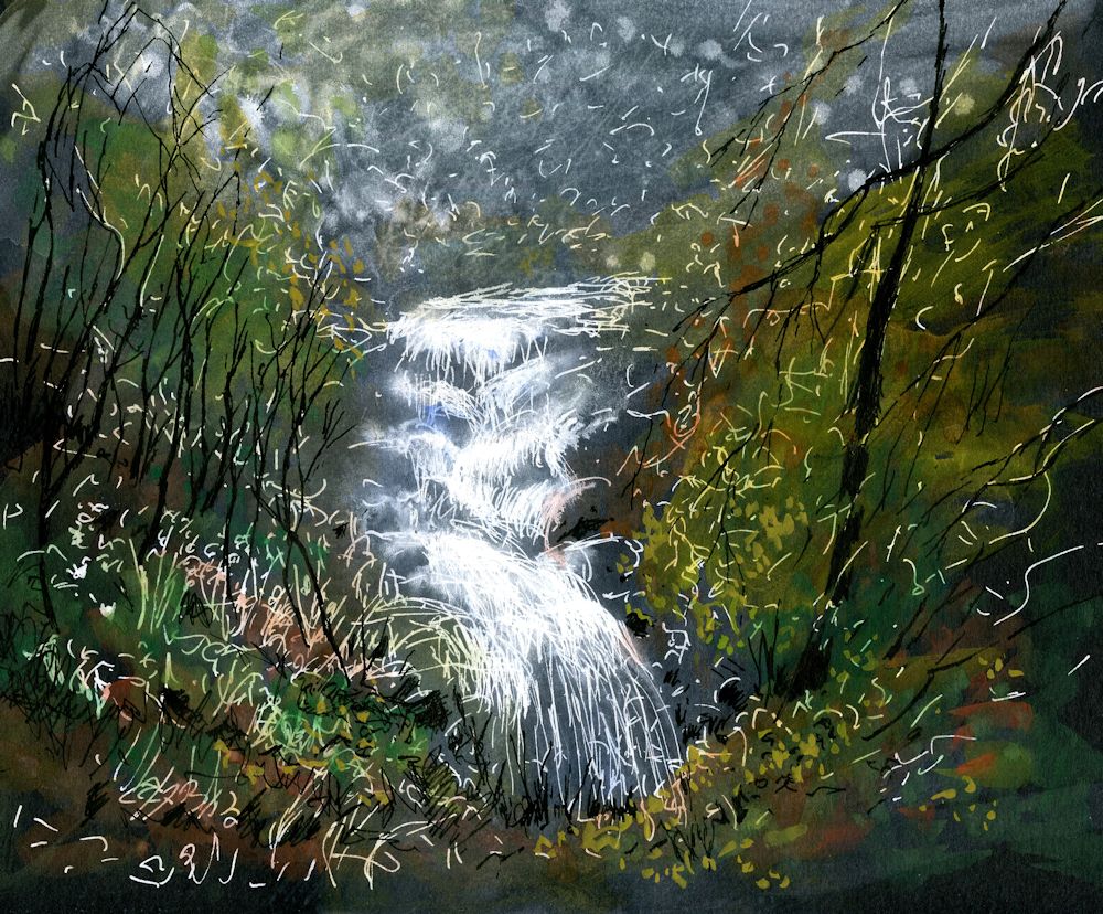
Mixed media on black paper by Jo
White marks were made freely with a white paint pen then dilute washes of permanent white gouache added and also some black India Ink marks for the trees. Finally, coloured washes of green and yellow ochre watercolour were applied.
Shapes
Try working intuitively with shapes on black paper. You may work in white or colour. If you don’t have any gouache colours, just add some permanent white gouache to your watercolour mix to make it more opaque. If you already have some gouache paints you won’t have to add white unless you need a paler tint.
This tiny sampler 2 1/2 x 2 1/2 inches was painted with some Derwent Graphitint pans which proved to be very opaque.
For this week’s project you may like to work intuitively or be inspired by natural forms. You may also like to look at the following Pinterest Boards on pattern and rock art.
Rock Art
https://www.pinterest.co.uk/jhall1282/magic-of-black/rock-art/
Abstract Pattern
https://www.pinterest.co.uk/jhall1282/magic-of-black/abstract-pattern/
Patterns of Nature
https://www.pinterest.co.uk/jhall1282/magic-of-black/patterns-of-nature/
Materials you will need
Black paper; white gouache and brushes or white ink or paint pen, watercolour or gouache colours;
You could alternatively work in pastel pencils or pastel or mix the media.
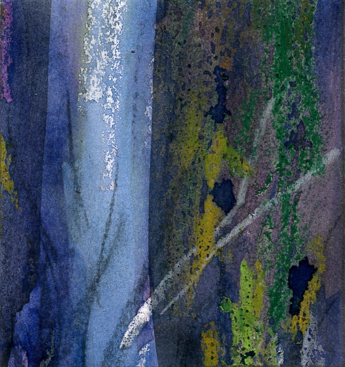
Have some India Ink ready as it can be used to reinstate black as in the waterfall drawing.
1.Experiment with making patterns of dots, lines and shapes. Aim to work a small sample of each and using all three together.
Then do either 2 or 3
2.Make an abstract or near abstract composition of lines and/or dots and/or shapes. Some lines and dots may overlay areas of colour. Try to make the black support an important element in the work. The work may be very free and organic or more geometric. The rock art and abstract Pinterest boards may give some useful inspiration.
3.Make a finished drawing/painting inspired by natural forms or landscape. Think about what drawing marks will suit your subject and composition best. Use at least one of the techniques described. The marks and shapes may “speak for themselves” or you may like to add veils of colour with dilute watercolour or pastel to soften them.
Your paintings:

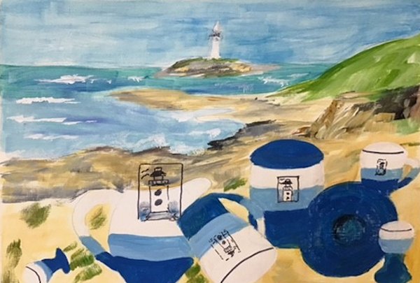
by Pam
by Pam
by Liz
by Liz
by Heather

by Heather

by Heather
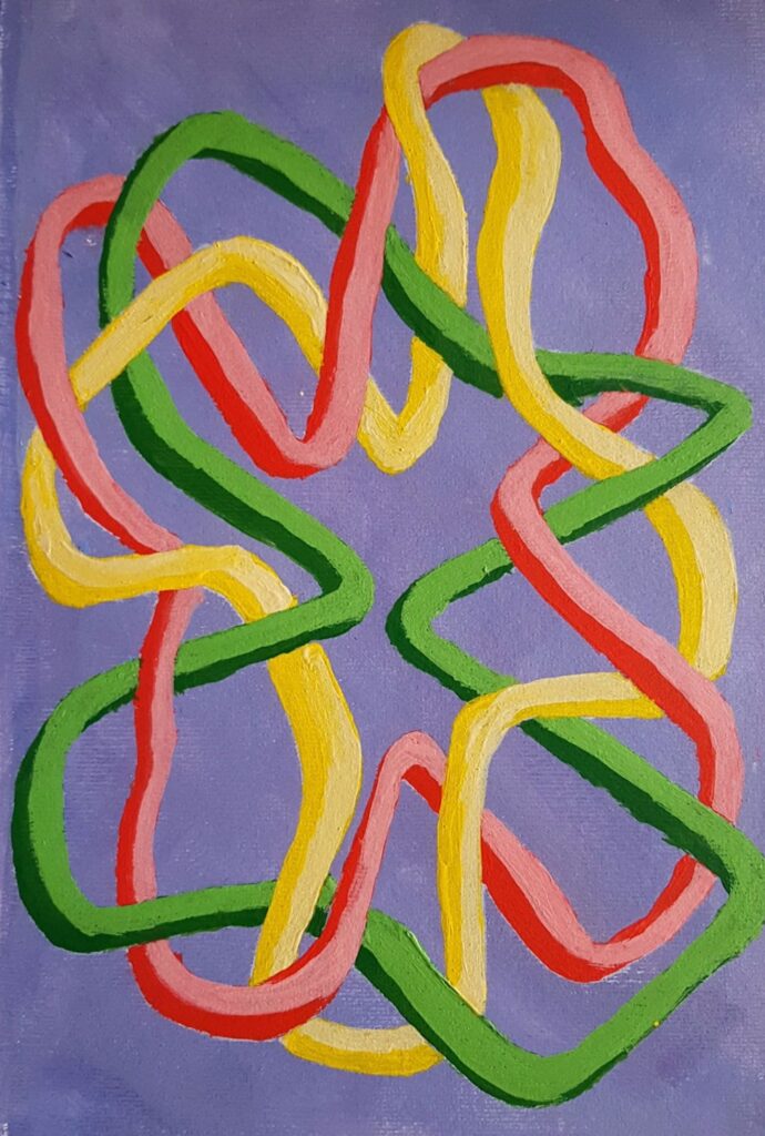
by Mali

by Mali

In line and filled shapes
by Kate

by Kate
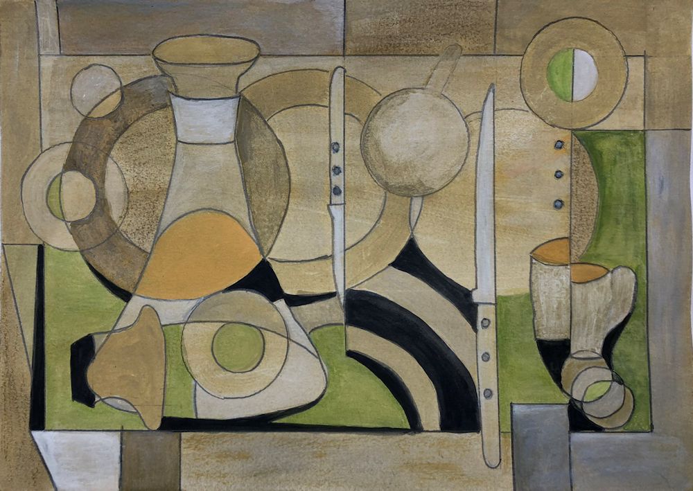
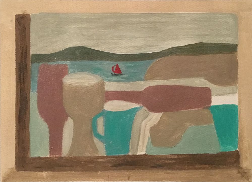
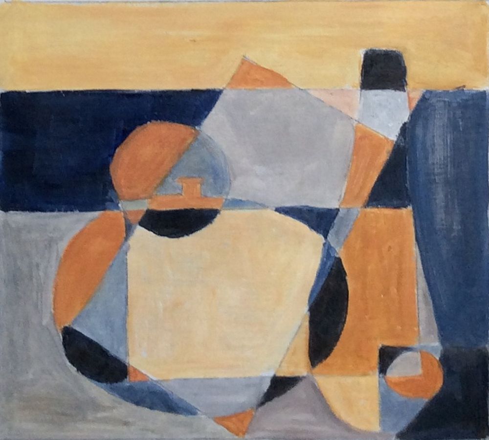
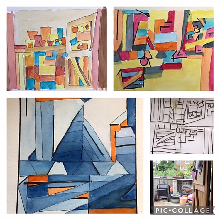
Still Life 4: Abstraction and Ben Nicholson
January 26, 2022
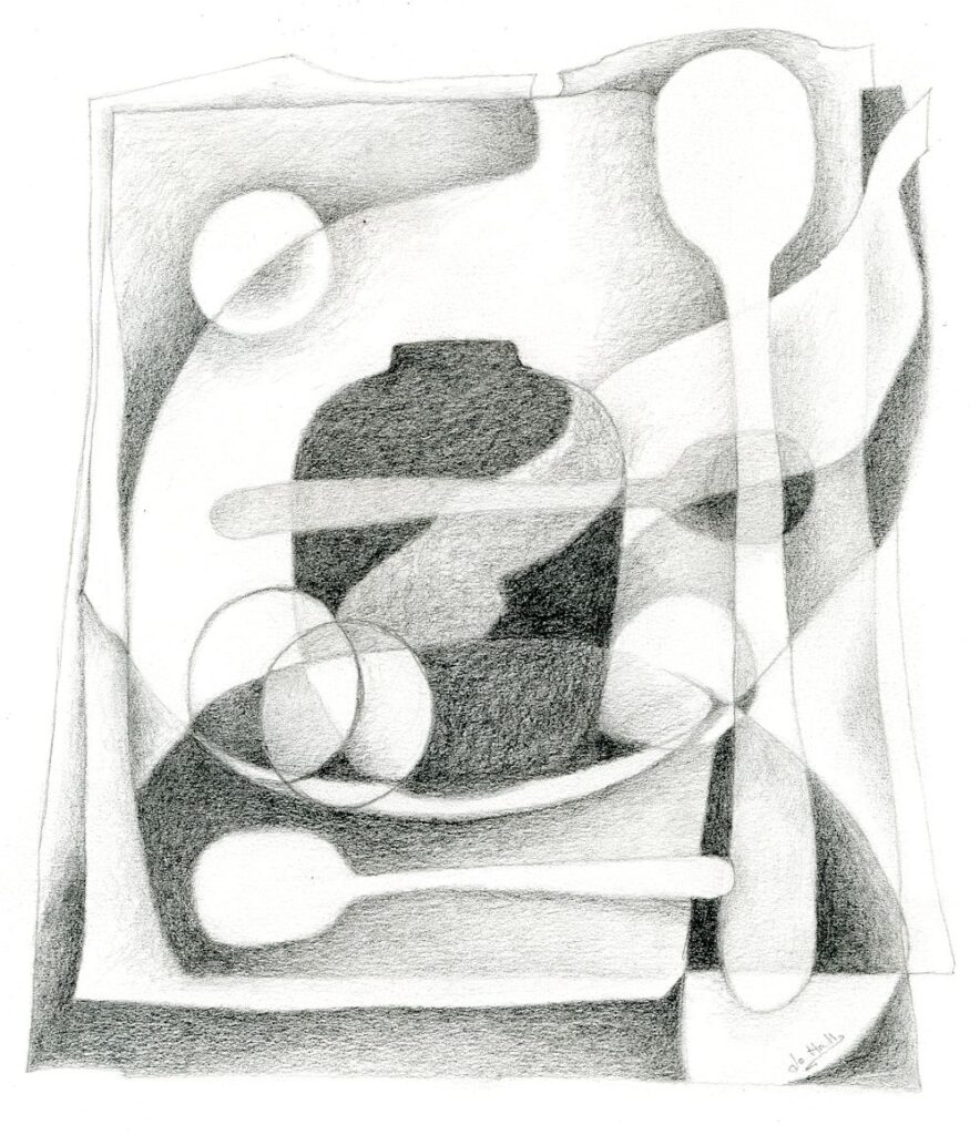
Pencil drawing by Jo
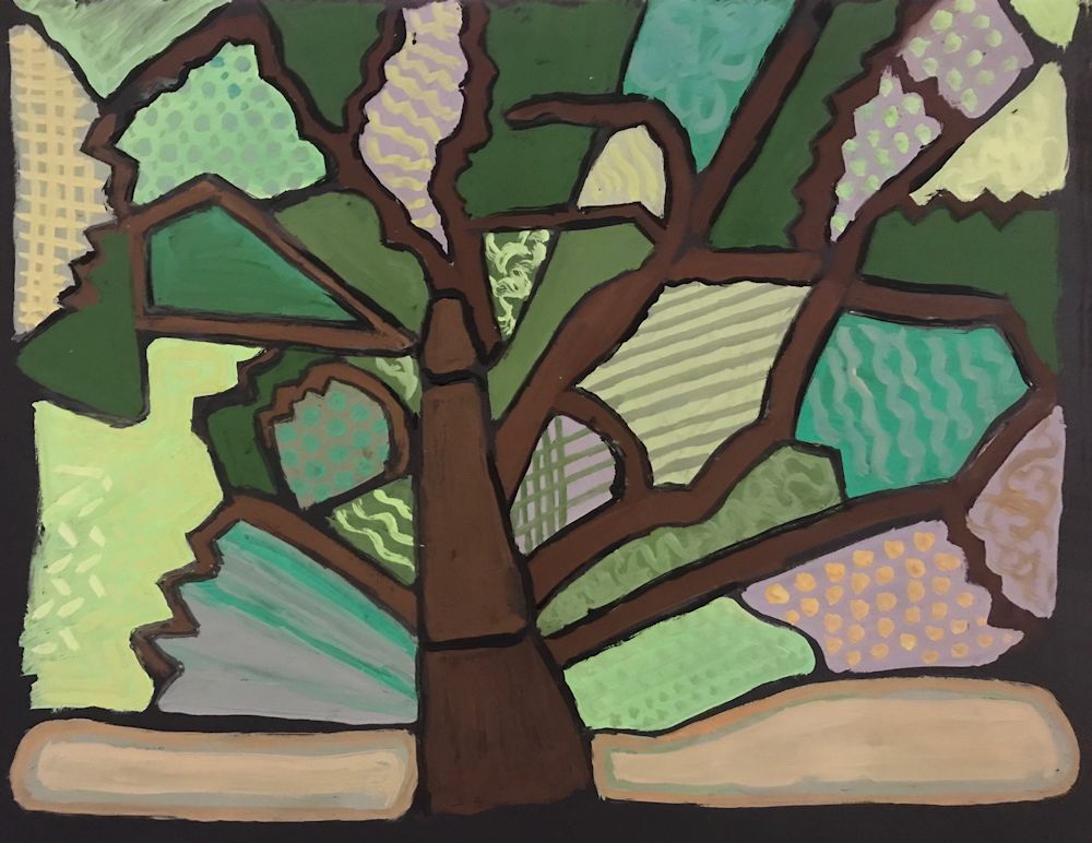
This is Jo’s composition based on shapes from the photo below.
At next week’s class Jo will demonstrate a painting in colour using a similar starting point. The practical suggestions in this post will help you to make a composition including some of the cubist techniques used by Ben Nicholson.
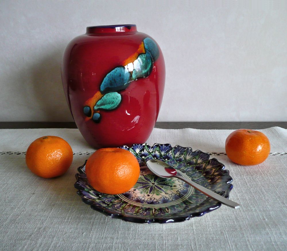
Vase and Saucer with Spoons and Oranges
Ben Nicholson was born in 1894 to artists Sir William Nicholson and Mabel Pryde. He attributed his interest in Still life to his father but trod a very different artistic journey, visiting the studios of Picasso, Braque, Hans Arp and Brancusi in the 1920’s and becoming intrigued with cubism. Cubist techniques of overlapping shapes and seeing objects from more than one viewpoint simultaneously, became firmly established in Nicholson’s still life work to a greater or lesser degree for the rest of his life.
He started training at the Slade in 1910 but left after a year. His contemporaries there included Paul Nash, Stanley Spencer, Mark Gertler and Edward Wadsworth. However, after spending time in the studios of Picasso and Braque, cubism became the main focus of his output in the 30’s. This was especially so during wartime when he and Barbara Hepworth moved to St. Ives. Ben was asthmatic so unable to join the services and for a time he and Hepworth worked well together and Hepworth said they were each other’s best critics. Nicholson’s compositions often took in other influences besides cubism as can be seen from either Googling his work or the Pinterest board, link below. Sometimes a cubist still life may have a backdrop of a Cornish landscape as viewed from a window
https://www.pinterest.co.uk/jhall1282/still-life/nicholson-ben/
We are principally engaged with Nichoson’s still life work which gradually became more abstract. In the 20’s he painted a wooden box with a rather flat depiction of a jug and mug where shape and colour and flat darker tones make up the compositions inside the lid and on top of the box. In 1930 he painted a simple composition of a mug and a little bowl. The forms overlap but the way in which the stag decorating the mug is painted tells us another story. The stag is shown as a flat motif superimposed over the other objects and overlapping the bowl and background. It gives us a different view of the decoration than would be seen if we were looking at it as seen on the curved surface of the mug.
This overlapping technique can be seen even more clearly in Nicholson’s drawings of three pears where he has drawn one pear over another as if we could see all those edges when viewing the set up. Also look at his compositions of objects arranged on table tops. Then try one or more of the following;
Challenge 1. Overlapping
Find a small group of overlapping objects (e.g. a couple of mugs, a bowl with some fruit) and draw as if you can actually see all the edges that you cannot see. Fill the shapes with tone or colour to make an interesting composition.
Nicholson takes this idea a whole lot further towards more extreme abstraction. He plays with shapes placing them at different scales and places in his picture than they are in reality or even could be in reality. Notice how in the table top still life studies the table top is up ended. In other works, perhaps only half a bottle or vase is seen, or shapes are repeated, tilted or reversed, and elsewhere coloured rectangles of deep or pale tones are introduced.
Challenge 2. Different Viewpoints in the same Composition
Make a composition using the cubist technique of being able to see works in the same picture as if seen from at least two directions, for example, a piece of fruit on a plate where the fruit is drawn as seen but the plate is seen as if you were looking down on it, or do something similar to what Nicholson does with the decorative stag motif.
Challenge 3. Rearranging Shapes and Repeating Shapes at different Scales
Make a cut out of a jug, goblet or egg cup at two sizes. Cut two of each, one on pale and one on a coloured paper. Cut at least one shape in half and play with the shapes on your support till you find a pleasing composition.
Remember you can;
tilt or reverse the shapes; use the negative shapes from which you made your cut outs; fit one shape inside another where the scales are very different; partly overlap shapes.
Glue to a support (this should be a heavier weight than your cut outs: multimedia paper or heavy watercolour paper should be OK). If any of your shapes have been cut from white paper consider painting a background colour on your support before glueing the pieces down. When everything is stuck down and dry, assess whether more drawing or painting is required. This may mean altering the colour or tone or adding texture or pattern to some areas.
You may prefer to play with the shapes and then draw or paint a composition based on your preferred arrangement instead of making a collage. The important thing is to play with shape and scale, tone and colour.
Challenge 4. Make your own composition
Either use some of Nicholson’s techniques for your own composition or paint your own version of one of his works.
Your paintings;
by Pam
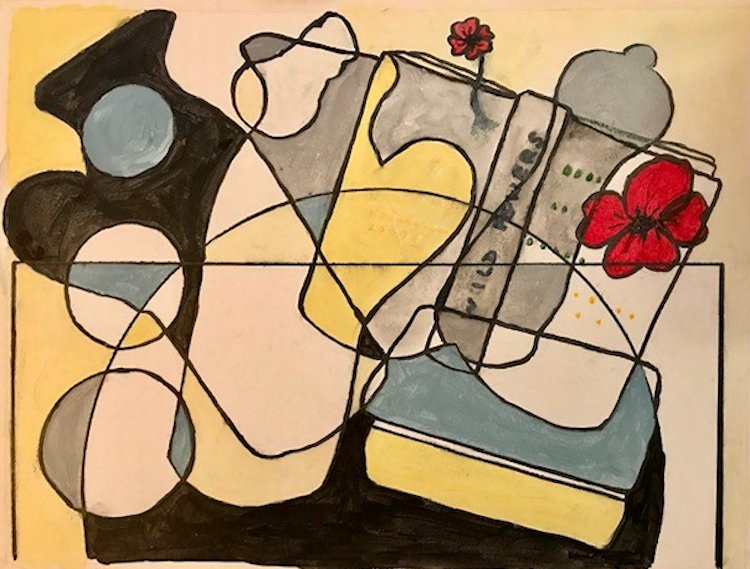
by Heather N
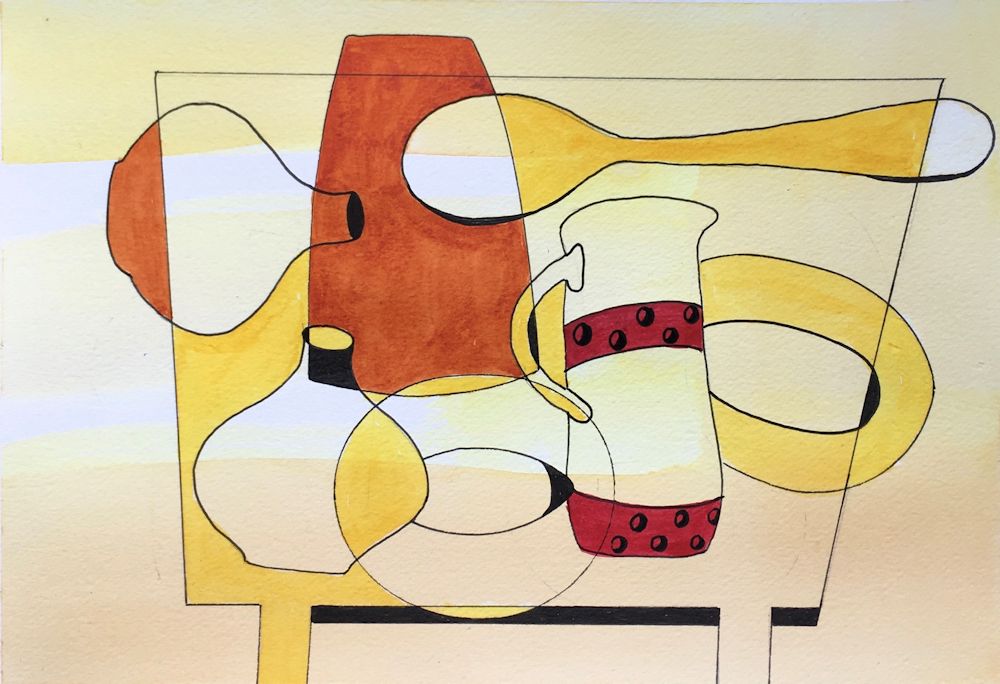
by Heather C
Gouache by Maricarmen
Gouache by Ann
by Ann
by Mali
by Anne
by Sandra
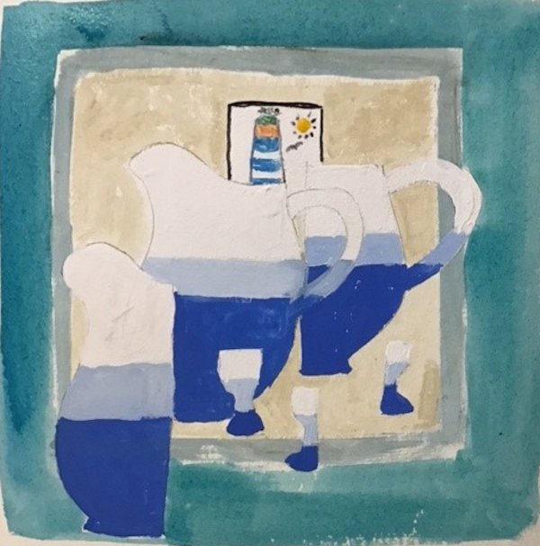
by Sandra
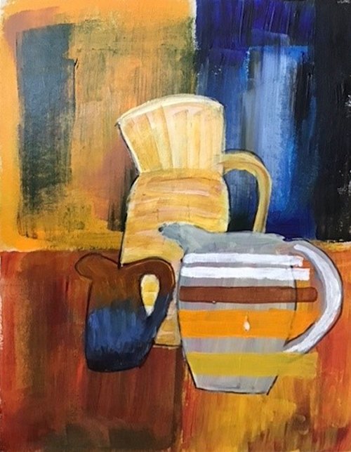
by Sandra
by Kate
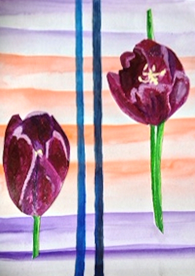
by Virginia
by Virginia
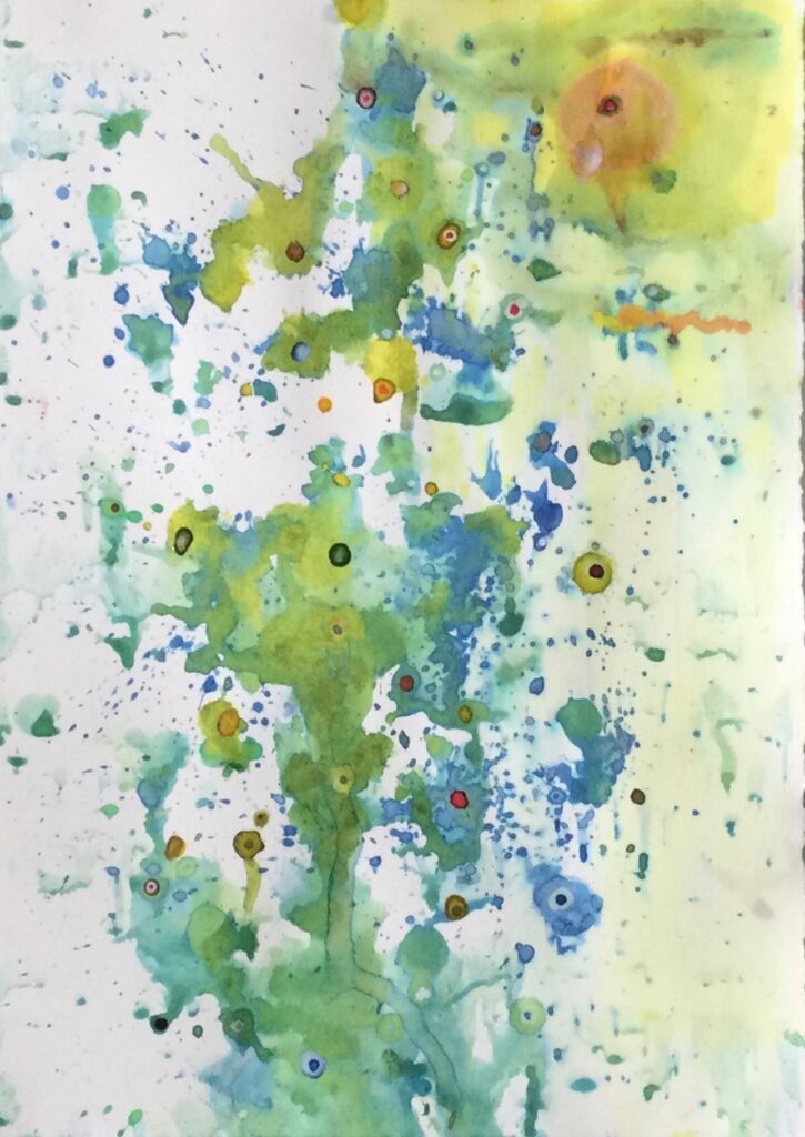
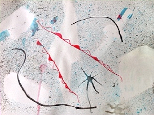
Starting Points for Abstraction Week 4: Emotion and Intuition
July 13, 2021

Intuitive drawing and mixed media
Jackson Pollock quote:
« One day, a critic wrote that my works didn’t have a starting point or an end. He wasn’t looking to pay me a compliment but he did”, said the artist.
Intuitive Watercolour
It is no surprise that some of the most famous artists with abstraction as the greater part of their work are either musicians or have both a passion for and knowledge of music. It is after all the most abstract of the arts and has a huge power to communicate emotion from laughter to despair.

Intuitive Drawing and Watercolour
Colour and music
These include; Rothko, Kandinsky, Klee, Mondrian, Pollock. Individual works are often described as sorrowful, rhythmic, playful, loud, adjectives you could just as easily use for music. Several worked in an abstract style with the conscious intent of finding in art and equivalent language to music. Klee likened the colours in a paint box to musical notes. Kandinsky heard colours. When he saw yellow he heard the exuberance of the trumpet. Pollock’s action paintings are full of the rhythm of his movements as he dripped his paint. Some of Klee’s works appear as symbols on lines almost resembling staves. Kandinsky used musical terms such as Improvisation, composition, fugue when assigning titles to his works. Klee’s most abstract grid paintings contained variations on a theme; rows of different hues would be reversed or more subtly changed to create movement.
Pencil and wax crayon
Thought about this one.
Think of music that makes you feel; sad, happy, relaxed, excited, thoughtful, serene etc.
What colours do you associate with these?
Practical
Look at works by Jackson Pollock, Lee Krasner, Mark Rothko, Patrick Heron and William Baziotes
https://www.pinterest.co.uk/jhall1282/abstraction/jackson-pollock/
https://www.pinterest.co.uk/jhall1282/abstraction/lee-krasner/
https://www.pinterest.co.uk/jhall1282/abstraction/mark-rothko/
https://www.pinterest.co.uk/jhall1282/abstraction/patrick-heron/
https://www.pinterest.co.uk/jhall1282/abstraction/william-baziotes/
Then use line and/or colour to make a work with a definite emotion in mind. This may be inspired by a piece of music, person or experience. It may be an emotion in the sense of sad, happy etc. or the thrill of a roller coaster, exhaustion after running, any experience that you feel inspired to translate into colour and/or line.
The Action painters like Pollock made a start and added each step intuitively. It is for you to choose whether to plan or just to start and see where you pencil or brush leads you. Music is useful as it has a rhythm that can be expressed by line. Try experimenting with music mimicking the rhythm first with a broad brush and then on the same paper with a narrow brush or a rigger. If you are feeling less brave try pencil or crayon.
During the session we will do short exercises exploring how different lines and colours can express very different emotions, followed by developing one of the resulting drawings as a more considered work.
Have the following ready ;
Inexpensive A4 paper (cartridge or copier paper); a soft pencil or dark coloured pencil; a dark or bright wax crayon; your choice of medium and an appropriate support for developing the painting inspired by your drawing.
Your paintings:
Pastel on Watercolour over textured Gesso
by Malcolm

PVA and ink by Sandra

by John
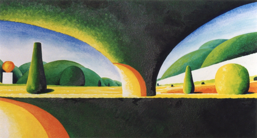
In the Deep Sea
by Elizabeth

The Olgas Western Australia
by Elizabeth
Starting Points for Abstraction Week 3: Starting from Observation and Memory
July 6, 2021
Starting an abstract painting from observation or memory is something we looked at in passing when considering Paul Klee’s abstractions of the landscape and towns of Tunisia. Although many of these were based on loose grids they never lost sight of some of the motifs he saw. They were however considerably transformed.
Here are a few ideas you may like to explore this week. Choose just one and work on some of the planning ahead of next week’s session. Each one could constitute a sizeable project. Links to reference artists on my Pinterest boards are given in the text.
1.Simplifying a direct Observation or using a loose Grid
Find a landscape or building reference sketch (preferably) or photograph and work on simplifying the shapes till the identity of the place is considerably reduced. The final work should remind you of the place but should be far from a highly representational picture. The colours and scale of the parts may be changed but do not have to be. Figures or animals inhabiting the landscape should be be simplified in the same way and where there are groups of figures try representing them as one shape. If you didn’t make a grid composition in Week 1 that may be a good thing to try this week.
2. A Closer Look
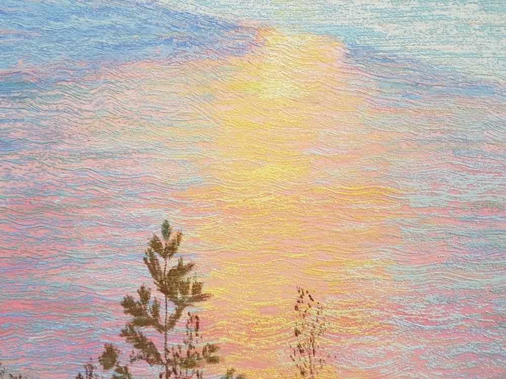
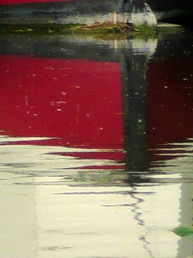
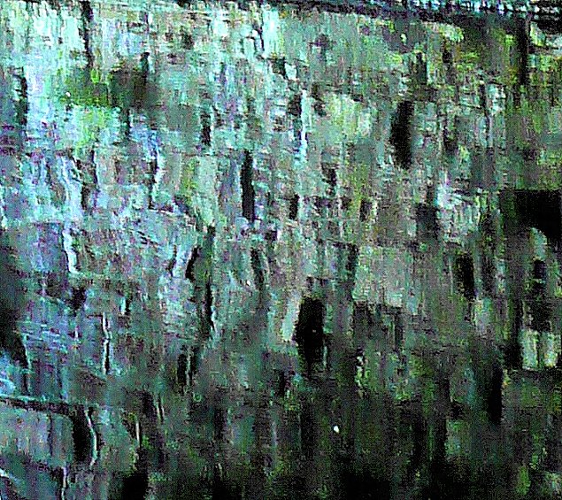
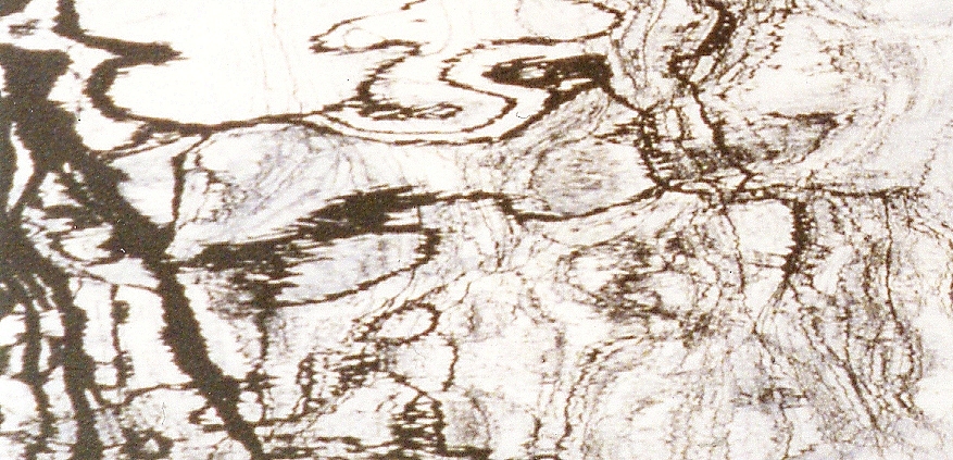
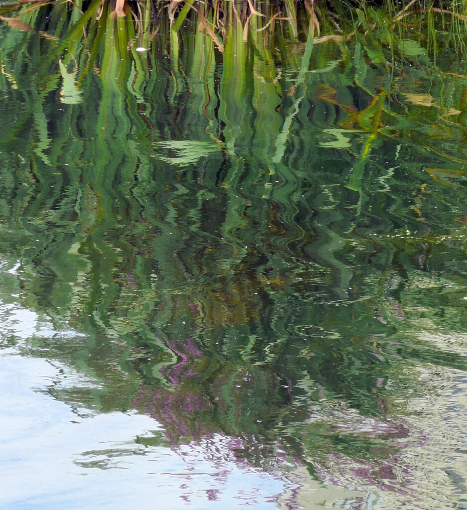
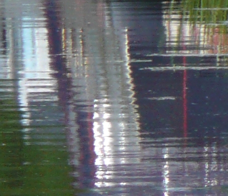
Abstract shapes can often be found by looking closer; at natural forms where surface patterns emerge in minute detail and at reflections in water. This can be pretty much direct observation but the images can appear totally divorced from the bigger picture and painted as pure pattern and shape. Below are a few photographic details from the landscape.

3. Memory
You could make an abstract painting based on a memory of a place or experience. Memories are often charged with emotion as well as being a visual mental record. The former was hugely important to Kandinsky and we will discuss that further during the last session when we take a brief look at abstract expressionist painters so you may like to leave this one till Week 4.
Kandinsky’s path to abstraction was rooted in love for his native Russia; village life, Moscow and the folk lore. Many of his earlier works show this vividly and the accent on colour and mood was clear. He heard sounds when he saw colour. For Kandinsky yellow was an exuberant trumpet and later in life he designed ballet sets for for Mussorgsky’s Pictures at an Exhibition. It is no surprise that some of his works were also titled in musical terms like Improvisation, Composition Fugue etc but there was also Deluge, …. and other exciting works that stemmed from different experiences.
https://www.pinterest.co.uk/jhall1282/abstraction/wassily-kandinsky/
4. Still Life
William Scott painted abstracted still life subjects reducing them to their bare essentials and playing with perspective. Far simpler than cubist paintings you may like to work in a similar way to Scott or emulate a cubist painting with a simple set up of your own objects
https://www.pinterest.co.uk/jhall1282/abstraction/william-scott/
5. Figures and Animals; simplification
If you would prefer to work from figures or animals look at Picasso’s drawings showing a bull in a series of works in which the bull is reduced to very basic shapes.
https://www.pinterest.co.uk/jhall1282/abstraction/picasso/
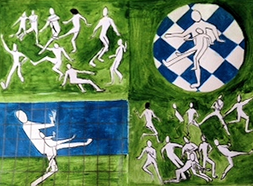
Kandinsky made some drawings of a dancer reduced to geometric curves and angular lines. The lines and arcs described her movement as she danced. In the absence of a live model similar schematic drawings could be made photographs of ballet dancers, judo fights,or footballers etc.
https://www.pinterest.co.uk/jhall1282/abstraction/wassily-kandinsky/
A group of drawings could be put together so that that the lines overlapped or drawings could be made from groups of footballers or rugby players interacting. It would be easiest to design the work first then transfer it to the support for painting. You may also like to work out which lines would be the thickest and if colour was used to which areas it should be applied and how.
6. Contour and blind contour drawing
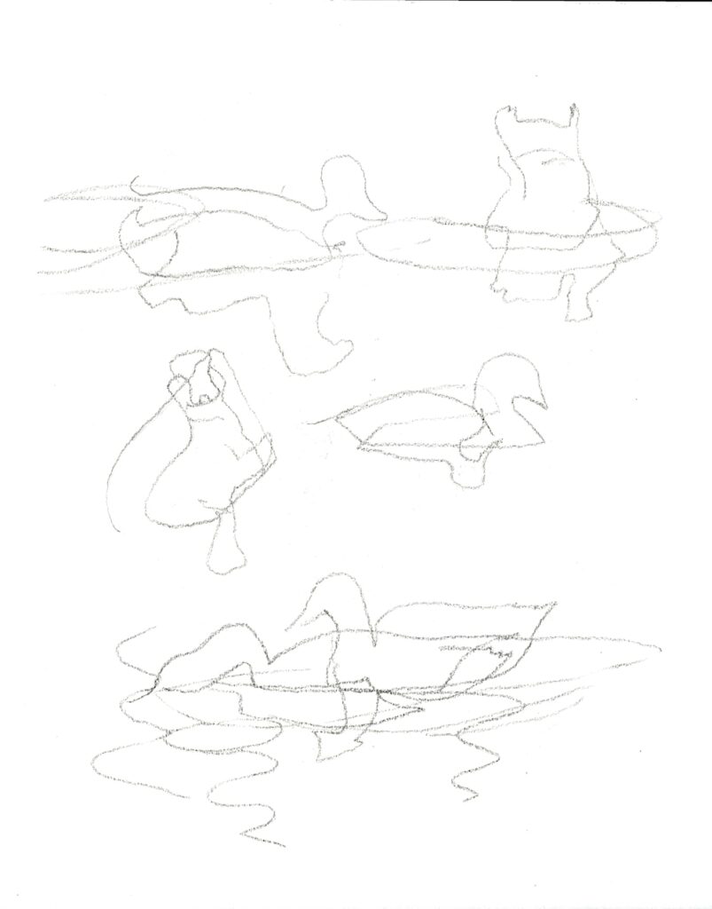
If you have any rapid sketches of birds, animals or plant forms from life you can use their shapes and rearrange them to form an interesting pattern that can be blocked in initially with flat colour. This becomes even more interesting where shapes overlap and you could work with transparent colour to show this or by changing the tone or colour of opaque paint.You could also make some blind contour drawings and use them in the same way. These are made by looking at the subject while you are drawing but not looking at your paper.

These could be traced and arranged to overlap or cut up as we did this week and used as a starting point for an abstract painting.
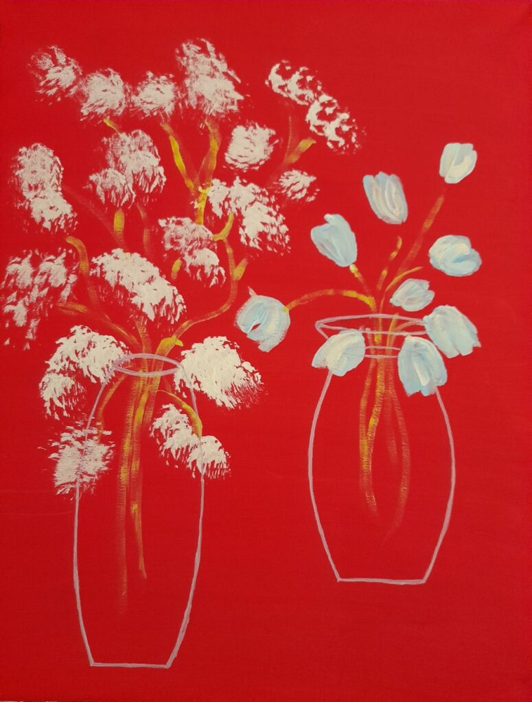
Your paintings:
by Virginia
by Virginia
A Memory by Sandra

by Sandra
by Malcolm
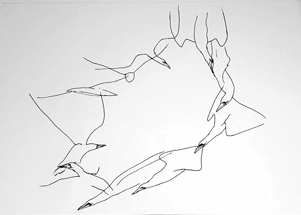
The Gannet Spies, Dives, Gulps and Flies
Ink by Malcolm

by John

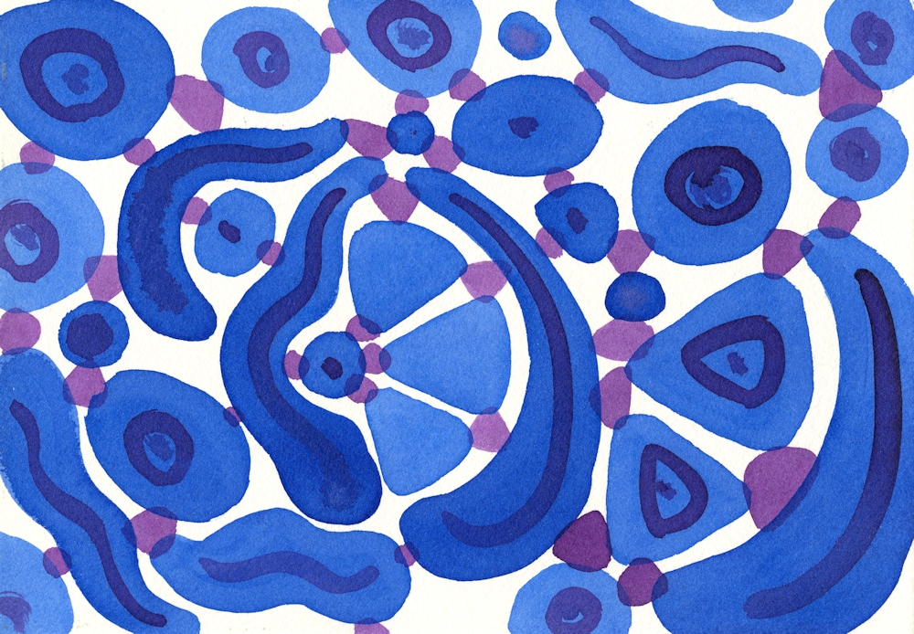
by Heather

by Elizabeth
by Elizabeth
Starting Points for Abstraction: Week 2 Chance, Recycling and Intuition
June 29, 2021

Pieces of paper kitchen towel were torn into larger and smaller shapes, about ten in all and dropped on to a piece of watercolour paper. They were left as they fell, overlapping or not overlapping. Using an old toothbrush acrylic ink was spattered over the whole. A wooden skewer was used to draw out a few lines from the larger spatters and then left to dry completely before removing the pieces of paper towel.
Chance and Recycling
Jean Arp, one of the leading artists of the Dada movement used chance for several of his works. He tore up papers and collaged them where they fell. Some of the works appear too ordered for this to have been the whole story and I suspect he may have put some torn shapes into a hat or equivalent and placed them on the support intuitively as each was drawn out of the hat in a random sequence. He also tore up a woodcut made in 1920 into several pieces and rearranged them on a support in 1954. For Arp this was the artwork. For us it may be or it may be that such methods could be employed as the starting points for developing an abstract painting.
You could certainly do this with a failed painting or with a copy of a suitable good drawing or painting. The pieces could be cut into regular pieces and rotated till you felt a successful arrangement had been achieved or you could shuffle them and place them in a grid in the order that you drew them out. You are in charge of whether to work mainly with chance or mainly with design and whether to develop the work further by adding other media.
The pieces could also of course be dropped on the support and glued where they fell. If a collage was not required it would be easy to make a series of photographs of several dropping events with pieces from the same art work. The resulting photographs might suggest an interesting painting or be art works in their own right separately or collectively. Old greetings cards, magazine pages etc. could be similarly recycled.
Some of the fragments are below and are interesting in their own right as well as being perhaps the inspiration for further abstract works.

A few are shown in detail below;


Exploring Negative Shapes
The technique below can be as designed, intuitive or suggested by a natural form as you wish. Anything from geometric shapes to tea cups or branching trees can be fun to investigate. They can remain as flat areas of colour or be blended for some great intertwining effects.


No blending.
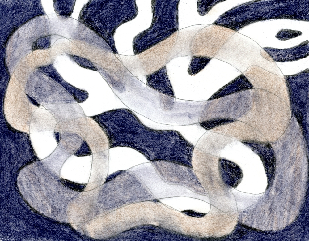
The two coloured shapes were blended including where they crossed the white shape.
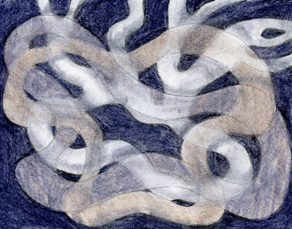
In the finished drawing all shapes were blended leaving some of the white shape unblended. Similar effects could be achieved in acrylic or watercolour using glazing techniques.
The paint left on your palette;

At the end of a painting session it is all too easy just to slide unused paint into a trash can or let it congeal uselessly on the palette. Why not just get a brush or palette knife and spread it almost without thinking on to a sheet of thick card or paper. (you are also allowed the think about it but not with the aim of making it look like a tree or a bird or a flower.) It may do but don’t intend it. It may turn out that it is your first Colour Field work! But my guess is that it may need further development.
Abstract Expressionists are subdivided into two groups of rather different artists
The Action Painters such as Jackson Pollock
https://www.pinterest.co.uk/jhall1282/abstraction/jackson-pollock/
and the Colour Field Painters such as Mark Rothko, Clyfford Still, Barnett Newman.
https://www.pinterest.co.uk/jhall1282/abstraction/colour-field-artists/
Although never listed with these American artists perhaps Patrick Heron should be included here for his colourful gouache paintings.
https://www.pinterest.co.uk/jhall1282/abstraction/patrick-heron/
Practical:Our next practical session will involve using chance, recycling and intuition for beginning an abstract painting or drawing.
Choose to work on one or more of the following;
Aim to have a drawing/painting copy or original to cut or tear up, perhaps a large magazine image. It does become more personal to use your own drawing though. You will also need a support for painting on and your usual paints.
1.Old drawing/painting: either cut up and rotate pieces till they make an interesting arrangement or shake and draw randomly from a container laying them in a grid one by one in the same order that they are drawn out. You may collage the pieces and work over them with more paint or drawing or photograph/trace them and use the image as the basis for your painting.
2. Chance; dropping cut or torn paper on to a support, spatter with paint, remove the paper when all is dry and develop the painting intuitively.
3. Recycled paint; Use what is left on your palette by just painting it out on to a piece of card or paper, perhaps with some intent like putting the pale colours in the middle or the brightest colours in the middle or irregular bands of colour, varying the sizes of colour patches ( this happens naturally as more of some colour than others remain). Colour mixing also happens depending on the mixes on the palette and how much they become blended as they are painted out. This should be done prior to the session so that the development process can take place at next week’s session.
Your paintings;

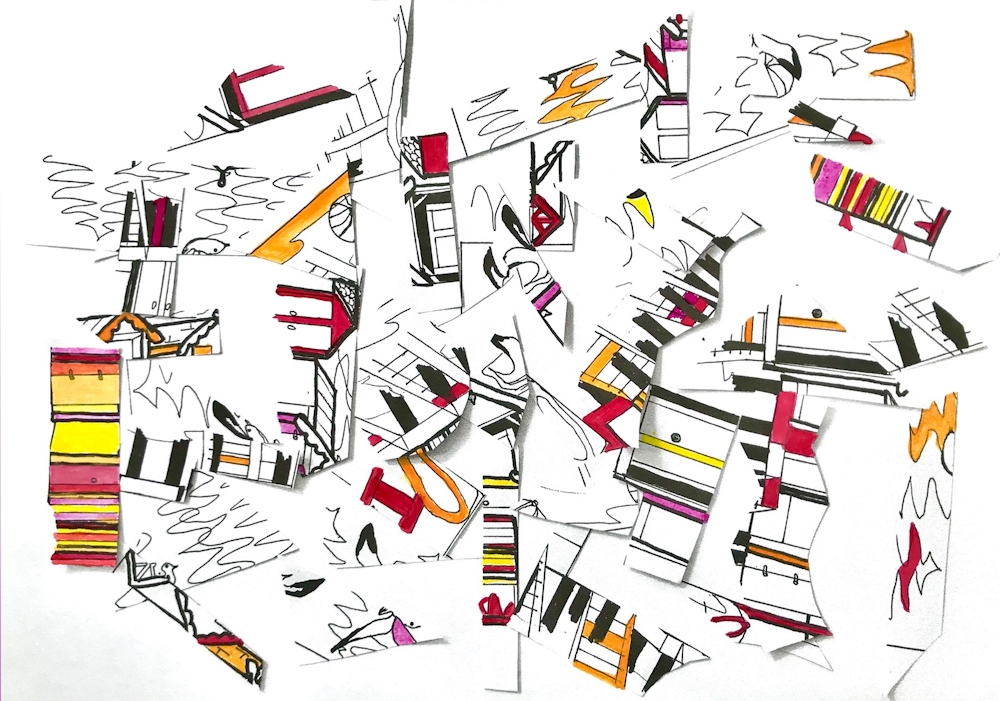
From cut and rearranged pieces of a river painting with added paint
by John
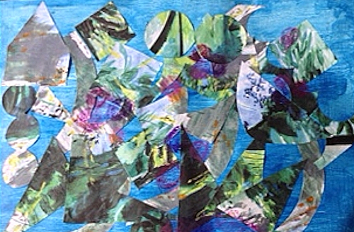
by Virginia
Collage of a cut, rearranged pen and ink drawing with added colour
by Heather
Collage from rearranged pieces
by Liz
Collage by Sandra

by Malcolm
by Sandra
Reorganizing a drawing, painting or photographic image can be a useful starting point to look at the shapes and forms in a more abstract way.
The simplest form of this is to rotate a landscape through 90 degrees.
by Virginia
Masked shapes, spattered and worked into intuitively
by Liz
by Malcolm
by Malcolm
by Liz
Starting Points for Abstraction: Week 1: Ideas and Rules
June 21, 2021
Why would any one paint an abstract work?
Acrylic on paper
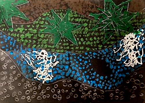
Abstract based on observation, simplification and exaggeration of forms
The fast answer is to express an idea, an emotion or reaction without direct reference to tangible objects.
The reality is that many abstract paintings do reference recognisable things but they are significantly transformed. Given that in painting objects are already transformed from three dimensions to two it does not seem surprising that abstract art at its purest has no relation to objects but that there is a continuum from highly representational art at one end, to paintings with simplified or altered forms, and at the other end more radical abstraction where the shapes whether organic or geometric bear no relation to objects.
However being set free from objects does allow the artist to express mood with colour, with jagged or smoothe lines, slow or fast lines, lines made slowly, hesitantly or at speed, or shapes that are geometric or organic with hard or soft edges.

Watercolour
Intuition: This painting began as the wavy line across it. Some candle wax was rubbed rather randomly across and layers of watercolour washes some wet and some applied with a sponge. There was no initial idea just a get on with it and paint shapes, spots and introduce colours that seemed to be a next best step at each stage till it seemed time to stop. The title was given after the work was made.

Acrylic on paper
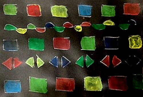
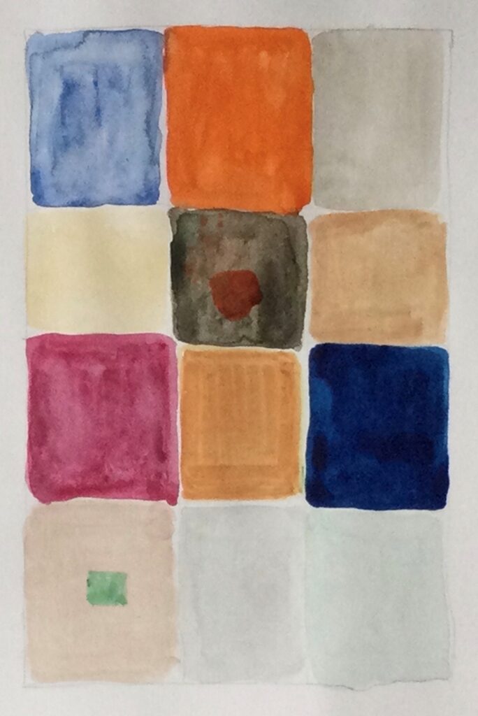
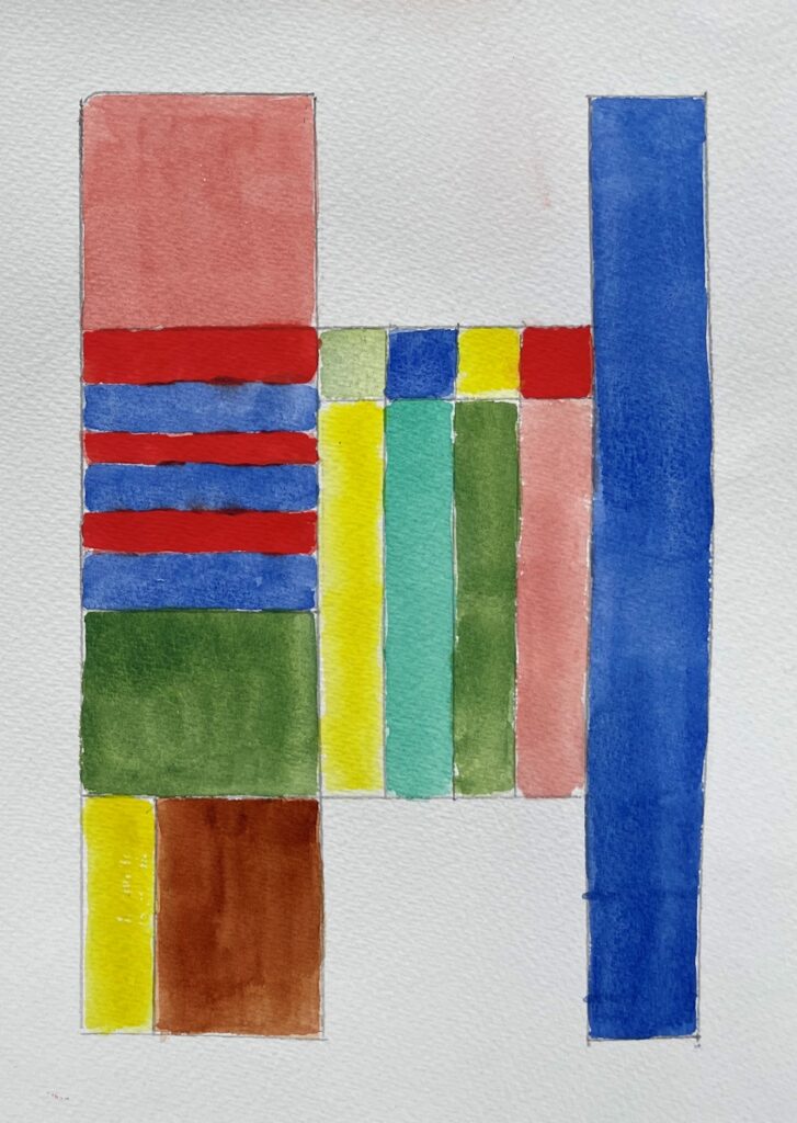
Idea: interpretations of scale/scales made visible by geometric shapes
Musical scales are the little stairways of rectangles; metronomes without pointers the three outside small triangles; the central part is filled with a balance and there are further triangles of different size; only the colour is intuitive but seeks to find a balance for each side
The most useful analogy is with music, the most abstract of the arts. It is not surprising that many artists have written on this subject. Music can be described as joyful, frivolous, melancholy, sublime, romantic, loud, soft, tender. So it is expressive without direct reference to objects.
What else? Various kinds of music have different rules within which they are made made; scale, rhythm, pattern, variation etc.
Acrylic ink on paper
Rules and Intuition A more intuitive study but where the artist chose to restrict one colour to the larger shapes and purple to the smaller connecting shapes producing a sense of movement. The final result was not envisaged at the beginning. The blue shapes were placed one at a time till the rectangle was filled and then connected by the purple shapes.
Music is created by a composer and interpreted by musicians so that the often written score/composition can be made audible.
Any composition will be a result of the composer’s imagination, intuition and skill within the rules of his/her musical culture and that culture will develop as the composer’s thought processes discover new ways, new rules etc. only limited by his/her imagination and will to experiment.
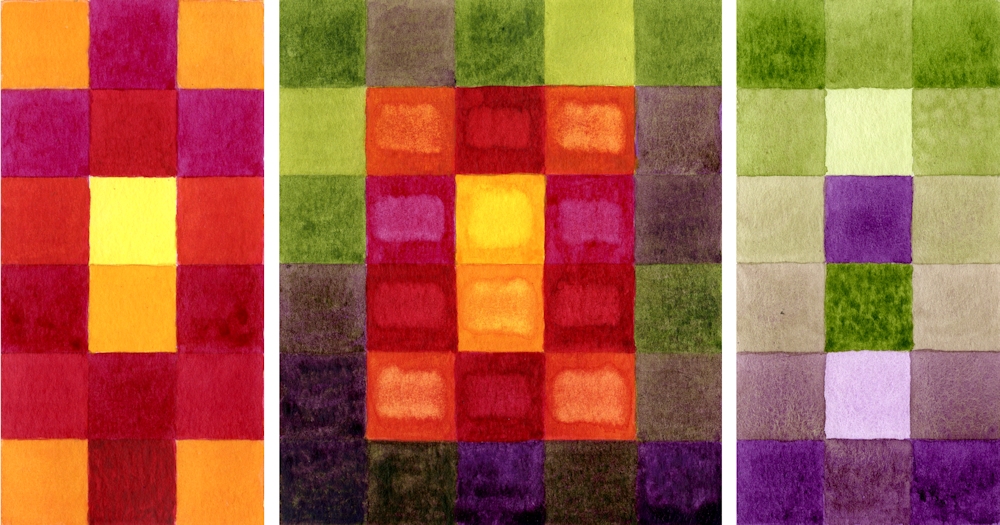
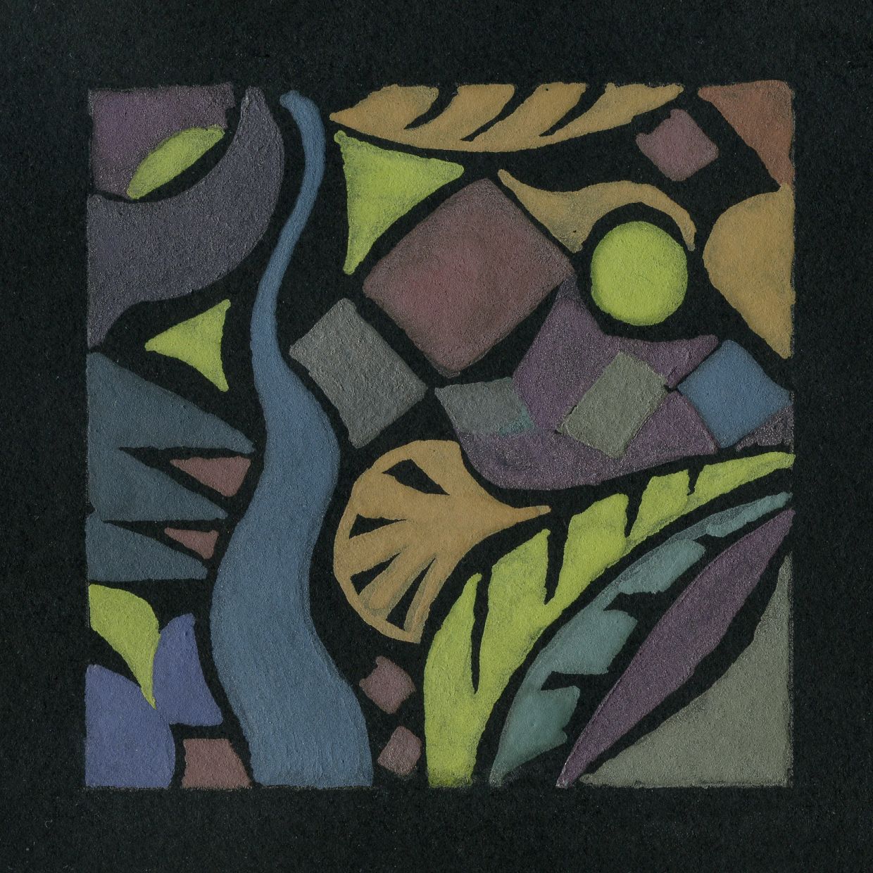
Watercolour
Rules and Idea; The idea is to represent the outside and the inside of the fig separately and combined. The rule is to make coloured squares to do so. The aim is to show the coolness of the exterior compared to the richness of hues within.
Music has an audience which receives and interprets the music. Painting has an audience that similarly receives and interprets. Figurative (representational) art works can be appreciated for their skill, the stories they tell, and often evoke an emotional response. They obey rules to varying degrees; of perspective, tone, and shape of the objects within a composition.
Music does this without reference to objects, though natural sounds, of the cuckoo, for instance may be incorporated into the music. The artist may also wish to produce works which rely less on the appearance of objects, producing expressive works freed from tangible subject matter.

Acrylic paint sticks and acrylic ink on paper
A part accident and part intuitive composition; some of the paint was dripped on to a wet surface and lines extended through pale areas with a brush handle.
In this way Paul Klee described a paint box as the artist’s equivalent to a keyboard. He is deserving of study as possibly more than any artist Klee investigated the processes behind making abstract and imaginative works which may start with an idea or observation but do not have to. One can institute rules for development of the work or work very intuitively and over the next four weeks we will scratch the surface of some of these ideas.
The practical challenge for this week;
Reference the works of Paul Klee on the Pinterest Board at:
https://www.pinterest.co.uk/jhall1282/abstraction/paul-klee/
and Piet Mondrian at
https://www.pinterest.co.uk/jhall1282/abstraction/mondrian/
Make your own rules and then create two or three small paintings with expressive colours to set the mood of each. The paintings may be as small as 6 x 6 inches if working in gouache or watercolour, and larger if working in acrylic and all should be variations using the same rules. You may of course work larger if you prefer.
Make your own rules and write them down, or use one of the suggestions below;
1.Work with a grid however loose or tight and use colour and texture to suggest a remembered place or event.
2.Make a square or rectangle. Fill it with the same geometric shape at different sizes. They may overlap and be at any orientation. Colour using a limited palette or shades of one colour.
3.Fill a rectangle or square with groups of parallel straight lines at various angles to each other. Each line should meet another line at each end. No lines should extend the whole length or width of the rectangle or square. Fill the shapes with a harmonious colour scheme except for one complementary area. Reference Klee’s work ” Forest Architecture” or “Castle to be built in the Forest”.
4. Similar to 3. but the lines may be curved
Use colour to set the atmosphere/mood of each painting. Your own rules may include using different organic shapes connected by lines or shapes or shapes that are enclosed or partly enclosed by other shapes. The possibilities are endless. After a few quick doodles go for one set of rules and stick to it.
During the practical session we will review the work and look at more intuitive starting points and how these can be developed.
Your paintings;
by Heather

by Malcolm
by Virginia
by Liz

by Liz
by John
by John
by Malcolm
by Heather
by Virginia