Almost Monochrome: Week 1
September 1, 2022
Week 1: Monochrome mixes; plus a colour
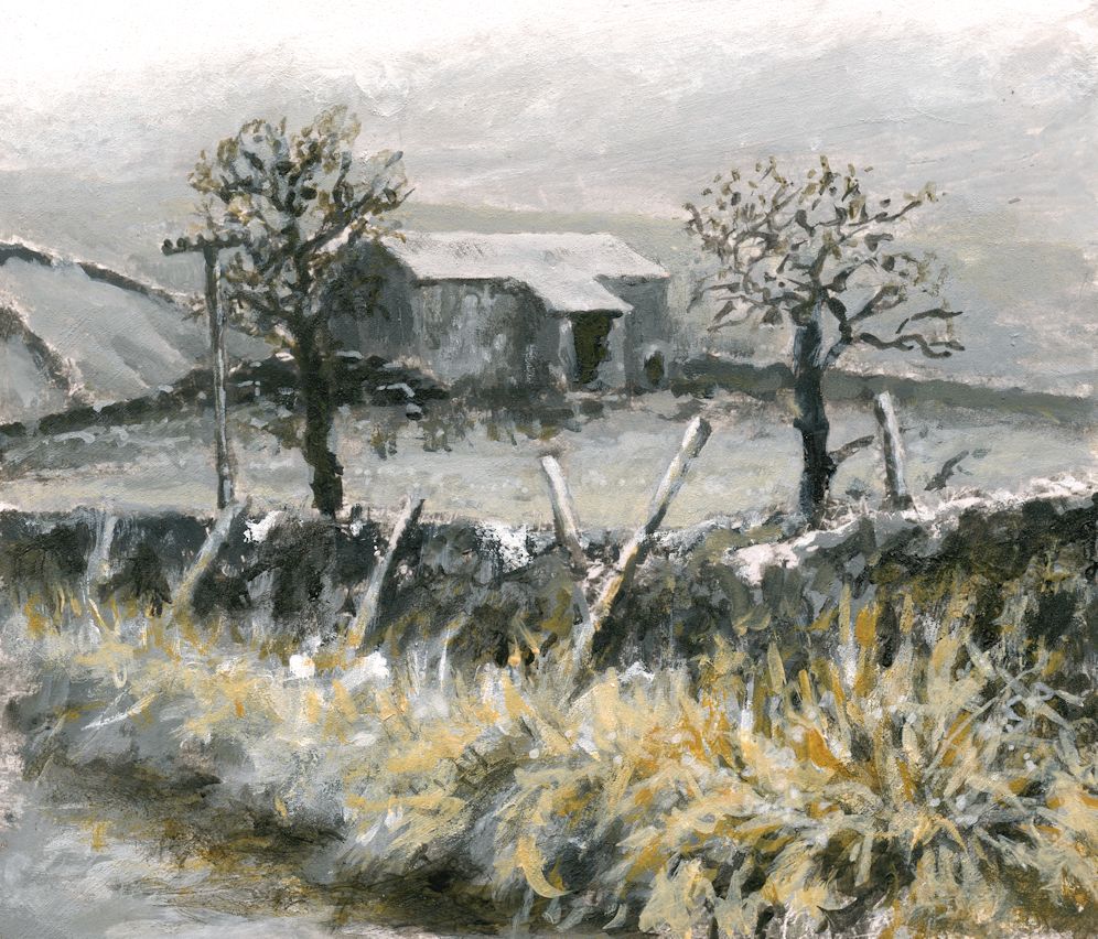
Alone or in mixes with white the Yellow Ochre appears bright and warm, bringing the foreground forward. Where small amounts of Yellow Ochre have been added to pale grey mixes a coloured grey with a greenish tinge resulted. Because the mixes were opaque I was able to modify the tones as well as the colour.
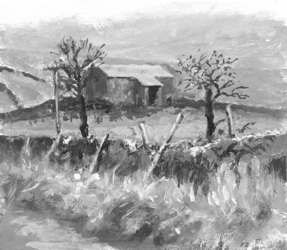
The roof of the barn was left untouched.
See further on in this post for making colour mixes to suit your composition.
Working in monochrome alone can be very dramatic. Introducing a subtle colour can soften this and alter the atmosphere of a painting. Over the next four weeks we will explore some of the possibilities.
Monochrome paintings rely on tone, shape, line and mark making for their impact, and although it is easy always to think of monochrome as a work constructed of black and white plus greys mixed from black and white, artists have used other colours such as Burnt Umber and Prussian Blue in mixes with white as a tonal bases for their work.
All paint hues can be muted either by adding black or by adding small amounts of their complementary colours. For these sessions we will work exclusively with tone and adding colour to black, white and grey mixes rather than using complementary colours, although you may like to work a composition using Neutral Tint/white, sepia or bunt Umber/white, or even Prussian Blue/white mixes as a tonal base.
Have at the ready; titanium White, Black and a few colours; yellow , Yellow Ochre or Raw Sienna, a red, a blue and a lemon yellow or similar pale yellow.
Shades, Muted Colours and Tints
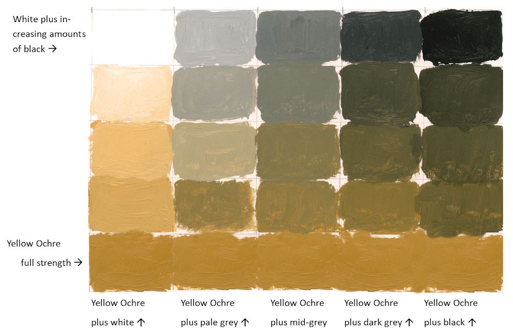
Colours can be muted by adding black to make shades or by adding white to make tints. This range can be extended by adding the colour to greys made with mixes of black and white as below. It is useful to make a range of greys and try adding increasing amounts of a colour to each mix. It is very much the artist’s choice to decide on which parts of a composition will include some colour and which to leave as monochrome.
1.Reference the haunting works of Victor Mirabelli who uses limited amounts of subtle colour in largely tonal paintings of old farm buildings and barns. Google the artist or see a couple of his works and a couple of works by other contemporary artists on the following Pinterest board.
https://www.pinterest.co.uk/jhall1282/limited-palettes/almost-monochrome/
2.Find a landscape reference with an interesting tonal structure.
3.Then make up some colour swatches from black to white and experiment to find what happens when amounts of a different of a colour are added. It may be useful to make a formal grid for at least one colour and a few less formal experiments to home in on the colour that will suit your composition best. An example of how this could be set out is below.
| Monochrome base plus white in this case black | White | Pale Grey | Mid Grey | Dark Grey | Black |
| more white | more grey | more black | |||
| more white | more grey | more black | |||
| more white | more grey | more black | |||
| +white | +grey | +black | |||
| Pure colour e.g. yellow Ochre (YO) | YO | YO | YO | YO | YO |
My attempt this week wasn’t great. The dark grey was too dark! But it will give you the idea:
4.Make your own painting working in monochrome initially, and then working your chosen colour into the mix as appropriate.
During the session I’ll start a painting with a different monochrome base, perhaps using burnt umber or either indigo or a Payne’s Grey (blue shade).
Your paintings:

Monochrome Painting in Acrylic

with added colour

Acrylic by Norma

The next three images are different stages in the development of an oil painting by Virginia


