From the Riverbank: Week 5 Hurley
June 20, 2021
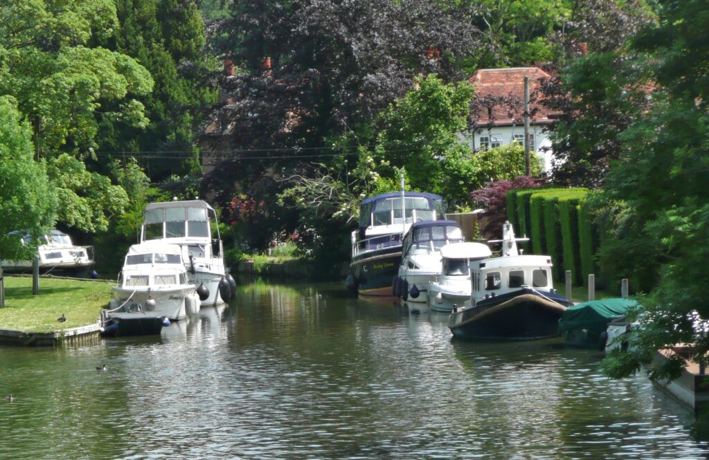
With just an hour till coffee time everyone set about painting a watercolour sketch of the Thames at Hurley. This is a challenging task at this time of year, busy with all sorts of boats from motor cruisers to kayaks. There was always the option to finish at home or stay a little longer to complete the work or make another painting.
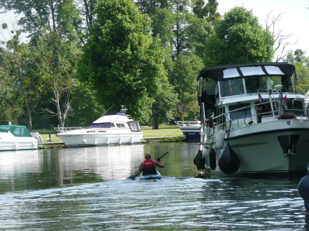
Because of the complexities of boat shapes this challenge necessitated considerable simplification of the shapes and a critical view of the tones. When you add in the fact that many of the boats were moving one can understand wanting to finish at home perhaps referencing a ‘photo. This is OK but there are a few pitfalls.
1.Always take the shot at the eye height you were drawing at. There is often the temptation to stand up if you have been working sitting down and the view will not be the same.
2. Photographs taken in the high light conditions we were on Tuesday, can have too much contrast. The shade areas often looking very dark and very pale areas being ultra white. No worries in your painting to leave the white of the paper for the palest areas. This will give your work a really sunny appearance. If you copy the darkness of your reference in the shade areas you should ensure the differences in tone have sharper cut off points than on a dull day. In sun all shadows will be crisper..
If you need to lower the tone of a whole area this is usually best achieved by putting a wash over the whole of the darker area, leaving just a few tiny paler areas rather than doing it by dabbing away with small brush strokes. Sometimes by referencing your photo and on site watercolour, it can be better to to work another picture taking these tones into account with the first washes as this can be difficult on site in very sunny conditions.
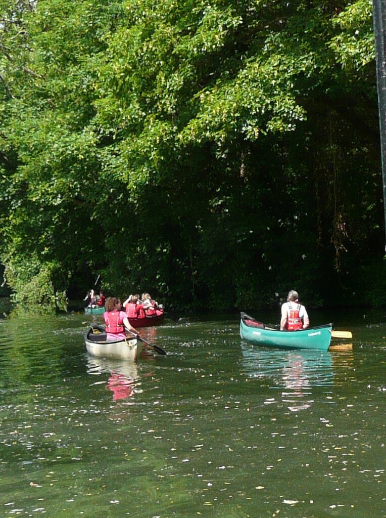
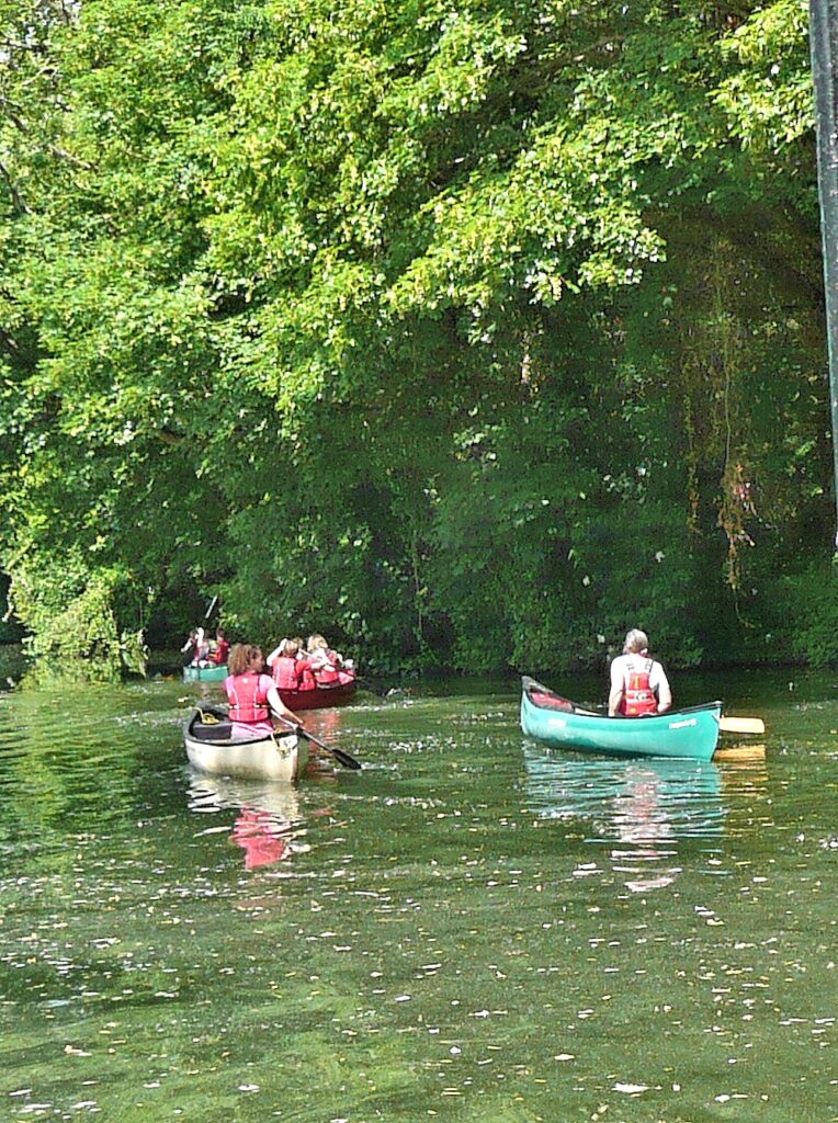
Exactly how dark to make your shadows can also be greatly governed by your intention. The reality as in the first photo below was that the shadow area behind the canoes was so dark it was hardly even textured. You may choose the dark to offset the colour of the canoes for a dramatic effect, or you may choose the softer effect of seeing more of the texture and colour of the background as in the modified second photo below .
3. There is also a temptation to add washes to the water that soften the edges too much. Last Tuesday the weather made for very clear reflections and waves and that should be reflected in your paintings. Again this was made difficult as in places the water appeared very green. Where a paddle hits the water you can always give a little sparkle to the splash by scratching out with a sharp point. Wait till the rest of the painting is complete before attacking the paper in this way.
This week we’ll be at Hurley again and probably in very different light conditions. Notice any differences especially if you visit the same spot to paint. We’ll also talk about colour, especially the water and reflections.
Your paintings;
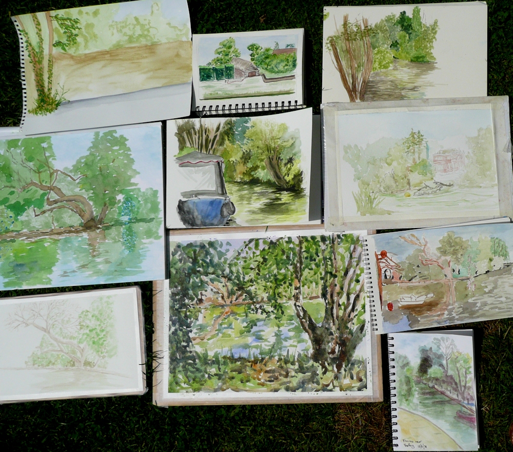
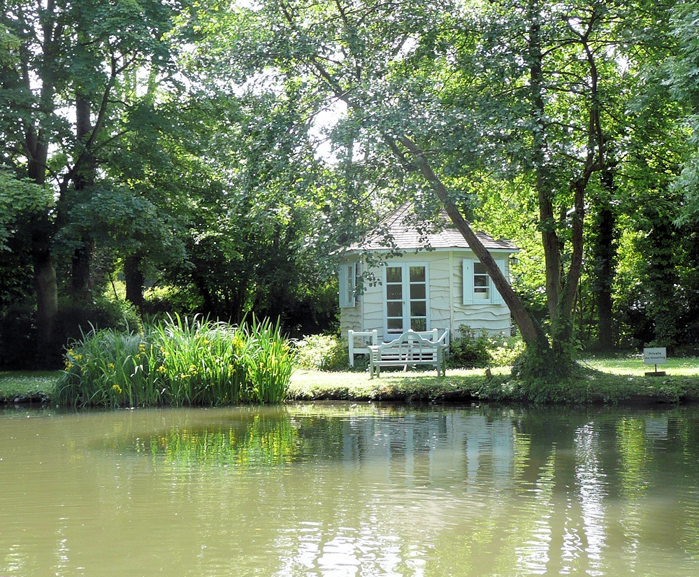
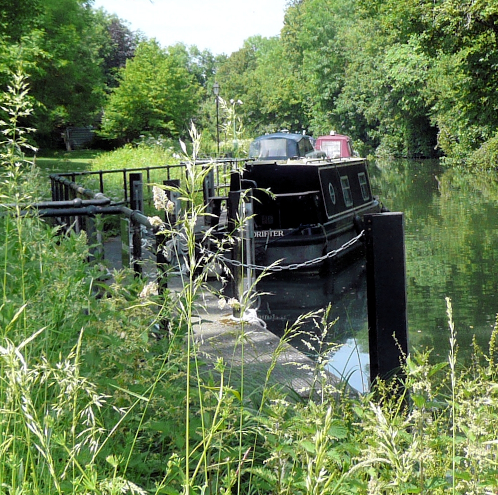
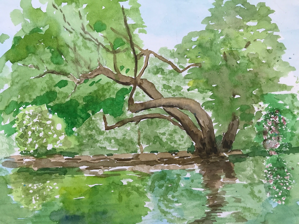
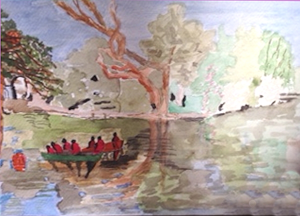
On Site at Hurley
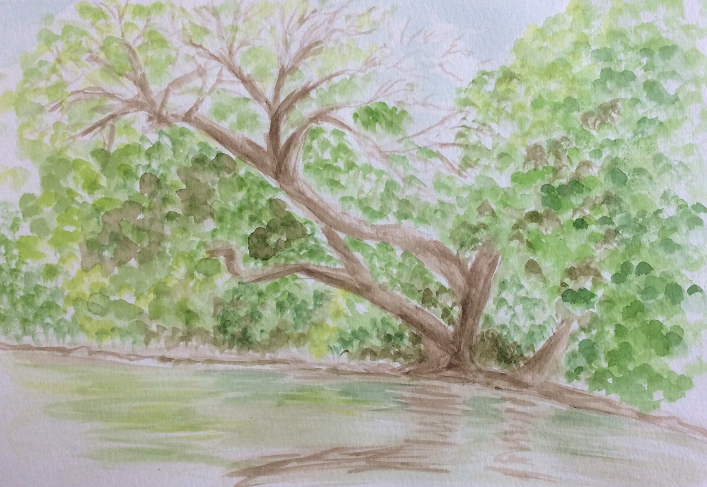
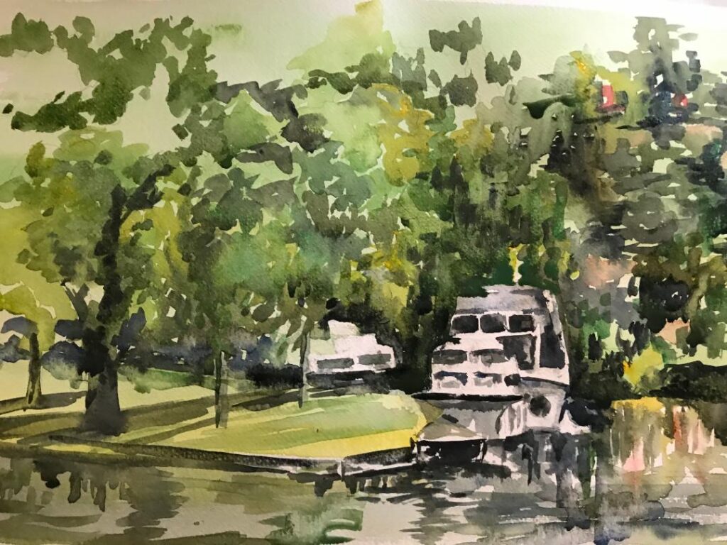
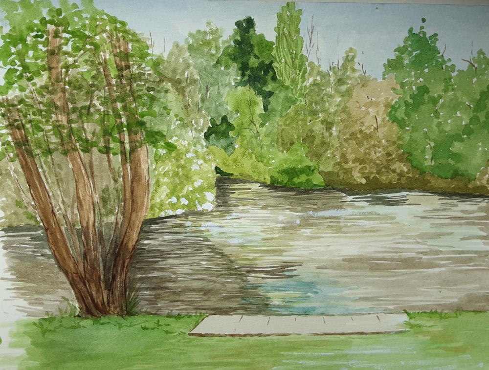
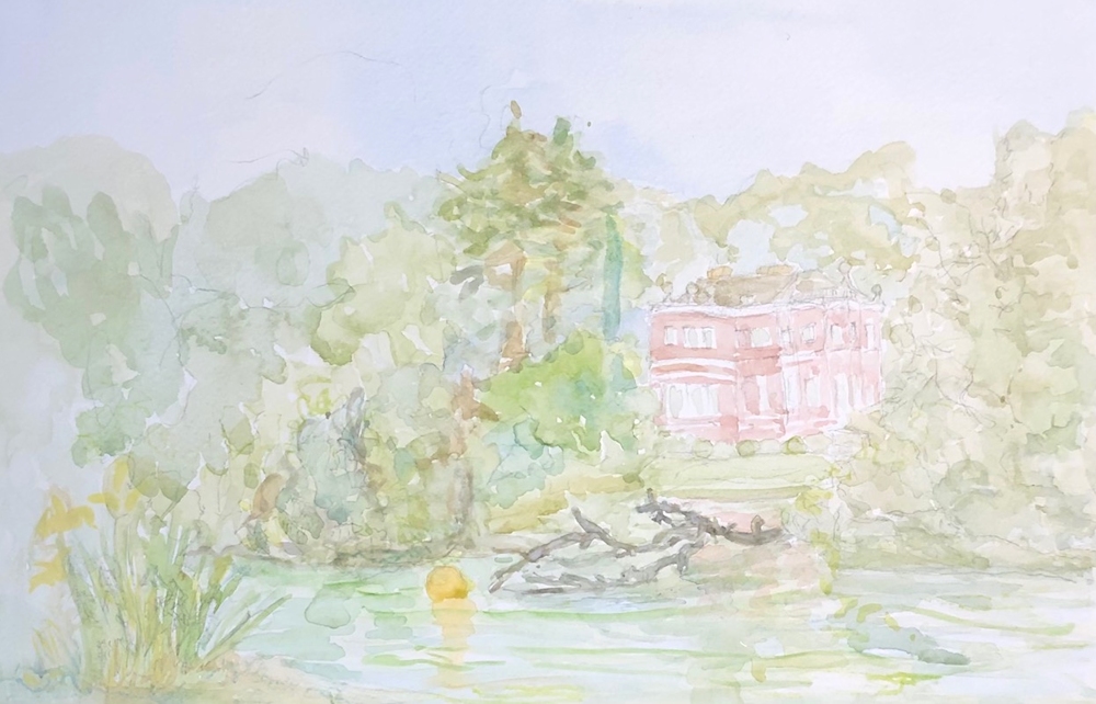
Completed Afterwards
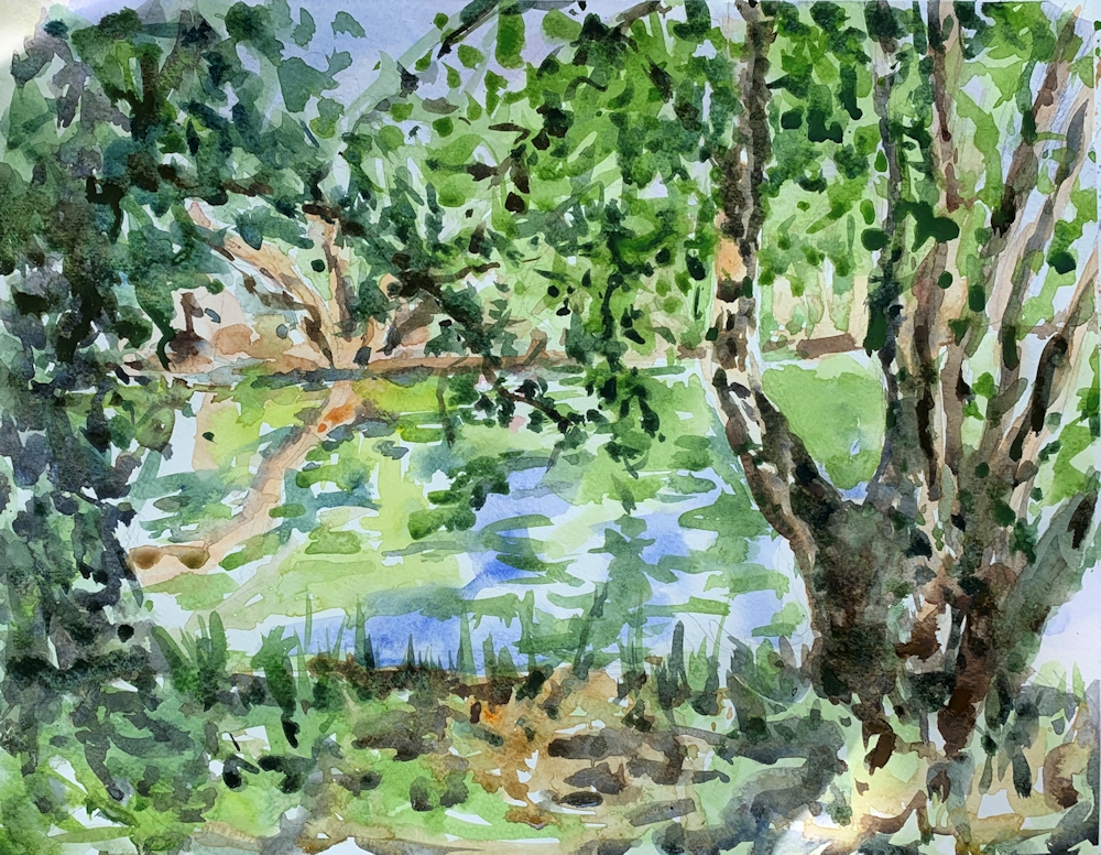
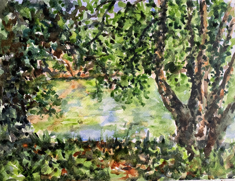
Jan has left some light spots in the foreground and on the tree foliage and trunk so the painting is still lively. The darker than original foreground and trees/foliage, has made a good contrast with water. A little of the freshness of the first painting has been lost but I can see the reasons for making adjustments.
Watercolour by Mali
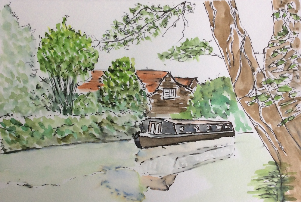
Ink and wash by Barbara from a photograph
Watercolour by Elizabeth
Watercolour by Sarah from Photograph
Watercolour by Liz
by Virginia