Category Archive: Buildings
Almost Monochrome: Week 2
September 7, 2022
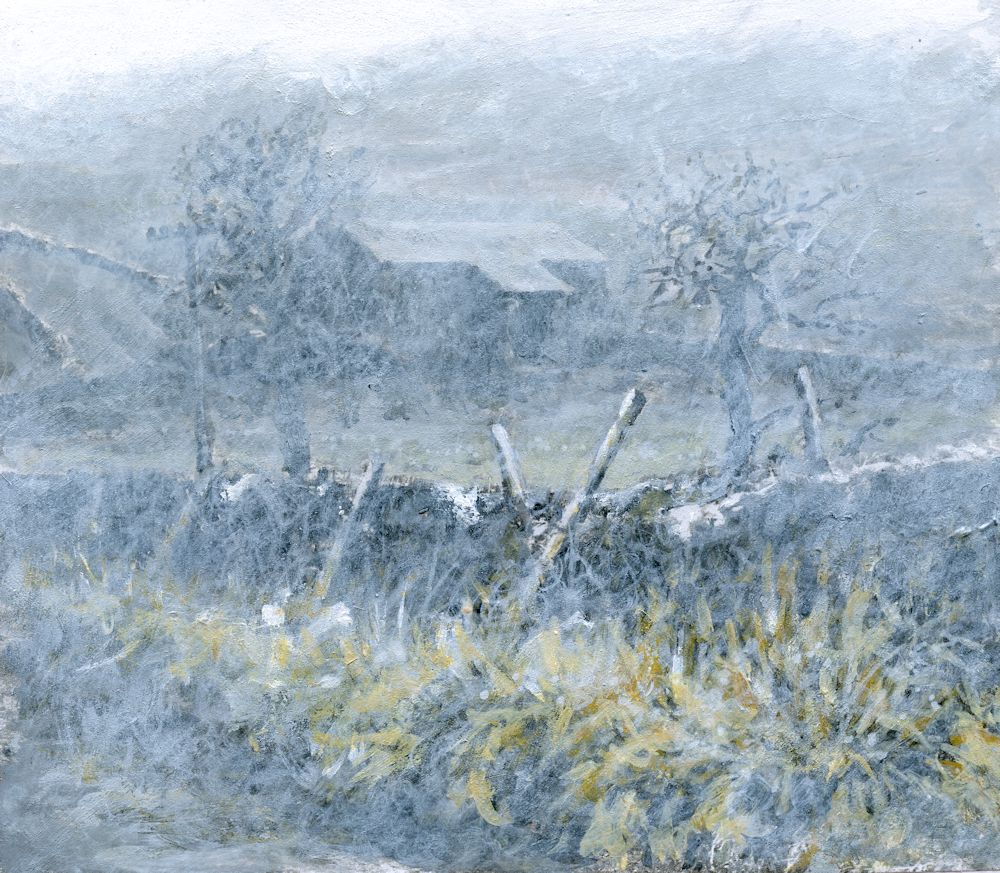
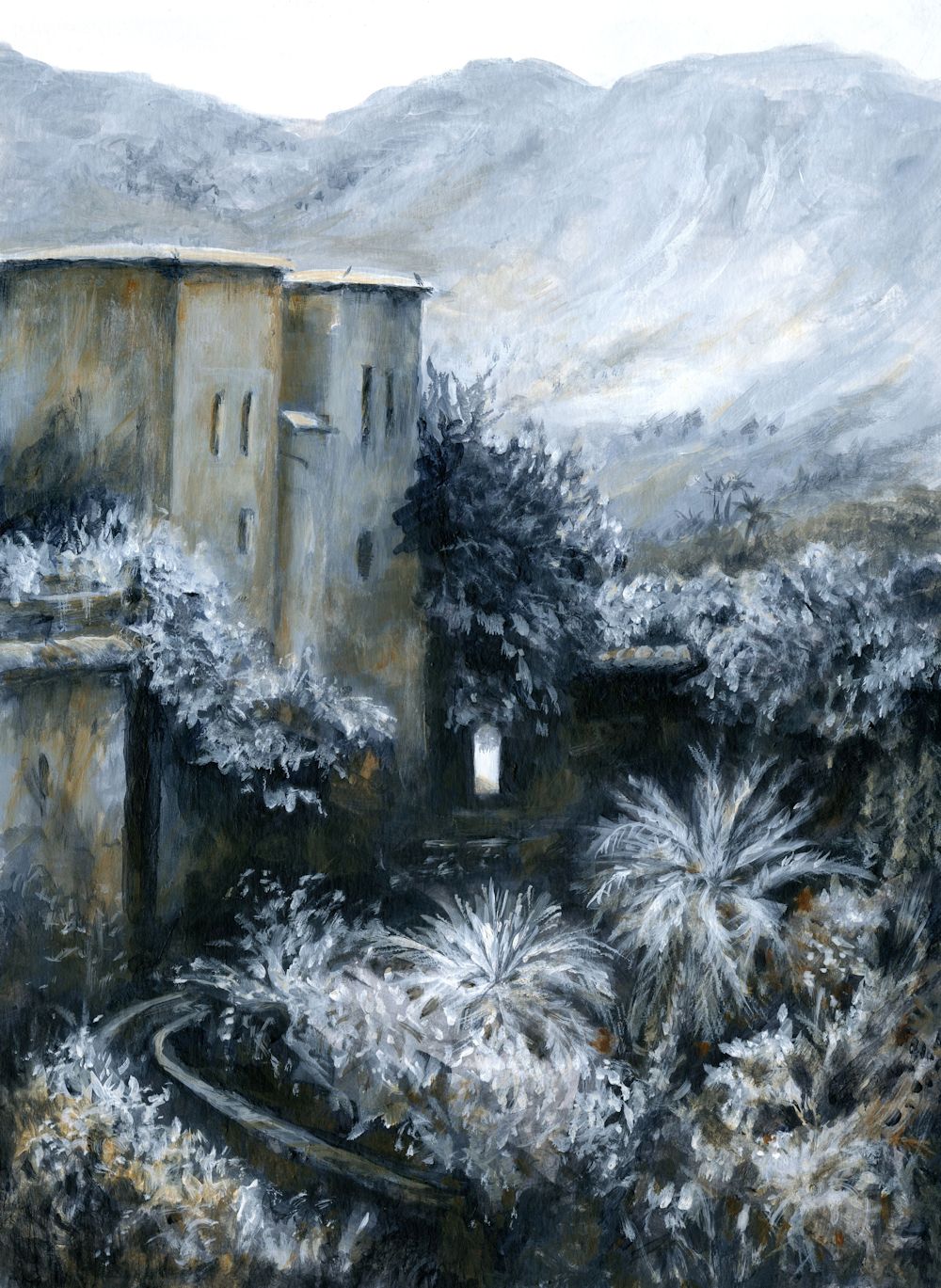
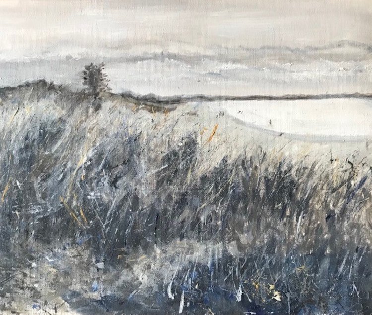
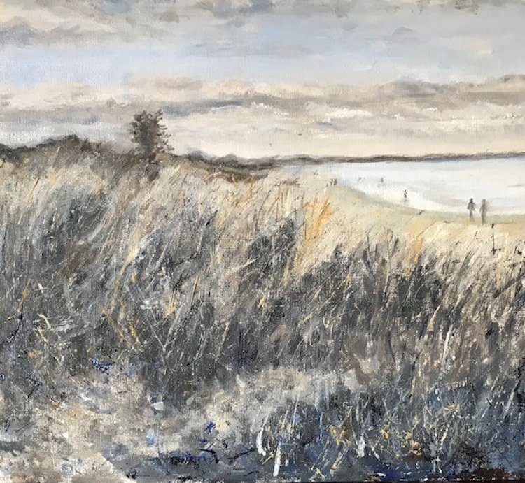
Acrylic by Jo
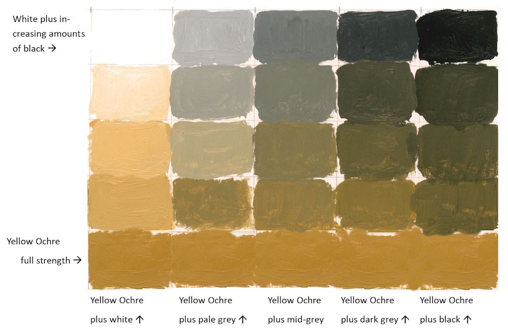
Pigments: Titanium White, Ivory Black, Yellow Ochre
The image above is of the same painting that featured in last week’s post but with white paint “scribbled” rather than scumbled over the surface. The coloured greys took on a greenish tinge as in the chart below.
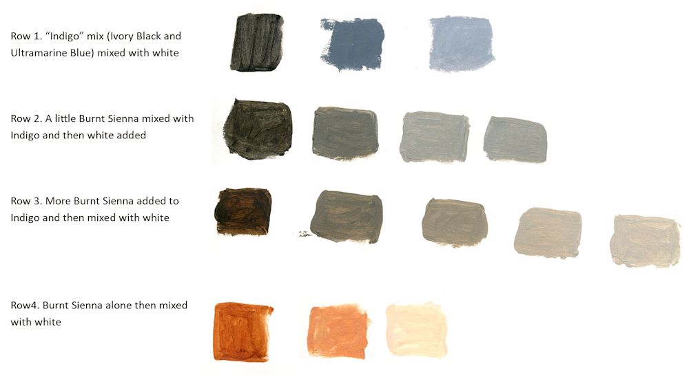
This week I made a large mix of Ivory Black and Ultramarine Blue to make an indigo like colour.
This was then mixed with White and burnt Sienna as in the chart above. Note how much bluer the greys are when indigo is mixed with white. Also note that because Burnt Sienna is much redder than Yellow Ochre their is no greenish tinge to the coloured greys, they just get warmer as more Sienna is added.
Acrylic by Jo
For this painting a large amount of an Ivory Black and Ultramarine Blue mix was made, then a monochrome painting created using this mix with varying amounts of Titanium White
This week we chose a dark pigment; black, burnt umber, Indigo or similar and added varying amounts of white to paint a monochrome picture.
Please photograph your painting at this stage then go on to identify another colour to enrich your painting. Explore a few colour mixes before homing in on the pigment you will use. Then think about how subtle or vibrant you want to make the added colour and make some colour swatches of mixes with white and the dark pigment used for the monochrome study. Last week I added Yellow Ochre; this week I will be adding Burnt Sienna and will post the result in a few days.
Either complete your painting during the week or at next week’s session when we will discuss adding a third colour into the mix. In any event please send an image of your colour mixes and a photo of the monochrome painting.
Your paintings:
Acrylic by Maryon
Pigments: Indigo, Yellow Ochre, Viridian
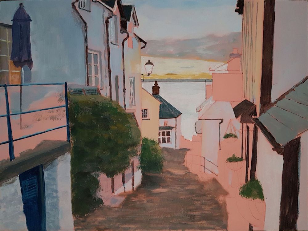
Acrylic by Kate
Acrylic by Norma
Acrylic by Virginia
Mix of French Ultramarine and Burnt Umber with Zinc White to give a monochrome painting albeit with a rogue brushstroke of Burnt Sienna
Acrylic by Virginia
The painting completed with some French Ultramarine with Zinc White, and Yellow Ochre
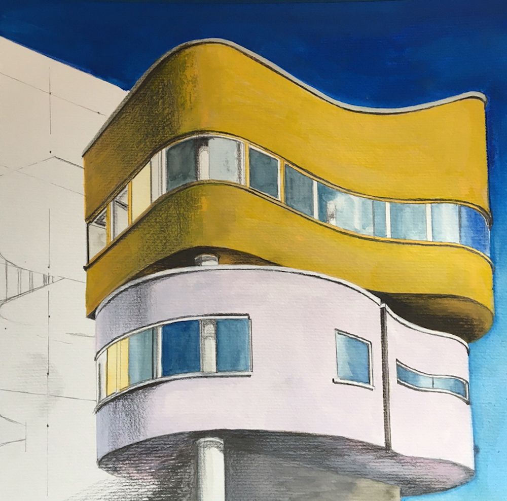
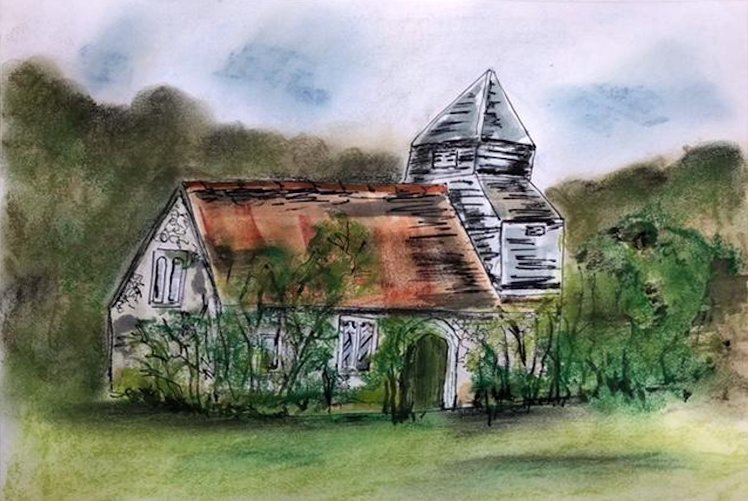
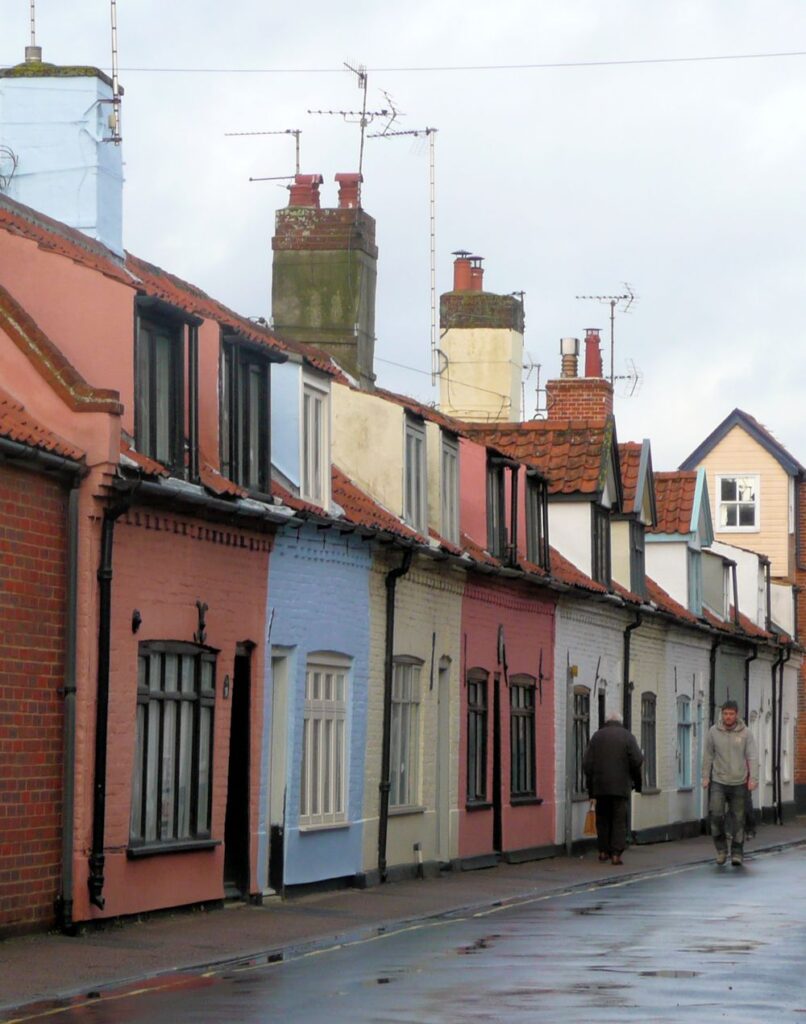
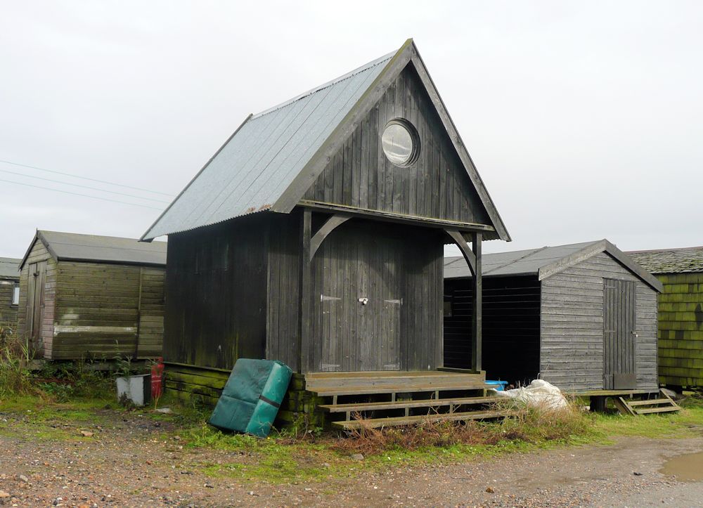
Buildings Week 4: Quirky or Eccentric
October 27, 2021
Photo
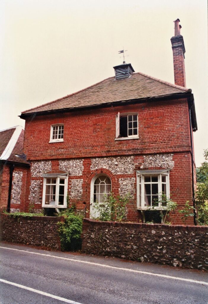
This week’s challenge is to draw or paint a quirky building. The only definition I can give is that it should be a building you find strange, amusing or eccentric. One example that I could not resist is above. As the road name suggests this little lane does indeed coil round and ends so that you are forced to retrace your steps to exit. There is also a sheer drop on the other side of the house.
Below is a house that at first sight looks pretty conventional till you notice the bricked up windows and the fact that there is a strange attachment to the house next door and a very tall chimney.
Photo
When you see the rear it appears to be a very strange house indeed.
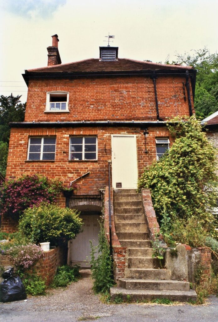
I kept wondering what was beyond the mysterious white door beside the steps! Was this part of the original house before the extension and concrete steps were added?
I wonder what you will find for this challenge?
My demonstration will be from one of the images above.
Remember the basic observation of perspective is just as important this week. Also you may have to deal with shapes that are far from square and conventional, so imagining how the structure is in three dimensions may help with your drawing. If you can, choose a building you know, and have seen from several viewpoints.
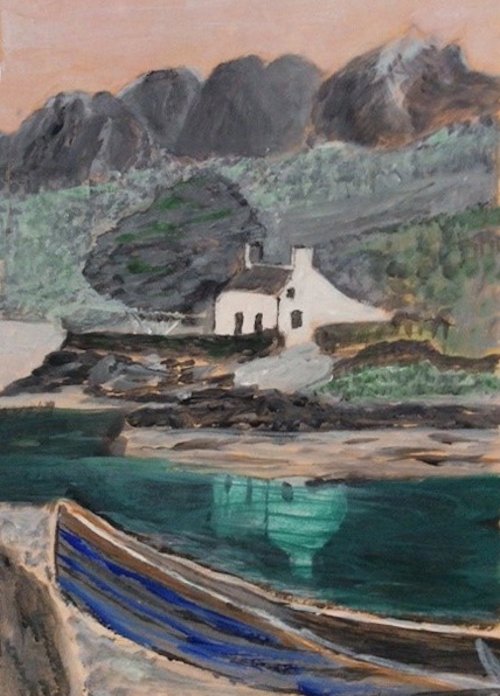
Your paintings:
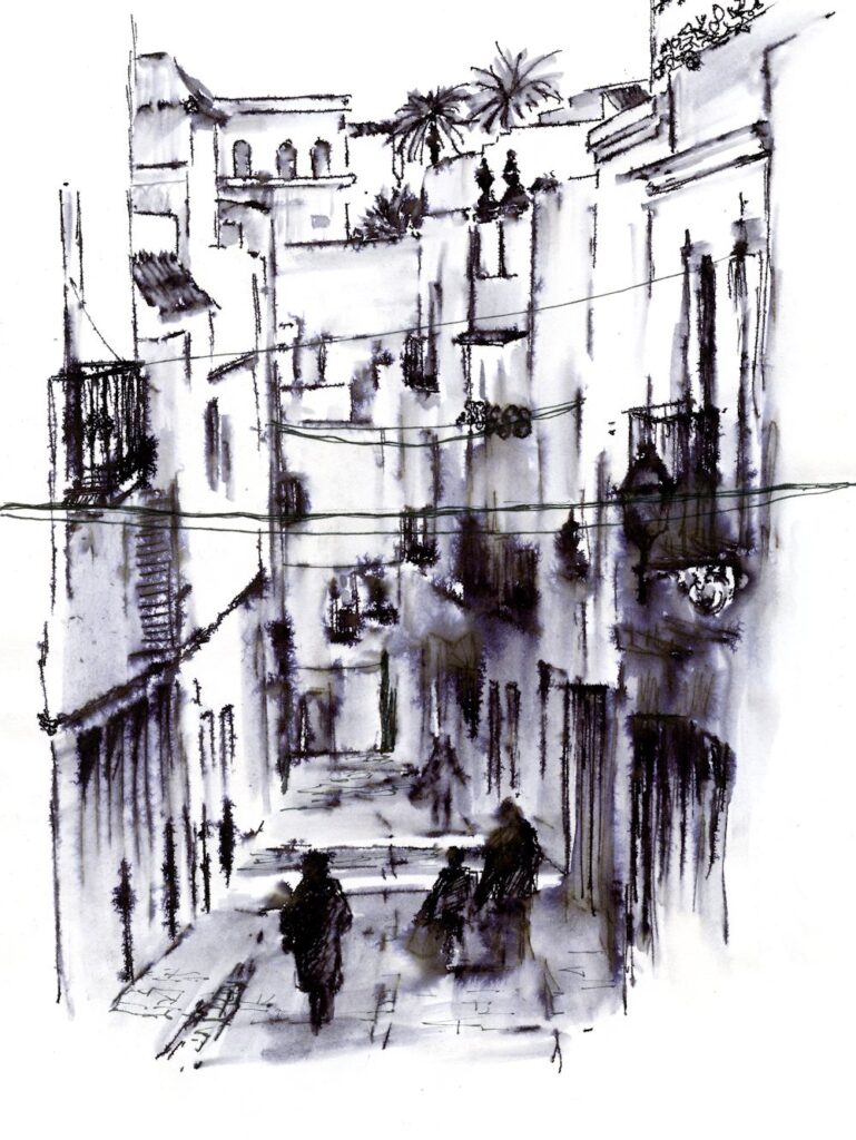
Gouache and graphite by Maryon
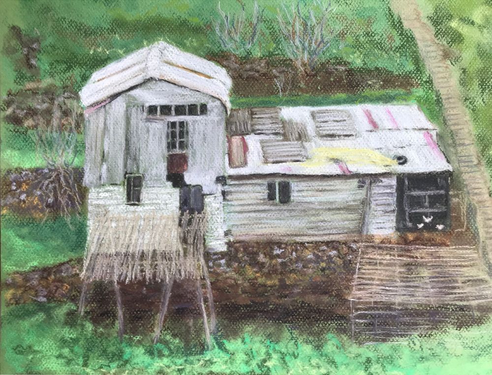
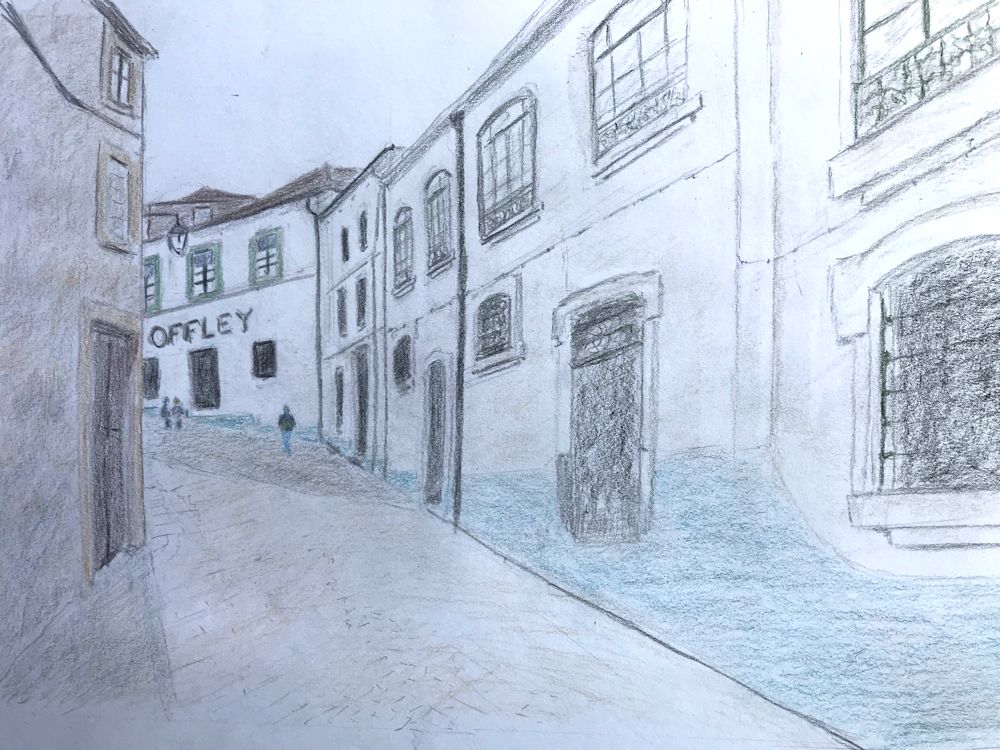
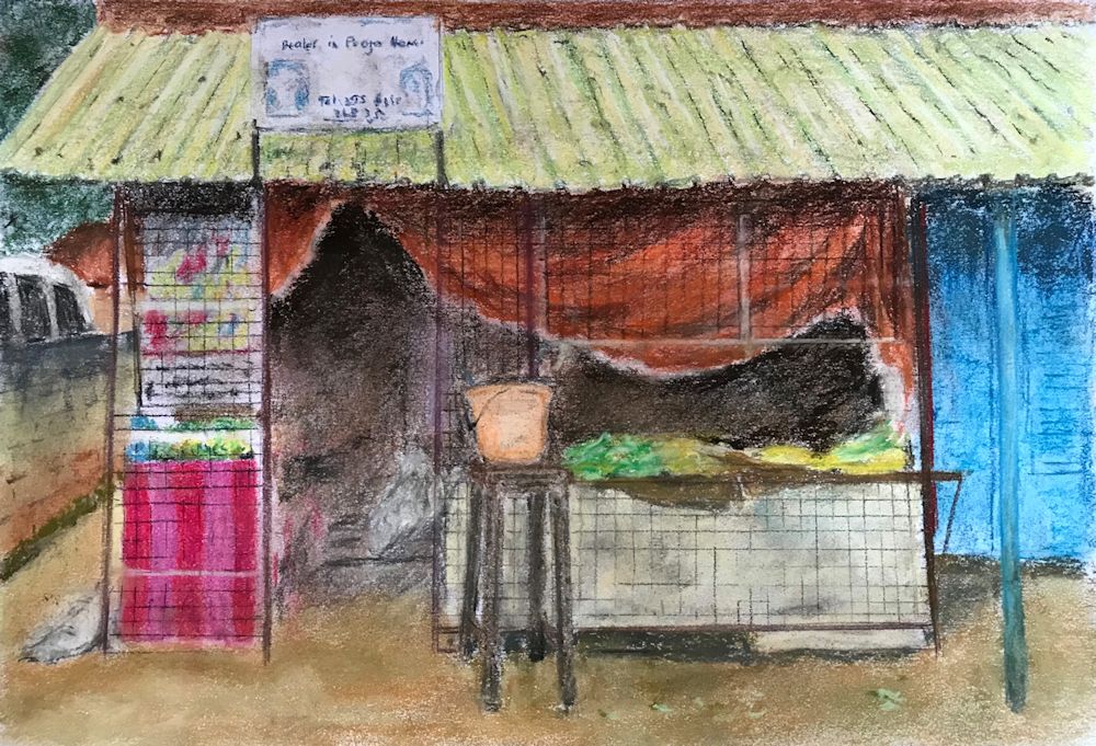
Pastel by Mali
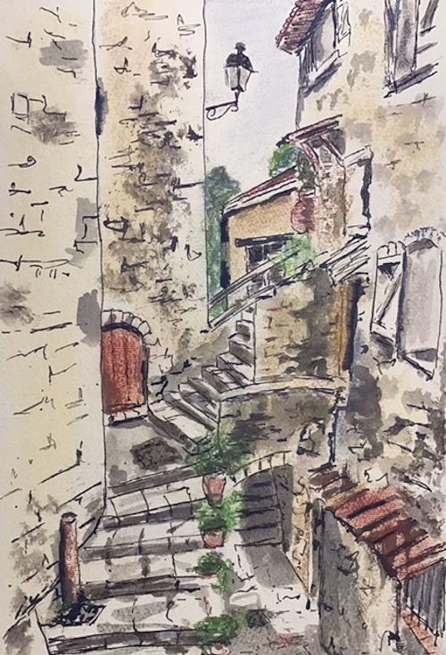
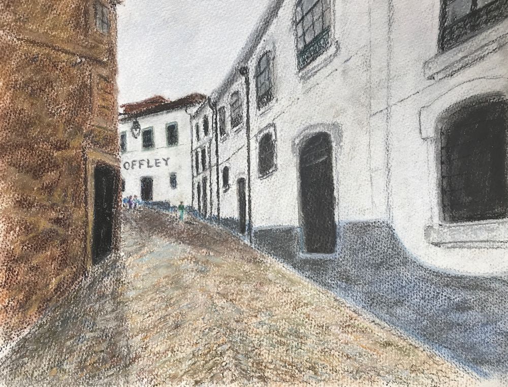
Ink and pastel by Sandra
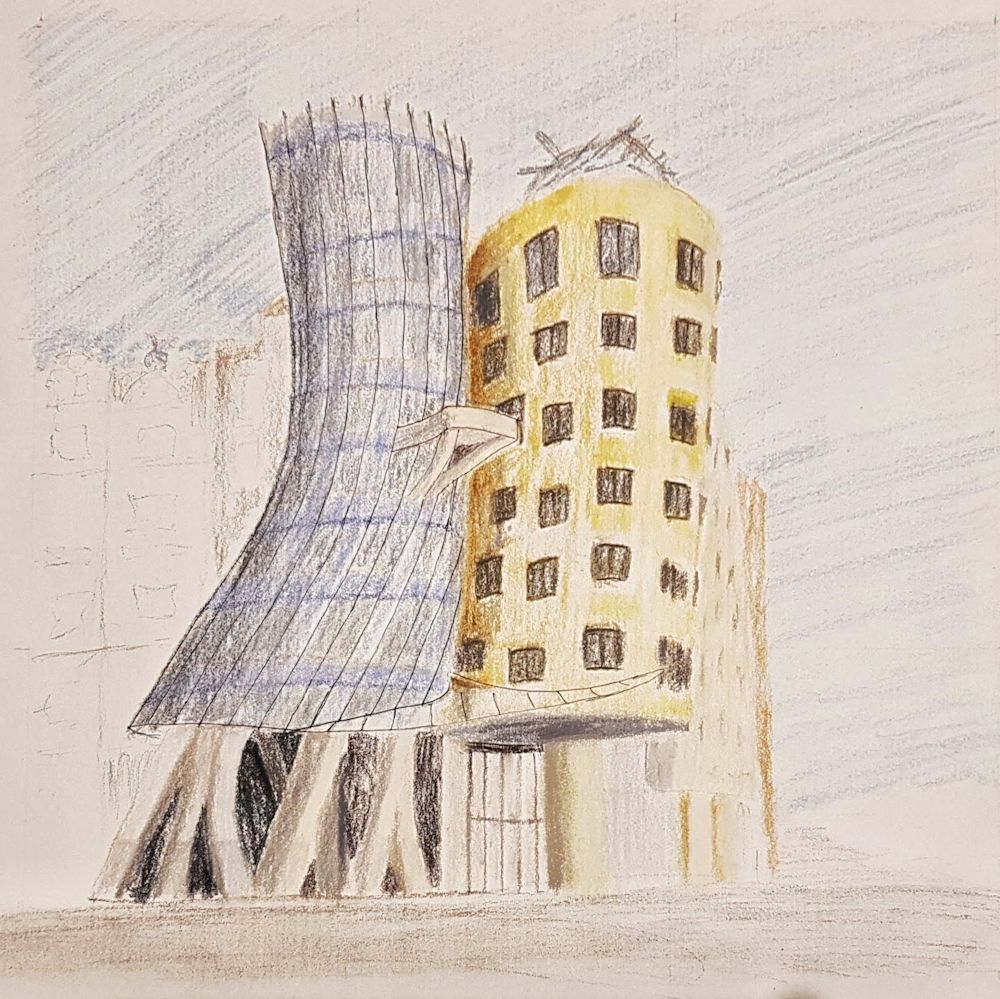
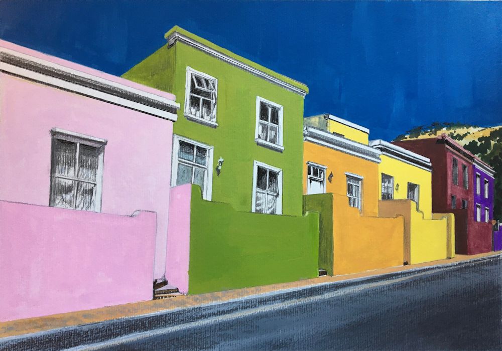
Pastel pencil by Malcolm
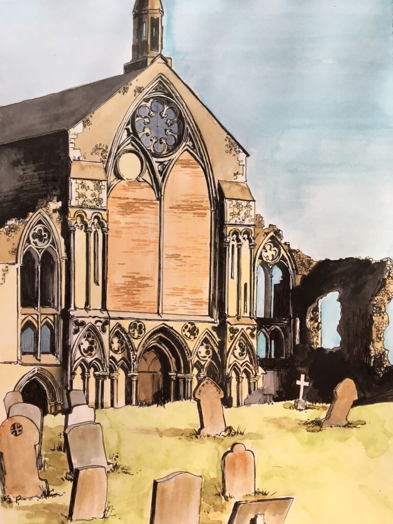
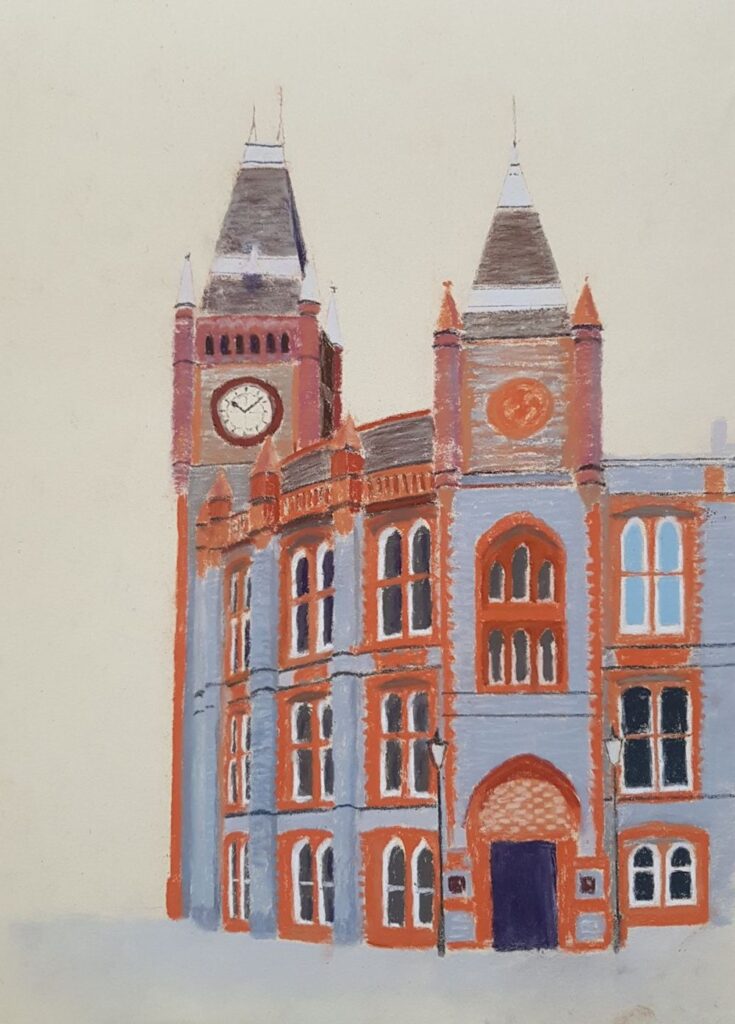
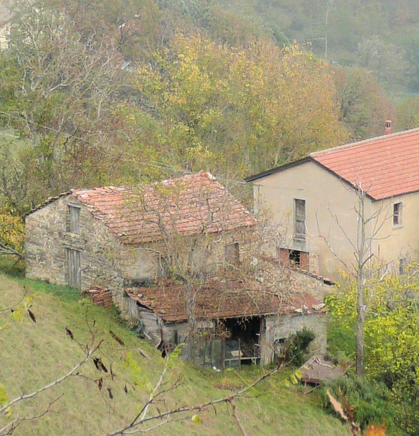
Buildings 3: Architecture with a Cultural or Community Interest
October 20, 2021
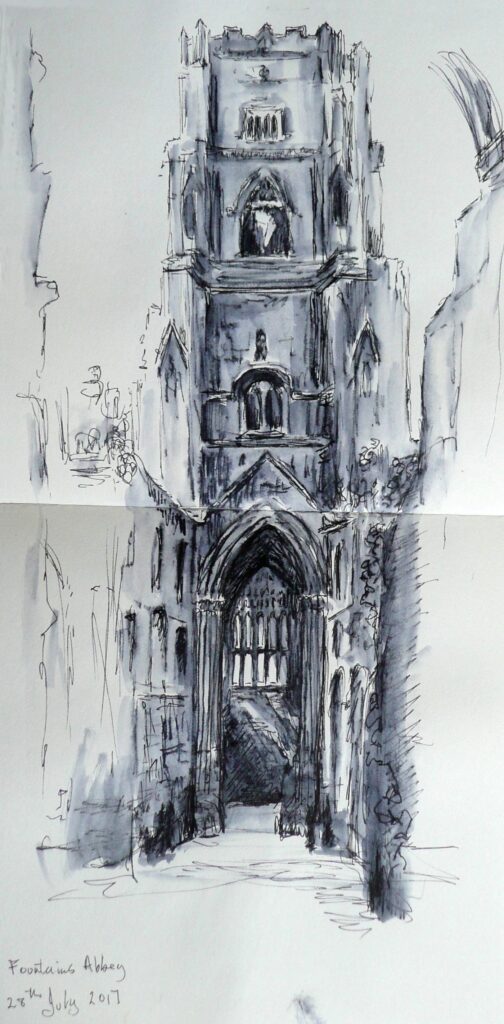
Because the abbey is a ruin parts of the outside and of the interior of this tower are visible at the same time.
The sketch was made on site with non-waterproof ink brushed with water which is a great way to record tone with the minimum of equipment; just a pen, in this case a Rotring Art Pen, a water brush and a sketchbook.
This week we’ll consider a single building, a theatre, church, castle, or a mosque, in use or ruined, that has a particular appeal to you. It is always best to choose a place you know, have walked around, hopefully sketched and photographed as you will have a memory of how it felt to be there not just the nuts and bolts of the structure.
Just a few of the many ways artists have tackled buildings can be seen at the Pinterst Board below
https://www.pinterest.co.uk/jhall1282/buildings-in-art/culturalcommunity-buildings/
It includes Impressionist paintings, works by John Piper and also by the contemporary artist David Tress and a few others. These artists use both different materials and different approaches to painting architecture. Perhaps try making several sketches from your reference and while you are drawing think about what you want to communicate about the place.
Is it the architectural details that interest you and how much should you include? Are you excited by the textures and patterns or graffiti on the walls. Do you want to suggest the mood or time of day with the lighting and colour? What do you feel about this building; is it joyful and uplifting or sad and lonely. Are you overwhelmed by it’s size etc. How much of its surroundings will you include and/or do you wish to paint only part of the building?
By making these initial sketches, especially if you have references from different viewpoints of the same building, you will also familiarise yourself with all it shapes and angles and become much more aware of how it is constructed. Last week’s session should help with this.
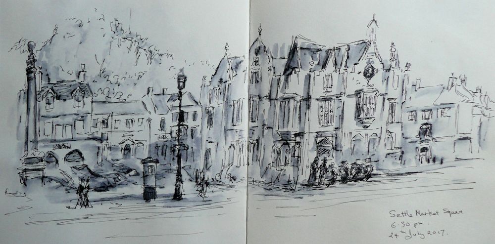
Most of this very loose sketch is taken up by the huge and rather gothic building with turrets and bay windows beside the market place. I sketch . I took photos and left to make dinner. My camera will capture the detail but my sketch will supply the quirky grandeur of the building and its surroundings.
If you have time look at the many paintings Monet made of Rouen Cathedral at different times of day. Enjoy looking at more works by John Piper and David Tress and then set about your own building work! Have fun!
Your paintings:
by Mali
Mixed media by Sandra
Ink and watercolour by Maryon
Acrylic by Malcolm
Ink and watercolour by Ann
Ink and Watercolour by Heather
Ink and Watercolour by Ann
Drawing by Heather
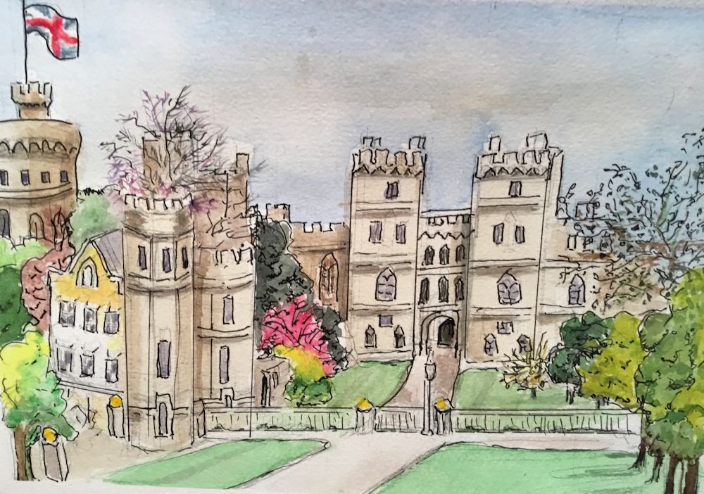
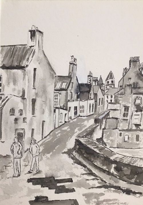
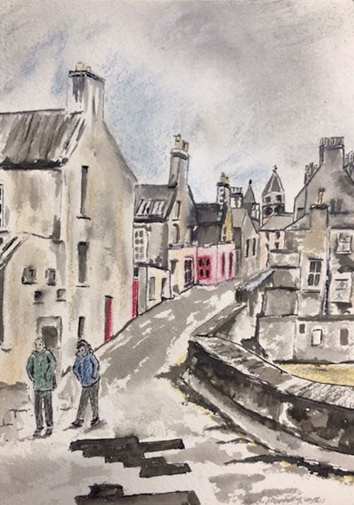
Buildings 2: Viewpoint
October 13, 2021
Gouache and watercolour on grey paper
The Importance of Viewpoint
This week we explore looking at buildings with regard to the artists viewpoint.
First look at the Pinterest board at:
https://www.pinterest.co.uk/jhall1282/buildings-in-art/town-square-or-street/
Think about the viewpoint from which these works were made. Was the artist looking up at or down on the street. Also look at whether the scene is on level ground or a slope. What happens to the horizontal structures e.g. window ledges and door lintels in relation to the ground when the buildings are on a slope?
Ink and wash
In drawing a straight street it may be useful to understand how single point perspective works. Where a group of buildings or single buildings are being drawn it is also useful to come to grips with two point perspective. In many situations where buildings are at different angles to each other measurement or estimating the relative sizes of the forms becomes increasingly important. The following diagrams describe how the most basic forms of perspective work.
Single point perspective: If perfectly parallel rows of houses are situated facing a road that is also perfectly straight it would be perfectly feasible to draw construction lines as guides for the drawing which employ the use of single point perspective.
In a perfect street as that described in the text the straight road with a perfect row of houses on either side could be constructed in the same way.
However streets have a tendency to bend and buildings are not always built at Only straight sections lend themselves to this approach. New vanishing points have to be constructed for every bend in the road.
Because buildings are often on streets that bend, and built at different angles to each other, you will often have to resort to measuring the main heights and widths of the large shapes and then home in on how best to draw the smaller details.
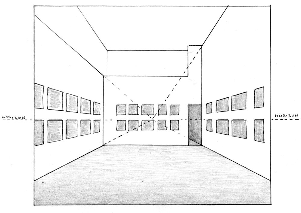
Two point perspective: Sometimes where one building dominates the scene an idea of how two point perspective works will give a starting point from where you can estimate and or measure the rest. Below are diagrams that will help you analyze what is happening when a building is seen from below, from a slightly higher elevation and from a point above the building.
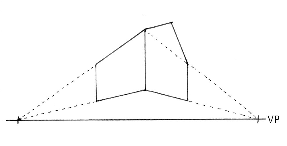
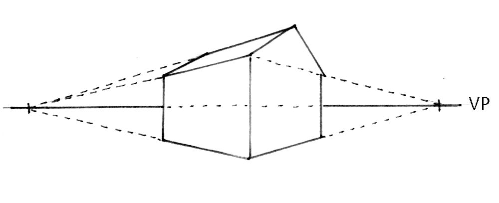
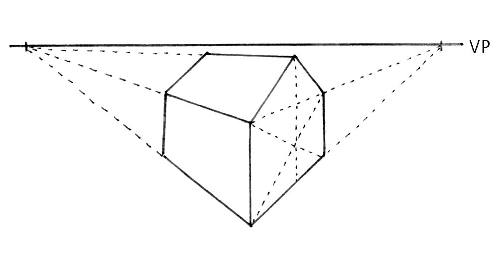
Understanding how perspective works will help you sort out the drawing if something looks out of place, and will supply you with some tools to make necessary adjustments with individual buildings and with some street scenes. More often buildings are not at convenient angles to each other and it will be your skills in observing, making actual or mental measurements (estimations of relative sizes and angles) that will be most useful for drawing clusters of houses. The best way to learn is by sketching wherever possible on site (the best way), or from photographic reference. Continually ask yourself questions about relative heights and widths and angles.
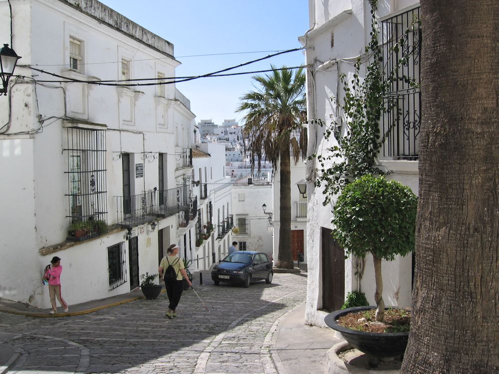
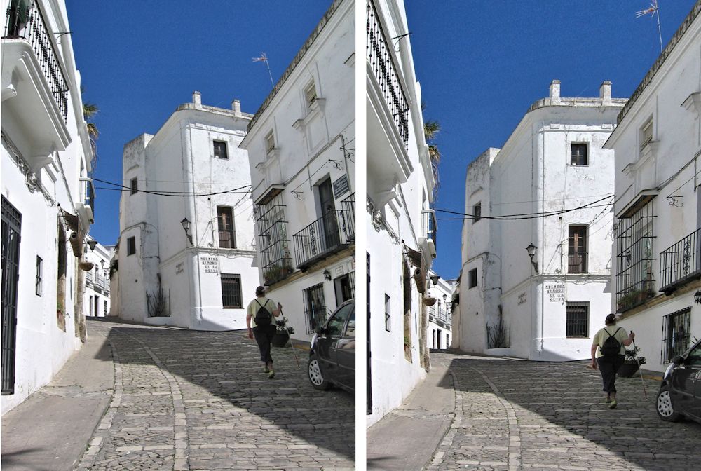
Note what is missing on all four sides of the image on the right. I have also lost some of the foreground and the hill has become flattened out. Look also at the foreground shadow. Sketching on site is hugely valuable as decisions about what to include are made and most distortions as in the left hand image are largely eliminated.
If I were drawing this scene from the photo reference I would think very hard how to either use the distortions making the picture slightly surreal or manage them in a way that accommodated all the items I wish to include, and most importantly maintaining the impression of a very steep ascent..
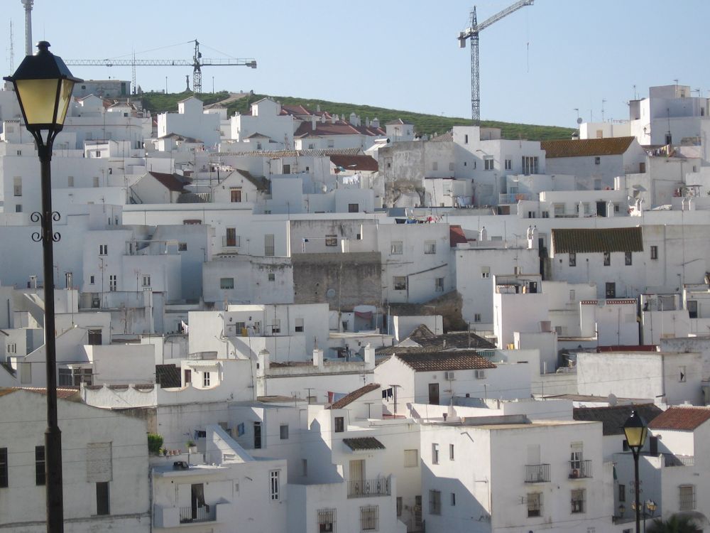
When things get very complicated as when looking across at a sea of dwellings just enjoy the pattern of shapes and colours and have fun with them.
This week: choose to paint a rather straight street of regular houses or a single building or group of buildings in which one building dominates. Think about how single and two point perspective can help in constructing the drawing and/or help you check your preliminary drawing before developing the work further. Alongside this think hard about how important a part measuring dimensions and angles will be.
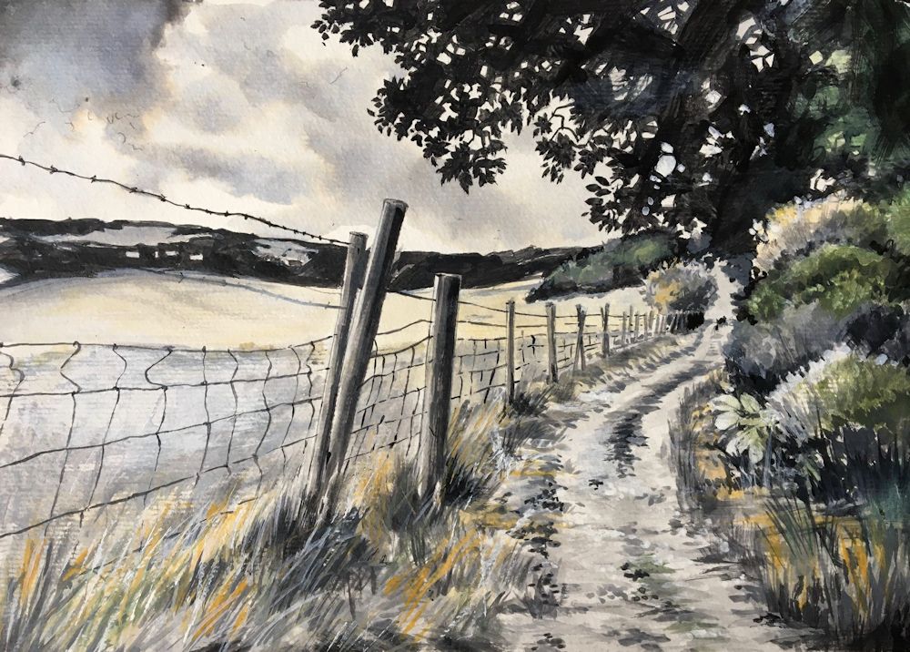
Your Paintings:
Rothschild Avenue Tel Aviv
Ink and Watercolour by Maryon
Acrylic by Malcolm
Acrylic by Malcolm
Drawing by Mali
Pastel by Mali
by Maryon
by Sandra
by Sandra
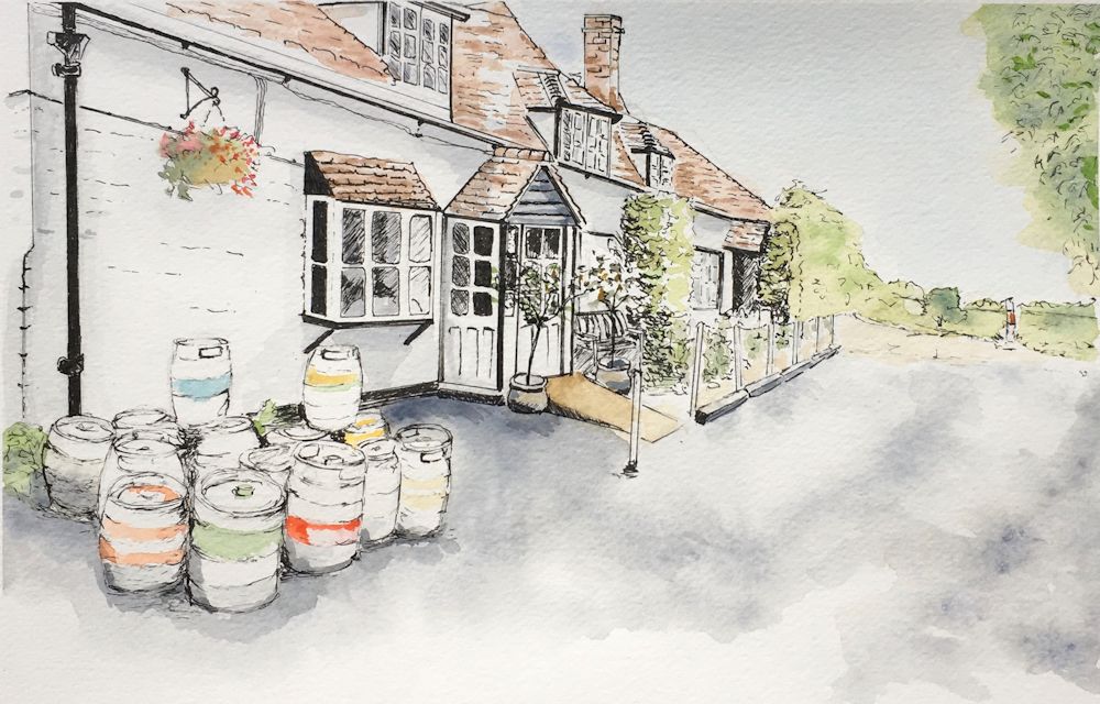
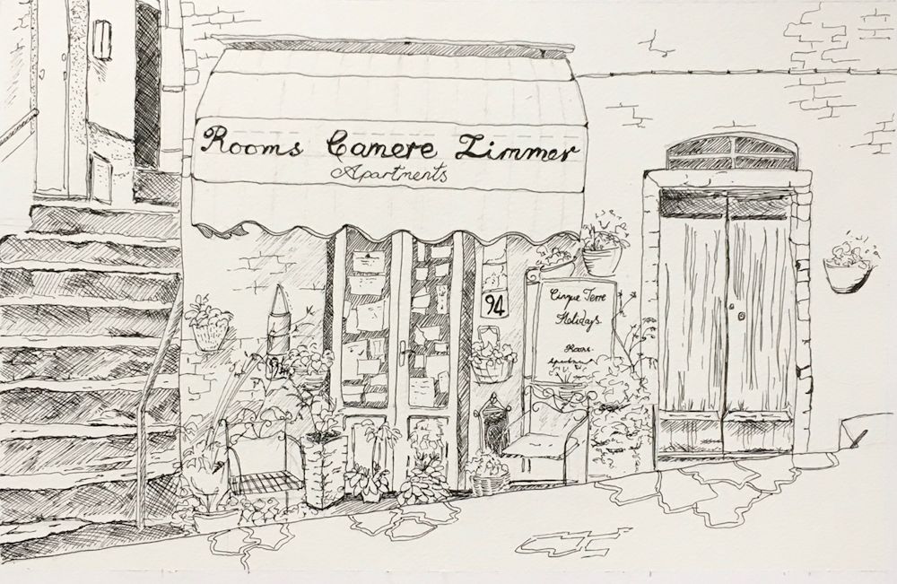
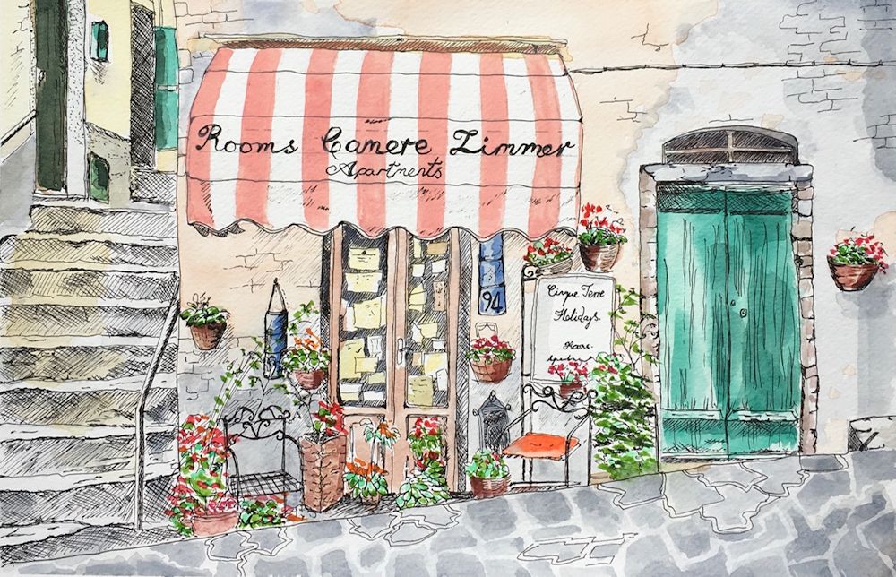
Buildings: Week 1 Shop and Bar Fronts
October 7, 2021
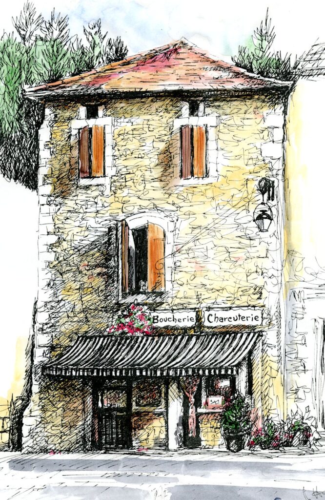
Ink and Watercolour
This drawing of a shop front includes the whole façade of the building with a suggestion of the trees behind and the vaguest idea of what is on either side of the shop front. There is a good sense of the light but very little detail of what is in the shop window. These are all choices you will have to make when considering your composition.
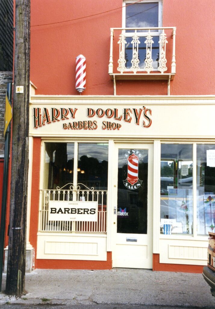
This is the first of four drawing and painting challenges looking at different aspects of drawing and painting buildings in towns and villages. Have a look at the Pinterest Board;
https://www.pinterest.co.uk/jhall1282/buildings-in-art/shop-fronts/
You will find a varied selection of works of bar and shop fronts from painterly works by Maurice Utrillo, Edward Hopper, Stephen Magzig and Brett Amory to the illustrative and very graphic coloured drawings by the contemporary artist Eleanor Crow. Not included are the wonderful drawings of Lucinda Rogers; well worth Googling!
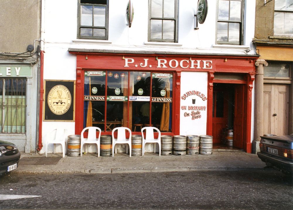
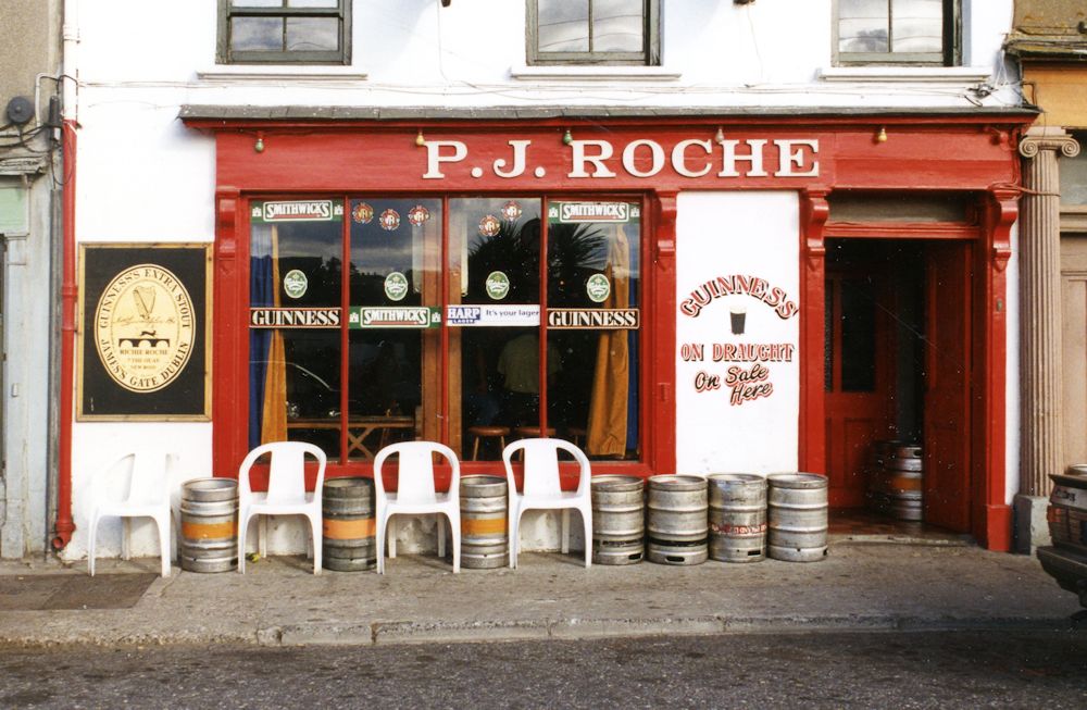
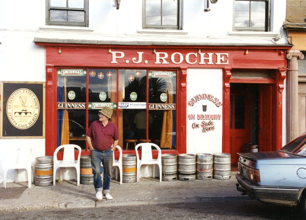
A study of a shop is a well defined subject and seen from front on there is little perspective to worry about so it may thought to be an easy place to start. However there are still a lot of composition choices to make and of course some perspective issues as with with a corner shop, for instance. The photo references below have been chosen to illustrate just some of these choices.
Photograph
Here only the shopfronts and pavement are included. There are many possibilities for composition here;treating the two establishments separately; including or not including the tree; editing the foreground shoulder bottom left and/or the back of the bus on the right etc.
Over all composition: It is very much the artist’s choice what to include of adjacent buildings and also how much of the building above the shop front and how much of the pavement or road outside the store.
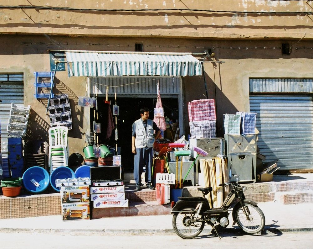
Photograph
Blue sky, much sun, great cast shadows and contrasts!
Tone: look at the dark areas. If a shop has an awning, what is below may be very shadowed. Doorways are often in slight alcoves and relatively dark. Really look at the pattern of light and dark across your reference sketch or photo. There may also be significant cast shadows. Contrasts of tone will be much greater on sunny days while cloudy days result in rather flat lighting so communicating this will give your work the atmosphere of the day, as well as depicting the objects.
Photograph
Look at the important part cast shadows play in the composition, especially that of the awning
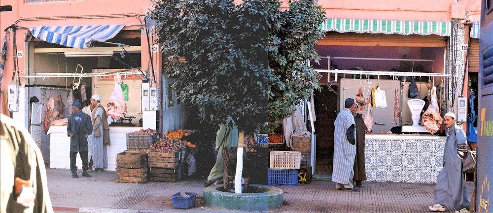
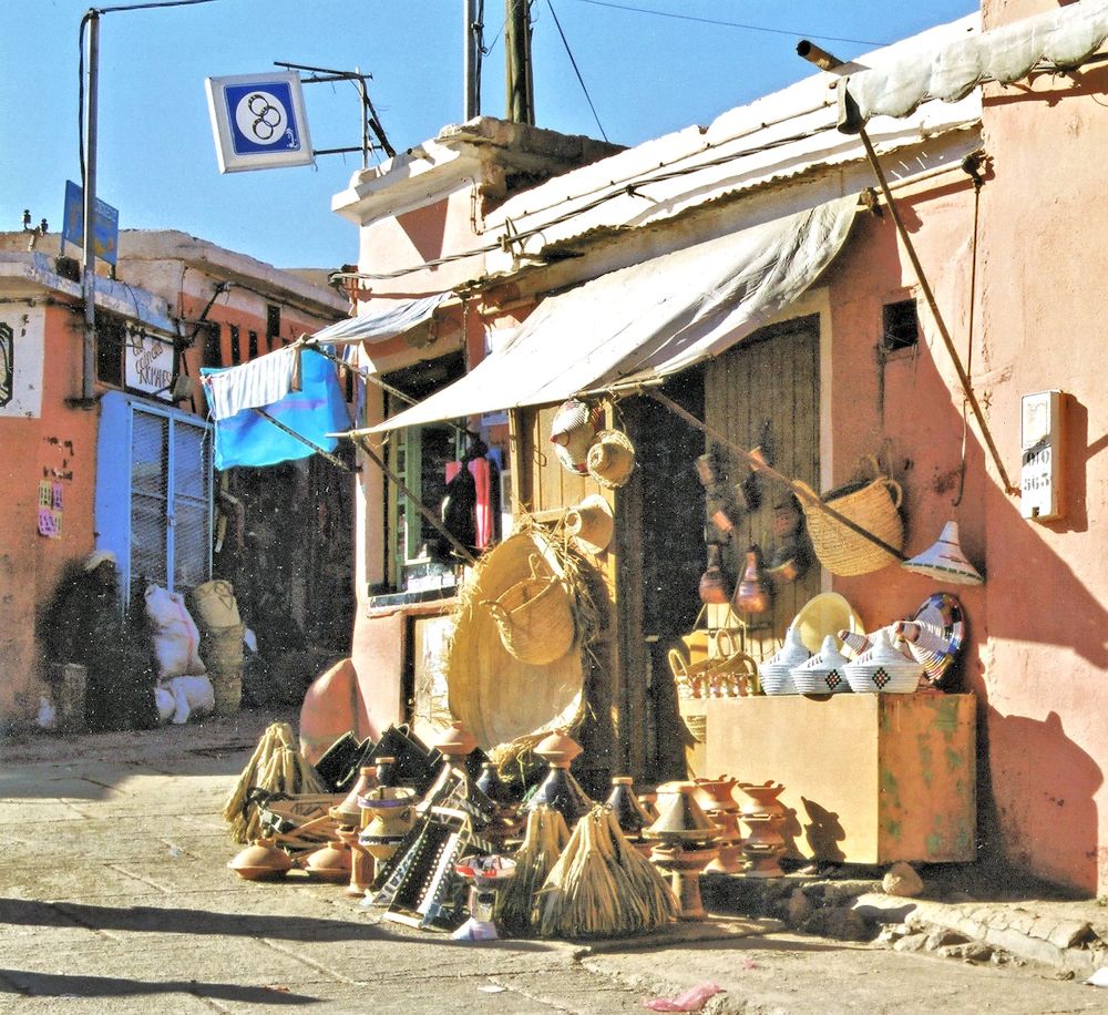
Some of the most fun to paint are stores where the produce spills out over on to the pavement like a rather complicated still life and/or when the seller can be seen. I think of these shops as halfway to being a market.
Photograph
With trash can and street lamp, dull day.
Photograph
A different view with tree and news stands. Note the lower tone of the side of the building and the general pattern of light and dark, also the brilliance of the “welcoming lights” claiming our attention.
Whether and which street furniture to include; street lamps, waste bins, newspaper stands, traffic lights and other street signs etc.
People and traffic; decisions on whether to include pedestrians and window shoppers and parked bikes or vehicles.
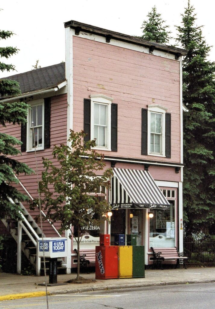
Photograph
Seems a bit cluttered to me!
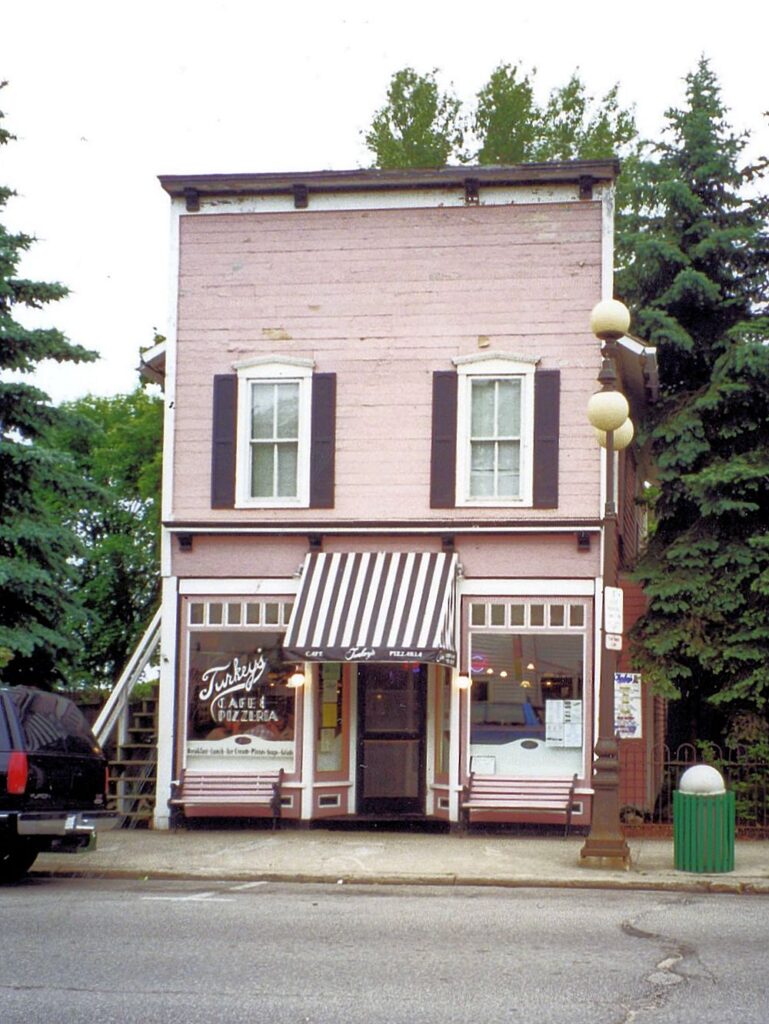
Photograph
Would consider cropping to just below the window sills. Undecided about the car but it does lend credence to this being a busy street and love the pedestrian.
Store signage, lettering, closed and open signs and how much detail to include of the wares on show.
Photograph
Plenty of lettering and pattern here! Might use my imagination to complete the shop front on the right to experiment with a rather symmetrical composition.
Deciding on the detail of lettering is another choice but it should be in keeping with the rest of the work. If you are a calligrapher this will come easily to you. If not and you wish to make very careful lettering or even rather free lettering don’t be afraid to get a ruler out just so that you keep your lettering or scribble to the right height. If you are working the rest of the painting quite loosely it is usually best to work such details in the same way. Remember that loose does not mean inaccurate so be aware of the relative sizes of windows, doors,etc. and always remember to check the verticals.
Next week we will look a little at perspective, measuring and estimating by eye. This week should give you a good feel for looking at relative proportions and thinking about composing from your reference.
Your Drawings and Paintings;
by Mali
by Maryon
by Malcolm
Watercolour by Sandra
Ink Drawing by Heather
Ink drawing with watercolour wash by Heather
Ink and watercolour by Ann
Ink and Watercolour by Maryon