Monthly Archives: September 2022
Almost Monochrome Week 4
September 21, 2022
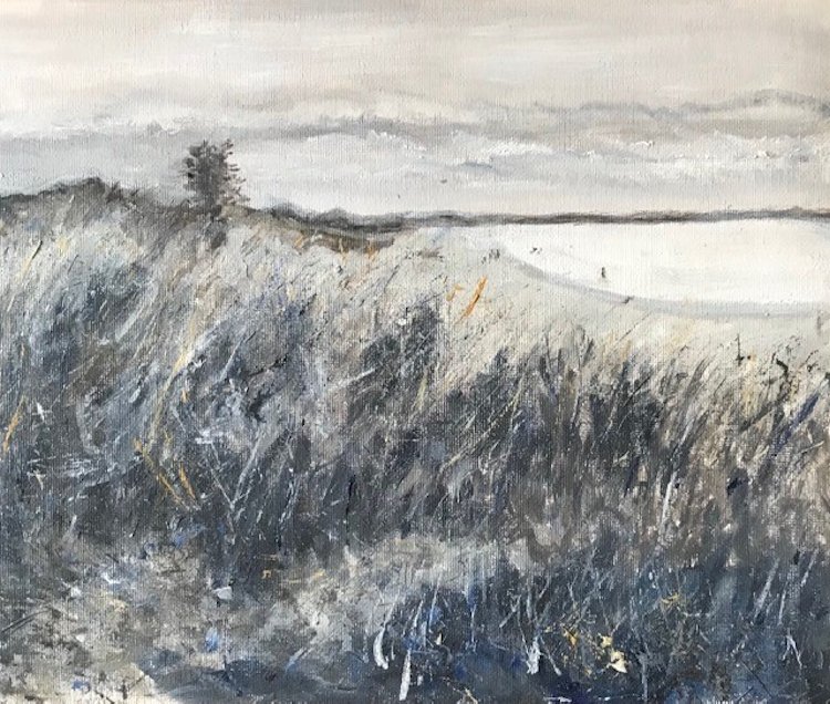
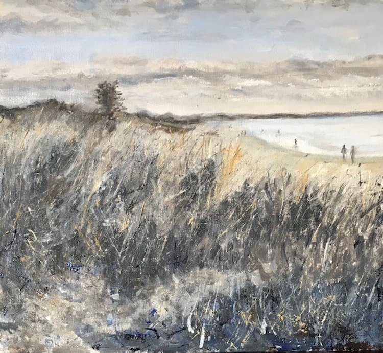
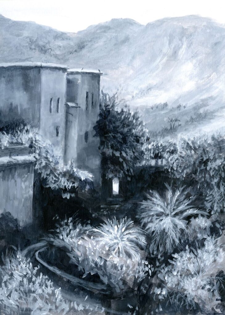
Every stage of a painting has its merits. Often as in the monochrome painting below, the initial rapid response to the landscape is more exciting than the finished painting.
Starting with a cool colour
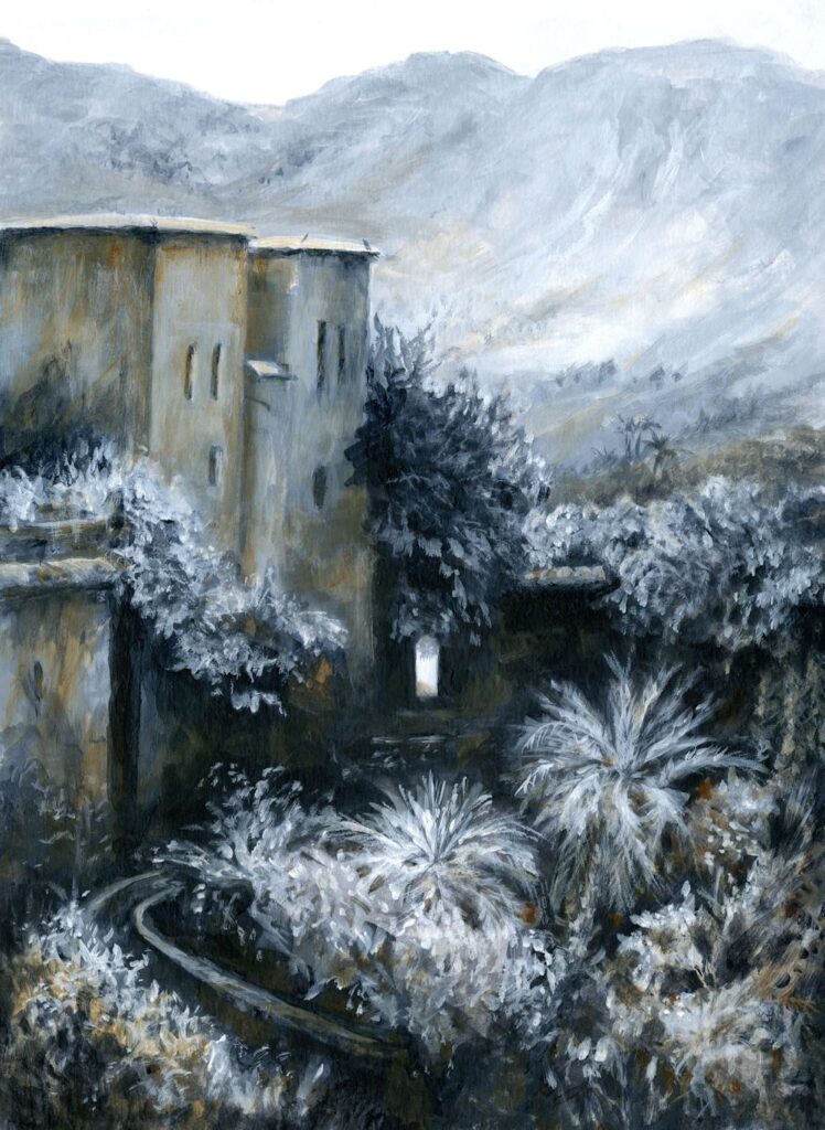
The initial acrylic sketch was made with a cold blue grey made from Cadmium Red Hue and Phthalo Blue, mixed with white. The painting was completed with purplish reds made with Cadmium Red and Phthalo Blue, almost pure Phthalo Blue and white form much of the water and adding Yellow Ochre into the mix for some of the vegetation.
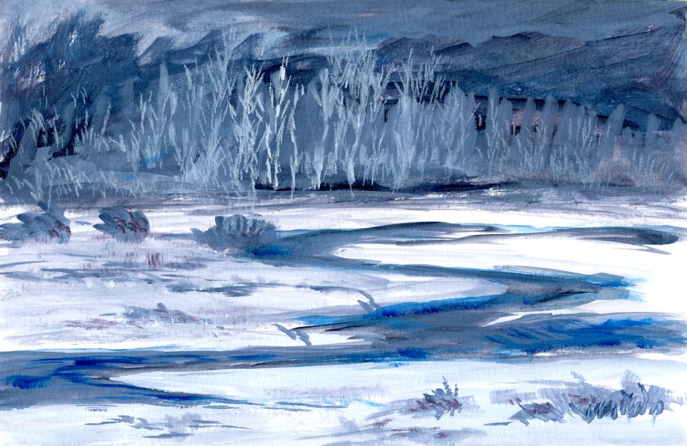
Stage 1: A large amount of a mix of Phthalo Blue and Cadmium Red Hue was made to make a cool blue grey and a basic monochrome sketch made in acrylic. Some further Phthalo Blue mixed with a little white was added in places. This will form a monochrome structure for a more colourful painting.
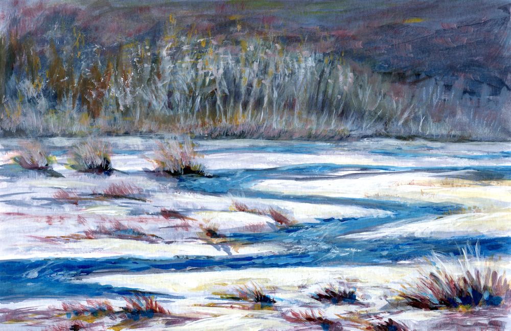
Acrylic by Jo
Completed with additions of mixes of Phthalo Blue and cadmium Red plus some Yellow Ochre
Starting with a warm colour
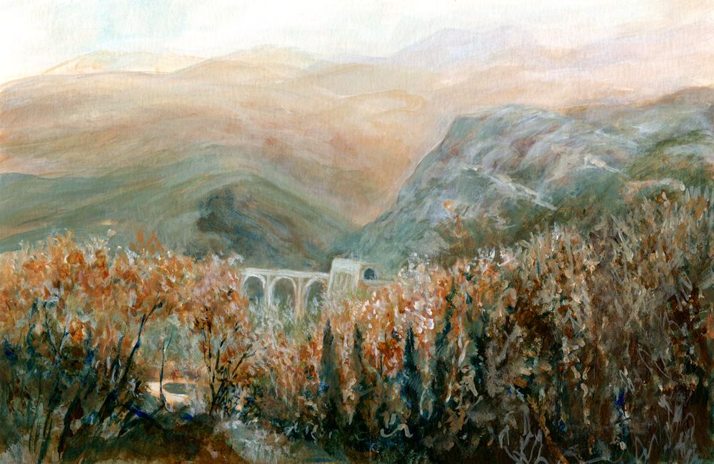
Burnt Umber and white was used for most of the first stages of the painting below, with added mixes of Phthalo Blue. The result was a much warmer sketch. I wanted the bridge to appear set into the landscape more and to show the green colour of the nearer hills. The bridge and tunnel are exactly the same size at each stage shown but note the illusion of the bridge looking smaller when painted closer in tone to its surroundings and the trees painted to cover more of the lower part of the bridge. In the final painting the tiny patch of pale riverbed/path/water, near the bottom left is the point of most contrast and appears much nearer to us than the bridge, reinforcing the illusion of depth in the painting.
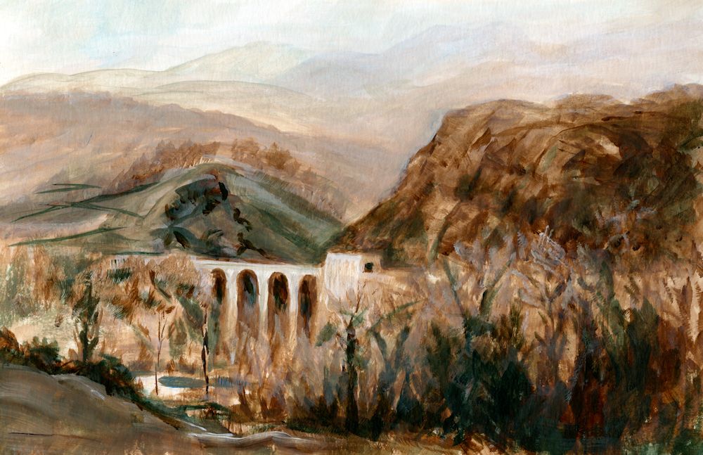
Stage 1: monochrome painting in Burnt Umber and white to
which mixes of Phthalo Blue with Burnt Umber have been added.
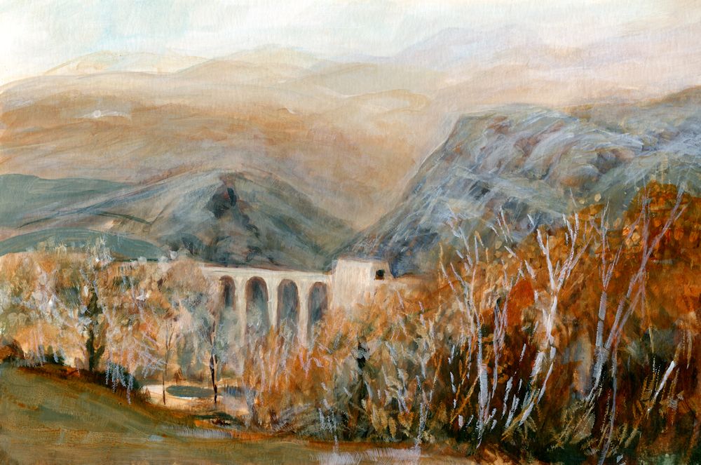
Acrylic by Jo
The completed painting. Although I liked the freshness of the initial colour sketch I wanted the bridge to appear more set into the landscape and to show the greenish tinge of the rocks in that part of the Parma Apennines. The foreground hills were reworked a little and the bridge and tunnel made very slightly darker so that it receded. The foreground and middle distance trees were also worked on and at some stage the bright Sienna foliage on the nearer trees may be reinstated.
Although not as exciting as the initial sketch the finished painting does remind me of a hazy day with the last remnant of Autumn colour in the trees rather than the brightly lit bridge of the first stage. Note how using a cool or warm colour can alter the atmosphere. The cold Phthalo Blue mixed with the warmth of Burnt Umber meant I could choose between keeping the painting warm as in the initial sketch or making it far colder in appearance.
This week I would like you to complete any unfinished work and to make a tonal painting in a rather different way. The challenge is to paint a contre jour subject. This could be a landscape against a bright sky or sunset, or a simple still life in front of a bright window. The subject will not be a completely stark silhouette but may appear dark and with subdued tones against the light.
I have put a few examples of contre jour works on the following Pinterest board, which includes some delightful paintings by Anton Mauve, link below:
https://www.pinterest.co.uk/jhall1282/limited-palettes/contre-jour/
Think carefully about how you would like to start the painting. If it is a sunset landscape it may be good to start by painting the sky especially in a work with trees and a low horizon. If it is a still life in front of a window you may like to paint the dark of the window frame and the objects before painting the light through the window. In either case think carefully about the pigments for the main tonal areas and whether your finished painting will have dark tones that tend toward warm browns or dark tones that tend toward cool blues and greens. Keeping to a restricted palette as we have done over the past few weeks, make a mainly tonal painting of a contre jour subject.
Your paintings:
Almost Monochrome: Week 3
September 14, 2022
Acrylic by Jo
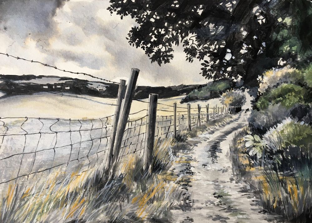
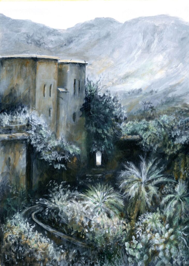
Painted in Indigo, White, Burnt Sienna and Phthalo Green
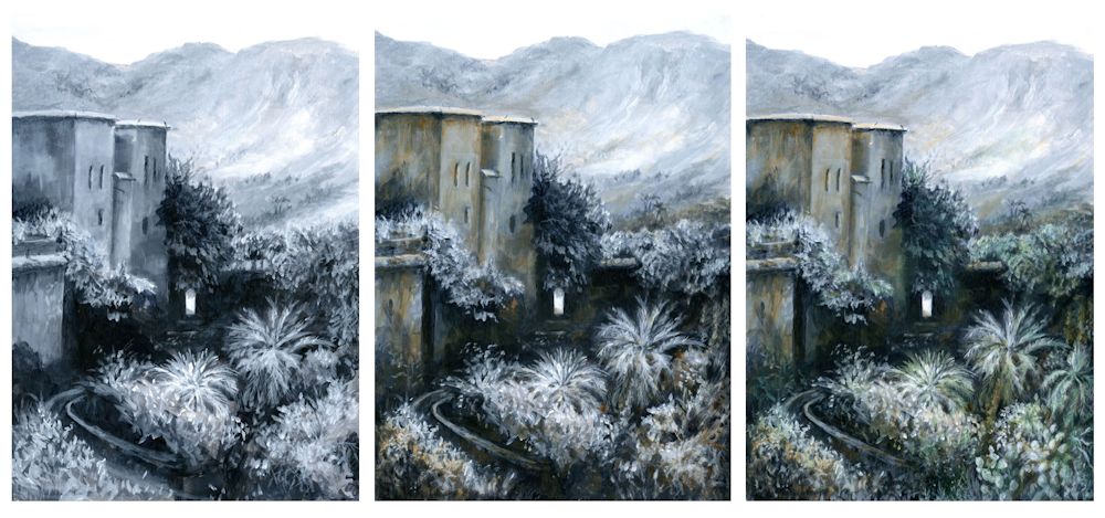
This week I chose to complete the painting of Oumesnat by adding Phthalo Green, alone and in mixes with the Indigo and Burnt Sienna already used. Only small amounts were used so the painting remains largely tonal. It is very different from the study of the barn in Yorkshire where the misty feel was added with opaque scumbles of white, Here everything remains relatively clear and with huge tonal shifts. I did alter some of the foreground vegetation but kept to the chosen pigments.
Choosing the Pigments to suit Your Painting
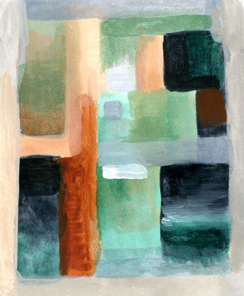
This can only be done by experiment and can be done as shown in the last post, or less formally as below where I have painted Indigo, Burnt Sienna and Phthalo Green unmixed to see how they would look together as saturated colours; mixed with white; and lastly by mixing any or all of these pigments together in varying proportions. Phthalo Green is a very strong pigment so only minute amounts were needed to effect the subtle changes I wanted to make in the painting above.
I like this way of working because you end up with little abstract paintings which can be quite fun in their own right. You may of course choose very different pigments to work with your monochrome base colour. It is also evident that I could have chosen to work in a much brighter way while still maintaining strong tonal contrasts.
This week the challenge will be to either add another hue to the painting or to start a new work. This time choose your main tonal colour but instead of adding the colour after making a purely monochrome work try and incorporate one or two more pigments in a subtle way as you progress. This painting should still rely heavily on tone for its impact but may end up being more colourful than the painting featured in this post. Have a look at the two Pinterest board links below for ideas or look at paintings by Andrew Wyeth, Victor Mirabelli, Alexandre-Louis Jacob or some of the sunset scenes painted by Anton Mauve.
https://www.pinterest.co.uk/jhall1282/limited-palettes/more-colour-subtle/
https://www.pinterest.co.uk/jhall1282/limited-palettes/more-colour-bright/
Choose to work entirely from your own reference or work in the spirit of one of these artists.
Your Paintings:
Almost Monochrome: Week 2
September 7, 2022
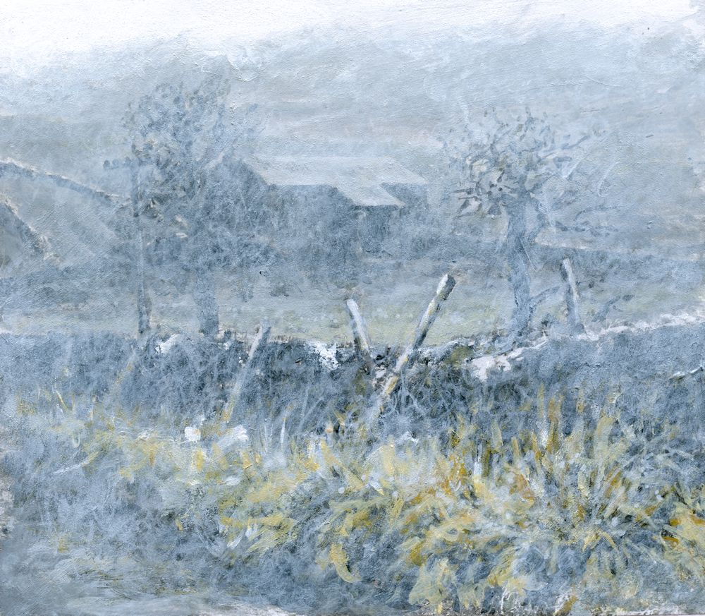
The image above is of the same painting that featured in last week’s post but with white paint “scribbled” rather than scumbled over the surface. The coloured greys took on a greenish tinge as in the chart below.
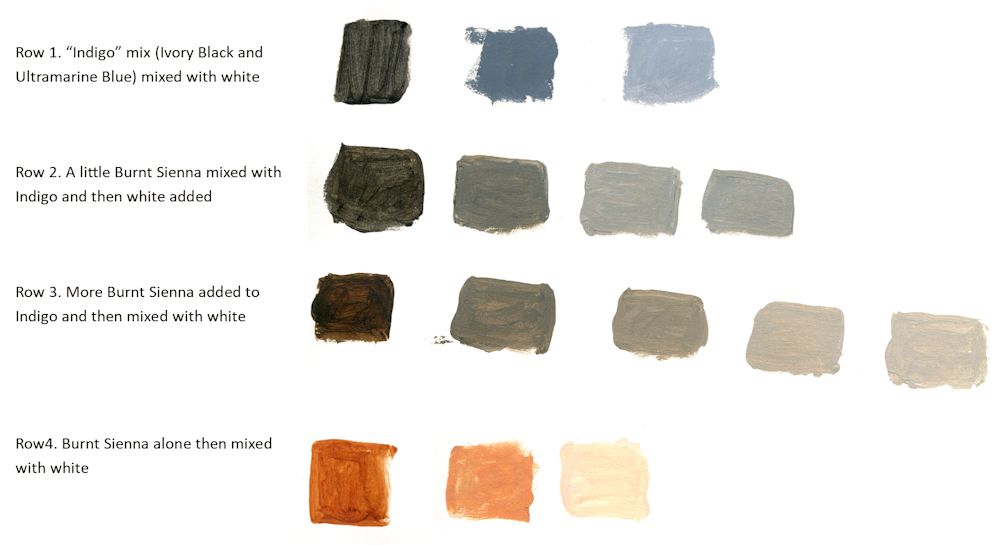
This week I made a large mix of Ivory Black and Ultramarine Blue to make an indigo like colour.
This was then mixed with White and burnt Sienna as in the chart above. Note how much bluer the greys are when indigo is mixed with white. Also note that because Burnt Sienna is much redder than Yellow Ochre their is no greenish tinge to the coloured greys, they just get warmer as more Sienna is added.
Acrylic by Jo
For this painting a large amount of an Ivory Black and Ultramarine Blue mix was made, then a monochrome painting created using this mix with varying amounts of Titanium White
This week we chose a dark pigment; black, burnt umber, Indigo or similar and added varying amounts of white to paint a monochrome picture.
Please photograph your painting at this stage then go on to identify another colour to enrich your painting. Explore a few colour mixes before homing in on the pigment you will use. Then think about how subtle or vibrant you want to make the added colour and make some colour swatches of mixes with white and the dark pigment used for the monochrome study. Last week I added Yellow Ochre; this week I will be adding Burnt Sienna and will post the result in a few days.
Either complete your painting during the week or at next week’s session when we will discuss adding a third colour into the mix. In any event please send an image of your colour mixes and a photo of the monochrome painting.
Your paintings:
Almost Monochrome: Week 1
September 1, 2022
Week 1: Monochrome mixes; plus a colour
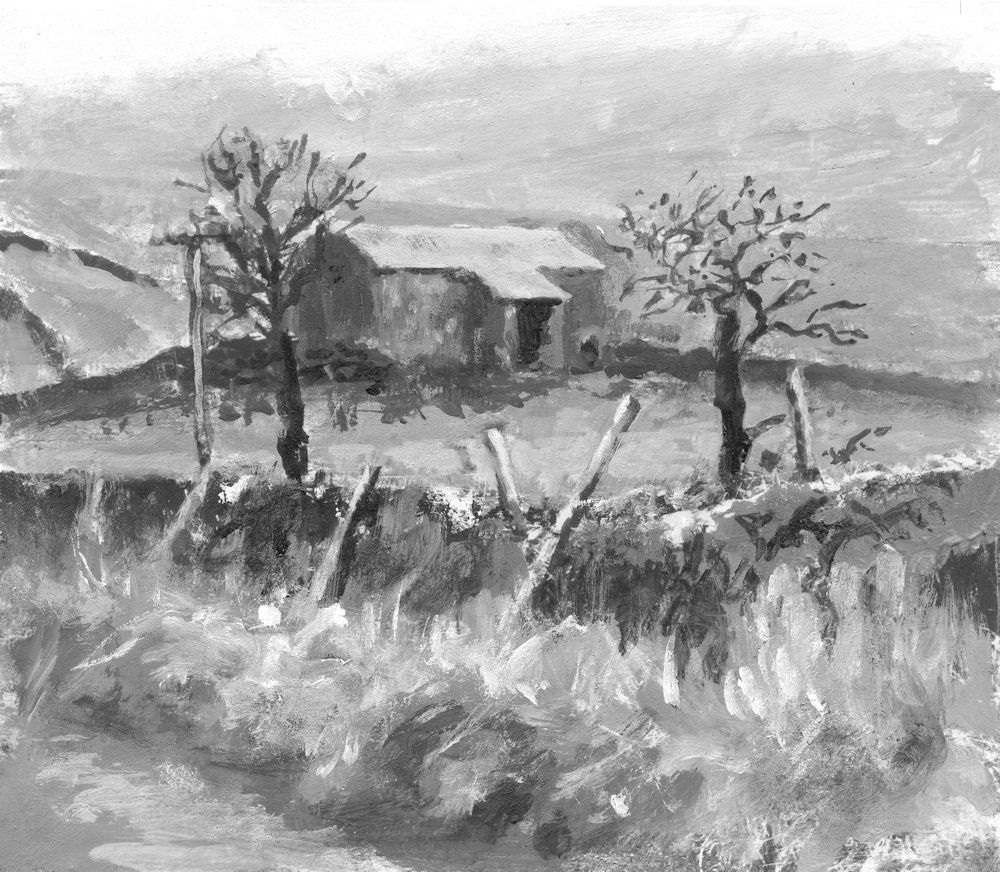
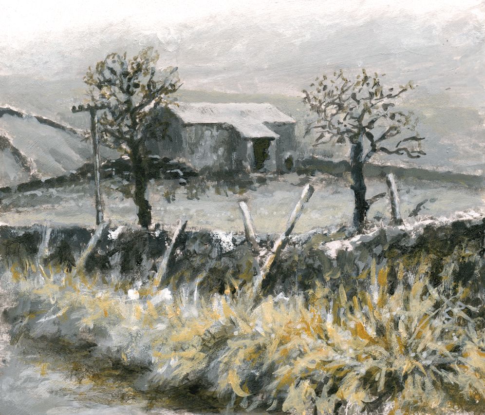
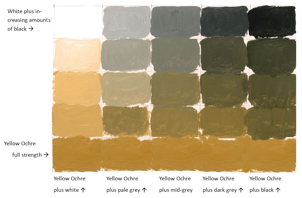
Alone or in mixes with white the Yellow Ochre appears bright and warm, bringing the foreground forward. Where small amounts of Yellow Ochre have been added to pale grey mixes a coloured grey with a greenish tinge resulted. Because the mixes were opaque I was able to modify the tones as well as the colour.
The roof of the barn was left untouched.
See further on in this post for making colour mixes to suit your composition.
Working in monochrome alone can be very dramatic. Introducing a subtle colour can soften this and alter the atmosphere of a painting. Over the next four weeks we will explore some of the possibilities.
Monochrome paintings rely on tone, shape, line and mark making for their impact, and although it is easy always to think of monochrome as a work constructed of black and white plus greys mixed from black and white, artists have used other colours such as Burnt Umber and Prussian Blue in mixes with white as a tonal bases for their work.
All paint hues can be muted either by adding black or by adding small amounts of their complementary colours. For these sessions we will work exclusively with tone and adding colour to black, white and grey mixes rather than using complementary colours, although you may like to work a composition using Neutral Tint/white, sepia or bunt Umber/white, or even Prussian Blue/white mixes as a tonal base.
Have at the ready; titanium White, Black and a few colours; yellow , Yellow Ochre or Raw Sienna, a red, a blue and a lemon yellow or similar pale yellow.
Shades, Muted Colours and Tints
Colours can be muted by adding black to make shades or by adding white to make tints. This range can be extended by adding the colour to greys made with mixes of black and white as below. It is useful to make a range of greys and try adding increasing amounts of a colour to each mix. It is very much the artist’s choice to decide on which parts of a composition will include some colour and which to leave as monochrome.
1.Reference the haunting works of Victor Mirabelli who uses limited amounts of subtle colour in largely tonal paintings of old farm buildings and barns. Google the artist or see a couple of his works and a couple of works by other contemporary artists on the following Pinterest board.
https://www.pinterest.co.uk/jhall1282/limited-palettes/almost-monochrome/
2.Find a landscape reference with an interesting tonal structure.
3.Then make up some colour swatches from black to white and experiment to find what happens when amounts of a different of a colour are added. It may be useful to make a formal grid for at least one colour and a few less formal experiments to home in on the colour that will suit your composition best. An example of how this could be set out is below.
| Monochrome base plus white in this case black | White | Pale Grey | Mid Grey | Dark Grey | Black |
| more white | more grey | more black | |||
| more white | more grey | more black | |||
| more white | more grey | more black | |||
| +white | +grey | +black | |||
| Pure colour e.g. yellow Ochre (YO) | YO | YO | YO | YO | YO |
My attempt this week wasn’t great. The dark grey was too dark! But it will give you the idea:
4.Make your own painting working in monochrome initially, and then working your chosen colour into the mix as appropriate.
During the session I’ll start a painting with a different monochrome base, perhaps using burnt umber or either indigo or a Payne’s Grey (blue shade).
Your paintings:
The next three images are different stages in the development of an oil painting by Virginia
