Almost Monochrome Week 4
September 21, 2022
Every stage of a painting has its merits. Often as in the monochrome painting below, the initial rapid response to the landscape is more exciting than the finished painting.
Starting with a cool colour
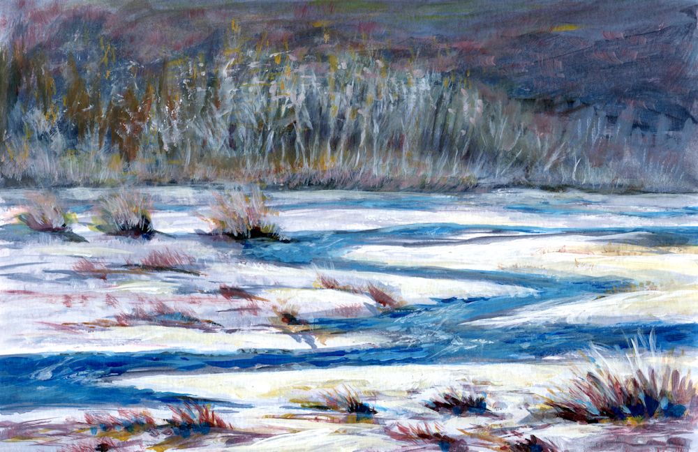
The initial acrylic sketch was made with a cold blue grey made from Cadmium Red Hue and Phthalo Blue, mixed with white. The painting was completed with purplish reds made with Cadmium Red and Phthalo Blue, almost pure Phthalo Blue and white form much of the water and adding Yellow Ochre into the mix for some of the vegetation.
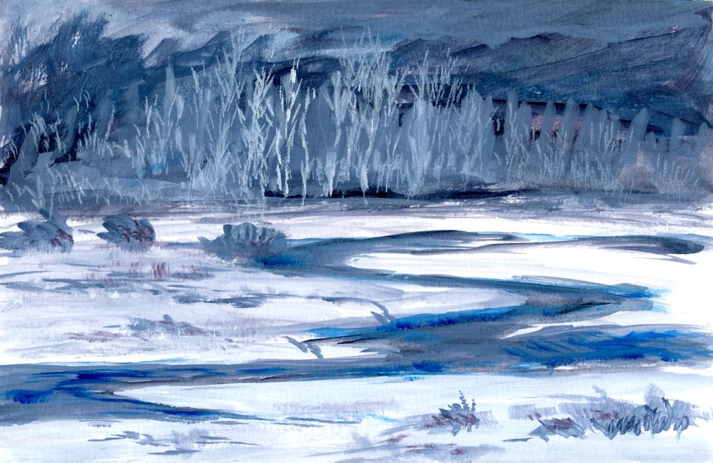
Stage 1: A large amount of a mix of Phthalo Blue and Cadmium Red Hue was made to make a cool blue grey and a basic monochrome sketch made in acrylic. Some further Phthalo Blue mixed with a little white was added in places. This will form a monochrome structure for a more colourful painting.
Acrylic by Jo
Completed with additions of mixes of Phthalo Blue and cadmium Red plus some Yellow Ochre
Starting with a warm colour
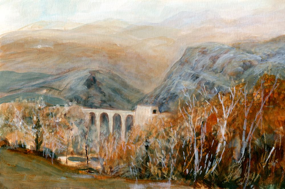
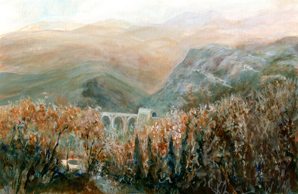
Burnt Umber and white was used for most of the first stages of the painting below, with added mixes of Phthalo Blue. The result was a much warmer sketch. I wanted the bridge to appear set into the landscape more and to show the green colour of the nearer hills. The bridge and tunnel are exactly the same size at each stage shown but note the illusion of the bridge looking smaller when painted closer in tone to its surroundings and the trees painted to cover more of the lower part of the bridge. In the final painting the tiny patch of pale riverbed/path/water, near the bottom left is the point of most contrast and appears much nearer to us than the bridge, reinforcing the illusion of depth in the painting.
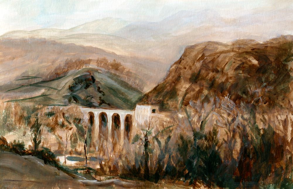
Stage 1: monochrome painting in Burnt Umber and white to
which mixes of Phthalo Blue with Burnt Umber have been added.
Acrylic by Jo
The completed painting. Although I liked the freshness of the initial colour sketch I wanted the bridge to appear more set into the landscape and to show the greenish tinge of the rocks in that part of the Parma Apennines. The foreground hills were reworked a little and the bridge and tunnel made very slightly darker so that it receded. The foreground and middle distance trees were also worked on and at some stage the bright Sienna foliage on the nearer trees may be reinstated.
Although not as exciting as the initial sketch the finished painting does remind me of a hazy day with the last remnant of Autumn colour in the trees rather than the brightly lit bridge of the first stage. Note how using a cool or warm colour can alter the atmosphere. The cold Phthalo Blue mixed with the warmth of Burnt Umber meant I could choose between keeping the painting warm as in the initial sketch or making it far colder in appearance.
This week I would like you to complete any unfinished work and to make a tonal painting in a rather different way. The challenge is to paint a contre jour subject. This could be a landscape against a bright sky or sunset, or a simple still life in front of a bright window. The subject will not be a completely stark silhouette but may appear dark and with subdued tones against the light.
I have put a few examples of contre jour works on the following Pinterest board, which includes some delightful paintings by Anton Mauve, link below:
https://www.pinterest.co.uk/jhall1282/limited-palettes/contre-jour/
Think carefully about how you would like to start the painting. If it is a sunset landscape it may be good to start by painting the sky especially in a work with trees and a low horizon. If it is a still life in front of a window you may like to paint the dark of the window frame and the objects before painting the light through the window. In either case think carefully about the pigments for the main tonal areas and whether your finished painting will have dark tones that tend toward warm browns or dark tones that tend toward cool blues and greens. Keeping to a restricted palette as we have done over the past few weeks, make a mainly tonal painting of a contre jour subject.
Your paintings:
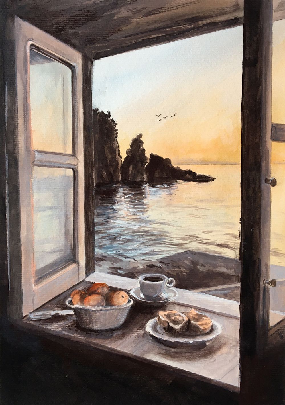
Acrylic by Maryon
The still life in the window, the window frame and the rocks in the water are all seen against the light, but the panes of the open window reflect the light.
Colours used are black with burnt umber and white for the greys, plus orange and blue lake.