Monthly Archives: March 2020
Draw a Flower at Different Stages of Opening: charcoal and pastel
March 30, 2020
This week’s challenge is to find a flower and draw it from bud to full flower. You may still have daffodils and there are loads of primroses, periwinkles and flowering shrubs and very soon we will have tulips. Look especially at the relation between the stem and the flower head and the axis of the flower. The daffodil in bud follows a line almost straight from the stem and then the stem bends down sharply as the flower opens. The trumpet starts as a cone behind the petals and is aligned with the new stem direction. Look at how the petals attach near the base of the trumpet and how seen from the front the petal tips lie on a circle. As you turn the flower head around the tips lie on an increasingly shallow ellipse till you see the flower in profile.
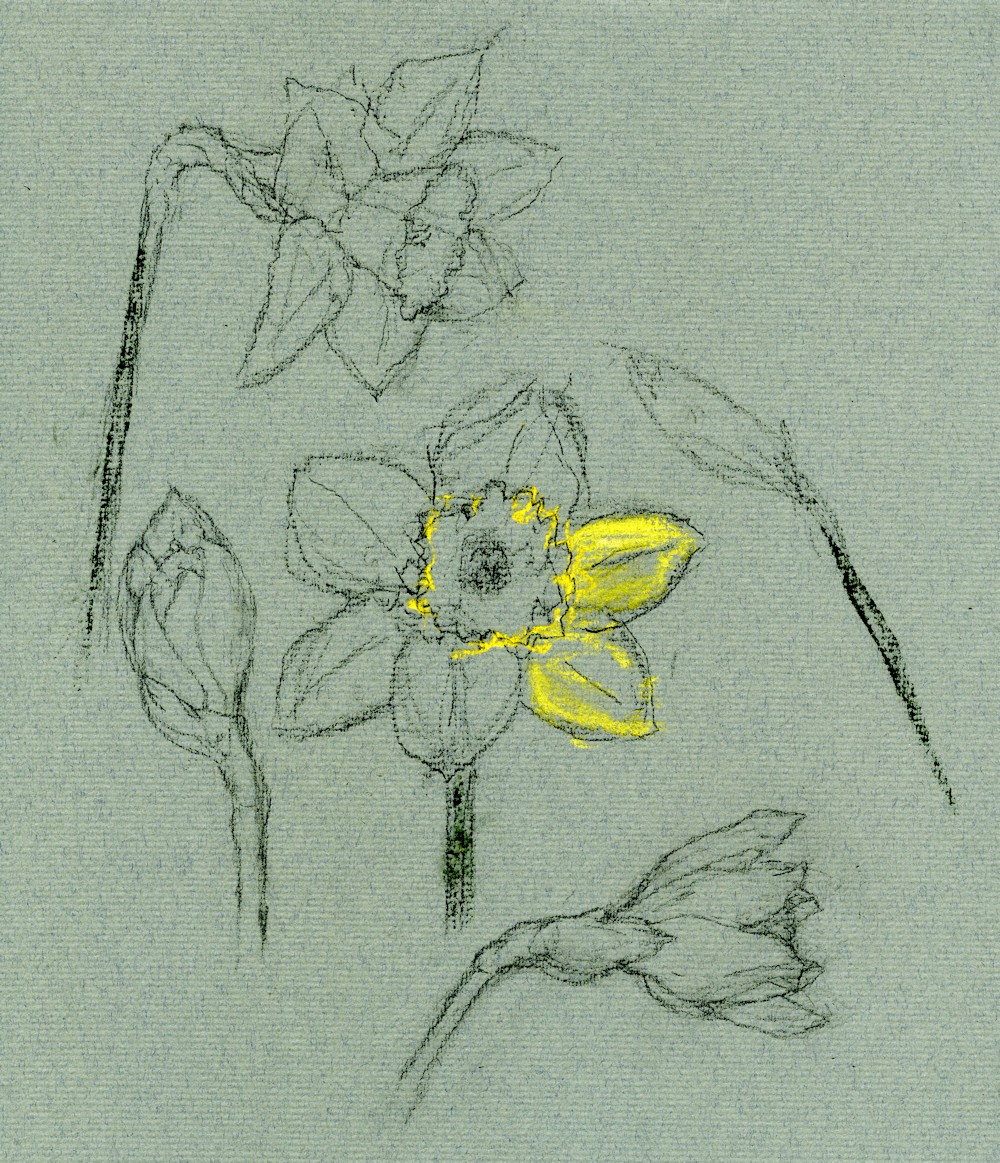
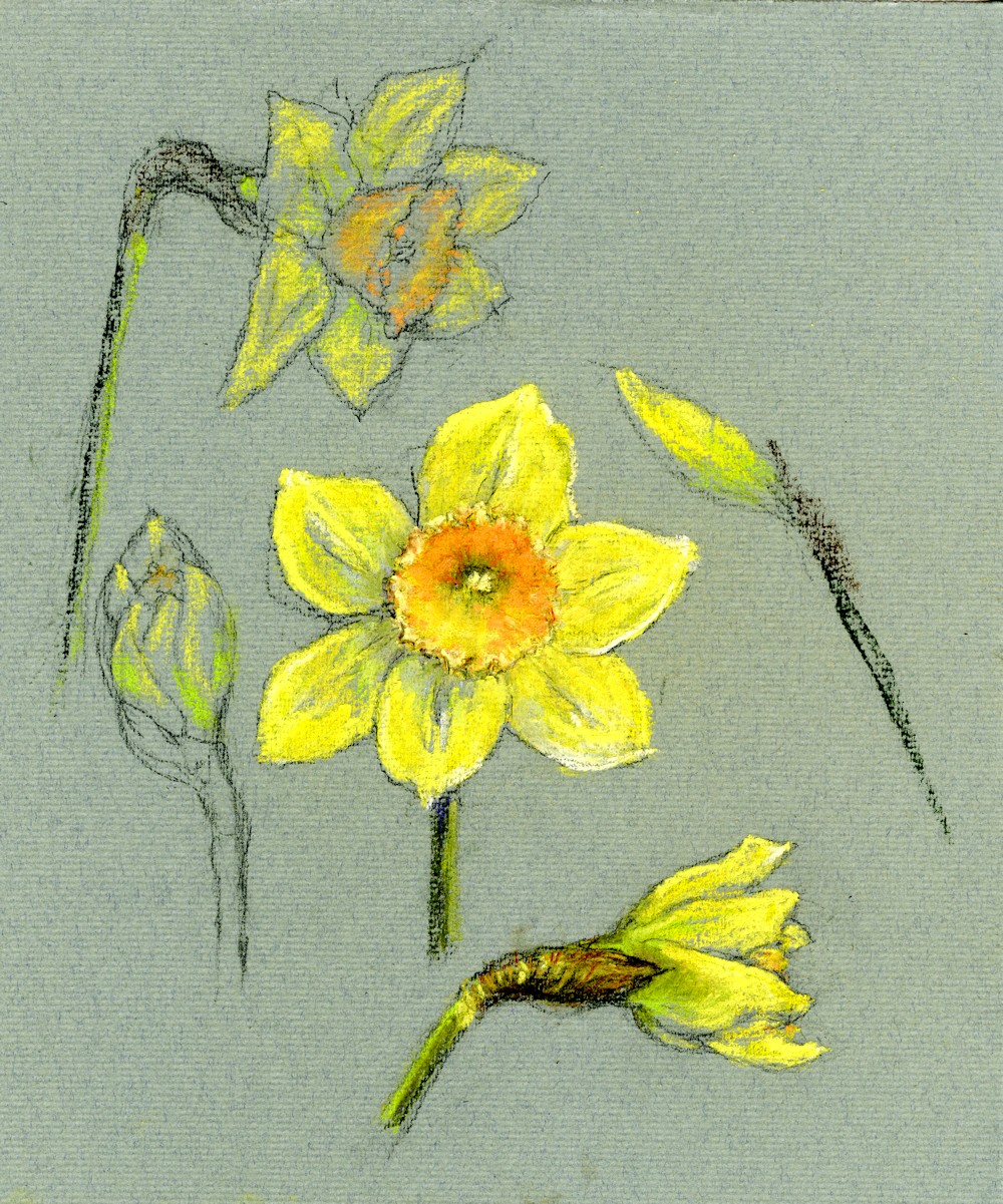
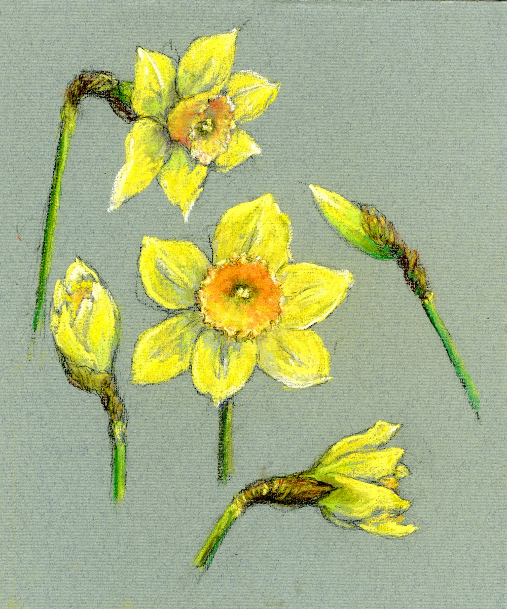
In June we’ll see the poppies emerge doing the opposite, their buds dangling till they open then turn up to face the sun! The daffodil example was drawn in charcoal on green Ingres paper and then layers of soft pastel were applied to finish.
The Response: Your Drawings

Opaque and Transparent Colours: Acrylic
This is the first of my art challenges for Art Challenge Tuesday which I hope to publish every Tuesday on this blog. Hopefully it will be a good way to cheer everyone up till we can meet again face to face. I have been running a course on watercolour and acrylic glazing techniques for my group at Norden Farm and will be running a similar course in the autumn for another group.
Sadly the isolation rules came in half way through the course, so the project below exploring acrylic glazing techniques has already been sent to that group by e-mail. Below is a bit of a recap plus a few of the things we would have explored in the remaining Tuesday sessions.
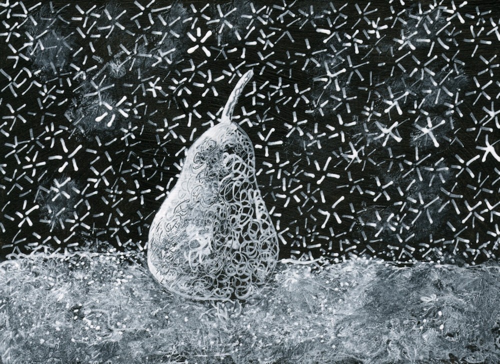
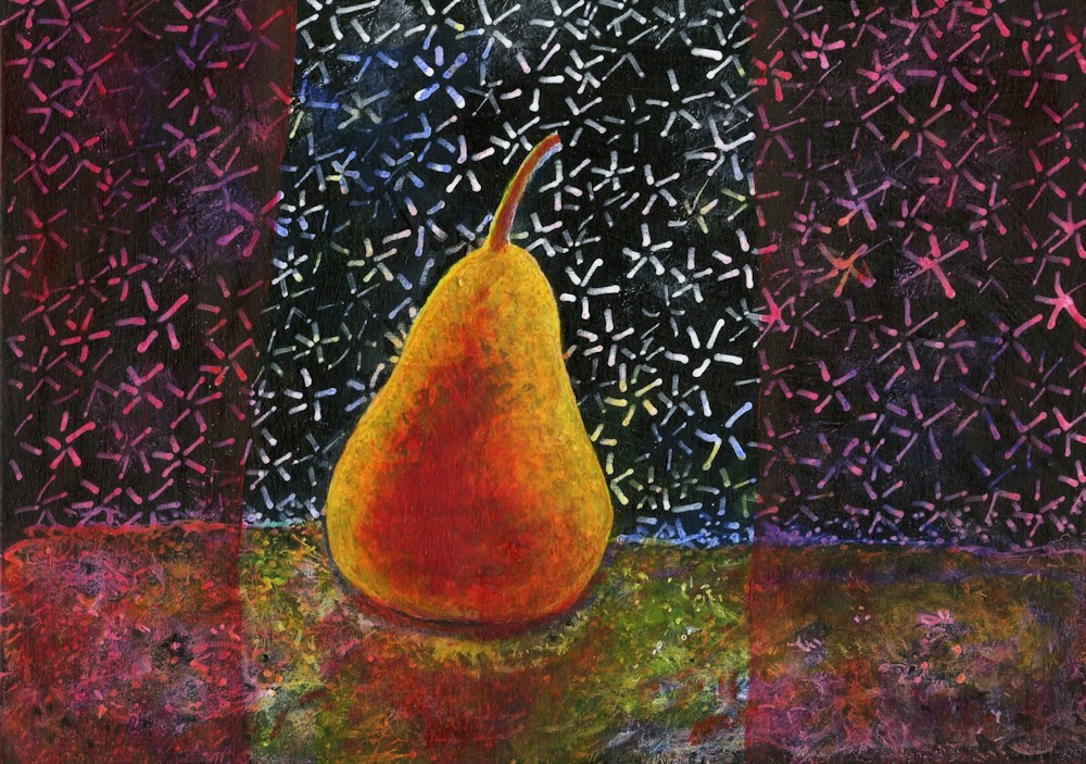
Acrylic: Opaque and transparent colours
To explore grisaille (working in monochrome) and glazing techniques we have been producing under paintings in greyscale and then adding layers of transparent glazes to colour them. It’s obviously important to know which the transparent colours in your box are, so here are a couple of things you may like to try.
Number one may be a bit basic for some of you but have a look and do what you feel like attempting.
- Opaque and transparent colours
To find which paints in your box are transparent
Paint half a small sheet of thick paper with black and half with white.
Paint a stroke of colour across the white and black.
Opaque paint will obliterate the join where black meets white.
Very transparent colours that contain no white will almost disappear on black making the surface look rich and shiny. Dioxazine purple and phthalo blue and green will do this.
However they won’t if the tube also contains any white.
To keep working transparently always mix your transparent paints with medium or water NOT WHITE.
Most yellows are either opaque or translucent. Translucent colours become more transparent when diluted.
Judging how much to dilute pigments for glazing.
Sometimes you will require quite an intense glaze and at others you will want just the merest hint of colour to tint your painting.
You can practice different strengths of pigment by glazing on newsprint that either has text or greyscale images. You need only glaze small areas but if you have time do glue the newsprint down on a sturdier piece of paper first with some acrylic medium.
When dry paint over with acrylic colour. Try different colours and make a note of which colours are transparent when dry.
Diluting acrylic paints;
Do the same thing with more dilute pigments.
Dilute with water or acrylic medium.
Medium makes it easier to blend pigments and to control where the paint is laid down. Acrylic mediums usually appear milky when wet but dry transparent. Diluting with water makes the paint behave more like water colour.
Always add a tiny amount of paint to the medium or water not the other way round or you may waste a lot of paint. You can always add more but generally you won’t need as much paint when you are tinting an underpainting than when working in colour from the start.
These are experiments so can be done on a very small scale.
They will help you find the right paint dilution for your purpose.
You can also experiment with overlaying different colours but always ensure one layer is dry before adding the next.
- Subtle and bright glazes
3a. If you have access to a photocopier you could photocopy a landscape or room interior in greyscale on to watercolour or other substantial paper. It would be great to make two copies of the same image and glaze one in a very subtle way with very dilute glazes and a much more vibrant version with bolder colours and some more concentrated colour.
It is always best to use your own photos if possible.
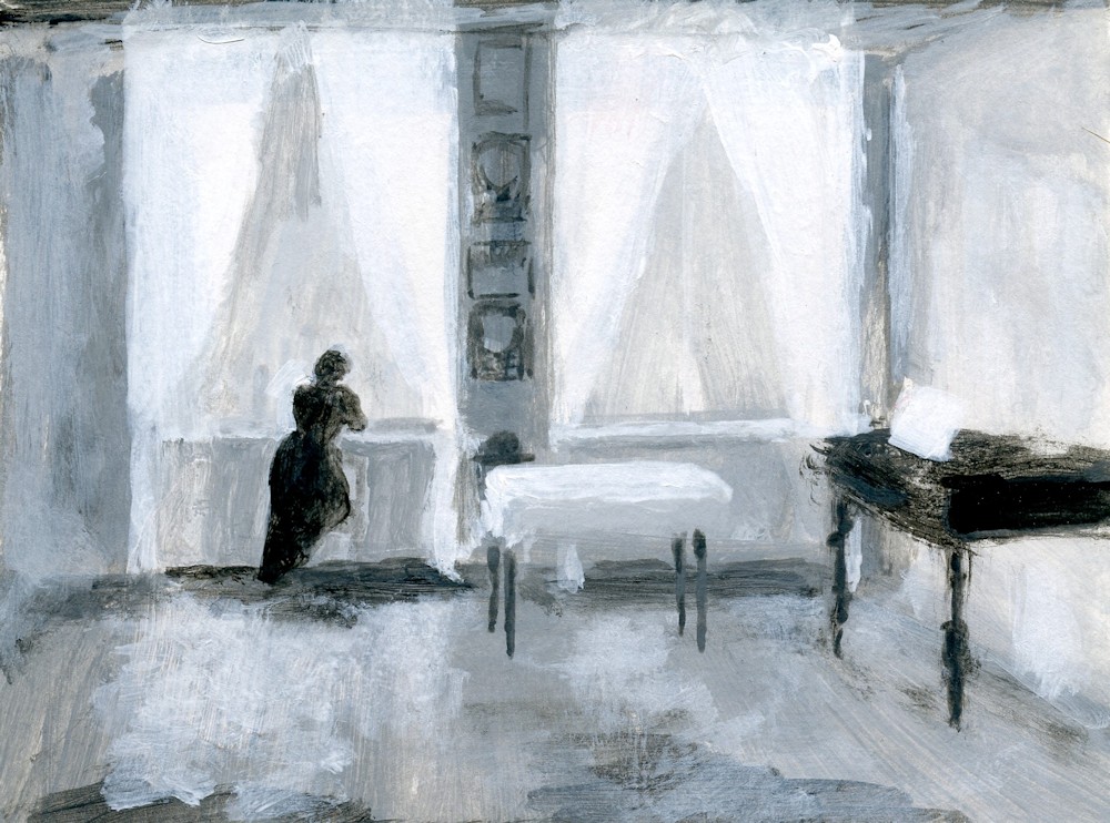
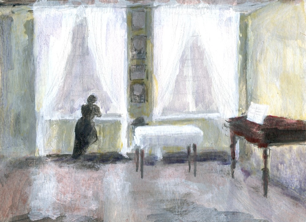
3b. Make two similar under paintings in greyscale for a simple composition, then glaze with colour to produce a subtle version and a more vibrant one. Take care with the tones in your under painting. Think about the fact that every time you add a layer of transparent paint that area will become darker. Make sure you paint some white areas for the palest glazes and any areas that will remain white. However, with acrylic if you haven’t got the tones quite right you can always repaint with white or the right shade of grey and add more glazes.
You could choose to make your versions of a Matisse interior for this exercise; judging the tones will be a challenge. Or you could make your version of a Hammershøi interior. His paintings are very tonal with very subdued colour, so getting the under painting right will be much easier. It would be a good exercise to do one version with subtle glazes echoing Hammershøi’s use of colour, and a second with vibrant glazes of bright transparent colours. Remember in either case you can glaze part or all of the painting and you can further modify the colour and tone by overlaying glazes.
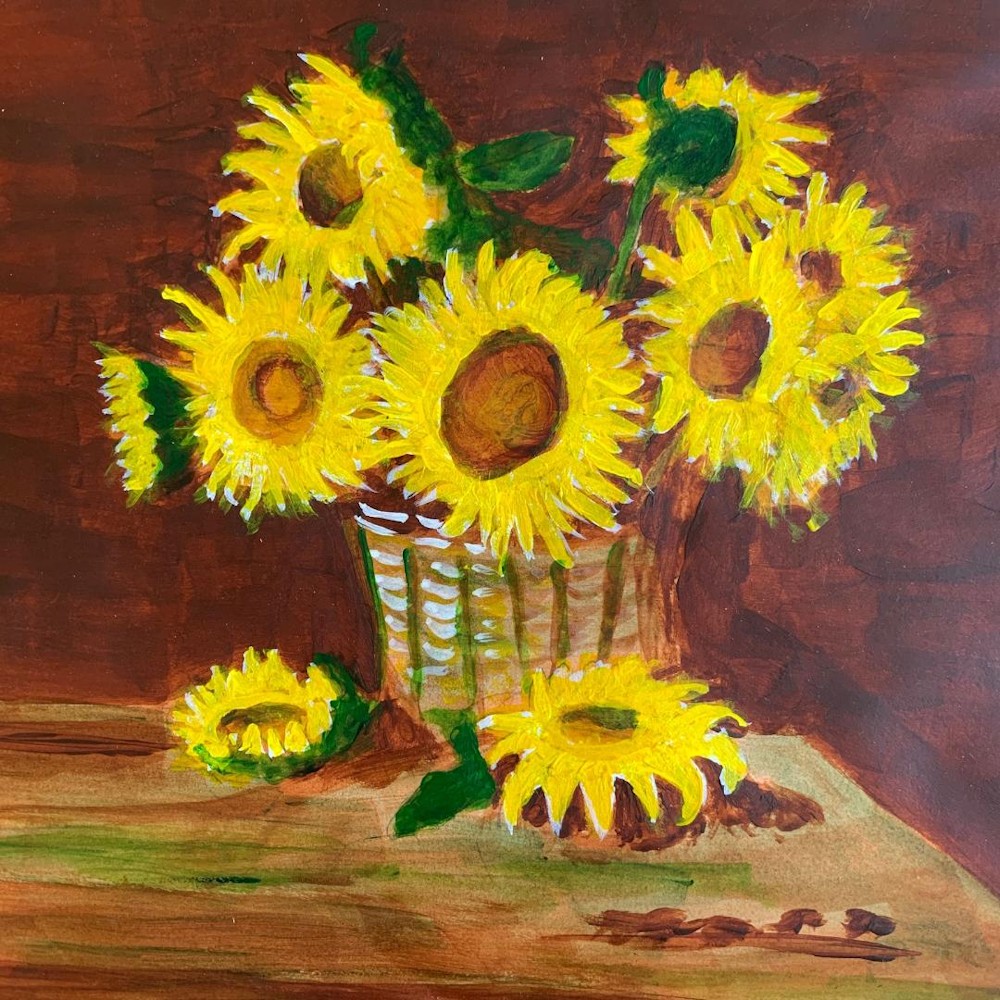
The response: Your Paintings
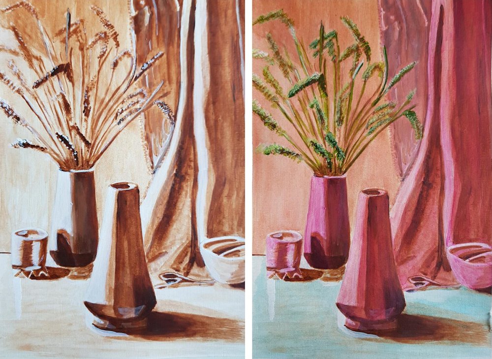
Acrylic by Angela

by John
Monochrome study with added green and then yellow glazes by John

Underpainting and finished work by Liz