Monthly Archives: May 2022
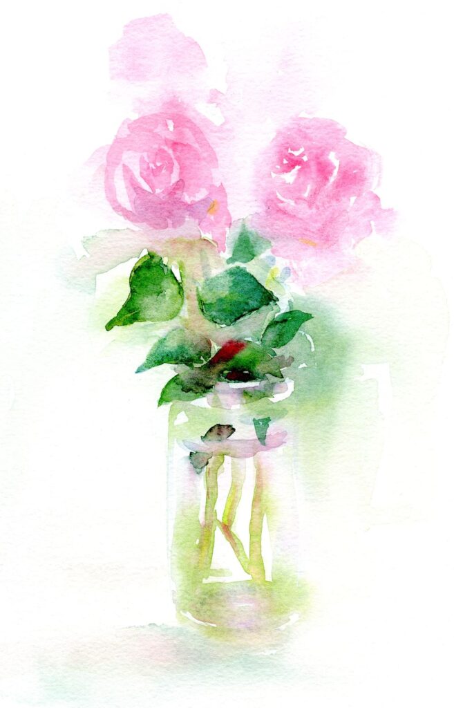
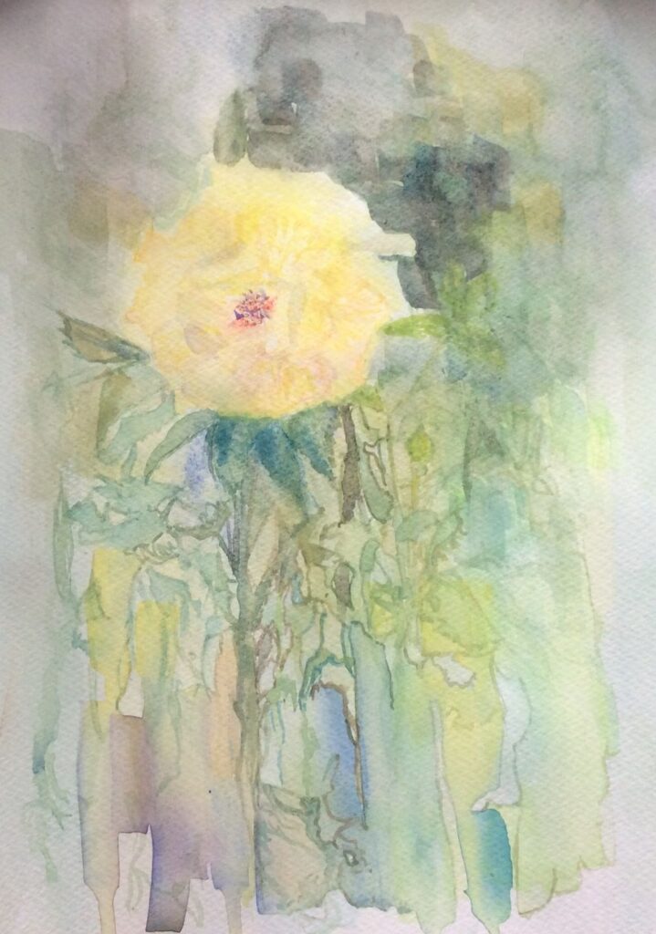
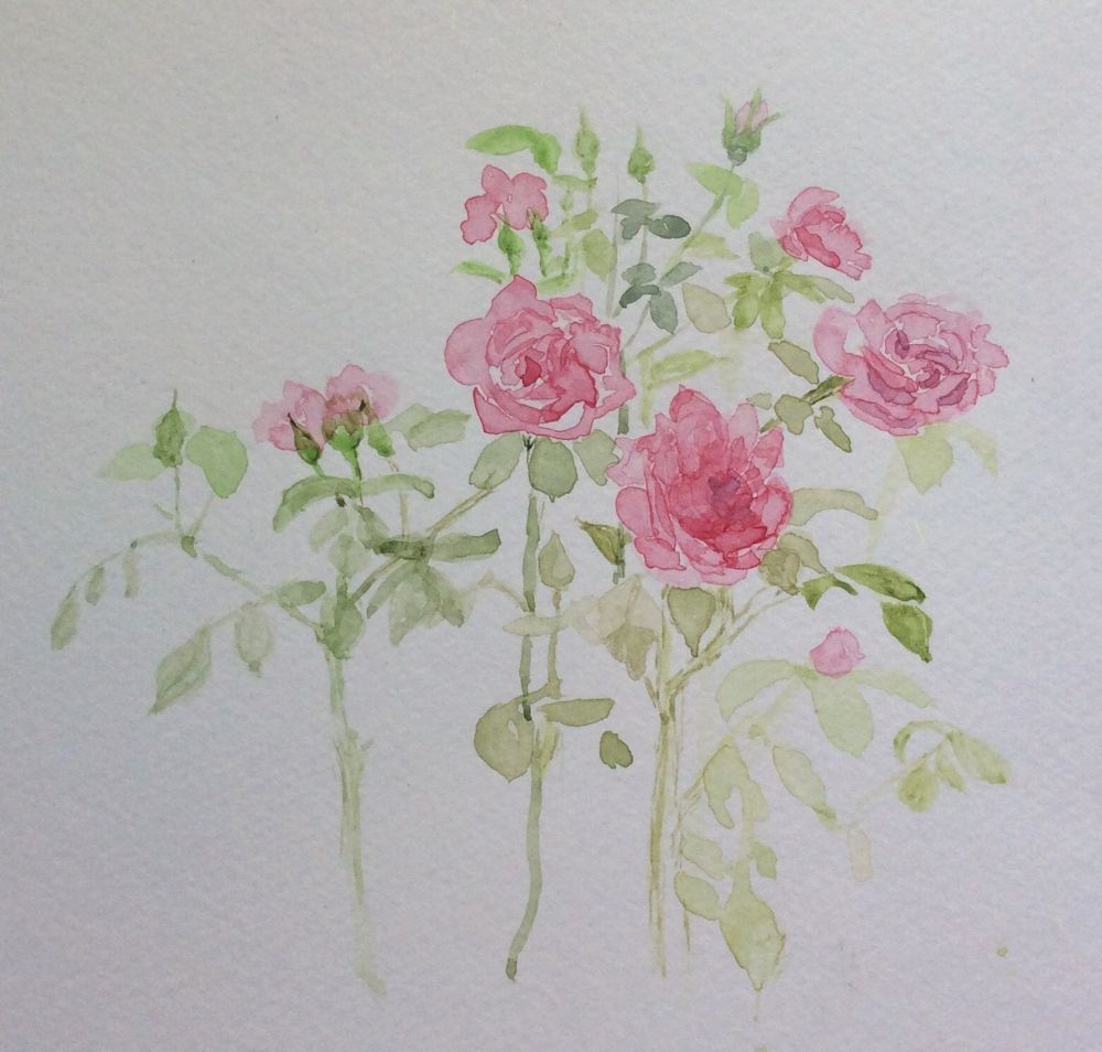
Watercolour Flowers Week 5: Rose
May 27, 2022
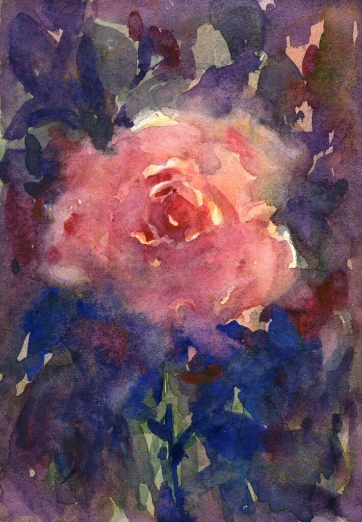
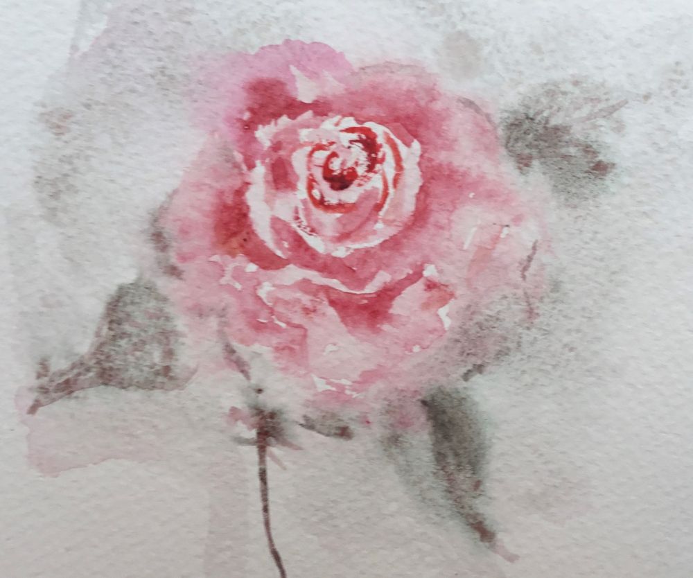
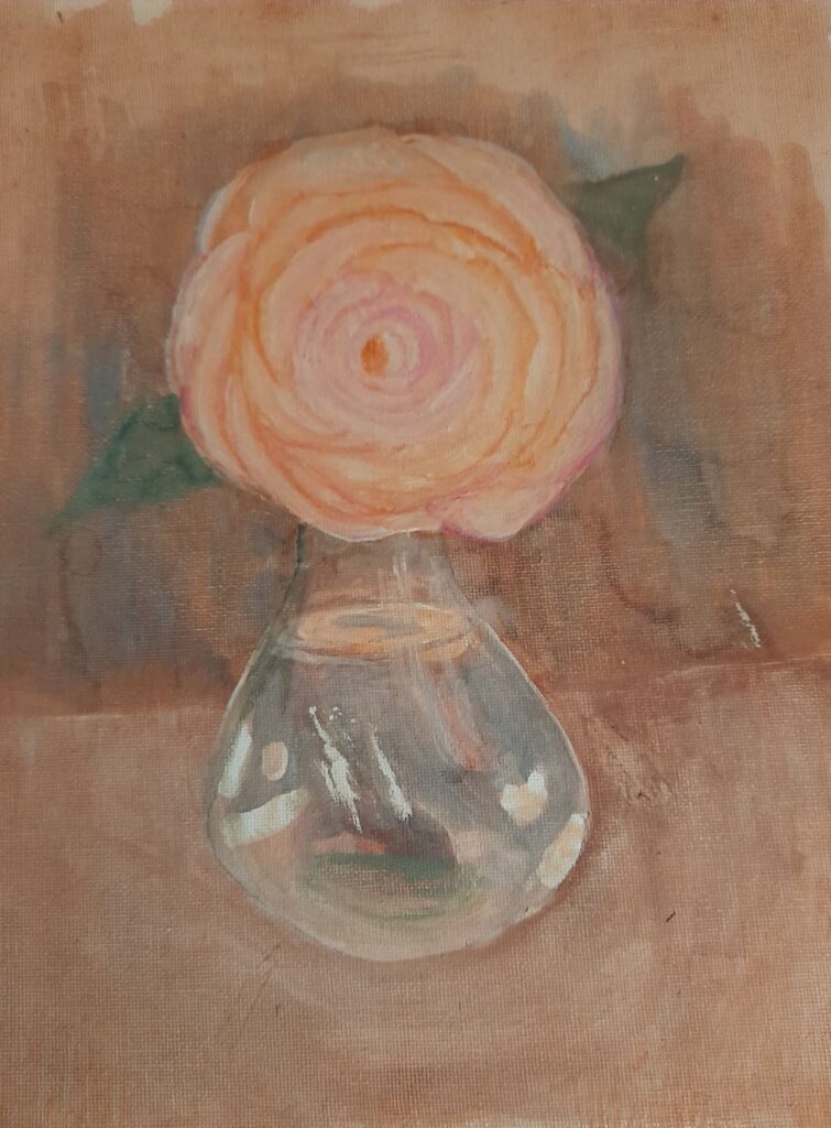
Painted mainly wet in wet
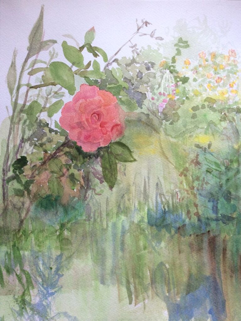
This week’s challenge is to paint a single rose or small group up to two and a bud. We’ll try two ways of working one largely wet in wet and also perhaps look at the use of masking tape in addition to the masking fluid used last week to make some interesting textures and compositions.
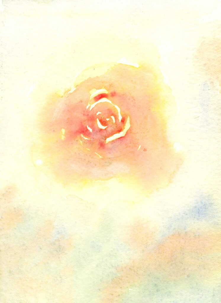
I could have stopped there.
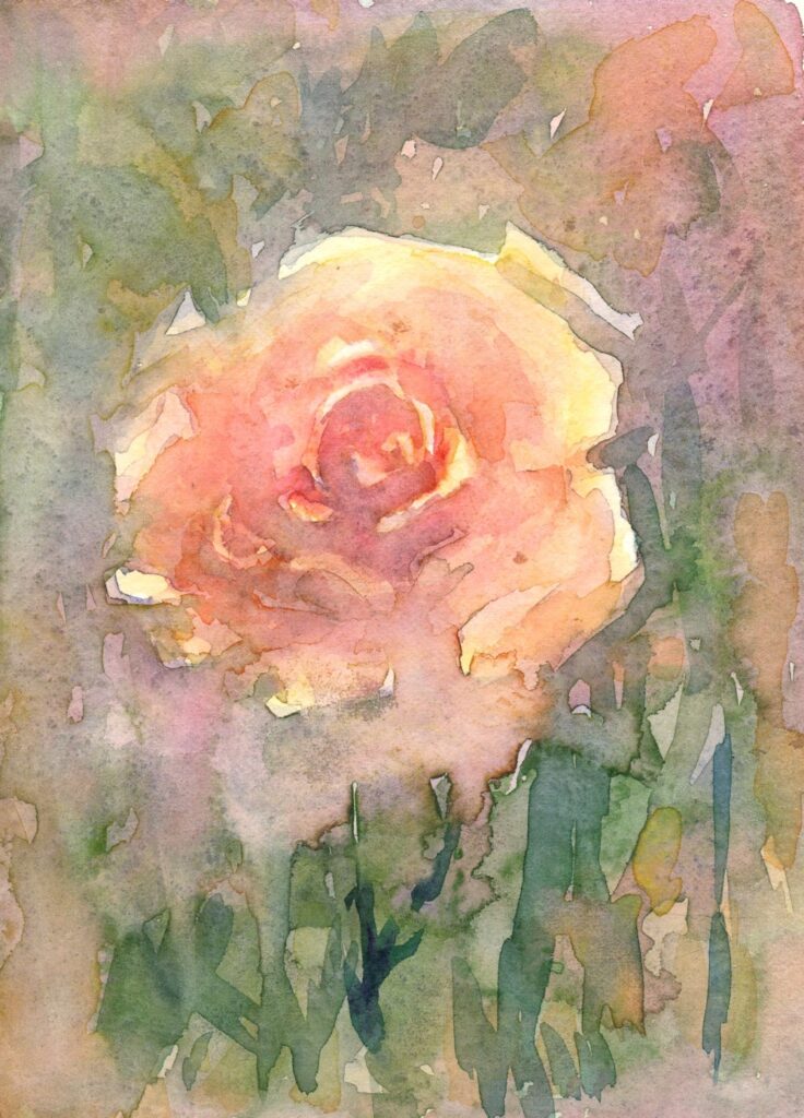
Much of the time will be spent looking and choosing the pigments best suited to your particular rose, thinking in terms of using no more than three pigments.
1. Look at tone;
Thinking tonally becomes even more important when painting single flowers so it is important to take note of how light falls on the bloom. In strongly directional light the darker side of even the palest rose may appear quite dark. Conversely the better lit side of the deepest rose may appear surprisingly light in colour. Observe how the light affects each individual petal revealing their spiral arrangement. If a flower is seen against the light as when placed in a window with the light behind it, the whole form may appear dark and almost silhouetted against the incoming light.
2. Look at the form and shapes;
Try turning your rose so that you are looking straight down at the flower and take note of the spiral arrangement of its petals. Then turn it slightly away from you and notice how different it looks, finally turn the flower so you are looking at it from the side. It may be helpful to make rapid sketches of your rose at these different angles to familiarise yourself with the shapes.
3. Choose pigments
Decide on the pigments best suited to paint your rose. Try to limit this to three. This will help unify the study and help prevent muddy mixes especially if you are able to use transparent colours for most of the painting. Try out mixing colours in the palette as well as seeing what happens when one colour is dropped into another while it is still wet.
4. Background;
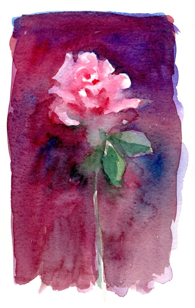
Rich dark background
Pale background giving a much cooler look.
The background may be composed of the foliage surrounding the bloom, a colour and tone which is observed or may be your choice. The hue and tone of the background will greatly affect the mood of the study. Another important element will be to decide on the tone and hue of the background which can greatly affect the mood of the painting.
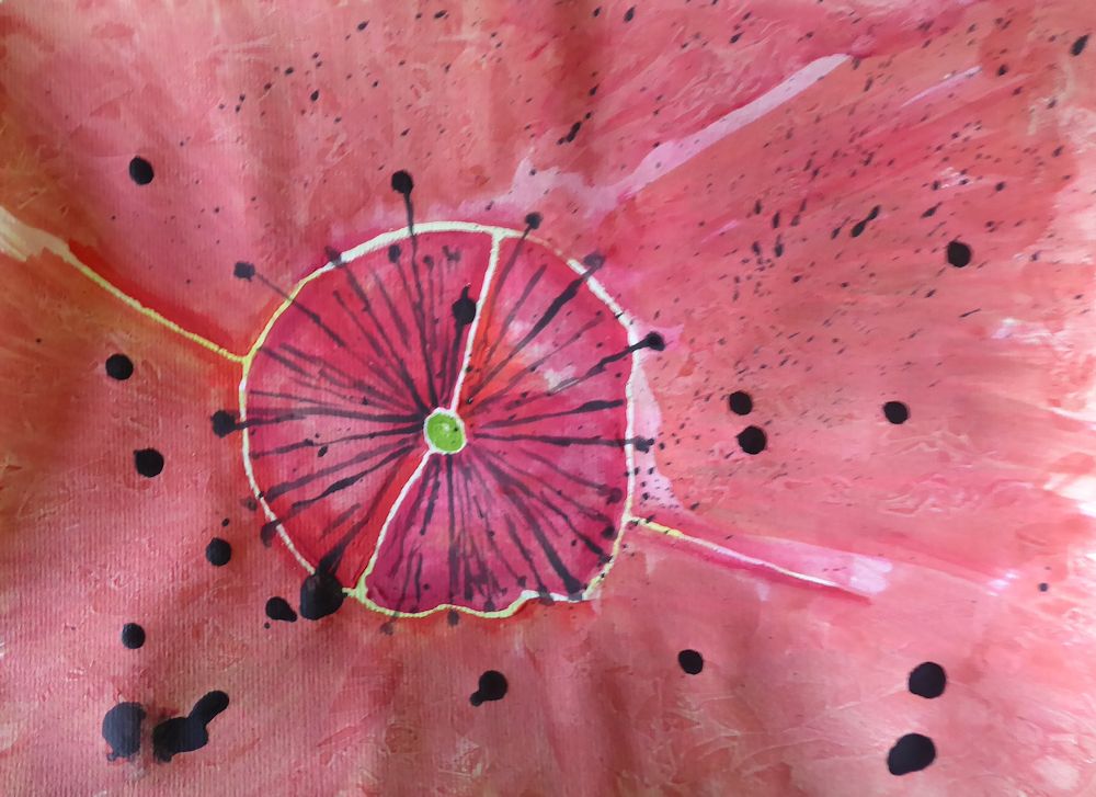
Another interesting approach to have fun with the composition and the background is to apply some initial washes and allow them to dry and then apply low tack masking tape. The demonstration below is how last week’s composition has developed so far. This could easily be done with a much simpler study and can be very useful if your background is a window or edge of a wall.
This was painted into in places, allowed to dry thoroughly before carefully removing the tape.
Further washes were then applied.
In this week’s session I will start a wet in wet rose and while the first washes dry I’ll progress the posy, adding more washes, a few details and a little gouache. Some of the masking fluid was very free mark making so now it has been removed I have a rather different painting to develop!
Do take a look at Trevor Waugh’s roses, Pinterest link below: https://www.pinterest.co.uk/jhall1282/flower-painting-in-watercolour/trevor-waugh/
and another look at Shirley Trevena’s work at
https://www.pinterest.co.uk/jhall1282/flower-painting-in-watercolour/shirley-trevena/
Have some small pieces of cold pressed watercolour paper at the ready or tape off some areas on a larger sheet for your wet in wet studies of a single rose. There is then scope for allowing washes to dry while another study is started.
A hair dryer greatly speeds the process!
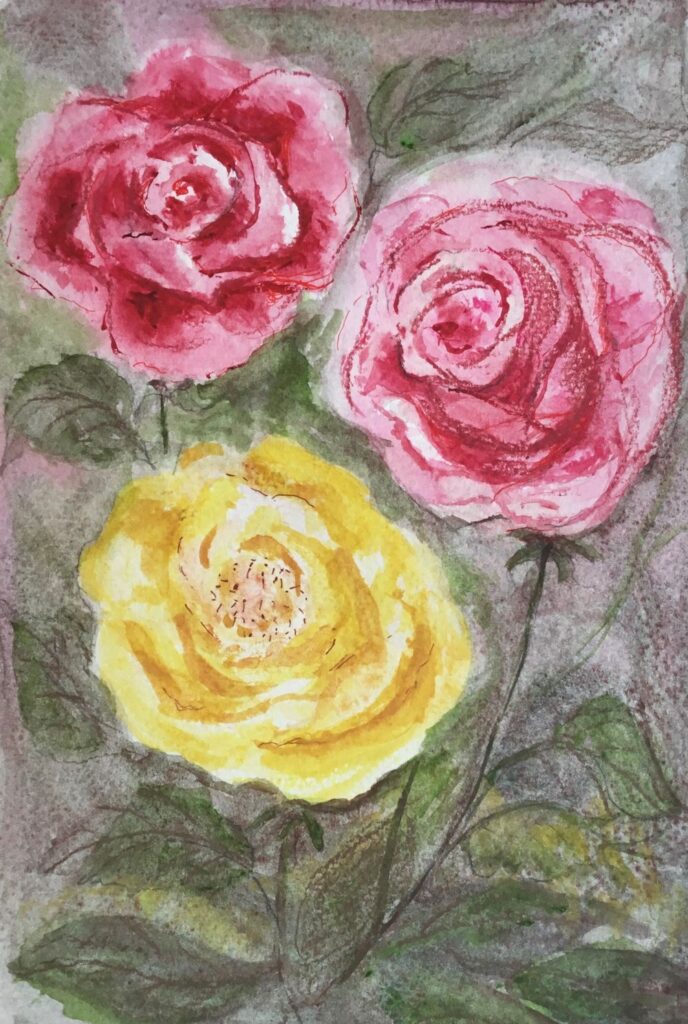
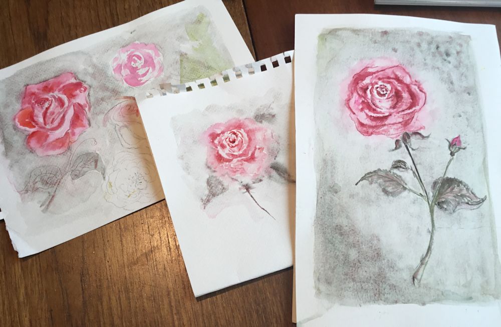
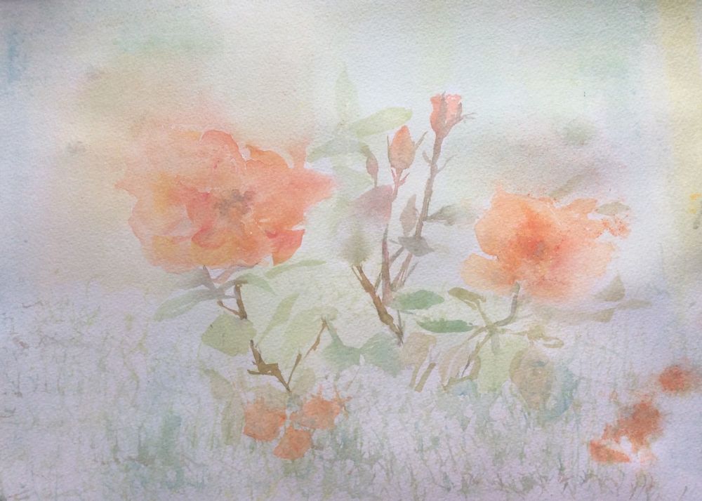
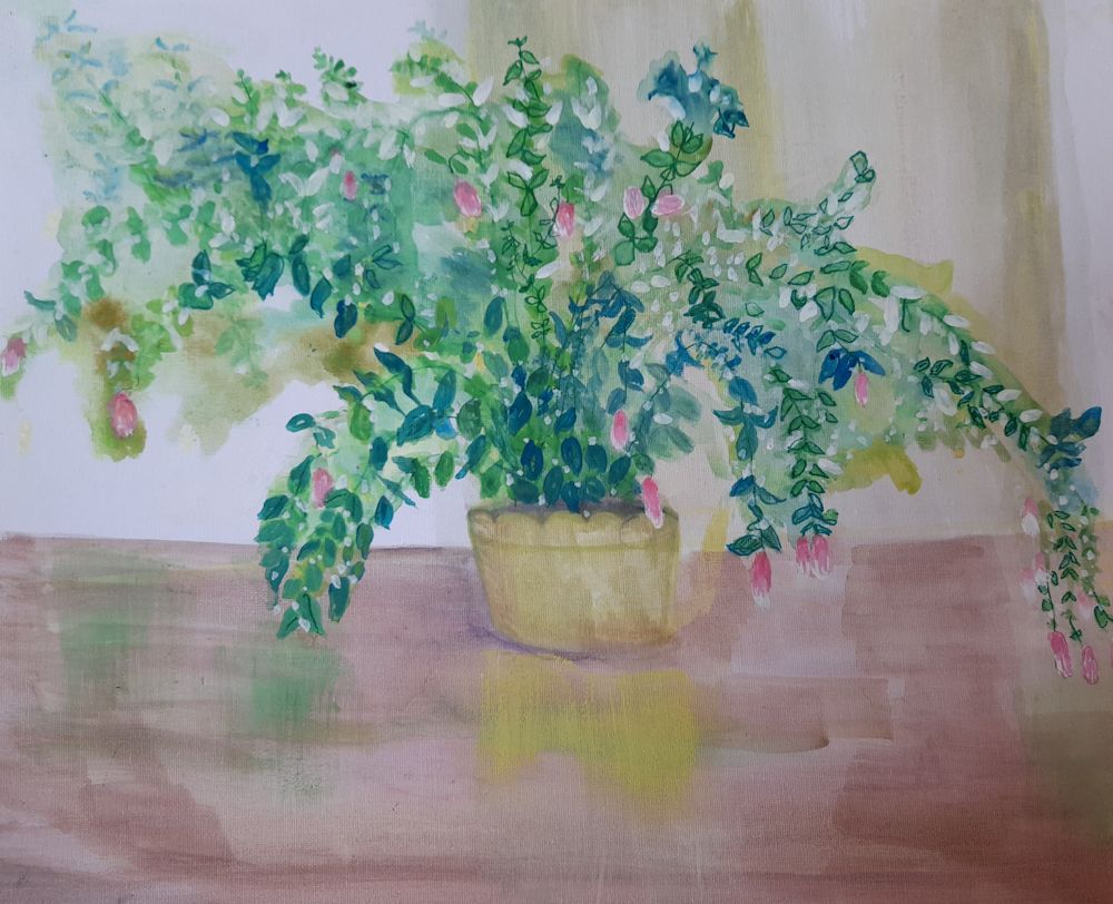
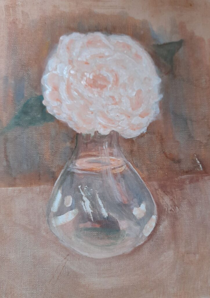
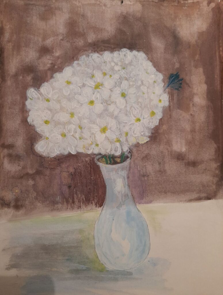
Your Paintings;
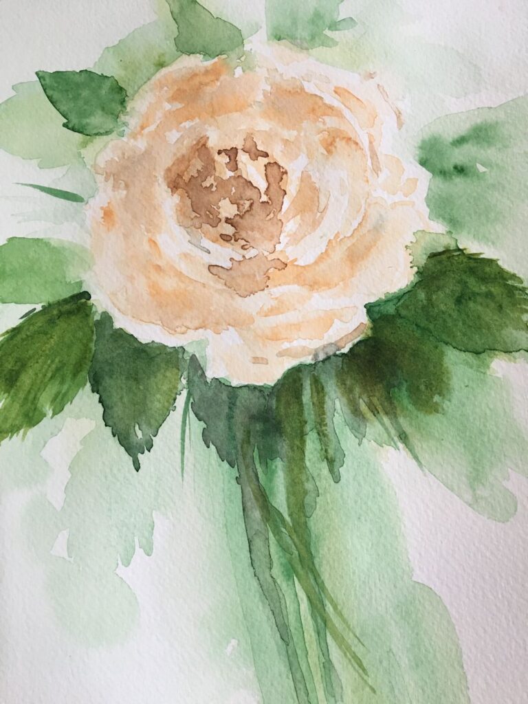
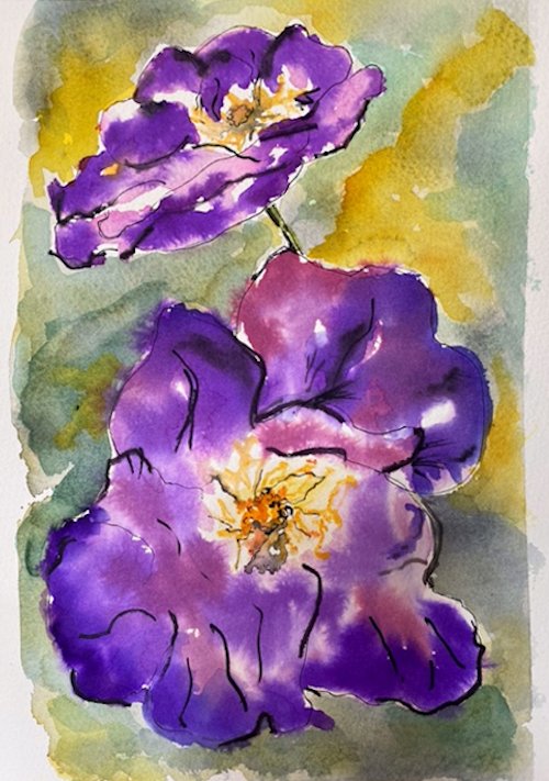
Painted wet in wet by Ann
by Ann
Started with wet in wet washes and then developed with drawing media
by Ann
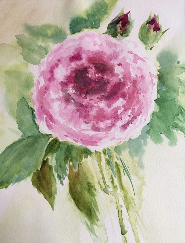
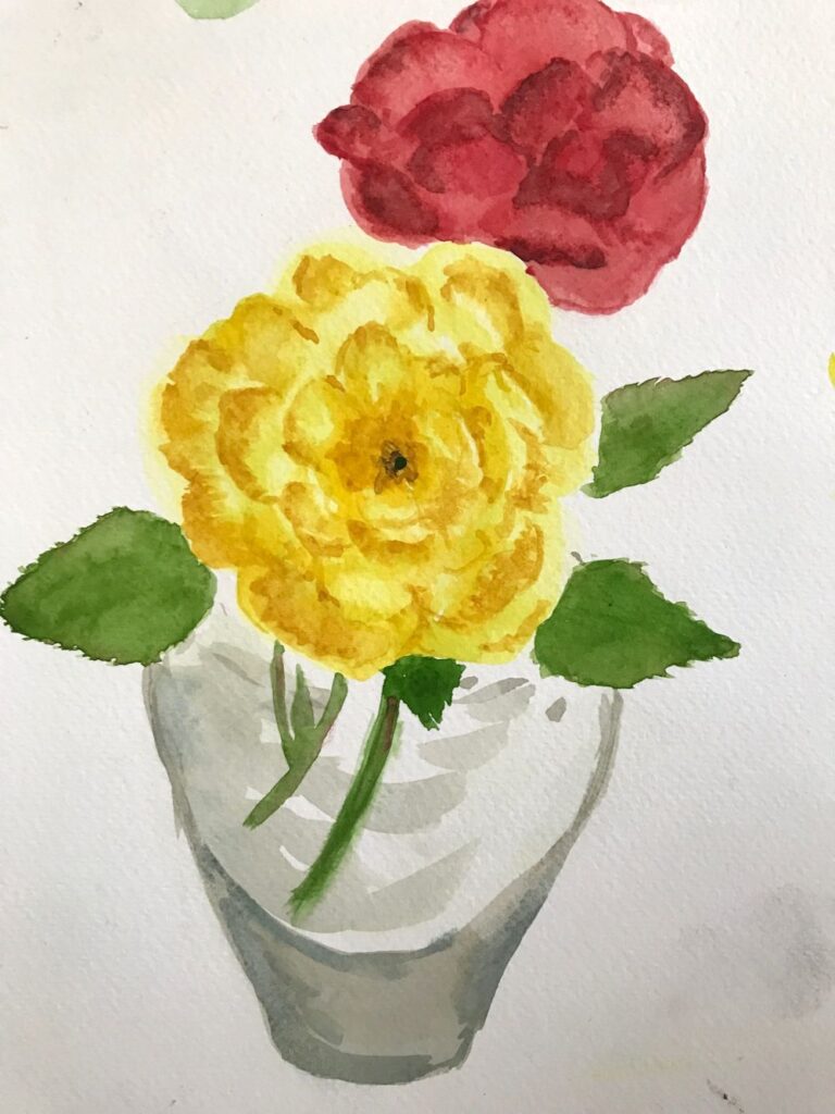
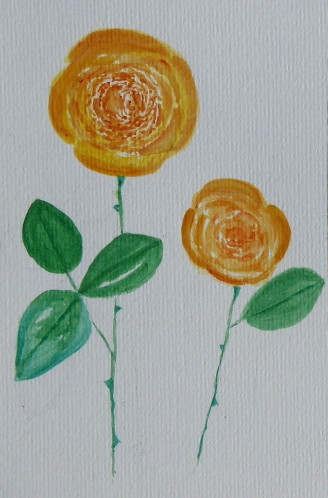
by Maryon
by Maryon
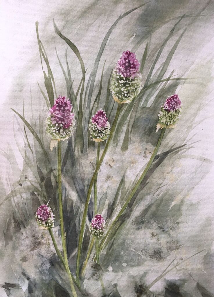
by Mali
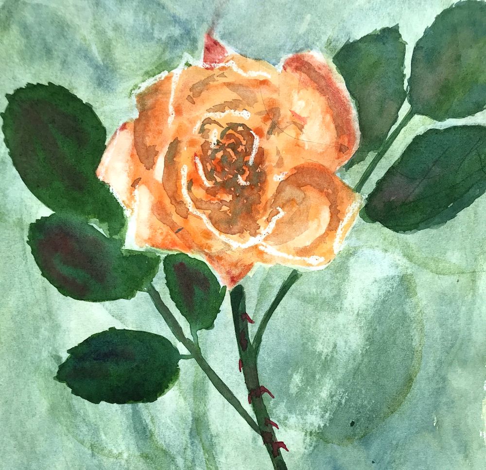
by Mali
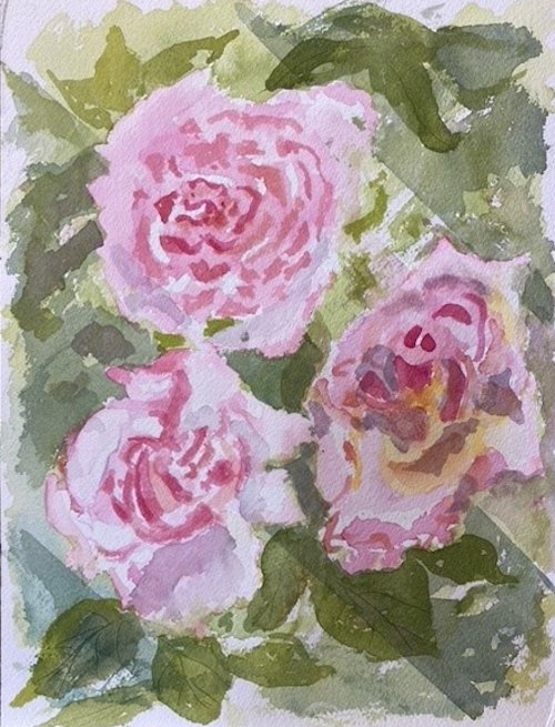
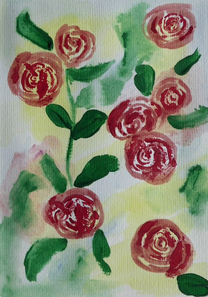
by Sandra
by Sandra
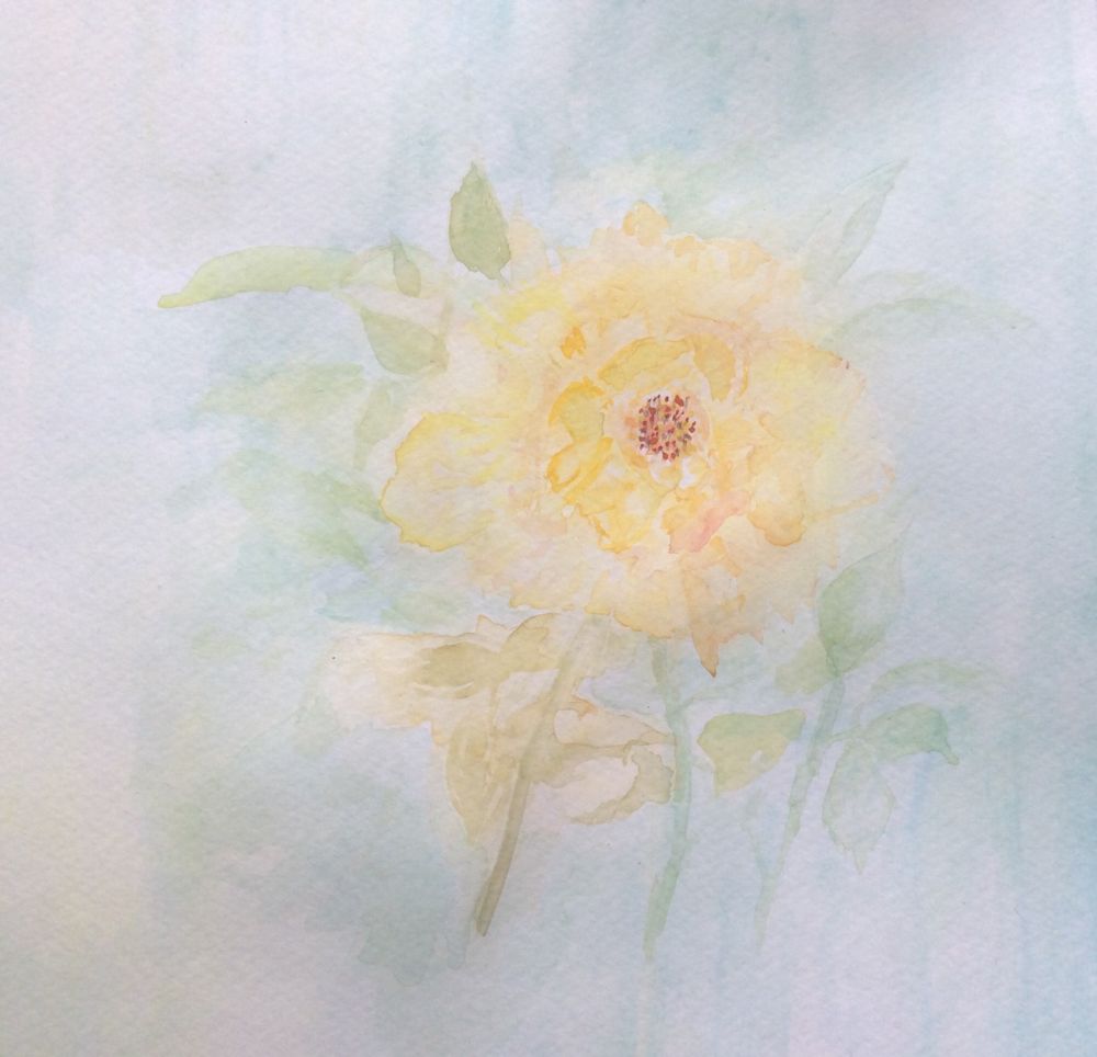
by Anne
by Anne
by Virginia
by Virginia
by Virginia
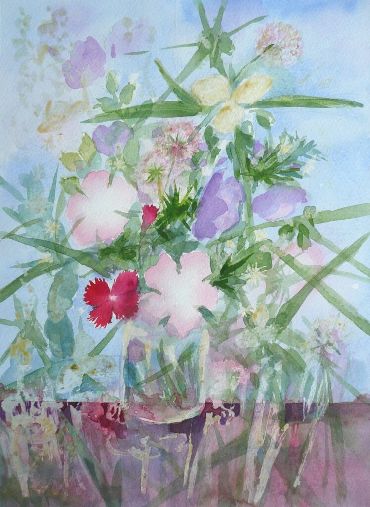
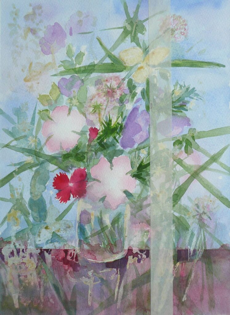
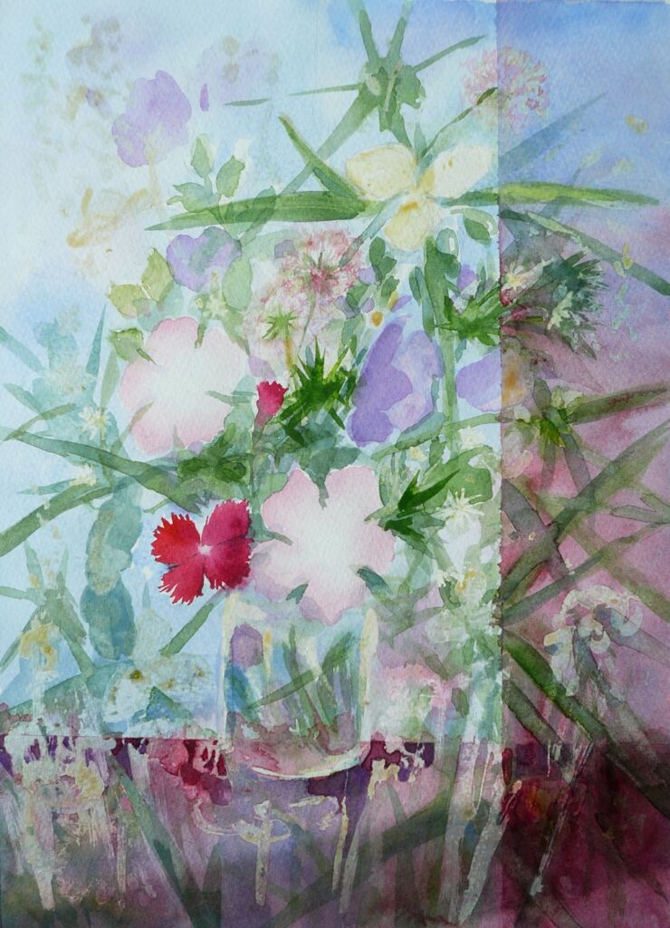
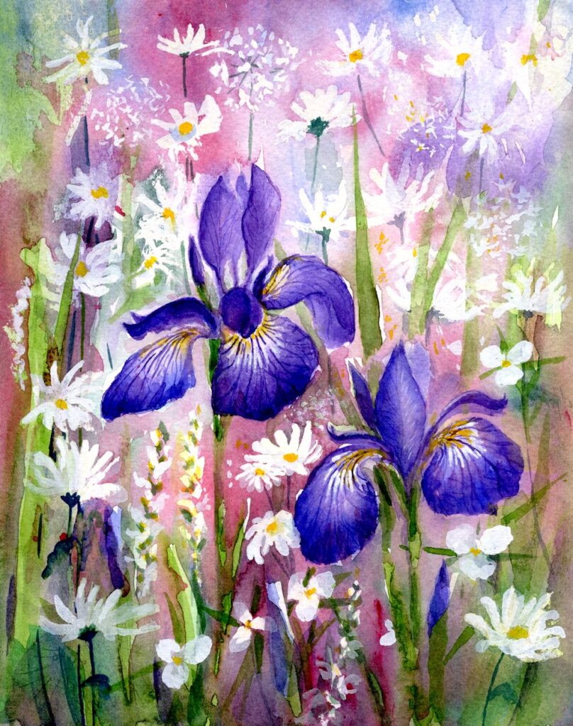
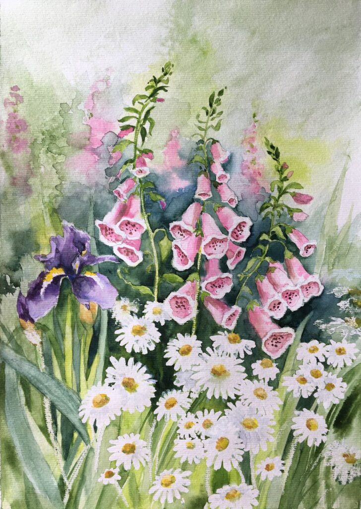
Watercolour Flowers Week 4: Composing with Flowers
May 18, 2022
by Jo
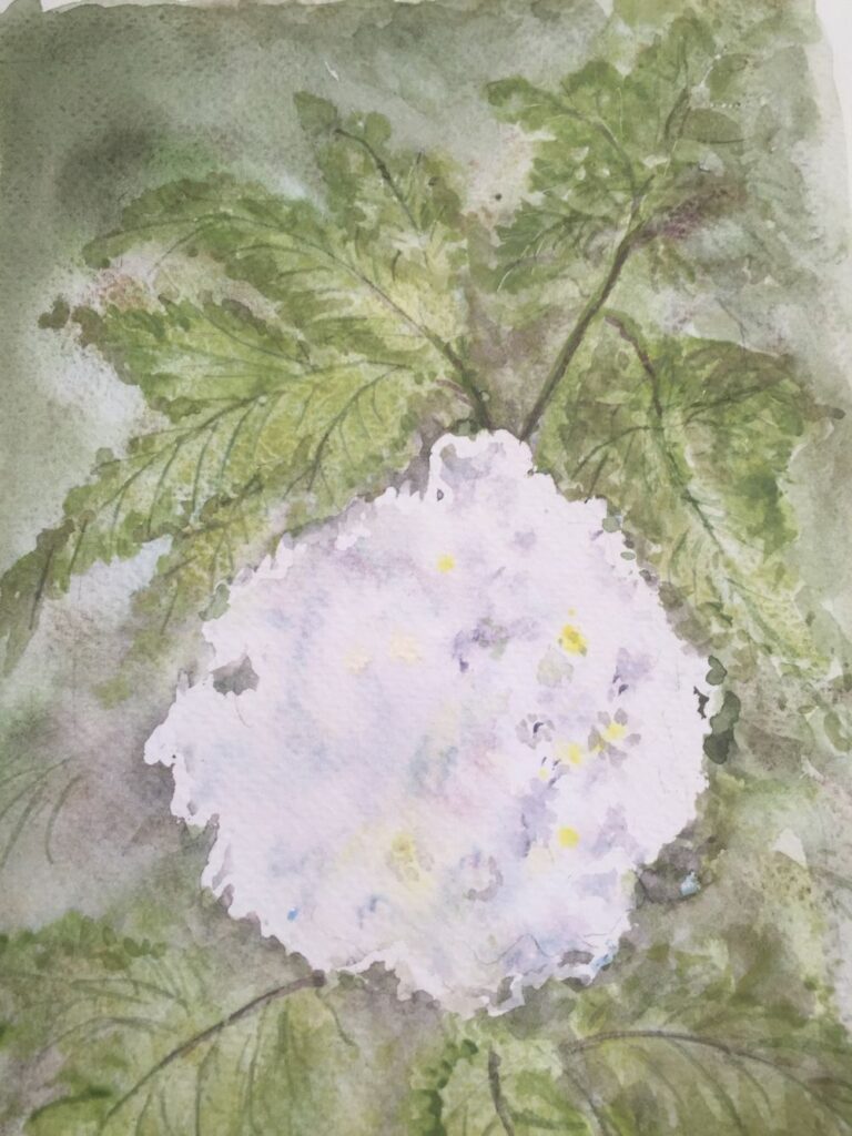
This week the challenge will be to make a painting with flowers of different sizes and colours in the garden. Perhaps find two or three large blooms, poppies for example with spikes of blue Veronica and white daisies making a soft focus backdrop. The colours in your garden may be more harmonious like foxgloves withe pale pink and purple Aquilegia.
In week 2 we looked at dark backgrounds for pale blooms but in the real world you will find flowers against backgrounds that are similar or paler in colour and you may also find flowers like pale Rhodedendrons and Azaleas where the leaves form a dark green backdrop for the blooms.
This challenge should result in a fairly free painting of the flowers but with close attention as to how various background shapes, tones and colours work harmoniously or discordantly with some large flowers seen close to. Do look at the works of Shirley Trevena: Pinterest Board link below
https://www.pinterest.co.uk/jhall1282/flower-painting-in-watercolour/shirley-trevena/
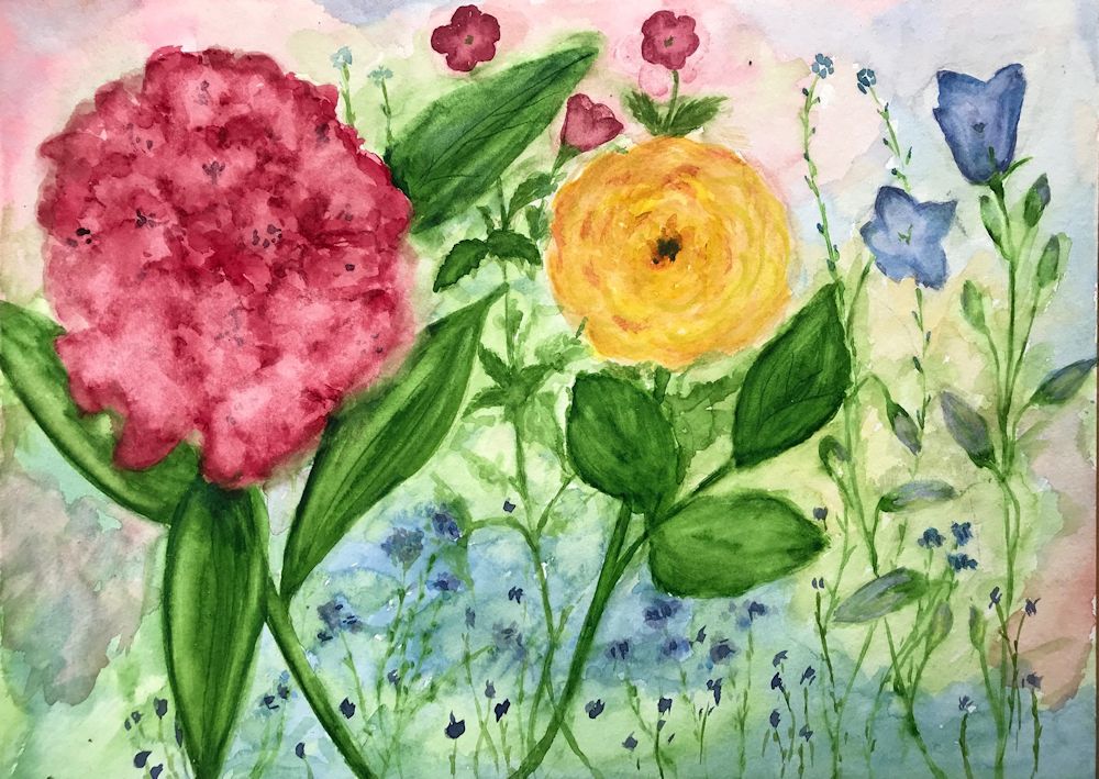
These works on one level are quite free but are also highly organised. See how she arranges the little painting of spray carnations where half the painting is dark against light and this is reversed in the top half. Your painting may not be this extreme but be very aware of how the flowers appear against different colours and tones.
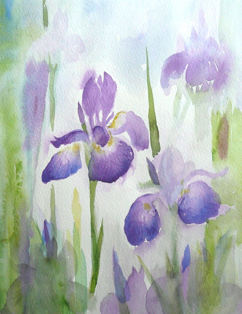
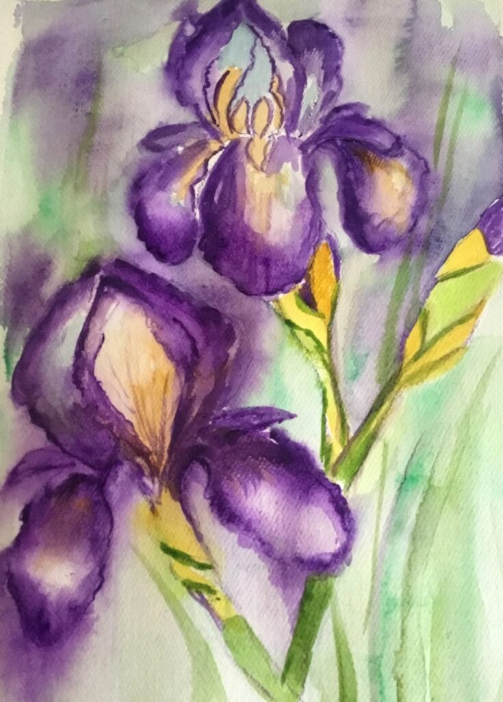
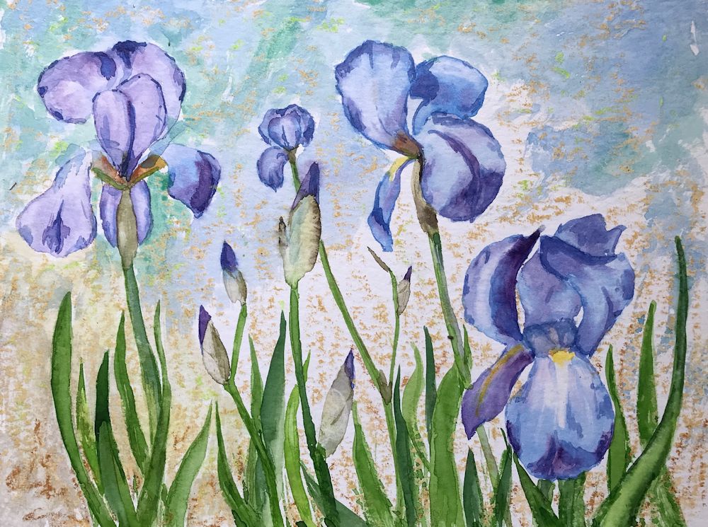
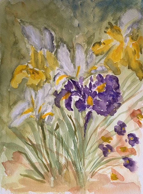
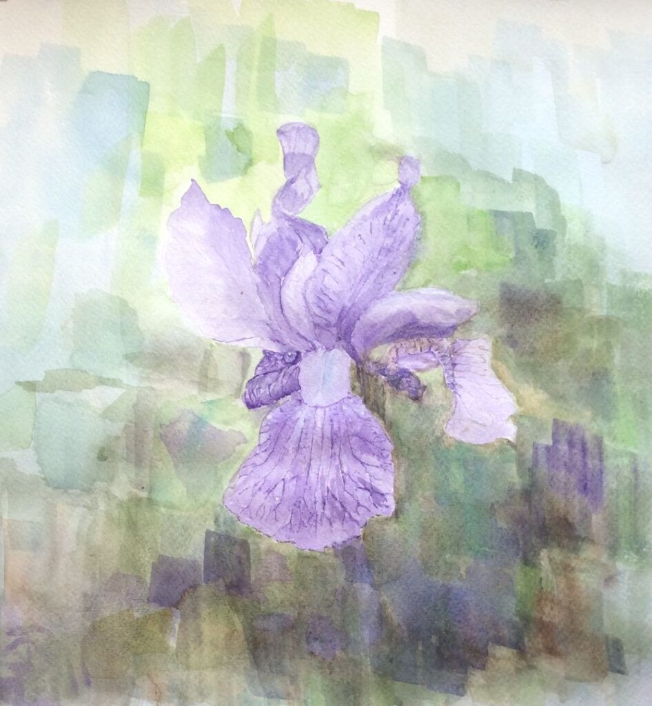
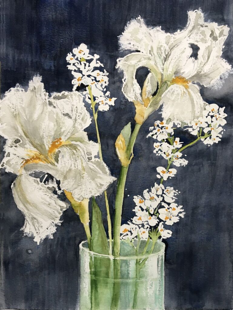
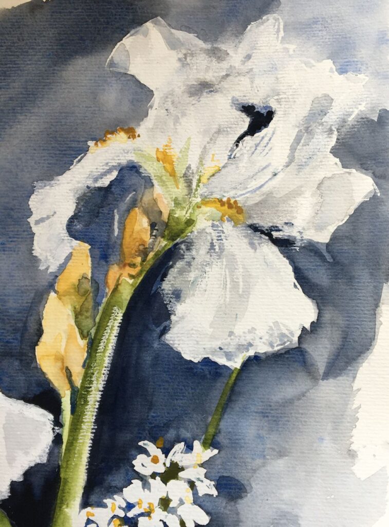
Below is the iris demonstration given last week and how it developed into the painting heading this post.
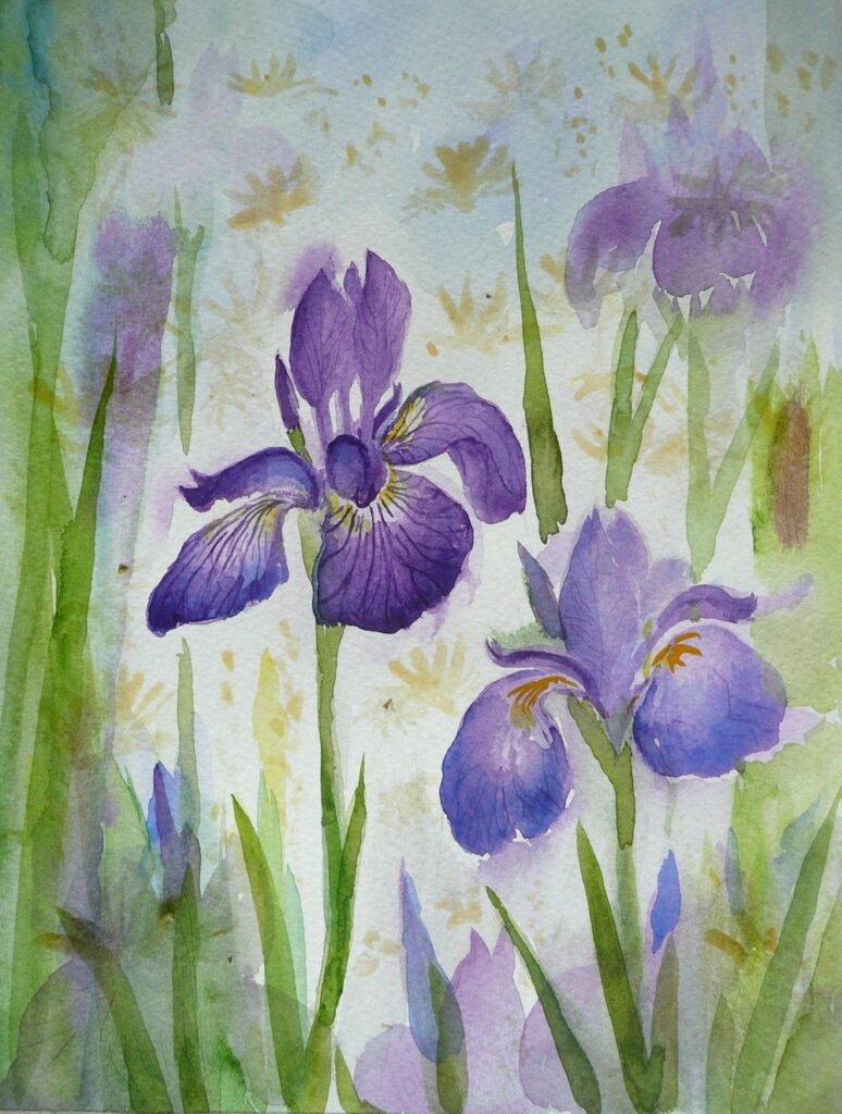
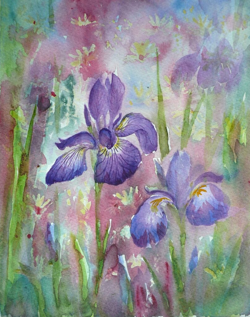
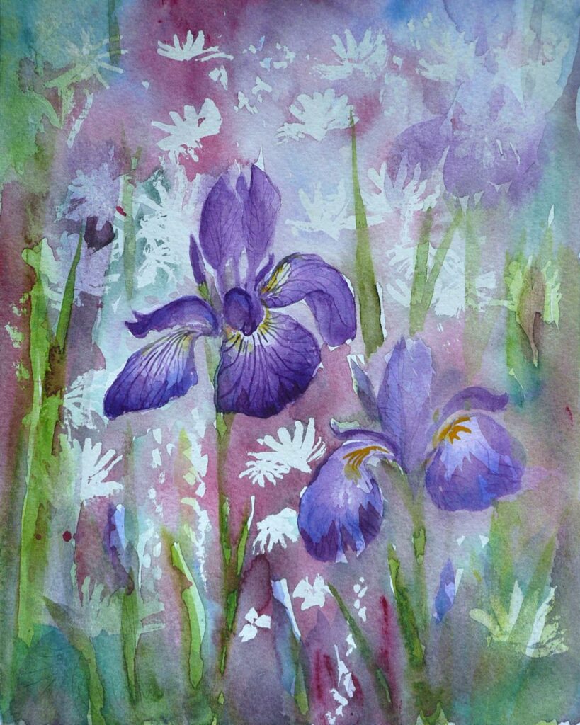
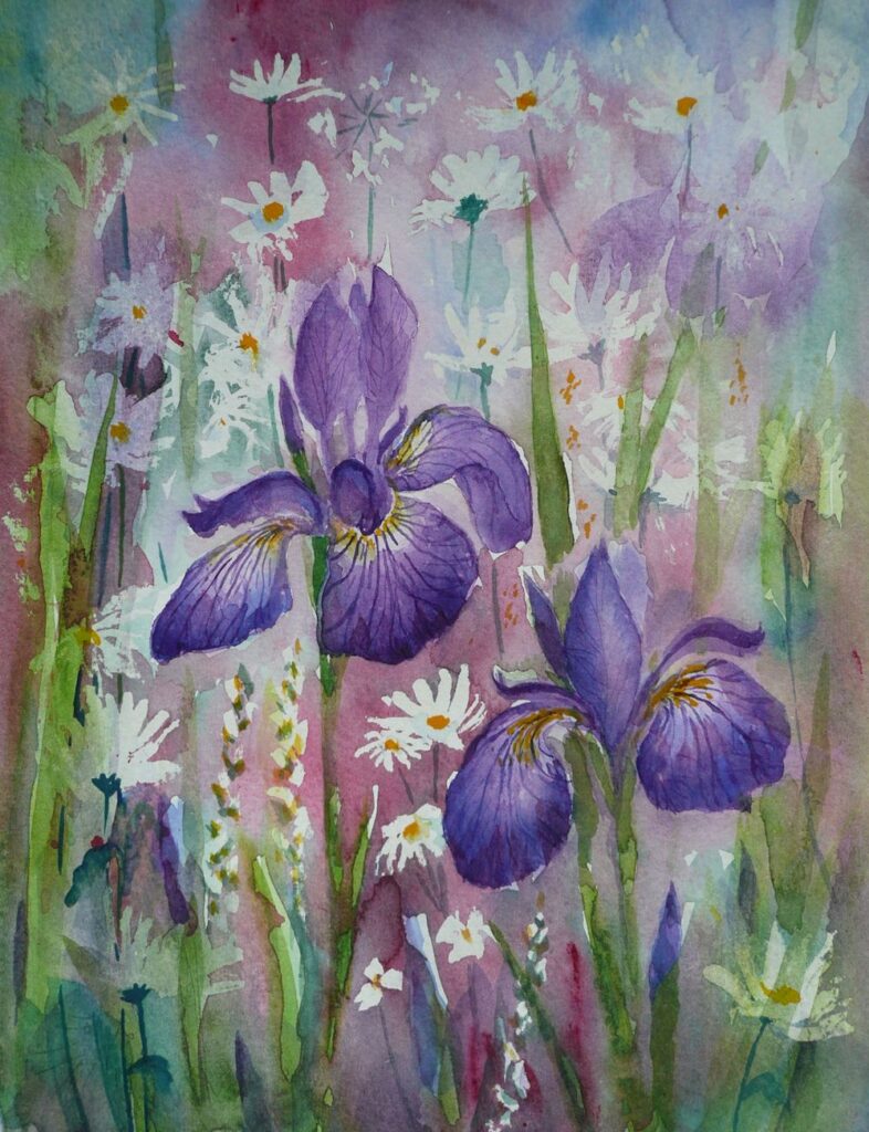
The colours of the Iris buds and and the fall petals were strengthened with further washes of Dioxazine Purple (Winsor Purple) with a dash of Ultramarine Blue.
Apart from the two iris blooms this was composing as I went along. One change in some sort dictated the next till I felt some sort of balance was achieved.
So far we have used very little in the way of a guideline drawn with pencil to map out the shapes so have gained a lot of experience in handling the paint with a brush. It’s now time for a slightly different approach.
This is the week where a tonal sketch before setting off on the final painting will help enormously in organising the composition with regard to the light and dark areas. It would also be a good idea to make another small study juxtaposing some of the colours you are going to use in the foreground with the smaller shapes and colours in the distance and play with the hues surrounding each flower.
When the sheet of of watercolour paper for the final piece is in front of you, make sure to mark the paper so that it is in the same proportion as the composition sketch or photo-reference chosen to work from. Do map out all the main areas and challenging shapes with pencil. Think about whether and where to apply masking fluid or a wax resist for the white/palest areas. It may be that it would be better to reserve the white of the paper by painting around the shapes to be left untouched and to used pigments that can be lifted out while the paint is still damp or after the first washes are dry. Note that “staining” pigments do precisely that and will sink into the paper so that when dry they are very hard or impossible to lift out.
As the painting progresses it may be that elements of the flowers and the background are worked at the same time. It can be great to leave some hard edges but there will be other places where it may be good to let wet paint bleed from one area into another. Make sure a damp sponge, “dry brush” (brush dipped in water then squeezed gently in some paper tissue) or just the paper tissue is to hand in case the flow gets out of hand.
Don’t worry about the end result, to some extent you will have to go with the flow, enjoy the process and have fun. Not sure whether this post will get illustrated but if not there is plenty of food for thought here and plenty to look at on the Pinterest Board.
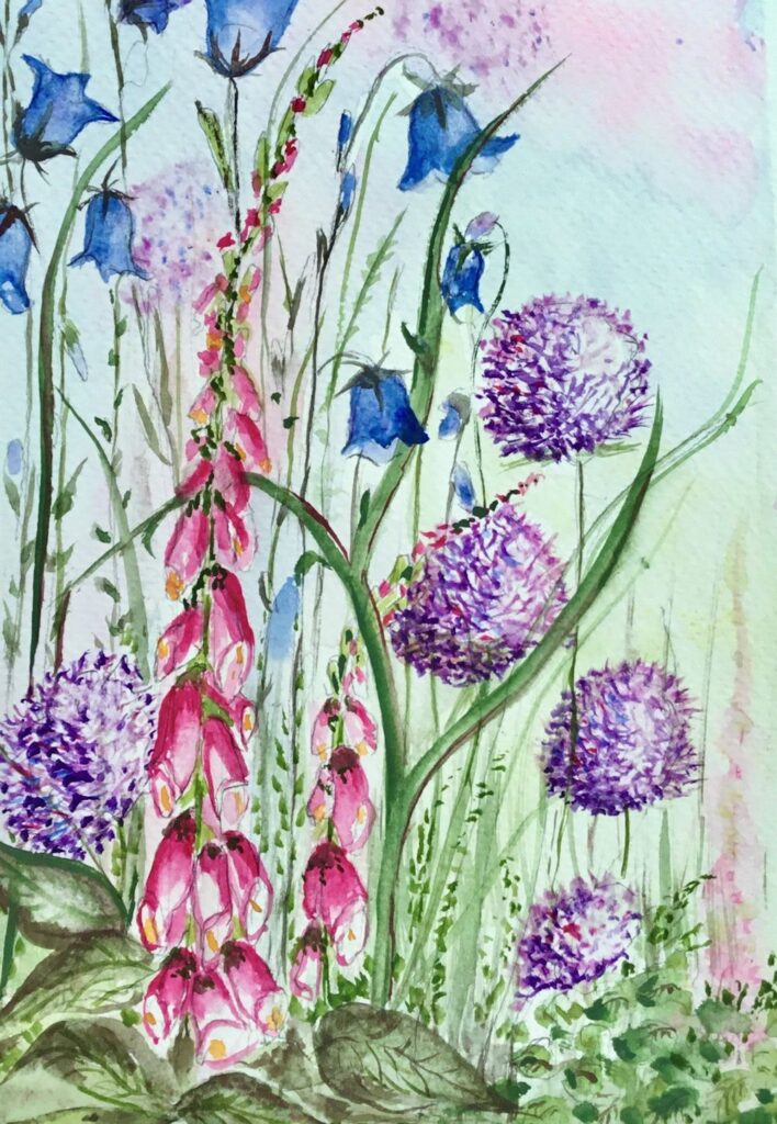
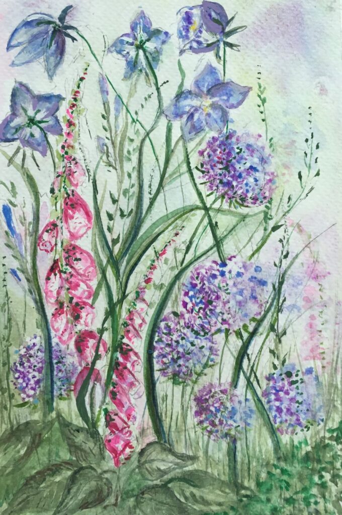
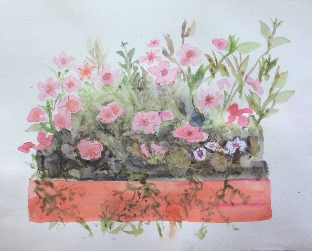
Your Paintings;
by Maryon
by Sandra
by Mali
by Mali
by Anne
by Kate
by Ann
by Ann
by Virginia
by Virginia
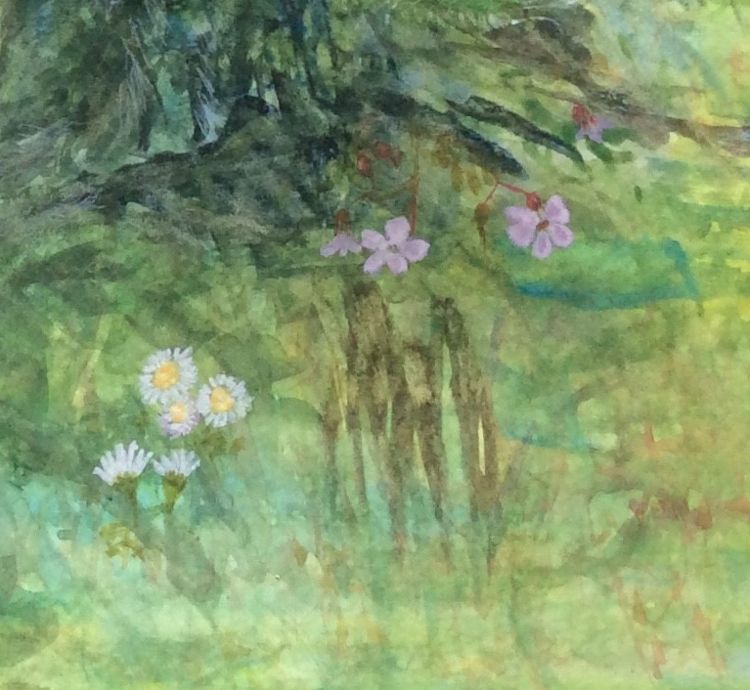
This beautifully painted detail from Virginia’s painting above could be easily overlooked when seeing the whole painting at a small scale as above.
Just delightful!
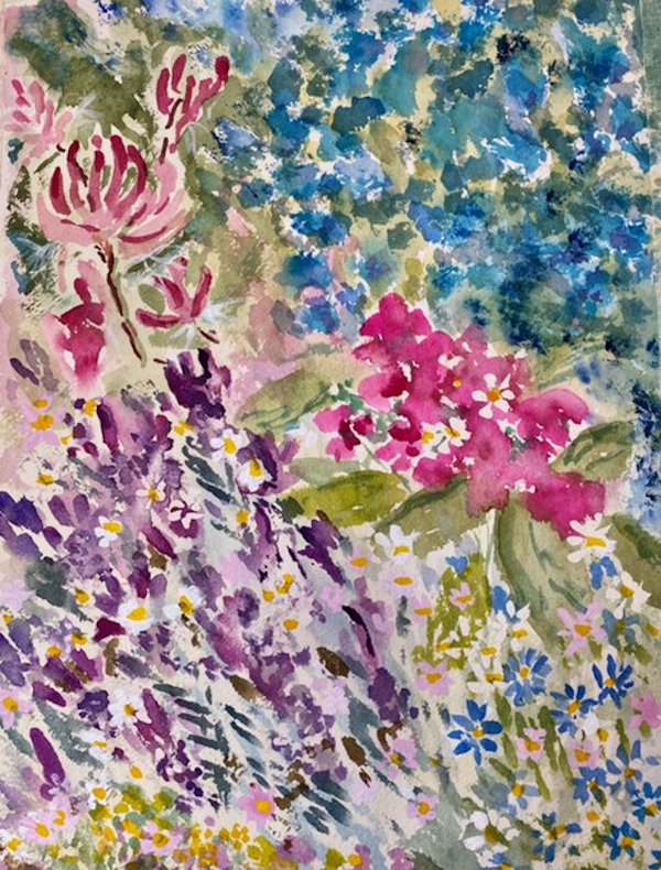
Flowers in Watercolour Week 3: From dark Backgrounds to Colourful Blooms
May 13, 2022
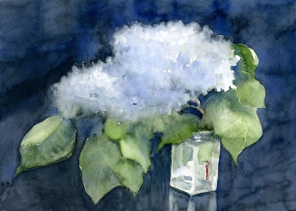
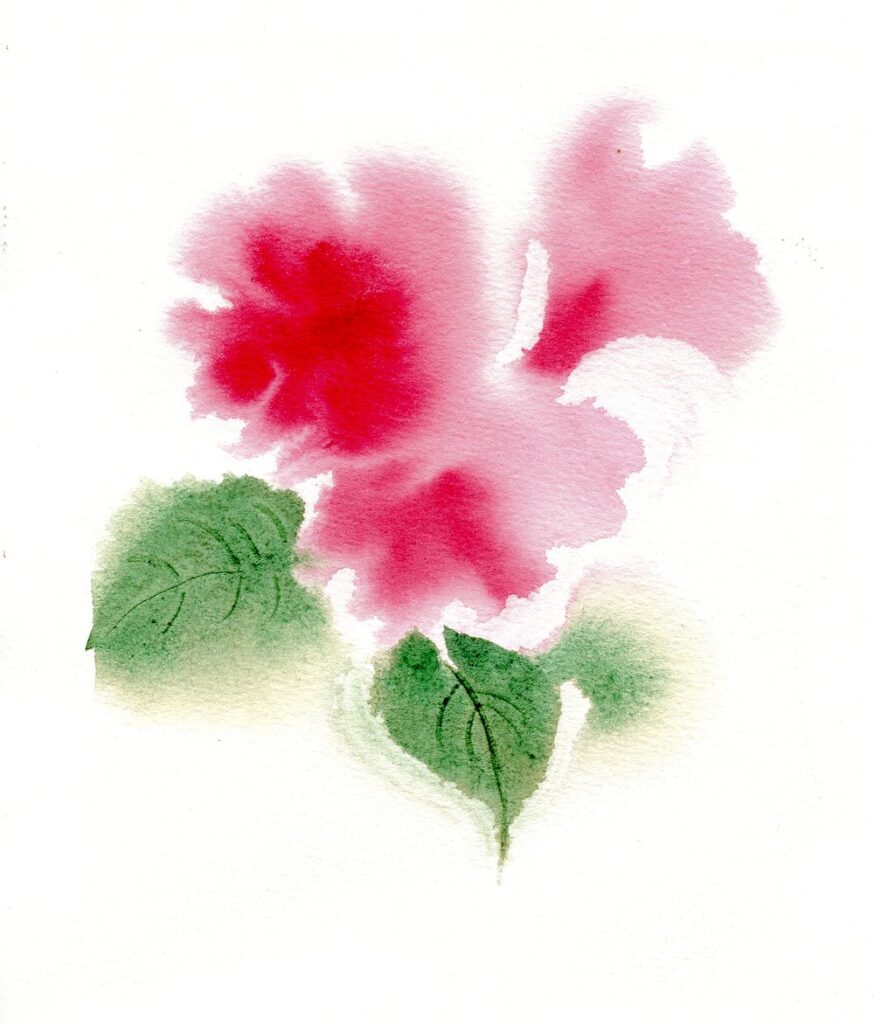
As the lilacs are pretty much ended I was delighted to find a couple of headily perfumed blooms left to paint. The painting above was on a quarter sheet of Bockingford cold pressed watercolour paper which stood up to very wet washes, indenting wet paint to make veins in the leaves and lifting out areas to soften them and give and indication of petals.
The white of untouched paper shines through in the glass jar. This time I decided against masking fluid as I hoped for a soft look to the painting.
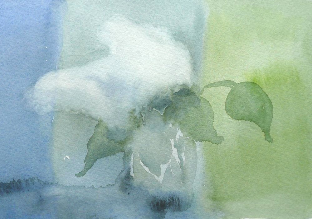
The three images below show how a smaller study was made on very damp paper working wet in wet then leaving the paper to dry before re-wetting the paper and adding further washes. Some lifting out was done while the paint was wet but the petal shapes were lifted out when the paper was dry.
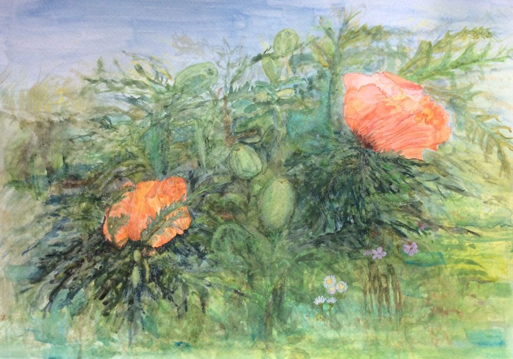
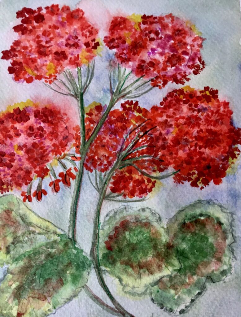
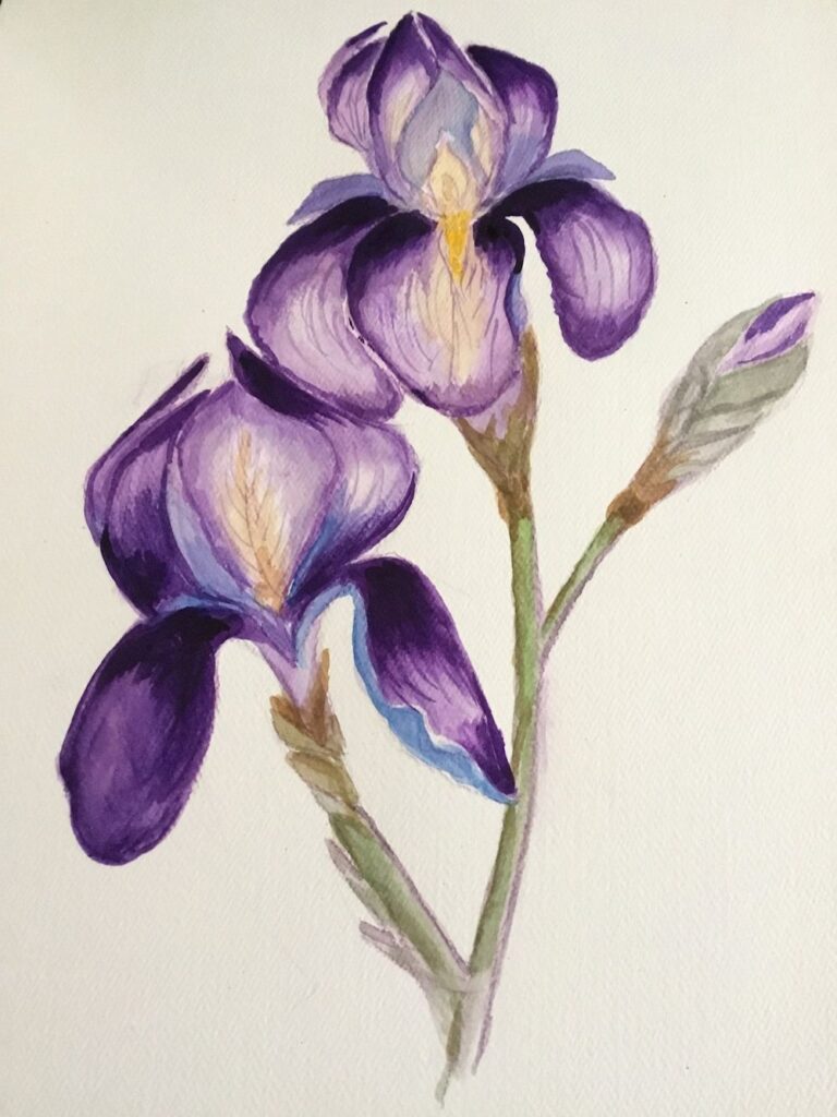
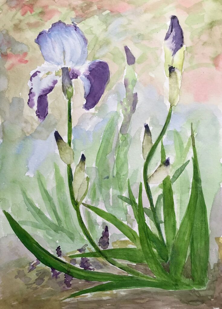
This week’s challenge is to paint flowers as they grow in the garden using any of the watercolour techniques used so far and with the aim of capturing an impression of their character; how they look up at you as the pansies and little pink geraniums or how they point toward the sky like the iris in the photo below..
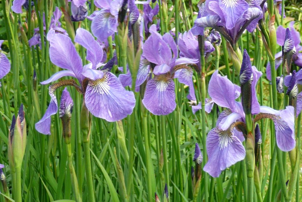
Photo by Jo
If you have time try to get out into the garden and sketch and photograph your favourite flowers. Make sketches of individual blooms, buds, stems and leaves to familiarise yourself with the shapes, and small composition sketches to explore the arrangement you may choose to paint. Iris and Weigela are blooming as are geraniums and Aquilegia so there should be plenty of colour around.
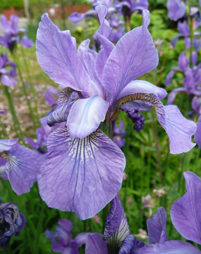
Photo by Jo
Before starting to paint explore the colours and brush strokes which will help depict the plant’s character and then review the composition sketchesmade outside and home in on one idea for the final painting. This may include just one or two plant stems relatively close up or with a backdrop of the same flowers or different plants giving an impression of a massed planting.
Experiment with colours and how they interact when mixed to find the hues and strength of washes you will need, erring on the side of making more wash and stronger washes than you think you may need. It is easy and quick to add water, not so easy to “drop in ” strong colour if it isn’t already mixed.
You may like to look at the following Pinterest board for some ideas on painting iris, link below:
https://www.pinterest.co.uk/jhall1282/flower-painting-in-watercolour/iris/
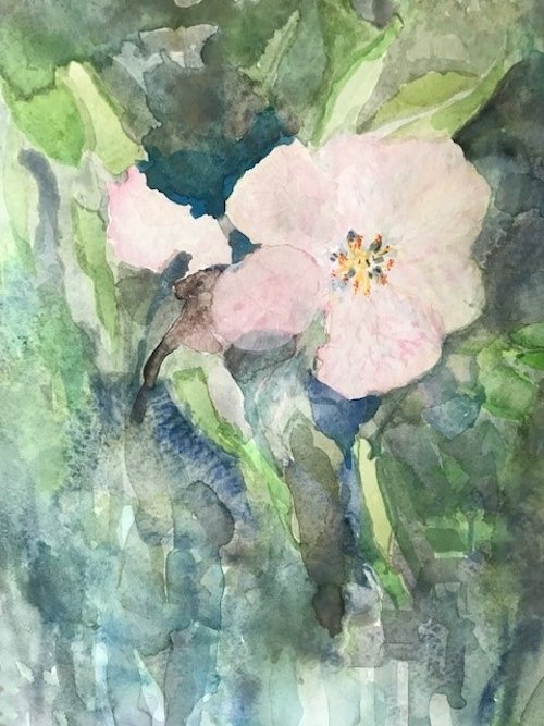
Your paintings:
by Ann
by Ann
by Maryon
by Maryon
Watercolour and Oil Pastel by Mali
by Mali
by Sandra
Watercolour by Sandra
by Anne
by Kate
by Vitginia
by Virginia
by Virginia
Watercolour Flowers, a Free Approach: Week 2
May 6, 2022
The first part of this post is a recap of what we did in the last session. The second part explores painting pale flowers and backgrounds.
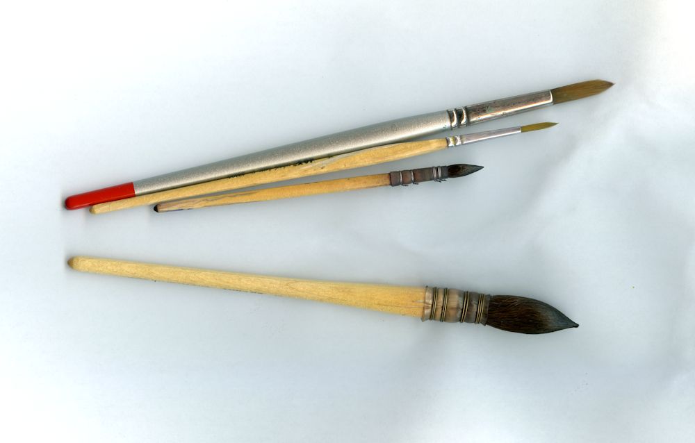
The much larger squirrel mop below these brushes has an excellent point so although I usually use it when when working at a larger scale it is a versatile brush capable of making fine lines and adding small marks for detail.
By increasing the pressure as the stroke is made and then decreasing the pressure as the stroke is ended and the brush lifted from the paper leaf shapes both thin and broader can be made with round brushes. We also used flat brushes to make a variety of marks resembling leaf shapes by twisting the brush as the stroke is made. Depending on whether the broad or thin edge of the brush is presented to the paper a variety of line widths can be made with flat brushes. Some of the best fun can be had by loading a brush; any variety and using it sideways as a printer on to dry or damp paper.
Below is a demonstration of a cornflower where flat and round brushes were used on wet and dry paper.
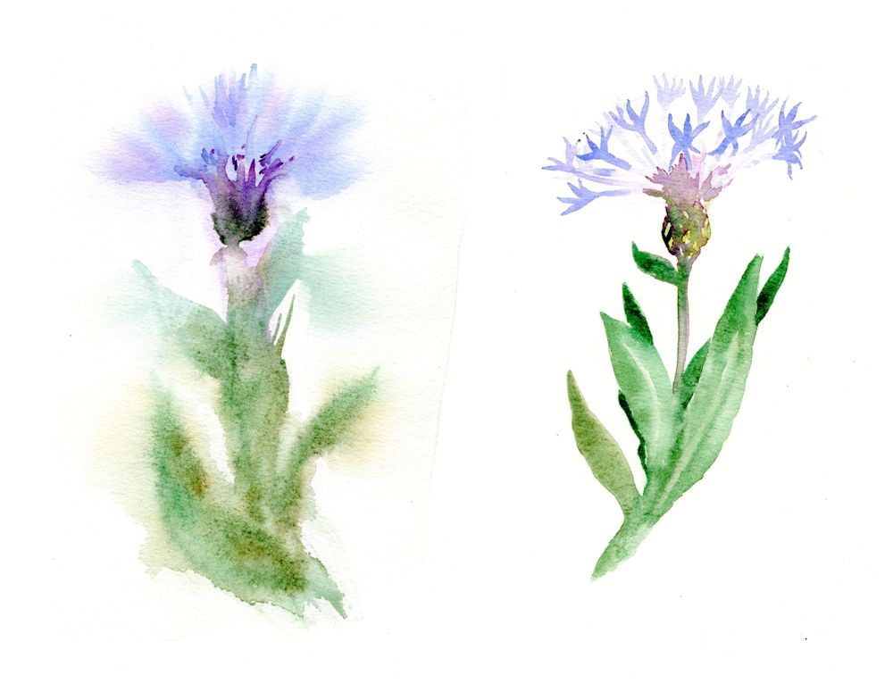
Painted on damp paper on the left and on dry paper on the right.
A wash of water was applied to half the sheet with a large brush and allowed to dry just a little. Colour was added as the paper slowly dried. Defined shapes occurred where the wash has been mopped with a “dry brush”, tissue or sponge.
When working in watercolour, especially when working on wet paper it is essential to have your colour washes mixed and at the ready, together with a sponge, tissue paper or to pick up excess paint as you proceed or to remove moisture from your brush so that the brush can be used to control very wet washes.
While the paint was wet a blunt tool was used to score the paper so that paint filled the troughs to indicate veins on the leaves.
Now it is time to consider backgrounds both for dark and especially for pale paintings of pale flowers.
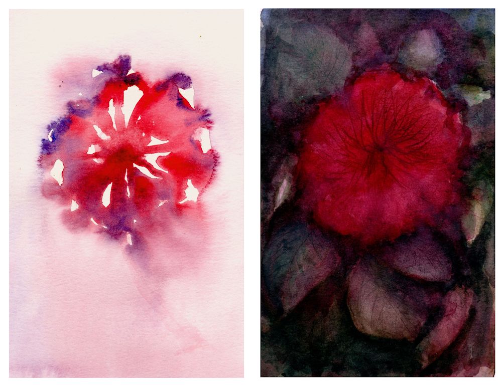
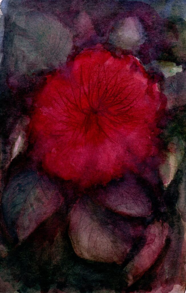
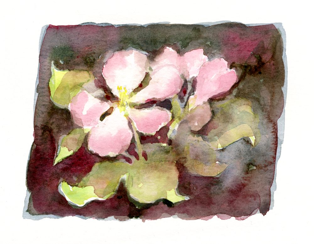
It was then allowed to dry. Dark washes were added mostly wet in wet and with indenting to suggest marks on the flower as well as leaf veins. The dark leaf mixes were made using Viridian mixes with Alizarin and Purple and also Viridian with Burnt Sienna. The result of perhaps too many layers is a very dark painting of an azalea like flower.
With a lighter touch a dark background to pale flowers can preserve a feeling of freshness as in the watercolour sketch of some apple blossom below. Here I did have a model in front of me and applied some colours using a round brush and very fluid washes on dry paper.
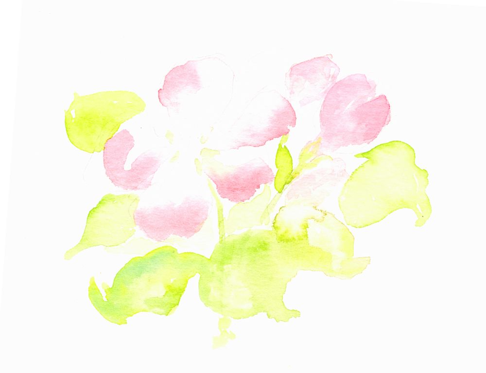
This was allowed to dry before dampening large areas of the sketch and dropping in colour. the shapes were refined using a small brush while the paint was still wet. Washes were allowed over the leaves in places refining their shapes. This time I stopped before the whole thing got too heavy and finally added some very pale yellow at the flower centre and a couple of pencil marks to indicate stamens. The result was lively and playful rather than accurate reflecting the joy apple blossom brings.
The point is that the background can often determine the mood of the painting and it is important that the way the subject is treated should be complemented by its background.
Left: painted around
Centre: masked
Right: wax resist
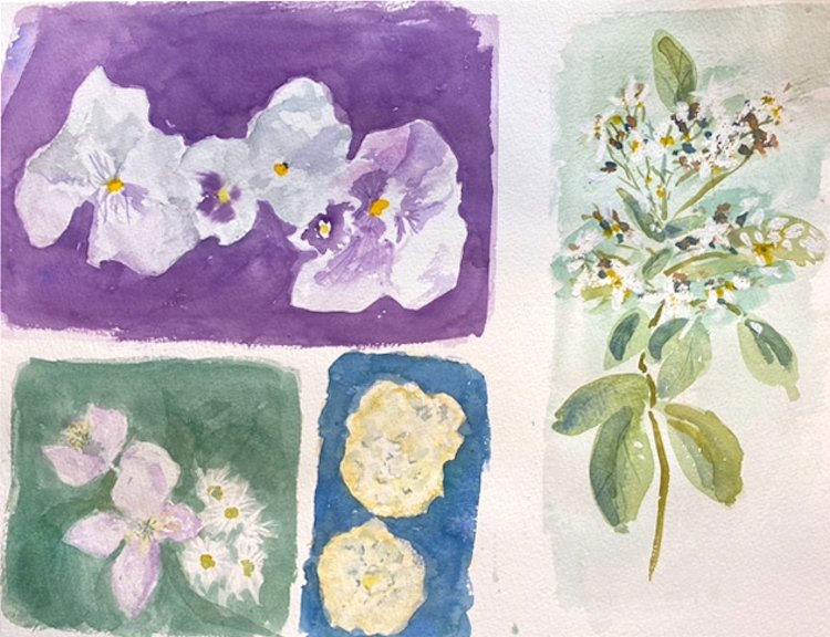
This week’s challenge is to paint pale or white flowers. Painting a background reveals the shapes of white flowers and is easier than painting pale blooms with no background. Colour, tone and how much to simplify backgrounds are all important factors to consider as well as deciding how free and loose you approach should be.
Inevitably you may question whether to mask or not to mask parts of the composition. Masking fluid can free you up to be more adventurous with the background but may make your flowers appear more graphic and less painterly. Painting around the subject may make you simplify more than was the original intention but that is not always a bad thing.
At the end of the day the only way is to experiment.
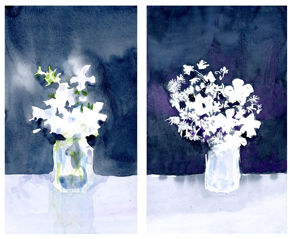
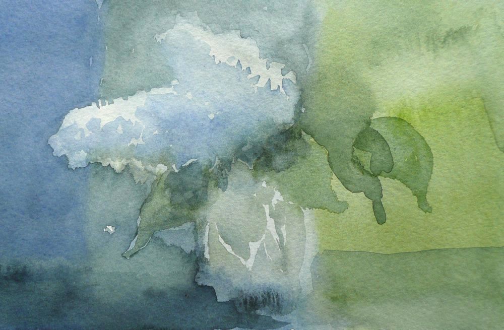
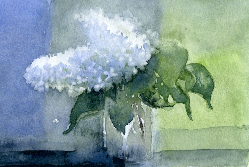
Left: background painted around the flowers
Right: masking fluid used on the flowers and the jar
The study on the left was of the same jam jar of flowers as on the right. The objects are more simplified and less accurate. Hints of colour have already been added.
The study on the right was carefully masked with masking fluid and washes applied when the masking had dried. Because the background was applied more uniformly and quite dark every detail of the marks made with the masking fluid are visible giving it a much more graphic quality. I was quite pleased with both and had I developed them further would have ended up with two paintings of the same subject but with a very different feel to to them.
Some more ideas for painting white or pale flowers can be found on my Pinterest Board, Link below:
https://www.pinterest.co.uk/jhall1282/flower-painting-in-watercolour/white-and-pale-flowers/
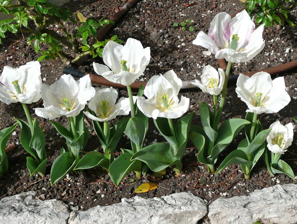
Photo by Jo
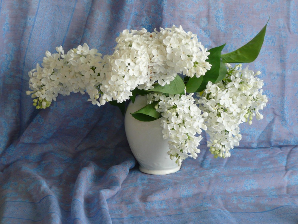
Photo by Jo
So first find some white flowers for the session and we’ll investigate ways to paint them in a way that has enough structure but still feels free and lively.
Your Paintings;
by Maryon
by Maryon
by Sandra
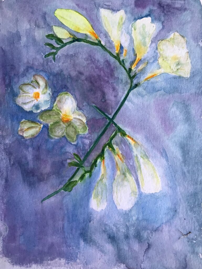
by Ann
by Ann
Flowers masked before painting the wet in wet background
by Anne
by Kate
by Kate
by Kate
by Virginia
by Virginia
by Mali
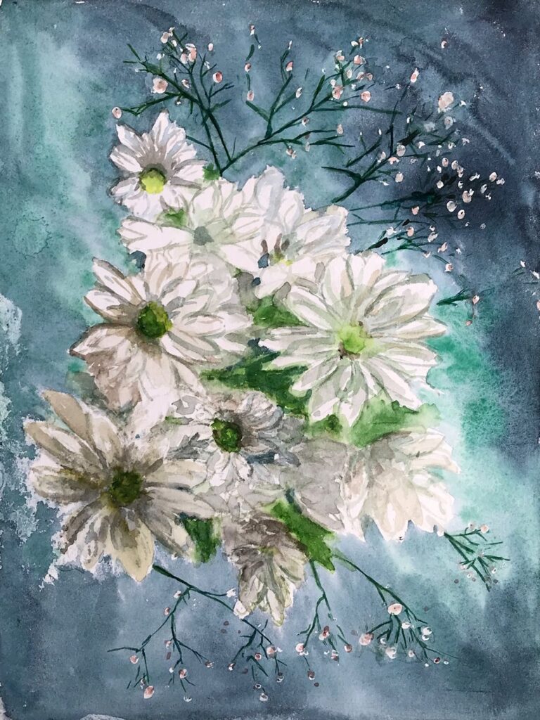
by Mali