Monthly Archives: June 2021
Starting Points for Abstraction: Week 2 Chance, Recycling and Intuition
June 29, 2021

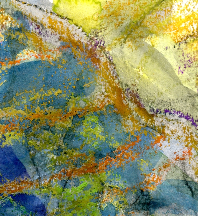
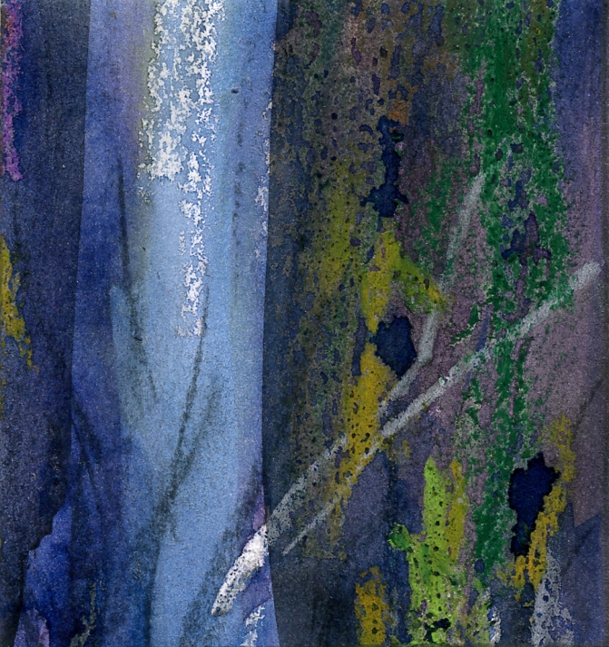
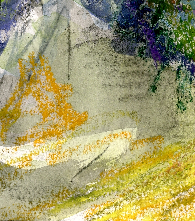
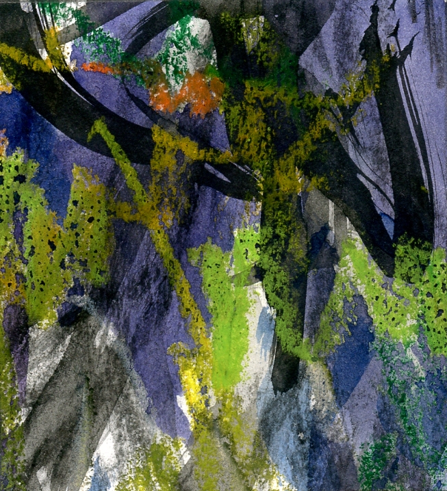
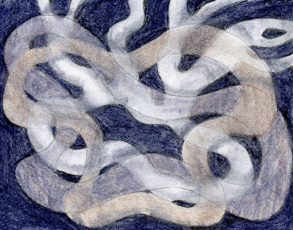
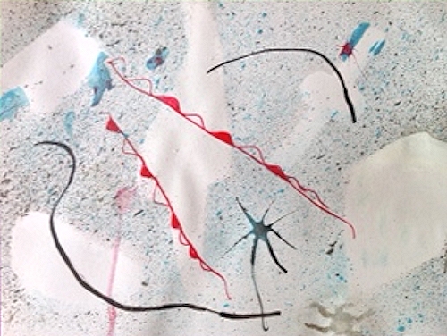
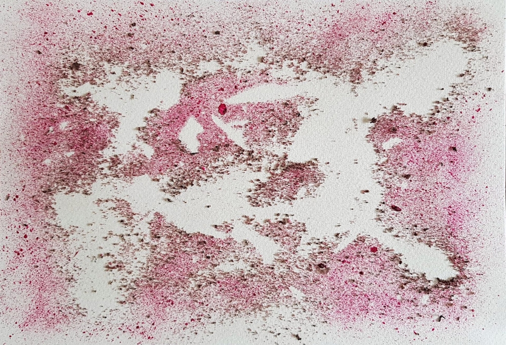
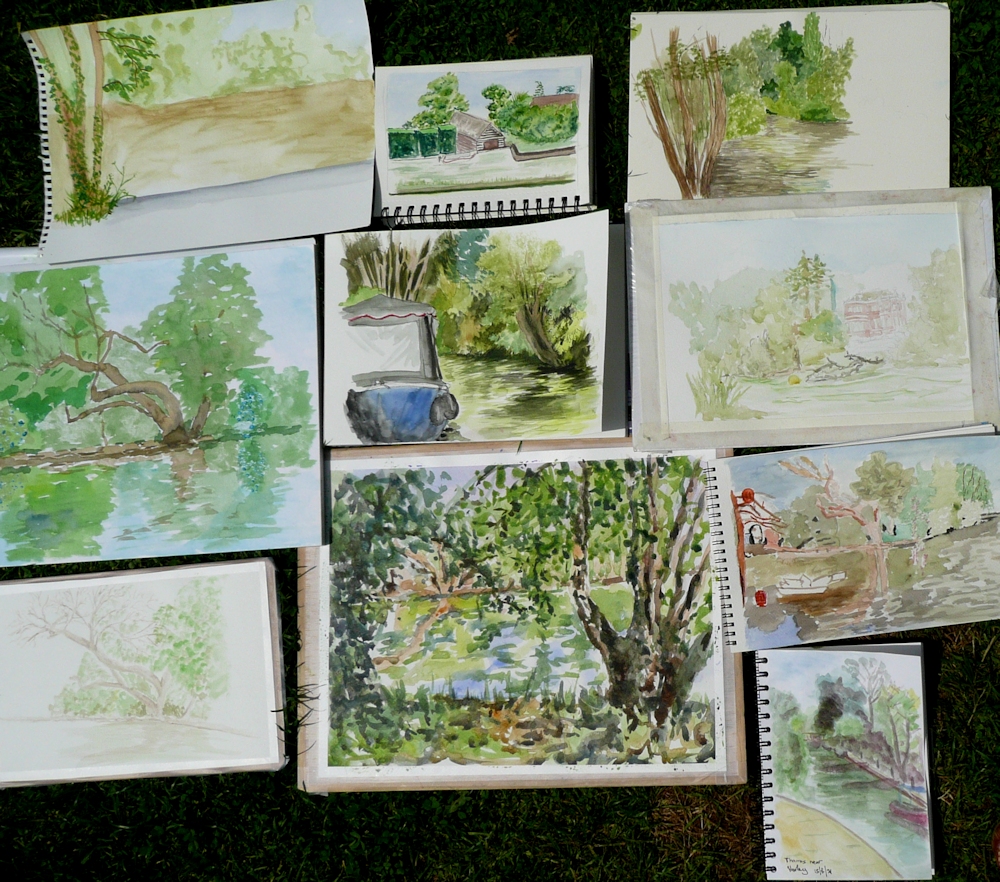
Pieces of paper kitchen towel were torn into larger and smaller shapes, about ten in all and dropped on to a piece of watercolour paper. They were left as they fell, overlapping or not overlapping. Using an old toothbrush acrylic ink was spattered over the whole. A wooden skewer was used to draw out a few lines from the larger spatters and then left to dry completely before removing the pieces of paper towel.
Chance and Recycling
Jean Arp, one of the leading artists of the Dada movement used chance for several of his works. He tore up papers and collaged them where they fell. Some of the works appear too ordered for this to have been the whole story and I suspect he may have put some torn shapes into a hat or equivalent and placed them on the support intuitively as each was drawn out of the hat in a random sequence. He also tore up a woodcut made in 1920 into several pieces and rearranged them on a support in 1954. For Arp this was the artwork. For us it may be or it may be that such methods could be employed as the starting points for developing an abstract painting.
You could certainly do this with a failed painting or with a copy of a suitable good drawing or painting. The pieces could be cut into regular pieces and rotated till you felt a successful arrangement had been achieved or you could shuffle them and place them in a grid in the order that you drew them out. You are in charge of whether to work mainly with chance or mainly with design and whether to develop the work further by adding other media.
The pieces could also of course be dropped on the support and glued where they fell. If a collage was not required it would be easy to make a series of photographs of several dropping events with pieces from the same art work. The resulting photographs might suggest an interesting painting or be art works in their own right separately or collectively. Old greetings cards, magazine pages etc. could be similarly recycled.
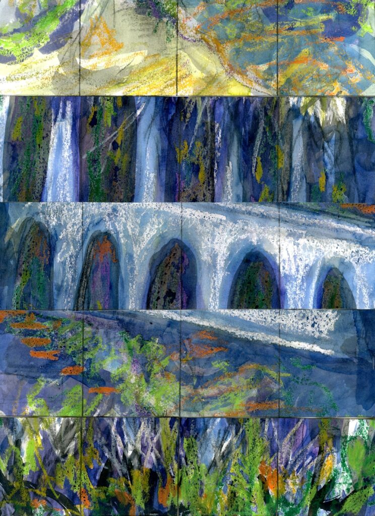
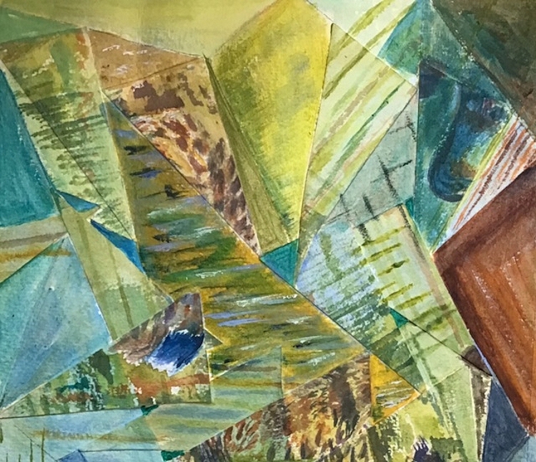
Some of the fragments are below and are interesting in their own right as well as being perhaps the inspiration for further abstract works.
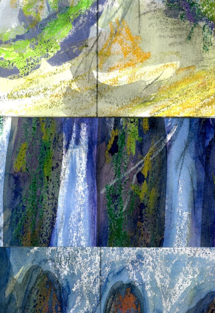

A few are shown in detail below;


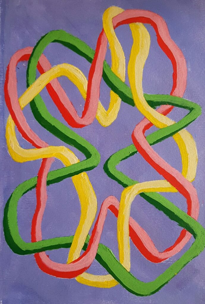
Exploring Negative Shapes
The technique below can be as designed, intuitive or suggested by a natural form as you wish. Anything from geometric shapes to tea cups or branching trees can be fun to investigate. They can remain as flat areas of colour or be blended for some great intertwining effects.


No blending.
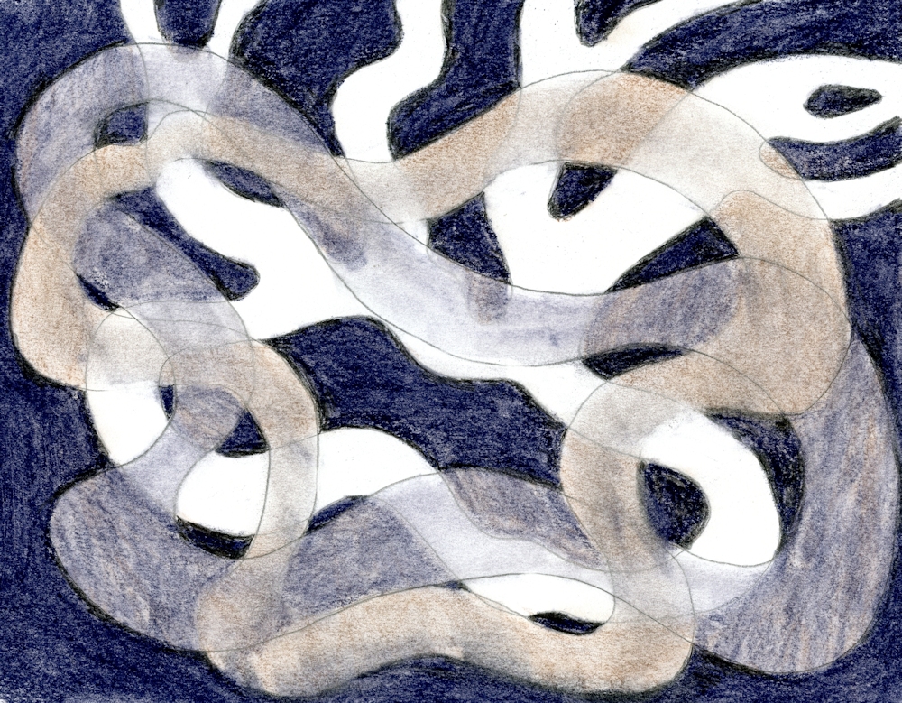
The two coloured shapes were blended including where they crossed the white shape.
In the finished drawing all shapes were blended leaving some of the white shape unblended. Similar effects could be achieved in acrylic or watercolour using glazing techniques.
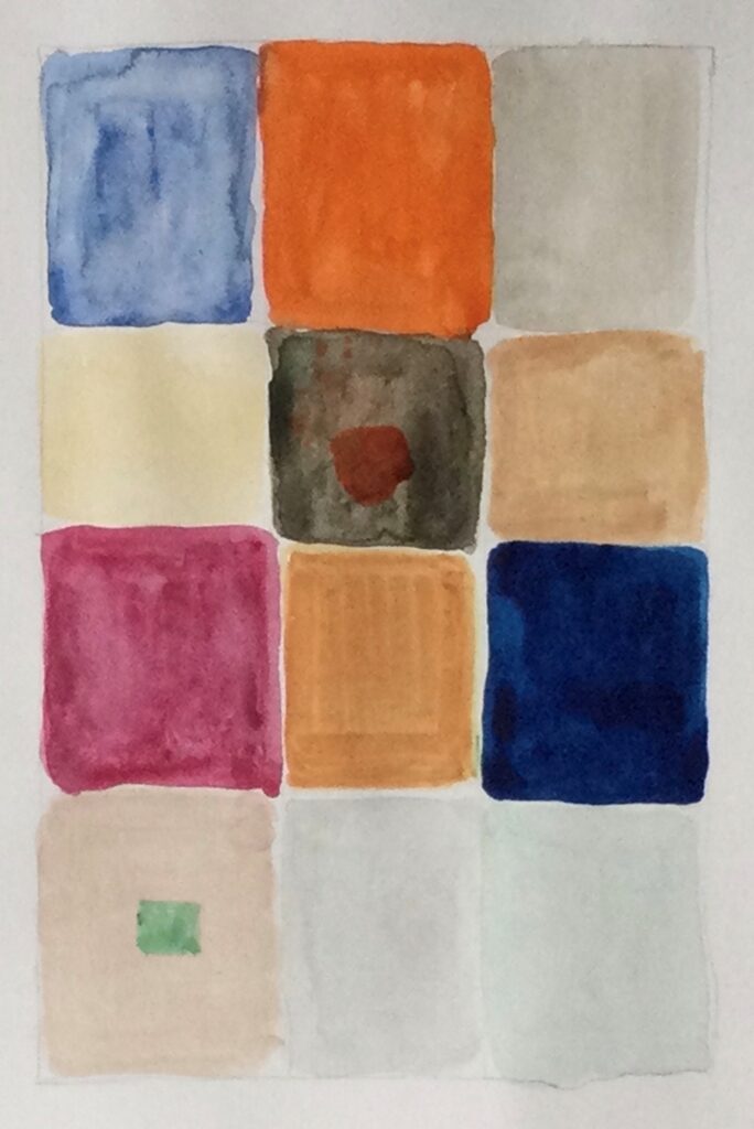
The paint left on your palette;

At the end of a painting session it is all too easy just to slide unused paint into a trash can or let it congeal uselessly on the palette. Why not just get a brush or palette knife and spread it almost without thinking on to a sheet of thick card or paper. (you are also allowed the think about it but not with the aim of making it look like a tree or a bird or a flower.) It may do but don’t intend it. It may turn out that it is your first Colour Field work! But my guess is that it may need further development.
Abstract Expressionists are subdivided into two groups of rather different artists
The Action Painters such as Jackson Pollock
https://www.pinterest.co.uk/jhall1282/abstraction/jackson-pollock/
and the Colour Field Painters such as Mark Rothko, Clyfford Still, Barnett Newman.
https://www.pinterest.co.uk/jhall1282/abstraction/colour-field-artists/
Although never listed with these American artists perhaps Patrick Heron should be included here for his colourful gouache paintings.
https://www.pinterest.co.uk/jhall1282/abstraction/patrick-heron/
Practical:Our next practical session will involve using chance, recycling and intuition for beginning an abstract painting or drawing.
Choose to work on one or more of the following;
Aim to have a drawing/painting copy or original to cut or tear up, perhaps a large magazine image. It does become more personal to use your own drawing though. You will also need a support for painting on and your usual paints.
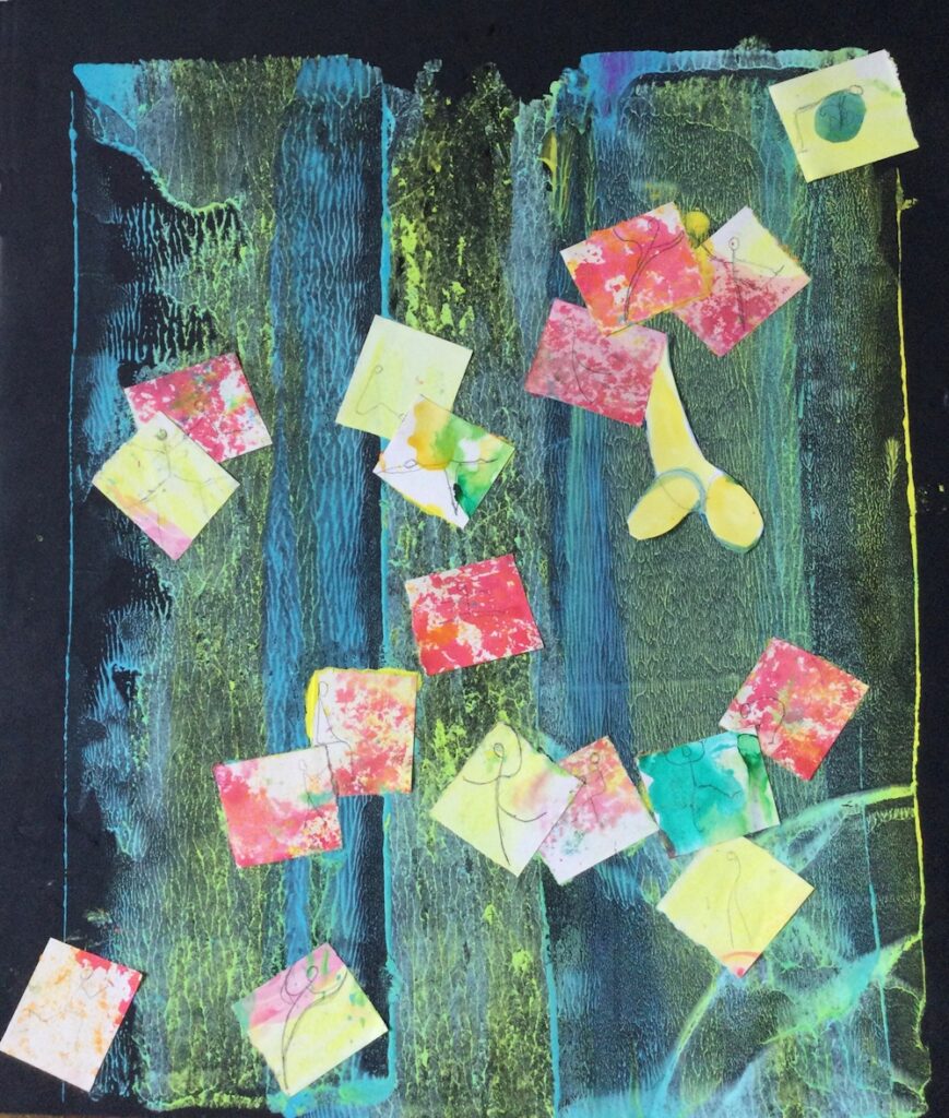
1.Old drawing/painting: either cut up and rotate pieces till they make an interesting arrangement or shake and draw randomly from a container laying them in a grid one by one in the same order that they are drawn out. You may collage the pieces and work over them with more paint or drawing or photograph/trace them and use the image as the basis for your painting.
2. Chance; dropping cut or torn paper on to a support, spatter with paint, remove the paper when all is dry and develop the painting intuitively.
3. Recycled paint; Use what is left on your palette by just painting it out on to a piece of card or paper, perhaps with some intent like putting the pale colours in the middle or the brightest colours in the middle or irregular bands of colour, varying the sizes of colour patches ( this happens naturally as more of some colour than others remain). Colour mixing also happens depending on the mixes on the palette and how much they become blended as they are painted out. This should be done prior to the session so that the development process can take place at next week’s session.
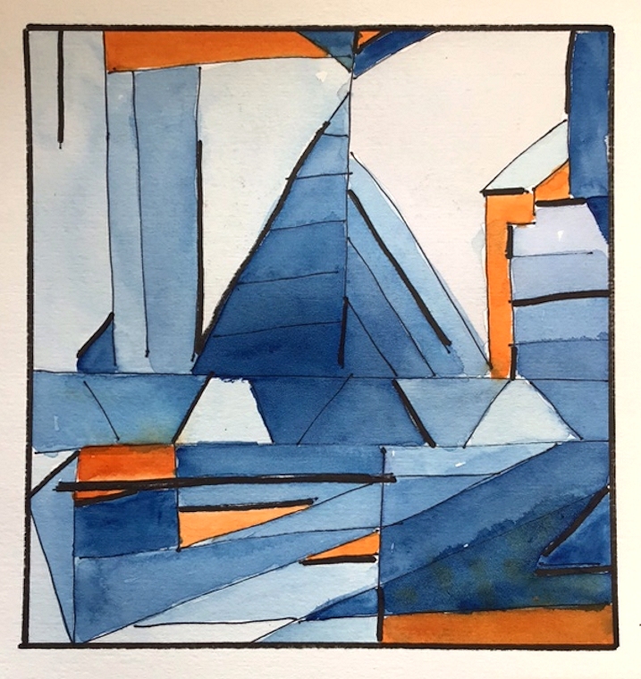
Your paintings;

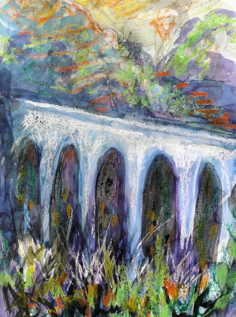
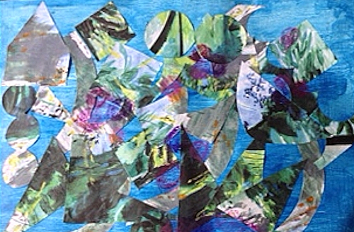
From cut and rearranged pieces of a river painting with added paint
by John
by Virginia
Collage of a cut, rearranged pen and ink drawing with added colour
by Heather
Collage from rearranged pieces
by Liz
Collage by Sandra

by Malcolm
by Sandra
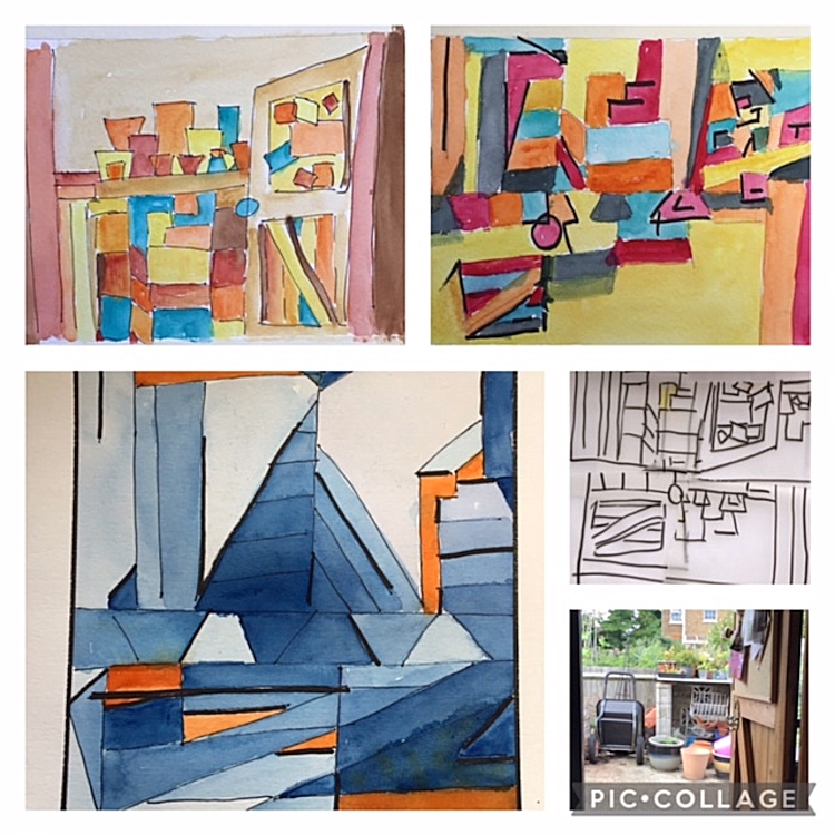
Reorganizing a drawing, painting or photographic image can be a useful starting point to look at the shapes and forms in a more abstract way.
The simplest form of this is to rotate a landscape through 90 degrees.
by Virginia
Masked shapes, spattered and worked into intuitively
by Liz
by Malcolm
by Malcolm
by Liz
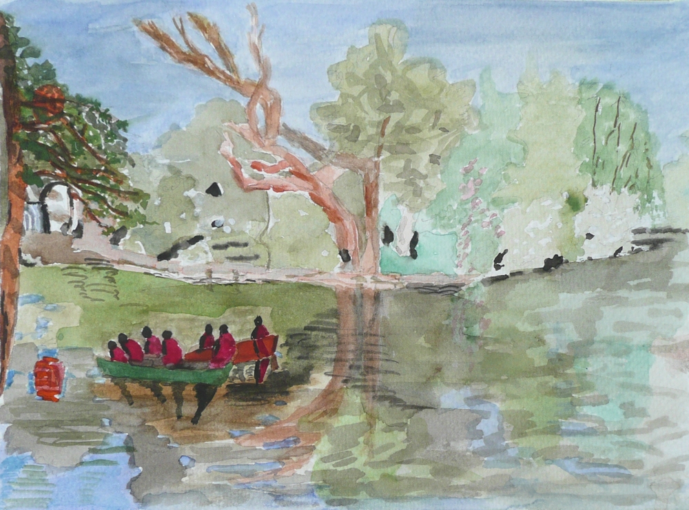
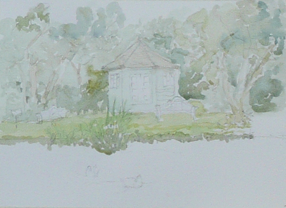
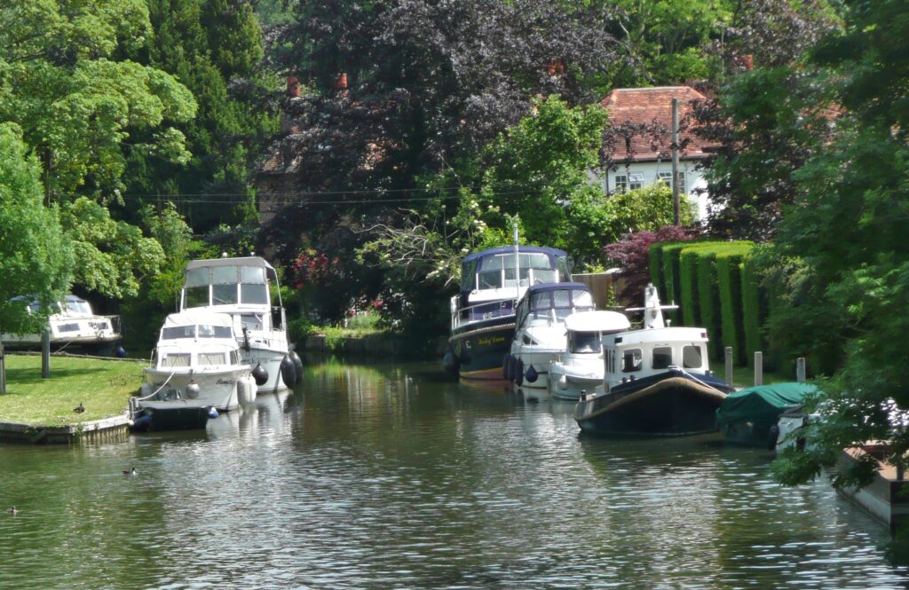
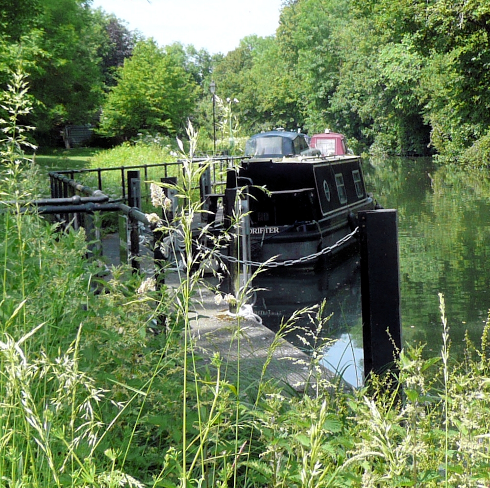
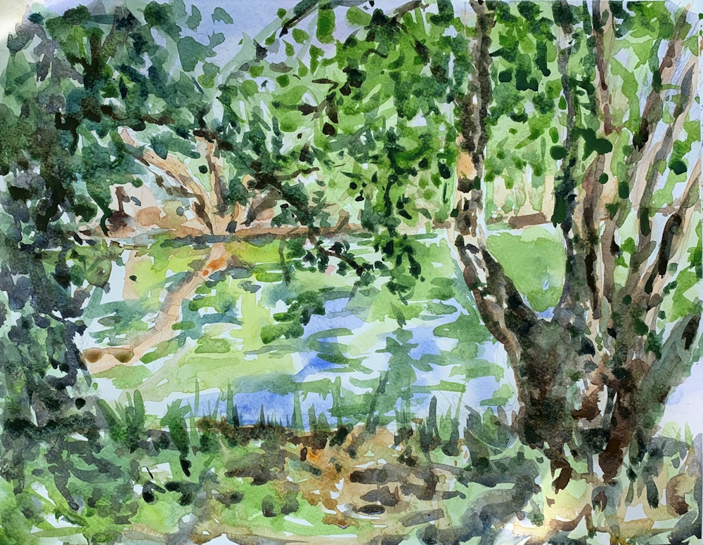
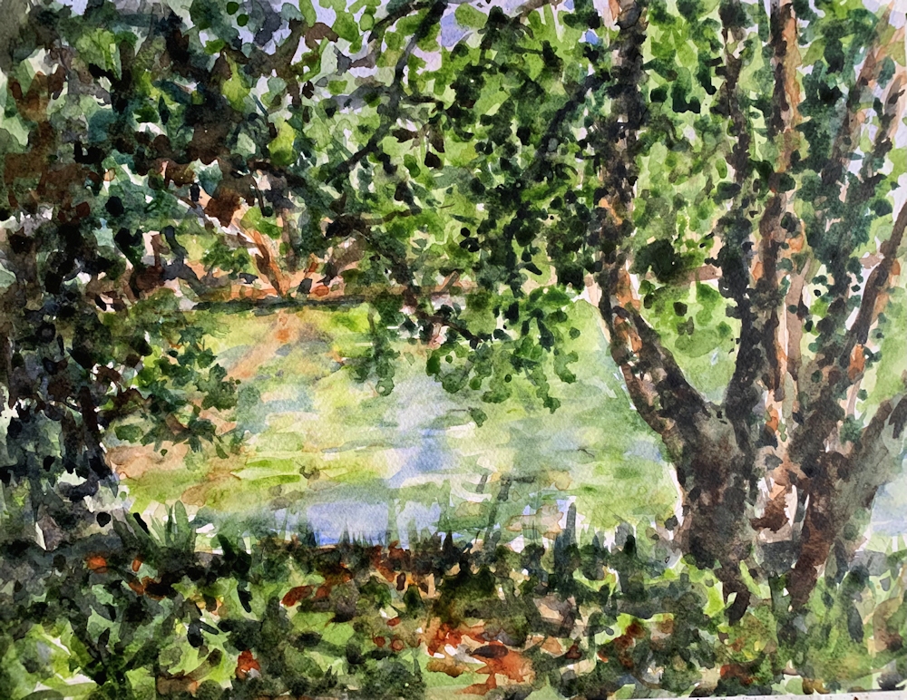
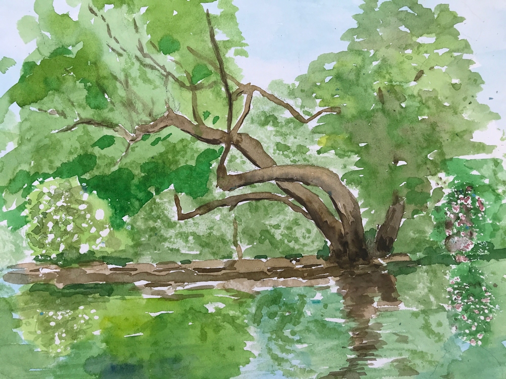
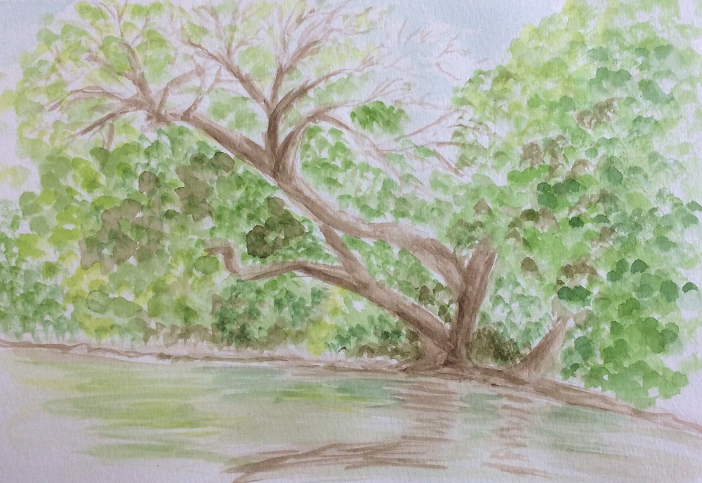
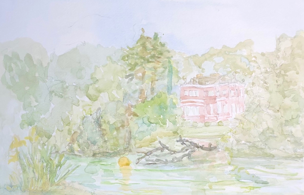
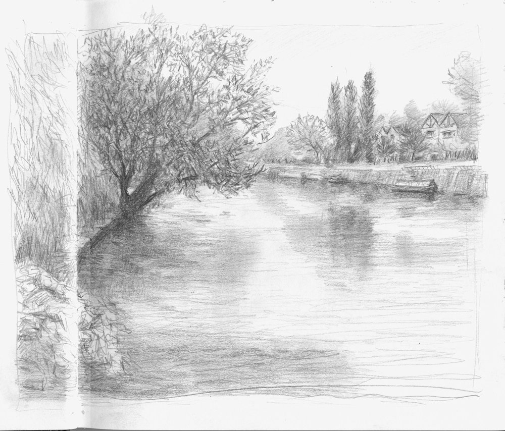
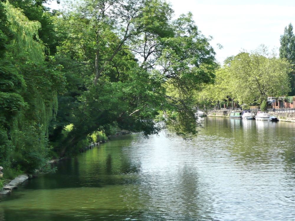
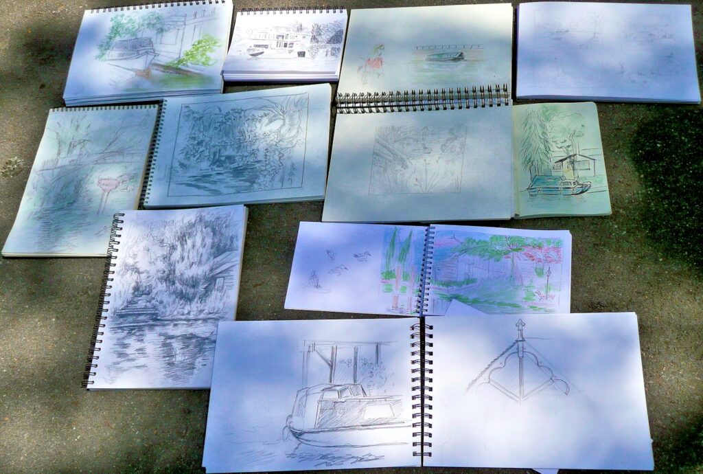
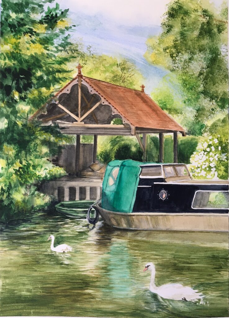
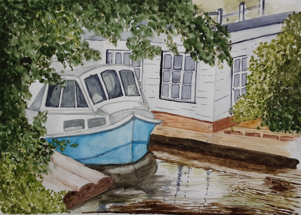
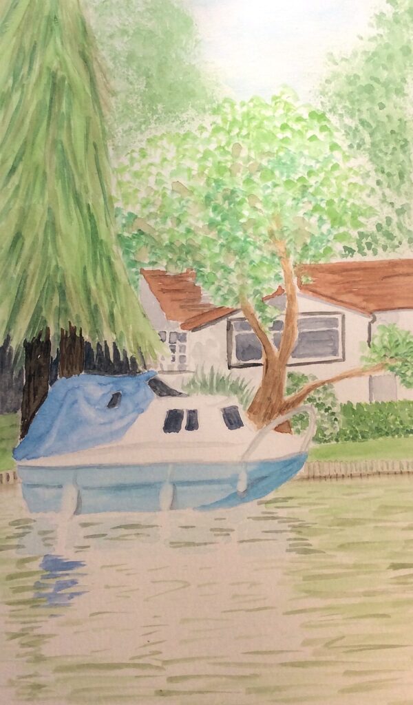
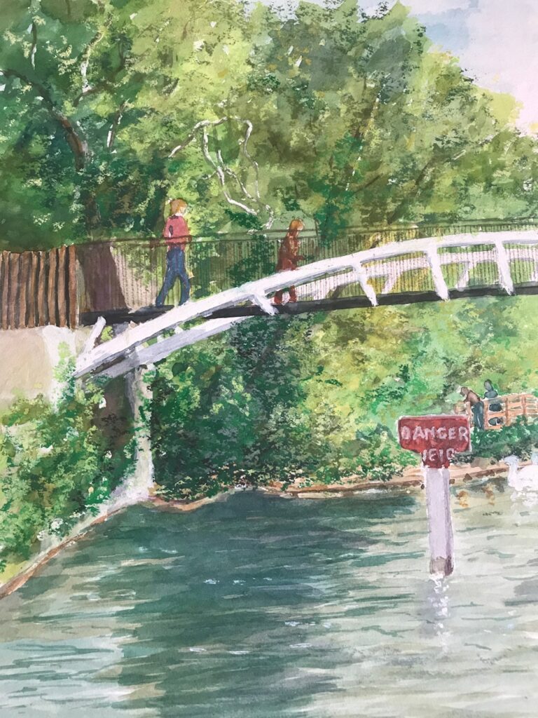
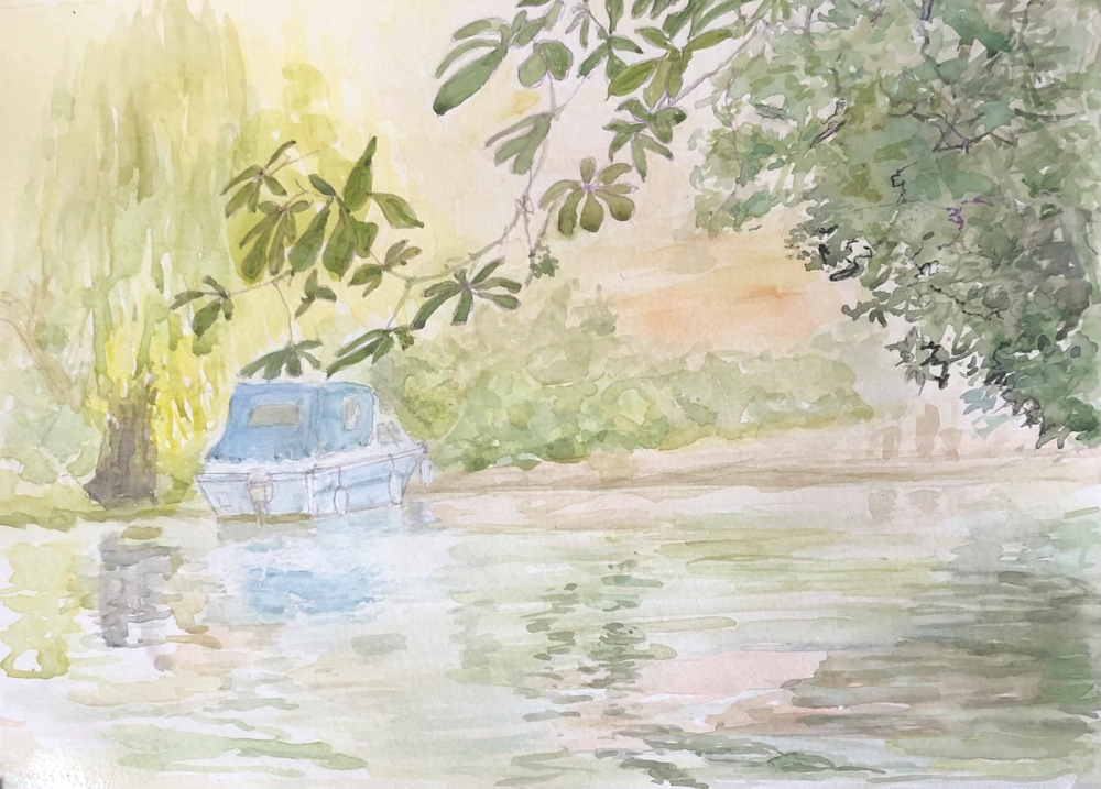
From the Riverbank: Week 6 Hurley
June 28, 2021
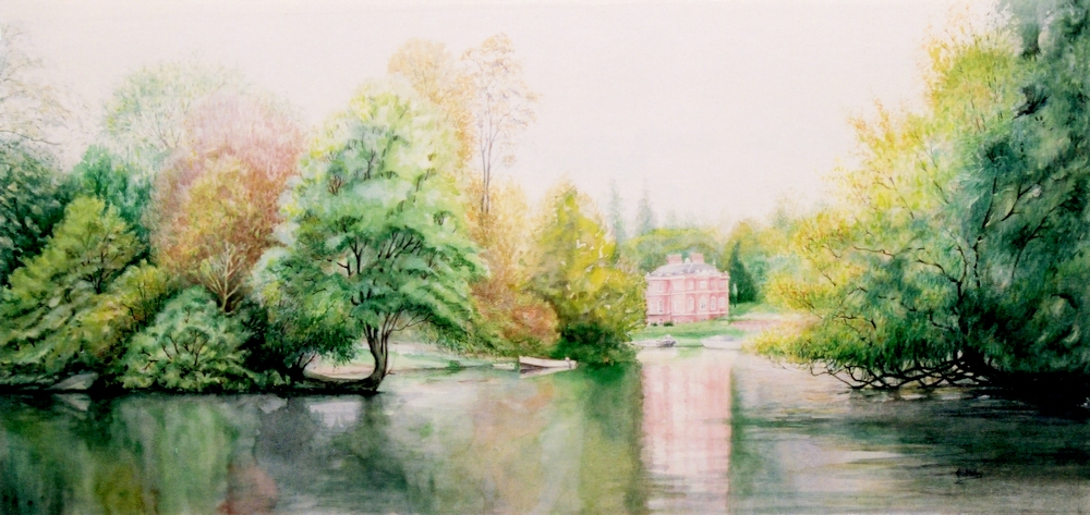
Watercolour
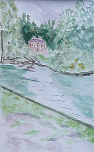
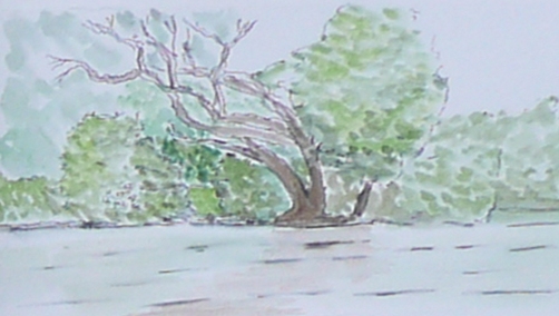
These are the results from everyone painting or drawing at Hurley in very different weather conditions from the previous week, while I visited all the drawing locations and took a few photos plus made the briefest of sketches. The view of Harleyford Manor was painted in 2000 from location sketches and was about 27 inches wide so a bit large to paint on site!
Your paintings:
Watercolour by Sarah
Watercolour by Sarah
Watercolour by Elizabeth
Watercolour by Elizabeth
Watercolour by Jan
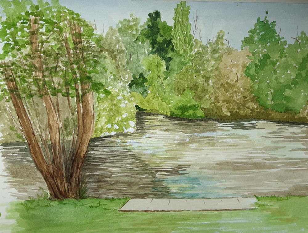
Watercolour by Virginia
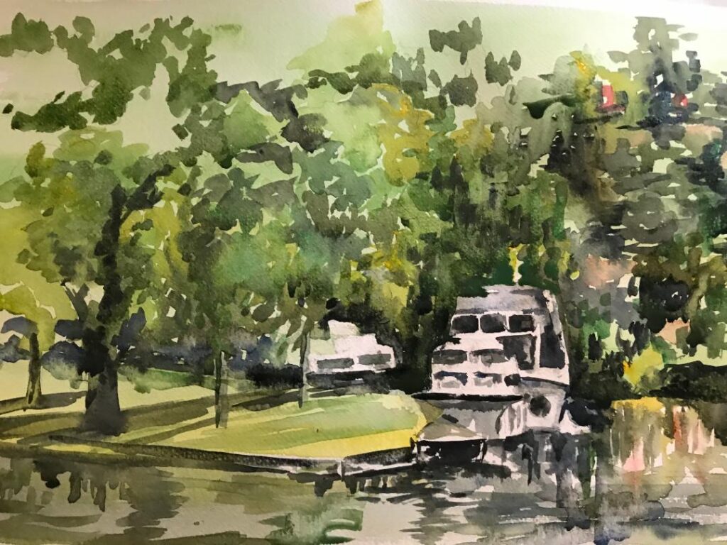
Watercolour by John

Watercolour by Liz
Starting Points for Abstraction: Week 1: Ideas and Rules
June 21, 2021
Why would any one paint an abstract work?
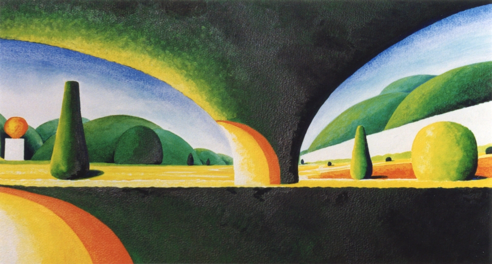
Acrylic on paper
Abstract based on observation, simplification and exaggeration of forms
The fast answer is to express an idea, an emotion or reaction without direct reference to tangible objects.
The reality is that many abstract paintings do reference recognisable things but they are significantly transformed. Given that in painting objects are already transformed from three dimensions to two it does not seem surprising that abstract art at its purest has no relation to objects but that there is a continuum from highly representational art at one end, to paintings with simplified or altered forms, and at the other end more radical abstraction where the shapes whether organic or geometric bear no relation to objects.
However being set free from objects does allow the artist to express mood with colour, with jagged or smoothe lines, slow or fast lines, lines made slowly, hesitantly or at speed, or shapes that are geometric or organic with hard or soft edges.

Watercolour
Intuition: This painting began as the wavy line across it. Some candle wax was rubbed rather randomly across and layers of watercolour washes some wet and some applied with a sponge. There was no initial idea just a get on with it and paint shapes, spots and introduce colours that seemed to be a next best step at each stage till it seemed time to stop. The title was given after the work was made.

Acrylic on paper
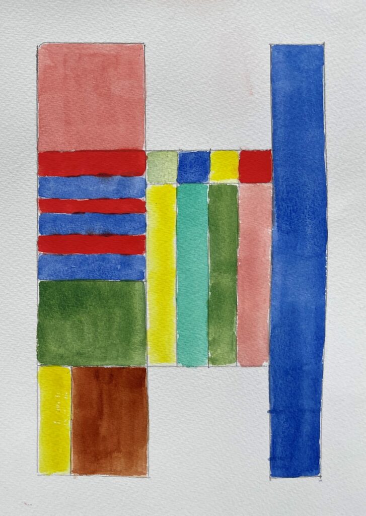
Idea: interpretations of scale/scales made visible by geometric shapes
Musical scales are the little stairways of rectangles; metronomes without pointers the three outside small triangles; the central part is filled with a balance and there are further triangles of different size; only the colour is intuitive but seeks to find a balance for each side
The most useful analogy is with music, the most abstract of the arts. It is not surprising that many artists have written on this subject. Music can be described as joyful, frivolous, melancholy, sublime, romantic, loud, soft, tender. So it is expressive without direct reference to objects.
What else? Various kinds of music have different rules within which they are made made; scale, rhythm, pattern, variation etc.
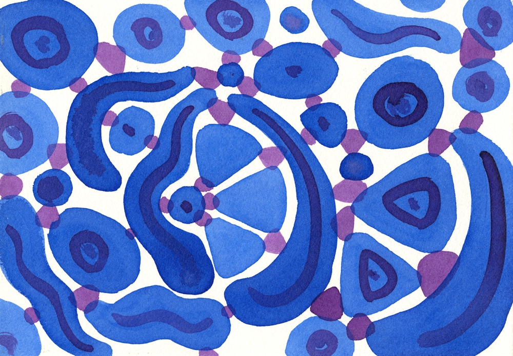
Acrylic ink on paper
Rules and Intuition A more intuitive study but where the artist chose to restrict one colour to the larger shapes and purple to the smaller connecting shapes producing a sense of movement. The final result was not envisaged at the beginning. The blue shapes were placed one at a time till the rectangle was filled and then connected by the purple shapes.
Music is created by a composer and interpreted by musicians so that the often written score/composition can be made audible.
Any composition will be a result of the composer’s imagination, intuition and skill within the rules of his/her musical culture and that culture will develop as the composer’s thought processes discover new ways, new rules etc. only limited by his/her imagination and will to experiment.
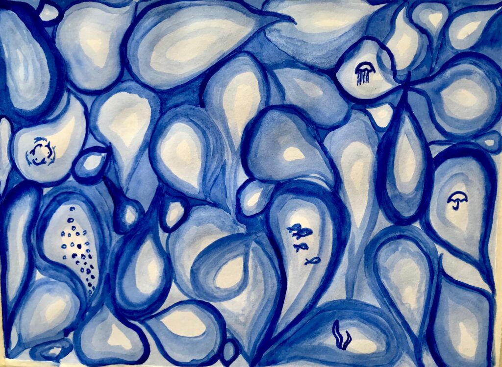
Watercolour
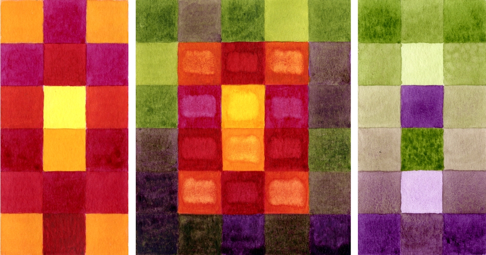
Rules and Idea; The idea is to represent the outside and the inside of the fig separately and combined. The rule is to make coloured squares to do so. The aim is to show the coolness of the exterior compared to the richness of hues within.
Music has an audience which receives and interprets the music. Painting has an audience that similarly receives and interprets. Figurative (representational) art works can be appreciated for their skill, the stories they tell, and often evoke an emotional response. They obey rules to varying degrees; of perspective, tone, and shape of the objects within a composition.
Music does this without reference to objects, though natural sounds, of the cuckoo, for instance may be incorporated into the music. The artist may also wish to produce works which rely less on the appearance of objects, producing expressive works freed from tangible subject matter.

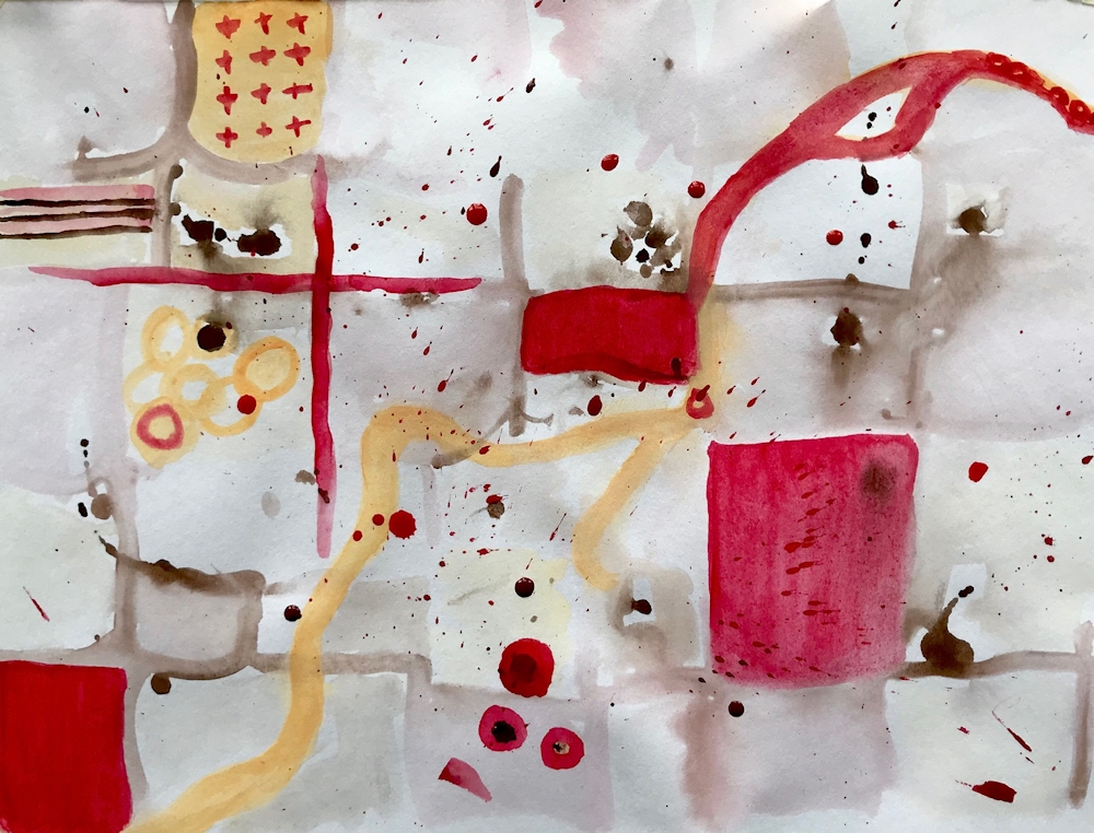
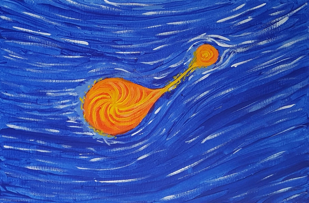
Acrylic paint sticks and acrylic ink on paper
A part accident and part intuitive composition; some of the paint was dripped on to a wet surface and lines extended through pale areas with a brush handle.
In this way Paul Klee described a paint box as the artist’s equivalent to a keyboard. He is deserving of study as possibly more than any artist Klee investigated the processes behind making abstract and imaginative works which may start with an idea or observation but do not have to. One can institute rules for development of the work or work very intuitively and over the next four weeks we will scratch the surface of some of these ideas.
The practical challenge for this week;
Reference the works of Paul Klee on the Pinterest Board at:
https://www.pinterest.co.uk/jhall1282/abstraction/paul-klee/
and Piet Mondrian at
https://www.pinterest.co.uk/jhall1282/abstraction/mondrian/
Make your own rules and then create two or three small paintings with expressive colours to set the mood of each. The paintings may be as small as 6 x 6 inches if working in gouache or watercolour, and larger if working in acrylic and all should be variations using the same rules. You may of course work larger if you prefer.
Make your own rules and write them down, or use one of the suggestions below;
1.Work with a grid however loose or tight and use colour and texture to suggest a remembered place or event.
2.Make a square or rectangle. Fill it with the same geometric shape at different sizes. They may overlap and be at any orientation. Colour using a limited palette or shades of one colour.
3.Fill a rectangle or square with groups of parallel straight lines at various angles to each other. Each line should meet another line at each end. No lines should extend the whole length or width of the rectangle or square. Fill the shapes with a harmonious colour scheme except for one complementary area. Reference Klee’s work ” Forest Architecture” or “Castle to be built in the Forest”.
4. Similar to 3. but the lines may be curved
Use colour to set the atmosphere/mood of each painting. Your own rules may include using different organic shapes connected by lines or shapes or shapes that are enclosed or partly enclosed by other shapes. The possibilities are endless. After a few quick doodles go for one set of rules and stick to it.
During the practical session we will review the work and look at more intuitive starting points and how these can be developed.
Your paintings;
by Heather

by Malcolm
by Virginia
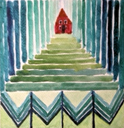
by Liz

by Liz
by John
by John
by Malcolm
by Heather
by Virginia
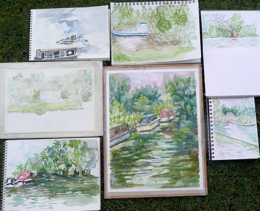
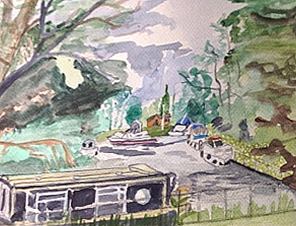
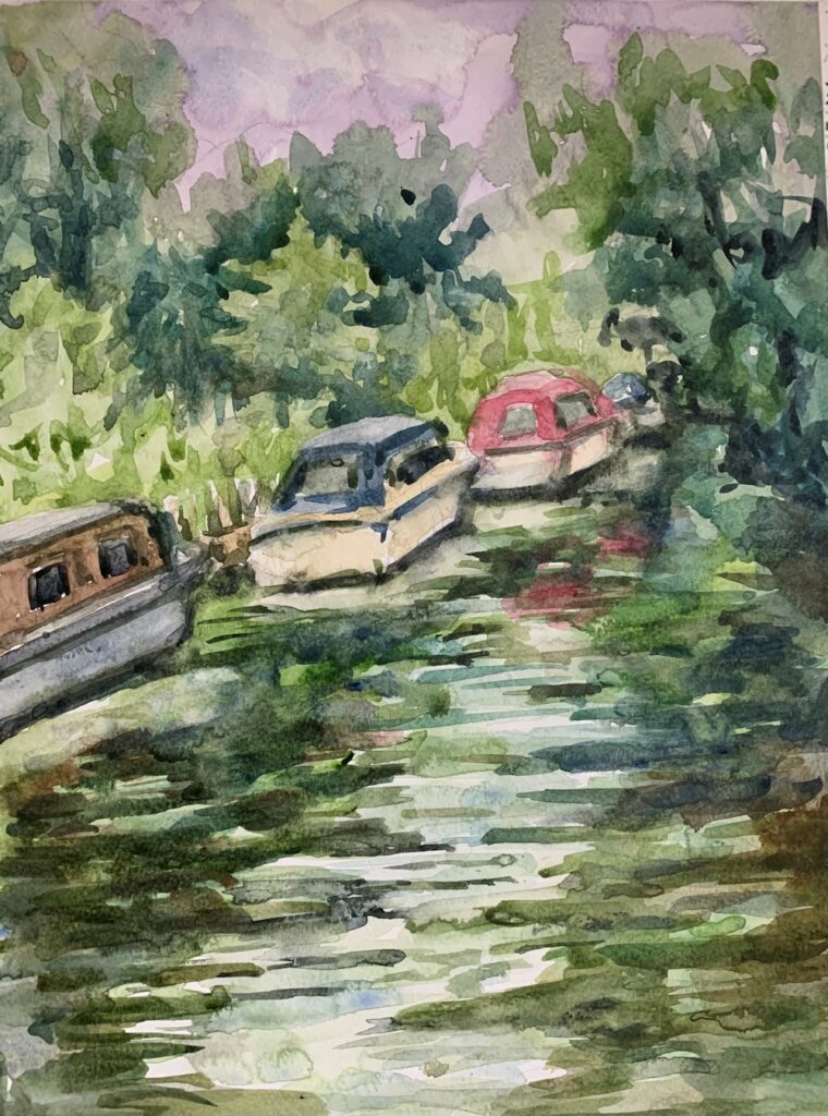
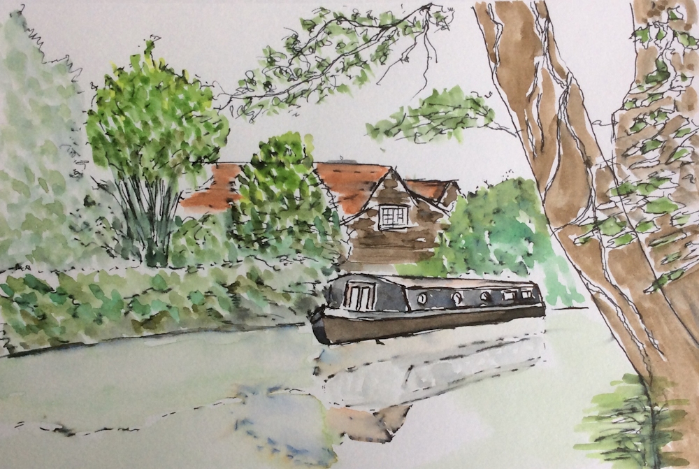
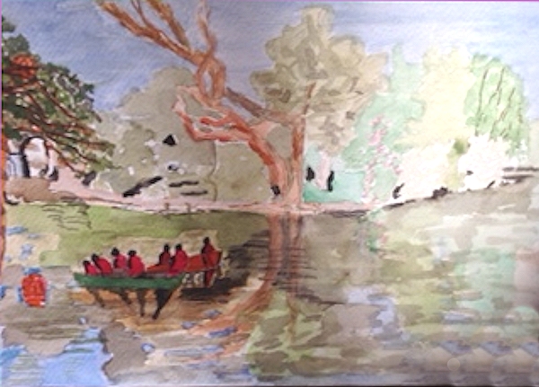
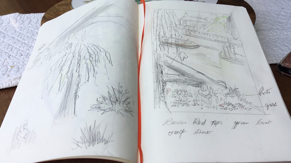
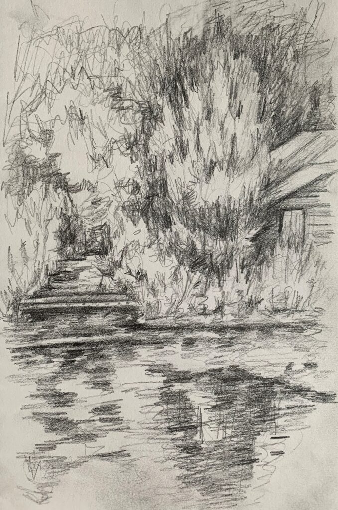
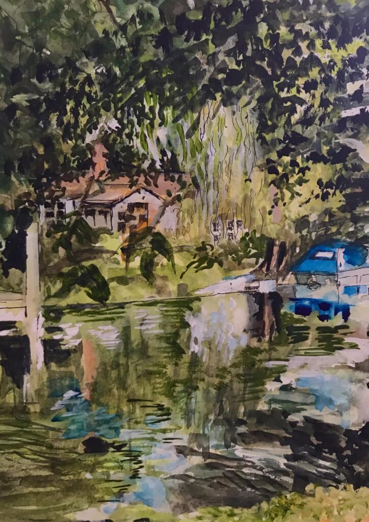
From the Riverbank: Week 5 Hurley
June 20, 2021
With just an hour till coffee time everyone set about painting a watercolour sketch of the Thames at Hurley. This is a challenging task at this time of year, busy with all sorts of boats from motor cruisers to kayaks. There was always the option to finish at home or stay a little longer to complete the work or make another painting.
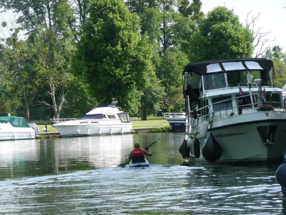
Because of the complexities of boat shapes this challenge necessitated considerable simplification of the shapes and a critical view of the tones. When you add in the fact that many of the boats were moving one can understand wanting to finish at home perhaps referencing a ‘photo. This is OK but there are a few pitfalls.
1.Always take the shot at the eye height you were drawing at. There is often the temptation to stand up if you have been working sitting down and the view will not be the same.
2. Photographs taken in the high light conditions we were on Tuesday, can have too much contrast. The shade areas often looking very dark and very pale areas being ultra white. No worries in your painting to leave the white of the paper for the palest areas. This will give your work a really sunny appearance. If you copy the darkness of your reference in the shade areas you should ensure the differences in tone have sharper cut off points than on a dull day. In sun all shadows will be crisper..
If you need to lower the tone of a whole area this is usually best achieved by putting a wash over the whole of the darker area, leaving just a few tiny paler areas rather than doing it by dabbing away with small brush strokes. Sometimes by referencing your photo and on site watercolour, it can be better to to work another picture taking these tones into account with the first washes as this can be difficult on site in very sunny conditions.
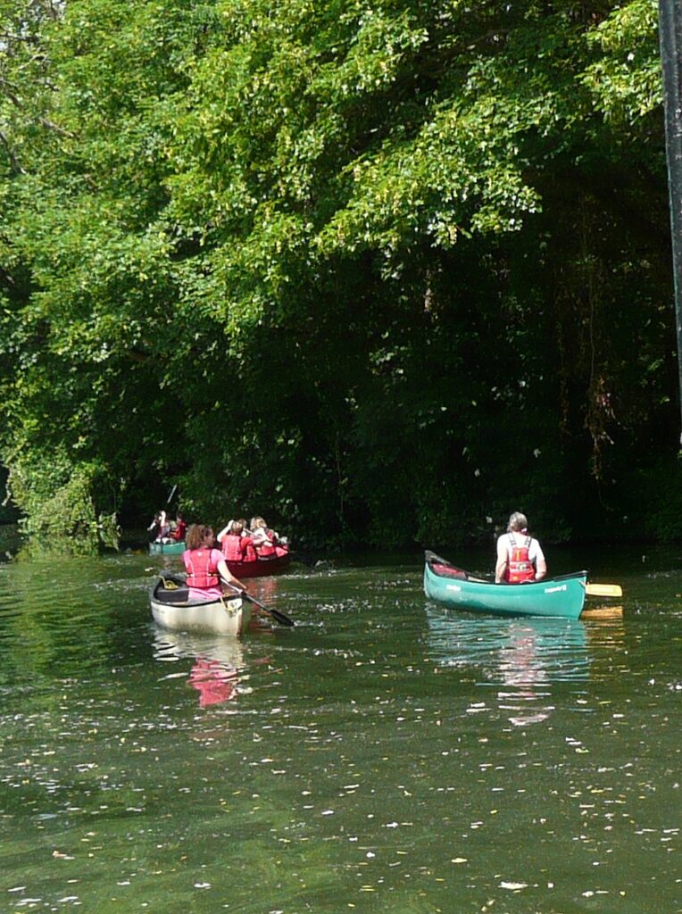
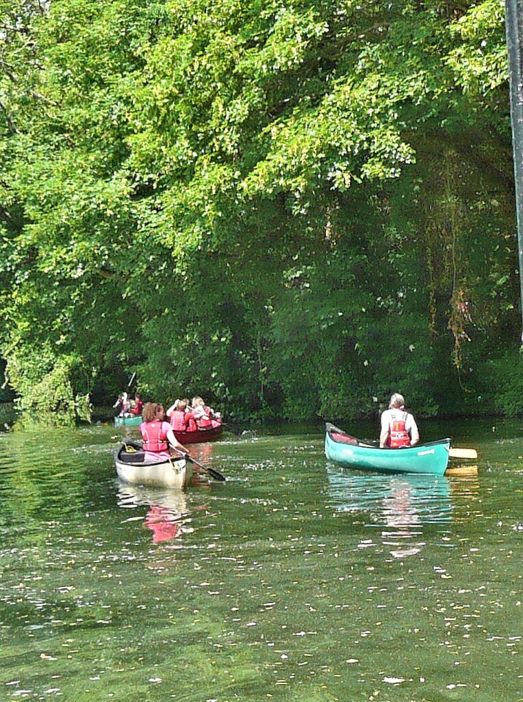
Exactly how dark to make your shadows can also be greatly governed by your intention. The reality as in the first photo below was that the shadow area behind the canoes was so dark it was hardly even textured. You may choose the dark to offset the colour of the canoes for a dramatic effect, or you may choose the softer effect of seeing more of the texture and colour of the background as in the modified second photo below .
3. There is also a temptation to add washes to the water that soften the edges too much. Last Tuesday the weather made for very clear reflections and waves and that should be reflected in your paintings. Again this was made difficult as in places the water appeared very green. Where a paddle hits the water you can always give a little sparkle to the splash by scratching out with a sharp point. Wait till the rest of the painting is complete before attacking the paper in this way.
This week we’ll be at Hurley again and probably in very different light conditions. Notice any differences especially if you visit the same spot to paint. We’ll also talk about colour, especially the water and reflections.
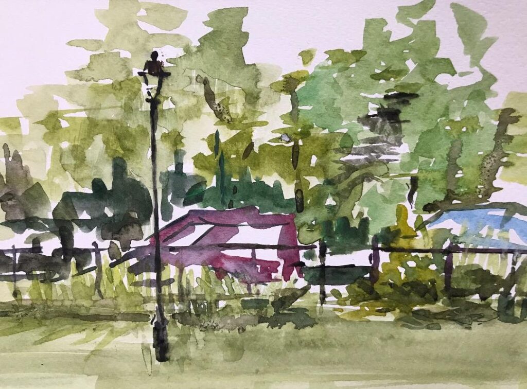
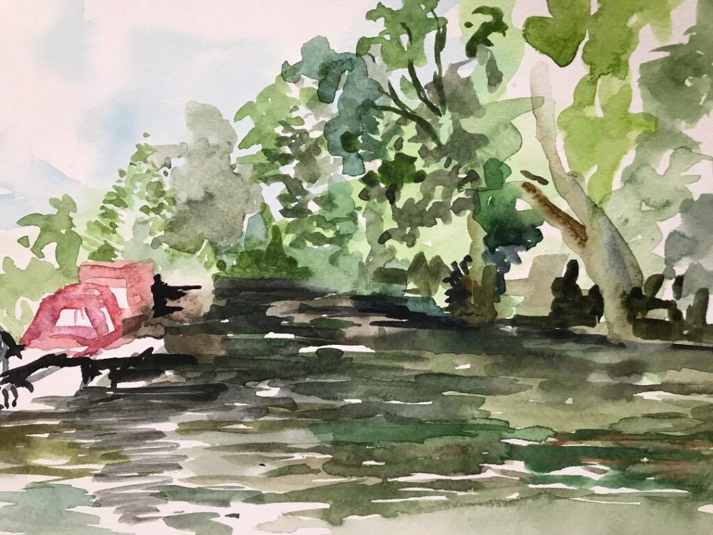
Your paintings;
On Site at Hurley
Completed Afterwards
Jan has left some light spots in the foreground and on the tree foliage and trunk so the painting is still lively. The darker than original foreground and trees/foliage, has made a good contrast with water. A little of the freshness of the first painting has been lost but I can see the reasons for making adjustments.
Watercolour by Mali
Ink and wash by Barbara from a photograph
Watercolour by Elizabeth
Watercolour by Sarah from Photograph
Watercolour by Liz
by Virginia
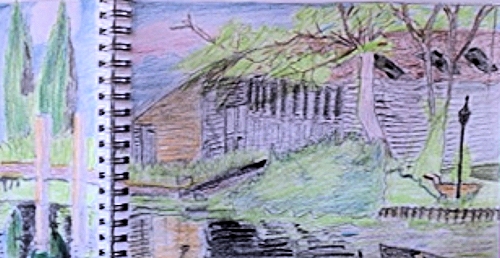
From the Riverbank Week 4: Sketching near Boulter’s Lock
June 8, 2021
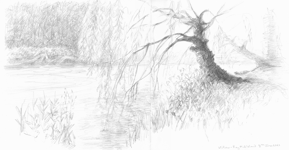
Such a treat today to be sitting outside drawing subjects we have become familiar with using photo reference. Before publishing I added more tone to these sketches from memory.
Have already spotted a couple of areas that need adjusting.
The heightened contrast reflects the very bright sunlight we worked in. I’m now going to discover the ‘photos taken at the same venues which I know will have too much contrast, so no good as photos but a very good reminder of the importance of tone in composition.
Your Sketches and Paintings from Sunny Maidenhead;
Watercolour by Maryon
by Ann
by Barbara
by Jan
by Mali
Watercolour by Virginia
Pencil and Coloured Pencil by Elizabeth
by Sarah