Category Archive: Painting Techniques
Inspired by Words: Autumn Poetry
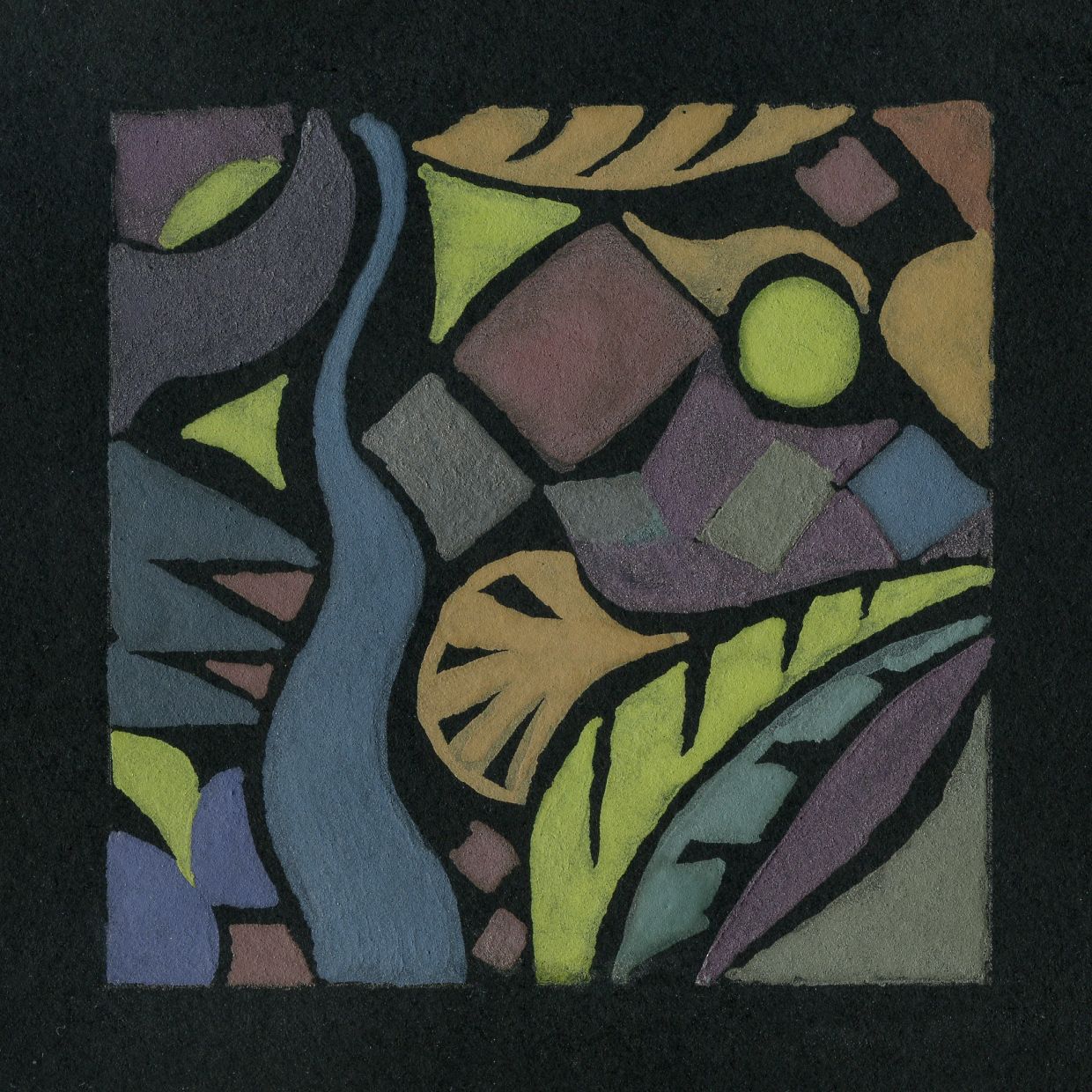
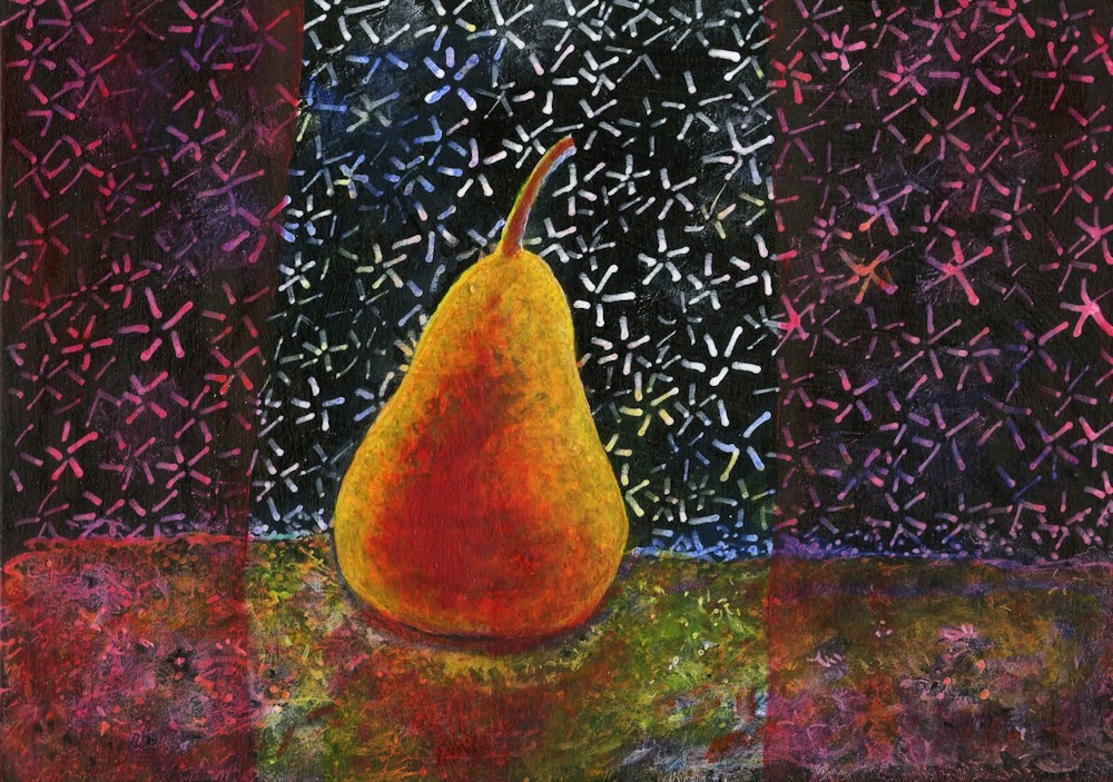
November 15, 2024

by Jo Hall
Acrylic and Ink
Many of us will know the poem “To Autumn” by John Keats that begins “Season of mists and mellow fruitfulness”. Written in 1819 and first published in 1820 I took my cue from
“To bend with apples the moss’d cottage-trees,
And fill all fruit with ripeness to the core;”
The little painting above was a demonstration piece from a short course I am presently tutoring at Norden Farm Centre for the Arts, Maidenhead, where participants are invited to make artworks inspired by poetry. The work could be representational and narrative or much more abstract and we talked about how decisions on the approach could be made according to the nature of the words referenced. We started with poetry about Autumn and found works ranging from the highly descriptive, to poetry that is more concerned with emotions concerning decay and death as in Shakespeare’s Sonnet No. 73.
The imagined landscape above has fruit laden trees and mists with a clearer view to sunlight on red roofed cottages in the middle-ground. Beyond them golden fields and more mists merge into a clouded sky that looks blustery enough to blow the mists away. Mist is so frequently referenced in connection with autumn that it is useful to find ways of portraying it. In the painting above this was simply achieved by applying white and pale blue-grey pastel over the acrylic paint and ink line work. The middle-ground cottages were left in their original colourful state so the difference is clear. To achieve misty effects, pastel dust can be ground from a regular pastel stick and applied with a finger or cloth dabber, or Pan pastel can be applied with a soft rubber sponge.

A similar effect can be produced by scumbling thin veils of pale blue-gey or white acrylic using a stiff brush. Do ensure the painting is completely dry before scumbling.

Another poem I was attracted to was “The Burning of Leaves” by Laurence Binyon. It begins
“Now is the time for the burning of the leaves,
They go to the fire; the nostril pricks with smoke
Wandering slowly into a weeping mist.”
Then the later line appears:
“Fingers of fire are making corruption clean.”

by Jo Hall
Inspired by the poem by Laurence Binyon
Mixed media

Stages showing how this painting was built up in layers of mixed media
1. acrylic
2. ink and some oil pastel scratched into for texture (sgraffito) soft pastel rubbed over to soften blue areas
3. Pale Posca pen, more black ink, further layer of pale pastel over blue and gray areas for smoke
Another two lines from the same poem inspired the painting below:

by Jo Hall
Acrylic and pastel
“All the spices of June are a bitter reek
All the extravagant riches spent and mean,”
Here I imagine the rich blocks of colour representing the rich flowers and smells of June heavy with roses, are being consumed by the fire. The comparison with our personal earthly riches and their destiny is clear.
The poem’s end bleakly reminds us of our own mortality, but also hope for those who follow us who will see the Spring, and there is an inference that the decay and purification process is necessary for this renewal.
My personal view on mortality is that for those with faith the outlook is not bleak, but as a former scientist I know decay is certainly vital for the renewal of life in Spring! So glad tutoring this course has rekindled my interest in poetry.
Magic of Black Week 6; Imagine and Experiment
March 29, 2023

White Posca pen and interference watercolour over a very light application of white pastel pencil
by Jo
This last challenge in the series is to use your imagination to make a story drawing and/or to experiment further with materials, perhaps using them together as in the image above.

Sampler by Jo
Before this series of challenges using black paper I had hardly used interference watercolours but had used some metallics. As you can see in the sampler above they can almost appear like stain glass windows when separated by small areas of black. You may like to design your own window or paint a bird with iridescent wings.

by Jo
To draw the jellyfish the upper part was drawn first and the bright base where the tentacles attach. The tentacles were then drawn with a very relaxed arm to produce a smooth and fluid line. It is best to practice this first. To prime a Posca pen the first time it is used, or during the drawing process if it does not flow freely; just shake the pen to mix the paint then press the nib down gently on a spare piece of paper. The nib will retract into the barrel. Release the pressure. If necessary repeat till ink seeps into the nib and the ink flows freely again. Always shake the pen first before using.
In the sea anemone drawing look at how opaque the paint pens are and how when dry layers of different colours can be built up. This is a rather cartoon like/decorative piece but it helped me find out how the different colours could work together. These pens are excellent for making areas of flat colour as well as for line and small bright marks like dots.

Coloured pencil by
Jo
The dandelion head is made with soft coloured pencils and is an easy exercise to try which I cannot take credit for. Choose a fairly smooth black paper to work on. Simply draw the stalk with a white, a pale yellow green and a brown pencil. Lightly mark out a circle with its centre where the stalk ends. Lightly draw a yellow green area at the centre before drawing lines mostly in white radiating outwards. Start each stroke at the centre easing of the pressure toward the edge of the seed head. These lines should vary in length some ending only a short distance from the centre and others extending to the edge. Then the little white “stars” can be added with fast short strokes. Adjust the colour with a little yellow green or brown in places and there is your dandelion clock!

Soft pastel and Iridescent soft pastel
by Jo
For the sea dragon which is related to the seahorse, a white pastel pencil was used to draw a feint outline which was drawn into with a pale cream pastel before picking the features out with an iridescent soft pastel.

Oil pastel, iridescent and metallic oil pastel over a little soft pastel and a little line work in white pen
by Jo
In the image above some areas were worked with thinly rubbed in soft pastel. A little line work in white ink was then applied before going in with oil pastel. Again the iridescent oil pastel was used as the final sparkle.
Hope you have enjoyed the last six weeks challenges and that working on black paper has been a fun and exciting way to experiment with different media.
Your Paintings;

by Heather

by Heather

by Mali

by Mali

by Kate

Design by Pam

by Kate

Brusho and white Posca pen by Liz

by Pam
Magic of Black Week 5: Paint a Still Life with Flowers or a Natural Form
March 22, 2023

This week’s challenge is to paint a still life with flowers or a natural form. There is no set medium and pastel, acrylic or gouache would all work well. The support does have to be black, either paper or a board primed with black gesso. The example above is gouache on a smooth black paper.
Unlike working with negative shapes, this time it may be that the object or still life group has a mainly black background. It may be useful to paint a simple object that you wish to include in the final painting to work out how your chosen medium works on your choice of support. It is an opportunity to use very opaque colour, and also thin veils of colour. My demonstration includes some Honesty seed heads, which being translucent make an ideal subject to illustrate this.
The following images may help you to get started. Choose as simple or complicated a set up as you are comfortable with. As previously, a white or pale grey well sharpened pastel pencil was used to very lightly draw in the main lines of the composition before going in with paint.


Looking forward to some really colourful work!
Your paintings:

by Pam

by Kate

by Mali

by Liz

by Heather
Magic of Black Week 4: Notan
March 15, 2023

by Jo
If the Notan had been produced by the artist very careful consideration would have been made in deciding which mid tone areas to allocate to either the white or black areas of the Notan. The arbitrary limit set by the program was highly successful in this case in preserving the character and information in the painting.
This is not always the case in digitally produced Notans,
Thinking in black and white (and possibly grey)
Notan is the balance of dark and light in a composition. This Japanese word word derives from the Chinese, Nóng Dàn, which refers to Nóng meaning strong or concentrated (dark ink) and Dàn meaning weak (watery ink). We will make Notan studies using two, and three tonal values and discuss how these relate to painting in colour and printmaking. We will also see that the pattern of shapes in a successful Notan study can be more than a strict reflection of tonal values.
One of the best ways to develop a strong composition is to build a strong pattern of lights and darks. A Notan study will help to identify these patterns before embarking on the final work. Whether working on black or white paper It is helpful to draw the main shapes swiftly but accurately to avoid getting bogged down in details. This could be done with a white pastel pencil if working on black paper. Then all the pale area areas can be filled with white ink or paint. It is relatively easy to identify the darkest areas but when it comes to the mid tones you should try to assign these areas to light(white) or dark(black) values which best convey the sense of what is happening in the picture. This applies whether you are working from life or from a photograph. Where only two tones, black and white are used the Notan study is called a 2 value Notan.

by Jo
Some compositions are better described by 3 value Notans where the subject is reduced to black, a mid-tone(grey) and white. It is of course very possible to include more values but for our purposes 2 and 3 should suffice.
Do read the short introduction to Notan by Mitchell Alabala which very eloquently describes how Notan is linked to shape and patterns that define the structure of a composition rather than being studies totally defined by tone ; links below
https://mitchalbala.com/the-wisdom-of-notan/
And look at the accompanying 13 minute video
https://mitchalbala.com/video-exploring-composition-though-shape
You will see how this is especially the case where different colours that are similar in tone make distinct patterns of shapes over the whole area of an abstract work.
Practical: Try making a 2 value Notan, and if you have time a three value Notan;
Choose to make these from an existing well known artwork, a simple still life set up or a photo reference. This will be easiest where there are well defined areas of light and dark as in a portrait or still life lit strongly from one side. Identifying the main shapes and eliminating unnecessary detail is the key to a successful Notan as is including necessary detail and careful assignment of the mid tones in a two value Notan. In the Notan derived digitally from a photo of a painting at the beginning of this post much of the detail could have been eliminated leaving a stronger pattern of larger shapes. Necessary detail may be a tiny slither of light or glint that makes sense of the overall image.
Making a 2 Value Notan
1.Find a reference ( photo or art work) or work from a simple still life set up. If working from a reference try to find one with strong contrasts and relatively simple shapes. Mark out a rectangle of the correct proportions on your paper.
2.Identify all the main shapes by tone. Decide which mid tones will be assigned to the black of the paper and which will be painted white. On black paper this could be done by working with a white pastel pencil to establish the proportions of the main light and dark areas.
3.Block in the light areas with white paint or ink.
4. If you have time make a second study from the same reference and assign the mid tones assigned rather differently. Think about which Notan is most informative.
Making a 3 Value Notan
1.Find a reference and then mark out a rectangle of the correct proportions as before.
2.Identify dark, mid tone and white areas and mark them with a white pastel pencil or white coloured pencil.
3.Then paint in the mid tone and white areas. Sometimes it will be easier to paint all areas that are not to be left black in white first, and then to add the mid tone over the top. In other cases it may be easier to paint everything except the darkest with a mid tone grey first, before adding the palest parts in white over the top.
4.Please send an image of your reference as well as the Notan studies. Reference material will not be published on the blog but would be helpful for the review.

produced digitally
by Jo
In this instance although the 3 value Notan describes the image a little better, the subject can be very well understood from the two value Notan.
Below are a few additional notes:
Digital Notans
There are several computer programs which will provide you with 2, 3 and more value Notans. These do not always convey the spirit and energy of a reference in the way that your personal Notan study will. This is because an arbitrary and fixed threshold of what will be designated as dark or light may be different to the best way to communicate your subject. Some areas of the composition may require a different threshold to communicate that. That said, if you have problems in beginning your studies, seeing the results of a digital process can be helpful. One of the other problems is that a digital process will not simplify the shapes for you.
Notans and Printmaking
After making a few studies you will soon see the practical relevance of making Notan studies both to analyse the patterns of shape that inform a composition for painting and also for print making, especially for relief printing where you will need to clearly define the shapes that will be inked or cut away so they are not inked.
Decorative Notans

by Jo
Here fish and sea weeds were cut out of a square of black paper. The paper and and the positive shapes cut from it were pasted on to a white piece of card.
Interesting designs can be made by playing with positive and negative shapes as in the sea and fish decorative Notan above. This is a really fun way to play around with shape and pattern.
Your Notan Studies:


Some of the smaller shapes detract from the fact that Liz has observed the larger shapes very well. Because the paint did not cover well in places Liz’s Notan was made to look flatter digitally.

Black paper square cut and arranged on white board.

2 value Notan by Mali

3 value Notan by Mali

by Mali

by Mali

Not sure this has anything to do with Notan but it is very lovely drawing. Really like the contrast of the transparent and translucent looking vases.

Magic of Black Week 3: Night Scene
March 8, 2023

Pastel on Black paper by Jo
Note how the tree trunks are “not drawn or painted”.
All the drawing is in the spaces between.
Working on black paper lends itself well to drawing and painting night scenes just because they are DARK. Lights from street lamps, moon and stars can be depicted simply and dramatically.

Watercolour by Jo (unfinished)
The main lines were lightly marked with pastel pencil. Masking fluid was applied to all areas that were to remain black. The paper was dampened then washed with layers of blue and green interference watercolours using a large mop brush. These washes were modified with smaller brushes. The painting was allowed to dry thoroughly before removing the masking fluid.
Pastel and pastel pencil, or gouache or acrylic would work well. Paint pens could be useful for the odd bright pop of colour. Happy for you to experiment and mix the media. When working with pastel white gouache can be used to accentuate highlights. Pastel can also be applied as over gouache or paint pens where a softer effect is needed. Most watercolours are too transparent for effective work on black paper but mixing with a little permanent white increases opacity and the effect is similar to working in gouache.
Work from a reference or your imagination. In either case think very carefully about which areas you wish to leave as untouched paper or with a thin veil of colour and which areas need to stand out brightly. Whether working in pastel or gouache it can be useful to mark out the major areas of the composition very lightly in pale pastel pencil just to give a road map. Deal with the mid tone areas and then add the brightest areas of light as the finishing touches.

Tiny pastel by Jo 4 x 5 inches
Here the tower is left as mainly untouched paper.

Pastel and Pastel Pencil by Jo about 4 x 5 inches
Note the arrangement of light and dark areas, use of line and use of broken colour. In this drawing the trees trunks and branches were drawn first before laying in the misty areas. The leaves were then added as bright dots and dashes of white and near white broken colour.

Pastel by Jo
This red cloud is an imagined galaxy full of white stars. Each star is made to look luminous by making its immediate surround dark giving a huge contrast with the star embedded in the light to mid tone dust cloud.

Pastel and Pastel Pencil by Jo
Here the moon is made to look luminous in the same way as in the previous image except the full moon is surrounded by a small ring of untouched paper then a halo of mid tone. Note the reflected light on the cloud, the reflection in the water and the moonbeams lighting up the landscape.

Photo by Jo
Imagine how it would be to use this photo as a reference and how all black areas could be represented as untouched black paper, while making the lights brilliant.
Also identify the main areas of mid-tone.

Photo by Jo
This could also be painted on black paper reserving the black of the paper for the palm trees and telegraph pole. How could you deal with the wires? Night scenes like this and the photo above could be painted in pastel or gouache.
This week is really an introduction to painting the negative spaces between the trees and other objects that block the light. it’s also a great opportunity to make lights that appear truly luminous in your paintings. Happy for you to work from the photos above, from your own reference or from your imagination using any medium.
Practical
1.Choose a night scene photo reference or work from imagination.
2.Work our your composition on a small piece of black paper and do some experiments to find which medium or media will suit your subject best. Mixing the media may produce an exciting result.
3.Map out the composition very lightly with a pastel pencil on the paper selected for the final work and then create a work where some of the paper is left untouched or is visible beneath translucent layers of colour.
Your Paintings:

Acrylic over Black Gesso
by Pam

Pastel
by Liz

Gouache
by Liz

Gouache on Black paper
by Heather

by Kate

Gouache by
Mali

Pastel
by Mali

by Mali
Magic of Black: Week 2 Dots Lines and Shapes
March 2, 2023
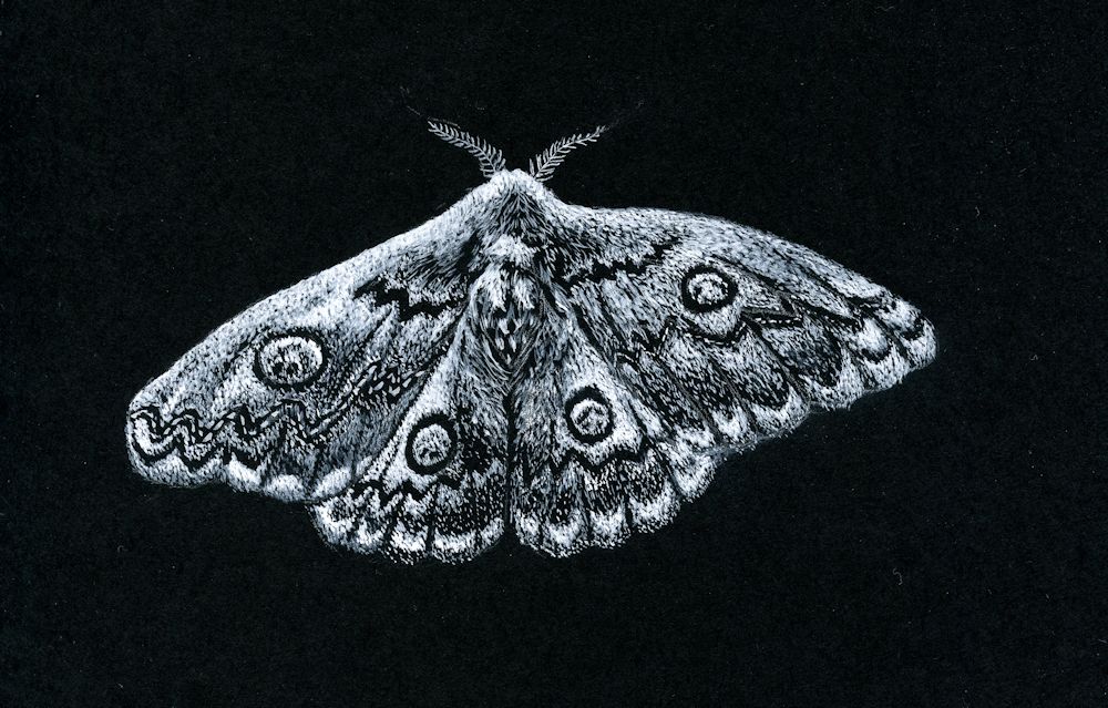
White gouache on black paper by Jo
This painting is entirely made up of tiny dots and dashes
This week we’ll explore making patterns of dots, lines and shapes to create texture or to make illustrative or imaginative drawings. If you are working with very small marks don’t attempt a large piece. The moth drawing above was only about five inches by 3 1/2 inches. If you decide on exploring shapes this can be as large or small as you like but for a large piece use large brushes or chunky materials to suit the scale.
Happy for you to experiment with seeing a scene in plan view. As in the drawing below.

Gouache by Jo
Note how the dots have been used to make patterns of eddies in the river. The scene is as if in plan view so the green circles are trees. The palest dots have been used to mark out the main areas.
The composition relies on the shapes; the arrangement of the large areas and the arrangement of the colours and tones of the dots. There is no attempt to create an illusion of three dimensions but there is a sense of movement.
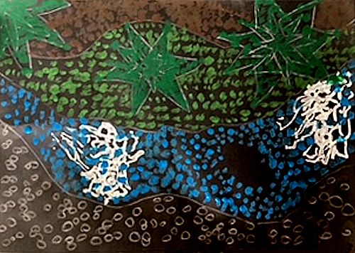
Dots
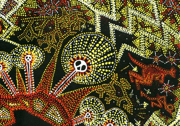
Shapes, dots and lines have been used in very ancient rock art and also the more recent and intriguing dot paintings of aboriginal artists in Australia. I took inspiration from both rock art and dot paintings for the “Ring of Fire” drawing below. The dots are used in two main ways; firstly to fill shapes and secondly to form lines to mark out the main areas/motifs of the composition. They can also be arranged in lines making decorative patterns as in the haloes of the lightning spirits below which are filled with radiating lines of dots. Unlike the Meander drawing where the dots are placed close to each other over the whole work, in the drawing below the black paper between the dot motifs plays a much more significant role in the composition.

Gouache by Jo
This dot painting combines ancient cave painting motifs of lightning spirits with a dot technique. Gouache was used and applied with a small round brush held vertically to make each dot.
Note how the colours are used to produce pale and mid tones on the black paper.
Gouache by Jo
Note how the spaces between the dots play a significant role.
Patterns of lines
Similarly lines can be used to form patterns within a composition or as the basis for its structure separating one area from another. By altering the density of marks across a shape both lines and dots can also describe form as we saw from the scribbling marks in the previous post.
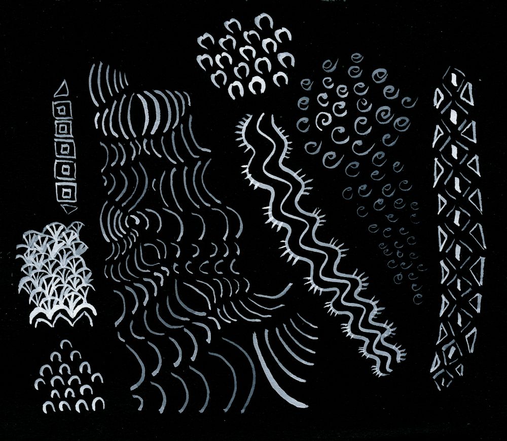
These can be free and organic or more geometric: experiment!
Another consideration is perspective and acuity. If you reduce the size of marks so that those at the bottom of the paper are large and gradually become smaller the further up the paper they occur they usually read as being more distant rather than smaller in size. Imagine a long shingle beach. The stones closest to you are seen as distinct individuals; further away they form an irregular pattern, further still they are seen as a texture but can no longer be sees as distinct entities; yet further away they will just be a colour in the distance.
Decide whether you would like the marks to speak for themselves or whether you would like to add thin veils of watercolour or pastel as in the image below.
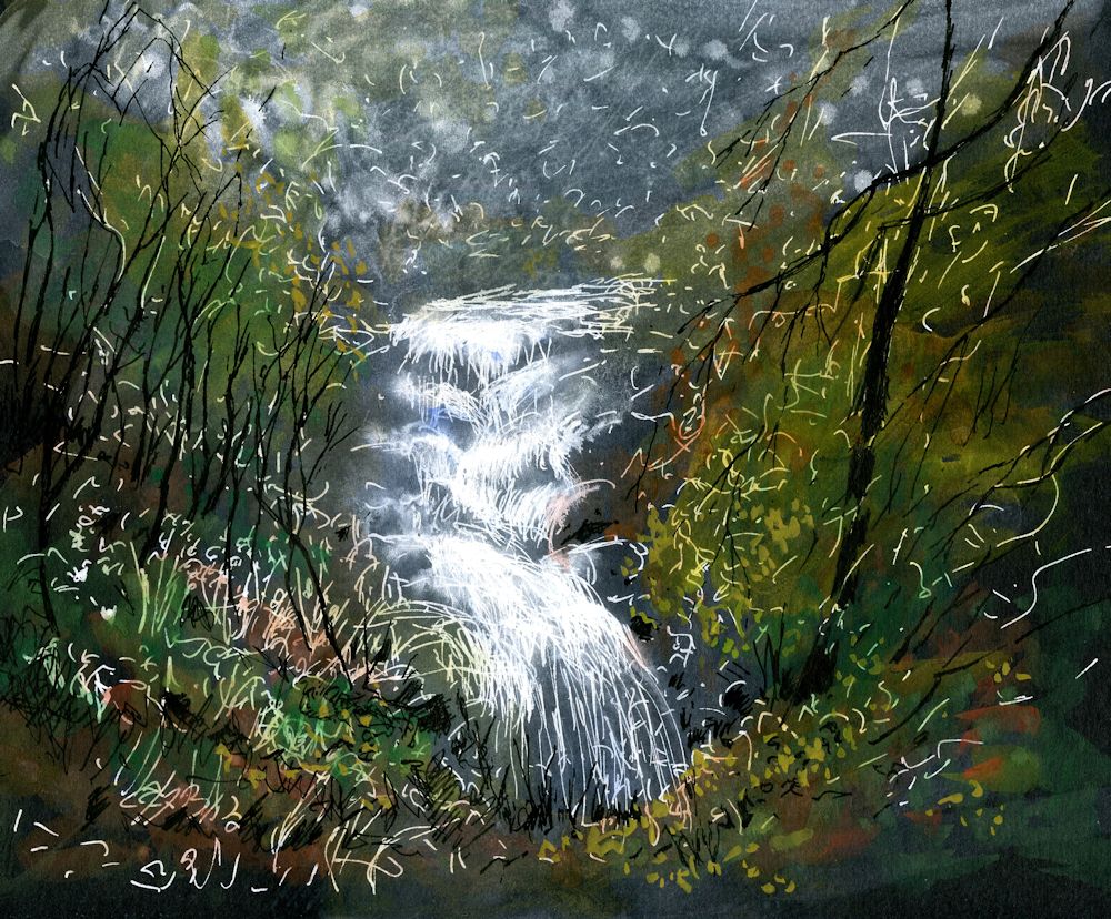
Mixed media on black paper by Jo
White marks were made freely with a white paint pen then dilute washes of permanent white gouache added and also some black India Ink marks for the trees. Finally, coloured washes of green and yellow ochre watercolour were applied.
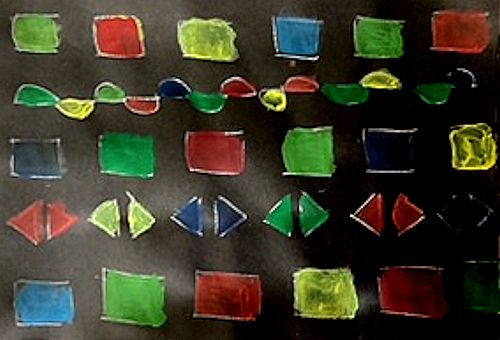
Shapes
Try working intuitively with shapes on black paper. You may work in white or colour. If you don’t have any gouache colours, just add some permanent white gouache to your watercolour mix to make it more opaque. If you already have some gouache paints you won’t have to add white unless you need a paler tint.
This tiny sampler 2 1/2 x 2 1/2 inches was painted with some Derwent Graphitint pans which proved to be very opaque.
For this week’s project you may like to work intuitively or be inspired by natural forms. You may also like to look at the following Pinterest Boards on pattern and rock art.
Rock Art
https://www.pinterest.co.uk/jhall1282/magic-of-black/rock-art/
Abstract Pattern
https://www.pinterest.co.uk/jhall1282/magic-of-black/abstract-pattern/
Patterns of Nature
https://www.pinterest.co.uk/jhall1282/magic-of-black/patterns-of-nature/
Materials you will need
Black paper; white gouache and brushes or white ink or paint pen, watercolour or gouache colours;
You could alternatively work in pastel pencils or pastel or mix the media.
Have some India Ink ready as it can be used to reinstate black as in the waterfall drawing.
1.Experiment with making patterns of dots, lines and shapes. Aim to work a small sample of each and using all three together.
Then do either 2 or 3
2.Make an abstract or near abstract composition of lines and/or dots and/or shapes. Some lines and dots may overlay areas of colour. Try to make the black support an important element in the work. The work may be very free and organic or more geometric. The rock art and abstract Pinterest boards may give some useful inspiration.
3.Make a finished drawing/painting inspired by natural forms or landscape. Think about what drawing marks will suit your subject and composition best. Use at least one of the techniques described. The marks and shapes may “speak for themselves” or you may like to add veils of colour with dilute watercolour or pastel to soften them.
Your paintings:

by Pam
by Pam
by Liz
by Liz
by Heather

by Heather

by Heather
by Mali

by Mali

In line and filled shapes
by Kate

by Kate
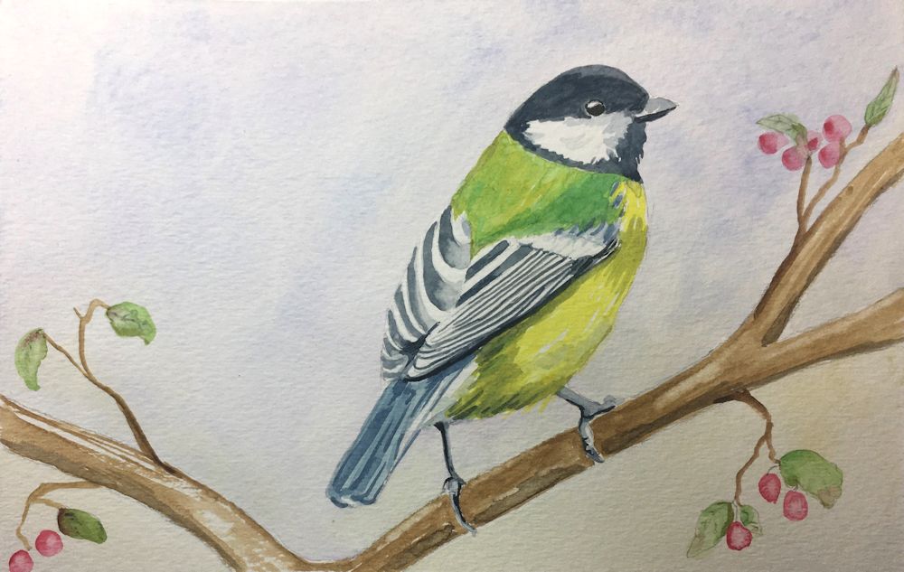
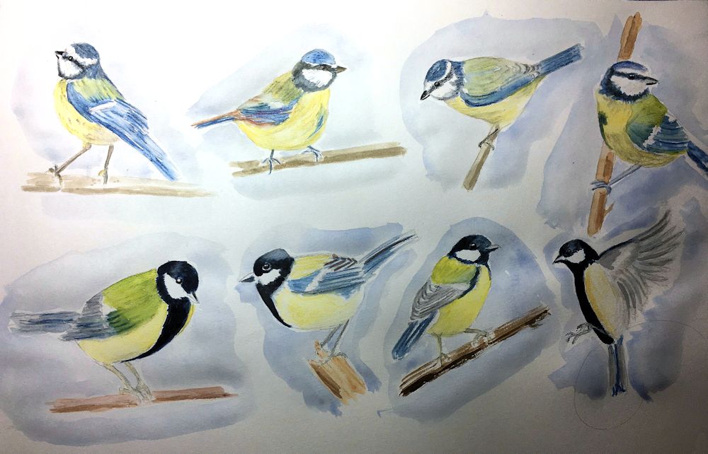
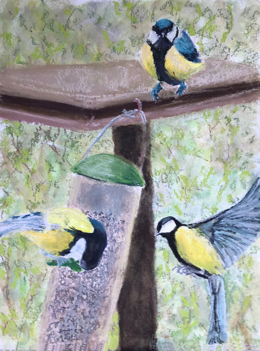
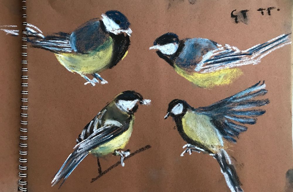
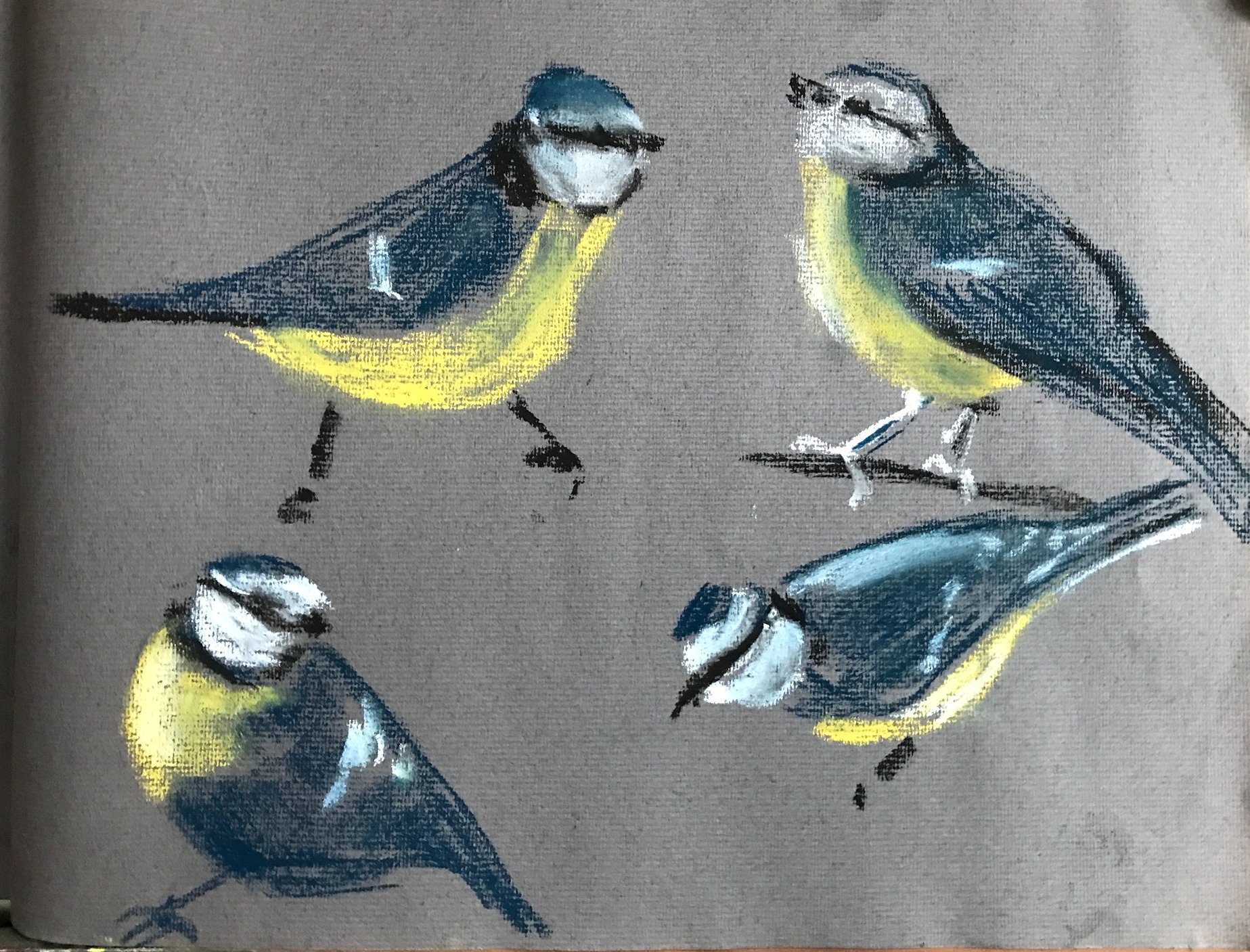
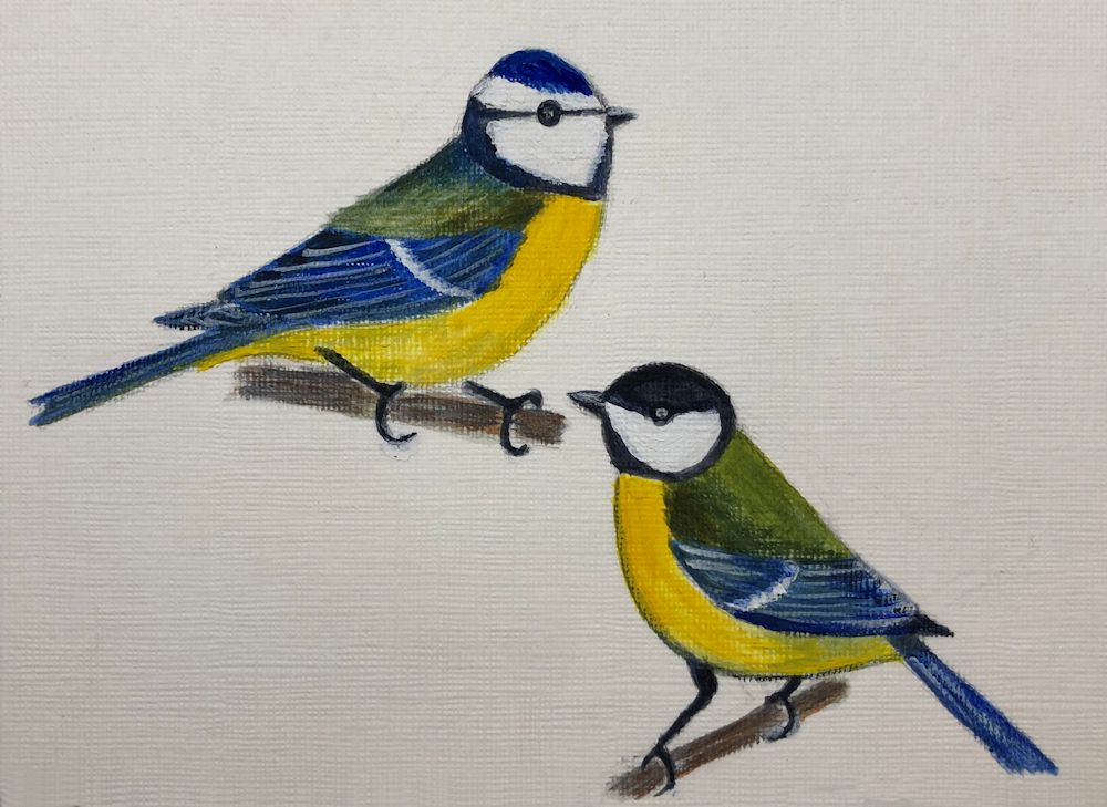
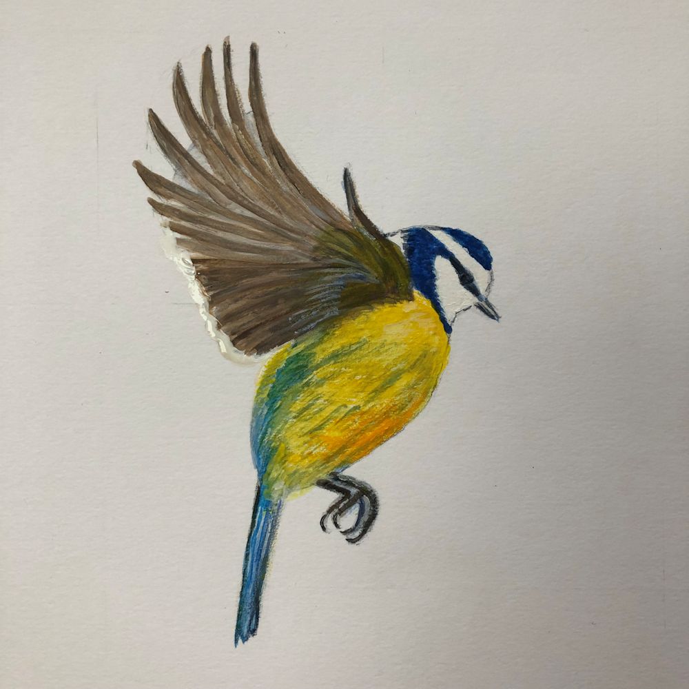
Birds in the Garden: Week 3
November 16, 2022
Quick sketches with pencil and watercolour by Jo
First a recap on this week’s painting session
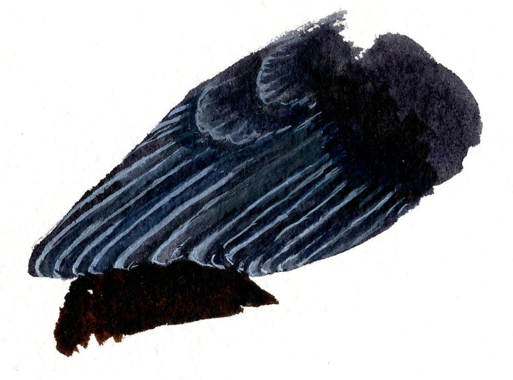
Two ways of delineating feathers on a dark bird:
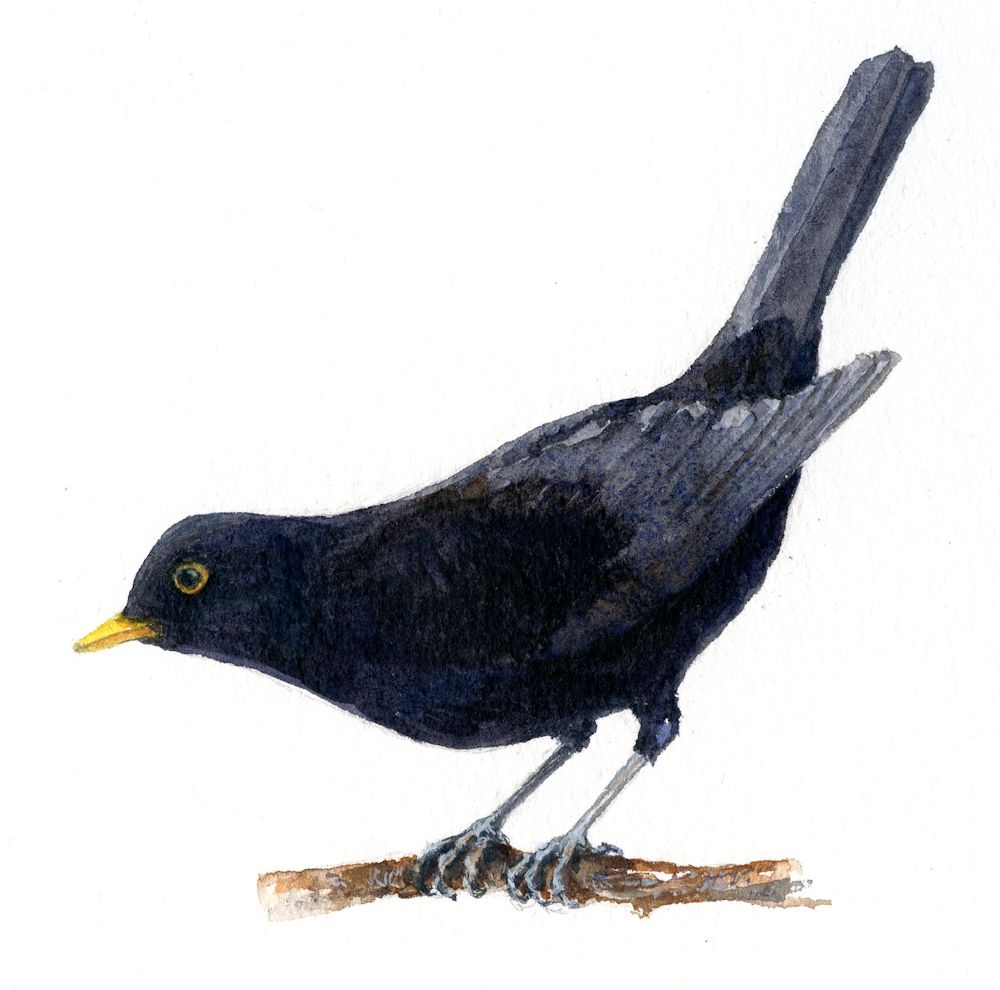
Study by Jo
The blackbird above was painted in watercolour, painting the flight feathers paler than the rest of the wing. With a fine brush the individual feather edges were painted in. When dry the wing was too light so a further wash of a dark grey mix was added and the feathers reinstated just a little.
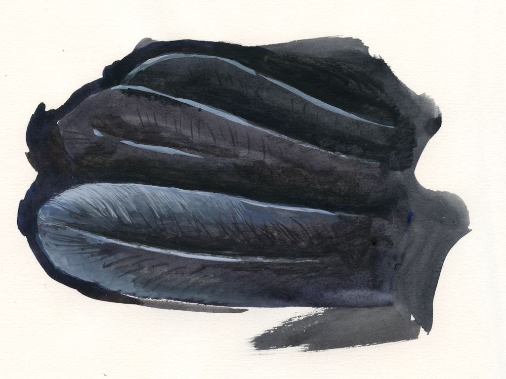
Another way to paint the details of feathers on a dark bird is to paint everything in the dark tone that it appears and to add any necessary detail with mixes of white gouache and watercolour:
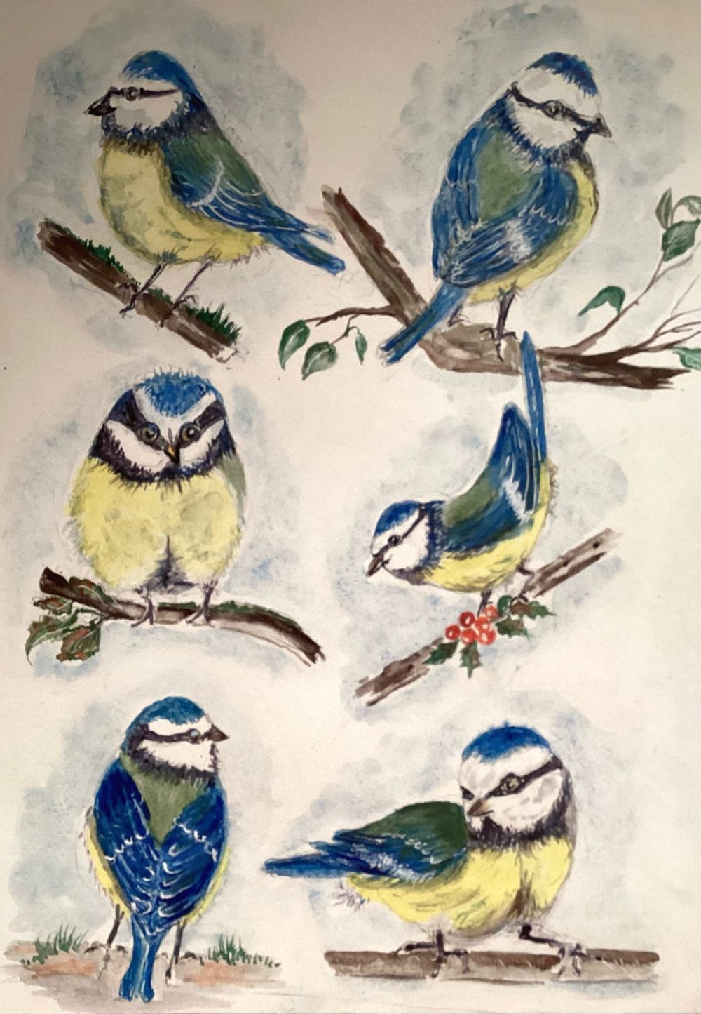
This week we’ll be looking at the colourful Blue Tits and the slightly heavier looking Great Tit with its black cap. Do look at any tit family references you have and the Pinterest board at
https://www.pinterest.co.uk/jhall1282/birds-in-art-and-photos/tits-photos/
and come to grips with making a few rapid sketches either before or at the beginning of the session. As before take in what the main body and head shapes look like when the bird is perching, on the ground or turning its head. Also look at the legs and claws.
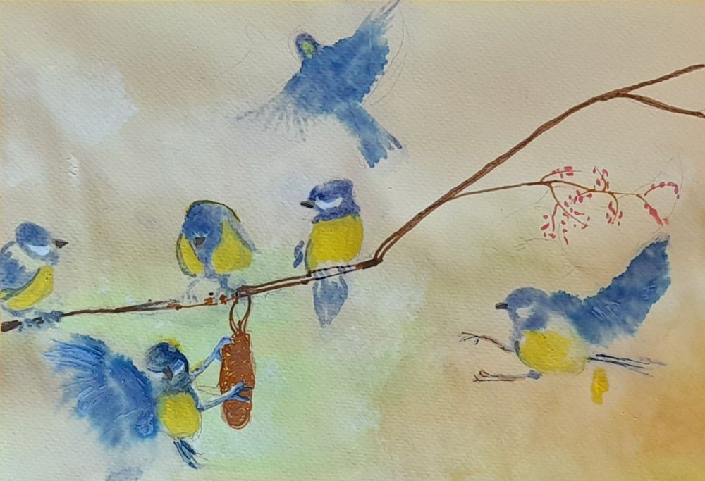
We can use these sketches to apply trial mixes of the colours needed for a more considered painting. Blue tits are often seen, two or three at a time so you may like to consider making a composition with more than one bird. If so, do plan this in your sketchbook first before making the drawing on watercolour paper. Perhaps also start to think about the background for the birds and make a tonal sketch.
The drawing on watercolour paper or in preparation for working in acrylic, should be detailed enough to show the main feathers of the wings and indicate the position of the markings, as well as placing the beak, eye, legs and claws. Draw just enough of the background to aid the composition and plan to create most of the background with paint always aiming to make the birds the focal point.
Make sure the pencil marks are not too dark and lighten them if they are. If working in watercolour, reinforce the main lines with a pale blue/grey painted line using a small brush and then put a light blue grey wash over all the slightly shadowed areas of the birds. (If working in acrylic just establish the main shapes of colour and tone and gradually build into this with the smaller shapes and marks.)
Then mix up your washes and try them on your rapid sketches. For the blue tits you will need a blue, a yellow, a green for the back and various grey/black mixes which can be added last. You will also have to be careful if working in watercolour to leave the paper untouched by paint for the white areas.
Then start to paint your bird; probably eye and beak first, then suggest the legs before painting the paler areas of colour followed by any blue and green and finally the darker areas remembering to reserve the white areas.
Try to add colour as washes where the feathers are tiny as on the breast, head and back. It is often better to suggest the texture a little in places later if neccessary, rather than paint a lot of feather like strokes in the beginning. The wing feathers need a different consideration as when the wing is folded against the body some feather edges appear as stripes of light and dark. The light is very often not white so a wash of the right pale colour needs to be painted first and allowed to dry before painting stripes of the darker colour over the top. Your initial drawing should indicate where this needs to be done.
There are no rules as to the stage when you start painting the background. If the birds are in trees or bushes it will be integral to the drawing and if on the ground, you will have to indicate whether it is grass or path etc. or your birds may be seen partly with a backdrop of trees and partly of sky. We will discuss backgrounds during the session, especially about whether these should be just suggested or more definite and what will suit your purpose best.
Your paintings:
Watercolour by Heather
Watercolour sketches by Heather
Mixed media by Mali
Pastel sketches by Mali
Pastel sketches by Mali
Acrylic by Pam
Acrylic by Pam
Watercolour by Ann
Watercolour by Kate
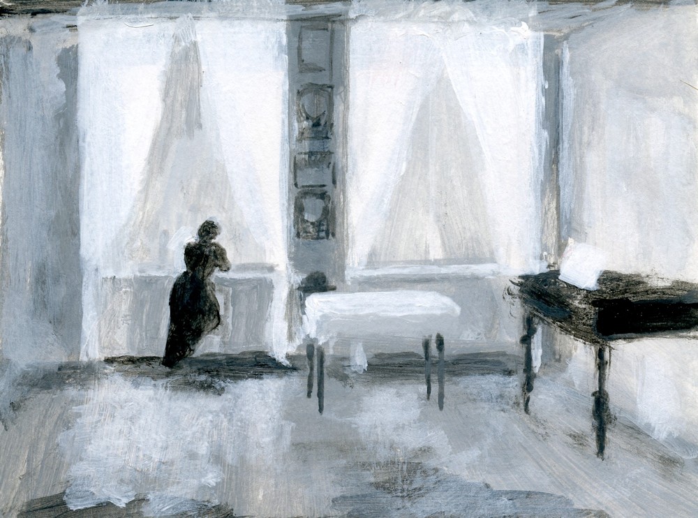
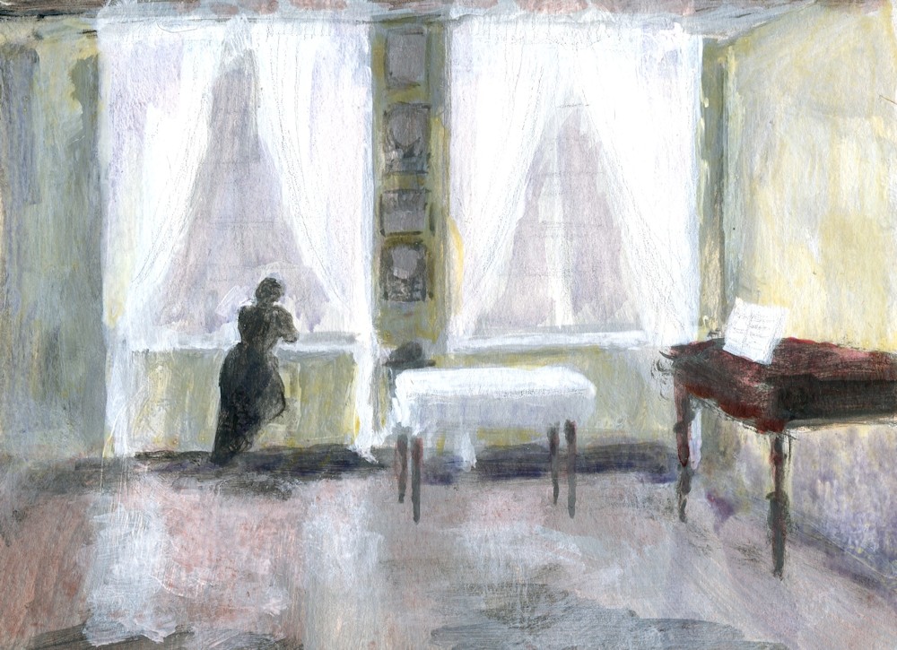
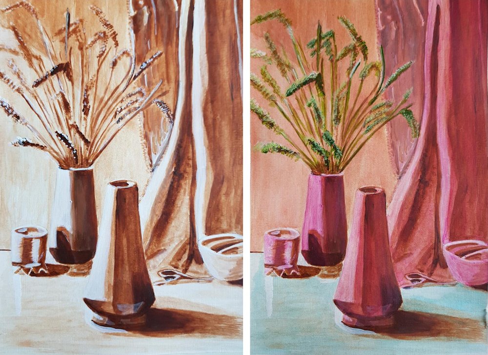
Opaque and Transparent Colours: Acrylic
March 30, 2020
This is the first of my art challenges for Art Challenge Tuesday which I hope to publish every Tuesday on this blog. Hopefully it will be a good way to cheer everyone up till we can meet again face to face. I have been running a course on watercolour and acrylic glazing techniques for my group at Norden Farm and will be running a similar course in the autumn for another group.
Sadly the isolation rules came in half way through the course, so the project below exploring acrylic glazing techniques has already been sent to that group by e-mail. Below is a bit of a recap plus a few of the things we would have explored in the remaining Tuesday sessions.
Acrylic: Opaque and transparent colours
To explore grisaille (working in monochrome) and glazing techniques we have been producing under paintings in greyscale and then adding layers of transparent glazes to colour them. It’s obviously important to know which the transparent colours in your box are, so here are a couple of things you may like to try.
Number one may be a bit basic for some of you but have a look and do what you feel like attempting.
- Opaque and transparent colours
To find which paints in your box are transparent
Paint half a small sheet of thick paper with black and half with white.
Paint a stroke of colour across the white and black.
Opaque paint will obliterate the join where black meets white.
Very transparent colours that contain no white will almost disappear on black making the surface look rich and shiny. Dioxazine purple and phthalo blue and green will do this.
However they won’t if the tube also contains any white.
To keep working transparently always mix your transparent paints with medium or water NOT WHITE.
Most yellows are either opaque or translucent. Translucent colours become more transparent when diluted.
Judging how much to dilute pigments for glazing.
Sometimes you will require quite an intense glaze and at others you will want just the merest hint of colour to tint your painting.
You can practice different strengths of pigment by glazing on newsprint that either has text or greyscale images. You need only glaze small areas but if you have time do glue the newsprint down on a sturdier piece of paper first with some acrylic medium.
When dry paint over with acrylic colour. Try different colours and make a note of which colours are transparent when dry.
Diluting acrylic paints;
Do the same thing with more dilute pigments.
Dilute with water or acrylic medium.
Medium makes it easier to blend pigments and to control where the paint is laid down. Acrylic mediums usually appear milky when wet but dry transparent. Diluting with water makes the paint behave more like water colour.
Always add a tiny amount of paint to the medium or water not the other way round or you may waste a lot of paint. You can always add more but generally you won’t need as much paint when you are tinting an underpainting than when working in colour from the start.
These are experiments so can be done on a very small scale.
They will help you find the right paint dilution for your purpose.
You can also experiment with overlaying different colours but always ensure one layer is dry before adding the next.
- Subtle and bright glazes
3a. If you have access to a photocopier you could photocopy a landscape or room interior in greyscale on to watercolour or other substantial paper. It would be great to make two copies of the same image and glaze one in a very subtle way with very dilute glazes and a much more vibrant version with bolder colours and some more concentrated colour.
It is always best to use your own photos if possible.
3b. Make two similar under paintings in greyscale for a simple composition, then glaze with colour to produce a subtle version and a more vibrant one. Take care with the tones in your under painting. Think about the fact that every time you add a layer of transparent paint that area will become darker. Make sure you paint some white areas for the palest glazes and any areas that will remain white. However, with acrylic if you haven’t got the tones quite right you can always repaint with white or the right shade of grey and add more glazes.
You could choose to make your versions of a Matisse interior for this exercise; judging the tones will be a challenge. Or you could make your version of a Hammershøi interior. His paintings are very tonal with very subdued colour, so getting the under painting right will be much easier. It would be a good exercise to do one version with subtle glazes echoing Hammershøi’s use of colour, and a second with vibrant glazes of bright transparent colours. Remember in either case you can glaze part or all of the painting and you can further modify the colour and tone by overlaying glazes.
The response: Your Paintings
Acrylic by Angela

by John
Monochrome study with added green and then yellow glazes by John

Underpainting and finished work by Liz