Monthly Archives: June 2022
Portraits of Older Children: Week 3
June 30, 2022
This week’s challenge is to start a portrait painting in colour. The notes below suggest ways of starting a portrait study in pastel and also in acrylic.
1. Pastel
If your chosen medium is pastel you may like to start by drawing in the main shapes quite loosely with charcoal or a pastel stick. Remember to draw the axis of symmetry of the face if working a front view and also a line through the eyes from which you can measure the positions of the other features.
When seen in three quarter view the axis of symmetry through the face will be on a curve. If looking at a profile view look carefully at the position of the ear and take note of the shape of the whole head. Then look at the forehead in relation to the nose and the jawline and chin in relation to the nose. Ask yourself questions like does the chin recede slightly?
As a general principle work the large shapes first before homing in on the smaller ones.
When you are happy with the main shapes start to work in colour. Block in the main areas of shadow with a light touch using the stick on its side for these larger areas. You will define these as the work progresses so don’t apply the pastel too densely at first. Then draw in the mid tones and finally the palest tones and details.
I have talked about tone but your work will be in colour and working out flesh tones in pastel can be challenging. One reason I used conte crayon in white, black and sanguine on toned paper last week is that it is a half way house between working totally in tone and working in colour. With small additions of blue, red and ochre these drawings can depict flesh tones quite convincingly. Experiment with the colours in your box, cross hatching, overlaying (layering) and blending to find suitable colours for your portrait.
You may like to fix the work after the main areas have been drawn and again when the mid-tone colours have been established. When working on the brightest and lightest colours as the portrait nears completion either fix very sparingly or not at all especially if working on a dark toned support.
2. Acrylic
There are several ways of starting to paint a portrait, three of which are outlined below..
1.Under drawing in charcoal developed with transparent and opaque paint.
This is described in a previous post; link below. The example is of a young woman rather than a child but a similar method and palette could be used. I like to work with a relatively limited palette and this will give your work unity.
https://www.jo-hall.co.uk/2021/03/03/painting-portraits-from-photographs-week-2-colours/
The following palette makes a good starting point and some mixes made with the colours below is illustrated in the blog post referred to above..
White, Crimson Alizarin, Cadmium Yellow pale, Ultramarine Blue, Burnt Sienna and Burnt Umber. (or similar)
Other primary colours, plus white and a couple of earth colours will also work well. The Burnt Umber was included as it gives excellent darks when combined with ultramarine. With portraits of young people you will need to keep the colours fresh and make smooth transitions of tone and colour over the face.
2. Tone the background then use paint and a brush to draw the basic shape of the head and place the features. Then develop the painting with transparent and opaque paint working from light to dark and on the large shapes first before tackling the smaller areas and detail..
3. Make a detailed monochrome under painting making all the tones a little lighter than as seen. Develop the painting by adding colour as layers of transparent glazes. The palest and brightest areas should be left till last and if necessary executed in opaque paint. This can be knocked back a bit with further glazes where necessary.
For this session we will concentrate on the first way of working. So have at the ready, a board or canvas support, charcoal, some acrylic medium and of course paints, palette, brushes and water pots.
Your paintings;


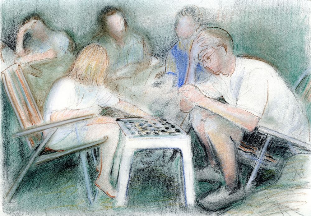
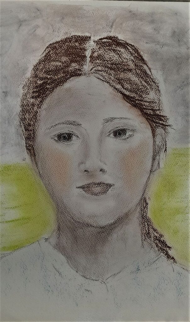
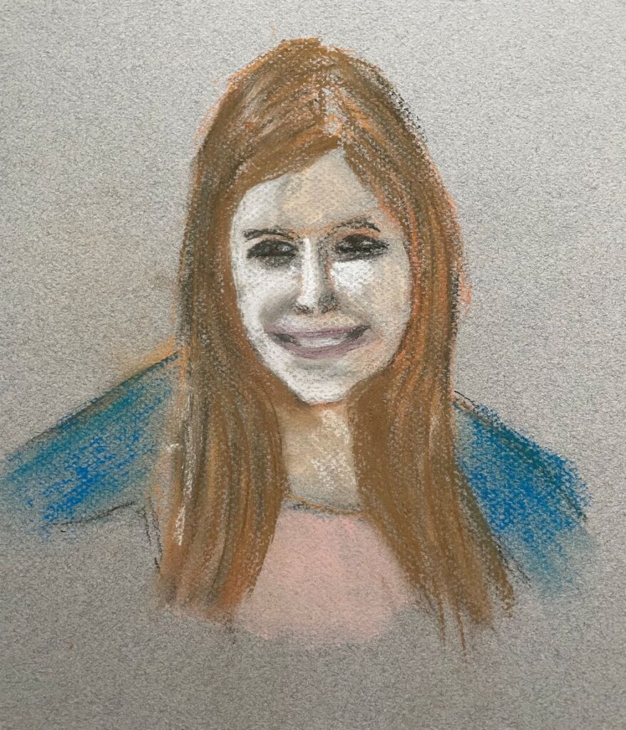
Acrylic by Vivienne

Pastel by Liz

Acrylic by Liz

Oil by Virginia
Portraits of Older Children Week 2
June 24, 2022
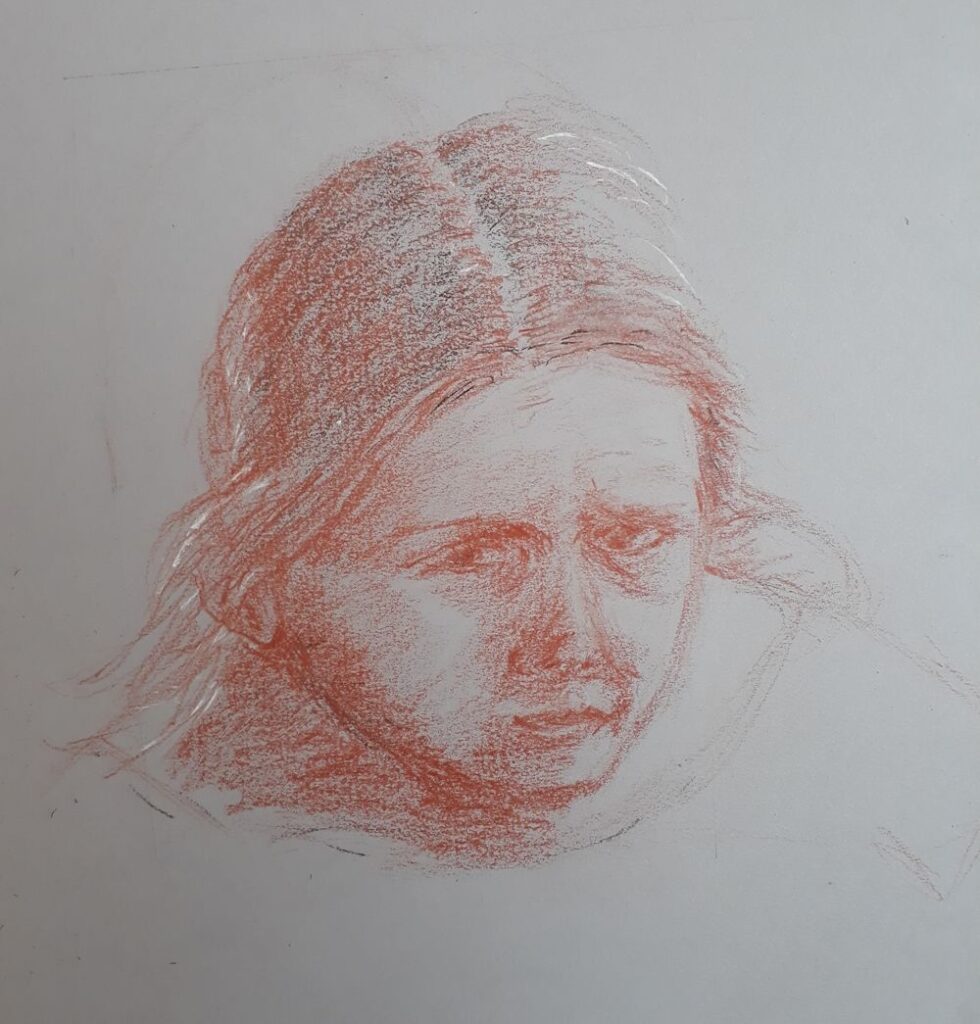
Conte crayon: black, sanguine, white
Plus small additions of blue and crimson pastel pencil
on Rembrandt toned paper; Industrial grey
This week is another drawing session.
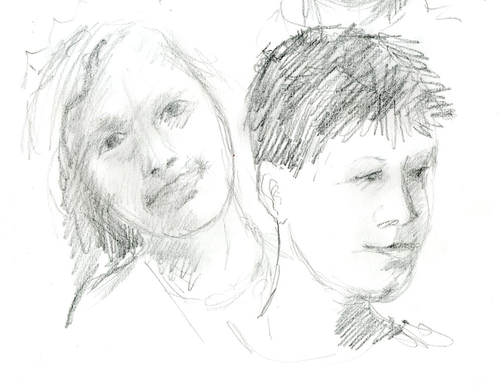
To start with this week I’ll screen share some references and we’ll do a few warm up sketches before launching into a more considered drawing for the rest of the morning.Maximum time 5 minutes for each. I will share my screen with you so we can work from the same image.
Probably best to work in soft pencil or charcoal for this and do all four studies on the same sheet (A3 cartridge would be ideal).
For the more considered drawing perhaps try drawing a boy if you chose a girl last week and vice versa. Girls may seem easier because the ear is often hidden by hair. If drawing a profile take time to look at the position of the ear in your reference; it may appear further back than you think.
I mentioned the proportions of the head last week and that in older children these proportions are close to that of an adult. Quite often noses may be slightly shorter and less developed and the only way is to observe the particular reference photo or the sitter closely. Also even in adults these measurements vary a lot between individuals.
Just to recap;
When looking at the full face;
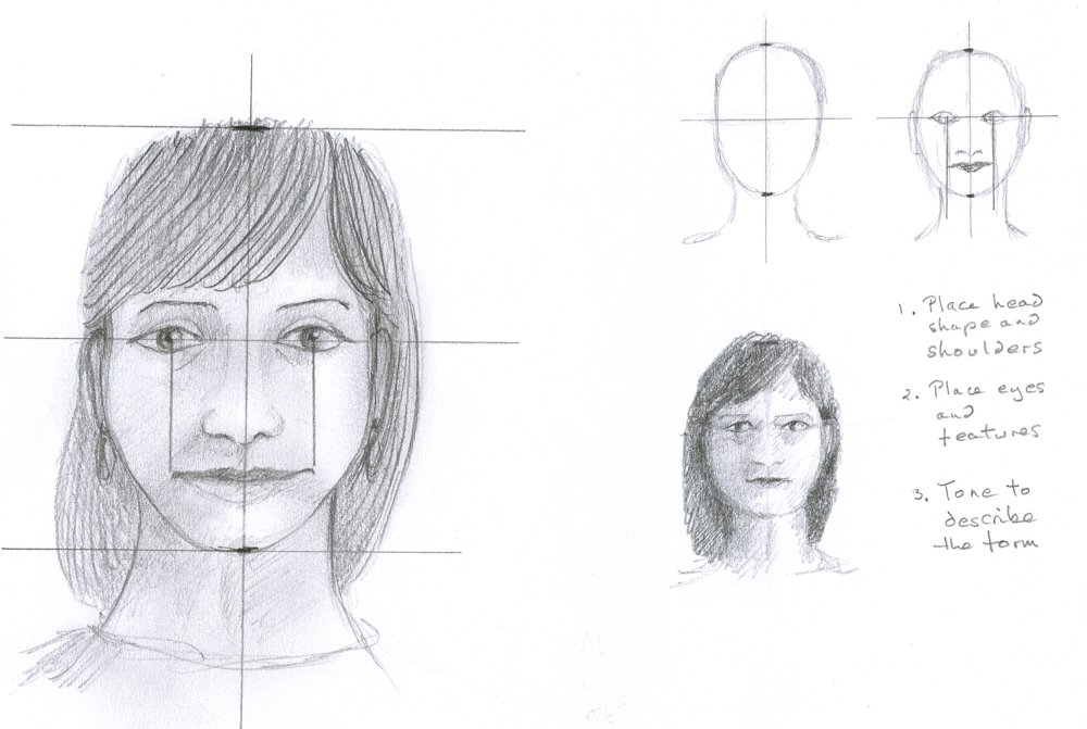
1. look at the over all proportion of the head; i.e. how wide is it compared to its height then draw the head shape, tilted if the head is tilted.
2. draw in the vertical axis of the head and note how this axis changes direction for the neck if the head is on the tilt.
3. Show how the head connects to the body looking carefully at the width of the neck
4. Draw a line through the eyes; this will help with proportions as about half the head will be above and half below when the sitter is looking straight at you and you are at the same height.
5. For the fast sketches place the features roughly then use tone to reveal the form of the head and features. This will be greatly influenced by the lighting.
With the profile face the vertical proportions will be the same but do look at the overall shapes you are presented with first, and then place the ear correctly with noting far back it appears and its relation to the hinge point of the jaw which is just below the lower point of the attachment of the ear.
The three quarter view is beloved by portrait artists as it gives some idea of both profile and full face views. The amount of information on the full face is miniscule if the view is almost profile and likewise information on the profile is short if the face is viewed almost from the front. the axis for three quarter views is best drawn as a curve which we will discuss. If you think of portraiture as another kind of still life you will understand that perspective is every bit as important in portraiture, unless you are going for a cubist style but that is a different course!
For the more considered drawing you may continue with pencil, three crayons on a toned paper or work in colour. Working in monochrome or a with very limited range of colour will help you depict the structures of the head and tonal studies will form the basis for colour work in the following weeks.
Your Drawings;

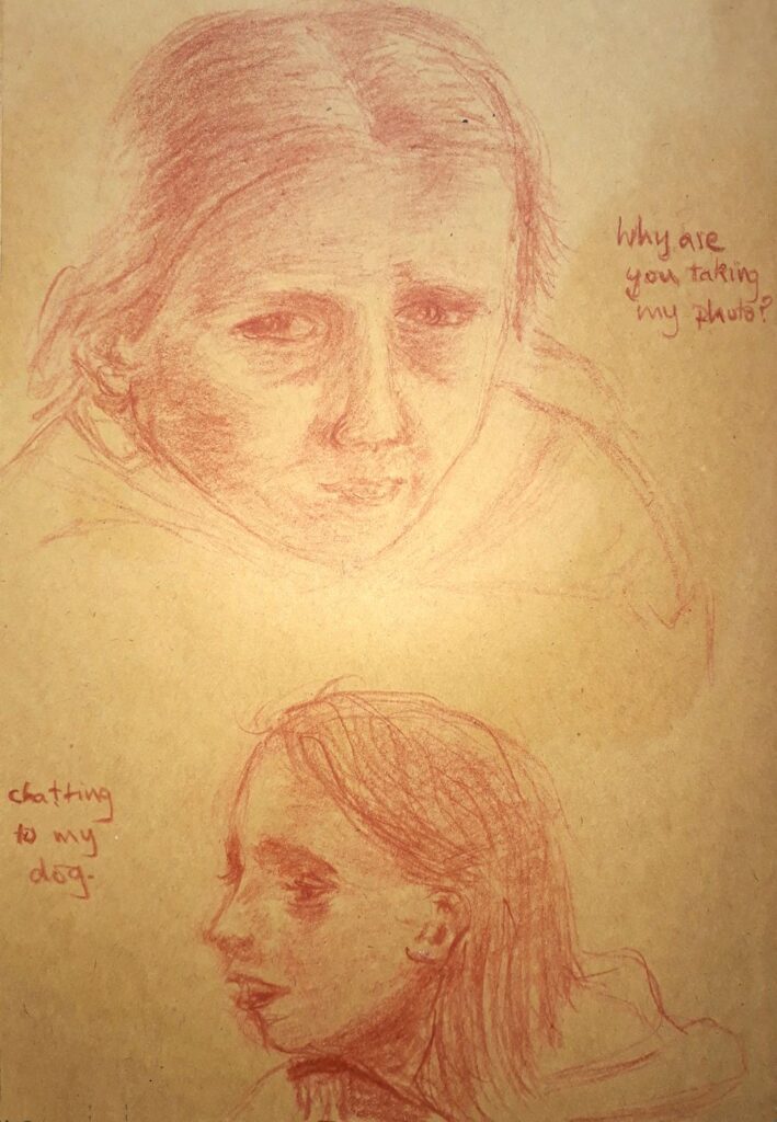
by Norma

Black conte crayon on pale grey paper by Vivienne

Conte crayon and pastel by Vivienne

Tonal study by Liz

Pastel by Liz

by Virginia

by Virginia
Portraits of Older Children: Week 1
June 13, 2022
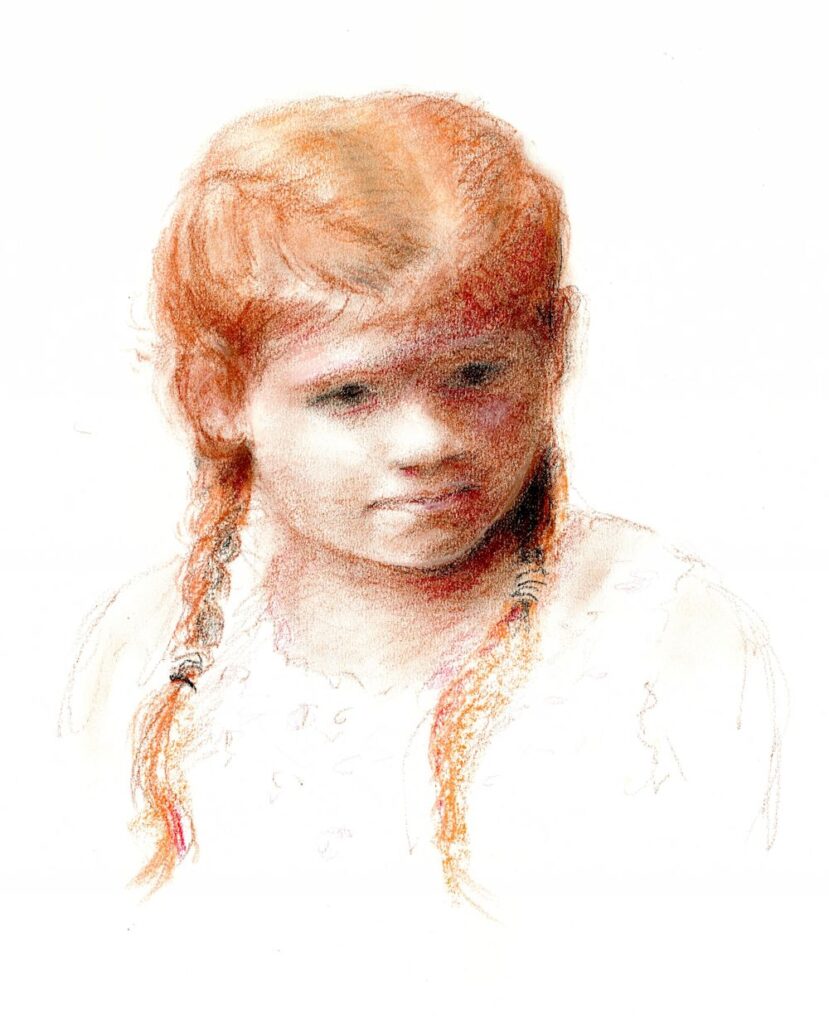
Sanguine and Sepia Conte Crayon
by Jo
I find the age group between about eight and thirteen or fourteen is incredibly interesting. Facial features develop so that the adult in waiting can be glimpsed. All the facial features become larger and take up a greater proportion of the head. Baby noses begin to take on their adult form and facial expressions become more subtle, whether of wonder and delight or perhaps moody, dreamy or slightly rebellious!
In this first session we’ll remind ourselves of the proportions of the head, using conte crayon, pastel pencil or charcoal for some initial sketches before moving on to a more considered drawing. I would strongly advise drawing from a reference of someone you know and meet often. Even when working from a photograph your mind will fill in remembering the forms you have observed in real life that the photographic image may flatten. Try to work as if the subject is really with you as you draw.
in my Mother’s Garden
(and nine is winning!)
Conte crayon and pastel
by Jo
I give the same advice to anyone working on a landscape from photographic reference; try to draw as if you are immersed in the landscape again!
For this first week we’ll draw a head and shoulders portrait that is three quarter view or almost full face as in the drawing heading this post. It will also be useful to have a reference that is strongly lit from one side revealing the forms of the head and facial features.
If you would also like to make a profile view drawing of the same young person, that will really help you understand the form of the head. And what about the view of the back of the head? In a live portrait session I would encourage you to make several warm up drawings looking at the sitter from different viewpoints, so that literally all round knowledge of the head is gained.
I have prepared a Pinterest board of portraits of older children. The link is
https://www.pinterest.co.uk/jhall1282/portraits/older-children/
Look at some of these examples in detail and imagine an axis running through the centre of the head and whether this is tilted. Note the position of the eyes relative to the top of the head and the chin. Also look at how the artist has shown how the light falls across the head. There are a couple of photographic works among the paintings and drawings. Observe these in the same way. In addition a few profile views are included. Again observe the lighting and the tonal values as well as the proportions and placement of the features. Measure the width of the head in front and behind the ear. This will vary significantly with even a slight turn of the head. Getting the ear placement right will help you make a convincing drawing.
As the first session will be drawing, observing the major areas of tone in your reference will be essential and should be roughly indicated at the earliest opportunity working from the large shapes before homing in on the detail. Indicate the masses of hair in a similar way before indicating a few strands of hair.
Learn to enjoy looking and assessing as much as drawing!
Make sure you have; cartridge paper, some toned paper like a warm fairly pale grey, some conte crayon, pastel pencils or pastel in white, black and sanguine, table easel and drawing board and lastly a good photo reference of your subject.
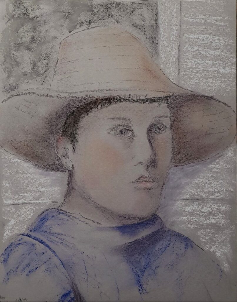
Your Drawings:
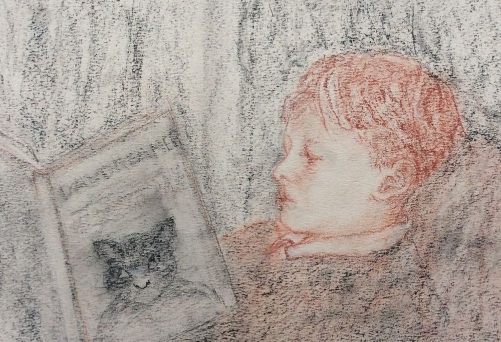
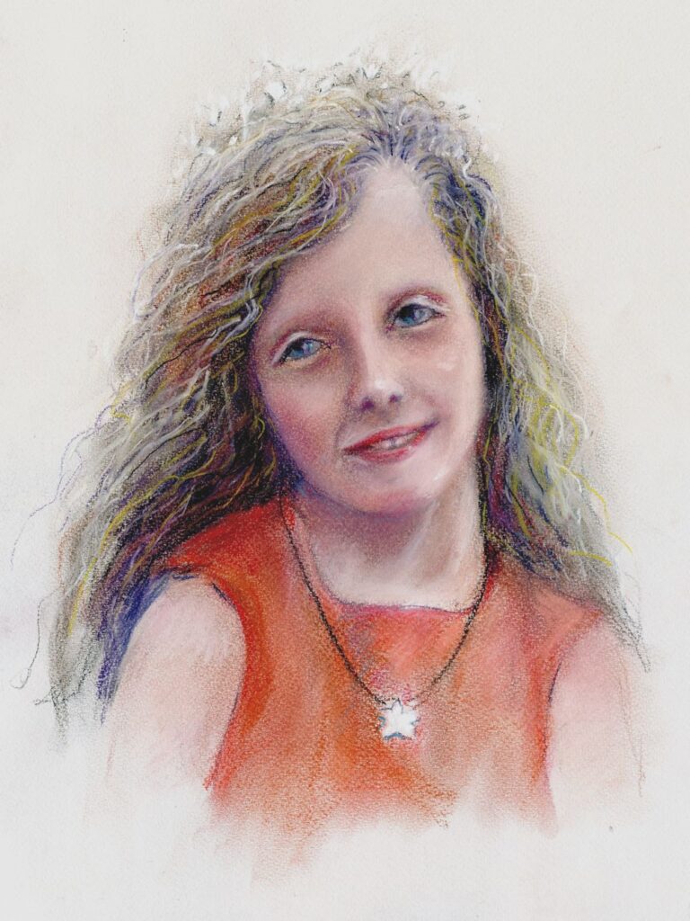
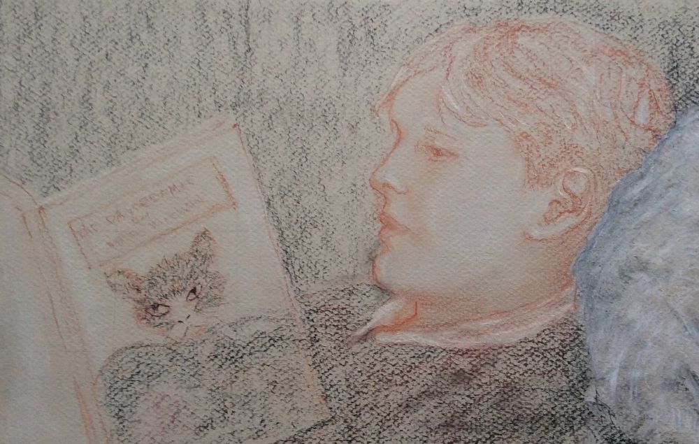
Pastel drawing by Virginia
This is a sensitive portrait showing us Tom’s complete involvement with the book he is reading. Virginia made two subsequent studies one of which was a better likeness, but I didn’t feel the connection between the boy and the book in the same way. A very hard choice to decide which of the two good drawings to include!
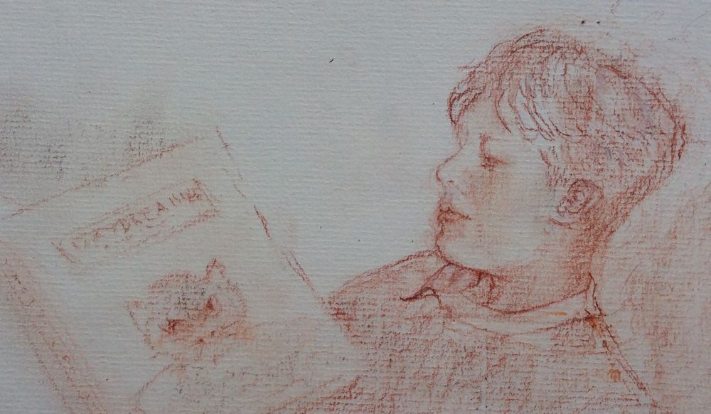
Conte crayon drawing by Virginia
So I decided to include both!
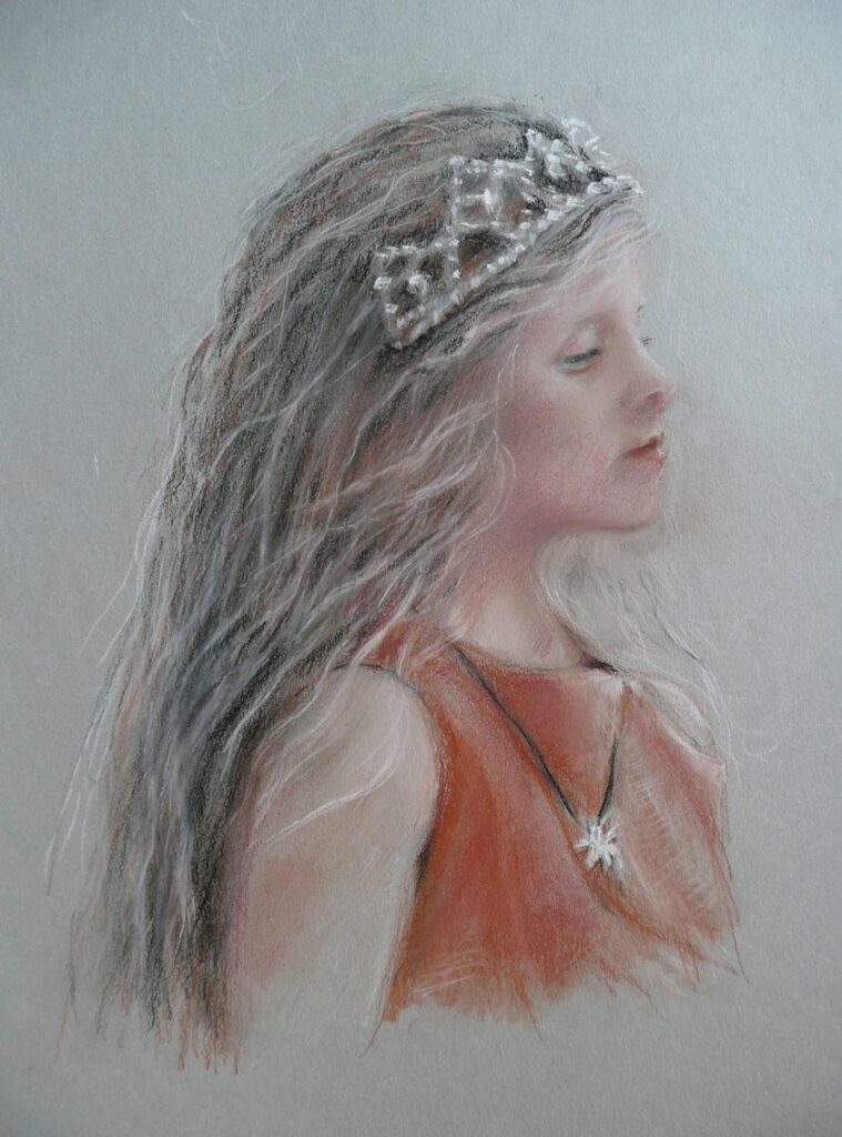
Pastel drawing by Virginia
Conte crayon on grey paper by Vivienne
by Vivienne
Charcoal and pastel by liz
Charcoal and pastel
by Liz
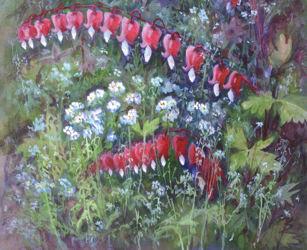
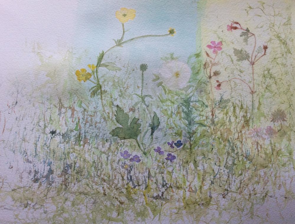
Watercolour Flowers Week 6: Growing like Weeds
June 1, 2022
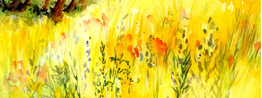
a very free sketch!
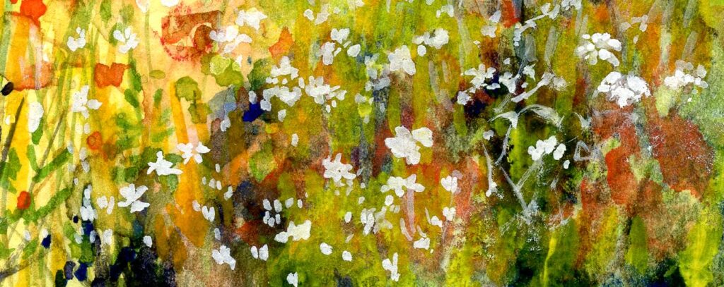
This week’s challenge is to paint flowers that either spread like weeds or are arrivals from the wild, generally known as weeds! It’s very much your choice whether you paint them in situ; perhaps a sprinkling of buttercups and daisies in a patch of grass, rather like the poppies spangling the cornfield above, or at the other extreme make a delicate arrangement of your favourite visitors or freely spreading plants on one sheet of paper.
Either way, try to keep the colours clear and work some passages by wetting the water first before adding the colour and/or some wet in wet areas.
Forget-me-nots grow everywhere and at most times of year in my garden. Here they were against a dark ground so were painted in gouache by adding Permanent white in varying amounts to Cerulean Blue and in some places to Cobalt Blue. The pale stems were painted in a similar way with mixed greens and white.
As ever the first background washes will be important for determining how you proceed. The Forget-me-nots above were painted in gouache over a dark ground. Do experiment with the strength of washes for the situation in your painting. For a lawn, blades of grass with a soft focus can be suggested with darker greens by deft brushstrokes into a wash while it is drying as in the right hand side of the image below. When the wash is dry more definite grasses and stems can be added wet on dry.

If you have buttercups, daisies, clover and other delights in your lawn you could paint them in a similar way to the meadow flowers above. After choosing your subject think about how you wish to represent any pale flowers against darker tones. If by lifting out, test how well the pigments selected for the painting work when lifting while still damp and also when dry. Staining pigments do not lift well when dry!
Painting around many small flowers often looks very laboured so it may be useful to reserve the white or pale areas with masking fluid.
If painting the white flowers with gouache, this is usually best applied when the paper is absolutely dry if crisp edges are required.
Lastly remember that Permanent White can be mixed with other watercolour paints to make them opaque so can be mixed with yellow for a scattering of buttercups or blues for Forget-me-nots against a dark ground. Again test the strength of the gouache mixes over a swatch of the colours they will be painted over in the final painting.
This should give some ideas for how to set about this week’s challenge. No one recipe will solve all the different challenges met in the freer kind of flower painting. The best way is just to experiment and explore the colours, mixing, layering, brushing and spattering etc. enjoying the journey and deciding on the best place to stop.
Your Paintings:
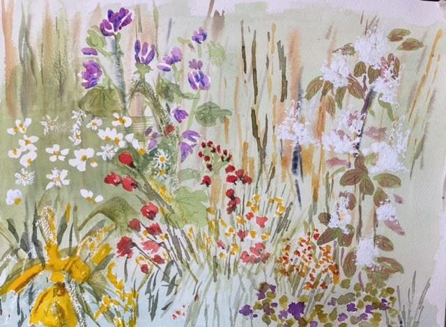
by Sandra
by Virginia
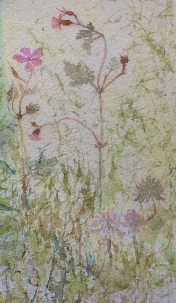
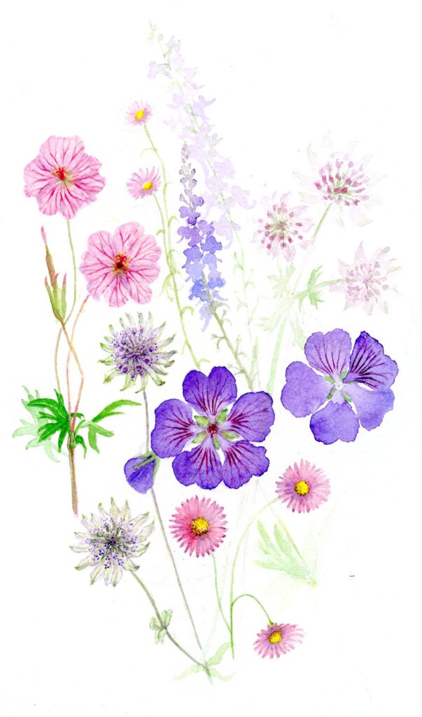
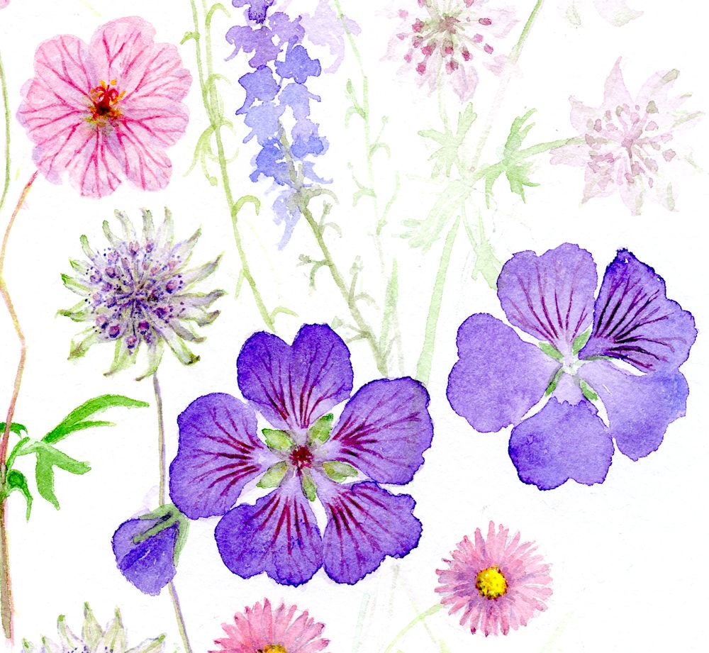
Herb Robert and Pink Clover