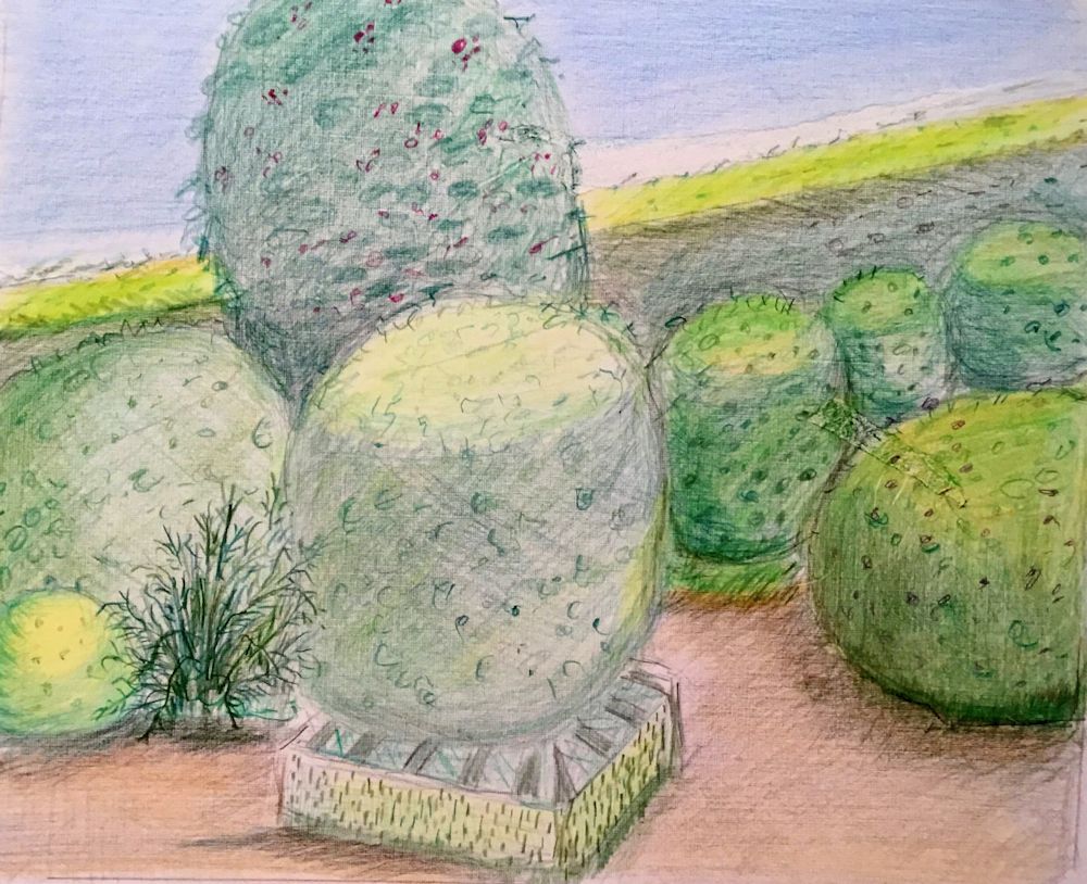
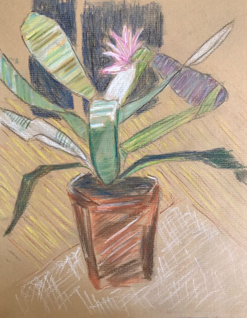
Category Archive: Still Life
Magic of Black Week 5: Paint a Still Life with Flowers or a Natural Form
March 22, 2023

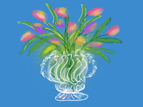
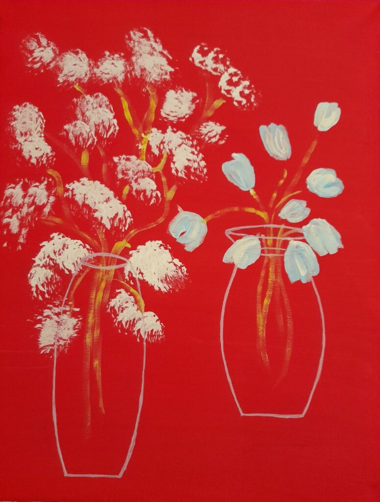
This week’s challenge is to paint a still life with flowers or a natural form. There is no set medium and pastel, acrylic or gouache would all work well. The support does have to be black, either paper or a board primed with black gesso. The example above is gouache on a smooth black paper.
Unlike working with negative shapes, this time it may be that the object or still life group has a mainly black background. It may be useful to paint a simple object that you wish to include in the final painting to work out how your chosen medium works on your choice of support. It is an opportunity to use very opaque colour, and also thin veils of colour. My demonstration includes some Honesty seed heads, which being translucent make an ideal subject to illustrate this.
The following images may help you to get started. Choose as simple or complicated a set up as you are comfortable with. As previously, a white or pale grey well sharpened pastel pencil was used to very lightly draw in the main lines of the composition before going in with paint.


Looking forward to some really colourful work!
Your paintings:

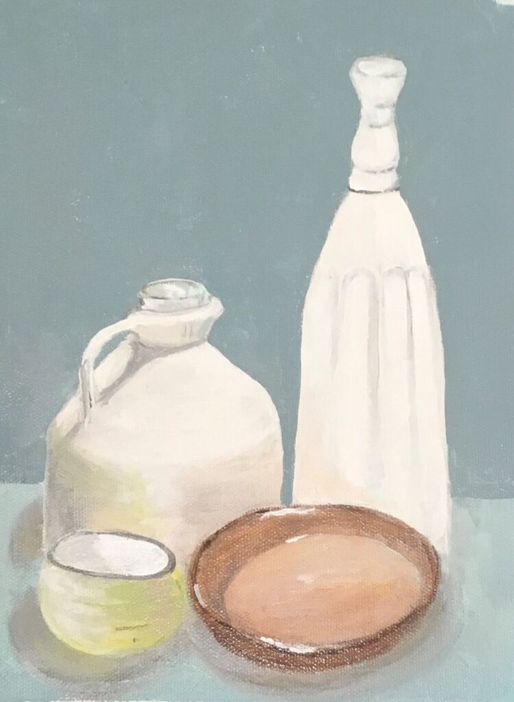
by Pam

by Kate

by Mali

by Liz

by Heather
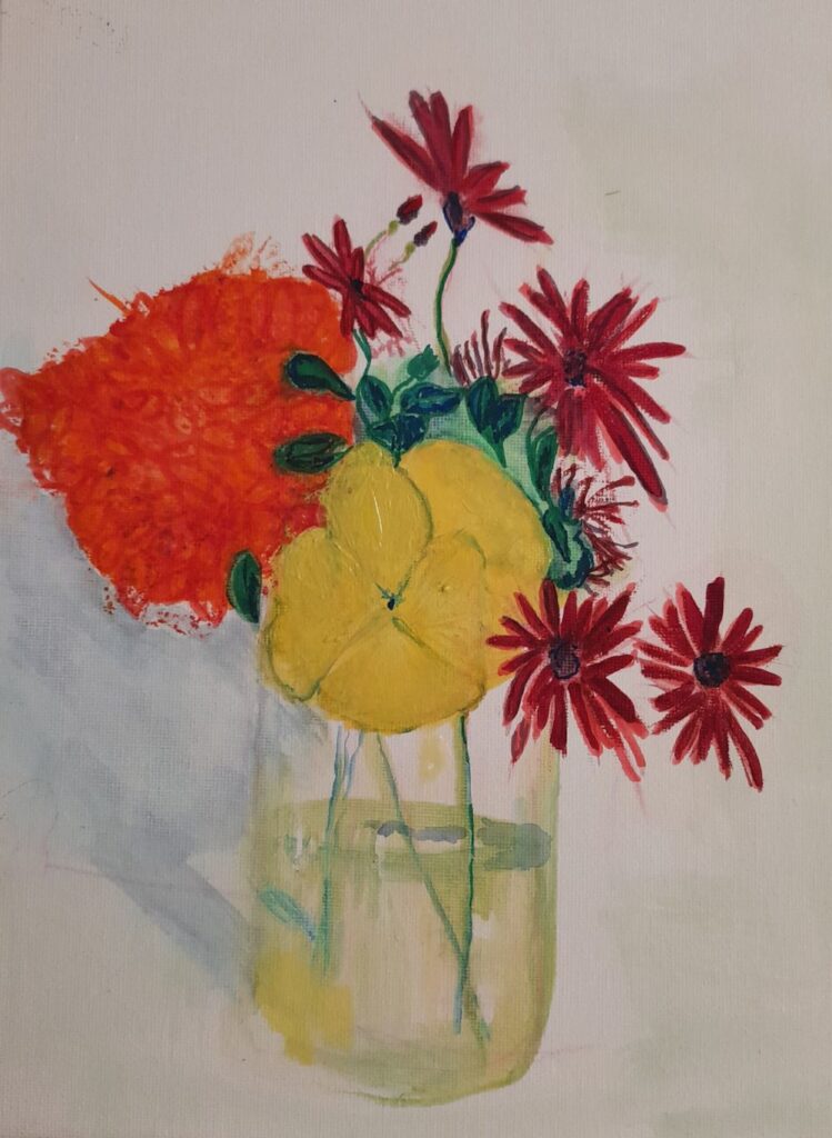
Flowers in Watercolour Week 3: From dark Backgrounds to Colourful Blooms
May 13, 2022
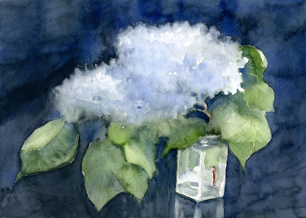
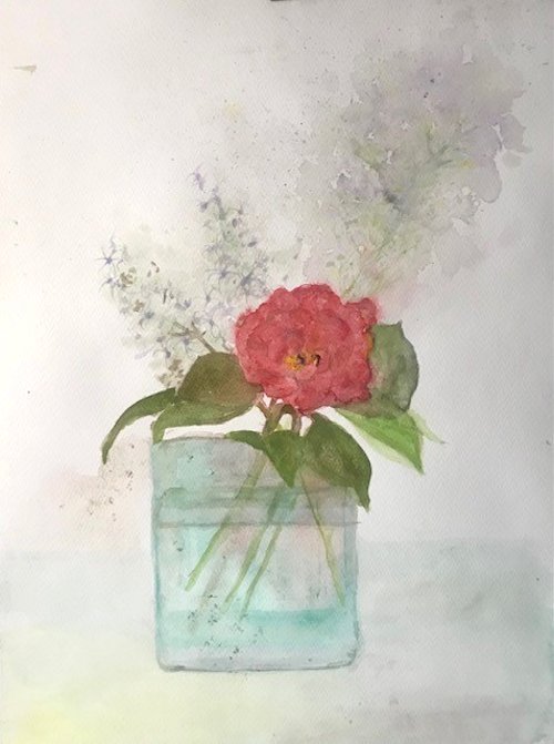
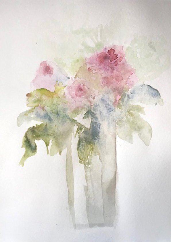
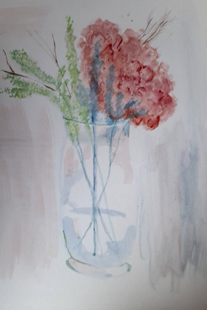
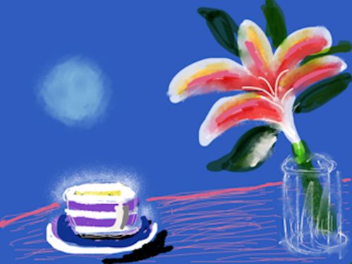
As the lilacs are pretty much ended I was delighted to find a couple of headily perfumed blooms left to paint. The painting above was on a quarter sheet of Bockingford cold pressed watercolour paper which stood up to very wet washes, indenting wet paint to make veins in the leaves and lifting out areas to soften them and give and indication of petals.
The white of untouched paper shines through in the glass jar. This time I decided against masking fluid as I hoped for a soft look to the painting.
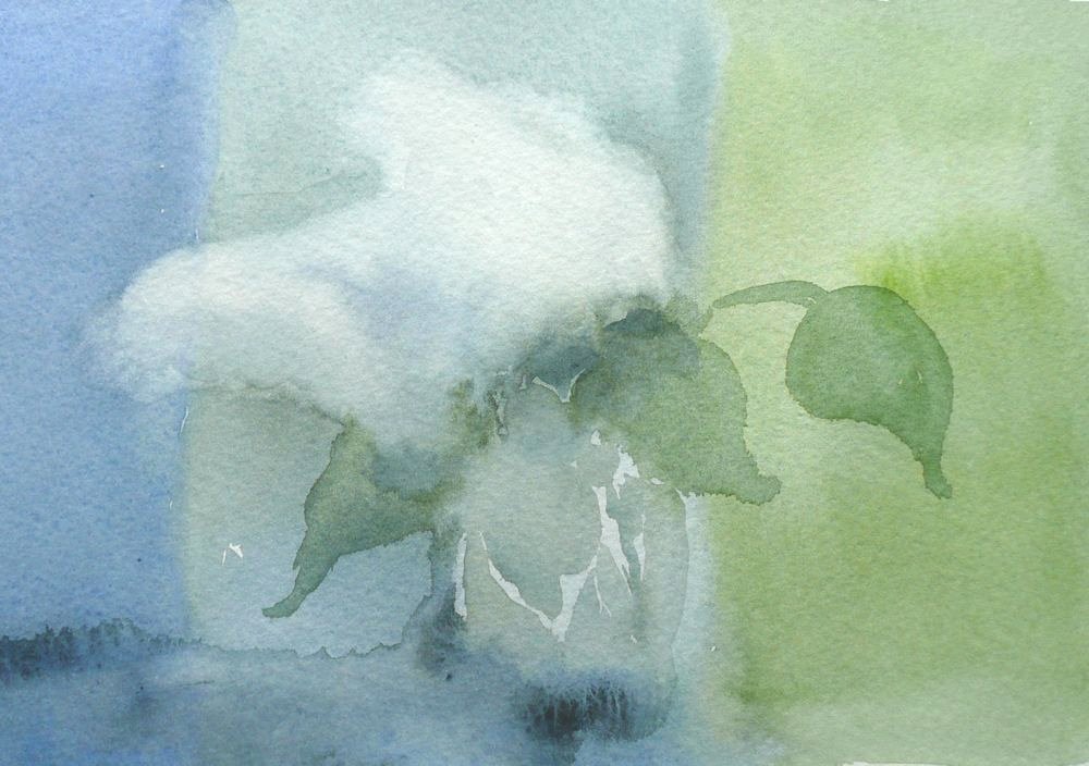
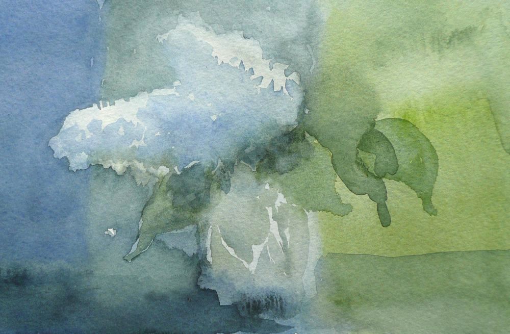
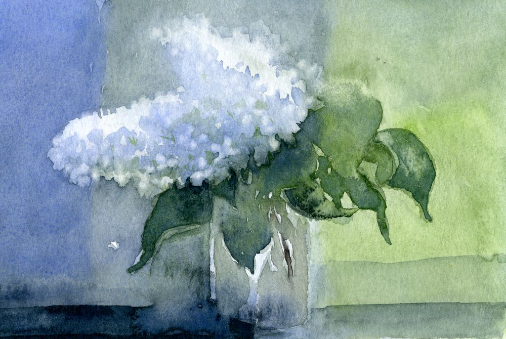
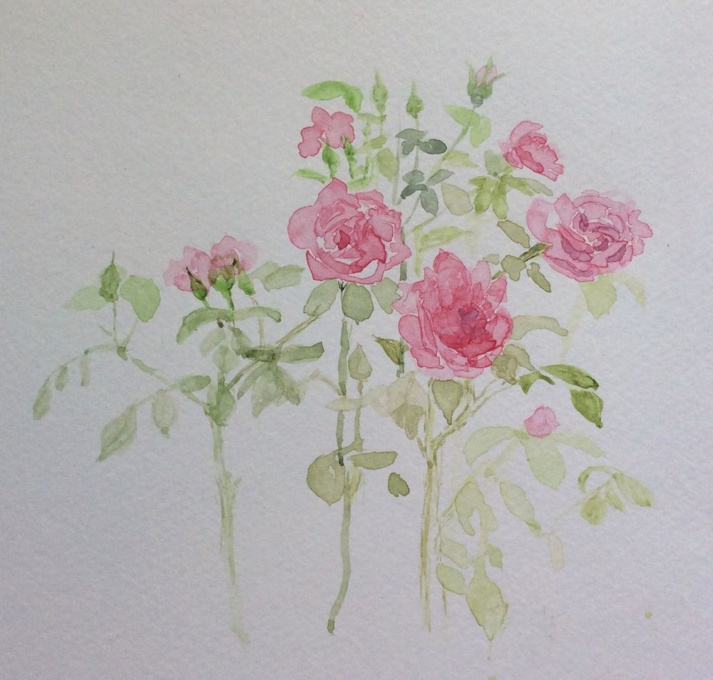
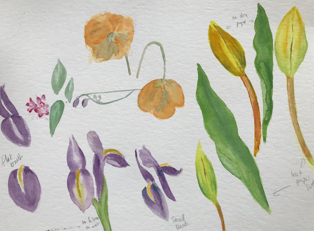
The three images below show how a smaller study was made on very damp paper working wet in wet then leaving the paper to dry before re-wetting the paper and adding further washes. Some lifting out was done while the paint was wet but the petal shapes were lifted out when the paper was dry.
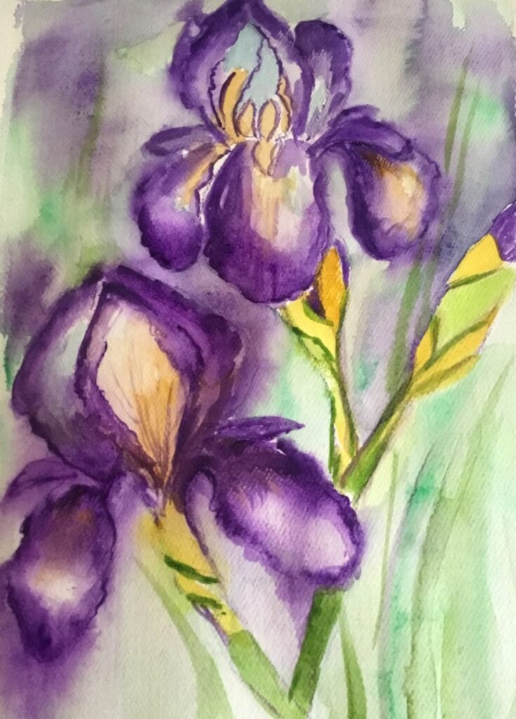
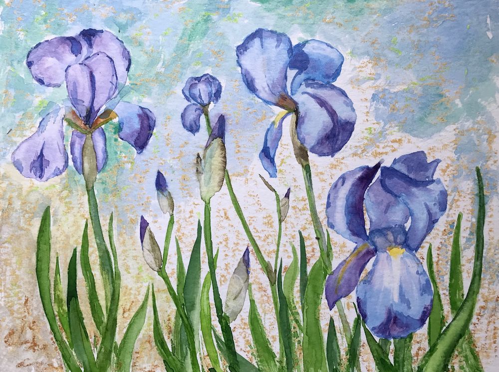
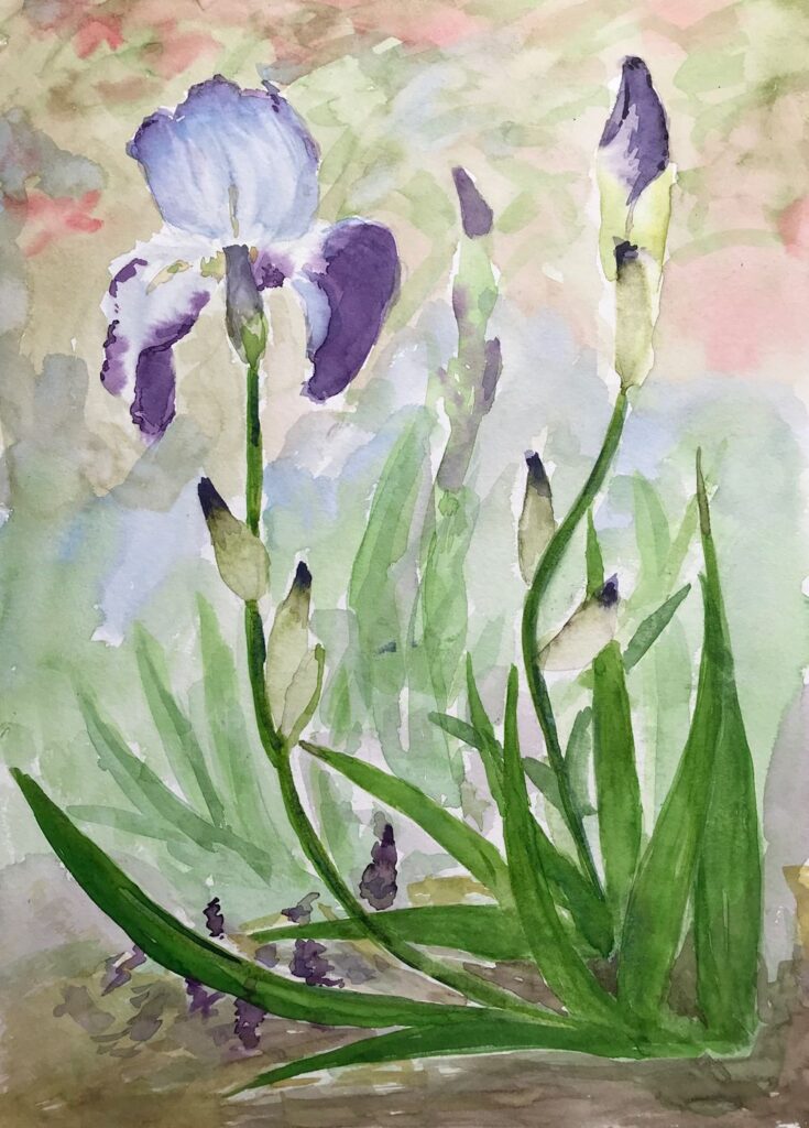
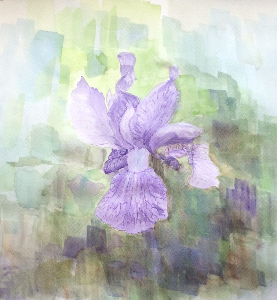
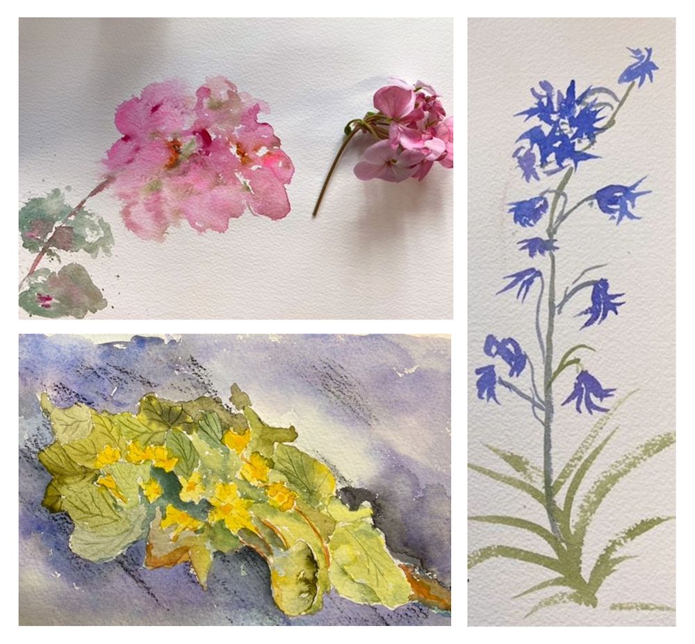
This week’s challenge is to paint flowers as they grow in the garden using any of the watercolour techniques used so far and with the aim of capturing an impression of their character; how they look up at you as the pansies and little pink geraniums or how they point toward the sky like the iris in the photo below..
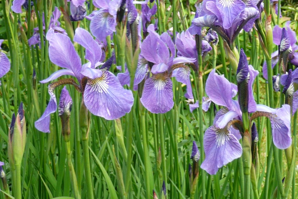
Photo by Jo
If you have time try to get out into the garden and sketch and photograph your favourite flowers. Make sketches of individual blooms, buds, stems and leaves to familiarise yourself with the shapes, and small composition sketches to explore the arrangement you may choose to paint. Iris and Weigela are blooming as are geraniums and Aquilegia so there should be plenty of colour around.
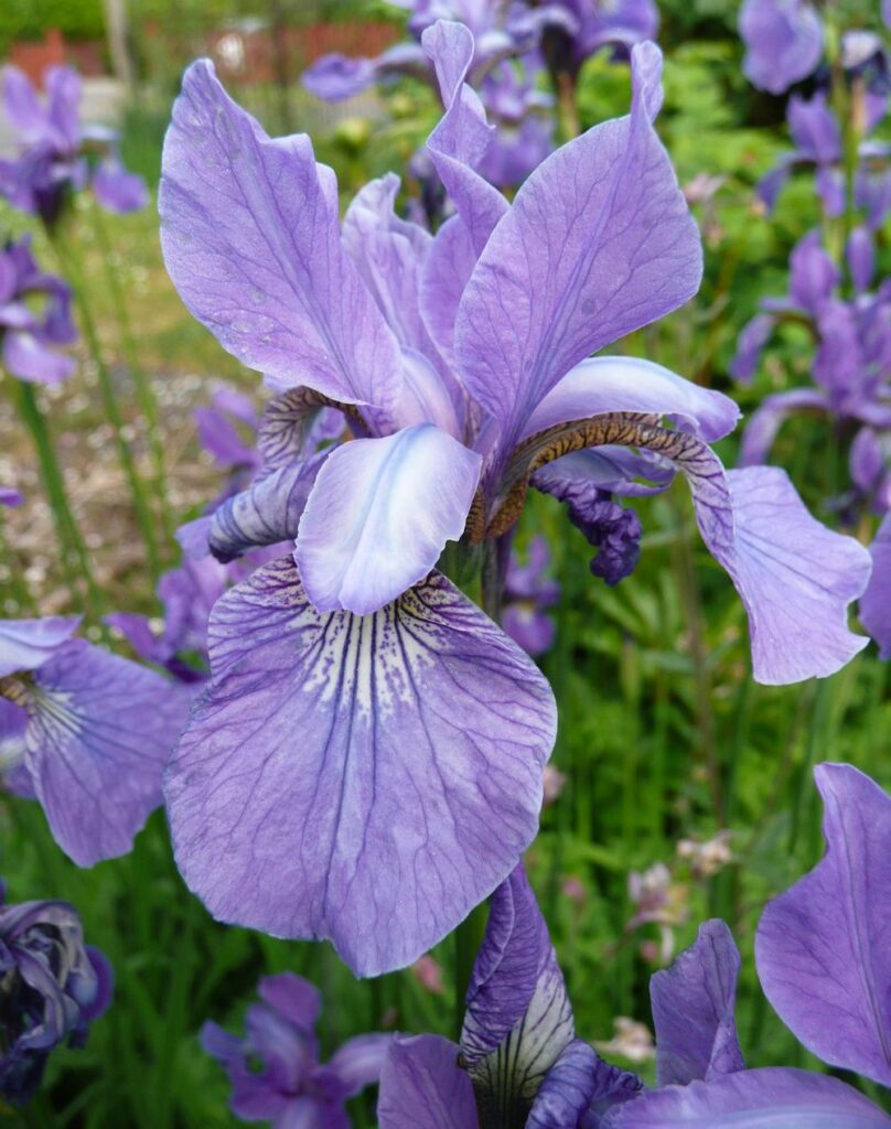
Photo by Jo
Before starting to paint explore the colours and brush strokes which will help depict the plant’s character and then review the composition sketchesmade outside and home in on one idea for the final painting. This may include just one or two plant stems relatively close up or with a backdrop of the same flowers or different plants giving an impression of a massed planting.
Experiment with colours and how they interact when mixed to find the hues and strength of washes you will need, erring on the side of making more wash and stronger washes than you think you may need. It is easy and quick to add water, not so easy to “drop in ” strong colour if it isn’t already mixed.
You may like to look at the following Pinterest board for some ideas on painting iris, link below:
https://www.pinterest.co.uk/jhall1282/flower-painting-in-watercolour/iris/
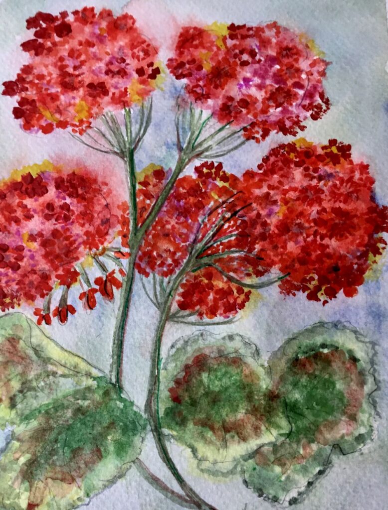
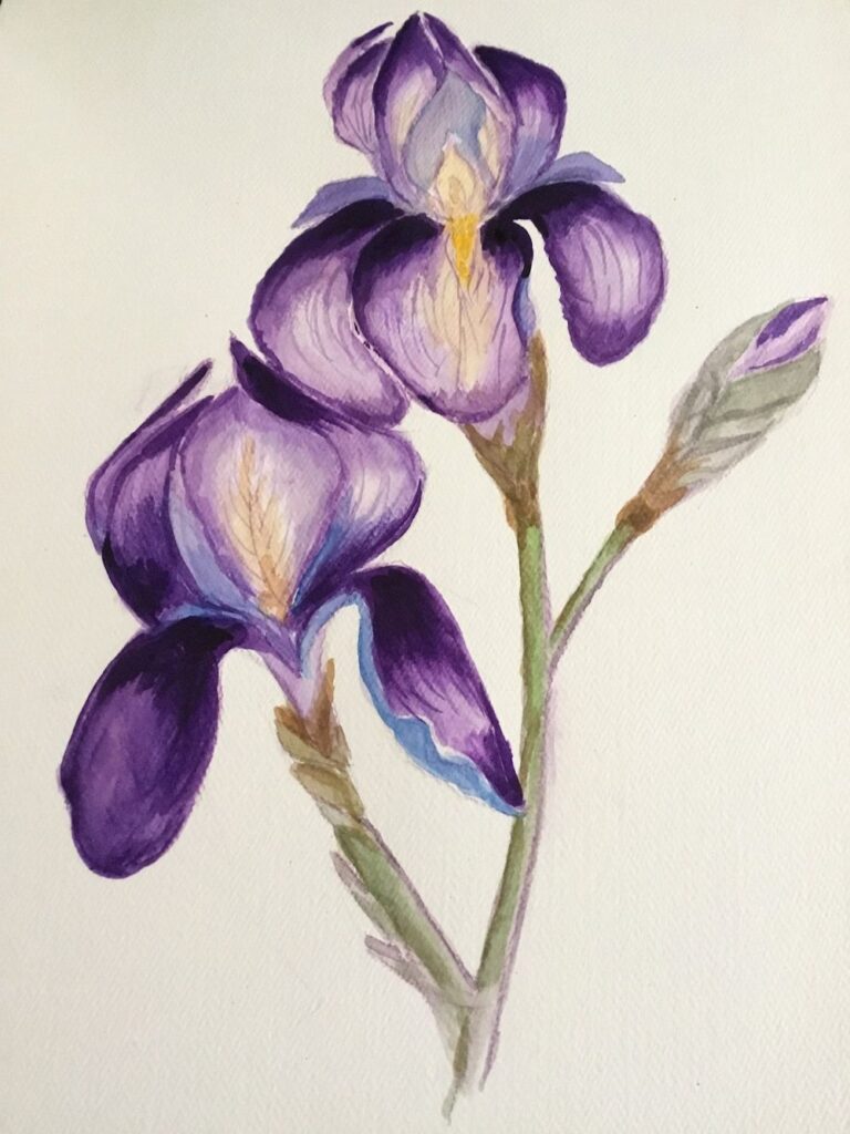
Your paintings:
by Ann
by Ann
by Maryon
by Maryon
Watercolour and Oil Pastel by Mali
by Mali
by Sandra
Watercolour by Sandra
by Anne
by Kate
by Vitginia
by Virginia
by Virginia
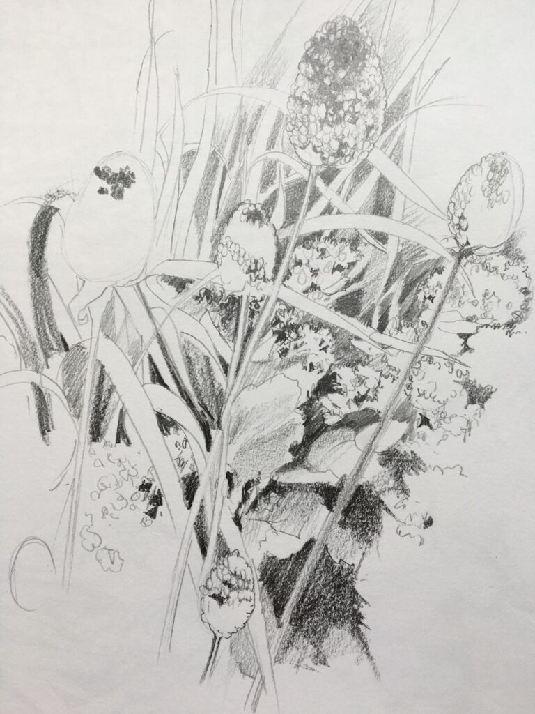
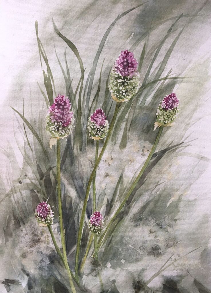
Watercolour Flowers a Free Approach: Week 1
April 27, 2022
Wet in wet followed by dropping in more colour as the paint slowly dried. Final brush strokes applied when dry.
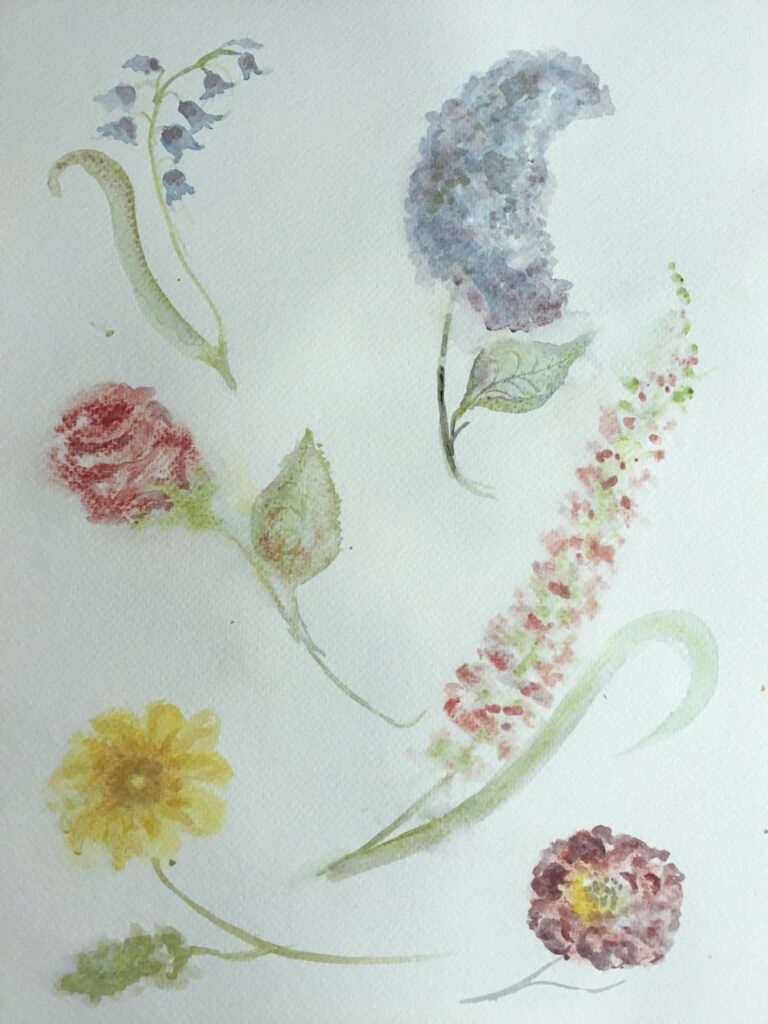
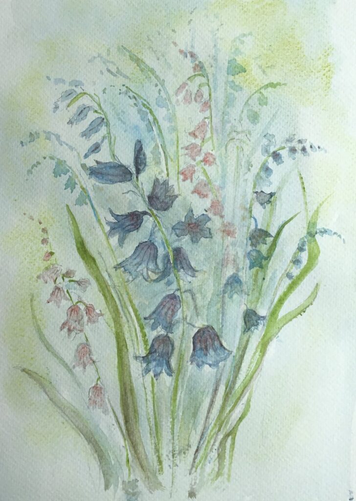
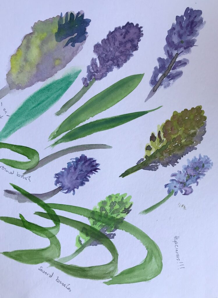
In this course the challenge will be to paint flowers freely in watercolour, using the brush for shapes and some really wet washes. Any under drawing in pencil will be kept to a minimum and the aim is to create some very expressive flower paintings rather than botanical illustrations.
The first two weeks will be spent on gaining confidence in drawing with the brush, suggesting plant structures with different brush strokes, applying washes either to to fill shapes or to paint around shapes. There will be a lot of dropping colours into wet paint or water and finding ways of controlling very wet washes and/or coping with and taking advantage of some of the happy accidents that occur on the way.
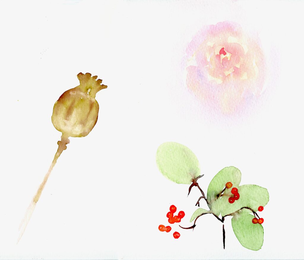
Bottom: leaves “printed on with a large round brush, brown stem/twig painted while the leaves were a little damp; berries added with the same small round brush when all was dry
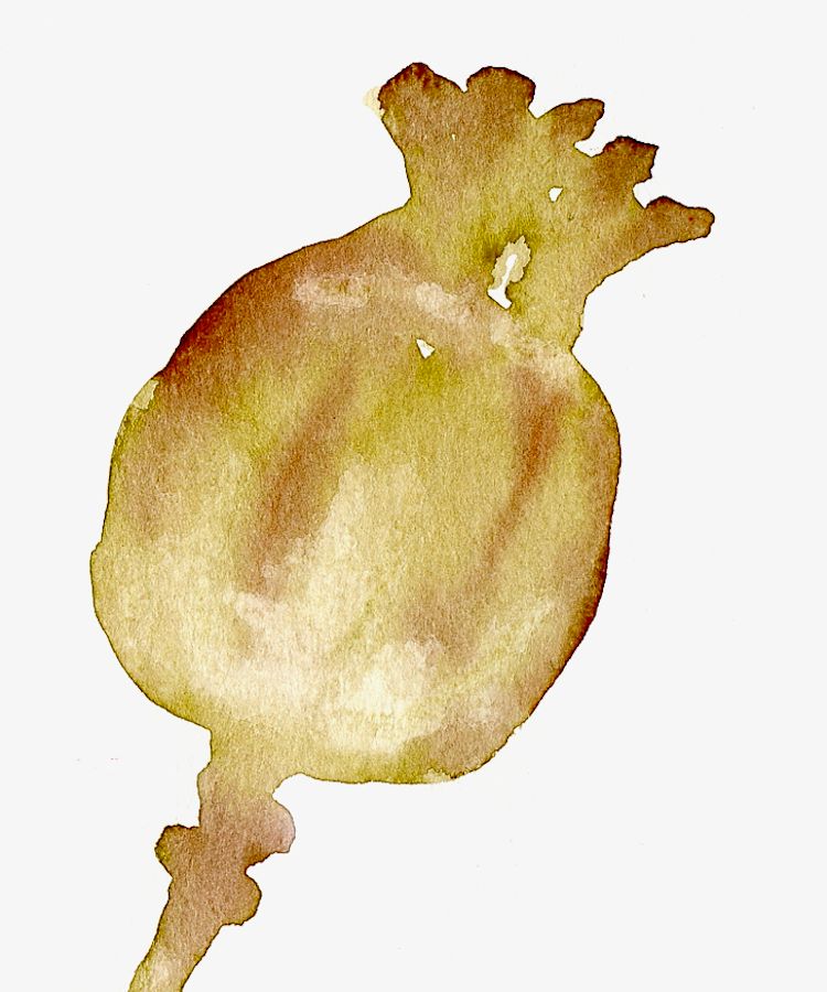
Left: poppy seed head shape wetted with clear water, pale olive green added; brown dropped in when a little drier and pale parts lifted before all was completely dry
Complicated shapes may need a pencil guideline and we’ll practise filling shapes with water before flooding them with colour and also painting around shapes and making wet in wet backgrounds. This means it’s a good idea to think in advance about the overall composition, the colours you need and the tonal range. Keep the number of pigments you use low and experiment to find which mixes will suit the work best.
Your washes should be ready in sufficient quantity and in the concentration needed for the painting, before the first wash is delivered to the paper. Always mix stronger than you think you will need as the colours will often be added to wet paper and they dry paler than they appear when wet.
The execution may be quite fast and spontaneous but a bit of thought and planning ahead will be invaluable.
Think it’s finished?
The three artists chosen for inspiration have different styles and by no means limit themselves to flower painting. One can learn a lot from studying their work so I have put together a Pinterest Board, link below referencing their work and techniques so do have a look. Each artist has a section within this board.
https://www.pinterest.co.uk/jhall1282/flower-painting-techniques/
Trevor Waugh has a magical way of working with washes and has produced books on watercolour roses in conjunction with the RHS at Kew Gardens. Paul Riley‘s compositions of floral still life subjects are sometimes quite complicated, but a lot the techniques can be used in much simpler studies and one can learn a lot about drawing with the brush as well as working in broader wetter passages from his works. He enjoys using oriental brushes for linear work and mark making. I am sure many of you will know Shirley Trevena‘s imaginative compositions, rooted in observation but often with an unreal and exciting twist.
For this course it will be useful to have;
Brushes: One large round, one small round brush, a rigger brush and a flat (half inch or larger). If you have other kinds of brushes, great! They will all be useful.
Watercolour paper 300gsm or heavier: 300gsm will cockle a little when very wet so may be a good idea to stretch your paper or use a block for the more considered paintings but this is not necessary for the exercises.
A block to tilt your drawing board. This will be better than a table easel and we will be working flat some of the time and/or turning the paper round so this is much easier to arrange if a block of wood about six inches long and about 2 1/2 inches in cross section.
Watercolour paints and a palette with deep wells. If you intend to work large a daisy palette or a plastic bun tin palette will be useful, although for most purposes and up to A3 size I find my usual folding palette adequate. Tubes are easier than pans to work at a large scale and if using pans remember to flood your paintbox with water so the pans are moist and the colours can be lifted easily without scrubbing the pan with the brush. Some artists use a different hardy brush like an acrylic brush for lifting paint from pan to palette to lessen the wear on their watercolour brushes.
Also: water pots, paper towel, small natural sponge
A couple of flowers to inspire your brush marks and washes.
This first session we’ll make a lot of brush marks on to dry paper and on to paper that is damp or randomly spattered with water. When making these marks we will have flower structures in mind but the purpose will be to find ways of making marks and controlling washes that will give a lively and free way of expressing these forms in watercolour.
After the exercises an expressive study of your chosen flowers should be attempted. The exercises will be done in real time as they are demonstrated at the class session. Hope the illustrations will give you a few ideas for the session.
Your Paintings;
by Sandra
by Ann
by Ann
Watercolour painted wet on dry by Virginia
Watercolour painted wet in wet by Virginia
by Mali
by Mali
Watercolour by Kate
by Maryon
by Maryon
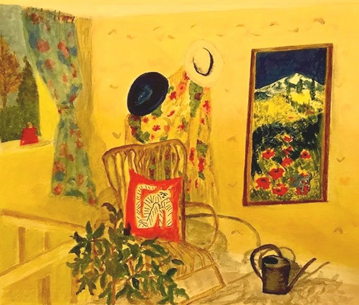
Still Life Week 6: Looking with David Hockney
February 11, 2022
Coloured Pencil Sketch by Jo
For the last week the challenge will be to make a still life drawing taking inspiration from the coloured pencil and crayon drawings of David Hockney, born in 1937. He made a number of still life drawings in the late 70’s, sometimes of tables in restaurants and also of plants in pots, including a very representational drawing of a yellow jacket, hat and a suitcase on a chair.
Examples of these can be seen on my still life Pinterest board at
/https://www.pinterest.co.uk/jhall1282/still-life/hockney-david/
together with examples of Hockney’s etchings, lithographs and i-Pad drawings.
Some are relatively simple drawings, for example the two peppers, but note the proportion of white space and that it appears “right”. One deceptively uncomplicated but elegantly drawn composition is of a double bed with a green cover where an astonishingly even tone of green has been laid down.
It’s worth studying these works for the techniques used in drawing; where Hockney used line and where he hatched or scribbled or made other marks that show us what he was observing. Look for fast frenetic marks as in the drawing of peppers and where he uses slower marks.
Is it possible to tell what the artist is feeling? Look at that smooth green pasture of a double bed for instance. Look out for instances where Hockney works up some areas more than others, literally drawing our attention to what he thinks is important.
Also study the structure of the compositions and where composition relies more on line and form and where composition depends more on colour and shape for impact.
These days we are probably more familiar with Hockney’s later i-Pad drawings of still life subjects and you are invited to take inspiration from Hockney for your coloured crayon or coloured pencil drawings. Worry not if you have no access to coloured pencils, just draw with a graphite pencil or pencil plus pastel or pastel pencil.
I hope to add my as yet unfinished work, inspired by the other artists we have taken inspiration from over the last few weeks, to this post. meanwhile I am very much looking forward to seeing your Hockney inspired drawings.
Your Drawings inspired by David Hockney:
Coloured Pencil Drawing by Heather C
by Pam
i-Pad drawing by Maricarmen
i-Pad drawing by Maricarmen
by Maricarmen
Coloured pencil drawing by Heather N
Coloured Pencil by Ann
Coloured Pencil by Ann
Pencil drawing by Virginia
Pastel Pencil by Mali
Coloured Pencil by Anne
Pastel Pencil by Mali
Rotring Pen drawing by Sandra
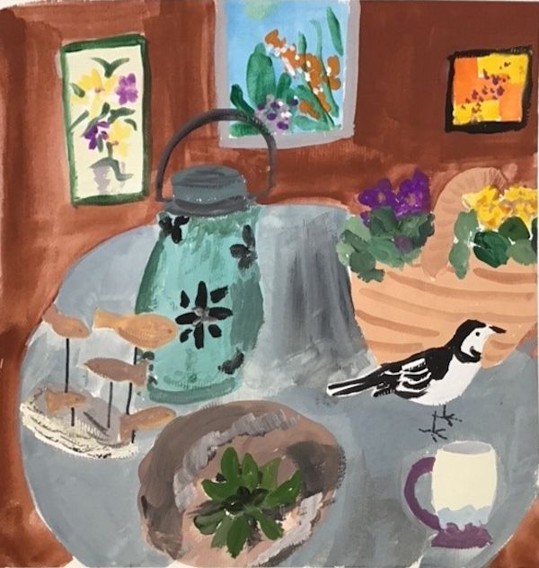
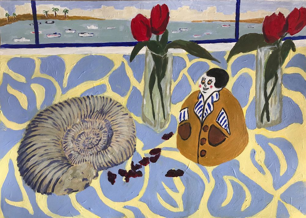
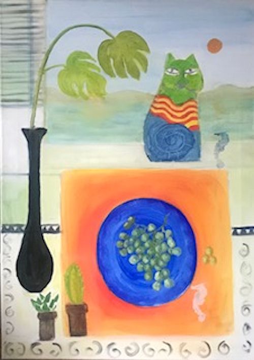
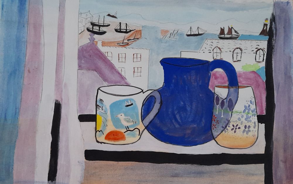
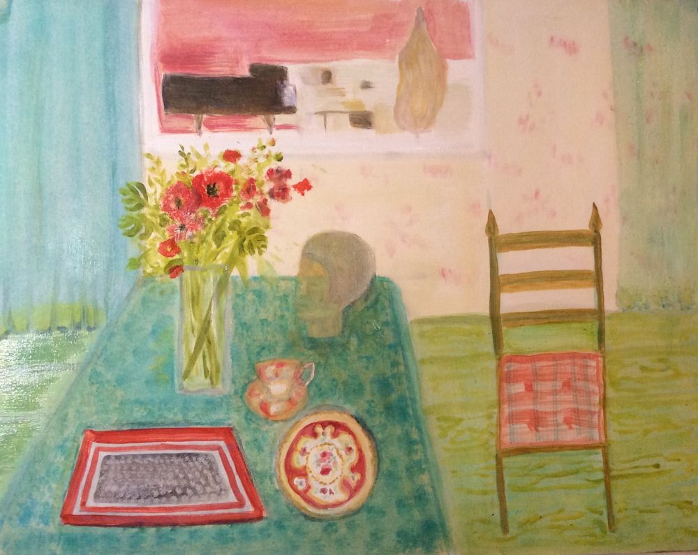
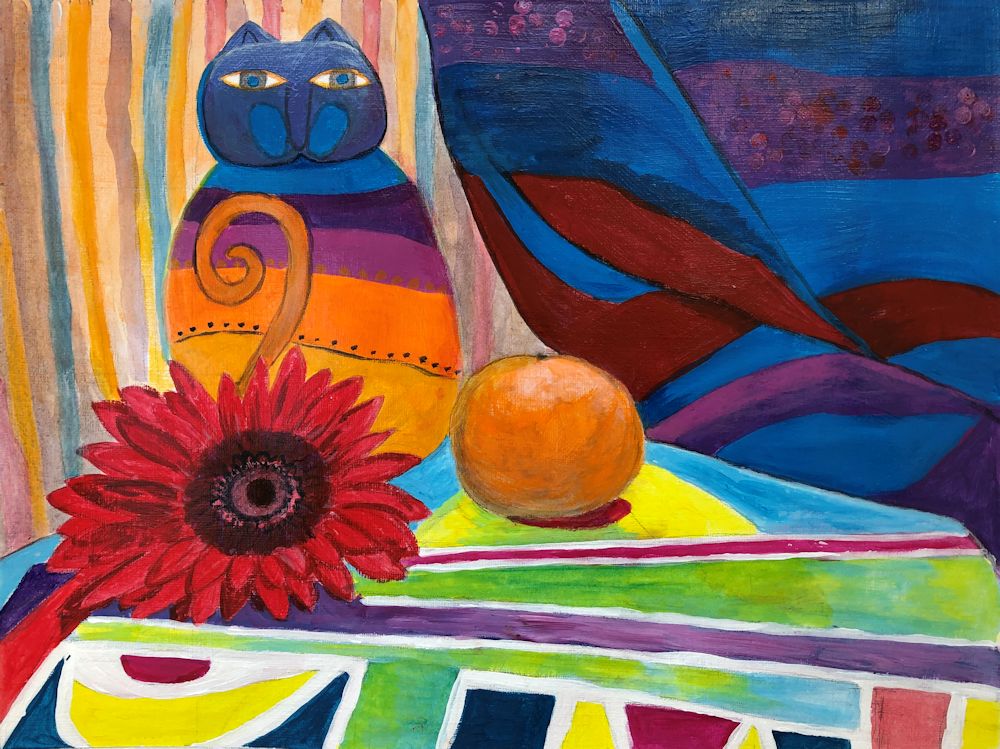
Still Life Week 5: The Magic of Mary Fedden
February 2, 2022
Mary Fedden OBE, RWA, RA was born in Bristol 1915 and remained a popular and acclaimed painter till her death in London in 2012. Fedden knew from an early age that she wanted to be a painter and trained at the Slade from 1932 to 1936, a pupil of the theatre designer Vladimir Polunin.
After her time at the Slade Fedden worked on portraits and stage designs for the Sadler’s Wells Theatre, followed by teaching in Bristol till World War 2 broke out when she served in the Land Army, the WVS and as a driver for NAAFI in Europe.
She admired the early works of Ben Nicholson and his wife Winifred and also the still life paintings of Anne Redpath and the French painter Henri Hayden. She also received commissions for many mural works including one for the TV pavilion at the festival of Britain.
It was after the war that Fedden developed her own way with painting flowers and still life subjects and I believe was still greatly influenced by a sense of drama from her stage design days. Fedden’s still life works seem to me very theatrical, like little sets for the objects that they contain. These sometimes have landscape or window backdrops and the shapes are somewhat flattened as in Nicholson’s early works. She certainly breathes magic and wonder into quirky and ordinary objects alike. In one painting a teapot and an Auricularia has a background of an erupting volcano and a zebra in the middle ground! Such juxtapositions abound in her work and one can only imagine the stories behind them. Some examples can be seen on the Pinterest Board, link: https://www.pinterest.co.uk/jhall1282/still-life/fedden-mary/
Fedden did work in oil but favoured working in gouache, especially on rough textured hand made Indian papers. Her compositions were not set in stone from the beginning, rather she would make a few guidelines and improvise as she went along. She had a wonderful vocabulary of brush strokes and painted exclusively in the studio from the many drawings made in her sketchbooks. Do look at the short U-tube clip to watch her painting. Link: https://www.youtube.com/watch?v=BxOOKRhllPw
Many works also include some elements of collage. As well as quirky objects subjects often included a light source, a candle or lamp to dramatic or rather romantic effect as in “lilies at Moonlight”..
Looking at the works of Mary Fedden gives an interesting link with Ben Nicholson whose early work was one of her influences and next week’s artist, David Hockney who was one of her pupils at RCA.
For more of Fedden’s work see the link to “115 works by Mary Fedden” below:
Your challenge this week is to find an unusual gathering of objects and make a magical still life study from them. Think about the setting and especially the tonal balance in your painting as well as the colour. Suggested media: gouache, watercolour or acrylic with perhaps a collaged element.
Your paintings:
by Sandra
by Sandra
by Mali
by Maricarmen
by Anne
by Virginia
by Kate
by Heather C
by Heather C
by Heather N
by Ann
Mixed media with collage by Pam
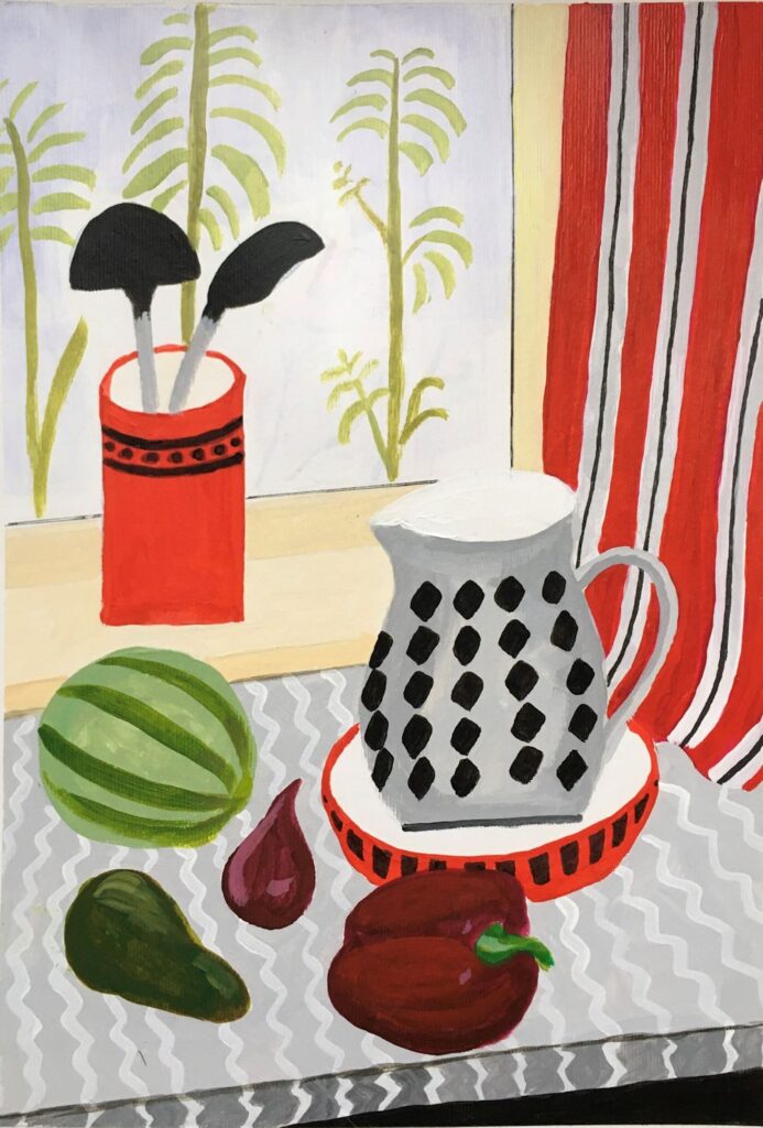
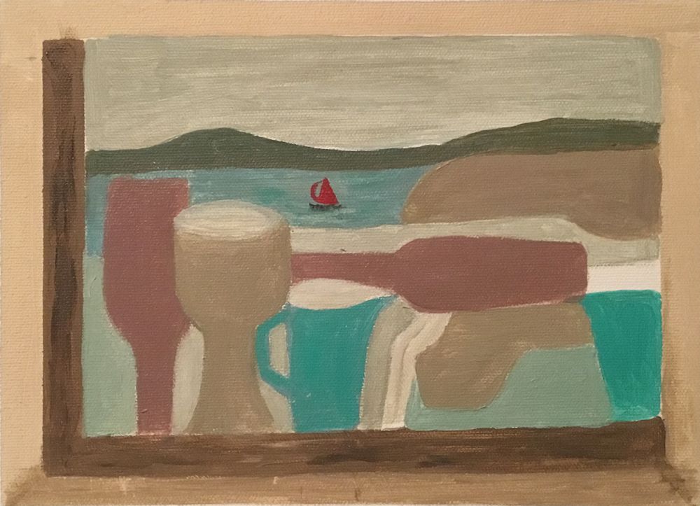
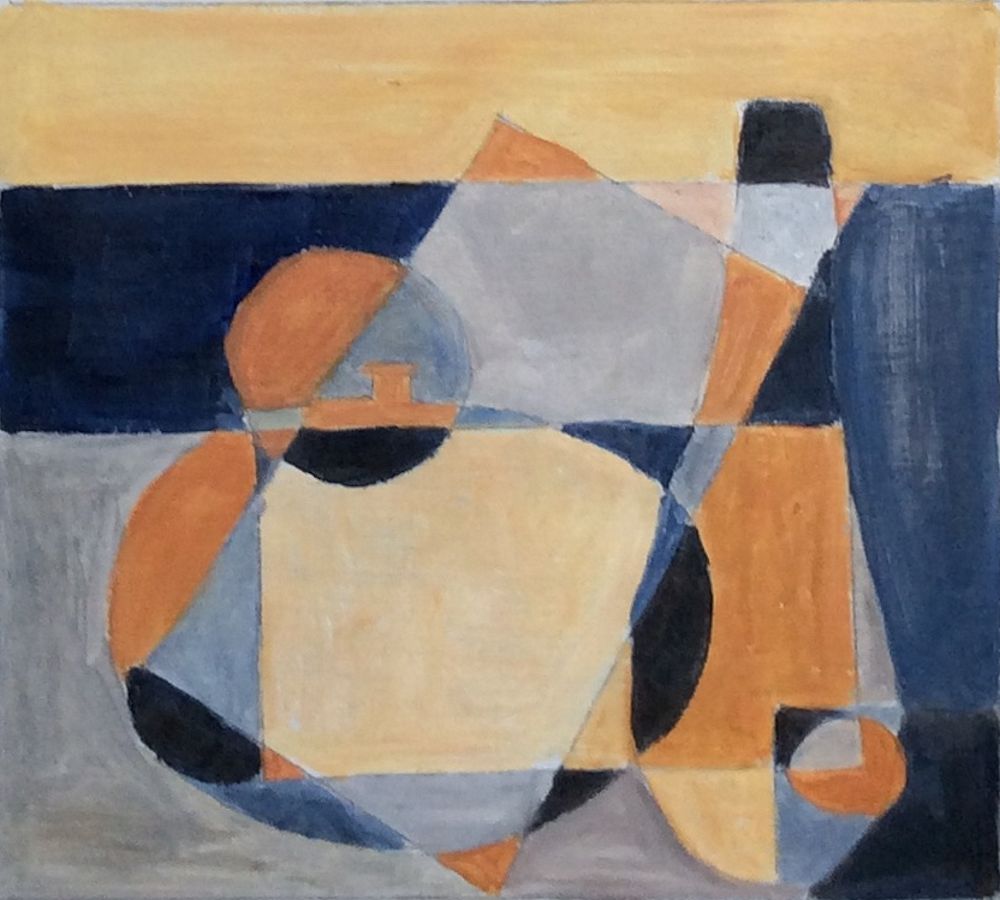
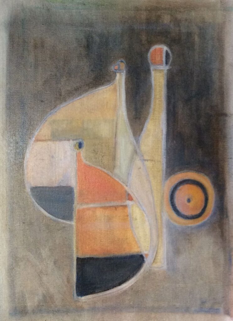
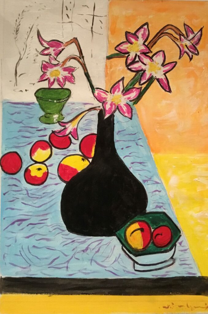
Still Life 4: Abstraction and Ben Nicholson
January 26, 2022
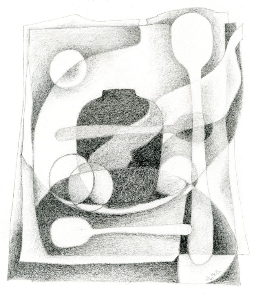
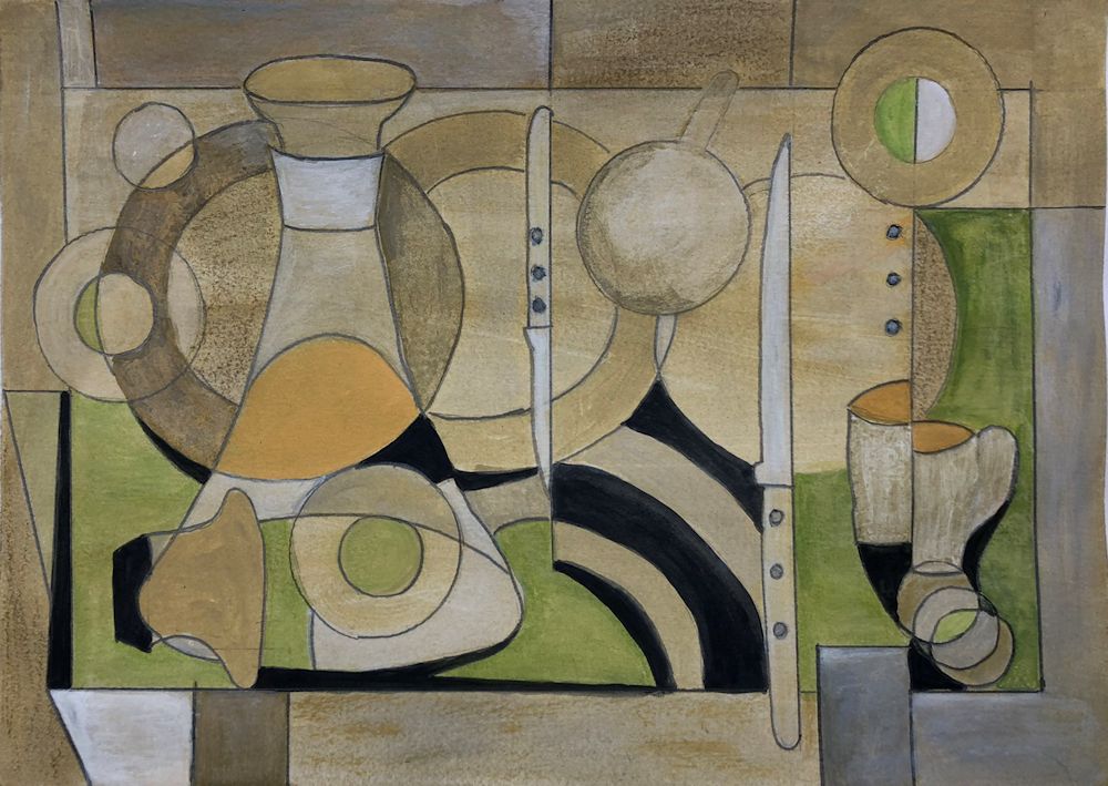
Pencil drawing by Jo
This is Jo’s composition based on shapes from the photo below.
At next week’s class Jo will demonstrate a painting in colour using a similar starting point. The practical suggestions in this post will help you to make a composition including some of the cubist techniques used by Ben Nicholson.
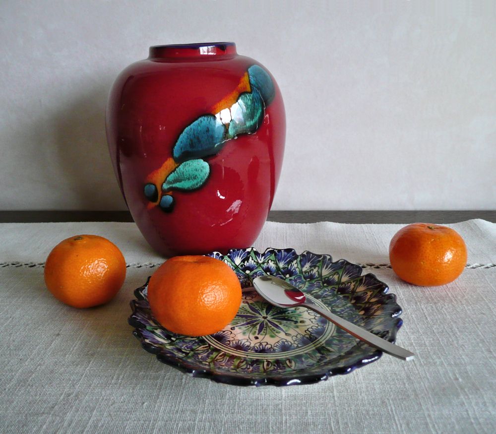
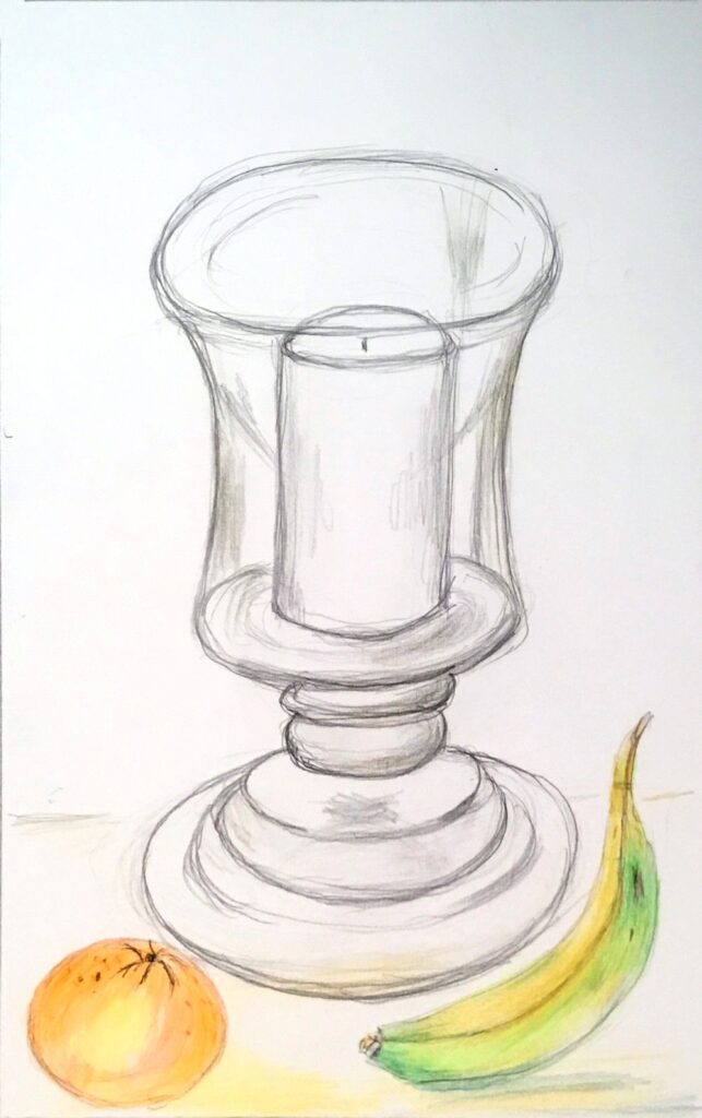
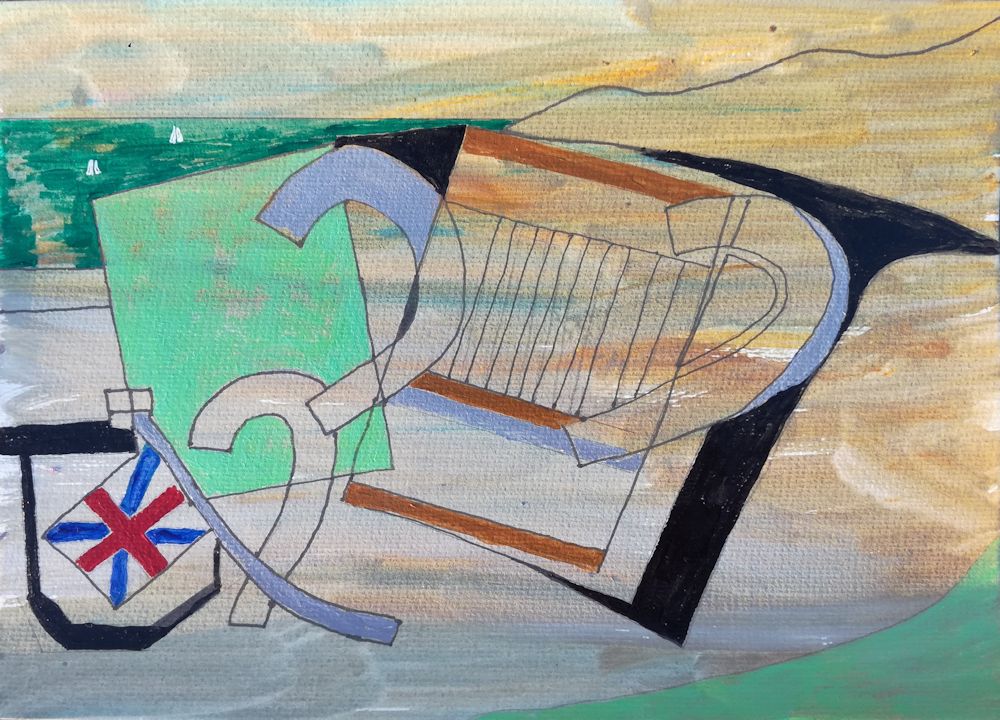
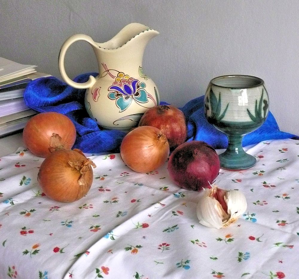
Vase and Saucer with Spoons and Oranges
Ben Nicholson was born in 1894 to artists Sir William Nicholson and Mabel Pryde. He attributed his interest in Still life to his father but trod a very different artistic journey, visiting the studios of Picasso, Braque, Hans Arp and Brancusi in the 1920’s and becoming intrigued with cubism. Cubist techniques of overlapping shapes and seeing objects from more than one viewpoint simultaneously, became firmly established in Nicholson’s still life work to a greater or lesser degree for the rest of his life.
He started training at the Slade in 1910 but left after a year. His contemporaries there included Paul Nash, Stanley Spencer, Mark Gertler and Edward Wadsworth. However, after spending time in the studios of Picasso and Braque, cubism became the main focus of his output in the 30’s. This was especially so during wartime when he and Barbara Hepworth moved to St. Ives. Ben was asthmatic so unable to join the services and for a time he and Hepworth worked well together and Hepworth said they were each other’s best critics. Nicholson’s compositions often took in other influences besides cubism as can be seen from either Googling his work or the Pinterest board, link below. Sometimes a cubist still life may have a backdrop of a Cornish landscape as viewed from a window
https://www.pinterest.co.uk/jhall1282/still-life/nicholson-ben/
We are principally engaged with Nichoson’s still life work which gradually became more abstract. In the 20’s he painted a wooden box with a rather flat depiction of a jug and mug where shape and colour and flat darker tones make up the compositions inside the lid and on top of the box. In 1930 he painted a simple composition of a mug and a little bowl. The forms overlap but the way in which the stag decorating the mug is painted tells us another story. The stag is shown as a flat motif superimposed over the other objects and overlapping the bowl and background. It gives us a different view of the decoration than would be seen if we were looking at it as seen on the curved surface of the mug.
This overlapping technique can be seen even more clearly in Nicholson’s drawings of three pears where he has drawn one pear over another as if we could see all those edges when viewing the set up. Also look at his compositions of objects arranged on table tops. Then try one or more of the following;
Challenge 1. Overlapping
Find a small group of overlapping objects (e.g. a couple of mugs, a bowl with some fruit) and draw as if you can actually see all the edges that you cannot see. Fill the shapes with tone or colour to make an interesting composition.
Nicholson takes this idea a whole lot further towards more extreme abstraction. He plays with shapes placing them at different scales and places in his picture than they are in reality or even could be in reality. Notice how in the table top still life studies the table top is up ended. In other works, perhaps only half a bottle or vase is seen, or shapes are repeated, tilted or reversed, and elsewhere coloured rectangles of deep or pale tones are introduced.
Challenge 2. Different Viewpoints in the same Composition
Make a composition using the cubist technique of being able to see works in the same picture as if seen from at least two directions, for example, a piece of fruit on a plate where the fruit is drawn as seen but the plate is seen as if you were looking down on it, or do something similar to what Nicholson does with the decorative stag motif.
Challenge 3. Rearranging Shapes and Repeating Shapes at different Scales
Make a cut out of a jug, goblet or egg cup at two sizes. Cut two of each, one on pale and one on a coloured paper. Cut at least one shape in half and play with the shapes on your support till you find a pleasing composition.
Remember you can;
tilt or reverse the shapes; use the negative shapes from which you made your cut outs; fit one shape inside another where the scales are very different; partly overlap shapes.
Glue to a support (this should be a heavier weight than your cut outs: multimedia paper or heavy watercolour paper should be OK). If any of your shapes have been cut from white paper consider painting a background colour on your support before glueing the pieces down. When everything is stuck down and dry, assess whether more drawing or painting is required. This may mean altering the colour or tone or adding texture or pattern to some areas.
You may prefer to play with the shapes and then draw or paint a composition based on your preferred arrangement instead of making a collage. The important thing is to play with shape and scale, tone and colour.
Challenge 4. Make your own composition
Either use some of Nicholson’s techniques for your own composition or paint your own version of one of his works.
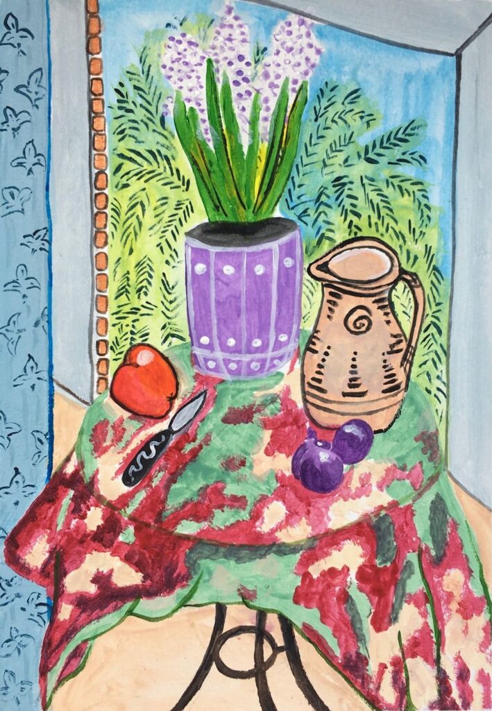
Your paintings;
by Pam
by Heather N
by Heather C
Gouache by Maricarmen
Gouache by Ann
by Ann
by Mali
by Anne
by Sandra
by Sandra
by Sandra
by Kate
by Virginia
by Virginia
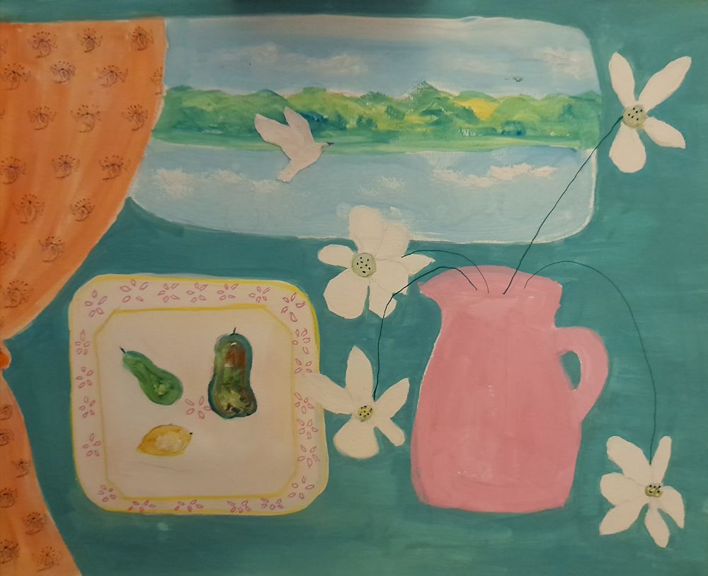
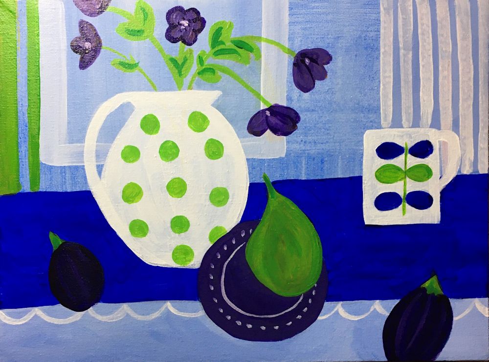
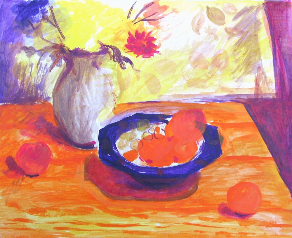
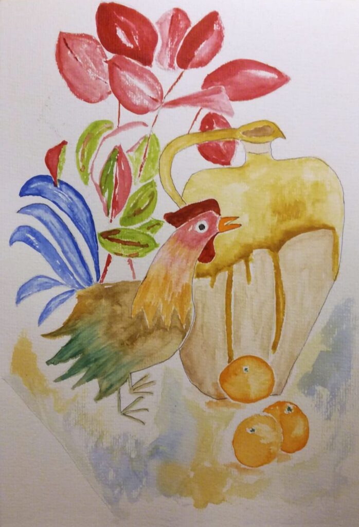
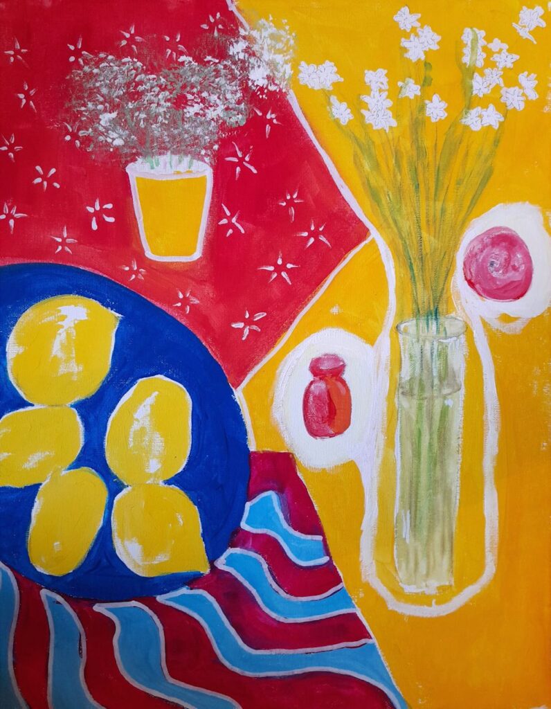
Still Life 3: Rearranging Matisse
January 19, 2022
Rearranging Matisse sounds like heresy, but is in fact a useful exercise because it illuminates the possibilities that arranging and rearranging objects bring. Matisse had a different interest in still life to Morandi. Matisse consciously sought to communicate what he felt about objects, and as early as 1908 told his students, “To copy objects in a still life is nothing; one must render the emotion they awaken in him”, whereas Morandi writes “The only interest the visible world awakens in me concerns space, light, colour and forms.” Morandi was far more interested in communicating what he saw with his eyes.
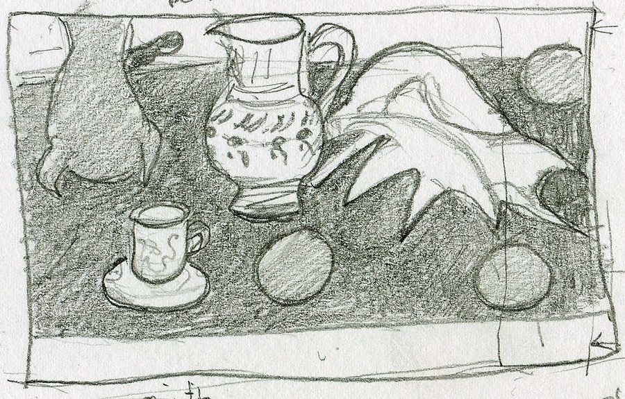
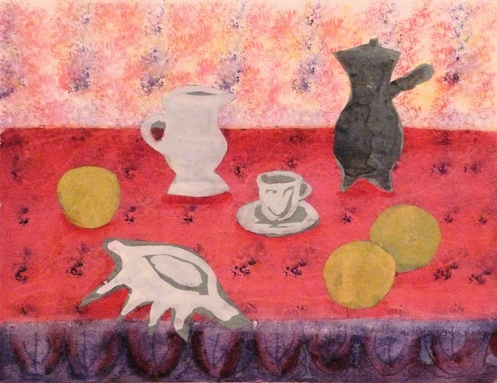
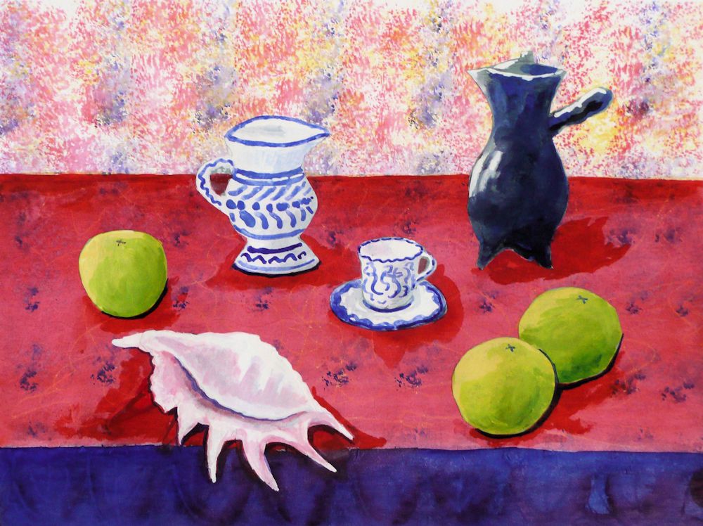
The illustrations in this post include my version of “Still Life with Sea Shell on Black Marble” 1940. Matisse had some difficulty in finding a suitable composition for these objects and resorted to using cut outs of apples and string to mark the table edge before arriving at the final study. Matisse only ever intended this as a study for a final work but it is a method you may like to try. As you will see I have rearranged his objects after very rapidly noting the development of this work at the “Matisse in his Studio” exhibition at the Royal Academy several years ago. I also took serious liberties with the colour of the background and table top.
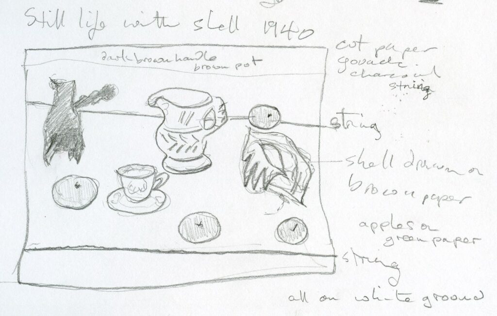
“Still Life with Sea Shell on Black Marble” is included in my Still Life Pinterest Board: Section Matisse, link given below:
https://www.pinterest.co.uk/jhall1282/still-life/matisse/
Both artists used their objects as “actors” arranging them on “the set” and often using the same actors in different works. Both were interested in the relationships between objects but while Morandi searched for the nuances of light, shade and spatial relationships, Matisse also wished to bring objects and their associated memories into the equation. This extended to bringing a unity to arrangements of objects he had collected on his journeys or that he had grown up with, and throwing their surroundings and sometimes fruit and flowers into the mix. In Morandi’s still lives one never sees a still life before an open window or had any idea of how Morandi’s room was furnished whereas for Matisse the environment in which his objects existed often formed an integral part of the composition.
Matisse used vibrant colours purposely to communicate emotion, something totally alien to Morandi’s simplified but more observation based still lives with their muted colours depicting simple vessels. Curiously, Morandi’s work does give us emotion, as a sense of calm unity pervades his work without seeming boring in any way. However for those seriously interested in colour Matisse offers continual inspiration.
Matisse leads us through compositions that rely less on form as revealed by light than by shape and the juxtaposition of colour. Objects become simplified and patterns exaggerated so that we see emotion celebrated through a more abstract way of seeing.
Here are a few photographs of objects chosen for their shape and colour with some rearrangements! which may give you a few ideas for setting up. My ‘photos don’t include glimpses from windows or interiors but you may have just such a setting for your composition.
This week the challenge is to arrange colourful objects that may be everyday and/or have have personal significance for you and then make a colourful still life composition, using colour and shape in the spirit of Matisse. Alternatively you are invited to make your own version of a still life by Matisse.
Your Paintings;
by Heather C
Acrylic by Sandra
Pastel by Mali
Acrylic by Mali
Oil by Virginia
Acrylic by Heather N
by Anne
by Ann
by Pam
by Maricarmen
by Kate
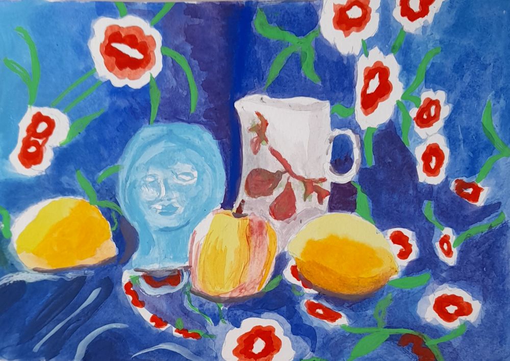
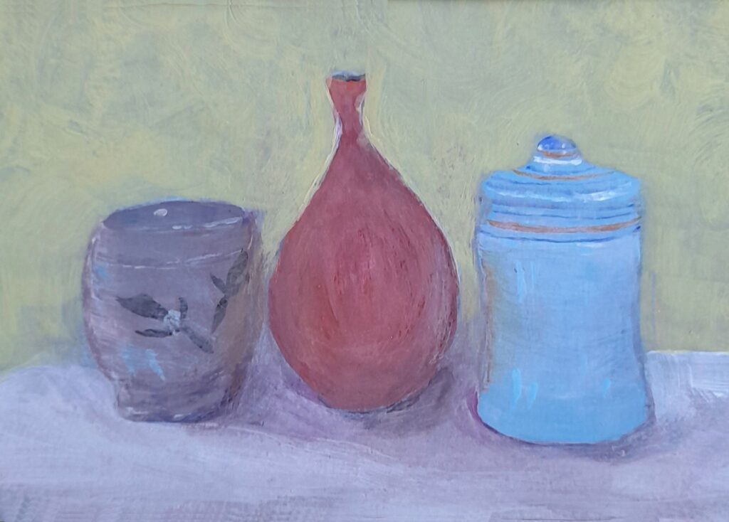
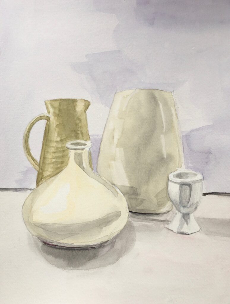
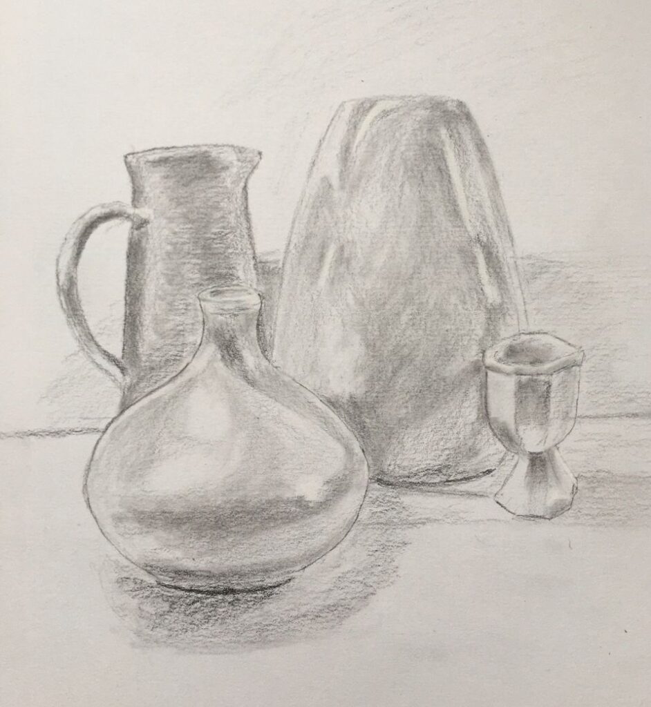
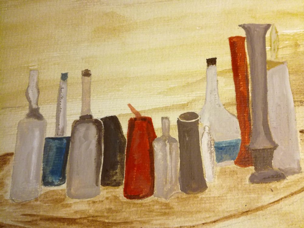
Still Life 2: Learning from Morandi
January 12, 2022
From a medium sized sitting room in Bologna, overlooking a small courtyard with trees Giorgio Morandi (1890 -1964), lived and worked painting everyday objects. These objects inhabited his shelves and became arranged and rearranged for his drawings, oil paintings, watercolours and etchings.
He admired artists of the Renaissance, Giotto, Masaccio, Uccello and Piero della Francesca and also Cezanne, Chardin, described in Morandi’s words as “the greatest of all still life painters ” and Corot, who he though of as the master of stillness. This last seems of most relevance as Morandi’s paintings of simple things give a sense of timeless calm to the viewer.
The author Horst Bienick wrote “Giorgio Morandi only painted jugs and bottles all his life but in these pictures he said more about life, about real life, than there is in all the colourful pictures around us.”
The quotes above are from ” Morandi” edited by Ernst-Gerhard Guse and Franz Armin Morat published by Prestel 2008. You will find a selection of Morandi’s works posted on the Morandi section of my Still Life Pinterest board, link below:
https://www.pinterest.co.uk/jhall1282/still-life/morandi-giorgio/
All Morandi’s works are based on intense observation simplifying forms and understanding how light reveals forms and how shadows can hide form and soften edges so that one form melts into another. The photos are all of my everyday objects and were taken to illustrate this.
In a letter of 6th January 1957 Morandi writes, “The only interest the visible world awakens in me concerns space, light, colour and forms.”
The way in which Morandi simplifies forms is most evident in his pencil drawings. The line is slow and deliberate, tracing the contours of what he sees. Areas of tone are added with diagonal hatching. In the watercolours, areas of tone are washed in as seen, immediately simplifying the forms and lending an abstract quality to these closely observed works. Morandi pays equal attention to the spaces between objects and the shadows the objects cast, as he does to the care he takes with the objects themselves.
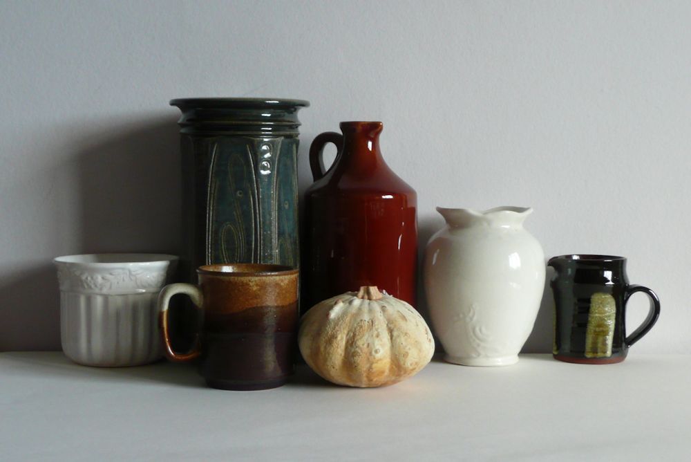
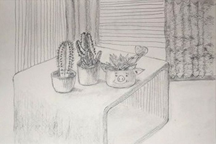
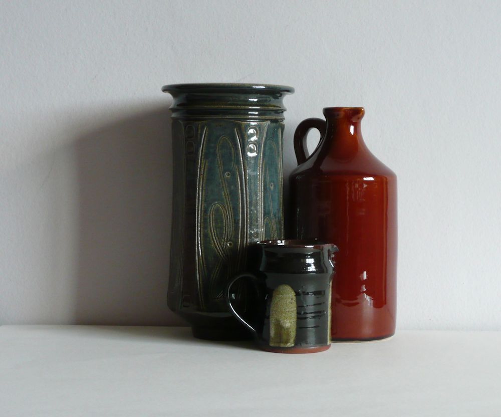
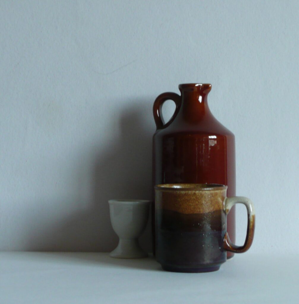
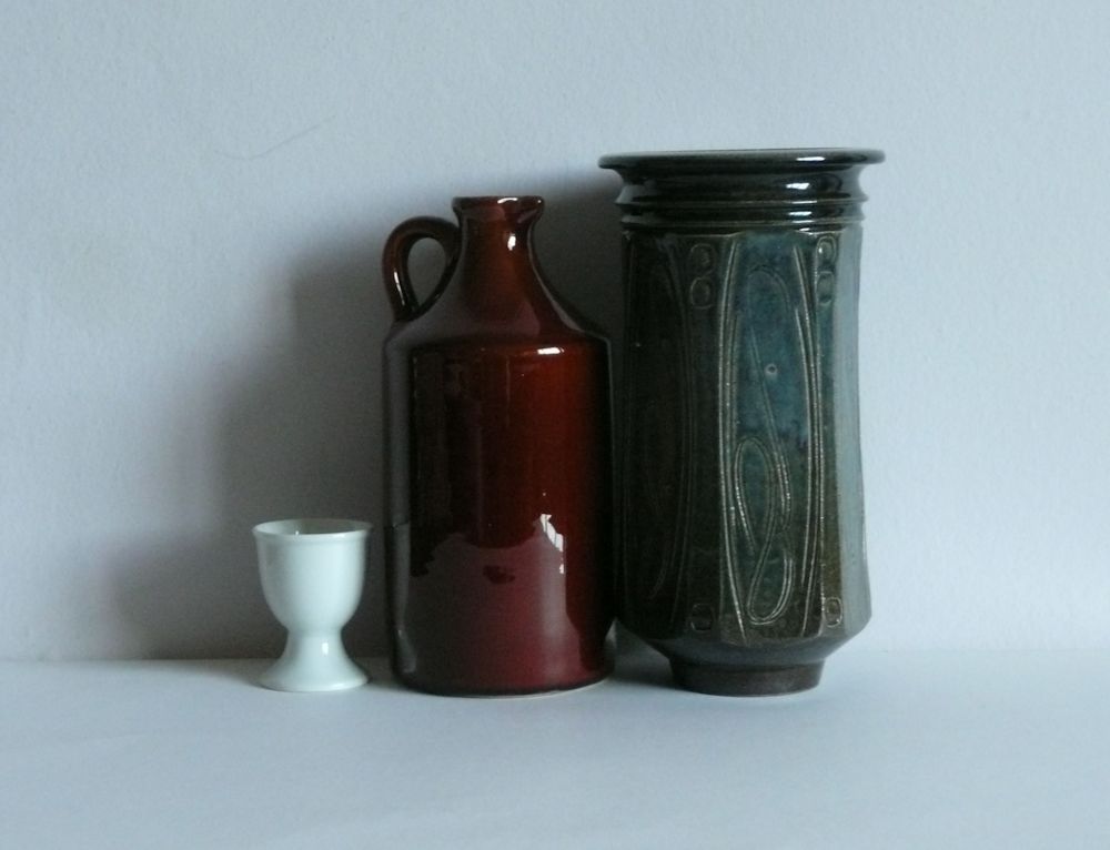
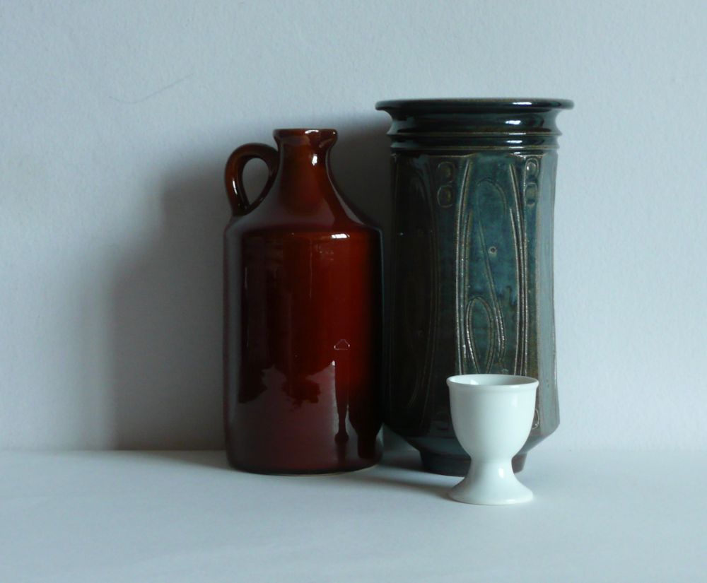
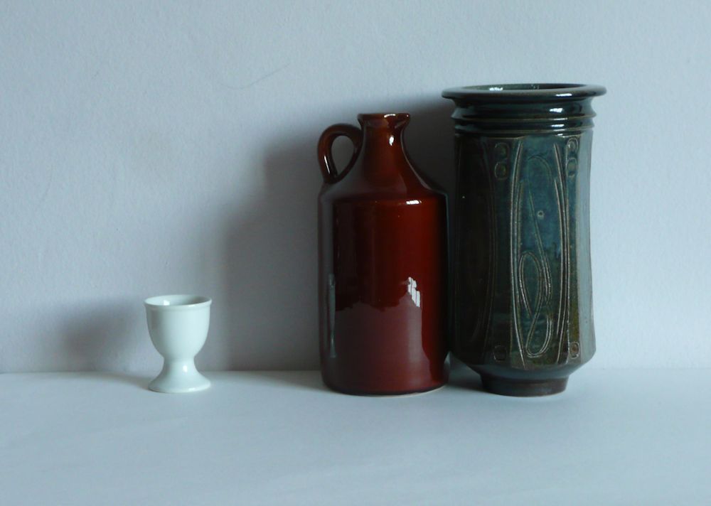
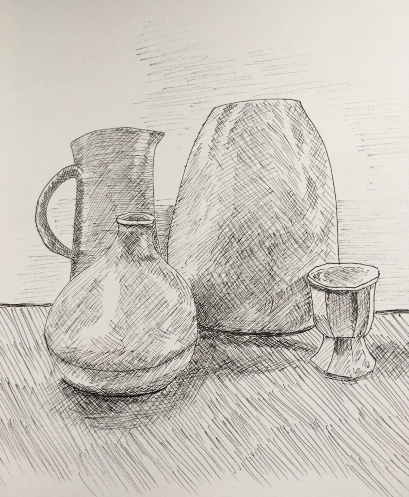
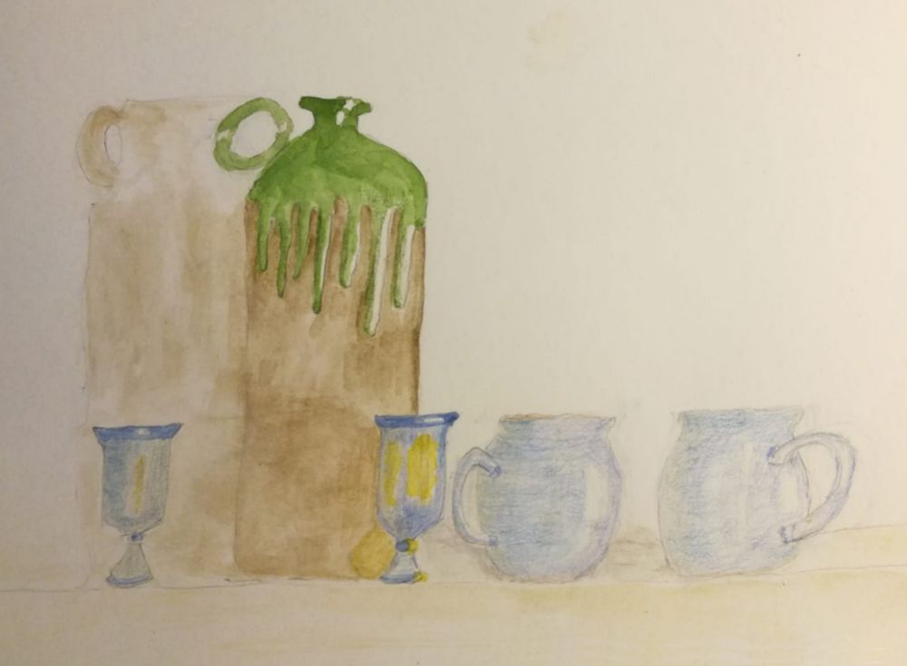
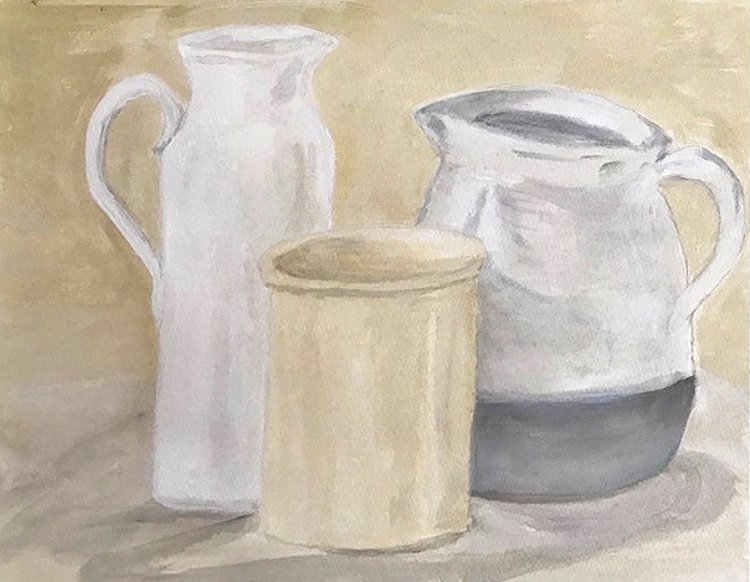
Try arranging a few everyday objects in different ways. make simple line and tone drawings. Where edges between objects cannot be seen treat them as one form. Look at the images below and note the difference that changing their arrangement makes. You may like to draw from these but if you can, find your own subjects and draw from life.
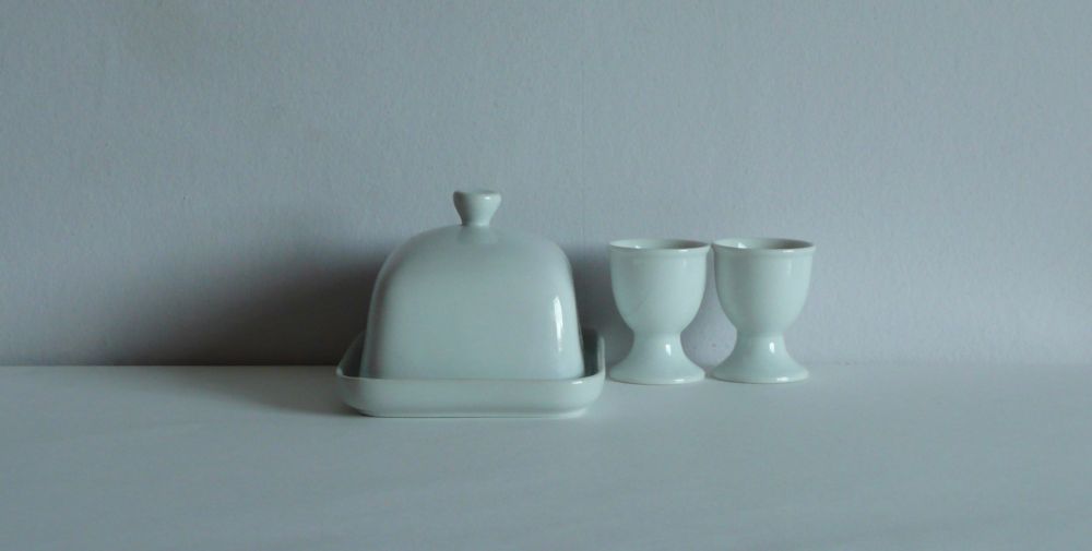

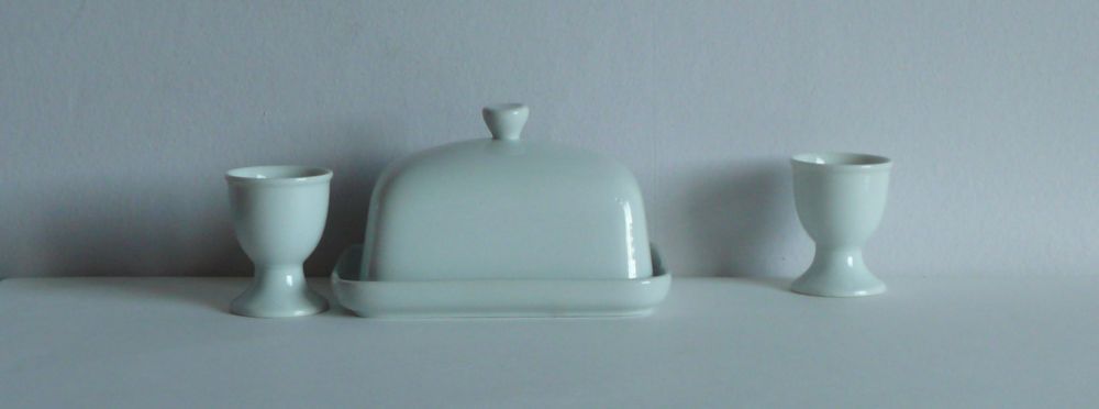
Notice the appearance of the egg cup in the images below and also what happens to the edges where one dark ceramic is close to another.
During the session we will make either several watercolours or an acrylic painting in the spirit of Morandi.
Your paintings:
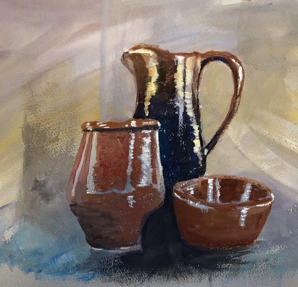
Acrylic by Mali
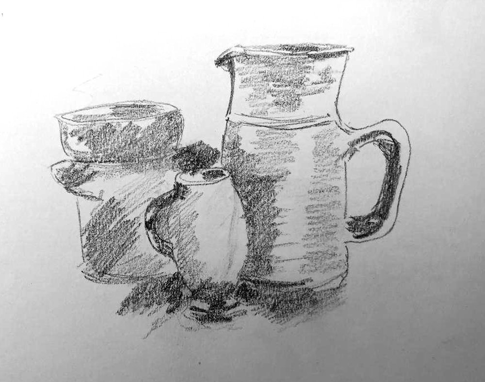
by Ann
Pencil over acrylic background by Ann
by Ann
Gouache by Sandra
Gouache sketch by Sandra
Acrylic by Maricarmen
by Kate
by Anne

by Pam

Oil by Virginia
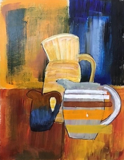
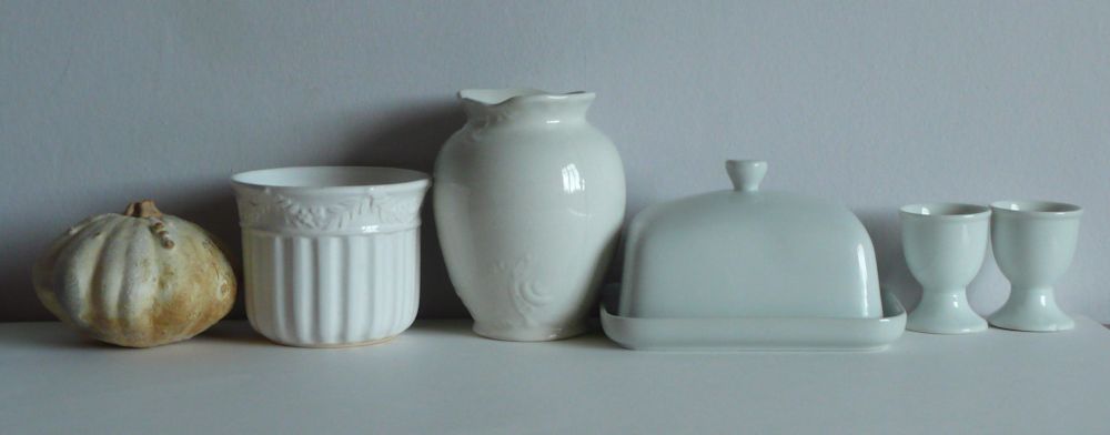
Still Life 1; Painting in the spirit of Sir William Nicholson
January 4, 2022
Over the next six weeks our challenge will be to paint still life paintings in the spirit of William Nicholson, Giorgio Morandi, Henri Matisse, Ben Nicholson, Mary Fedden and David Hockney. These artists were chosen because of their very different approaches to still life subjects and also the different media and objects favoured by each.

Our first artist, Sir William Nicholson(1872 to 1949), is perhaps the most traditional of these artists. Alongside painting in oil, Nicholson was a printmaker using woodcut, wood-engraving and lithographic techniques and produced many book illustrations, posters and set designs for the theatre. For more detail on this look at the Wikipedia article; link below
https://en.wikipedia.org/wiki/William_Nicholson_(artist)
Encouraged by James McNiell Whistler, after about 1900 Nicholson ‘s efforts were concentrated on painting. By this time he had already become well known as a portrait artist but is probably more celebrated today because of his still life works and poetic landscapes.
William Nicholson’s landscape and still life paintings were also greatly admired by his son Ben Nicholson whose work we’ll be looking at in a few weeks’ time.

My Still Life Pinterest Board samples a few of William Nicholson’s still life paintings and shows his enormous aptitude for painting lustrous, metallic and glass objects, depicting their highly reflective surfaces with deft brushstrokes that look fresh and convincing.
https://www.pinterest.co.uk/jhall1282/still-life/nicholson-william/
The challenge is to either paint your own version of one of Nicholson’s works or to set up a still life including similarly reflective objects to those depicted by Nicholson. The photographic illustrations in this post indicate some of the kinds of objects you may like to find for your own studies for which acrylic, pastel or gouache would all be suitable media. I will demonstrate in acrylic but if we have any oil painters amongst us that would be the best!

If you have time, familiarise yourself with your chosen objects, drawing them from a few angles and then decide on the composition. Nicholson often chose a very simple set up; just one or two main objects as in The Gilt Tankard which hangs in Clarence House or Still life with Glass and Spoon.

or take the easy route and crop a photograph.
We’ll discuss starting and developing paintings at the beginning of the practical session. meanwhile you may like to think about the following;
If working in acrylic or gouache, I like to start by start by drawing in the main shapes with a brush, then lay in the dark and mid tones. Some may prefer a pencil line to indicate the composition but there is always the risk of becoming too detailed too soon, on the other hand there may be elements such as cutlery handles where some accurate drawing will be useful. Another way to start is to make an under-drawing in charcoal and fix this well before blocking in the main shapes. With all media, work on the large shapes first making sure the tones are right before depicting the smaller shapes and details.


Note the slightly green colour of the glass.

When painting transparent vessels, note whether they are empty or contain liquid. Are there differences in how objects placed behind the vessel appear when seen through empty or water filled parts of the vessel? What do you notice about the water in the jar facing the light compared with the water in the jar on the same side as its shadow?
Starting with a background that is near the colour and tone of the reference setup results in very harmonious, peaceful works. You may at some stage like to paint the same picture over a much more vibrant ground. For the lemon and rosemary in a jar, a sienna or even bright red could be chosen.
Acrylic, pastel and gouache are all opaque media or can be used opaquely, so the sharp details of pale reflections and highlights can be added as the final touches.
Have a good look at each photograph observing not only the obvious reflections but also where colour is more subtly reflected onto the different surfaces. You may have already done this but right clicking on each image will give you the option to open a larger version in a separate tab.
Your Paintings;

Acrylic by Heather C
Acrylic by Heather C

Acrylic by Mali
Pastel by Mali

Acrylic by Ann

Acrylic by Maricarmen

Coloured Pencil by Anne

painted on blue card by Heather N

Acrylic by Heather N

Acrylic by Sandra

by Pam

Acrylic by Virginia

Acrylic by Kate

Acrylic by Maryon
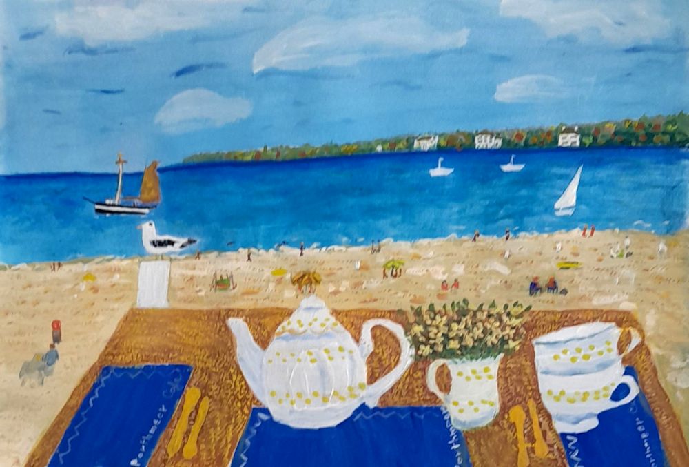
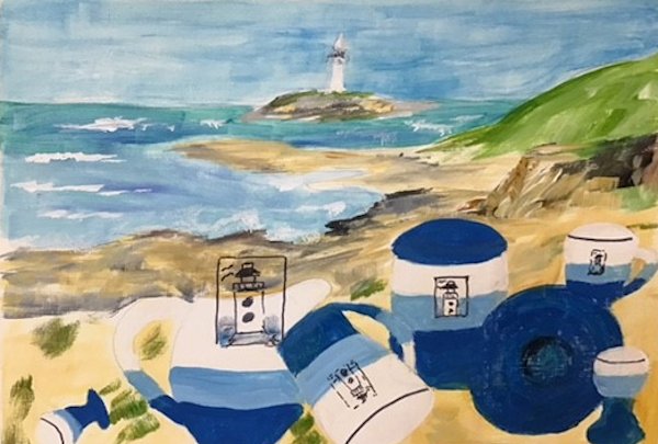
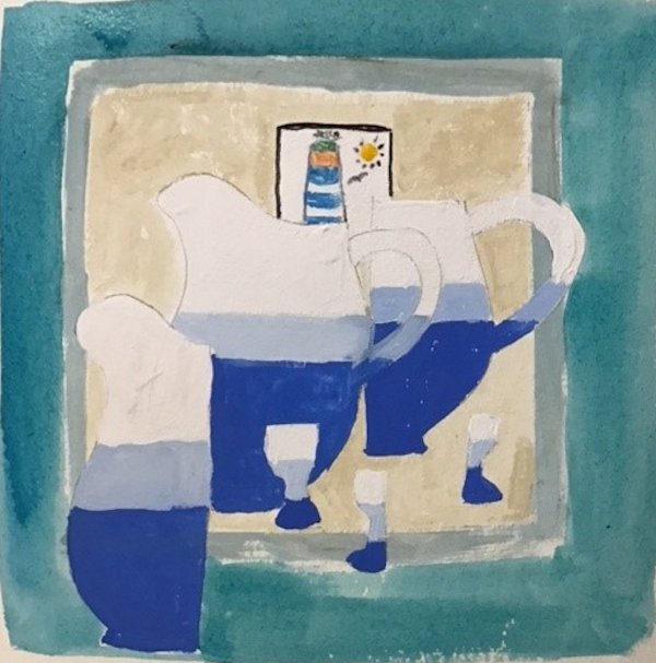
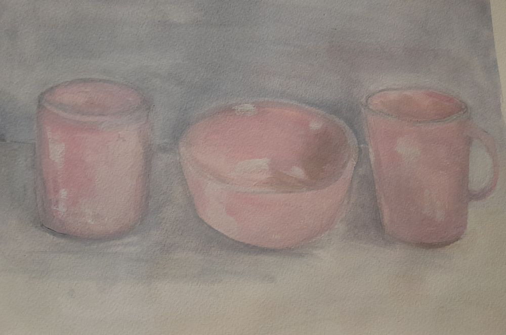
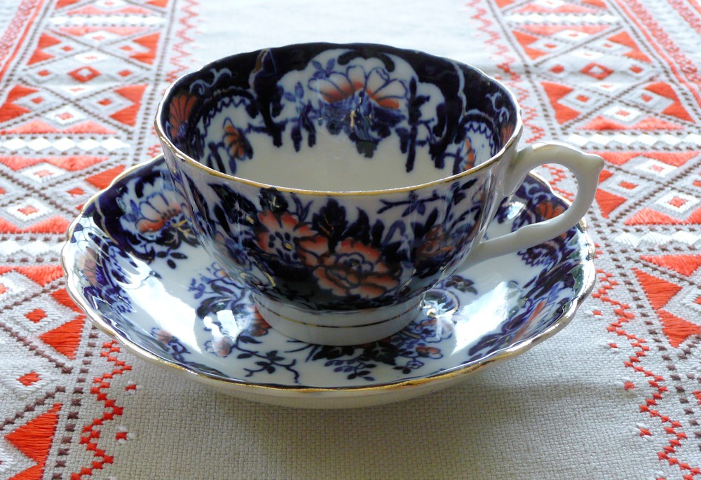
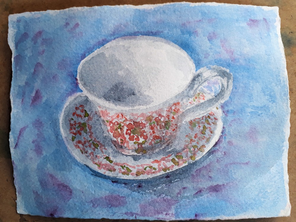
Virtual Tea Party: Paint a Cup and Saucer in Watercolour
April 6, 2020
Responses to this challenge would be a lovely way to contact your friends with a virtual cuppa. You could even do this one in a garden setting if the weather’s good, part of an alfresco cream tea perhaps!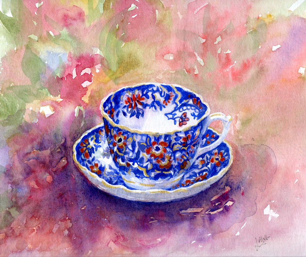
Getting the drawing right isn’t essential but if you would like to end up with a convincing structure there are a few things you should think about. If you feel confident with the brush you may like to go straight in with paint but reading through the following and looking at the photos may help your observation skills and thoughts about the composition.
When you are very close to the object you are painting, it becomes more difficult to measure so when you have chosen your cup and saucer, put it down on a table. Then make some observations. Move your head/eye level up and down and you will see changes in what you see, so once you have decided on the view you like best, stick to it!
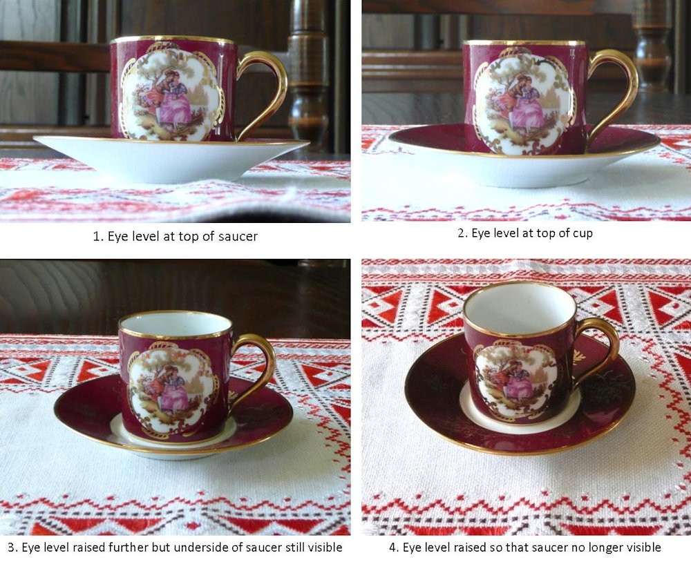
Photo 4. should read…. underside of saucer not visible!
So you have chosen your view. The object is on a suitable cloth and you are ready to draw.
Ask yourself the following questions;
Composition
Where do you want to place the cup and saucer on the paper?
How important is the background(cloth, pattern, wall behind etc.)?
This may impact the size and placement of your cup and saucer in the composition.
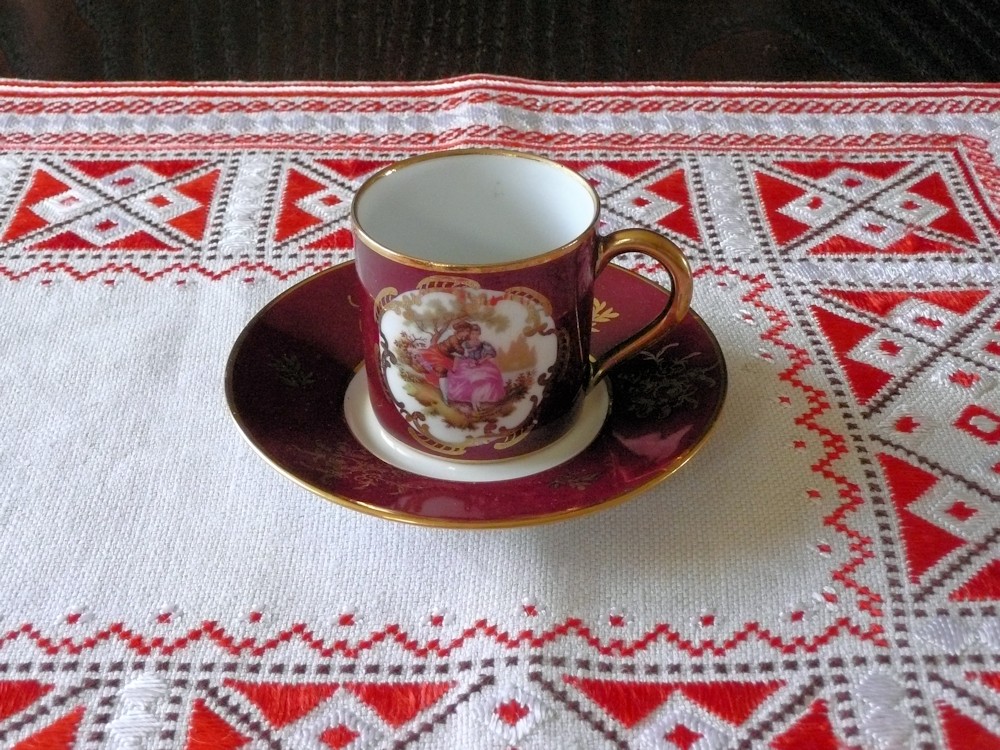
Cup and saucer itself
What is the relative overall width and height of the cup and saucer?
How wide is the saucer in relation to the width of the cup?
Can I see the bottom edge of the cup?
How much of the lower surface of the saucer, if any, can I see?
Vertically how far up the cup does the widest point of the saucer occur?
At what point does the saucer disappear behind the cup?
How much of the inside of the cup can I see?
How is the handle attached?
In some ways it is easier to draw from a photograph but photographs can have unwanted distortions especially if you take a shot very close to the object. These distortions can be largely avoided by taking the shot at a distance from the object and zooming in.
Draw the main shapes of your composition on watercolour paper.
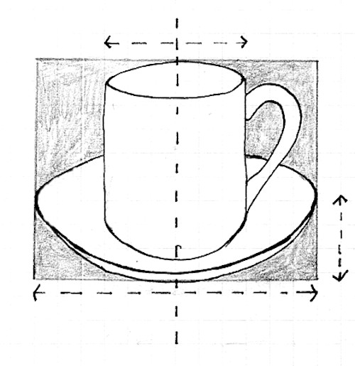
It may be useful to indicate the mid-line of the cup and saucer with a feint vertical line. This will make it easy for you to check that you have the widths of the cup and saucer symmetrical. Some cups have wide tops and much narrower bases and all sorts of curves in between. This vertical will provide a marker so that the symmetry of all the parts of the cup can be checked.
Concentrate on the largest shapes first, then add the details of fluted edges etc. You may choose to paint pattern directly with the brush after putting in the main washes or to indicate the main areas of decoration very lightly with pencil.
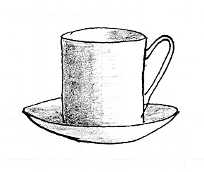
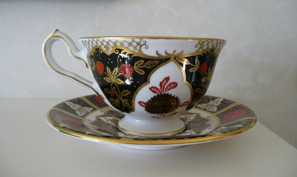
Lit from the right side
Lit from the left side
Before adding washes observe how the light falls on the objects and note if there are any areas you need to remain absolutely white. These may be very small; note the base of the cup, handle and part of the saucer rim and a couple of reflections in the photo above. You can do this by either leaving the paper white or using masking fluid. Slightly more subtle lights can be achieved by lifting out. If lit from the side the difference in tone between the light areas and more shaded parts may be dramatic and obvious, but where the light is diffuse or from more than one direction this may not be so clear. Start by washing in the main areas of tone and the background fairly lightly at first then add further washes till these are built up sufficiently before adding the pattern.
Diffuse light
Think about the background. I chose to invent a wet in wet background . You can do the same or choose to have a patterned cloth, or for the backdrop to take in part of the room. Always look carefully at the tones and how they relate to the cup and saucer. Look for shadows; the shadow that may be cast on to the saucer by the cup and the shadow below and/or to one side of the cup and saucer that falls on to the cloth or a wall behind.
Contre Jour
When the main areas have been painted, the detail of pattern can be added, and if gilded the last thing to add would be some imitation gold watercolour to lend a decorative touch to the painting.
Have fun with the paint and don’t take the words too seriously; just look and paint!
Your paintings;
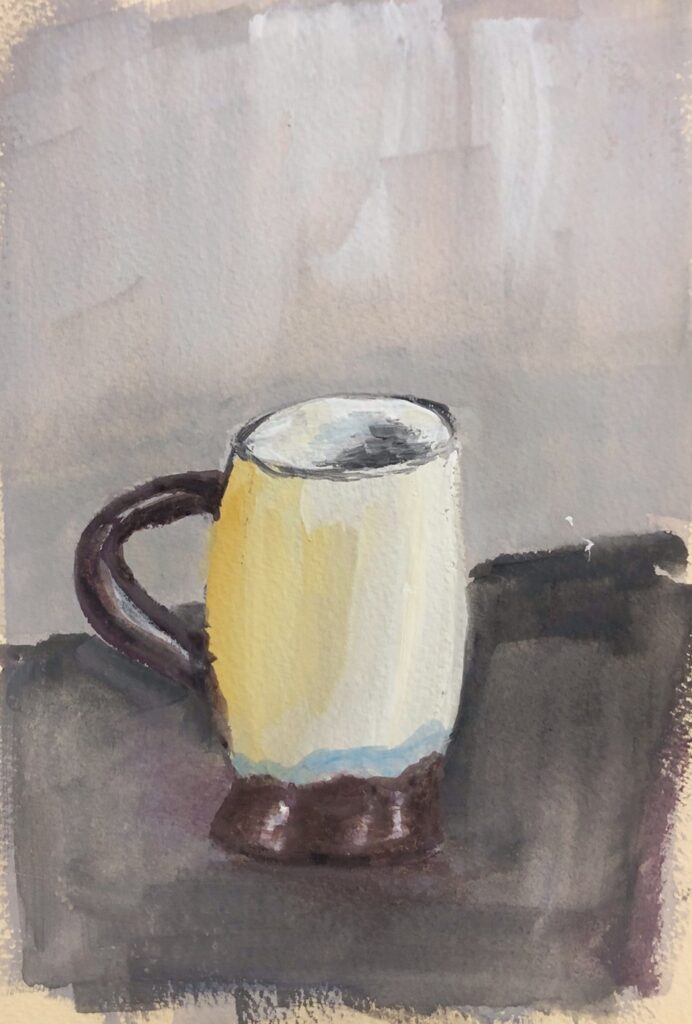
Tones well observed and beautiful pattern painted freely with the brush
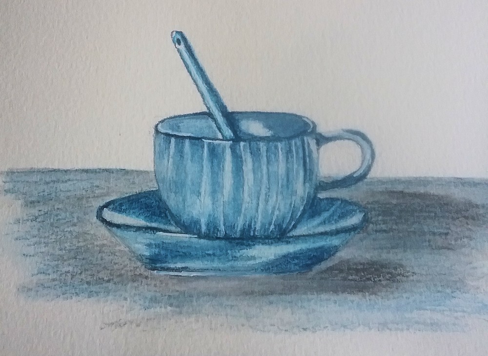
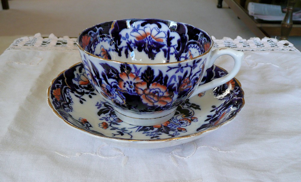
Blue Cup and Saucer; Handle looks really convincing and upper ellipses good, just needs a curve on the bottom of the saucer.
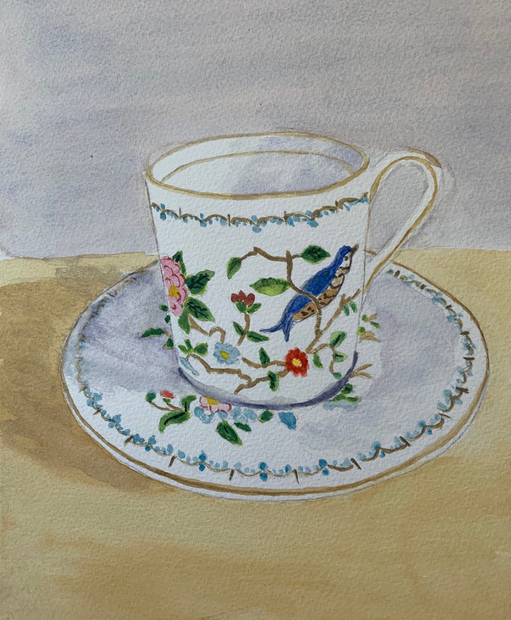
Cup and saucer with gold decoration