Category Archive: Colour
Inspired by Words: Autumn Poetry
November 15, 2024

by Jo Hall
Acrylic and Ink
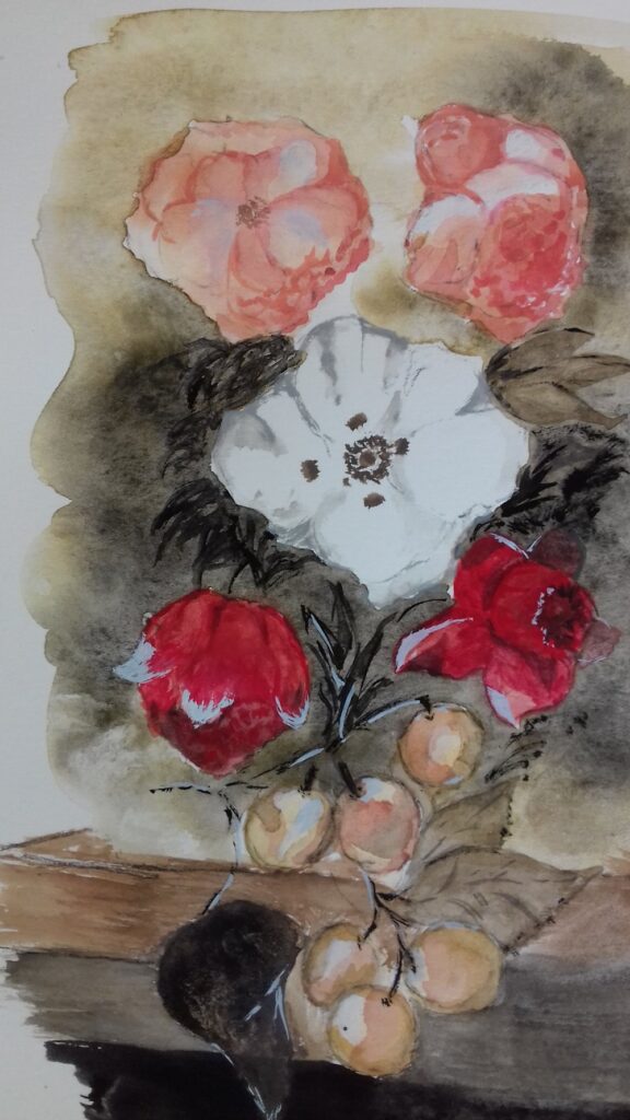
Many of us will know the poem “To Autumn” by John Keats that begins “Season of mists and mellow fruitfulness”. Written in 1819 and first published in 1820 I took my cue from
“To bend with apples the moss’d cottage-trees,
And fill all fruit with ripeness to the core;”
The little painting above was a demonstration piece from a short course I am presently tutoring at Norden Farm Centre for the Arts, Maidenhead, where participants are invited to make artworks inspired by poetry. The work could be representational and narrative or much more abstract and we talked about how decisions on the approach could be made according to the nature of the words referenced. We started with poetry about Autumn and found works ranging from the highly descriptive, to poetry that is more concerned with emotions concerning decay and death as in Shakespeare’s Sonnet No. 73.
The imagined landscape above has fruit laden trees and mists with a clearer view to sunlight on red roofed cottages in the middle-ground. Beyond them golden fields and more mists merge into a clouded sky that looks blustery enough to blow the mists away. Mist is so frequently referenced in connection with autumn that it is useful to find ways of portraying it. In the painting above this was simply achieved by applying white and pale blue-grey pastel over the acrylic paint and ink line work. The middle-ground cottages were left in their original colourful state so the difference is clear. To achieve misty effects, pastel dust can be ground from a regular pastel stick and applied with a finger or cloth dabber, or Pan pastel can be applied with a soft rubber sponge.

A similar effect can be produced by scumbling thin veils of pale blue-gey or white acrylic using a stiff brush. Do ensure the painting is completely dry before scumbling.

Another poem I was attracted to was “The Burning of Leaves” by Laurence Binyon. It begins
“Now is the time for the burning of the leaves,
They go to the fire; the nostril pricks with smoke
Wandering slowly into a weeping mist.”
Then the later line appears:
“Fingers of fire are making corruption clean.”

by Jo Hall
Inspired by the poem by Laurence Binyon
Mixed media

Stages showing how this painting was built up in layers of mixed media
1. acrylic
2. ink and some oil pastel scratched into for texture (sgraffito) soft pastel rubbed over to soften blue areas
3. Pale Posca pen, more black ink, further layer of pale pastel over blue and gray areas for smoke
Another two lines from the same poem inspired the painting below:

by Jo Hall
Acrylic and pastel
“All the spices of June are a bitter reek
All the extravagant riches spent and mean,”
Here I imagine the rich blocks of colour representing the rich flowers and smells of June heavy with roses, are being consumed by the fire. The comparison with our personal earthly riches and their destiny is clear.
The poem’s end bleakly reminds us of our own mortality, but also hope for those who follow us who will see the Spring, and there is an inference that the decay and purification process is necessary for this renewal.
My personal view on mortality is that for those with faith the outlook is not bleak, but as a former scientist I know decay is certainly vital for the renewal of life in Spring! So glad tutoring this course has rekindled my interest in poetry.
Magic of Black Week 4: Notan
March 15, 2023

by Jo
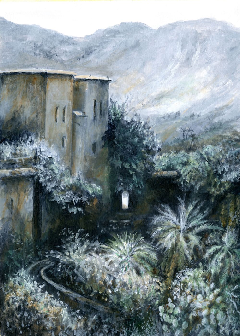
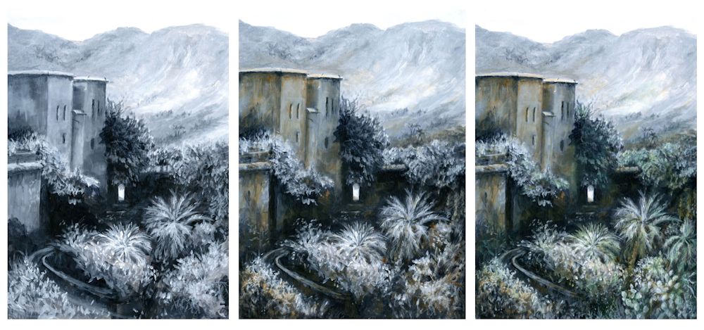
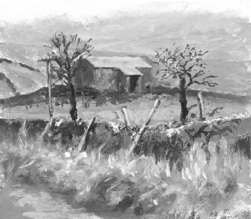
If the Notan had been produced by the artist very careful consideration would have been made in deciding which mid tone areas to allocate to either the white or black areas of the Notan. The arbitrary limit set by the program was highly successful in this case in preserving the character and information in the painting.
This is not always the case in digitally produced Notans,
Thinking in black and white (and possibly grey)
Notan is the balance of dark and light in a composition. This Japanese word word derives from the Chinese, Nóng Dàn, which refers to Nóng meaning strong or concentrated (dark ink) and Dàn meaning weak (watery ink). We will make Notan studies using two, and three tonal values and discuss how these relate to painting in colour and printmaking. We will also see that the pattern of shapes in a successful Notan study can be more than a strict reflection of tonal values.
One of the best ways to develop a strong composition is to build a strong pattern of lights and darks. A Notan study will help to identify these patterns before embarking on the final work. Whether working on black or white paper It is helpful to draw the main shapes swiftly but accurately to avoid getting bogged down in details. This could be done with a white pastel pencil if working on black paper. Then all the pale area areas can be filled with white ink or paint. It is relatively easy to identify the darkest areas but when it comes to the mid tones you should try to assign these areas to light(white) or dark(black) values which best convey the sense of what is happening in the picture. This applies whether you are working from life or from a photograph. Where only two tones, black and white are used the Notan study is called a 2 value Notan.

by Jo
Some compositions are better described by 3 value Notans where the subject is reduced to black, a mid-tone(grey) and white. It is of course very possible to include more values but for our purposes 2 and 3 should suffice.
Do read the short introduction to Notan by Mitchell Alabala which very eloquently describes how Notan is linked to shape and patterns that define the structure of a composition rather than being studies totally defined by tone ; links below
https://mitchalbala.com/the-wisdom-of-notan/
And look at the accompanying 13 minute video
https://mitchalbala.com/video-exploring-composition-though-shape
You will see how this is especially the case where different colours that are similar in tone make distinct patterns of shapes over the whole area of an abstract work.
Practical: Try making a 2 value Notan, and if you have time a three value Notan;
Choose to make these from an existing well known artwork, a simple still life set up or a photo reference. This will be easiest where there are well defined areas of light and dark as in a portrait or still life lit strongly from one side. Identifying the main shapes and eliminating unnecessary detail is the key to a successful Notan as is including necessary detail and careful assignment of the mid tones in a two value Notan. In the Notan derived digitally from a photo of a painting at the beginning of this post much of the detail could have been eliminated leaving a stronger pattern of larger shapes. Necessary detail may be a tiny slither of light or glint that makes sense of the overall image.
Making a 2 Value Notan
1.Find a reference ( photo or art work) or work from a simple still life set up. If working from a reference try to find one with strong contrasts and relatively simple shapes. Mark out a rectangle of the correct proportions on your paper.
2.Identify all the main shapes by tone. Decide which mid tones will be assigned to the black of the paper and which will be painted white. On black paper this could be done by working with a white pastel pencil to establish the proportions of the main light and dark areas.
3.Block in the light areas with white paint or ink.
4. If you have time make a second study from the same reference and assign the mid tones assigned rather differently. Think about which Notan is most informative.
Making a 3 Value Notan
1.Find a reference and then mark out a rectangle of the correct proportions as before.
2.Identify dark, mid tone and white areas and mark them with a white pastel pencil or white coloured pencil.
3.Then paint in the mid tone and white areas. Sometimes it will be easier to paint all areas that are not to be left black in white first, and then to add the mid tone over the top. In other cases it may be easier to paint everything except the darkest with a mid tone grey first, before adding the palest parts in white over the top.
4.Please send an image of your reference as well as the Notan studies. Reference material will not be published on the blog but would be helpful for the review.

produced digitally
by Jo
In this instance although the 3 value Notan describes the image a little better, the subject can be very well understood from the two value Notan.
Below are a few additional notes:
Digital Notans
There are several computer programs which will provide you with 2, 3 and more value Notans. These do not always convey the spirit and energy of a reference in the way that your personal Notan study will. This is because an arbitrary and fixed threshold of what will be designated as dark or light may be different to the best way to communicate your subject. Some areas of the composition may require a different threshold to communicate that. That said, if you have problems in beginning your studies, seeing the results of a digital process can be helpful. One of the other problems is that a digital process will not simplify the shapes for you.
Notans and Printmaking
After making a few studies you will soon see the practical relevance of making Notan studies both to analyse the patterns of shape that inform a composition for painting and also for print making, especially for relief printing where you will need to clearly define the shapes that will be inked or cut away so they are not inked.
Decorative Notans

by Jo
Here fish and sea weeds were cut out of a square of black paper. The paper and and the positive shapes cut from it were pasted on to a white piece of card.
Interesting designs can be made by playing with positive and negative shapes as in the sea and fish decorative Notan above. This is a really fun way to play around with shape and pattern.
Your Notan Studies:


Some of the smaller shapes detract from the fact that Liz has observed the larger shapes very well. Because the paint did not cover well in places Liz’s Notan was made to look flatter digitally.

Black paper square cut and arranged on white board.

2 value Notan by Mali

3 value Notan by Mali

by Mali

by Mali

Not sure this has anything to do with Notan but it is very lovely drawing. Really like the contrast of the transparent and translucent looking vases.

Almost Monochrome Week 4
September 21, 2022
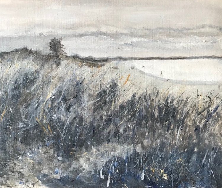
Every stage of a painting has its merits. Often as in the monochrome painting below, the initial rapid response to the landscape is more exciting than the finished painting.
Starting with a cool colour
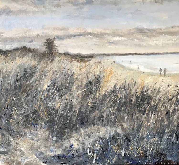
The initial acrylic sketch was made with a cold blue grey made from Cadmium Red Hue and Phthalo Blue, mixed with white. The painting was completed with purplish reds made with Cadmium Red and Phthalo Blue, almost pure Phthalo Blue and white form much of the water and adding Yellow Ochre into the mix for some of the vegetation.
Stage 1: A large amount of a mix of Phthalo Blue and Cadmium Red Hue was made to make a cool blue grey and a basic monochrome sketch made in acrylic. Some further Phthalo Blue mixed with a little white was added in places. This will form a monochrome structure for a more colourful painting.
Acrylic by Jo
Completed with additions of mixes of Phthalo Blue and cadmium Red plus some Yellow Ochre
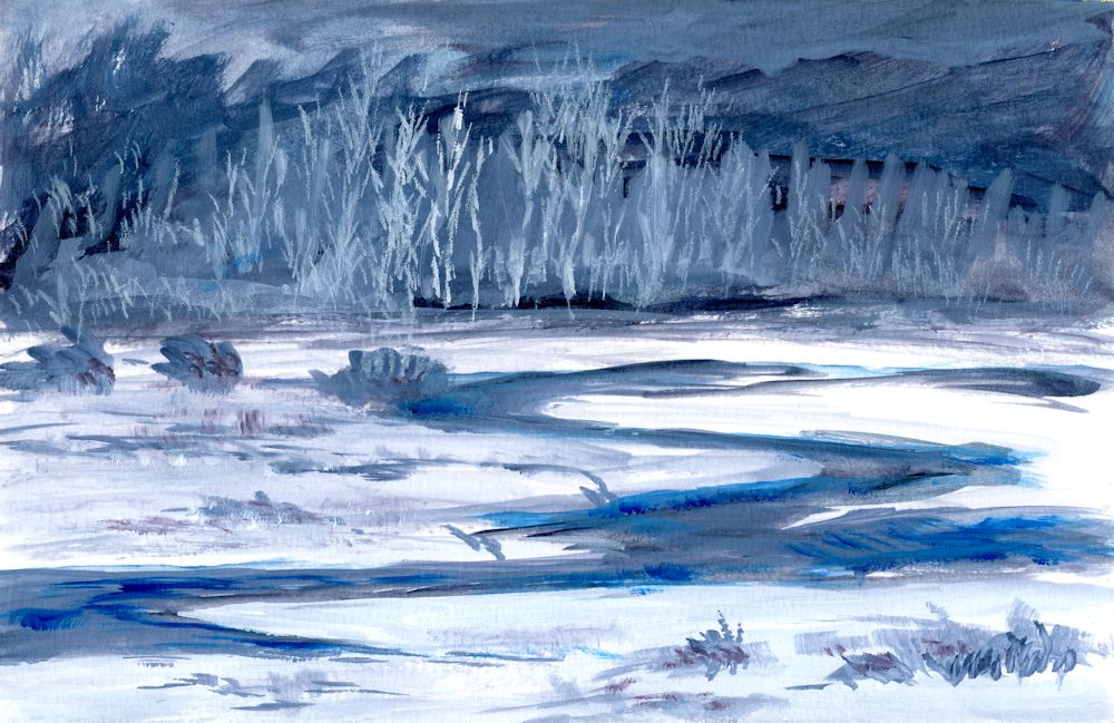
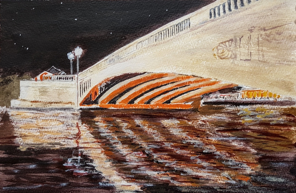
Starting with a warm colour
Burnt Umber and white was used for most of the first stages of the painting below, with added mixes of Phthalo Blue. The result was a much warmer sketch. I wanted the bridge to appear set into the landscape more and to show the green colour of the nearer hills. The bridge and tunnel are exactly the same size at each stage shown but note the illusion of the bridge looking smaller when painted closer in tone to its surroundings and the trees painted to cover more of the lower part of the bridge. In the final painting the tiny patch of pale riverbed/path/water, near the bottom left is the point of most contrast and appears much nearer to us than the bridge, reinforcing the illusion of depth in the painting.
Stage 1: monochrome painting in Burnt Umber and white to
which mixes of Phthalo Blue with Burnt Umber have been added.
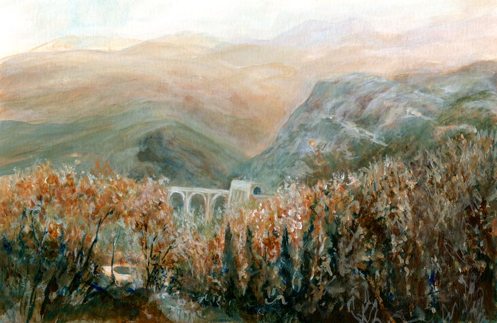
Acrylic by Jo
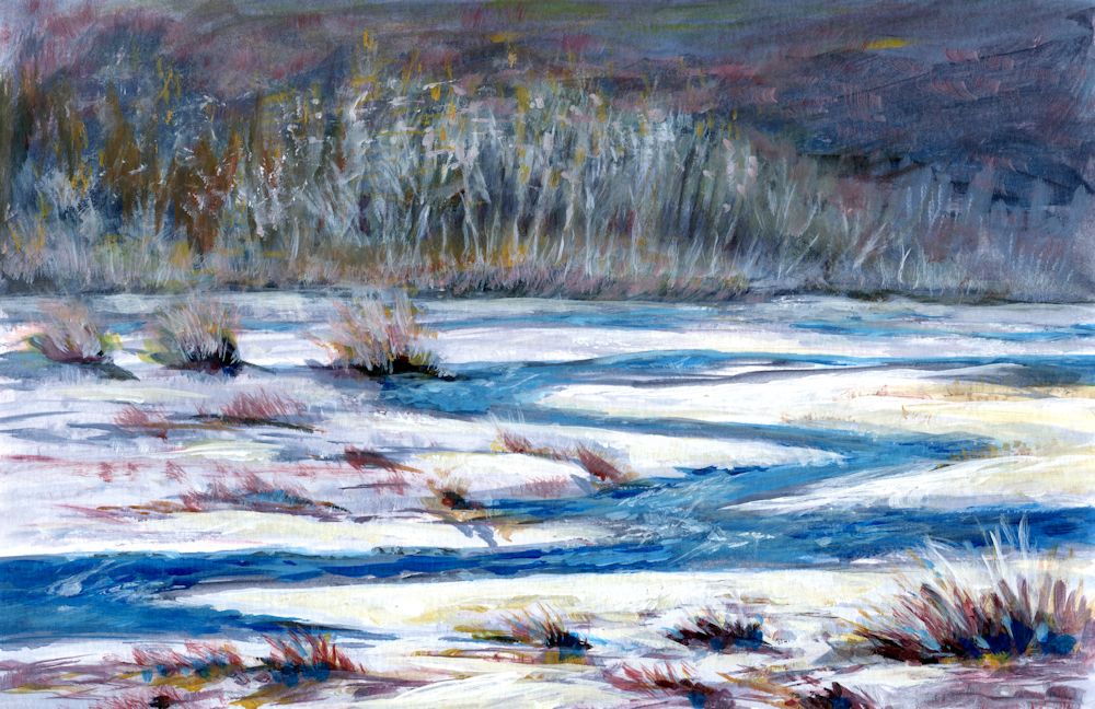
The completed painting. Although I liked the freshness of the initial colour sketch I wanted the bridge to appear more set into the landscape and to show the greenish tinge of the rocks in that part of the Parma Apennines. The foreground hills were reworked a little and the bridge and tunnel made very slightly darker so that it receded. The foreground and middle distance trees were also worked on and at some stage the bright Sienna foliage on the nearer trees may be reinstated.
Although not as exciting as the initial sketch the finished painting does remind me of a hazy day with the last remnant of Autumn colour in the trees rather than the brightly lit bridge of the first stage. Note how using a cool or warm colour can alter the atmosphere. The cold Phthalo Blue mixed with the warmth of Burnt Umber meant I could choose between keeping the painting warm as in the initial sketch or making it far colder in appearance.
This week I would like you to complete any unfinished work and to make a tonal painting in a rather different way. The challenge is to paint a contre jour subject. This could be a landscape against a bright sky or sunset, or a simple still life in front of a bright window. The subject will not be a completely stark silhouette but may appear dark and with subdued tones against the light.
I have put a few examples of contre jour works on the following Pinterest board, which includes some delightful paintings by Anton Mauve, link below:
https://www.pinterest.co.uk/jhall1282/limited-palettes/contre-jour/
Think carefully about how you would like to start the painting. If it is a sunset landscape it may be good to start by painting the sky especially in a work with trees and a low horizon. If it is a still life in front of a window you may like to paint the dark of the window frame and the objects before painting the light through the window. In either case think carefully about the pigments for the main tonal areas and whether your finished painting will have dark tones that tend toward warm browns or dark tones that tend toward cool blues and greens. Keeping to a restricted palette as we have done over the past few weeks, make a mainly tonal painting of a contre jour subject.
Your paintings:
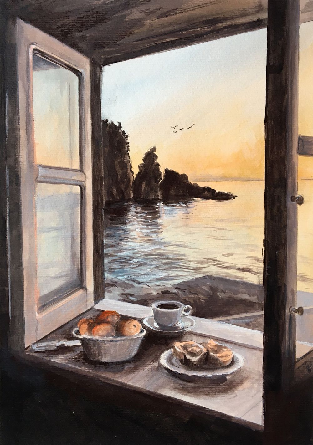
Acrylic by Maryon
The still life in the window, the window frame and the rocks in the water are all seen against the light, but the panes of the open window reflect the light.
Colours used are black with burnt umber and white for the greys, plus orange and blue lake.
Almost Monochrome: Week 3
September 14, 2022
Acrylic by Jo
Painted in Indigo, White, Burnt Sienna and Phthalo Green
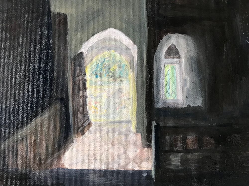
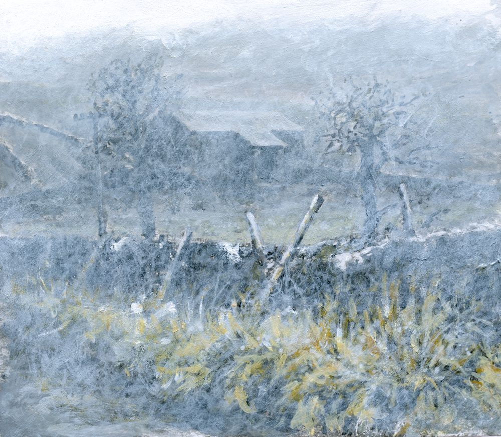
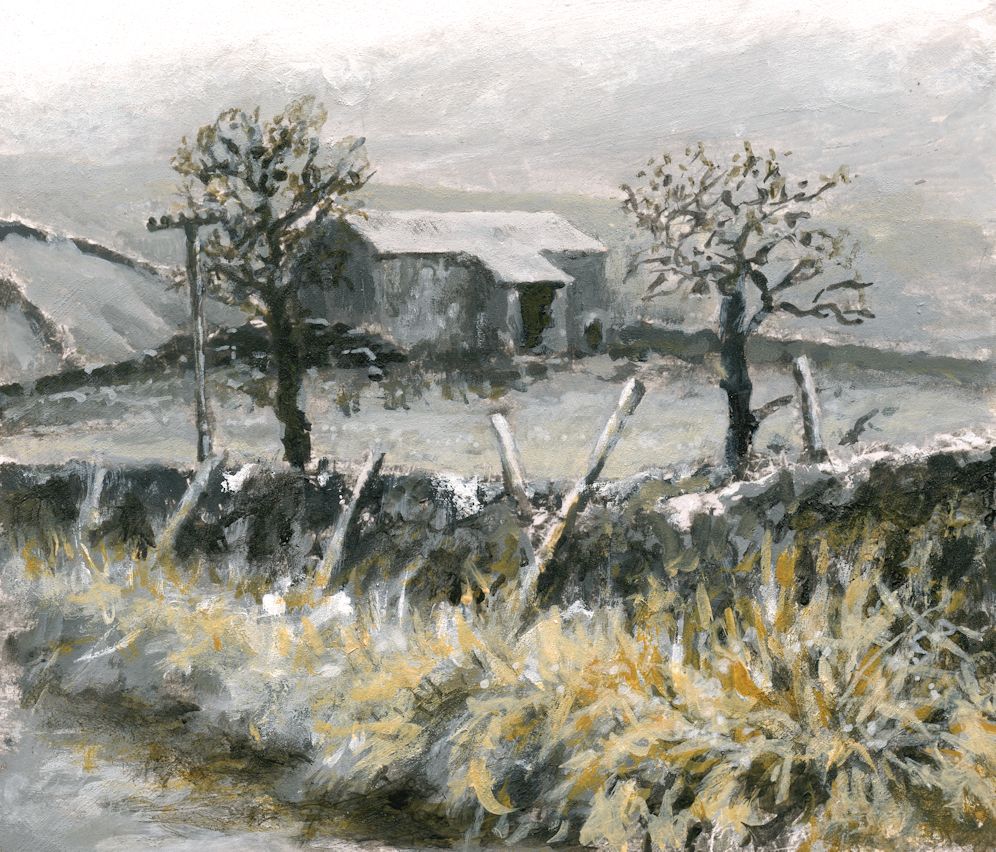
This week I chose to complete the painting of Oumesnat by adding Phthalo Green, alone and in mixes with the Indigo and Burnt Sienna already used. Only small amounts were used so the painting remains largely tonal. It is very different from the study of the barn in Yorkshire where the misty feel was added with opaque scumbles of white, Here everything remains relatively clear and with huge tonal shifts. I did alter some of the foreground vegetation but kept to the chosen pigments.
Choosing the Pigments to suit Your Painting
This can only be done by experiment and can be done as shown in the last post, or less formally as below where I have painted Indigo, Burnt Sienna and Phthalo Green unmixed to see how they would look together as saturated colours; mixed with white; and lastly by mixing any or all of these pigments together in varying proportions. Phthalo Green is a very strong pigment so only minute amounts were needed to effect the subtle changes I wanted to make in the painting above.
I like this way of working because you end up with little abstract paintings which can be quite fun in their own right. You may of course choose very different pigments to work with your monochrome base colour. It is also evident that I could have chosen to work in a much brighter way while still maintaining strong tonal contrasts.
Indigo, White, Burnt Sienna, Phthalo Green
This week the challenge will be to either add another hue to the painting or to start a new work. This time choose your main tonal colour but instead of adding the colour after making a purely monochrome work try and incorporate one or two more pigments in a subtle way as you progress. This painting should still rely heavily on tone for its impact but may end up being more colourful than the painting featured in this post. Have a look at the two Pinterest board links below for ideas or look at paintings by Andrew Wyeth, Victor Mirabelli, Alexandre-Louis Jacob or some of the sunset scenes painted by Anton Mauve.
https://www.pinterest.co.uk/jhall1282/limited-palettes/more-colour-subtle/
https://www.pinterest.co.uk/jhall1282/limited-palettes/more-colour-bright/
Choose to work entirely from your own reference or work in the spirit of one of these artists.
Your Paintings:
Acrylic by Maryon
Acrylic by Norma
Acrylic by Kate
Oil by Virginia
Almost Monochrome: Week 2
September 7, 2022
Acrylic by Jo
Pigments: Titanium White, Ivory Black, Yellow Ochre
The image above is of the same painting that featured in last week’s post but with white paint “scribbled” rather than scumbled over the surface. The coloured greys took on a greenish tinge as in the chart below.
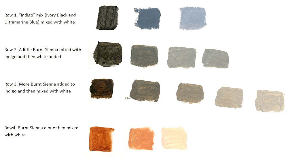
This week I made a large mix of Ivory Black and Ultramarine Blue to make an indigo like colour.
This was then mixed with White and burnt Sienna as in the chart above. Note how much bluer the greys are when indigo is mixed with white. Also note that because Burnt Sienna is much redder than Yellow Ochre their is no greenish tinge to the coloured greys, they just get warmer as more Sienna is added.
Acrylic by Jo
For this painting a large amount of an Ivory Black and Ultramarine Blue mix was made, then a monochrome painting created using this mix with varying amounts of Titanium White
This week we chose a dark pigment; black, burnt umber, Indigo or similar and added varying amounts of white to paint a monochrome picture.
Please photograph your painting at this stage then go on to identify another colour to enrich your painting. Explore a few colour mixes before homing in on the pigment you will use. Then think about how subtle or vibrant you want to make the added colour and make some colour swatches of mixes with white and the dark pigment used for the monochrome study. Last week I added Yellow Ochre; this week I will be adding Burnt Sienna and will post the result in a few days.
Either complete your painting during the week or at next week’s session when we will discuss adding a third colour into the mix. In any event please send an image of your colour mixes and a photo of the monochrome painting.
Your paintings:
Acrylic by Maryon
Pigments: Indigo, Yellow Ochre, Viridian
Acrylic by Kate
Acrylic by Norma
Acrylic by Virginia
Mix of French Ultramarine and Burnt Umber with Zinc White to give a monochrome painting albeit with a rogue brushstroke of Burnt Sienna
Acrylic by Virginia
The painting completed with some French Ultramarine with Zinc White, and Yellow Ochre
Almost Monochrome: Week 1
September 1, 2022
Week 1: Monochrome mixes; plus a colour
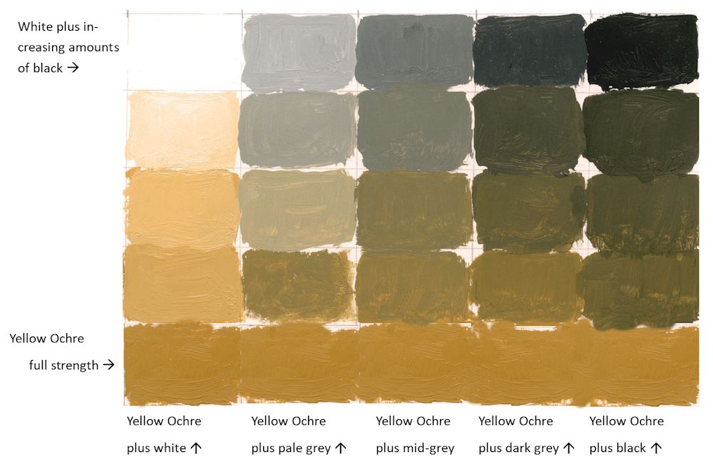
Alone or in mixes with white the Yellow Ochre appears bright and warm, bringing the foreground forward. Where small amounts of Yellow Ochre have been added to pale grey mixes a coloured grey with a greenish tinge resulted. Because the mixes were opaque I was able to modify the tones as well as the colour.
The roof of the barn was left untouched.
See further on in this post for making colour mixes to suit your composition.
Working in monochrome alone can be very dramatic. Introducing a subtle colour can soften this and alter the atmosphere of a painting. Over the next four weeks we will explore some of the possibilities.
Monochrome paintings rely on tone, shape, line and mark making for their impact, and although it is easy always to think of monochrome as a work constructed of black and white plus greys mixed from black and white, artists have used other colours such as Burnt Umber and Prussian Blue in mixes with white as a tonal bases for their work.
All paint hues can be muted either by adding black or by adding small amounts of their complementary colours. For these sessions we will work exclusively with tone and adding colour to black, white and grey mixes rather than using complementary colours, although you may like to work a composition using Neutral Tint/white, sepia or bunt Umber/white, or even Prussian Blue/white mixes as a tonal base.
Have at the ready; titanium White, Black and a few colours; yellow , Yellow Ochre or Raw Sienna, a red, a blue and a lemon yellow or similar pale yellow.
Shades, Muted Colours and Tints
Colours can be muted by adding black to make shades or by adding white to make tints. This range can be extended by adding the colour to greys made with mixes of black and white as below. It is useful to make a range of greys and try adding increasing amounts of a colour to each mix. It is very much the artist’s choice to decide on which parts of a composition will include some colour and which to leave as monochrome.
1.Reference the haunting works of Victor Mirabelli who uses limited amounts of subtle colour in largely tonal paintings of old farm buildings and barns. Google the artist or see a couple of his works and a couple of works by other contemporary artists on the following Pinterest board.
https://www.pinterest.co.uk/jhall1282/limited-palettes/almost-monochrome/
2.Find a landscape reference with an interesting tonal structure.
3.Then make up some colour swatches from black to white and experiment to find what happens when amounts of a different of a colour are added. It may be useful to make a formal grid for at least one colour and a few less formal experiments to home in on the colour that will suit your composition best. An example of how this could be set out is below.
| Monochrome base plus white in this case black | White | Pale Grey | Mid Grey | Dark Grey | Black |
| more white | more grey | more black | |||
| more white | more grey | more black | |||
| more white | more grey | more black | |||
| +white | +grey | +black | |||
| Pure colour e.g. yellow Ochre (YO) | YO | YO | YO | YO | YO |
My attempt this week wasn’t great. The dark grey was too dark! But it will give you the idea:
4.Make your own painting working in monochrome initially, and then working your chosen colour into the mix as appropriate.
During the session I’ll start a painting with a different monochrome base, perhaps using burnt umber or either indigo or a Payne’s Grey (blue shade).
Your paintings:

Monochrome Painting in Acrylic

with added colour

Acrylic by Norma

The next three images are different stages in the development of an oil painting by Virginia


The Power of Colour 6: Red and Green
February 9, 2021

This week I just took a little time exploring how two reds, one closely related to orange, Vermilion and the other Alizarin Crimson, closer to purple, mixed and related to two very different greens, Sap Green which is much more yellow that Phthalocyanine Green which leans toward blue.


Middle has Sap green and Crimson Alizarin squares.
Right has Phthalo Green and Vermilion squares.
Look at how differences in tone and differences in hue determine how bright or dull each square appears in its surroundings. See how the top left red square in the middle image almost disappears and how bright the pure vermilion in the image looks against a complementary dark green and also against a very dark tone in the image on the right. Even the top left Vermilion square looks subdued against reds that are more like it with regard to hue and tone.

Sadly where the spots were painted against their complementary colour, even though these were very de-saturated (impure), a black line appeared where some of the paint mixed. However this dark line does make the spots glow!

The dark line of the first scarf image was eliminated by digitally collaging spots of the same pure colour with no outline. There is still a slight optical illusion of a dark edge, especially on the Phthalo Green spot on the impure Crimson Alizarin mix, due to after images making the edge “vibrate”.
Look at how all these spots glow from their de-saturated surroundings and
how much brighter they appear than the same dots of colour on the white ground to the left.

The left pair share Vermilion
The right pair share Crimson Alizarin
I was not surprised by the darks or brownish colours but really enjoyed the near purple colours achieved with Phthalo Green and Crimson Alizarin
You may have different greens and reds in your paint box. Take some time to discover how near to orange or purple s each red is and how near to yellow or blue each green is.
Viridian, Phthalocyanine Green, Cobalt green and Prussian Green are all examples of greens nearer to blue. Sap Green is a more yellow green and Hooker’s Green is much bluer than Sap Green but more yellow than Phthalo Green.
Vermilion, and Cadmium Red Pale are much nearer to orange than Crimson Alizarin, Quinacridone Rose and Magenta and you may have other reds which are somewhere between the two.
Before homing in on the green and red pigments you choose for your painting subjects this week find which combinations will be best suited by experimenting a little.
Have a look at this week’s Pinterest board at
https://www.pinterest.co.uk/jhall1282/the-power-of-colour/red-and-green/
In each example make a note of how the red and green pigments are being employed and how they interact. Observe how red looks when surrounded by dark, pale tones, by similar hues and by complementary colours both pale greens, dark greens, yellow greens and bluer greens.
Practical
Choose only two from the following list and make two paintings incorporating one in each. That doesn’t mean to say the other items won’t be present but I would like you to have one main theme for each painting, just as a story may involve one main character and a couple of supporting roles. Don’t feel you have to do two paintings. One well thought out composition is really worthwhile.
- A bright red line winding a bright way through a green and a very close blue green of similar tone
- A painting with very equal amounts of red and green
- A painting that is almost all green with a tiny flash of red or a painting with a large area of red with a little green.
- A painting where the colours adjacent to each other are just slightly different but span the range between red and green. This should involve a lot of mixing either wet in wet or on the palette/overlaying colours.
- A painting with huge tonal differences.
You may use white pure in areas and in mixes, and your paintings may be representational or abstract. The medium is up to you. Try to make dark tones by mixing the appropriate reds and greens and use black only if essential.
Think very carefully about how many greens you wish/need to work with and how many reds. The illustrations will give you some idea of the scope of using only four pigments but you may wish to explore lots of greens in a painting and only one red for instance. Try to have a reason for your choices.
After a while it becomes intuitive to just go for the “right” colour knowing how it will appear on its own and in mixes, and you will definitely begin to enjoy using some pigments more than others. I firmly believe that individual colour choices and combinations form as much of the identity of an artist as the shapes and lines he produces. (“he” being used in the universal mankind sense here.) Think this has already been born out in the last few weeks by those who prefer orange and blue to yellow and violet and vice versa!
Your paintings;

Watercolour and oil pastel by Liz

Watercolour by Liz
Brilliant Red, Alizarin, Sap Green, Winsor Green

Oil pastel and watercolour by Maricarmen

Watercolour and collage by Maryon
The colours used throughout Maryon’s works are;
Sap Green, Phthalo Green, Viridian, Madder Red Deep
and oil pastel in green and white.

Collage and watercolour by Maryon

Watercolour and oil pastel by Maryon

Heather exchanged black areas for red
Acrylic
Viridian, Sap and Light green plus Deep Red and Vermilion.

Greens used are;
Viridian, Sap Green and Hookers Green

Watercolour and pastel
Alizarin crimson, Scarlet and Vermilion on the dragon fly. Pencil for the wings.

Collage and watercolour by Shirley

Collage and watercolour by Shirley

Watercolour by Jan
Permanent Red, Alizarin Crimson, Permanent Rose
Sap Green, Hookers Green, Perylene Green

Watercolour by Jan
Permanent Red, Alizarin Crimson, Permanent Rose
Sap Green, Hookers Green, Perylene Green

Watercolour by Ann

Acrylic by Barbara
Scarlet, Cadmium Red
Viridian, Leaf Green, Medium Green

Watercolour by Sarah
Hookers Green, Sap Green, Crimson, Vermilion

Watercolour by Sarah
Crimson, Vermilion, Hookers Green, Sap Green, Viridian, White

by John
Viridian, Sap Green, Cadmium Red

Acrylic by Malcolm
The light background is a total undercoat of clear varnish with a touch of Phthalo Green in producing a nice turquoise.
Colours used were;
Phthalo Green (G7) and Sap Green (B15.3, Y74),
Alizarin Crimson, Cadmium Scarlet, Magenta
The Power of Colour 5: Red
February 3, 2021

Watercolour
Red demands our attention even in the smallest quantities. The tiniest area of pure red can form a focal point as in the painting of the blue rug above. It’s like an itch that cannot be ignored.

Oil pastel
This work references a medieval sgraffito wedding plate found in Cyprus and now in the Ashmolean Museum.
Only one dark red pastel is used over a base of well rubbed in pale orange-yellow which was revealed when the red was drawn into.
Where blue may be sad or holy, red is fiery, passionate, romantic, celebratory. Blue is recession or depression, red leads the cavalry to advance. We need both the calm of blue and the jollity of red for a balanced colour diet.
Look at the way red is used in the works on this week’s Pinterest board at:
https://www.pinterest.co.uk/jhall1282/the-power-of-colour/red/
Look at the red dot in Matisse’s cut out “Icarus”. See how different reds interact in the abstracts by Rothko and Patrick Heron. Explore how Bernard Cathelin manipulates red in still life, portrait and studies of groups of figures.
This week for all the studies you may use any red pigment alone or in combination with other reds. You may use Magenta, Quinacridone Rose, Alizarin as well as the warmer reds cadmium Red Pale, Scarlet and Vermilion. It would be useful for these studies to have one cool red(nearer to purple) and one warm red(nearer to orange).
One way to understand your reds is to test each one by discovering how it appears surrounded by black , white or a different red. Make a note of which appear to advance or whether the same red appears different against different surrounding hues. After that try at least one of the following red/reds to make a composition. You may use back and white, mixed with the reds or as areas of white and black. These paintings may be abstract or representational, hard or soft edged.
1. Make a painting using one or more red pigments, black and white. This may be hard or soft edged, abstract or representational.
2. Make a painting with red as in 1. but a small amount of a related hue may be used, but only one; either a reddish orange or a reddish mauve but not both.
3. Make a painting with any colour but include one small area of red as a focus.

This painting references a composite wooden statue from Nigeria drawn at the British Museum. The red background is a monoprint of black and red mixes drawn over the top with acrylic inks. Only black, red and white is used.
Your paintings;

Lady in Red by Barbara
Inspired by the portrait of Anita Berber by Otto Dix

Watercolour by Maricarmen
After a painting by Jill Leman RAWCA

Oil pastel my Maricarmen

Watercolour by Maricarmen

Watercolour by Maricarmen

watercolour by Maryon

India Ink and watercolour by Maryon
The red is Madder Lake

Watercolour by Maryon
Quinacridone rose, Vermillion, Black
White mixed with the reds

Watercolour by Maryon
The earring is Vermillion and the skin tones
are mixes of black and vermillion.

Watercolour by John
Mainly cadmium Red and Black

Watercolour by John
Cadmium Red, Alizarin Crimson, Black, little Ultramarine

Acrylic by Heather
Scarlet, Deep Red, Rose, Black and White.

Heather’s watercolour version of an African print
Vermillion, Alizarin Crimson, Black and Orange plus Black oil pastel and a touch of Yellow oil pastel

by Shirley

Watercolour and Oil Pastel by Shirley

A red for every cloak
Watercolour by Shirley

Watercolour by Shirley

Watercolour and oil pastel by Jan

Watercolour by Jan

Watercolour and oil pastel by Jan

Acrylic by Malcolm
My reds are Naphthol R9 (lightest); Cad Red Medium R108 (middling); Permanent Alizarin R175+R122 (darkest, used mass tone only); Quin Magenta R122. Black is Carbon Bk7.

Acrylic by Malcolm
Transparent Perinone Orange O73, a reddish orange tints the pink undercoat visible in places. Reds are Naphthol and Cadmium Red Medium; both mixed with black for the browns.

Watercolour by Liz

Red and black watercolour with
red oil pastel resist by Liz

Watercolour and pastel by Liz

Watercolour by Ann

Watercolour by Ann

Watercolour by sarah
Crimson, Vermillion, Black
and a little oil pastel resist

Watercolour by Sarah
Crimson, Vermillion, Rose Madder, Black

Watercolour by Sarah
Crimson, Vermillion, White, Black
with Cerulean, Ultramarine and Sap Green
This painting will lead us very nicely into thinking about the project for next week.
The Power of Colour 4: Yellow and Purple
January 26, 2021

This week we have high drama purple and yellow. It’s in some ways very like the blue orange challenge, although to my mind not as easy. Yellow and purple together always brings to mind mauve and yellow crocuses and Iris. I didn’t find quite so many references so perhaps I’m not the only one to find this challenging.
https://www.pinterest.co.uk/jhall1282/the-power-of-colour/yellow-and-purple/
All the same principles apply as for the orange blue complementary pair, and it’s worth trying to mix a few yellows with one purple colour to find out what you can make with this limited palette. Again purple will very quickly denature any yellow much in the same way that blue does the same with orange, so always add a small amount of purple to the yellow to make your mixes, unless you just want to add a small amount of yellow to a very strong pigment like Dioxazine Purple, just to take the edge off its rather harsh colour.

A few notes on other pigments and the use of pastel are included in the Challenges for this week: section nearer the end.
Unlike red and blue and especially when working with oil or acrylic, yellow can be used to make a deep colour paler while at the same time lessening its saturation (purity). That is why a little yellow with Dioxazine will lessen its vivid colour. This does not work where reds and blues are opaque paints that already contain a lot of white; especially gouache and acrylic paints (some pink and pale bluecolours).
Charging
A useful watercolour technique is charging. Make a small square of yellow wash, about 3inches square and drop a strong purple into it while it is wet. This technique is called charging. Very often the colours mingle rather than mix, but the results can be stunning. Then try dropping yellow into a purple wash.


I repeated this with a stronger purple wash; the results are subtle but would be wonderful for a ceramic vase.


Yellow with analogous colours and Black
Study from previous post with black added
Colours: Cadmium Yellow pale, Cadmium Yellow Deep, Orange, touch of Cerulean Blue for yellow green leaves, Ivory Black

Colours as previous image plus Dioxazine Purple
Used at full strength Dioxazine purple is extremely dark.
Challenges for this week:
Spend most of the time on 3. and/or 4.
1. Yellow and Purple mixes;
I suggest you stick to one purple, Dioxazine (also called Winsor Violet) would be a good choice being a strong pigment that will give you plenty of tonal contrast and see how it mixes with the yellows in your box. Just remember it is very strong, transparent and staining.
A gentler option would be any other mauve or violet.
If you have a pale opaque violet like the rather expensive Cobalt Violet your yellow mixes will be much more subtle but you will not be able to make dark tones with yellow. It is certainly worth experimenting with as it is a beautiful pigment for delicate colour washes but will not give you any strong tones.
Purple is one of the more difficult colours to mix but a magenta added to an ultramarine should give a good purple. Mix a large amount if you wish to have a consistent colour mix for a painting.
You may also wish to use either pastel or oil pastel which would be great as a wax resist with watercolour.
If you are using acrylic Dioxazine Purple is the strongest. There are other purple pigments which are often mixed with white so you would automatically reduce the transparency of your colour by mixing with transparent yellows. All are useful but please be aware that the results will be different.
2. Charging
If working with watercolour try the charging technique as outlined above. Note any difference in the behaviour of your pigments. Try charging purple into yellow and yellow into purple.
3. Make a composition using only yellows, one purple and white if required.
4. Make a second painting using yellows, one purple, white, black and a small amount of colour analogous to purple e.g. a purplish blue like ultramarine.
The painting should appear mainly yellow purple and mixes of these two. Use black with caution but do try using a pure black and very strong purple beside each other or for a very rich dark area try laying strokes of purple over a dry black wash. A strong transparent purple like Dioxazine is necessary for this.
If you use Payne’s Grey instead of black also be aware that this paint is a mixed pigment that contains black so will tend to desaturate/muddy colours in the same way that black does. Very often the added hues are blue and/or purple pigments. My personal choice is to use a Payne’s Grey Blue Shade as the alternatives are generally very dull.
If time is limited, choose to do either 3. or 4.
Do first look at the Matisse painting of a woman in a purple and yellow jacket and the Dufy work of a view through a window in Nice. It would also be well worth looking at the contemporary artist David Tress who works mainly with land and city scapes. If you can, choose to work from your imagination or your own reference, otherwise make your version of one of the paintings referenced.
Your Paintings:

by Barbara

by Maryon

Watercolour by Maryon

Watercolour by Maryon

Watercolour by Maryon

Yellow flowers charged with Quinacridone Purple

Watercolour: Yellow and Quinacridone Purple
by Heather

Violet, Cobalt Violet, Lemon Yellow, Cadmium Yellow

watercolour by Ann
Violet, Lemon Yellow, Cadmium Yellow

Watercolour by Ann
Yellow, purple, black, white, with touches of analogous colours
The reference is van Dongen’s portrait of Alicia Alanova which along with works of Chagall and other famous artists was stolen from the collection of an elderly couple in Los Angeles and reported in the Telegraph Newspaper 10th September 2008

Violet, Lemon Yellow Cadmium Yellow

Acrylic with glazing by Malcolm
Several yellows: Diarylamide Y83 (Rowney Cad deep hue), Cad Medium Y37, Arylide Y73 (Galeria Cad med hue), Arylide Y74 (Transparent) and a Lemon.
The glaze is Ultramarine Violet V15, which gives a greenish result on Lemon but on others brown. The shade depends on the strength of glaze.

Acrylic by Malcolm
Accomplished with direct brush strokes and no glazing.
Dioxazine purple, White and Yellows: Diarylamide Y83 (Rowney Cad deep hue), Cad Medium Y37, Arylide Y73 (Galeria Cad med hue), Arylide Y74 (Transparent) and a Lemon.
Acrylic by Malcolm

Includes a Chrome Yellow which Turner included in his palette almost as soon as it was in production

Watercolor by Shirley

Watercolour by Shirley
Mixes of yellows and purple to make muted colours

Watercolour by Shirley
On white paper (white in the image) and no colour mixing

by Jan
Top; Cadmium Yellow and Dioxazine Purple
Lower: Lemon Yellow and Dioxazine Purple

Cadmium Yellow, lemon yellow,
Dioxazine Purple plus Ultramarine

Watercolour by Jan

Oil pastel and Watercolour by Jan

Watercolour by Liz

Watercolour by liz

By Liz

Watercolour by Maricarmen

Watercolour by Maricarmen

Watercolour by Maricarmen

Watercolour by Maricarmen

Watercolour by Sarah
Lemon Yellow, Cadmium Y,ellow, Violet and White

Watercolour by Sarah
Lemon Yellow, Cadmium Yellow, Violet,
plus Ultramarine, Cerulean, Sap Green and White

Watercolour by John
SAA intense violet, cadmium yellow, Indian yellow and a touch of ultramarine

Watercolour by John
Cobalt Yellow, Indian Yellow, Intense Violet, Cobalt Violet, touch of White
The power of colour 3: Yellow
January 19, 2021

Lemon Yellow, Cadmium Yellow Pale, Cadmium Yellow deep and Indian Yellow
Yellow, the sunshine colour; just what we could do with today! Opposite purple on the simple colour wheel this is the colour intrinsically pale in tone, even the yellows that are nearer to orange are pale in their most saturated form.
Yellow paints in your box may range from the very pale lemony yellows nearest to green;
Lemon Yellow, Cadmium Lemon, Cadmium Yellow Light
To the middle yellows;
Cadmium Yellow Medium, Chromium Yellow Light
And yellows that are almost orange;
Turner’s Yellow, Chromium Yellow Deep, Cadmium Yellow Deep, Indian Yellow
You can do any of the suggested projects below with one pale or lemony yellow and one that is nearer to orange or at least in the middle range of yellows.
Have a look at the Pinterest board to see how other artists have worked with yellow as the principal colour in a composition.
https://www.pinterest.co.uk/jhall1282/the-power-of-colour/yellow/
Then try any two of the following (more if it’s pouring with rain outside).
1. Try making an abstract or representational painting, using any pure yellows. If you need to because you are using an opaque medium like pastel or gouache you may use white.
Do not use earth yellows such as the ochres. These are already de-saturated colours. By mixing yellow with black, or as we shall see next week with purple, you should be able to mix your own approximations to these.
2. Find how the yellows in your box mix with black and make a hard edged composition with at least some pure black areas, some pure white/white of the paper areas, and blocks of pure yellow and yellow mixed with black or white. This may be representational or abstract.

Lemon Yellow, Cadmium Yellow Pale, Cadmium Yellow Deep, Indian Yellow, Black
Note how the deep orange mixes, two middle columns make warm brown mixes with black but the pale lemony yellows make greenish mixes.

Lemon Yellow, Cadmium Yellow Pale, Cadmium Yellow Deep, Indian Yellow, Black
Note how the deep orange mixes, two middle columns make warm brown mixes with black but the pale lemony yellows make greenish mixes.

Lemon Yellow, Cadmium Yellow Pale, Cadmium Yellow deep and Indian Yellow and Black
Yellows were dropped on to the paper wet in wet. A swirl of black was run through the still wet wash with a rigger brush. The handle end of the brush was use to make curved lines into the wash while it was still damp and paint settled into the indented grooves and allowed to dry. Guided by some of these lines, opaque white, yellow and mixes of black and yellow were applied in a rather decorative manner. If you enjoy doodling and working intuitively, this is the exercise for you!
3.Make a painting with hard and soft edges with any mixes of yellow, black and white, abstract or representational. For textures as in the Sargent portrait you may consider using pastel instead of a wet medium.

The same pigments were used for the yellows, plus black and a hint of vermilion was added to some of the yellow for the orange vase and a hint of cerulean was added to lemon yello for the yellow green colour.
4. Make a painting using the same colours as in 3 but you may add touches of closely related colours like a reddish orange or a yellowy green.
With your paintings try to find ways of sorting out major tonal areas. The dark and unsaturated colours will be the perfect foil to pure or almost pure colours. Be very aware of when you are using pure colour and when you are using de-saturated colour. Look at how pure colours seem to stand out from duller unsaturated colours demanding attention.
Your paintings;

Watercolour by Sarah
Lemon Yellow, Cadmium Yellow, Indian yellow, Black, White

Watercolour by Sarah
Lemon yellow, cadmium yellow, Indian Yellow, Black
Touch of Ultramarine for yellow green colours

Watercolour by Maricarmen 15 x 12 cm
Cadmium Lemon, Cadmium yellow, Indian Yellow, Payne’s Grey

Watercolour by Maricarmen 10 x 15cm
Cadmium lemon, Indian Yellow, Payne’s Grey
(and a touch of violet in the shadows)

Gouache by Maricarmen 19 x 26cm
Two Yellows, Payne’s Grey and White

Study in watercolour by Maryon

Watercolour by Maryon
Cadmium Lemon, Cadmium Yellow Pale, Naples Yellow

Yellow and Black

Watercolour by Ann

Waterolour in Yellows and Black

Watercolour by Ann
Analogous colours plus Black

Watercolour by Heather

Watercolour by Heather

Watercolour and gouache by Heather


Watercolour by Shirley
Watercolour by Shirley


Watercolour by Jan
Lemon Yellow, Cadmium Yellow Hue, Indian Yellow, Black

Watercolour by Jan
Lemon Yellow, Cadmium Yellow Hue, Indian Yellow, Black

Watercolour by Jan
Lemon Yellow, Cadmium Yellow Hue, indian Yellow, Black
and a little red

Yellow Medium, Yellow Deep, Indian yellow and Black
watercolour by Liz

Watercolour and Gouache by Liz

Digital image by Malcolm
Background deep yellow, fill medium yellow

Digital image by Malcolm
As previous image but with white line

Digital image by Malcolm
As previous image but with black line

Digital image by Malcolm
As previous image but with Lemon Yellow line

Acrylic by Malcolm
Arylide yellow and Carbon Black
Please note; yellow and black make green

by John
Note the lemon yellows make green with black and the deeper yellows that are nearer to orange make brown.

Watercolour by John
Note the attention demanding power of the small areas of red in this mainly yellow and black painting

Watercolour by Barbara
Pale lemon Yellow wash with more Lemon Yellow and Cadmium Yellow Hue

by Barbara
Previous image was photocopied and black watercolour and marker pen lines added.

Watercolour by Barbara
The Power of Colour 2: Blue and Orange
January 12, 2021

Orange and Blue is a very versatile colour combination producing vivid contrasts and yet in mixes some lovely muted colours and greys can be made. In theory you should be able to mix a neutral grey if the orange and blue are mixed in the right proportions. Try this with an ultramarine and a cadmium orange. The exercise below used gouache pigments but could be done with watercolour or acrylic.

Try adding a titanium white to one of the darkest mixes. That will soon reveal whether the mix has a blue or an orange bias. See below.

Last week we saw how different hues looked when the same hue was surrounded by hues that were different in tone and saturation. This week we are throwing a much greater colour difference into the mix and the effects of pale and dark borders. The following were constructed digitally but the same principles apply when you are painting.


Outlines matter: the arrangement of colour is identical in the three illustrations below, they differ only in that the first group have no outline, the second group a black outline and the third group a white otline to the cross shapes.

Lower row middle two blues are the same hue and tone
Think about how the difference in appearance of the top two left squares has been achieved.

Lower row middle two blues are the same hue and tone
Generally the black outline prevents colour from appearing to spread. Think about why some of the black boundaries seem to disappear and why the colours of stained glass appear so rich.

Lower row middle two blues are the same hue and tone
Think about why a white outline can almost always be noticed.
References for this week can be found on the Power of Colour Pinterest board at:
https://www.pinterest.co.uk/jhall1282/the-power-of-colour/blue-and-orange/
The first challenge is to create two or three small studies that show how blue and orange can relate to each other, much as we did for the different blue hues. This time I would like to see both studies use similar shapes; these can be organic or more geometric. The colours should be distinct and either have no border, a black border or a white border. Use only one blue and a premixed orange e.g. cadmium orange or a similar bright orange.
Some people really enjoy making these studies/little abstract paintings. If you do, you may like to spend all your time on this. If not just spend a short time mixing colours; especially noticing any differences between mixing the complementary colours together, and mixing each complementary with white or black before spending most of your time on a painting; see notes below the study notes..
First Study; work with your chosen blue and orange as the brightest blocks of colour you can make. Include white as pure white and black as pure black and include shapes with and without outlines.
Second Study: In the second study try including some desaturated colour by mixing your blue with the orange. You may use white but not black.
(if time)Third Study: This time you may still use only one orange and one blue but do not mix them with each other, just use white or black to de-saturate the colours. You may choose whether to include any areas of pure blue and pure orange or you may choose to work with either very pale or very dark colour mixes.
Medium: You may use any medium for this; collage would work brilliantly perhaps inspired by works by Patrick Heron or Josef Albers. An opaque medium like gouache would also work well. This can also be done with watercolour, pastel or acrylic. These studies can be quite small and contain only about eight shapes, certainly not more than about twelve. If you decide to work in collage; paint some pieces of cartridge paper and cut or tare them to make your shapes. White paper can be your pure white and if you have any black paper that can be your black.
Painting; after the studies spend some time looking at the Pinterest Board again and make your own composition using any of your blue pigments, black and white but use only one premixed orange. Mix these however you like. An opaque orange like Cadmium Orange would be ideal but any bright orange will do.
Note how black lines can separate areas of colour, containing them as in a stained glass window. We often prepare to paint by drawing with lines that separate areas we may later choose to fill with colour. These lines usually represent edges of what we can see. Very often we obliterate these lines during the course of painting so that one colour lies directly against its neighbouring colour with no dividing line. See how in some works the artist uses line, sometimes to separate blocks of colour and/or to define the edges of objects within an area of colour as in the blue and gold interior painted by Matisse referenced on the Pinterest board for this week.
When looking at paintings look for works that use line and those that represent forms with no line which is much more as we see them.
Look at how Modigliani sometimes used a pale blue for eyes in a rather orange face. You might consider working from a black and white portrait photo. In landscape paintings blues tend to recede and the orange and red colours seem to advance. Whether you produce an abstract or a representational piece think about edges and enjoy the colour!
Your Paintings;


Pastel and Collage by Maryon

Gouache by Maricarmen

Gouache by Maricarmen


Watercolour by Heather


Gouache and collage

Gouache and Ink

Ultramarine and Orange watercolour with Titanium White

Ultramarine Blue and Orange watercolour

Watercolour by Barbara


Acrylic by Barbara
Orange and Cerulean


Watercolour by Shirley


Watercolour by Sarah
Indigo, Ultramarine, Orange, Black, White

Watercolour, India Ink, Pastel

Watercolour by Sarah

or Floating Cerulean Rectangle
Just for once the reds lose out!
Acrylic by Malcolm
The Power of Colour: 1. Blue
January 5, 2021

For the next few weeks we’ll be looking at primary colours used on their own and their use with each of their complementary colours. Primary colours will also be used with closely related hues to make harmonious compositions.
We’ll also explore some of the effects of colours on each other, after all colour can seriously affect your eyes or at the least deceive them a little!

Look at the appearance of the four blue squares on the right and middle columns above. Do they look different? What happens at their edges?
Then: stare at each of the squares in turn for about a minute then look at the blank space below before going on to the next one. What do you see?
For even more spectacular after images stare at the colour wheel below and then at a white space. these after images and illusions are with us all the time we are seeing.
To start with, here are a few basic definitions that are relevant to the course.: please skip if you are already up to speed with this!
Hue: a pure colour of a certain wavelength in the visible light spectrum.

Colour wheel; this should be a circle with a continuum of all the different hues in the visible spectrum. In practical terms this has been reduced to a beach ball of just six colours which represent six major groups of colour as used for painting; firstly, the three primary colours; red, yellow, and blue called primaries because they cannot be mixed from other colours; secondly, the three secondary colours orange, green and purple which can be mixed from the primary colours and which lie in between the colours they are mixed from on the colour wheel. Scientists and artists have invented a huge number of colour wheels, some of which include many more colours and also tints and shades at different levels within the circle.
Analogous colours; colours close in hue and next to each other on the colour wheel. the colour wheel. e.g. red and a reddish purple
Saturation : the purity of the colour, which is occasionally and I think confusingly, called intensity. To de-saturate a colour mix the pure hue (fully saturated colour), with its complementary colour, or black or white. The saturation of some colours is altered radically by even the smallest amounts of these; for example yellow is very rapidly changed by the addition of the smallest amounts of purple or black.
Tone: how light or dark a colour appears. Every pure hue has an intrinsic tone. A pure yellow for instance is always paler than a pure red. The additionof black, both de-saturates a hue and lowers or darkens its tone. Colours darkened in this way are usually called shades. The addition of a complementary colour also lowers its tone.
The addition of white to a hue lightens it and is said to raise its tone to make tints.
The definition of tints and shades is not always consistent as pastels are often labelled as e.g. tints 1 to 6 where usually a stick labelled tint 1 or 0 is the palest and is the pure colour plus white, and a stick labelled tint 6 is the darkest of that colour made up of the pure hue plus black.

Black ink and watercolour
This week’s colour is blue. Often the colour of melancholy and depression as in Picasso’s blue period portraits, I didn’t choose blue first because of Covid creating so much depression this New Year. No, I chose it first because it’s also the colour of sunny skies and Mediterranean waters, and because as you will see next week blue is great to combine with its complementary orange.
The blue pigments I have used for the exercises are
French Ultramarine (warm),
Cobalt Blue (warm)
Phthalo Blue, green shade or Prussian blue (cold)
Cerulean Blue(cold)
It’s useful to have at least one warm and one cool blue to work with. If I had only two I would probably favour Ultramarine and Cerulean, but the richness of cobalt and the dark tones that can be produced with Phthalo or Prussian Blues are very useful additions.
For this week you will also need a black and white, and perhaps a couple of analogous colours a blueish purple and a blueish green or turquoise.
Used at full strength pure cobalt and pure cerulean are not as dark in tone as Ultramarine or Phthalo Blue and the darkest is Prussian blue. Phthalo Blue, Prussian blue and Ultramarine are generally more transparent than Cerulean and cobalt blue.
What does this mean in practice?
Transparency only applies to watercolour, oil and acrylic paints as if you are using gouache or pastel you are effectively working with an inherently opaque medium. Transparent colours deepen the more layers of colour that are added. Opaque colours laid down at full strength do not become darker when further layers are added. Very often it is difficult unless you know their position to identify the transparent colours of watercolour pans in a box because they all appear so dark whereas the more opaque colours give away their identity on sight; e.g, cadmium red, cadmium orange etc.
Exercises; I have chosen watercolour for this week but most could be done with pastel, acrylic or gouache. I hope to provide some pastel examples later in the week. The illustrations are only to give you ideas of ways to explore the blue pigments in your own boxes,
1. Tone and saturation
Take a blue pigment and try 1. diluting with water, 2. mixing with increasing amounts of white, 3. mixing with black and adding increasing amounts of white, and 4. compare with black to which increasing amounts of white are added.
Try this for a warm blue like Ultramarine and a cool blue like Cerulean or Phthalo Blue. Adding water or white will make tints and adding black will darken the colour and de-saturate the blue. Adding white to this mix will produce blueish greys.

Column 1: diluted with water to give tints
Column 2: permanent white added to give opaque tints
Column 3: mixed with black then white added to give blueish greys
Column 4: black with white added for comparison

Column 1: diluted with water to give tints
Column 2: permanent white added to give opaque tints
Column 3: mixed with black then white added to give blueish greys
Column 4: black with white added for comparison
2. Optical properties
Dark and light surrounds, disappearing boundaries; very closely related hues of the same tone.
Make a study where similar shapes of one hue are surrounded by white, a much darker hue or by a closely related hue of the same tone. An example is given below.

You may choose to do 3 or 4 below;
3. Make a painting/study using just blue pigments

Colours used; Ultramarine, Cerulean, Cobalt Blue, Phthalo Blue Green Shade

Cerulean, Cobalt, Ultramarine and Prussian Blue with
Winsor Green Blue Shade and Winsor Violet
4. Make a painting or study using blue pigments, and black. You may also use white and a couple of analogous colours like a blueish green and/or a blueish purple. The general effect should be that you are making a predominantly blue and harmonious painting.
3 and 4 may be your own composition or your version of a famous painting where the predominant colour is blue.
Think about;
What conditions make a blue advance, float, or recede?
With regard to tone and hue how does a background colour affect how a blue hue appears?
Pinterest board for reference.
The link for this week’s board is:
https://www.pinterest.co.uk/jhall1282/the-power-of-colour/blue/
which includes abstract works by Patrick Heron, Marc Rothko, Josef Albers, Kandinsky and Matisse alongside works from Picasso’s blue period.
Your paintings:

Using only blue pigments

Watercolour: Blue pigments only

Blue with a little Violet

Watercolour by Shirley

Watercolour by Shirley

Watercolour by Barbara

Watercolour by Barbara
Pigments; Ultramarine Blue, Black, Permanent White

Blue watercolour by Ann

Watercolour: blue pigments only

Watercolour by Liz

Watercolour by Liz

Watercolour and acrylic by John

Watercolour by John

Watercolour by Heather

Watercolour by Heather

Watercolour by Heather

Watercolour by Maricarmen
Pigments; French Ultramarine, Phthalo Blue, Cerulean, Cobalt Turquoise, Violet and Cadmium Yellow

Watercolour by Maricarmen
Pigments; Cerulean Blue and Prussian blue

Acrylic by Malcolm
Pigments; Cobalt Blue with a little Phthalo Blue Red Shade and Cerulean
Limited Palettes 1: the Zorn Palette
September 9, 2020
Working with just a triad of colours (plus white if not working in pure watercolour) may be a challenge, but also gives unity to a painting. The first triad we will try is known today as the Zorn palette.
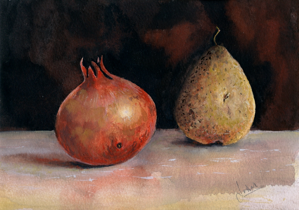
Anders Leonard Zorn (1860 to 1920) a Swedish artist greatly acclaimed internationally for his portraits, including those of several American presidents, was also famous for frequently using a limited palette of just four pigments: Yellow Ochre, Vermillion, Ivory Black and Flake White. Now we may prefer to use Yellow Ochre, Cadmium red Pale, Ivory Black and Titanium White. Flake white is warmer than Titanium White but is made from lead oxide, so rather a health and safety hazard.

Many old masters including Rembrandt, frequently used a similar limited palette partly due to the expense of blue pigments and also due to the fact that many of the pigments we use today were not known or manufactured then. Zorn used this limited palette when working in oil but it is perfectly feasible to use the same palette when working in acrylic, gouache, watercolour or even pastel.
It is a very suitable palette for mixing skin tones, hence the many Zorn portraits using this limited palette, but can also be successfully used for other subjects; still life studies, some natural forms and city-scapes. It is more of a challenge for landscapes but could work for Autumn trees against a leaden sky. The black becomes a substitute for blue and both black and white (or water if using watercolour) contribute to the tonal and saturation range in the composition.
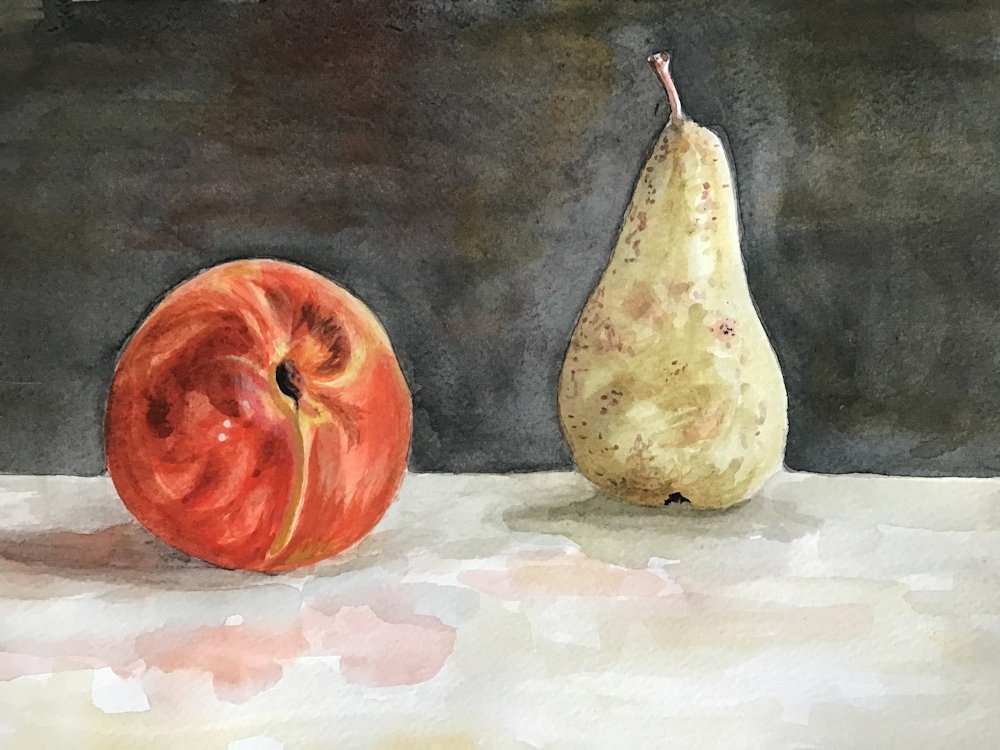
My “Pomegranate and Pear” study uses watercolour and titanium white gouache, but I could have used just watercolour without the white pigment or all gouache or acrylic. I decided to find what mixing the pigments would look like before starting to paint the still life. This was a chart of mixing the pairs of colours to make secondary colours. This could have been extended by mixing any of the squares with the missing pigment e.g. mixing a little black into the orange mix. I could have also extended the tonal range by diluting with water or adding titanium white.
First row: Yellow Ochre with increasing amounts of Cadmium Red Pale
Second row: Ivory Black with increasing amounts of Yellow Ochre
Third row: Cadmium Red Pale with increasing amounts of Ivory Black
You will see that some rather olive green colours were created when Yellow Ochre was mixed with Ivory Black. This is because Ivory Black is very slightly blue and will make very cool (tending toward blue) greys when mixed with Titanium White or water. It is often difficult to see exactly what hues are in very dark colours but by diluting the colour with white or water the inherent colour can be more easily seen.
Added a few more rows, first three as previous colour chart. Row 4 added black to water, should have added less initially to make a smoother transition through loads of grey shades! Rows 5,6,7, various pale mixes; some with red, yellow and black; no system to them! Row 8 Permanent White (Titanium Oxide White) with increasing additions of Ivory Black.
On a general note when colours are mixed it is always best to add a little of the darker pigment to the paler one, as much more pigment is needed to change the appearance of a dark colour by adding a paler one, so you risk wasting paint.
- Indicated where cloth meets wall and shapes of fruit in pencil
- Made sure I had some strong washes of all colours except the white ready for mixing.
- Mixed and applied washes wet in wet on the fruit, reserving highlight on the pomegranate and lifting out the highlight on the pear. Dropped in some reddish yellow mix on the pear as it reflected some colour from the pomegranate. Adjusted washes when dry especially with regard to tone. Left to dry again then painted some of the markings on the pear and pomegranate wet on dry.
- Turned the paper upside down and applied a wash of black with a little red all over the background, dropping in a more reddish back mix wet in wet and left to dry.
- Decided the table needed to look as though it had more substance/texture to balance the dark background so used white mixed with the colours; mixes for shadows were of all three pigments and mixes made with varying amounts of red and yellow were used to suggest colour reflected on to the table from the fruit.
- Finally the highlights, markings and colour on the fruit were adjusted; in places just with watercolour and in other areas using watercolour mixed with white.
Practical
Have at the ready;
Yellow Ochre
Cadmium Red Pale (or any other bright warm red like Vermilion)
Ivory Black
Titanium White gouache if not using pure watercolour. This is usually labelled Permanent White. Zinc white is more transparent.
You will also need watercolour paper, a deep welled palette for making washes and your usual brushes and equipment. I would experiment a bit with mixing but if time is limited don’t be too precise just make sure you understand the possibilities.
1. Make a colour chart of mixes of each colour
2. Try extending the black with water and with white. You will notice a difference.
3. Try mixing the secondary colours with the missing (complementary) colour e.g. add a little black into a mixed orange.
4. Allow your colours to mingle wet in wet on the paper. Allow to dry then add other colours over them.
5. Make an abstract or a representational painting; a simple still life, natural form or a portrait study either from your own reference or referencing one of Zorn’s paintings.
Ensure you understand the tonal composition of your reference. If working in watercolour start with the palest tones and colour and build up to the darker washes. In acrylic and gouache the darks may be established earlier on and over painted with paler tones mixed with white where appropriate.
Reference Pinterest Board “Limited Palettes”
https://www.pinterest.co.uk/jhall1282/limited-palettes/
Some of Anders Zorn’s works are referenced on my Limited Palette Pinterest board together with a gouache demonstration of the Zorn palette used with gouache by James Gurney. It has an unusual setting but is very useful. He does talk about using additional browns but you should be able to mix all of these from your red, yellow and black. He also used a paper primed with an Ochre or Raw Sienna casein paint; you could always apply a dilute acrylic wash of a similar hue. At one stage he removes paint to let the background casein colour show through. That should also work with an acrylic wash. However as you can see from the still life at the beginning of the post you can see that it is perfectly possible just to paint on white watercolour paper.
Alvaro Castagnet
Castagnet works in watercolour and I have included one of his cityscape works which could be reinterpreted using the pigments of the Zorn palette.
Your Zorn Palette Paintings:


Both of Sandra’s works were painted with Cadmium Red Deep instead of a brighter red like Cadmium Red Pale, Vermilion or Scarlet Lake.


Opaque and Transparent Colours: Acrylic
March 30, 2020
This is the first of my art challenges for Art Challenge Tuesday which I hope to publish every Tuesday on this blog. Hopefully it will be a good way to cheer everyone up till we can meet again face to face. I have been running a course on watercolour and acrylic glazing techniques for my group at Norden Farm and will be running a similar course in the autumn for another group.
Sadly the isolation rules came in half way through the course, so the project below exploring acrylic glazing techniques has already been sent to that group by e-mail. Below is a bit of a recap plus a few of the things we would have explored in the remaining Tuesday sessions.
Acrylic: Opaque and transparent colours
To explore grisaille (working in monochrome) and glazing techniques we have been producing under paintings in greyscale and then adding layers of transparent glazes to colour them. It’s obviously important to know which the transparent colours in your box are, so here are a couple of things you may like to try.
Number one may be a bit basic for some of you but have a look and do what you feel like attempting.
- Opaque and transparent colours
To find which paints in your box are transparent
Paint half a small sheet of thick paper with black and half with white.
Paint a stroke of colour across the white and black.
Opaque paint will obliterate the join where black meets white.
Very transparent colours that contain no white will almost disappear on black making the surface look rich and shiny. Dioxazine purple and phthalo blue and green will do this.
However they won’t if the tube also contains any white.
To keep working transparently always mix your transparent paints with medium or water NOT WHITE.
Most yellows are either opaque or translucent. Translucent colours become more transparent when diluted.
Judging how much to dilute pigments for glazing.
Sometimes you will require quite an intense glaze and at others you will want just the merest hint of colour to tint your painting.
You can practice different strengths of pigment by glazing on newsprint that either has text or greyscale images. You need only glaze small areas but if you have time do glue the newsprint down on a sturdier piece of paper first with some acrylic medium.
When dry paint over with acrylic colour. Try different colours and make a note of which colours are transparent when dry.
Diluting acrylic paints;
Do the same thing with more dilute pigments.
Dilute with water or acrylic medium.
Medium makes it easier to blend pigments and to control where the paint is laid down. Acrylic mediums usually appear milky when wet but dry transparent. Diluting with water makes the paint behave more like water colour.
Always add a tiny amount of paint to the medium or water not the other way round or you may waste a lot of paint. You can always add more but generally you won’t need as much paint when you are tinting an underpainting than when working in colour from the start.
These are experiments so can be done on a very small scale.
They will help you find the right paint dilution for your purpose.
You can also experiment with overlaying different colours but always ensure one layer is dry before adding the next.
- Subtle and bright glazes
3a. If you have access to a photocopier you could photocopy a landscape or room interior in greyscale on to watercolour or other substantial paper. It would be great to make two copies of the same image and glaze one in a very subtle way with very dilute glazes and a much more vibrant version with bolder colours and some more concentrated colour.
It is always best to use your own photos if possible.
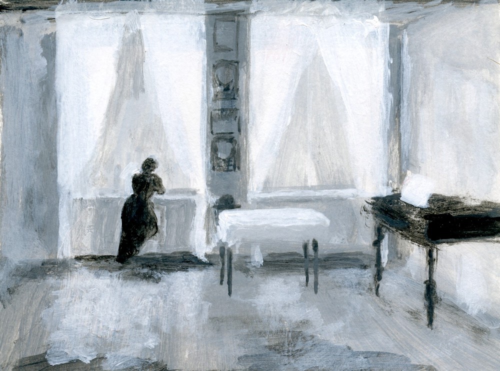
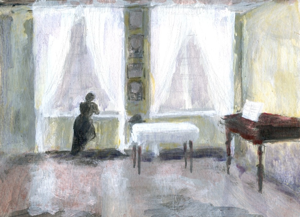
3b. Make two similar under paintings in greyscale for a simple composition, then glaze with colour to produce a subtle version and a more vibrant one. Take care with the tones in your under painting. Think about the fact that every time you add a layer of transparent paint that area will become darker. Make sure you paint some white areas for the palest glazes and any areas that will remain white. However, with acrylic if you haven’t got the tones quite right you can always repaint with white or the right shade of grey and add more glazes.
You could choose to make your versions of a Matisse interior for this exercise; judging the tones will be a challenge. Or you could make your version of a Hammershøi interior. His paintings are very tonal with very subdued colour, so getting the under painting right will be much easier. It would be a good exercise to do one version with subtle glazes echoing Hammershøi’s use of colour, and a second with vibrant glazes of bright transparent colours. Remember in either case you can glaze part or all of the painting and you can further modify the colour and tone by overlaying glazes.
The response: Your Paintings
Acrylic by Angela

by John
Monochrome study with added green and then yellow glazes by John

Underpainting and finished work by Liz