Monthly Archives: August 2020
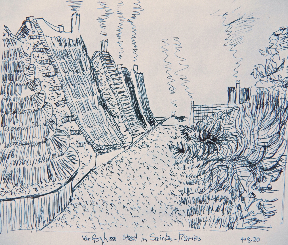
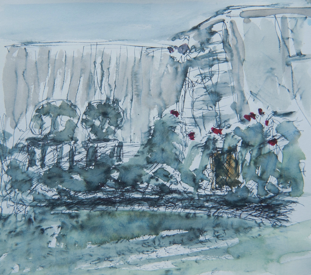
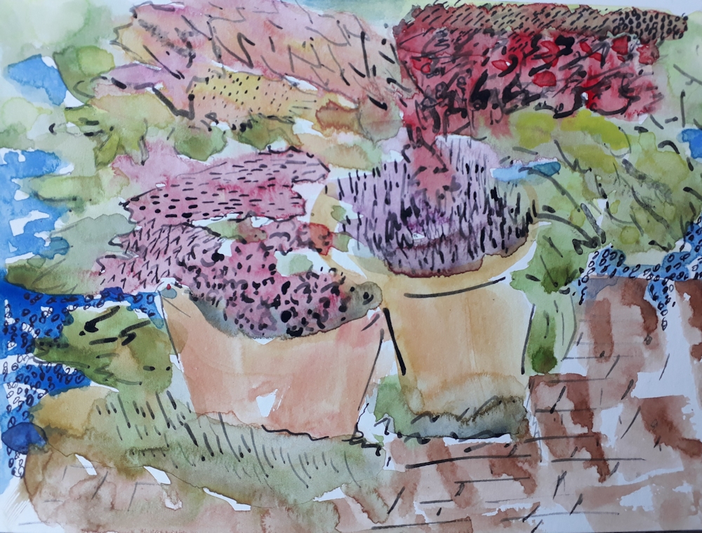
Ink and Wash 4: Street Scene or Busy Market
August 22, 2020

This week’s challenge is to draw from a street scene or market. This may be a colourful shop front, still life of a market stall with colourful flowers and vegetables, a stand at a car boot sale or a wider view of a busy road or market.

Including figures in your work may seem a bit daunting but whether you work from life or from a reference it’s a good idea to start by drafting in the static elements of the composition first. The main large shapes; the buildings and/or market stalls, and of course the road or square they stand on. This can be done very lightly in pencil but do not record any detail at this stage. Leave that to subsequent work with the pen, however you may like to draft in the odd figure just to gauge the relative size at an early stage. Again remember not to be detailed: you are not executing a portrait so just indicate a rough shape and note where the top of the head and feet are located. Groups of people are best drafted in as one shape and sorted out as individual characters later.
This week waterproof or non-waterproof ink may be used but think about whether your colour washes need to be kept as clean bright colours or whether a more subtle effect is required. You may also choose to work in monochrome adding wash to non-waterproof ink as plain water or by diluting the ink for the washes if using waterproof ink.

Don’t worry at all if some of the lines used to delineate buildings dissect any figures included. Once colour is added the lines will seem unimportant; such is the power of colour. Reportage artists working from life know this happens inevitably, and often as a consequence of people moving off or new characters arriving that they would like to include. It is a good reason for not making all the lines of buildings and stalls too strong at an early stage.

There are very many ways of treating these kinds of subject. This week I have restricted my choice of refence artists to two reportage artists as this approach may inspire your sketchbook studies on location.
This week’s artists for reference
Examples of works by this week’s reference artists can be found on my Pinterest Ink and Wash board at:
https://www.pinterest.co.uk/jhall1282/ink-and-wash/
and include
George Butler; extraordinary reportage artist who has worked in Syria and Afghanistan. Mainly India ink and watercolour. Note limited and stategic use of colour and amazing draftsmanship. See his work at
Lucinda Rogers; also a reportage artist who has made many drawings of markets, street scenes and garage workshops. Rogers visited New York in the aftermath of the collapse of the Twin Towers producing poignant studies there. Works with ink, marker pens, crayon and watercolour. Note how freely the colour is added but usually again limited to a few areas giving interest and emphasis to parts of the drawing.
Your Drawings;
This week’s drawings, mainly of market scenes are lively and reflect some interesting journeys to faraway places as well as markets much nearer to home!

Angela used Unipen Fine Line pens; 0.1 and 0.8 and watercolour on cartridge paper. Angela has done a good job here, as when working on cartridge paper washes must be laid with the minimum of brush strokes. This paper is very fragile when wet and can scuff up making unsightly blobs if the paper is ‘scrubbed’ too much. If you need to add another layer of paint wait until the paper is completely dry first.


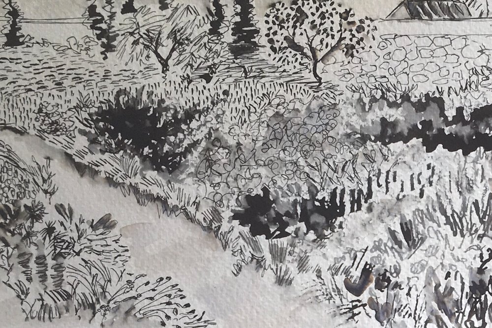
This drawing references a visit made to Samarkand and gives a great idea of the hustle and bustle of the market. Waterproof ink was used alternately with watercolour washes.


references a guide book


The space in Roger’s drawing has been very well constructed with regard to tone focusing attention on the middle area where a dark clothed figure is talking with another market in paler dress. When my gaze left them I felt led clockwise round the picture to the meat stall and the foreground lady in red, before the strong diagonal took me to the left taking in all the other stalls and lit doorway before returning to the figures where I landed first.
Great composition Roger!


For both of her drawings Barbara used pen, India ink and watercolour.

Pen and India ink with washes of dilute ink and of watercolour

The composition was brushed in with watercolour and allowed to dry before drawing in the detail with a Rotring Art Pen. Further ink and watercolour washes were added to finish.
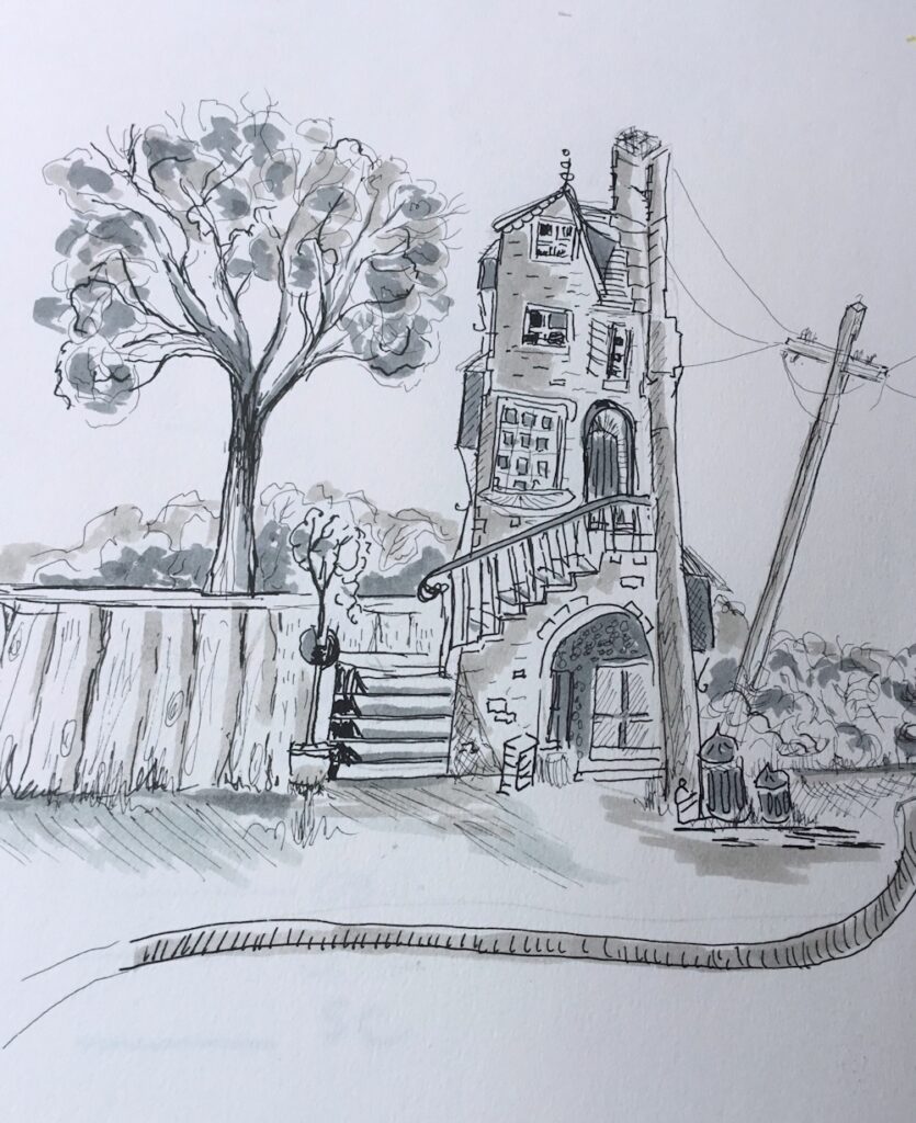
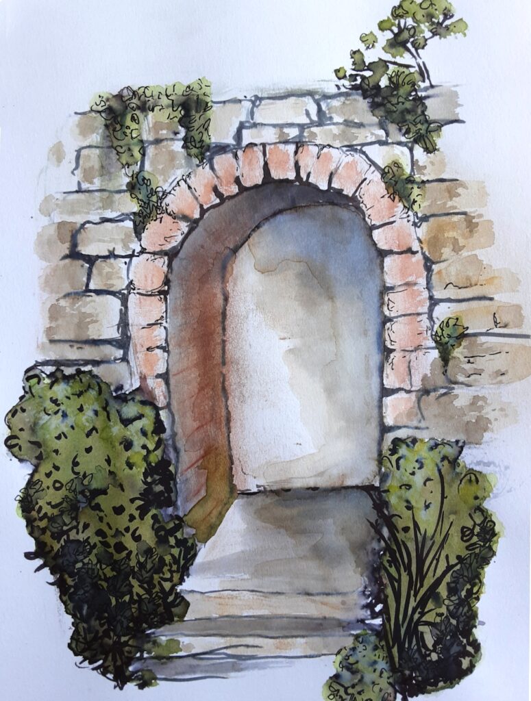
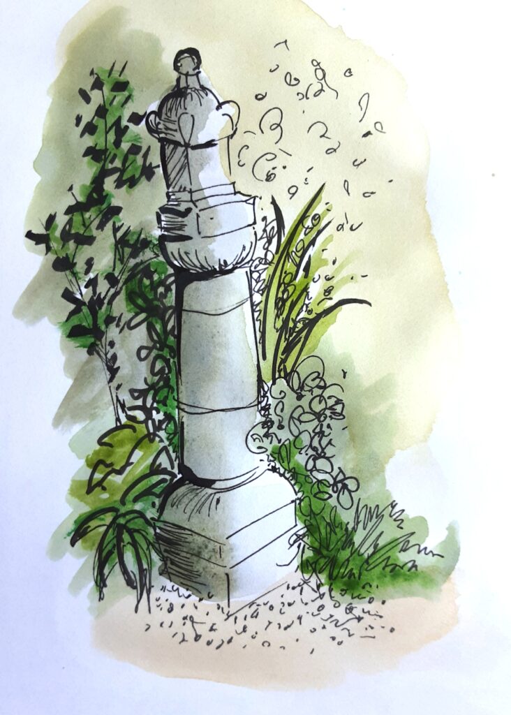
Ink and Wash 3: An Architectural Feature
August 15, 2020

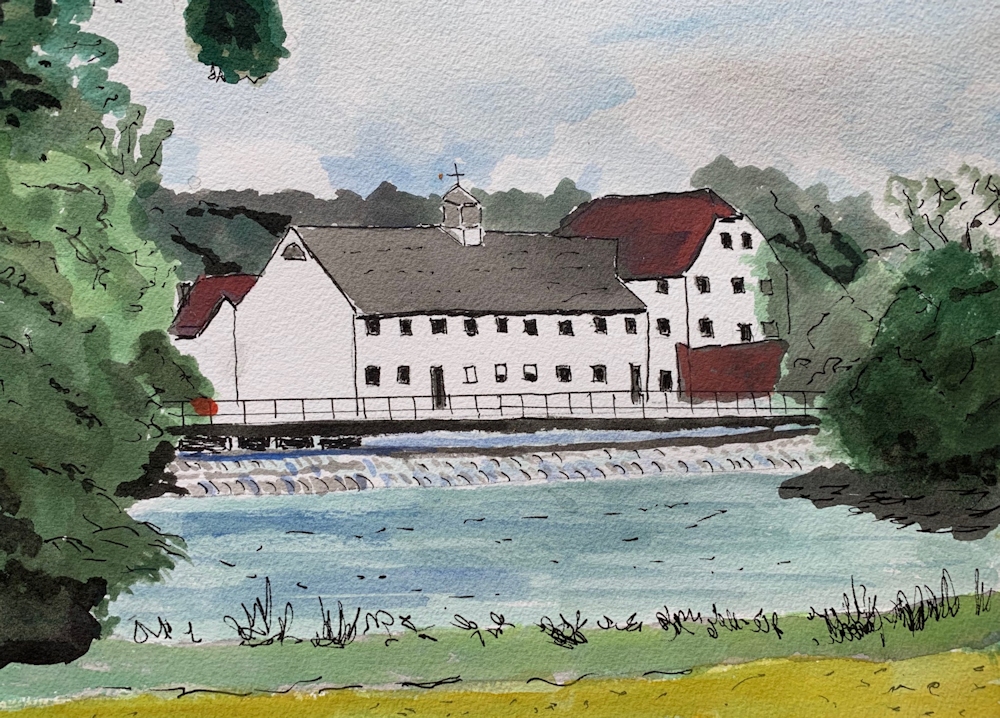
I have included two little drawings made in 1991and 1993, mainly because they are local illustrations and because ink and wash has long afforded a means to record buildings and other architectural features. I remember Norden Farmhouse as seen here, when the barns, though in bad repair were still used for poultry farming.

70 Altwood road must be one of the prettiest buildings in Maidenhead. It too has developed over time with a thatched Victorian extension to the rear of the more ancient thatch.

This week I would like you to make one drawing of a building, wall, bridge, or tower set in a rural or town setting. It may be a street scene and you may like to include some candle wax, wax crayon or oil pastel as a resist. This may be just to texture a small area or used in several places as in the demonstration sketch below. Resist techniques were often used by John Piper and the sketch detail below was scanned at each stage to show how oil pastel as a resist may be used to add both colour and texture to an ink and watercolour drawing.


Waterproof ink has been used in all the illustrations to this post and I suggest that it would be good to try using only waterproof ink for this week’s drawing. Remember that while still wet you can produce tone with a brush charged with plain water or watercolour, but if you wish to work in this way you should have your wash made up so it is ready to use before the ink dries. You can also mix up a couple of dilute mixes of ink and store in small glass jars with lids. Individual glass jam pots are ideal. The sketch below was made with full strength and diluted ink.

So before you start, look at your reference and decide whether you wish to work in colour, monochrome, with or without wax resist. You may like to invent or exaggerate colours, or to work much more closely to the colours of the reference.
Think also about the main structure of the building, drawing the main large forms first. Look carefully at the size of windows and doors in relation to the whole, then the surface patterns and details will fall into place much more easily.
Finally look at how the building is lit. Is it from strong sunlight creating huge tonal contrasts and shadows or is the light more subdued and the tonal differences more subtle? Is it night time and some of the light is coming from windows and street lights?
John Piper was an excellent draftsman so could choose to play with perspective. He also played hugely with decoration and colour and light but the proportions of windows, ornaments, balustrades etc. to the whole structure were always shewn accurately and it is these proportions that often give a building it’s character.
Reference Artists and Link
As usual the reference artists are an eclectic mix from Rembrandt to Emma Fitzpatrick so I hope you enjoy the variety on the Ink and Wash Board of my Pinterest account at
https://www.pinterest.co.uk/jhall1282/ink-and-wash/
There must be a washboard joke there somewhere!
Here are brief notes on each artist but best just to look!
Rembrandt van Rijn: 1669 to 1669:
Cottage among Trees 1650: pen and brown ink, brown wash on paper
Dutch Farmhouse in Sunlight: look at how the light falls
Giovanni Battista Piranesi: 1720 to 1778: drawing and printmaking
Visionary architectural drawings; Roman Prison ca 1750 wash drawing
Tomb of the Metelli: pastiche of ancient temples with a piazza
Francis Towne: look at works from 1781 when he visited Italy, washed drawings and watercolours, very calm and cool
Roman Ruins 1781
In the park of the Villa Mondragone, Frascati 1781
John Piper: just look
David Gentleman: just look
Getrude Hermes: 1901 to 1983 sculptor and wood engraver
Stonehenge; 1959 Have included this one as the markings on the stones are wonderful. Do look up this reference
Emma Fitzpatrick: contemporary; just love her freedom of line and colour!
Lastly, not so much for his work but because he does have some useful line and wash demonstrations on U-tube, Peter Sheeler. Easy to Google and find.
I didn’t feel the need to say anything about John Piper or David Gentleman. You will come across scores of others using ink and wash but hope this handful will provide food for thought and creativity. You are quite at liberty to design your own shack, castle or fantastical bridge!
Enjoy drawing!
Your works:


The line and wash sketch of the chapel outside Orviedo started as a line and wash sketch using a fine nibbed dip pen and ink to which dilute washes of ink were added. Vivienne then built up layers of oil pastel, watercolour and more ink, scratching out some of the oil pastel.


Angela used Unipin Fine Line 0.1mm black, acrylic ink, watercolour, candle wax and charcoal pencil for her view of All saints Church.


Malcolm made use of numerous nibs and a twig to draw the bridge in India ink and a Chinese brush for washes of dilute ink. A little white gouache was added on the water in places.

Sandra’s painting is a mix of sepia acrylic ink using dip pen, oil pastel as resist, watercolour, Indian ink line and wash, gigonda red chalk plus light and dark sepia
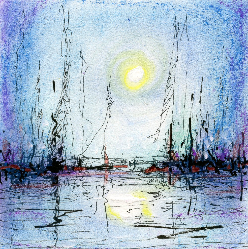
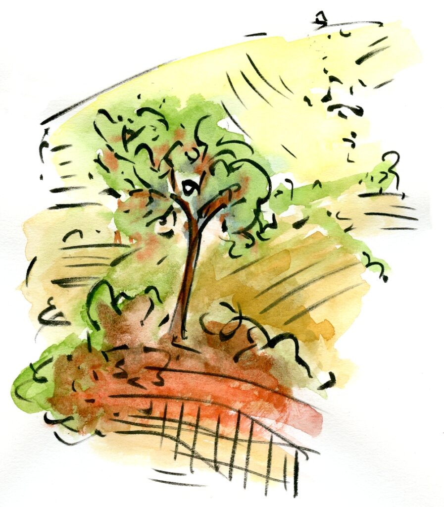
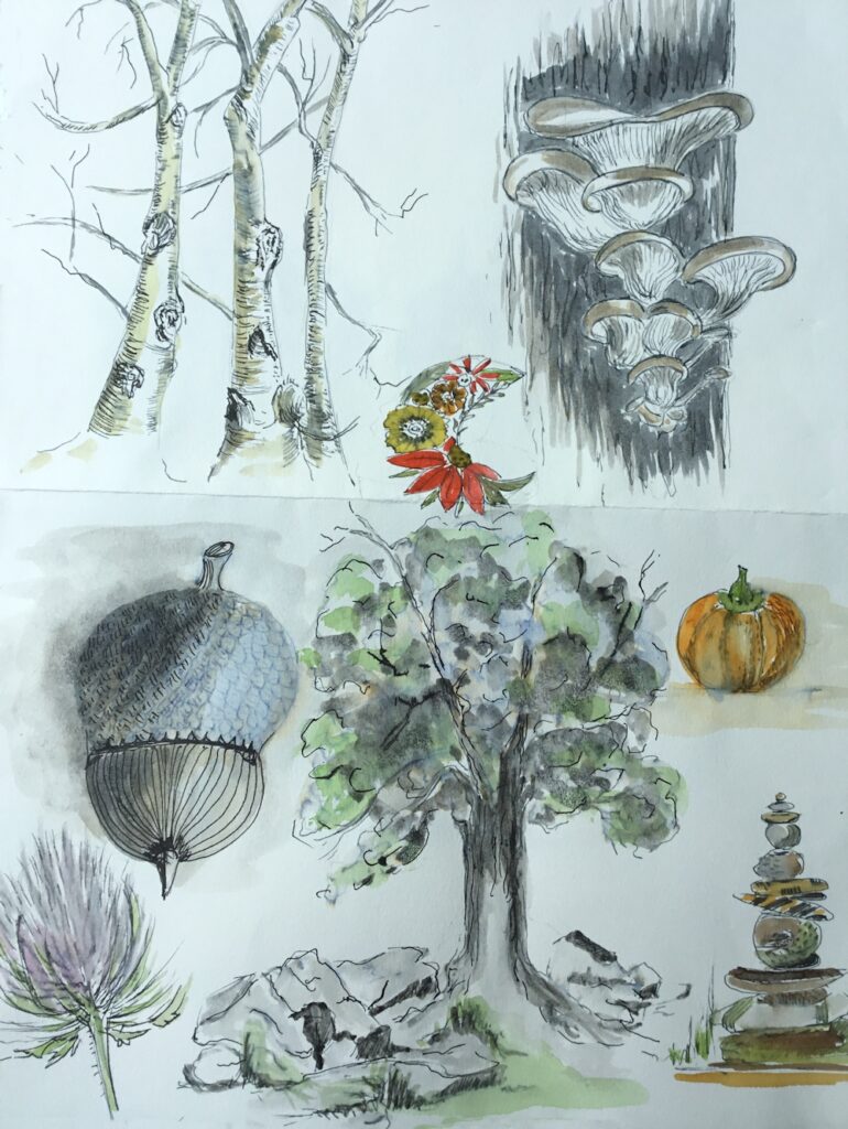
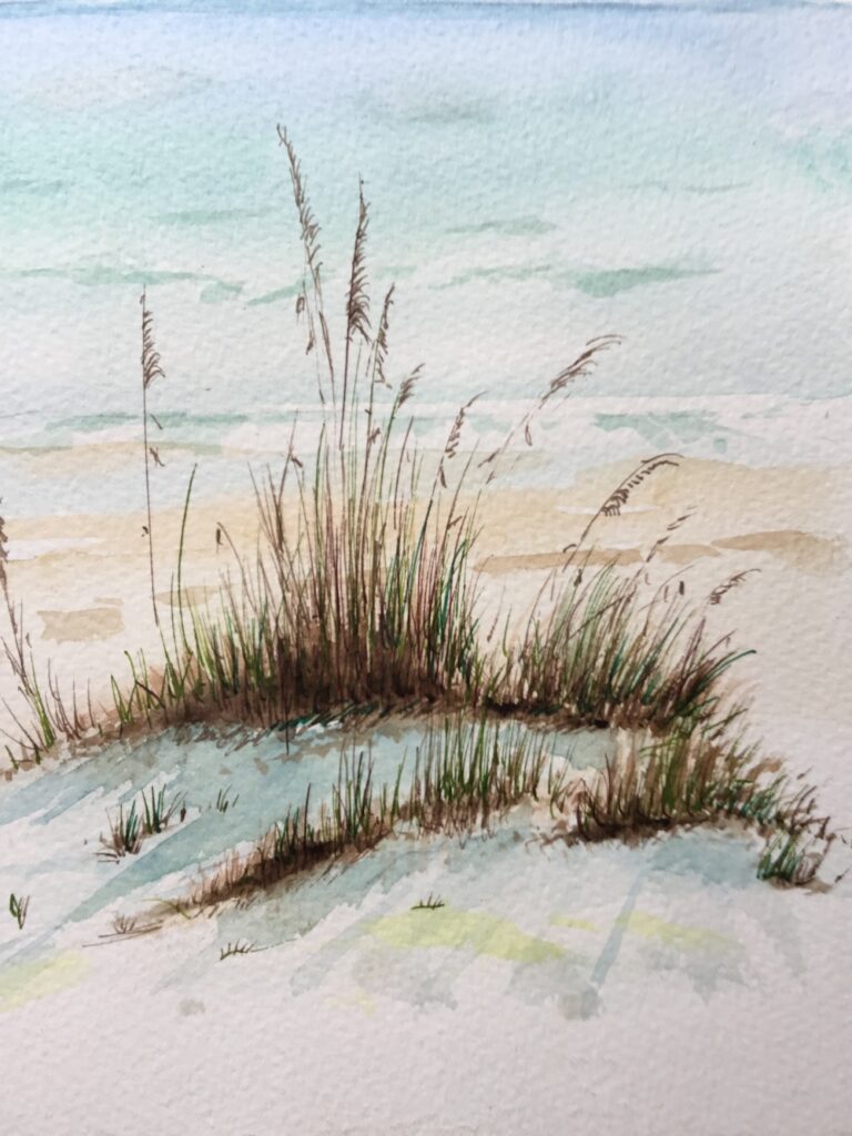
Ink and Wash 2: Into the Landscape
August 9, 2020

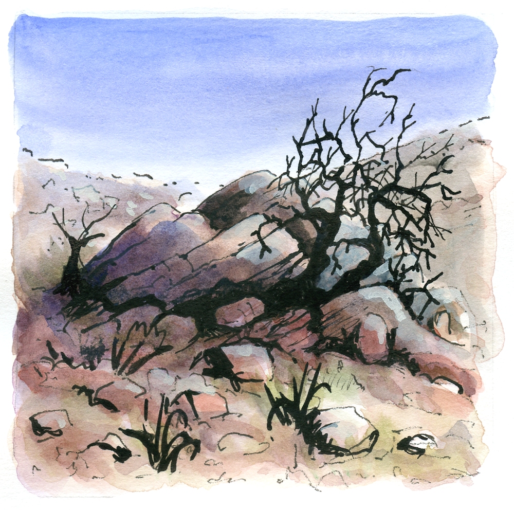
In last week’s post the accent was on mark and line making and different techniques for drawing in ink and adding washes of more ink and/or watercolour or pastel and our aim was to produce an ink and wash drawing of a natural form. This week we are operating on a larger scale and moving out into the landscape. You have many techniques at your disposal and I would like to see you try a landscape from your own reference material; somewhere you know and either love or find interesting. Best of all would be to work from life at a landscape near you!

Think about how your subject will be best depicted; whether the accent should be more on line or mark making or whether only an indication of line is needed and most of the “work” will be left to the wash to supply tone and colour.

Also think about how you will provide a sense of space and distance. This may be important or not as we shall see from the rather eclectic group of images chosen for the Ink and Wash Pinterest board at
https://www.pinterest.co.uk/jhall1282/ink-and-wash/
Claude Lorrain
Claude Lorrain’s Study of an Oak Tree ca. 1638 is rich in pen marks on the trunk and foliage but many of his ink wash drawings were almost solely wash as in his View from Monte Mario, where a river winds its way through dark trees against a backdrop of distant mountains. The paper is white where the water reflects light most strongly and the composition relies almost completely for changes in tone for its effect. In Trees and Rocks by a Stream ca.1635 there are beautiful calligraphic lines as well as washes where the tone of the wash varies from a very weak tea stain to something much darker. I find his work has a timeless quality and he has much to teach us today.
Samuel Palmer
Moving forward Samuel Palmer’s work is equally dramatic tonally but rather more graphically defined. In Drawing for the Bright Cloud ca. 1831-2 look at how Palmer’s clouds depend on line as well as tone, how the middle ground is very dark and the tree trunks white against the dark and how carefully the sheep have been washed with different tones so we know exactly how the light is falling on them. There is also an abundance of mark making on their wool and much patterning of foliage.
There are several ways you can produce light against dark;
Reserve the white of the paper; draw/brush round anything you wish to remain white.
Add White: When the work is almost complete add white gouache or even acrylic or white pastel/pastel pencil.
Scratching with a sharp implement taking care not to put a hole in the paper-always best done at the very end and only if the paper is heavy enough to take harsh treatment
Wax: At the very beginning either a line of candle wax which cannot be removed; experiment first on a small piece of the paper you will use to see how much pressure is needed when you add a wash and the wax acts as a resist.
Masking fluid; apply at the beginning with a ruling pen or old brush which must be cleaned immediately afterwards. Make sure the masking fluid is completely dry before removing by rubbing with a finger or soft eraser; not suitable for rough papers so again experiment first
PLEASE NOTE: Wax resist, or adding chalk pastel when a work is almost complete will work with waterproof ink, non-waterproof ink or watercolour.
Non-waterproof ink may lift when you add wet gouache or acrylic. You may lighten areas of non-waterproof ink or watercolour by lifting out with a damp brush and clean tissue. You can wet the paper repeatedly to lift out but do not rub the surface or it wil become damaged. Paper is at its most fragile when wet.
The other reference artists chosen are :
John Piper; images of rocky landscapes
Paul Nash; trees and woods in the landscape, carefully considered compositions and delicate lines The Pin labelled Paul Nash at Tate Britain has an image of The Wanderer. Do look at how the line and colour work together producing a magical narrative landscape where the distant figure has trodden a path through the field.
Ceri Richards; trees and foliage full of wonderful lines and marks evoking a strong sesne of movement
Wu Gannzhong
Lastly I have included the Chinese artist Wu Guanzhong, who died in 2010 and is often thought of as the father of modern Chinese brush painting. Like Lorrain he has made wash drawings that wholly depend on wash but also those where line is the key element. The contour of the land is well established so that however abstract his work becomes, it still convinces us. We are still travelling the path with him and I think his work also has that timeless quality.
Aim to produce;
One considered drawing of a landscape with rocks, trees or both.
Foliage of trees may be suggested with ink but always remember the side of your brush can be very useful whether in strokes or “printed” against the paper.
Remember to mix some washes up in advance of starting the pen/brush drawing as you may wish to add some wash while the ink is still wet, if you are using waterproof ink. Also ensure that all your equipment like brushes and a sponge or paper towel are to hand.
If you have time for a second drawing, try to make one that is different in nature to the first. For example the first may be a calm day and the second blowing a hurricane or at least windy. The first may be monochrome and the second very vibrant.
Enjoy drawing!
Your Drawings:


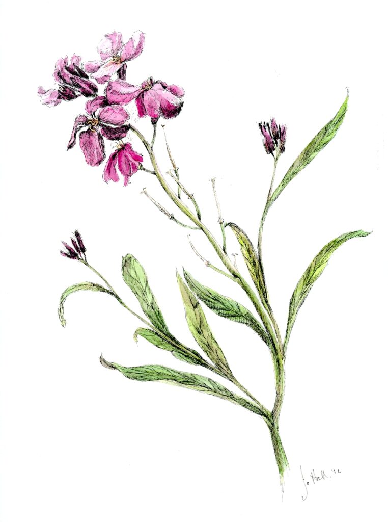
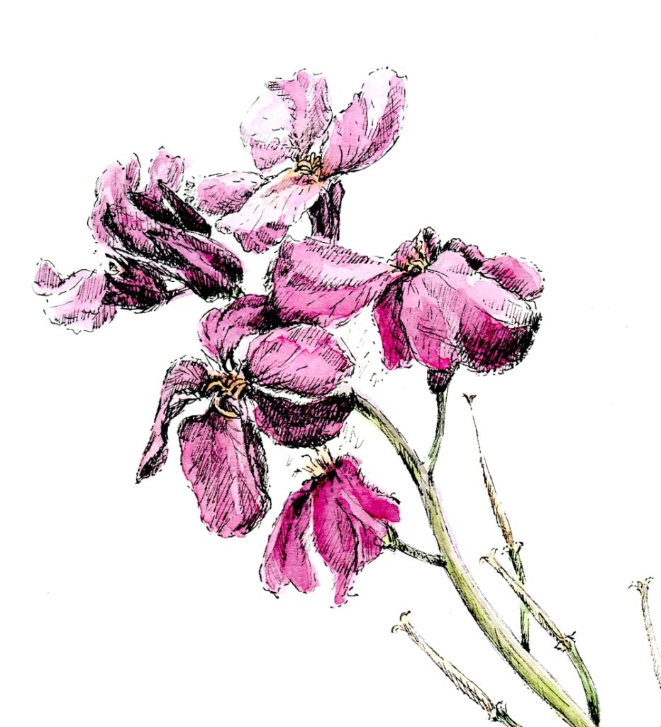
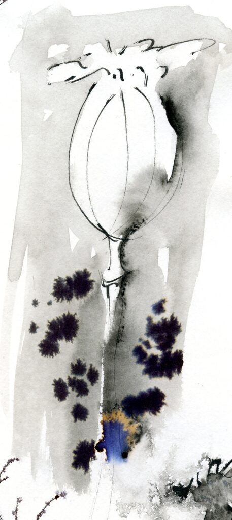
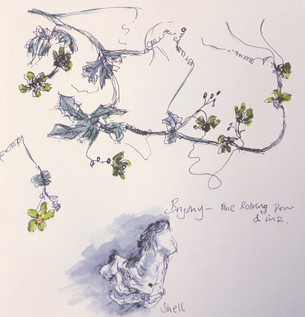
Ink and Wash 1
August 1, 2020
Lines, Marks and a Natural Form in Ink and Wash
Why Ink and wash and not line and wash? I had thought of calling this short course line and wash, but what about all those little marks, dots and splatters that so often add to the character of an ink and watercolour drawing? And what about the decision to paint an area of ink instead of a line?
I’ve also been asked two other interesting questions recently:
Can you put down the wash before the line/ink?
Can you use pastel as a wash?
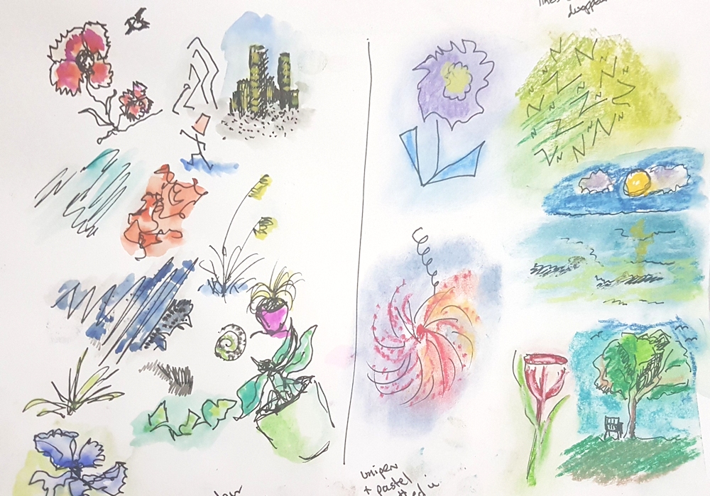
Of course you can. See first image!
I often think of the line element in a drawing as the narrative of a story. It finds out the main players and arranges them. This may be sufficient in itself. Look at line drawings by Matisse. At the other end of the scale look at the amazing reed pen drawings of Van Gogh, full of beautifully arranged groups of marks.
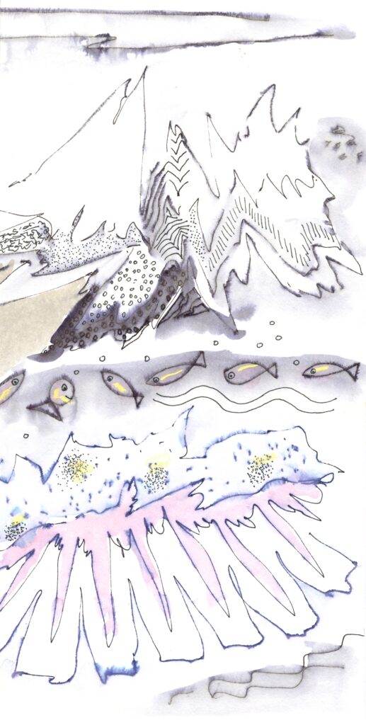
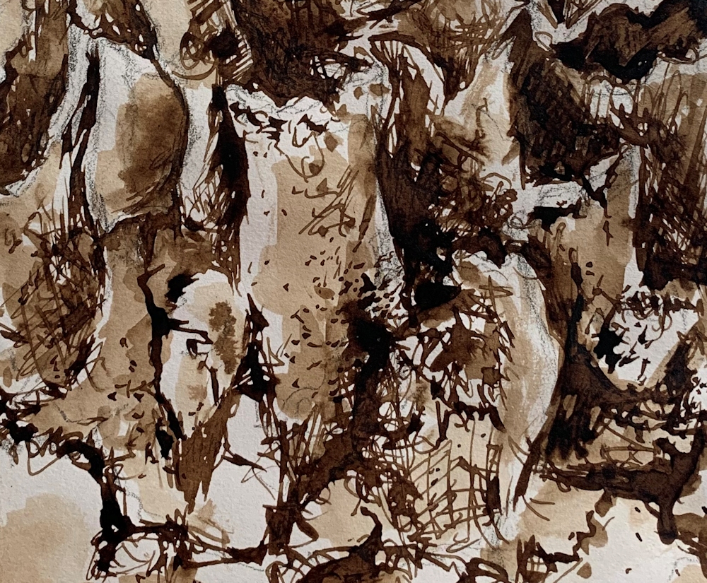
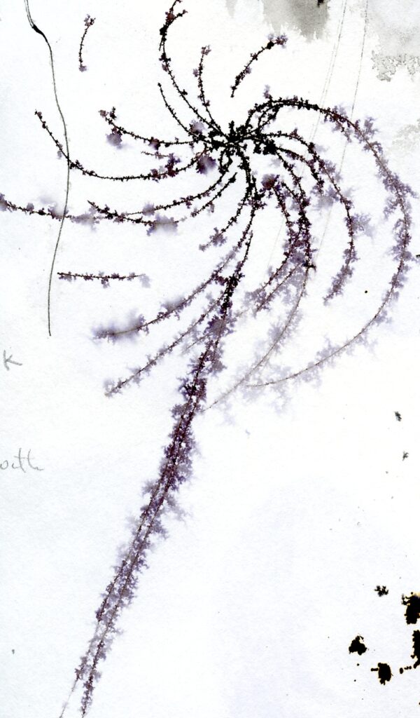
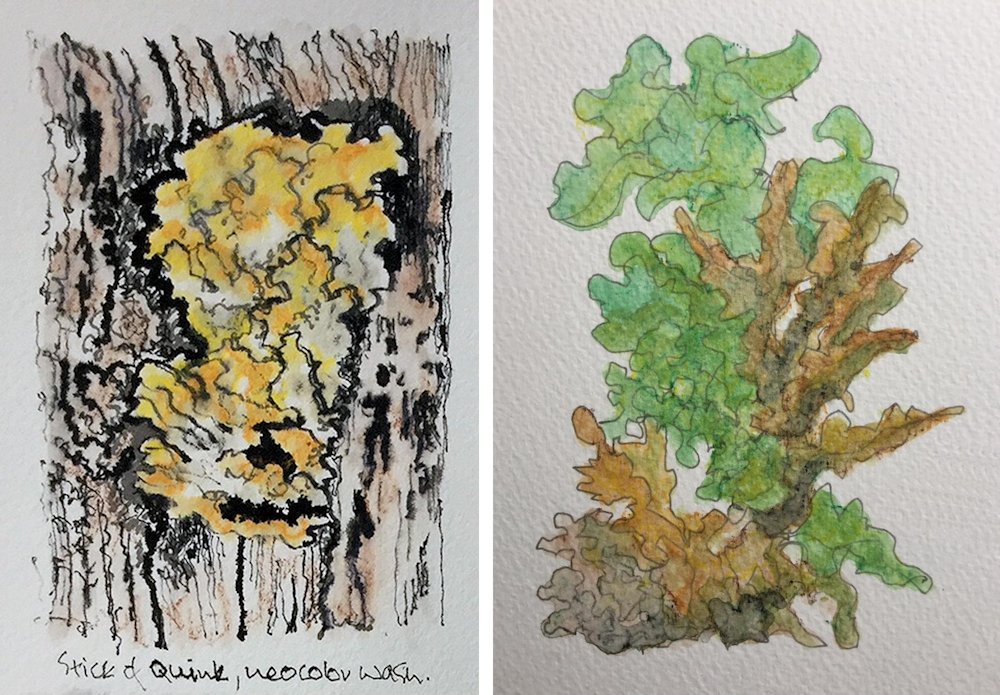
Washes of dilute ink, watercolour or “dry” washes of pastel add tone and atmosphere, and all the little marks can add further descriptions of the main players and introduce smaller ones. These little marks may suggest the ageing process whether in a face or a piece of driftwood. Shells and stones carry the marks of their history, growth lines or pits made by burrowing worms etc. Likewise the barks of trees can bear growth marks, further enriched by the growth of lichens.and fungi; the minor characters.
First of all we are going to consider mark making as it’s a good way to get used to using ink and different pens and tools, and go on to making drawings of natural forms and adding washes. Those of you who are already used to making drawings with a variety of tools, pens and inks may like to go straight to the drawing challenge for this week.
Marks can be patterns in the shape of the objects they depict; e.g. leaf forms or can be more anonymous, adding a texture rather than being ‘in the shape of’. Although it is easy to think of a system of dots or a series of short strokes as being marks and long thin strokes of a pen describing the profile of a face, a figure or undulating hills as being lines, there is a grey area in between where the definitions break down.
Materials and equipment
Ink
Waterproof India Ink or an Acrylic black ink; these inks are made of carbon (historically soot) suspended in water with a shellac or acrylic binder which makes them waterproof when dry. Non-waterproof India Ink can also be purchased but you can gain very similar effects with waterproof ink by adding washes before it has dried. The carbon particles could not be ground fine enough for fountain pens and unless labelled as suitable India Inks should not be used in fountain pens as they will clog the nibs.
Fountain pen inks are generally dye based, often of more than one dye and are solutions of the dyes in water rather than suspensions of tiny particles. They are very beautiful to work with and readily split into there component dyes. Sadly most are not at all light fast, so though useful for sketchbooks are not suitable for showing on a wall. Most reputable ink manufacturers will give lightfast ratings for their products but if your ink is not labelled as lightfast it probably isn’t. This is a particular sadness for people who like to use Black Quink.
Pens
Dip pen, twig or reed pen plus any other pen with water based ink that you have but not solvent based marker pens as these will bleed through the paper.
Watercolour brushes; round and if you have one; a rigger, an oriental, a flat brush (all can make different marks)
Watercolours
Deep welled palette for washes.
Cartridge paper or other smooth heavy weight paper
Watercolour paper
Masking or Magic tape.
Pen, brush and ink care.
There are a few guidelines you should follow when using a pen or brush with ink and they are especially important when using waterproof inks because of the shellac or an acrylic binder they contain. These binders dry on nibs and brushes and cannot be removed once dry.
ALWAYS
Dip your pen in water then wipe with a paper towel before dipping in the ink. Touch the side of the nib on the ink jar side to allow excess ink to drip into the container (avoids blots when drawing). Every few strokes clean your nib by swirling in water and wiping again with a paper towel. This keeps the nib clean and prevents dilution of the ink. When you have finished using the pen wash well with water and wipe carefully both outside and inside the nib and clean again till no ink colours the paper towel when it is wiped.
When using a bamboo or other reed pen NEVER leave the pen in water other than dipping in to clean it, as described above. The wood will swell and the pen will crack and be useless.
Use a similar procedure with brushes. Dipping your brush into water before just blotting on some paper towel before dipping in the ink will help to prevent staining and build up of ink. It is just as important to clean your brush at intervals by swirling in water and even more important to blot before dipping into the ink again to prevent diluting the ink, especially if using a large brush. After you have finished using your brush swirl in water and clean under the tap gently with soap before rinsing and allowing to dry.
Ink When not using your ink even for a tea break put the lid on; it will evaporate over time. Store diluted ink in a small lidded container; individual jam or marmalade jars are ideal for this.
Examples of some of the artists referenced can be found on my “Ink and Wash” Pinterest board at
https://www.pinterest.co.uk/jhall1282/ink-and-wash/
Van Gogh was a master at mark making with a reed pen and I am going to suggest you make some patterns of marks that suggest different kinds of vegetation as in his drawing “A Garden with Flowers” Arles 1888.
Warm up exercises
1.Van Gogh’s reed pen drawings of wheat fields and waves wonderfully suggest movement so try to create your own marks to suggest the way grasses or waves are blown by the wind. Any sort of dip pen will work for this but do try a bamboo (reed) pen or twig if you have one.
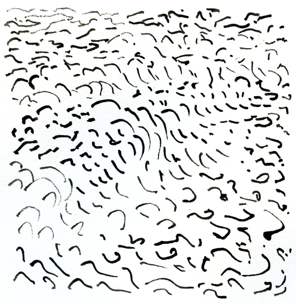
2. After that try series of tiny circles, ovals, lines of little dashes, curls and spirals or just random marks letting your pen move swiftly over the paper and letting it touch the paper briefly and at the same time changing direction as you go. Invent your own marks to suggest textures or massed leaves/plants.
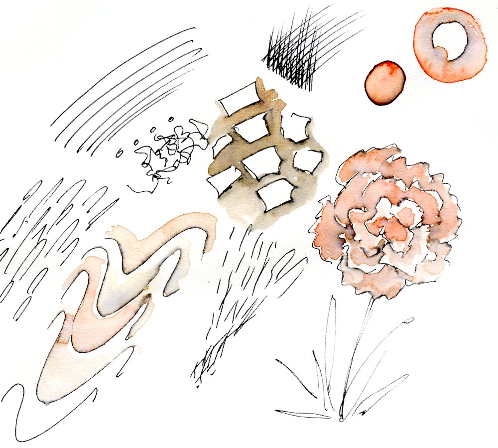
3. Mix up some dilute ink or some watercolour washes and test their strength before making some more marks and lines suggesting a piece of driftwood or tree bark. Make two small drawings in this way then add some wash to one before the ink has dried. Let the other dry completely before adding a wash with a medium round brush depending on the area of wash. Medium size 5 to 8.
Use a smaller brush for small areas and larger one if working at a large scale.
4. Make a watercolour wash and make ink marks into the wash while it is still damp. Leave to dry then add further marks and lines.
5. Have fun with lines from your pen; try making slow smooth lines, try making rapidly drawn lines, try making lines that start and stop hesitantly, leaving the pen in contact with the paper while you change direction and move on.
6. See what happens if you spritz water at some India Ink before it dries.
The Drawing Challenge
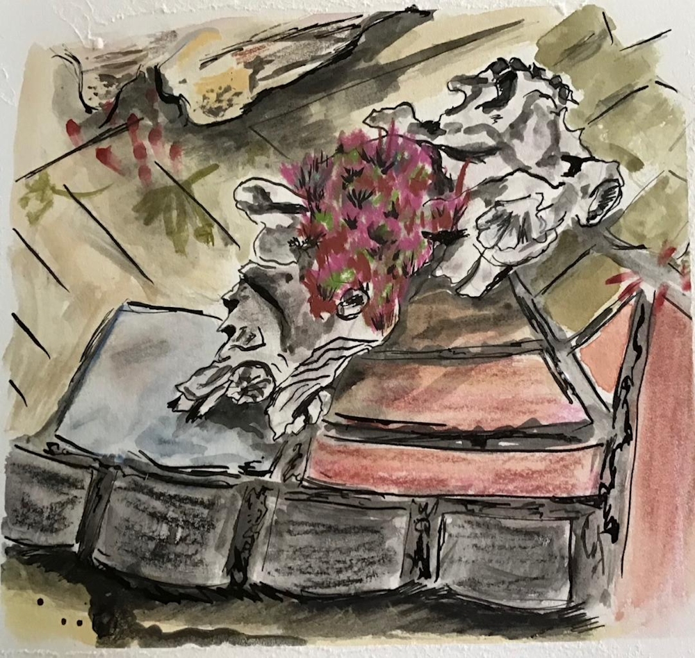
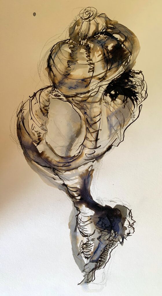
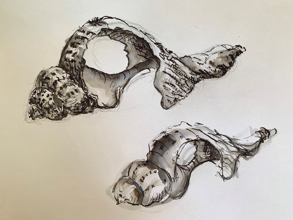
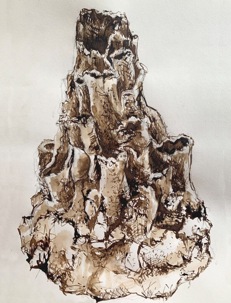
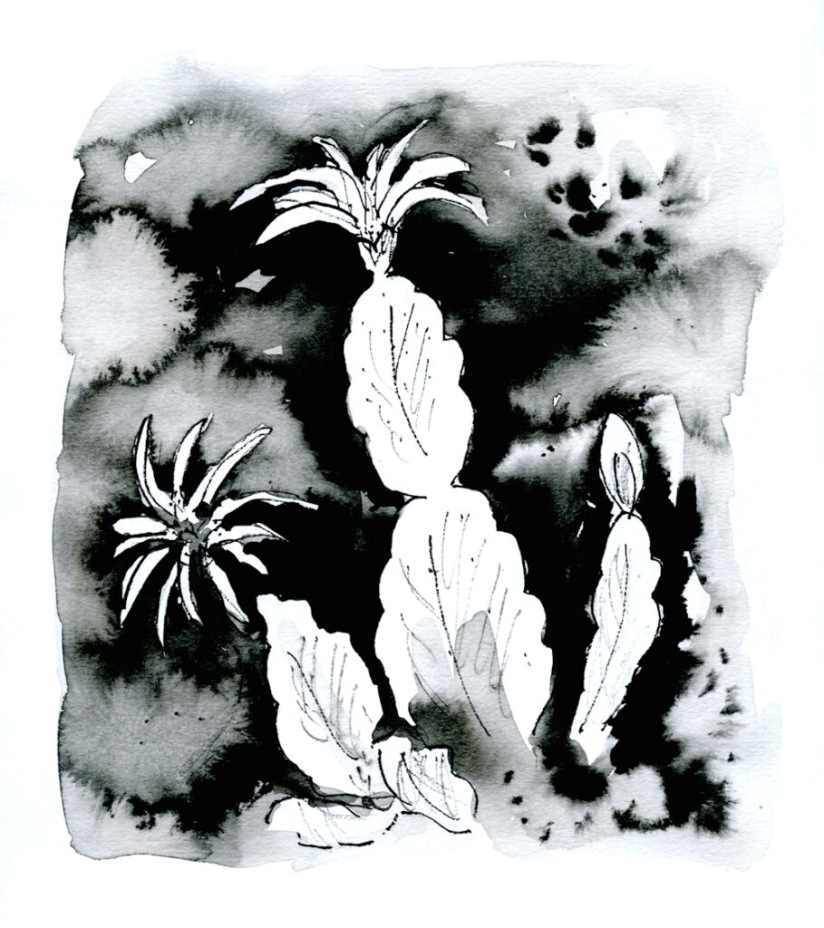
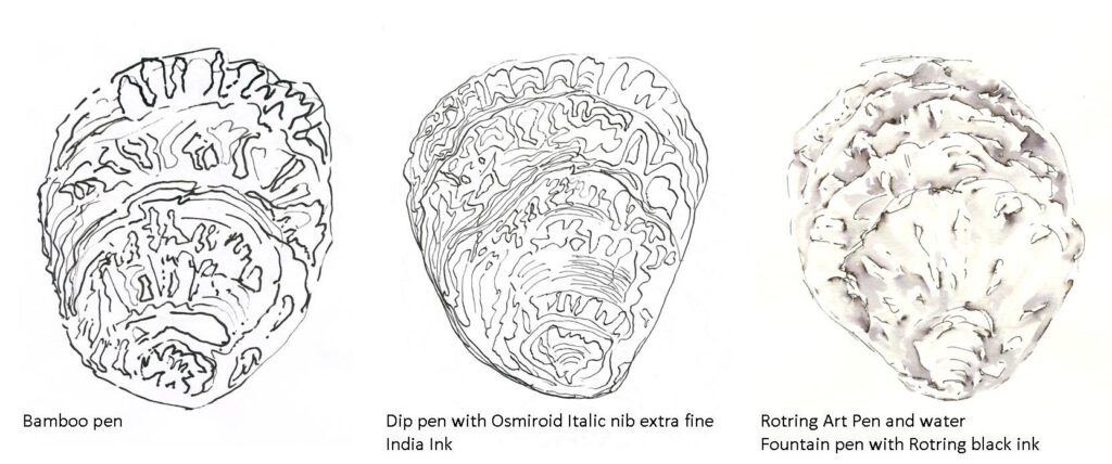
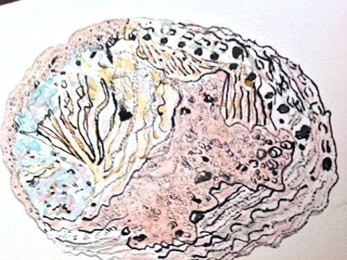
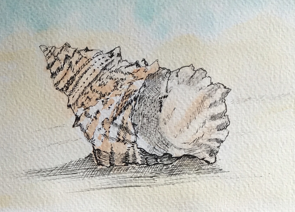
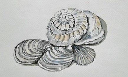
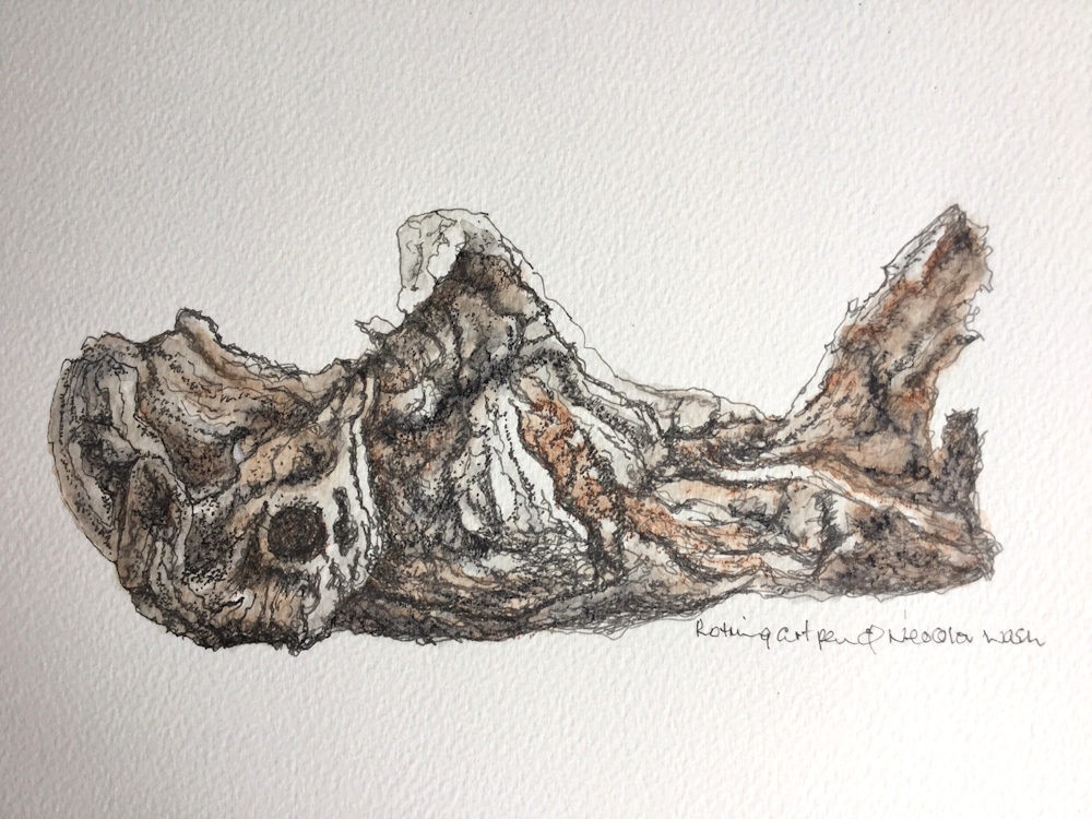
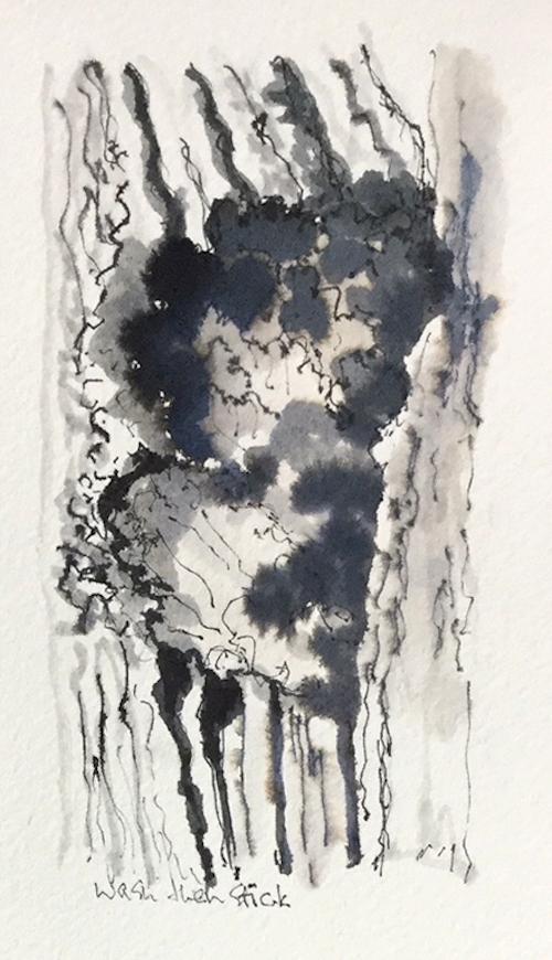
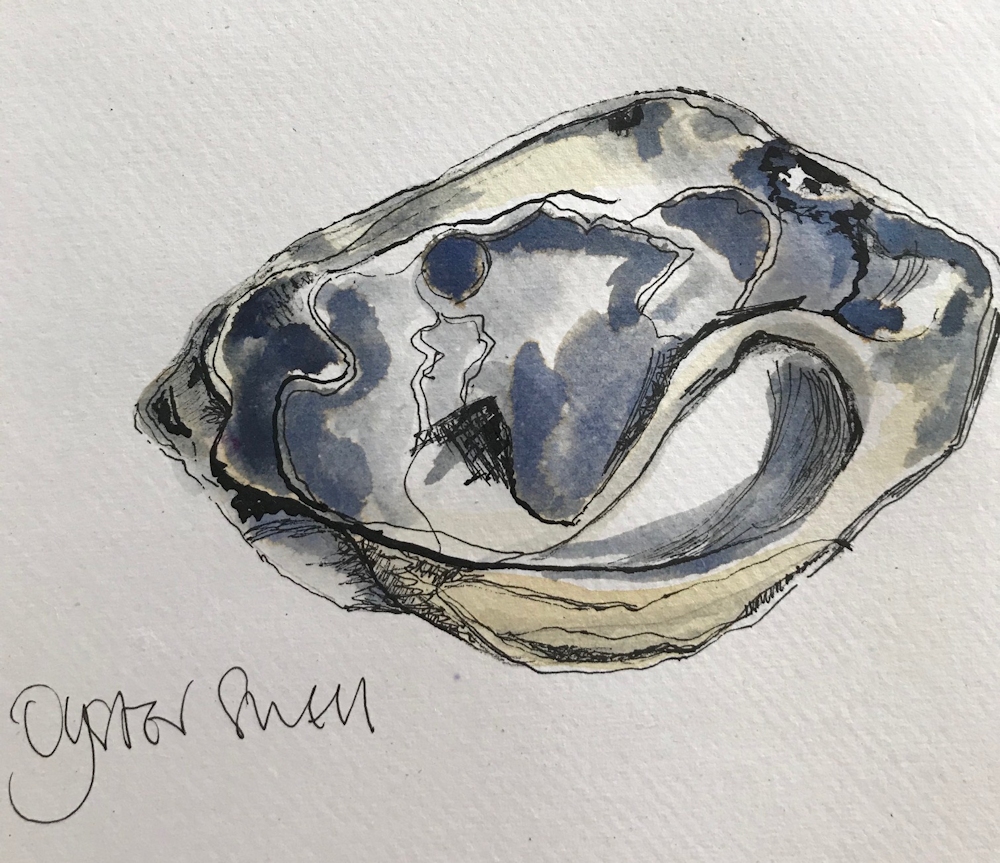
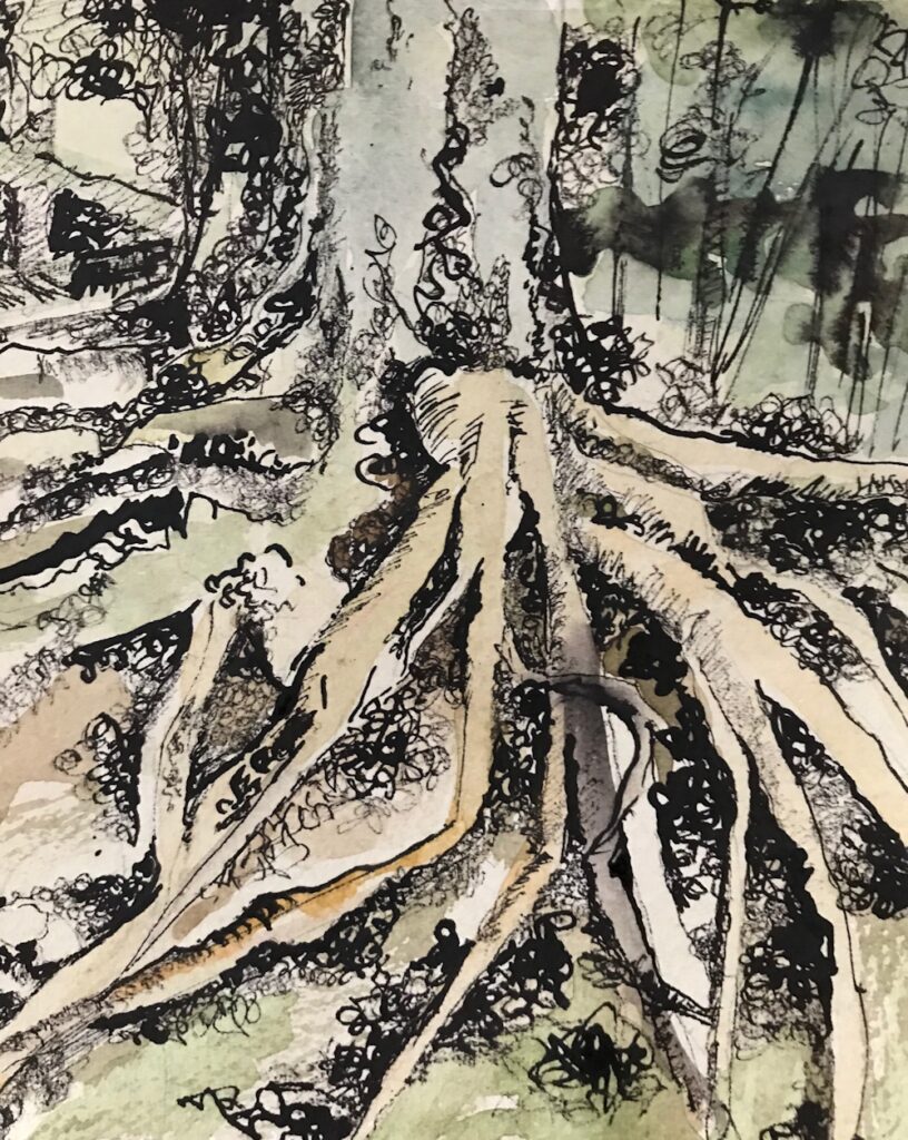
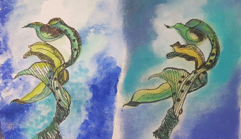
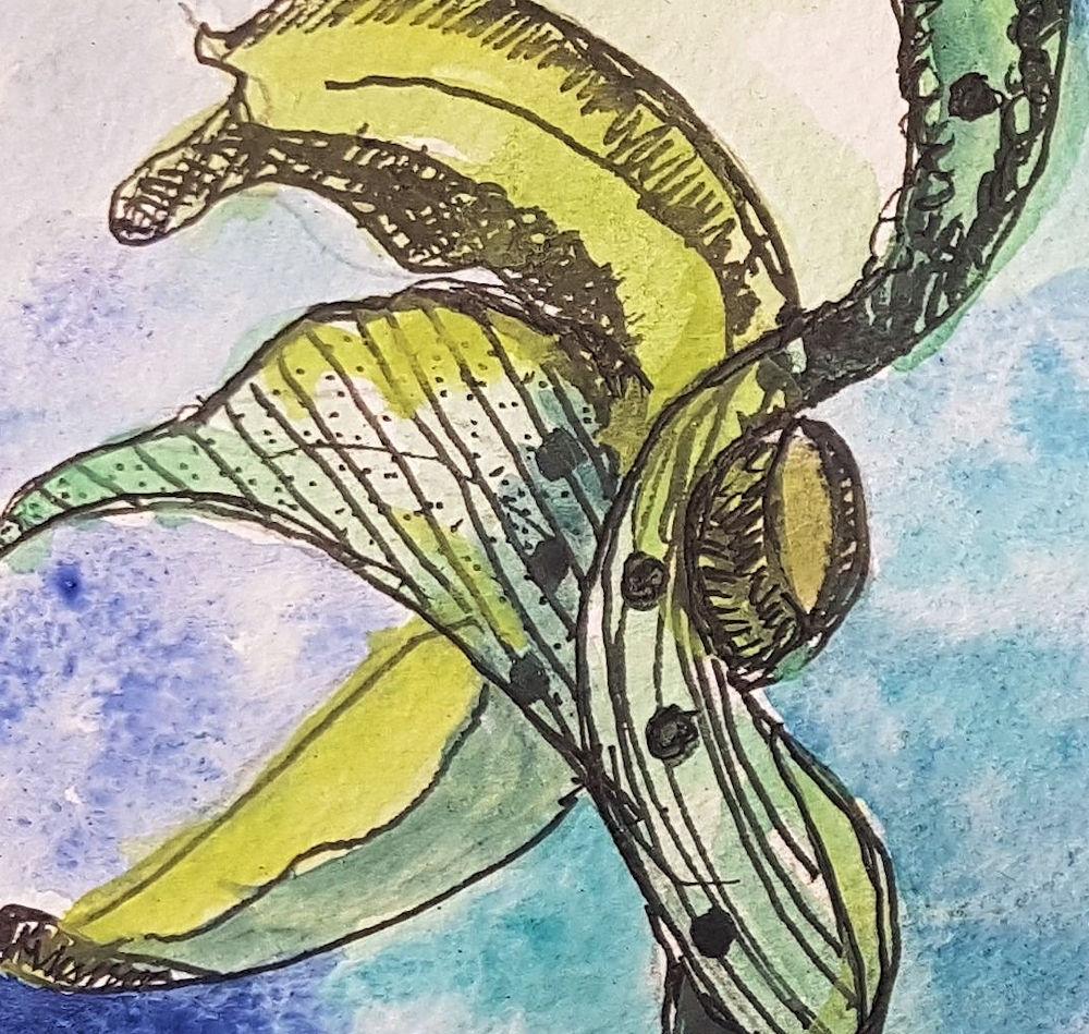
7. The challenge now is to produce a drawing with ink and washes of dilute ink and/or watercolour. Choose a natural form with an abundance of marks to inspire you. Your drawing can be as abstract or representational as you like but it should have some sort of centre of interest. A stone or weathered oyster shell with loads of pits, a piece of driftwood, a tree bark encrusted with lichen, a tree trunk with gnarled exposed roots or a frilly kale leaf would all be excellent subjects.
You could even make a large drawing of a small object like a walnut shell.
Think about whether you want to let your ink dry before adding a wash of ink or watercolour. Think about the lightest areas you do not wish to cover with wash and either reserve them by painting round them or apply a little candle wax to act as a resist to the wash. When this has dried you may feel you wish to strengthen certain lines or add more marks till your drawing is finished. You can add marks and washes in layers but proceed with caution as once added marks cannot be taken away. Watercolour washes can however be lifted out but only successfully on watercolour paper, as cartridge paper has a much more delicate surface which is easily damaged.
How do you feel about using a brush to make some of the marks and lines for a second drawing?
Again practice mark making on a separate piece of paper and get used to the amount of ink to load on your brush. Try a round brush, making thicker lines by pressing down more and thinner lines by lightly touching the paper. As well as small circular marks with the brush you can also make ’printed’ marks by laying the side of the brush directly on the paper; pressure on the heel(part furthest from the tip) of the brush as you remove the brush from the paper will make the mark broader there.
If you have time try other brushes, flat brushes, worn out brushes, rigger brushes and oriental brushes are all great for making different lines and marks.
I would like you to send your favourite “experimental sheet” and one finished drawing for the review session, with details of the ink and colours used and a little about your reference material.
Artists for reference
https://www.pinterest.co.uk/jhall1282/ink-and-wash/
Van Gogh; especially mark making
Samuel Palmer; line and markmaking
Ch’ng Kiah Kiean; line, wash, marks
Wyona Legg; ink and pastel
Your Drawings:
It is a great combination of ink and watercolour.
The line and wash complement each other beautifully.
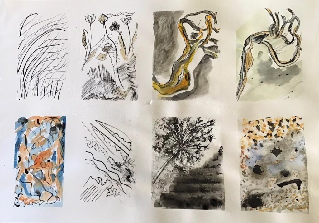
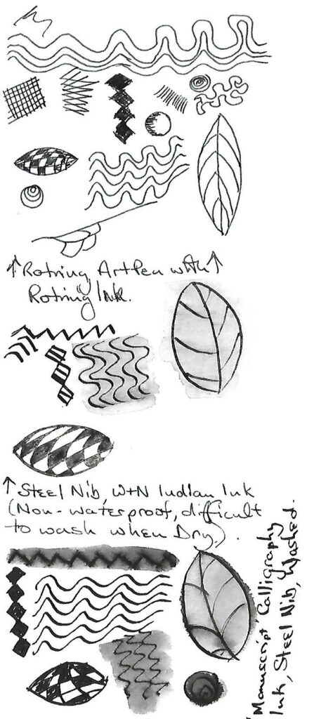
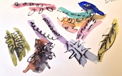
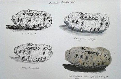
Exercises Left to right: top row; 1 cola pen and Indian ink 2 dip pen Indian ink watercolour
3 dip pen, Indian ink and wash when wet 4 dip pen, Indian ink.Let dry then watercolour
Bottom row; 5 watercolour wash + India ink whilst wet , when dry Rotring and brush
6 Indian ink with dip pen, rotring random lines 7 accidental ink spots brushed out with toothbrush and then dip pen to create steps. Allium sketch in India ink and spritzed when wet
8 accidental spots, spritzed. To me looked like a puddle on gravel path, watercolour and chalk