Monthly Archives: May 2020
Paint a Flower in watercolour: wet in wet or wet on dry?
May 25, 2020
One of the best things about watercolour is that it runs and to get some of the most exciting results it’s a good thing to take a few risks. As a bit of a control freak (where paint is concerned) I have found it as daunting as any one, but with a little practice I can now let my paint run without it getting out of control. I have chosen flowers for this week’s challenge, simply because they are beautiful and abundant and offer good scope for trying some elements of wet in wet technique.
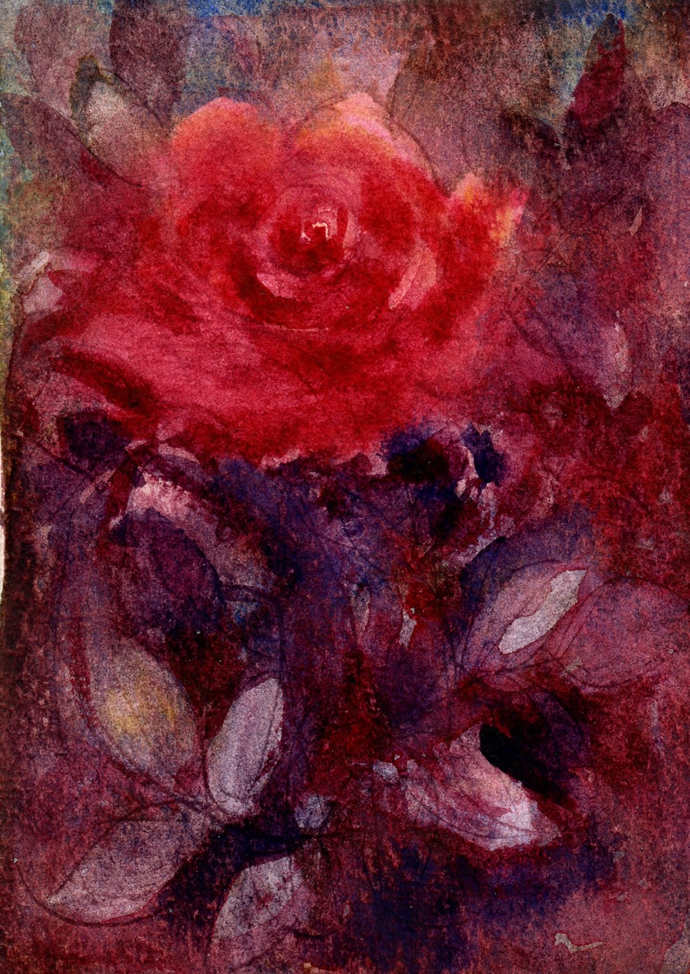
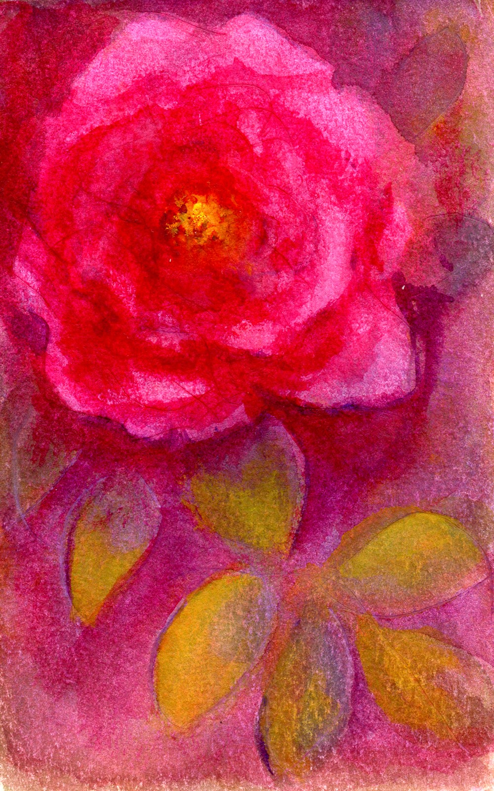
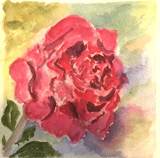
Red Rose: pigments; Crimson Alizarin, Blue Ultramarine, Cadmium Lemon
Much of this painting was made wet in wet and the lines were made by indenting with a cocktail stick while the wash was very wet so that the pigment flowed into the groove. This could have been done with the handle of my brush. a fine embossing tool or any fine object that would dent but not tear the paper.
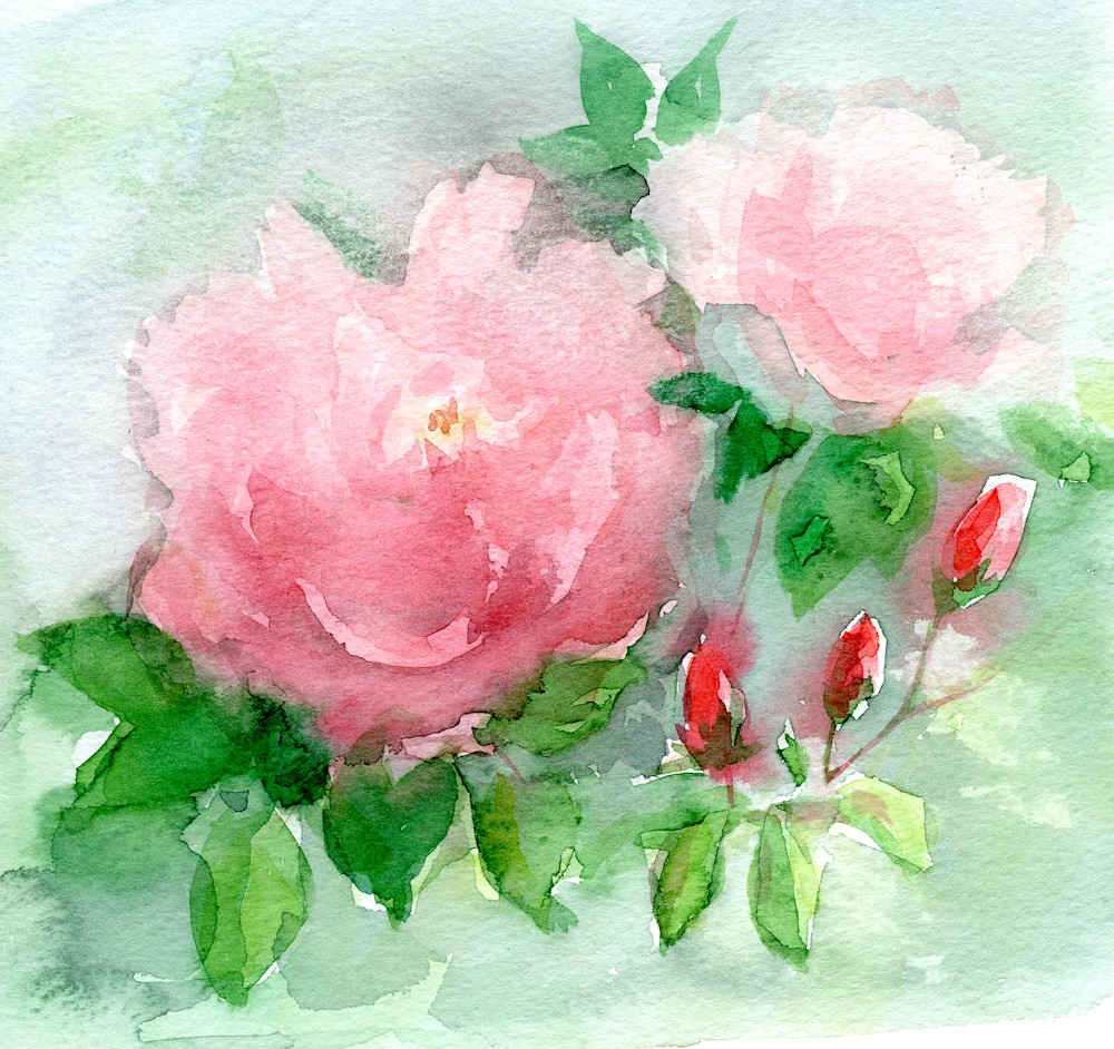
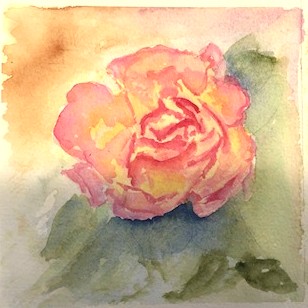
Pink roses in my garden; painted outside
Pigments for pink roses in my garden; Crimson Alizarin, Schminke Olive Green Permanent, Cadmium Lemon
One of the first considerations when painting flowers using any technique is to decide on the palette that best suits them and the mood you wish to convey. The dark rose above was painted with Alizarin Crimson, French Ultramarine and Cadmium Lemon. The very fresh looking pink rambler was again painted with the same red and yellow but handled with a much lighter touch and I used a Schminke Olive Green Permanent mixed in places with the red and yellow. Unlike some olive green pigments this one is a fresh green which was exactly right for this rose. Usually I mix my greens but there are no rules just observation and experimentation.
Although I have chosen roses for the examples feel free to choose any flower but I would like you to paint from life and to use the brush rather than draw with pencil before painting. This seems harsh but will lead you to a freer technique with your painting and/or improve your brush skills enormously!
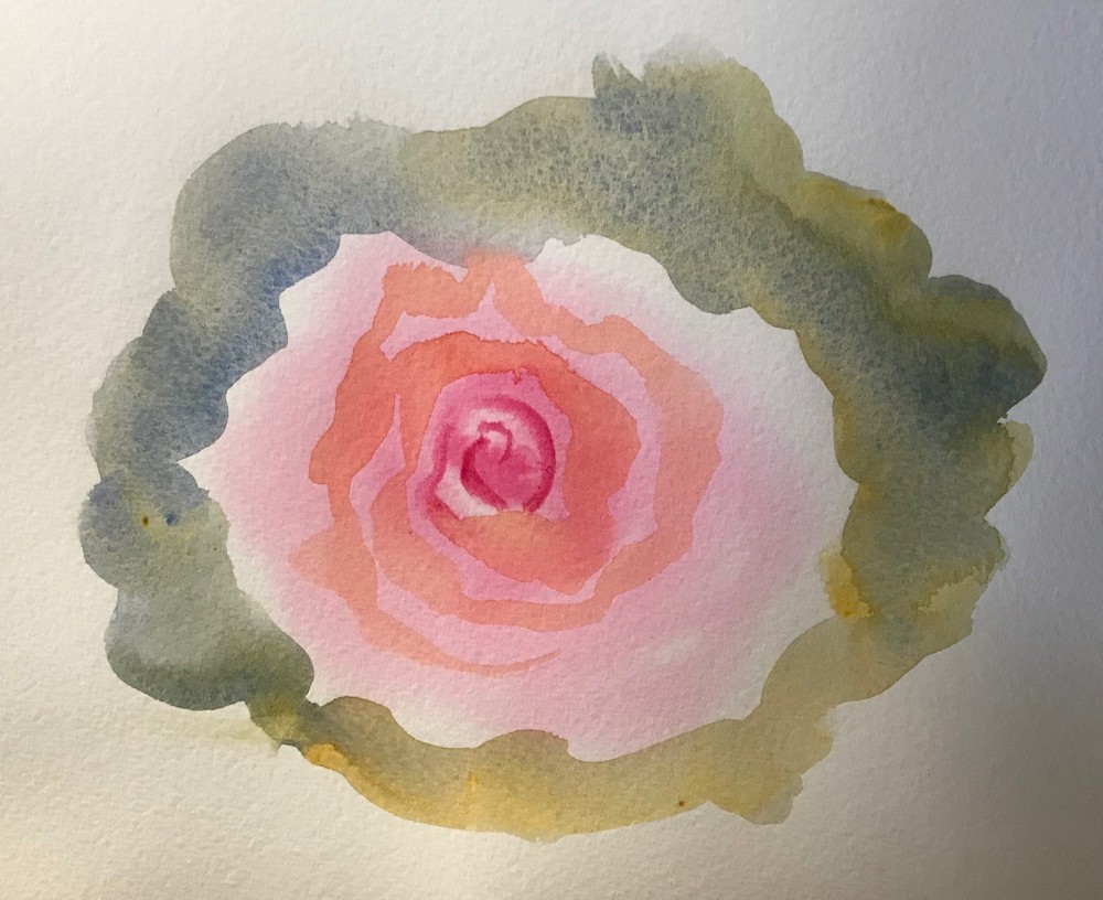
Four stages for night rose
This rose started with a few arc shaped swirling brushstrokes that I gradually dropped colour into while the paper was still wet. I worked out from the centre until the whole paper was wet. I left this wash to dry before rewetting areas of the paper and dropping in more colour and lifting colour where needed. I left the second wash to dry then added foliage on some wet and some dry paper. At this stage I was unhappy, left the whole thing to dry, rewetted some of the rose and much of the rest of the paper but left some dry and then dropped in some crimson Alizarin and Ultramarine which gave it a rich rather than fresh look. I allowed myself to go on an untried journey, making mistakes but learning all the time.
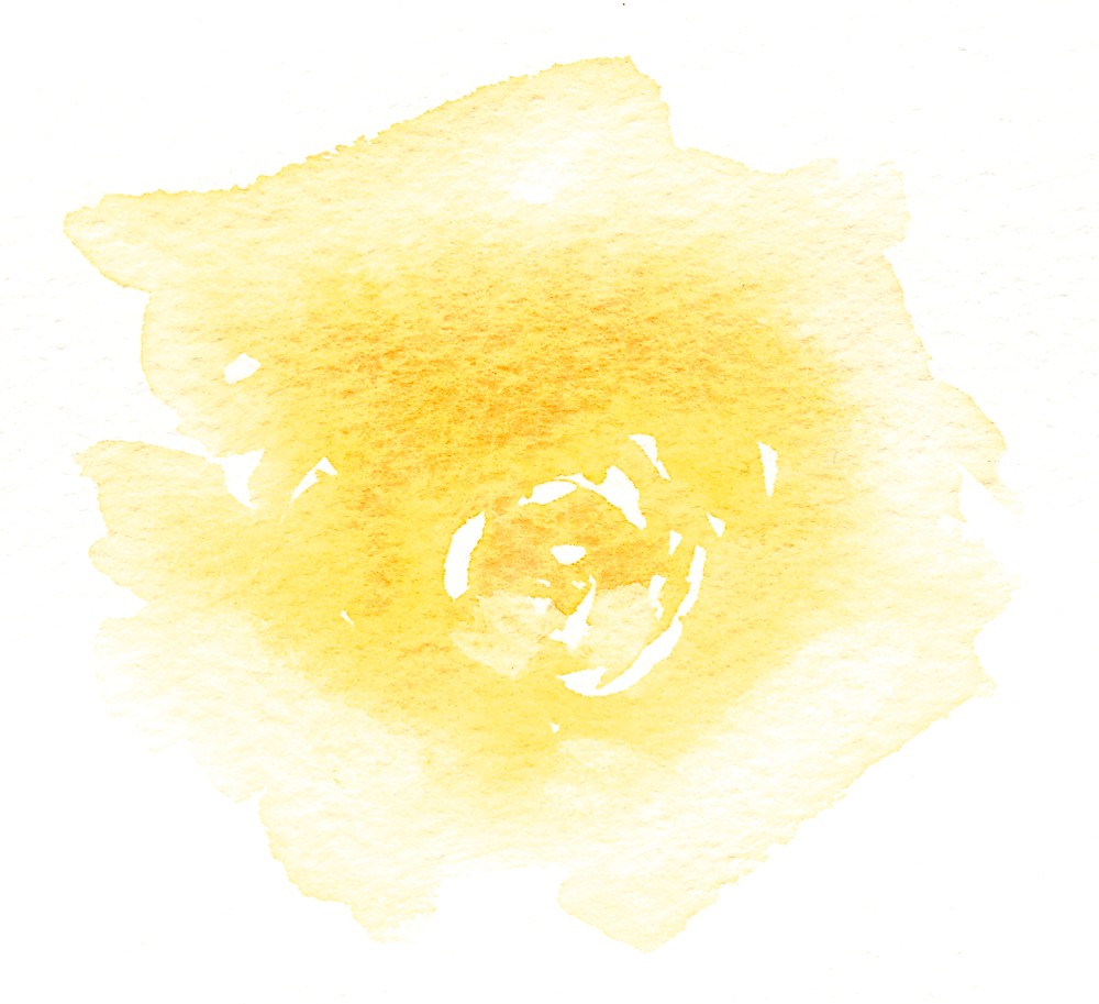
The yellow rose below was painted with a much warmer palette of Indian Yellow, Scarlet Vermilion, French Ultramarine and Burnt Sienna. I came across this combination recently from the artist Trevor Waugh and would encourage you to look at his flower paintings and also those of Paul Riley. When you have chosen your flower, try colour mixes with three or four pigments at the most to find which will work best. Do look at the leaves and stem too as very often the colours in the flower occur in lesser quantities in the leaves and stem. Experiment by trying out various pigment combinations and find out how your pigments behave on their own, in varying degrees of dilution, and then seeing how they mingle when allowed to flood into each other as well as how they act when mixed in the palette.
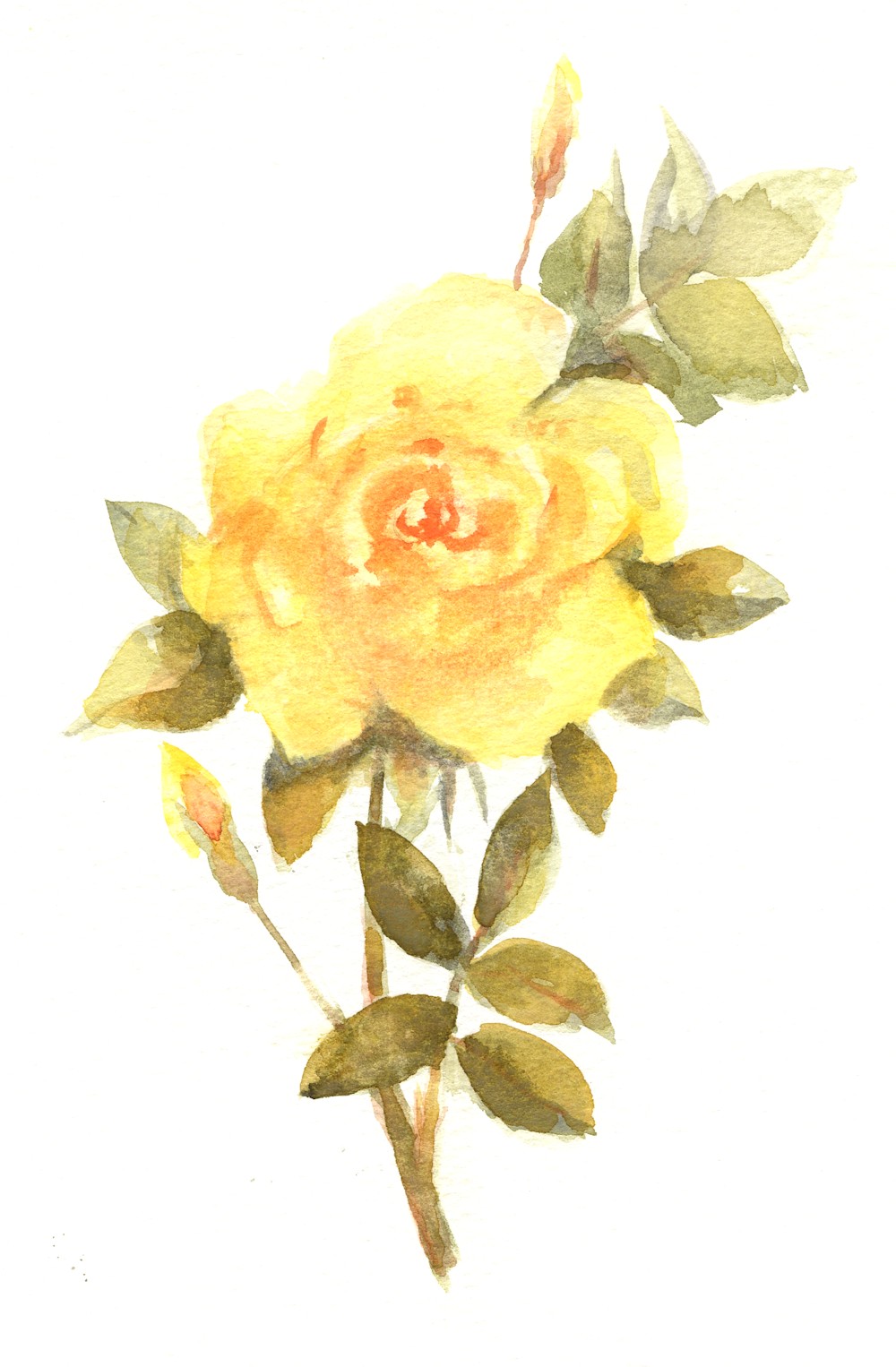
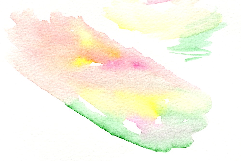
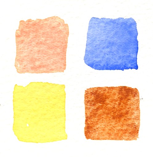 Clockwise: medium to pale washes of French Ultramarine, Burnt Sienna, Indian Yellow and Scarlet Vermilion. Sadly the Indian Yellow here appears too lemon; it is in fact a lovely warm yellow.
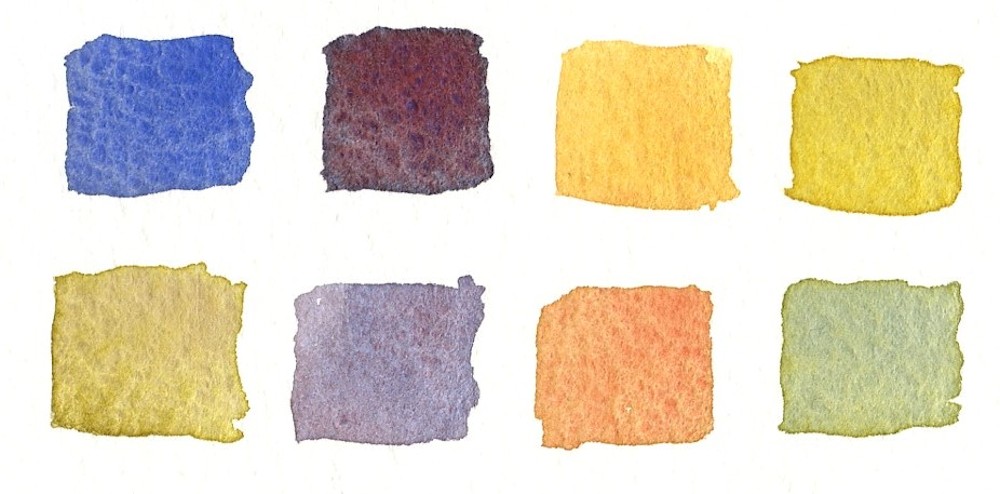
The same pigments mixed in the palette
Same pigments wet in wet
When working by dropping pigments on to each other while wet or dropping pigment on to wet paper the results are not always as expected; quite often the pigments mingle rather than mix as they do when agitated in a palette. Dropping pigment in to wet paper creates a very fresh look especially useful for delicate petals.
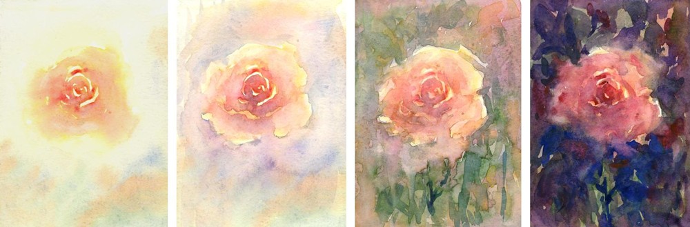
First trial wash for the yellow rose. I loaded a large pointed round brush with a fairly dilute wash of Indian Yellow and made spiral marks that echoed the shape of the rose leaving some paper bare. I diluted the wash as I worked outwards wetting much of the paper. I then returned to the still wet centre of the flower and dropped in more yellow and a little Scarlet Vermilion.
Colours decided I then mix up quite a quantity of the washes I wish to use and have the same pigments squeezed out or on wetted pans so that more concentrated colour can be quickly lifted when needed. When working with very wet colour always test the strength of your wash as watercolour always looks darker when wet. Having said that go quite gently when working with pale flowers.
Suitable papers for this way of working are NOT or Rough watercolour paper 300gsm or more in weight. If you are working on a small scale you may not need to stretch papers over 300gsm and this certainly is not necessary for experimenting with your colours. If you work very wet for your final paintings either stretch your paper or work on a block unless you have paper about 425 gsm and above or are prepared to work with less controllable washes and stretch your paper from the back afterwards.
With roses I often start by loading a large pointed round brush with pigment and making strokes that follow the petals as they spiral outwards; a series of arcs that describe the form of the flower, leaving little gaps where the palest areas are and loading my brush with more water as I work outwards till, if I wish to drop a background in I continue till the whole paper is wet.
I may at this stage drop some pale pigment into the centre of the flower and the same or other pigments into the background. As the wash dries I can continue to drop more pigment in, becoming gradually much more strategic about where, and lifting out pigment in places where needed. It’s hard to put all this into words so I hope the images will help and give you some ideas about how you may like to work.
After getting the first wash down with at least some some wet in wet passages, I let it dry, then re-wet the paper where I want to deepen the colour by dropping more pigment in, or work wet on dry to add leaves and stems. Another good tip when rewetting paper is to rewet a much larger area than you intend to deepen with more colour. It is much easier to avoid unwanted hard edges. It is also a good idea to work leaves with a large brush so that the shape can be described with one or two stokes. The paper will still be damp enough for you to drop more colour or a different colour into your leaf before it dries. As with everything practice on another piece of paper first.
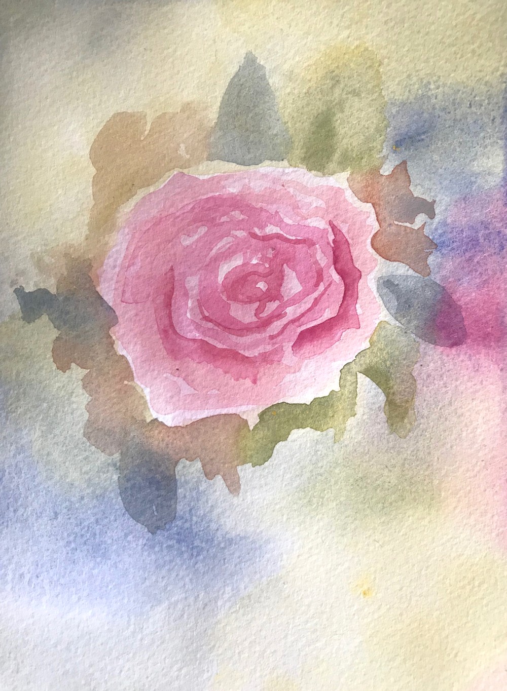
Deep Pink Rose; pigments; Permanent Rose, Cobalt Blue, Cadmium Lemon
Gradually build your painting up till you are happy with it but be prepared for accidents that happen with washes. Also work in the knowledge that you can soften an edge after it has dried with a brush, damp natural sponge or a piece of tissue paper after re-wetting the area. You can also lift out pale areas of petals and or background in the same way.
The number of pigment combinations possible is enormous but I do recommend you use only three or four pigments for the whole of each painting. Try to find how many colours your can make from the pigments you choose and think about whether you need a cooler red or a more lemon yellow etc for your particular flower. Experiment with all the pigments in your box then select your three or four. At first I would not advise using black or Payne’s grey as such beautiful neutrals can be mixed, and result in a more unified work.
Don’t listen to the words, look at the pictures, observe your flowers, pick up your paints and have fun!
Your Paintings:
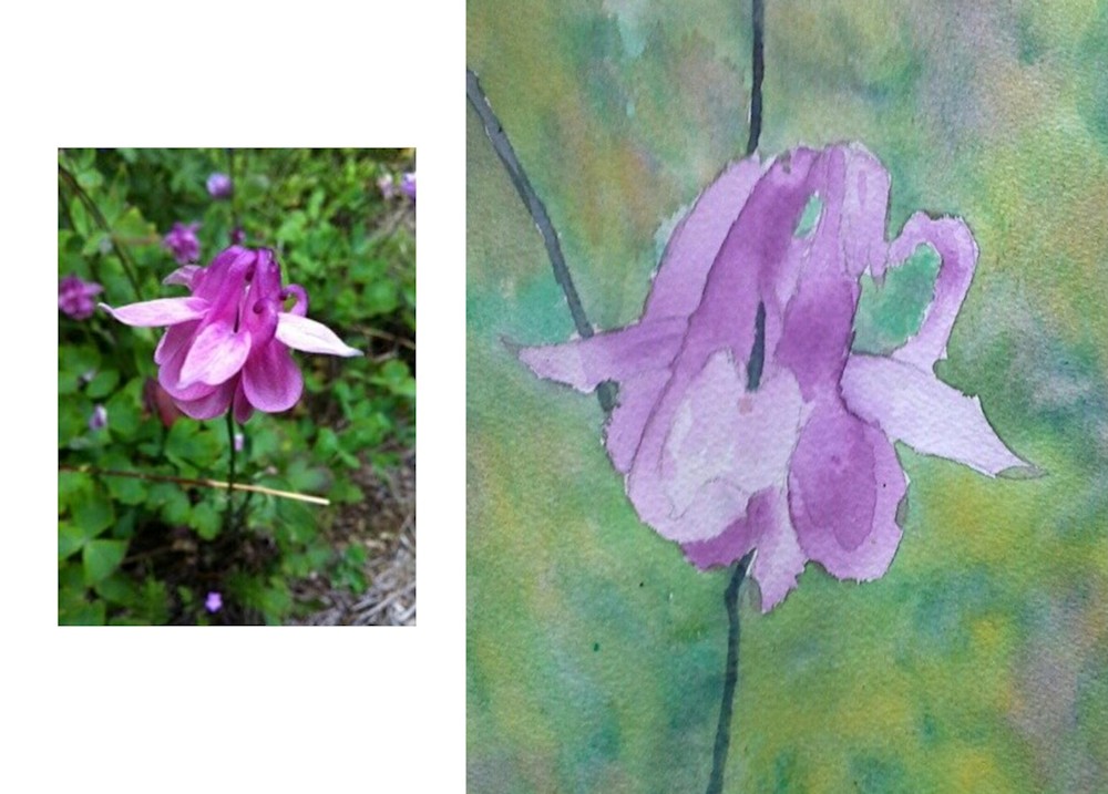
Aquilegia: watercolour and photo reference by Angela
Archway Rose by Roger
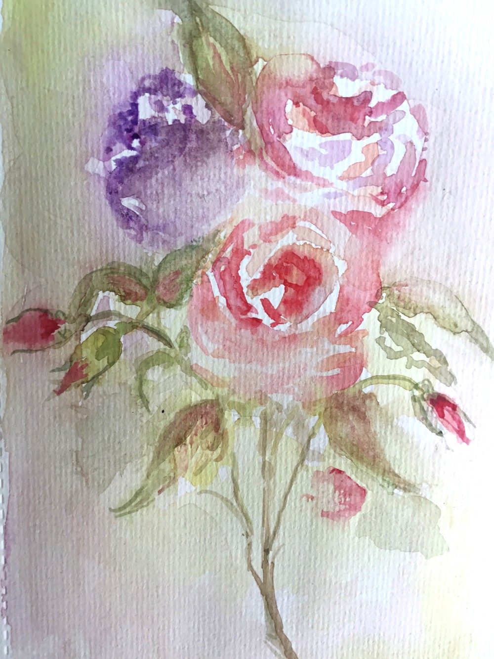
Roses by Ann
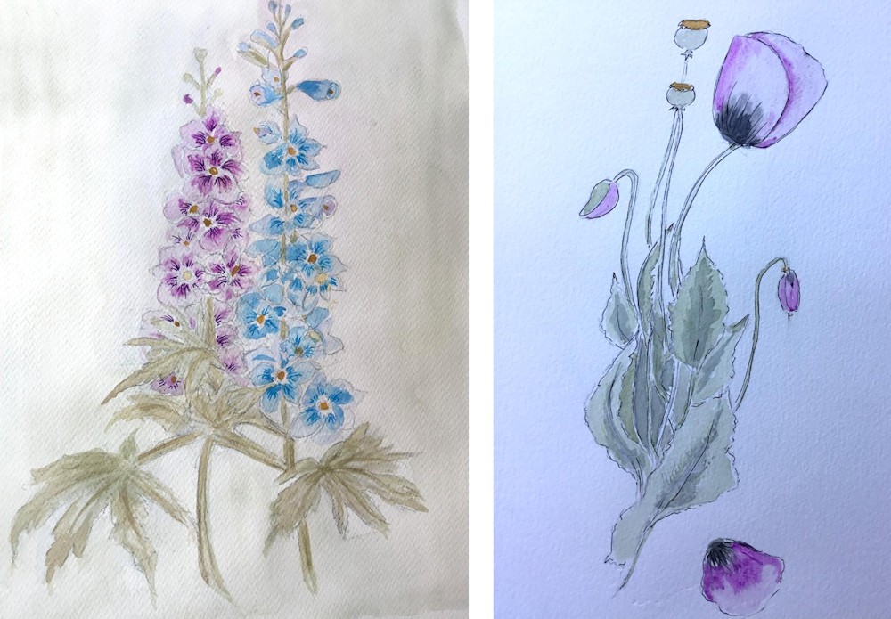
Delphinium and Poppy by Ann
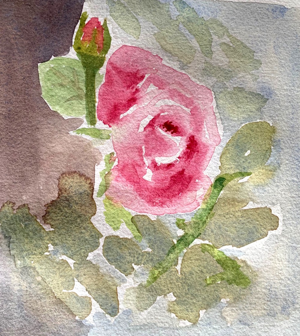
Roses by Heather
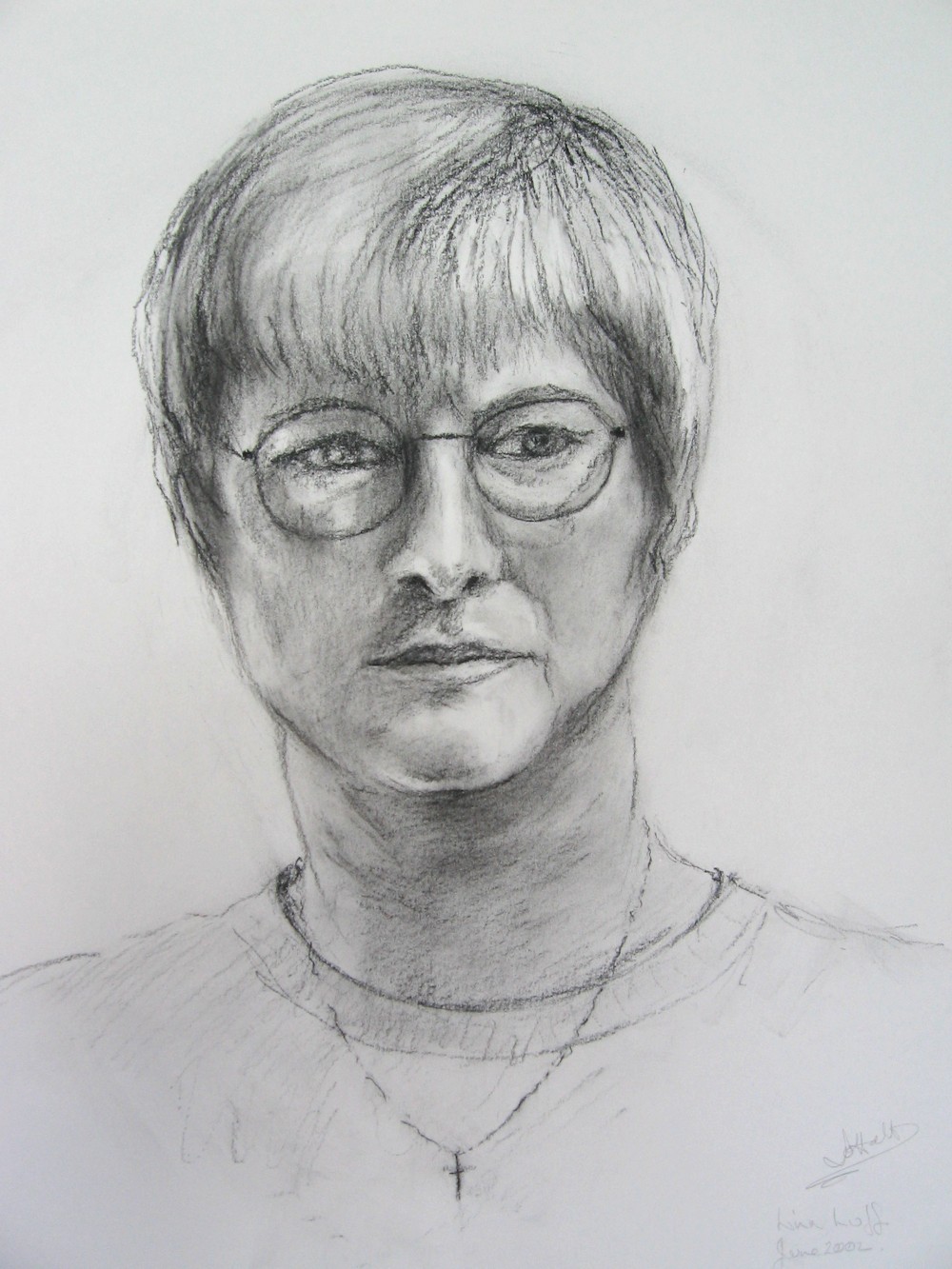
Rose by John
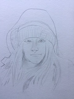
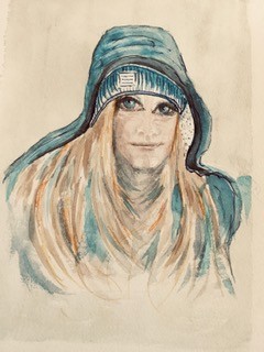
Flowers by Liz
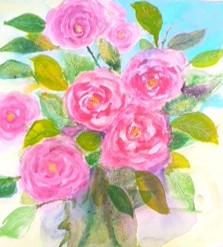
Roses by Maricarmen
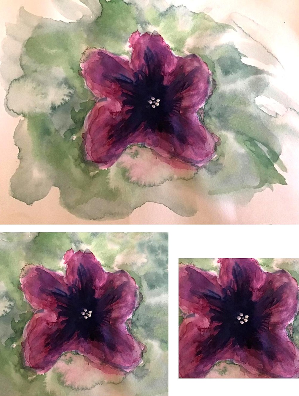
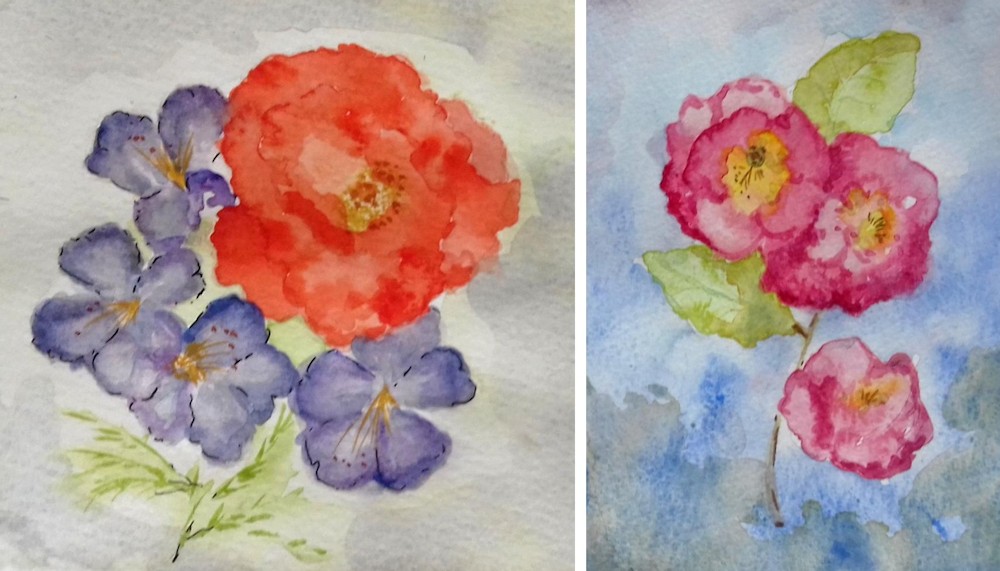
Petunia by Rosemarie
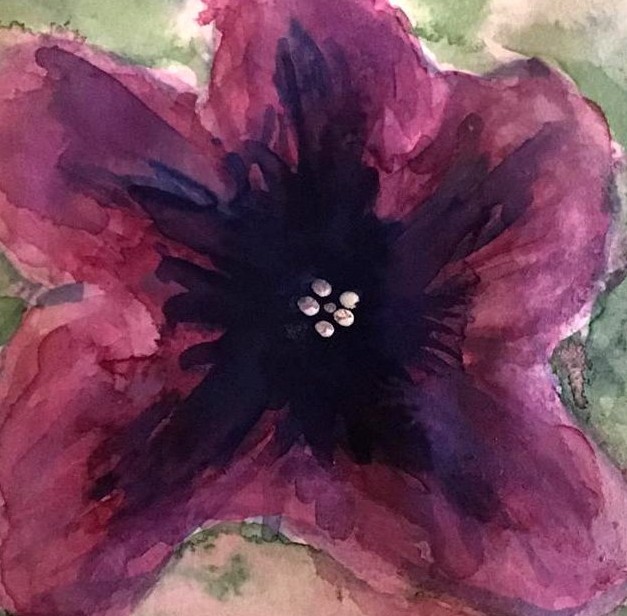
Petunia by Rosemarie
Orange Rose by Sandra
Red Rose by Sandra
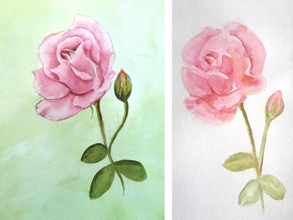
Pink Rose by Shane
Pink Rose 2 by Shane
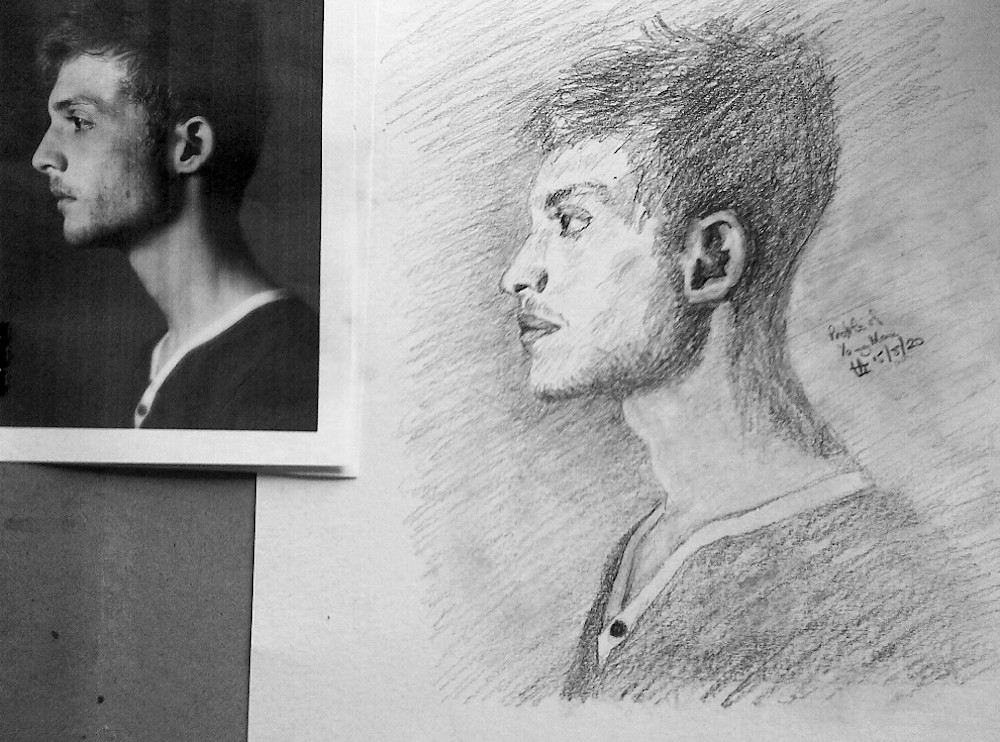
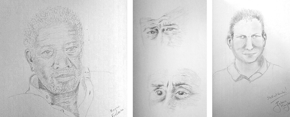
Thinking about portraits 2 Profile View
May 18, 2020
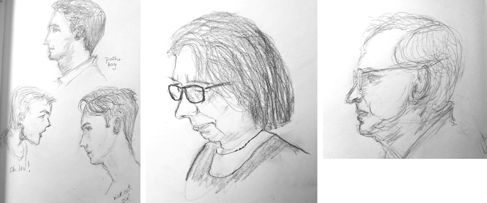
Last week we looked at the head from the front. This time we are going to consider the profile view. Four years ago I ran a short course called ” Eyes, Ears, Nose, Mouth, Face” in which we explored facial features each week, alone, and in context with the rest of the head. For the last week we had a delightful model called Lea but for the first four weeks our models were each other. The students kindly gave permission for me to photograph their work and publish on my blog or social media pages. The drawings of Lea and Colin below, are among my favourites for their observation of the models and for their very different drawing styles.
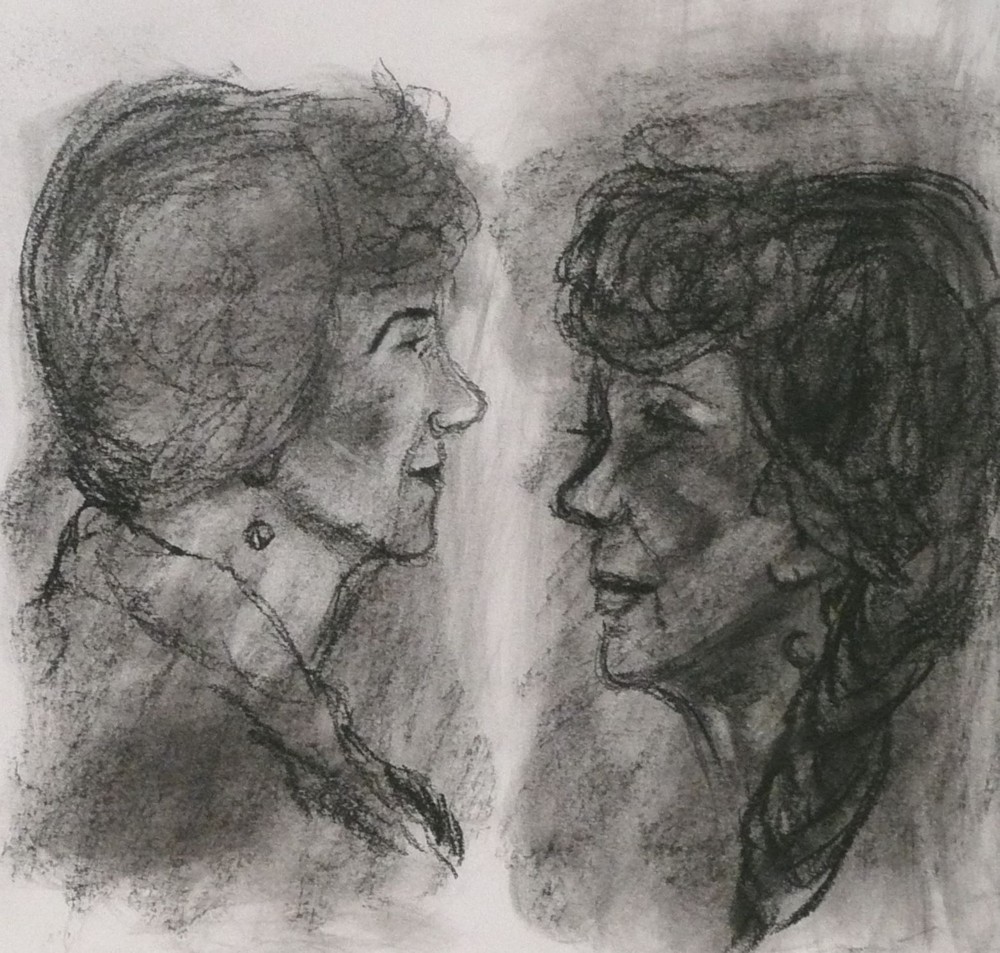
Lea; in charcoal
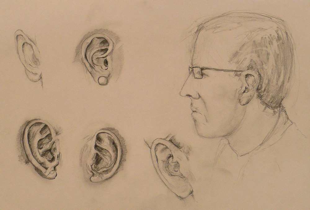
Colin: in pencil
Below is what I can only call a photo-fit of a fictional face but note just as the eyes are about half way down the head in front view the same applies to the profile view. All the features and the shape of the forehead are revealed in the profile view including the ear which may be seen totally or obscured by hair. Often when someone turns sideways we are surprised to find a nose that is a very different shape to what was imagined from the front. The information in profile view is quite different, lacking wholly the other eye and the other side of the face. It is why the most informative view and that which is perhaps most popular among portrait artists is the three quarter view because partial information about the face in profile and full face is combined, but more about that in two weeks time.
Here are a few suggestions for this week’s challenge.
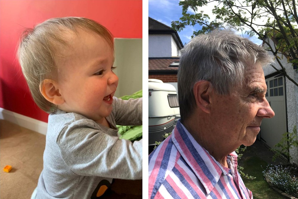
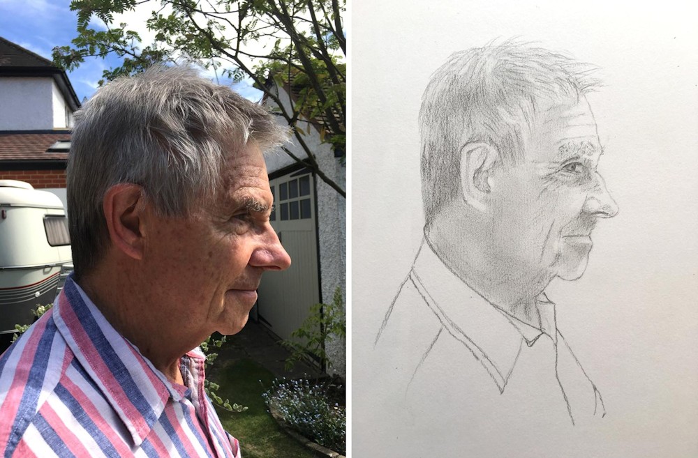
Try finding some photos, preferably of someone you know in profile view, and spend a while just looking before drawing, better still if you have someone at home willing to sit for you. Look especially at the shape of the whole head and the placement of the ear. It may be further back than you might have thought. Look also at the relation of the line of the jaw to the ear. See how different the eye looks in this view. Look at the angles and shape of the nose and its relation to the eye socket and upper jaw.
When you start to draw sketch the largest shapes first and loosely enough so that you can refine the shapes as you work, always bearing in mind the relationship of the shapes to each other. Start to block in tones as you go, lightly at first and as your drawing becomes better defined work on the tones making them communicate the forms more strongly. Think about the underlying shape of the skull before adding the masses of hair.
This first drawing will have made you question. Next try drawing from life or from photographic reference the eye or both eyes, the nose and the mouth in full face and profile views. Also practice drawing several ears. You may like to try making a silhouette head and placing the ear.
When you have tried some of these exercises make a painting of a of a head in profile. If you prefer to continue drawing perhaps try making two further drawings one of a child and one of an older person in profile. What differences do you notice and how do they affect the way you draw?
Your Work:
Hope by Shane
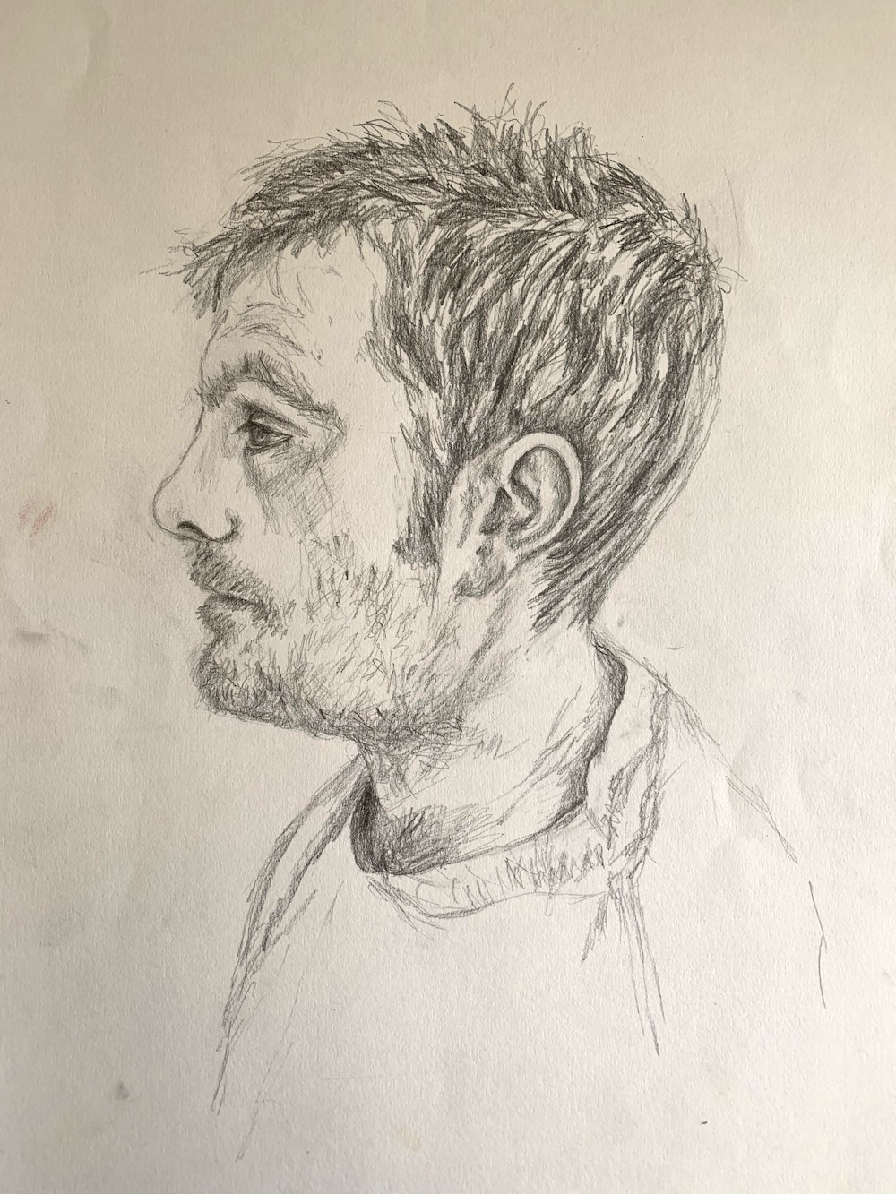
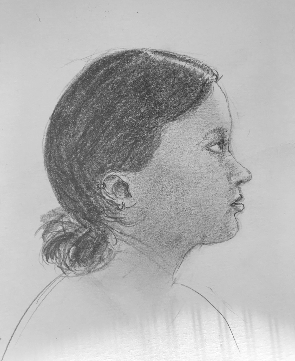
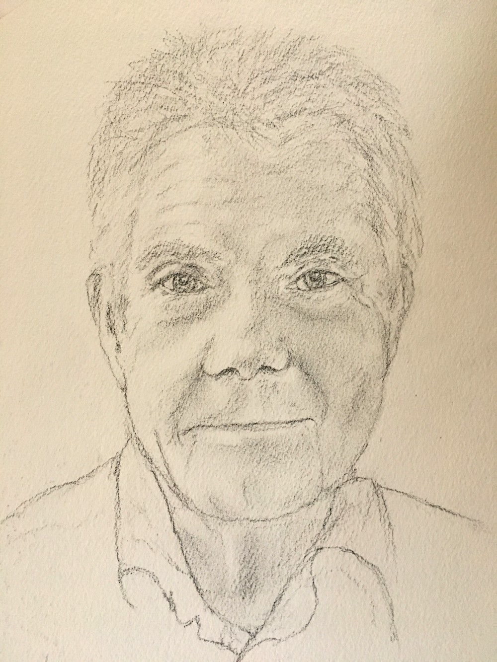
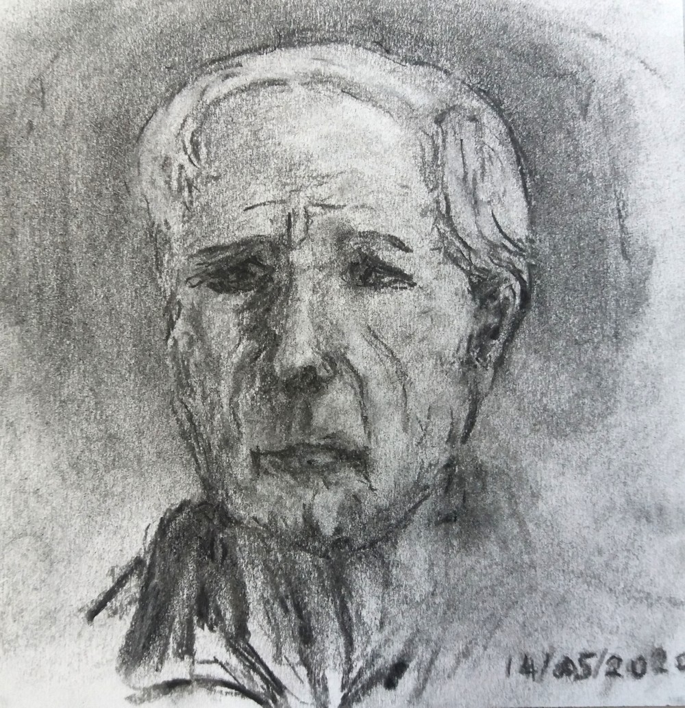
Richard by Jan
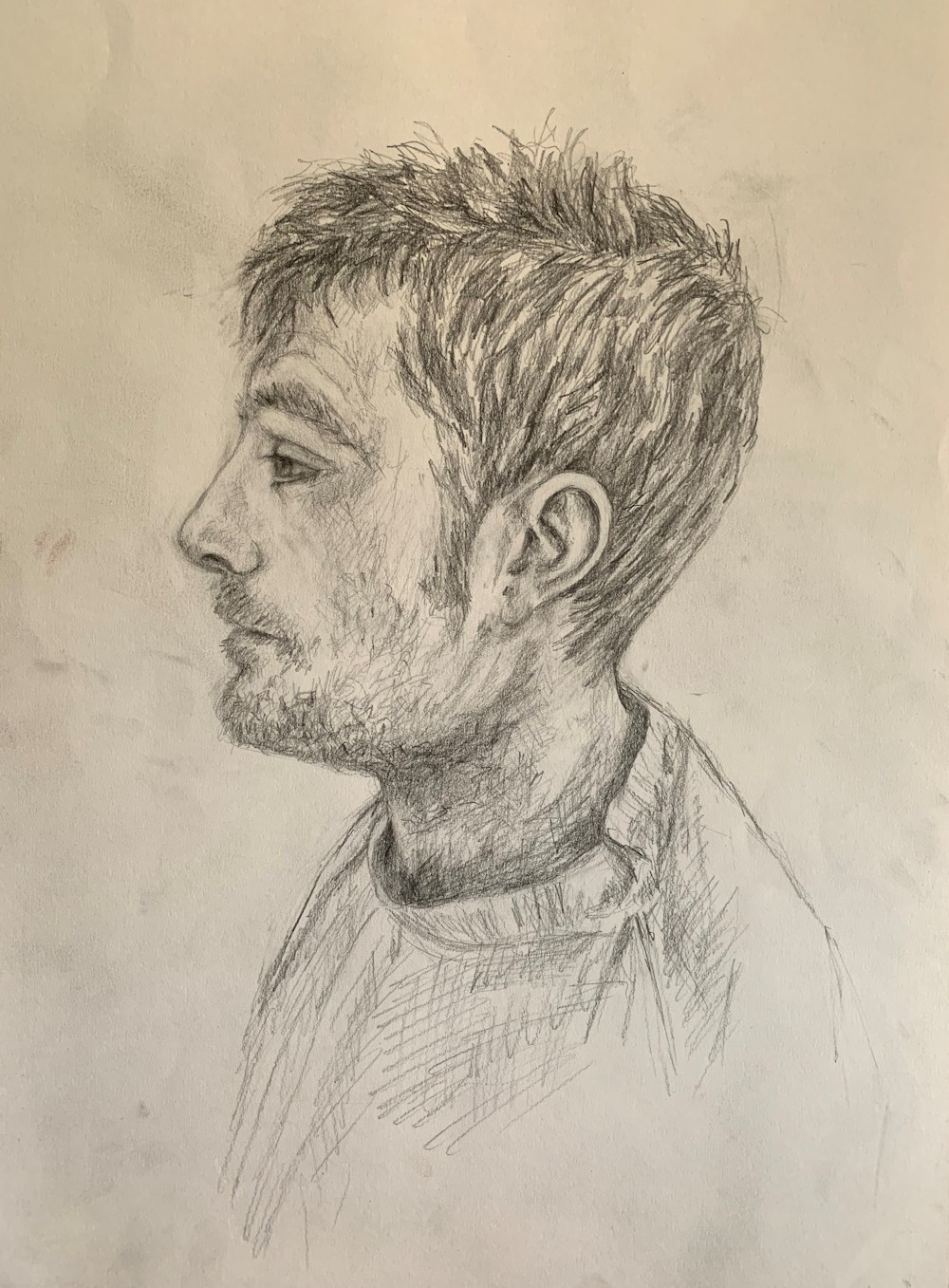
Richard: Jan has developed and reworked some areas of this drawing
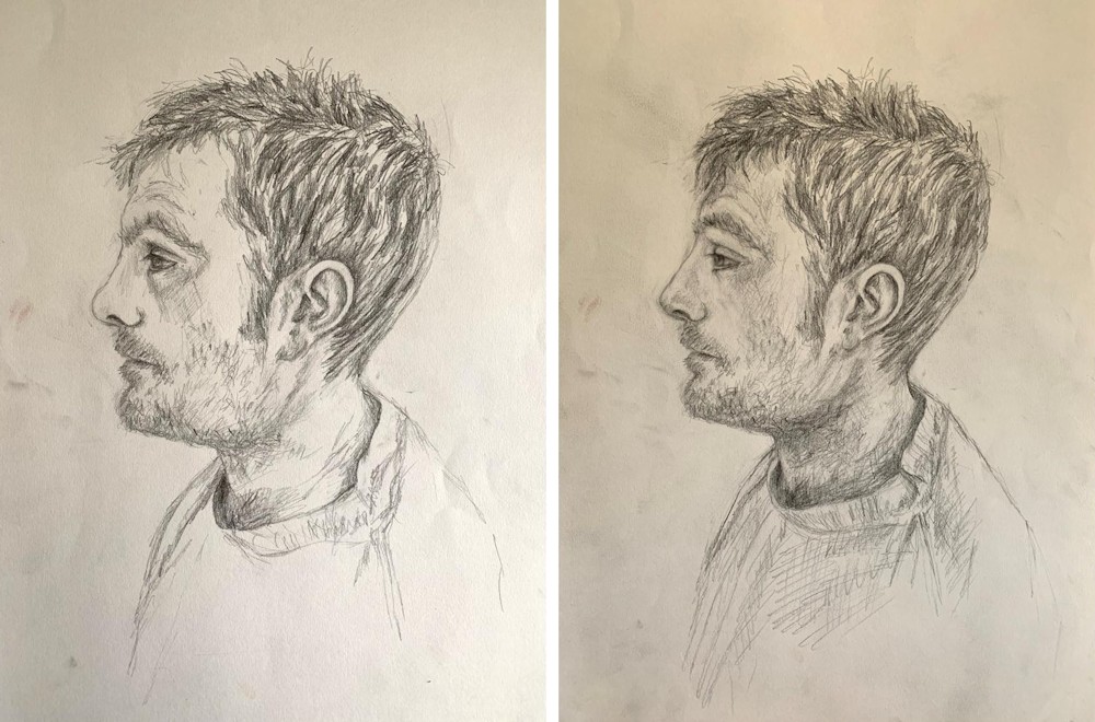
Jan’s drawing of Richard at both stages for comparison
Young Man by Angela with reference
Angela’s reference was in colour but I converted to gray scale so that everyone can see the tones in the reference. I would love to see another drawing or painting where the tones were as in the reference. When painting tonally the shapes of the back of the neck and hair are “lost”; the similarities in tone merge the head into the background. Another important lost edge in this reference occurs under the chin. These very soft almost indiscernible edges contrast with the sharply defined edges of the young man’s brow, nose, chin and front of the young man’s neck. In drawing it is good to be aware of all the structures and edges and then to think about the lost edges that will help the portrait to sit within the volume that the work is depicting. If too much emphasis is placed on delineating all the edges with sharp difference in tone between the background and the model, the artist risks the model appearing as a cut out on top of rather than part of the work. The drawing here is helped by the texture of the hair which softens the tonal differences with the background and also the well observed shadow in Angela’s drawing, under the chin. Love Angela’s handling of the hair!
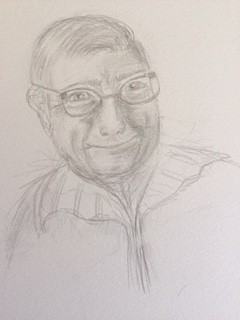
Drawings by Vivienne and Roger
Archie and Chris photos by Heather
Chris by Heather
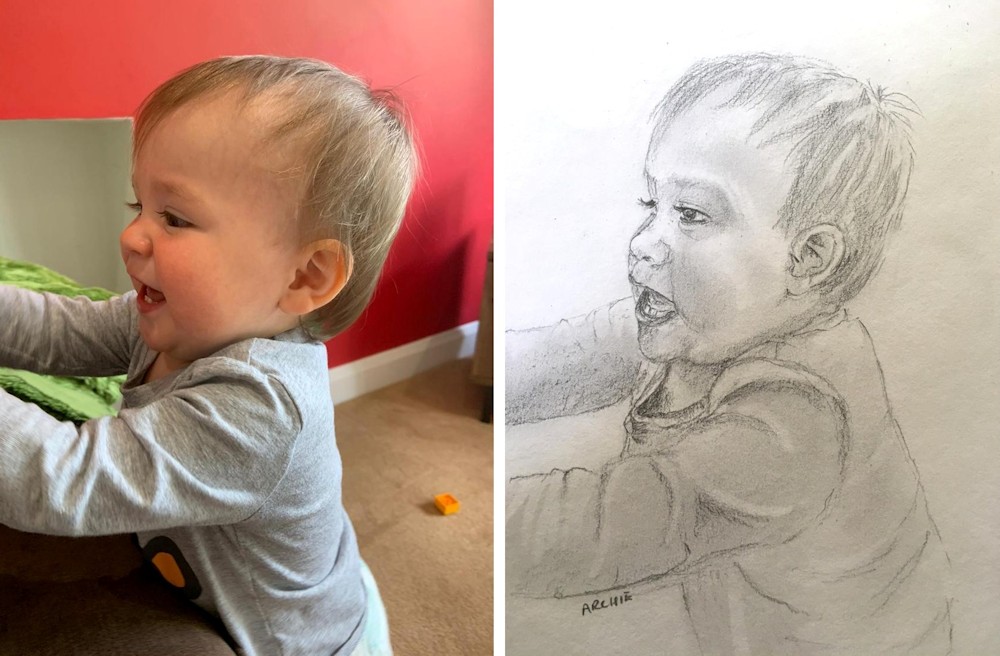
Archie by Heather
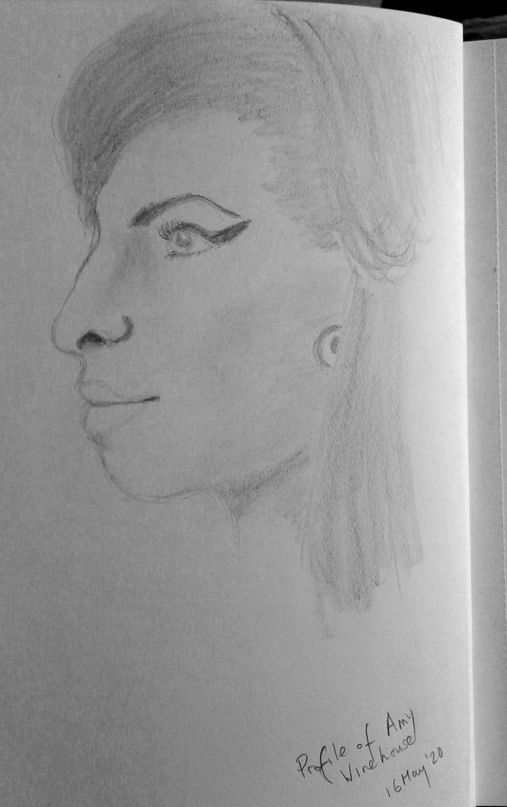
Amy by Barbara
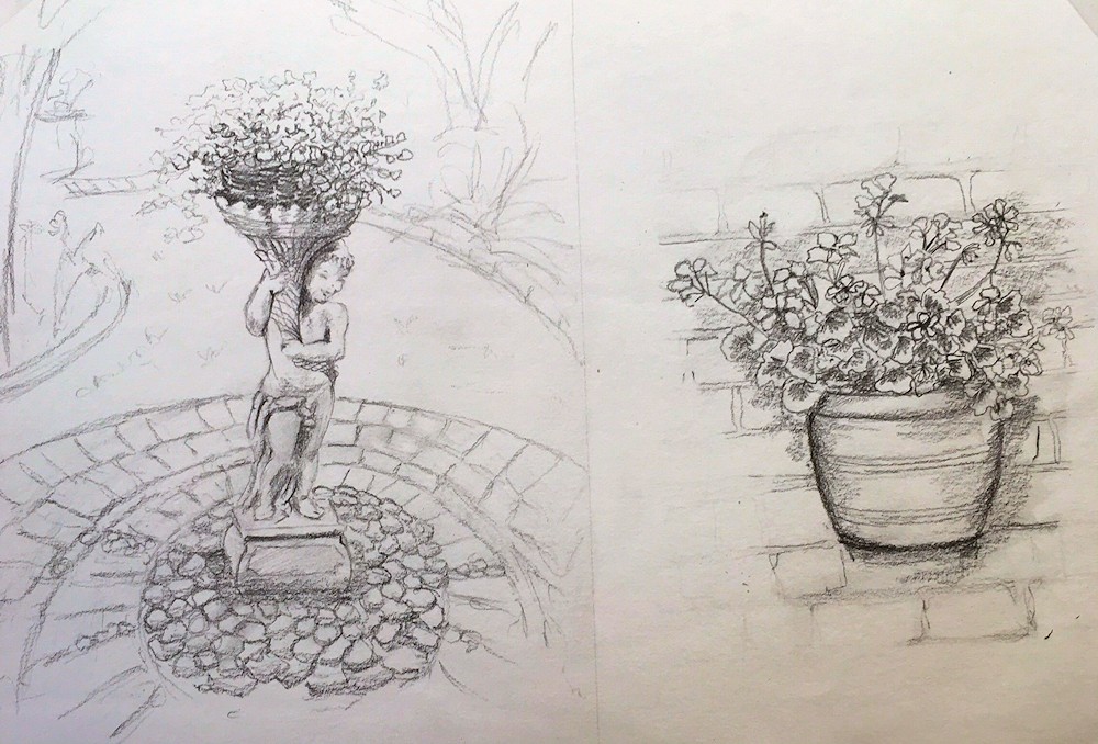
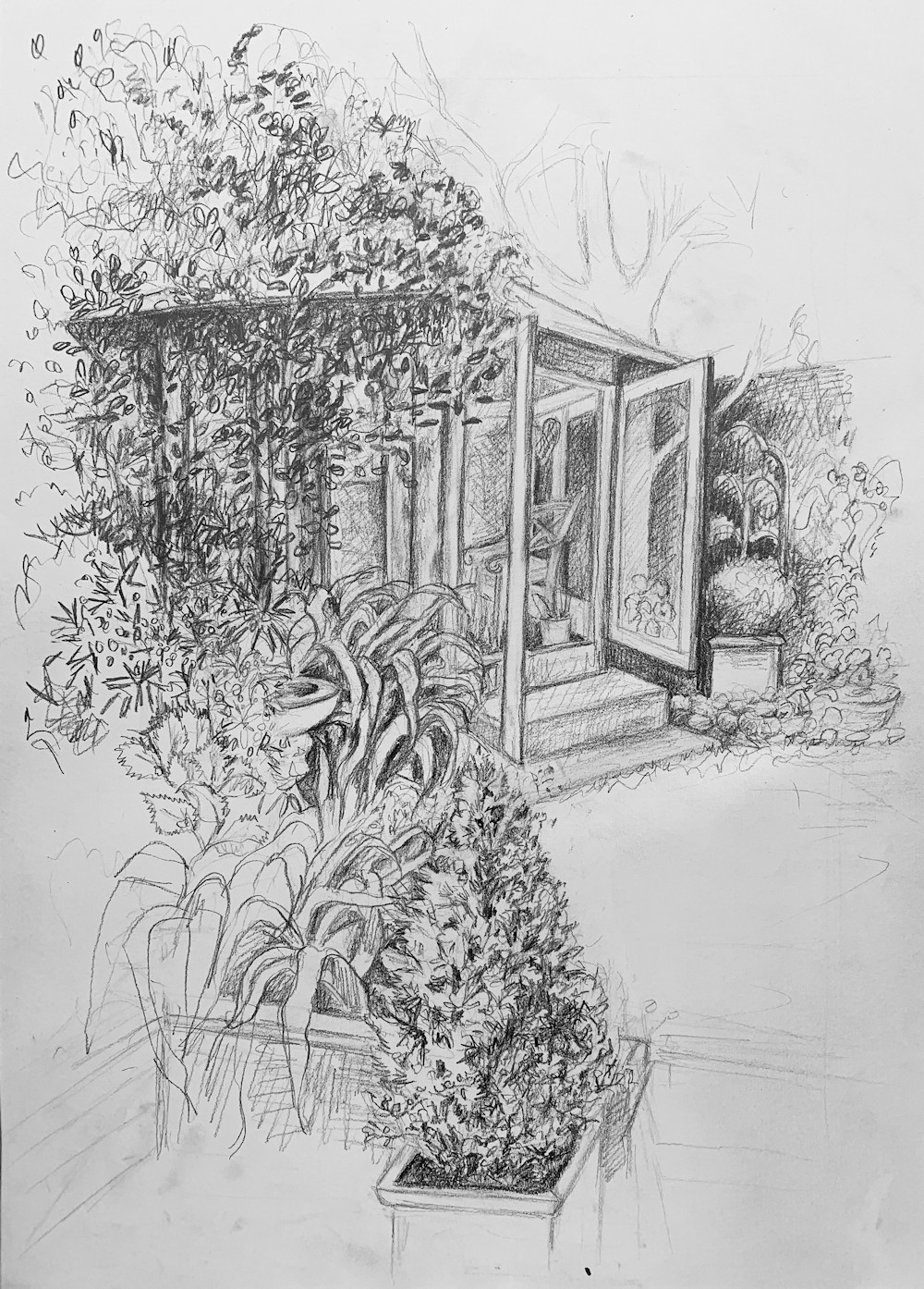
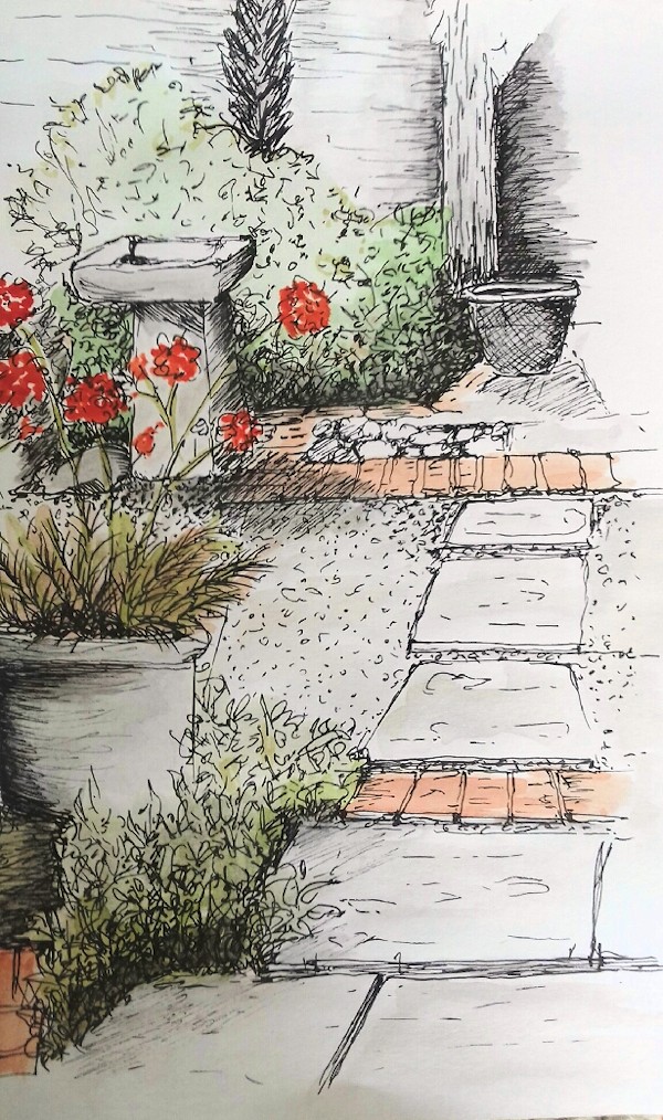
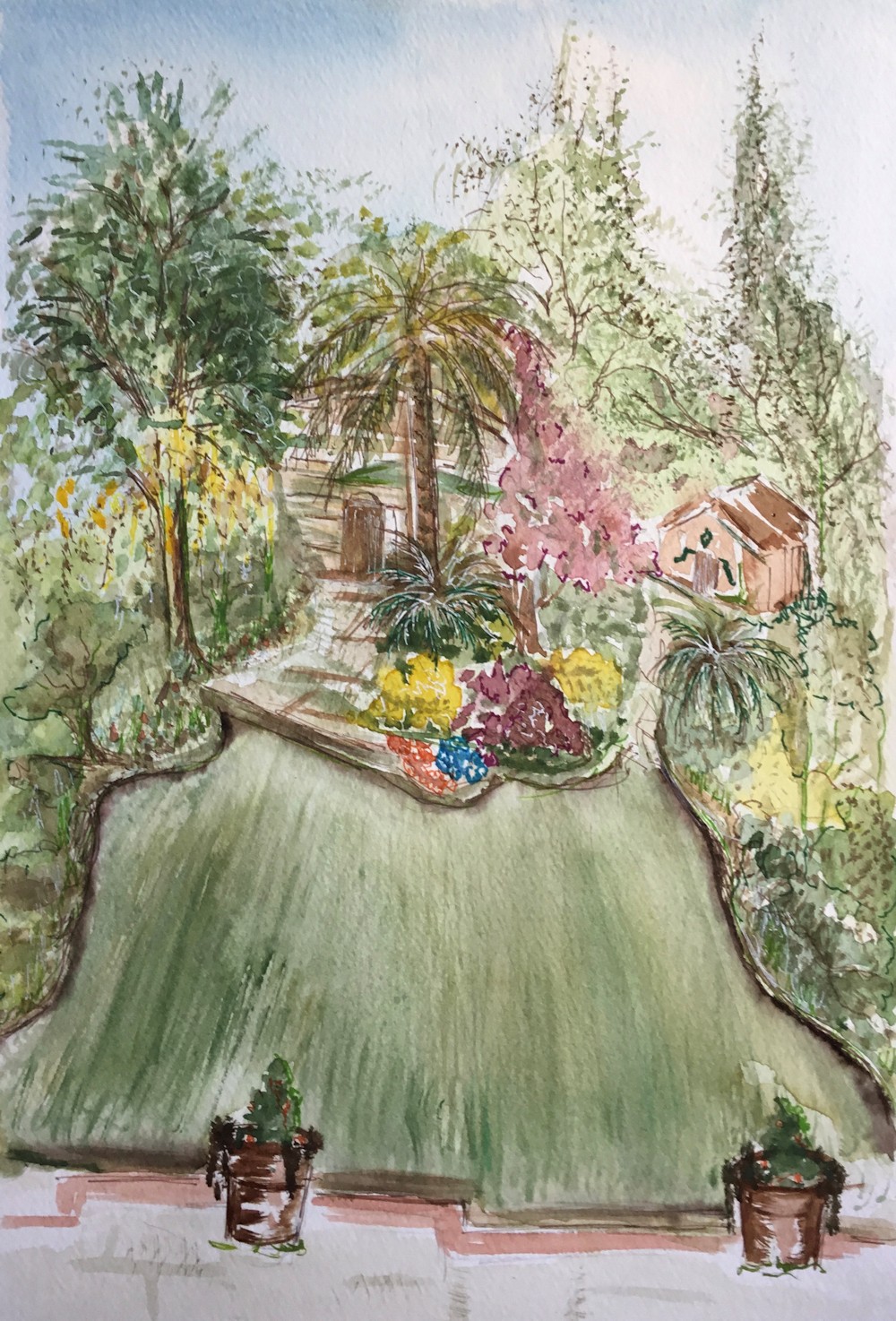
In the Garden: garden tools and features
May 12, 2020
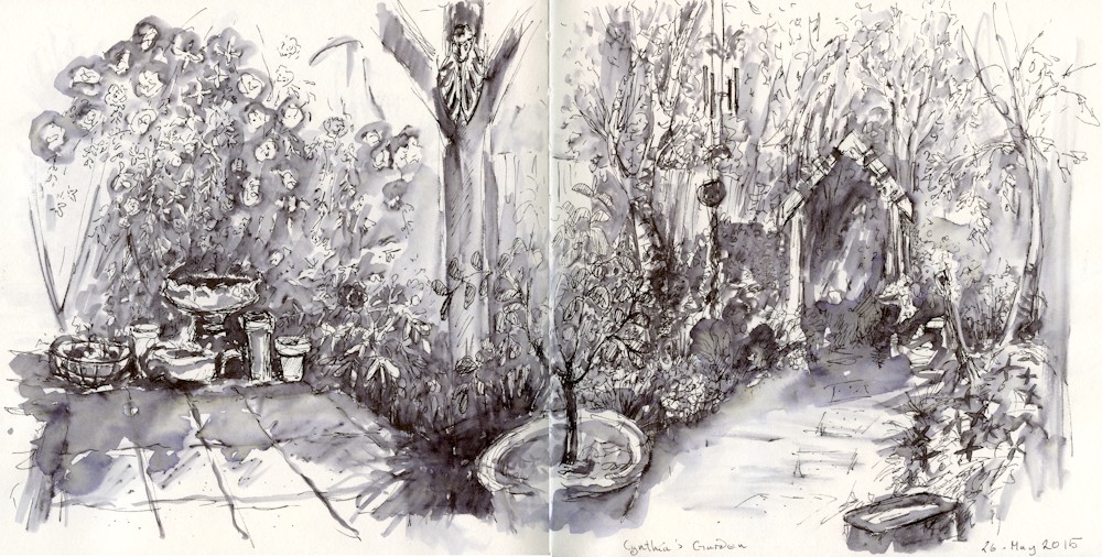
Cynthia’s Garden; watersoluble ink
This week’s challenge is to draw something found in a garden; anything from a lawn mower to a fishpond, ornament, watering can, topiary shears and a ladder if you have a very grand garden or remember what it was like to visit one! or perhaps a simple bench with a backdrop of flowers.
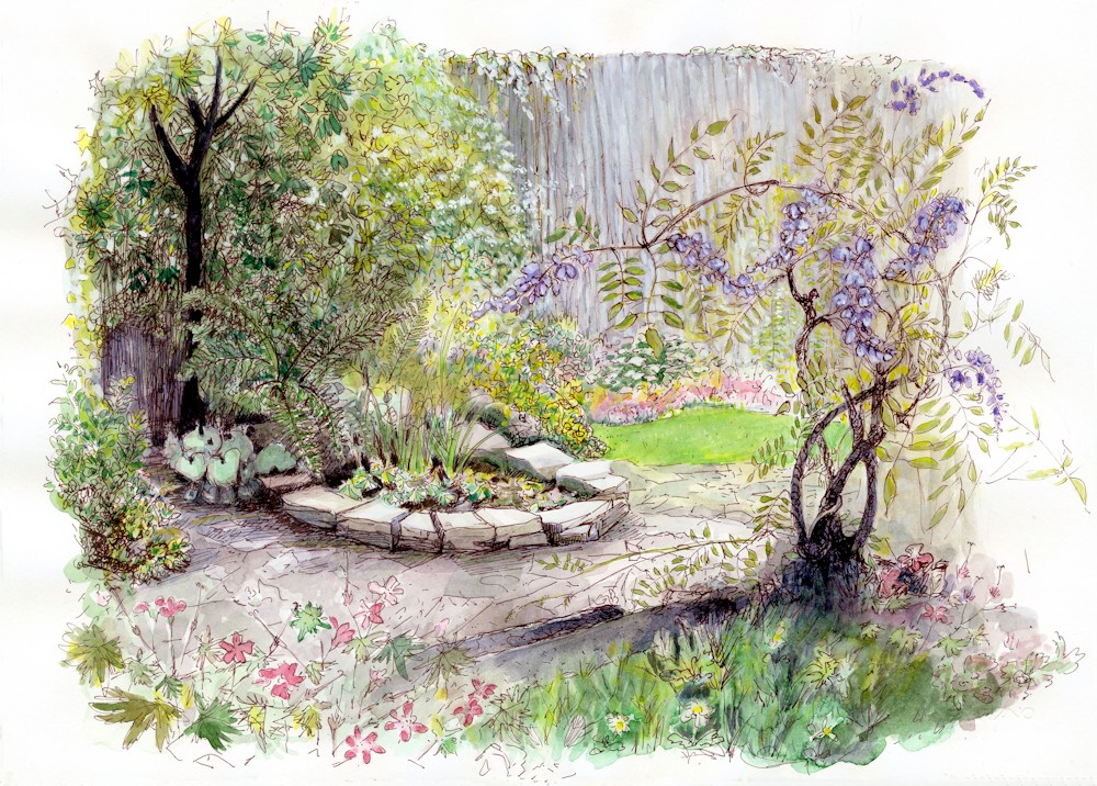
Vida’s Garden; sepia ink and watercolour
If you usually draw in pencil, try ink and a wash or two of watercolour.
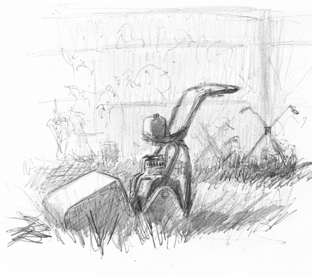
Matt’s Mower: pencil sketch
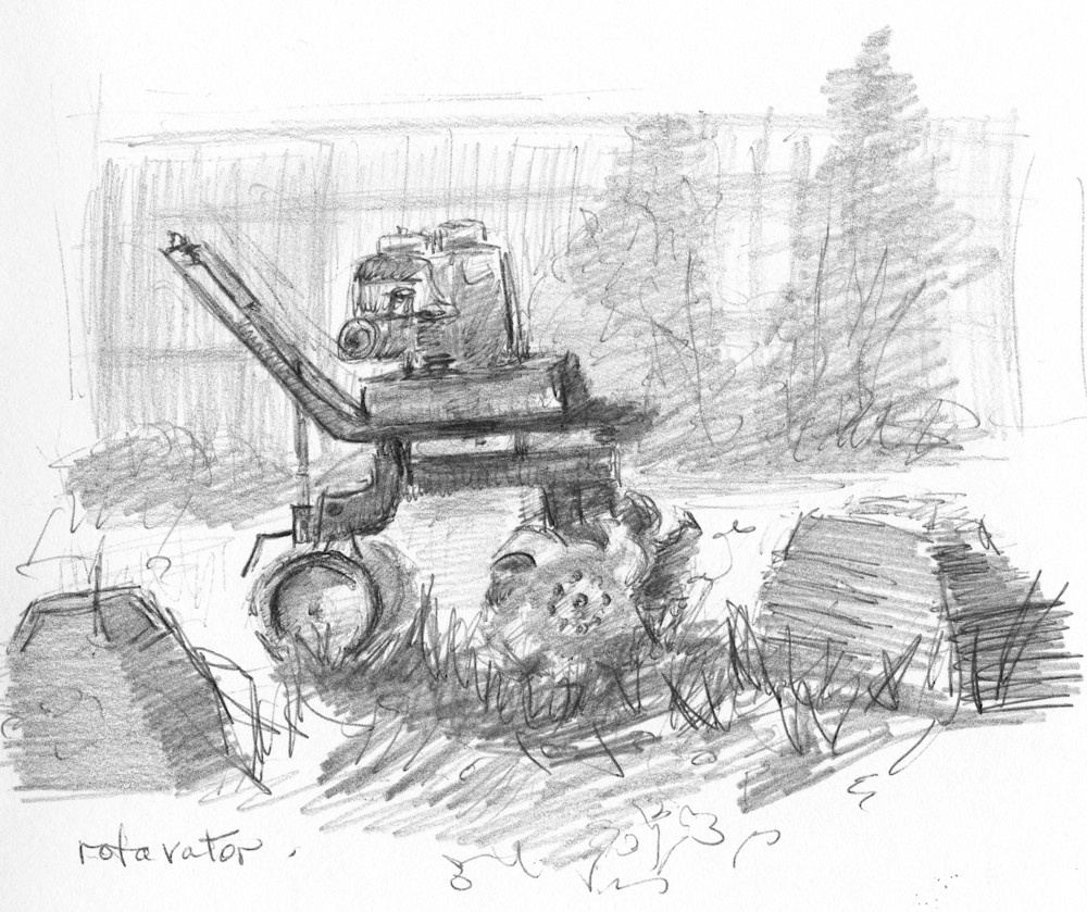
Rotavator: pencil sketch
If the weather is cold settle for doing a few sketches on the same page of a sketchbook with a view to painting a more considered work indoors with a warming coffee.
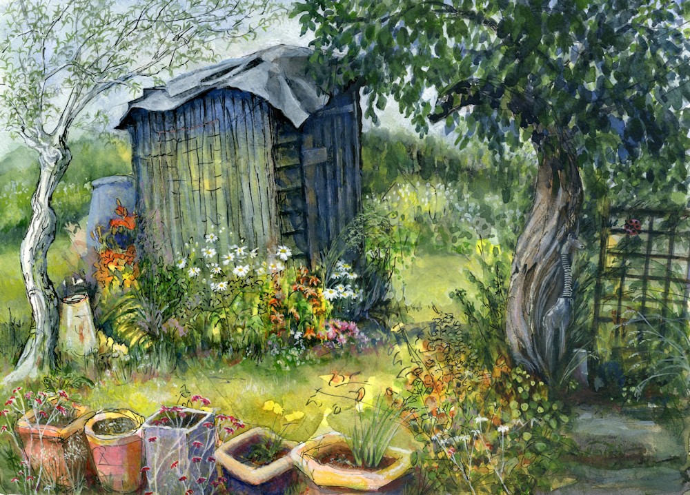
The Blue Shed: mixed media with collage
Hope these give you a few ideas!
Your Paintings and Drawings:
Garden Scene; watercolour by Maricarmen
Drawings by Heather
Summer House by Jan
Bird Bath; Ink line and watercolour by Liz
Lawn: watercolour by Ann
Water Feature: pastel by Ruth
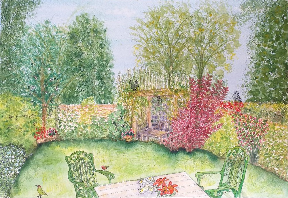
In the Garden by Jan: pen and ink
Thinking about Drawing Portraits 1 Full Face
May 5, 2020
Lea: pastel detail
I have been asked to present a portrait challenge so I’m going to do three but every other week so that in between we’ll concentrate on the outside world of gardens, flowers and lawnmowers! We’ll be considering full front, profile and three quarter views and if you get really hooked the back of the head, though that may get left till I write a post on hair.
When you set about drawing a portrait head there are several considerations;
How much of the sitter to include apart from the head?
Even if the head is viewed full front is the sitter’s body also facing front or is the neck slightly turned?
Which direction does the main light come from?
Lit from the side the contrast between one side of the face and the other may be dramatic.
How do the features sit within the general form of the head and what is their spatial relationship with each other?
What measurements should I make to help construct a framework to build a convincing drawing?
Then the most important question:
What is it about the sitter I want to communicate and what will be the mood of the drawing?
Below are three very different portraits made for different reasons and from different kinds of reference;
Mysterious Mr.X: pastel pencil
This small portrait in scribbled pastel pencil began as a thumbnail sketch of a convicted criminal in a Russian Jail. I didn’t visit; he was featured in a television documentary. There was no time for detail, just an atmospheric drawing of a person possibly with much to hide but with a grim determination to carry on in harsh conditions. He is tight lipped and his eyes though open are scarcely defined.
He is looking straight at and through us, his face strongly lit from one side. The eyes are vertically in the middle point between the base of his chin and the top of his head and about one eye’s width apart. These measurements are approximations for when the head is turned fully towards us and this is true for nearly all heads, human heads, that is! In case the head is tilted a little it can be useful to make a feint line through the axis of the head before you start on drawing the features. I usually start by getting an idea of the overall shape of the head, sometimes measuring its overall width and height. I then indicate the neck and shoulders. After that I usually tackle placing the features, The eyes are usually in shadow so before marking out the detail I may work a pale layer of tone over the eye socket area.
Many people place the features with line, again usually starting with the eyes. Take care to look at the length of the nose, it is easy to make the nose too long. One famous artist quote is that ‘ the nostril is always nearer the eye than you think!’ Also the relation between the base of the nose and the upper lip and the lower lip to the base of the chin. Can you see the ears?
Lynn: charcoal, drawn from life
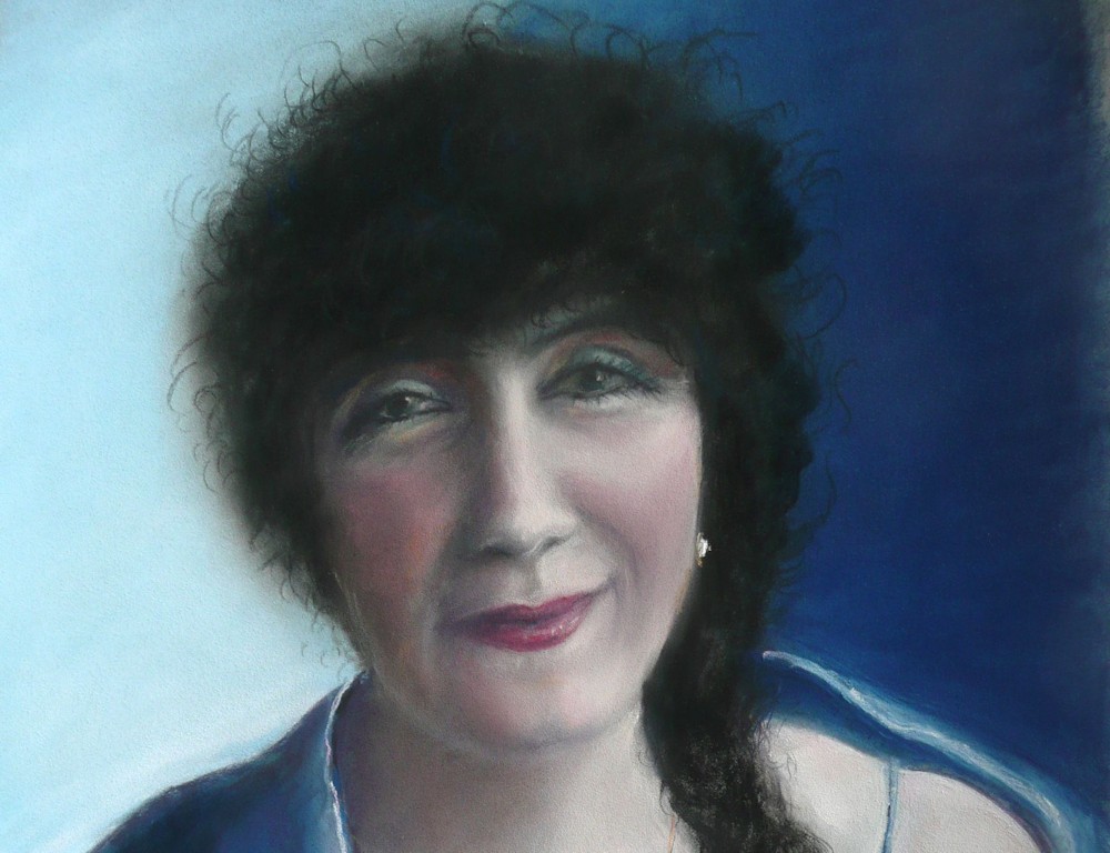
Place them and the mass of the hair if there is any! Then work tonally to describe the form of the head and ts features, adding any detail you feel is necessary. Look to see where areas of shadow are on your model or reference, especially under the nose, the upper lip, under the chin, the eye sockets and under the hair line.When you go back to working further on the hair it may be good to show the flow of the hair with line work in places but it can look laboured if you try to draw every individual hair. This is especially so if the tonal mass of the hair has already been well indicated. In the portrait of Lea below I scumbled masses of dark pastel so the hair became a texture. Always be guided by what you observe and use the appropriate technique. Explore line and texture on a separate paper, imagining the kind of hair you wish to depict.
For your first drawings use charcoal or pencil, about an A3 or larger sheet for charcoal and a much smaller sheet for pencil studies. You may like to make several quite small sketches in pencil, from different people or photos till you get used to describing various head shapes and features so that you become confident to tackle a more considered portrait.
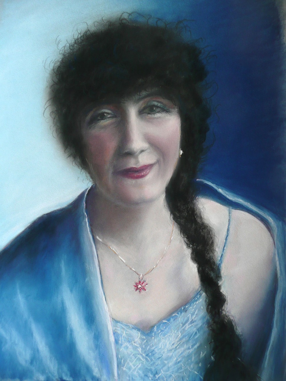
Lea: pastel from sketches made from life and a photographic reference
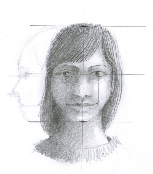
Tackle a portrait of someone you know, perhaps a family member either from life or from a photograph. Try to draw directly or scale up your reference by using a grid. Use a grid just to place the main features then draw everything with as free and fluent a hand as you can. But please do not trace your image as it may become wooden and not have your own personality in the line. The way we draw is as unique as our signature.
For the portrait of Lea I decided to include her cape and the top of her dress to show off her beautifully braided black hair.
Just wish you could hear her sing!
If you have not tackled a head before don’t worry about likeness just go for making a convincing head!
Your drawings and paintings;
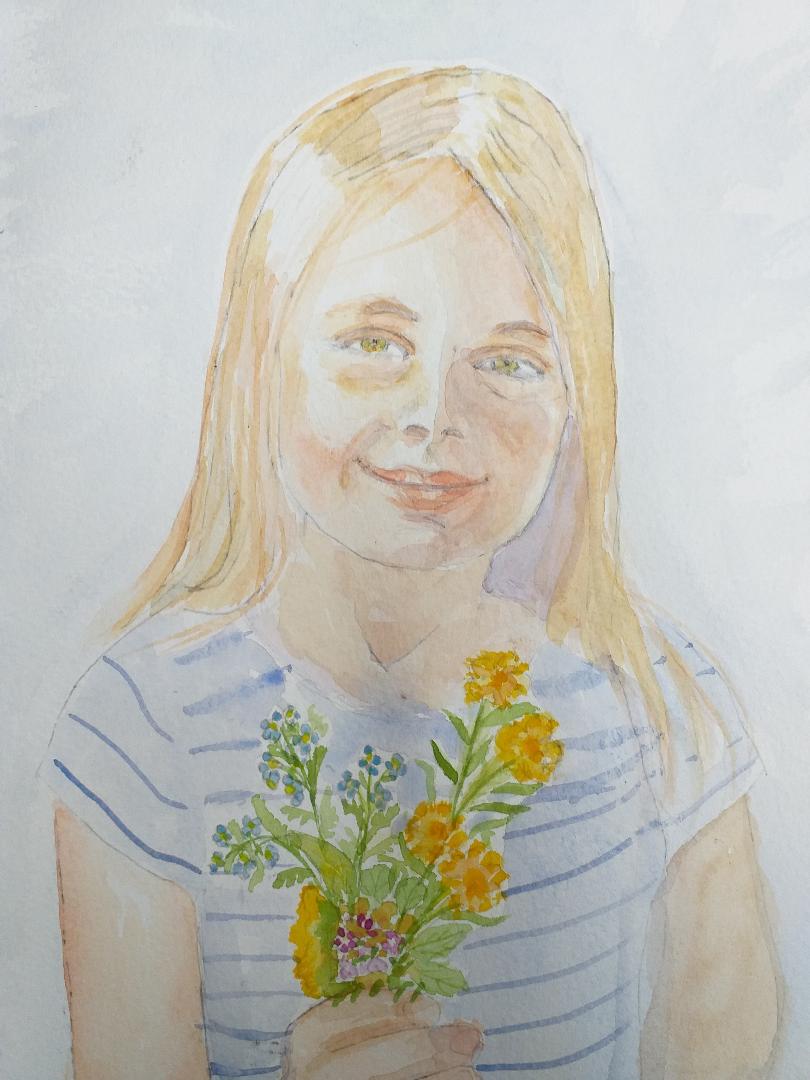
Maricarmen’s Grand-daughter
Portrait of Russell, Choir director, by Jan at a rehearsal
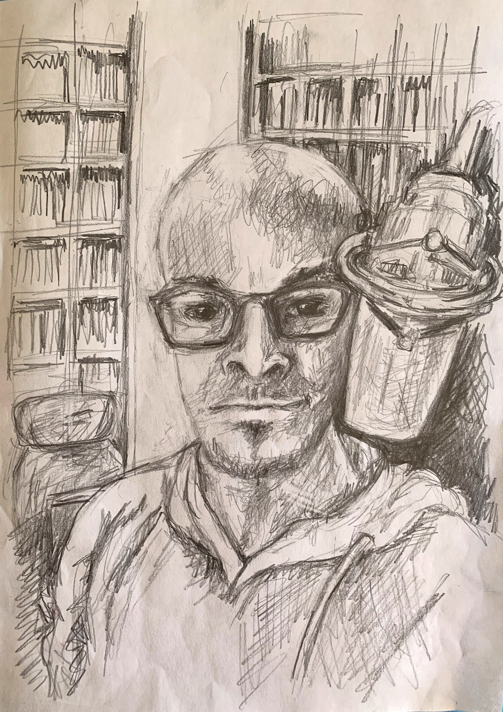
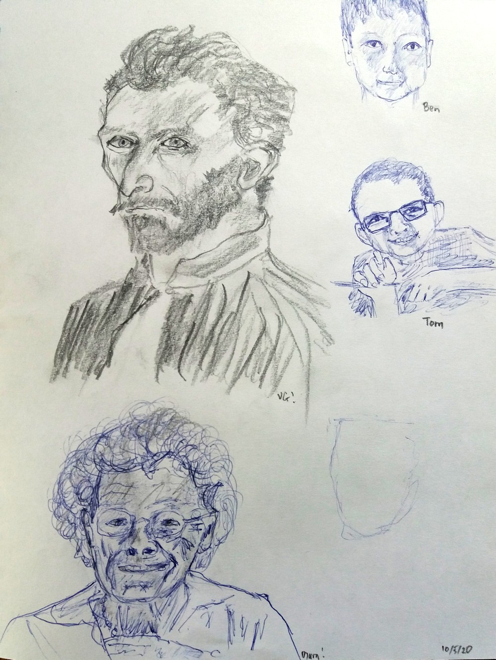
Sketches by Jane
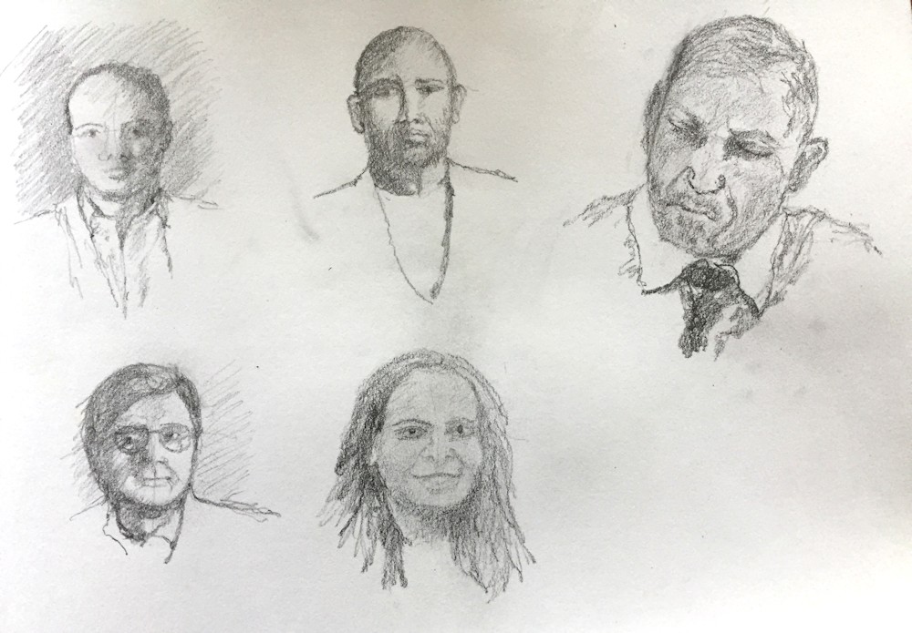
Control the Virus: Vivienne’s sketchbook studies from the news
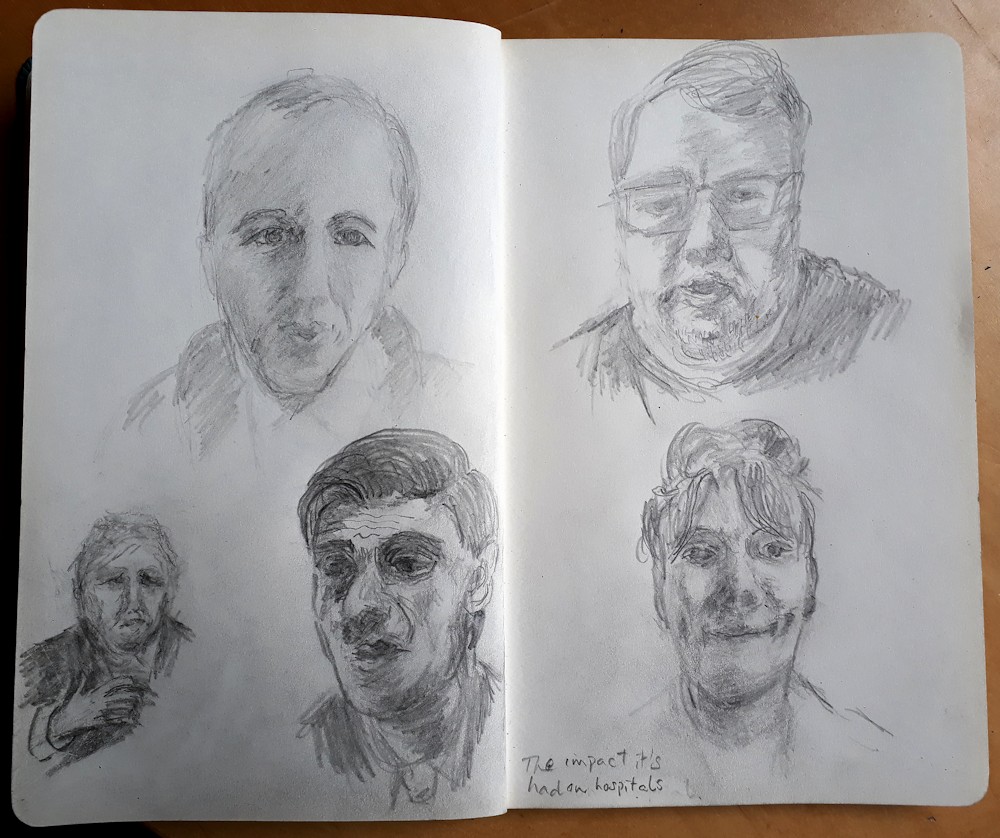
Roger’s sketch book studies
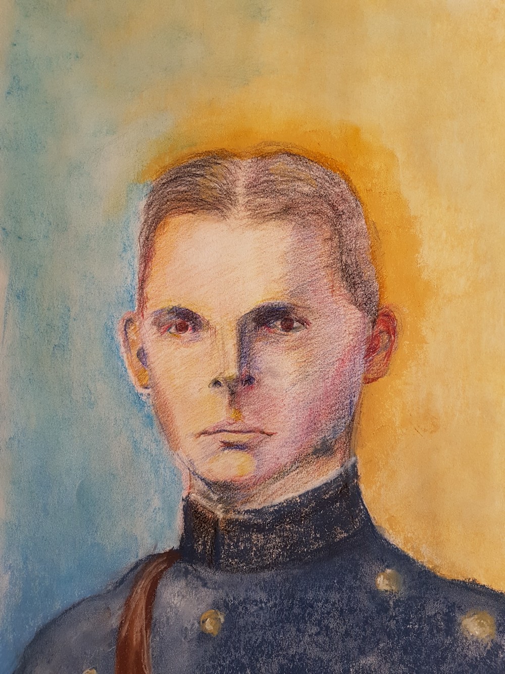
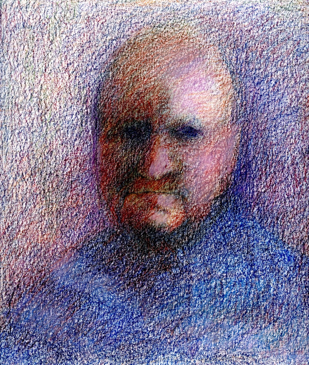
Ruth’s Uncle Brian who fought in Burma in WW2 drawn in coloured pencil and soft pastel
Heather’s Portrait of Chris
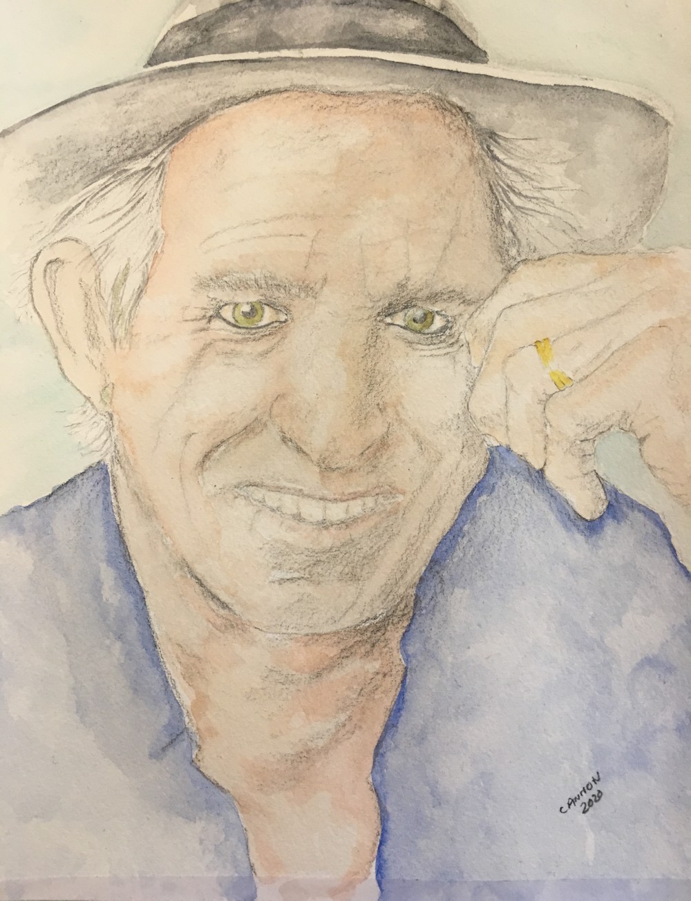
Heather’s Portait of Keith Richards
Two drawings from Ann
Ann’s Husband
Roger by Vivienne; from life
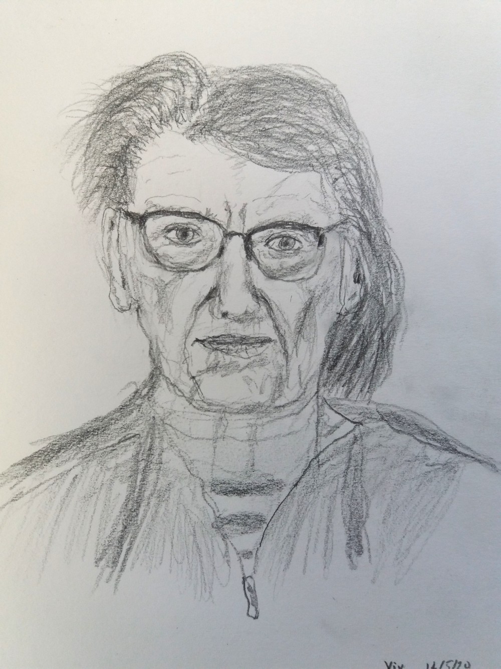
Vivienne: by Roger from life
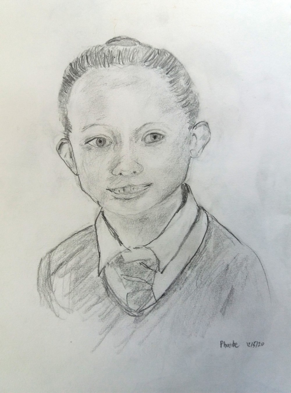
Phoebe by Roger
Drawings from life and reference by Barbara