Monthly Archives: June 2020
Cast Shadows 2 Interiors
June 28, 2020
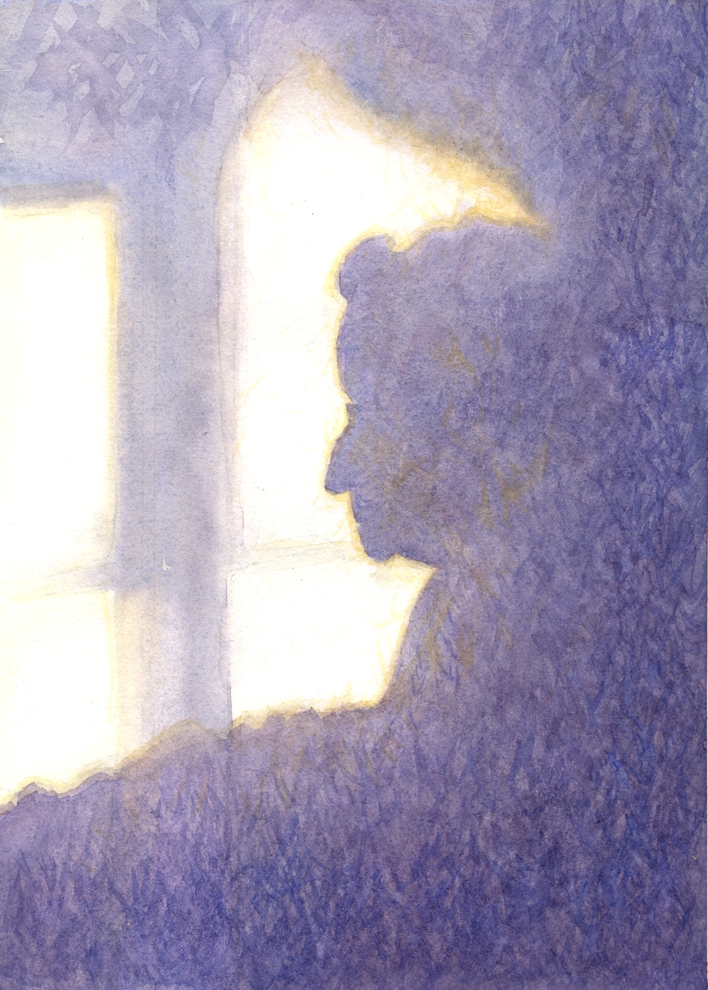
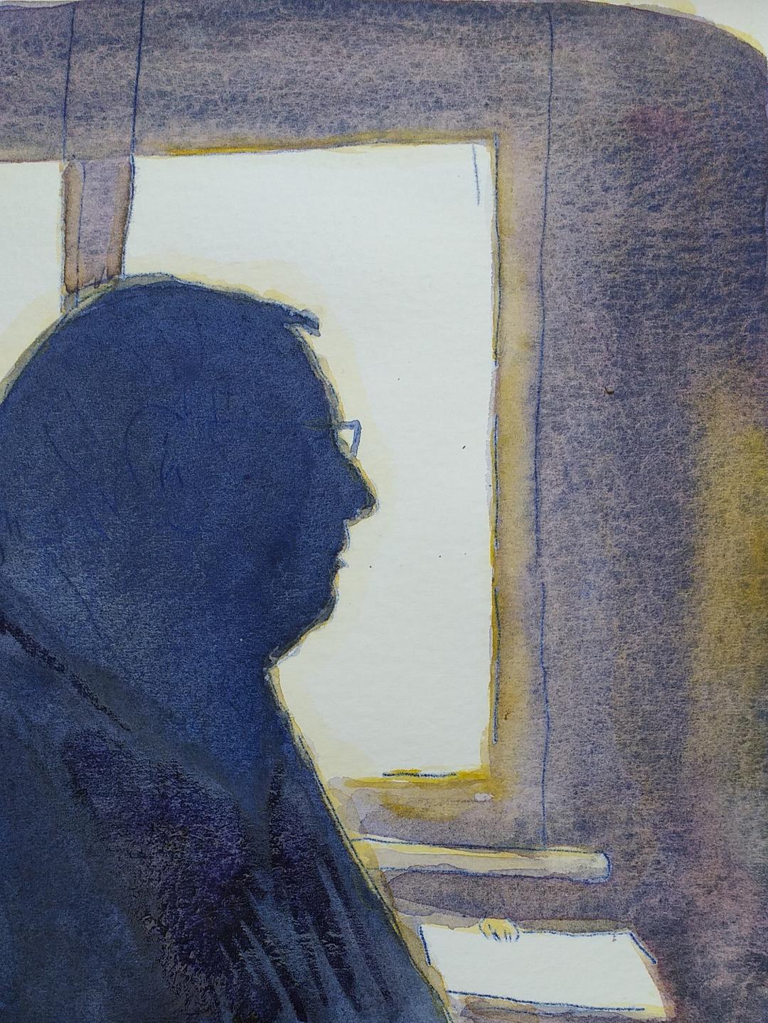
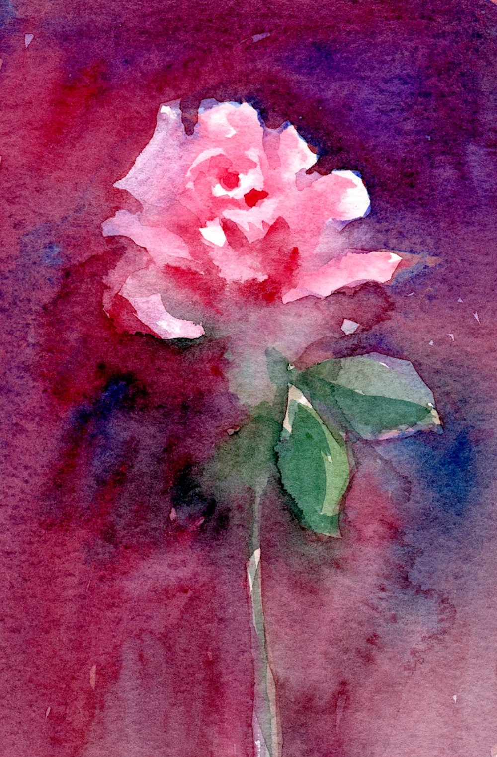
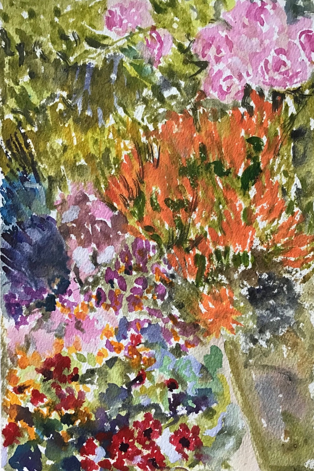
Vida’s Shadow: watercolour
This week’s project is to produce a painting of an interior that includes cast shadows so I’m starting by showing you one way of tackling shadows in watercolour. It’s in place of the short live demo I would usually give my workshop participants and I hope it will be helpful. Artists for reference and some ideas for painting interiors appear later in the post.
There are several ways of painting shadows and the colours used will depend on what you see and how you wish to interpret what you see. We saw last week that some artists choose to work in an extremely representational style while others are more inventive with colour and tone. Very often you will only need one colour mix for a shadow, sometimes the colour of the object mixed with a colour that will mute the colour slightly e,g, a purple object may need a purple gray shadow. In daylight on a bright day shadows are often bluish reflecting the colour of the sky.
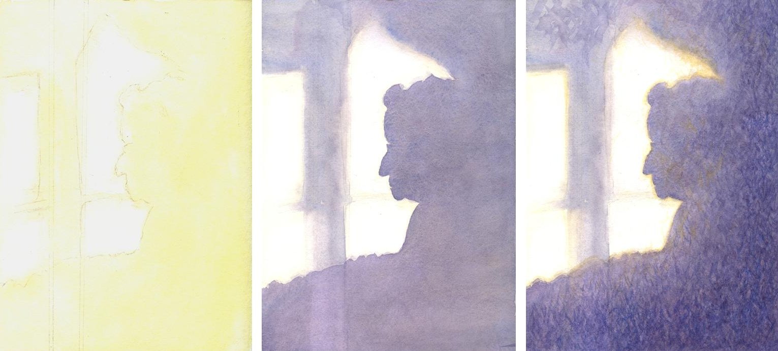
The watercolour above is the shadow of my Mum. It appeared while we were having lunch, not the best time to get the paints out, so a photo reference was used. Below you will see three stages of making the painting. If I had been tackling a shadow of a tree or a simple object I would probably have just used a brush and a much freer approach but I was working small (about 25cm x 15 cm) and wished to end up with a recognizable profile.
Vida’s Shadow: 1. First wash of yellow ochre 2. washes of ultramarine, crimson alizarin and a little ochre 3. edges softened more ochre added and texturing with small brush strokes of a similar mix but with more blue in places.
1. A light pencil line was drawn around the edges of all the shadows. I noticed a distinct yellow halo to the shadow so I decided to lay down an Ochre wash over the whole of the shadow area and extending outside the drawn line. Because I wanted this to be soft I moistened the area to be painted with a sponge first. Sadly the edge of the Ochre wash does not show up well on the image.
2. I then mixed a large puddle of Ultramarine, Alizarin Crimson and a little Yellow Ochre to make a muted purple gray wash. This wash was taken over the whole of the shadow area which I softened in places with a tissue while wet, and also lifted out the lower part of the vertical shadow of the window frame. When this had dried I took another wash of a similar mix over the shadow area on the entire right side so that part of the shadow remained lighter in tone as observed.
3. I softened some edges of the head with a hardly damp brush and added more Ochre to the silhouette shadow and some of the window frame. The wall on which the shadow was cast was a textured wallpaper. I could have stopped after adding the Ochre but decided to texture the shadow using rapid strokes of a small brush wet on dry and adding more tone toward the right and bottom of the shadow. Most of this was done with a purple grey mix as before but more blue was added in places and some strokes of Yellow Ochre were added within the shadow area to unify the painting and give extra warmth.
When tackling an interior think of it as a landscape. With landscape painting it is always important to think first of the topography of the land before adding its clothes of vegetation and man made enclosures, buildings etc. With an interior, think first about the structure of the part of the room you will be referencing before you populate it with furniture etc. Is it a straight wall or are you looking into a corner, or are you including the whole of an end wall and at least some of both sides? Does the ceiling play a part in your composition? If there are windows and/recesses, or fires and chimney breasts place them next and then the lights, carpets furniture etc.
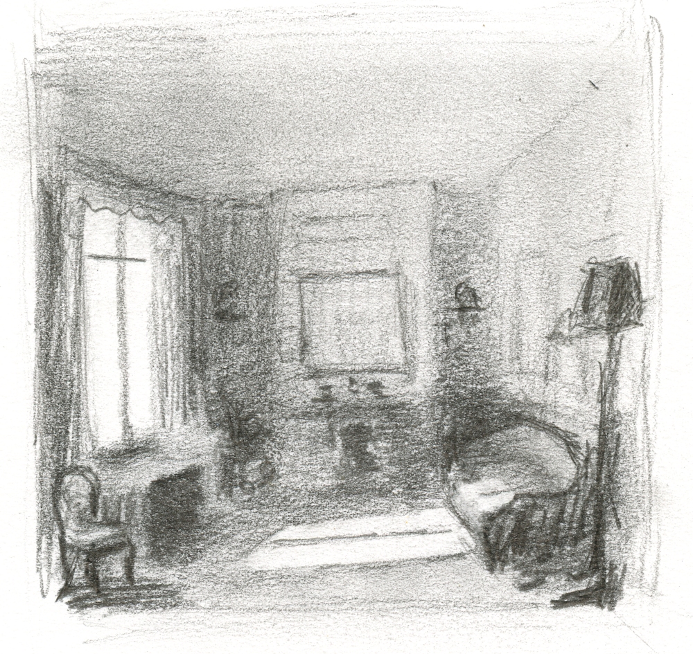
Thumbnail 1: fictional room with cast shadows (and wonky ceiling!)
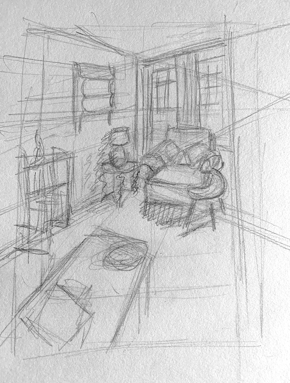
To get an idea of the tonal balance before starting on a more considered work it’s a good idea to do a couple of thumbnail sketches. The two examples are about three or four inches across. Just enough to get an idea of shapes, sizes and tonal values. Thumbnail 1 shows a cast shadow from a window on to a floor and sofa, where the middle of the window frame makes a dramatic shadow. There are also cast shadows in the rest of the room although not so dominant; the shadow under the chair on the extreme right and the diffuse shadow of the cupboard on the right. The darkest corner is on the right as is the darkest wall, apart from the window which is the brightest area.
Thumbnail 2: Diffuse Shadows in my Dining Room
The brightest area is the sunlit window recess and the top of the sideboard on the left. The shadows are all diffuse; under the table; under the chair in the corner; light shining through a window to the left before the doors opening to the dining room results in a diffuse diagonal shadow of the wall above the doors cast on to the carpet.
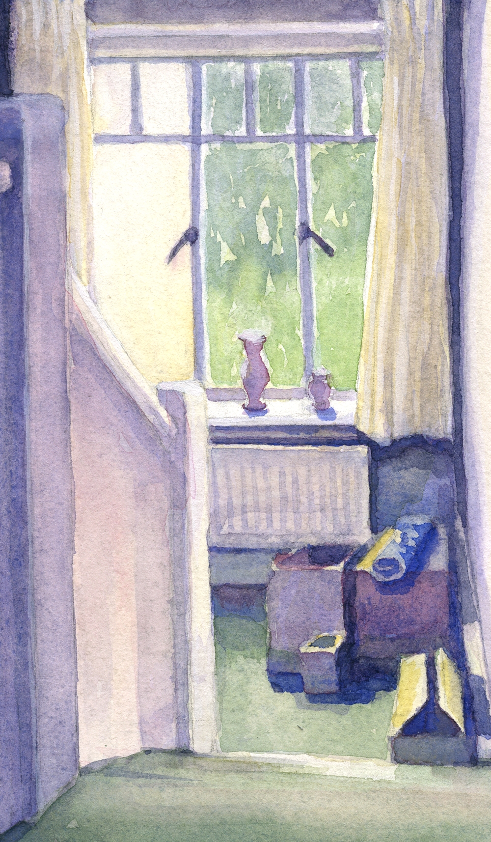
The Half Landing at Morar: watercolour sketch
The brightest area in the watercolour sketch is the window sill. The pale yellow area filling the left window is a brightly lit outside wall. There are cast shadows; of the pots on the sill; under the sill; round the radiator; on the carpet from the boxes and on to the skirting board on the right from the boxes; on the carpet from the wall and radiator; also more subtle shadows are cast from the handrail and newell post on to the blocked in bannister. This situation is not as dramatic as in the first thumbnail sketch or the cast shadow of my Mum’s profile but these are the sorts of shadows you are likely to encounter in any interior setting.
The Challenge
This week I would like you to make a painting of an interior with cast shadows that form a major element in the composition. Do start by making thumbnail sketches of possible compositions and also to check that you have understood the tonal balance with regard to the shadows, light source and objects, baring in mind that if strong sunlight is entering a room the wall with the window or door letting the light in is probably dark, and that the transparent glass allowing the light in is very often the brightest area so the greatest contrasts in tone may be on the same wall. I would like to see the finished work and perhaps the thumbnail sketch that formed your ideas for the painting. Choose either to work from an interior you know well; a room in your home for instance or make your own version of a painting by one of the artists references on my Cast Shadows Pinterest board.
https://www.pinterest.co.uk/jhall1282/cast-shadows/
Reference Artists; a slightly eclectic mix, of the contemporay artists do look at works by Karnes, Couloumy and Willis
The Copenhagen Interior School artists;
Wilhelm Hammershoi 1861 -1933
Carl Holsoe 1863 – 1935
Peter Wilhelm Ilsted 1864 – 1916
These three artists produced works with subtle colours with an air of stillness and mystery. Hammershoi is the most well known and used the figure, often his wife Ida in compositions that provoke questions in the mind of the viewer as do some of the rooms. Among the paintings are wonderful shadows cast by sunlight from windows.
Edvard Munch; night interiors
Edward Hopper
Mark E Karnes; an American artist; wonderful monochrome brush drawings and paintings of his home and neighbourhood
Jan van der Kooi
Anne Francoise Couloumy; a little surreal
Suzanne Moxhay; combines photography with painted surfaces
David Hockney
John Lidzey; watercolours
Lucy Willis; watercolours
Your paintings;
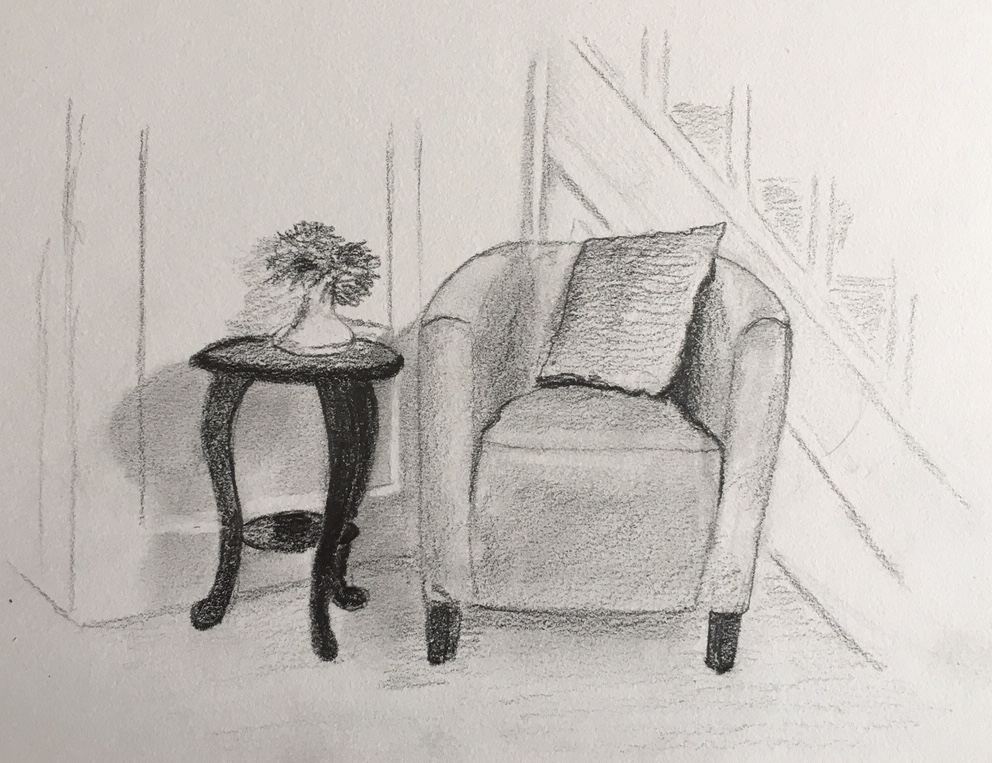
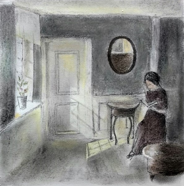
In the Hall; pencil tonal sketch by Heather
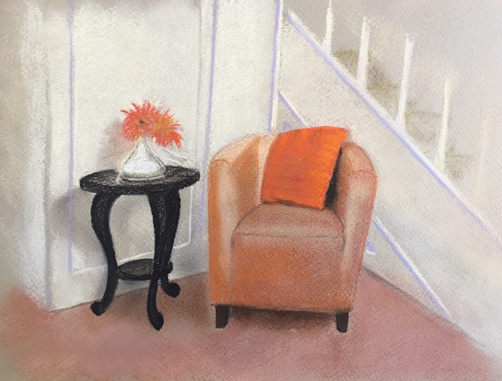
In the Hall: pastel by Heather
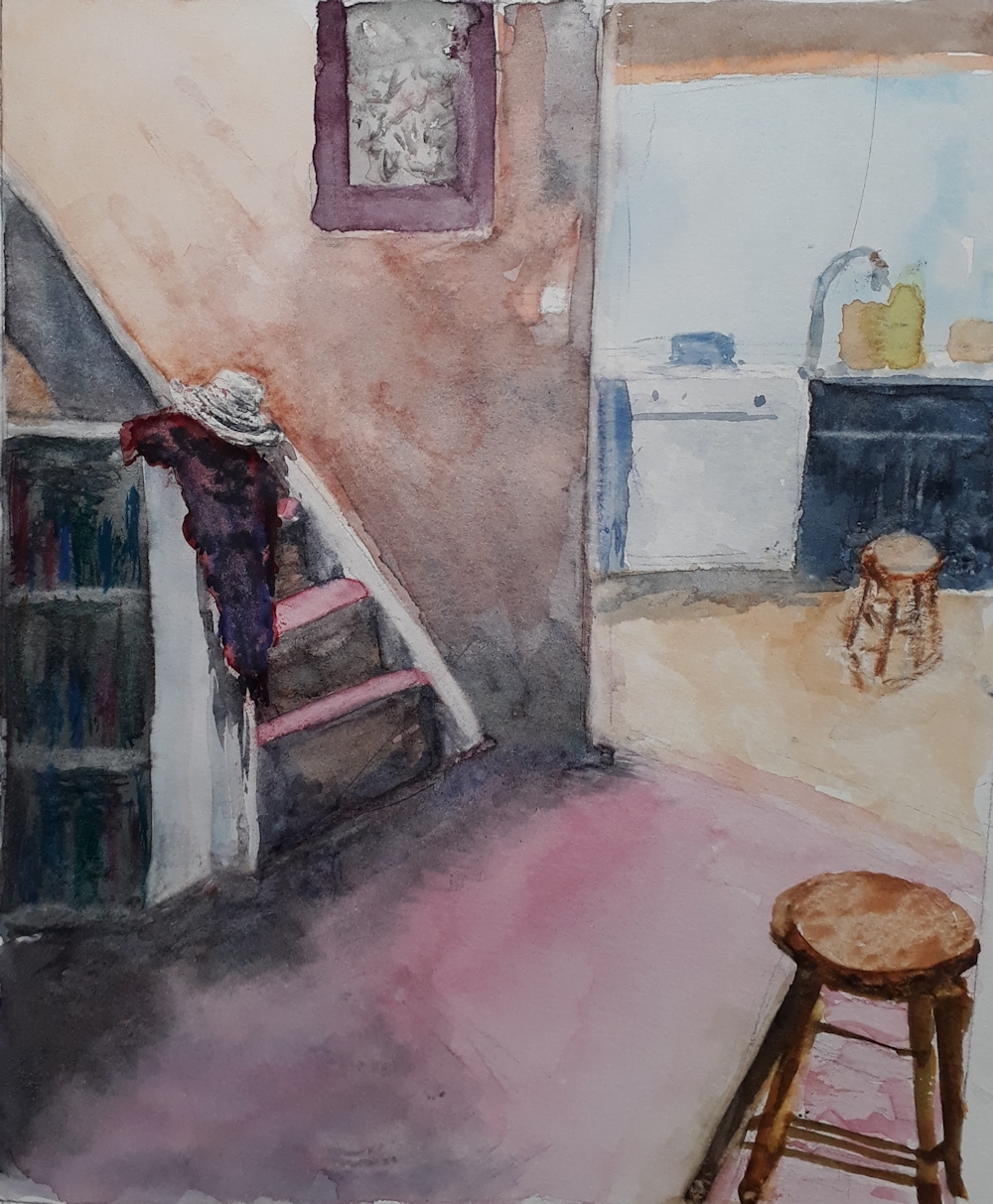
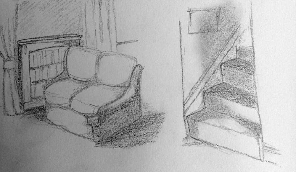
Hall and Kitchen: watercolour by Vivienne: Note diffuse cast shadows at the bottom of the stairs and of the bookcase beside the stair, slightly sharper shadows of the coat on the bannister and stool and dishwasher in the kitchen.
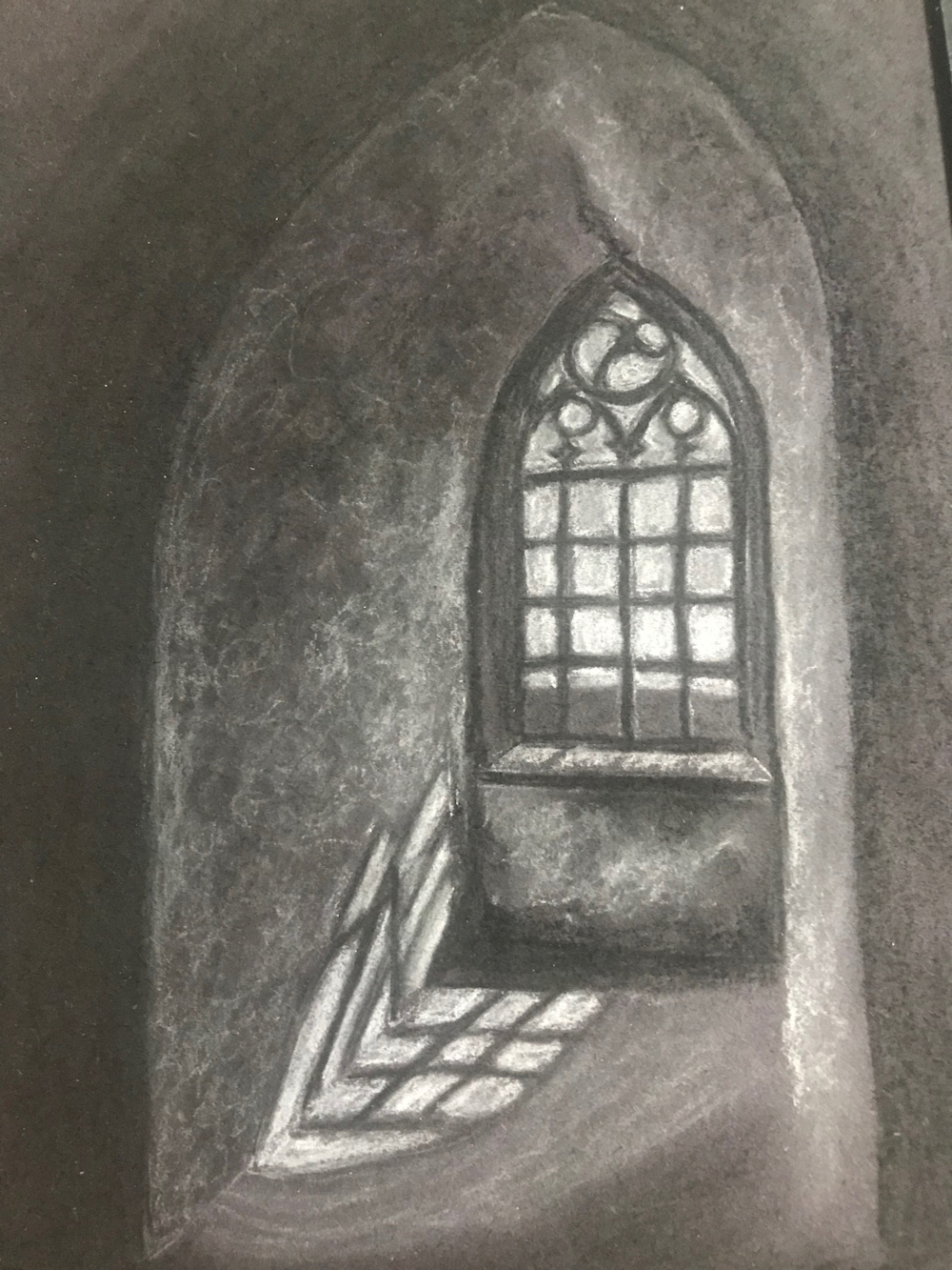
Arched Window by Shane
After Hammershoi by Ann
Window Shadow: watercolour by Angela
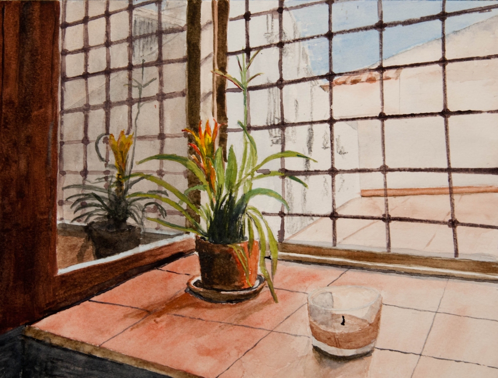
A Window in Palermo by Roger: This painting includes a strong reflection and shadows. Note the diagonal reflections of the leaded light widows on the side of the frame, and that the reflection of the horizontal bars continue in a straight line only interupted by the window frame. Because anything reflected is seen as if receding into the distance note the decreasing size of the metal framework and of the plant in the reflection. The plant and candle both have their shadows cast on to the tiled window sill. There is also a very strong shadow of the window on the sill bottom left.
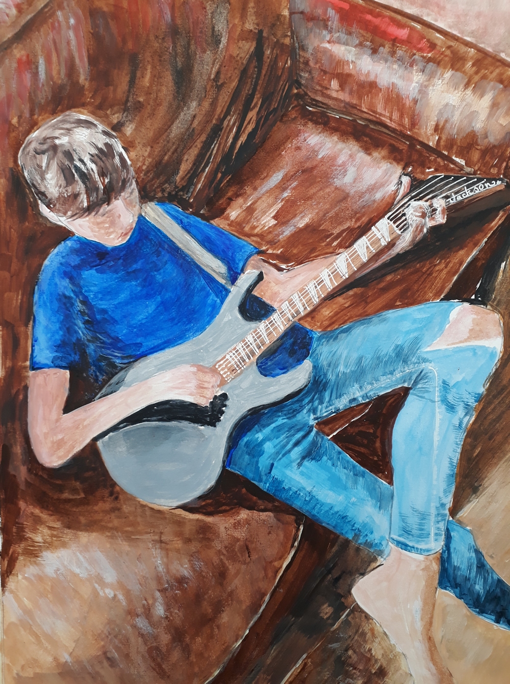
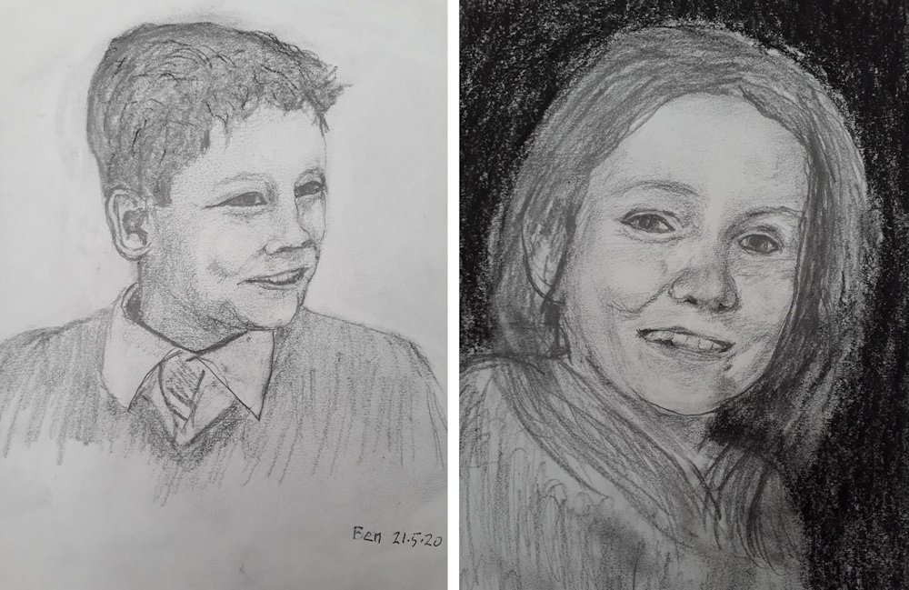
Ben playing his new guitar by Vivienne: Note the strong shadow cast by Ben’s hand and arm on the guitar and sofa, the shadows cast by the guitar on to Ben and the sofa, shadow cast by his head on to his T-shirt and also the arm of the sofa on to the seat. There are a few other shadows too!
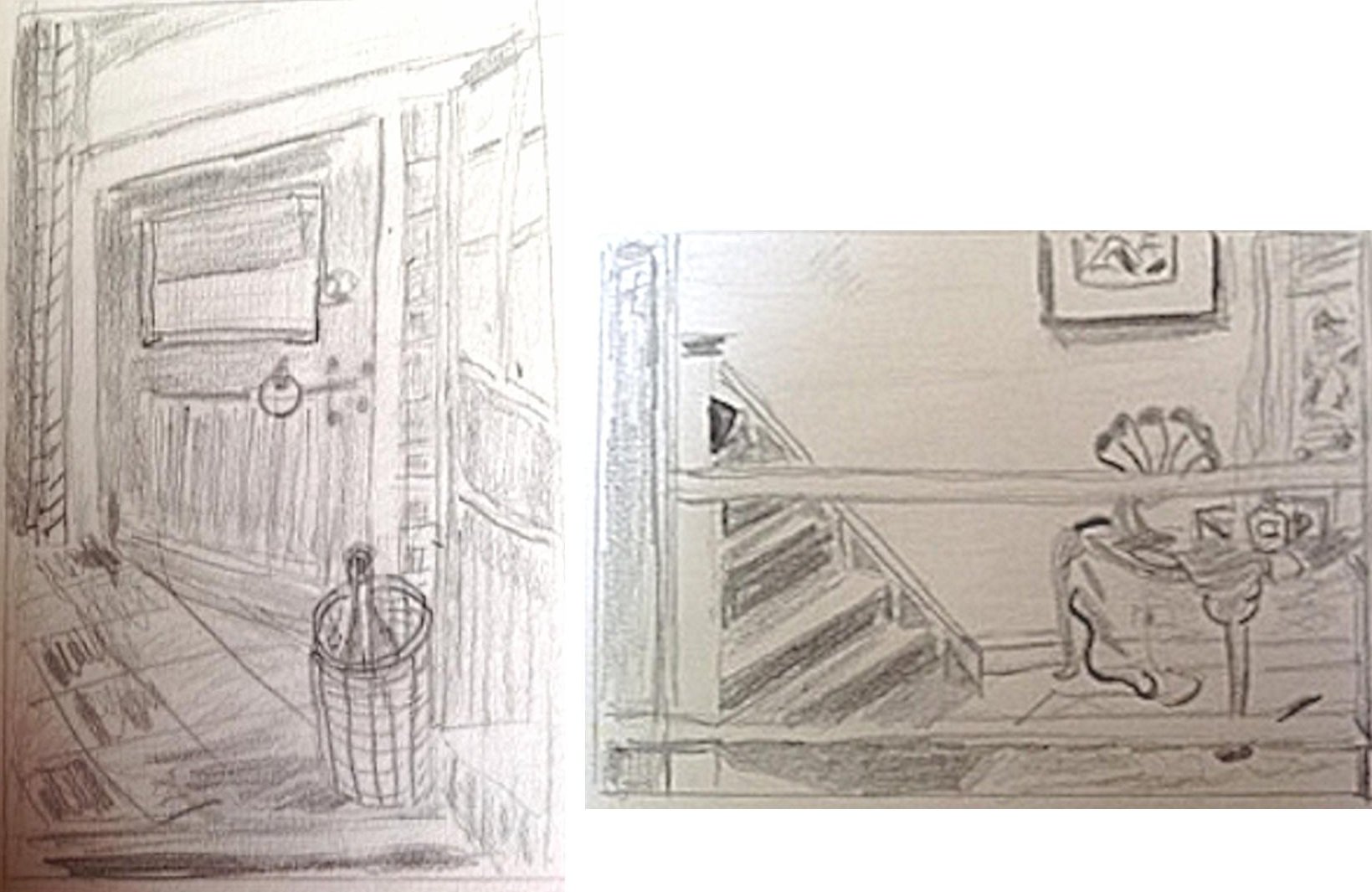
Sketch to work out perspective and placement by Jan
In the Drawing Room: watercolour by Jan
Two sketches by Liz
Girl Reading after Ilsted: drawing bt Liz
Sketches by Elizabeth
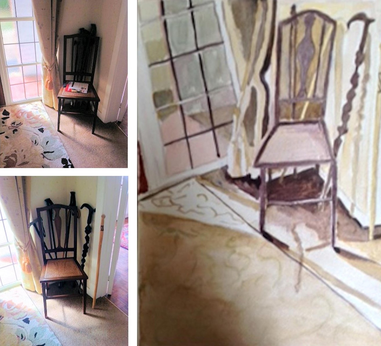
Chair in the hall: watercolour and references by Elizabeth
Watercolour by Maricarmen inspired by a painting by Jan van der Kooi
Armchair after Lucy Willis by Maricarmen
My Husband’s Shadow: watercolour by Maricarmen
Inside the log cabin, Yosemite: pastel by Ruth
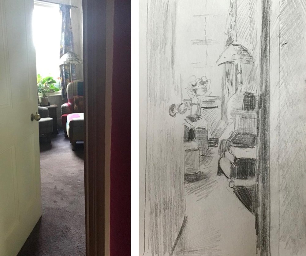
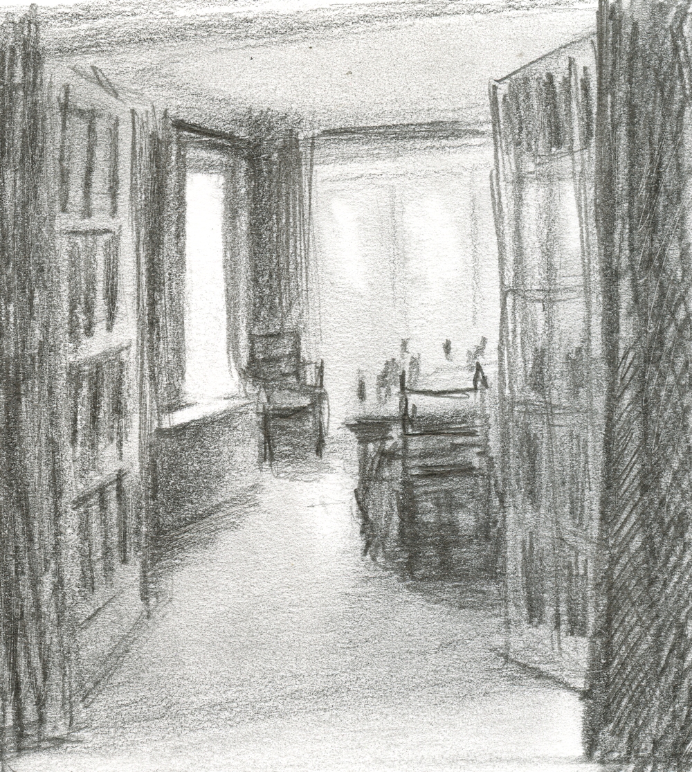
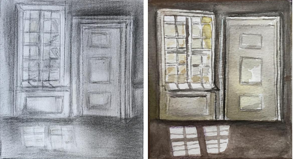
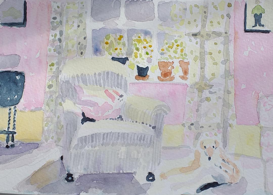
Through the Door: photo reference and sketch by Sandra
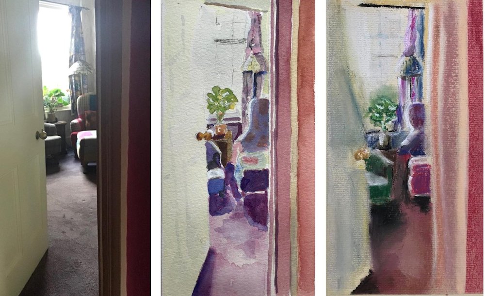
Through the Door: photo reference, watercolour and pastel by sandra
Cast Shadows 1 Still Life
June 19, 2020
Cast Shadows introduction and Still Life
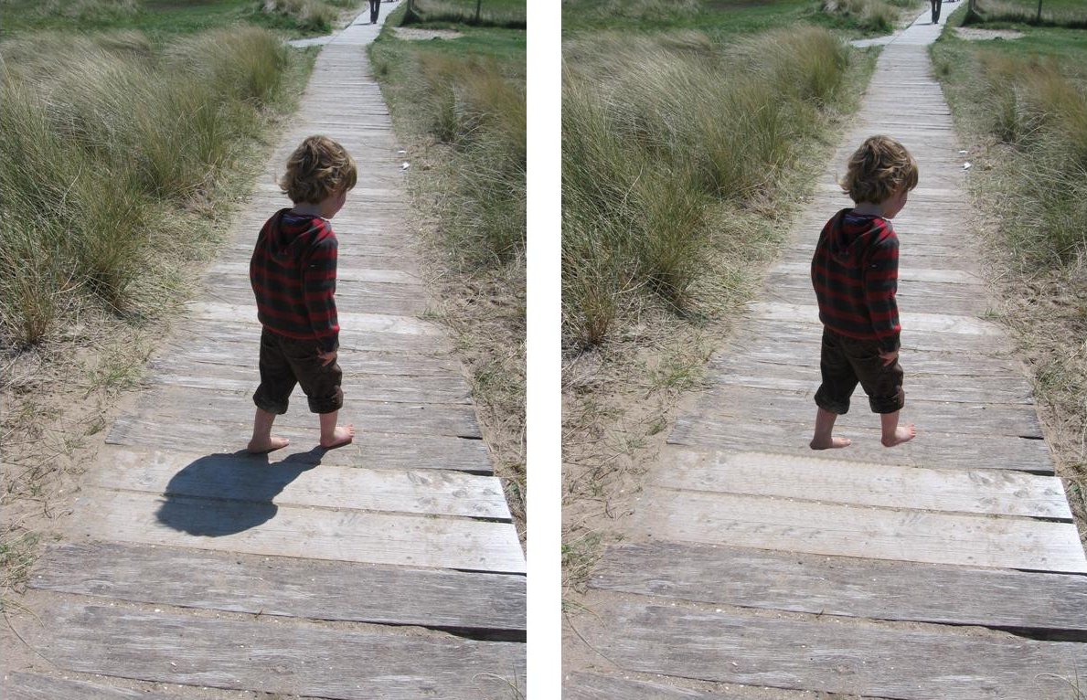
I love those Peter Pan moments when you tell a child that he’s lost his shadow and he looks in the wrong direction so you tell him to turn round and!
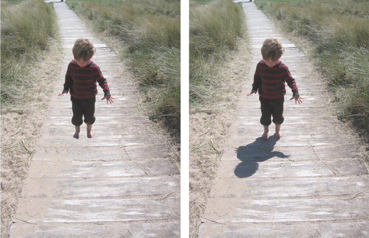
Fortunately Toby’s shadow returned a few seconds later or he might have been flying off to find pirates in Never Never Land instead of going on a bear hunt in the dunes.
Introduction
What exactly is a cast shadow? I understand it as the shadow made by parts of an object that obstruct the incoming light from appearing on surfaces other than the object itself. This is obvious with the Peter Pan photo, not quite so obvious when it is the cast shadow under a nose (rather than the underside of the nose), more obvious when it is the shadow of a wide brimmed hat that falls over the upper parts of the face. Cast shadows are not for instance the part of the head or hill that is away from the light direction. A different surface has to be involved.
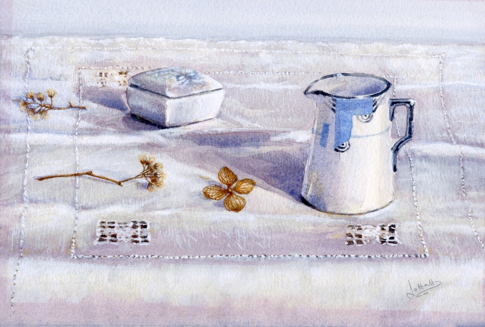
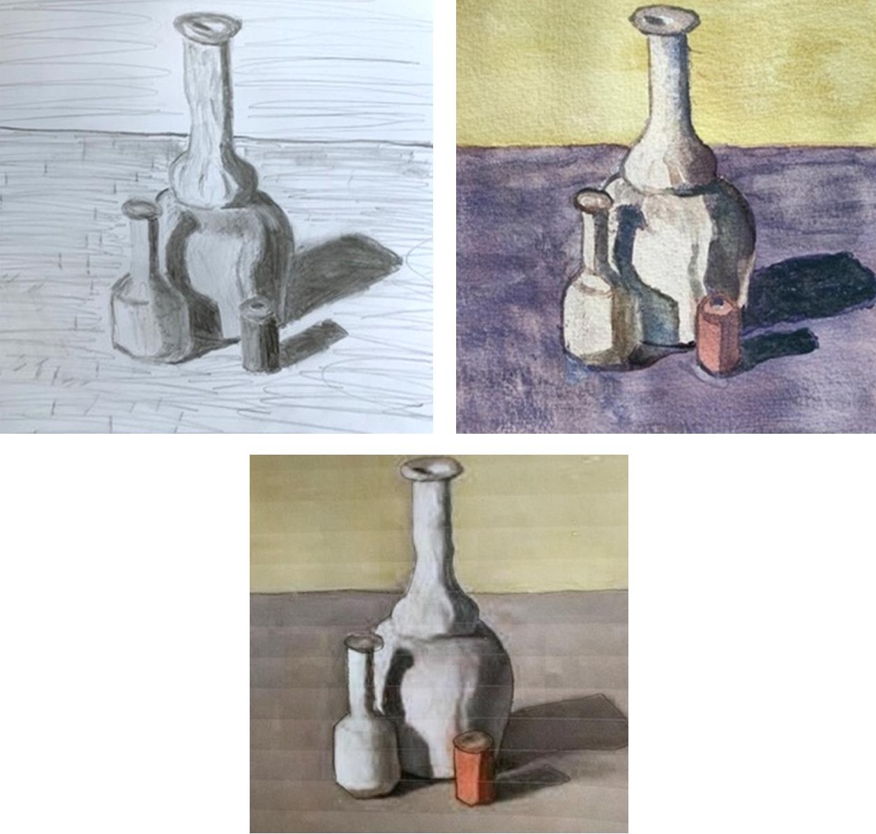
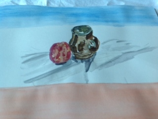
Blue and White Jug: watercolour by Jo, The diagonal shadow cast on the cloth is a similar colour but deeper tone to the cloth and is a strong composition element.
Mostly cast shadows assist in making a composition convincing without being the dominant feature and in the four projects over the next few weeks we will explore this aspect and also how cast shadows may be vital, to the extent of becoming the major element. Visually as seen in the images above cast shadows help to anchor the objects to whatever they are placed on. Mary Fedden R A produced still life paintings including objects with and without their cast shadows, sometimes within the same work and those without really do seem to float in the composition.
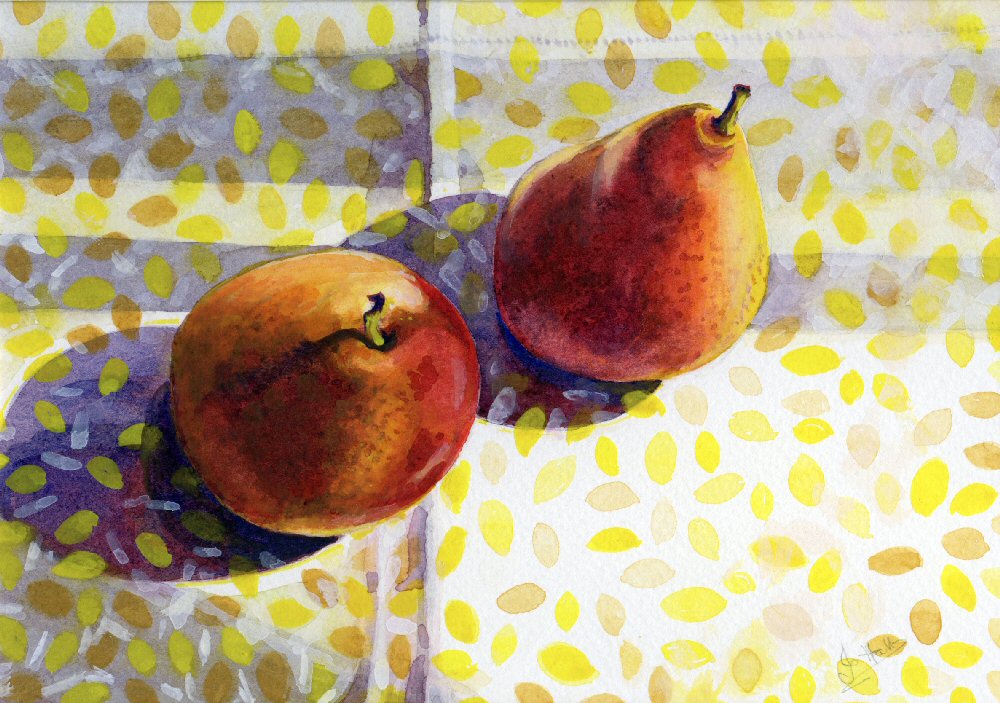
Pears on Yellow Patterned Cloth: watercolour by Jo, strong sunlight, sharp shadows, rather purple cast shadows of pears
Cast Shadows and Still life
We can easily think of shadows as just being darker areas of tone but they also have colour and artists have exploited this and sometimes even invent shadow colours of pure but believable fiction. Thinking firstly of the tones and shapes of shadows it is most important to establish the light direction in relation to the objects. And still life is a good place to begin.
Imagine a football on a table. Lit strongly, directly from above its underside will appear dark and it will cast a circular shadow on to the table. The size of the shadow will depend on how far the light source is from the table. On a bright day outside, the midday sun will result in a cast shadow on the table approximately the same size as the diameter of the ball. If the football is on a table indoors and lit by a single lamp much nearer the ball, the circle of shadow may be much larger. Both the direction and angle at which light hits the object blocking the light determine the placement of the cast shadow and is why cast evening shadows are much longer than at midday.
This is relatively easy when the object is on a flat table and that is the only plane on which the shadow is projected. If you have a vase of flowers or a pot plant, place it on a table to the side of a window on a sunny day so that a shadow is projected diagonally across the table and on to the wall behind. Observe what happens if you move the vase or pot nearer the wall. If you have an overhead light try putting the arrangement of flowers or plant directly below the light at night. Putting a white or pale cloth under the vase will give a really dramatic effect.
In dull daylight or diffuse light in doors, cast shadows largely disappear and all that be seen may be a rather general difference in tone.
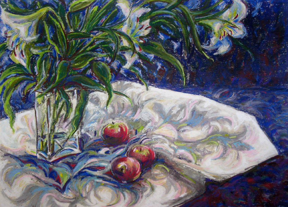
A Shadow of Lilies: Pastel by Jo: lit from directly above, Jo heightened the colours observed in the shadows
Secondly we should think about colour.
Two very different artists who exploited the use of complementary colours in cast shadows were Van Gogh and Wayne Thiebaud. The cast shadows in Van Gogh’s paintings of boots and also of bottles and earthenware pots of his home country were conventionally as brown and neutral as the objects casting them, but in his works just a few years later in the South of France, we see the sun and instead of dark shadows we see luminous complementary cool blues against yellow grounds. Thiebaud uses complementary colours in the cast shadows of his stylised rather Pop Art paintings of cakes, confectionary and even sardines. These cool almost turquoise blues make us feel the cool of shade as the temperature rises. They are not just observed they are also the shadows of the mind in a hot country just as neutral shadows are observed and their depressing drabness felt in less sunny climates.
Yellow Still Life (detail), acrylic by Jo: use of complementary colour in the shadow
Practical
This week’s challenge is to produce a still life composition that involves cast shadows so try placing a few objects where there is strong directional light either from a lamp or from a window. If you are relying on daylight the shadows will alter through the day so you may need to do one of three things; work rapidly (one hour maximum); return at the same hour and paint for a limited time each visit; or lastly take a photograph of your set up but do not use flash as you will not capture the cast shadows and you may introduce some unwanted ones.
Arrange and Observe
Don’t be too ambitious, perhaps choose two or three objects of different shapes and explore how they appear. Place them on a non-reflective cloth rather than a shiny surface to minimise confusion between shadows and reflections. You may of course notice how an exciting cast shadow has just been thrown up on a wall in your home from familiar objects. Then rush for your camera and sketch book, take a picture and draw from life if you have time. Look at the shape of the shadows and observe the colours in the shadow, especially if the shadow is from a transparent or translucent object. Also note whether the shadow has hard or soft edges. There may be more than one shadow. If so choose to depict the main shadow and the direction of light making that shadow.
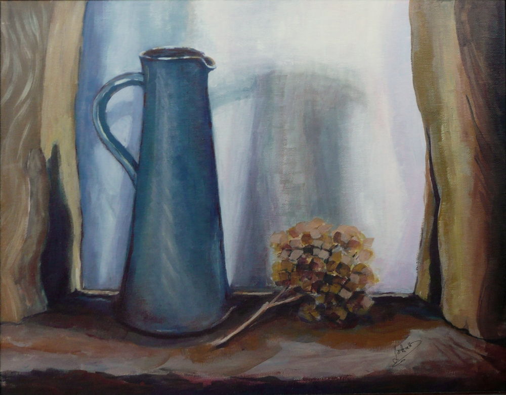
The Shadow of the Jug: oil on board by Jo; multiple shadows, soft edges, different colours in the shadow on the wall
Observe differences in tone between the object and the shadow especially where these meet and any differences in tone in different areas of the cast shadow.
If possible record what your arrangement looks like lit from the side and what it looks like when lit from above. Plants or flowers in vases can be fascinating subjects as the shadows can create a life form of their own, and can contain wonderful colours that can be exaggerated.
Another area to explore is to arrange an object so that it casts a shadow on to a curved surface or on to a folded cloth.
Draw and paint
It would be great if you could produce two drawings/rapid sketches of two arrangements with cast shadows and one finished painting in oil pastel or soft pastel, or water media (watercolour, gouache or acrylic). One object may be a plant form. Remember to look for the tone and colour of the shadows and whether there are both hard and soft edges.
More Ideas
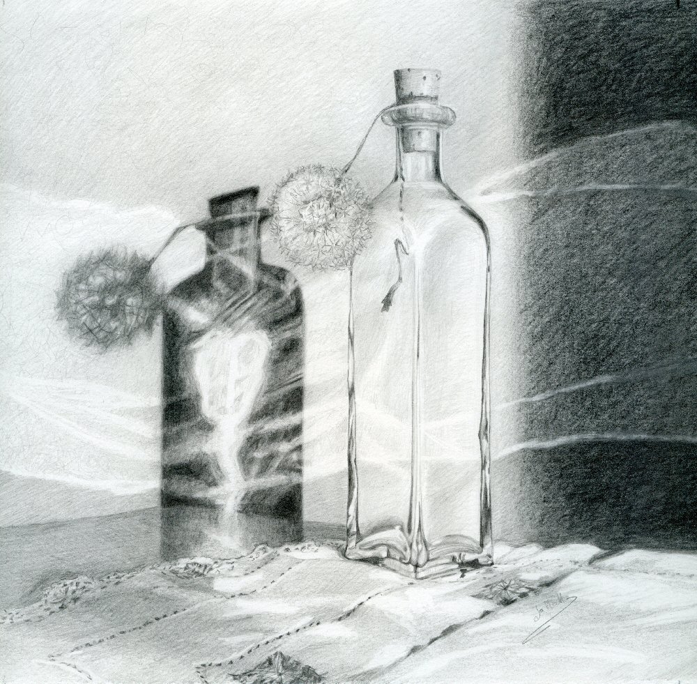
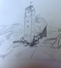
Stranger than Fiction: pencil by Jo
Sometimes extraordinary things happen with shadows. I set up my narrow bottle with dandelion head on a surface in my workroom and the sun threw an amazing cast shadow which contained an internal reflection from the bottle so it appeared like an illuminated shadow. The roughly horizontal lines across the rest of the drawing are fiction but the shadow happened.
Once you are used to drawing and painting shadows as they are, it is great fun to play around with them; making a shadow in the right tone and direction but giving it a surreal twist by turning part of it into something different to the real shadow. You may even like to be disturbing by placing a shadow on the opposite side of the object to where it should be.
History and Reference Artists:
Copyright issues make it difficult for me to publish the works I would like to illustrate this post so it is illustrated with my work. I have put examples of works by the reference artists listed below on my Shadows Pinterest board.
https://www.pinterest.co.uk/pin/476044623087613785/
There are so many others but I hope this collection will give you some inspiration.
1659 Carel Fabritius:
The Goldfinch
1664 Francisco de Zurbaran: Still Life:
Note cast shadows on the cloth and of the handle of the vessel on the right and shadow cast by the upper right lip of that vessel
Van Gogh
1884/5: Still Life with Three Bottles and Earthenware Vessel
Note: tone and direction of shadows, composition, neutral colour
1889: Still Life: Drawing Board,Pipe Onions and Sealing Wax
Note: Tone of cast shadow not very different BUT use of complementary colour
Giorgio de Chirico
1919 Sacred Fish: in this surreal still life, like his paintings of surreal buildings and monuments the cast shadows form a hugely important element in the composition and is very different from his other still life style.
Salvador Dali
1924 Still Life: Sharp and soft edges
Giorgio Morandi
1919 Still Life: This metaphysical still life is completely different in style to the later style which he developed and kept to for several decades. Note its precision and hard edged cast shadows forming an intrinsic part of the composition. This is a still life of the mind not observation though the constructions are all built on the principles of what we know to be possible.
1943 Still Life: This still life is an example of the style we think of most; the skilfully arranged and observed arrangements of the objects Morandi collected and seemed to paint with love.
Wayne Thiebaud
During the 1950s and 60s, painted cakes and other food and shadows using complementary colours
Gerhard Richter
1965 Kitchen Chair: oil monochrome, hard and soft edges, realistic unlike Dali’s
Mary Fedden
Who died in 2012 produced many still life paintings, some where objects with and without cast shadows were included in the same work.
Contemporary artists;
Michael Naples
Avocado studies; may give you ideas for using simple objects
Chris Liberti
Some deceptively simple and some more complicated still life semi-abstract paintings; cast shadows, colour and composition
Eric Merrell
Thanksgiving: cast shadow from transparent vase
Jon Redmond
Plate with Apple
Alice Mumford
A rather impressionist handling of paint, one example of cast shadow and contre jour light
Elizabeth Geiger
Tea and port; crisp shadows make important contribution to composition
Your paintings;
Strong shadows by Angela
More subtle shadows in a pastel by Angela
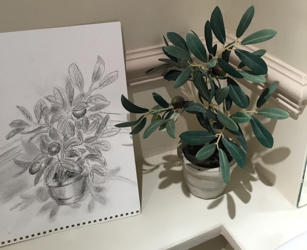
Olive Plant: drawing by Ann, lighting from above
Still Life, drawing by Ann , note change in shadow position
Still Life: watercolour by Ann
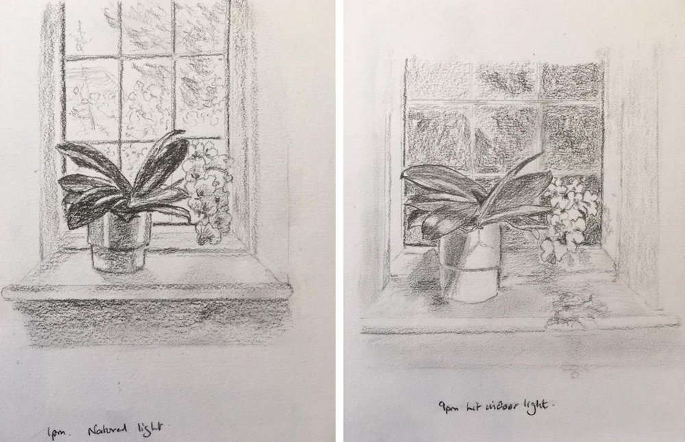
Drawings by Heather; daylight 1pm and indoor light 9pm note; compare differences in the cast shadows of the leaves on the plant pot, the darker leaves against the light outside during the day; the paleness of the flowers against the dark outside at 9pm; the cast shadows on the wndow sill and the darker tone under the window sill during the day; the contre jour leading of the window and window frame appear darker during the day than at night when the light is falling from within the room. All very well observed.
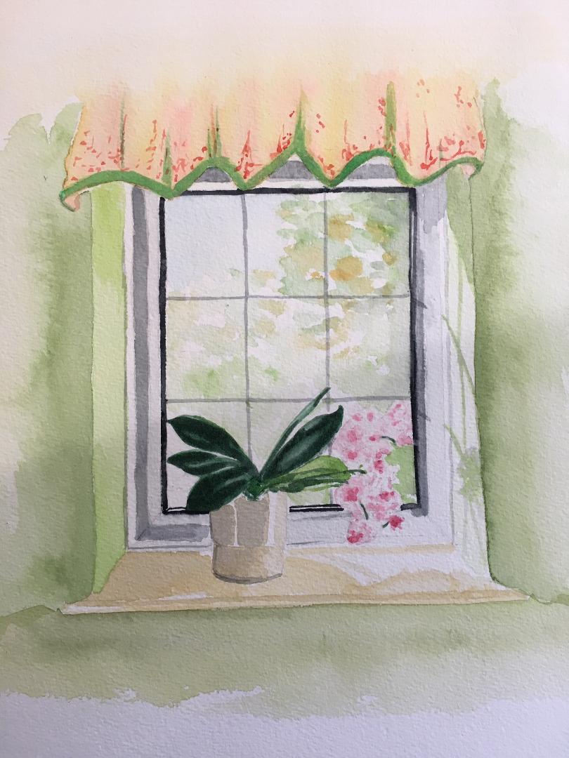
Watercolour by Heather : strong sunlight
Reference for Heather’s watercolour
Colours in shadow areas become muted, taking a darker wash over the whole of the wall and curtain would have added drama and direct the eye to the window and plant. The shadows projected on to the window recess are beautifully painted.
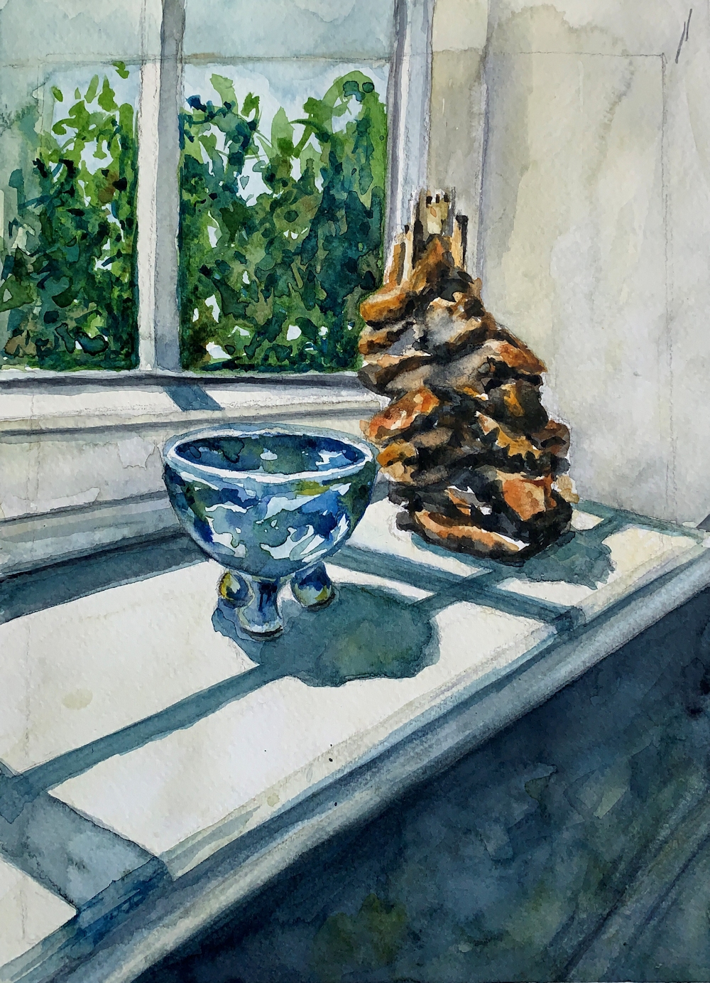
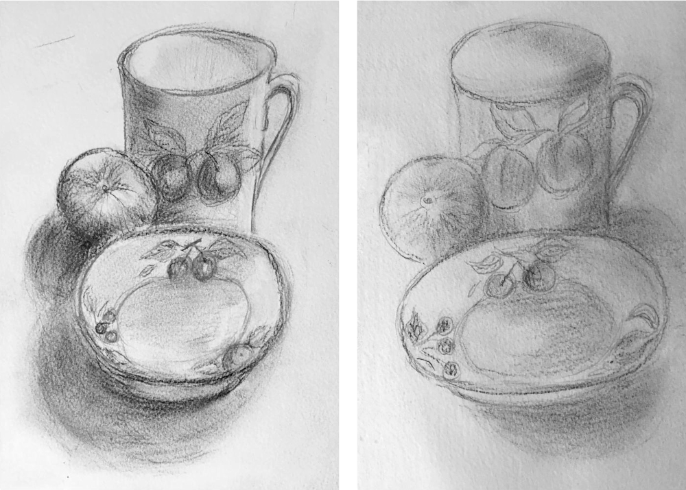
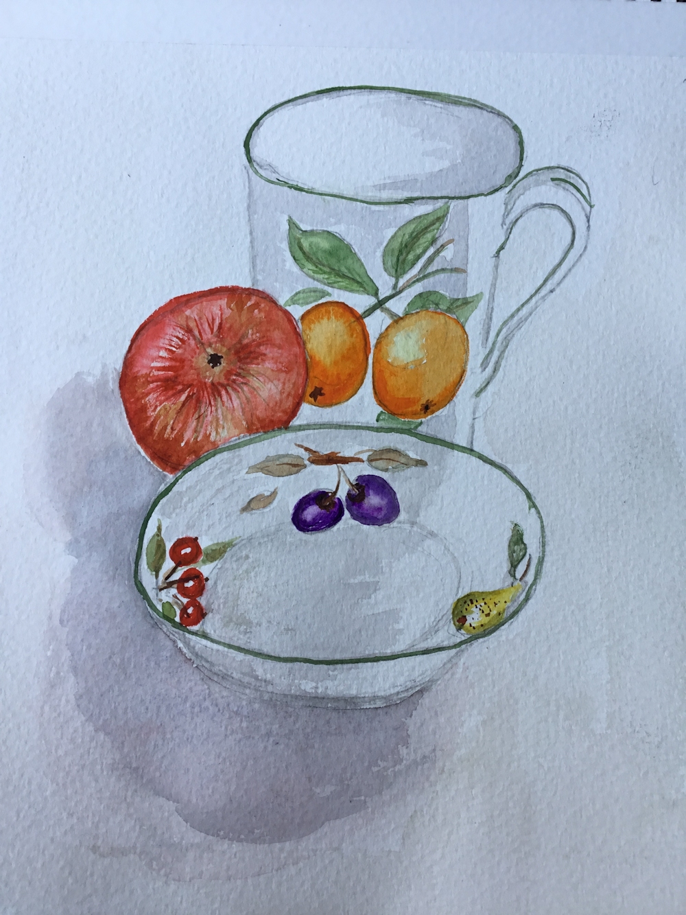
Bowl and ceramic sculpture: watercolour by Jan : bright sunlight and huge tonal contrasts
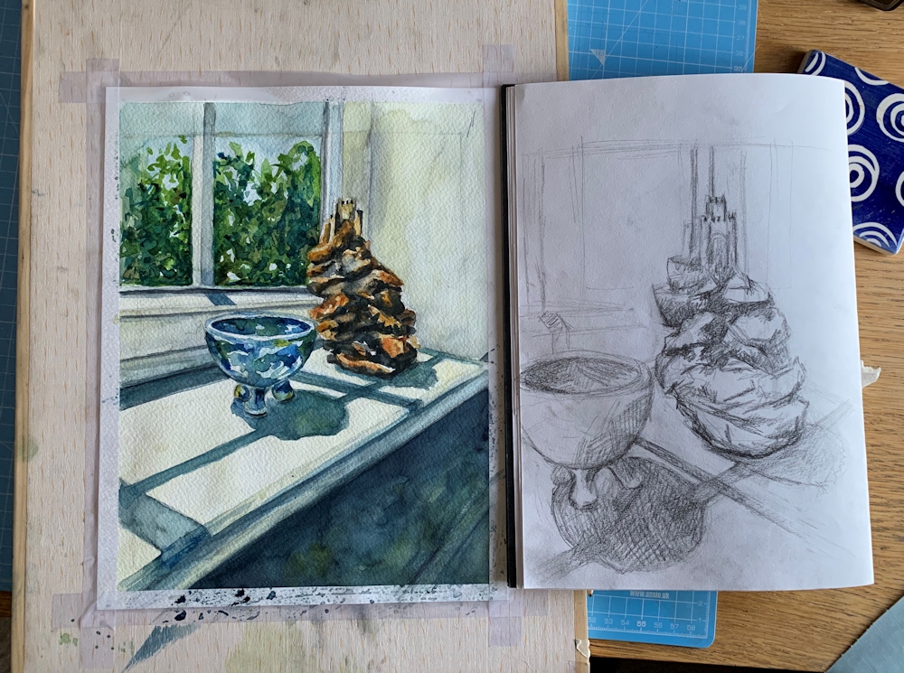
Watercolour and preliminary sketch from Jan; useful to work out ideas, viewpoint, composition and tonal values
After Morandi: sketch and watercolour by John with the Morandi reference below

Two pencil and pastel sketches by Liz; one with a rather diffuse morning light near a window and one of a vase in strong afternoon sunlight with a sharper cast shadow
Pots in strong sunlight: pastel by Liz
Pencil sketch by Elizabeth
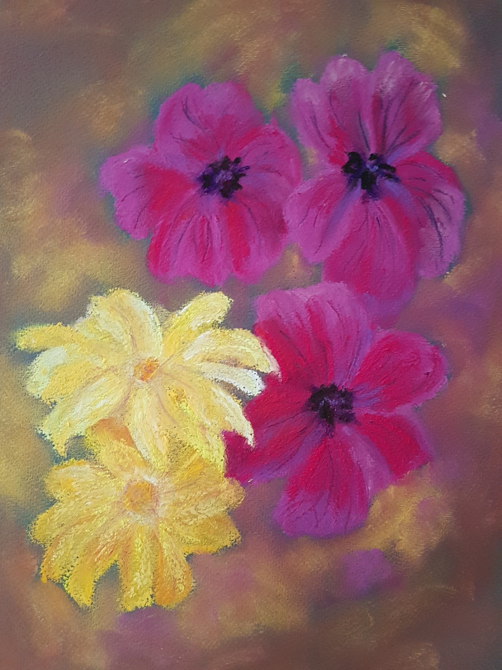
Cosmos: pastel by Elizabeth
Watercolour by Elizabeth
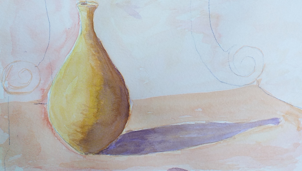
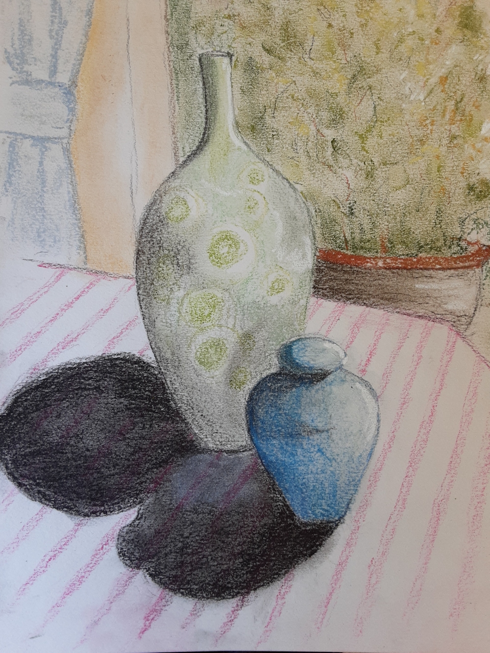
Yellow Vase: watercolour by Maricarmen; note the complementary colour observed in the shadow
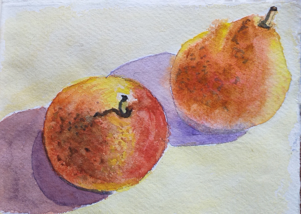
Pears: watercolour by Maricarmen
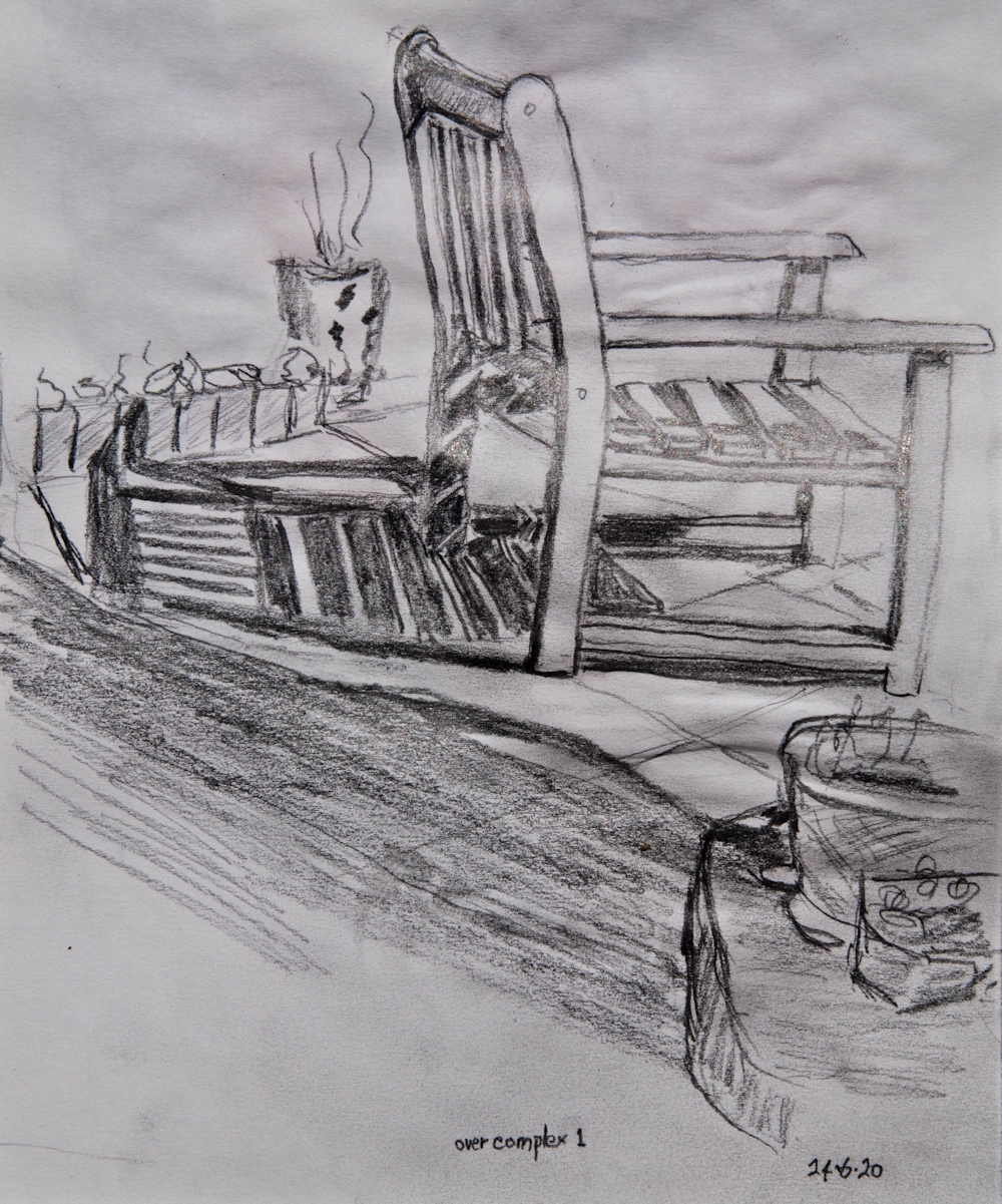
Garden Seat: drawing by Roger; great shadow patterns, quite a challenge!
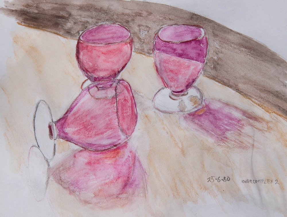
Pink Glasses: watercolour by Roger
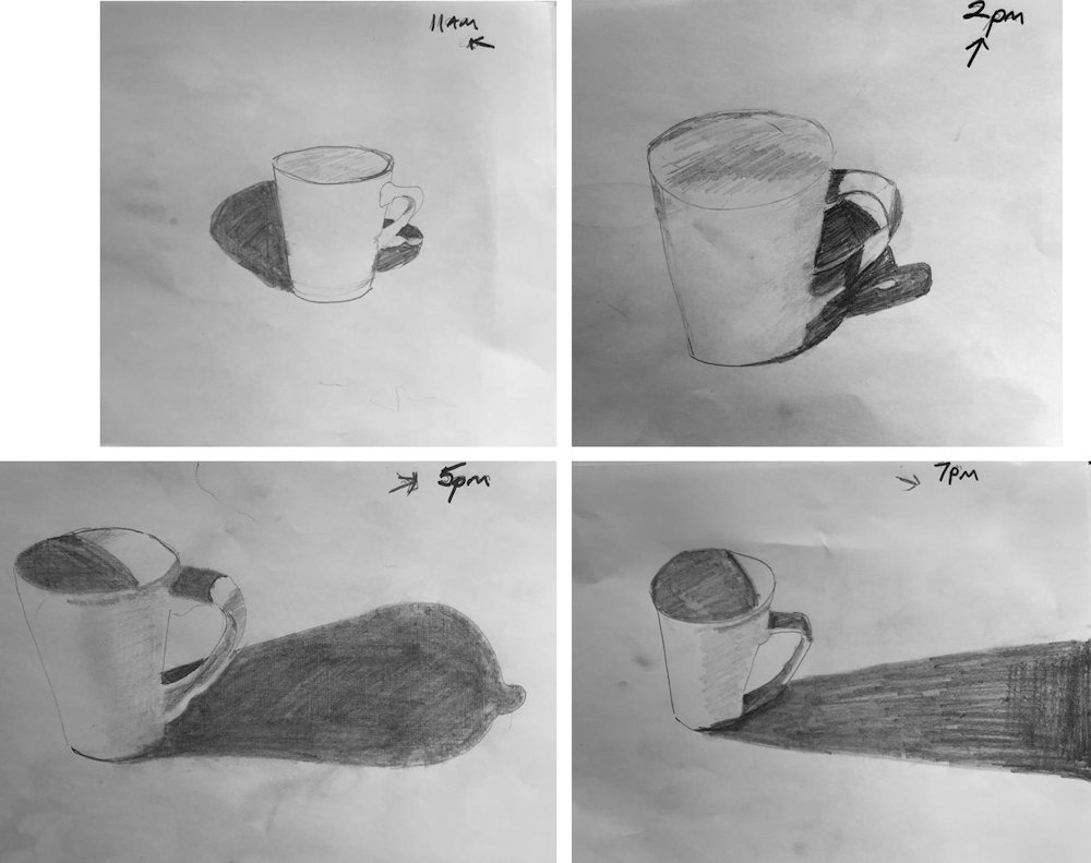
Drawings by Sandra: same mug different hours 11am 2pm 5pm 7pm; Sandra has observed the shadows cast on to the mug handle as well as on to the table, and the shadows within the mug
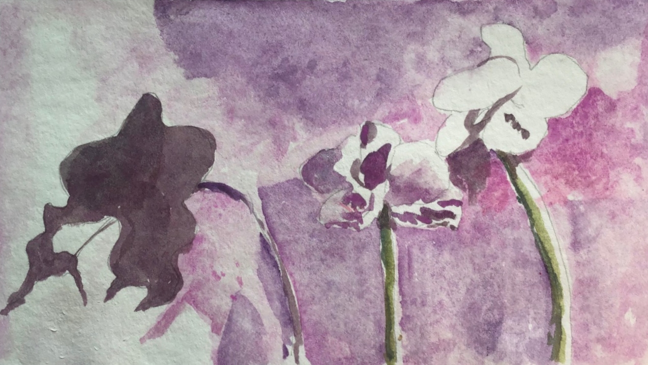
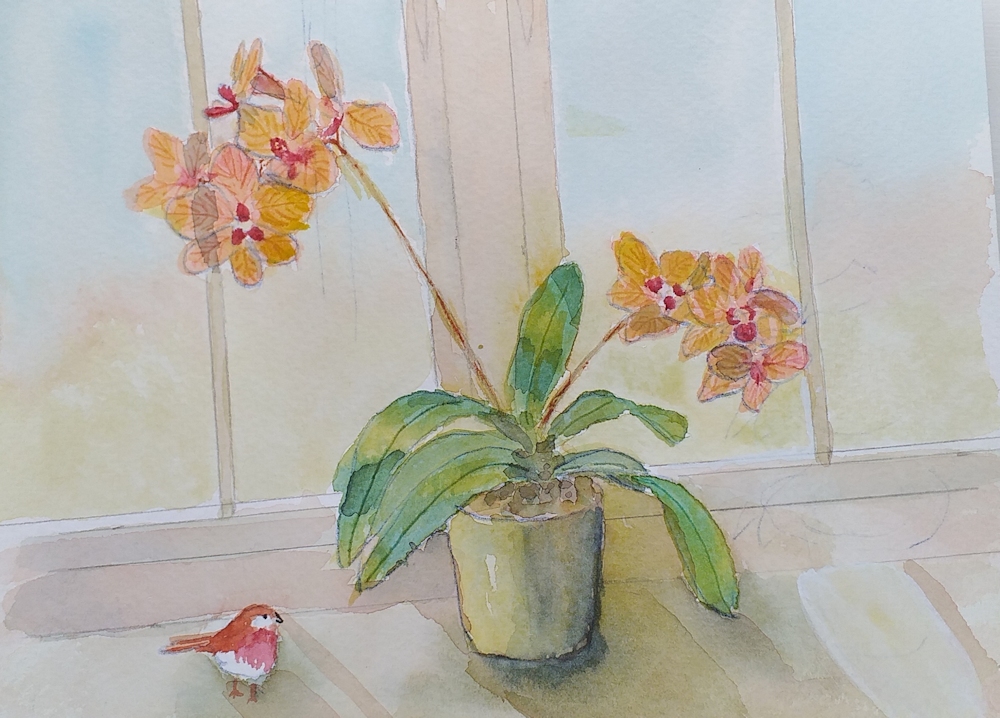
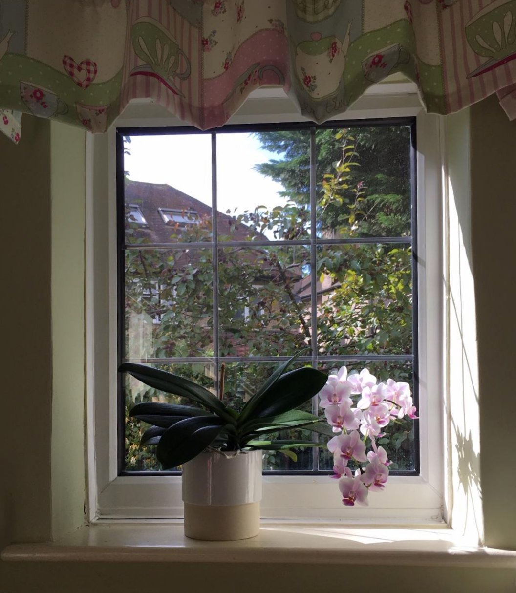
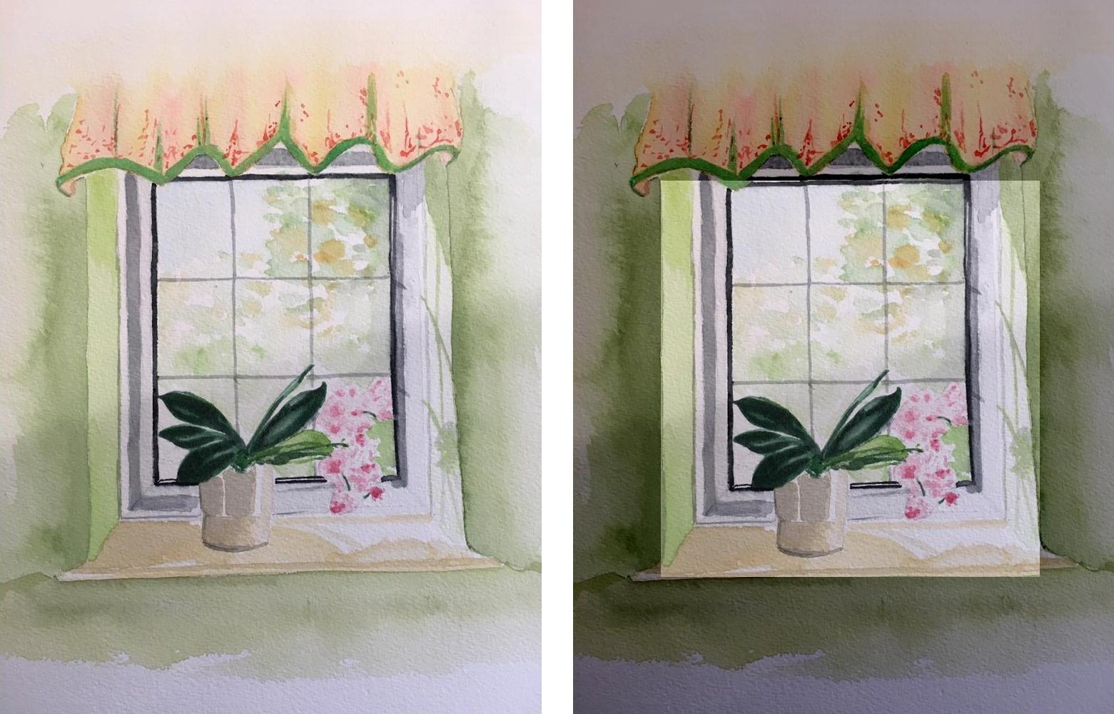
Orchid Shadows: watercolour by Sandra
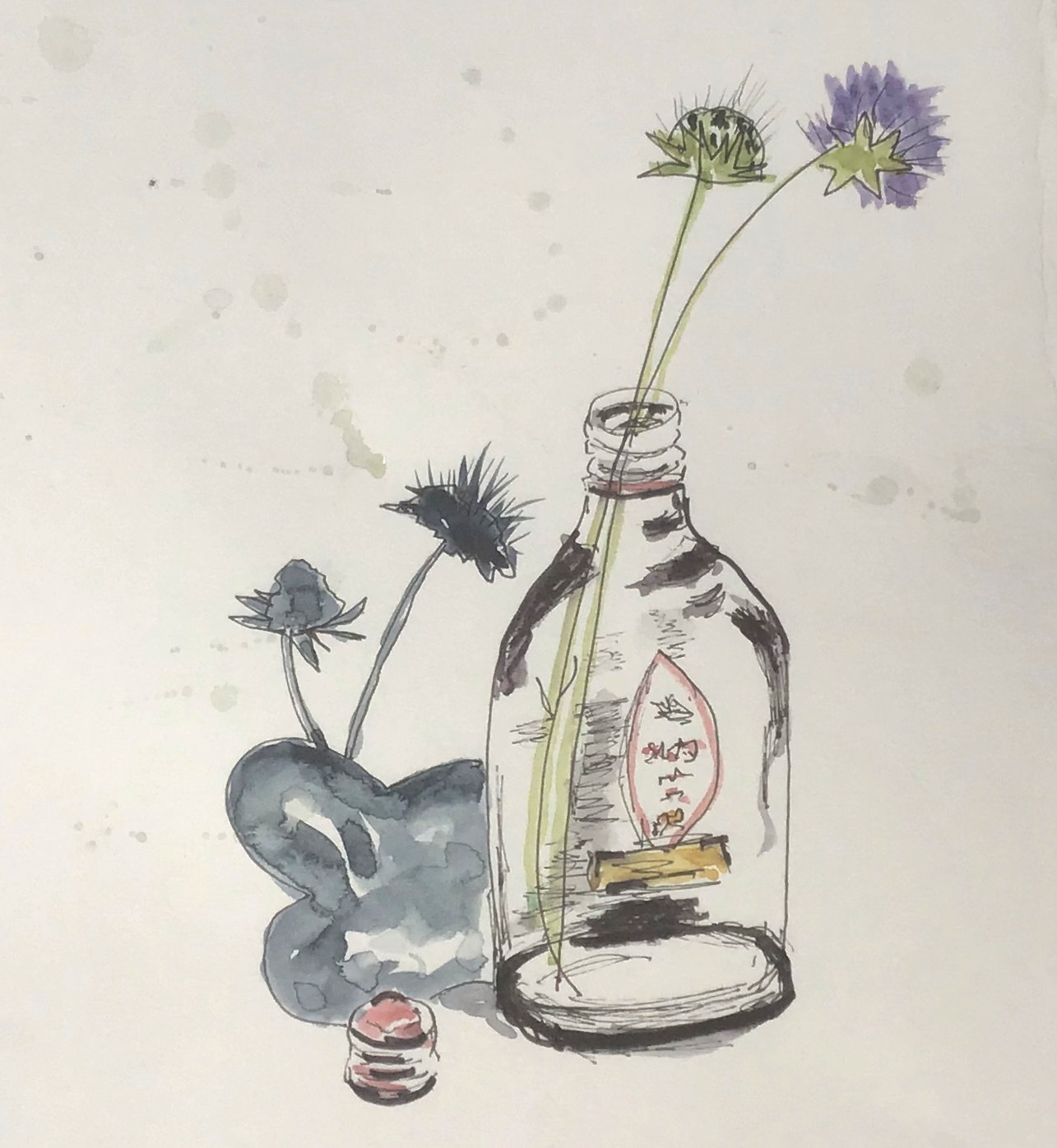
Watercolour sketch by Sandra
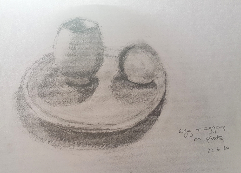
Egg, Cup and Plate: sketch by Ruth
Still Life Set up and sketch by Ruth
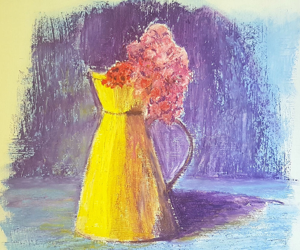
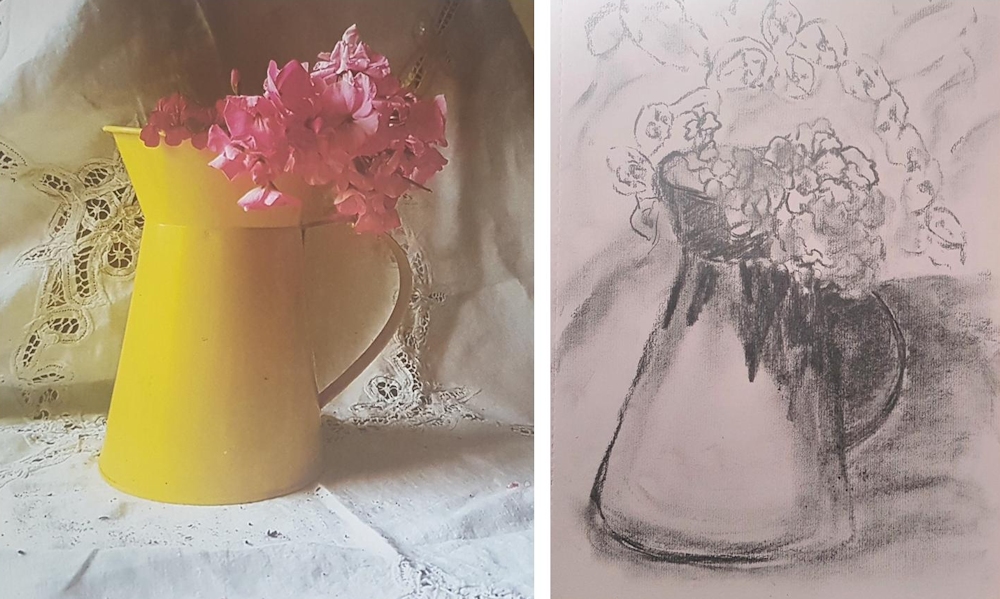
Yellow Jug: pastel by Ruth: Ruth has been inventive with the background and colour of the cast shadow, and the red/pink flowers make a colour bridge between the purple blue background colours and the and yellow jug.
Set up and pencil sketch by Shane
Still Life: pastel by Shane
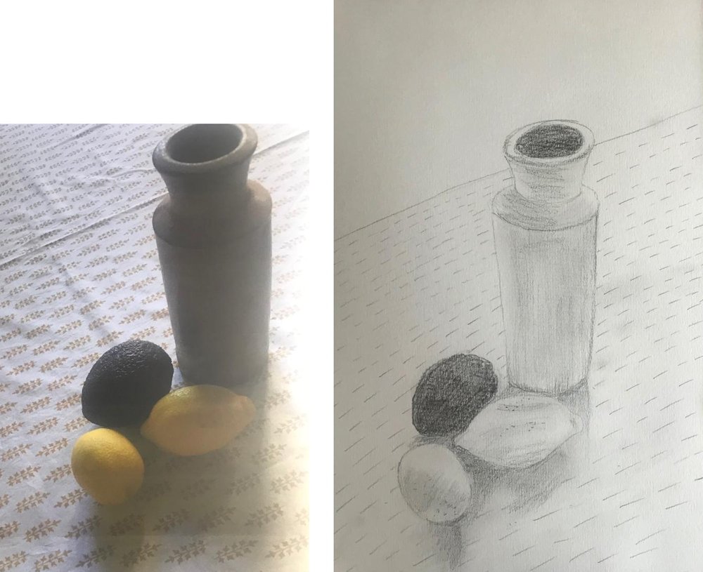
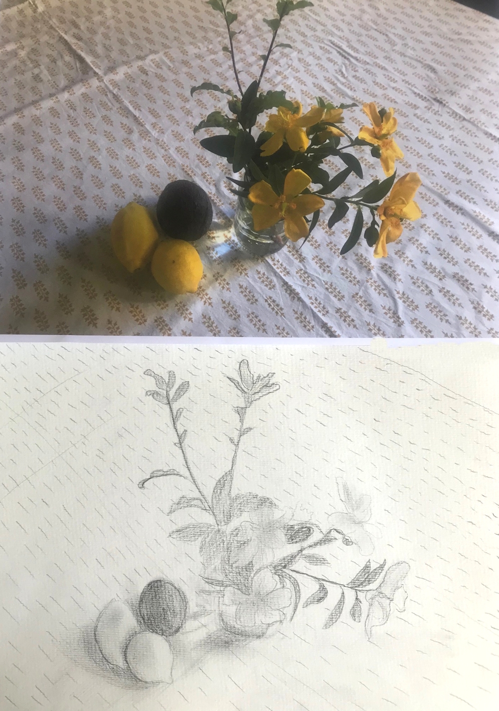
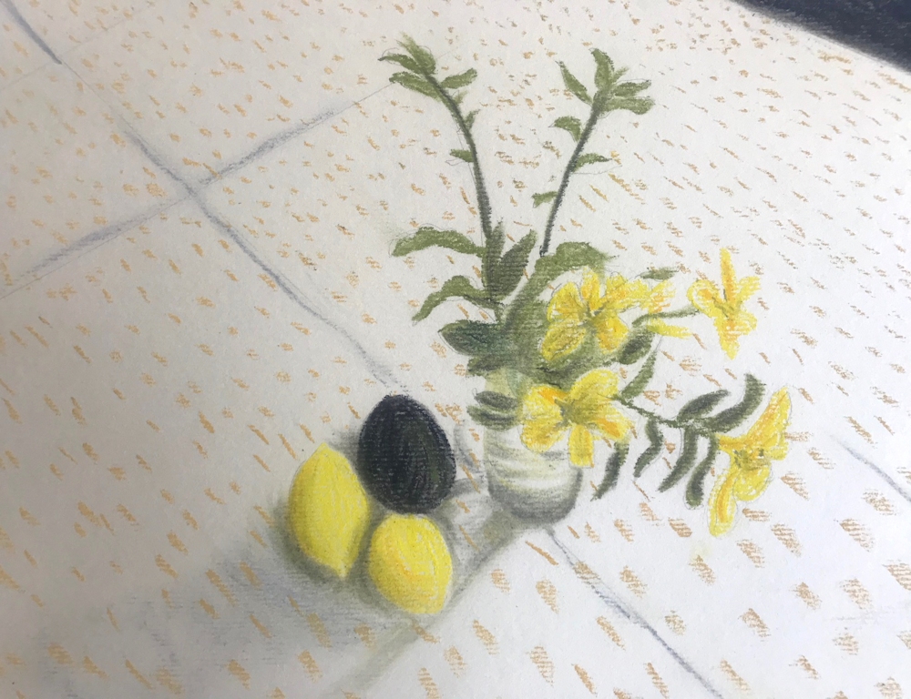
Set up and drawing of Still life with Lemons by Shane
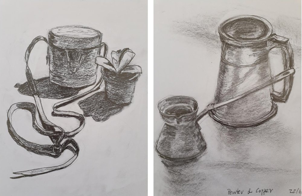
Binoculars and plant, and Pewter and Copper Ware; drawings by Vivienne
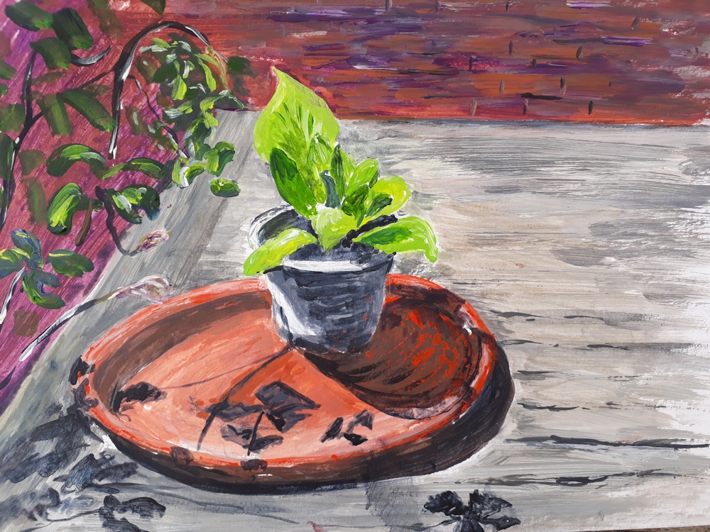
Still Life by Vivienne
Flowers from the Soul: create an expressionist floral painting
June 8, 2020
Pink Rose 2: watercolour by Jo
Expressionism began in Germany at the beginning of the 20th century. Its character was to reflect the world from a totally subjective perspective. In art this meant creating works based on presenting an emotional response to objects or experiences rather than depicting physical characteristics. These included outrage at the atrocities of war, but also the beautiful floral works of Emil Nolde.
OK that’s fair enough, but how is it done? Emil Nolde 1867 to 1956 was a brilliant colourist with horrid politics who produced floral paintings that were very far from botanical illustration. They have a power and a deceptive simplicity but whatever emotion they convey they glow with colour, especially the works in watercolour.
One of the founder members of the expressionist movement, Nolde’s flower paintings are works born of observation but full of energy and colour, making us feel the flowers and their character rather than giving us a blow by blow account of every petal and stamen. Sometimes it is the sense of movement, sometimes it is their rich texture, sometimes pattern or an exciting background colour but they glow with life.
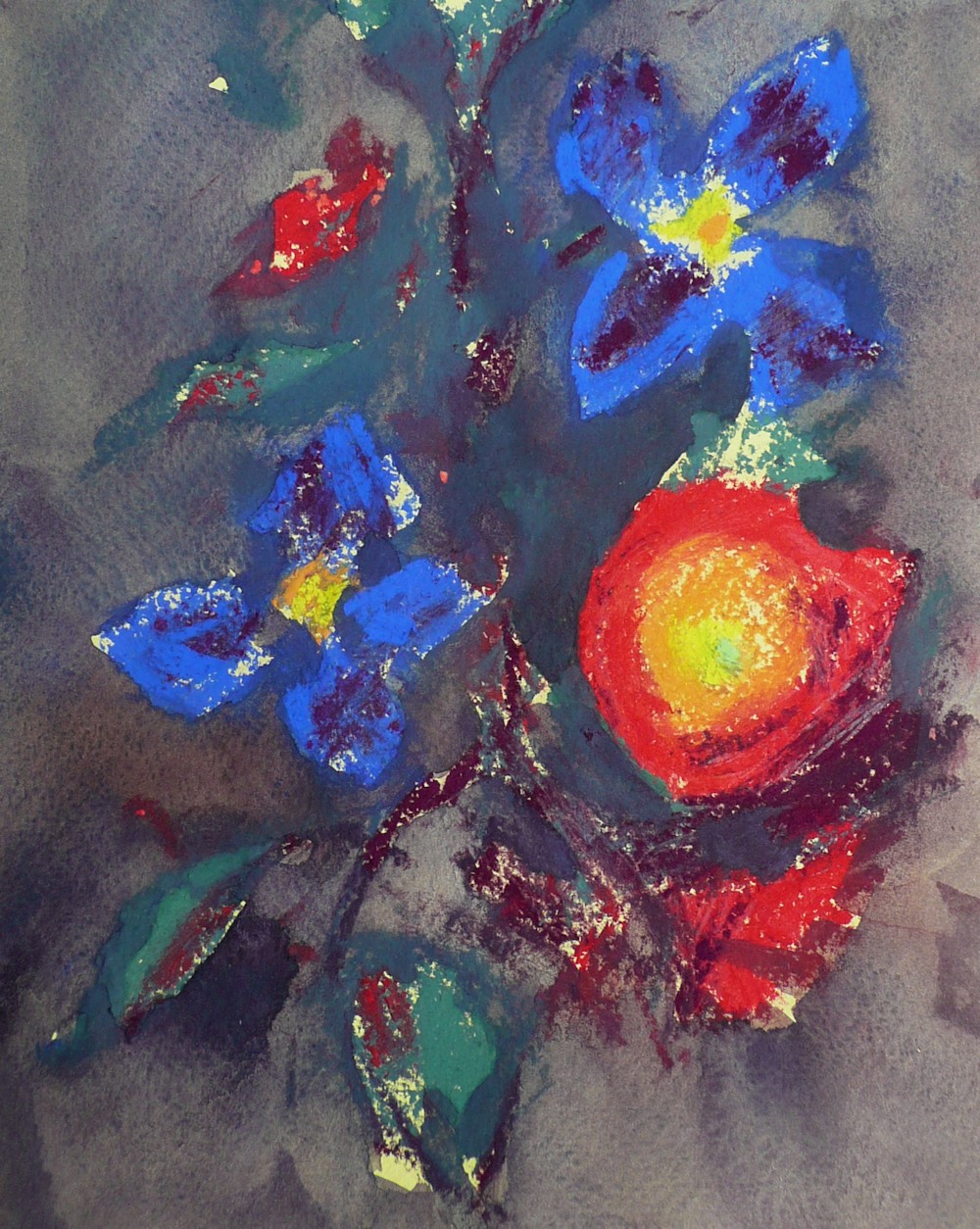
Ranunculus and Clematis: pastel over watercolour by Jo
I have put together a couple of studies some rather sketchy, just to show how you may think of srarting your own expressionist flower painting. Colour is obviously important so look at your flower models. What mood do they suggest to you?
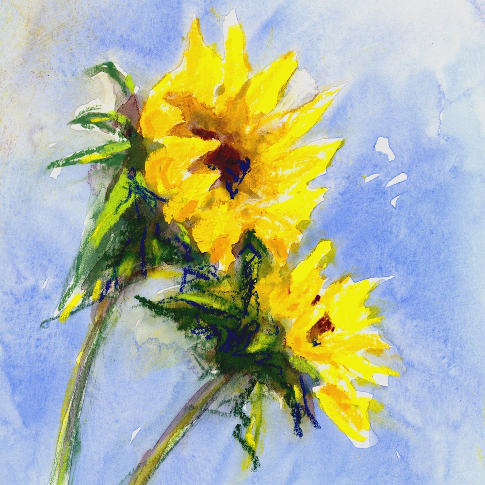
Sunflowers: pastel over watercolour by Jo
Light and airy?
Rich and decadent?
Romantic?
Frilly and frivolous?
Sombre or sad?
Peaceful?
Happy?
What colours and colour combinations do these moods suggest?
What tonal contrasts go with that mood?
Just reflect on this before you start; a sort of art meditation!
If you Google Emil Nolde flower paintings you will find a huge number; feel free to choose your own flowers or to make your own version of one of his paintings in any medium. Watercolour or pastel would work well.
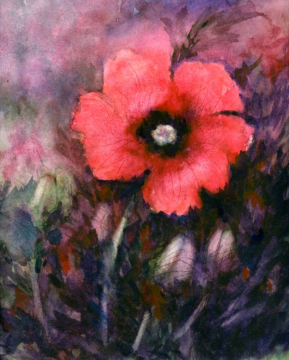
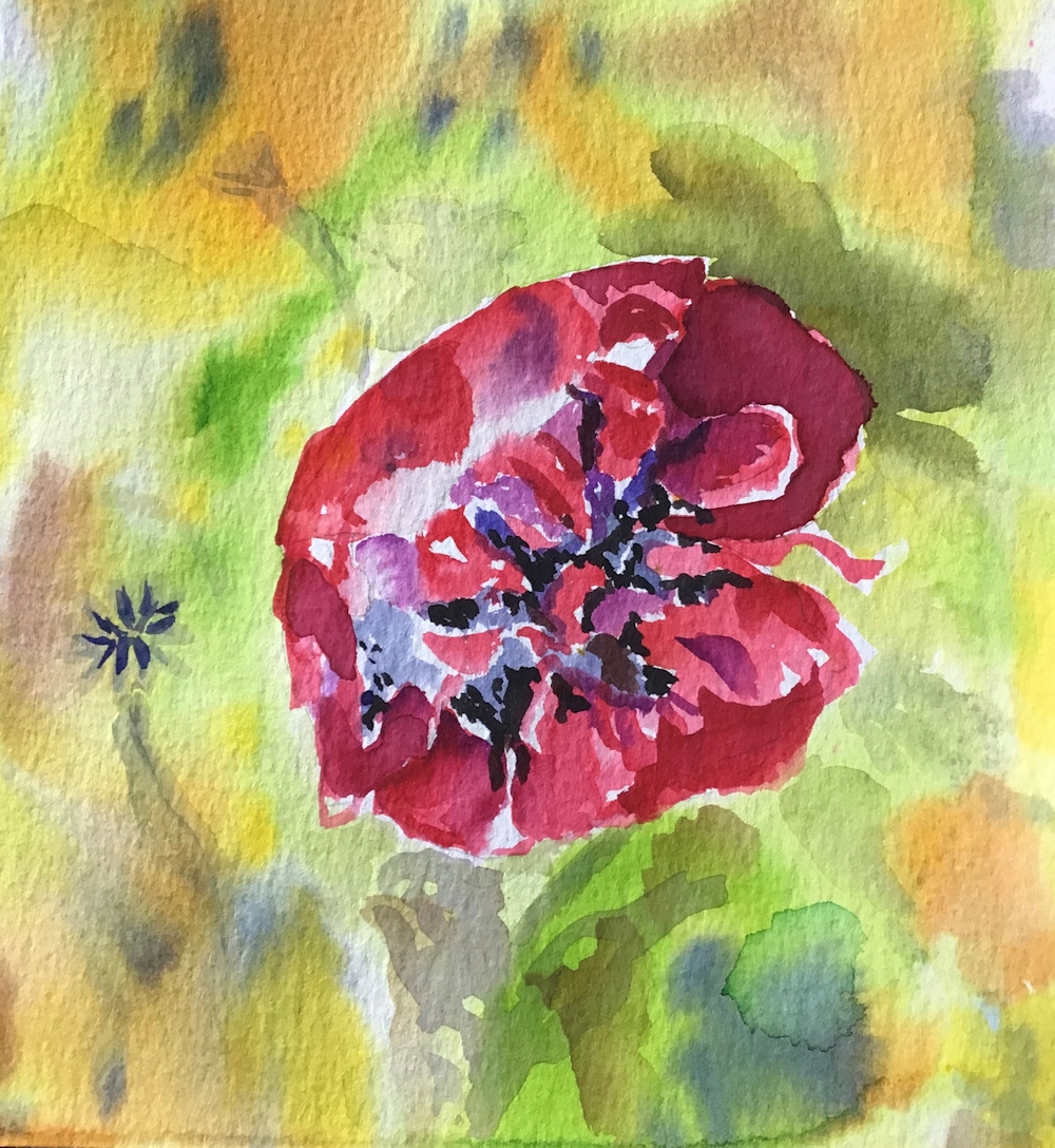
Poppy: watercolour
My poppy painting definitely has a mood. Below I have included three stages of a watercolour of the Phlomis blooming in my garden at three stages. The mood of the painting changes as the colours become richer and darker.
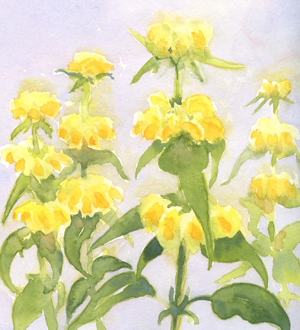
Phlomis 1: watercolour
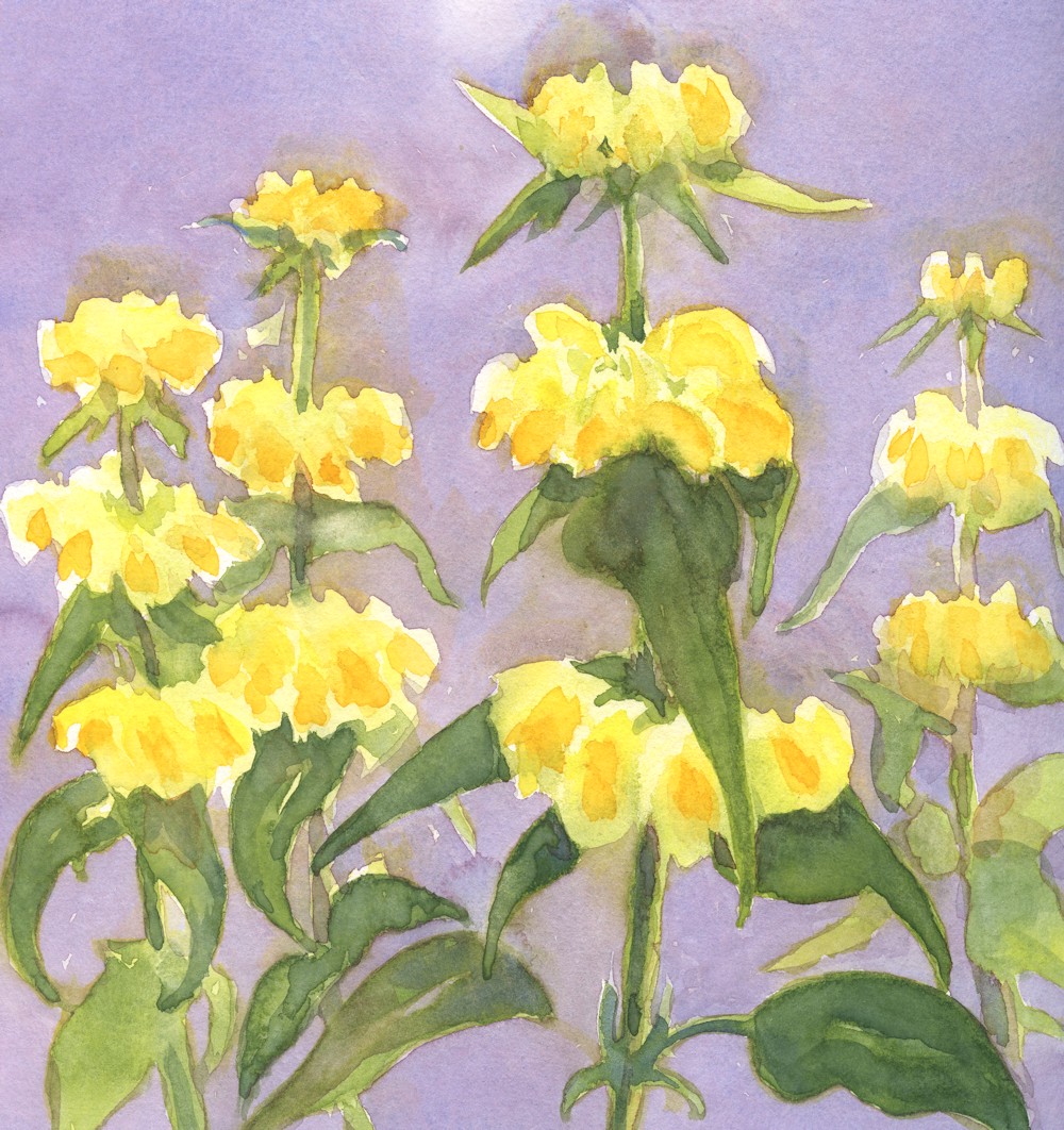
Phlomis 2: watercolour
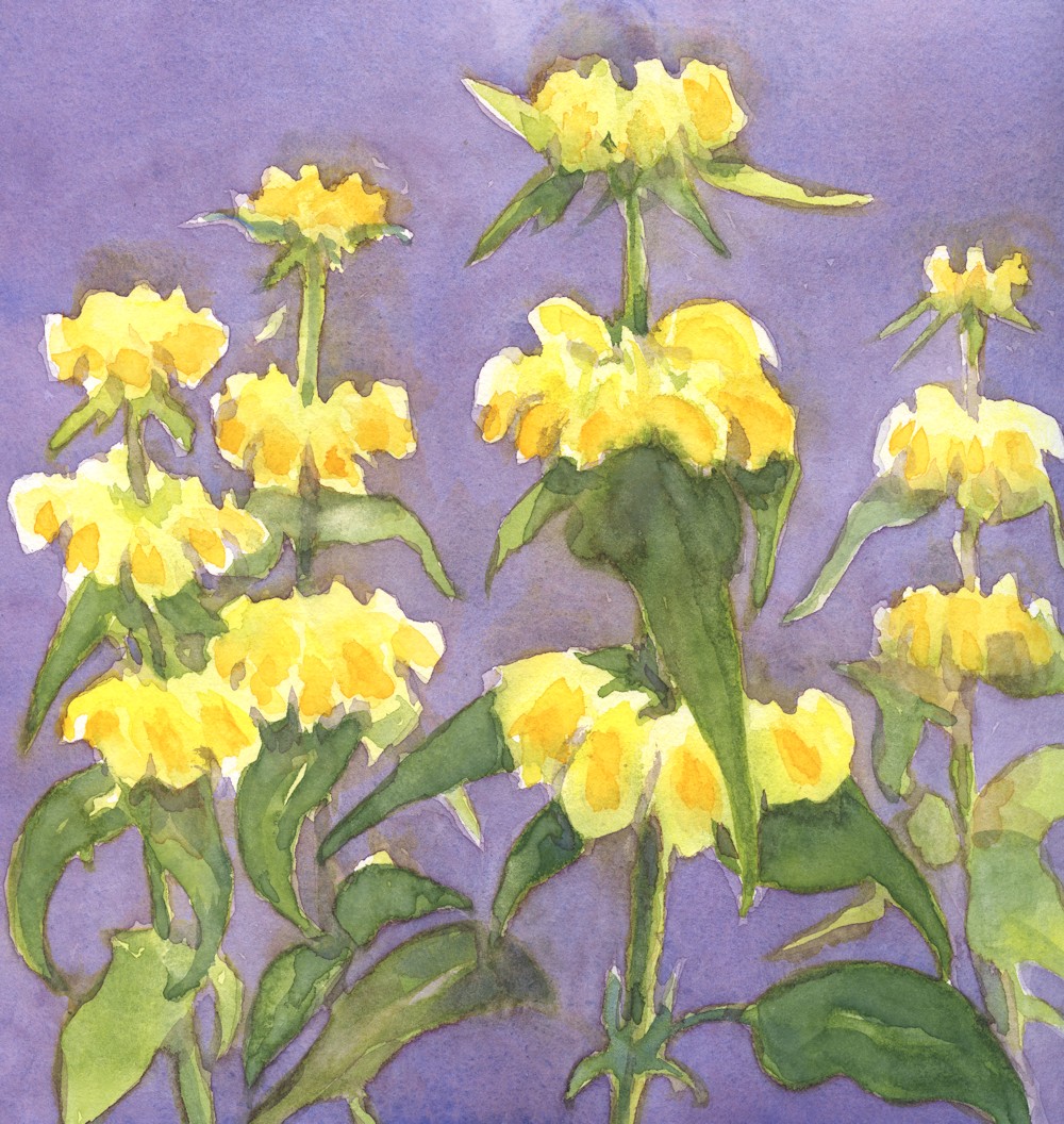
Phlomis 3: watercolour
Have fun and create flowers from your heart!
Your paintings:
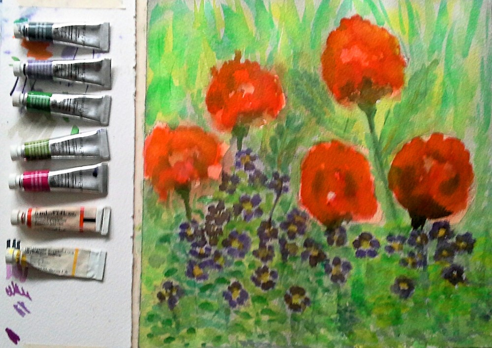
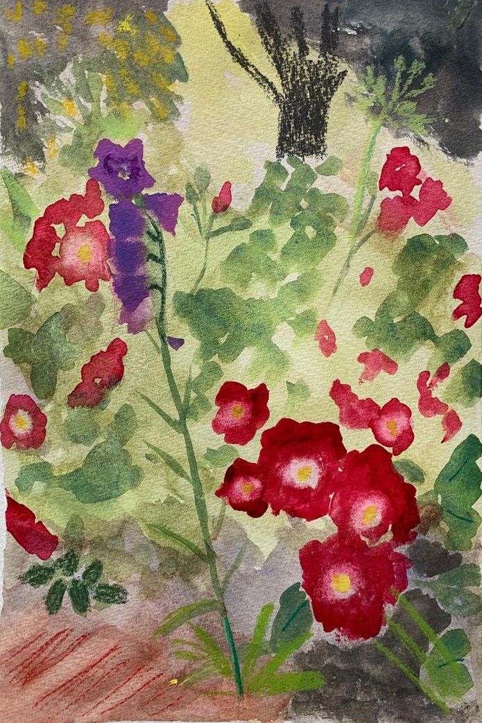
Orange Poppies and Hardy Geraniums by Angela
A flat watercolour by Angela
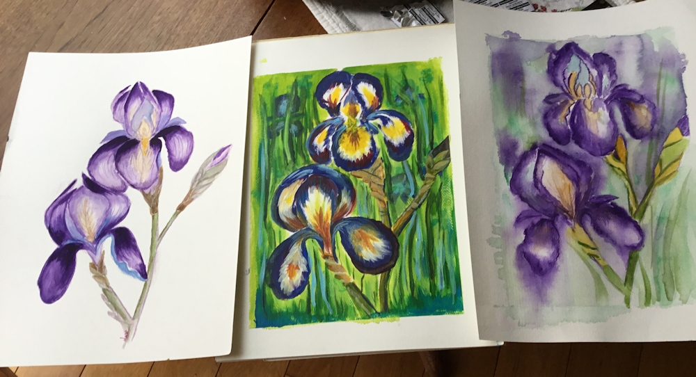
Irises by Ann
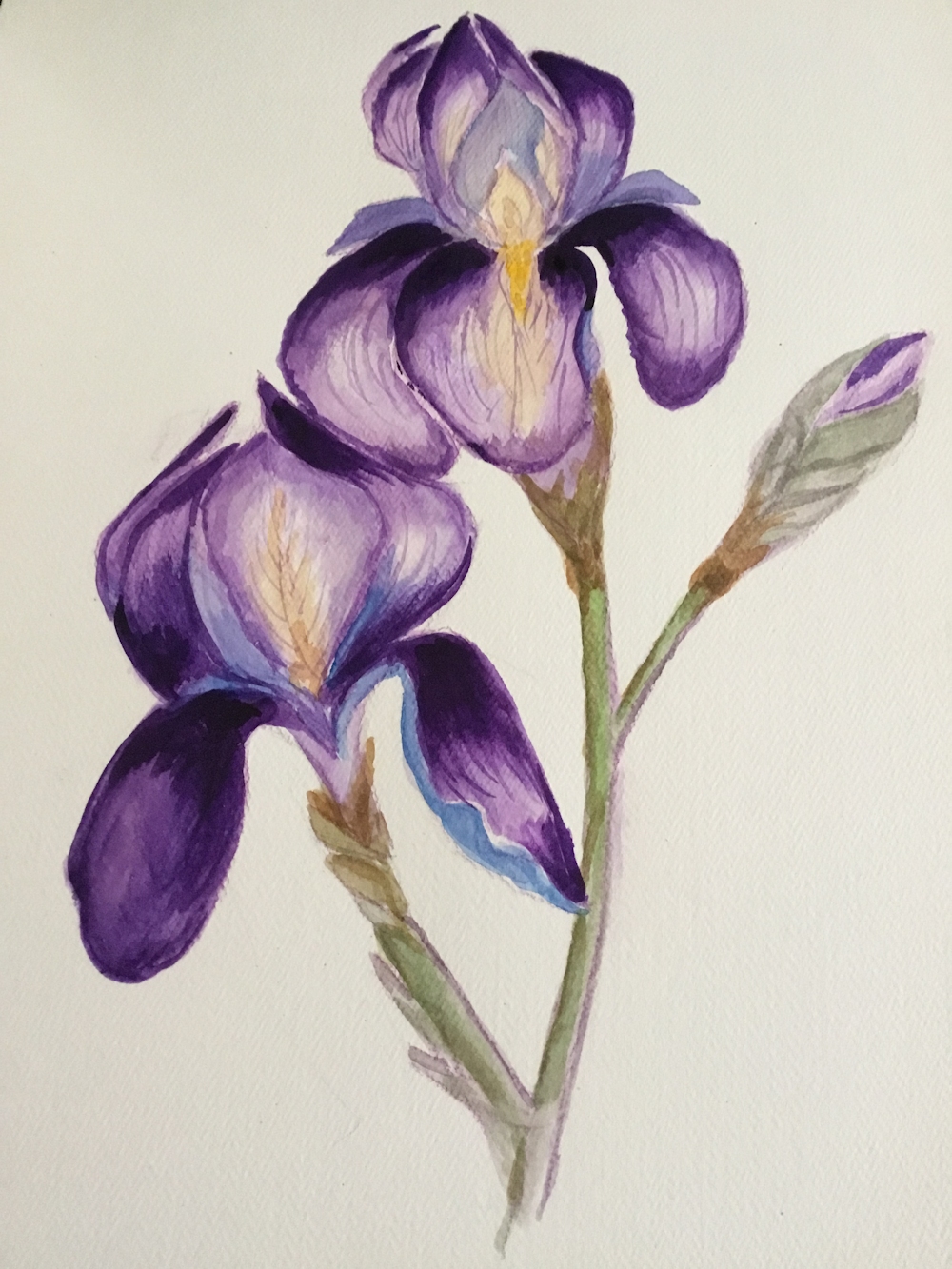
Iris by Ann
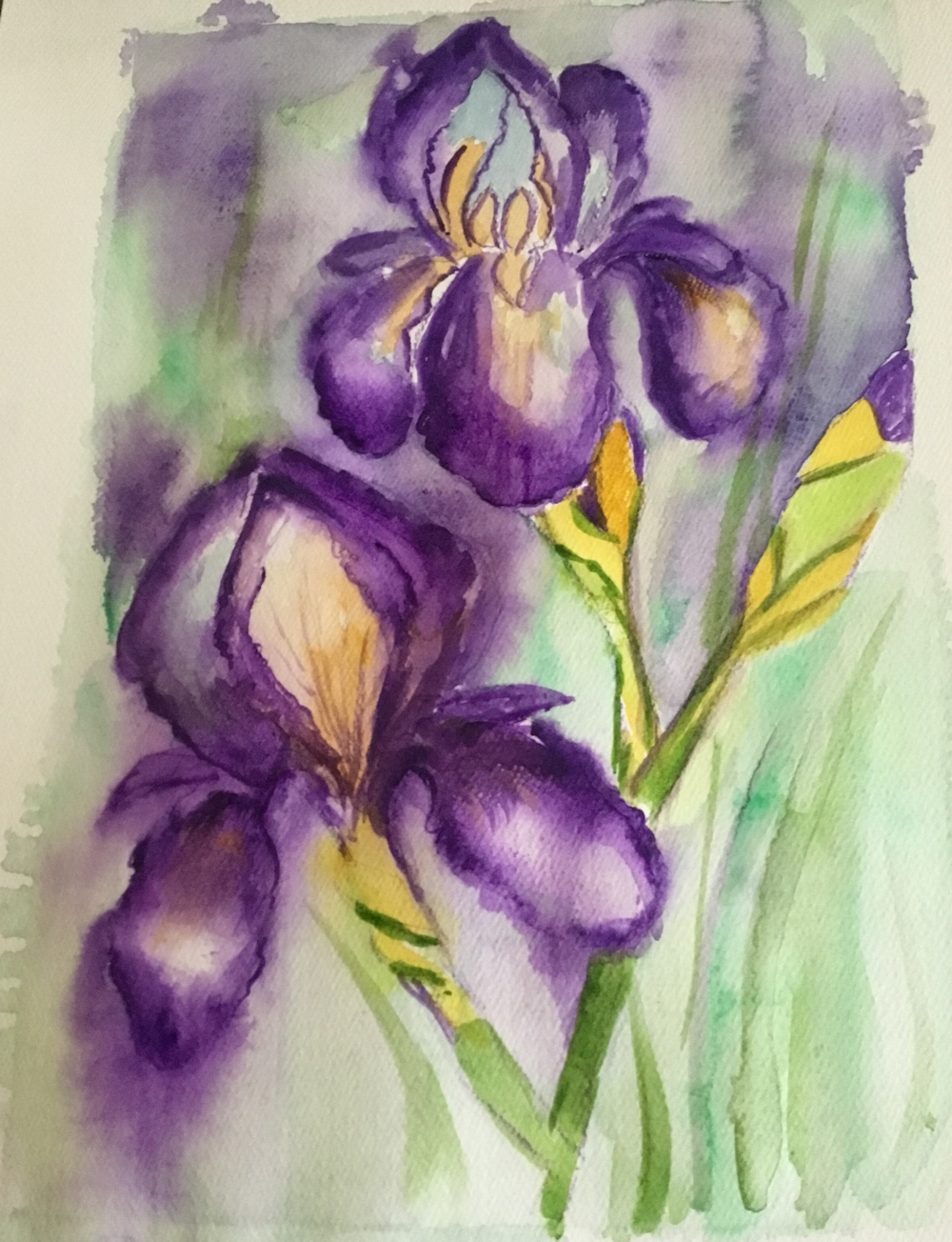
Iris by Ann
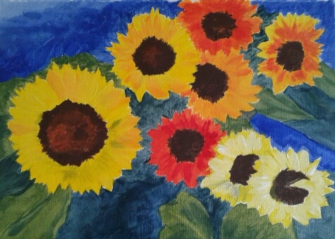
Sunflowers after Nolde by Barbara
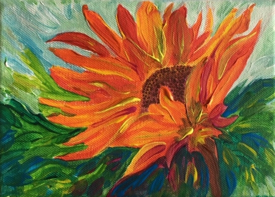
Sunflower, acrylic by Heather
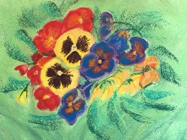
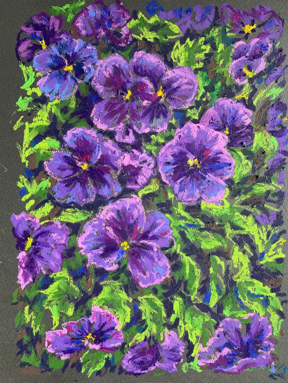
Pansies, watercolour and pastel by Heather
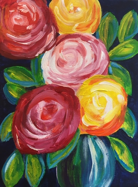
Roses, acrylic by Heather
Pansies, pastel by Jan
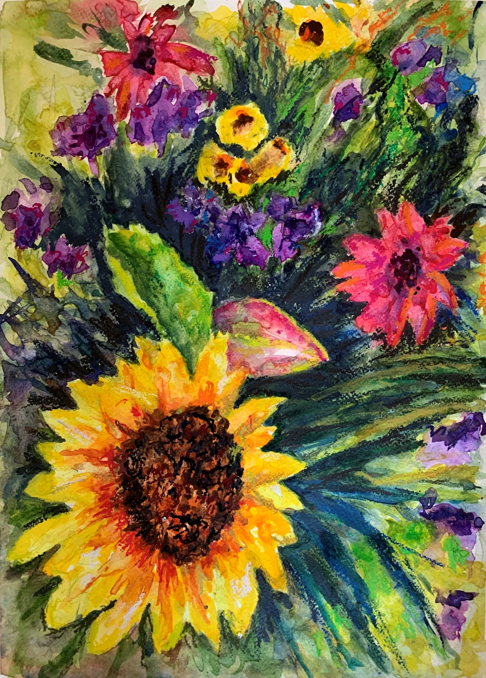
Flowers, watercolour by Jan
Watercolour Flowers by Jane
Pink and Orange Poppies, watercolour by Jane
Garden, watercolour by John
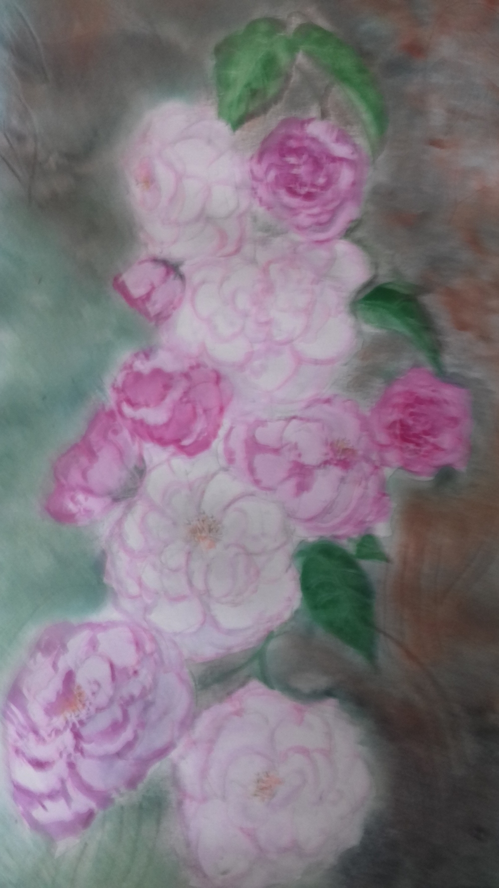
Pink Roses by Liz
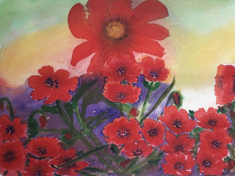
Red Poppies, watercolour by Maricarmen
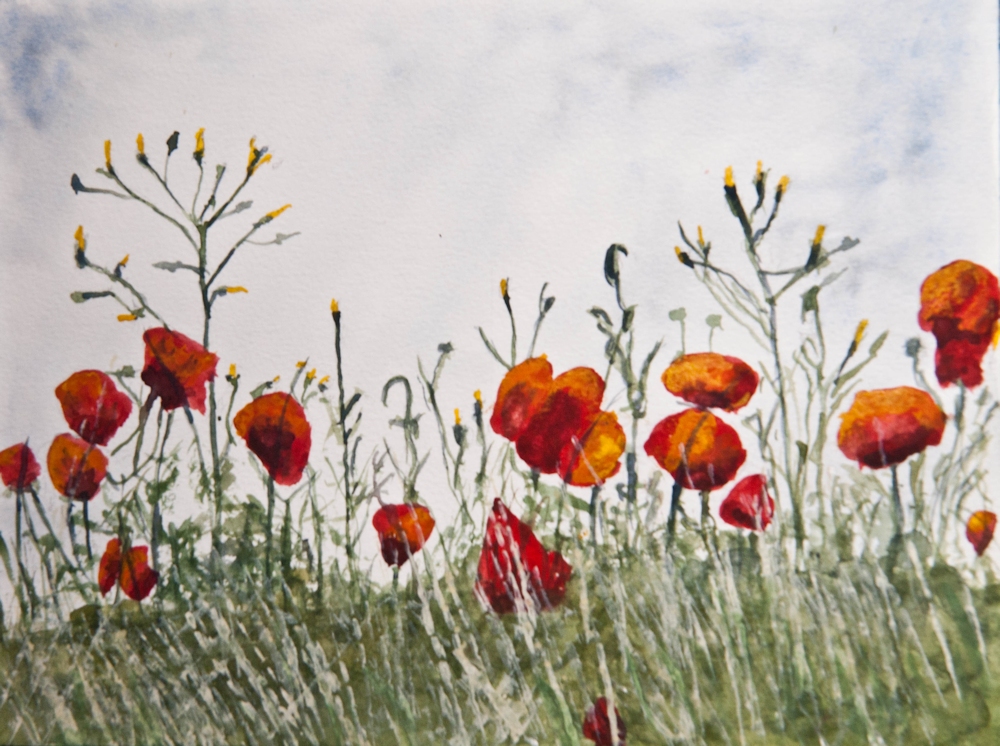
Poppy Bank by Roger
Jamaica Primrose and Hardy Geraniums, pastel by Ruth
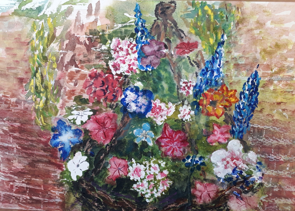
Basket of Flowers by Vivienne
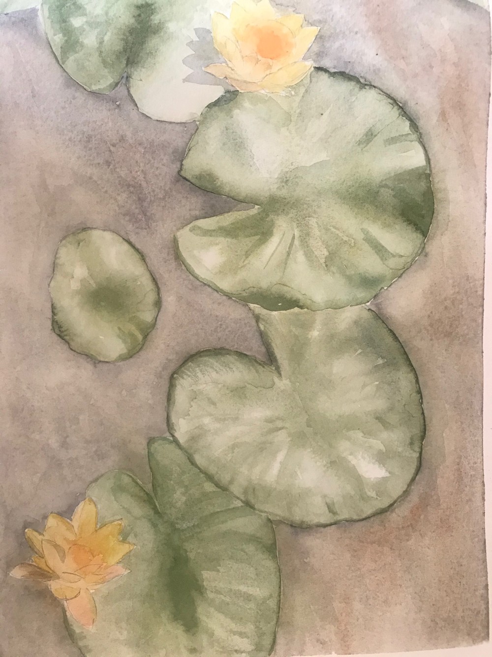
Waterlilies by Shane
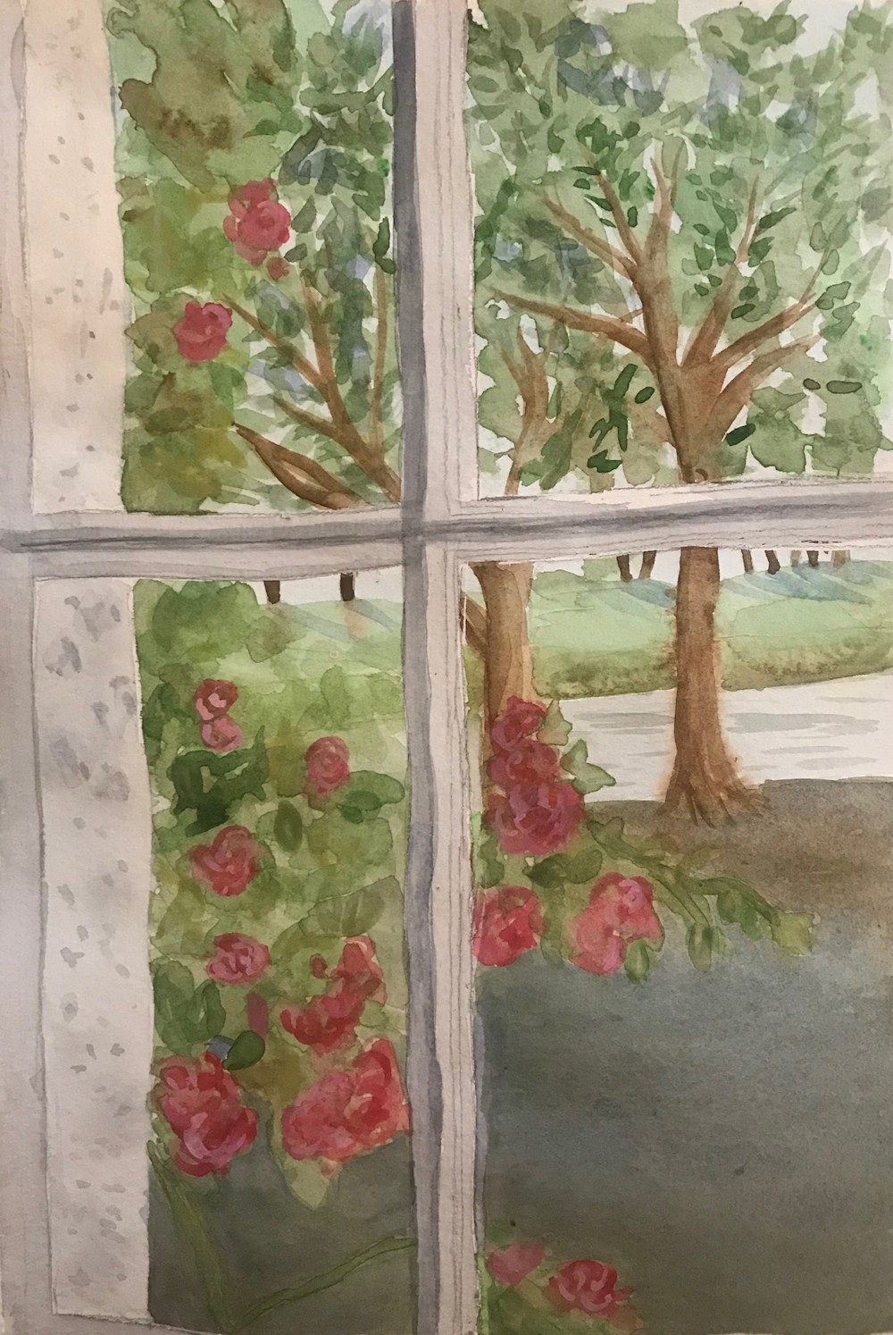
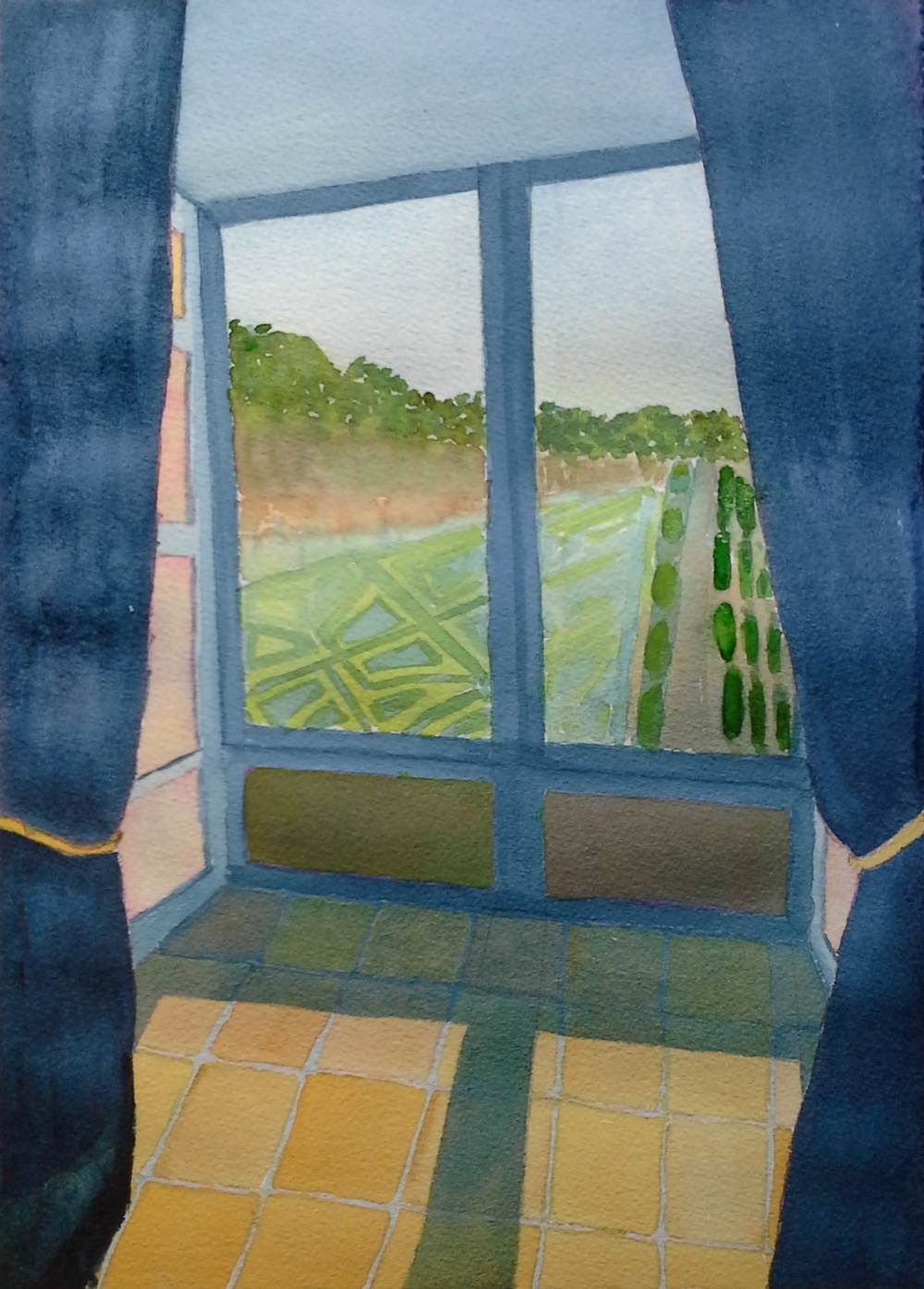
Through the Window, watercolour by Shane
Watercolour by Sandra
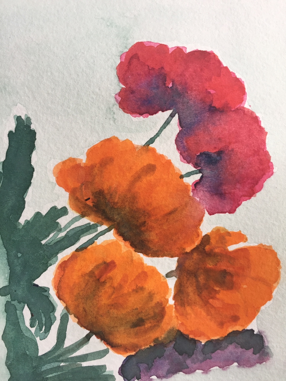
Poppy by Sandra
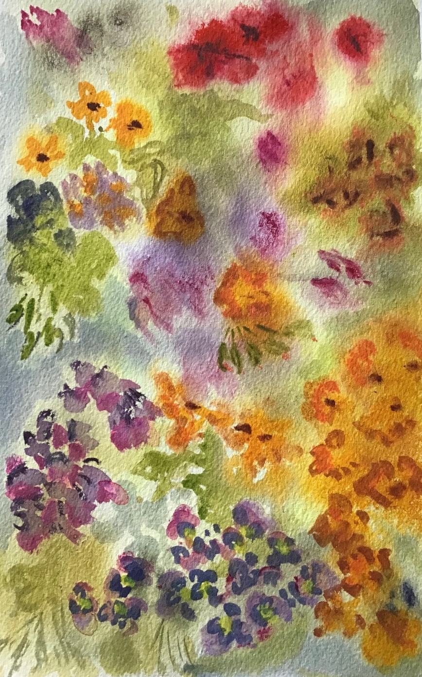
Watercolour by Sandra
Thinking about Portraits 3: Three Quarter View
June 1, 2020
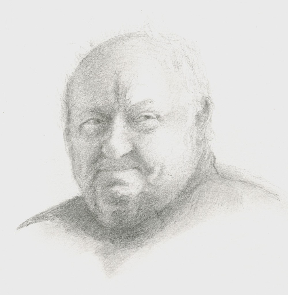
Pietro: Artisan and Collector, Bardi, in pencil
I tremendously enjoyed meeting Pietro in his Aladdin’s cave of a workshop, housing every kind of ancient woodworking tool, nails, and planes beautifully arranged among collections of old terracotta stoves and his magnificent sculptures made from ivy roots that once embraced trees in the local forests of Emilia Romagna.
The drawing above was made from a photo but I so need to make a colour portrait with a backdrop of his tools and collections. The drawing is very much in the chiarascuro tradition of revealing the three dimensional form by the use of dramatic lighting. The near frontal view and three quarter view give a huge amount of information about the sitter, including hints of the profile view as well as the frontal view. It is probably the view favoured most by portrait artists and I recommend you to study portraits by Caravaggio, Rembrandt and Vermeer who all used chiarascuro lighting to reveal the form of their subjects.
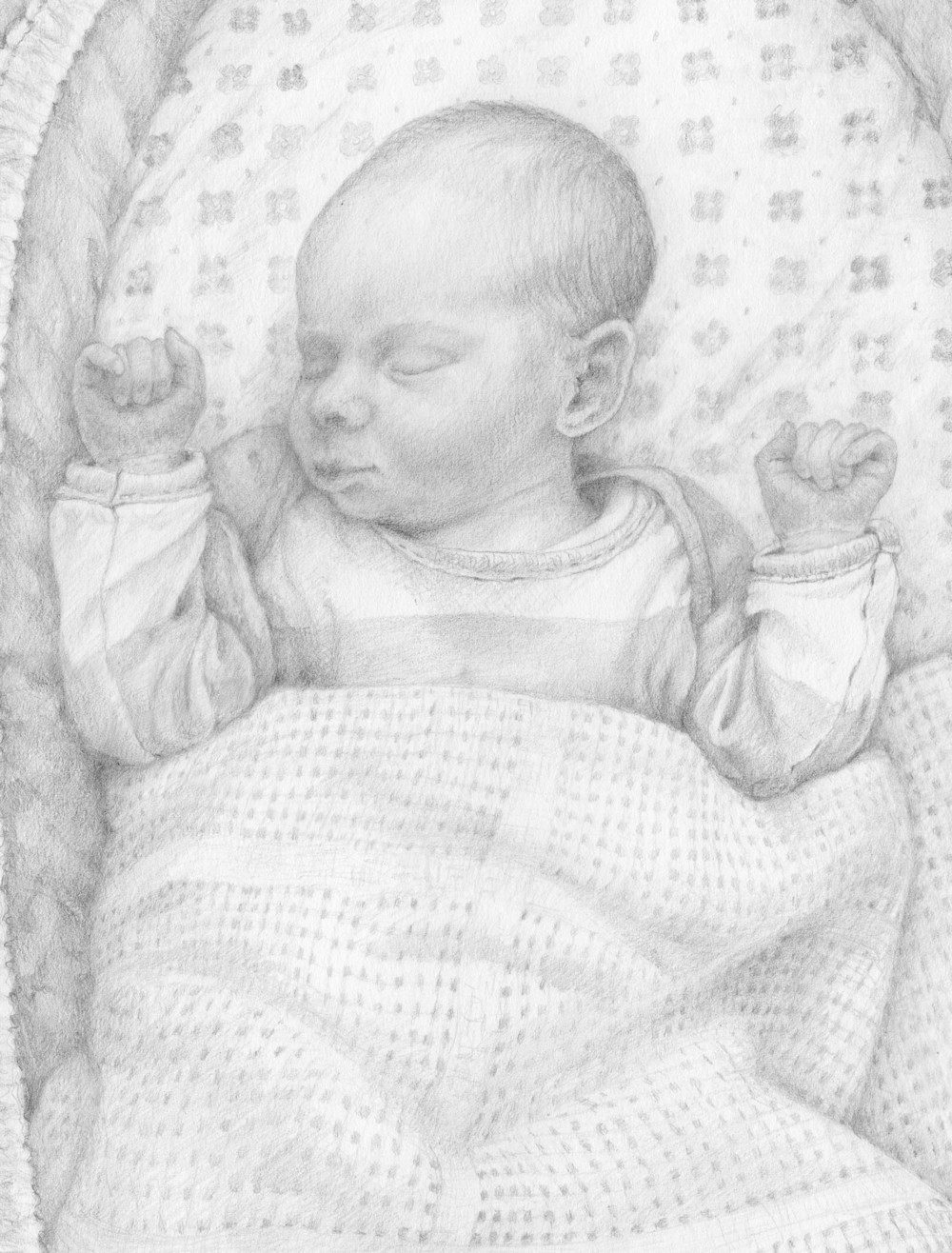
Crown prince Toby: first grandchild in pencil
It is hoped the images chosen for this post will help you think about drawing young and old, how much else to include besides the head, and a nod to putting your model in context to tell a story.
Best of all would be for you to work from life asking a family member to sit, and arrange for your model to be strongly lit from one side. Alternatively find a three quarter view photograph of someone you know or make your own version of an old master painting, again looking for a reference with strong lighting that reveals the form of the head.
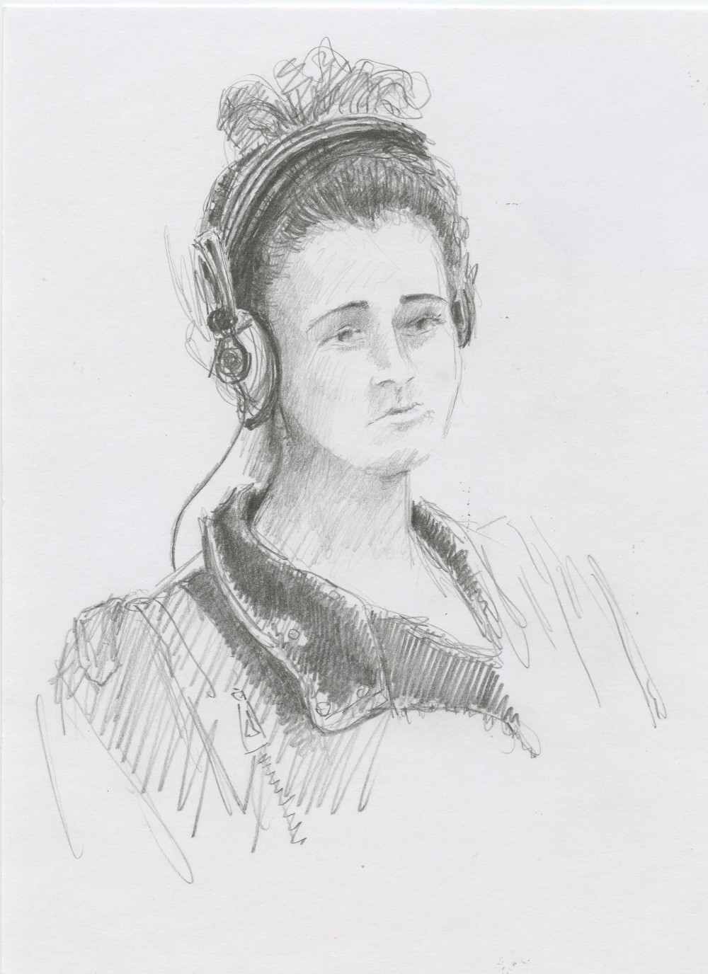
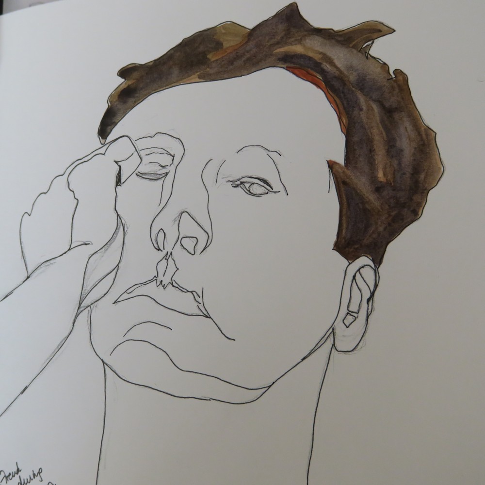
Headset on the Jubilee Line; pencil sketch
Whether you decide to work from a live model, a photo reference or make your own version of an old master painting think about the general height and width of the head and how it connects to the body. In three quarter view you wil see the neck rather differently in relation to the head and shoulders than with a head facing you directly. Lightly place the eyes, bottom of the nose, mouth and chin, noting that one eye will appear closer to or even be partly obscured by the bridge of the nose. The eyes will also appear slightly closer together. Go on to place the ear; again the position of the ear will appear very different depending on how much the head is turned away from you.
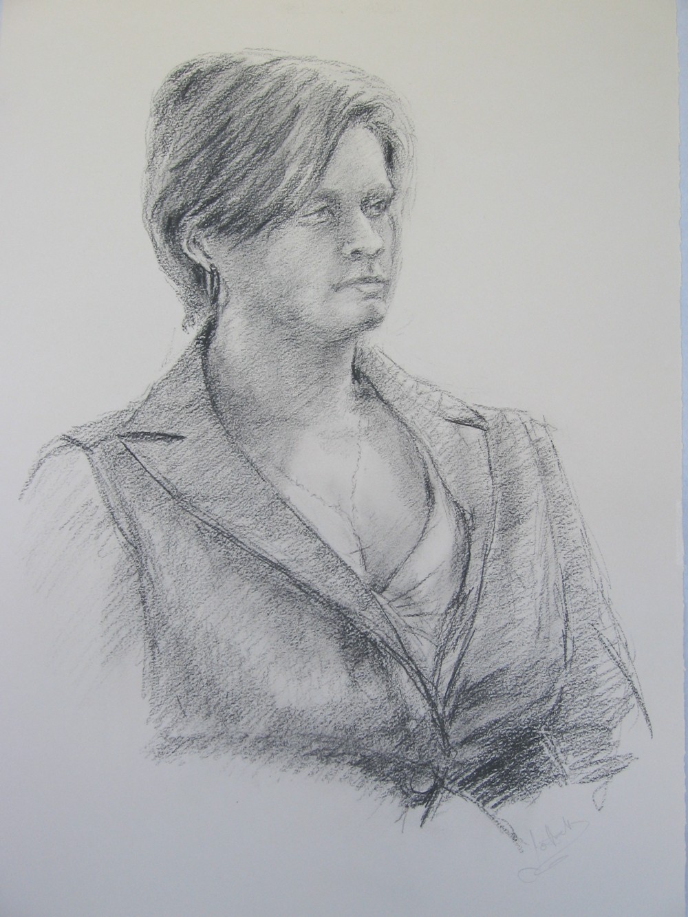
Drawing from Life; charcoal pencil
Perhaps suggest the mass of the hair, ensuring you understand the underlying shape of the skull first. Then work on very lightly shading all the areas that are not the very lightest with an HB pencil. next work on the mid tones hatching with a slightly softer pencil and start to work your hatching to describe the form. Then start to reinforce the darkest areas with some hatching and some mark making to suggest the textures you see; wrinkles, freckles etc. Adjust all the tones paying special attention to under the chin and neck, the whole of the darker side of the face, shadows under the nose and from the hair etc. till you are happy.
Not everyone has a skeleton in their cupboards but if you can find the opportunity to draw a skull in side, front and three quarter view it would help to give you a very clear understanding of the spatial relations of the eye sockets, nose and jaw line. Even with a very plump face it is the skeleton and its overlying muscles that give the head its over all structure. Exploring the head tonally by drawing will give you great assistance when painting a portrait in any medium.
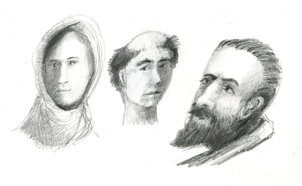
Doodle heads imagined: pencil
Try to continue with sketchbook studies from life whenever you can, but don’t be afraid to invent doodle heads and give your drawings a dramatic chiarascuro lighting.
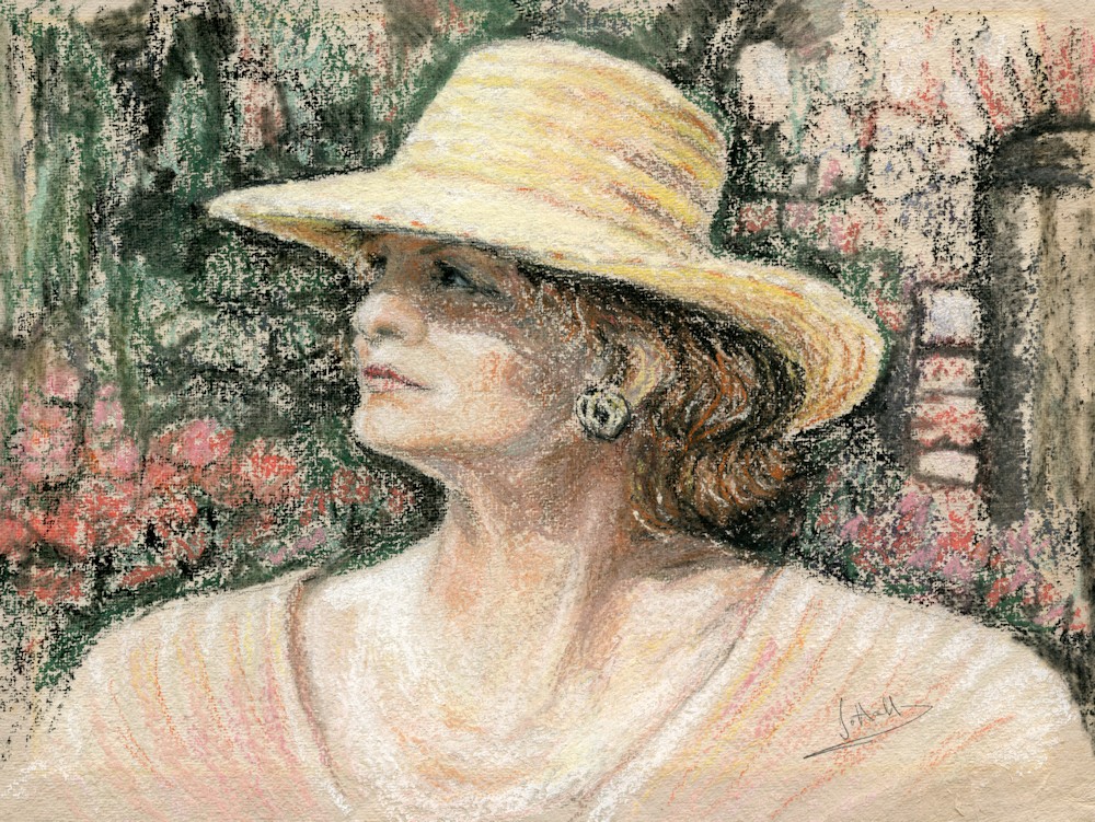
Eva in Tuscany: soft pastel
The last examples in colour are not all three quarter but all are dramatically lit. Eva’s hat provides a wonderful shadow over her face.
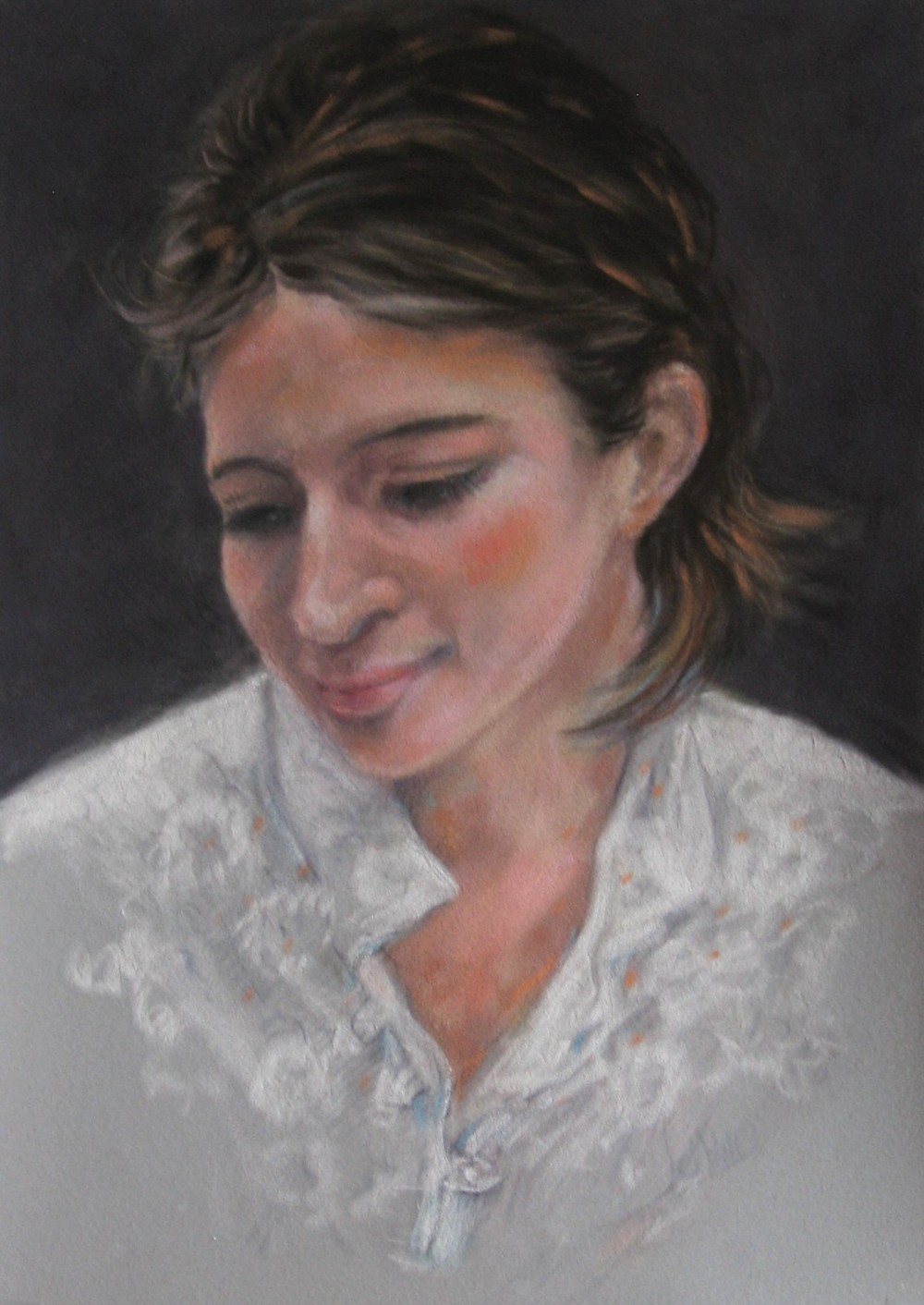
Claire: soft pastel on velour paper
Claire was painted in pastel on velour paper giving a very soft look.
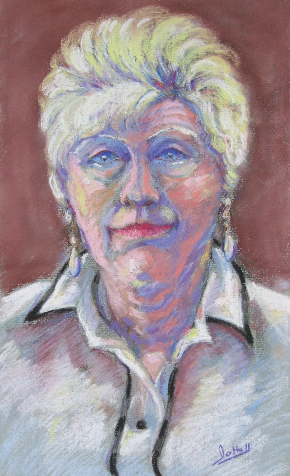
Soft pastel painting from life
The last shows how colour can be used to indicate tone and shade much in the way some Fauve paintings were made. In future posts I hope to explore colour and portraiture and also portraits that include something of the passion of the sitter in the way that a portrait of Pietro in his workshop with all his tools, sculpture and quirky collections would tell something of his story.
Your Drawings and Paintings:
From photo reference, in pencil by Jane
Almost front view from photo reference with dramatic lighting, pencil by Jane. Totally my rule of thumb: if you can see both ears the head is approximately full front, but as you can see here the side of the face on the shadow side is slightly narrower and we can see more of the ear on the lighter side, even a small rotation from absolutely straight ahead makes a difference. Also note how the strong use of light and shade (chiarascuro) reveals the form of the head and helps us understand the form of the nose, chin and brow with tone rather than line. All very well observed.
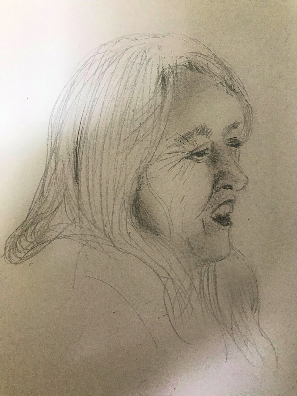
Mary Beardsley drawn from television by Shane; this is great, I can almost hear her speaking. Look at how some deft tone has helped us make sense of the form, while the line gives us the shape of her features and head. The mark making especially round the eye nearest to us and treatment of the hair are direct and not overly fussy. Drawing from people that are moving is not easy even when already translated into 2D on a screen but often produces lively drawings!
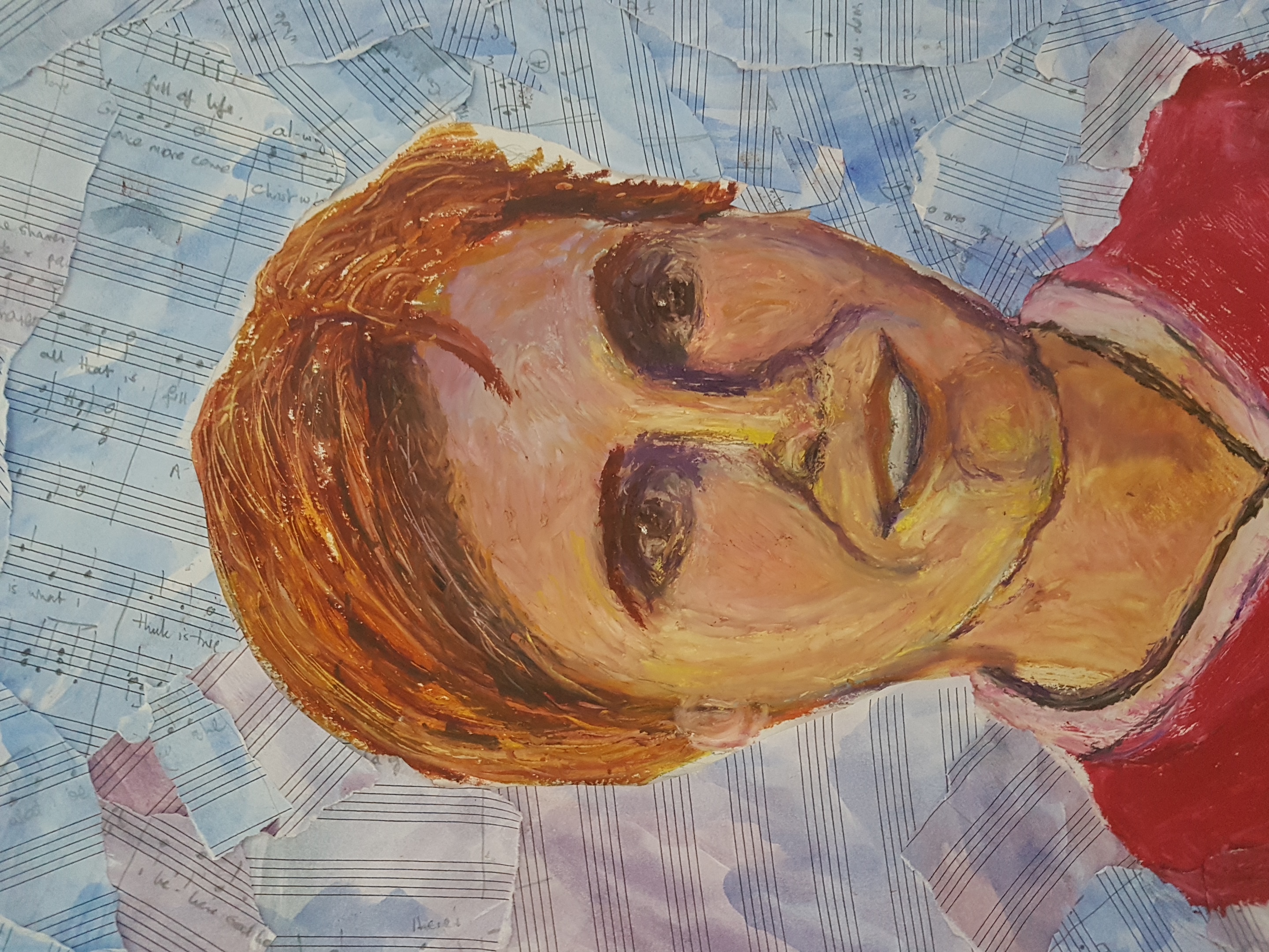
Tania by Ruth in oil pastel and collage. Tania is a musician, hence the background; another lively portrait with well observed tones.
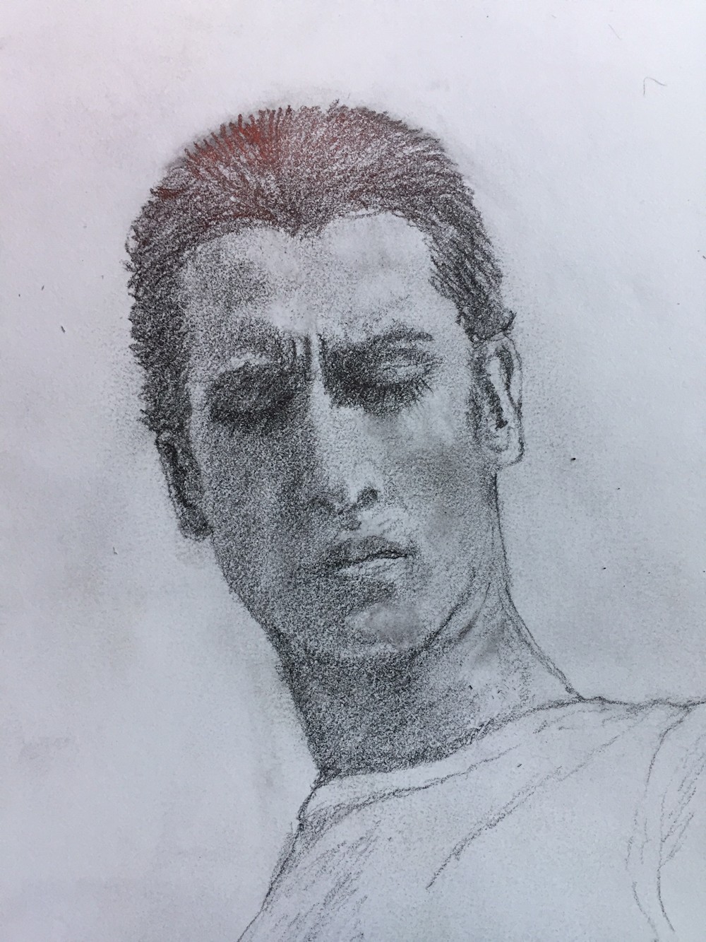
Barry in Lockdown by Maria; a very powerful image, the direction of the hatching giving a very sculptural feel to this portrait head. It looks as though Barry is looking up from the position of the eyes and the fact that we can see almost under his chin.
Another drawing from Maria: this time her version of a work by Lucien Freud, again with the head tilted up. This is very convincing as we can see the underside of the chin and nostrils, the eyes correctly positioned and the also the ear. Really good idea to try drawing like this with pen from life as well as from other artists and photo reference.
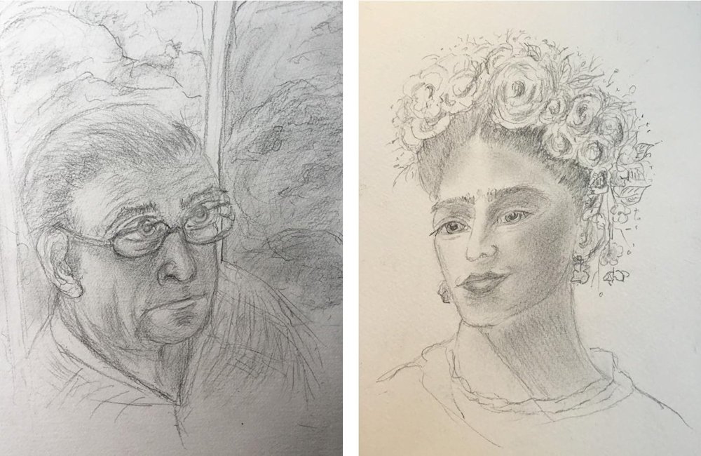
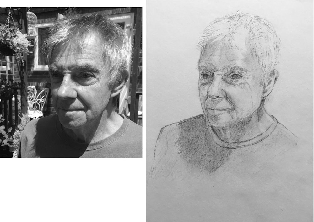
Drawings of Husband and Frida by Ann
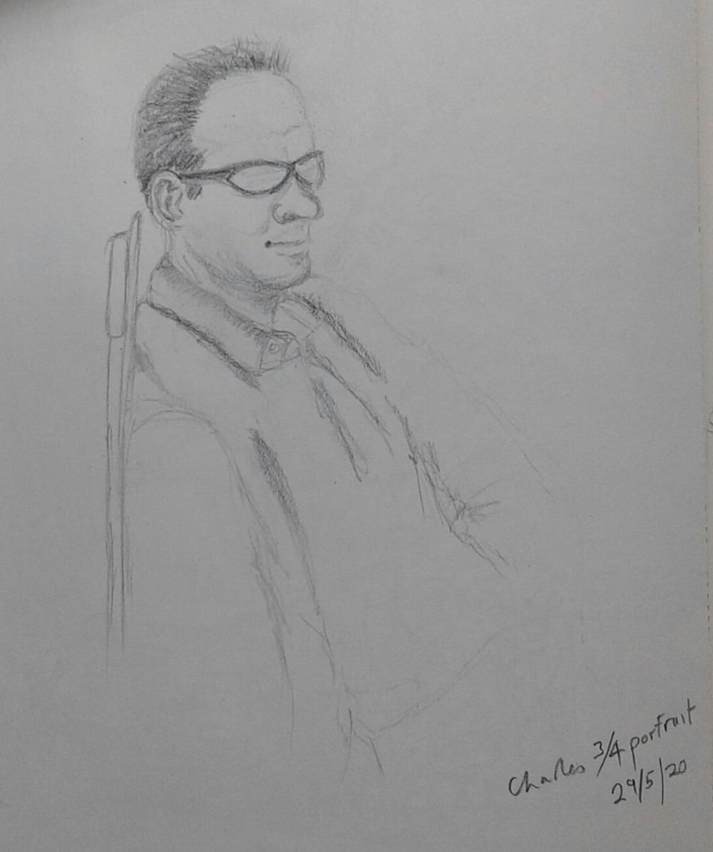
Charles by Barbara
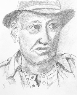
Paul Simon at 70 by Sandra
Chris by Heather; Good framework of shapes to build on; needs more tone generally except in the very lightest areas and a lot more tone round the eyes, across the brow ridge and on the dark side of his face.
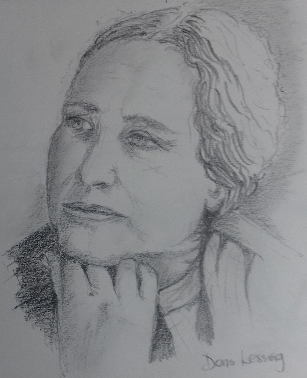
Doris Lessingham by Liz from photo
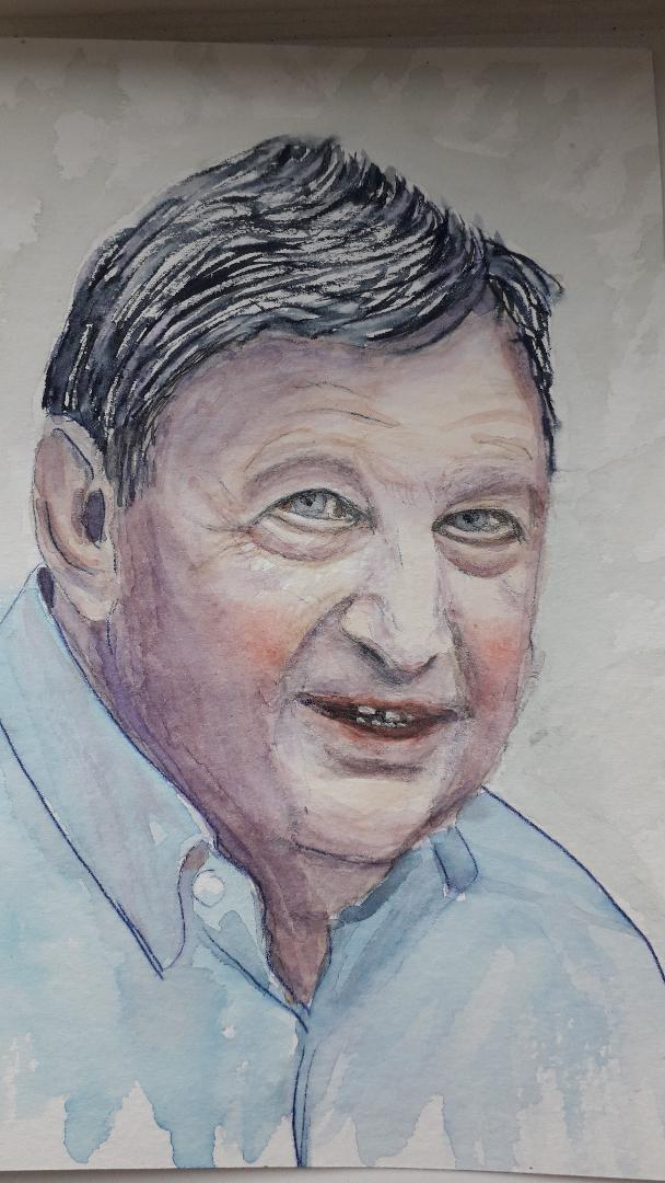
John by Maricarmen; watercolour
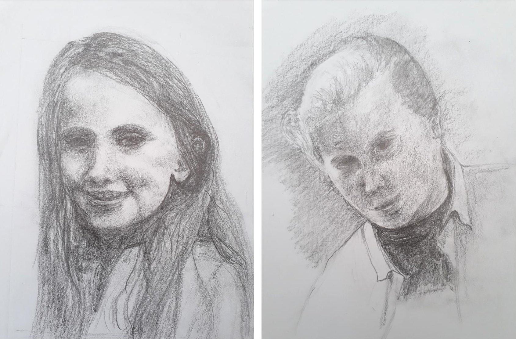
Phoebe and Helen by Vivienne
Ben and Naomi by Roger