Monthly Archives: November 2020
Lights in the Sky, Lights from the Land: Fire
November 17, 2020
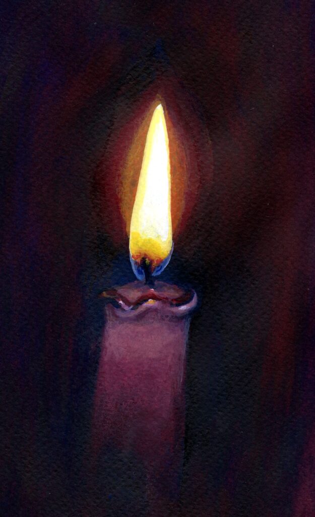
Watercolour and gouache on burgundy pastel paper
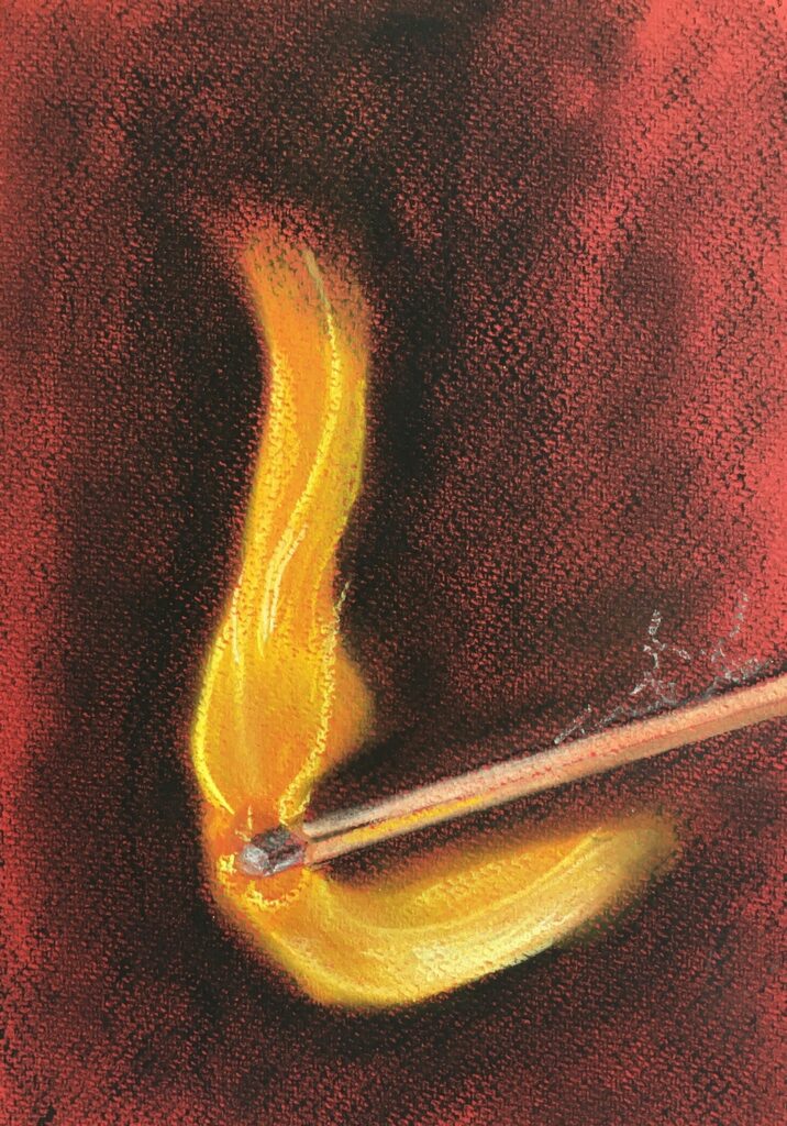
Fire is natural light. We can cause fire to happen but it is a natural phenomenon and unpredictable in its shape and form which is as flickering and fluid as water. There are some similarities with the way fire and water behave visually; the explosive bursts of fire from natural causes or rockets exploding in the sky are not so different from fountains spraying water as pressure is released by a valve; fire can also pour down volcanic mountains. A difference is that we see water because it reflects light but fire is the light source. Visually it is the difference between the sun and the moon. In our thought processes when we depict fire we depict power and potential danger, even when this is in the form of a humble candle.
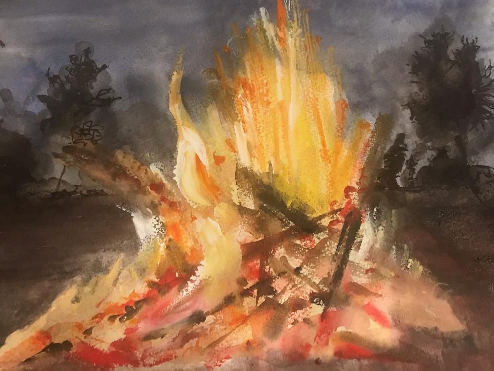
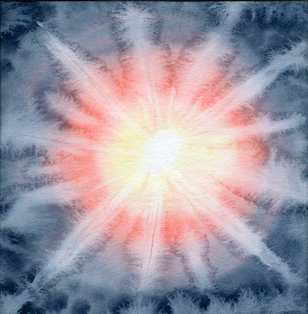
Watercolour; flames masked and rest worked wet in wet
Perhaps the disconnect between the power of fire which we harness domestically and its destructive nature, whether natural or harnessed for war is why we find the flickering flame so exciting.
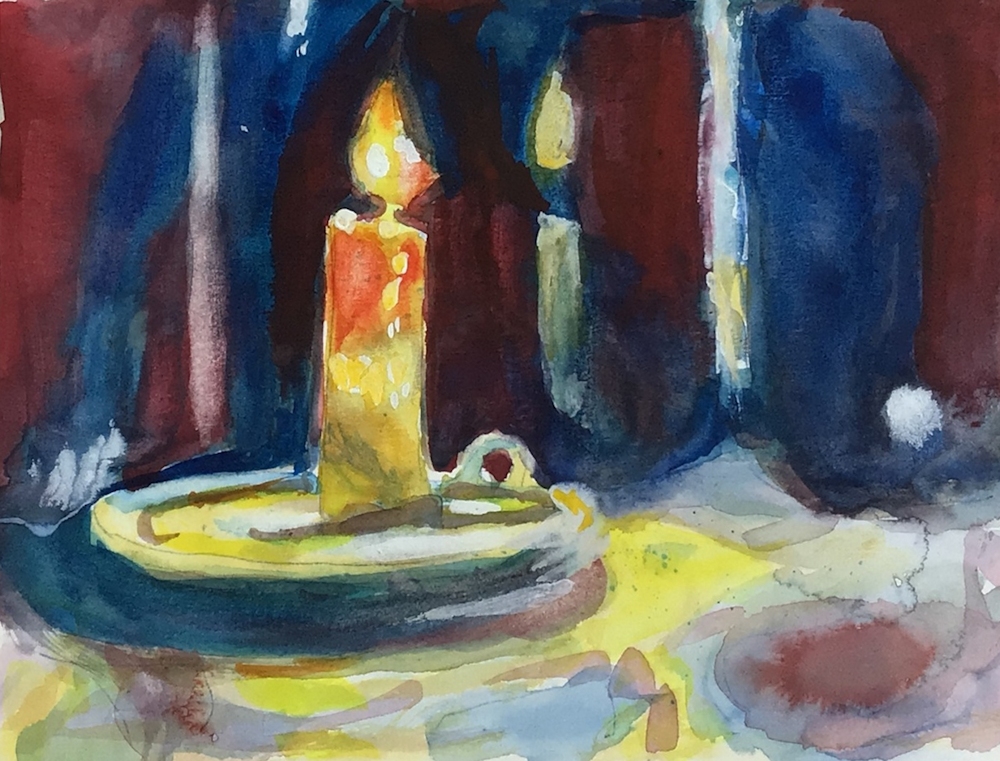
Gouache
That’s the philosophy bit done! Now for a look at the candle;
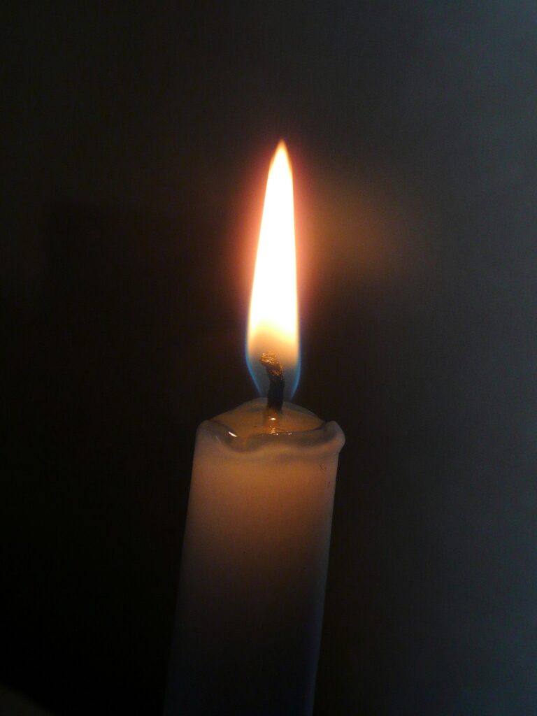
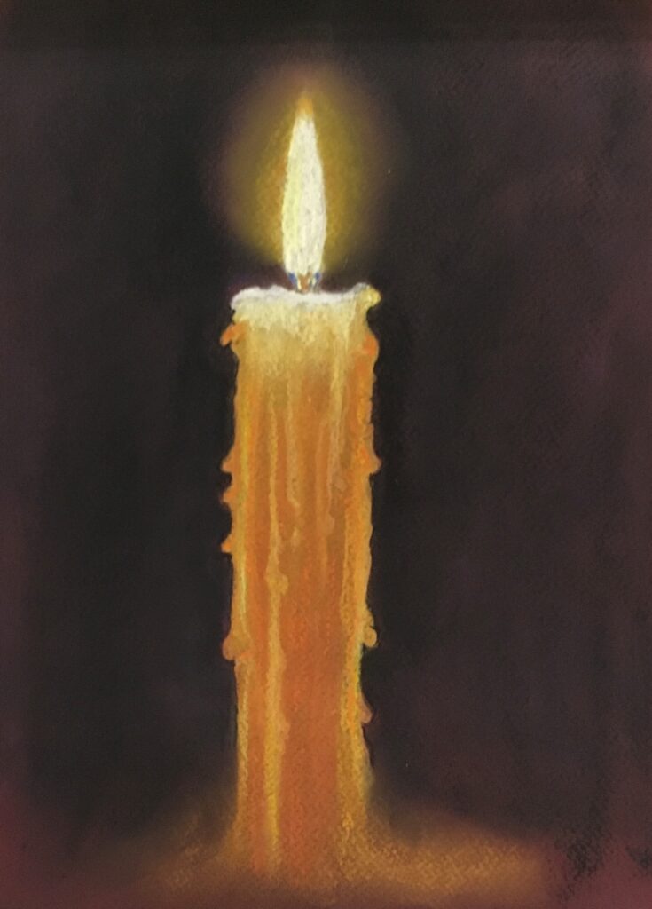
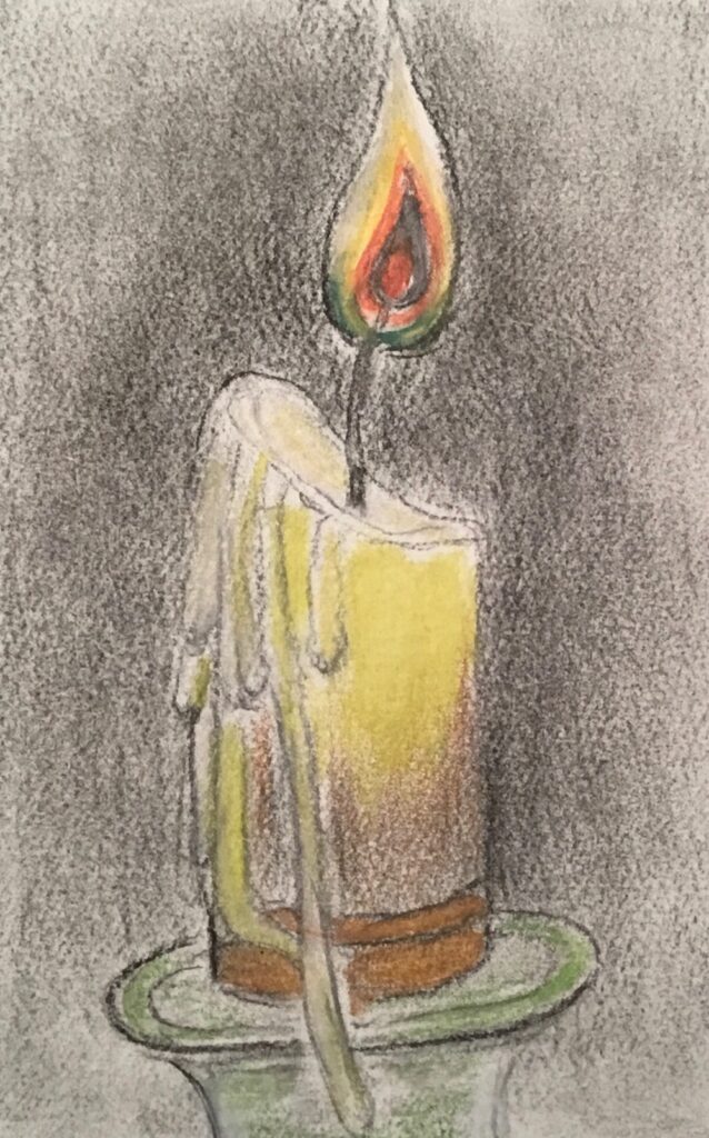
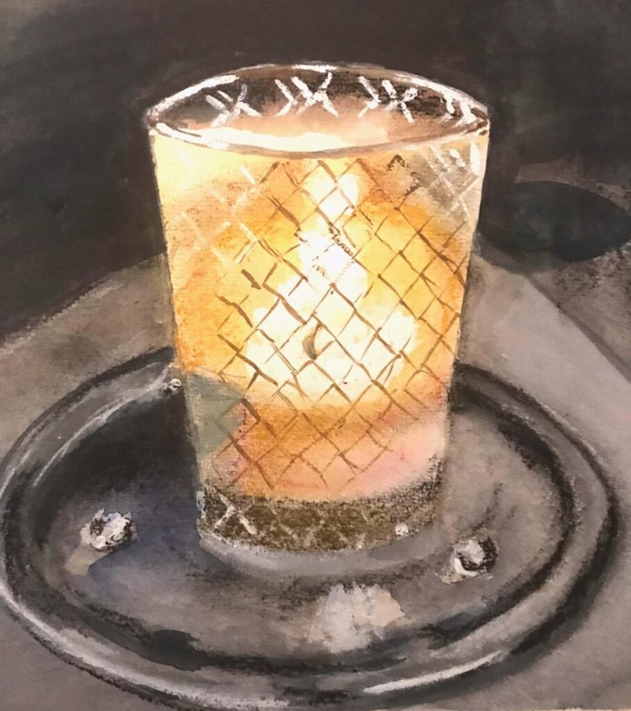
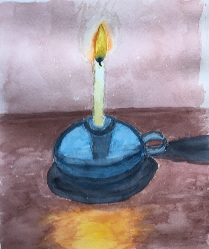
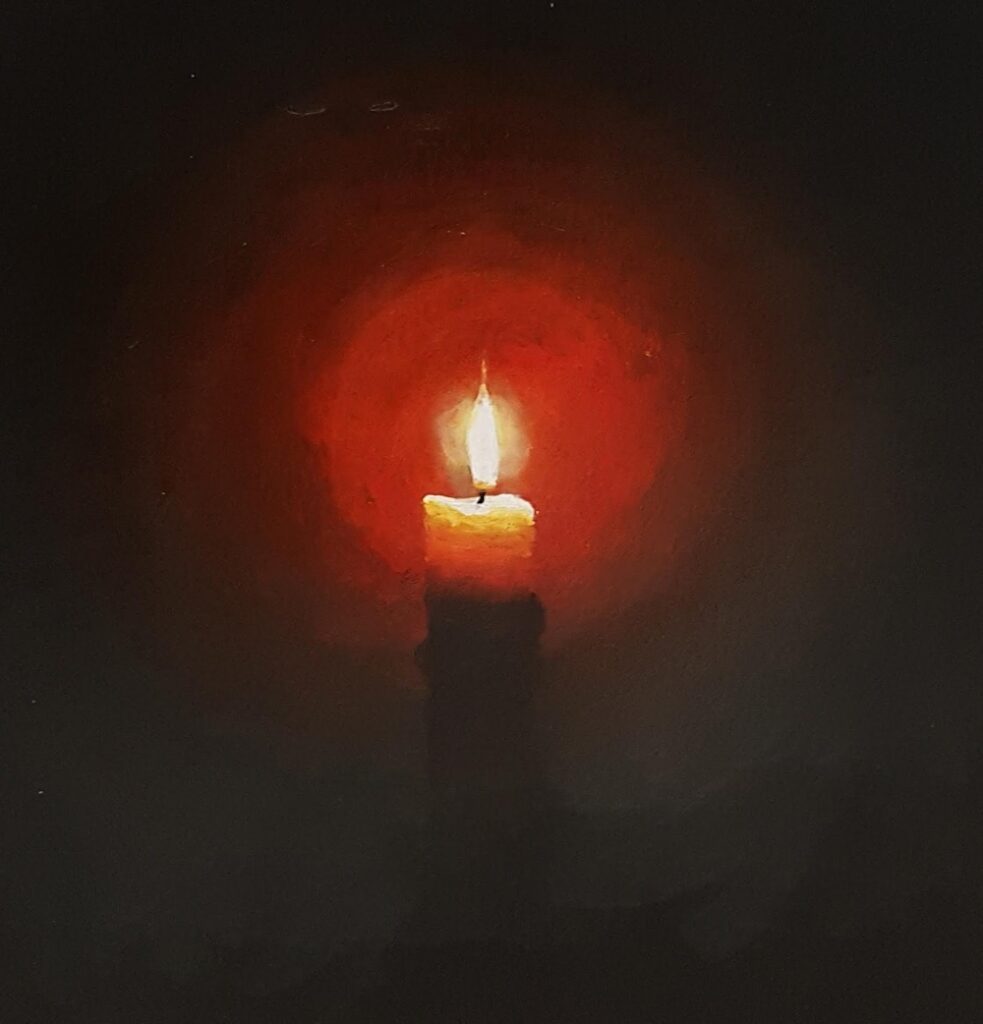
Photograph:
The “halo” is not necessarily the sphere as seen in so many Christmas greetings cards. Note the blue at the base of the flame and bands of orange and yellow. Look at the soft glow of the top of the candle itself and tiny subdued highlights in the molten wax. The wick is barely discernible against the dark background here.
Lastly note how the reddish halo gradually merges with the dark ground; colours from dark orange to deep red before becoming indistinguishable from the red/black darks.
If you wish to make a candle study you may like to light a candle, taking sensible safety precautions and observe the colours you see. Your colours and tones may be very different from those in the photograph above so observation is the key to developing a realistic painting.
In 1982 to 1983 Gerhardt Richter made some very beautiful and photo-realistic oil paintings of candles, closely observed against different backgrounds. These look deceptively simple but are carefully painted with huge skill in handling the paint where gradual transitions from light to dark occur. References to these can be found on this week’s Pinterest board at:
https://www.pinterest.co.uk/jhall1282/lights-in-art/fires-candles-fireworks-bonfires/
Alongside works by;
Georges de la Tour: more candles and candle light; look at how faces reflect the candle light in his works
Joseph Wright of Derby: volcanic eruptions and a fire burning a cottage down at night
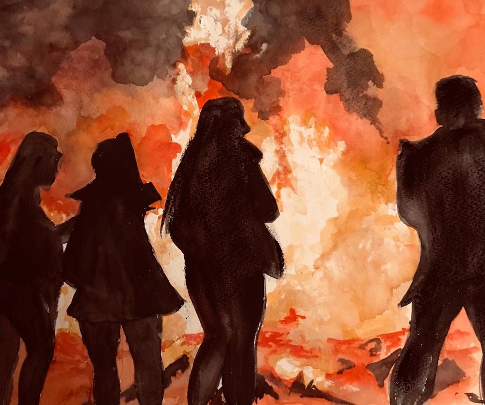
And Bonfires by the contemporary artist Brent Cotton.
This should supply you with plenty of ideas for next week’s painting. I would like to see work either from your imagination or a fire situation you have experienced; from an erupting volcano to a child’s birthday celebration or Christmas candle.
Looking forward to seeing
Your paintings;
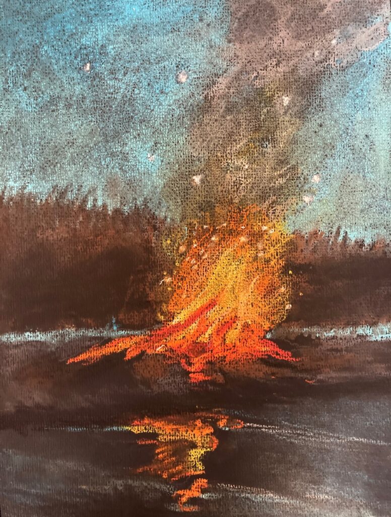
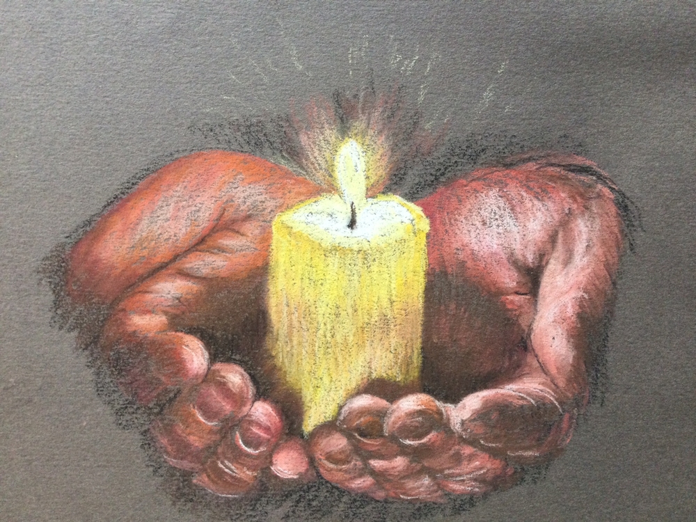
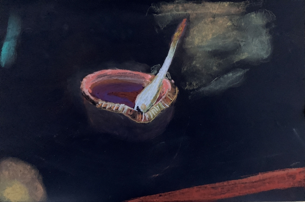
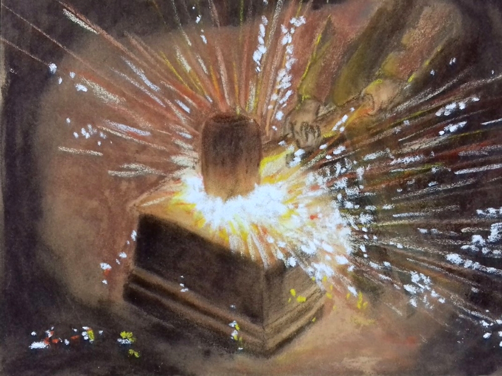
Pastel by Heather
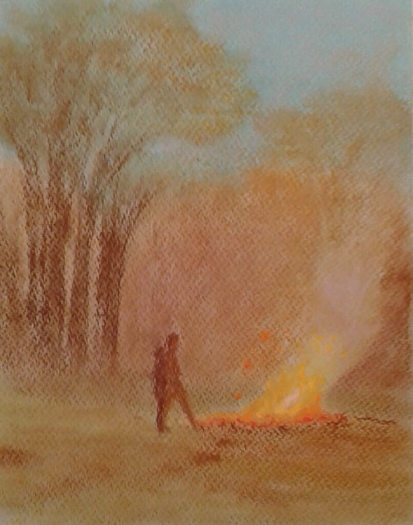
Pastel by Heather
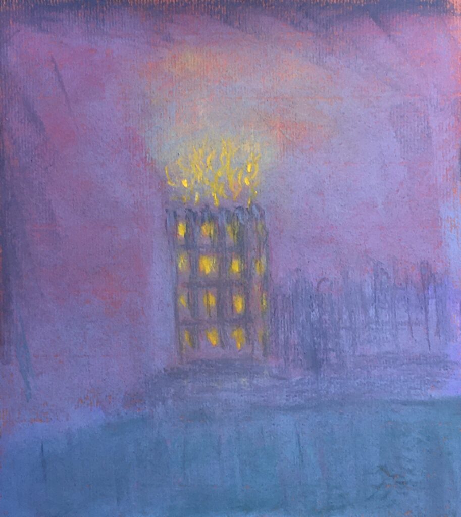
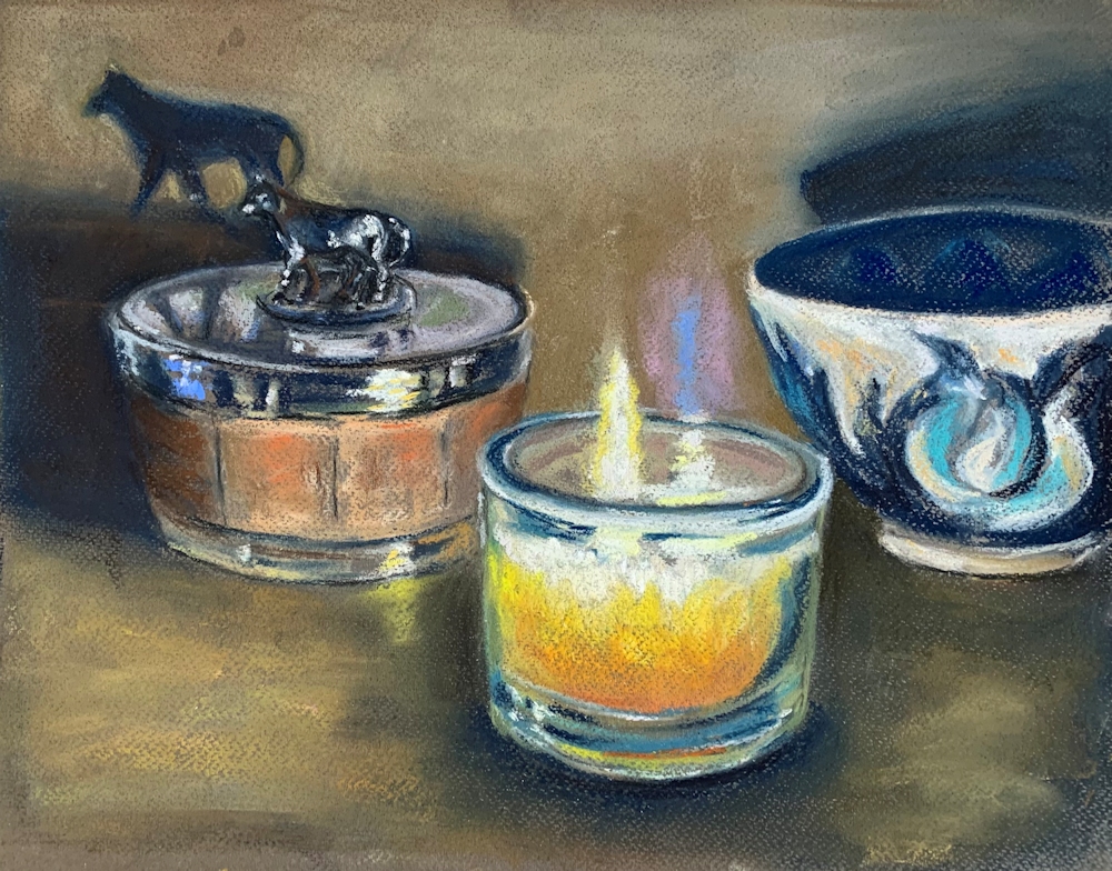
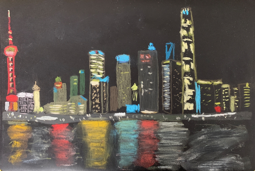
Pastel by Shane
Pastel by Barbara
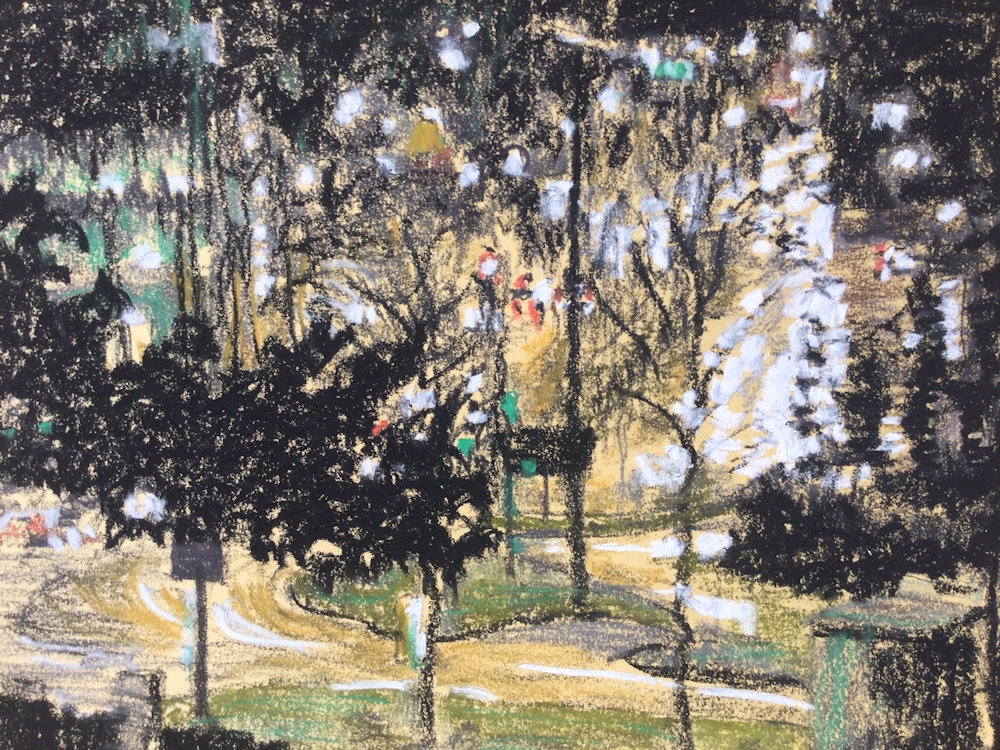
Pastel pencil on pastel paper
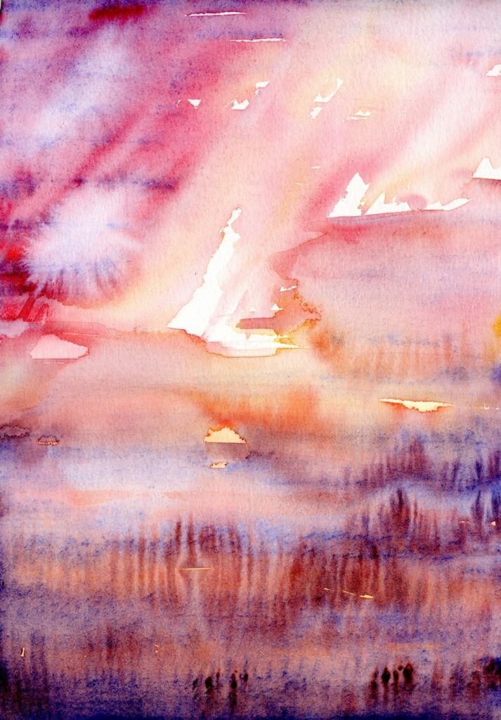
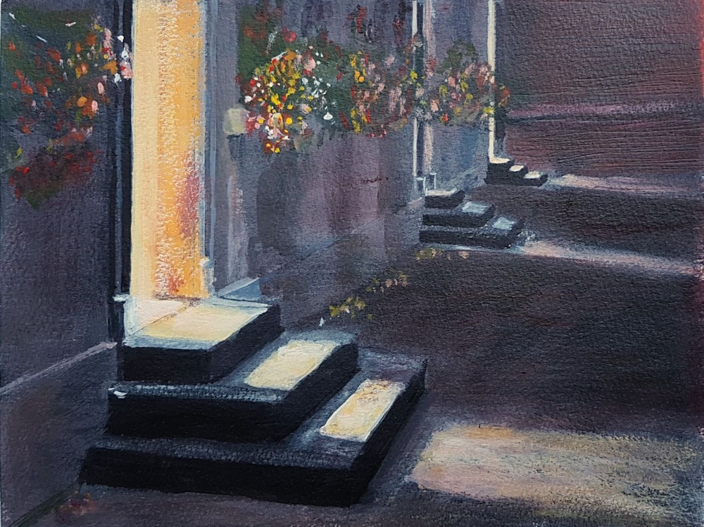
Watercolour
Charcoal and coloured pencil
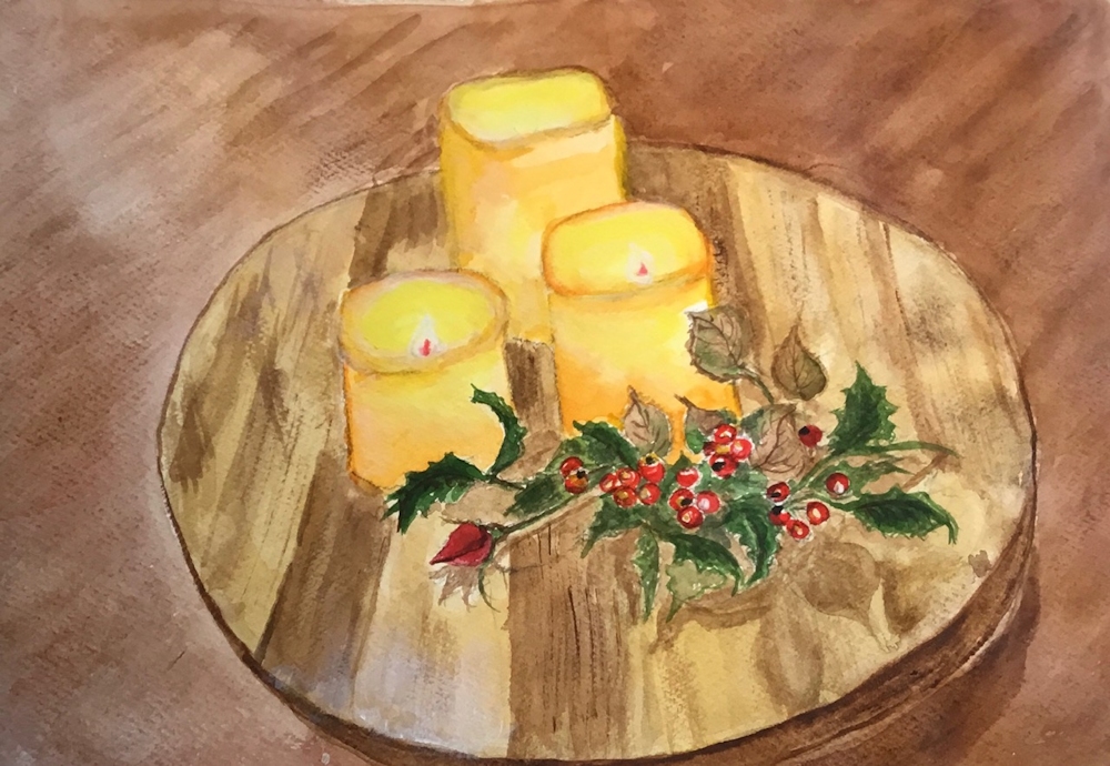
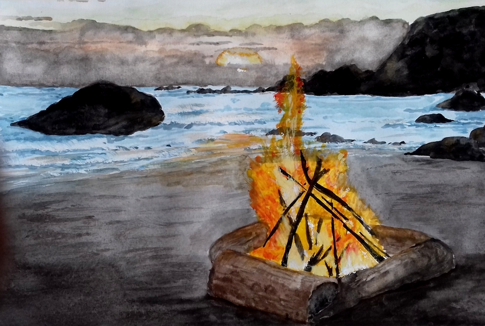
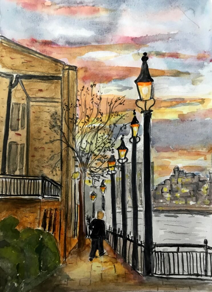
Watercolour by Sarah
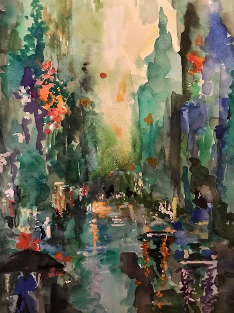
Painted with brush and finger by Sarah
Watercolour and pastel by Sarah
Watercolour by Maricarmen
Watercolour by Maricarmen
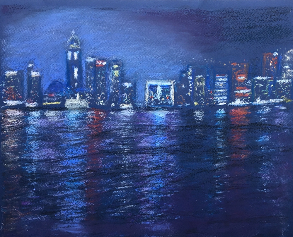
Pastel by John
pastel by Shirley
Watercolour by Shirley
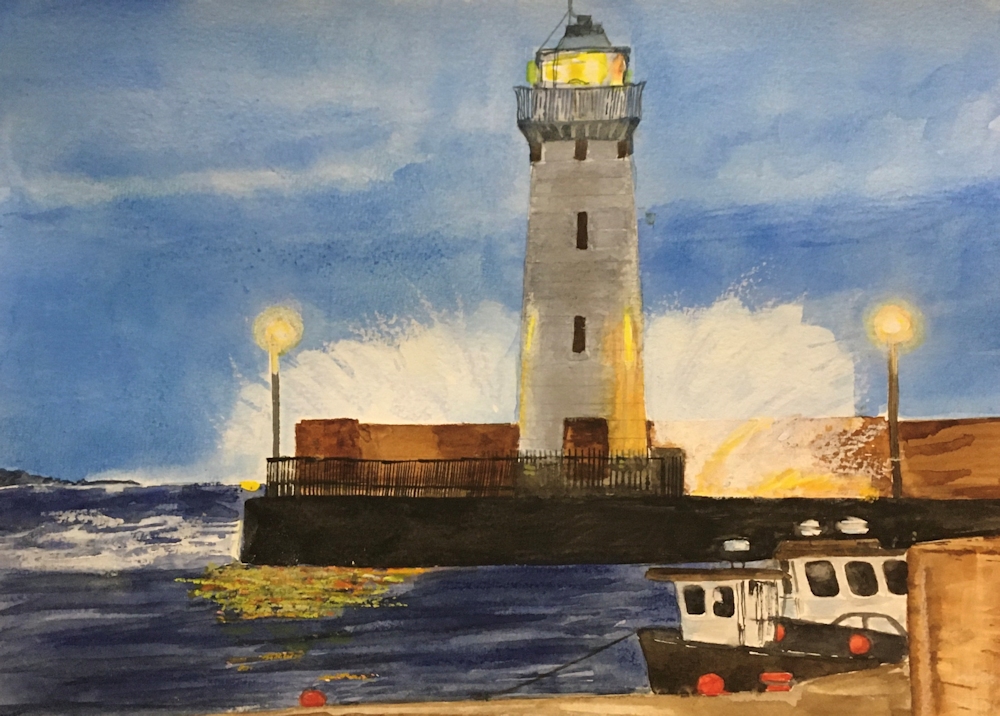
Watercolour by Liz
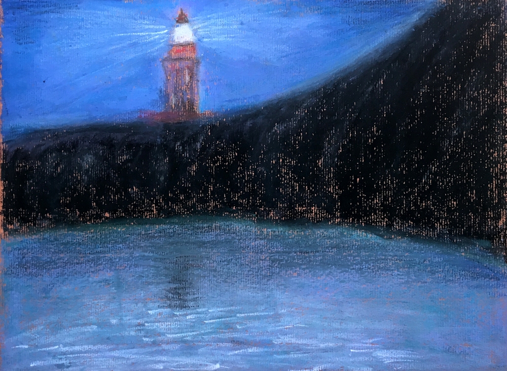
Pastel by Liz
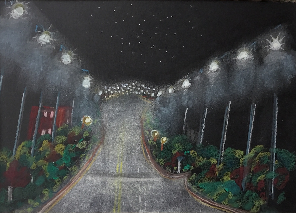
Pastel by Jan
Acrylic by Malcolm
Acrylic by Malcolm
Lights in the Sky, Lights from the Land: Harbour and River Lights
November 10, 2020
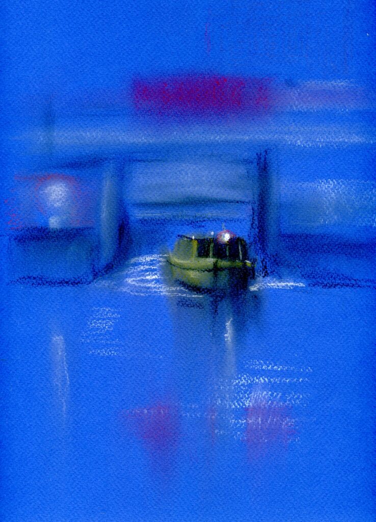
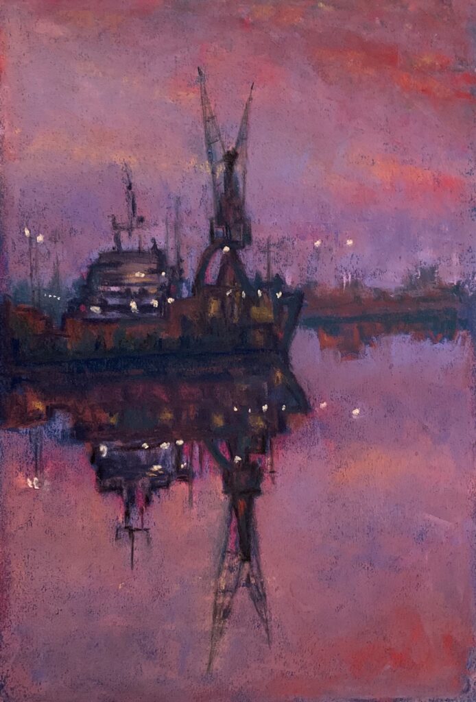
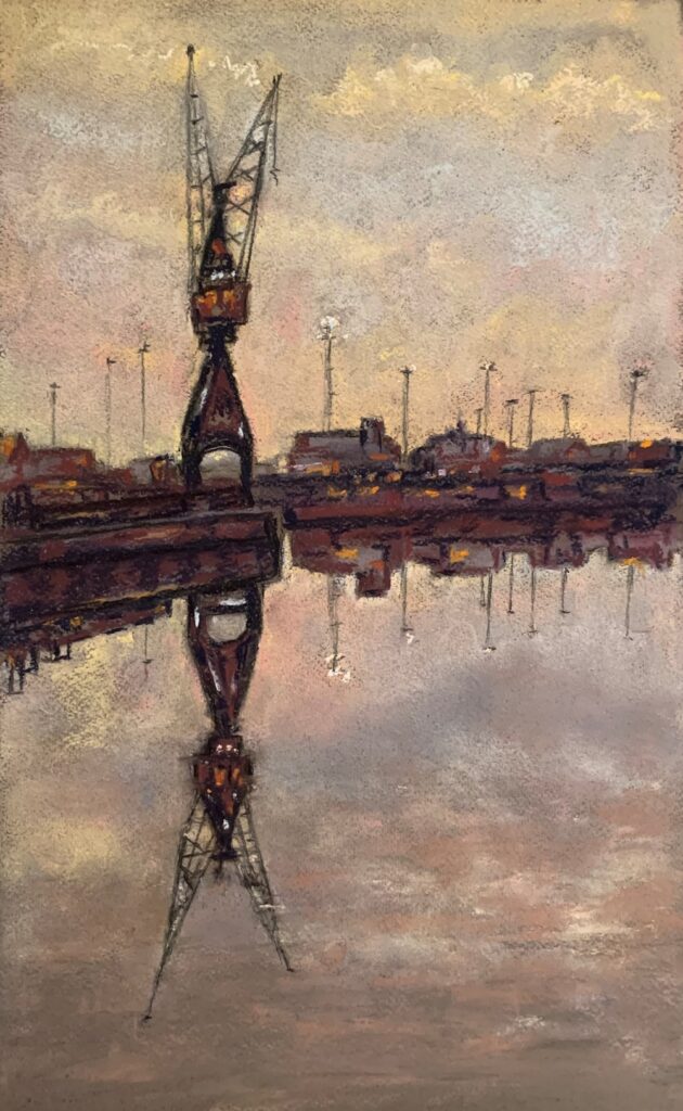
Pastel on blue paper
This week we are moving toward the coast, rivers and canals for inspiration and your challenge will be to produce paintings including a light source and its reflection in water. The reflection will not only be affected by the position of the light source to its reflection but also the prevailing light conditions; mist or the darkness of night and whether the water is calm, rippling or rough.
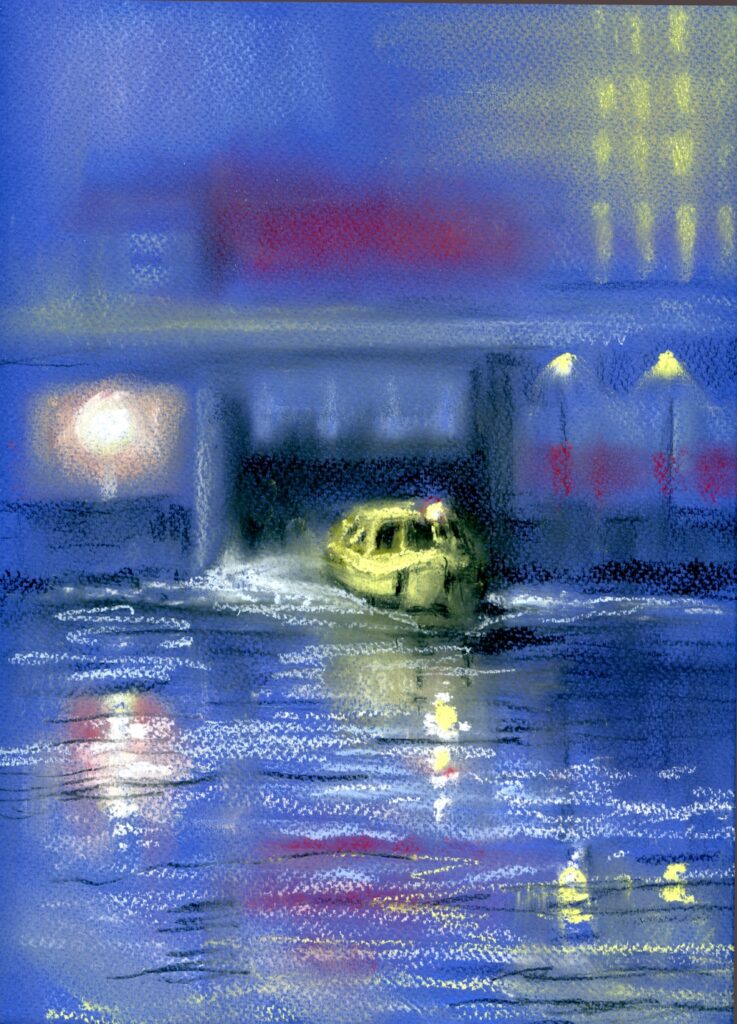
Pastel on blue paper
This has been developed from the first picture and has a completely different atmosphere.
Look at photos of rivers and the sea where any light is reflected and look at how reflections are interrupted and sometimes scattered by waves.
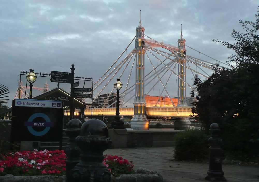
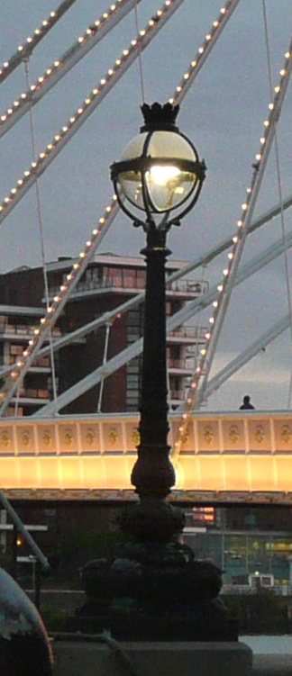
Apart from the vertical positioning of any reflection take special care that each reflection is directly below the light source being reflected. This is seen very clearly both in works by Whistler and Andrew Gifford. better still take a walk along the Thames in the early evening.
The medium is very much your choice and as last week you may work from your imagination or from a reference, preferably of a place you know. James McNiell Whistler is famed for his series of “nocturne” paintings of the Thames. The darkest of these are full of drama and the most subtle have that beauty of early morning stillness. Examples of Whistler’s nocturnes alongside works by Andrew Gifford and the Canadian artist David Haughton can be seen on this week’s Pinterest board at:
https://www.pinterest.co.uk/jhall1282/lights-in-art/harbour-lights-lighthouses-and-docks/
Also included are some imaginative works by Charles Philippe Jacquet. The artist’s rather surreal compositions combine his ideas with an almost believable reality. In reviewing some of your own photographs you may be inspired to adapt them to an imaginative approach or to paint a more representational painting. If your reference is complicated, consider making a study of part of it and experiment with little sketches before homing in on a final composition.
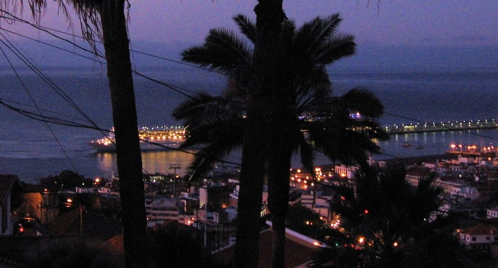
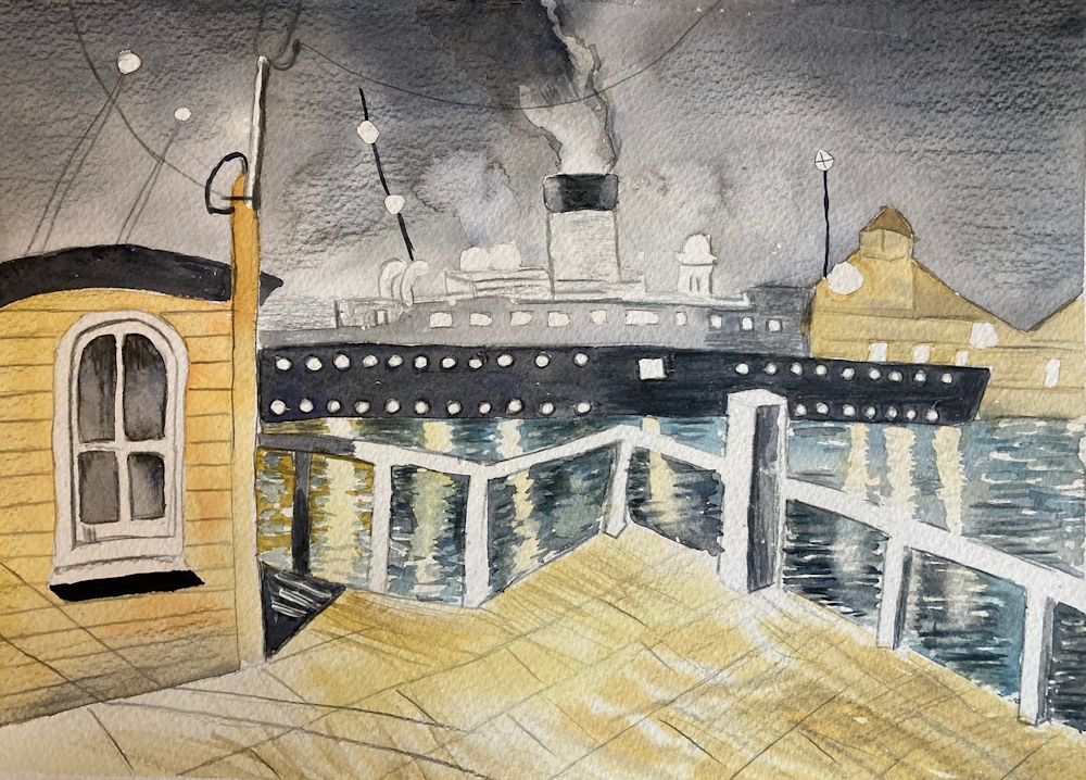
Lastly I couldn’t resist including this photo of a cruise ship leaving Funchal; the antithesis of the little yellow boat that carries commuters and tourists alike from Leeds Dock.
If you have very little in the way of references for lights reflected in water at night or evening from boats or buildings on the shore, make a sketch or photo of one of the bridges or part of the Thames shoreline at dusk. Maidenhead Bridge has plenty of lights. Alternatively, if you would like to try a more surreal approach why not choose a building you know and perch it with fully lit windows on a rock in the middle of a lake and imagine your own private lighthouse!
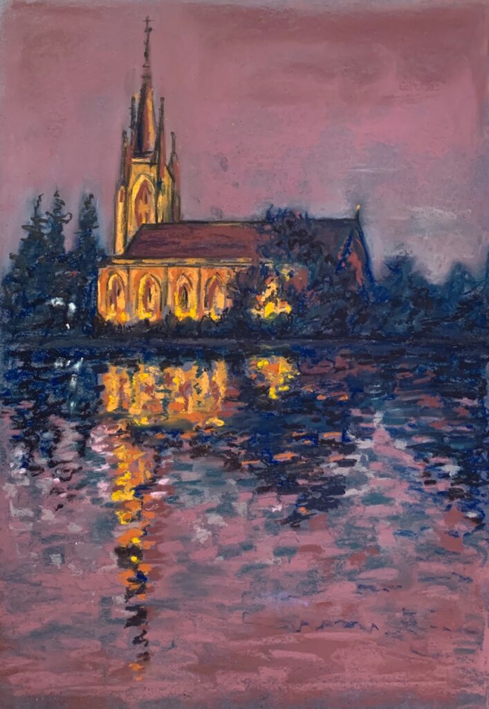
Your paintings:
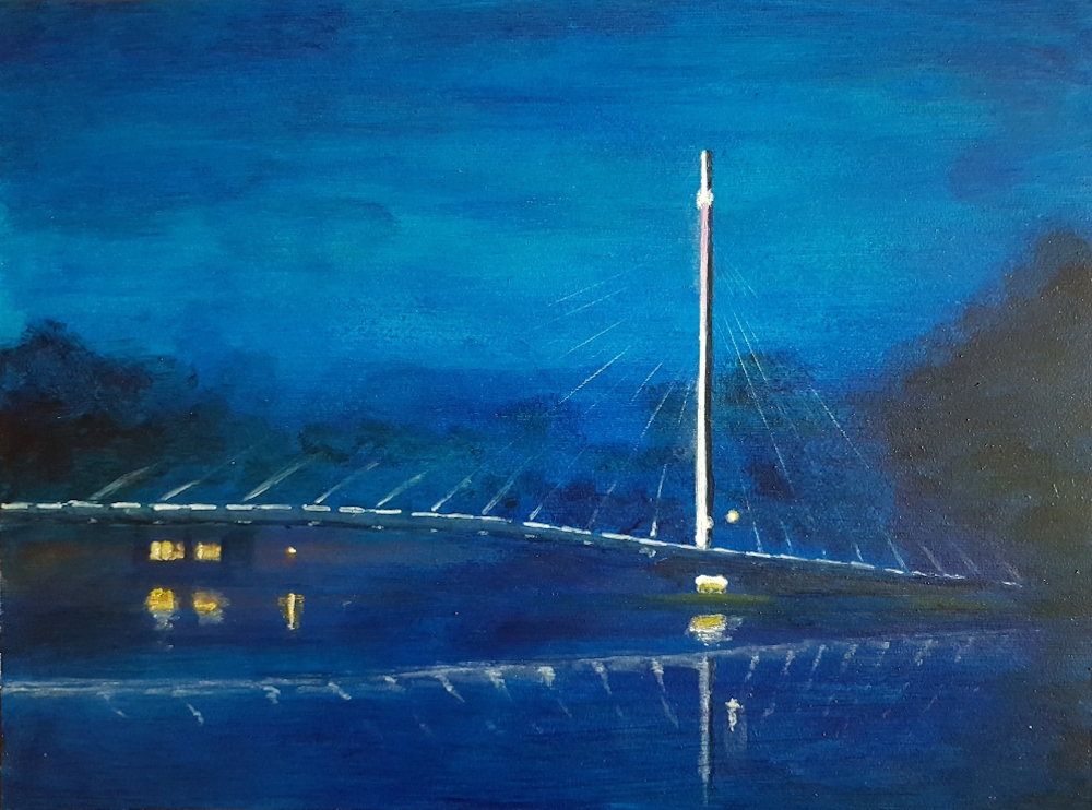
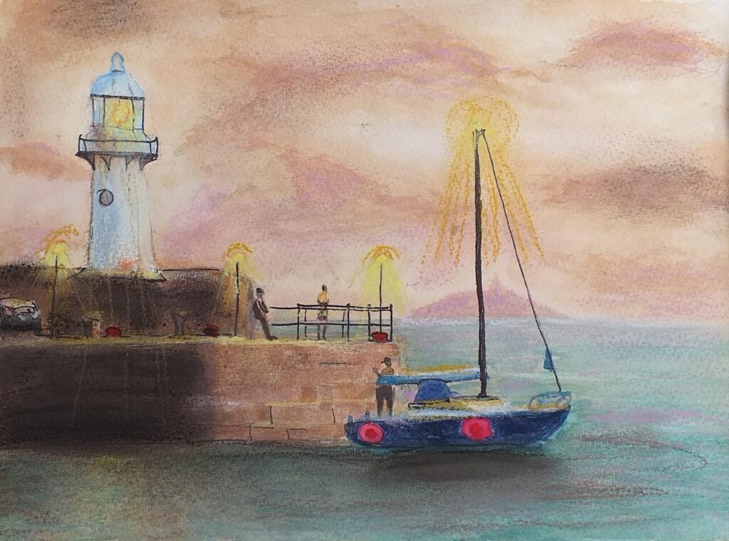
Pastel on black paper by Barbara
Acrylic by Malcolm
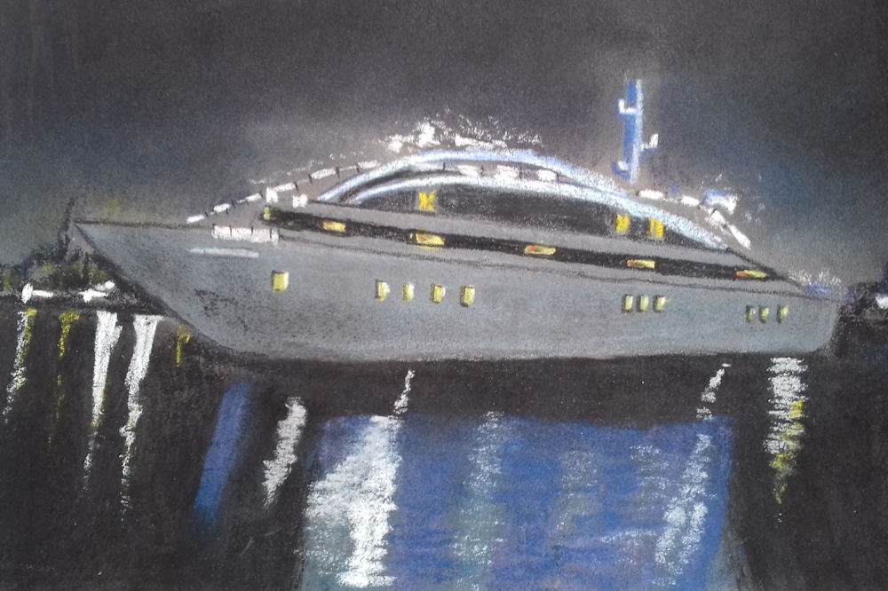
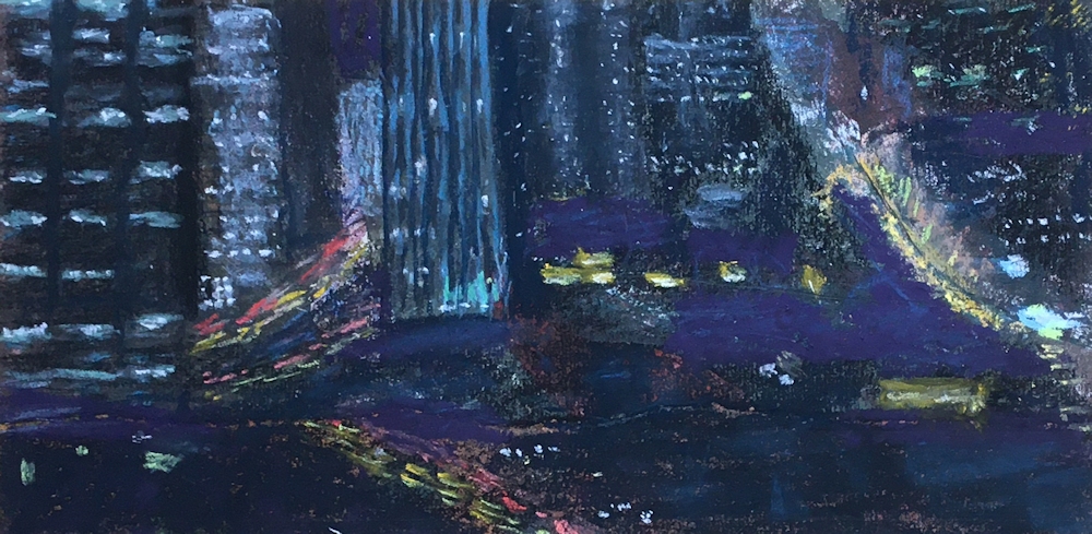
Watercolour by Shane
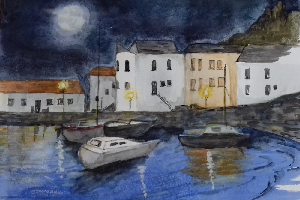
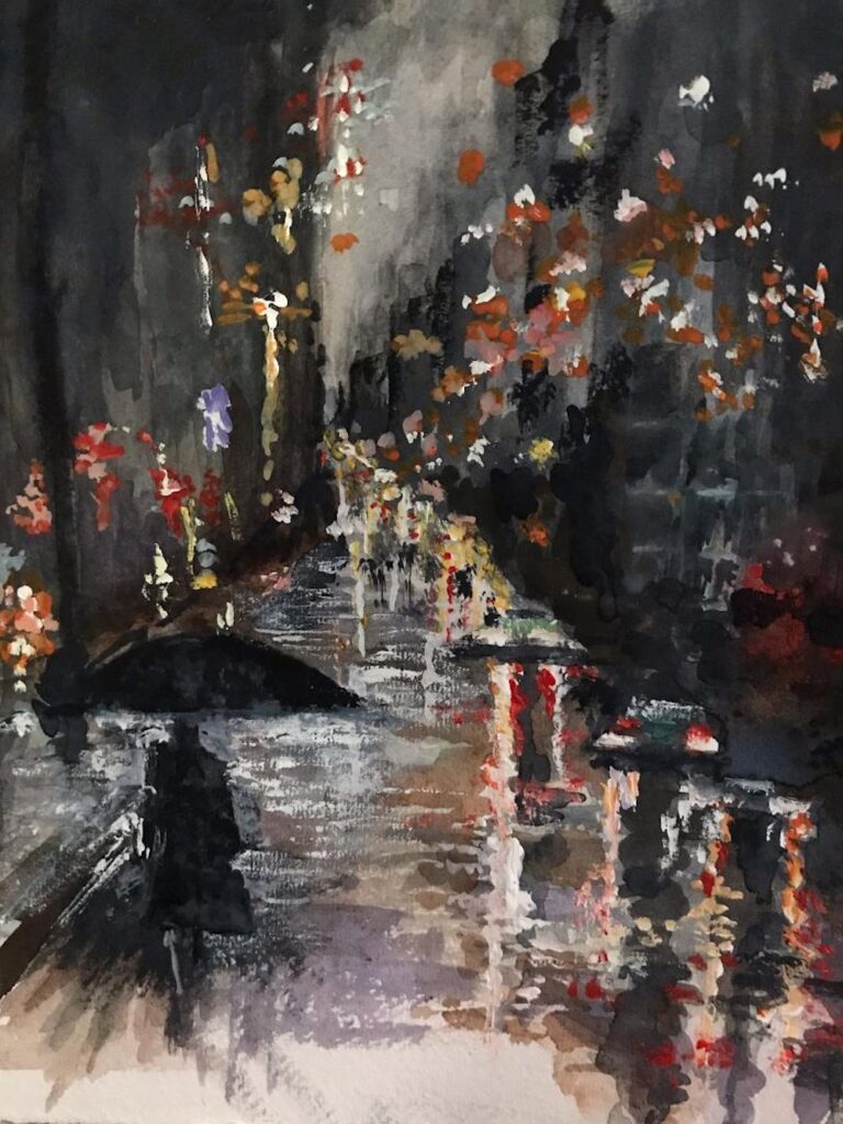
Watercolour by Sarah
Watercolour by Sarah
Pastel by Jane
Pastel by Jane
Watercolour and Pastel by Heather
Pastel on terracotta paper by Shirley
Pastel on dark paper by Shirley
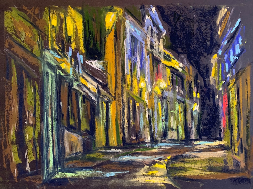
Pastel by John
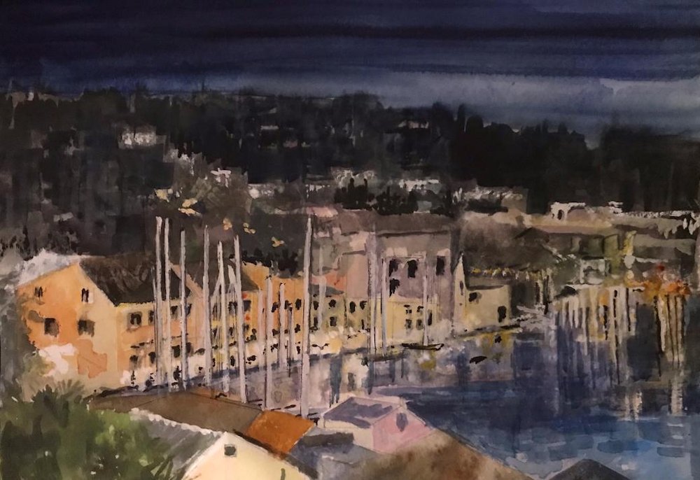
Watercolour by Maricarmen
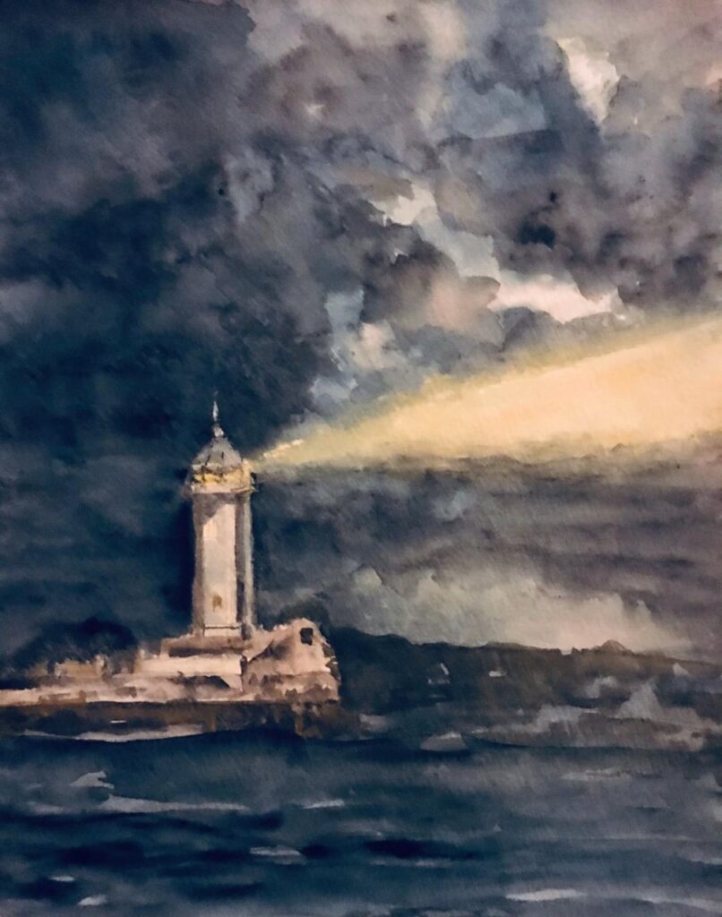
Watercolour by Ann
Watercolour by Ann
Pastel by Liz
Watercolour, highlighted with pastel by Liz
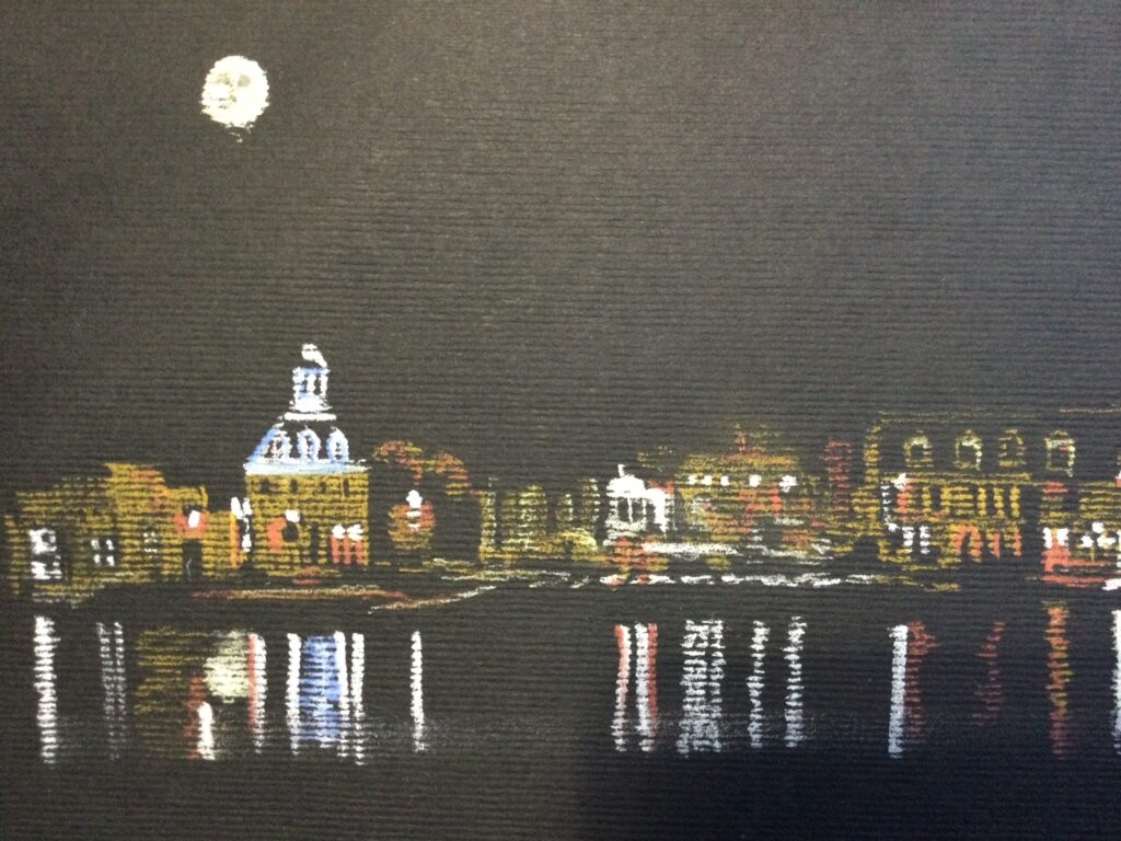
Pastel on dark blue paper by Jan
Pastel on grey paper by Jan
Pastel on blue grey paper by Jan
Lights in the Sky; Lights from the Land; Street and City
November 3, 2020
This week we’ll consider street lights and other urban lights. The principles are exactly the same as last week; huge tonal differences between the light source and its surroundings.
Last week you were invited to make a very representational painting or to use your imagination to invent a moonlit scene. This week you may consider a representational approach or look at the abstract patterns made by traffic and street lighting which would work very well in pastel on dark papers. A few ideas for working in pastel or watercolour are outlined below.
If working in pastel or opaque watercolour you may like to consider working on a dark or mid toned paper. Often street lights are on well before the light fails completely and in this case a mid toned paper may be useful enabling you to easily make some areas lighter and others darker, perhaps using the paper as one of the tones/colours in your painting.

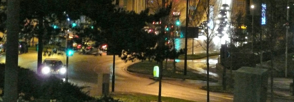
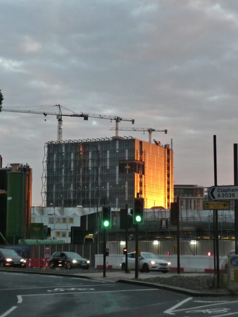
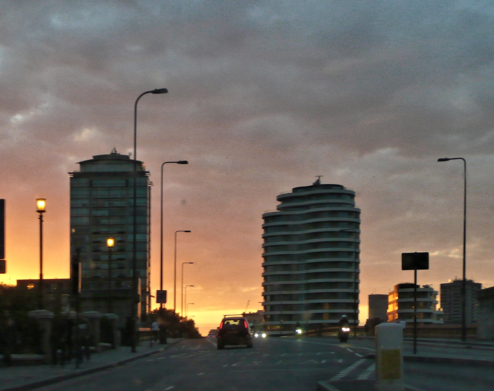
This photo could be interpreted as an abstract pattern of lights and dark.
When using pastel and a very dark blue paper, like midnight blue or even indigo, black will make that even darker for the very deepest tones but use it sparingly. As last week you may need to place your shapes by working with a mid-toned pastel pencil before blocking them in and reserve your palest pastels for the light sources; light from windows, street lamps etc.
If you are working in watercolour plan out your composition so that you can either reserve the lightest and white areas by painting around them or by using masking fluid. Remember not to apply your washes till the masking is absolutely dry. Then work as you would usually working first the pale areas, then the middle and lastly the darkest washes. Your palest washes may be washed over pretty much the whole of your paper, lending unity to subsequent washes and you may like to drop in mid tone colours in some areas at this stage.
Do look at your reference carefully as there may be areas of reflected light and sharp edged shadows.
The photographic references include a dark night time scene from Bradford and some in London at twilight where the shadows are diffuse and there is less glare from each light source.
Try to avoid reflections in water this week as that will be the subject of the following week’s challenge. Stick to street lighting, traffic and car lights, shops and window lights and even cafe lighting. If you are feeling more ambitious try a floodlit building, sports stadium or building site.
Look at how the light is emitted from the light source. It may appear as a round dazzle of light as round the sun or from a torch. It may be directed as the floodlights illuminating a building or stadium. You may even see “pools” of light on the ground.
Concentric rings of wet in wet colour were lifted while wet with a small piece of dry paper towel twisted to form a point. This was dragged from the centre outwards, making creative backruns.
Hope this gives you some ideas and there are examples of how several artists have tackled this subject on the Pinterest Board link below.
https://www.pinterest.co.uk/jhall1282/lights-in-art/street-and-city-lights/
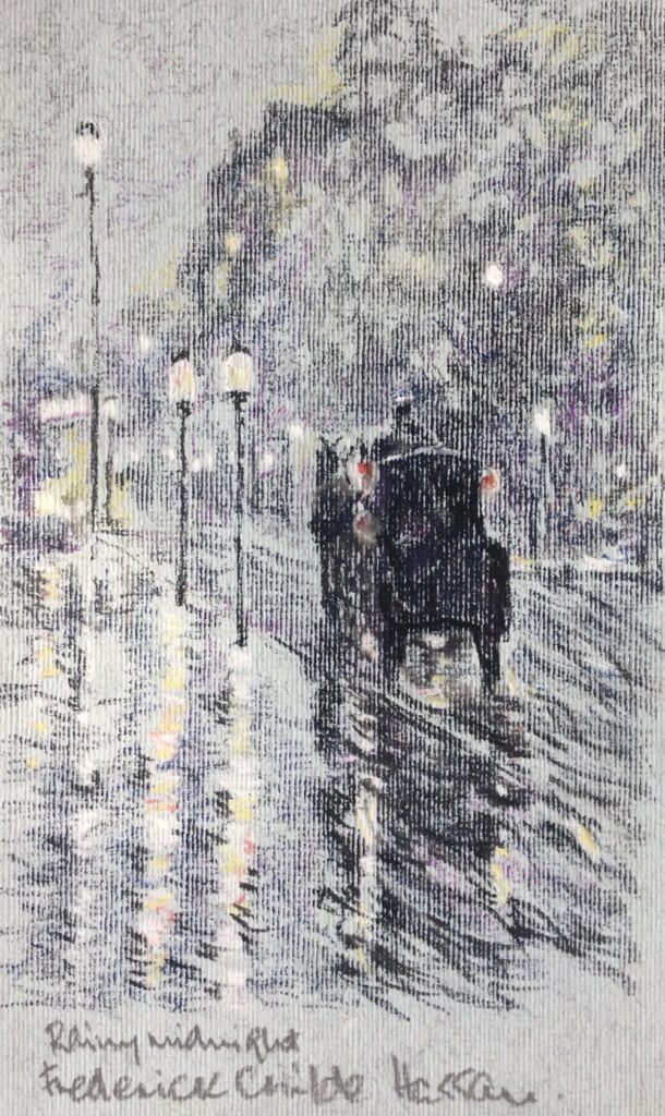
Works by John Atkinson Grimshaw, Frederick Childe -Hassam and Whistler are featured and also works by the Czech artist Jacob Schikaneder. I especially like his tramway scenes. These artists all worked over a similar period about 1890 to 1920.
Have fun and don’t forget to photograph/sketch some fireworks ready for the week 5 challenge.
Your paintings;
Acrylic by Malcolm
Pastel by Jane
Pastel by Jane
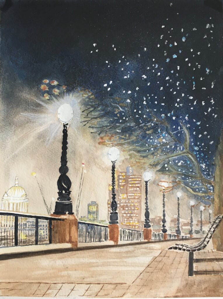
Watercolour by Heather
Pastel by Liz
Pastel by Barbara
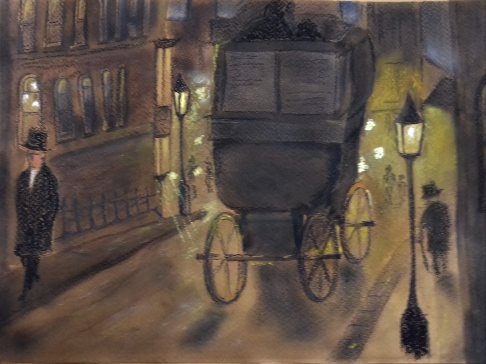
Watercolour and Pastel by Maricarmen
by Maricarmen
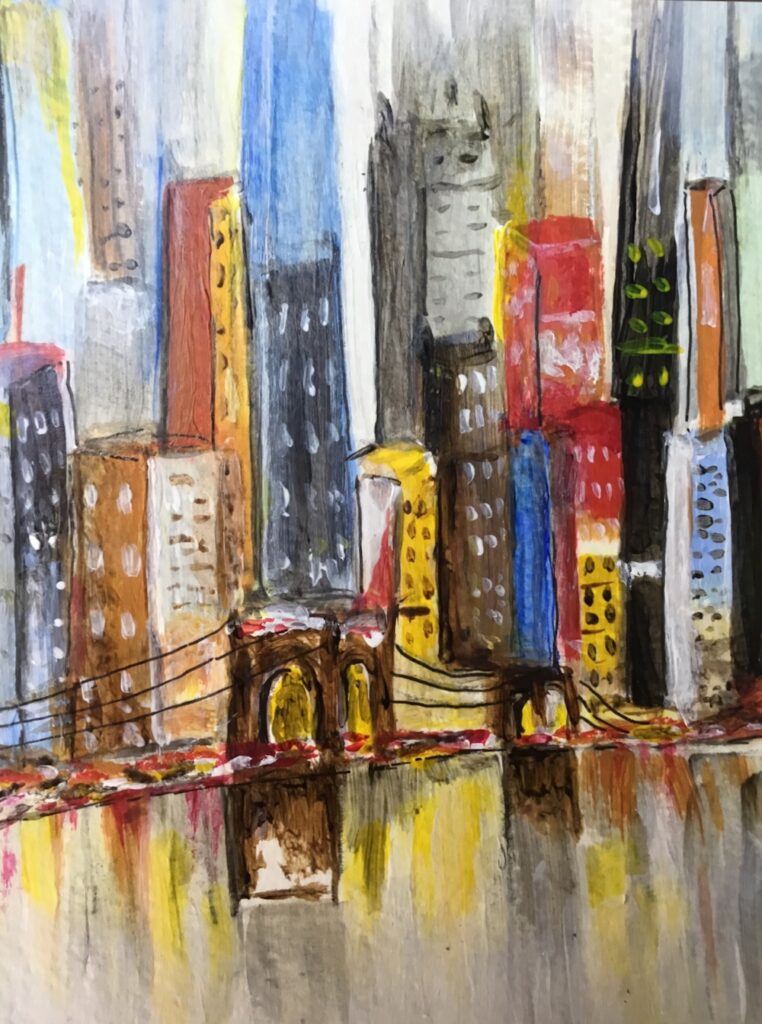
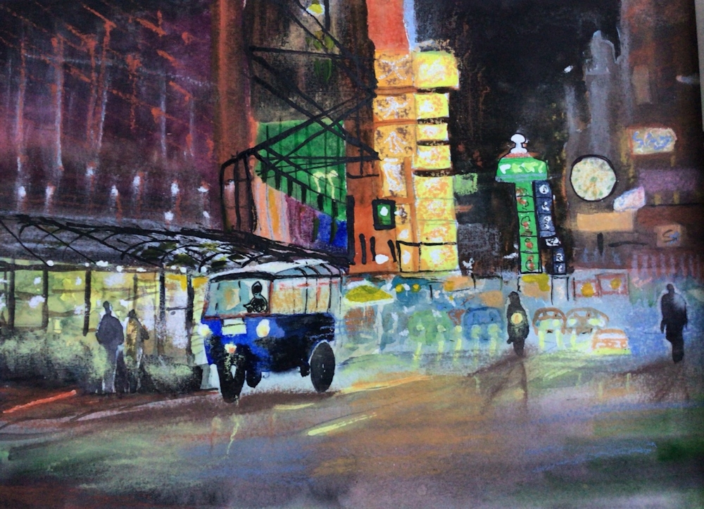
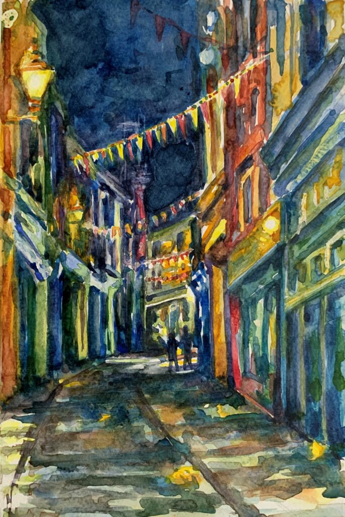
Watercolour after Chin H Shin by sarah
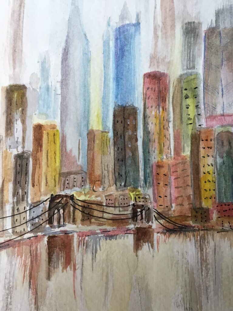
Watercolour after Chi H Shin by Sarah
Pastel by Ann
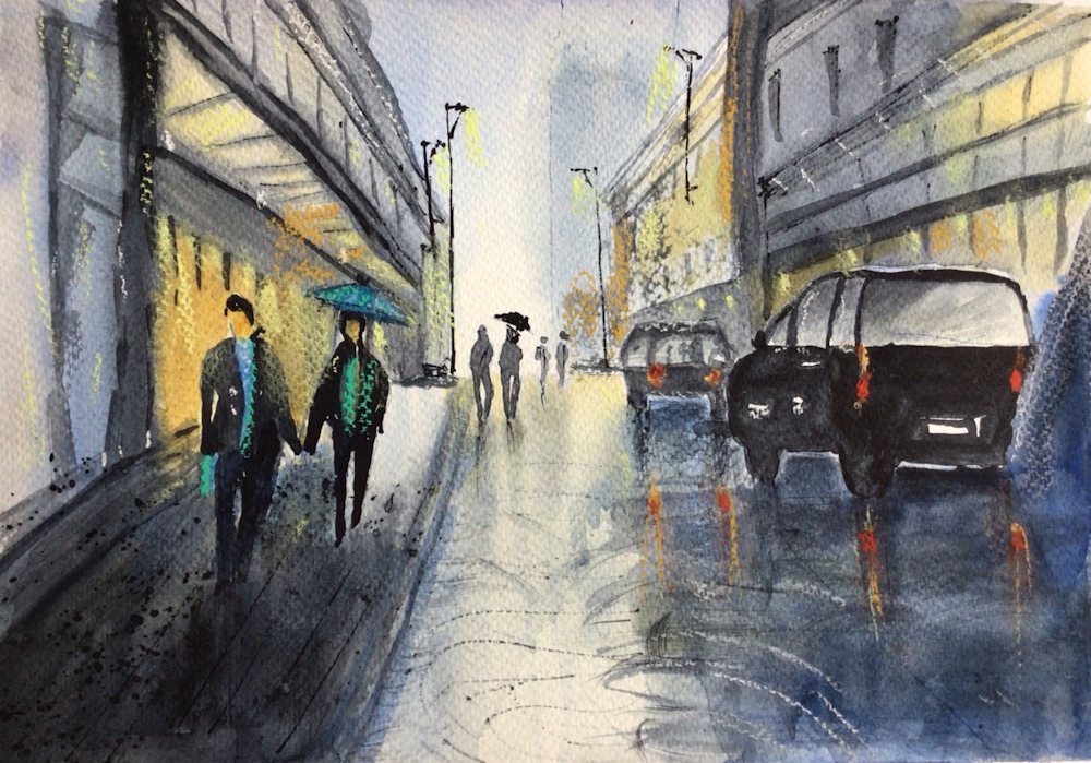
Watercolour by Ann
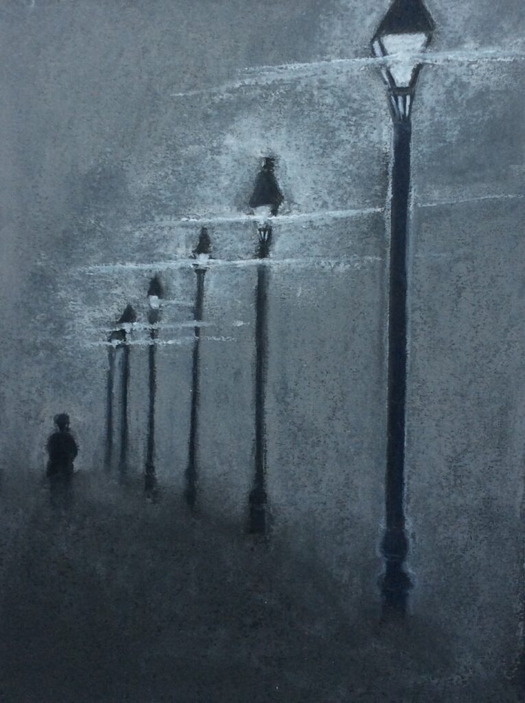
Pastel by Shirley
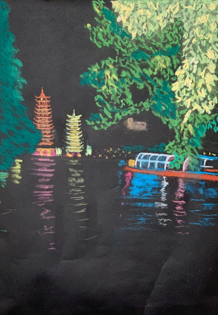
Pastel by John
Pastel by Jan
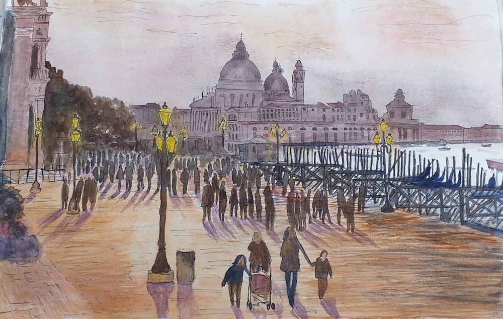
Watercolour by Jan