Limited Palettes 1: the Zorn Palette
September 9, 2020
Working with just a triad of colours (plus white if not working in pure watercolour) may be a challenge, but also gives unity to a painting. The first triad we will try is known today as the Zorn palette.
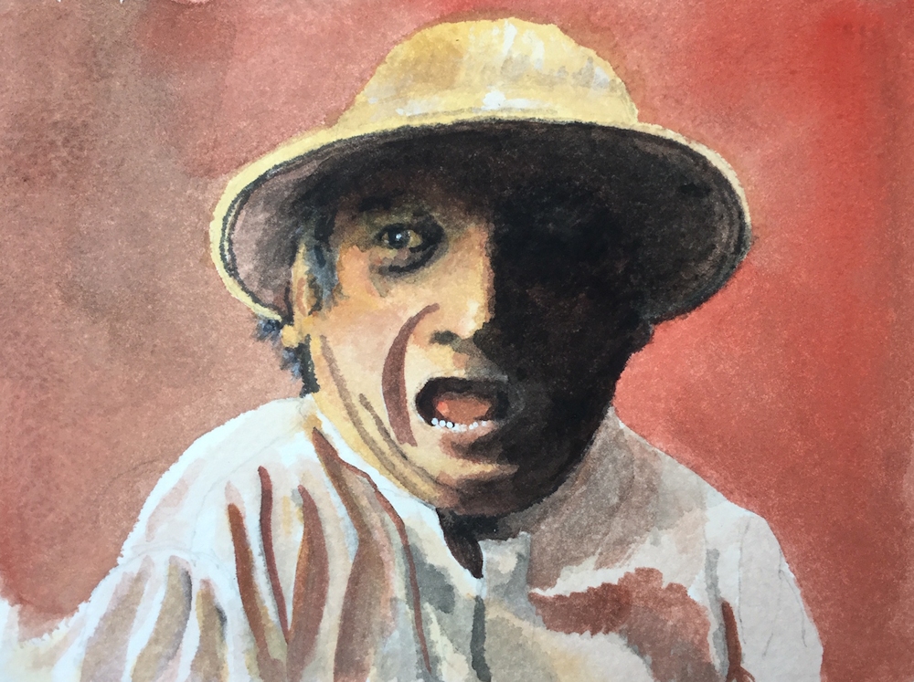
Anders Leonard Zorn (1860 to 1920) a Swedish artist greatly acclaimed internationally for his portraits, including those of several American presidents, was also famous for frequently using a limited palette of just four pigments: Yellow Ochre, Vermillion, Ivory Black and Flake White. Now we may prefer to use Yellow Ochre, Cadmium red Pale, Ivory Black and Titanium White. Flake white is warmer than Titanium White but is made from lead oxide, so rather a health and safety hazard.

Many old masters including Rembrandt, frequently used a similar limited palette partly due to the expense of blue pigments and also due to the fact that many of the pigments we use today were not known or manufactured then. Zorn used this limited palette when working in oil but it is perfectly feasible to use the same palette when working in acrylic, gouache, watercolour or even pastel.
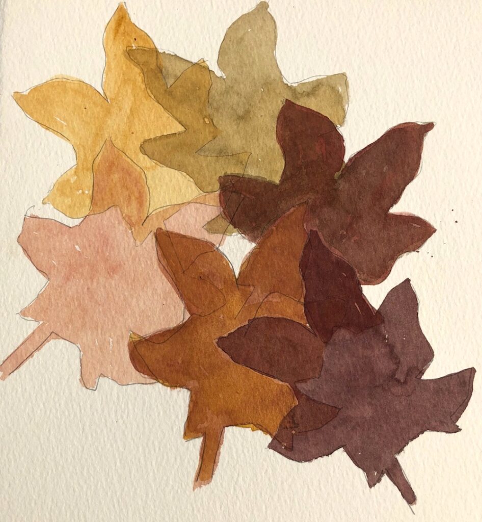
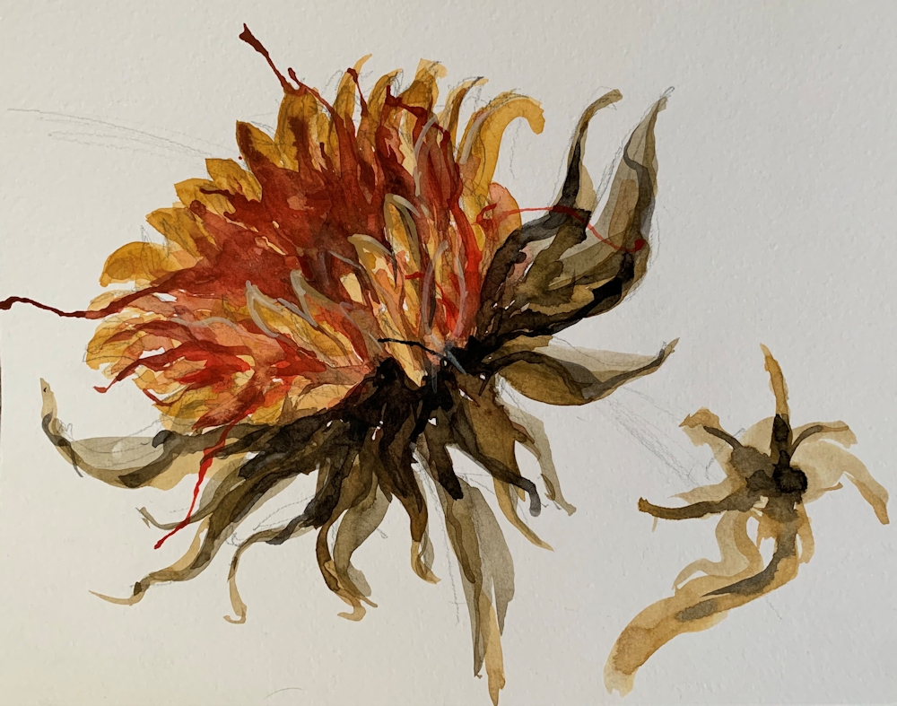
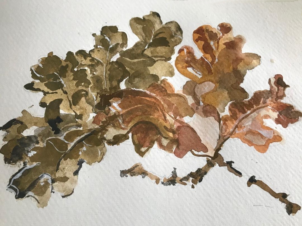
It is a very suitable palette for mixing skin tones, hence the many Zorn portraits using this limited palette, but can also be successfully used for other subjects; still life studies, some natural forms and city-scapes. It is more of a challenge for landscapes but could work for Autumn trees against a leaden sky. The black becomes a substitute for blue and both black and white (or water if using watercolour) contribute to the tonal and saturation range in the composition.
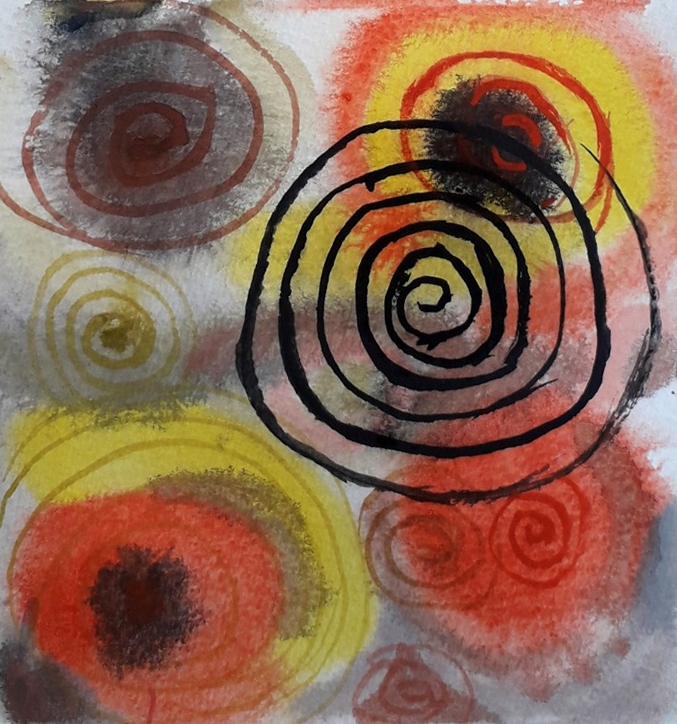
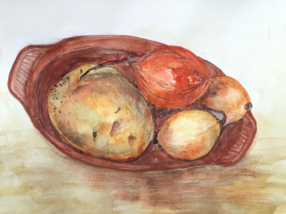
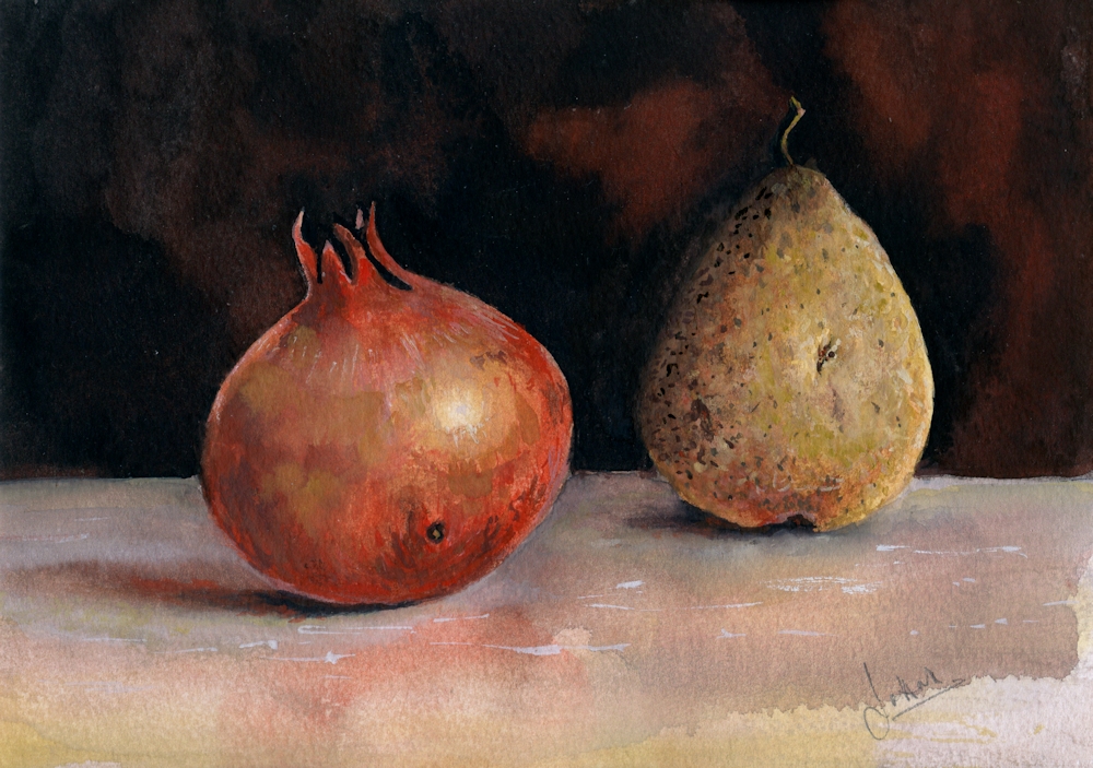
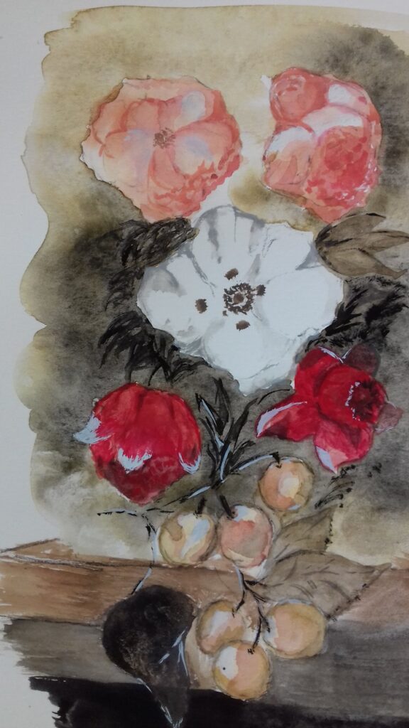
My “Pomegranate and Pear” study uses watercolour and titanium white gouache, but I could have used just watercolour without the white pigment or all gouache or acrylic. I decided to find what mixing the pigments would look like before starting to paint the still life. This was a chart of mixing the pairs of colours to make secondary colours. This could have been extended by mixing any of the squares with the missing pigment e.g. mixing a little black into the orange mix. I could have also extended the tonal range by diluting with water or adding titanium white.
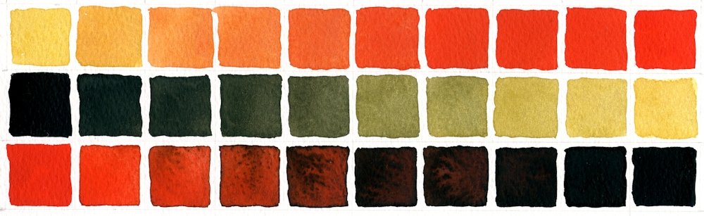
First row: Yellow Ochre with increasing amounts of Cadmium Red Pale
Second row: Ivory Black with increasing amounts of Yellow Ochre
Third row: Cadmium Red Pale with increasing amounts of Ivory Black
You will see that some rather olive green colours were created when Yellow Ochre was mixed with Ivory Black. This is because Ivory Black is very slightly blue and will make very cool (tending toward blue) greys when mixed with Titanium White or water. It is often difficult to see exactly what hues are in very dark colours but by diluting the colour with white or water the inherent colour can be more easily seen.
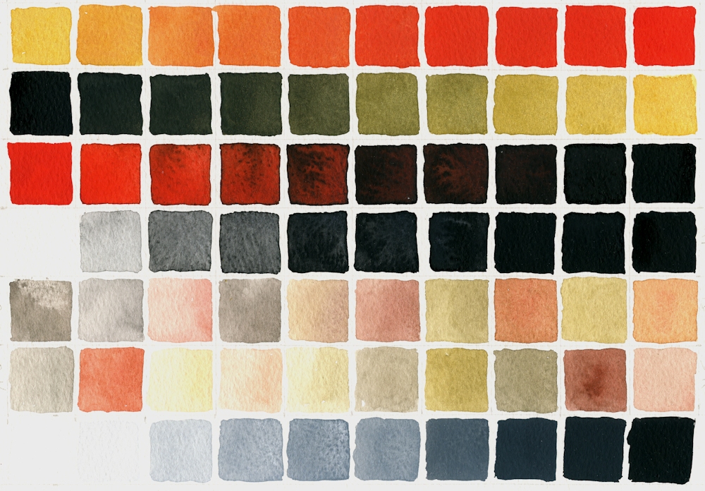
Added a few more rows, first three as previous colour chart. Row 4 added black to water, should have added less initially to make a smoother transition through loads of grey shades! Rows 5,6,7, various pale mixes; some with red, yellow and black; no system to them! Row 8 Permanent White (Titanium Oxide White) with increasing additions of Ivory Black.
On a general note when colours are mixed it is always best to add a little of the darker pigment to the paler one, as much more pigment is needed to change the appearance of a dark colour by adding a paler one, so you risk wasting paint.
- Indicated where cloth meets wall and shapes of fruit in pencil
- Made sure I had some strong washes of all colours except the white ready for mixing.
- Mixed and applied washes wet in wet on the fruit, reserving highlight on the pomegranate and lifting out the highlight on the pear. Dropped in some reddish yellow mix on the pear as it reflected some colour from the pomegranate. Adjusted washes when dry especially with regard to tone. Left to dry again then painted some of the markings on the pear and pomegranate wet on dry.
- Turned the paper upside down and applied a wash of black with a little red all over the background, dropping in a more reddish back mix wet in wet and left to dry.
- Decided the table needed to look as though it had more substance/texture to balance the dark background so used white mixed with the colours; mixes for shadows were of all three pigments and mixes made with varying amounts of red and yellow were used to suggest colour reflected on to the table from the fruit.
- Finally the highlights, markings and colour on the fruit were adjusted; in places just with watercolour and in other areas using watercolour mixed with white.
Practical
Have at the ready;
Yellow Ochre
Cadmium Red Pale (or any other bright warm red like Vermilion)
Ivory Black
Titanium White gouache if not using pure watercolour. This is usually labelled Permanent White. Zinc white is more transparent.
You will also need watercolour paper, a deep welled palette for making washes and your usual brushes and equipment. I would experiment a bit with mixing but if time is limited don’t be too precise just make sure you understand the possibilities.
1. Make a colour chart of mixes of each colour
2. Try extending the black with water and with white. You will notice a difference.
3. Try mixing the secondary colours with the missing (complementary) colour e.g. add a little black into a mixed orange.
4. Allow your colours to mingle wet in wet on the paper. Allow to dry then add other colours over them.
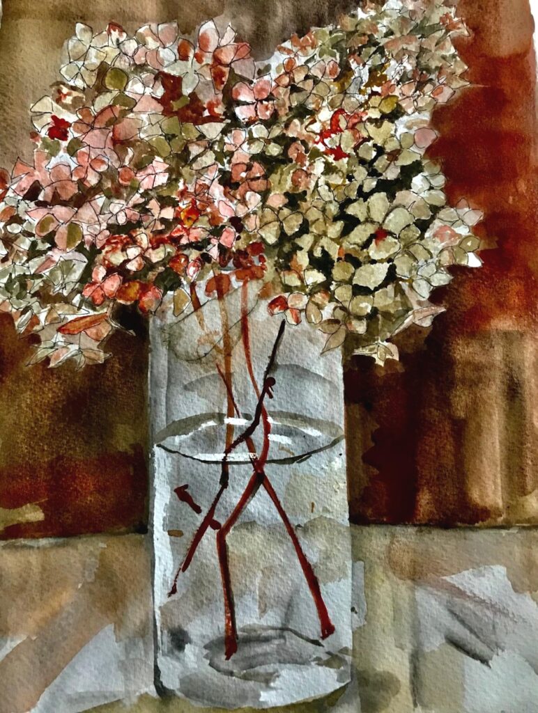
5. Make an abstract or a representational painting; a simple still life, natural form or a portrait study either from your own reference or referencing one of Zorn’s paintings.
Ensure you understand the tonal composition of your reference. If working in watercolour start with the palest tones and colour and build up to the darker washes. In acrylic and gouache the darks may be established earlier on and over painted with paler tones mixed with white where appropriate.
Reference Pinterest Board “Limited Palettes”
https://www.pinterest.co.uk/jhall1282/limited-palettes/
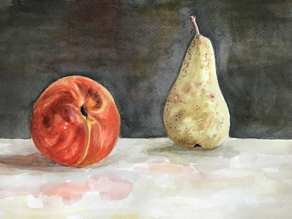
Some of Anders Zorn’s works are referenced on my Limited Palette Pinterest board together with a gouache demonstration of the Zorn palette used with gouache by James Gurney. It has an unusual setting but is very useful. He does talk about using additional browns but you should be able to mix all of these from your red, yellow and black. He also used a paper primed with an Ochre or Raw Sienna casein paint; you could always apply a dilute acrylic wash of a similar hue. At one stage he removes paint to let the background casein colour show through. That should also work with an acrylic wash. However as you can see from the still life at the beginning of the post you can see that it is perfectly possible just to paint on white watercolour paper.
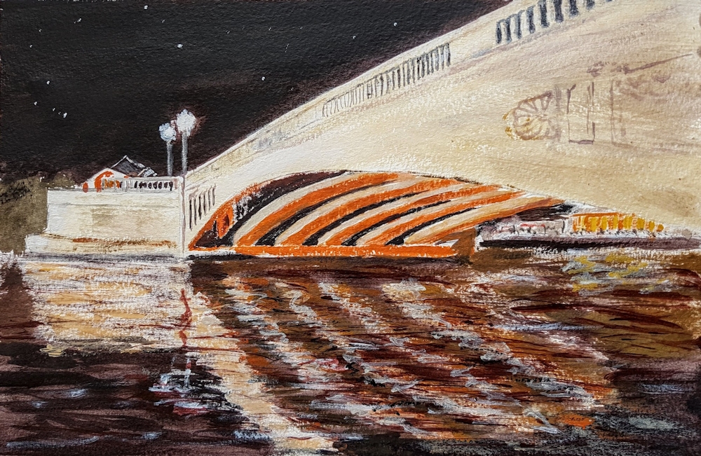
Alvaro Castagnet
Castagnet works in watercolour and I have included one of his cityscape works which could be reinterpreted using the pigments of the Zorn palette.
Your Zorn Palette Paintings:


Both of Sandra’s works were painted with Cadmium Red Deep instead of a brighter red like Cadmium Red Pale, Vermilion or Scarlet Lake.