Category Archive: Uncategorised
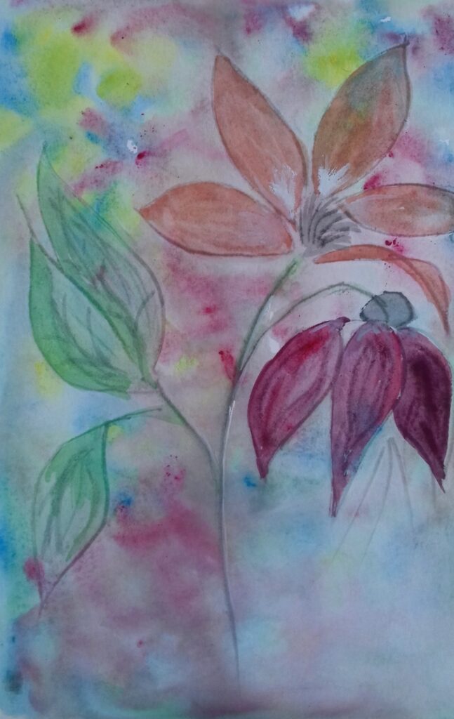
The Power of Colour 6: Red and Green
February 9, 2021

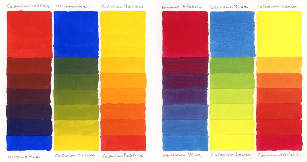
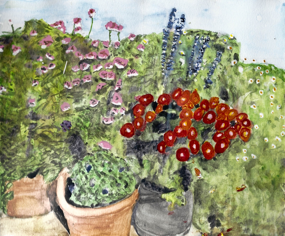
This week I just took a little time exploring how two reds, one closely related to orange, Vermilion and the other Alizarin Crimson, closer to purple, mixed and related to two very different greens, Sap Green which is much more yellow that Phthalocyanine Green which leans toward blue.


Middle has Sap green and Crimson Alizarin squares.
Right has Phthalo Green and Vermilion squares.
Look at how differences in tone and differences in hue determine how bright or dull each square appears in its surroundings. See how the top left red square in the middle image almost disappears and how bright the pure vermilion in the image looks against a complementary dark green and also against a very dark tone in the image on the right. Even the top left Vermilion square looks subdued against reds that are more like it with regard to hue and tone.

Sadly where the spots were painted against their complementary colour, even though these were very de-saturated (impure), a black line appeared where some of the paint mixed. However this dark line does make the spots glow!

The dark line of the first scarf image was eliminated by digitally collaging spots of the same pure colour with no outline. There is still a slight optical illusion of a dark edge, especially on the Phthalo Green spot on the impure Crimson Alizarin mix, due to after images making the edge “vibrate”.
Look at how all these spots glow from their de-saturated surroundings and
how much brighter they appear than the same dots of colour on the white ground to the left.

The left pair share Vermilion
The right pair share Crimson Alizarin
I was not surprised by the darks or brownish colours but really enjoyed the near purple colours achieved with Phthalo Green and Crimson Alizarin
You may have different greens and reds in your paint box. Take some time to discover how near to orange or purple s each red is and how near to yellow or blue each green is.
Viridian, Phthalocyanine Green, Cobalt green and Prussian Green are all examples of greens nearer to blue. Sap Green is a more yellow green and Hooker’s Green is much bluer than Sap Green but more yellow than Phthalo Green.
Vermilion, and Cadmium Red Pale are much nearer to orange than Crimson Alizarin, Quinacridone Rose and Magenta and you may have other reds which are somewhere between the two.
Before homing in on the green and red pigments you choose for your painting subjects this week find which combinations will be best suited by experimenting a little.
Have a look at this week’s Pinterest board at
https://www.pinterest.co.uk/jhall1282/the-power-of-colour/red-and-green/
In each example make a note of how the red and green pigments are being employed and how they interact. Observe how red looks when surrounded by dark, pale tones, by similar hues and by complementary colours both pale greens, dark greens, yellow greens and bluer greens.
Practical
Choose only two from the following list and make two paintings incorporating one in each. That doesn’t mean to say the other items won’t be present but I would like you to have one main theme for each painting, just as a story may involve one main character and a couple of supporting roles. Don’t feel you have to do two paintings. One well thought out composition is really worthwhile.
- A bright red line winding a bright way through a green and a very close blue green of similar tone
- A painting with very equal amounts of red and green
- A painting that is almost all green with a tiny flash of red or a painting with a large area of red with a little green.
- A painting where the colours adjacent to each other are just slightly different but span the range between red and green. This should involve a lot of mixing either wet in wet or on the palette/overlaying colours.
- A painting with huge tonal differences.
You may use white pure in areas and in mixes, and your paintings may be representational or abstract. The medium is up to you. Try to make dark tones by mixing the appropriate reds and greens and use black only if essential.
Think very carefully about how many greens you wish/need to work with and how many reds. The illustrations will give you some idea of the scope of using only four pigments but you may wish to explore lots of greens in a painting and only one red for instance. Try to have a reason for your choices.
After a while it becomes intuitive to just go for the “right” colour knowing how it will appear on its own and in mixes, and you will definitely begin to enjoy using some pigments more than others. I firmly believe that individual colour choices and combinations form as much of the identity of an artist as the shapes and lines he produces. (“he” being used in the universal mankind sense here.) Think this has already been born out in the last few weeks by those who prefer orange and blue to yellow and violet and vice versa!
Your paintings;

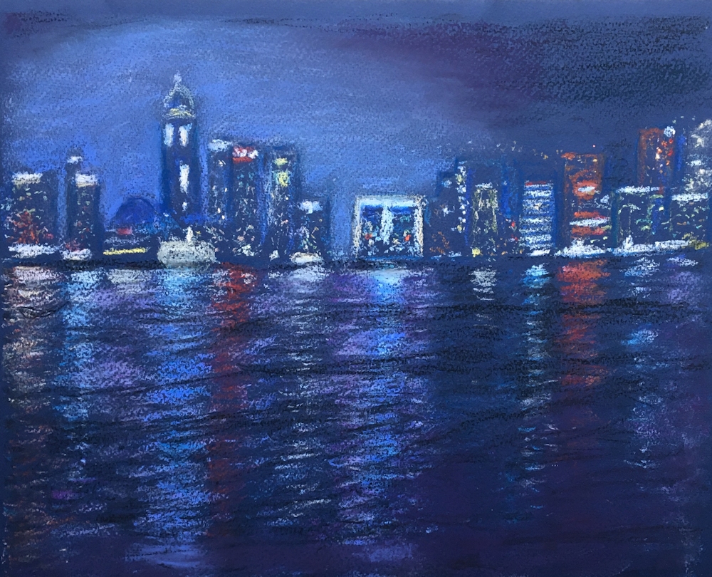
Watercolour and oil pastel by Liz

Watercolour by Liz
Brilliant Red, Alizarin, Sap Green, Winsor Green

Oil pastel and watercolour by Maricarmen

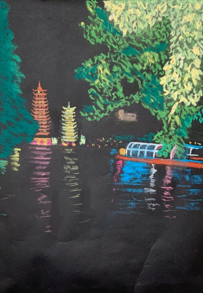
Watercolour and collage by Maryon
The colours used throughout Maryon’s works are;
Sap Green, Phthalo Green, Viridian, Madder Red Deep
and oil pastel in green and white.

Collage and watercolour by Maryon

Watercolour and oil pastel by Maryon

Heather exchanged black areas for red
Acrylic
Viridian, Sap and Light green plus Deep Red and Vermilion.

Greens used are;
Viridian, Sap Green and Hookers Green

Watercolour and pastel
Alizarin crimson, Scarlet and Vermilion on the dragon fly. Pencil for the wings.

Collage and watercolour by Shirley

Collage and watercolour by Shirley

Watercolour by Jan
Permanent Red, Alizarin Crimson, Permanent Rose
Sap Green, Hookers Green, Perylene Green

Watercolour by Jan
Permanent Red, Alizarin Crimson, Permanent Rose
Sap Green, Hookers Green, Perylene Green

Watercolour by Ann

Acrylic by Barbara
Scarlet, Cadmium Red
Viridian, Leaf Green, Medium Green

Watercolour by Sarah
Hookers Green, Sap Green, Crimson, Vermilion

Watercolour by Sarah
Crimson, Vermilion, Hookers Green, Sap Green, Viridian, White

by John
Viridian, Sap Green, Cadmium Red

Acrylic by Malcolm
The light background is a total undercoat of clear varnish with a touch of Phthalo Green in producing a nice turquoise.
Colours used were;
Phthalo Green (G7) and Sap Green (B15.3, Y74),
Alizarin Crimson, Cadmium Scarlet, Magenta
The Power of Colour 5: Red
February 3, 2021

Watercolour
Red demands our attention even in the smallest quantities. The tiniest area of pure red can form a focal point as in the painting of the blue rug above. It’s like an itch that cannot be ignored.

Oil pastel
This work references a medieval sgraffito wedding plate found in Cyprus and now in the Ashmolean Museum.
Only one dark red pastel is used over a base of well rubbed in pale orange-yellow which was revealed when the red was drawn into.
Where blue may be sad or holy, red is fiery, passionate, romantic, celebratory. Blue is recession or depression, red leads the cavalry to advance. We need both the calm of blue and the jollity of red for a balanced colour diet.
Look at the way red is used in the works on this week’s Pinterest board at:
https://www.pinterest.co.uk/jhall1282/the-power-of-colour/red/
Look at the red dot in Matisse’s cut out “Icarus”. See how different reds interact in the abstracts by Rothko and Patrick Heron. Explore how Bernard Cathelin manipulates red in still life, portrait and studies of groups of figures.
This week for all the studies you may use any red pigment alone or in combination with other reds. You may use Magenta, Quinacridone Rose, Alizarin as well as the warmer reds cadmium Red Pale, Scarlet and Vermilion. It would be useful for these studies to have one cool red(nearer to purple) and one warm red(nearer to orange).
One way to understand your reds is to test each one by discovering how it appears surrounded by black , white or a different red. Make a note of which appear to advance or whether the same red appears different against different surrounding hues. After that try at least one of the following red/reds to make a composition. You may use back and white, mixed with the reds or as areas of white and black. These paintings may be abstract or representational, hard or soft edged.
1. Make a painting using one or more red pigments, black and white. This may be hard or soft edged, abstract or representational.
2. Make a painting with red as in 1. but a small amount of a related hue may be used, but only one; either a reddish orange or a reddish mauve but not both.
3. Make a painting with any colour but include one small area of red as a focus.

This painting references a composite wooden statue from Nigeria drawn at the British Museum. The red background is a monoprint of black and red mixes drawn over the top with acrylic inks. Only black, red and white is used.
Your paintings;

Lady in Red by Barbara
Inspired by the portrait of Anita Berber by Otto Dix

Watercolour by Maricarmen
After a painting by Jill Leman RAWCA

Oil pastel my Maricarmen

Watercolour by Maricarmen

Watercolour by Maricarmen

watercolour by Maryon

India Ink and watercolour by Maryon
The red is Madder Lake

Watercolour by Maryon
Quinacridone rose, Vermillion, Black
White mixed with the reds

Watercolour by Maryon
The earring is Vermillion and the skin tones
are mixes of black and vermillion.

Watercolour by John
Mainly cadmium Red and Black

Watercolour by John
Cadmium Red, Alizarin Crimson, Black, little Ultramarine

Acrylic by Heather
Scarlet, Deep Red, Rose, Black and White.

Heather’s watercolour version of an African print
Vermillion, Alizarin Crimson, Black and Orange plus Black oil pastel and a touch of Yellow oil pastel

by Shirley

Watercolour and Oil Pastel by Shirley

A red for every cloak
Watercolour by Shirley

Watercolour by Shirley

Watercolour and oil pastel by Jan

Watercolour by Jan

Watercolour and oil pastel by Jan

Acrylic by Malcolm
My reds are Naphthol R9 (lightest); Cad Red Medium R108 (middling); Permanent Alizarin R175+R122 (darkest, used mass tone only); Quin Magenta R122. Black is Carbon Bk7.

Acrylic by Malcolm
Transparent Perinone Orange O73, a reddish orange tints the pink undercoat visible in places. Reds are Naphthol and Cadmium Red Medium; both mixed with black for the browns.

Watercolour by Liz

Red and black watercolour with
red oil pastel resist by Liz

Watercolour and pastel by Liz

Watercolour by Ann

Watercolour by Ann

Watercolour by sarah
Crimson, Vermillion, Black
and a little oil pastel resist

Watercolour by Sarah
Crimson, Vermillion, Rose Madder, Black

Watercolour by Sarah
Crimson, Vermillion, White, Black
with Cerulean, Ultramarine and Sap Green
This painting will lead us very nicely into thinking about the project for next week.
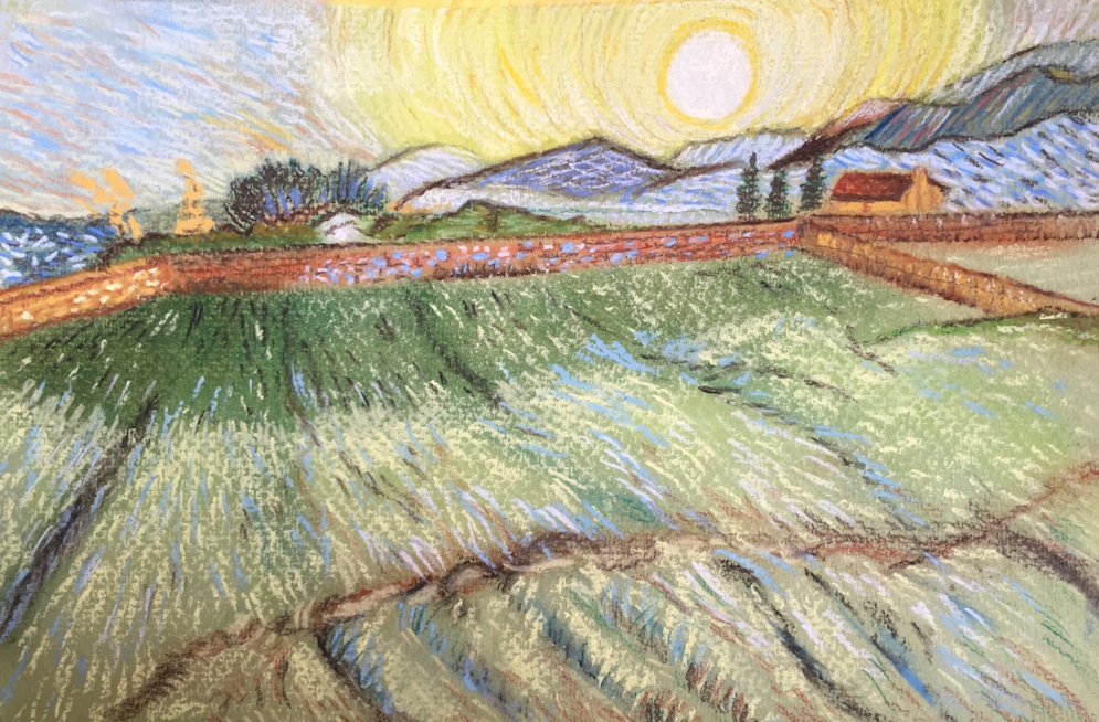
The Power of Colour 4: Yellow and Purple
January 26, 2021

This week we have high drama purple and yellow. It’s in some ways very like the blue orange challenge, although to my mind not as easy. Yellow and purple together always brings to mind mauve and yellow crocuses and Iris. I didn’t find quite so many references so perhaps I’m not the only one to find this challenging.
https://www.pinterest.co.uk/jhall1282/the-power-of-colour/yellow-and-purple/
All the same principles apply as for the orange blue complementary pair, and it’s worth trying to mix a few yellows with one purple colour to find out what you can make with this limited palette. Again purple will very quickly denature any yellow much in the same way that blue does the same with orange, so always add a small amount of purple to the yellow to make your mixes, unless you just want to add a small amount of yellow to a very strong pigment like Dioxazine Purple, just to take the edge off its rather harsh colour.

A few notes on other pigments and the use of pastel are included in the Challenges for this week: section nearer the end.
Unlike red and blue and especially when working with oil or acrylic, yellow can be used to make a deep colour paler while at the same time lessening its saturation (purity). That is why a little yellow with Dioxazine will lessen its vivid colour. This does not work where reds and blues are opaque paints that already contain a lot of white; especially gouache and acrylic paints (some pink and pale bluecolours).
Charging
A useful watercolour technique is charging. Make a small square of yellow wash, about 3inches square and drop a strong purple into it while it is wet. This technique is called charging. Very often the colours mingle rather than mix, but the results can be stunning. Then try dropping yellow into a purple wash.


I repeated this with a stronger purple wash; the results are subtle but would be wonderful for a ceramic vase.


Yellow with analogous colours and Black
Study from previous post with black added
Colours: Cadmium Yellow pale, Cadmium Yellow Deep, Orange, touch of Cerulean Blue for yellow green leaves, Ivory Black

Colours as previous image plus Dioxazine Purple
Used at full strength Dioxazine purple is extremely dark.
Challenges for this week:
Spend most of the time on 3. and/or 4.
1. Yellow and Purple mixes;
I suggest you stick to one purple, Dioxazine (also called Winsor Violet) would be a good choice being a strong pigment that will give you plenty of tonal contrast and see how it mixes with the yellows in your box. Just remember it is very strong, transparent and staining.
A gentler option would be any other mauve or violet.
If you have a pale opaque violet like the rather expensive Cobalt Violet your yellow mixes will be much more subtle but you will not be able to make dark tones with yellow. It is certainly worth experimenting with as it is a beautiful pigment for delicate colour washes but will not give you any strong tones.
Purple is one of the more difficult colours to mix but a magenta added to an ultramarine should give a good purple. Mix a large amount if you wish to have a consistent colour mix for a painting.
You may also wish to use either pastel or oil pastel which would be great as a wax resist with watercolour.
If you are using acrylic Dioxazine Purple is the strongest. There are other purple pigments which are often mixed with white so you would automatically reduce the transparency of your colour by mixing with transparent yellows. All are useful but please be aware that the results will be different.
2. Charging
If working with watercolour try the charging technique as outlined above. Note any difference in the behaviour of your pigments. Try charging purple into yellow and yellow into purple.
3. Make a composition using only yellows, one purple and white if required.
4. Make a second painting using yellows, one purple, white, black and a small amount of colour analogous to purple e.g. a purplish blue like ultramarine.
The painting should appear mainly yellow purple and mixes of these two. Use black with caution but do try using a pure black and very strong purple beside each other or for a very rich dark area try laying strokes of purple over a dry black wash. A strong transparent purple like Dioxazine is necessary for this.
If you use Payne’s Grey instead of black also be aware that this paint is a mixed pigment that contains black so will tend to desaturate/muddy colours in the same way that black does. Very often the added hues are blue and/or purple pigments. My personal choice is to use a Payne’s Grey Blue Shade as the alternatives are generally very dull.
If time is limited, choose to do either 3. or 4.
Do first look at the Matisse painting of a woman in a purple and yellow jacket and the Dufy work of a view through a window in Nice. It would also be well worth looking at the contemporary artist David Tress who works mainly with land and city scapes. If you can, choose to work from your imagination or your own reference, otherwise make your version of one of the paintings referenced.
Your Paintings:

by Barbara

by Maryon

Watercolour by Maryon

Watercolour by Maryon

Watercolour by Maryon

Yellow flowers charged with Quinacridone Purple

Watercolour: Yellow and Quinacridone Purple
by Heather

Violet, Cobalt Violet, Lemon Yellow, Cadmium Yellow

watercolour by Ann
Violet, Lemon Yellow, Cadmium Yellow

Watercolour by Ann
Yellow, purple, black, white, with touches of analogous colours
The reference is van Dongen’s portrait of Alicia Alanova which along with works of Chagall and other famous artists was stolen from the collection of an elderly couple in Los Angeles and reported in the Telegraph Newspaper 10th September 2008

Violet, Lemon Yellow Cadmium Yellow

Acrylic with glazing by Malcolm
Several yellows: Diarylamide Y83 (Rowney Cad deep hue), Cad Medium Y37, Arylide Y73 (Galeria Cad med hue), Arylide Y74 (Transparent) and a Lemon.
The glaze is Ultramarine Violet V15, which gives a greenish result on Lemon but on others brown. The shade depends on the strength of glaze.

Acrylic by Malcolm
Accomplished with direct brush strokes and no glazing.
Dioxazine purple, White and Yellows: Diarylamide Y83 (Rowney Cad deep hue), Cad Medium Y37, Arylide Y73 (Galeria Cad med hue), Arylide Y74 (Transparent) and a Lemon.
Acrylic by Malcolm

Includes a Chrome Yellow which Turner included in his palette almost as soon as it was in production

Watercolor by Shirley

Watercolour by Shirley
Mixes of yellows and purple to make muted colours

Watercolour by Shirley
On white paper (white in the image) and no colour mixing

by Jan
Top; Cadmium Yellow and Dioxazine Purple
Lower: Lemon Yellow and Dioxazine Purple

Cadmium Yellow, lemon yellow,
Dioxazine Purple plus Ultramarine

Watercolour by Jan

Oil pastel and Watercolour by Jan

Watercolour by Liz

Watercolour by liz

By Liz

Watercolour by Maricarmen

Watercolour by Maricarmen

Watercolour by Maricarmen

Watercolour by Maricarmen

Watercolour by Sarah
Lemon Yellow, Cadmium Y,ellow, Violet and White

Watercolour by Sarah
Lemon Yellow, Cadmium Yellow, Violet,
plus Ultramarine, Cerulean, Sap Green and White

Watercolour by John
SAA intense violet, cadmium yellow, Indian yellow and a touch of ultramarine

Watercolour by John
Cobalt Yellow, Indian Yellow, Intense Violet, Cobalt Violet, touch of White
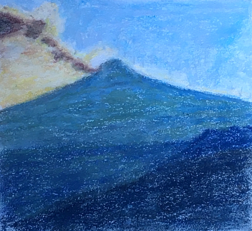
The power of colour 3: Yellow
January 19, 2021

Lemon Yellow, Cadmium Yellow Pale, Cadmium Yellow deep and Indian Yellow
Yellow, the sunshine colour; just what we could do with today! Opposite purple on the simple colour wheel this is the colour intrinsically pale in tone, even the yellows that are nearer to orange are pale in their most saturated form.
Yellow paints in your box may range from the very pale lemony yellows nearest to green;
Lemon Yellow, Cadmium Lemon, Cadmium Yellow Light
To the middle yellows;
Cadmium Yellow Medium, Chromium Yellow Light
And yellows that are almost orange;
Turner’s Yellow, Chromium Yellow Deep, Cadmium Yellow Deep, Indian Yellow
You can do any of the suggested projects below with one pale or lemony yellow and one that is nearer to orange or at least in the middle range of yellows.
Have a look at the Pinterest board to see how other artists have worked with yellow as the principal colour in a composition.
https://www.pinterest.co.uk/jhall1282/the-power-of-colour/yellow/
Then try any two of the following (more if it’s pouring with rain outside).
1. Try making an abstract or representational painting, using any pure yellows. If you need to because you are using an opaque medium like pastel or gouache you may use white.
Do not use earth yellows such as the ochres. These are already de-saturated colours. By mixing yellow with black, or as we shall see next week with purple, you should be able to mix your own approximations to these.
2. Find how the yellows in your box mix with black and make a hard edged composition with at least some pure black areas, some pure white/white of the paper areas, and blocks of pure yellow and yellow mixed with black or white. This may be representational or abstract.

Lemon Yellow, Cadmium Yellow Pale, Cadmium Yellow Deep, Indian Yellow, Black
Note how the deep orange mixes, two middle columns make warm brown mixes with black but the pale lemony yellows make greenish mixes.

Lemon Yellow, Cadmium Yellow Pale, Cadmium Yellow Deep, Indian Yellow, Black
Note how the deep orange mixes, two middle columns make warm brown mixes with black but the pale lemony yellows make greenish mixes.

Lemon Yellow, Cadmium Yellow Pale, Cadmium Yellow deep and Indian Yellow and Black
Yellows were dropped on to the paper wet in wet. A swirl of black was run through the still wet wash with a rigger brush. The handle end of the brush was use to make curved lines into the wash while it was still damp and paint settled into the indented grooves and allowed to dry. Guided by some of these lines, opaque white, yellow and mixes of black and yellow were applied in a rather decorative manner. If you enjoy doodling and working intuitively, this is the exercise for you!
3.Make a painting with hard and soft edges with any mixes of yellow, black and white, abstract or representational. For textures as in the Sargent portrait you may consider using pastel instead of a wet medium.

The same pigments were used for the yellows, plus black and a hint of vermilion was added to some of the yellow for the orange vase and a hint of cerulean was added to lemon yello for the yellow green colour.
4. Make a painting using the same colours as in 3 but you may add touches of closely related colours like a reddish orange or a yellowy green.
With your paintings try to find ways of sorting out major tonal areas. The dark and unsaturated colours will be the perfect foil to pure or almost pure colours. Be very aware of when you are using pure colour and when you are using de-saturated colour. Look at how pure colours seem to stand out from duller unsaturated colours demanding attention.
Your paintings;

Watercolour by Sarah
Lemon Yellow, Cadmium Yellow, Indian yellow, Black, White

Watercolour by Sarah
Lemon yellow, cadmium yellow, Indian Yellow, Black
Touch of Ultramarine for yellow green colours

Watercolour by Maricarmen 15 x 12 cm
Cadmium Lemon, Cadmium yellow, Indian Yellow, Payne’s Grey

Watercolour by Maricarmen 10 x 15cm
Cadmium lemon, Indian Yellow, Payne’s Grey
(and a touch of violet in the shadows)

Gouache by Maricarmen 19 x 26cm
Two Yellows, Payne’s Grey and White

Study in watercolour by Maryon

Watercolour by Maryon
Cadmium Lemon, Cadmium Yellow Pale, Naples Yellow

Yellow and Black

Watercolour by Ann

Waterolour in Yellows and Black

Watercolour by Ann
Analogous colours plus Black

Watercolour by Heather

Watercolour by Heather

Watercolour and gouache by Heather


Watercolour by Shirley
Watercolour by Shirley


Watercolour by Jan
Lemon Yellow, Cadmium Yellow Hue, Indian Yellow, Black

Watercolour by Jan
Lemon Yellow, Cadmium Yellow Hue, Indian Yellow, Black

Watercolour by Jan
Lemon Yellow, Cadmium Yellow Hue, indian Yellow, Black
and a little red

Yellow Medium, Yellow Deep, Indian yellow and Black
watercolour by Liz

Watercolour and Gouache by Liz

Digital image by Malcolm
Background deep yellow, fill medium yellow

Digital image by Malcolm
As previous image but with white line

Digital image by Malcolm
As previous image but with black line

Digital image by Malcolm
As previous image but with Lemon Yellow line

Acrylic by Malcolm
Arylide yellow and Carbon Black
Please note; yellow and black make green

by John
Note the lemon yellows make green with black and the deeper yellows that are nearer to orange make brown.

Watercolour by John
Note the attention demanding power of the small areas of red in this mainly yellow and black painting

Watercolour by Barbara
Pale lemon Yellow wash with more Lemon Yellow and Cadmium Yellow Hue

by Barbara
Previous image was photocopied and black watercolour and marker pen lines added.

Watercolour by Barbara
The Power of Colour 2: Blue and Orange
January 12, 2021

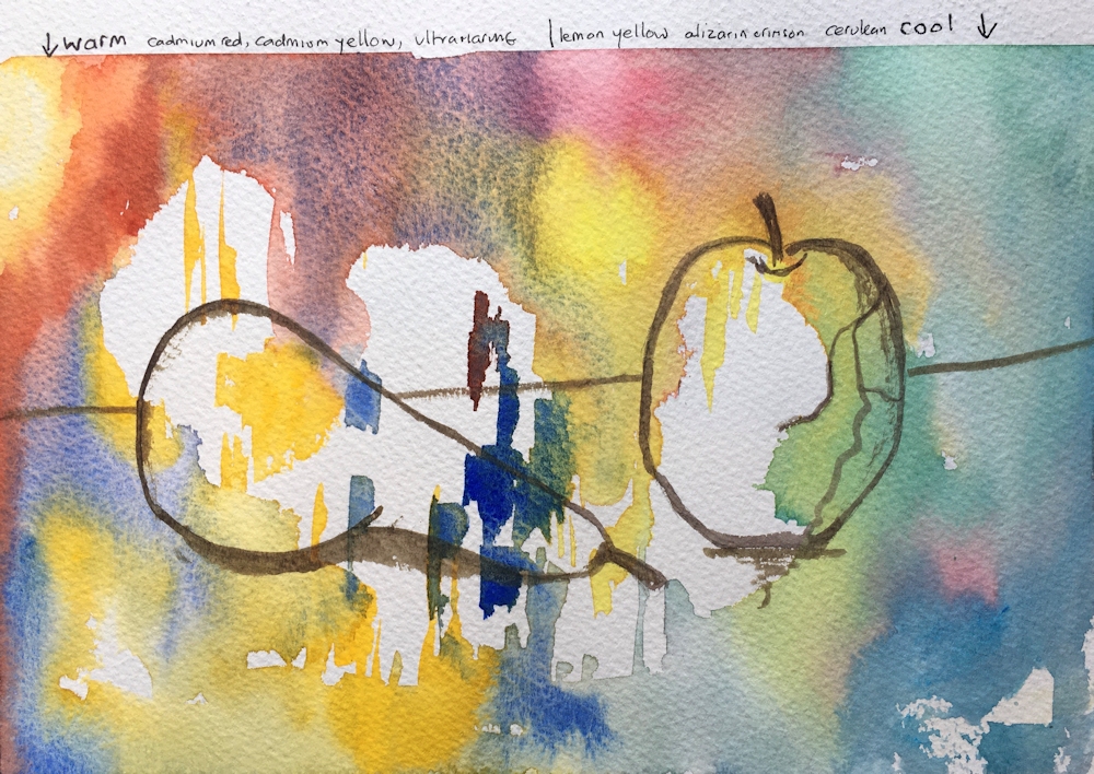
Orange and Blue is a very versatile colour combination producing vivid contrasts and yet in mixes some lovely muted colours and greys can be made. In theory you should be able to mix a neutral grey if the orange and blue are mixed in the right proportions. Try this with an ultramarine and a cadmium orange. The exercise below used gouache pigments but could be done with watercolour or acrylic.

Try adding a titanium white to one of the darkest mixes. That will soon reveal whether the mix has a blue or an orange bias. See below.

Last week we saw how different hues looked when the same hue was surrounded by hues that were different in tone and saturation. This week we are throwing a much greater colour difference into the mix and the effects of pale and dark borders. The following were constructed digitally but the same principles apply when you are painting.


Outlines matter: the arrangement of colour is identical in the three illustrations below, they differ only in that the first group have no outline, the second group a black outline and the third group a white otline to the cross shapes.

Lower row middle two blues are the same hue and tone
Think about how the difference in appearance of the top two left squares has been achieved.

Lower row middle two blues are the same hue and tone
Generally the black outline prevents colour from appearing to spread. Think about why some of the black boundaries seem to disappear and why the colours of stained glass appear so rich.

Lower row middle two blues are the same hue and tone
Think about why a white outline can almost always be noticed.
References for this week can be found on the Power of Colour Pinterest board at:
https://www.pinterest.co.uk/jhall1282/the-power-of-colour/blue-and-orange/
The first challenge is to create two or three small studies that show how blue and orange can relate to each other, much as we did for the different blue hues. This time I would like to see both studies use similar shapes; these can be organic or more geometric. The colours should be distinct and either have no border, a black border or a white border. Use only one blue and a premixed orange e.g. cadmium orange or a similar bright orange.
Some people really enjoy making these studies/little abstract paintings. If you do, you may like to spend all your time on this. If not just spend a short time mixing colours; especially noticing any differences between mixing the complementary colours together, and mixing each complementary with white or black before spending most of your time on a painting; see notes below the study notes..
First Study; work with your chosen blue and orange as the brightest blocks of colour you can make. Include white as pure white and black as pure black and include shapes with and without outlines.
Second Study: In the second study try including some desaturated colour by mixing your blue with the orange. You may use white but not black.
(if time)Third Study: This time you may still use only one orange and one blue but do not mix them with each other, just use white or black to de-saturate the colours. You may choose whether to include any areas of pure blue and pure orange or you may choose to work with either very pale or very dark colour mixes.
Medium: You may use any medium for this; collage would work brilliantly perhaps inspired by works by Patrick Heron or Josef Albers. An opaque medium like gouache would also work well. This can also be done with watercolour, pastel or acrylic. These studies can be quite small and contain only about eight shapes, certainly not more than about twelve. If you decide to work in collage; paint some pieces of cartridge paper and cut or tare them to make your shapes. White paper can be your pure white and if you have any black paper that can be your black.
Painting; after the studies spend some time looking at the Pinterest Board again and make your own composition using any of your blue pigments, black and white but use only one premixed orange. Mix these however you like. An opaque orange like Cadmium Orange would be ideal but any bright orange will do.
Note how black lines can separate areas of colour, containing them as in a stained glass window. We often prepare to paint by drawing with lines that separate areas we may later choose to fill with colour. These lines usually represent edges of what we can see. Very often we obliterate these lines during the course of painting so that one colour lies directly against its neighbouring colour with no dividing line. See how in some works the artist uses line, sometimes to separate blocks of colour and/or to define the edges of objects within an area of colour as in the blue and gold interior painted by Matisse referenced on the Pinterest board for this week.
When looking at paintings look for works that use line and those that represent forms with no line which is much more as we see them.
Look at how Modigliani sometimes used a pale blue for eyes in a rather orange face. You might consider working from a black and white portrait photo. In landscape paintings blues tend to recede and the orange and red colours seem to advance. Whether you produce an abstract or a representational piece think about edges and enjoy the colour!
Your Paintings;


Pastel and Collage by Maryon

Gouache by Maricarmen

Gouache by Maricarmen


Watercolour by Heather


Gouache and collage

Gouache and Ink

Ultramarine and Orange watercolour with Titanium White

Ultramarine Blue and Orange watercolour

Watercolour by Barbara


Acrylic by Barbara
Orange and Cerulean


Watercolour by Shirley


Watercolour by Sarah
Indigo, Ultramarine, Orange, Black, White

Watercolour, India Ink, Pastel

Watercolour by Sarah

or Floating Cerulean Rectangle
Just for once the reds lose out!
Acrylic by Malcolm
The Power of Colour: 1. Blue
January 5, 2021

For the next few weeks we’ll be looking at primary colours used on their own and their use with each of their complementary colours. Primary colours will also be used with closely related hues to make harmonious compositions.
We’ll also explore some of the effects of colours on each other, after all colour can seriously affect your eyes or at the least deceive them a little!

Look at the appearance of the four blue squares on the right and middle columns above. Do they look different? What happens at their edges?
Then: stare at each of the squares in turn for about a minute then look at the blank space below before going on to the next one. What do you see?
For even more spectacular after images stare at the colour wheel below and then at a white space. these after images and illusions are with us all the time we are seeing.
To start with, here are a few basic definitions that are relevant to the course.: please skip if you are already up to speed with this!
Hue: a pure colour of a certain wavelength in the visible light spectrum.

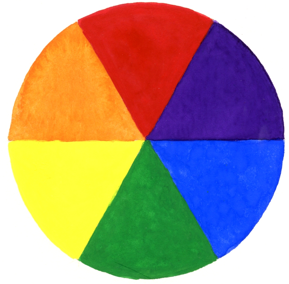
Colour wheel; this should be a circle with a continuum of all the different hues in the visible spectrum. In practical terms this has been reduced to a beach ball of just six colours which represent six major groups of colour as used for painting; firstly, the three primary colours; red, yellow, and blue called primaries because they cannot be mixed from other colours; secondly, the three secondary colours orange, green and purple which can be mixed from the primary colours and which lie in between the colours they are mixed from on the colour wheel. Scientists and artists have invented a huge number of colour wheels, some of which include many more colours and also tints and shades at different levels within the circle.
Analogous colours; colours close in hue and next to each other on the colour wheel. the colour wheel. e.g. red and a reddish purple
Saturation : the purity of the colour, which is occasionally and I think confusingly, called intensity. To de-saturate a colour mix the pure hue (fully saturated colour), with its complementary colour, or black or white. The saturation of some colours is altered radically by even the smallest amounts of these; for example yellow is very rapidly changed by the addition of the smallest amounts of purple or black.
Tone: how light or dark a colour appears. Every pure hue has an intrinsic tone. A pure yellow for instance is always paler than a pure red. The additionof black, both de-saturates a hue and lowers or darkens its tone. Colours darkened in this way are usually called shades. The addition of a complementary colour also lowers its tone.
The addition of white to a hue lightens it and is said to raise its tone to make tints.
The definition of tints and shades is not always consistent as pastels are often labelled as e.g. tints 1 to 6 where usually a stick labelled tint 1 or 0 is the palest and is the pure colour plus white, and a stick labelled tint 6 is the darkest of that colour made up of the pure hue plus black.

Black ink and watercolour
This week’s colour is blue. Often the colour of melancholy and depression as in Picasso’s blue period portraits, I didn’t choose blue first because of Covid creating so much depression this New Year. No, I chose it first because it’s also the colour of sunny skies and Mediterranean waters, and because as you will see next week blue is great to combine with its complementary orange.
The blue pigments I have used for the exercises are
French Ultramarine (warm),
Cobalt Blue (warm)
Phthalo Blue, green shade or Prussian blue (cold)
Cerulean Blue(cold)
It’s useful to have at least one warm and one cool blue to work with. If I had only two I would probably favour Ultramarine and Cerulean, but the richness of cobalt and the dark tones that can be produced with Phthalo or Prussian Blues are very useful additions.
For this week you will also need a black and white, and perhaps a couple of analogous colours a blueish purple and a blueish green or turquoise.
Used at full strength pure cobalt and pure cerulean are not as dark in tone as Ultramarine or Phthalo Blue and the darkest is Prussian blue. Phthalo Blue, Prussian blue and Ultramarine are generally more transparent than Cerulean and cobalt blue.
What does this mean in practice?
Transparency only applies to watercolour, oil and acrylic paints as if you are using gouache or pastel you are effectively working with an inherently opaque medium. Transparent colours deepen the more layers of colour that are added. Opaque colours laid down at full strength do not become darker when further layers are added. Very often it is difficult unless you know their position to identify the transparent colours of watercolour pans in a box because they all appear so dark whereas the more opaque colours give away their identity on sight; e.g, cadmium red, cadmium orange etc.
Exercises; I have chosen watercolour for this week but most could be done with pastel, acrylic or gouache. I hope to provide some pastel examples later in the week. The illustrations are only to give you ideas of ways to explore the blue pigments in your own boxes,
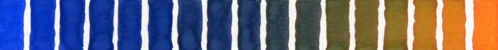
1. Tone and saturation
Take a blue pigment and try 1. diluting with water, 2. mixing with increasing amounts of white, 3. mixing with black and adding increasing amounts of white, and 4. compare with black to which increasing amounts of white are added.
Try this for a warm blue like Ultramarine and a cool blue like Cerulean or Phthalo Blue. Adding water or white will make tints and adding black will darken the colour and de-saturate the blue. Adding white to this mix will produce blueish greys.

Column 1: diluted with water to give tints
Column 2: permanent white added to give opaque tints
Column 3: mixed with black then white added to give blueish greys
Column 4: black with white added for comparison

Column 1: diluted with water to give tints
Column 2: permanent white added to give opaque tints
Column 3: mixed with black then white added to give blueish greys
Column 4: black with white added for comparison
2. Optical properties
Dark and light surrounds, disappearing boundaries; very closely related hues of the same tone.
Make a study where similar shapes of one hue are surrounded by white, a much darker hue or by a closely related hue of the same tone. An example is given below.

You may choose to do 3 or 4 below;
3. Make a painting/study using just blue pigments

Colours used; Ultramarine, Cerulean, Cobalt Blue, Phthalo Blue Green Shade

Cerulean, Cobalt, Ultramarine and Prussian Blue with
Winsor Green Blue Shade and Winsor Violet
4. Make a painting or study using blue pigments, and black. You may also use white and a couple of analogous colours like a blueish green and/or a blueish purple. The general effect should be that you are making a predominantly blue and harmonious painting.
3 and 4 may be your own composition or your version of a famous painting where the predominant colour is blue.
Think about;
What conditions make a blue advance, float, or recede?
With regard to tone and hue how does a background colour affect how a blue hue appears?
Pinterest board for reference.
The link for this week’s board is:
https://www.pinterest.co.uk/jhall1282/the-power-of-colour/blue/
which includes abstract works by Patrick Heron, Marc Rothko, Josef Albers, Kandinsky and Matisse alongside works from Picasso’s blue period.
Your paintings:

Using only blue pigments

Watercolour: Blue pigments only

Blue with a little Violet

Watercolour by Shirley

Watercolour by Shirley

Watercolour by Barbara

Watercolour by Barbara
Pigments; Ultramarine Blue, Black, Permanent White

Blue watercolour by Ann

Watercolour: blue pigments only

Watercolour by Liz

Watercolour by Liz

Watercolour and acrylic by John

Watercolour by John

Watercolour by Heather

Watercolour by Heather

Watercolour by Heather

Watercolour by Maricarmen
Pigments; French Ultramarine, Phthalo Blue, Cerulean, Cobalt Turquoise, Violet and Cadmium Yellow

Watercolour by Maricarmen
Pigments; Cerulean Blue and Prussian blue

Acrylic by Malcolm
Pigments; Cobalt Blue with a little Phthalo Blue Red Shade and Cerulean
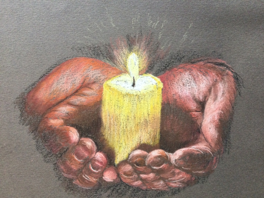
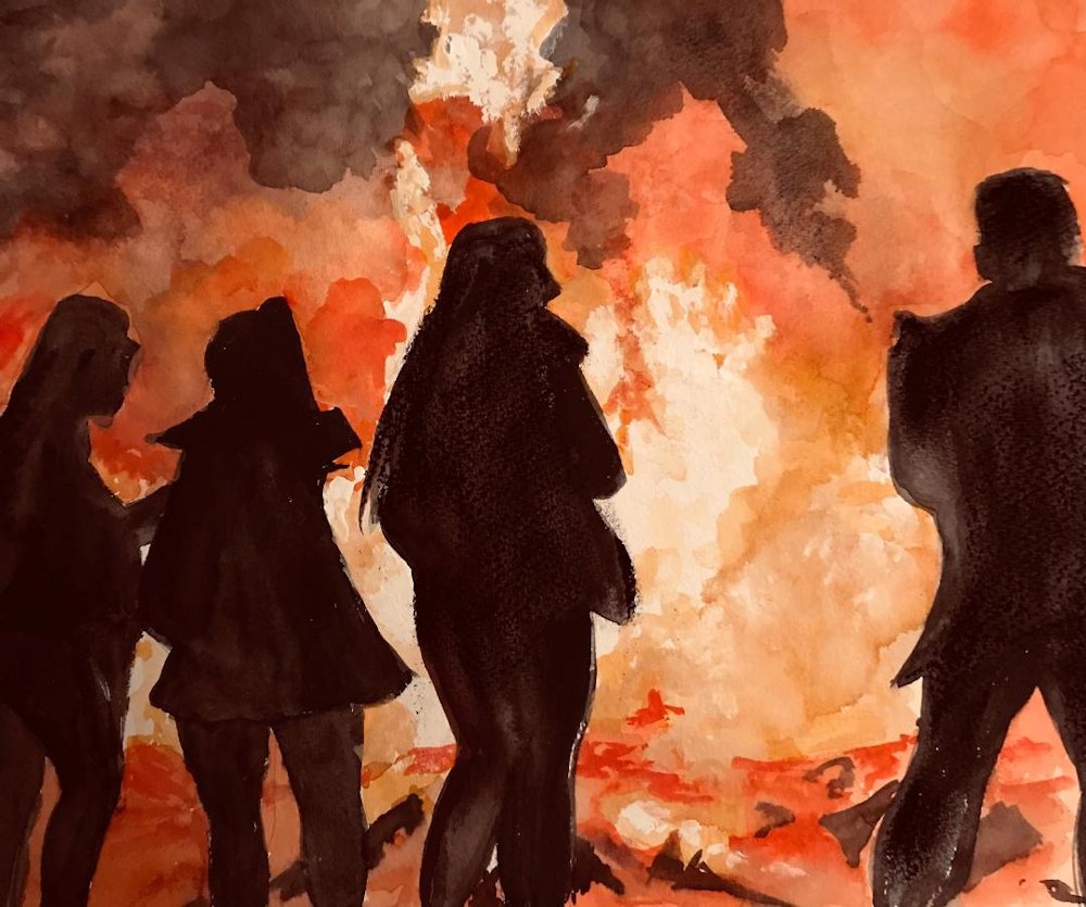
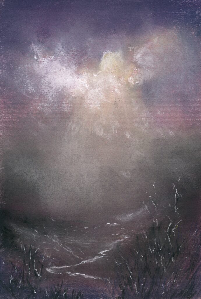
Lights in the Sky, Lights from the Land: Fire
November 17, 2020
Watercolour and gouache on burgundy pastel paper
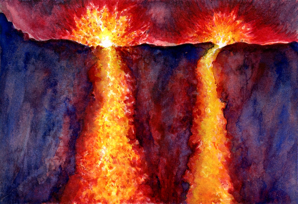
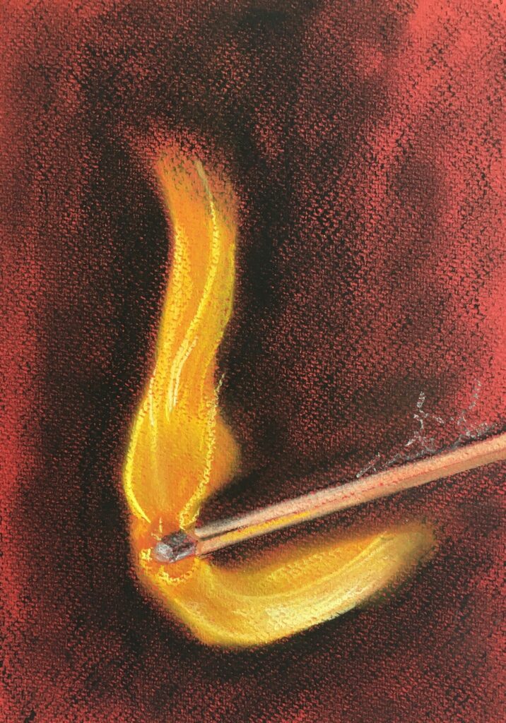
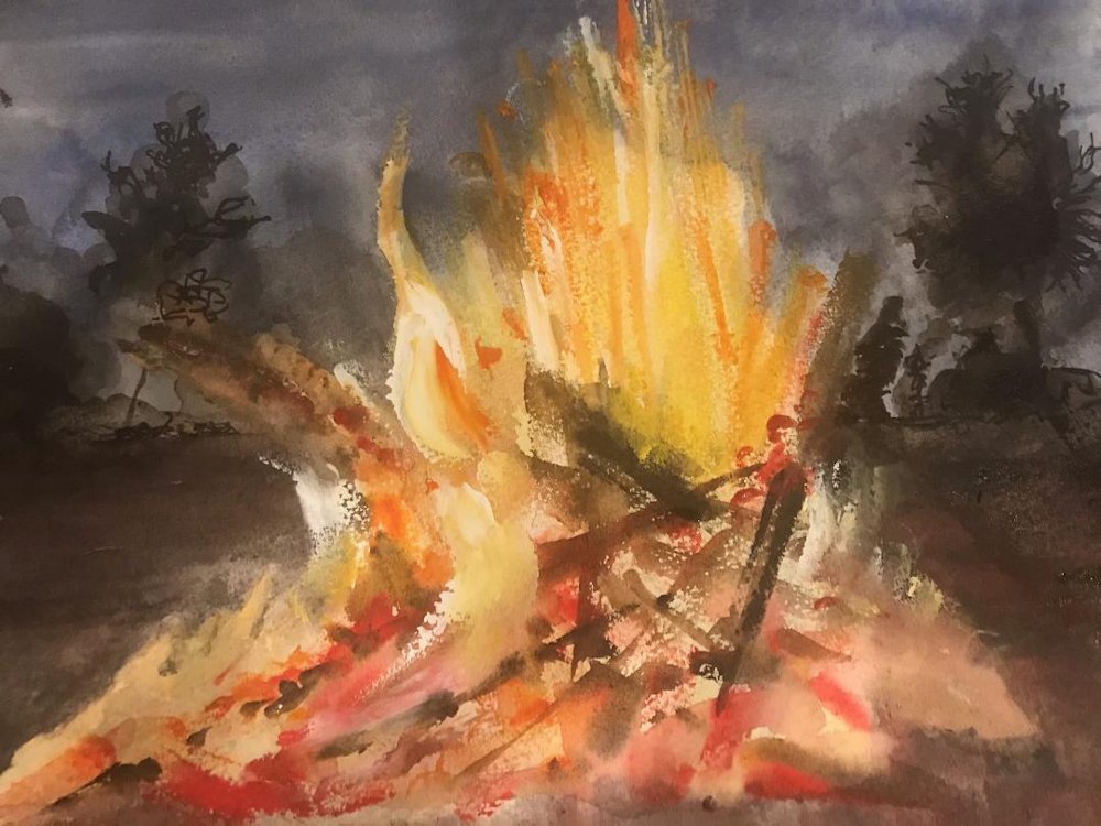
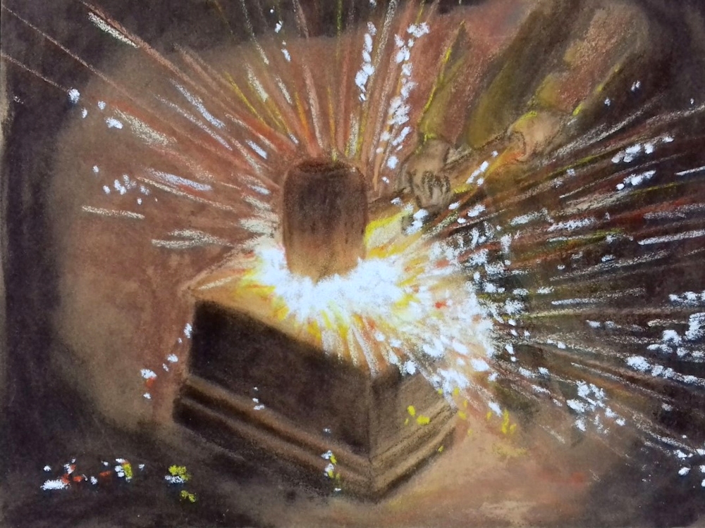
Fire is natural light. We can cause fire to happen but it is a natural phenomenon and unpredictable in its shape and form which is as flickering and fluid as water. There are some similarities with the way fire and water behave visually; the explosive bursts of fire from natural causes or rockets exploding in the sky are not so different from fountains spraying water as pressure is released by a valve; fire can also pour down volcanic mountains. A difference is that we see water because it reflects light but fire is the light source. Visually it is the difference between the sun and the moon. In our thought processes when we depict fire we depict power and potential danger, even when this is in the form of a humble candle.
Watercolour; flames masked and rest worked wet in wet
Perhaps the disconnect between the power of fire which we harness domestically and its destructive nature, whether natural or harnessed for war is why we find the flickering flame so exciting.
Gouache
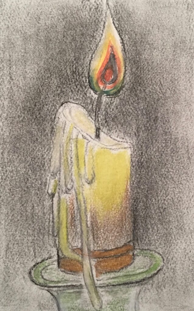
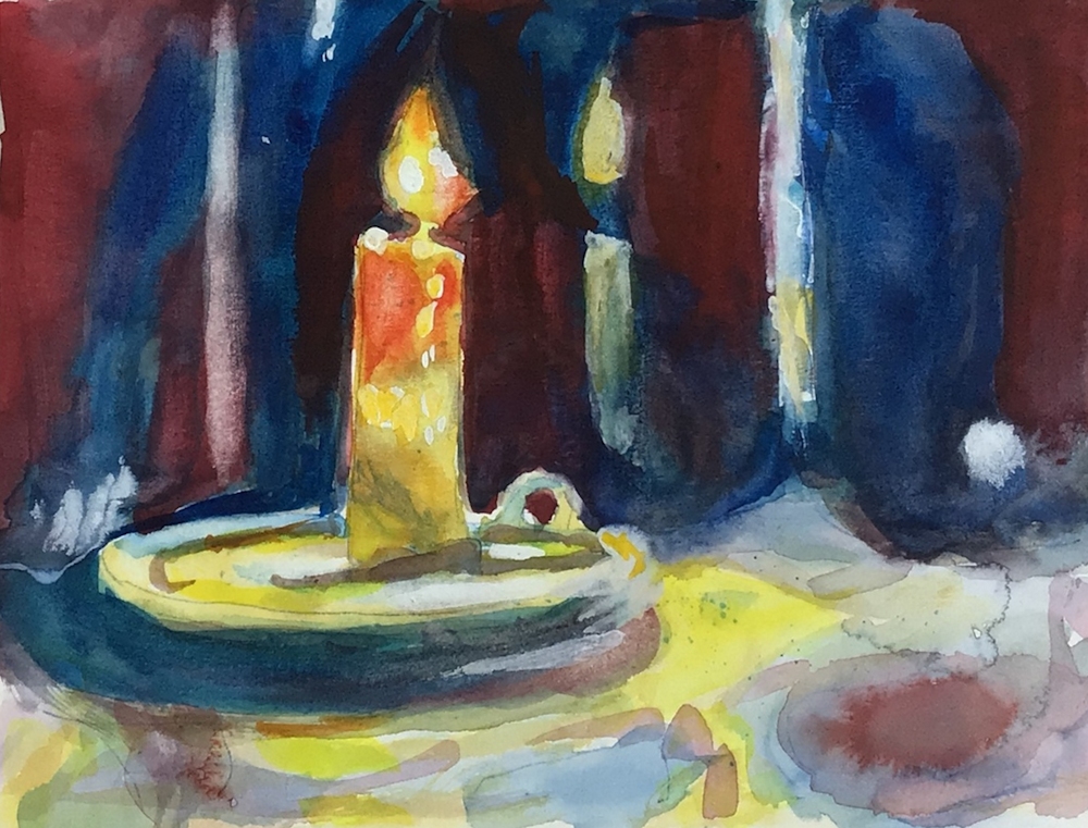
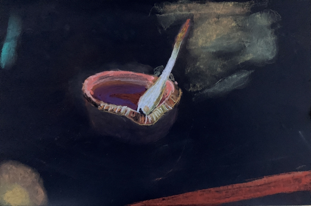
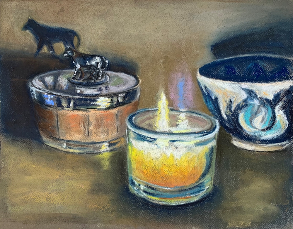
That’s the philosophy bit done! Now for a look at the candle;
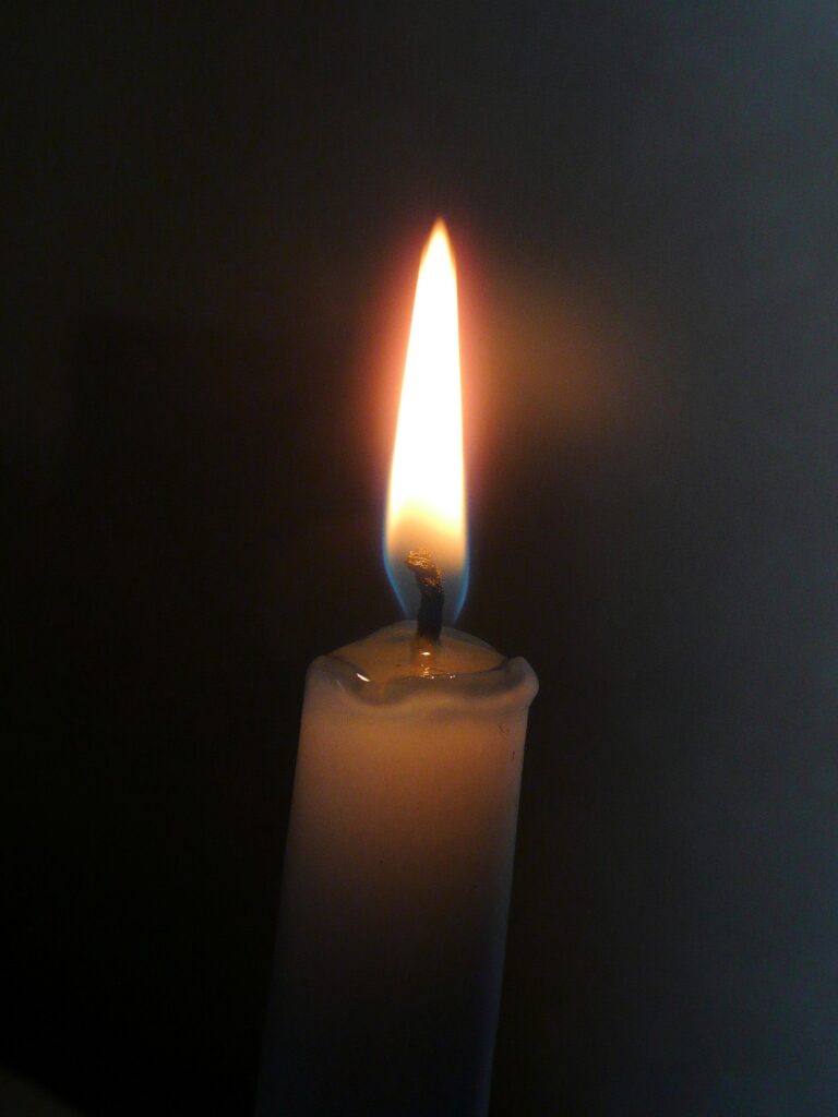
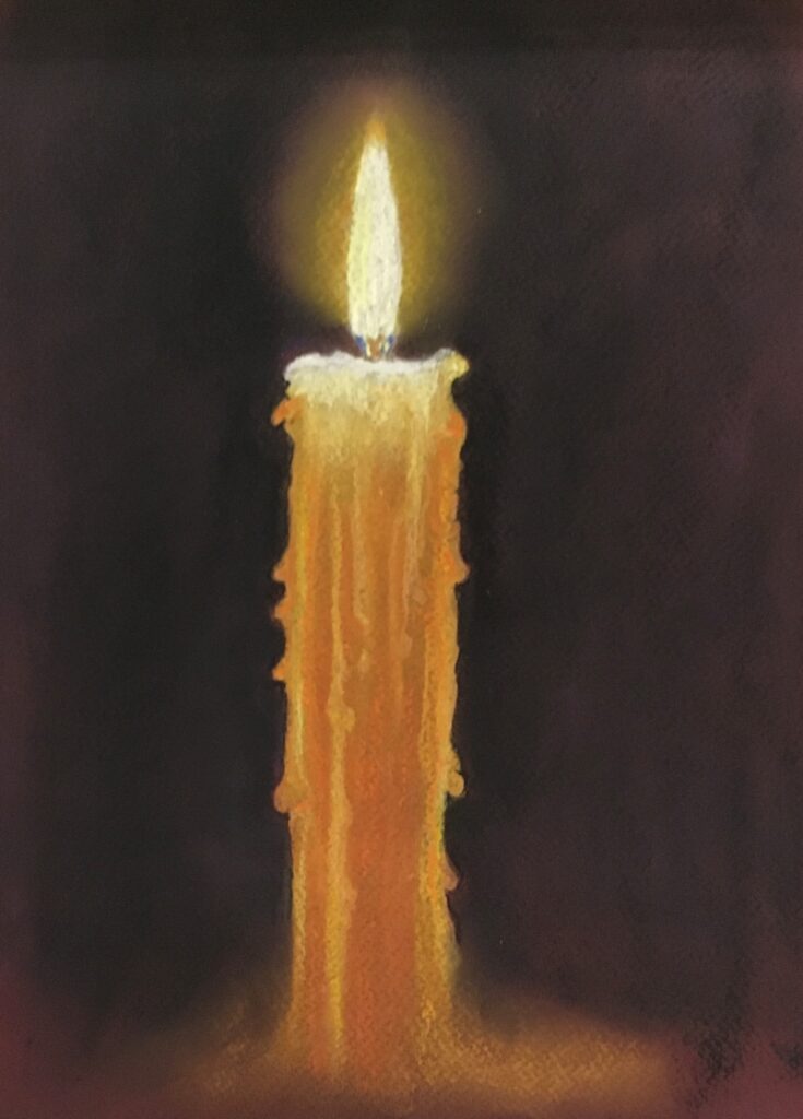
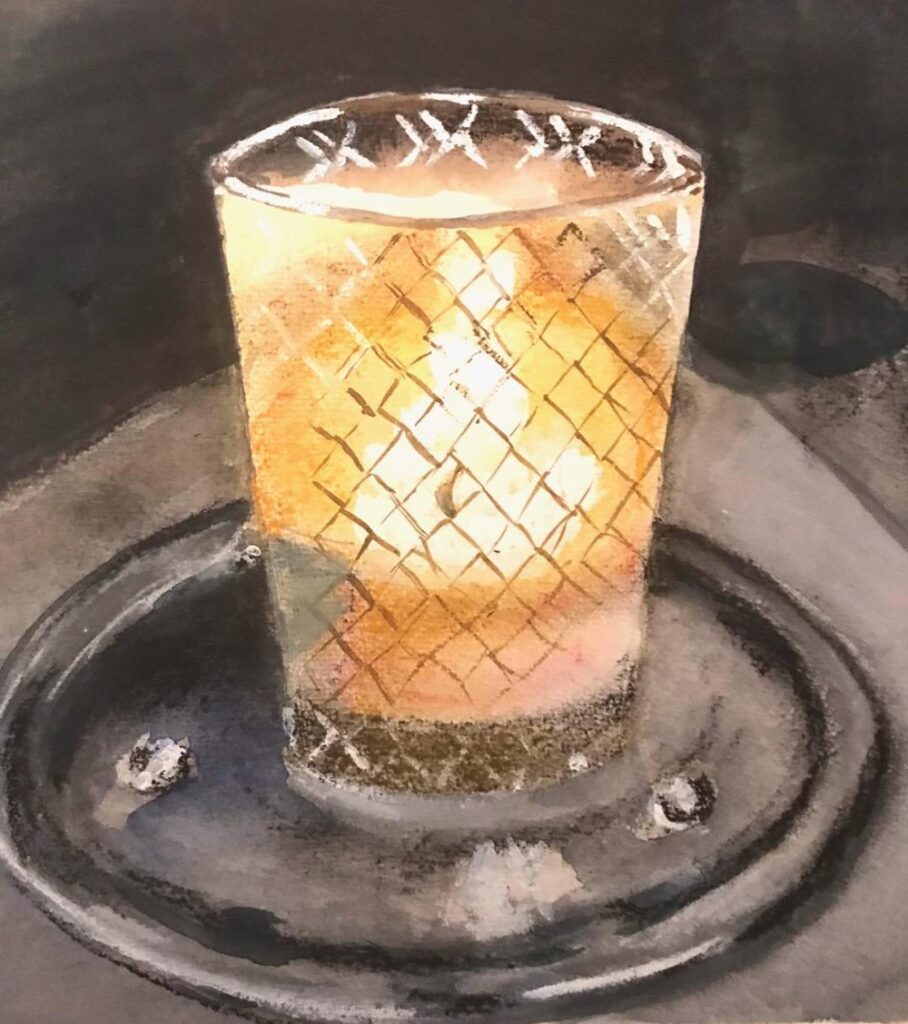
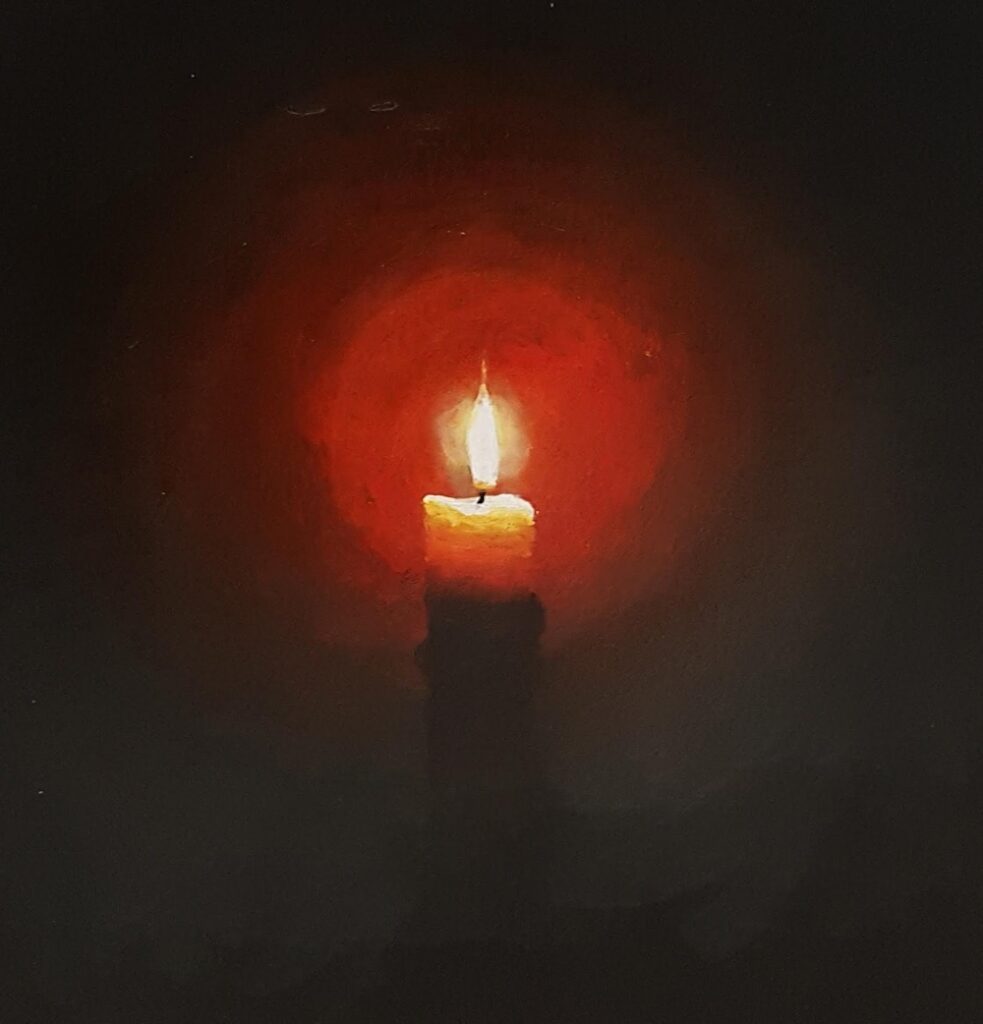
Photograph:
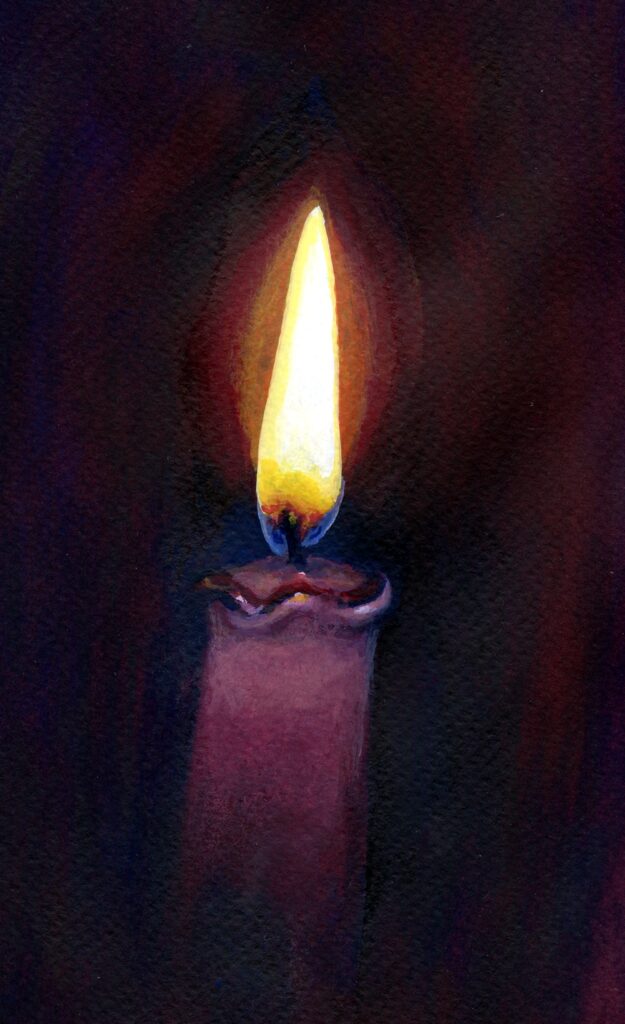
The “halo” is not necessarily the sphere as seen in so many Christmas greetings cards. Note the blue at the base of the flame and bands of orange and yellow. Look at the soft glow of the top of the candle itself and tiny subdued highlights in the molten wax. The wick is barely discernible against the dark background here.
Lastly note how the reddish halo gradually merges with the dark ground; colours from dark orange to deep red before becoming indistinguishable from the red/black darks.
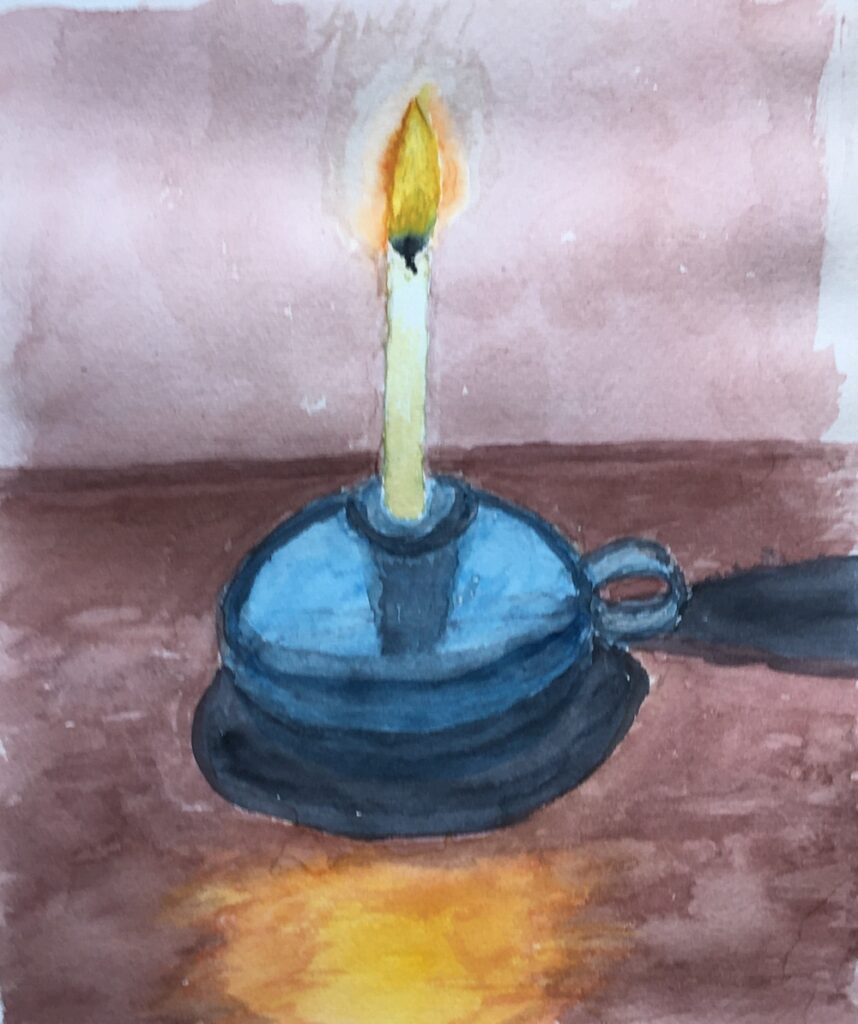
If you wish to make a candle study you may like to light a candle, taking sensible safety precautions and observe the colours you see. Your colours and tones may be very different from those in the photograph above so observation is the key to developing a realistic painting.
In 1982 to 1983 Gerhardt Richter made some very beautiful and photo-realistic oil paintings of candles, closely observed against different backgrounds. These look deceptively simple but are carefully painted with huge skill in handling the paint where gradual transitions from light to dark occur. References to these can be found on this week’s Pinterest board at:
https://www.pinterest.co.uk/jhall1282/lights-in-art/fires-candles-fireworks-bonfires/
Alongside works by;
Georges de la Tour: more candles and candle light; look at how faces reflect the candle light in his works
Joseph Wright of Derby: volcanic eruptions and a fire burning a cottage down at night
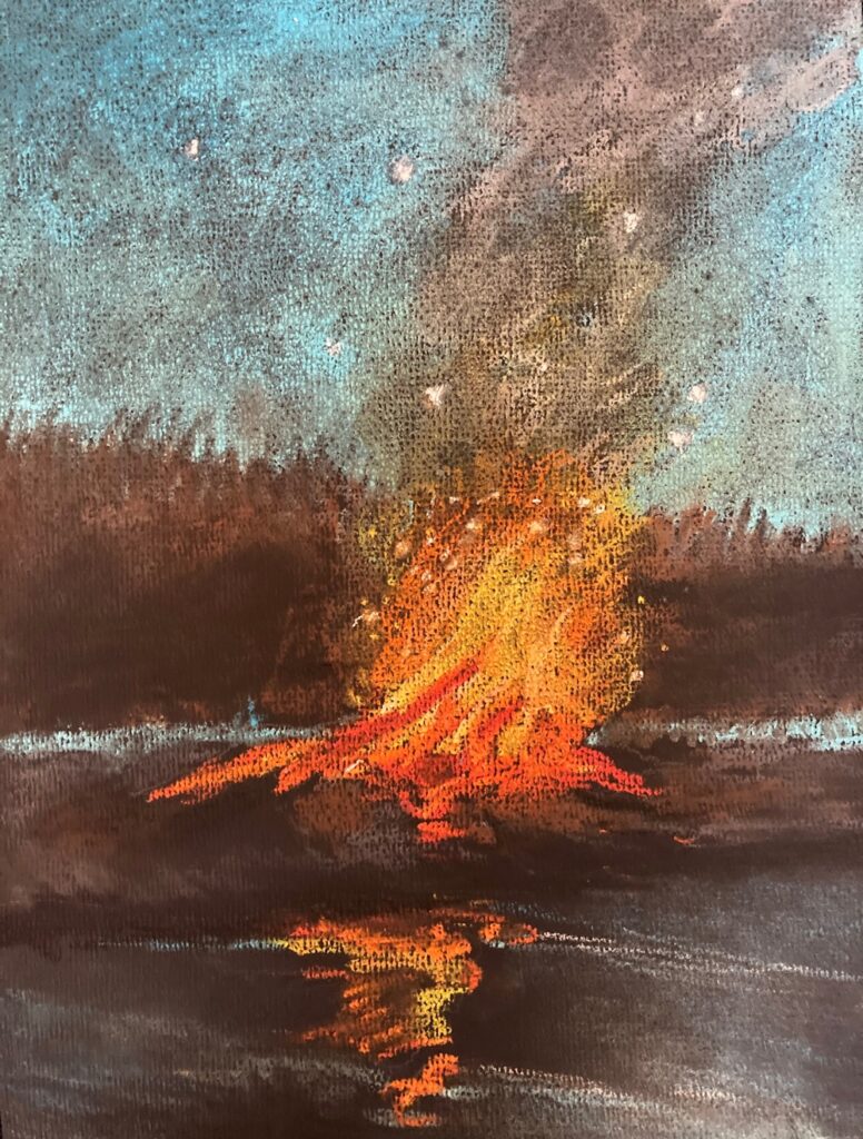
And Bonfires by the contemporary artist Brent Cotton.
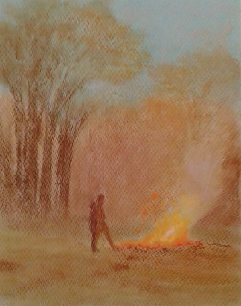
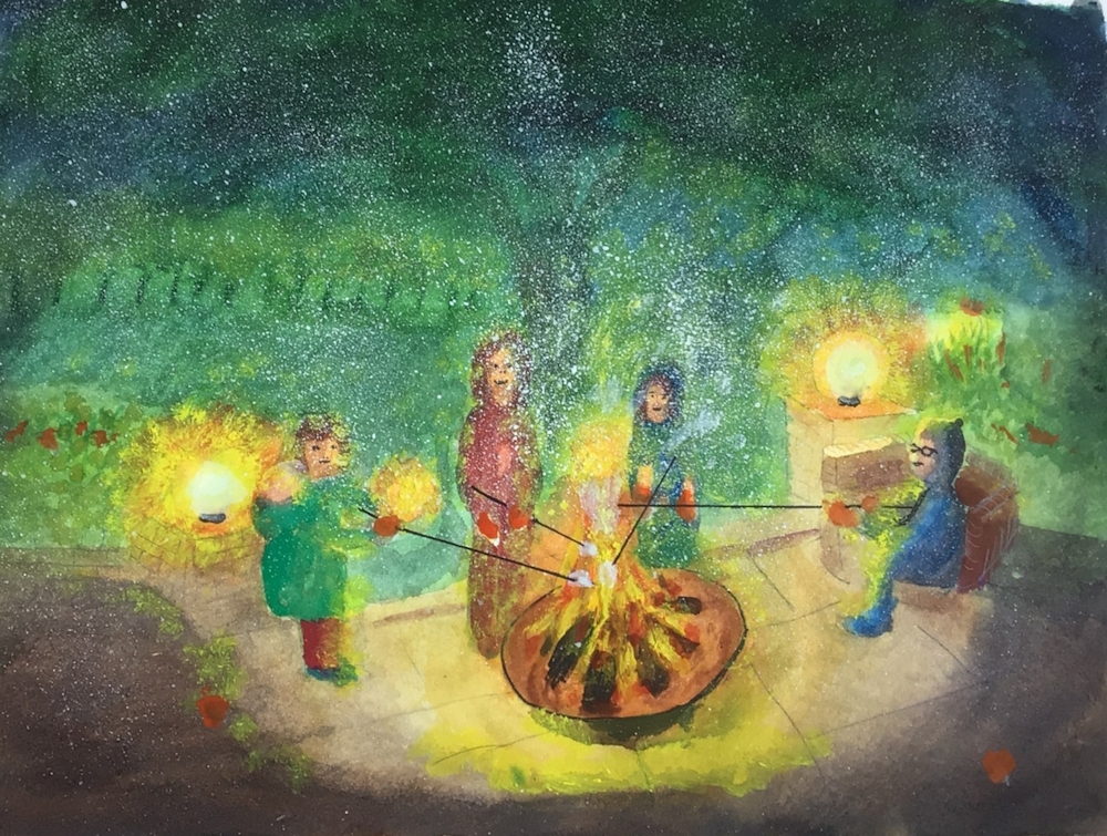
This should supply you with plenty of ideas for next week’s painting. I would like to see work either from your imagination or a fire situation you have experienced; from an erupting volcano to a child’s birthday celebration or Christmas candle.
Looking forward to seeing
Your paintings;
Pastel by Heather
Pastel by Heather
Pastel by Shane
Pastel by Barbara
Pastel pencil on pastel paper
Watercolour
Charcoal and coloured pencil
Watercolour by Sarah
Painted with brush and finger by Sarah
Watercolour and pastel by Sarah
Watercolour by Maricarmen
Watercolour by Maricarmen
Pastel by John
pastel by Shirley
Watercolour by Shirley
Watercolour by Liz
Pastel by Liz
Pastel by Jan
Acrylic by Malcolm
Acrylic by Malcolm
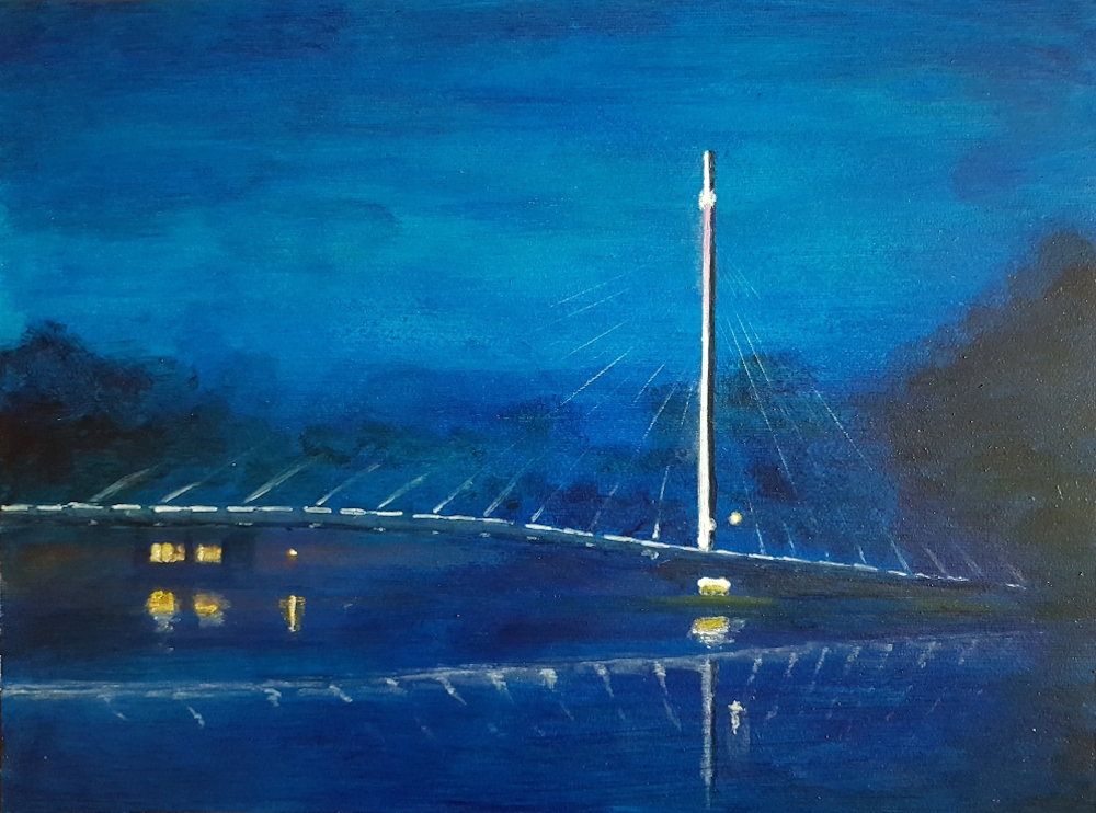
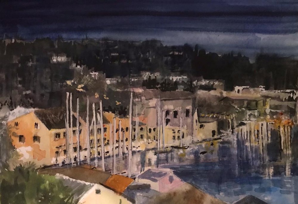
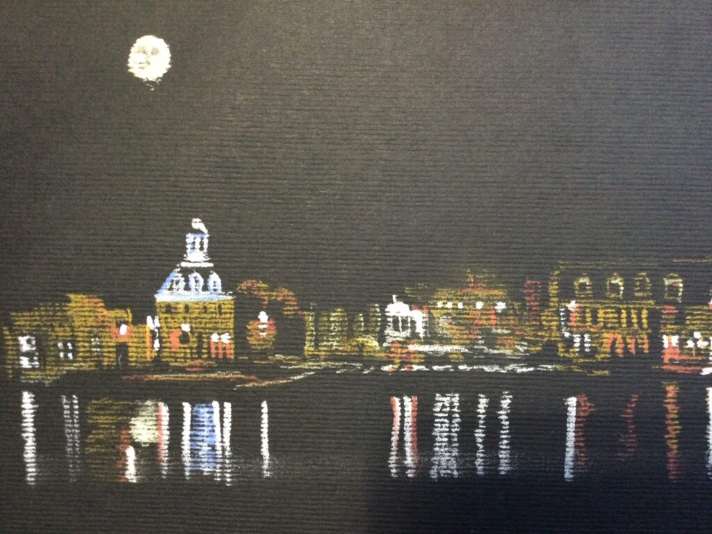
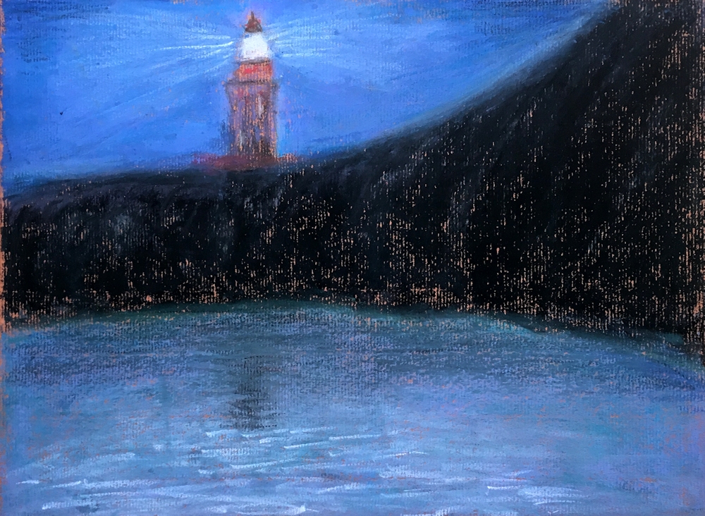
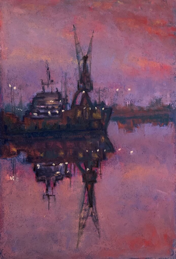
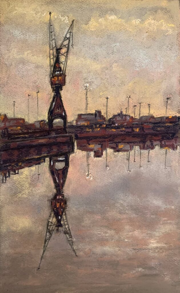
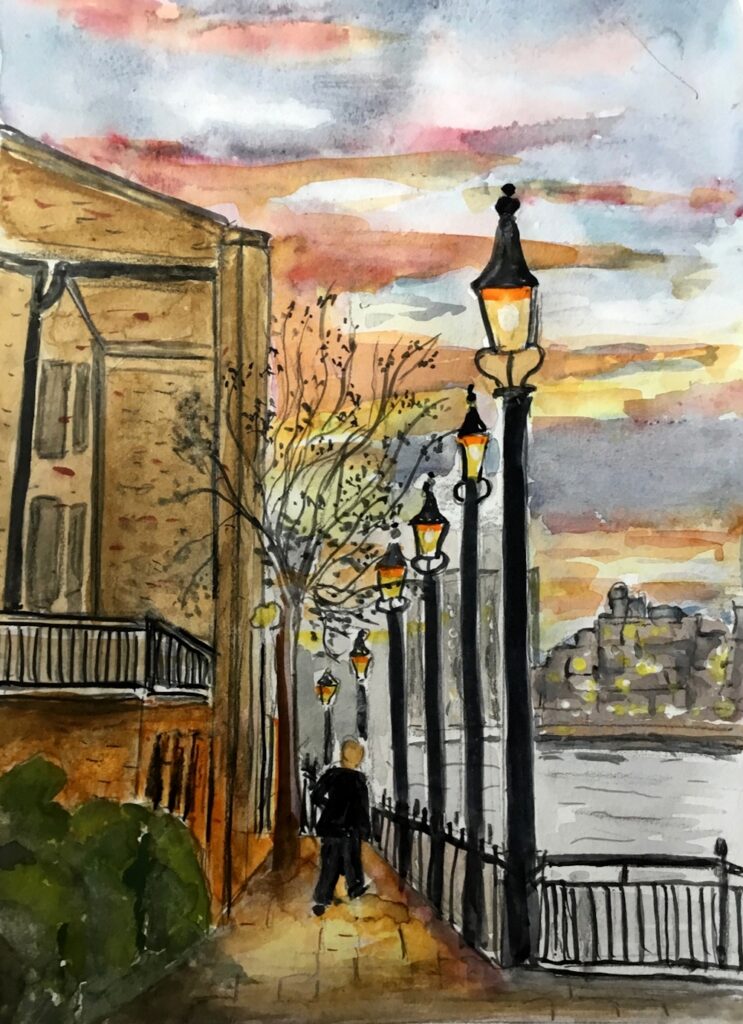
Lights in the Sky, Lights from the Land: Harbour and River Lights
November 10, 2020
Pastel on blue paper
This week we are moving toward the coast, rivers and canals for inspiration and your challenge will be to produce paintings including a light source and its reflection in water. The reflection will not only be affected by the position of the light source to its reflection but also the prevailing light conditions; mist or the darkness of night and whether the water is calm, rippling or rough.
Pastel on blue paper
This has been developed from the first picture and has a completely different atmosphere.
Look at photos of rivers and the sea where any light is reflected and look at how reflections are interrupted and sometimes scattered by waves.
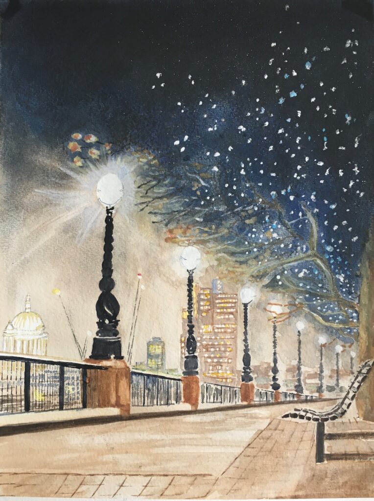
Apart from the vertical positioning of any reflection take special care that each reflection is directly below the light source being reflected. This is seen very clearly both in works by Whistler and Andrew Gifford. better still take a walk along the Thames in the early evening.
The medium is very much your choice and as last week you may work from your imagination or from a reference, preferably of a place you know. James McNiell Whistler is famed for his series of “nocturne” paintings of the Thames. The darkest of these are full of drama and the most subtle have that beauty of early morning stillness. Examples of Whistler’s nocturnes alongside works by Andrew Gifford and the Canadian artist David Haughton can be seen on this week’s Pinterest board at:
https://www.pinterest.co.uk/jhall1282/lights-in-art/harbour-lights-lighthouses-and-docks/
Also included are some imaginative works by Charles Philippe Jacquet. The artist’s rather surreal compositions combine his ideas with an almost believable reality. In reviewing some of your own photographs you may be inspired to adapt them to an imaginative approach or to paint a more representational painting. If your reference is complicated, consider making a study of part of it and experiment with little sketches before homing in on a final composition.
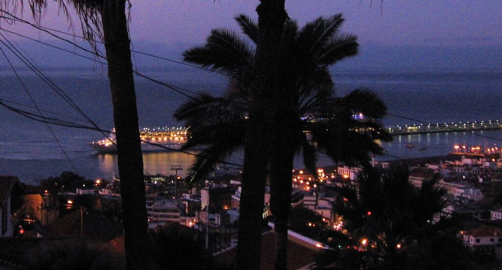
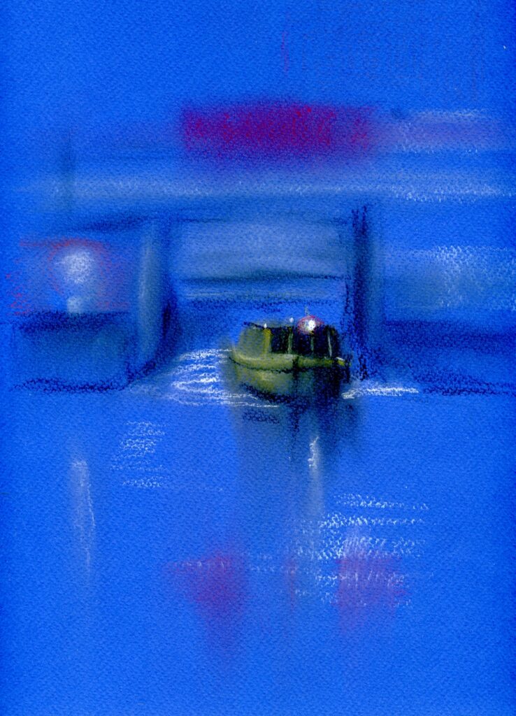
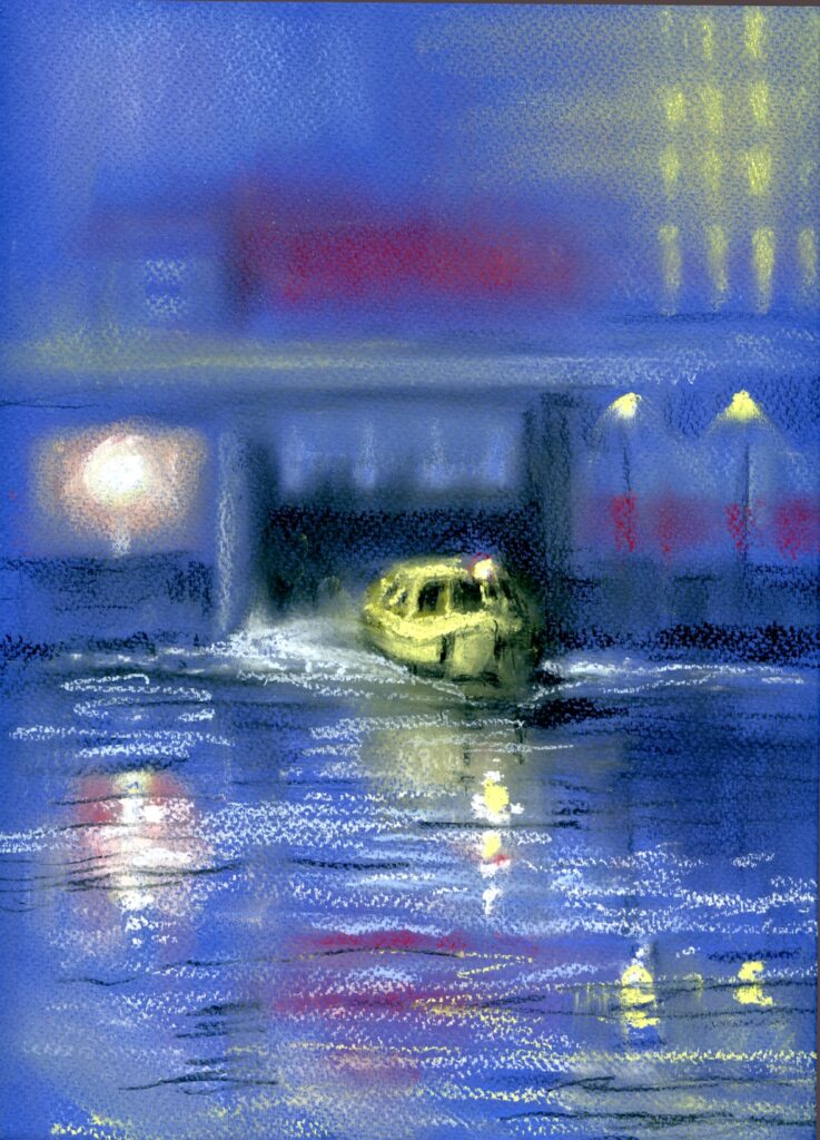
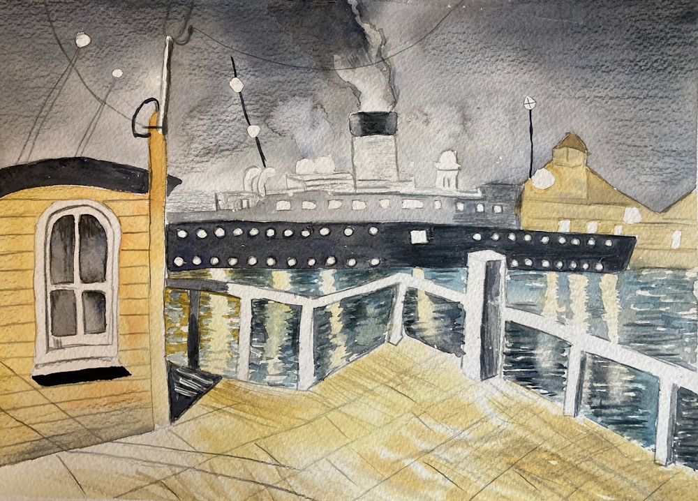
Lastly I couldn’t resist including this photo of a cruise ship leaving Funchal; the antithesis of the little yellow boat that carries commuters and tourists alike from Leeds Dock.
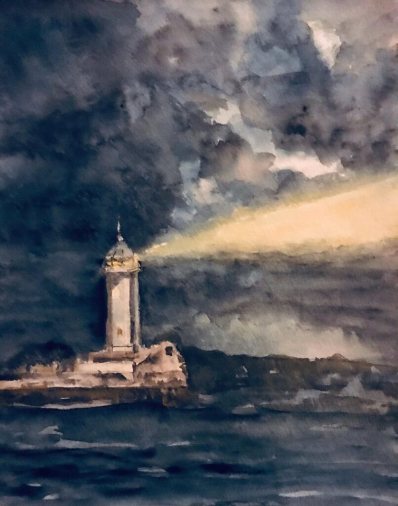
If you have very little in the way of references for lights reflected in water at night or evening from boats or buildings on the shore, make a sketch or photo of one of the bridges or part of the Thames shoreline at dusk. Maidenhead Bridge has plenty of lights. Alternatively, if you would like to try a more surreal approach why not choose a building you know and perch it with fully lit windows on a rock in the middle of a lake and imagine your own private lighthouse!
Your paintings:
Pastel on black paper by Barbara
Acrylic by Malcolm
Watercolour by Shane
Watercolour by Sarah
Watercolour by Sarah
Pastel by Jane
Pastel by Jane
Watercolour and Pastel by Heather
Pastel on terracotta paper by Shirley
Pastel on dark paper by Shirley
Pastel by John
Watercolour by Maricarmen
Watercolour by Ann
Watercolour by Ann
Pastel by Liz
Watercolour, highlighted with pastel by Liz
Pastel on dark blue paper by Jan
Pastel on grey paper by Jan
Pastel on blue grey paper by Jan
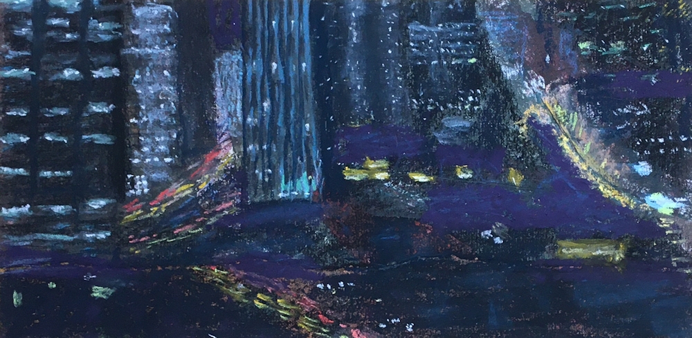
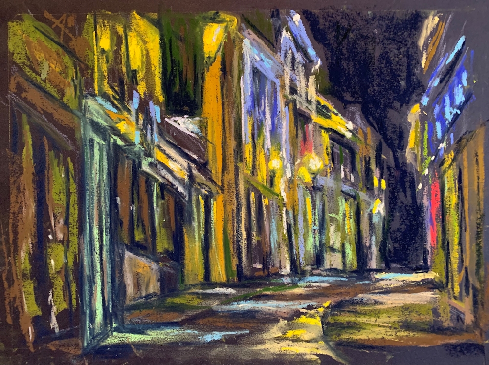
Lights in the Sky; Lights from the Land; Street and City
November 3, 2020
This week we’ll consider street lights and other urban lights. The principles are exactly the same as last week; huge tonal differences between the light source and its surroundings.
Last week you were invited to make a very representational painting or to use your imagination to invent a moonlit scene. This week you may consider a representational approach or look at the abstract patterns made by traffic and street lighting which would work very well in pastel on dark papers. A few ideas for working in pastel or watercolour are outlined below.
If working in pastel or opaque watercolour you may like to consider working on a dark or mid toned paper. Often street lights are on well before the light fails completely and in this case a mid toned paper may be useful enabling you to easily make some areas lighter and others darker, perhaps using the paper as one of the tones/colours in your painting.

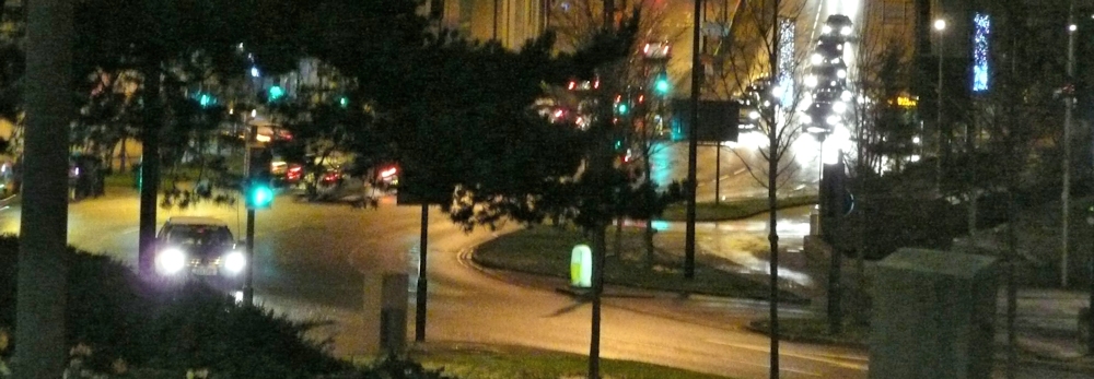
This photo could be interpreted as an abstract pattern of lights and dark.
When using pastel and a very dark blue paper, like midnight blue or even indigo, black will make that even darker for the very deepest tones but use it sparingly. As last week you may need to place your shapes by working with a mid-toned pastel pencil before blocking them in and reserve your palest pastels for the light sources; light from windows, street lamps etc.
If you are working in watercolour plan out your composition so that you can either reserve the lightest and white areas by painting around them or by using masking fluid. Remember not to apply your washes till the masking is absolutely dry. Then work as you would usually working first the pale areas, then the middle and lastly the darkest washes. Your palest washes may be washed over pretty much the whole of your paper, lending unity to subsequent washes and you may like to drop in mid tone colours in some areas at this stage.
Do look at your reference carefully as there may be areas of reflected light and sharp edged shadows.
The photographic references include a dark night time scene from Bradford and some in London at twilight where the shadows are diffuse and there is less glare from each light source.
Try to avoid reflections in water this week as that will be the subject of the following week’s challenge. Stick to street lighting, traffic and car lights, shops and window lights and even cafe lighting. If you are feeling more ambitious try a floodlit building, sports stadium or building site.
Look at how the light is emitted from the light source. It may appear as a round dazzle of light as round the sun or from a torch. It may be directed as the floodlights illuminating a building or stadium. You may even see “pools” of light on the ground.
Concentric rings of wet in wet colour were lifted while wet with a small piece of dry paper towel twisted to form a point. This was dragged from the centre outwards, making creative backruns.
Hope this gives you some ideas and there are examples of how several artists have tackled this subject on the Pinterest Board link below.
https://www.pinterest.co.uk/jhall1282/lights-in-art/street-and-city-lights/
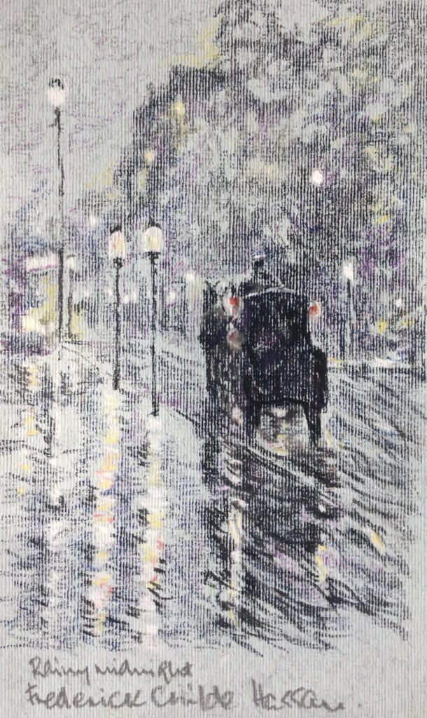
Works by John Atkinson Grimshaw, Frederick Childe -Hassam and Whistler are featured and also works by the Czech artist Jacob Schikaneder. I especially like his tramway scenes. These artists all worked over a similar period about 1890 to 1920.
Have fun and don’t forget to photograph/sketch some fireworks ready for the week 5 challenge.
Your paintings;
Acrylic by Malcolm
Pastel by Jane
Pastel by Jane
Watercolour by Heather
Pastel by Liz
Pastel by Barbara
Watercolour and Pastel by Maricarmen
by Maricarmen
Watercolour after Chin H Shin by sarah
Watercolour after Chi H Shin by Sarah
Pastel by Ann
Watercolour by Ann
Pastel by Shirley
Pastel by John
Pastel by Jan
Watercolour by Jan
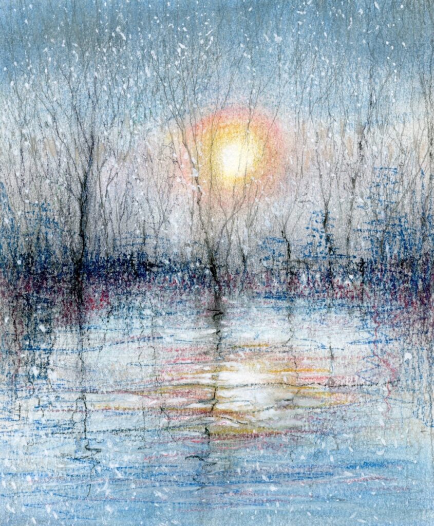
Lights in the Sky, Lights from the Land: Moonlight
October 27, 2020

These fields seemed like a magic staircase in the landscape so I transformed this very green daytime scene into the pale yellows and dark blue of moonlight
This week’s challenge is the moon and its effects on the landscape. You may paint an observed scene or introduce something more imaginative. The works of Turner and Samuel Palmer combine large elements of observation with imagination. Much smaller than the sun its size is often exaggerated in paintings; look at Turner’s watercolour sketch of Shields Lighthouse, 1823-26.
Several of Turner’s works together with works by Samuel Palmer and the contemporary artists John Caple and Richard Cartwright and others feature on the Pinterest Board titled Lights in the Sky, Lights from the Land, section: Moon and Stars, Link below;
https://www.pinterest.co.uk/jhall1282/lights-in-art/moon-and-stars/
Another featured artist is the Victorian artist, John Atkinson Grimshaw of whom Whistler famously remarked “I considered myself the inventor of nocturnes until I saw Grimmy’s moonlit pictures.” This is unbelievably arrogant in the face of moonlit paintings by Turner, Palmer etc. years earlier. However it is really worth studying Whistler’s nocturnes of the Thames which we’ll look at in a couple of weeks time.
The moon’s light being a mere reflection of the sun’s light is less bright, but is most often depicted during the hours of darkness, so affords huge contrasts with the darkened skies. Because of the darkness the palette used for painting moonlit scenes is generally less colourful and may be depicted in near monochrome.
This week you may work in pastel which will work very well on a dark paper, perhaps a very dark blue or even a dark burgundy colour as in the demonstration piece below. If you are working in watercolour you may choose a white paper as in the illustration above, or if you consider working in gouache, or white added to your watercolours, again you may like to choose a dark paper. Pastel papers can be stretched in the same way as watercolour paper, or you could work in gouache on an off cut of mount board.
The images below show stages in creating a moonlit landscape based loosely on the Eden valley in Northumberland.


Below are a few suggestions for painting the moon in watercolour.


Whatever your medium, compared with the sun the moon is a tiny object though it appears a good size from earth because of its proximity. It sheds a much paler silvery light on the landscape which is very different from the vast range of hues revealed by direct sunlight.
Your challenge for this week is to paint a picture of a moonlit landscape with the moon visible in the night sky. This may take the form of a very imaginative scene as in the works of John Caple or Richard Cartwight or something more literal. Have fun!
Your paintings:

Pastel by Barbara

Soft pastel and oil pastel on dark blue pastel paper
Oil pastel touches were added for the snow in the foreground.

Pastel on dark grey Pastelmat

Pastel

Pastel by Heather

Watercolour by Heather

Watercolour

Watercolour by Jan

Watercolour by Jan

Pastel by Jan

Pastel on buff paper by Shirley

Pastel on print making paper by Shirley

Watercolour by Maricarmen

Gouache on black paper by Maricarmen

Acrylic and pastel

Pastel pencil and pastel

Watercolour and pastel

Watercolour and pastel
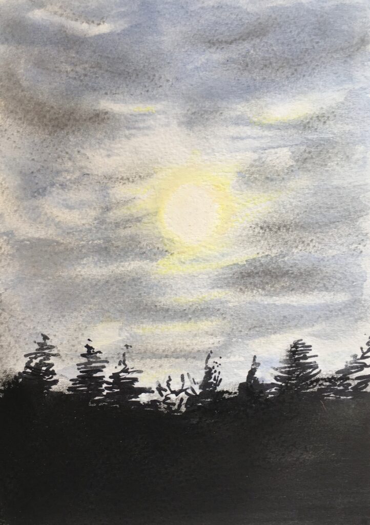
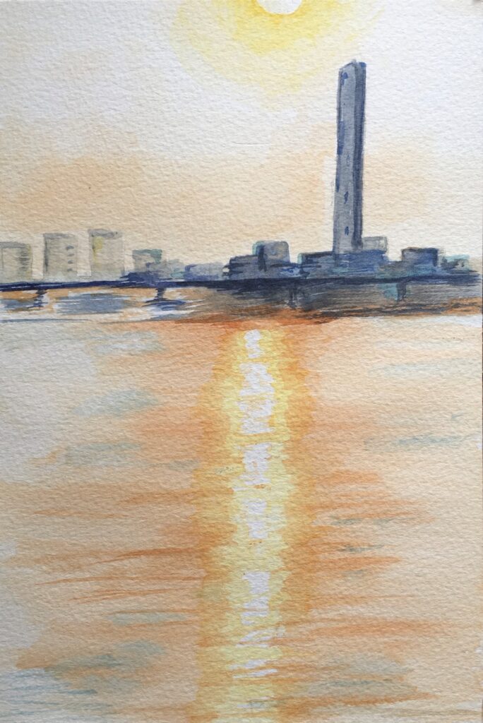
Lights from the Sky, Lights from the Land: The Sun
October 20, 2020
This week’s project is to depict the sun and effects of its luminosity on the landscape. As light sources, natural and manufactured are the topics for the next few weeks, I thought it would be useful to consider some general aspects of depicting luminosity.
Light sources vary in the colours they emit; some have haloes of different colours surrounding a white or paler coloured centre and others are single hued with a near white highlight at the centre. During the next few weeks we will discover some of these differences in more detail.
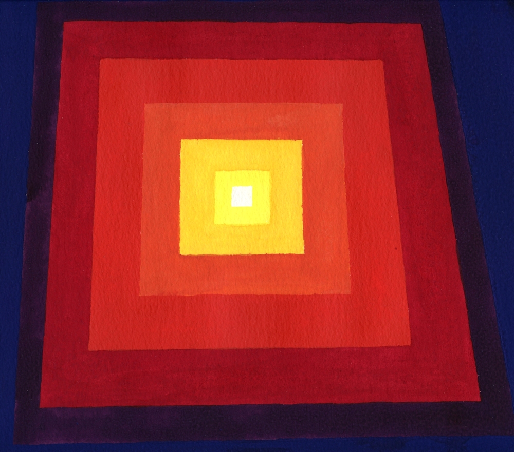
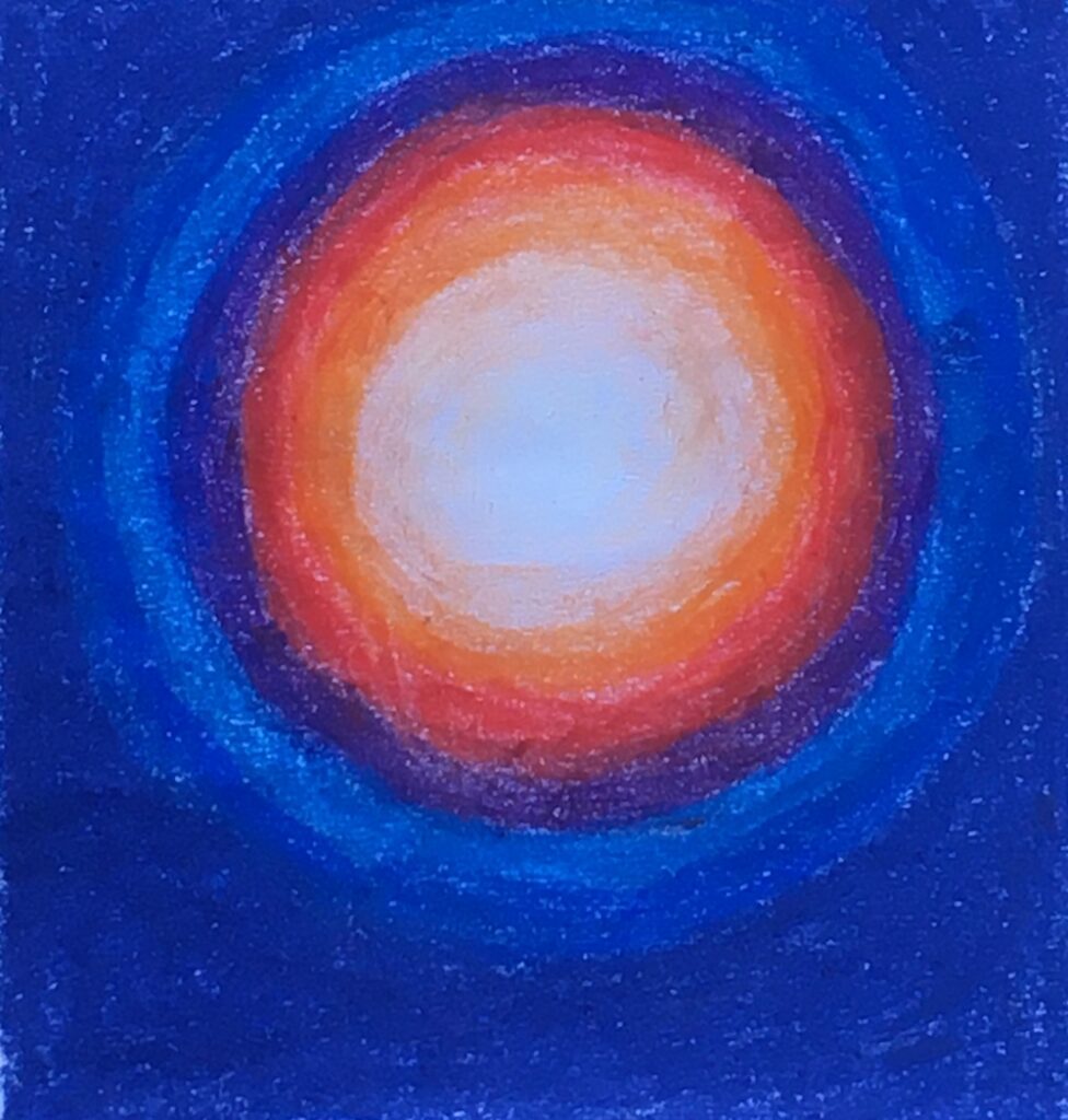
Guidelines for creating luminosity in a composition
(Some of this is rather obvious but here goes!)
1. The luminous area should be smaller than its surroundings.
2. The luminous area should be painted in paler tones than its surroundings and the highlight will be the palest tone.
3. Within the brightest part of the luminous area none of the tonal values should contrast with each other greatly. Deeper values should be painted outside this area although there may be different colours of medium tonal value outside the brightest part of the luminous area.
4. A sheen of the colours within and just outside the luminous area often pervades the entire composition. The Impressionists made great use of these effects. This can be seen in Monet’s paintings of the Houses of Parliament and the Waterloo Bridge series. The hues just outside the main illuminated feature and to a lesser extent those within the illuminated area are seen as echoes in streaks and dashes of paint, the colours that create a sheen over the surroundings area, giving the work colour unity as in the rather rough illustration below.
A link to the Pinterest board “Lights in Art” is below and you will find images of the works referenced as well as several other examples of how artists have depicted the sun and sunlight.
https://www.pinterest.co.uk/jhall1282/lights-in-art/sun/
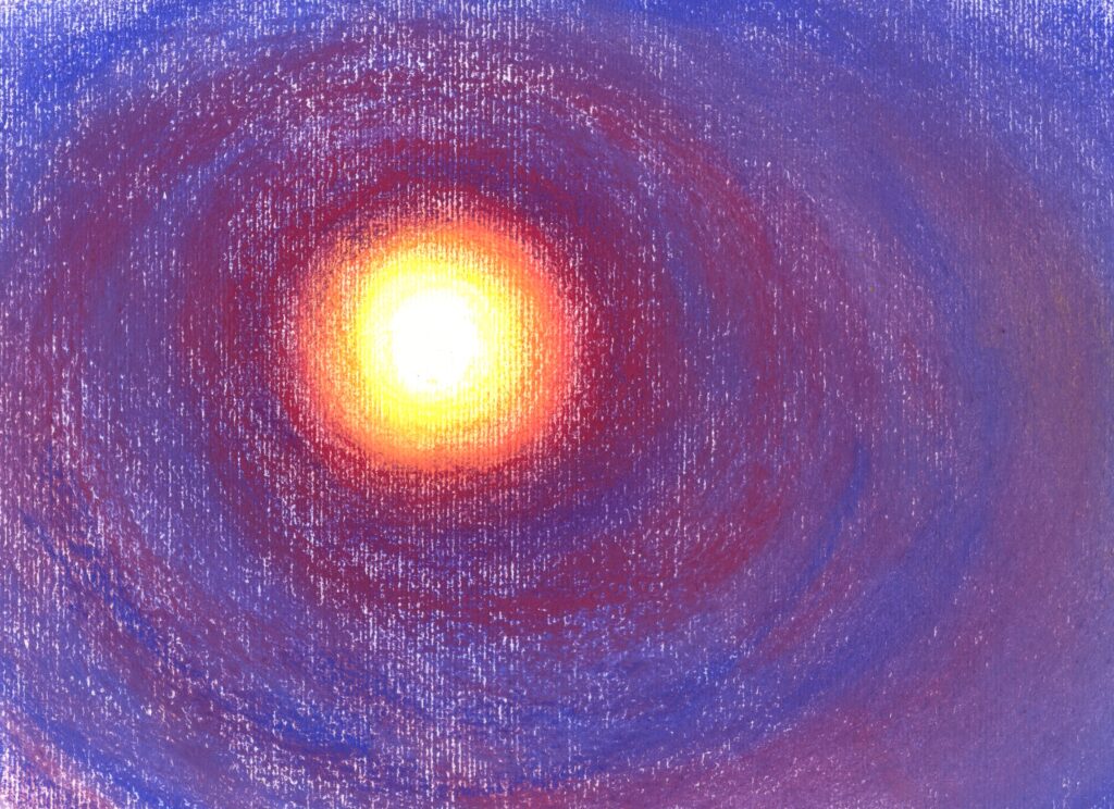
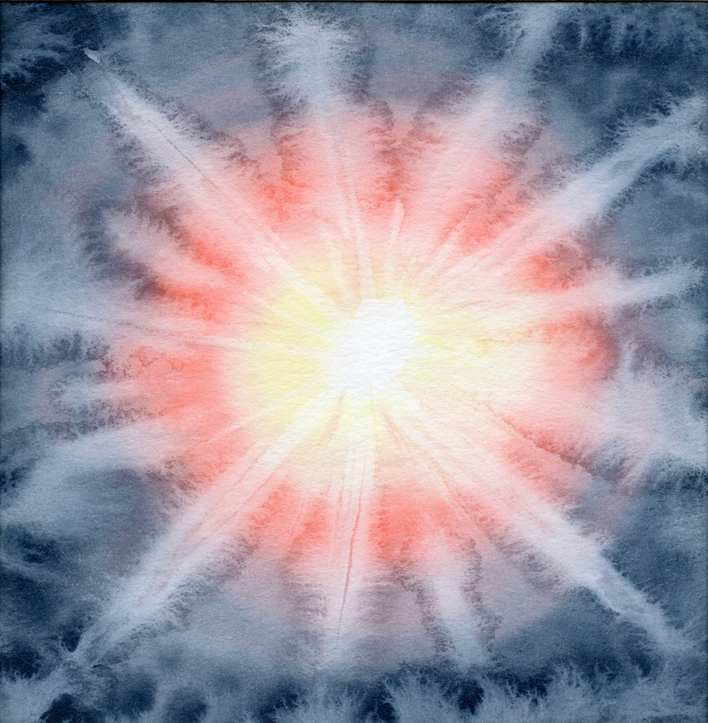
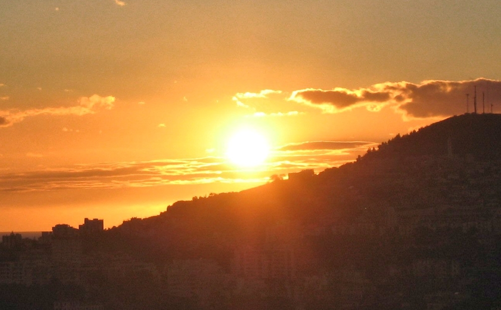
White surrounded by yellow, orange, red and purple rings; the blue surround has been streaked with mixes of the purplish red. Compare with how Monet used orange/red/purple hues in his Houses of Parliament paintings of around 1904.
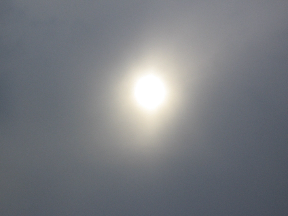
Note: white centre surrounded by less saturated (less pure) yellows and oranges than in the sunset photograph.
This sun is more like the sun in Martin Johnson Heade’s painting of “Sun over York Harbour, Maine USA”.
Colours
Luminosity may be achieved with neutral greys simply by surrounding a small white circle with rings of increasingly darker pale greys on a background of a much darker grey, or with single hue by doing the same but with a colour instead of grey.
Luminosity can also be achieved by using several hues e.g. white surrounded by yellow, then red and other colours but again choosing a darker hue for the wider area surrounding the light source.
Even a white square can appear luminous!
Look at the other colours and whether they appear more or less luminous against each other.
Another way of using colour is to surround a saturated colour (pure hue) with less saturated colours or the complement of the pure hue at the centre. Again it usually works best if the surrounding hues are similar tonally or darker than the luminous area.
A good example of a pure colour being surrounded by a less saturated near complementary colour is afforded by “Impression Sunrise”, 1872 by Monet. The sun is painted as a small disc of a rather pure orange against a rather desaturated(less pure) purple cloud. The reflection of the sun is painted clearly in the water and throughout the work echoes of the orange can be seen among the purples and chromatic(coloured) grays of the rest of the composition giving the impression of the sun’s light giving a sheen over the whole work.
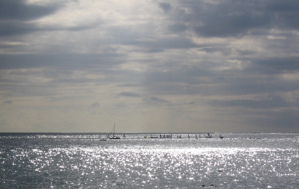
Note rather monochrome sparkle
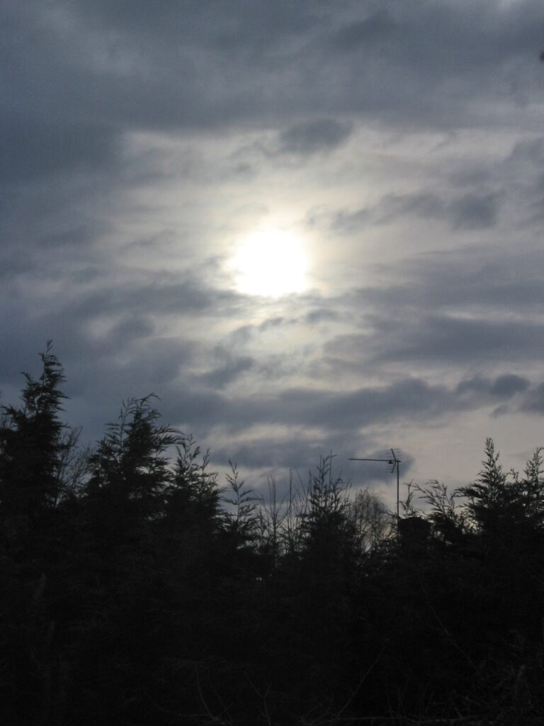
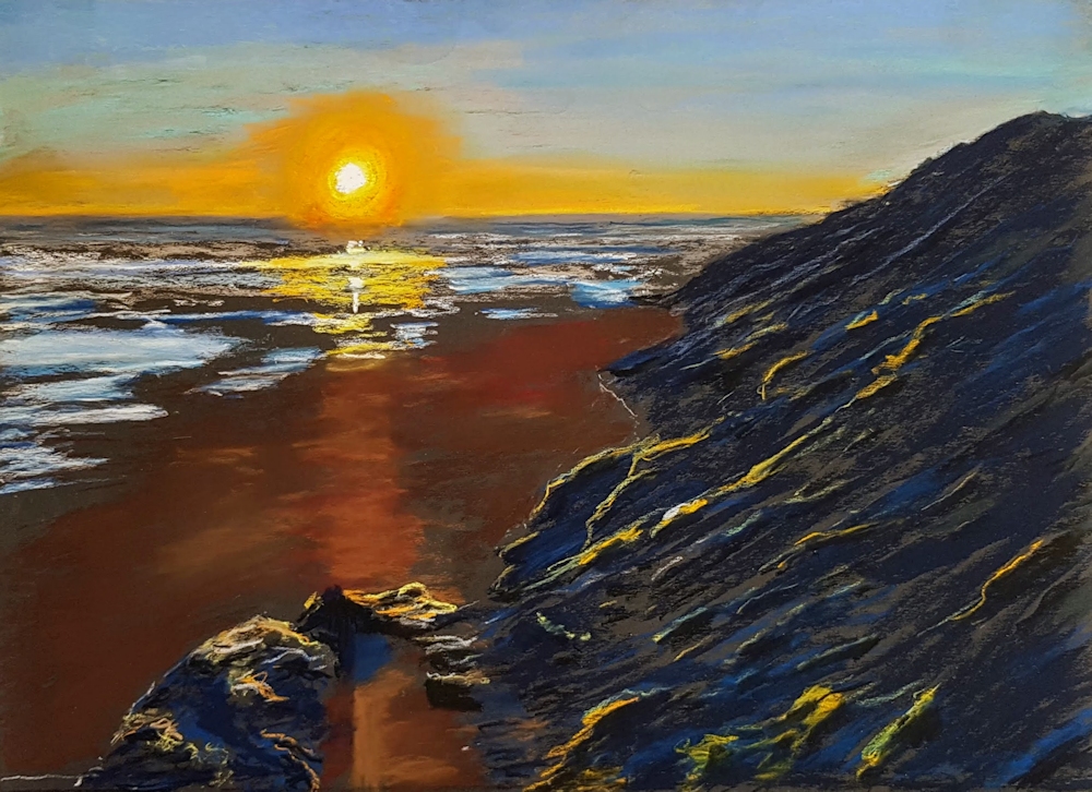
Sunlight bursting through a gap in the cloud cover and illuminating the river below.
It is of course almost impossible to depict the sun on a bright day with hardly a cloud in the sky. This is probably why most paintings of the sun involve sunsets and sunrises, or the sun in overcast conditions; its light pouring through the gaps between the clouds. Another way in which the brightness of the sun is depicted is it’s reflection in water; either as a sparkle or as a reflection of the whole sun.
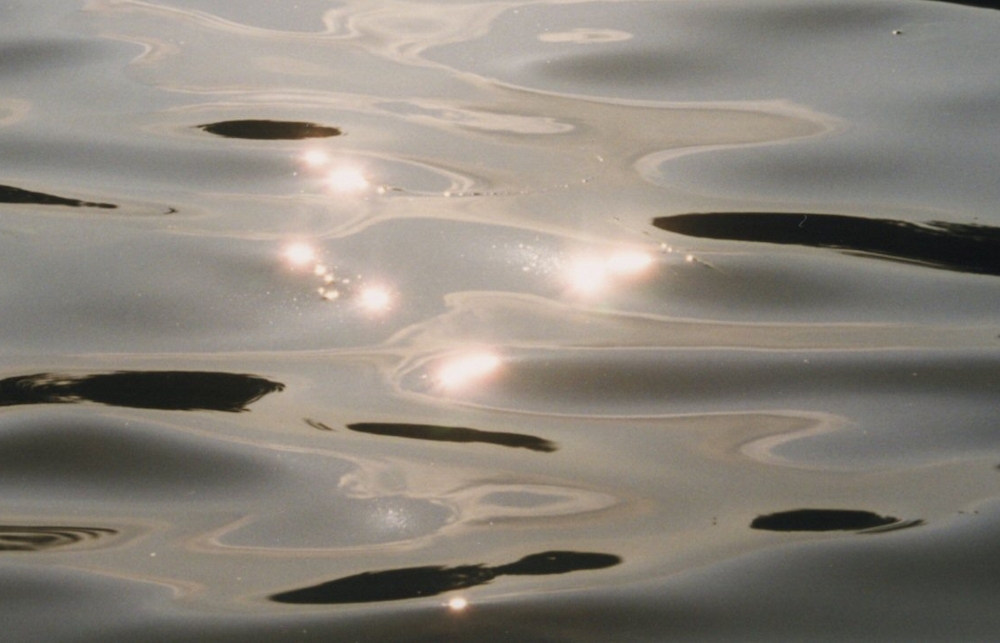
Each sparkle appears as a miniature reflection of the sun
Even on the dullest day the sun appears white at the centre surrounded by a ring of pale yellow. At sunset the sun may appear white or yellow at the centre and surrounded by red orange colours or the whole sun may appear bright orange/red. The duller the day the more monochrome it appears and the sun’s reflection in water behaves in the same way.
For more ideas do visit the Pinterest Board link below.
https://www.pinterest.co.uk/jhall1282/lights-in-art/sun/
Practical
1. Experiment with making a small area look luminous using one hue and then with several hues.
2. Using pastel or watercolour or a watercolour/pastel combination make a painting where the sun is evident in the sky and may also include a reflection of the sun. The reflection may appear as the reflection of the whole sun or as a sparkle on the water.
The weather is up to you!
You may like to work your own version of one of the images on the Pinterest board, or use your own reference/imagination.
Have fun!
Your paintings:
Pastel and pastel pencils on black emery paper P800 grit
Pastel by Barbara
Pastel
Pastel by Shirley
Watercolour, Sharpie Pen and Pastel
Pastel and a little Coloured Pencil
Watercolour
Watercolour
Watercolour by Sarah
Watercolour by Sarah
Pastel by Liz
Watercolour, Pastel and Pastel Pencil
Watercolour
Watercolour
Watercolour
Watercolour
Watercolour
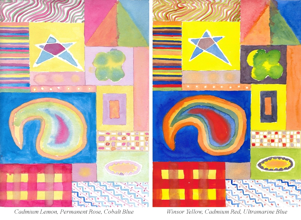
Limited Palettes 4: warm and cool primaries together
October 2, 2020

Painted with; Lemon yellow, Alizarin Crimson, Ultramarine Blue
This week we will still be working with just three primary colours but you may choose to use any two warm primaries with one cool primary or any two cool primaries with any one warm primary.
Palettes with a cool bias;
One that gives good mixing opportunities is;
Alizarin Crimson: cool red
Ultramarine: warm blue
Lemon yellow or Cadmium lemon: cool yellows
Reasonable green colours can be mixed and purple and orange hues, as well as near black neutral greys using the red plus blue plus a tiny amount of yellow. By substituting Alizarin with Permanent Rose or Magenta some great violet /purple colours can be made but cooler orange hues.
Another interesting choice with a cool bias would be
Cadmium Red Pale: warm red
Cerulean Blue or Phthalocyanine Blue: cool blues
Lemon Yellow or Cadmium Lemon: cool yellows
This will give very fresh and may give rather acid looking greens which can always be knocked down by adding the tiniest amount of red (more if you need a rather olive green/brown). You will not be able to mix a good purple.
Two Palettes with a warm bias would be;
Cadmium Red Pale: warm red
Ultramarine: warm blue
Lemon yellow or Cadmium lemon: cool yellows
and
Alizarin crimson or permanent rose: cool reds
Ultramarine Blue blue: warm blue
Indian Yellow: warm yellow
Remember that the overall look, cool or warm, will depend not only on the pigments used but the proportions in which they are used. If blue is predominant the whole may have a cooler appearance than if red dominates. Also where colours are diluted or made paler in tone by mixing with white this also has a ‘cooling’ effect, as does working with muted colours and coloured grays mixed from the primaries.
The Pinterest link below references a variety of works that could be interpreted with a limited mix of primary colours. There are a handful of still lives, some Impressionist and American landscapes including a couple by Thomas Moran, whose paintings I have seen at first hand with other amazing landscapes painted in America over the same period around 1870 to 1900. There are also a couple of delightful posies by Fred Cuming. Other artists represented are even better known, and a few sunsets and sunrises that I am sure you will know.
Hope you enjoy them!
https://www.pinterest.co.uk/jhall1282/limited-palettes/warm-and-cool-together/
Practical
1. The only rule this week is that your three primaries should include at least one cool and one warm primary colour, so investigate what you have in the paint box, and try some mixes out. If working in any opaque way you may use white but not black!
2. Paint a picture, perhaps a still life with flowers or a landscape with an architectural feature or a dramatic sky. The ‘architectural feature could be anything from a garden shed to a distant ruin. The palette used is more important than the subject but try to choose the combination of primaries that best suit the mood of your painting, and please list the pigments used when you send an image.
Your paintings:

Cool bias: Lemon Yellow, Permanent Rose, Ultramarine Blue

Warm bias: Lemon Yellow, Scarlet Red Ultramarine Blue

Indian Yellow, Alizarin Crimson, Ultramarine Blue, Chinese White

Indian Yellow, Alizarin Crimson, Ultramarine Blue, Chinese White
Zinc White Gouache

Cadmium Yellow, Cadmium Red, Prussian Blue

Cadmium Yellow, Alizarin Crimson, Ultramarine Blue

One that escaped last week’s post!

Left warm bias: Cadmium Yellow, Alizarin crimson, Ultramarine Blue
Right cool bias: Cadmium Red, Lemon Yellow, Cerulean Blue

Cadmium Yellow, Alizarin Crimson, Ultramarine Blue

Cadmium Red, Lemon yellow, Cerulean Blue

Lemon Yellow, Permanent Rose, French Ultramarine
and Grey pen

Lemon Yellow, Alizarin Crimson, French Ultramarine

Cadmium Yellow, Quinacridone Magenta, Ultramarine dark, Titanium White
Painted in acrylic with Cadmium Yellow Medium,
Quinacridone Magenta, Ultramarine Blue and White
Malcolm used a palette of warm blue, cool red, warm yellow: Ultramarine B29, Quinacridone Magenta R122, Cadmium Yellow Medium Y37. Plus white.
The reference was a black and white photo b&w photo of a vintage original which took his eye on a hotel staircase in the Cinque Terre; something about the light and dark composition. So Malcolm gave himself the challenge of relating the original tones to the colours achievable with the palette.
Starting with a reddish-purple monochrome underpainting of the darks only, everything except the sky was covered with a with a transparent glaze of the opaque yellow, using glazing medium. This turned the grisaille brown as in the basic building shadows. Malcolm deliberately left some yellow imperfectly covered to get a warm afternoon feel to the painting.

Lemon Yellow, Cadmium Red, Ultramarine Blue

Lemon Yellow, Cadmium Red Pale, Cerulean Blue

Lemon Yellow, Alizarin Crimson, Ultramarine Blue

Cadmium Yellow, Cadmium Red Hue, Cerulean Blue

Cadmium Yellow, Cadmium Red Hue, Cerulean Blue

Cool bias: Lemon yellow, Alizarin Crimson, Ultramarine Blue

Warm bias: Permanent Yellow Deep,
Permanent Rose, Ultramarine Blue

Cool bias: Lemon Yellow, Magenta, Ultramarine Blue

Warm bias: Cadmium Lemon, Cadmium Red Light, Ultramarine Blue

Lemon Yellow, Alizarin Crimson, Ultramarine Blue, White

Acrylic: Cadmium Yellow Hue, Cadmium Red Light,
Phthalo Blue Green Shade and White

Hansa Yellow, Cadmium Red, Ultramarine Blue

Cadmium Yellow, Alizarin Crimson, Cobalt Blue

Deep Yellow, Alizarin Crimson, Phthalo Blue
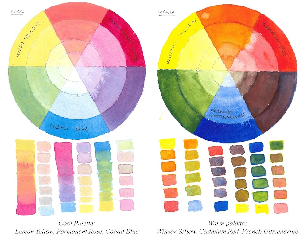
Limited palettes 3: Cool or Warm
September 26, 2020

The challenge this week is to work with either a cool palette or a warm palette, still using only three colours.
Warm palette: Indian Yellow, Cadmium Red Pale, Ultramarine Blue
Most people are aware of what constitutes a cool or a warm primary colour but for reference a basic colour wheel is shown below, which used primaries that are neither cool nor warm. These are colours designed to emulate printing colours and in theory you should be able to mix any hue from them.
However in practise, a much wider and richer range of colours can be mixed if you have the following;
A cool red; one that is nearer to purple
e.g. Alizarin Crimson, Permanent Rose
A warm red: one that is nearer to orange
e.g. Cadmium Red Pale, Vermilion, Scarlet Vermilion
A cool yellow; one that is nearer to green
e.g. cadmium lemon, cadmium yellow pale, lemon yellow
A warm yellow; one that is nearer to orange
e.g. cadmium Yellow Deep, Chrome Yellow Deep, Indian Yellow
A warm blue; one that is nearer to purple
e.g. French Ultramarine, Ultramarine red shade, Cobalt blue
A cool blue; one that is nearer to green
e.g. Cerulean Blue, Phthalo Blue, Phthalo Blue Green Shade
The cool palette will consist of a cool red, a cool yellow and a cool blue
The warm palette will consist of a warm red, a warm yellow and a warm blue
Working with only three primaries is still a restricted palette and some colours are difficult to mix with exclusively warm or cool palettes. Purple and violet shades are difficult with both but easier with some cool palettes. The freshest greens can be made with the cool palette and the hottest oranges with the warm palette as you can see from the chart below.
This chart was made with gouache but the result would be very similar for watercolour or acrylic.
Left: Warm palette; Ultramarine, Cadmium Yellow, Cadmium Red
Right: Cool palette; Cerulean Blue, Cadmium lemon, Permanent Alizarin
Next week we will still work with just three primary pigments but with a mixed palette that includes at least one cool and one warm primary.
Practical
1. Identify which cool and warm primary colours you have and make colour swatches to check them out. The pigments may be different to those I have suggested.
2a. Choose a set of three cool primaries and find what colours you can make with them either by mixing or overlaying them or letting them mingle wet in wet.
2b. Do the same with a set of three warm primaries.
3. Paint a picture, representational or more abstract using only three cool primary colours or three warm primaries. Still life subjects or landscape would be suitable. Hopefully you can find a reference which is a place you have visited or set up your own still life.
Think very carefully whether a warm or cool palette would suit your subject best. Remember that you may use white which will always “cool” all colours. Because it is possible to mix to mix greys and muted colours using both palettes you will be able to make very subtle colours from mixes of even the brightest of pigments. These can be incredibly beautiful.
Try making muted colours and chromatic greys by adding a little of a primary colour to its complementary colour. Complementary colours are opposite each other on the basic colour wheel.
e.g. Mix an orange and add a little of its complementary, blue.
The more blue that is added the duller the orange will become till a grey is achieved. From that point if more blue is added the grey will become a muted blue.
Small increments of blue are added to the orange on the right. About midway between orange and blue a neutral grey can be mixed and on either side hues that are slightly more blue or more orange. These are known as chromatic greys. Toward each end are muted colours which are still recognisably blue or orange but not as pure. These colours are often referred to as desaturated in various degrees. All pure hues can be desaturated by adding their complementary colour.
If, as above the mixes are very dark and it is difficult to see whether they (in this case) are slightly more orange or slightly more blue this will become evident by diluting the mix with water or by adding white.
I have tried to illustrate the differences in using a cool and warm palette in the choice of works for reference on this week’s Pinterest Board. The link is below and the sections called Cool Palettes and Warm Palettes are the ones to look at. The paintings all have either a cool palette or a warm palette feel to them and could be interpreted in that way.
https://www.pinterest.co.uk/jhall1282/limited-palettes/
4. If you have time it would be a real challenge to make a similar painting to your first using the alternative palette that you chose for your colour mixing at 2.
Your Paintings:
Cool palette: Lemon Yellow, Alizarin Crimson, Cerulean Blue
Warm palette: Cadmium yellow, Vermilion, Ultramarine blue
Lemon Yellow, Crimson, Phthalocyanine Blue
Left warm: Cadmium yellow, Cadmium Red, Ultramarine Blue
Right cool: Lemon Yellow, Alizarin Crimson, Cerulean Blue
Warm palette: Cadmium Yellow, Cadmium Red, Ultramarine Blue
Cool palette: Lemon Yellow, Alizarin Crimson, Cerulean Blue

Cool palette: Lemon Yellow, Alizarin Crimson, Cerulean Blue

Warm palette: Medium Yellow, Scarlet, Ultramarine Blue
Cadmium lemon, Alizarin Crimson, Cerulean Blue Hue

Cadmium Yellow Medium, Cadmium Red Pale, Ultramarine blue
Warm palette: Cadmium Yellow, Cadmium Red, Ultramarine Blue

Design inspired by a woodcut.
White of the paper is reserved and the grays are the only mixed colours.

Warm palette: Cadmium Yellow Medium, Napthol Red light, French Ultramarine Blue
America 2020 notes from Malcolm
The composition was fun, based on the Golden Ratio and “no two intervals the same”. So too was the physicality – “mad artist attacks easel”.
I first laid down a complete underpainting of yellow-orange. All of the darks are simply red dulled by blue, avoiding the purple side to preserve the sense of heat. There are a few dark greens and a few darker triple mixes. I couldn’t resist some tongues of pure red, and got the toothbrush out for yellow and orange sparks. It was all incredibly quick and hugely enjoyable.

Warm palette: Cadmium Yellow, Cadmium Red, Ultramarine Blue
Cool palette: Lemon Yellow, Alizarin Crimson, Cerulean Blue

Cool palette: Yellow Light (Sennelier),Phthalo Turquoise (Sennelier)
Permanent Rose (Winsor and Newton)
Cool palette: Lemon Yellow, Permanent Alizarin Crimson, Cerulean Blue
Cool palette: Lemon Yellow, Permanent Alizarin Crimson, Cerulean Blue
Note on Angela’s palettes;
Lemon yellow and Winsor yellow are not sufficiently different to cause much shift in the temperature of these palettes, however the Cobalt blue used in the left palette is significantly cooler than the ultramarine used on the left. Usually cobalt blue is a warm blue but does vary.
Here fresher green mixes are produced on the left in addition to good purple mixes which should definitely be possible with cobalt and permanent rose and is why in flower painting if a pan of purple or violet is not available, cobalt blue and permanent rose or ultramarine and permanent rose can make successful mixes.
The difficulties of mixing fairly pure purple or violet hues from the warm primaries cadmium red and Ultramarine blue can be clearly seen, in the palette on the right above and in Angela’s abstract studies below.
In the warmer study on the on the right below some fairly fresh looking greens have been mixed. This would not have been possible with a warm yellow like; Cadmium Yellow Deep, Indian Yellow or Gamboge which are much nearer to orange in hue and would have only allowed rather duller greens.

Warm palette: Cadmium Yellow, Cadmium red pale, Cobalt blue

Cool palette: Lemon Yellow, Alizarin Crimson, Winsor Blue

Almost cool palette: Cadmium Yellow Medium,
Alizarin Crimson, Phthalo Blue Green Shade

Almost warm palette: Cadmium Yellow Light,
Cadmium Red Pale, Ultramarine Blue
Indian Yellow, Cadmium Red, Cobalt Blue
Lemon Yellow, Permanent Red Medium, Ultramarine blue
Limited Palettes 2: Earth Pigments, a Link with Ancient Times
September 18, 2020
The purest definition of an earth pigment is that it derives from a naturally occurring mineral source. However the term seems to be more loosely applied today to include some pigments derived from plant extracts such as Indigo, and even a few synthetically produced pigments some of which now replace their less stable naturally occurring counterparts. For our purposes earth pigments will include most of the less saturated pigments i.e. the ochres and reddish browns etc.
The first pigments were discovered and extracted from minerals over forty thousand years ago and very soon Palaeolithic artists not only ground existing ochres from rocks but fired them to make other colours. They made crayons using ground pigment and spittle or vegetable gum binders and had a great variety of ochres from yellow to dark reds and browns at their disposal, together with carbon black from charcoal. If you are interested in how they made pigments and the chemical constituents of earth colours try the link below:
https://edu.rsc.org/resources/prehistoric-pigments/1540.article
It is a sobering thought that we still use pigments from the same mineral sources today although some have been superseded by synthetic equivalents.
Since the time of ancient Egypt many blue colours were obtained from azurite a copper carbonate mineral, which is unstable and becomes greener as it weathers. It was widely used in Europe in the twelfth and thirteenth centuries and was used by Holbein to paint the background of Lady with a Squirrel. Less expensive than lapis, azurite was a precursor to cerulean blue and is the only reason I can think that cerulean is included in some earth triads.
The Pinterest board for this week’s challenge is a collection of art works that are either painted or made with earth pigments or could easily be interpreted in those colours. There is rather a large content from the Palaeolithic ages which may fire your imagination and other art forms including mosaics and frescoes, finishing with several landscapes. This week the challenge will be to choose an earth palette and make a painting of a landscape, natural form or inspired by rock art, just with three earth pigments that approximate a yellow, a red and a blue.
https://www.pinterest.co.uk/jhall1282/limited-palettes/earth-palettes/
Practical
1. Collect the earth colours in your box and make swatches of each labelling them as you go.
2. Select an earth triad you would like to work with plus white This should contain one yellow, one red, and one blue equivalent plus white if wished.
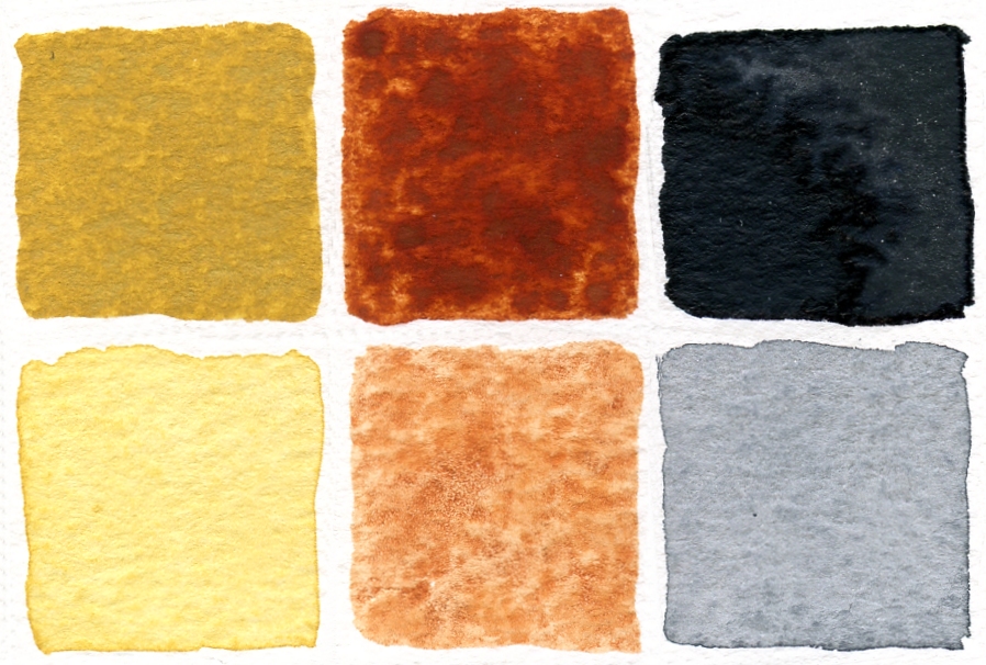
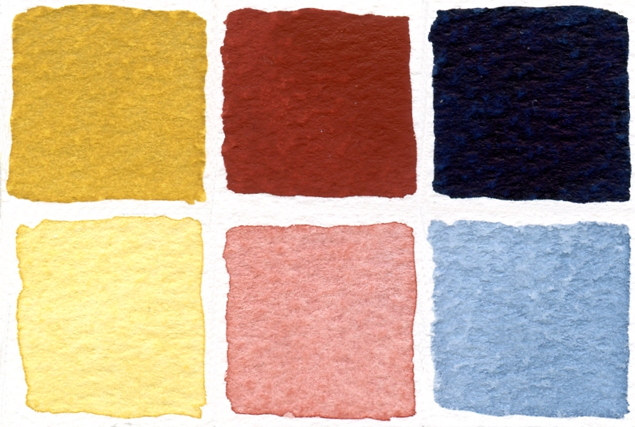
Below are a few suggestions of earth triads you may experiment with. If you don’t have the exact pigment use the closest you have and you are quite free to make your own combinations of earth pigments. The following are triads ancient and modern!
a) Raw Sienna (or Transparent Yellow Ochre), Burnt Sienna, Paynes Grey
Second row pale
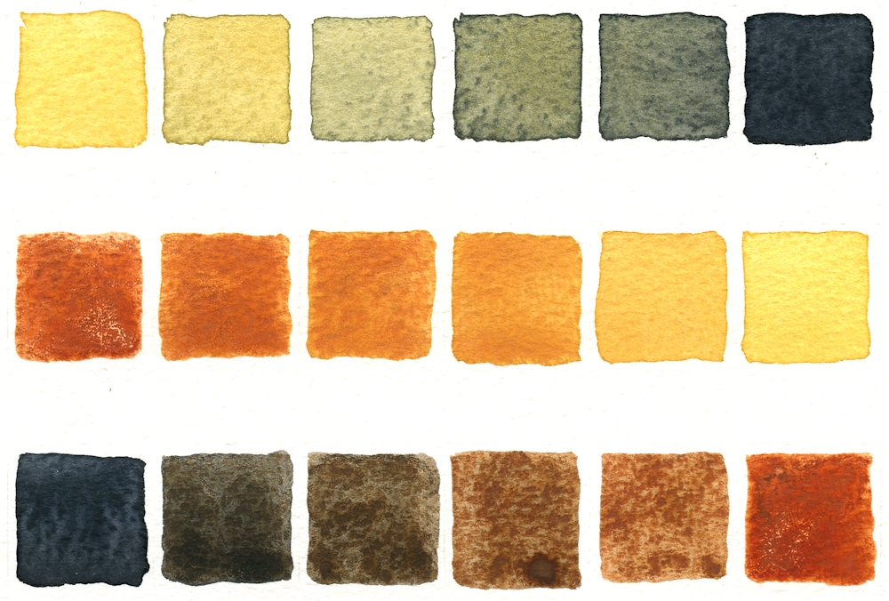
This is sometimes called the old masters earth triad and was a very useful combination of inexpensive pigments both for portrait and landscape studies. I prefer if possible to use the blue shade of Payne’s grey just because it allows mixing more definite green secondaries, albeit very desaturated greens. For this post I used a transparent Yellow Ochre. Raw Sienna is usually transparent and yellow ochre often opaque but is very slightly brighter than Raw Sienna.
b) Transparent Yellow Ochre, Light Red, Indigo
Second row pale

Red Oxide is a very opaque pigment and slightly redder but cooler than burnt Sienna. Indigo is usually semi-opaque and most often a mixture of pigments of including black, blue and sometimes violet or red constituents. Because of the greater blue content than Payne’s Grey a greater variety of greens can be mixed and because of the redness of the light red rather purplish browns can be achieved.
c) Quinacridone Gold, Brown madder, Indigo (bright earth, transparent)
I don’t have the first two pigments so would substitute a transparent Raw Sienna and a Permanent Madder Brownish. This should be an approximation as all the pigments are transparent and the brownish madder should allow some interesting shades.
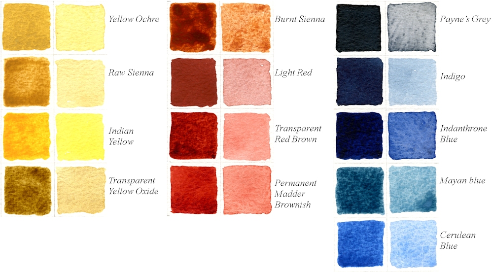
Some of the triads below have some pigments you may not have and are listed for interest but if you do have a tube or pan of for example Perylene Maroon and haven’t used it perhaps now is the time to try.
d) Raw Sienna, Transparent Red oxide, Cerulean: you won’t be able to make real darks with this triad but you could try substituting Indigo or Indanthrone Blue for the Cerulean. Red oxide is similar in appearance to Light Red and is available in opaque and transparent forms.
e) Yellow Ochre, Indian Red, Cerulean: another opaque and pale combination
f) Yellow Ochre, Red Ochre, Mayan Blue
g) Quinacridone Gold, Perylene Maroon, Indanthrone Blue: modern transparent
h) Raw Sienna, Quinacridone Burnt Scarlet, Indigo

Painted with Indigo, Light Red and Transparent Yellow Ochre
3. Paint your picture: landscape, natural form or inspired by ancient art
Having selected your colours and experimented with a few mixes, paint either a landscape or natural form or be inspired by a more ancient art form using some of the motifs from mosaics or even Palaeolithic cave paintings.
Your Paintings;
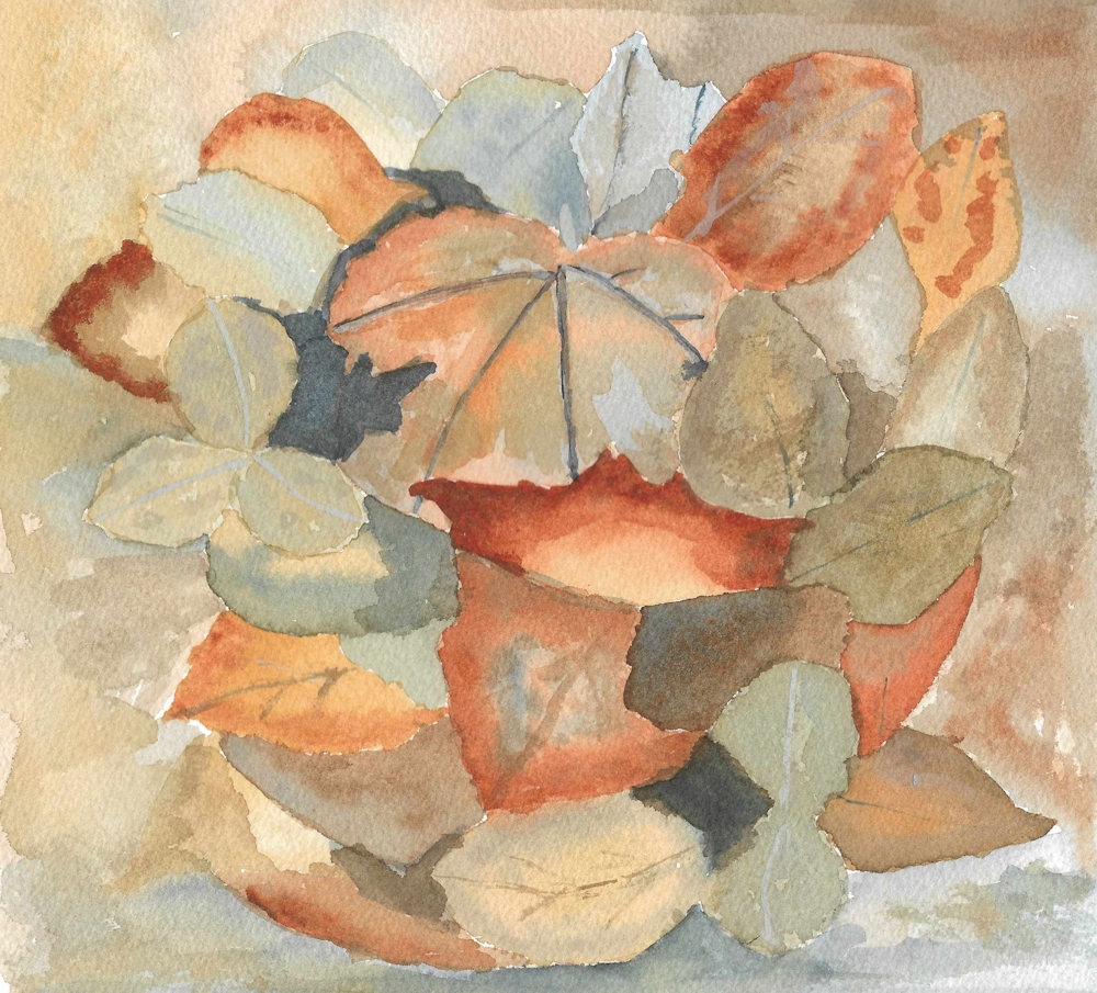
Yellow Ochre, Burnt Sienna, Payne’s Grey and Chinese White
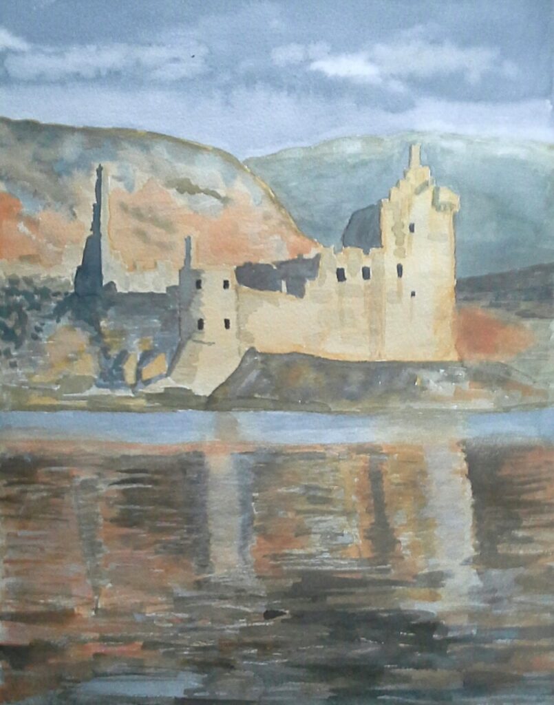
Yellow Ochre, Burnt Sienna, Payne’s Grey and Titanium White
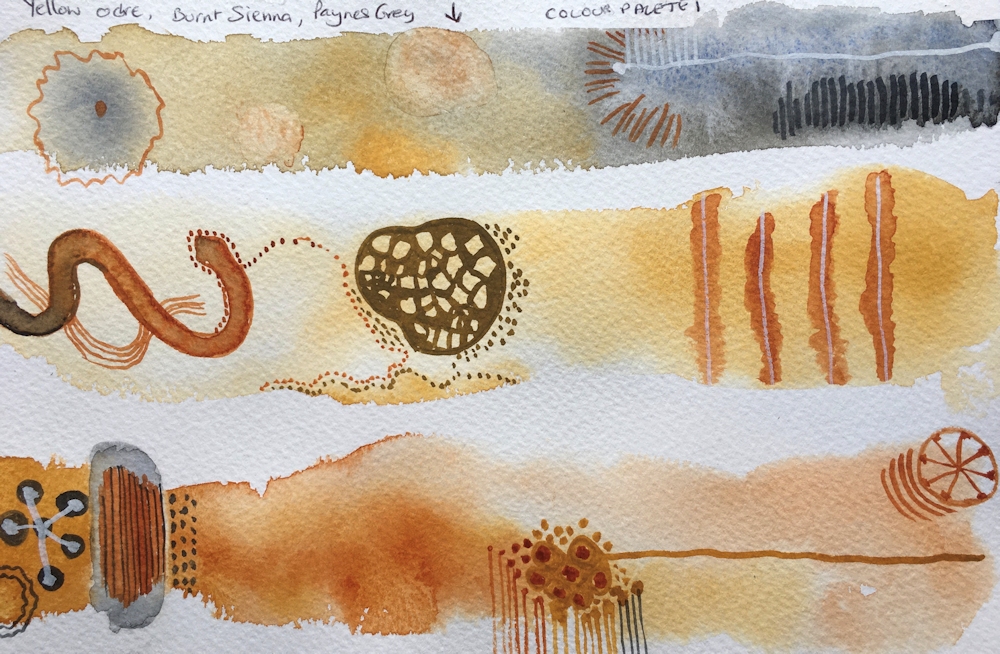
Yellow Ochre, Burnt Sienna, Payne’s Grey
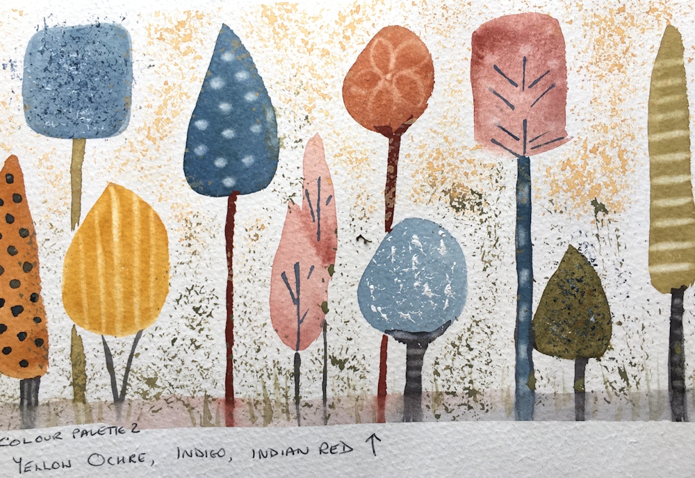
Yellow Ochre, Indian Red, Indigo
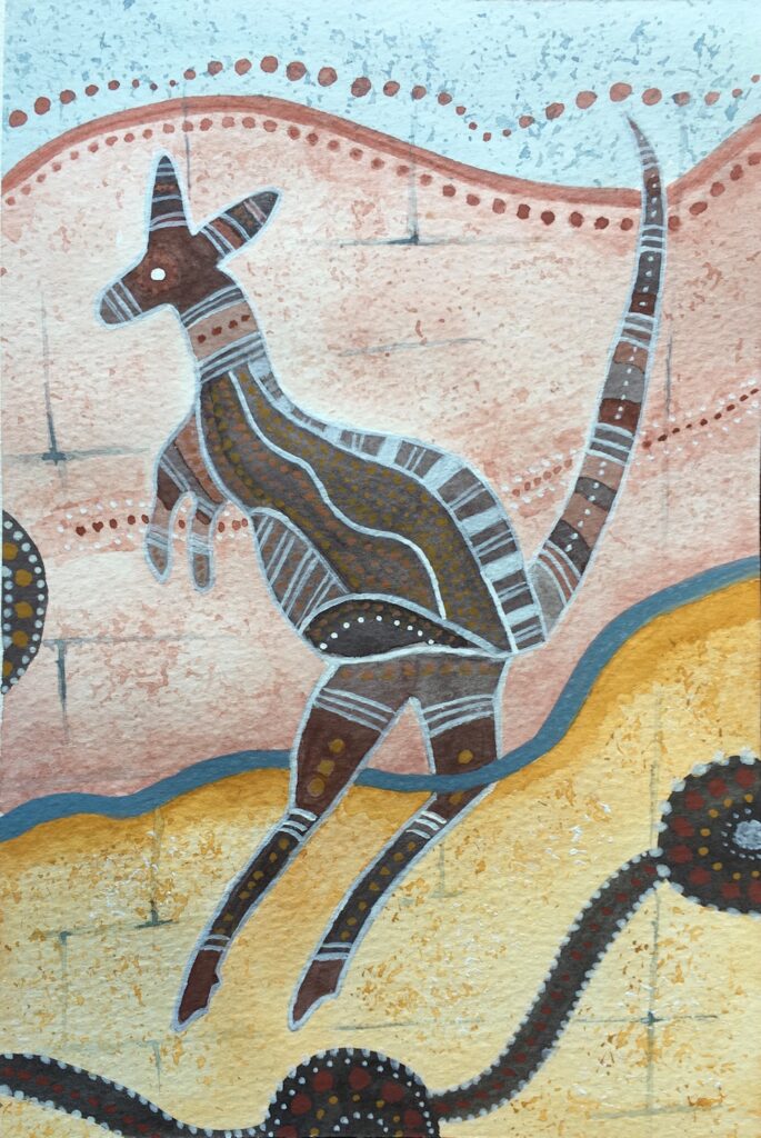
Yellow Ochre, Indian Red, Indigo

Inspired by art in Kakadu National Park
Yellow Ochre, Burnt Sienna, Paynes Gray

Yellow Ochre, Burnt Sienna, Payne’s Gray
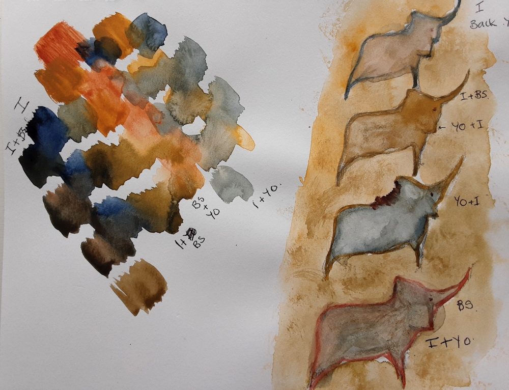
Yellow Ochre, Burnt Sienna, Indigo
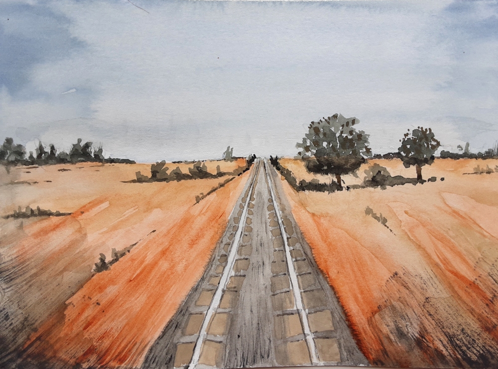
Yellow Ochre, Burnt Sienna, Indigo

Yellow Ochre, Burnt Sienna, Indigo

Yellow Ochre, Burnt Sienna, Indigo, White
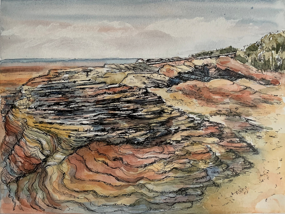
Yellow Ochre, Light Red,Indigo, Black Ink line

Yellow Ochre, Light Red, Intense Blue (Phthalocyanine Blue)
Left: colours mixed on a palette
Right: colours and secondary mixes mingling on the paper
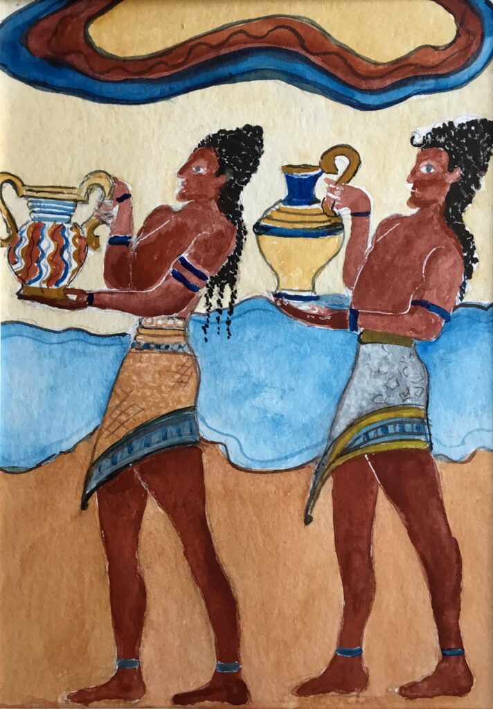
Yellow Ochre, Indian Red, Intense Blue (Phthalocyanine Blue)

Yellow Ochre, Rose Madder Hue, Prussian Blue
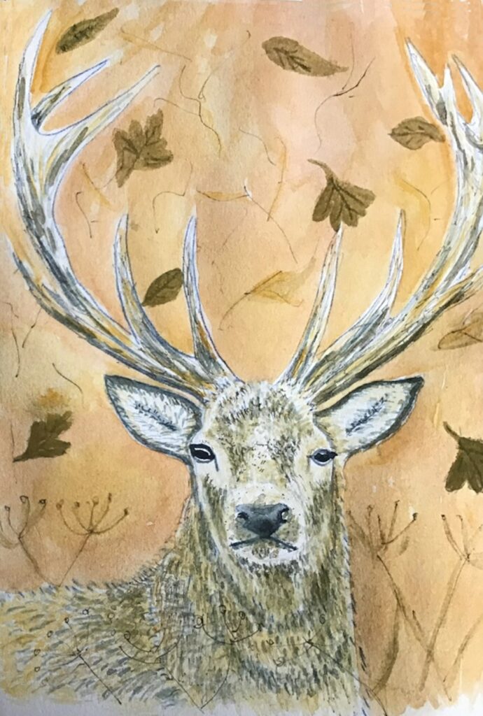
Yellow Ochre, Burnt Sienna, Payne’s Gray

Yellow Ochre, Burnt Sienna, Payne’s Gray
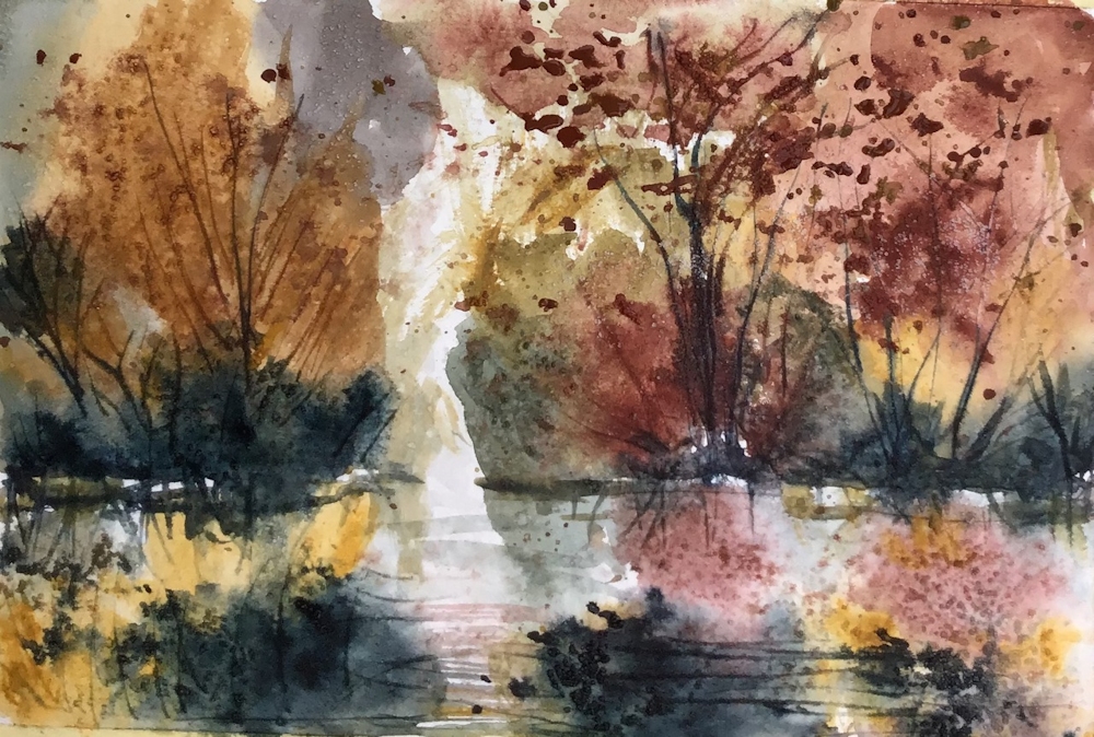
Yellow Ochre, Indian Red, Indigo
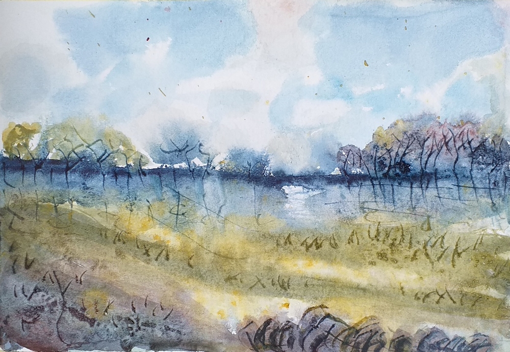
Yellow Ochre, Indian Red, Indigo

Yellow Ochre, Indian Red, Indigo
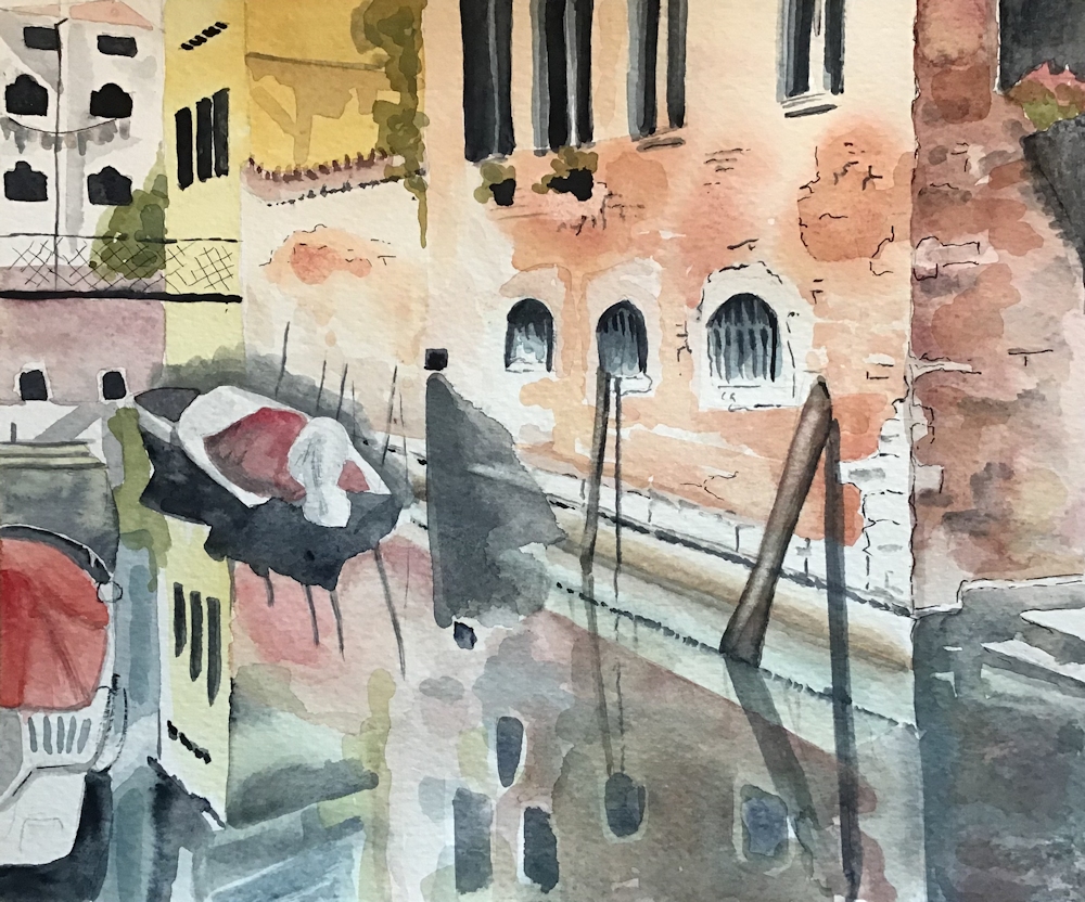
Quinacridone gold, Rose Madder, Indigo
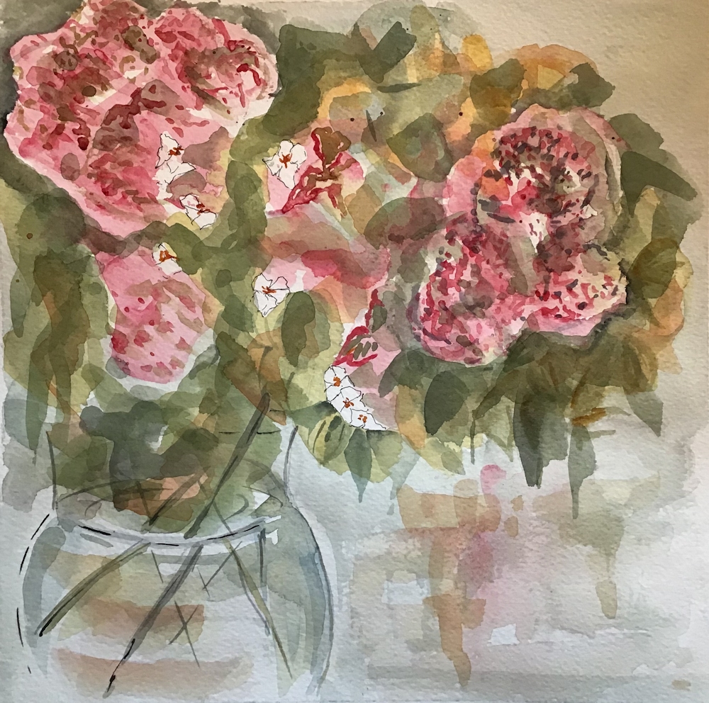
Quinacridone Gold, Rose Madder, Indigo
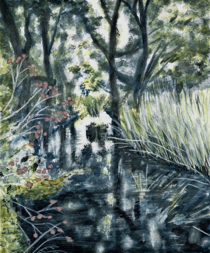
Quinacridone Gold, Indian Red, Indigo
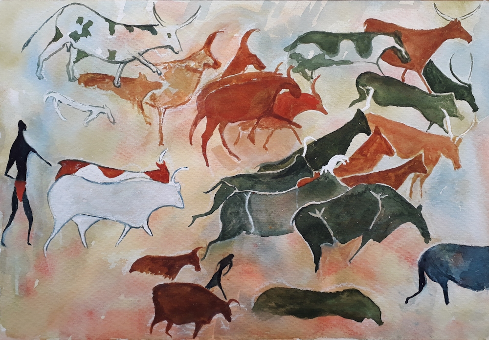
after a cave painting in the Tassili n’Ajjer mountains on the border of the Sahara
Quinacridone Gold, Titian Red, Indigo
Quinacridone Gold, Titian Red, Indigo

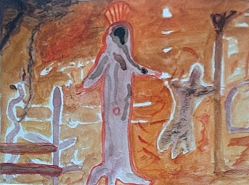
Yellow Ochre, Burnt Sienna, Payne’s Gray
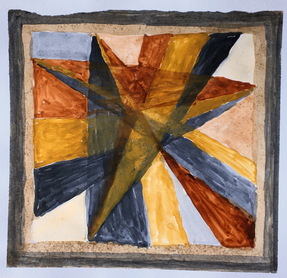
adapted from one of her silk scarf designs
Yellow Ochre, Burnt Sienna, Payne’s Gray

Yellow Ochre, Burnt Sienna, Payne’s Gray

Yellow Ochre, Vermillion, Indigo
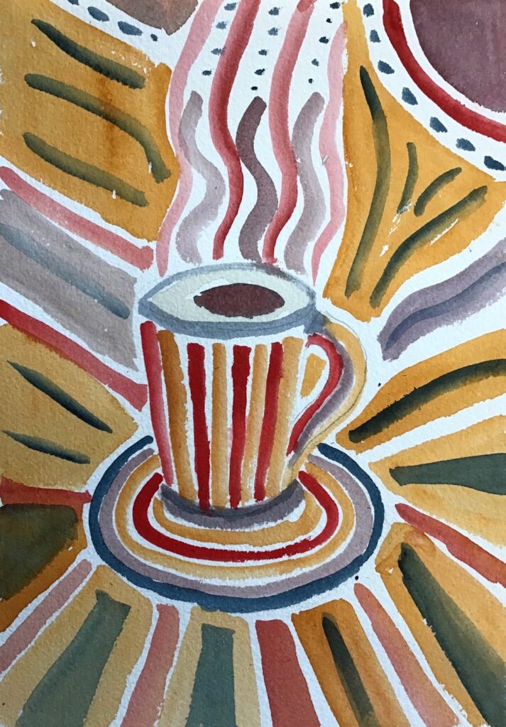
Gold Ochre, Madder Red Lake, Indigo

Gold Ochre, Madder Red Lake, Indigo
Transparent Red Oxide, Burnt Sienna, Payne’s Gray, White
Limited Palettes 1: the Zorn Palette
September 9, 2020
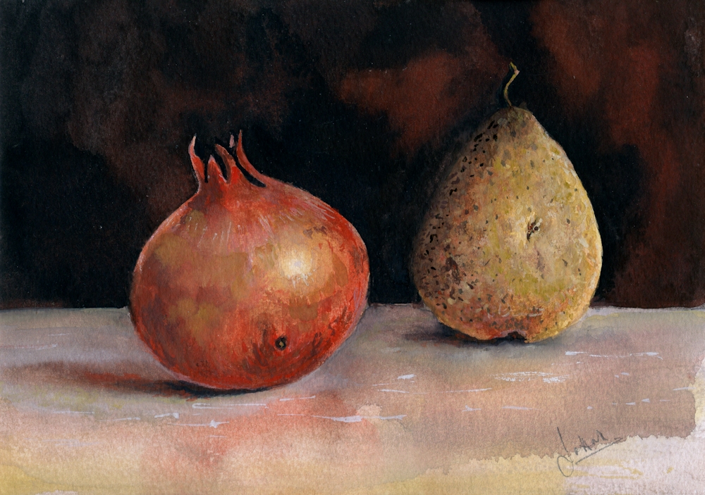
Working with just a triad of colours (plus white if not working in pure watercolour) may be a challenge, but also gives unity to a painting. The first triad we will try is known today as the Zorn palette.
Anders Leonard Zorn (1860 to 1920) a Swedish artist greatly acclaimed internationally for his portraits, including those of several American presidents, was also famous for frequently using a limited palette of just four pigments: Yellow Ochre, Vermillion, Ivory Black and Flake White. Now we may prefer to use Yellow Ochre, Cadmium red Pale, Ivory Black and Titanium White. Flake white is warmer than Titanium White but is made from lead oxide, so rather a health and safety hazard.

Many old masters including Rembrandt, frequently used a similar limited palette partly due to the expense of blue pigments and also due to the fact that many of the pigments we use today were not known or manufactured then. Zorn used this limited palette when working in oil but it is perfectly feasible to use the same palette when working in acrylic, gouache, watercolour or even pastel.
It is a very suitable palette for mixing skin tones, hence the many Zorn portraits using this limited palette, but can also be successfully used for other subjects; still life studies, some natural forms and city-scapes. It is more of a challenge for landscapes but could work for Autumn trees against a leaden sky. The black becomes a substitute for blue and both black and white (or water if using watercolour) contribute to the tonal and saturation range in the composition.
My “Pomegranate and Pear” study uses watercolour and titanium white gouache, but I could have used just watercolour without the white pigment or all gouache or acrylic. I decided to find what mixing the pigments would look like before starting to paint the still life. This was a chart of mixing the pairs of colours to make secondary colours. This could have been extended by mixing any of the squares with the missing pigment e.g. mixing a little black into the orange mix. I could have also extended the tonal range by diluting with water or adding titanium white.
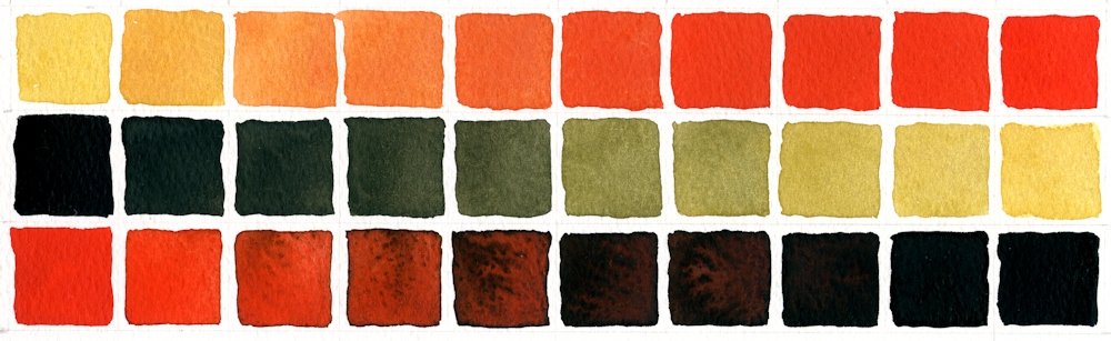
First row: Yellow Ochre with increasing amounts of Cadmium Red Pale
Second row: Ivory Black with increasing amounts of Yellow Ochre
Third row: Cadmium Red Pale with increasing amounts of Ivory Black
You will see that some rather olive green colours were created when Yellow Ochre was mixed with Ivory Black. This is because Ivory Black is very slightly blue and will make very cool (tending toward blue) greys when mixed with Titanium White or water. It is often difficult to see exactly what hues are in very dark colours but by diluting the colour with white or water the inherent colour can be more easily seen.
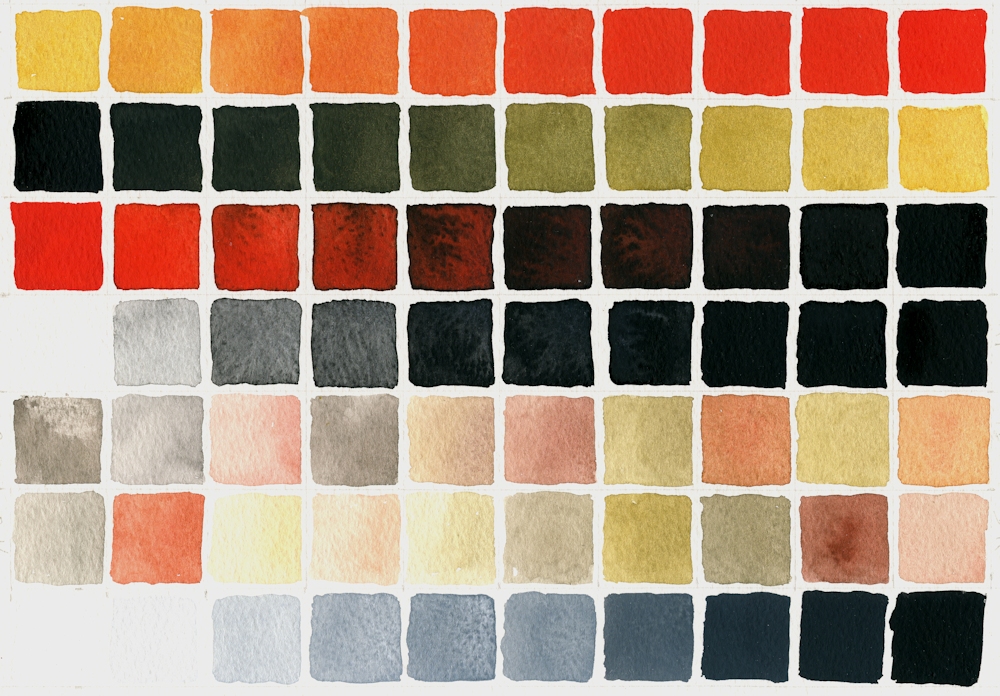
Added a few more rows, first three as previous colour chart. Row 4 added black to water, should have added less initially to make a smoother transition through loads of grey shades! Rows 5,6,7, various pale mixes; some with red, yellow and black; no system to them! Row 8 Permanent White (Titanium Oxide White) with increasing additions of Ivory Black.
On a general note when colours are mixed it is always best to add a little of the darker pigment to the paler one, as much more pigment is needed to change the appearance of a dark colour by adding a paler one, so you risk wasting paint.
- Indicated where cloth meets wall and shapes of fruit in pencil
- Made sure I had some strong washes of all colours except the white ready for mixing.
- Mixed and applied washes wet in wet on the fruit, reserving highlight on the pomegranate and lifting out the highlight on the pear. Dropped in some reddish yellow mix on the pear as it reflected some colour from the pomegranate. Adjusted washes when dry especially with regard to tone. Left to dry again then painted some of the markings on the pear and pomegranate wet on dry.
- Turned the paper upside down and applied a wash of black with a little red all over the background, dropping in a more reddish back mix wet in wet and left to dry.
- Decided the table needed to look as though it had more substance/texture to balance the dark background so used white mixed with the colours; mixes for shadows were of all three pigments and mixes made with varying amounts of red and yellow were used to suggest colour reflected on to the table from the fruit.
- Finally the highlights, markings and colour on the fruit were adjusted; in places just with watercolour and in other areas using watercolour mixed with white.
Practical
Have at the ready;
Yellow Ochre
Cadmium Red Pale (or any other bright warm red like Vermilion)
Ivory Black
Titanium White gouache if not using pure watercolour. This is usually labelled Permanent White. Zinc white is more transparent.
You will also need watercolour paper, a deep welled palette for making washes and your usual brushes and equipment. I would experiment a bit with mixing but if time is limited don’t be too precise just make sure you understand the possibilities.
1. Make a colour chart of mixes of each colour
2. Try extending the black with water and with white. You will notice a difference.
3. Try mixing the secondary colours with the missing (complementary) colour e.g. add a little black into a mixed orange.
4. Allow your colours to mingle wet in wet on the paper. Allow to dry then add other colours over them.
5. Make an abstract or a representational painting; a simple still life, natural form or a portrait study either from your own reference or referencing one of Zorn’s paintings.
Ensure you understand the tonal composition of your reference. If working in watercolour start with the palest tones and colour and build up to the darker washes. In acrylic and gouache the darks may be established earlier on and over painted with paler tones mixed with white where appropriate.
Reference Pinterest Board “Limited Palettes”
https://www.pinterest.co.uk/jhall1282/limited-palettes/
Some of Anders Zorn’s works are referenced on my Limited Palette Pinterest board together with a gouache demonstration of the Zorn palette used with gouache by James Gurney. It has an unusual setting but is very useful. He does talk about using additional browns but you should be able to mix all of these from your red, yellow and black. He also used a paper primed with an Ochre or Raw Sienna casein paint; you could always apply a dilute acrylic wash of a similar hue. At one stage he removes paint to let the background casein colour show through. That should also work with an acrylic wash. However as you can see from the still life at the beginning of the post you can see that it is perfectly possible just to paint on white watercolour paper.
Alvaro Castagnet
Castagnet works in watercolour and I have included one of his cityscape works which could be reinterpreted using the pigments of the Zorn palette.
Your Zorn Palette Paintings:
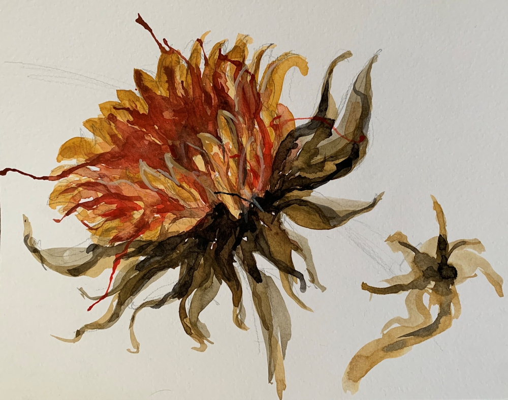


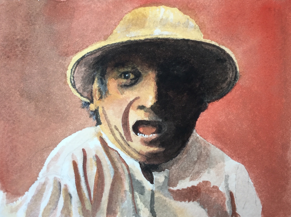


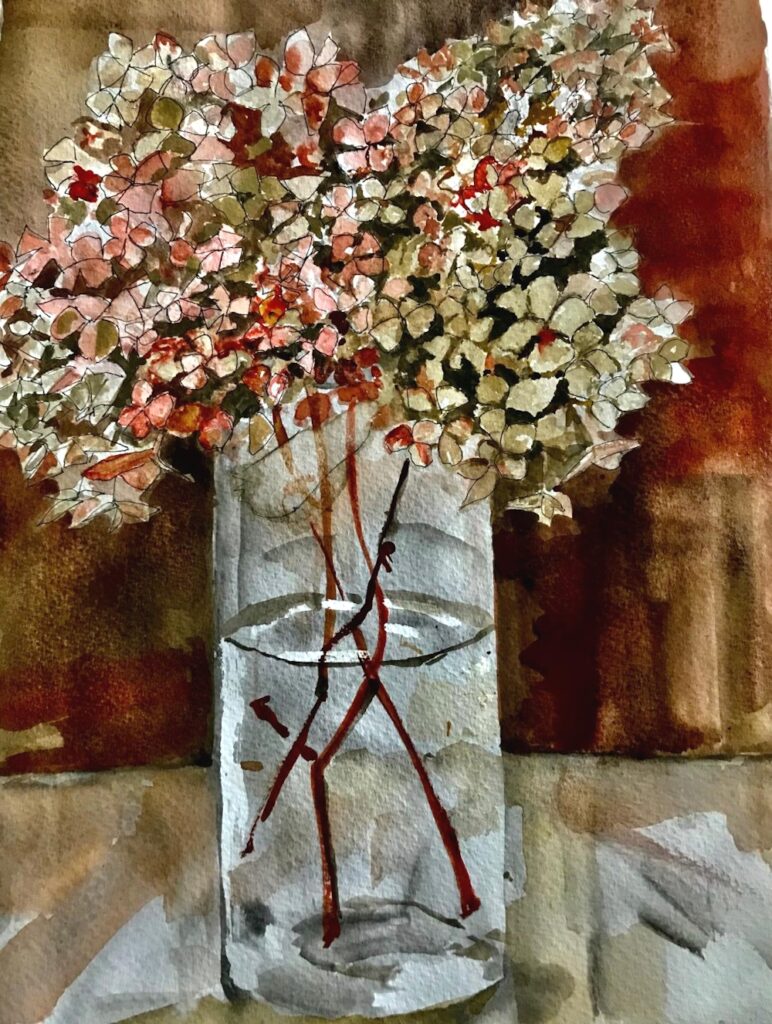
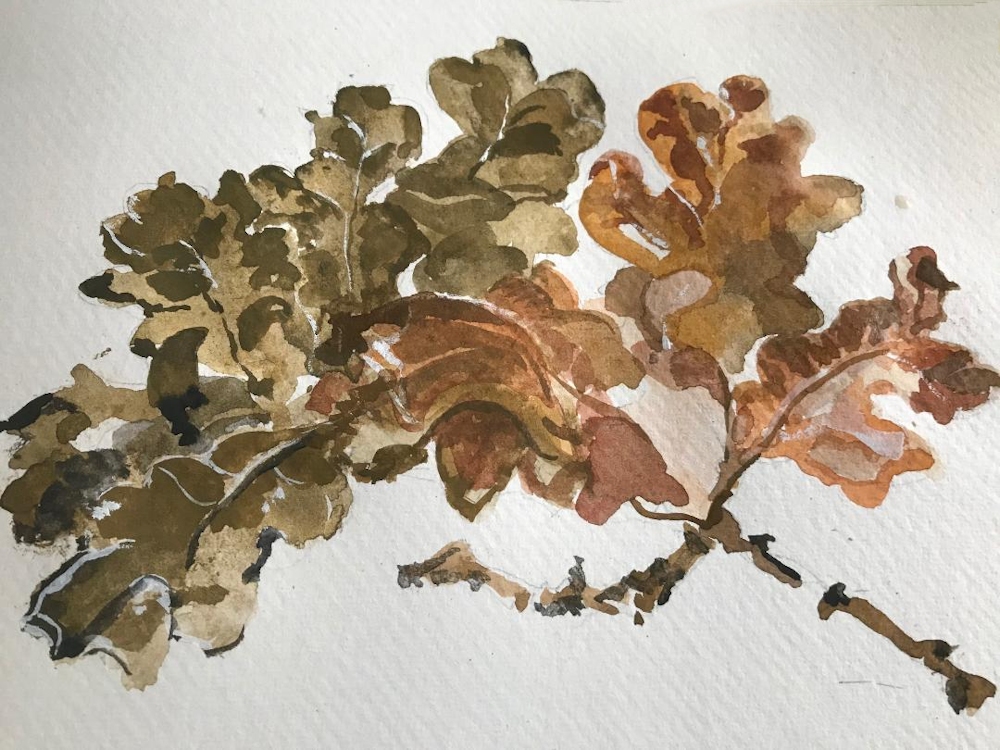


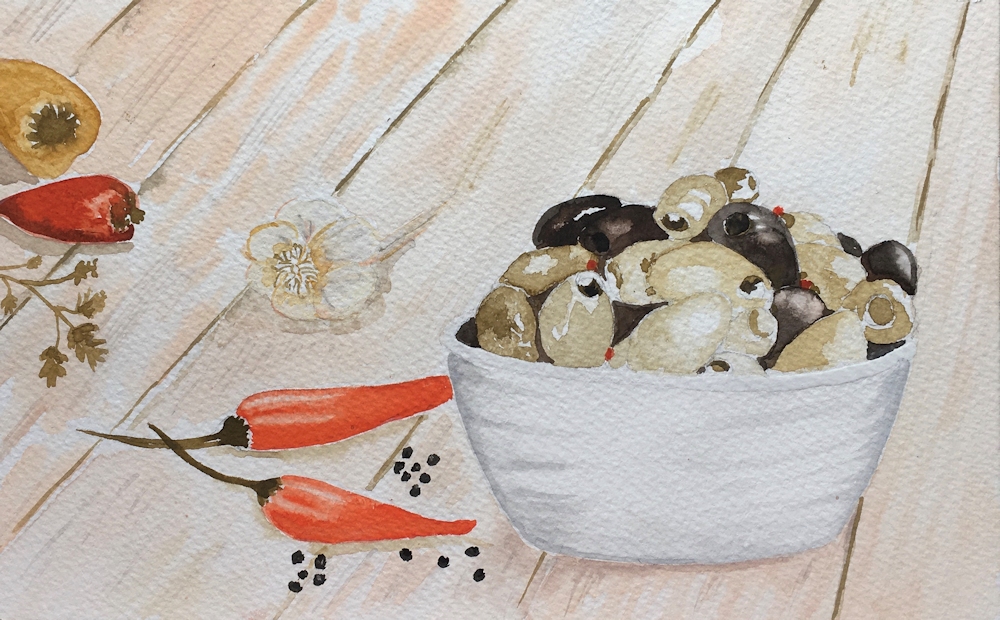

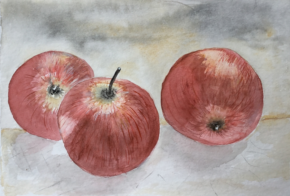
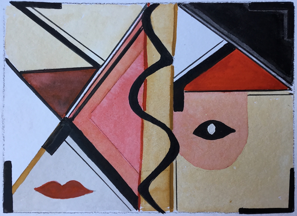


Both of Sandra’s works were painted with Cadmium Red Deep instead of a brighter red like Cadmium Red Pale, Vermilion or Scarlet Lake.

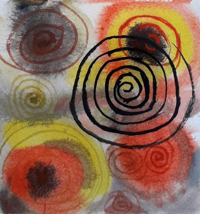
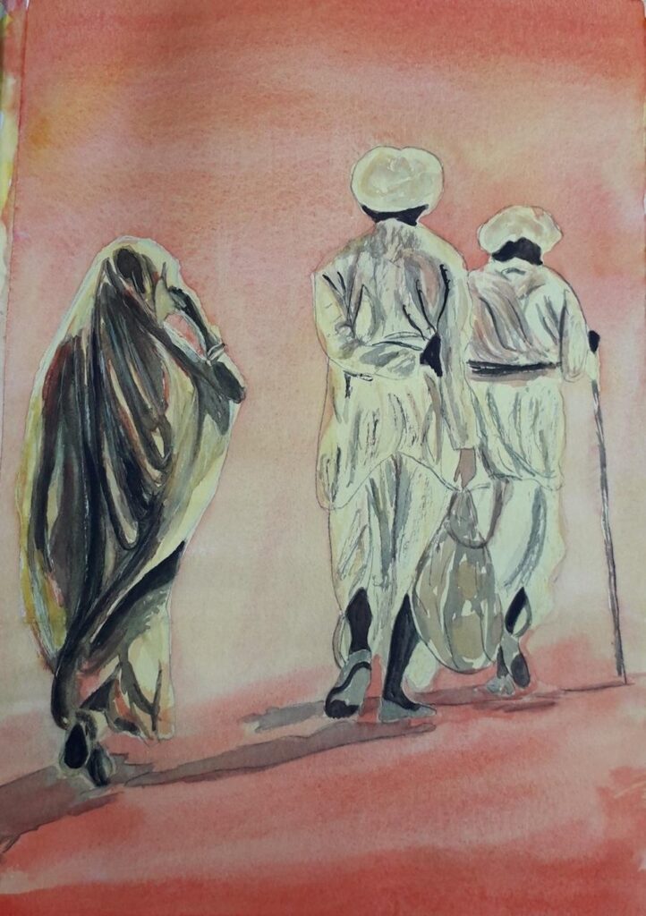
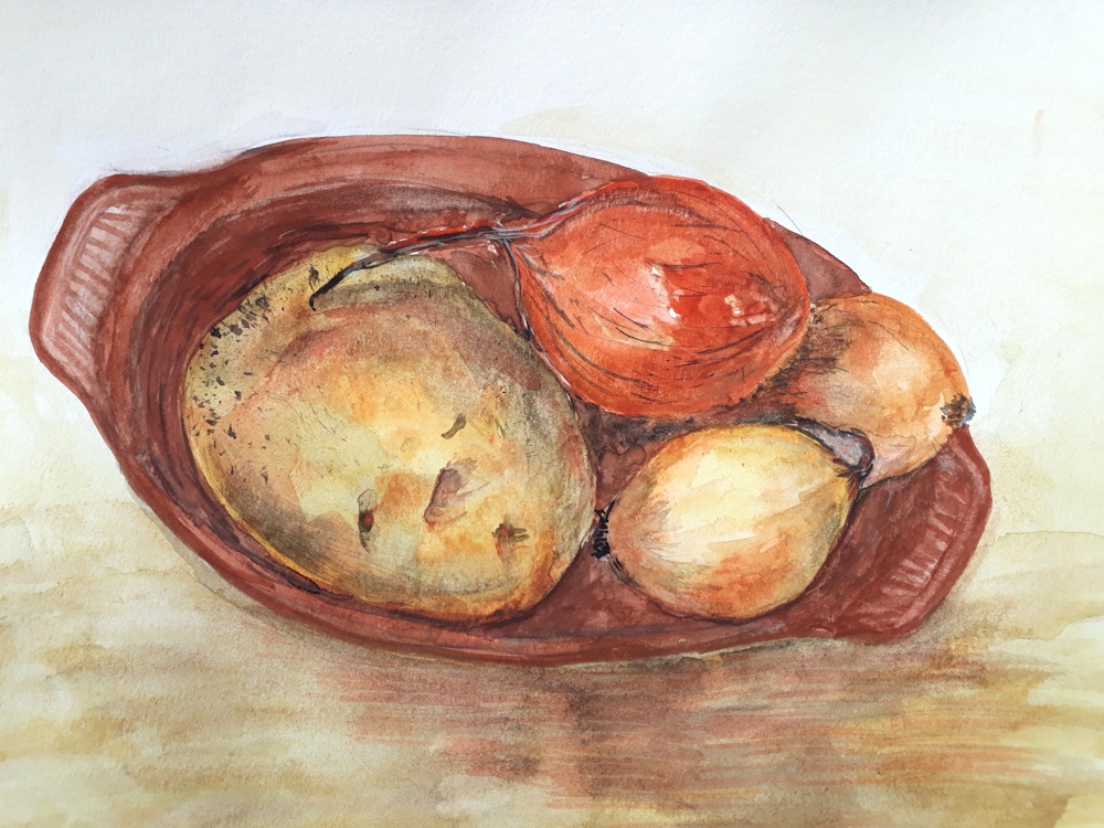
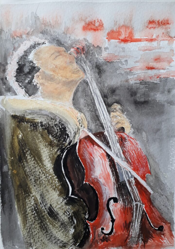
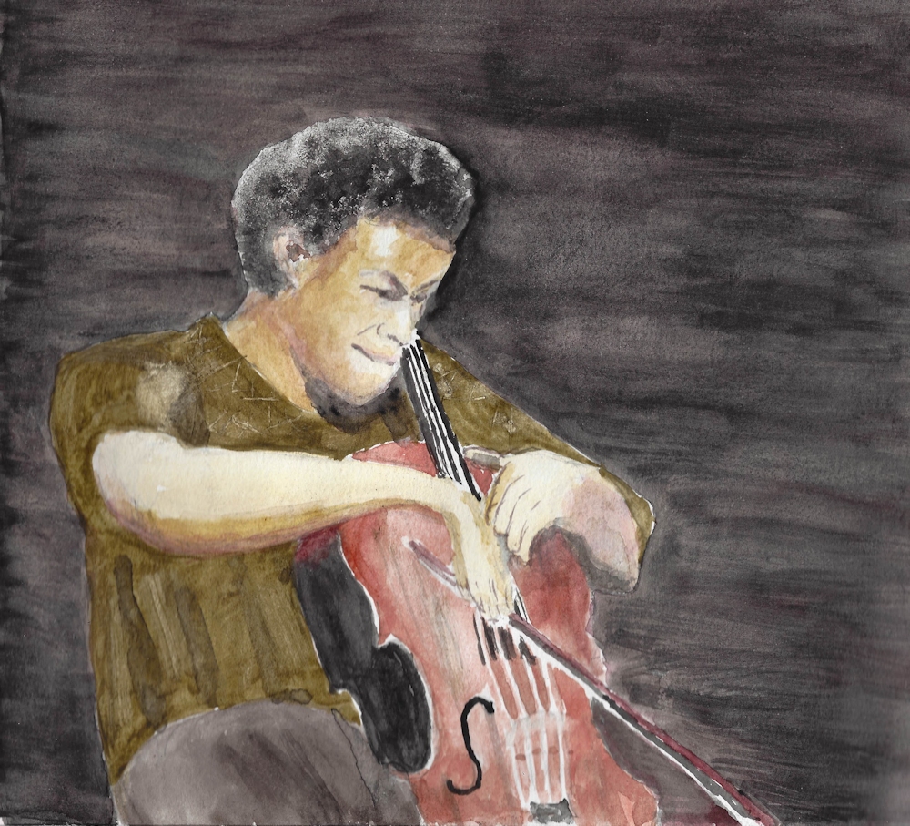
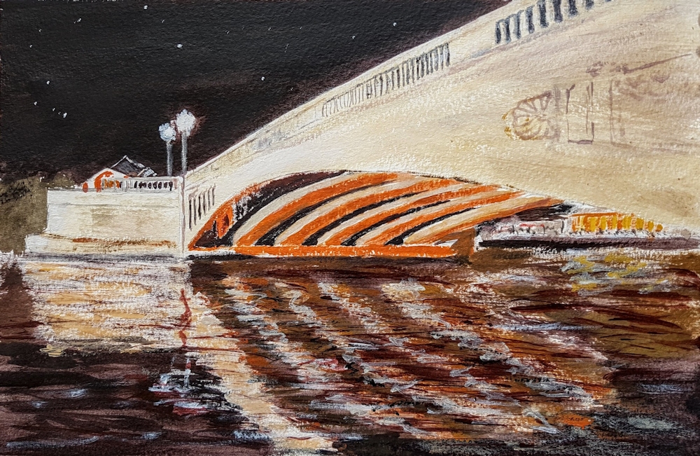
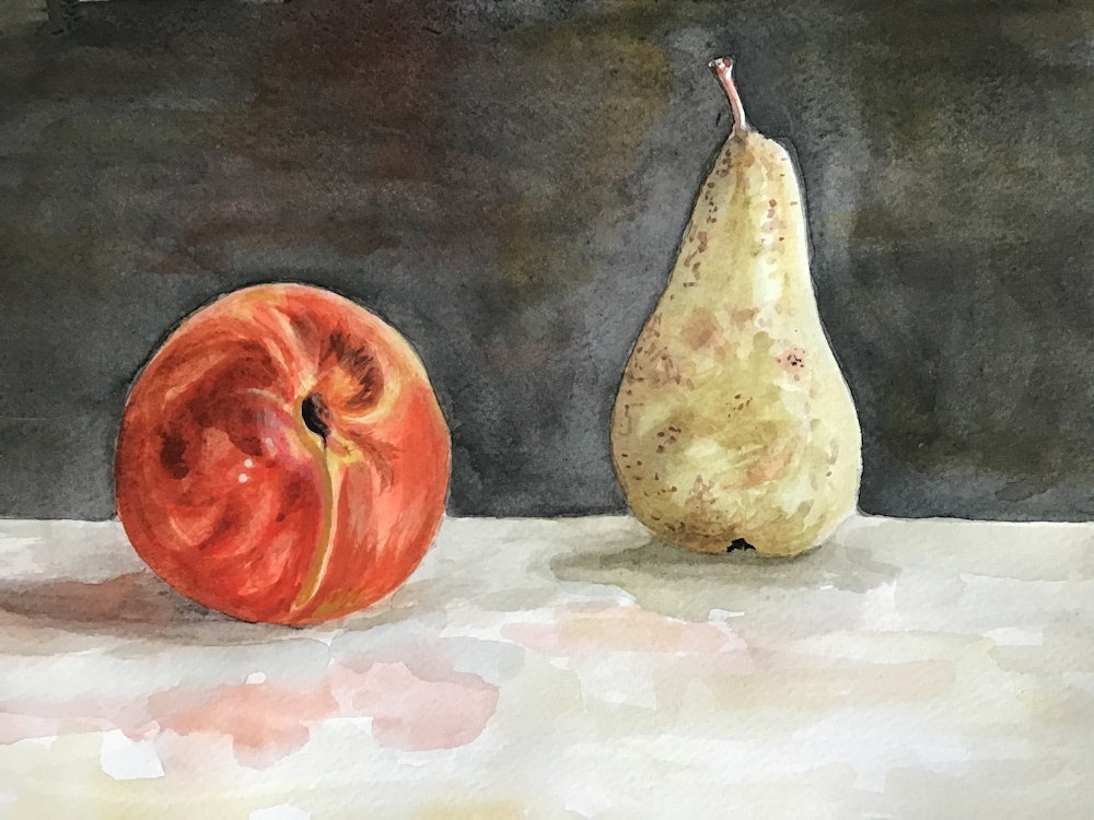

Ink and Wash 4: Street Scene or Busy Market
August 22, 2020

This week’s challenge is to draw from a street scene or market. This may be a colourful shop front, still life of a market stall with colourful flowers and vegetables, a stand at a car boot sale or a wider view of a busy road or market.

Including figures in your work may seem a bit daunting but whether you work from life or from a reference it’s a good idea to start by drafting in the static elements of the composition first. The main large shapes; the buildings and/or market stalls, and of course the road or square they stand on. This can be done very lightly in pencil but do not record any detail at this stage. Leave that to subsequent work with the pen, however you may like to draft in the odd figure just to gauge the relative size at an early stage. Again remember not to be detailed: you are not executing a portrait so just indicate a rough shape and note where the top of the head and feet are located. Groups of people are best drafted in as one shape and sorted out as individual characters later.
This week waterproof or non-waterproof ink may be used but think about whether your colour washes need to be kept as clean bright colours or whether a more subtle effect is required. You may also choose to work in monochrome adding wash to non-waterproof ink as plain water or by diluting the ink for the washes if using waterproof ink.

Don’t worry at all if some of the lines used to delineate buildings dissect any figures included. Once colour is added the lines will seem unimportant; such is the power of colour. Reportage artists working from life know this happens inevitably, and often as a consequence of people moving off or new characters arriving that they would like to include. It is a good reason for not making all the lines of buildings and stalls too strong at an early stage.

There are very many ways of treating these kinds of subject. This week I have restricted my choice of refence artists to two reportage artists as this approach may inspire your sketchbook studies on location.
This week’s artists for reference
Examples of works by this week’s reference artists can be found on my Pinterest Ink and Wash board at:
https://www.pinterest.co.uk/jhall1282/ink-and-wash/
and include
George Butler; extraordinary reportage artist who has worked in Syria and Afghanistan. Mainly India ink and watercolour. Note limited and stategic use of colour and amazing draftsmanship. See his work at
Lucinda Rogers; also a reportage artist who has made many drawings of markets, street scenes and garage workshops. Rogers visited New York in the aftermath of the collapse of the Twin Towers producing poignant studies there. Works with ink, marker pens, crayon and watercolour. Note how freely the colour is added but usually again limited to a few areas giving interest and emphasis to parts of the drawing.
Your Drawings;
This week’s drawings, mainly of market scenes are lively and reflect some interesting journeys to faraway places as well as markets much nearer to home!

Angela used Unipen Fine Line pens; 0.1 and 0.8 and watercolour on cartridge paper. Angela has done a good job here, as when working on cartridge paper washes must be laid with the minimum of brush strokes. This paper is very fragile when wet and can scuff up making unsightly blobs if the paper is ‘scrubbed’ too much. If you need to add another layer of paint wait until the paper is completely dry first.


This drawing references a visit made to Samarkand and gives a great idea of the hustle and bustle of the market. Waterproof ink was used alternately with watercolour washes.


references a guide book


The space in Roger’s drawing has been very well constructed with regard to tone focusing attention on the middle area where a dark clothed figure is talking with another market in paler dress. When my gaze left them I felt led clockwise round the picture to the meat stall and the foreground lady in red, before the strong diagonal took me to the left taking in all the other stalls and lit doorway before returning to the figures where I landed first.
Great composition Roger!


For both of her drawings Barbara used pen, India ink and watercolour.

Pen and India ink with washes of dilute ink and of watercolour

The composition was brushed in with watercolour and allowed to dry before drawing in the detail with a Rotring Art Pen. Further ink and watercolour washes were added to finish.
Ink and Wash 3: An Architectural Feature
August 15, 2020

I have included two little drawings made in 1991and 1993, mainly because they are local illustrations and because ink and wash has long afforded a means to record buildings and other architectural features. I remember Norden Farmhouse as seen here, when the barns, though in bad repair were still used for poultry farming.

70 Altwood road must be one of the prettiest buildings in Maidenhead. It too has developed over time with a thatched Victorian extension to the rear of the more ancient thatch.

This week I would like you to make one drawing of a building, wall, bridge, or tower set in a rural or town setting. It may be a street scene and you may like to include some candle wax, wax crayon or oil pastel as a resist. This may be just to texture a small area or used in several places as in the demonstration sketch below. Resist techniques were often used by John Piper and the sketch detail below was scanned at each stage to show how oil pastel as a resist may be used to add both colour and texture to an ink and watercolour drawing.


Waterproof ink has been used in all the illustrations to this post and I suggest that it would be good to try using only waterproof ink for this week’s drawing. Remember that while still wet you can produce tone with a brush charged with plain water or watercolour, but if you wish to work in this way you should have your wash made up so it is ready to use before the ink dries. You can also mix up a couple of dilute mixes of ink and store in small glass jars with lids. Individual glass jam pots are ideal. The sketch below was made with full strength and diluted ink.

So before you start, look at your reference and decide whether you wish to work in colour, monochrome, with or without wax resist. You may like to invent or exaggerate colours, or to work much more closely to the colours of the reference.
Think also about the main structure of the building, drawing the main large forms first. Look carefully at the size of windows and doors in relation to the whole, then the surface patterns and details will fall into place much more easily.
Finally look at how the building is lit. Is it from strong sunlight creating huge tonal contrasts and shadows or is the light more subdued and the tonal differences more subtle? Is it night time and some of the light is coming from windows and street lights?
John Piper was an excellent draftsman so could choose to play with perspective. He also played hugely with decoration and colour and light but the proportions of windows, ornaments, balustrades etc. to the whole structure were always shewn accurately and it is these proportions that often give a building it’s character.
Reference Artists and Link
As usual the reference artists are an eclectic mix from Rembrandt to Emma Fitzpatrick so I hope you enjoy the variety on the Ink and Wash Board of my Pinterest account at
https://www.pinterest.co.uk/jhall1282/ink-and-wash/
There must be a washboard joke there somewhere!
Here are brief notes on each artist but best just to look!
Rembrandt van Rijn: 1669 to 1669:
Cottage among Trees 1650: pen and brown ink, brown wash on paper
Dutch Farmhouse in Sunlight: look at how the light falls
Giovanni Battista Piranesi: 1720 to 1778: drawing and printmaking
Visionary architectural drawings; Roman Prison ca 1750 wash drawing
Tomb of the Metelli: pastiche of ancient temples with a piazza
Francis Towne: look at works from 1781 when he visited Italy, washed drawings and watercolours, very calm and cool
Roman Ruins 1781
In the park of the Villa Mondragone, Frascati 1781
John Piper: just look
David Gentleman: just look
Getrude Hermes: 1901 to 1983 sculptor and wood engraver
Stonehenge; 1959 Have included this one as the markings on the stones are wonderful. Do look up this reference
Emma Fitzpatrick: contemporary; just love her freedom of line and colour!
Lastly, not so much for his work but because he does have some useful line and wash demonstrations on U-tube, Peter Sheeler. Easy to Google and find.
I didn’t feel the need to say anything about John Piper or David Gentleman. You will come across scores of others using ink and wash but hope this handful will provide food for thought and creativity. You are quite at liberty to design your own shack, castle or fantastical bridge!
Enjoy drawing!
Your works:


The line and wash sketch of the chapel outside Orviedo started as a line and wash sketch using a fine nibbed dip pen and ink to which dilute washes of ink were added. Vivienne then built up layers of oil pastel, watercolour and more ink, scratching out some of the oil pastel.


Angela used Unipin Fine Line 0.1mm black, acrylic ink, watercolour, candle wax and charcoal pencil for her view of All saints Church.


Malcolm made use of numerous nibs and a twig to draw the bridge in India ink and a Chinese brush for washes of dilute ink. A little white gouache was added on the water in places.

Sandra’s painting is a mix of sepia acrylic ink using dip pen, oil pastel as resist, watercolour, Indian ink line and wash, gigonda red chalk plus light and dark sepia
Ink and Wash 2: Into the Landscape
August 9, 2020

In last week’s post the accent was on mark and line making and different techniques for drawing in ink and adding washes of more ink and/or watercolour or pastel and our aim was to produce an ink and wash drawing of a natural form. This week we are operating on a larger scale and moving out into the landscape. You have many techniques at your disposal and I would like to see you try a landscape from your own reference material; somewhere you know and either love or find interesting. Best of all would be to work from life at a landscape near you!

Think about how your subject will be best depicted; whether the accent should be more on line or mark making or whether only an indication of line is needed and most of the “work” will be left to the wash to supply tone and colour.

Also think about how you will provide a sense of space and distance. This may be important or not as we shall see from the rather eclectic group of images chosen for the Ink and Wash Pinterest board at
https://www.pinterest.co.uk/jhall1282/ink-and-wash/
Claude Lorrain
Claude Lorrain’s Study of an Oak Tree ca. 1638 is rich in pen marks on the trunk and foliage but many of his ink wash drawings were almost solely wash as in his View from Monte Mario, where a river winds its way through dark trees against a backdrop of distant mountains. The paper is white where the water reflects light most strongly and the composition relies almost completely for changes in tone for its effect. In Trees and Rocks by a Stream ca.1635 there are beautiful calligraphic lines as well as washes where the tone of the wash varies from a very weak tea stain to something much darker. I find his work has a timeless quality and he has much to teach us today.
Samuel Palmer
Moving forward Samuel Palmer’s work is equally dramatic tonally but rather more graphically defined. In Drawing for the Bright Cloud ca. 1831-2 look at how Palmer’s clouds depend on line as well as tone, how the middle ground is very dark and the tree trunks white against the dark and how carefully the sheep have been washed with different tones so we know exactly how the light is falling on them. There is also an abundance of mark making on their wool and much patterning of foliage.
There are several ways you can produce light against dark;
Reserve the white of the paper; draw/brush round anything you wish to remain white.
Add White: When the work is almost complete add white gouache or even acrylic or white pastel/pastel pencil.
Scratching with a sharp implement taking care not to put a hole in the paper-always best done at the very end and only if the paper is heavy enough to take harsh treatment
Wax: At the very beginning either a line of candle wax which cannot be removed; experiment first on a small piece of the paper you will use to see how much pressure is needed when you add a wash and the wax acts as a resist.
Masking fluid; apply at the beginning with a ruling pen or old brush which must be cleaned immediately afterwards. Make sure the masking fluid is completely dry before removing by rubbing with a finger or soft eraser; not suitable for rough papers so again experiment first
PLEASE NOTE: Wax resist, or adding chalk pastel when a work is almost complete will work with waterproof ink, non-waterproof ink or watercolour.
Non-waterproof ink may lift when you add wet gouache or acrylic. You may lighten areas of non-waterproof ink or watercolour by lifting out with a damp brush and clean tissue. You can wet the paper repeatedly to lift out but do not rub the surface or it wil become damaged. Paper is at its most fragile when wet.
The other reference artists chosen are :
John Piper; images of rocky landscapes
Paul Nash; trees and woods in the landscape, carefully considered compositions and delicate lines The Pin labelled Paul Nash at Tate Britain has an image of The Wanderer. Do look at how the line and colour work together producing a magical narrative landscape where the distant figure has trodden a path through the field.
Ceri Richards; trees and foliage full of wonderful lines and marks evoking a strong sesne of movement
Wu Gannzhong
Lastly I have included the Chinese artist Wu Guanzhong, who died in 2010 and is often thought of as the father of modern Chinese brush painting. Like Lorrain he has made wash drawings that wholly depend on wash but also those where line is the key element. The contour of the land is well established so that however abstract his work becomes, it still convinces us. We are still travelling the path with him and I think his work also has that timeless quality.
Aim to produce;
One considered drawing of a landscape with rocks, trees or both.
Foliage of trees may be suggested with ink but always remember the side of your brush can be very useful whether in strokes or “printed” against the paper.
Remember to mix some washes up in advance of starting the pen/brush drawing as you may wish to add some wash while the ink is still wet, if you are using waterproof ink. Also ensure that all your equipment like brushes and a sponge or paper towel are to hand.
If you have time for a second drawing, try to make one that is different in nature to the first. For example the first may be a calm day and the second blowing a hurricane or at least windy. The first may be monochrome and the second very vibrant.
Enjoy drawing!
Your Drawings:


Ink and Wash 1
August 1, 2020
Lines, Marks and a Natural Form in Ink and Wash
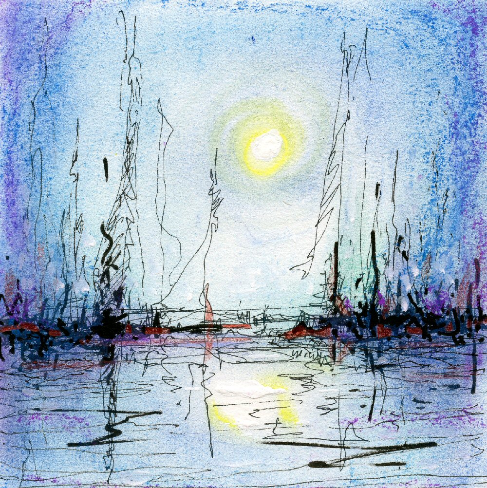
Why Ink and wash and not line and wash? I had thought of calling this short course line and wash, but what about all those little marks, dots and splatters that so often add to the character of an ink and watercolour drawing? And what about the decision to paint an area of ink instead of a line?
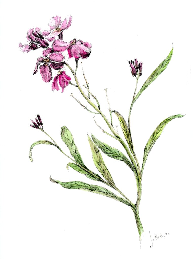
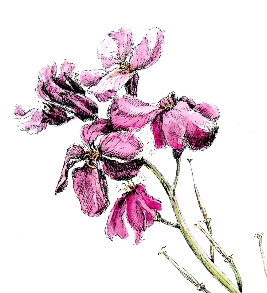
I’ve also been asked two other interesting questions recently:
Can you put down the wash before the line/ink?
Can you use pastel as a wash?
Of course you can. See first image!
I often think of the line element in a drawing as the narrative of a story. It finds out the main players and arranges them. This may be sufficient in itself. Look at line drawings by Matisse. At the other end of the scale look at the amazing reed pen drawings of Van Gogh, full of beautifully arranged groups of marks.
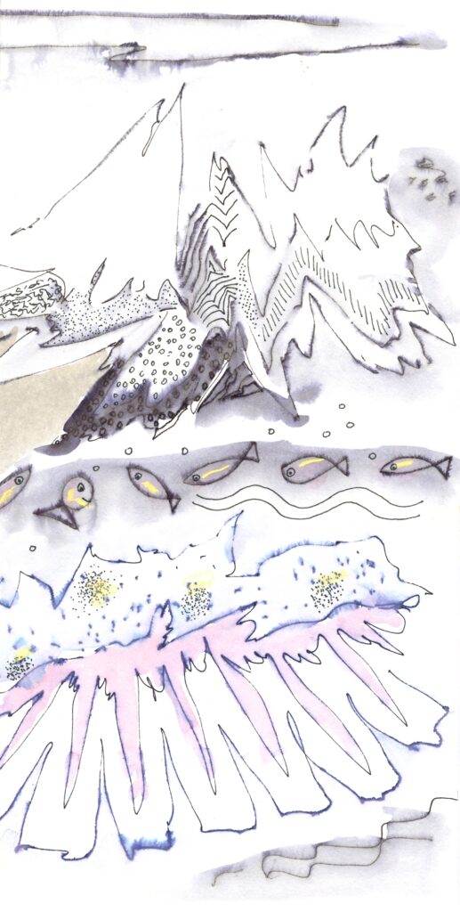
Washes of dilute ink, watercolour or “dry” washes of pastel add tone and atmosphere, and all the little marks can add further descriptions of the main players and introduce smaller ones. These little marks may suggest the ageing process whether in a face or a piece of driftwood. Shells and stones carry the marks of their history, growth lines or pits made by burrowing worms etc. Likewise the barks of trees can bear growth marks, further enriched by the growth of lichens.and fungi; the minor characters.
First of all we are going to consider mark making as it’s a good way to get used to using ink and different pens and tools, and go on to making drawings of natural forms and adding washes. Those of you who are already used to making drawings with a variety of tools, pens and inks may like to go straight to the drawing challenge for this week.
Marks can be patterns in the shape of the objects they depict; e.g. leaf forms or can be more anonymous, adding a texture rather than being ‘in the shape of’. Although it is easy to think of a system of dots or a series of short strokes as being marks and long thin strokes of a pen describing the profile of a face, a figure or undulating hills as being lines, there is a grey area in between where the definitions break down.
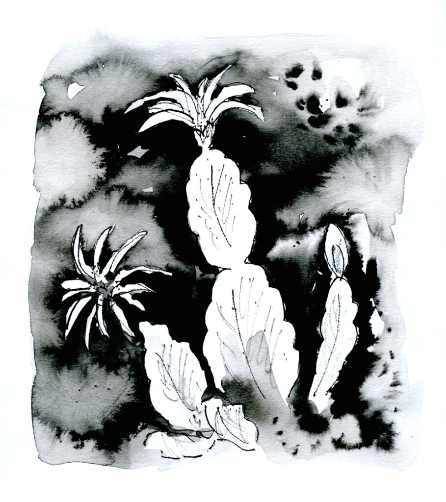
Materials and equipment
Ink
Waterproof India Ink or an Acrylic black ink; these inks are made of carbon (historically soot) suspended in water with a shellac or acrylic binder which makes them waterproof when dry. Non-waterproof India Ink can also be purchased but you can gain very similar effects with waterproof ink by adding washes before it has dried. The carbon particles could not be ground fine enough for fountain pens and unless labelled as suitable India Inks should not be used in fountain pens as they will clog the nibs.
Fountain pen inks are generally dye based, often of more than one dye and are solutions of the dyes in water rather than suspensions of tiny particles. They are very beautiful to work with and readily split into there component dyes. Sadly most are not at all light fast, so though useful for sketchbooks are not suitable for showing on a wall. Most reputable ink manufacturers will give lightfast ratings for their products but if your ink is not labelled as lightfast it probably isn’t. This is a particular sadness for people who like to use Black Quink.
Pens
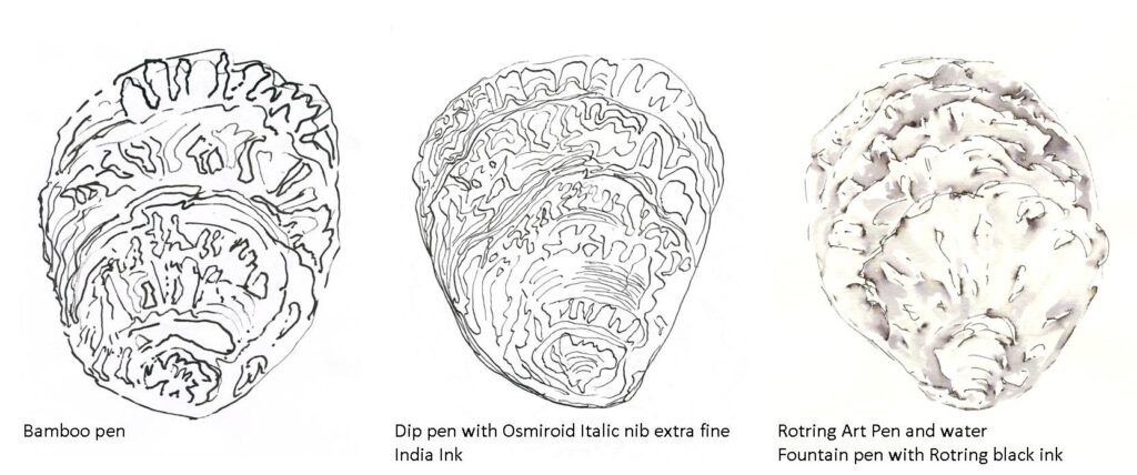
Dip pen, twig or reed pen plus any other pen with water based ink that you have but not solvent based marker pens as these will bleed through the paper.
Watercolour brushes; round and if you have one; a rigger, an oriental, a flat brush (all can make different marks)
Watercolours
Deep welled palette for washes.
Cartridge paper or other smooth heavy weight paper
Watercolour paper
Masking or Magic tape.
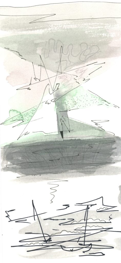
Pen, brush and ink care.
There are a few guidelines you should follow when using a pen or brush with ink and they are especially important when using waterproof inks because of the shellac or an acrylic binder they contain. These binders dry on nibs and brushes and cannot be removed once dry.
ALWAYS
Dip your pen in water then wipe with a paper towel before dipping in the ink. Touch the side of the nib on the ink jar side to allow excess ink to drip into the container (avoids blots when drawing). Every few strokes clean your nib by swirling in water and wiping again with a paper towel. This keeps the nib clean and prevents dilution of the ink. When you have finished using the pen wash well with water and wipe carefully both outside and inside the nib and clean again till no ink colours the paper towel when it is wiped.
When using a bamboo or other reed pen NEVER leave the pen in water other than dipping in to clean it, as described above. The wood will swell and the pen will crack and be useless.
Use a similar procedure with brushes. Dipping your brush into water before just blotting on some paper towel before dipping in the ink will help to prevent staining and build up of ink. It is just as important to clean your brush at intervals by swirling in water and even more important to blot before dipping into the ink again to prevent diluting the ink, especially if using a large brush. After you have finished using your brush swirl in water and clean under the tap gently with soap before rinsing and allowing to dry.
Ink When not using your ink even for a tea break put the lid on; it will evaporate over time. Store diluted ink in a small lidded container; individual jam or marmalade jars are ideal for this.
Examples of some of the artists referenced can be found on my “Ink and Wash” Pinterest board at
https://www.pinterest.co.uk/jhall1282/ink-and-wash/
Van Gogh was a master at mark making with a reed pen and I am going to suggest you make some patterns of marks that suggest different kinds of vegetation as in his drawing “A Garden with Flowers” Arles 1888.
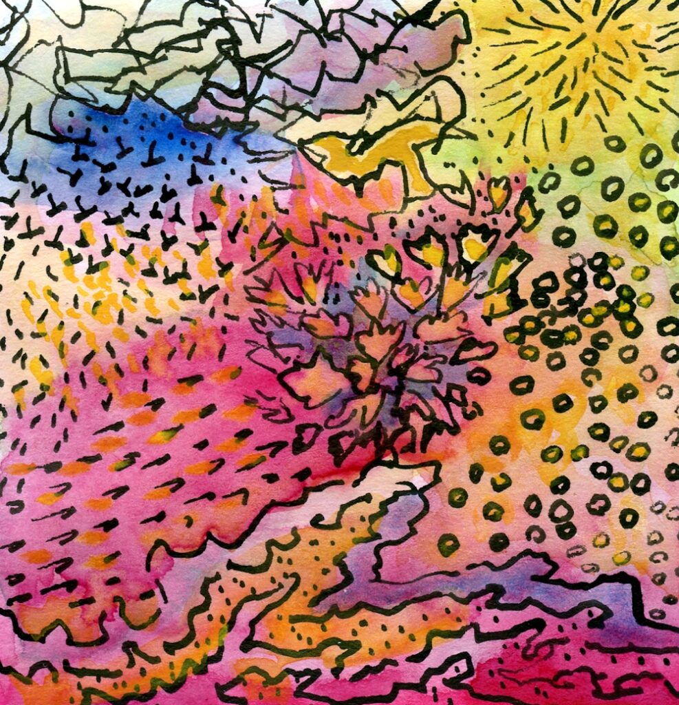
Warm up exercises
1.Van Gogh’s reed pen drawings of wheat fields and waves wonderfully suggest movement so try to create your own marks to suggest the way grasses or waves are blown by the wind. Any sort of dip pen will work for this but do try a bamboo (reed) pen or twig if you have one.
2. After that try series of tiny circles, ovals, lines of little dashes, curls and spirals or just random marks letting your pen move swiftly over the paper and letting it touch the paper briefly and at the same time changing direction as you go. Invent your own marks to suggest textures or massed leaves/plants.
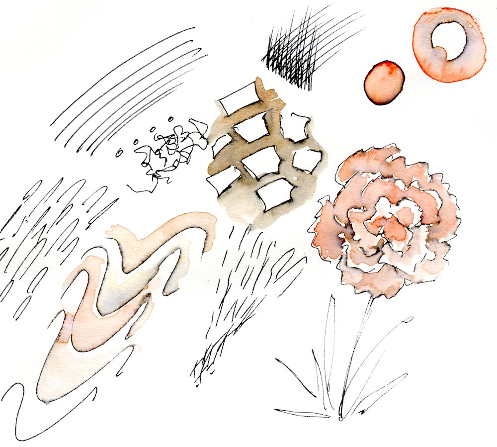
3. Mix up some dilute ink or some watercolour washes and test their strength before making some more marks and lines suggesting a piece of driftwood or tree bark. Make two small drawings in this way then add some wash to one before the ink has dried. Let the other dry completely before adding a wash with a medium round brush depending on the area of wash. Medium size 5 to 8.
Use a smaller brush for small areas and larger one if working at a large scale.
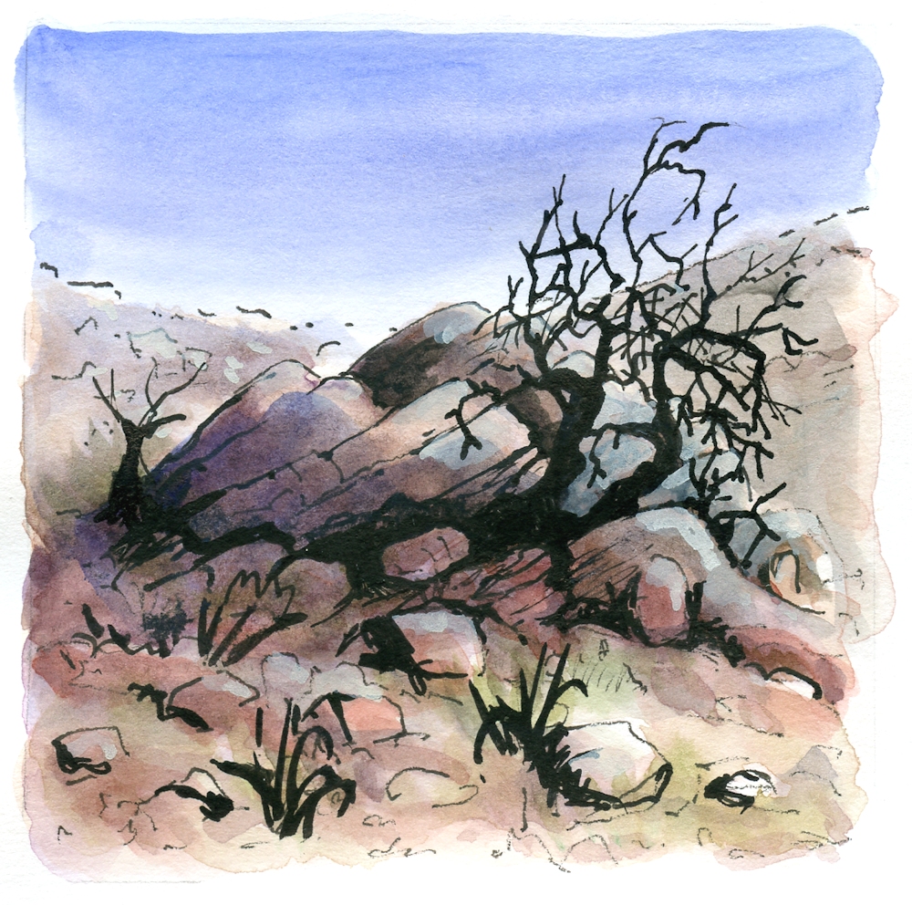
4. Make a watercolour wash and make ink marks into the wash while it is still damp. Leave to dry then add further marks and lines.
5. Have fun with lines from your pen; try making slow smooth lines, try making rapidly drawn lines, try making lines that start and stop hesitantly, leaving the pen in contact with the paper while you change direction and move on.
6. See what happens if you spritz water at some India Ink before it dries.
The Drawing Challenge
7. The challenge now is to produce a drawing with ink and washes of dilute ink and/or watercolour. Choose a natural form with an abundance of marks to inspire you. Your drawing can be as abstract or representational as you like but it should have some sort of centre of interest. A stone or weathered oyster shell with loads of pits, a piece of driftwood, a tree bark encrusted with lichen, a tree trunk with gnarled exposed roots or a frilly kale leaf would all be excellent subjects.
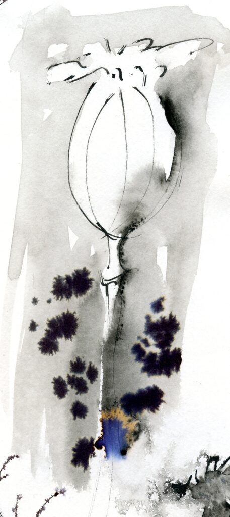
You could even make a large drawing of a small object like a walnut shell.
Think about whether you want to let your ink dry before adding a wash of ink or watercolour. Think about the lightest areas you do not wish to cover with wash and either reserve them by painting round them or apply a little candle wax to act as a resist to the wash. When this has dried you may feel you wish to strengthen certain lines or add more marks till your drawing is finished. You can add marks and washes in layers but proceed with caution as once added marks cannot be taken away. Watercolour washes can however be lifted out but only successfully on watercolour paper, as cartridge paper has a much more delicate surface which is easily damaged.
How do you feel about using a brush to make some of the marks and lines for a second drawing?
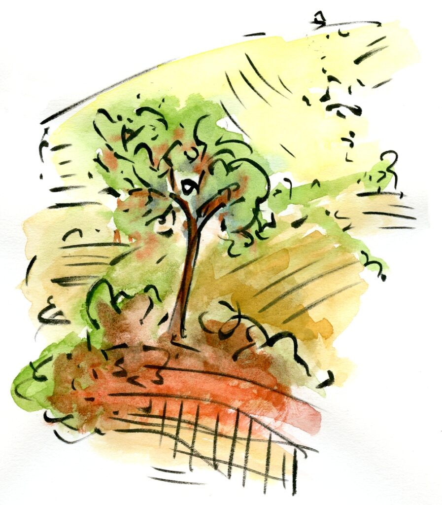
Again practice mark making on a separate piece of paper and get used to the amount of ink to load on your brush. Try a round brush, making thicker lines by pressing down more and thinner lines by lightly touching the paper. As well as small circular marks with the brush you can also make ’printed’ marks by laying the side of the brush directly on the paper; pressure on the heel(part furthest from the tip) of the brush as you remove the brush from the paper will make the mark broader there.
If you have time try other brushes, flat brushes, worn out brushes, rigger brushes and oriental brushes are all great for making different lines and marks.
I would like you to send your favourite “experimental sheet” and one finished drawing for the review session, with details of the ink and colours used and a little about your reference material.
Artists for reference
https://www.pinterest.co.uk/jhall1282/ink-and-wash/
Van Gogh; especially mark making
Samuel Palmer; line and markmaking
Ch’ng Kiah Kiean; line, wash, marks
Wyona Legg; ink and pastel
Your Drawings:
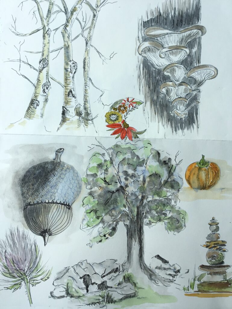
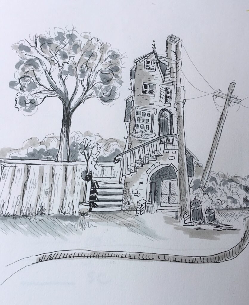
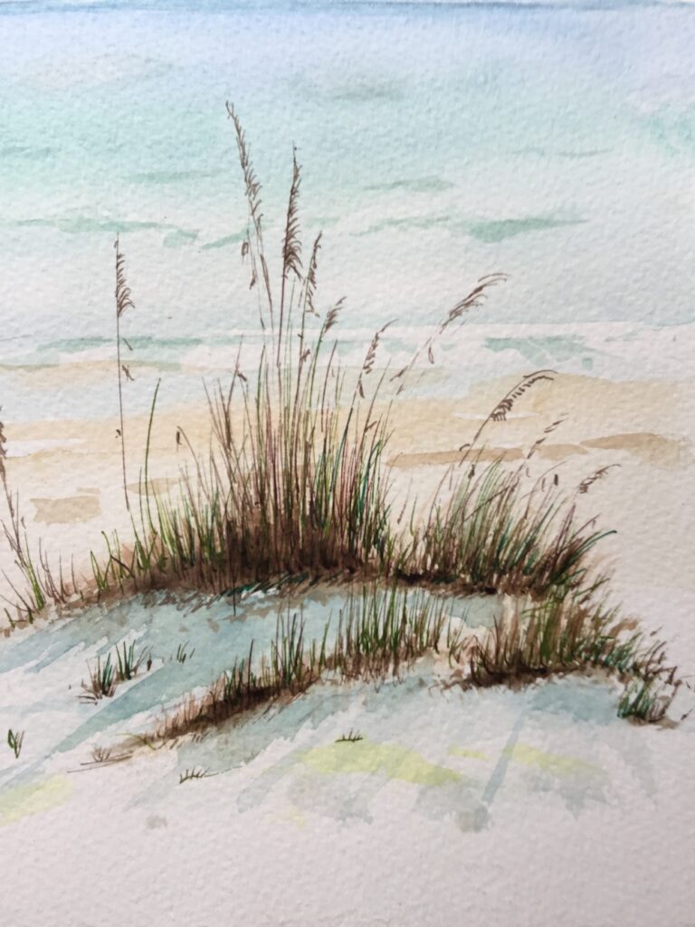
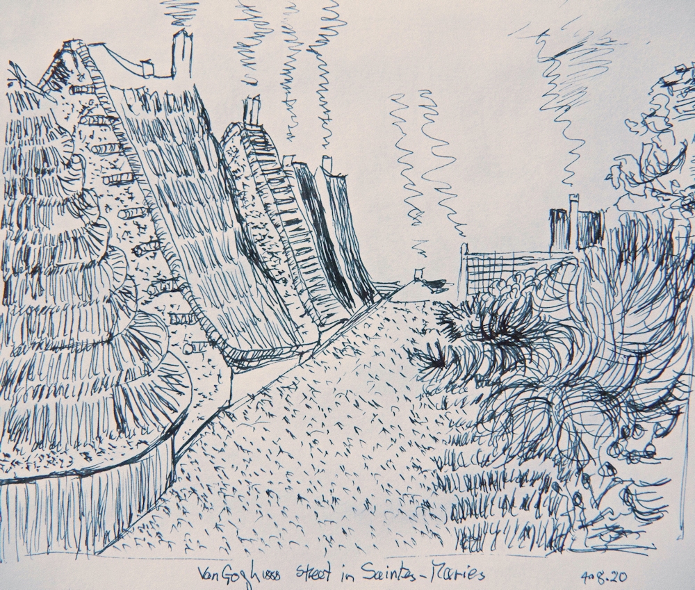
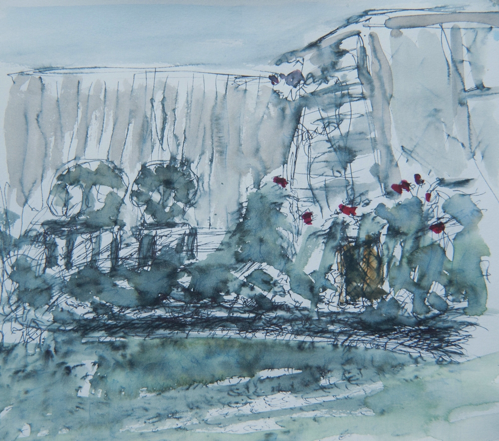
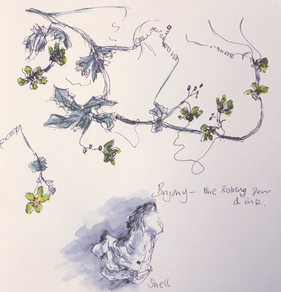
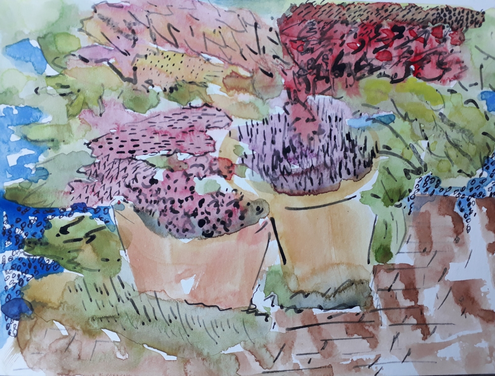
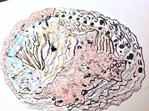
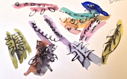
It is a great combination of ink and watercolour.
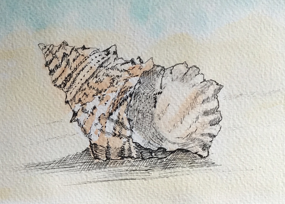
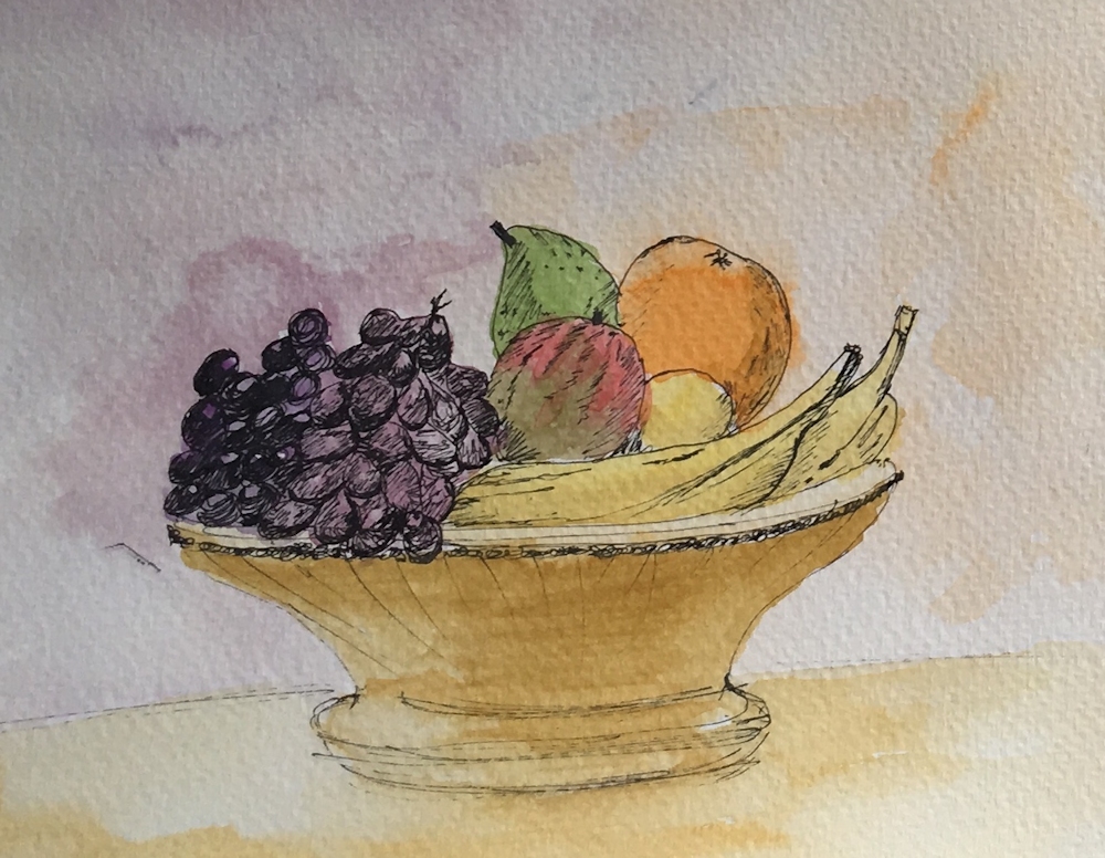
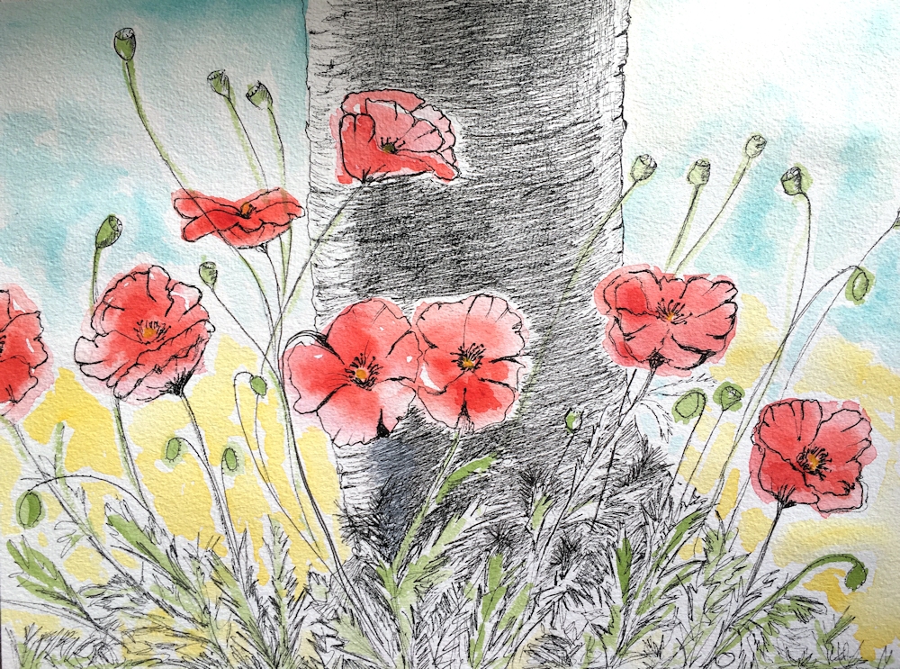
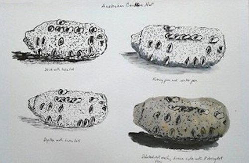
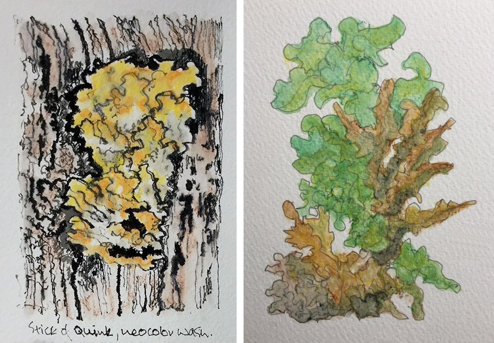
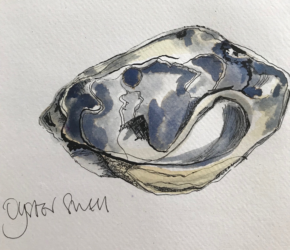
The line and wash complement each other beautifully.
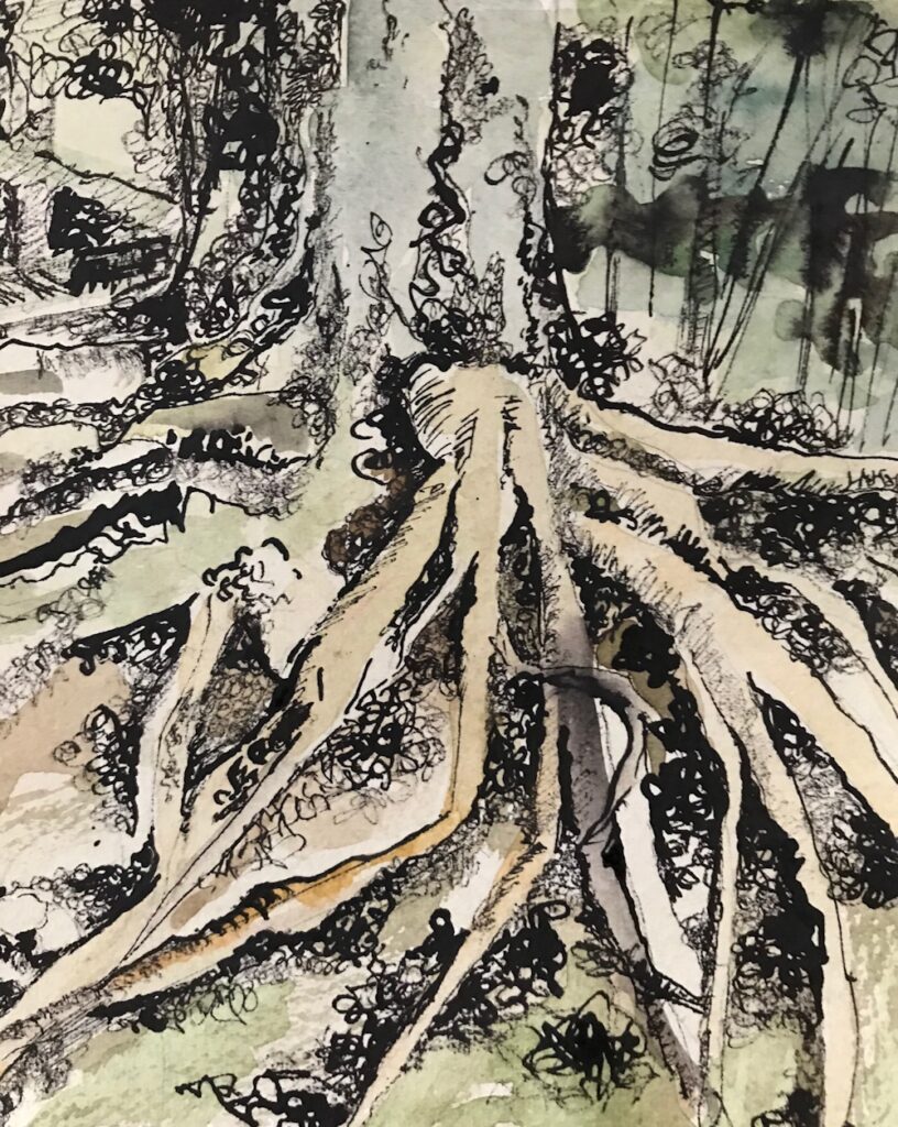
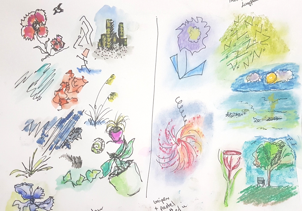
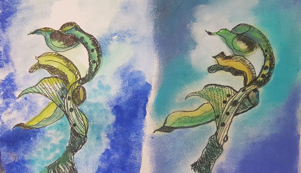
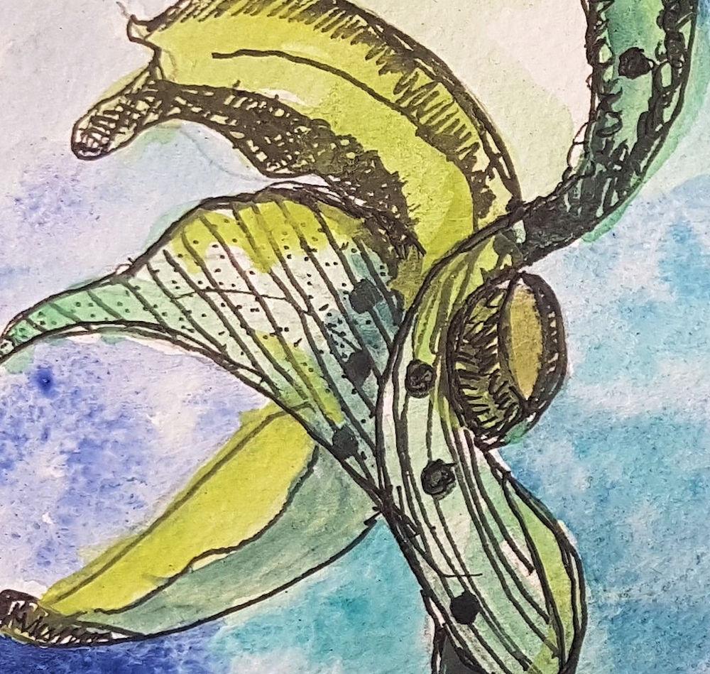
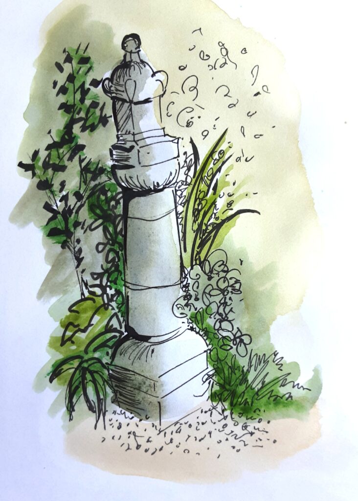
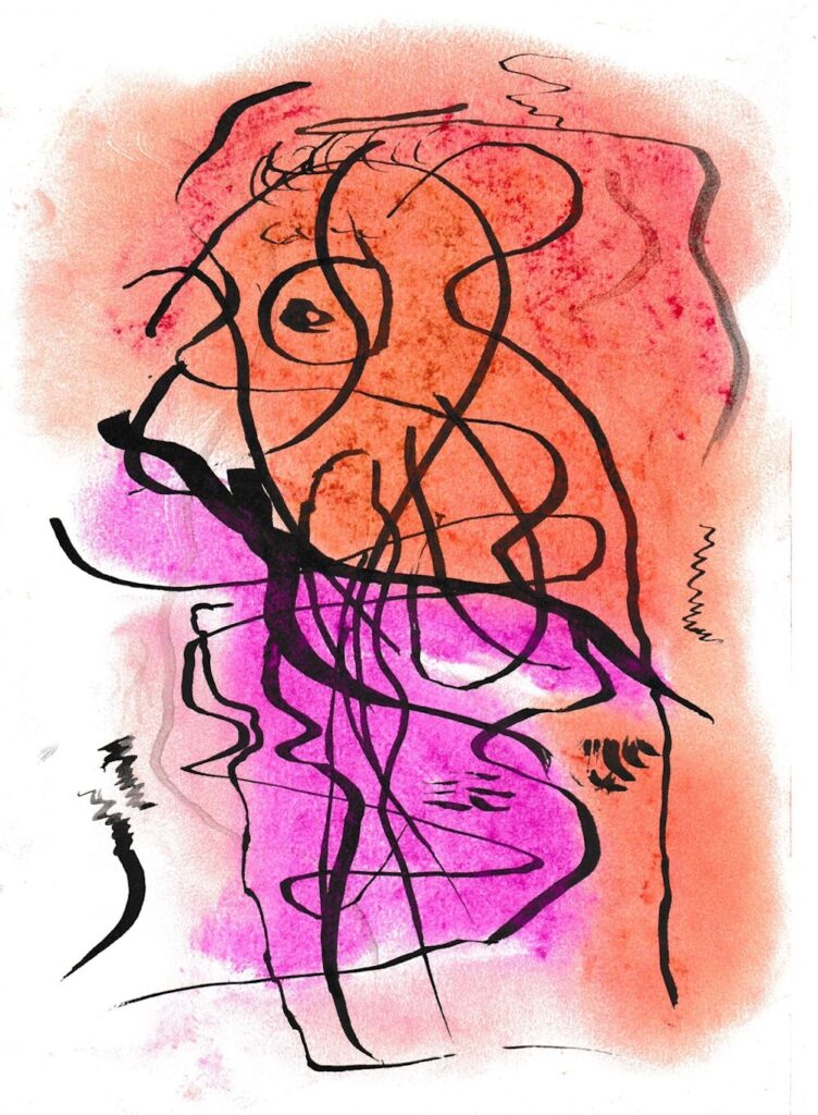
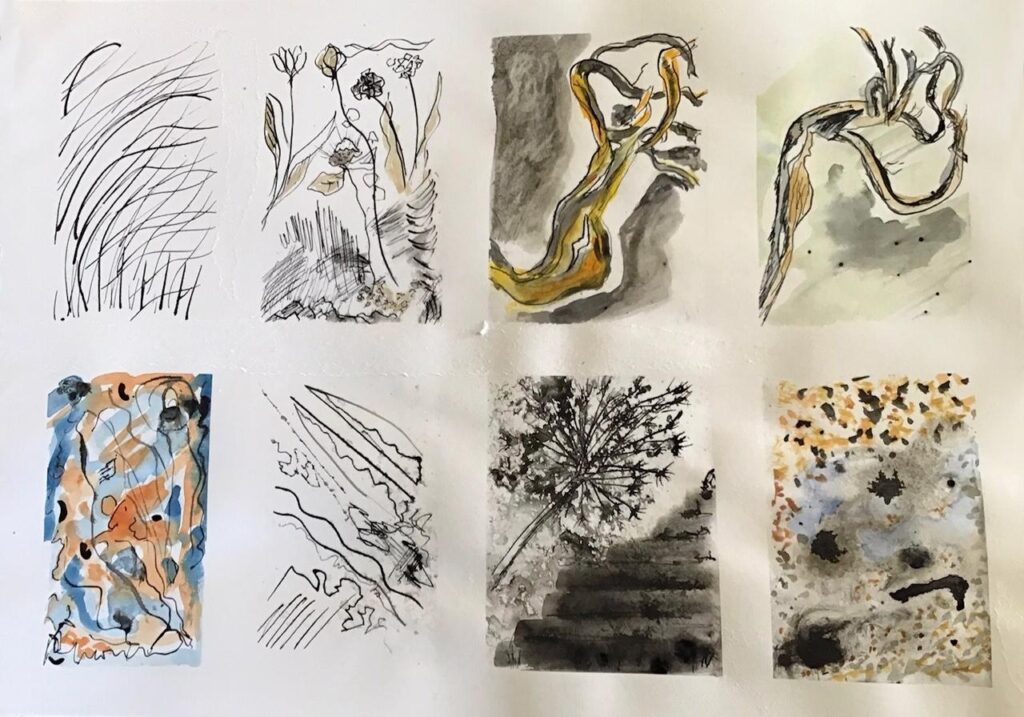
Exercises Left to right: top row; 1 cola pen and Indian ink 2 dip pen Indian ink watercolour
3 dip pen, Indian ink and wash when wet 4 dip pen, Indian ink.Let dry then watercolour
Bottom row; 5 watercolour wash + India ink whilst wet , when dry Rotring and brush
6 Indian ink with dip pen, rotring random lines 7 accidental ink spots brushed out with toothbrush and then dip pen to create steps. Allium sketch in India ink and spritzed when wet
8 accidental spots, spritzed. To me looked like a puddle on gravel path, watercolour and chalk
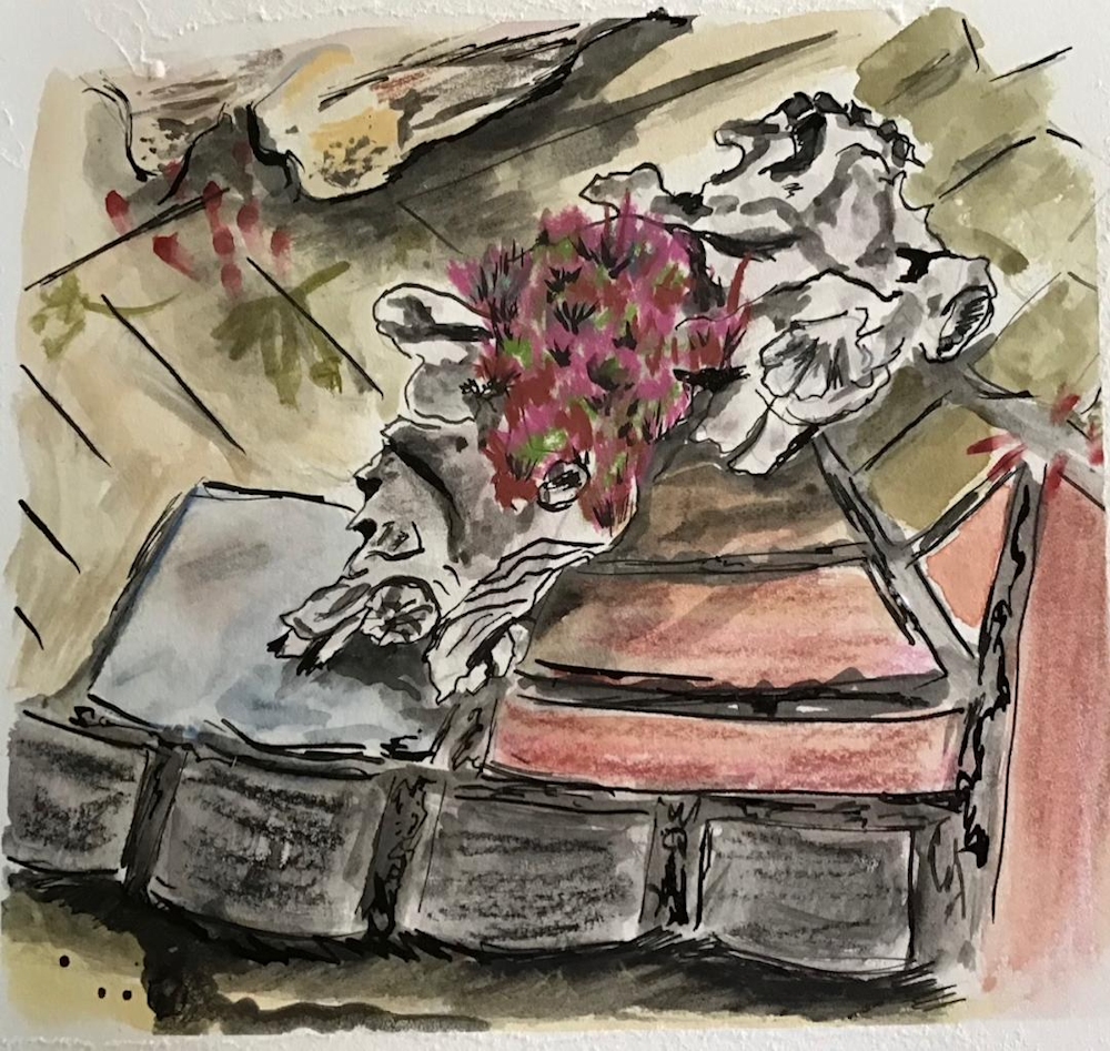
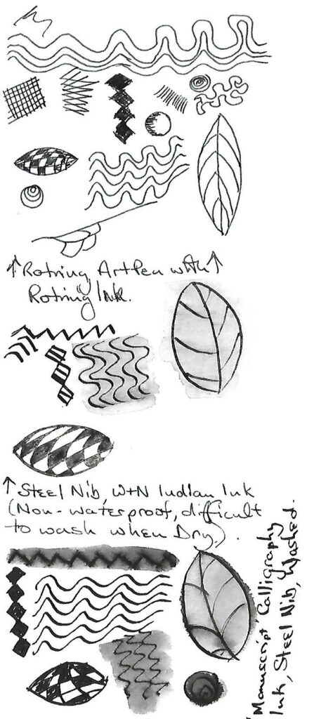
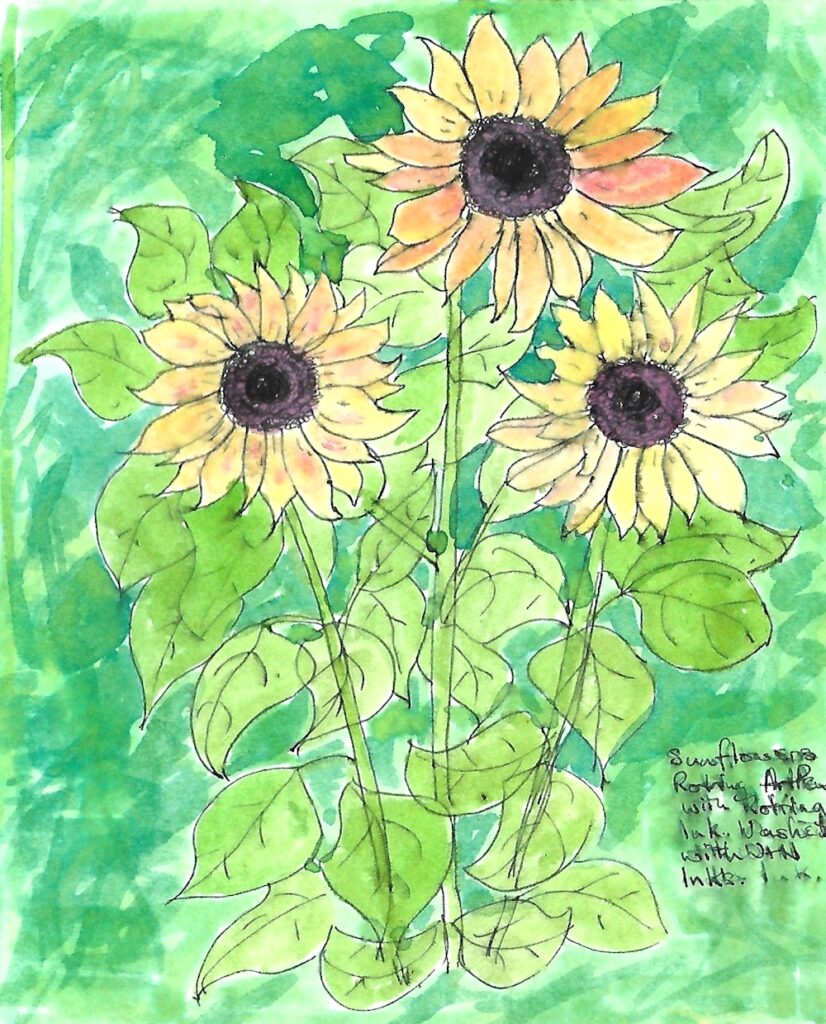
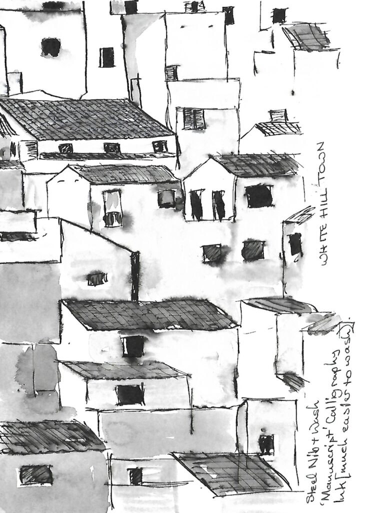
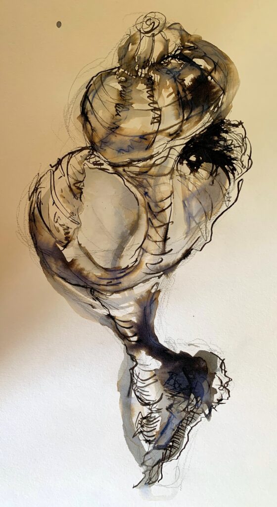
Cast Shadows 4: The Wider Landscape and Cloud Cover
July 12, 2020
This week we are going to consider the wider landscape, especially the effects of partial cloud cover and the shadows of passing clouds.
Except for the pastel painting above the illustrations are photographs taken in Yorkshire, where the hills are such that cloud shapes can often be seen as shadows on the hills or gaps in the cloud cover bringing patches of extreme brightness to the landscape. There are also more subtle cloud shaded areas where the clouds are not visible as whole shapes with clearly defined edges, but their shadows make their presence visible as dark grounds in the distant, middle or foregrounds.

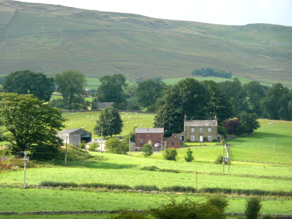
Images of works by the landscape artists referenced can be found added to my Cast Shadows Pinterest Board at
https://www.pinterest.co.uk/jhall1282/cast-shadows/
When there is wind and patchy cloud cover this makes things hard for the en plein air painter as the tones can vary in seconds and changes in tone can even mislead the eye into failing to read the topology of the landscape correctly. This should never deter you from working outside and gaining that firsthand experience of the landscape. It does mean that whether sketching as a preparation for painting, or painting outside, you have to watch the landscape and decide swiftly on where the shadow areas are and stay with this decision throughout your study. Cloud shadows can change far more rapidly than shadows caused by the elevation of the sun at different times of day.
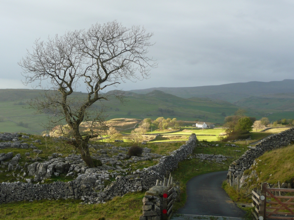
Starting with Caspar David Friedrich’s painting of 1810, Landscape in the Reisenberg we see a small low lying part of the landscape with a hamlet and church bathed in an island of light and dwarfed by the dark mountains behind in a similar same way that my photograph of Winskill Farm is lit by a gap in the cloud cover in the Yorkshire Dales just a few miles from Settle. Do look at the post referenced, scroll down till you get to the image of Friedrich’s painting and read about our reaction of awe when observing dramatic scenery on a large scale, of particular interest to those of you excited by exploring the psychology of art forms.
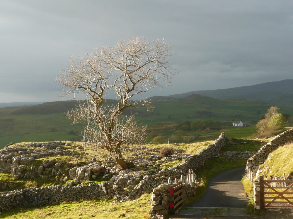
Two contemporary artists I have referenced are James Naughton: Evening Glow in the Lake District where again pools of light are surrounded by the shadows of cloud cover on the land, and Jenny Aitken. Jenny Aitken’s: Showers and Sun, Derbyshire was a prize winning work in the Artists and Illustrators Artists of the year competition 2012 and I did see this work at the accompanying show. Here we see a swathe of middle ground in sunlight with a dark foreground and suggested shapes of the cloud cover in the distance.
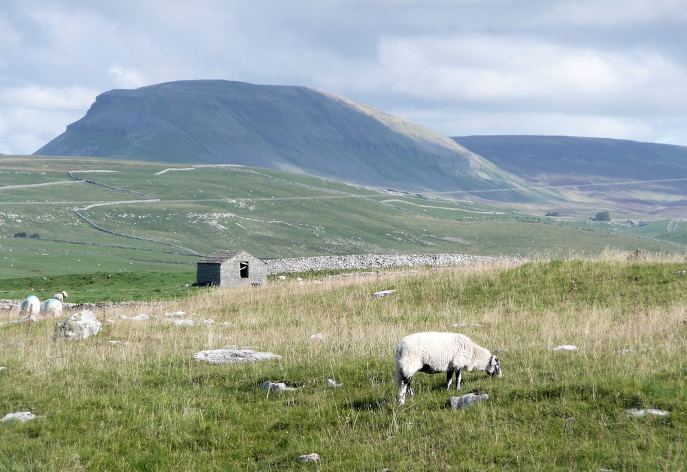
Another artist who often features the shadows of clouds on the land is Oliver Akers Douglas and very often the whole shapes of clouds are evident as darker and more muted versions of the underlying hues.
Going back again in time an American artist Edgar Payne produced compositions from the Grand Canyon and many mountainous regions, and while the cast shadows in his works were very often from the rock formations he also took great care over depicting the prevailing weather and cloud conditions as in Desert Rain. I have learned a great deal about composition from looking at his works.
Lastly do look at the vintage rail travel posters;
1948 Harry Riley: Barmouth North Wales for BR; shadows of clouds extend from sea and on to the sandy beach
1961 Ronald Lampitt for BR : Hamlet in the Yorkshire Dales; blue grey cloud shadows on the distant hills and dark trees against the light in the lower half of the image
Austin Cooper for LNER (London and North East Railway): another Yorkshire dales scene with cast cloud shadows right across the whole composition
Being aware of how many ways clouds affect what we see in the landscape should be helpful in your decision making, especially with regard to tonal values in what are so often rapidly changing situations.
Your paintings;
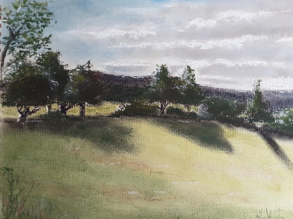
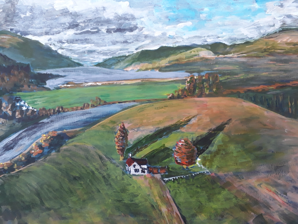
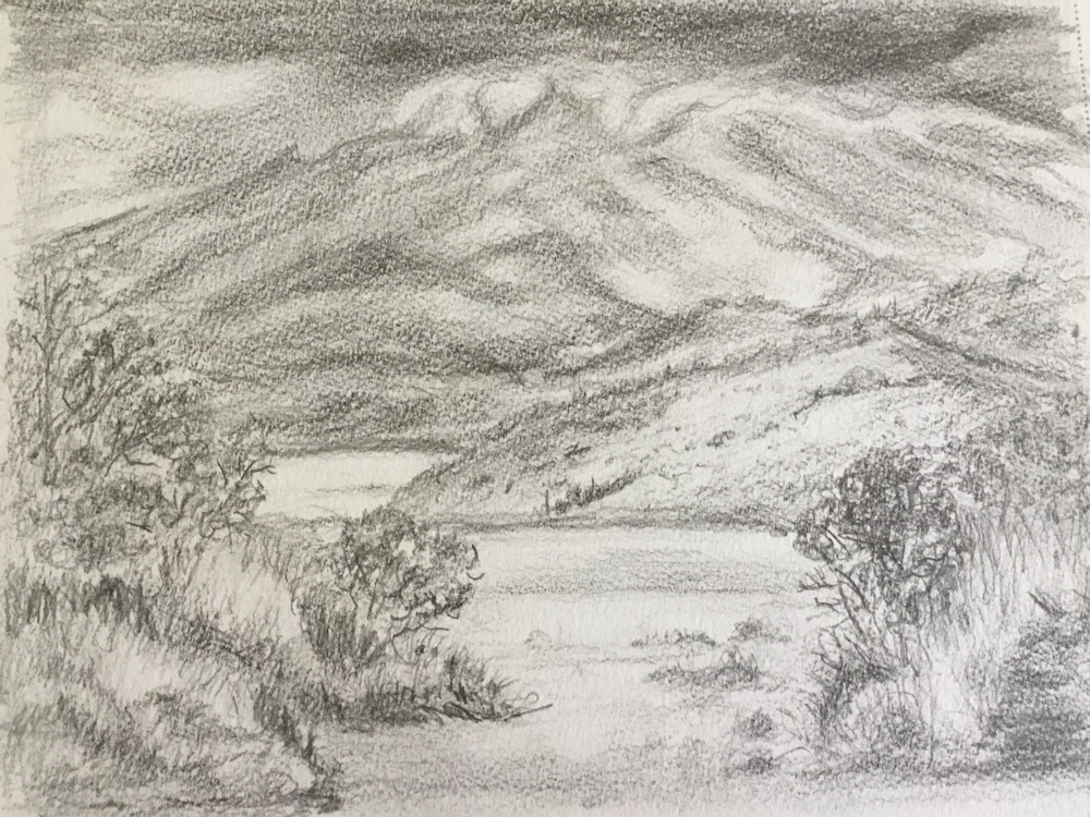
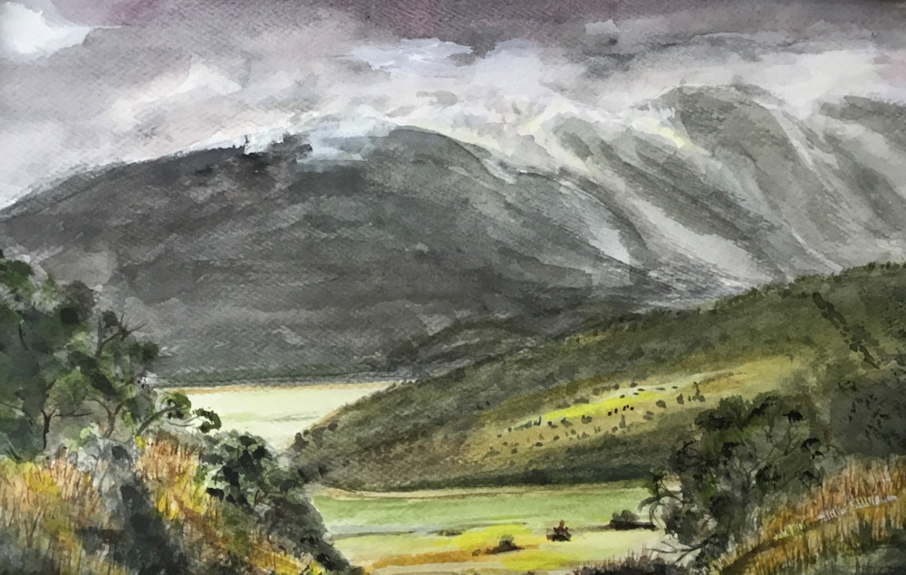
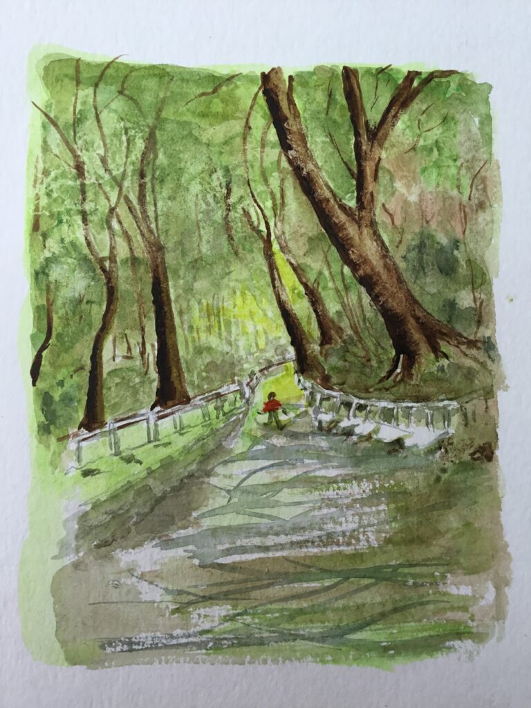
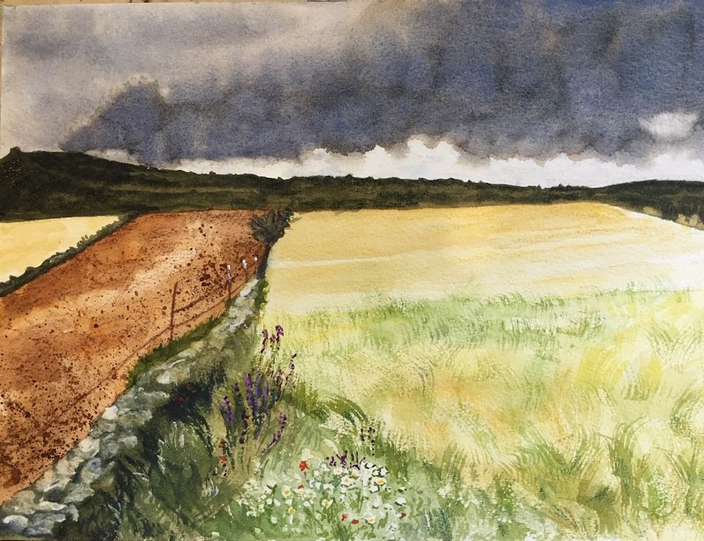
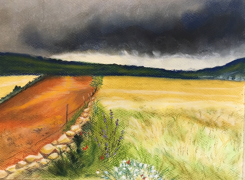
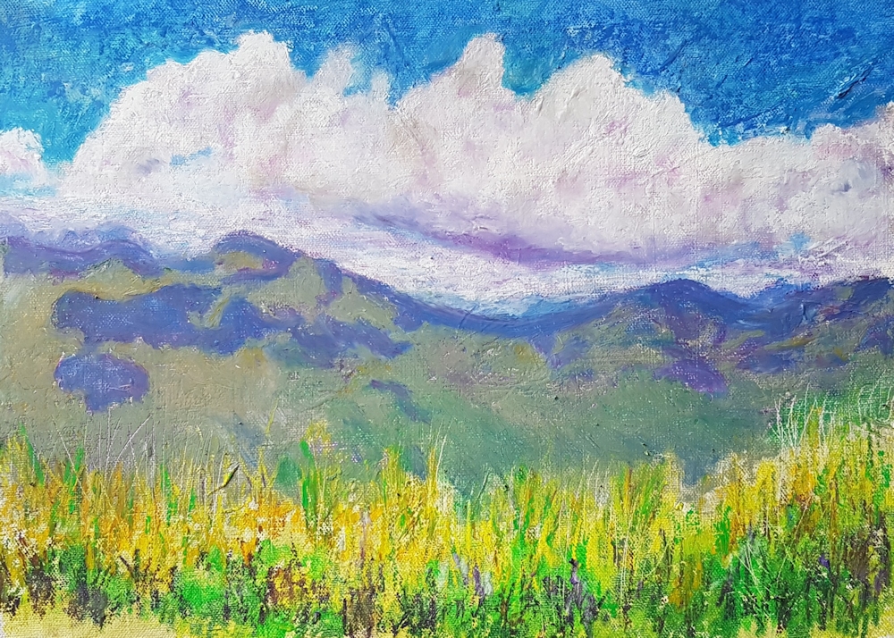
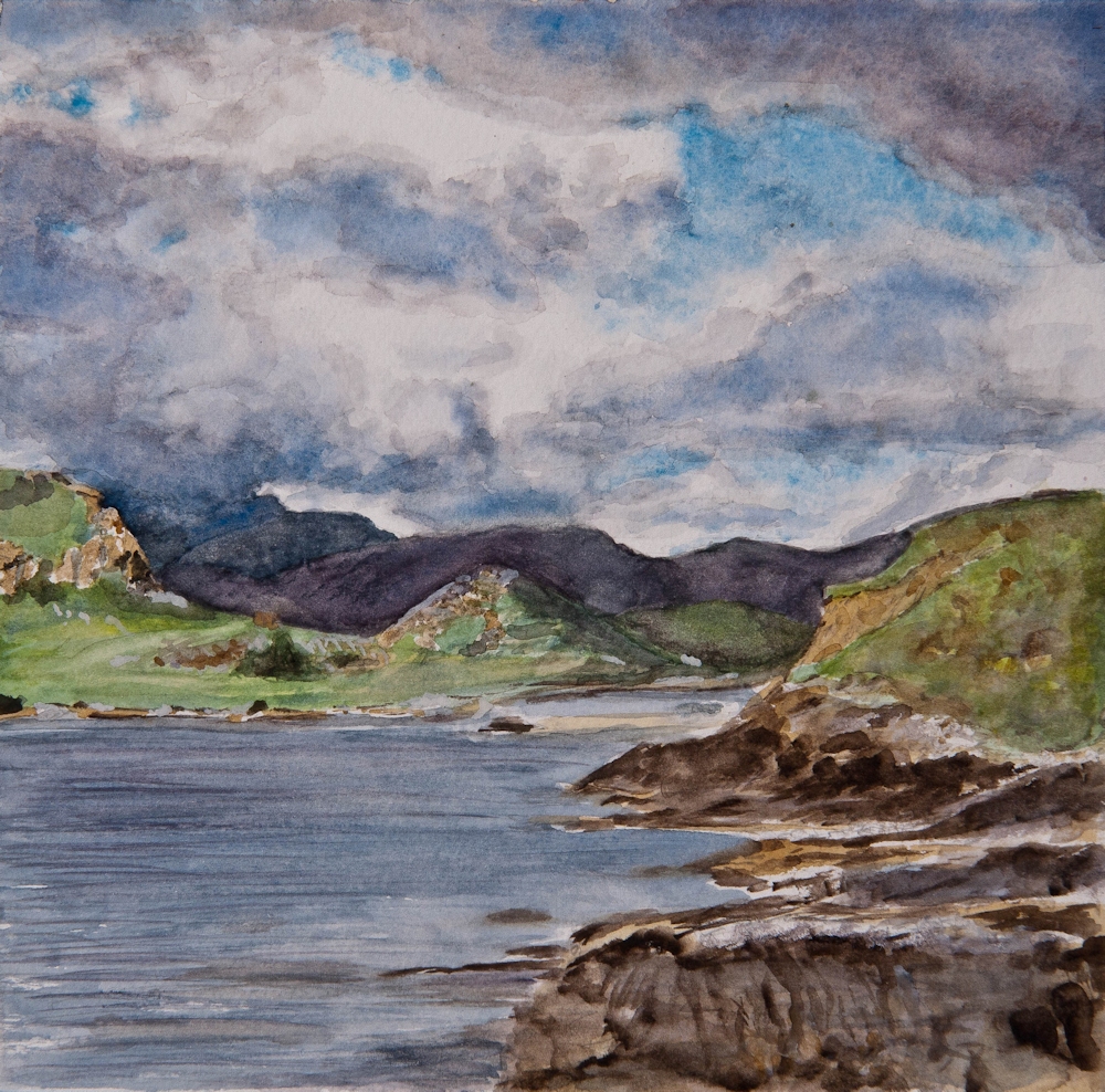
Rippon Vineyards, Otaga District the Crown Range New Zealand
by Elizabeth