Limited palettes 3: Cool or Warm
September 26, 2020

The challenge this week is to work with either a cool palette or a warm palette, still using only three colours.
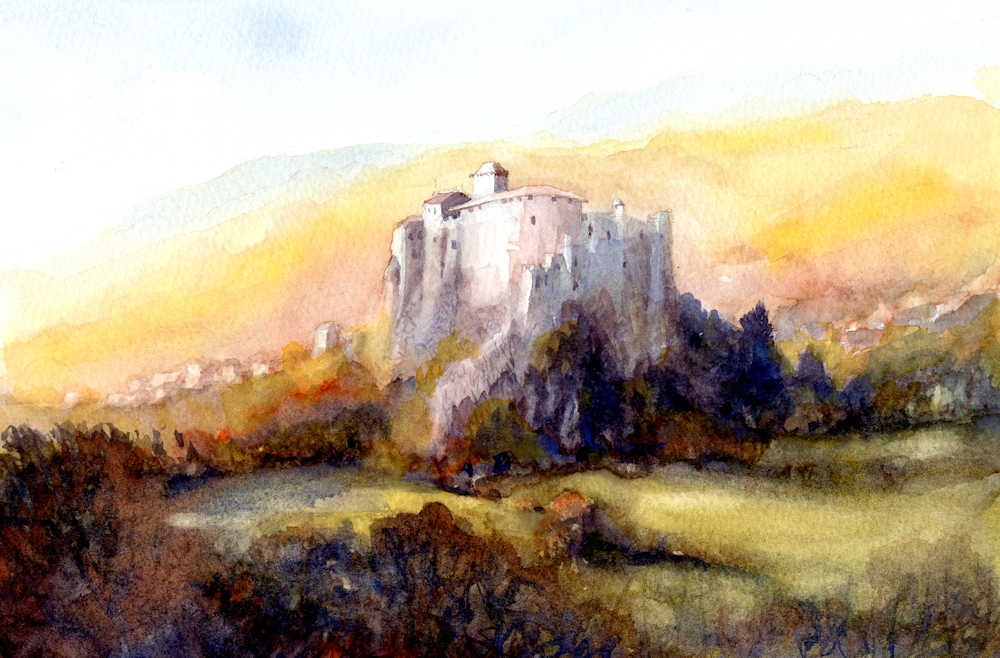
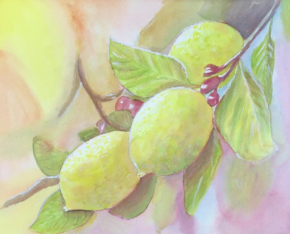
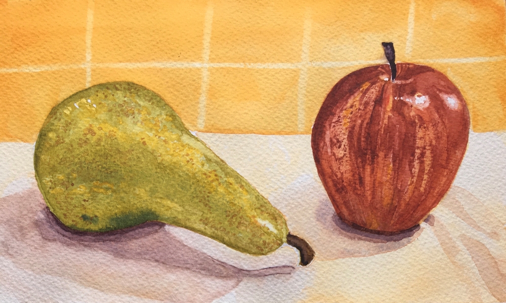
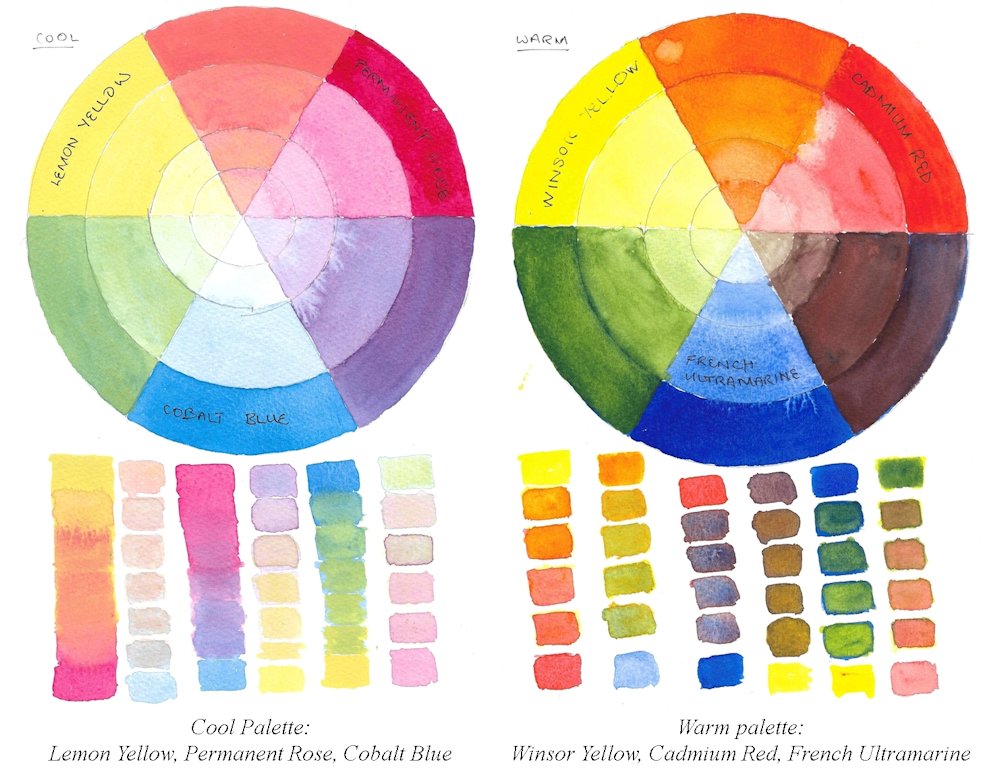
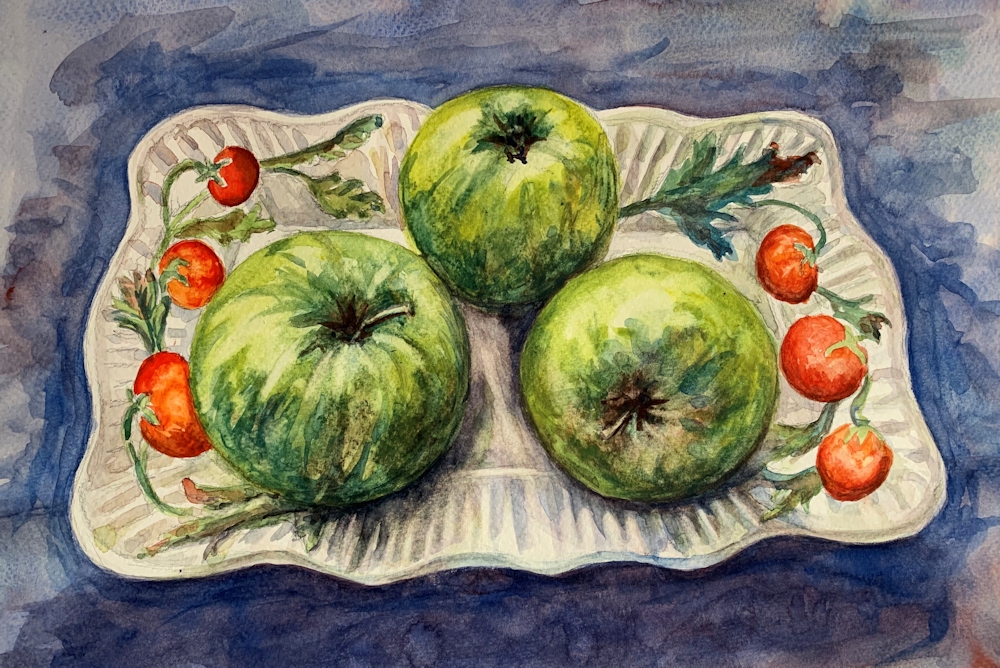
Warm palette: Indian Yellow, Cadmium Red Pale, Ultramarine Blue
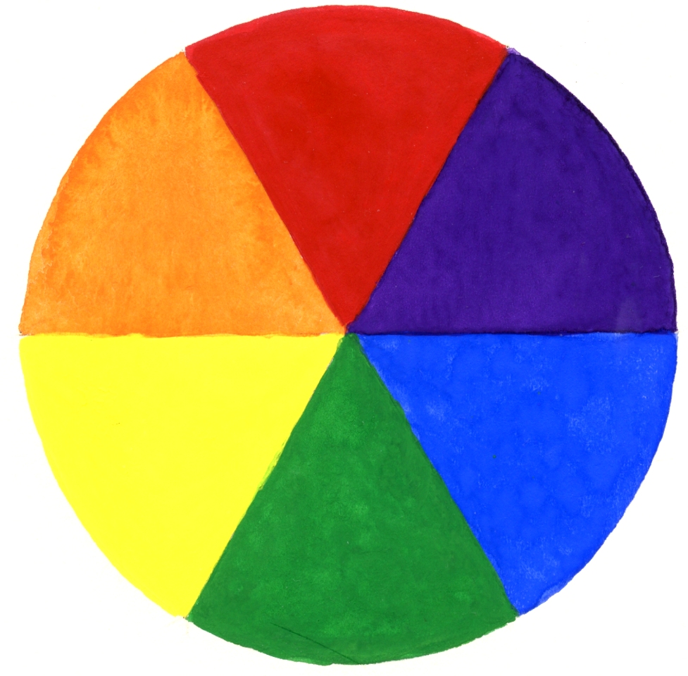
Most people are aware of what constitutes a cool or a warm primary colour but for reference a basic colour wheel is shown below, which used primaries that are neither cool nor warm. These are colours designed to emulate printing colours and in theory you should be able to mix any hue from them.
However in practise, a much wider and richer range of colours can be mixed if you have the following;
A cool red; one that is nearer to purple
e.g. Alizarin Crimson, Permanent Rose
A warm red: one that is nearer to orange
e.g. Cadmium Red Pale, Vermilion, Scarlet Vermilion
A cool yellow; one that is nearer to green
e.g. cadmium lemon, cadmium yellow pale, lemon yellow
A warm yellow; one that is nearer to orange
e.g. cadmium Yellow Deep, Chrome Yellow Deep, Indian Yellow
A warm blue; one that is nearer to purple
e.g. French Ultramarine, Ultramarine red shade, Cobalt blue
A cool blue; one that is nearer to green
e.g. Cerulean Blue, Phthalo Blue, Phthalo Blue Green Shade
The cool palette will consist of a cool red, a cool yellow and a cool blue
The warm palette will consist of a warm red, a warm yellow and a warm blue
Working with only three primaries is still a restricted palette and some colours are difficult to mix with exclusively warm or cool palettes. Purple and violet shades are difficult with both but easier with some cool palettes. The freshest greens can be made with the cool palette and the hottest oranges with the warm palette as you can see from the chart below.
This chart was made with gouache but the result would be very similar for watercolour or acrylic.
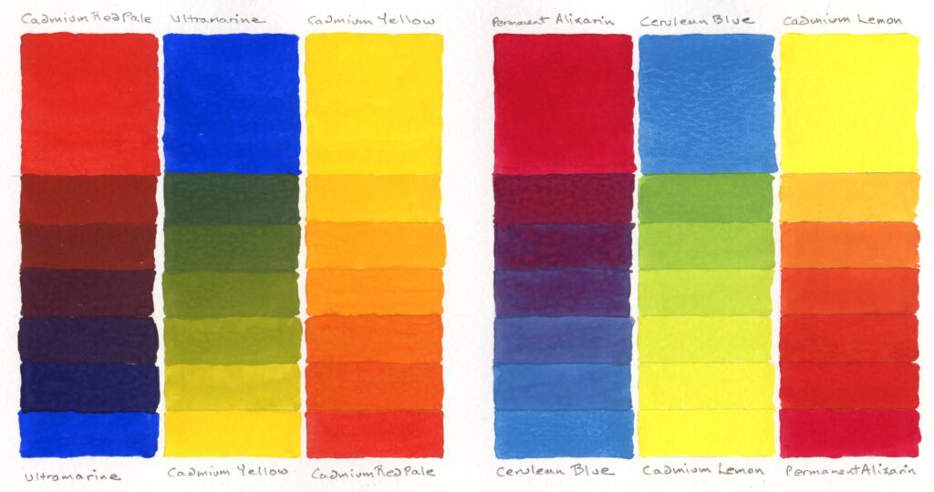
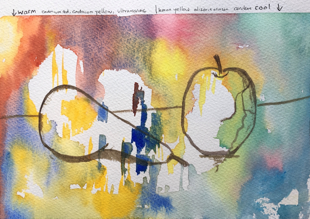
Left: Warm palette; Ultramarine, Cadmium Yellow, Cadmium Red
Right: Cool palette; Cerulean Blue, Cadmium lemon, Permanent Alizarin
Next week we will still work with just three primary pigments but with a mixed palette that includes at least one cool and one warm primary.
Practical
1. Identify which cool and warm primary colours you have and make colour swatches to check them out. The pigments may be different to those I have suggested.
2a. Choose a set of three cool primaries and find what colours you can make with them either by mixing or overlaying them or letting them mingle wet in wet.
2b. Do the same with a set of three warm primaries.
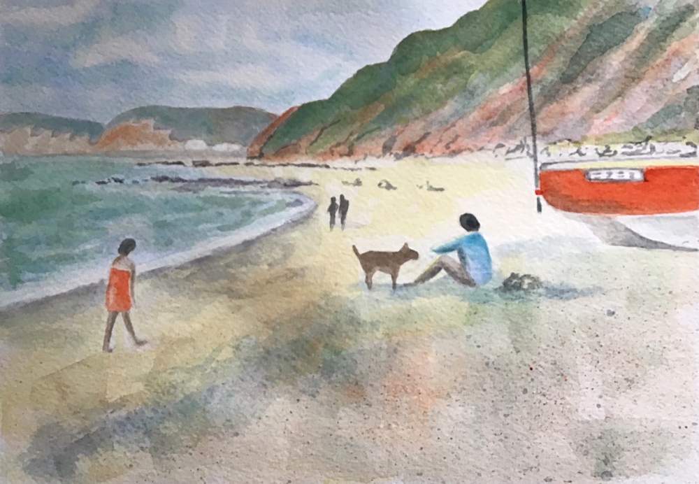
3. Paint a picture, representational or more abstract using only three cool primary colours or three warm primaries. Still life subjects or landscape would be suitable. Hopefully you can find a reference which is a place you have visited or set up your own still life.
Think very carefully whether a warm or cool palette would suit your subject best. Remember that you may use white which will always “cool” all colours. Because it is possible to mix to mix greys and muted colours using both palettes you will be able to make very subtle colours from mixes of even the brightest of pigments. These can be incredibly beautiful.
Try making muted colours and chromatic greys by adding a little of a primary colour to its complementary colour. Complementary colours are opposite each other on the basic colour wheel.
e.g. Mix an orange and add a little of its complementary, blue.
The more blue that is added the duller the orange will become till a grey is achieved. From that point if more blue is added the grey will become a muted blue.
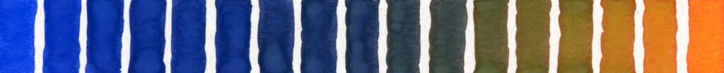
Small increments of blue are added to the orange on the right. About midway between orange and blue a neutral grey can be mixed and on either side hues that are slightly more blue or more orange. These are known as chromatic greys. Toward each end are muted colours which are still recognisably blue or orange but not as pure. These colours are often referred to as desaturated in various degrees. All pure hues can be desaturated by adding their complementary colour.
If, as above the mixes are very dark and it is difficult to see whether they (in this case) are slightly more orange or slightly more blue this will become evident by diluting the mix with water or by adding white.
I have tried to illustrate the differences in using a cool and warm palette in the choice of works for reference on this week’s Pinterest Board. The link is below and the sections called Cool Palettes and Warm Palettes are the ones to look at. The paintings all have either a cool palette or a warm palette feel to them and could be interpreted in that way.
https://www.pinterest.co.uk/jhall1282/limited-palettes/
4. If you have time it would be a real challenge to make a similar painting to your first using the alternative palette that you chose for your colour mixing at 2.
Your Paintings:
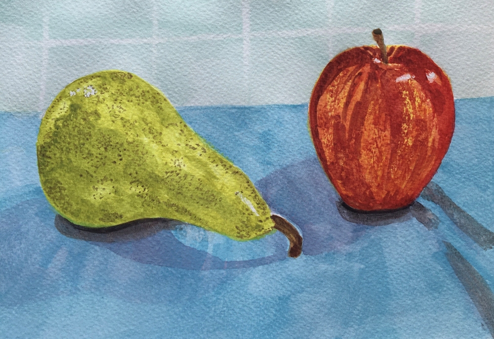
Cool palette: Lemon Yellow, Alizarin Crimson, Cerulean Blue
Warm palette: Cadmium yellow, Vermilion, Ultramarine blue
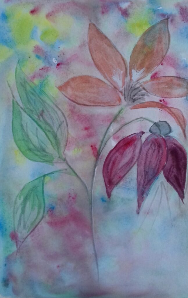
Lemon Yellow, Crimson, Phthalocyanine Blue
Left warm: Cadmium yellow, Cadmium Red, Ultramarine Blue
Right cool: Lemon Yellow, Alizarin Crimson, Cerulean Blue
Warm palette: Cadmium Yellow, Cadmium Red, Ultramarine Blue
Cool palette: Lemon Yellow, Alizarin Crimson, Cerulean Blue

Cool palette: Lemon Yellow, Alizarin Crimson, Cerulean Blue

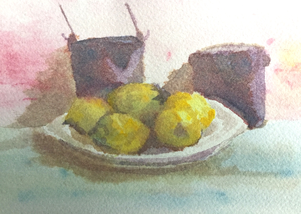
Warm palette: Medium Yellow, Scarlet, Ultramarine Blue
Cadmium lemon, Alizarin Crimson, Cerulean Blue Hue

Cadmium Yellow Medium, Cadmium Red Pale, Ultramarine blue
Warm palette: Cadmium Yellow, Cadmium Red, Ultramarine Blue

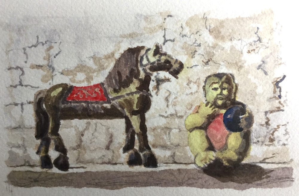
Design inspired by a woodcut.
White of the paper is reserved and the grays are the only mixed colours.

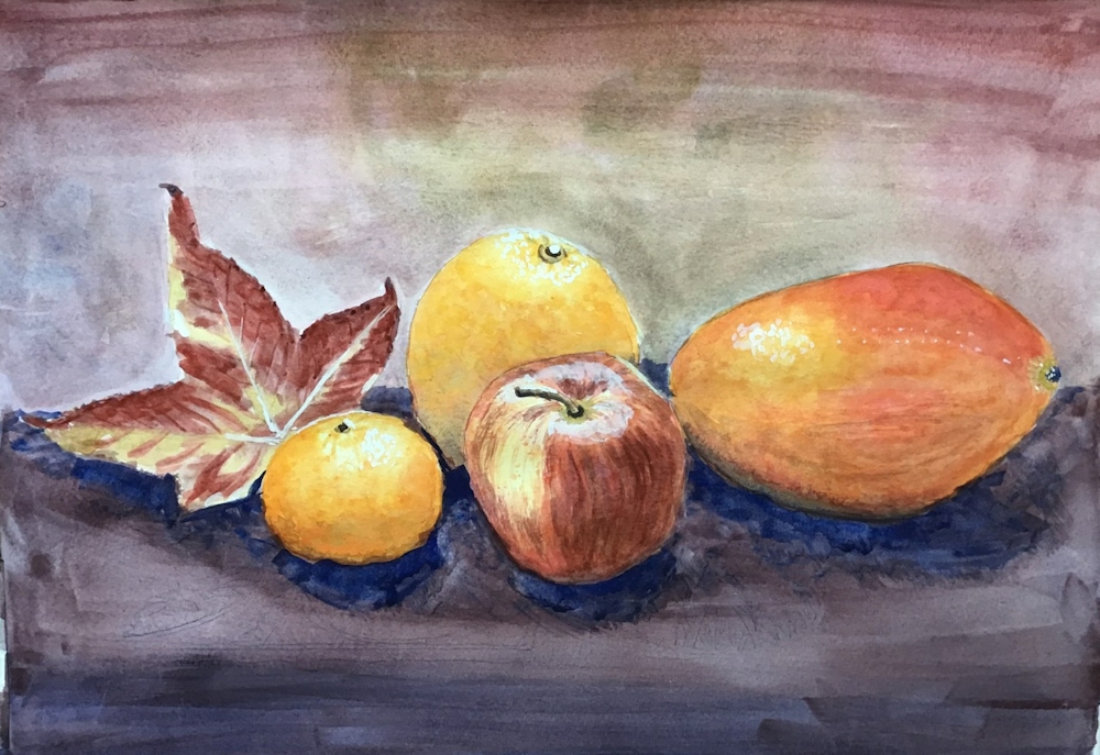
Warm palette: Cadmium Yellow Medium, Napthol Red light, French Ultramarine Blue
America 2020 notes from Malcolm
The composition was fun, based on the Golden Ratio and “no two intervals the same”. So too was the physicality – “mad artist attacks easel”.
I first laid down a complete underpainting of yellow-orange. All of the darks are simply red dulled by blue, avoiding the purple side to preserve the sense of heat. There are a few dark greens and a few darker triple mixes. I couldn’t resist some tongues of pure red, and got the toothbrush out for yellow and orange sparks. It was all incredibly quick and hugely enjoyable.

Warm palette: Cadmium Yellow, Cadmium Red, Ultramarine Blue
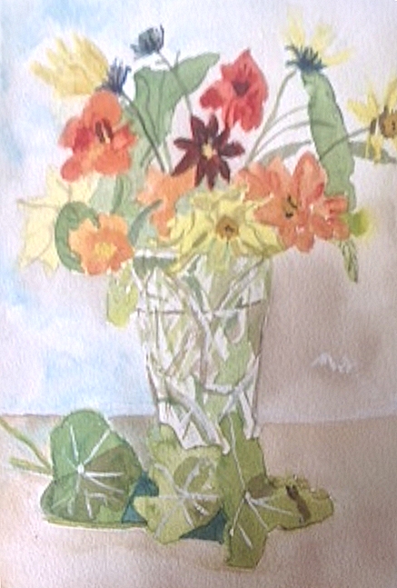
Cool palette: Lemon Yellow, Alizarin Crimson, Cerulean Blue

Cool palette: Yellow Light (Sennelier),Phthalo Turquoise (Sennelier)
Permanent Rose (Winsor and Newton)
Cool palette: Lemon Yellow, Permanent Alizarin Crimson, Cerulean Blue
Cool palette: Lemon Yellow, Permanent Alizarin Crimson, Cerulean Blue
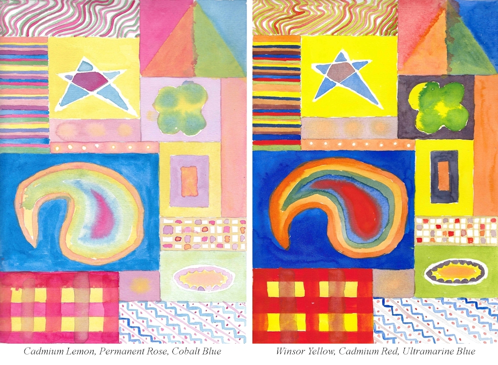
Note on Angela’s palettes;
Lemon yellow and Winsor yellow are not sufficiently different to cause much shift in the temperature of these palettes, however the Cobalt blue used in the left palette is significantly cooler than the ultramarine used on the left. Usually cobalt blue is a warm blue but does vary.
Here fresher green mixes are produced on the left in addition to good purple mixes which should definitely be possible with cobalt and permanent rose and is why in flower painting if a pan of purple or violet is not available, cobalt blue and permanent rose or ultramarine and permanent rose can make successful mixes.
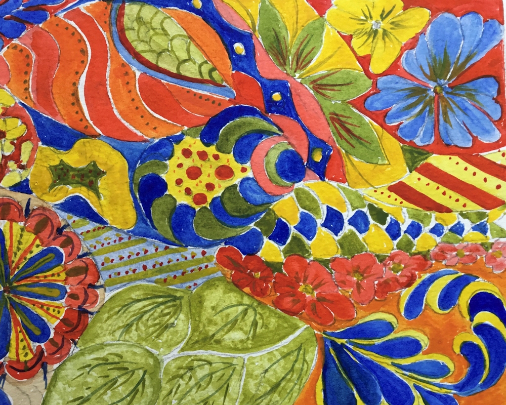
The difficulties of mixing fairly pure purple or violet hues from the warm primaries cadmium red and Ultramarine blue can be clearly seen, in the palette on the right above and in Angela’s abstract studies below.
In the warmer study on the on the right below some fairly fresh looking greens have been mixed. This would not have been possible with a warm yellow like; Cadmium Yellow Deep, Indian Yellow or Gamboge which are much nearer to orange in hue and would have only allowed rather duller greens.

Warm palette: Cadmium Yellow, Cadmium red pale, Cobalt blue

Cool palette: Lemon Yellow, Alizarin Crimson, Winsor Blue

Almost cool palette: Cadmium Yellow Medium,
Alizarin Crimson, Phthalo Blue Green Shade

Almost warm palette: Cadmium Yellow Light,
Cadmium Red Pale, Ultramarine Blue
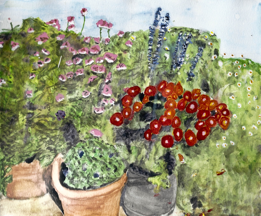
Indian Yellow, Cadmium Red, Cobalt Blue
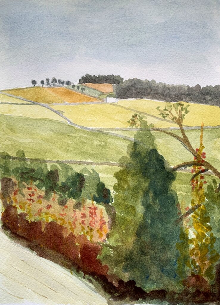
Lemon Yellow, Permanent Red Medium, Ultramarine blue