Lights in the Sky; Lights from the Land; Street and City
November 3, 2020
This week we’ll consider street lights and other urban lights. The principles are exactly the same as last week; huge tonal differences between the light source and its surroundings.
Last week you were invited to make a very representational painting or to use your imagination to invent a moonlit scene. This week you may consider a representational approach or look at the abstract patterns made by traffic and street lighting which would work very well in pastel on dark papers. A few ideas for working in pastel or watercolour are outlined below.
If working in pastel or opaque watercolour you may like to consider working on a dark or mid toned paper. Often street lights are on well before the light fails completely and in this case a mid toned paper may be useful enabling you to easily make some areas lighter and others darker, perhaps using the paper as one of the tones/colours in your painting.

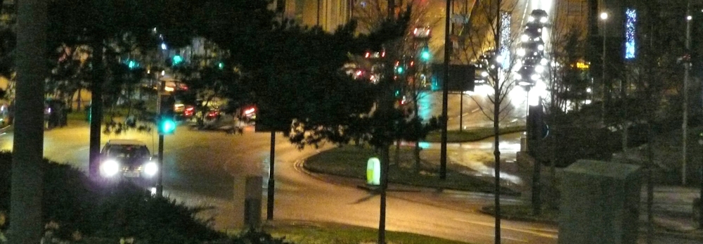
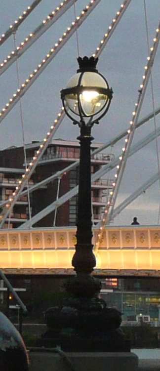
This photo could be interpreted as an abstract pattern of lights and dark.
When using pastel and a very dark blue paper, like midnight blue or even indigo, black will make that even darker for the very deepest tones but use it sparingly. As last week you may need to place your shapes by working with a mid-toned pastel pencil before blocking them in and reserve your palest pastels for the light sources; light from windows, street lamps etc.
If you are working in watercolour plan out your composition so that you can either reserve the lightest and white areas by painting around them or by using masking fluid. Remember not to apply your washes till the masking is absolutely dry. Then work as you would usually working first the pale areas, then the middle and lastly the darkest washes. Your palest washes may be washed over pretty much the whole of your paper, lending unity to subsequent washes and you may like to drop in mid tone colours in some areas at this stage.
Do look at your reference carefully as there may be areas of reflected light and sharp edged shadows.
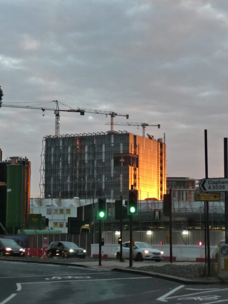
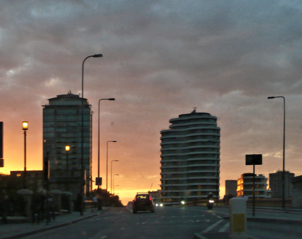
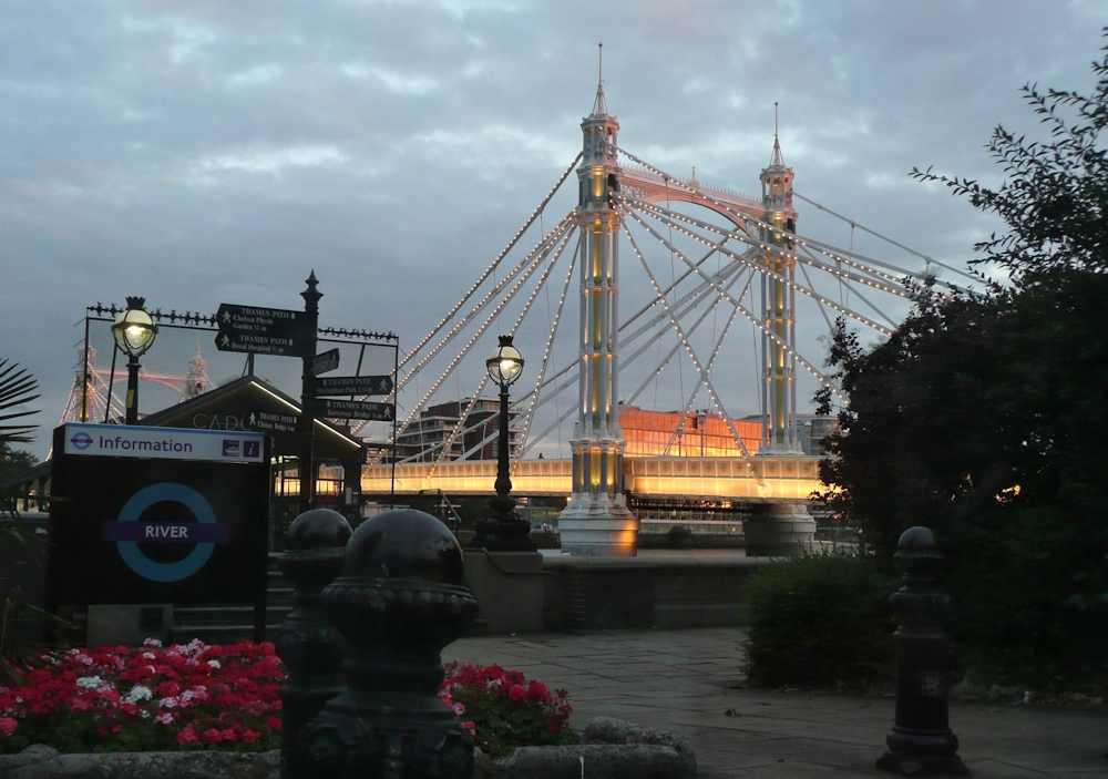
The photographic references include a dark night time scene from Bradford and some in London at twilight where the shadows are diffuse and there is less glare from each light source.
Try to avoid reflections in water this week as that will be the subject of the following week’s challenge. Stick to street lighting, traffic and car lights, shops and window lights and even cafe lighting. If you are feeling more ambitious try a floodlit building, sports stadium or building site.
Look at how the light is emitted from the light source. It may appear as a round dazzle of light as round the sun or from a torch. It may be directed as the floodlights illuminating a building or stadium. You may even see “pools” of light on the ground.
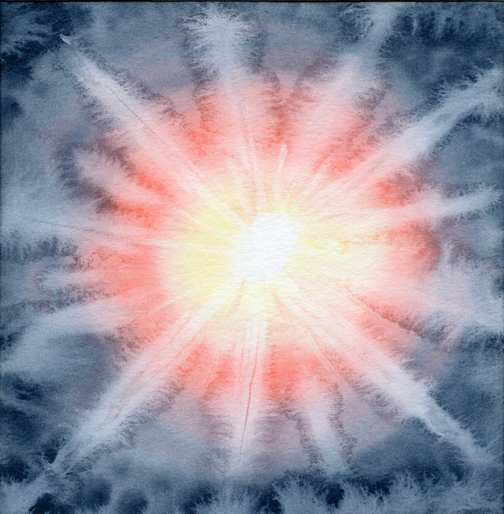
Concentric rings of wet in wet colour were lifted while wet with a small piece of dry paper towel twisted to form a point. This was dragged from the centre outwards, making creative backruns.
Hope this gives you some ideas and there are examples of how several artists have tackled this subject on the Pinterest Board link below.
https://www.pinterest.co.uk/jhall1282/lights-in-art/street-and-city-lights/
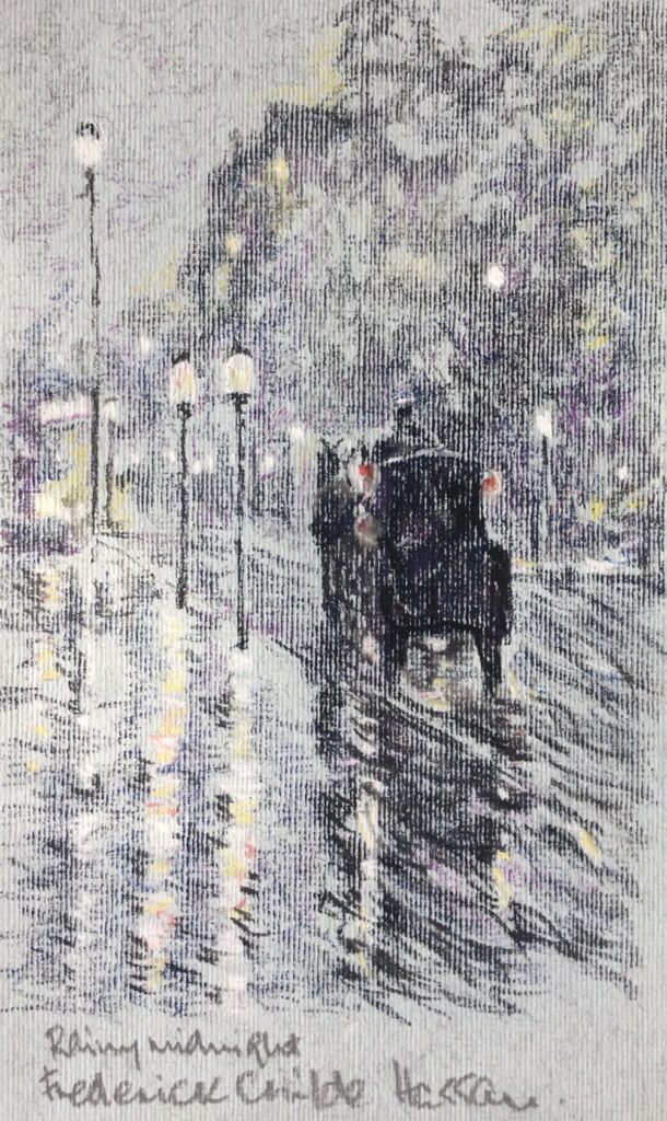
Works by John Atkinson Grimshaw, Frederick Childe -Hassam and Whistler are featured and also works by the Czech artist Jacob Schikaneder. I especially like his tramway scenes. These artists all worked over a similar period about 1890 to 1920.
Have fun and don’t forget to photograph/sketch some fireworks ready for the week 5 challenge.
Your paintings;
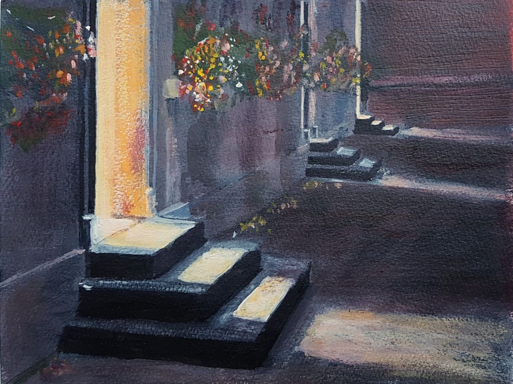
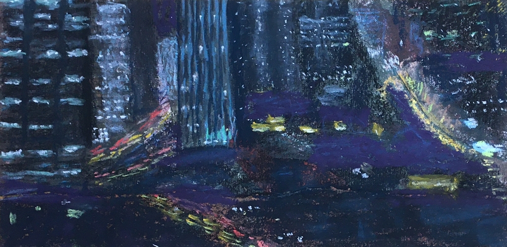
Acrylic by Malcolm
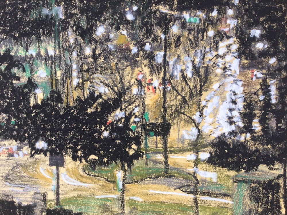
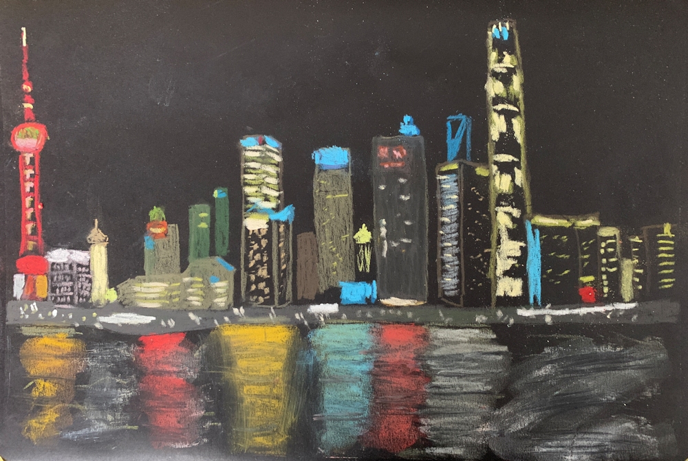
Pastel by Jane
Pastel by Jane
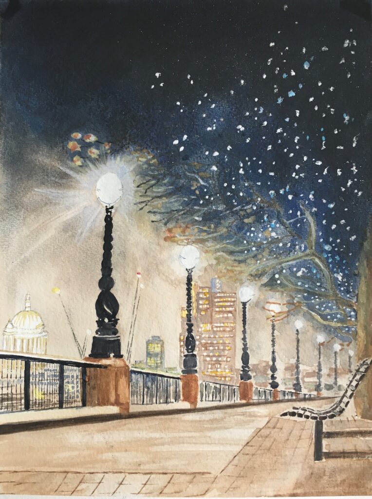
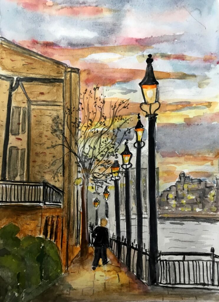
Watercolour by Heather
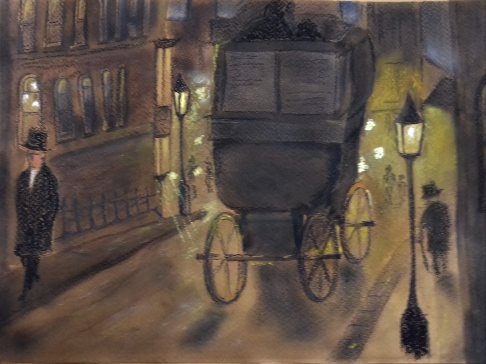
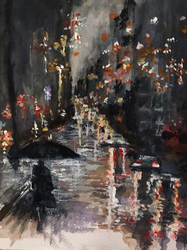
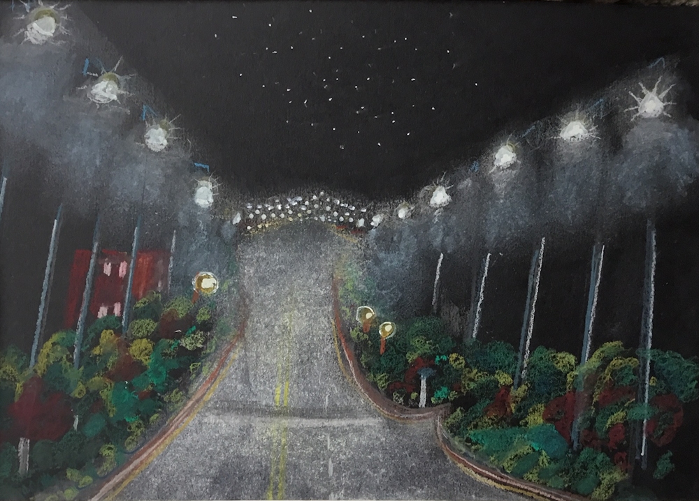
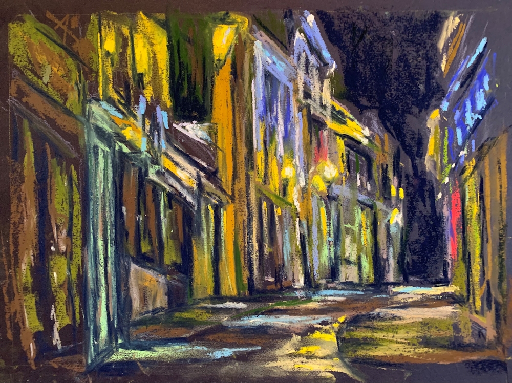
Pastel by Liz
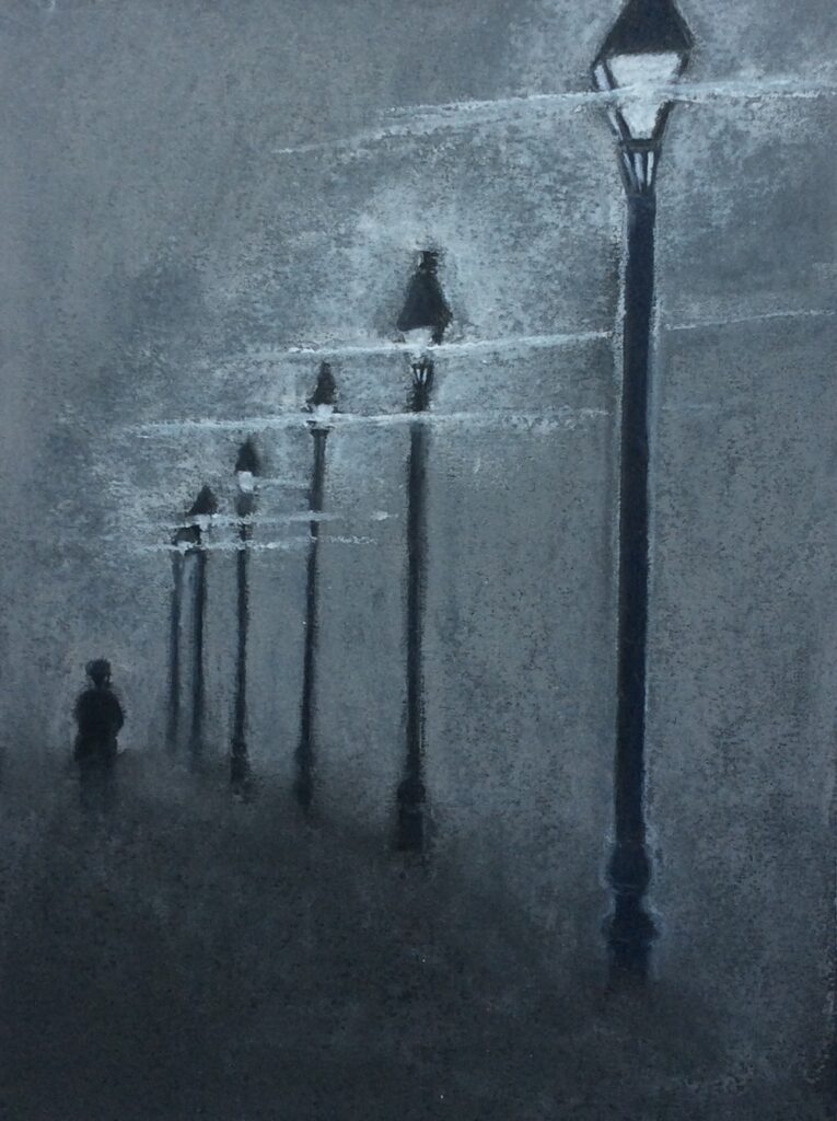
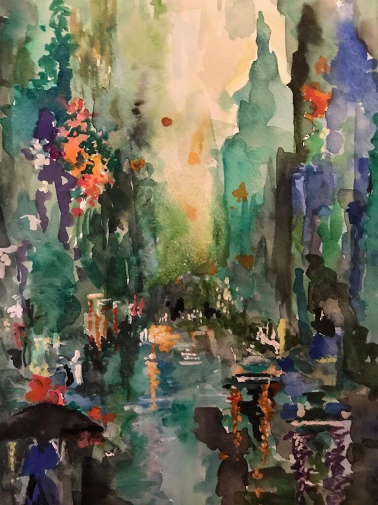
Pastel by Barbara
Watercolour and Pastel by Maricarmen
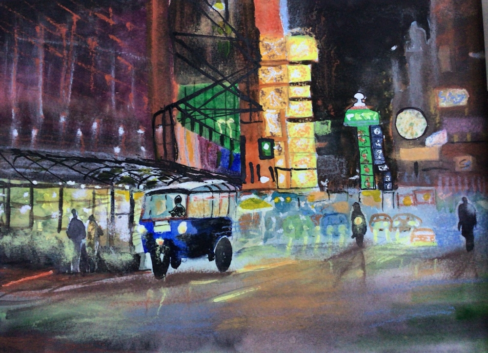
by Maricarmen
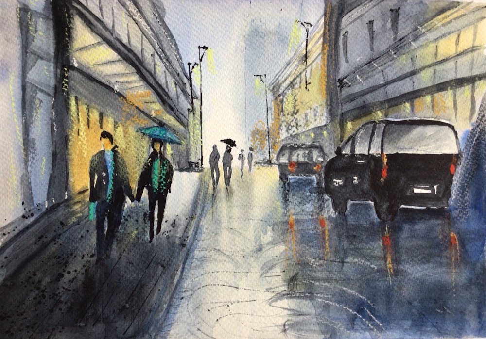
Watercolour after Chin H Shin by sarah
Watercolour after Chi H Shin by Sarah
Pastel by Ann
Watercolour by Ann
Pastel by Shirley
Pastel by John
Pastel by Jan
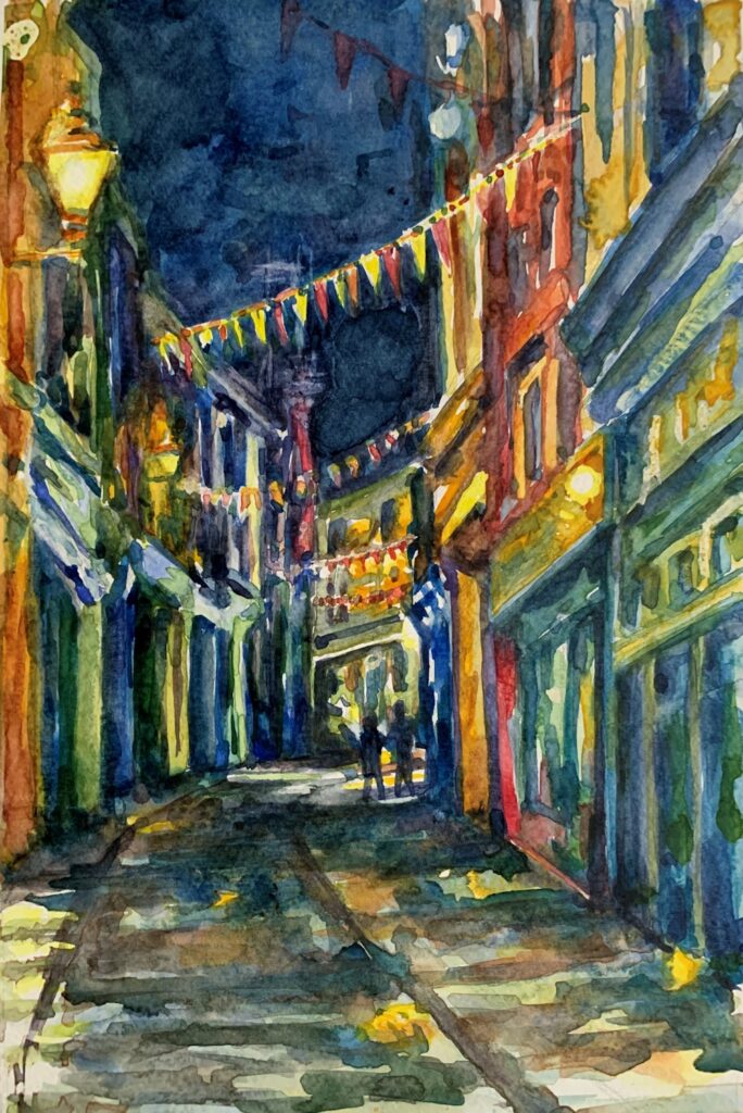
Watercolour by Jan