Buildings: Week 1 Shop and Bar Fronts
October 7, 2021
Ink and Watercolour
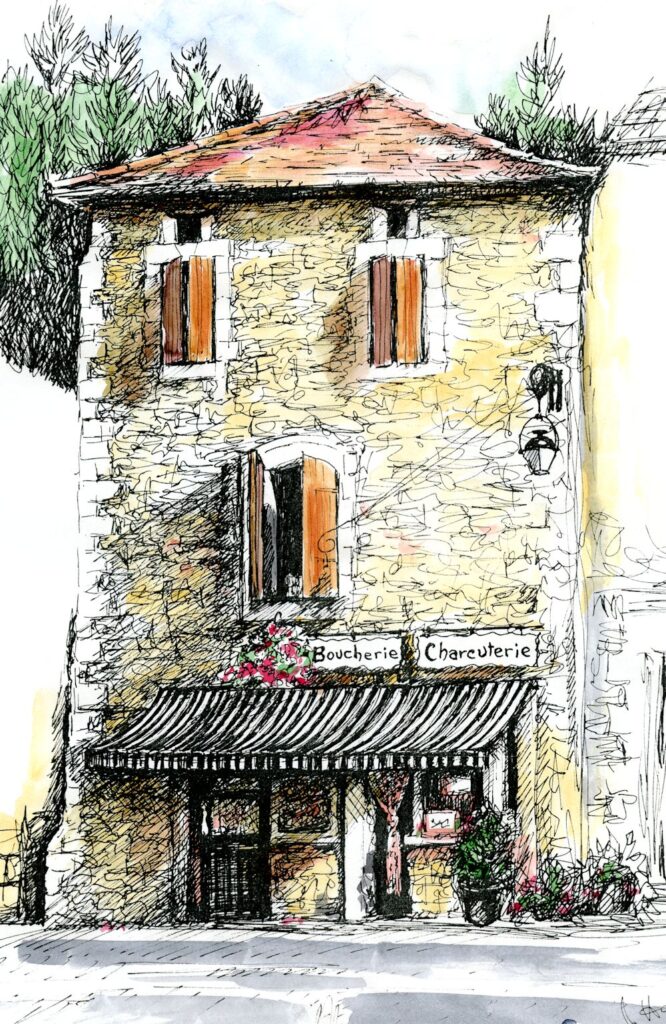
This drawing of a shop front includes the whole façade of the building with a suggestion of the trees behind and the vaguest idea of what is on either side of the shop front. There is a good sense of the light but very little detail of what is in the shop window. These are all choices you will have to make when considering your composition.
This is the first of four drawing and painting challenges looking at different aspects of drawing and painting buildings in towns and villages. Have a look at the Pinterest Board;
https://www.pinterest.co.uk/jhall1282/buildings-in-art/shop-fronts/
You will find a varied selection of works of bar and shop fronts from painterly works by Maurice Utrillo, Edward Hopper, Stephen Magzig and Brett Amory to the illustrative and very graphic coloured drawings by the contemporary artist Eleanor Crow. Not included are the wonderful drawings of Lucinda Rogers; well worth Googling!
A study of a shop is a well defined subject and seen from front on there is little perspective to worry about so it may thought to be an easy place to start. However there are still a lot of composition choices to make and of course some perspective issues as with with a corner shop, for instance. The photo references below have been chosen to illustrate just some of these choices.
Photograph
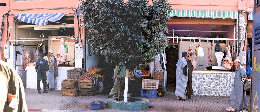
Here only the shopfronts and pavement are included. There are many possibilities for composition here;treating the two establishments separately; including or not including the tree; editing the foreground shoulder bottom left and/or the back of the bus on the right etc.
Over all composition: It is very much the artist’s choice what to include of adjacent buildings and also how much of the building above the shop front and how much of the pavement or road outside the store.
Photograph
Blue sky, much sun, great cast shadows and contrasts!
Tone: look at the dark areas. If a shop has an awning, what is below may be very shadowed. Doorways are often in slight alcoves and relatively dark. Really look at the pattern of light and dark across your reference sketch or photo. There may also be significant cast shadows. Contrasts of tone will be much greater on sunny days while cloudy days result in rather flat lighting so communicating this will give your work the atmosphere of the day, as well as depicting the objects.
Photograph
Look at the important part cast shadows play in the composition, especially that of the awning
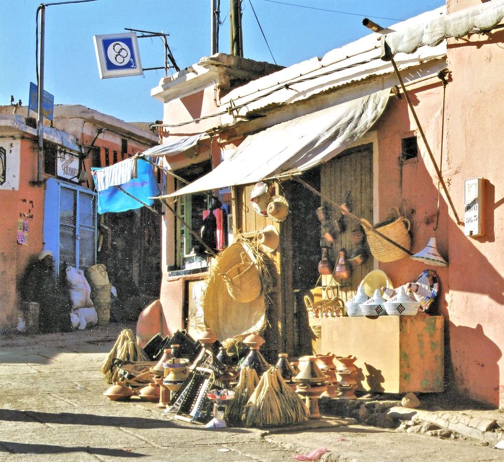
Some of the most fun to paint are stores where the produce spills out over on to the pavement like a rather complicated still life and/or when the seller can be seen. I think of these shops as halfway to being a market.
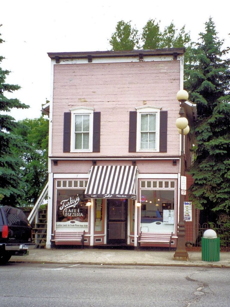
Photograph
With trash can and street lamp, dull day.
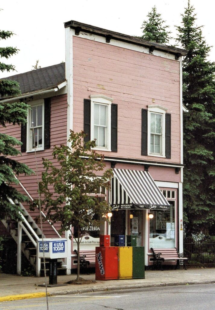
Photograph
A different view with tree and news stands. Note the lower tone of the side of the building and the general pattern of light and dark, also the brilliance of the “welcoming lights” claiming our attention.
Whether and which street furniture to include; street lamps, waste bins, newspaper stands, traffic lights and other street signs etc.
People and traffic; decisions on whether to include pedestrians and window shoppers and parked bikes or vehicles.
Photograph
Seems a bit cluttered to me!
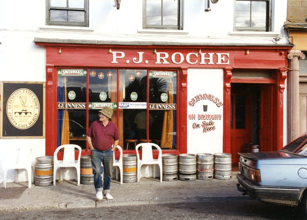
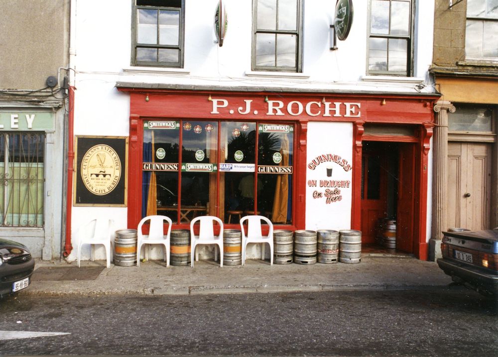
Photograph
Would consider cropping to just below the window sills. Undecided about the car but it does lend credence to this being a busy street and love the pedestrian.
Store signage, lettering, closed and open signs and how much detail to include of the wares on show.
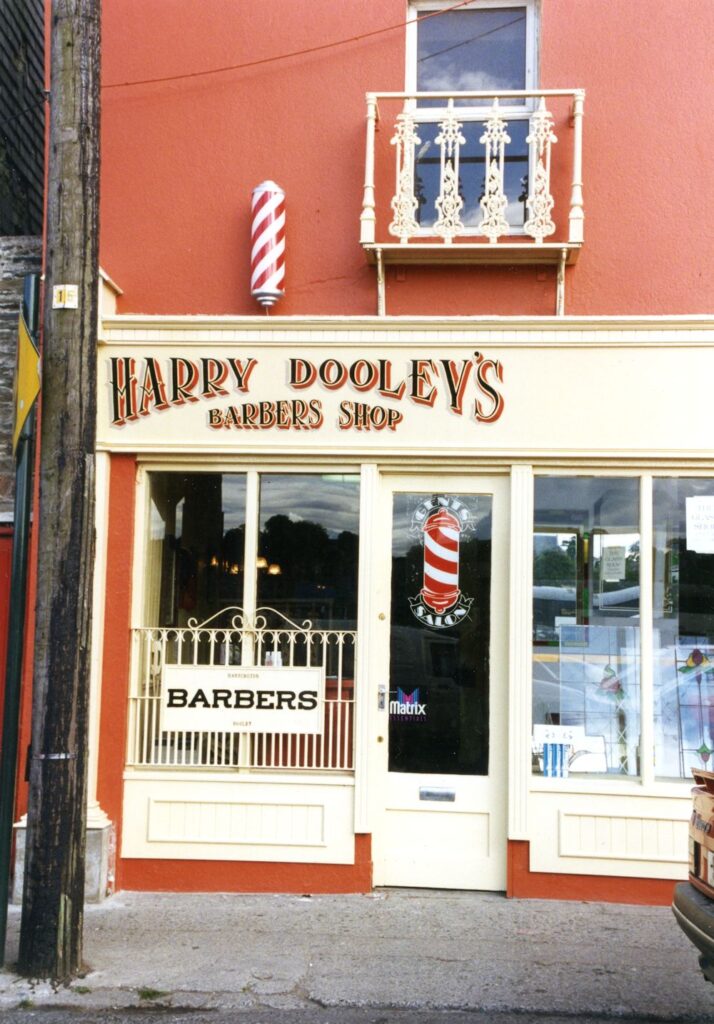
Photograph
Plenty of lettering and pattern here! Might use my imagination to complete the shop front on the right to experiment with a rather symmetrical composition.
Deciding on the detail of lettering is another choice but it should be in keeping with the rest of the work. If you are a calligrapher this will come easily to you. If not and you wish to make very careful lettering or even rather free lettering don’t be afraid to get a ruler out just so that you keep your lettering or scribble to the right height. If you are working the rest of the painting quite loosely it is usually best to work such details in the same way. Remember that loose does not mean inaccurate so be aware of the relative sizes of windows, doors,etc. and always remember to check the verticals.
Next week we will look a little at perspective, measuring and estimating by eye. This week should give you a good feel for looking at relative proportions and thinking about composing from your reference.
Your Drawings and Paintings;
by Mali
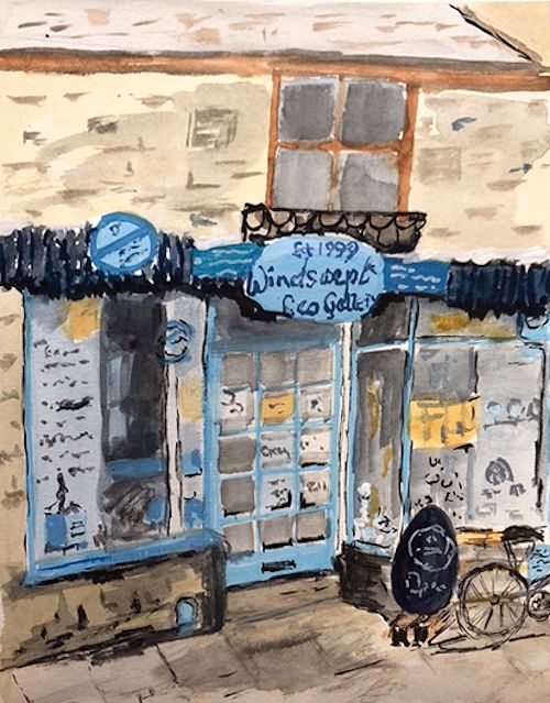
by Maryon
by Malcolm
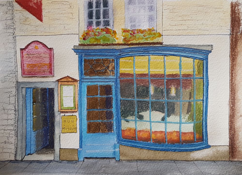
Watercolour by Sandra
Ink Drawing by Heather
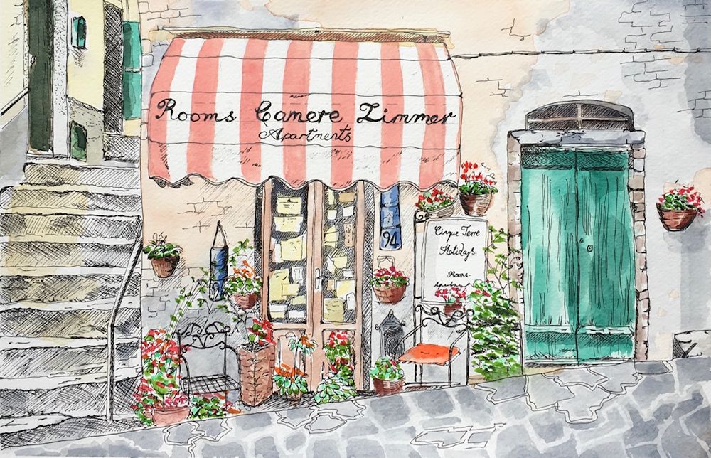
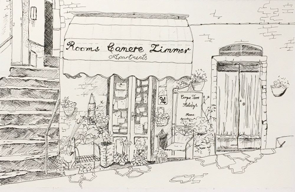
Ink drawing with watercolour wash by Heather
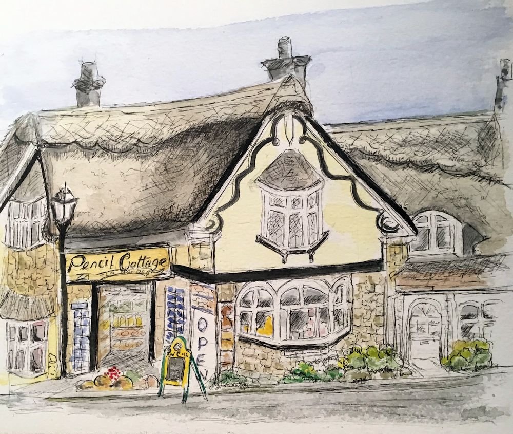
Ink and watercolour by Ann
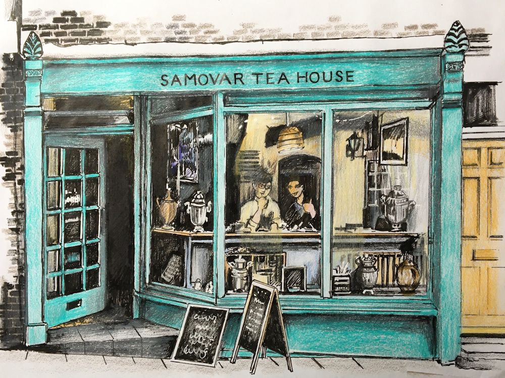
Ink and Watercolour by Maryon