Category Archive: Floral
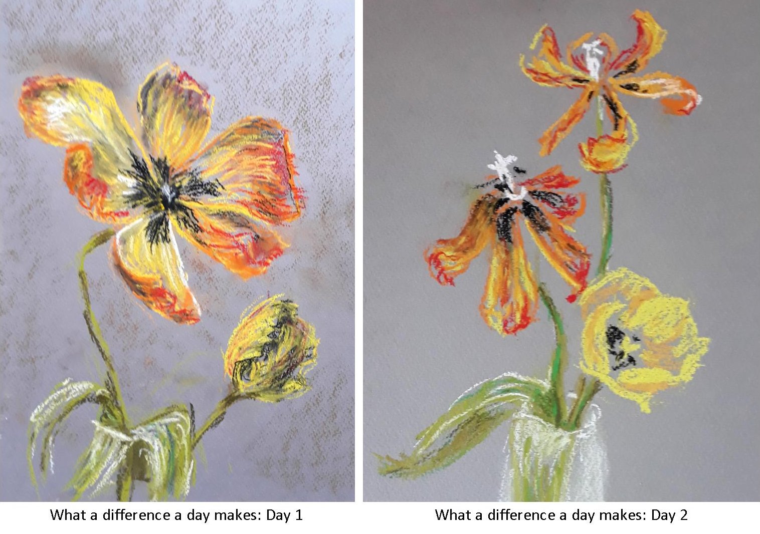
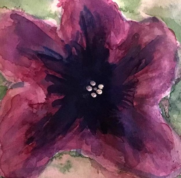
Magic of Black Week 5: Paint a Still Life with Flowers or a Natural Form
March 22, 2023

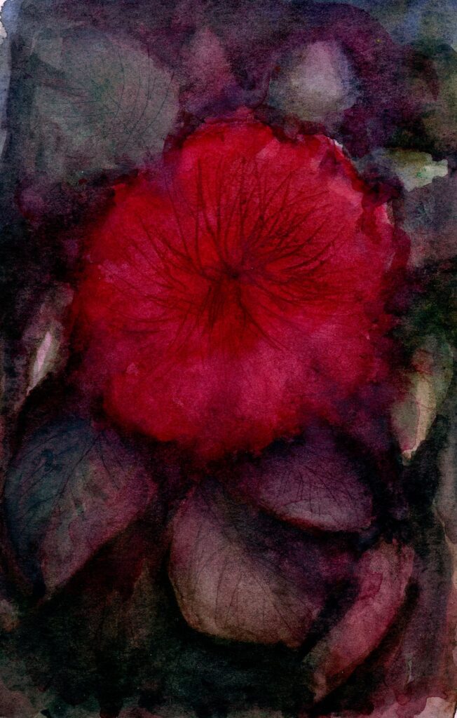
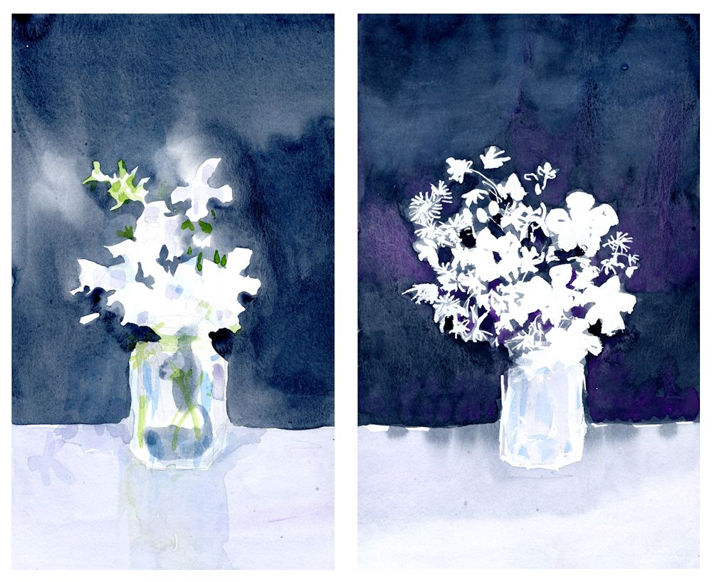
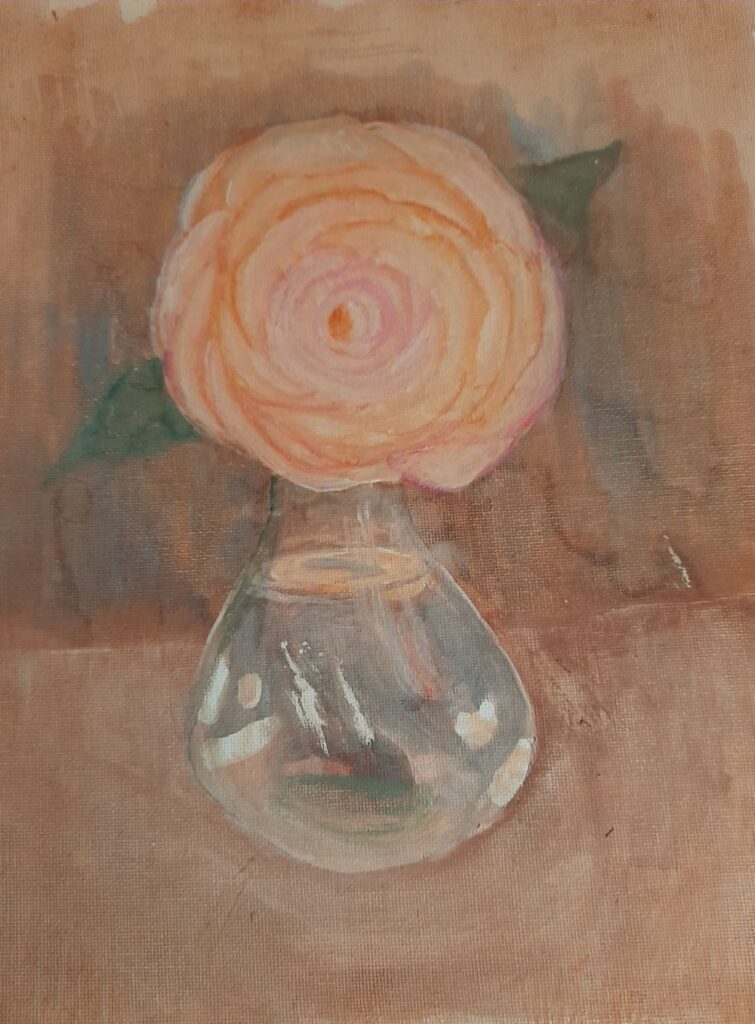
This week’s challenge is to paint a still life with flowers or a natural form. There is no set medium and pastel, acrylic or gouache would all work well. The support does have to be black, either paper or a board primed with black gesso. The example above is gouache on a smooth black paper.
Unlike working with negative shapes, this time it may be that the object or still life group has a mainly black background. It may be useful to paint a simple object that you wish to include in the final painting to work out how your chosen medium works on your choice of support. It is an opportunity to use very opaque colour, and also thin veils of colour. My demonstration includes some Honesty seed heads, which being translucent make an ideal subject to illustrate this.
The following images may help you to get started. Choose as simple or complicated a set up as you are comfortable with. As previously, a white or pale grey well sharpened pastel pencil was used to very lightly draw in the main lines of the composition before going in with paint.


Looking forward to some really colourful work!
Your paintings:

by Pam

by Kate

by Mali

by Liz

by Heather
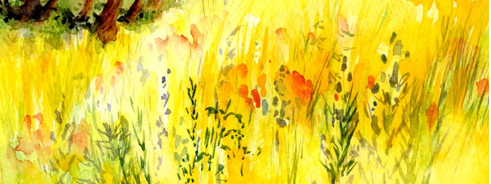
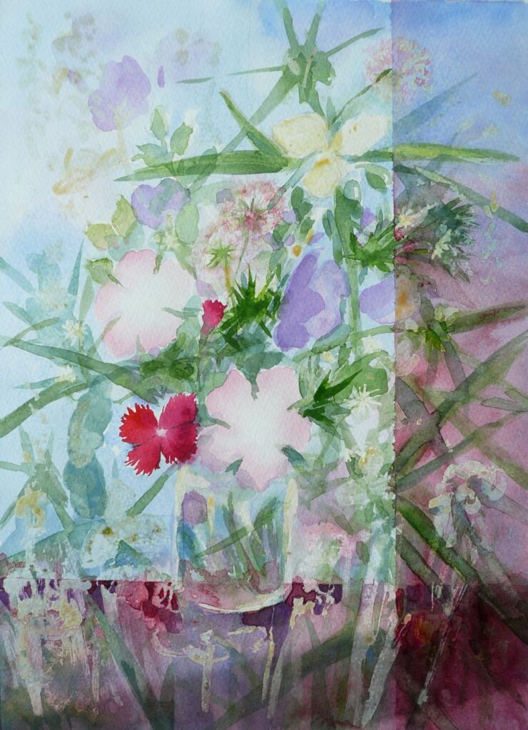
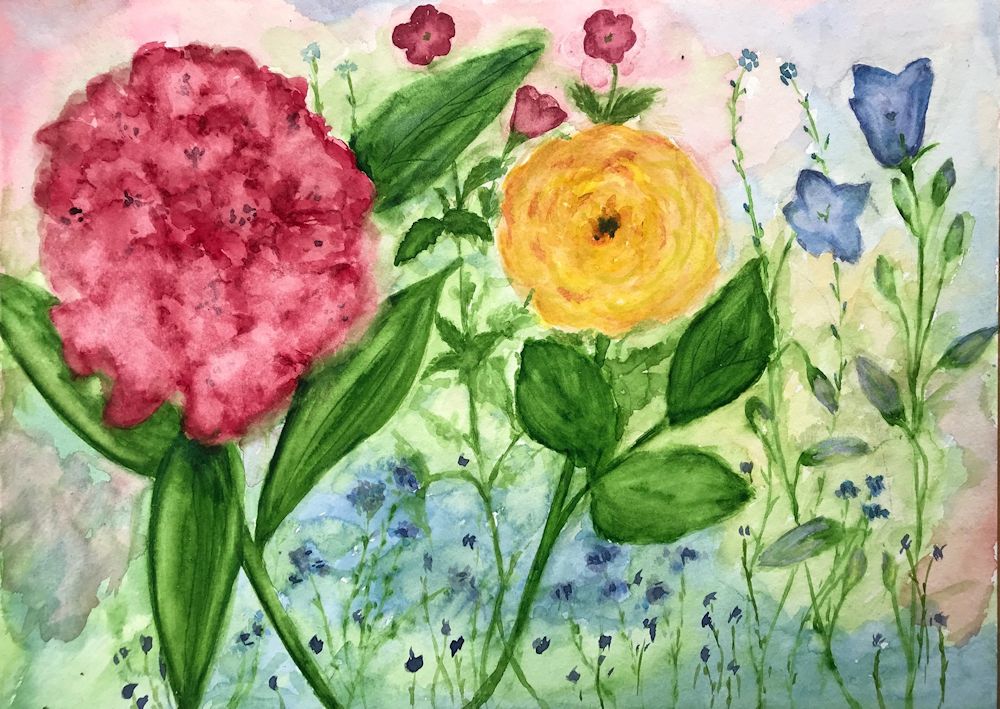
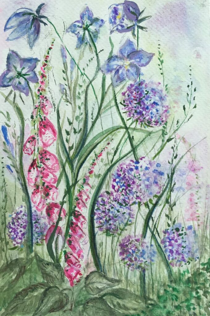
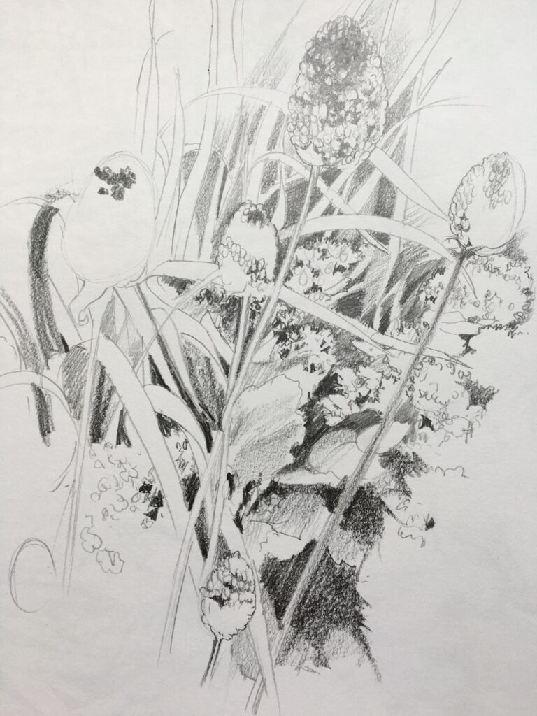
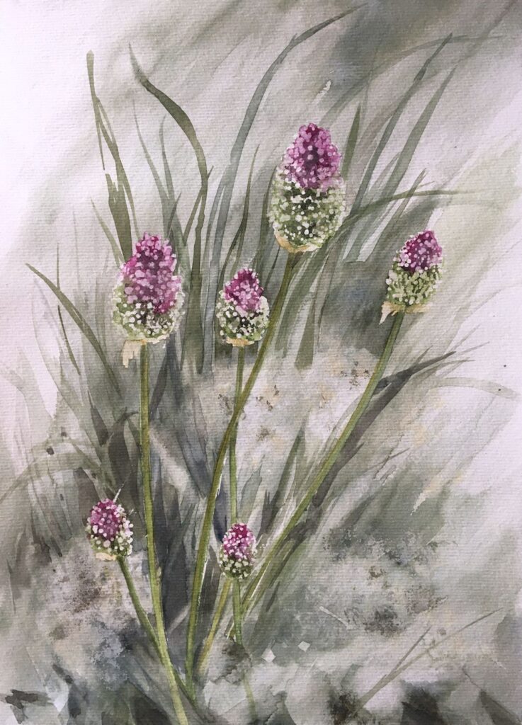
Watercolour Flowers Week 6: Growing like Weeds
June 1, 2022
a very free sketch!
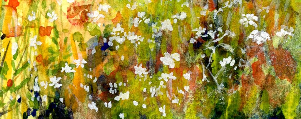
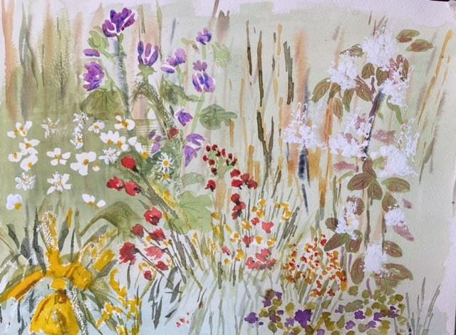
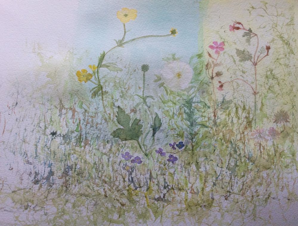
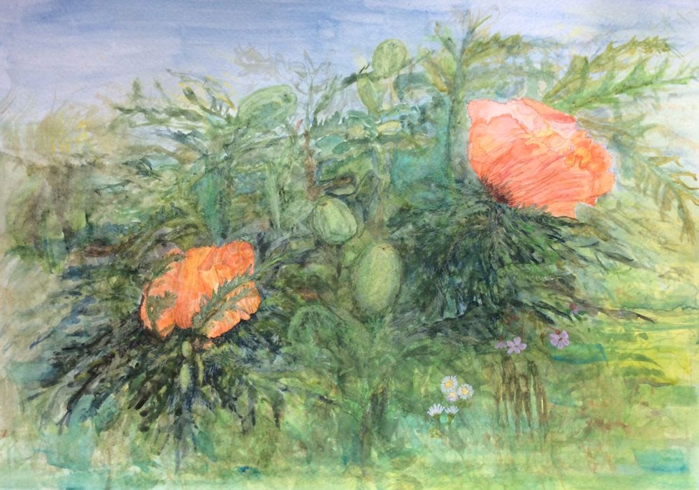
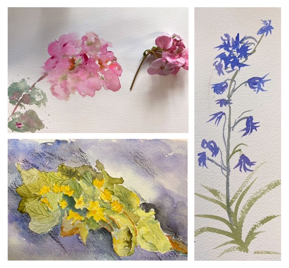
This week’s challenge is to paint flowers that either spread like weeds or are arrivals from the wild, generally known as weeds! It’s very much your choice whether you paint them in situ; perhaps a sprinkling of buttercups and daisies in a patch of grass, rather like the poppies spangling the cornfield above, or at the other extreme make a delicate arrangement of your favourite visitors or freely spreading plants on one sheet of paper.
Either way, try to keep the colours clear and work some passages by wetting the water first before adding the colour and/or some wet in wet areas.
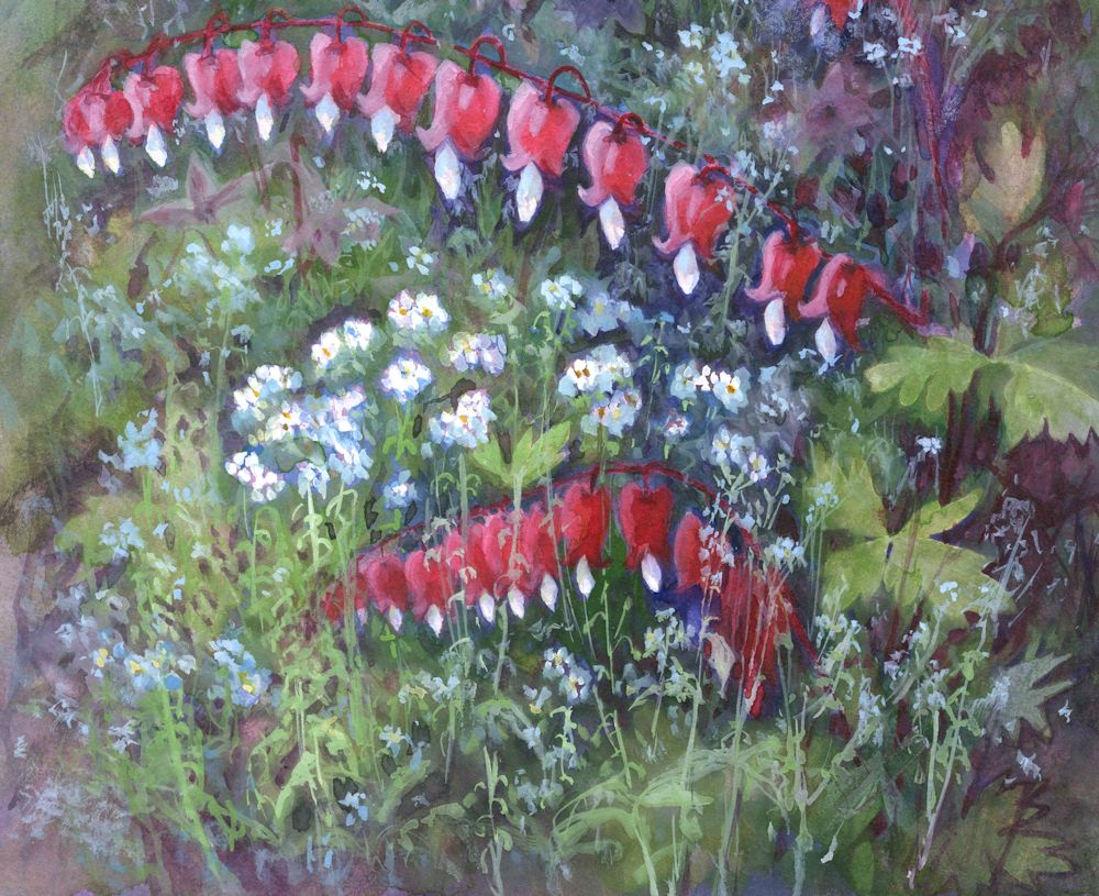
Forget-me-nots grow everywhere and at most times of year in my garden. Here they were against a dark ground so were painted in gouache by adding Permanent white in varying amounts to Cerulean Blue and in some places to Cobalt Blue. The pale stems were painted in a similar way with mixed greens and white.
As ever the first background washes will be important for determining how you proceed. The Forget-me-nots above were painted in gouache over a dark ground. Do experiment with the strength of washes for the situation in your painting. For a lawn, blades of grass with a soft focus can be suggested with darker greens by deft brushstrokes into a wash while it is drying as in the right hand side of the image below. When the wash is dry more definite grasses and stems can be added wet on dry.

If you have buttercups, daisies, clover and other delights in your lawn you could paint them in a similar way to the meadow flowers above. After choosing your subject think about how you wish to represent any pale flowers against darker tones. If by lifting out, test how well the pigments selected for the painting work when lifting while still damp and also when dry. Staining pigments do not lift well when dry!
Painting around many small flowers often looks very laboured so it may be useful to reserve the white or pale areas with masking fluid.
If painting the white flowers with gouache, this is usually best applied when the paper is absolutely dry if crisp edges are required.
Lastly remember that Permanent White can be mixed with other watercolour paints to make them opaque so can be mixed with yellow for a scattering of buttercups or blues for Forget-me-nots against a dark ground. Again test the strength of the gouache mixes over a swatch of the colours they will be painted over in the final painting.
This should give some ideas for how to set about this week’s challenge. No one recipe will solve all the different challenges met in the freer kind of flower painting. The best way is just to experiment and explore the colours, mixing, layering, brushing and spattering etc. enjoying the journey and deciding on the best place to stop.
Your Paintings:
by Sandra
by Virginia
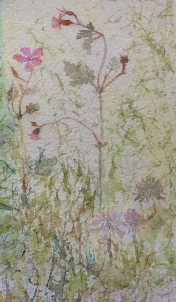
Herb Robert and Pink Clover
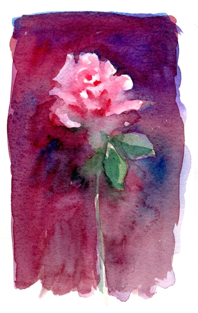
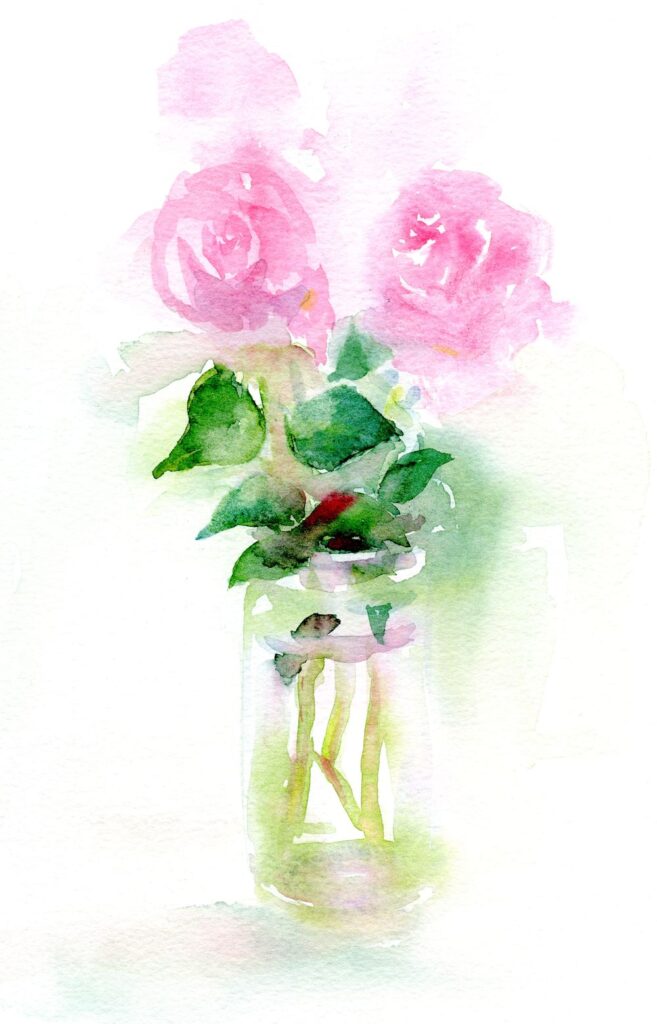
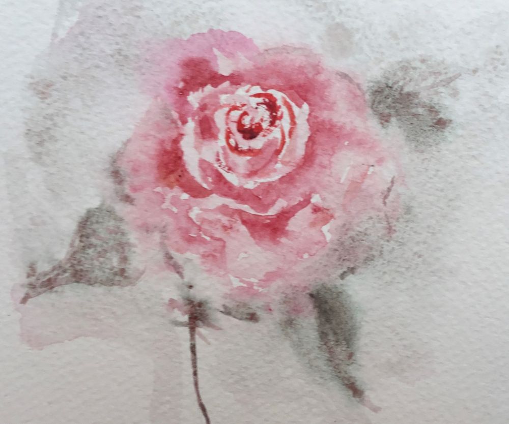
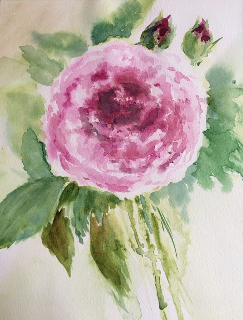
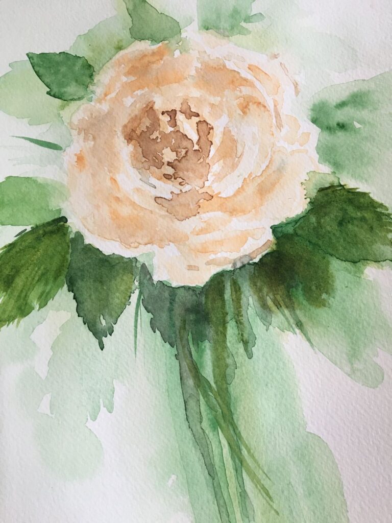
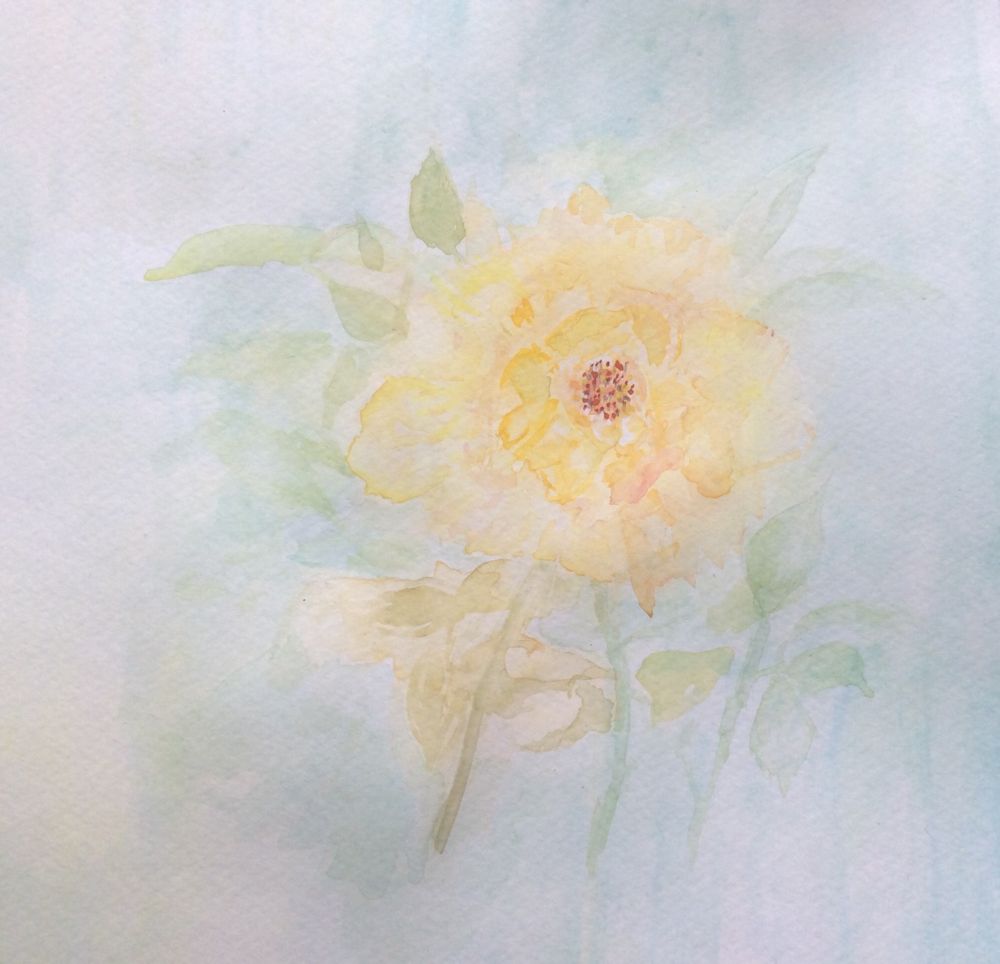
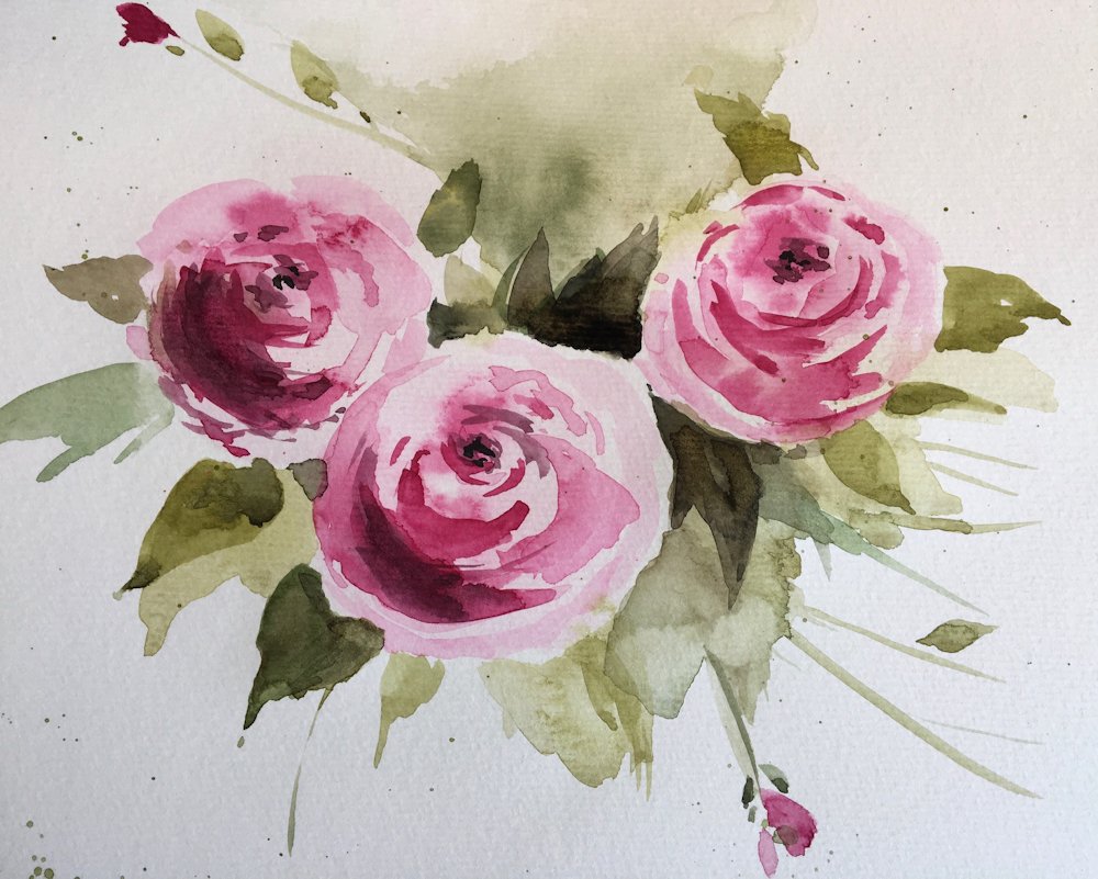
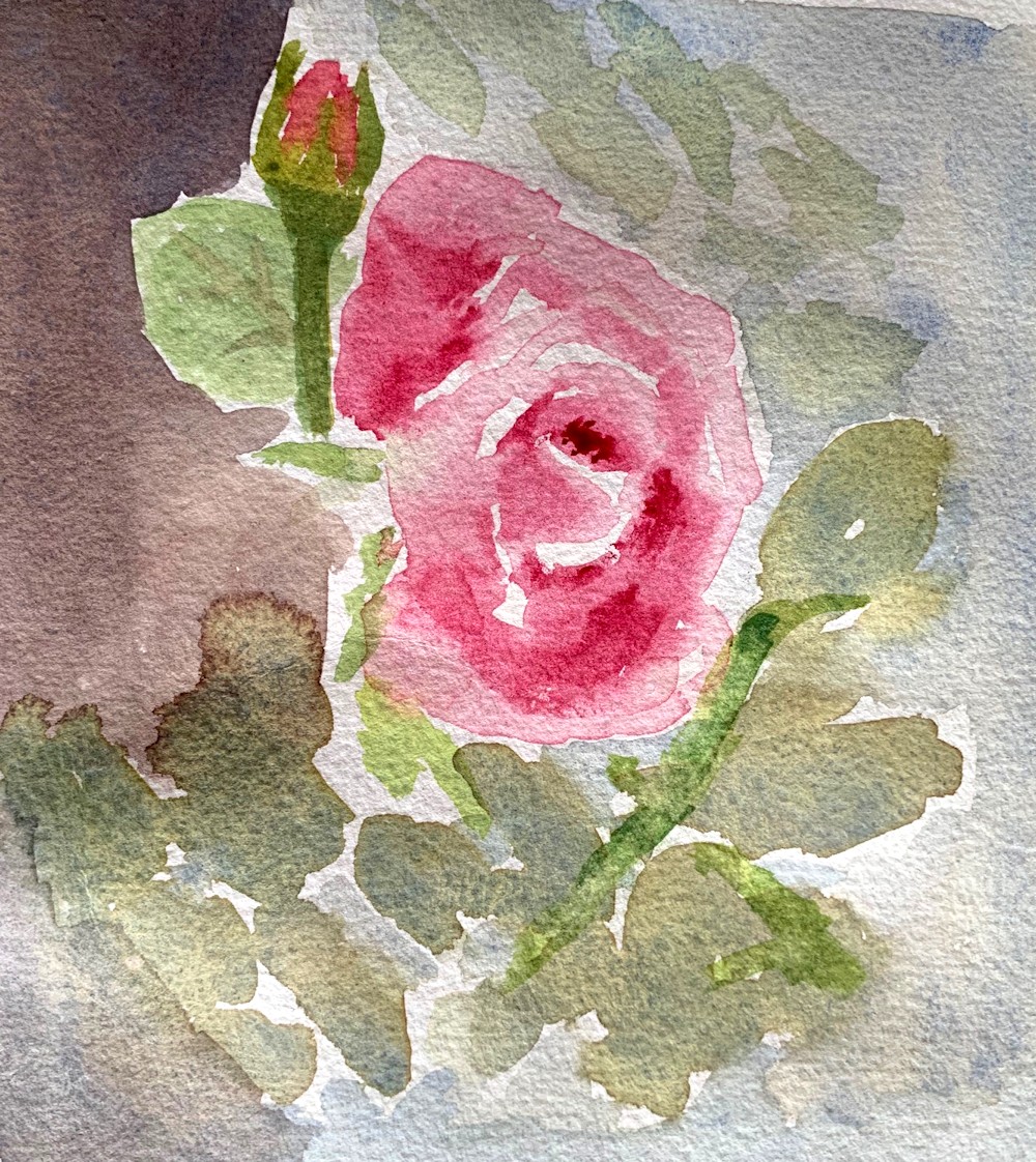
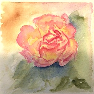
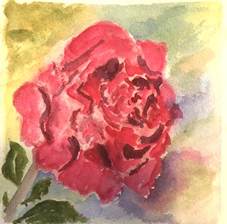
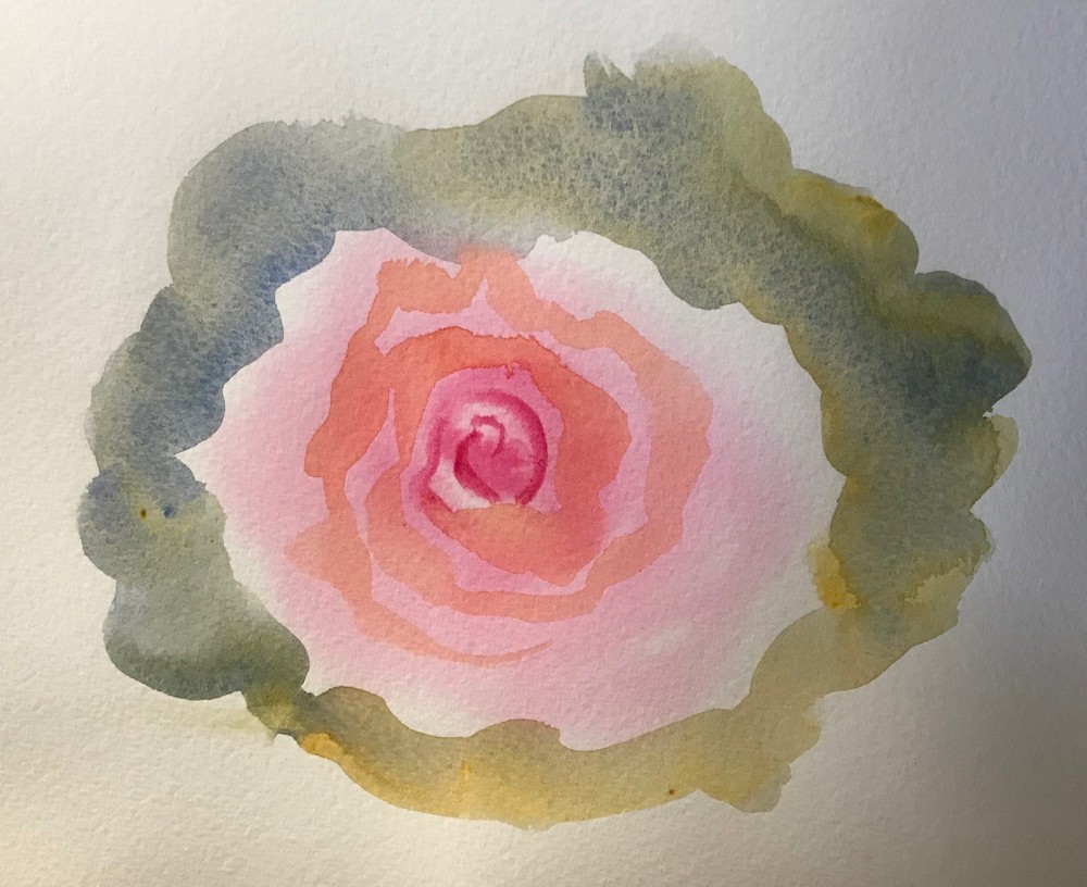
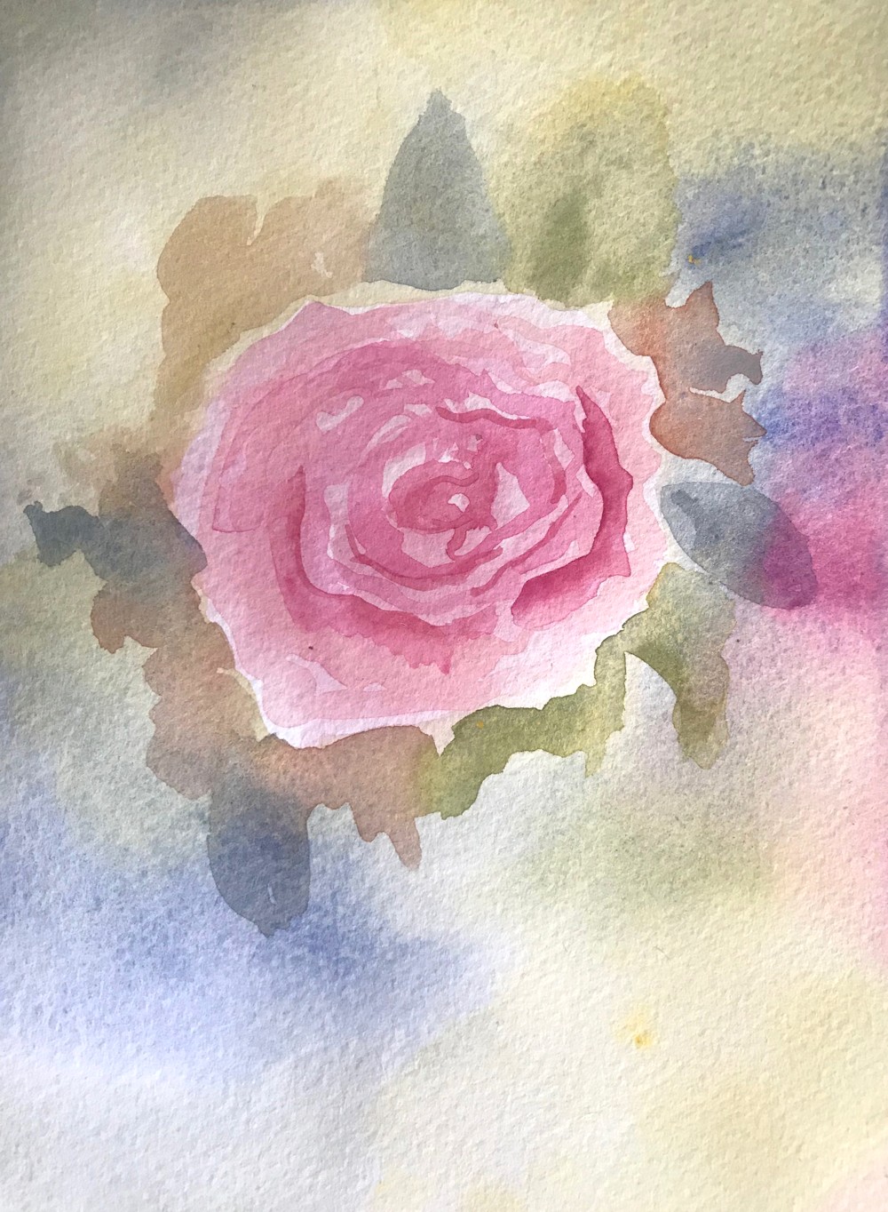
Watercolour Flowers Week 5: Rose
May 27, 2022
Painted mainly wet in wet
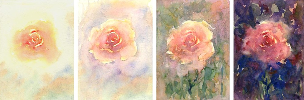
This week’s challenge is to paint a single rose or small group up to two and a bud. We’ll try two ways of working one largely wet in wet and also perhaps look at the use of masking tape in addition to the masking fluid used last week to make some interesting textures and compositions.
I could have stopped there.
Much of the time will be spent looking and choosing the pigments best suited to your particular rose, thinking in terms of using no more than three pigments.
1. Look at tone;
Thinking tonally becomes even more important when painting single flowers so it is important to take note of how light falls on the bloom. In strongly directional light the darker side of even the palest rose may appear quite dark. Conversely the better lit side of the deepest rose may appear surprisingly light in colour. Observe how the light affects each individual petal revealing their spiral arrangement. If a flower is seen against the light as when placed in a window with the light behind it, the whole form may appear dark and almost silhouetted against the incoming light.
2. Look at the form and shapes;
Try turning your rose so that you are looking straight down at the flower and take note of the spiral arrangement of its petals. Then turn it slightly away from you and notice how different it looks, finally turn the flower so you are looking at it from the side. It may be helpful to make rapid sketches of your rose at these different angles to familiarise yourself with the shapes.
3. Choose pigments
Decide on the pigments best suited to paint your rose. Try to limit this to three. This will help unify the study and help prevent muddy mixes especially if you are able to use transparent colours for most of the painting. Try out mixing colours in the palette as well as seeing what happens when one colour is dropped into another while it is still wet.
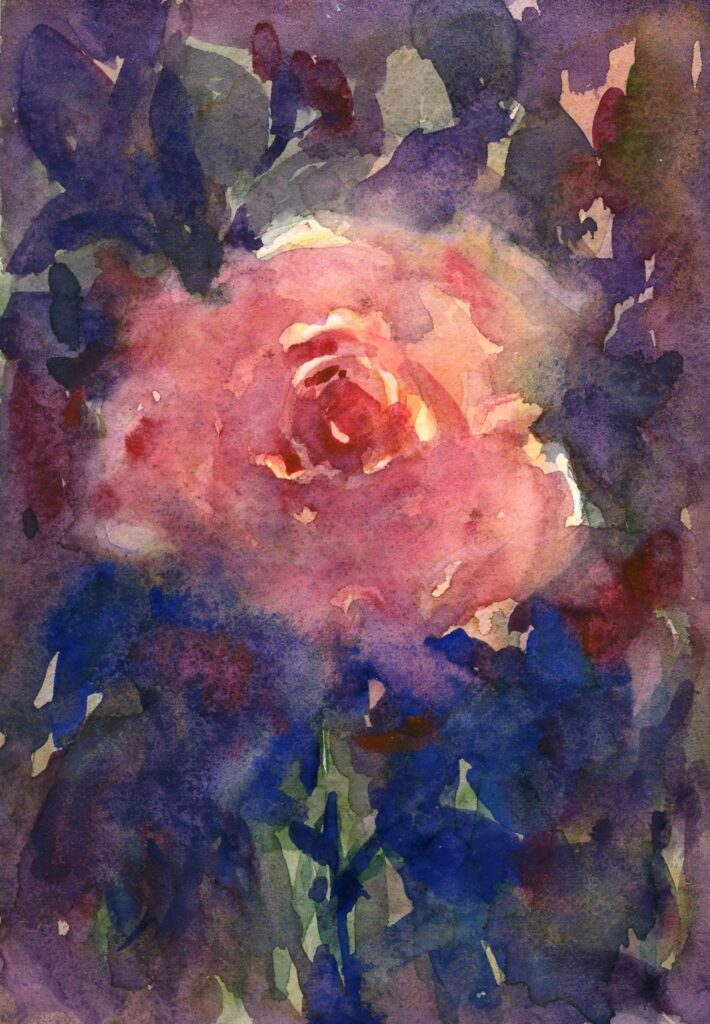
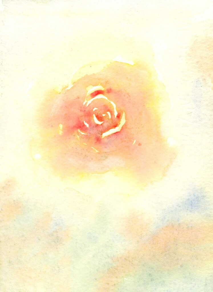
4. Background;
Rich dark background
Pale background giving a much cooler look.
The background may be composed of the foliage surrounding the bloom, a colour and tone which is observed or may be your choice. The hue and tone of the background will greatly affect the mood of the study. Another important element will be to decide on the tone and hue of the background which can greatly affect the mood of the painting.
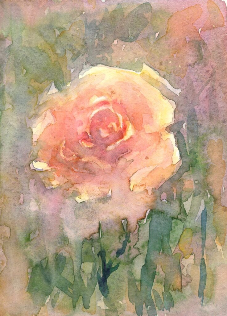
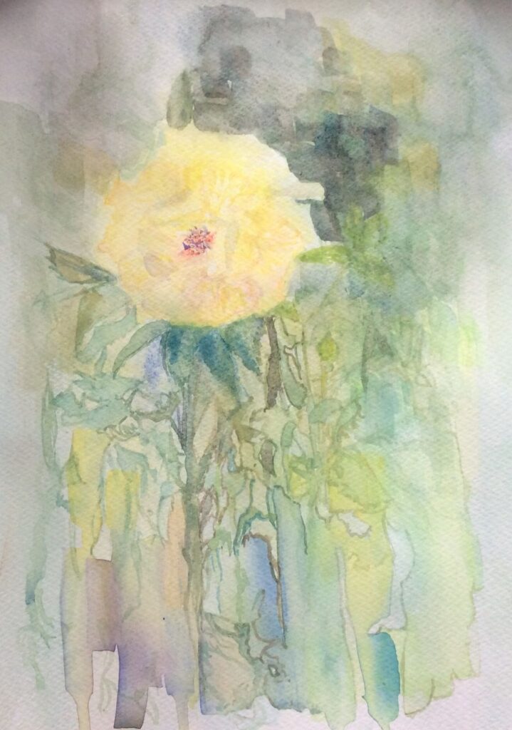
Another interesting approach to have fun with the composition and the background is to apply some initial washes and allow them to dry and then apply low tack masking tape. The demonstration below is how last week’s composition has developed so far. This could easily be done with a much simpler study and can be very useful if your background is a window or edge of a wall.
This was painted into in places, allowed to dry thoroughly before carefully removing the tape.
Further washes were then applied.
In this week’s session I will start a wet in wet rose and while the first washes dry I’ll progress the posy, adding more washes, a few details and a little gouache. Some of the masking fluid was very free mark making so now it has been removed I have a rather different painting to develop!
Do take a look at Trevor Waugh’s roses, Pinterest link below: https://www.pinterest.co.uk/jhall1282/flower-painting-in-watercolour/trevor-waugh/
and another look at Shirley Trevena’s work at
https://www.pinterest.co.uk/jhall1282/flower-painting-in-watercolour/shirley-trevena/
Have some small pieces of cold pressed watercolour paper at the ready or tape off some areas on a larger sheet for your wet in wet studies of a single rose. There is then scope for allowing washes to dry while another study is started.
A hair dryer greatly speeds the process!
Your Paintings;
Painted wet in wet by Ann
by Ann
Started with wet in wet washes and then developed with drawing media
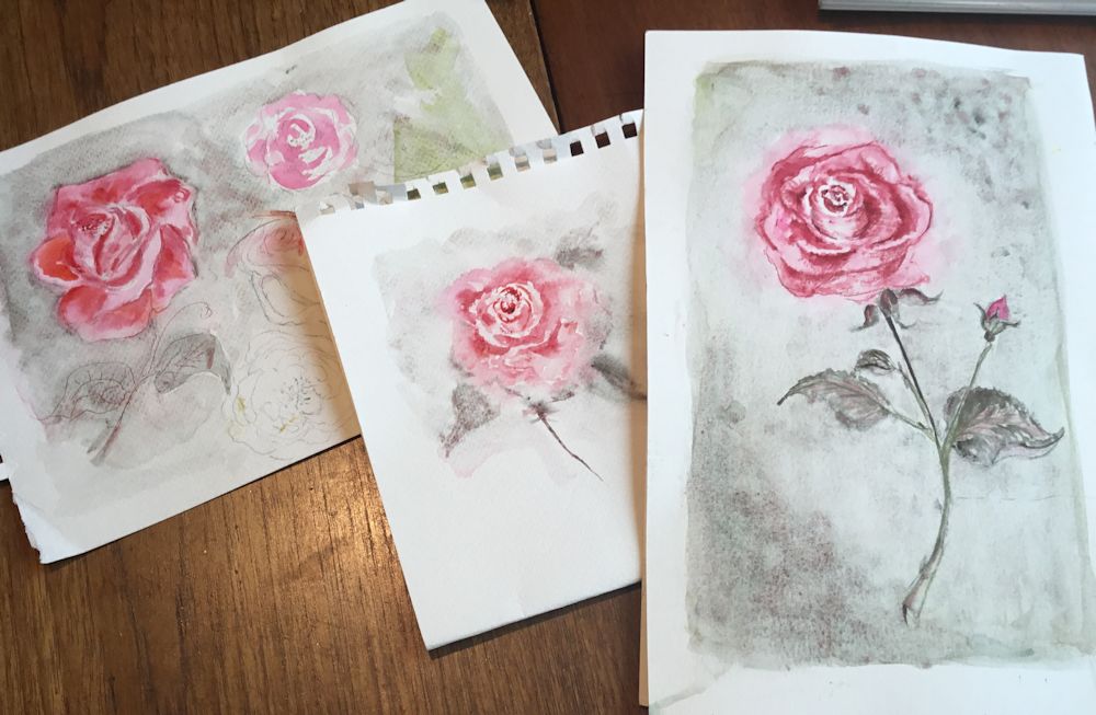
by Ann
by Maryon
by Maryon
by Mali
by Mali
by Sandra
by Sandra
by Anne
by Anne
by Virginia
by Virginia
by Virginia
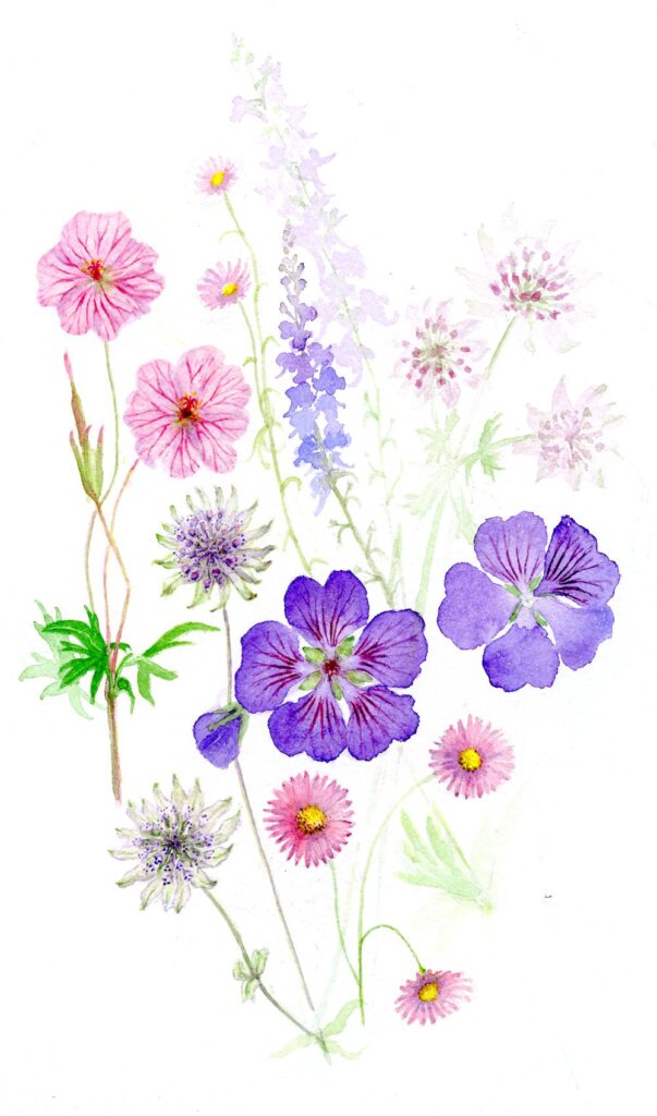
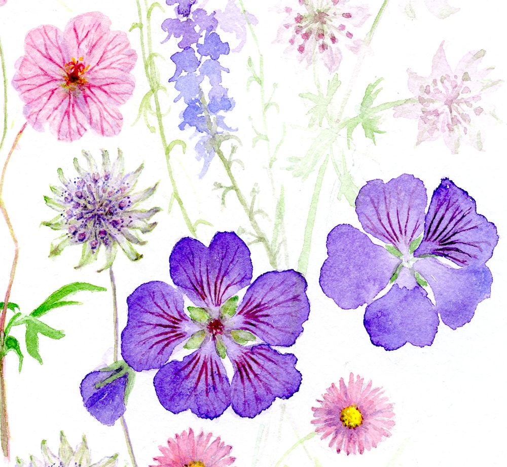
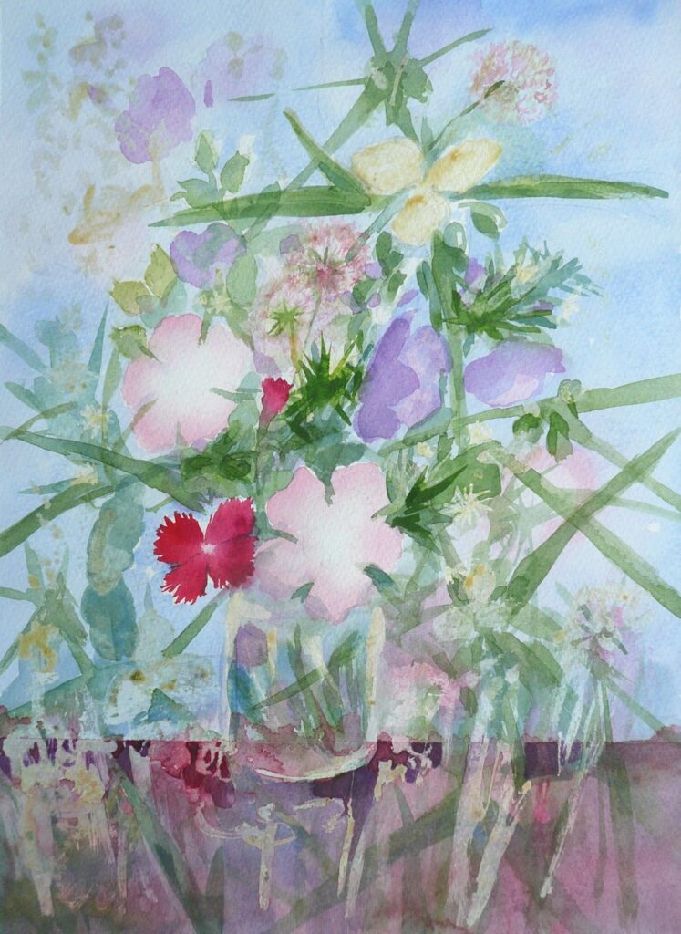
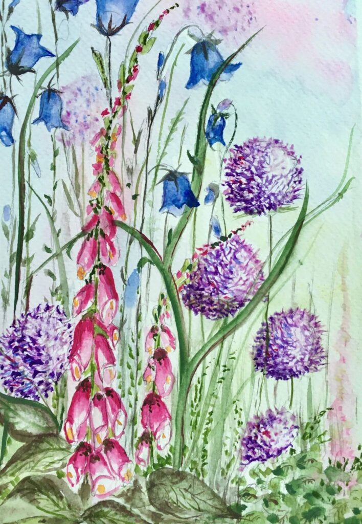
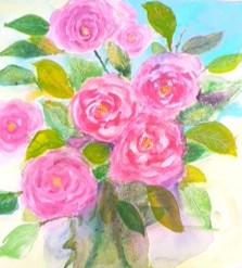
Watercolour Flowers Week 4: Composing with Flowers
May 18, 2022
by Jo
This week the challenge will be to make a painting with flowers of different sizes and colours in the garden. Perhaps find two or three large blooms, poppies for example with spikes of blue Veronica and white daisies making a soft focus backdrop. The colours in your garden may be more harmonious like foxgloves withe pale pink and purple Aquilegia.
In week 2 we looked at dark backgrounds for pale blooms but in the real world you will find flowers against backgrounds that are similar or paler in colour and you may also find flowers like pale Rhodedendrons and Azaleas where the leaves form a dark green backdrop for the blooms.
This challenge should result in a fairly free painting of the flowers but with close attention as to how various background shapes, tones and colours work harmoniously or discordantly with some large flowers seen close to. Do look at the works of Shirley Trevena: Pinterest Board link below
https://www.pinterest.co.uk/jhall1282/flower-painting-in-watercolour/shirley-trevena/
These works on one level are quite free but are also highly organised. See how she arranges the little painting of spray carnations where half the painting is dark against light and this is reversed in the top half. Your painting may not be this extreme but be very aware of how the flowers appear against different colours and tones.
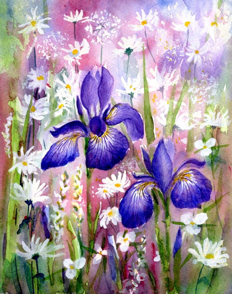
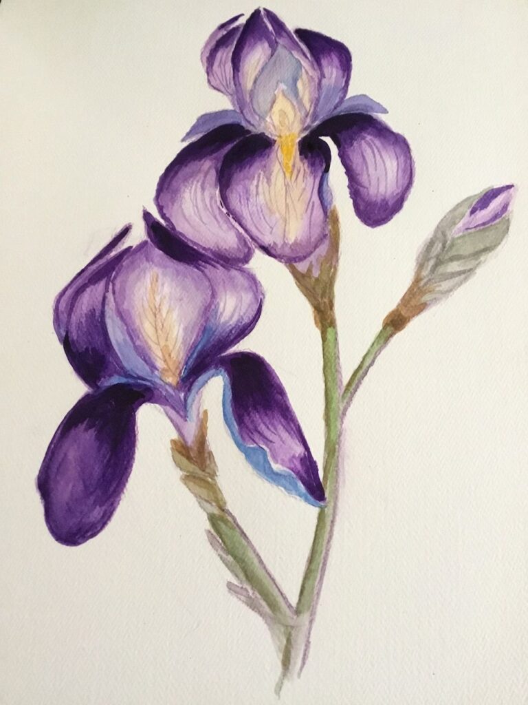
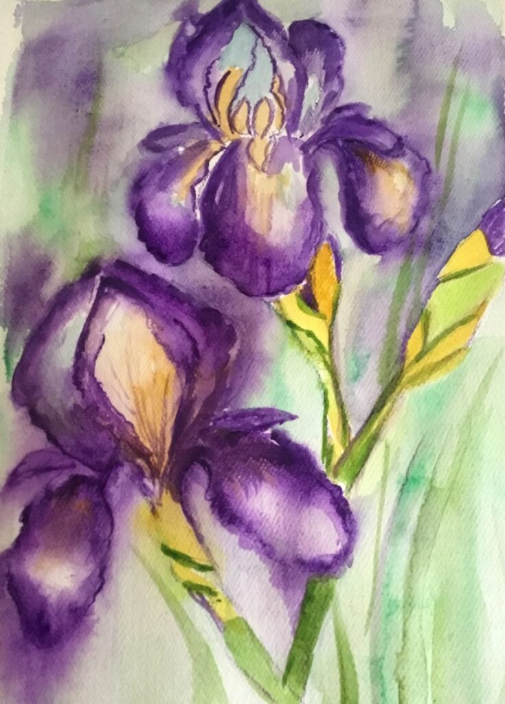
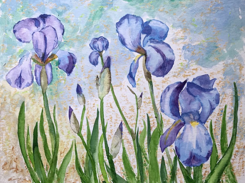
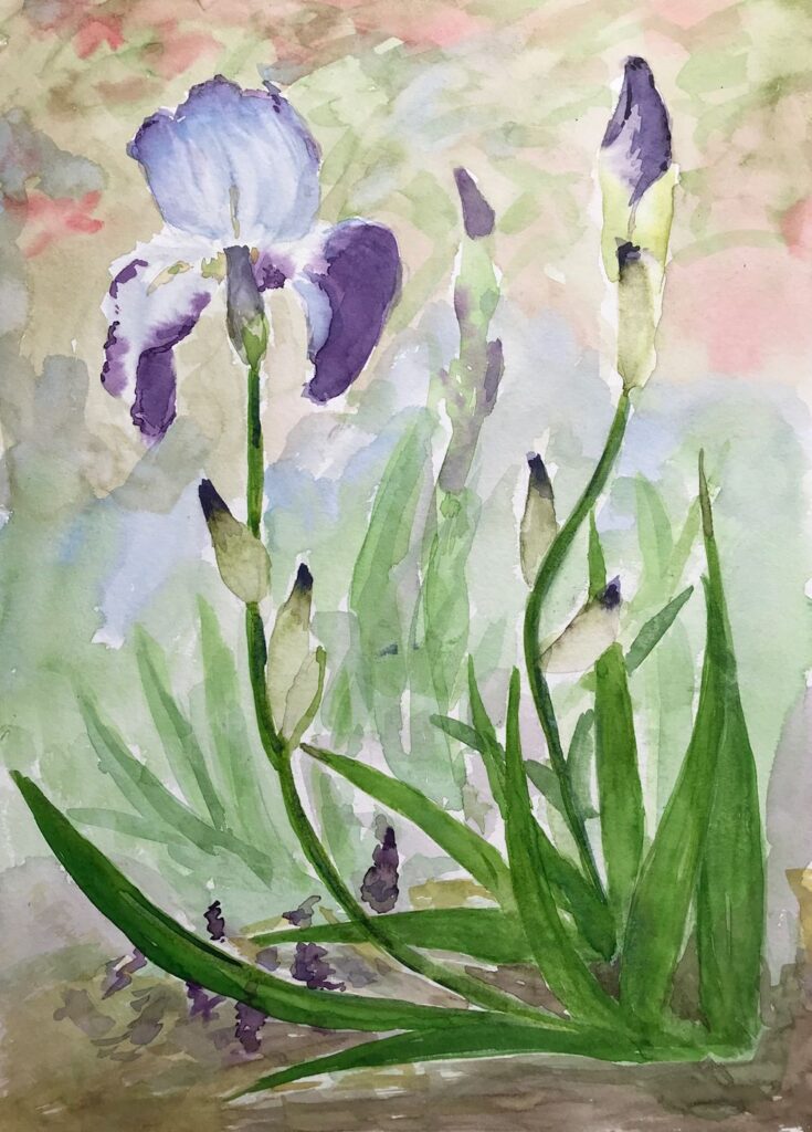
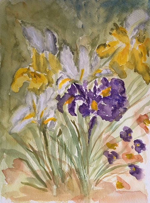
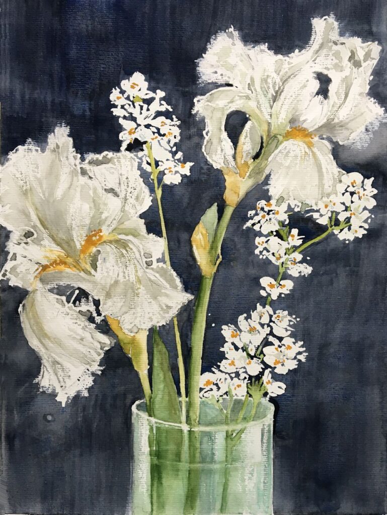
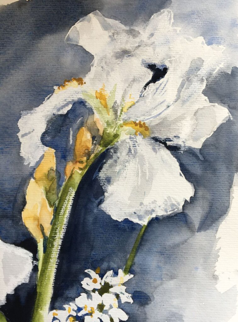
Below is the iris demonstration given last week and how it developed into the painting heading this post.
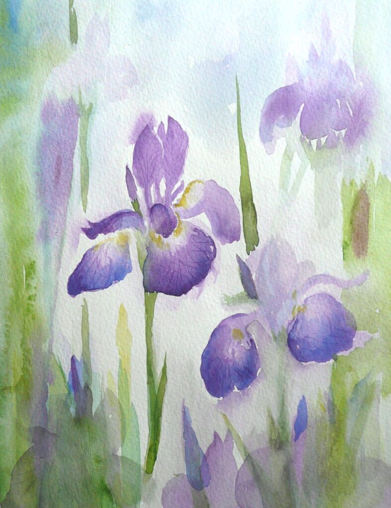
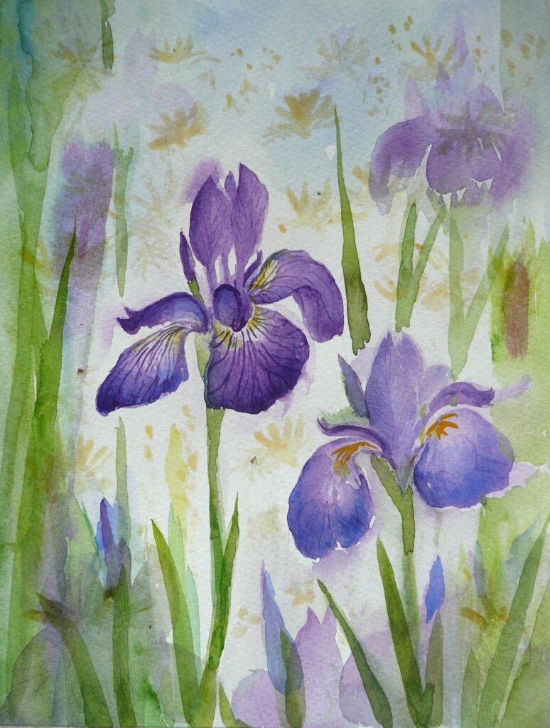
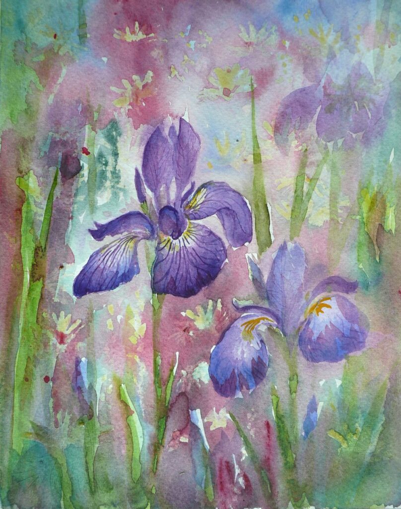
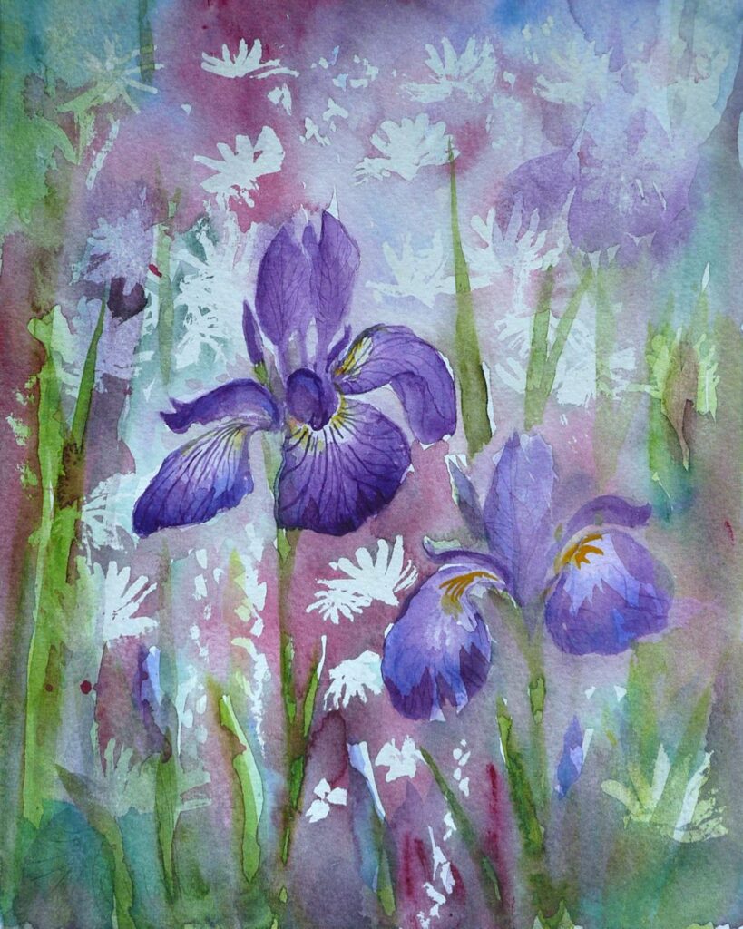
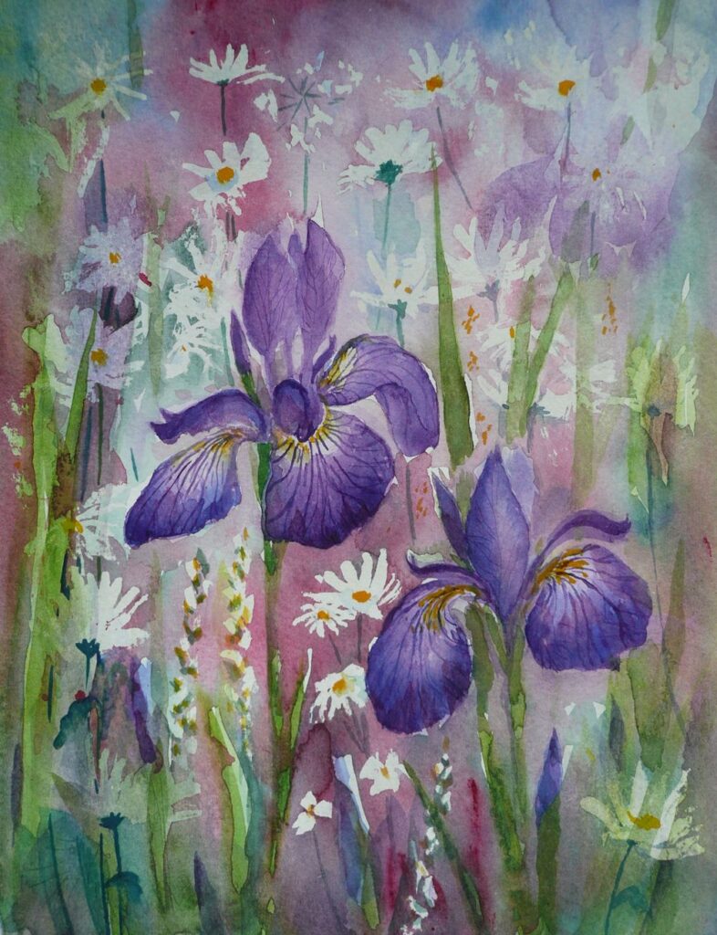
The colours of the Iris buds and and the fall petals were strengthened with further washes of Dioxazine Purple (Winsor Purple) with a dash of Ultramarine Blue.
Apart from the two iris blooms this was composing as I went along. One change in some sort dictated the next till I felt some sort of balance was achieved.
So far we have used very little in the way of a guideline drawn with pencil to map out the shapes so have gained a lot of experience in handling the paint with a brush. It’s now time for a slightly different approach.
This is the week where a tonal sketch before setting off on the final painting will help enormously in organising the composition with regard to the light and dark areas. It would also be a good idea to make another small study juxtaposing some of the colours you are going to use in the foreground with the smaller shapes and colours in the distance and play with the hues surrounding each flower.
When the sheet of of watercolour paper for the final piece is in front of you, make sure to mark the paper so that it is in the same proportion as the composition sketch or photo-reference chosen to work from. Do map out all the main areas and challenging shapes with pencil. Think about whether and where to apply masking fluid or a wax resist for the white/palest areas. It may be that it would be better to reserve the white of the paper by painting around the shapes to be left untouched and to used pigments that can be lifted out while the paint is still damp or after the first washes are dry. Note that “staining” pigments do precisely that and will sink into the paper so that when dry they are very hard or impossible to lift out.
As the painting progresses it may be that elements of the flowers and the background are worked at the same time. It can be great to leave some hard edges but there will be other places where it may be good to let wet paint bleed from one area into another. Make sure a damp sponge, “dry brush” (brush dipped in water then squeezed gently in some paper tissue) or just the paper tissue is to hand in case the flow gets out of hand.
Don’t worry about the end result, to some extent you will have to go with the flow, enjoy the process and have fun. Not sure whether this post will get illustrated but if not there is plenty of food for thought here and plenty to look at on the Pinterest Board.
Your Paintings;
by Maryon
by Sandra
by Mali
by Mali
by Anne
by Kate
by Ann
by Ann
by Virginia
by Virginia
This beautifully painted detail from Virginia’s painting above could be easily overlooked when seeing the whole painting at a small scale as above.
Just delightful!
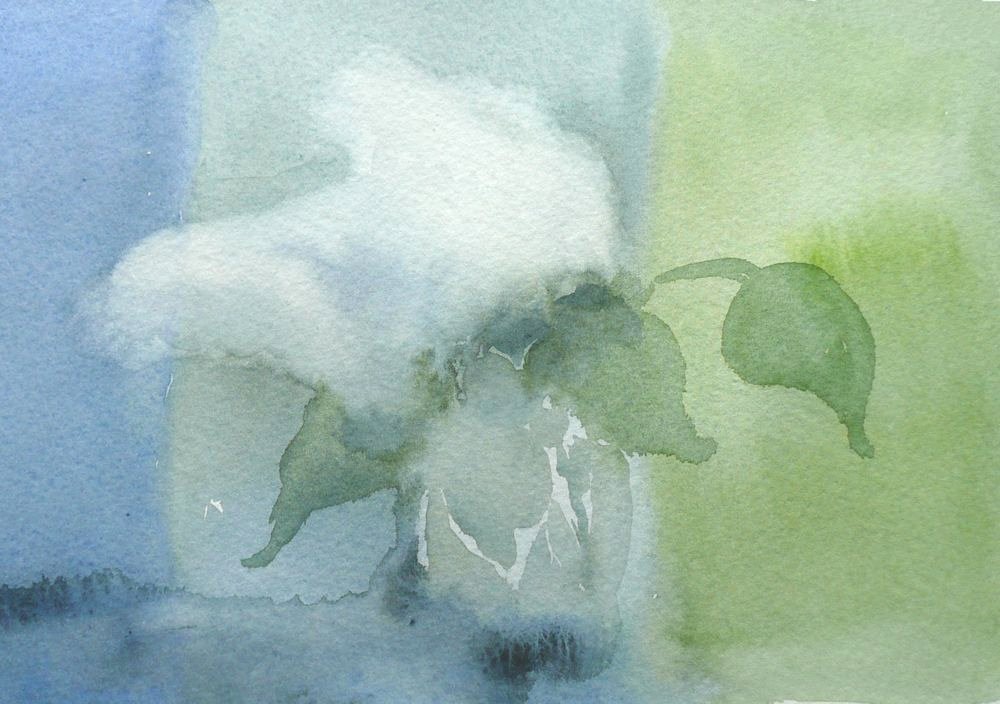
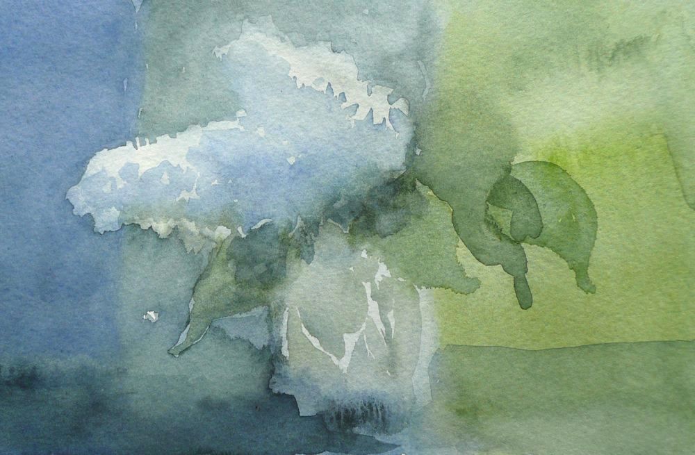
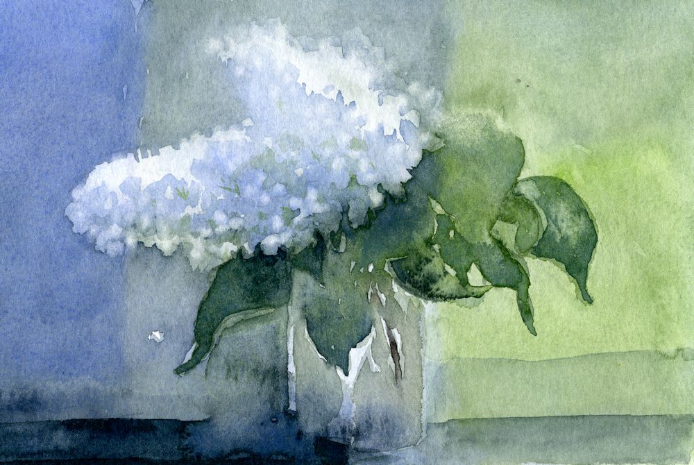
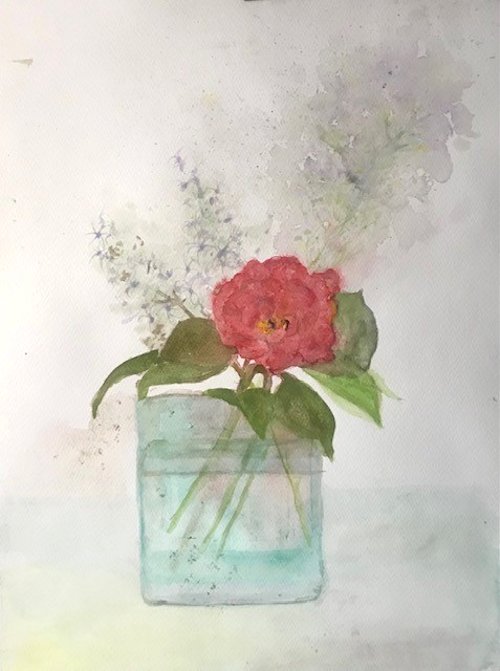
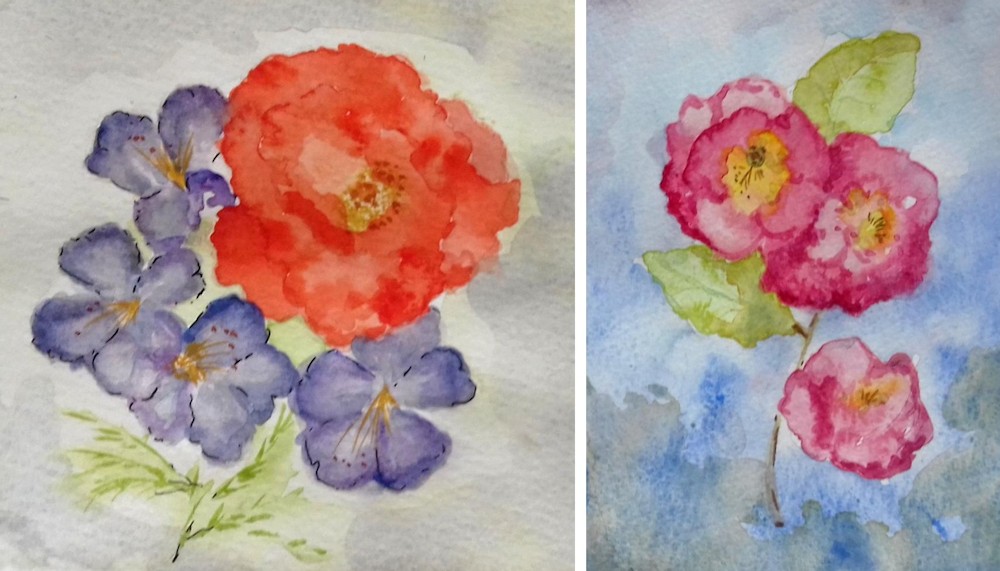
Flowers in Watercolour Week 3: From dark Backgrounds to Colourful Blooms
May 13, 2022
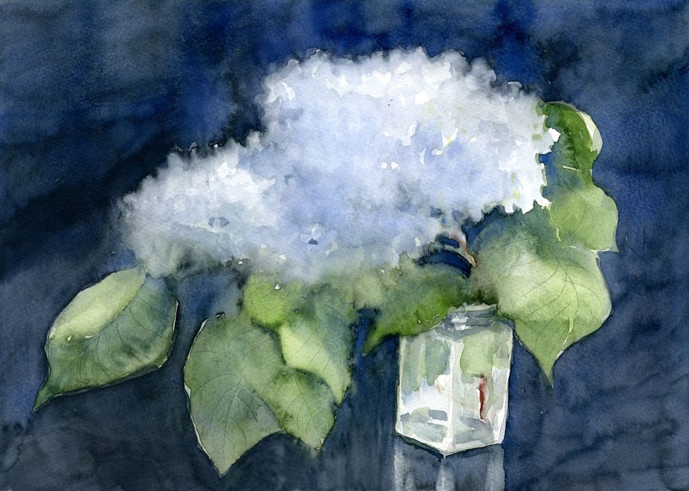
As the lilacs are pretty much ended I was delighted to find a couple of headily perfumed blooms left to paint. The painting above was on a quarter sheet of Bockingford cold pressed watercolour paper which stood up to very wet washes, indenting wet paint to make veins in the leaves and lifting out areas to soften them and give and indication of petals.
The white of untouched paper shines through in the glass jar. This time I decided against masking fluid as I hoped for a soft look to the painting.
The three images below show how a smaller study was made on very damp paper working wet in wet then leaving the paper to dry before re-wetting the paper and adding further washes. Some lifting out was done while the paint was wet but the petal shapes were lifted out when the paper was dry.
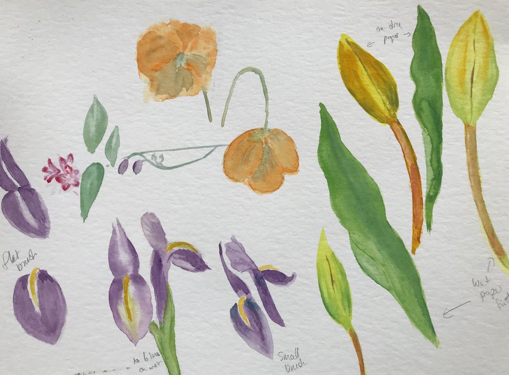
This week’s challenge is to paint flowers as they grow in the garden using any of the watercolour techniques used so far and with the aim of capturing an impression of their character; how they look up at you as the pansies and little pink geraniums or how they point toward the sky like the iris in the photo below..
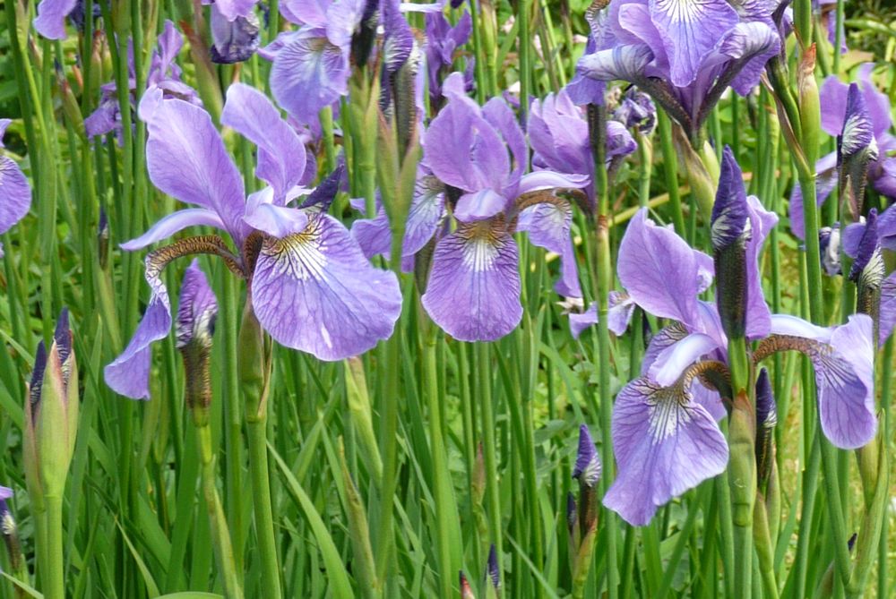
Photo by Jo
If you have time try to get out into the garden and sketch and photograph your favourite flowers. Make sketches of individual blooms, buds, stems and leaves to familiarise yourself with the shapes, and small composition sketches to explore the arrangement you may choose to paint. Iris and Weigela are blooming as are geraniums and Aquilegia so there should be plenty of colour around.
Photo by Jo
Before starting to paint explore the colours and brush strokes which will help depict the plant’s character and then review the composition sketchesmade outside and home in on one idea for the final painting. This may include just one or two plant stems relatively close up or with a backdrop of the same flowers or different plants giving an impression of a massed planting.
Experiment with colours and how they interact when mixed to find the hues and strength of washes you will need, erring on the side of making more wash and stronger washes than you think you may need. It is easy and quick to add water, not so easy to “drop in ” strong colour if it isn’t already mixed.
You may like to look at the following Pinterest board for some ideas on painting iris, link below:
https://www.pinterest.co.uk/jhall1282/flower-painting-in-watercolour/iris/
Your paintings:
by Ann
by Ann
by Maryon
by Maryon
Watercolour and Oil Pastel by Mali
by Mali
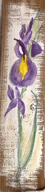
by Sandra
Watercolour by Sandra
by Anne
by Kate
by Vitginia
by Virginia
by Virginia
Watercolour Flowers, a Free Approach: Week 2
May 6, 2022
The first part of this post is a recap of what we did in the last session. The second part explores painting pale flowers and backgrounds.
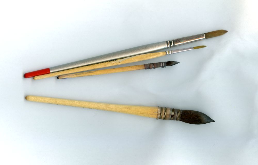
The much larger squirrel mop below these brushes has an excellent point so although I usually use it when when working at a larger scale it is a versatile brush capable of making fine lines and adding small marks for detail.
By increasing the pressure as the stroke is made and then decreasing the pressure as the stroke is ended and the brush lifted from the paper leaf shapes both thin and broader can be made with round brushes. We also used flat brushes to make a variety of marks resembling leaf shapes by twisting the brush as the stroke is made. Depending on whether the broad or thin edge of the brush is presented to the paper a variety of line widths can be made with flat brushes. Some of the best fun can be had by loading a brush; any variety and using it sideways as a printer on to dry or damp paper.
Below is a demonstration of a cornflower where flat and round brushes were used on wet and dry paper.
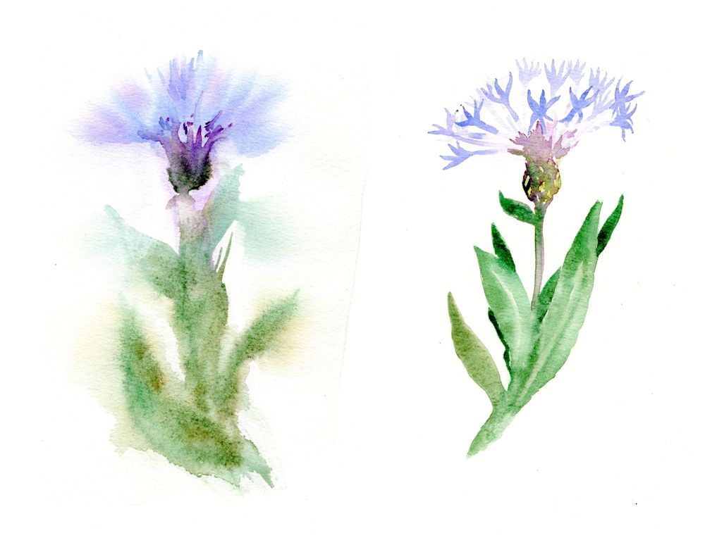
Painted on damp paper on the left and on dry paper on the right.
A wash of water was applied to half the sheet with a large brush and allowed to dry just a little. Colour was added as the paper slowly dried. Defined shapes occurred where the wash has been mopped with a “dry brush”, tissue or sponge.
When working in watercolour, especially when working on wet paper it is essential to have your colour washes mixed and at the ready, together with a sponge, tissue paper or to pick up excess paint as you proceed or to remove moisture from your brush so that the brush can be used to control very wet washes.
While the paint was wet a blunt tool was used to score the paper so that paint filled the troughs to indicate veins on the leaves.
Now it is time to consider backgrounds both for dark and especially for pale paintings of pale flowers.
It was then allowed to dry. Dark washes were added mostly wet in wet and with indenting to suggest marks on the flower as well as leaf veins. The dark leaf mixes were made using Viridian mixes with Alizarin and Purple and also Viridian with Burnt Sienna. The result of perhaps too many layers is a very dark painting of an azalea like flower.
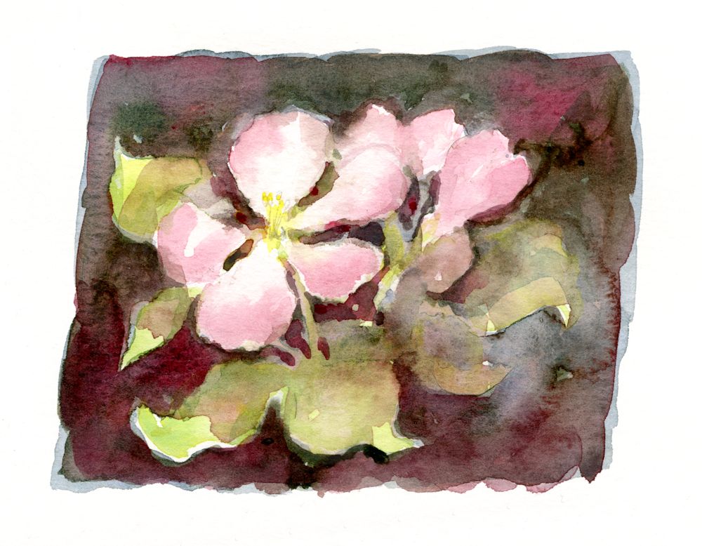
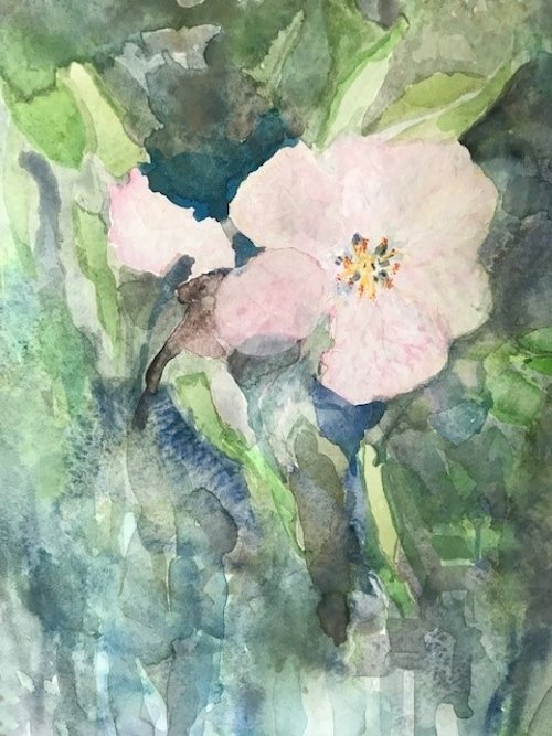
With a lighter touch a dark background to pale flowers can preserve a feeling of freshness as in the watercolour sketch of some apple blossom below. Here I did have a model in front of me and applied some colours using a round brush and very fluid washes on dry paper.
This was allowed to dry before dampening large areas of the sketch and dropping in colour. the shapes were refined using a small brush while the paint was still wet. Washes were allowed over the leaves in places refining their shapes. This time I stopped before the whole thing got too heavy and finally added some very pale yellow at the flower centre and a couple of pencil marks to indicate stamens. The result was lively and playful rather than accurate reflecting the joy apple blossom brings.
The point is that the background can often determine the mood of the painting and it is important that the way the subject is treated should be complemented by its background.
Left: painted around
Centre: masked
Right: wax resist
This week’s challenge is to paint pale or white flowers. Painting a background reveals the shapes of white flowers and is easier than painting pale blooms with no background. Colour, tone and how much to simplify backgrounds are all important factors to consider as well as deciding how free and loose you approach should be.
Inevitably you may question whether to mask or not to mask parts of the composition. Masking fluid can free you up to be more adventurous with the background but may make your flowers appear more graphic and less painterly. Painting around the subject may make you simplify more than was the original intention but that is not always a bad thing.
At the end of the day the only way is to experiment.
Left: background painted around the flowers
Right: masking fluid used on the flowers and the jar
The study on the left was of the same jam jar of flowers as on the right. The objects are more simplified and less accurate. Hints of colour have already been added.
The study on the right was carefully masked with masking fluid and washes applied when the masking had dried. Because the background was applied more uniformly and quite dark every detail of the marks made with the masking fluid are visible giving it a much more graphic quality. I was quite pleased with both and had I developed them further would have ended up with two paintings of the same subject but with a very different feel to to them.
Some more ideas for painting white or pale flowers can be found on my Pinterest Board, Link below:
https://www.pinterest.co.uk/jhall1282/flower-painting-in-watercolour/white-and-pale-flowers/
Photo by Jo
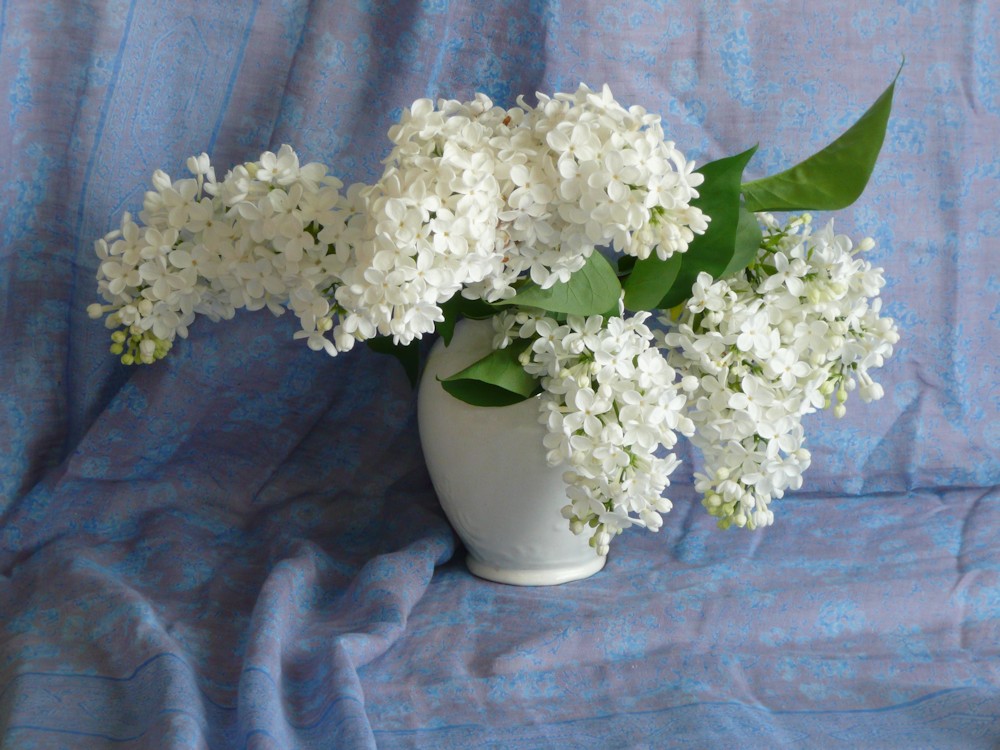
Photo by Jo
So first find some white flowers for the session and we’ll investigate ways to paint them in a way that has enough structure but still feels free and lively.
Your Paintings;
by Maryon
by Maryon
by Sandra
by Ann
by Ann
Flowers masked before painting the wet in wet background
by Anne
by Kate
by Kate
by Kate
by Virginia
by Virginia
by Mali
by Mali
Watercolour Flowers a Free Approach: Week 1
April 27, 2022
Wet in wet followed by dropping in more colour as the paint slowly dried. Final brush strokes applied when dry.
In this course the challenge will be to paint flowers freely in watercolour, using the brush for shapes and some really wet washes. Any under drawing in pencil will be kept to a minimum and the aim is to create some very expressive flower paintings rather than botanical illustrations.
The first two weeks will be spent on gaining confidence in drawing with the brush, suggesting plant structures with different brush strokes, applying washes either to to fill shapes or to paint around shapes. There will be a lot of dropping colours into wet paint or water and finding ways of controlling very wet washes and/or coping with and taking advantage of some of the happy accidents that occur on the way.
Bottom: leaves “printed on with a large round brush, brown stem/twig painted while the leaves were a little damp; berries added with the same small round brush when all was dry
Left: poppy seed head shape wetted with clear water, pale olive green added; brown dropped in when a little drier and pale parts lifted before all was completely dry
Complicated shapes may need a pencil guideline and we’ll practise filling shapes with water before flooding them with colour and also painting around shapes and making wet in wet backgrounds. This means it’s a good idea to think in advance about the overall composition, the colours you need and the tonal range. Keep the number of pigments you use low and experiment to find which mixes will suit the work best.
Your washes should be ready in sufficient quantity and in the concentration needed for the painting, before the first wash is delivered to the paper. Always mix stronger than you think you will need as the colours will often be added to wet paper and they dry paler than they appear when wet.
The execution may be quite fast and spontaneous but a bit of thought and planning ahead will be invaluable.
Think it’s finished?
The three artists chosen for inspiration have different styles and by no means limit themselves to flower painting. One can learn a lot from studying their work so I have put together a Pinterest Board, link below referencing their work and techniques so do have a look. Each artist has a section within this board.
https://www.pinterest.co.uk/jhall1282/flower-painting-techniques/
Trevor Waugh has a magical way of working with washes and has produced books on watercolour roses in conjunction with the RHS at Kew Gardens. Paul Riley‘s compositions of floral still life subjects are sometimes quite complicated, but a lot the techniques can be used in much simpler studies and one can learn a lot about drawing with the brush as well as working in broader wetter passages from his works. He enjoys using oriental brushes for linear work and mark making. I am sure many of you will know Shirley Trevena‘s imaginative compositions, rooted in observation but often with an unreal and exciting twist.
For this course it will be useful to have;
Brushes: One large round, one small round brush, a rigger brush and a flat (half inch or larger). If you have other kinds of brushes, great! They will all be useful.
Watercolour paper 300gsm or heavier: 300gsm will cockle a little when very wet so may be a good idea to stretch your paper or use a block for the more considered paintings but this is not necessary for the exercises.
A block to tilt your drawing board. This will be better than a table easel and we will be working flat some of the time and/or turning the paper round so this is much easier to arrange if a block of wood about six inches long and about 2 1/2 inches in cross section.
Watercolour paints and a palette with deep wells. If you intend to work large a daisy palette or a plastic bun tin palette will be useful, although for most purposes and up to A3 size I find my usual folding palette adequate. Tubes are easier than pans to work at a large scale and if using pans remember to flood your paintbox with water so the pans are moist and the colours can be lifted easily without scrubbing the pan with the brush. Some artists use a different hardy brush like an acrylic brush for lifting paint from pan to palette to lessen the wear on their watercolour brushes.
Also: water pots, paper towel, small natural sponge
A couple of flowers to inspire your brush marks and washes.
This first session we’ll make a lot of brush marks on to dry paper and on to paper that is damp or randomly spattered with water. When making these marks we will have flower structures in mind but the purpose will be to find ways of making marks and controlling washes that will give a lively and free way of expressing these forms in watercolour.
After the exercises an expressive study of your chosen flowers should be attempted. The exercises will be done in real time as they are demonstrated at the class session. Hope the illustrations will give you a few ideas for the session.
Your Paintings;
by Sandra
by Ann
by Ann
Watercolour painted wet on dry by Virginia
Watercolour painted wet in wet by Virginia
by Mali
by Mali
Watercolour by Kate
by Maryon
by Maryon
Paint a Flower in watercolour: wet in wet or wet on dry?
May 25, 2020
One of the best things about watercolour is that it runs and to get some of the most exciting results it’s a good thing to take a few risks. As a bit of a control freak (where paint is concerned) I have found it as daunting as any one, but with a little practice I can now let my paint run without it getting out of control. I have chosen flowers for this week’s challenge, simply because they are beautiful and abundant and offer good scope for trying some elements of wet in wet technique.
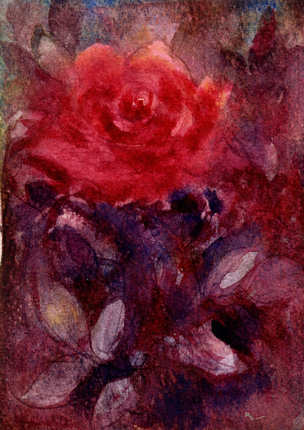
Red Rose: pigments; Crimson Alizarin, Blue Ultramarine, Cadmium Lemon
Much of this painting was made wet in wet and the lines were made by indenting with a cocktail stick while the wash was very wet so that the pigment flowed into the groove. This could have been done with the handle of my brush. a fine embossing tool or any fine object that would dent but not tear the paper.
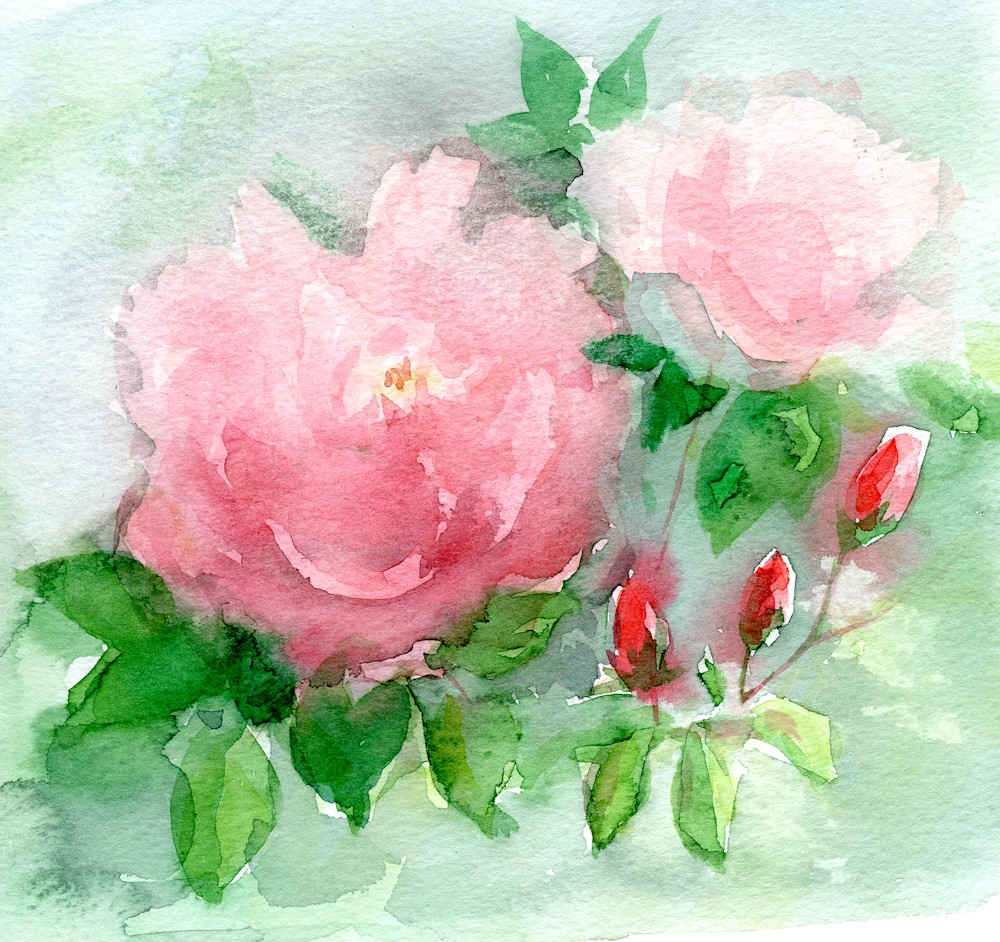
Pink roses in my garden; painted outside
Pigments for pink roses in my garden; Crimson Alizarin, Schminke Olive Green Permanent, Cadmium Lemon
One of the first considerations when painting flowers using any technique is to decide on the palette that best suits them and the mood you wish to convey. The dark rose above was painted with Alizarin Crimson, French Ultramarine and Cadmium Lemon. The very fresh looking pink rambler was again painted with the same red and yellow but handled with a much lighter touch and I used a Schminke Olive Green Permanent mixed in places with the red and yellow. Unlike some olive green pigments this one is a fresh green which was exactly right for this rose. Usually I mix my greens but there are no rules just observation and experimentation.
Although I have chosen roses for the examples feel free to choose any flower but I would like you to paint from life and to use the brush rather than draw with pencil before painting. This seems harsh but will lead you to a freer technique with your painting and/or improve your brush skills enormously!
Four stages for night rose
This rose started with a few arc shaped swirling brushstrokes that I gradually dropped colour into while the paper was still wet. I worked out from the centre until the whole paper was wet. I left this wash to dry before rewetting areas of the paper and dropping in more colour and lifting colour where needed. I left the second wash to dry then added foliage on some wet and some dry paper. At this stage I was unhappy, left the whole thing to dry, rewetted some of the rose and much of the rest of the paper but left some dry and then dropped in some crimson Alizarin and Ultramarine which gave it a rich rather than fresh look. I allowed myself to go on an untried journey, making mistakes but learning all the time.
The yellow rose below was painted with a much warmer palette of Indian Yellow, Scarlet Vermilion, French Ultramarine and Burnt Sienna. I came across this combination recently from the artist Trevor Waugh and would encourage you to look at his flower paintings and also those of Paul Riley. When you have chosen your flower, try colour mixes with three or four pigments at the most to find which will work best. Do look at the leaves and stem too as very often the colours in the flower occur in lesser quantities in the leaves and stem. Experiment by trying out various pigment combinations and find out how your pigments behave on their own, in varying degrees of dilution, and then seeing how they mingle when allowed to flood into each other as well as how they act when mixed in the palette.
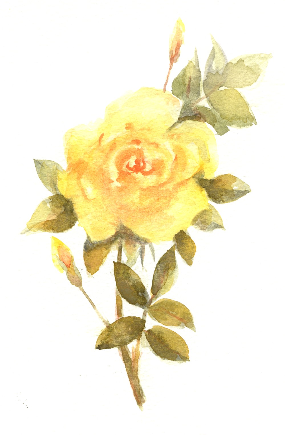
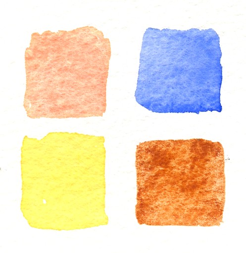 Clockwise: medium to pale washes of French Ultramarine, Burnt Sienna, Indian Yellow and Scarlet Vermilion. Sadly the Indian Yellow here appears too lemon; it is in fact a lovely warm yellow.
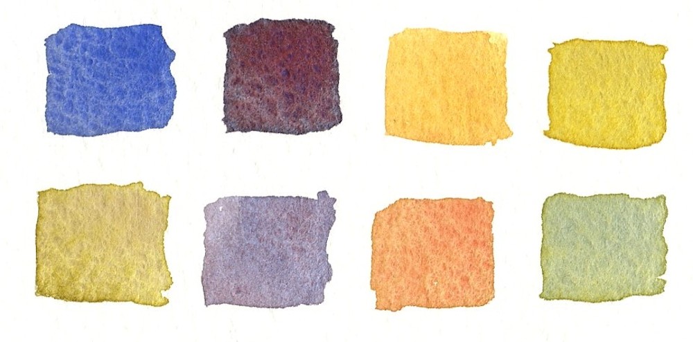
The same pigments mixed in the palette
Same pigments wet in wet
When working by dropping pigments on to each other while wet or dropping pigment on to wet paper the results are not always as expected; quite often the pigments mingle rather than mix as they do when agitated in a palette. Dropping pigment in to wet paper creates a very fresh look especially useful for delicate petals.
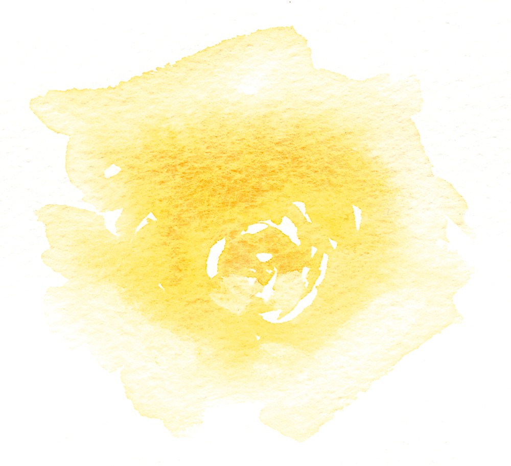
First trial wash for the yellow rose. I loaded a large pointed round brush with a fairly dilute wash of Indian Yellow and made spiral marks that echoed the shape of the rose leaving some paper bare. I diluted the wash as I worked outwards wetting much of the paper. I then returned to the still wet centre of the flower and dropped in more yellow and a little Scarlet Vermilion.
Colours decided I then mix up quite a quantity of the washes I wish to use and have the same pigments squeezed out or on wetted pans so that more concentrated colour can be quickly lifted when needed. When working with very wet colour always test the strength of your wash as watercolour always looks darker when wet. Having said that go quite gently when working with pale flowers.
Suitable papers for this way of working are NOT or Rough watercolour paper 300gsm or more in weight. If you are working on a small scale you may not need to stretch papers over 300gsm and this certainly is not necessary for experimenting with your colours. If you work very wet for your final paintings either stretch your paper or work on a block unless you have paper about 425 gsm and above or are prepared to work with less controllable washes and stretch your paper from the back afterwards.
With roses I often start by loading a large pointed round brush with pigment and making strokes that follow the petals as they spiral outwards; a series of arcs that describe the form of the flower, leaving little gaps where the palest areas are and loading my brush with more water as I work outwards till, if I wish to drop a background in I continue till the whole paper is wet.
I may at this stage drop some pale pigment into the centre of the flower and the same or other pigments into the background. As the wash dries I can continue to drop more pigment in, becoming gradually much more strategic about where, and lifting out pigment in places where needed. It’s hard to put all this into words so I hope the images will help and give you some ideas about how you may like to work.
After getting the first wash down with at least some some wet in wet passages, I let it dry, then re-wet the paper where I want to deepen the colour by dropping more pigment in, or work wet on dry to add leaves and stems. Another good tip when rewetting paper is to rewet a much larger area than you intend to deepen with more colour. It is much easier to avoid unwanted hard edges. It is also a good idea to work leaves with a large brush so that the shape can be described with one or two stokes. The paper will still be damp enough for you to drop more colour or a different colour into your leaf before it dries. As with everything practice on another piece of paper first.
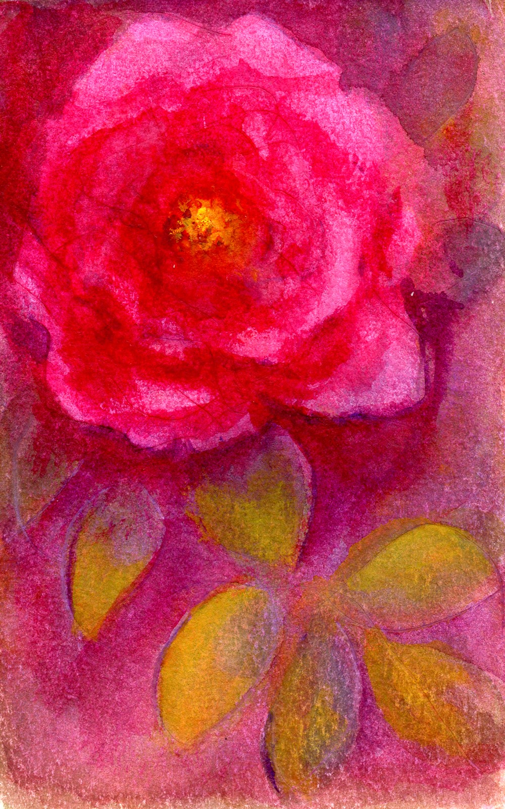
Deep Pink Rose; pigments; Permanent Rose, Cobalt Blue, Cadmium Lemon
Gradually build your painting up till you are happy with it but be prepared for accidents that happen with washes. Also work in the knowledge that you can soften an edge after it has dried with a brush, damp natural sponge or a piece of tissue paper after re-wetting the area. You can also lift out pale areas of petals and or background in the same way.
The number of pigment combinations possible is enormous but I do recommend you use only three or four pigments for the whole of each painting. Try to find how many colours your can make from the pigments you choose and think about whether you need a cooler red or a more lemon yellow etc for your particular flower. Experiment with all the pigments in your box then select your three or four. At first I would not advise using black or Payne’s grey as such beautiful neutrals can be mixed, and result in a more unified work.
Don’t listen to the words, look at the pictures, observe your flowers, pick up your paints and have fun!
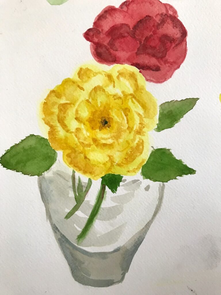
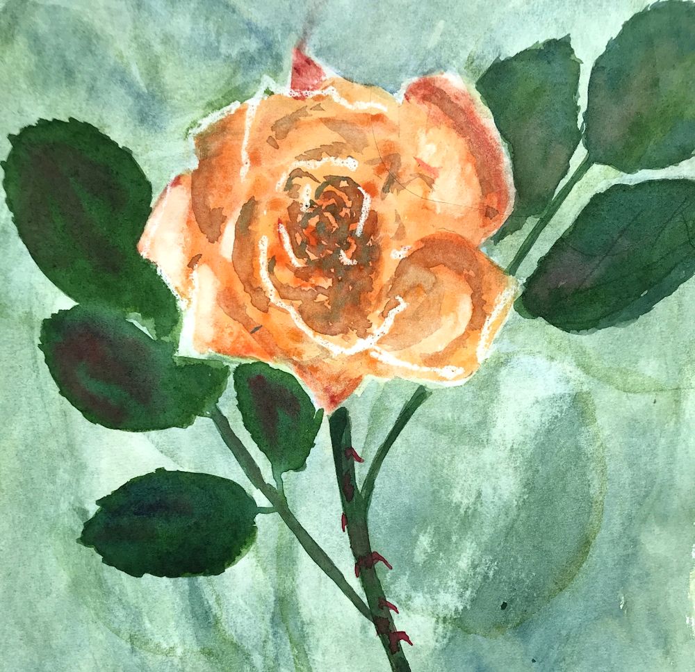
Your Paintings:
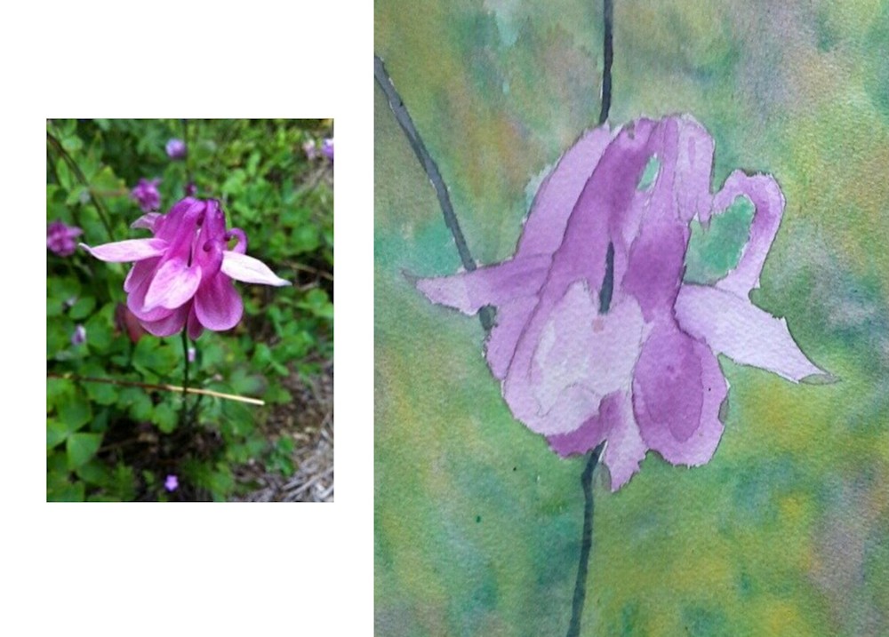
Aquilegia: watercolour and photo reference by Angela
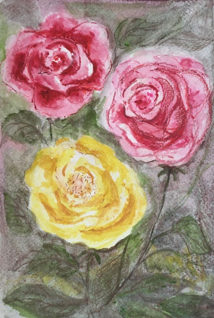
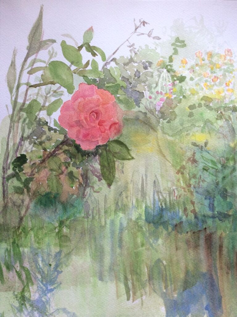
Archway Rose by Roger
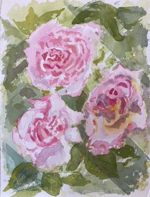
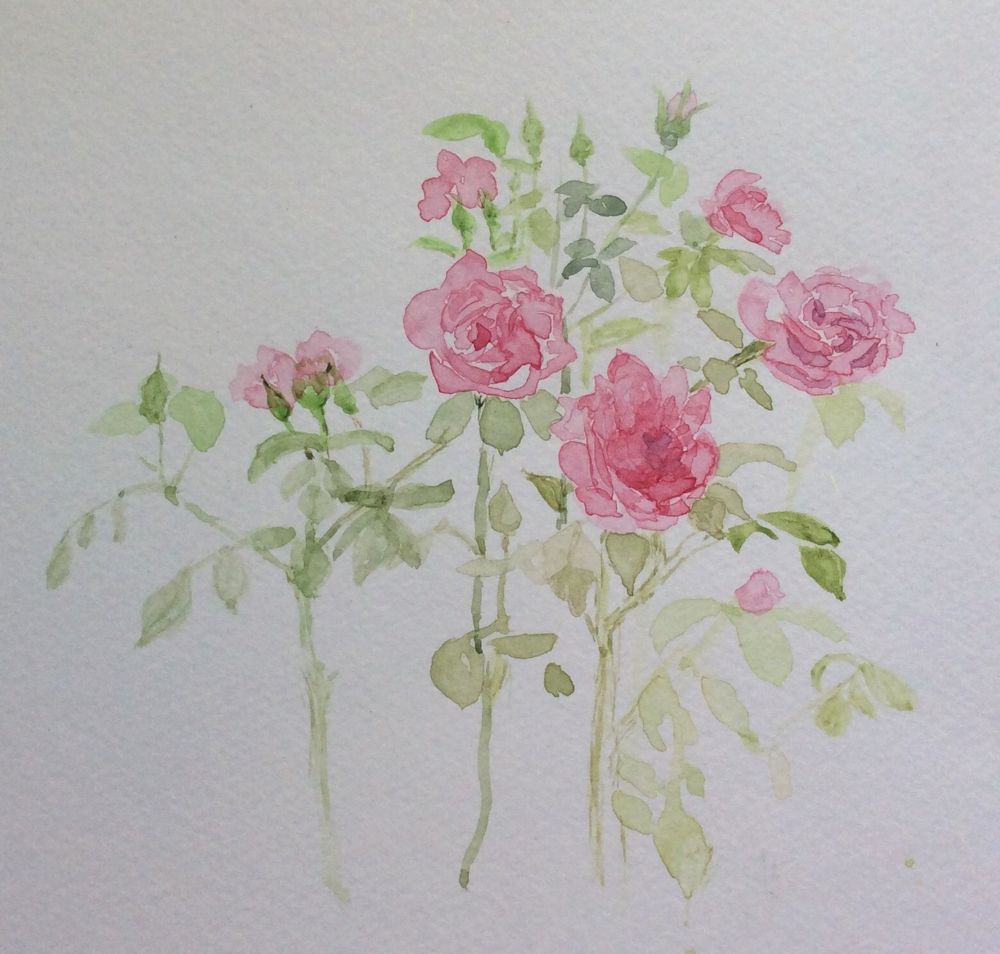
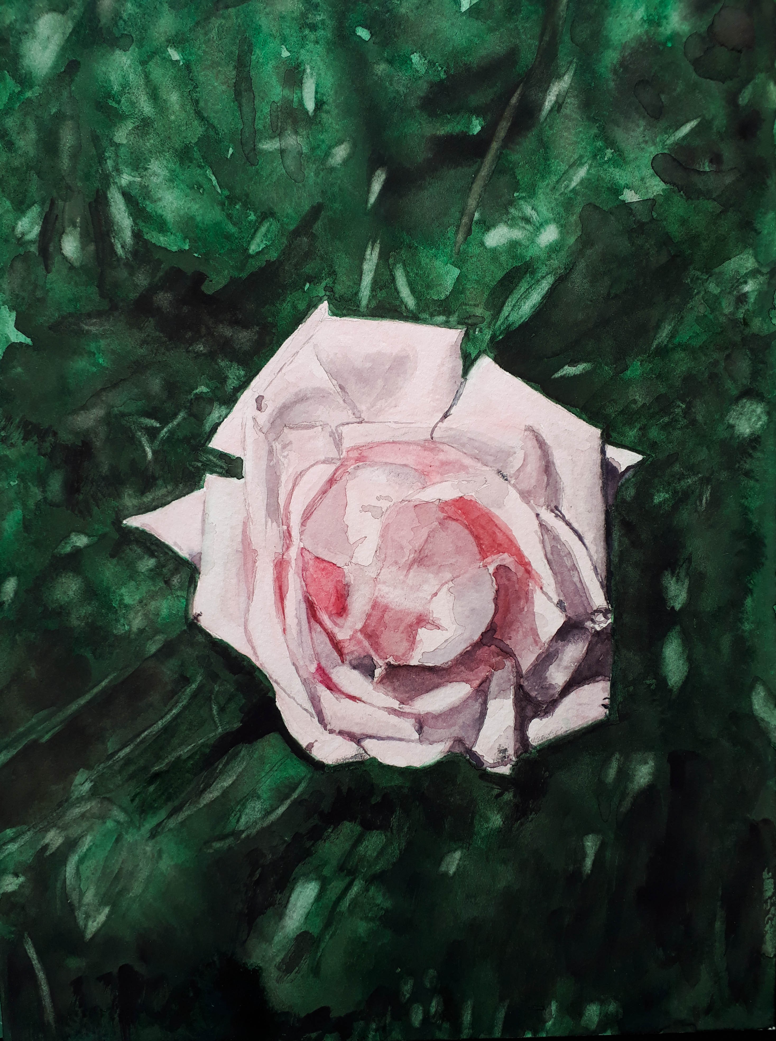
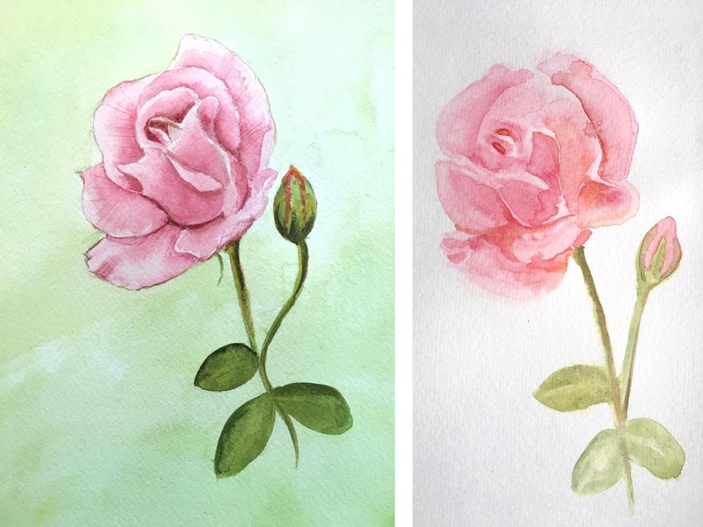
Roses by Ann
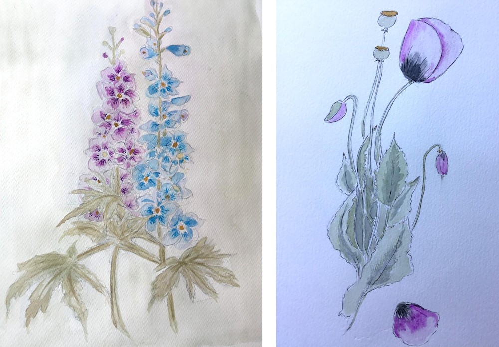
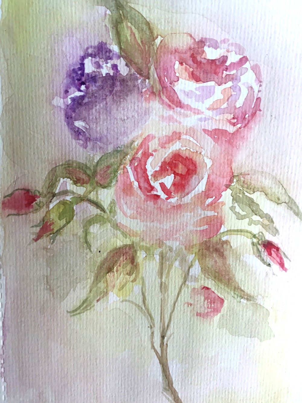
Delphinium and Poppy by Ann
Roses by Heather
Rose by John
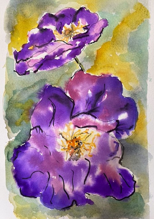
Flowers by Liz
Roses by Maricarmen
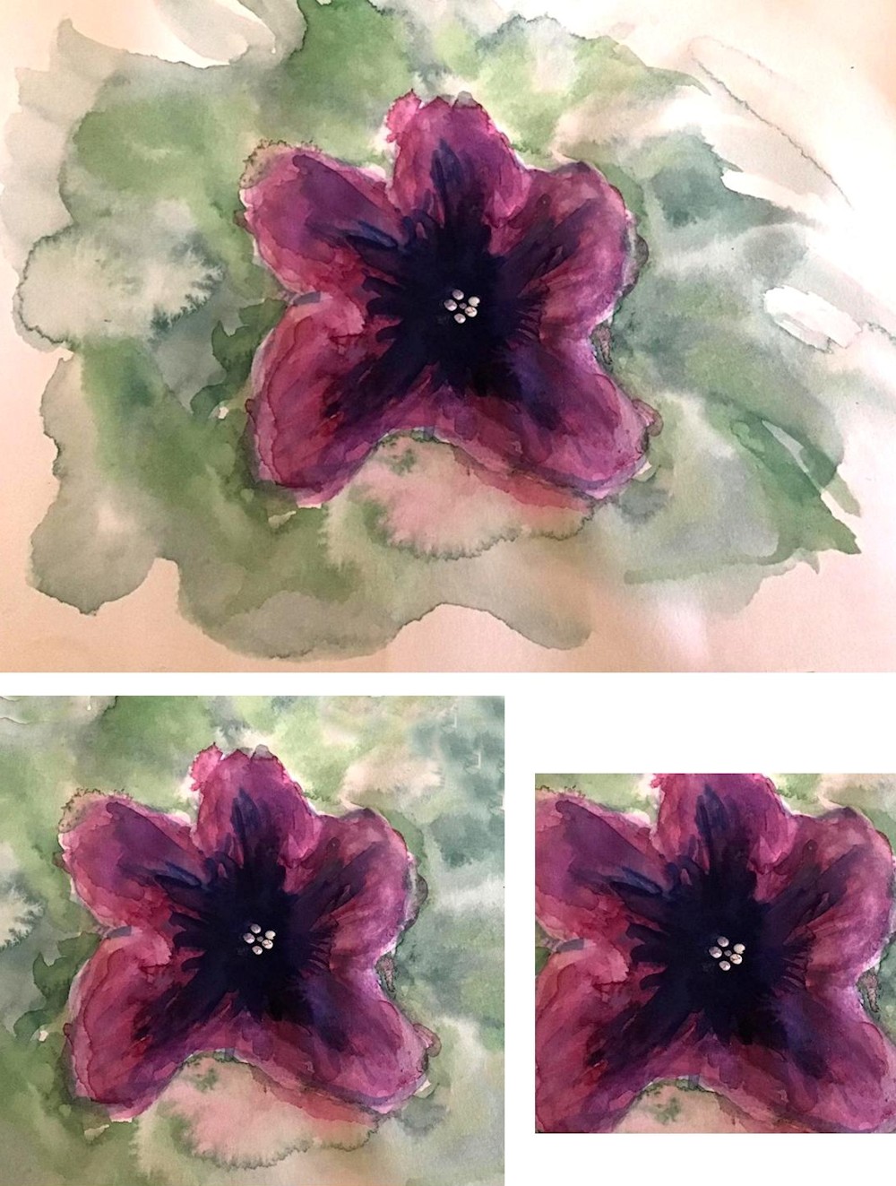
Petunia by Rosemarie
Petunia by Rosemarie
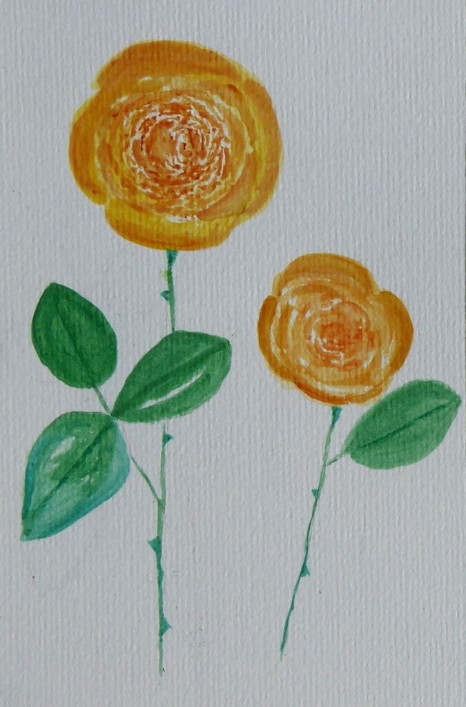
Orange Rose by Sandra
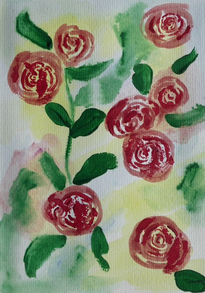
Red Rose by Sandra
Pink Rose by Shane
Pink Rose 2 by Shane
Draw a Flower at Different Stages of Opening: charcoal and pastel
March 30, 2020
This week’s challenge is to find a flower and draw it from bud to full flower. You may still have daffodils and there are loads of primroses, periwinkles and flowering shrubs and very soon we will have tulips. Look especially at the relation between the stem and the flower head and the axis of the flower. The daffodil in bud follows a line almost straight from the stem and then the stem bends down sharply as the flower opens. The trumpet starts as a cone behind the petals and is aligned with the new stem direction. Look at how the petals attach near the base of the trumpet and how seen from the front the petal tips lie on a circle. As you turn the flower head around the tips lie on an increasingly shallow ellipse till you see the flower in profile.
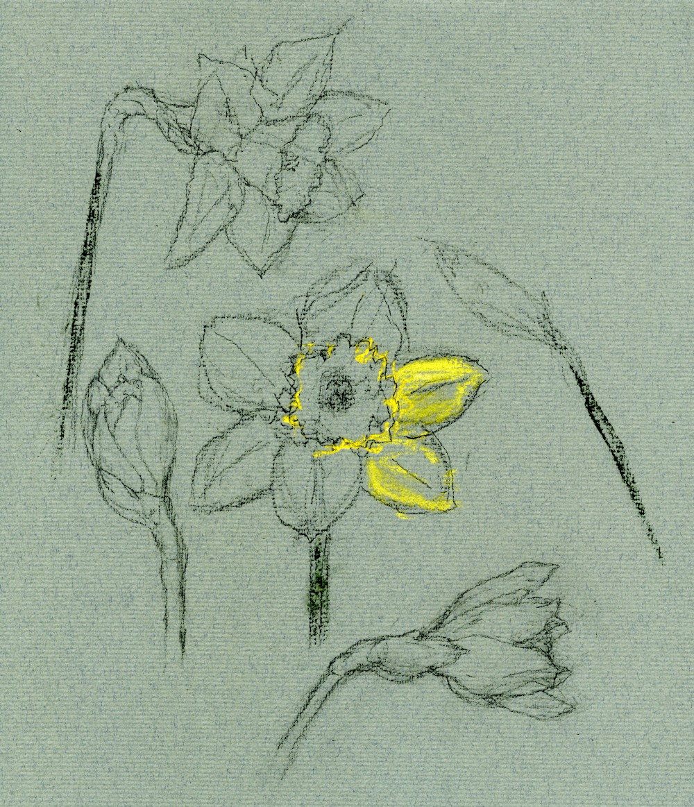
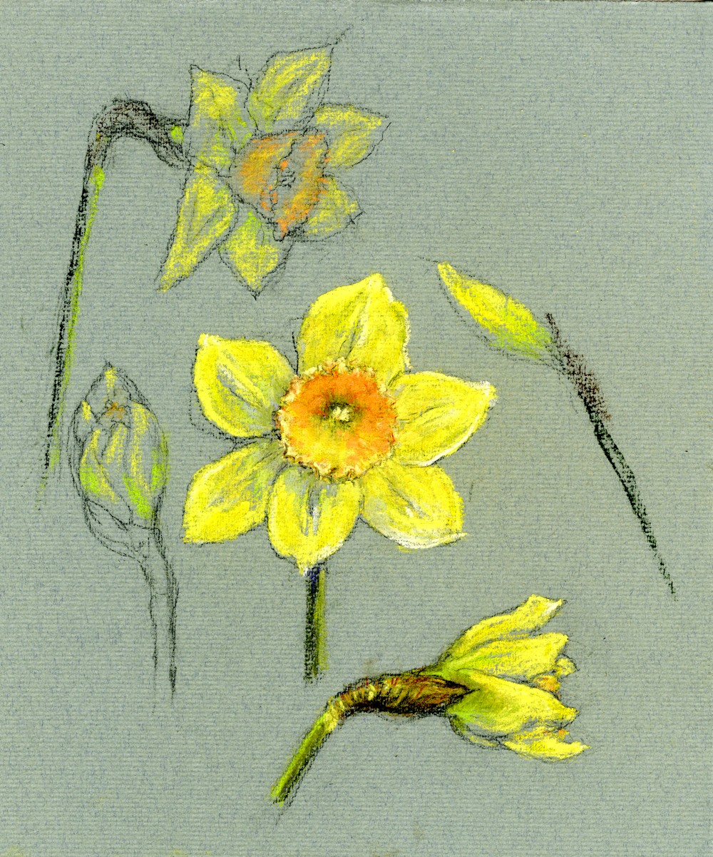
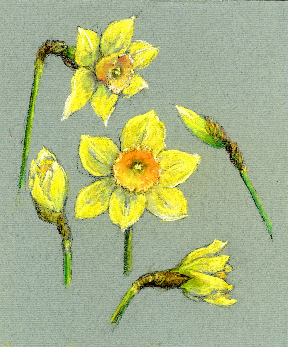
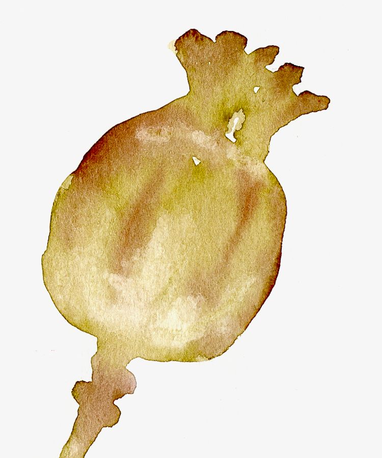
In June we’ll see the poppies emerge doing the opposite, their buds dangling till they open then turn up to face the sun! The daffodil example was drawn in charcoal on green Ingres paper and then layers of soft pastel were applied to finish.
The Response: Your Drawings