Watercolour Flowers Week 4: Composing with Flowers
May 18, 2022
by Jo
This week the challenge will be to make a painting with flowers of different sizes and colours in the garden. Perhaps find two or three large blooms, poppies for example with spikes of blue Veronica and white daisies making a soft focus backdrop. The colours in your garden may be more harmonious like foxgloves withe pale pink and purple Aquilegia.
In week 2 we looked at dark backgrounds for pale blooms but in the real world you will find flowers against backgrounds that are similar or paler in colour and you may also find flowers like pale Rhodedendrons and Azaleas where the leaves form a dark green backdrop for the blooms.
This challenge should result in a fairly free painting of the flowers but with close attention as to how various background shapes, tones and colours work harmoniously or discordantly with some large flowers seen close to. Do look at the works of Shirley Trevena: Pinterest Board link below
https://www.pinterest.co.uk/jhall1282/flower-painting-in-watercolour/shirley-trevena/
These works on one level are quite free but are also highly organised. See how she arranges the little painting of spray carnations where half the painting is dark against light and this is reversed in the top half. Your painting may not be this extreme but be very aware of how the flowers appear against different colours and tones.
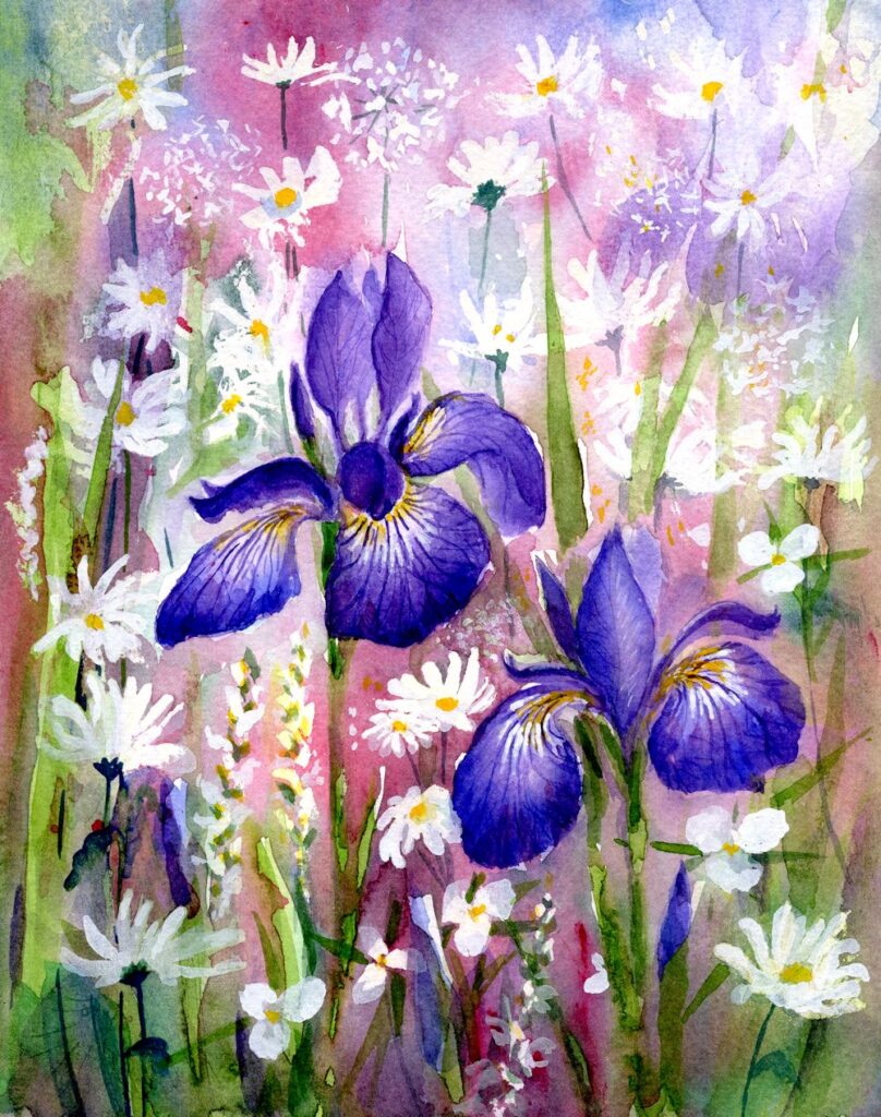
Below is the iris demonstration given last week and how it developed into the painting heading this post.
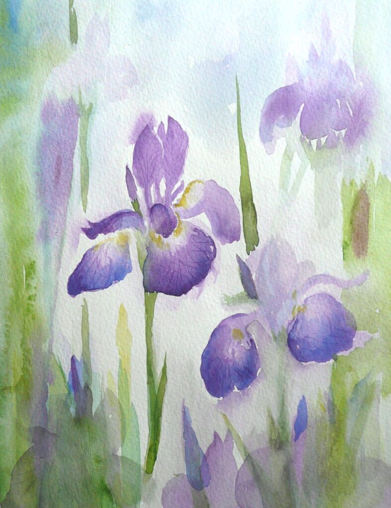
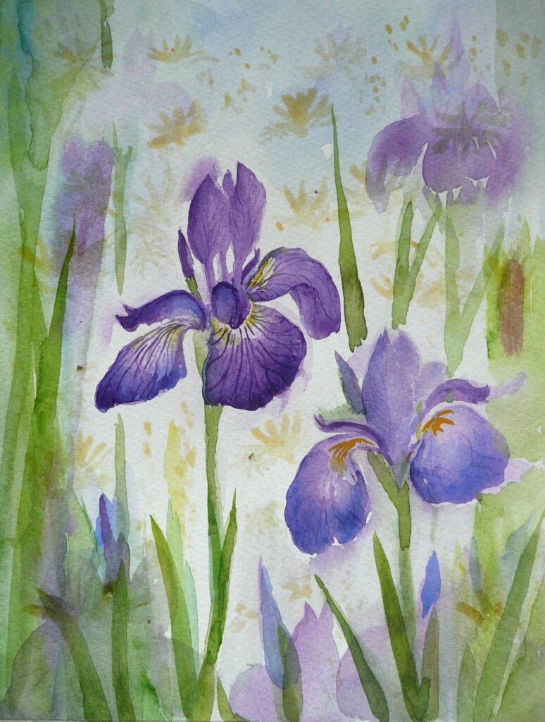
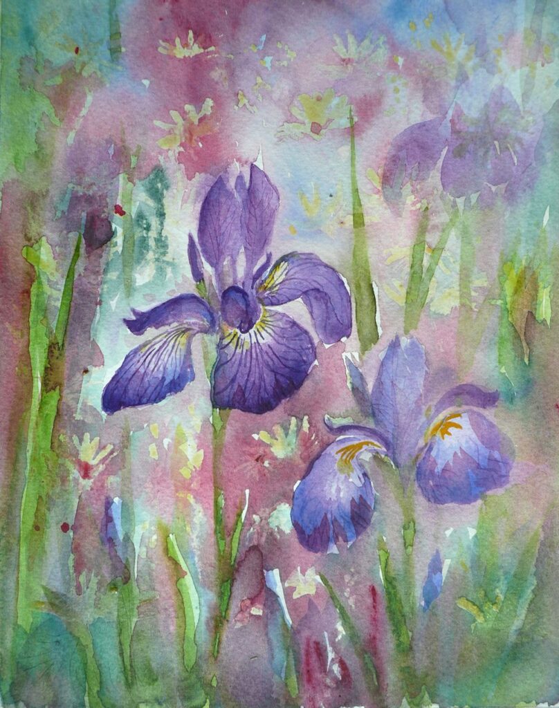
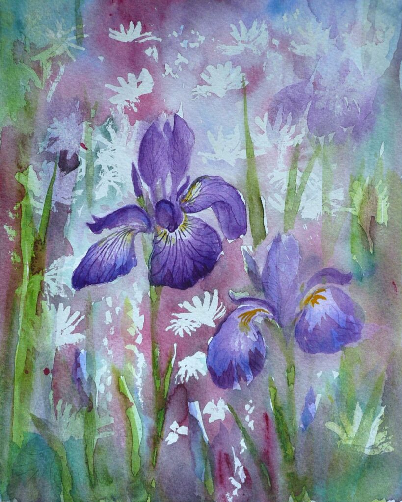
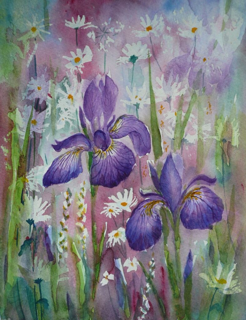
The colours of the Iris buds and and the fall petals were strengthened with further washes of Dioxazine Purple (Winsor Purple) with a dash of Ultramarine Blue.
Apart from the two iris blooms this was composing as I went along. One change in some sort dictated the next till I felt some sort of balance was achieved.
So far we have used very little in the way of a guideline drawn with pencil to map out the shapes so have gained a lot of experience in handling the paint with a brush. It’s now time for a slightly different approach.
This is the week where a tonal sketch before setting off on the final painting will help enormously in organising the composition with regard to the light and dark areas. It would also be a good idea to make another small study juxtaposing some of the colours you are going to use in the foreground with the smaller shapes and colours in the distance and play with the hues surrounding each flower.
When the sheet of of watercolour paper for the final piece is in front of you, make sure to mark the paper so that it is in the same proportion as the composition sketch or photo-reference chosen to work from. Do map out all the main areas and challenging shapes with pencil. Think about whether and where to apply masking fluid or a wax resist for the white/palest areas. It may be that it would be better to reserve the white of the paper by painting around the shapes to be left untouched and to used pigments that can be lifted out while the paint is still damp or after the first washes are dry. Note that “staining” pigments do precisely that and will sink into the paper so that when dry they are very hard or impossible to lift out.
As the painting progresses it may be that elements of the flowers and the background are worked at the same time. It can be great to leave some hard edges but there will be other places where it may be good to let wet paint bleed from one area into another. Make sure a damp sponge, “dry brush” (brush dipped in water then squeezed gently in some paper tissue) or just the paper tissue is to hand in case the flow gets out of hand.
Don’t worry about the end result, to some extent you will have to go with the flow, enjoy the process and have fun. Not sure whether this post will get illustrated but if not there is plenty of food for thought here and plenty to look at on the Pinterest Board.
Your Paintings;
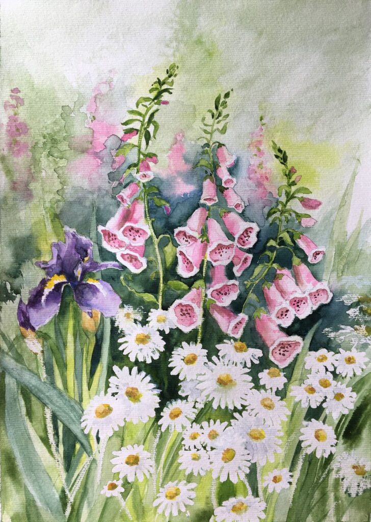
by Maryon
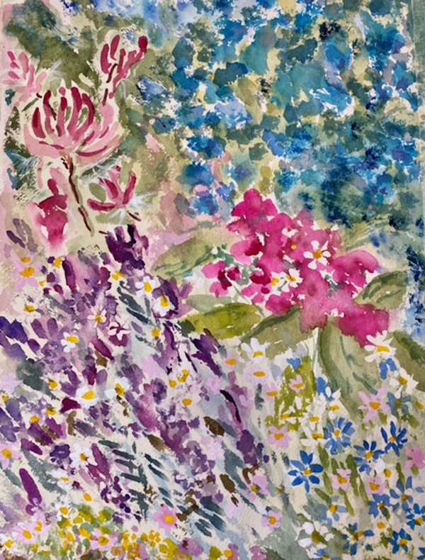
by Sandra
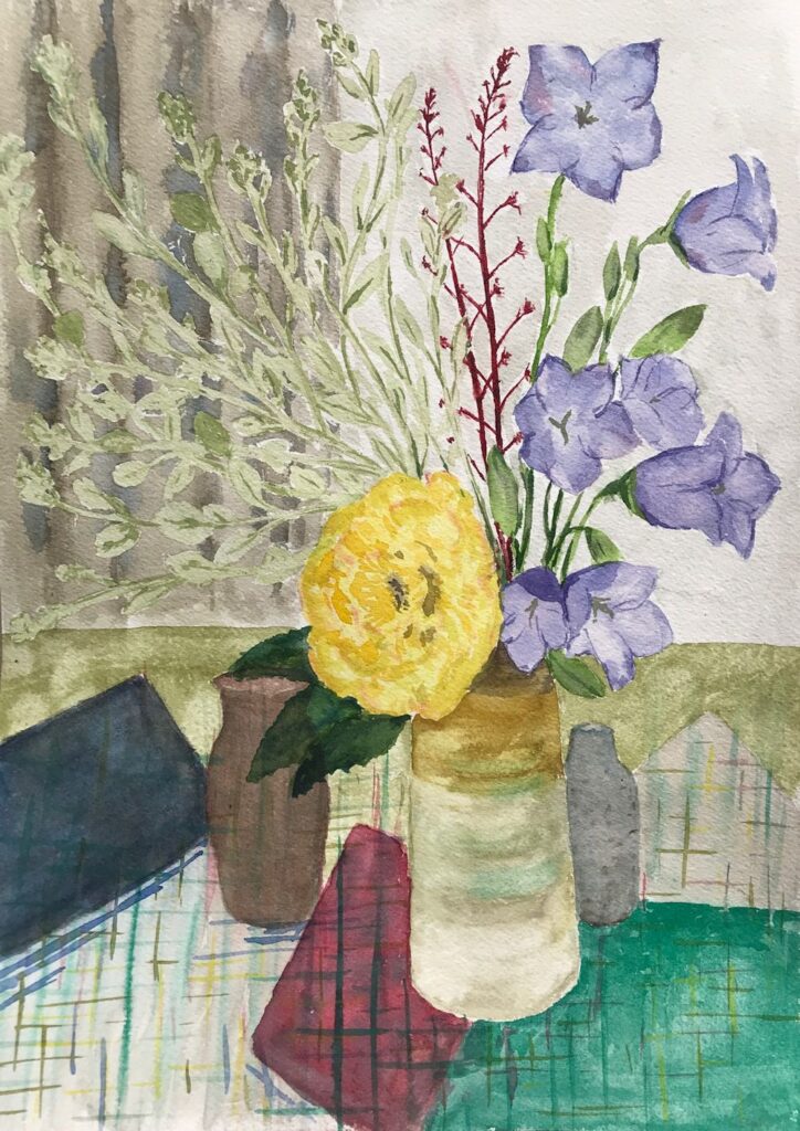
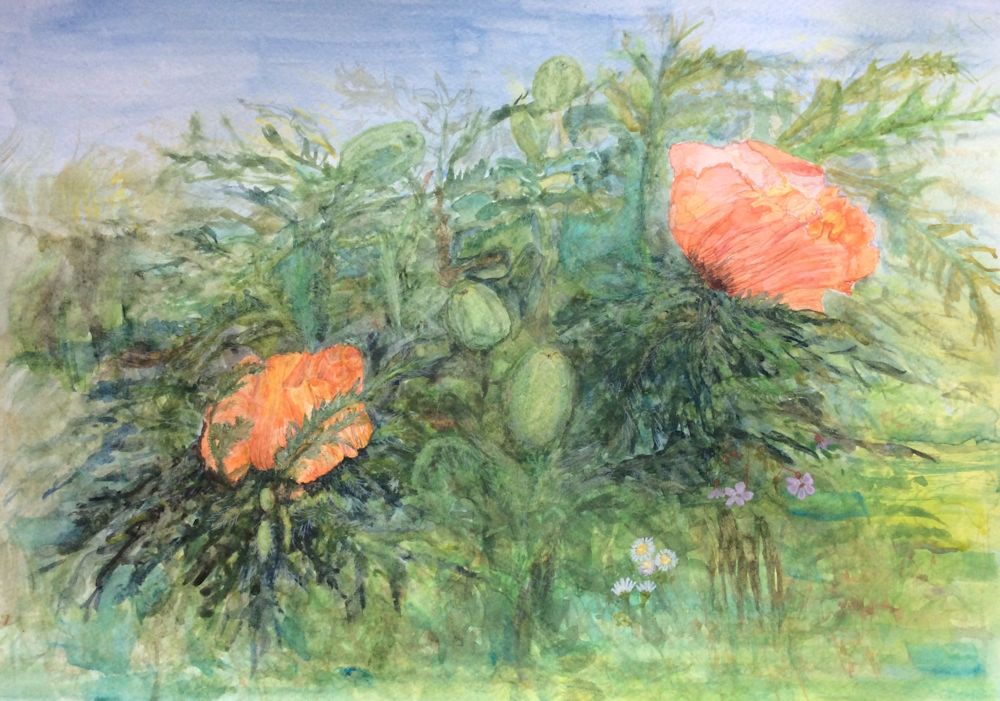
by Mali
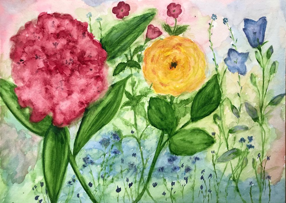
by Mali
by Anne
by Kate
by Ann
by Ann
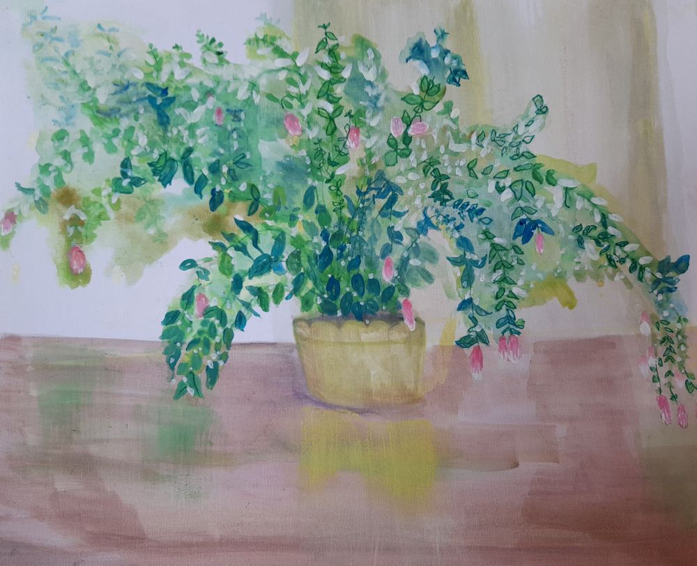
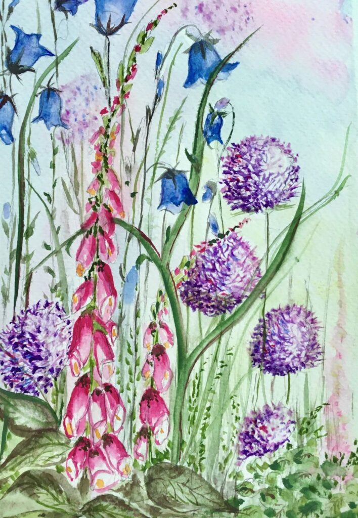
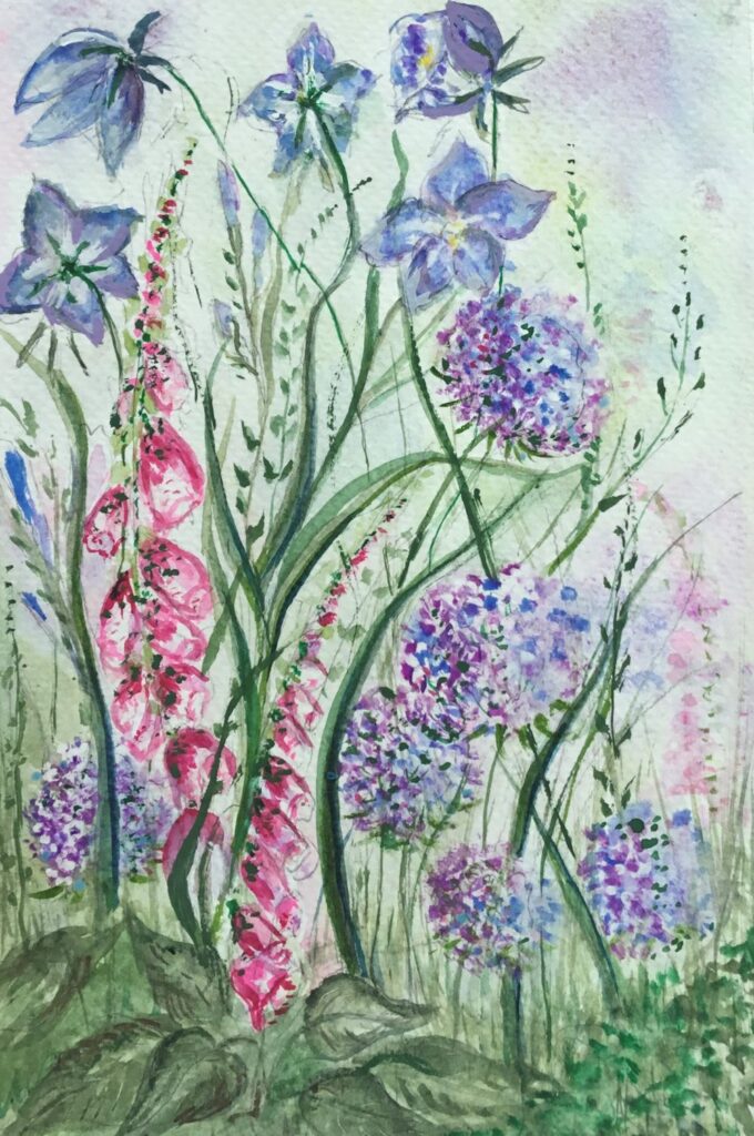
by Virginia
by Virginia
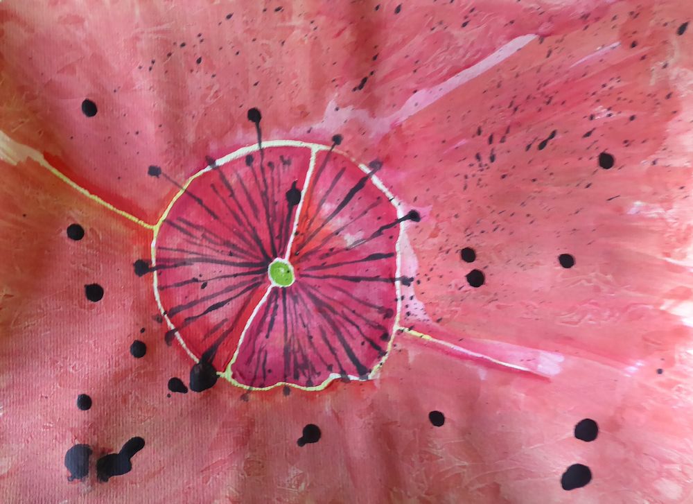
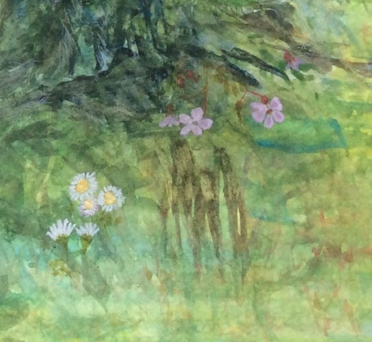
This beautifully painted detail from Virginia’s painting above could be easily overlooked when seeing the whole painting at a small scale as above.
Just delightful!