Babies and Young Children : Week 4
September 17, 2021
Pencil
This week’s challenge is to draw or paint the whole figure of a child, a child with another child, or a parent and child study. If you are fairly new to drawing I would advise drawing a single figure for your painting and to practice making as many small sketches of children whether from life or from photographs as you can, to train your eye to be accustomed to the fact that children’s heads are larger in proportion to their height than adult heads.
Watercolour
Not a whole figure but put into a context.
When painting young children either standing or involved with some activity it is useful to drop a perpendicular line from the highest point on your reference to work out the proportions of the body and the angles that the shoulders, hips and limbs and their relative lengths. Also put a perpendicular on your drawing paper. Some measuring will help you to see and draw taking into account any foreshortening that may occur as when an arm is pointing directly at you! If you prefer to draw completely freehand before painting, check the accuracy of your drawing by dropping a perpendicular from the same point as done for your reference.
As always also look for any clues from negative spaces that will help you get the proportions and lengths right.
With clothed figures, especially full skirts and baggy trousers try to imagine the limbs beneath them and their relation to the spine. Look at whether one shoulder is higher than the other and how this works in relation to the neck.
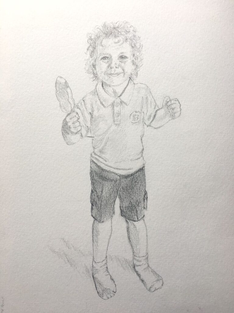
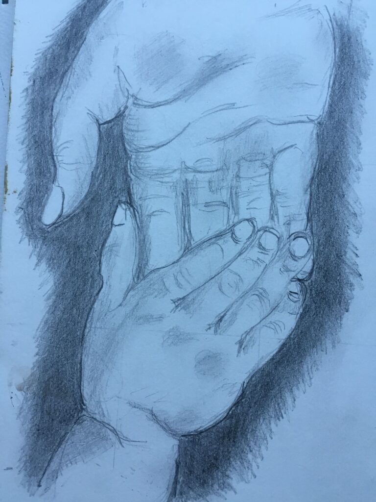
Pencil
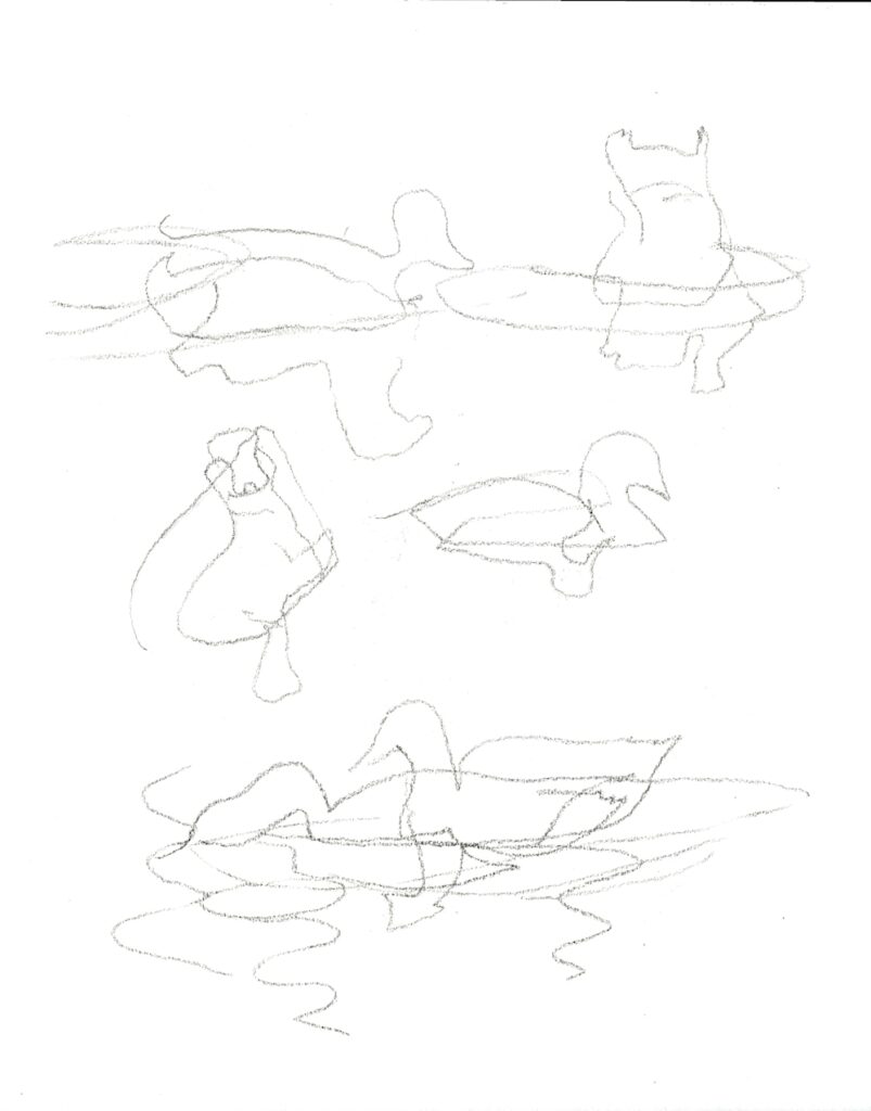
The little sketch above is of six year old Toby balancing on a wobble board. Note how in the figure on the left both feet are bearing some of his weight and if a line is dropped from his neck it would fall between the two feet. In the figure on the right most of his weight is on his right foot (left in the image) and a line dropped from his neck shows the neck to be positioned directly above the load bearing foot. Try to draw simple line drawings from life or ‘photos of standing children standing with the load shared between their feet, and also where the load is mainly on one foot. Then try to draw some children in the same way when they are actively engaged in a sporting or other activity where they are in motion.
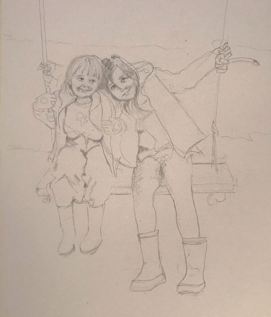
If you have the opportunity and wish to draw a group of children together especially where their forms overlap, treat the group as one whole shape before homing in on the individuals. Work lightly at first so that you can adjust as you look at your subject more critically as the drawing progresses. Lastly make sure you take more time looking than drawing so that all the main shapes are correct before committing yourself to painting.
In the initial stages of painting look very critically at the direction of the light and how this affects the tones that reveal the form of the child. Look also at how light can affect the darkest local colours, for example even a black T-shirt can appear quite pale on the side that is turned toward the light but retain its dark appearance where turned away from the light source.
Lastly look at shadows cast by the child’s form; e.g. a shadow of the head falling on to the child’s neck and shoulder; shadows below the feet which will help anchor the figure to the ground; and in some cases the shadow of the whole figure against the ground or cast on a wall etc.
For examples of drawing and painting children look at the Pinterest Board below:
https://www.pinterest.co.uk/jhall1282/portraits/babies-and-young-children/
Your Paintings:
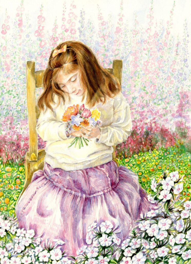
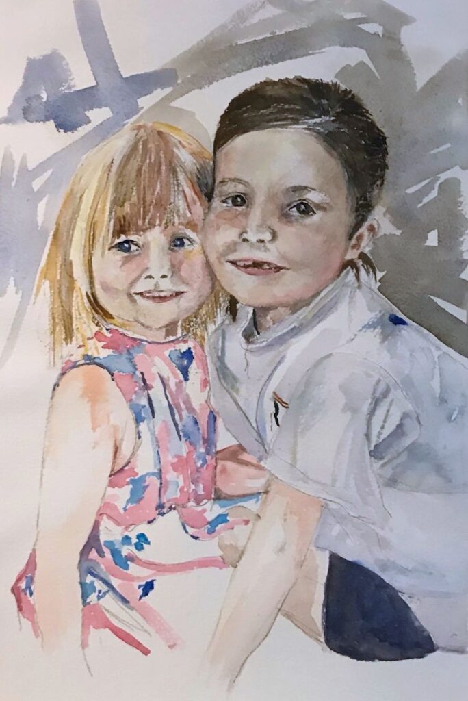
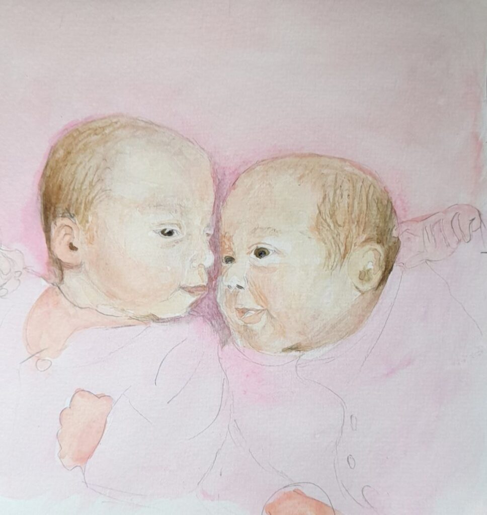
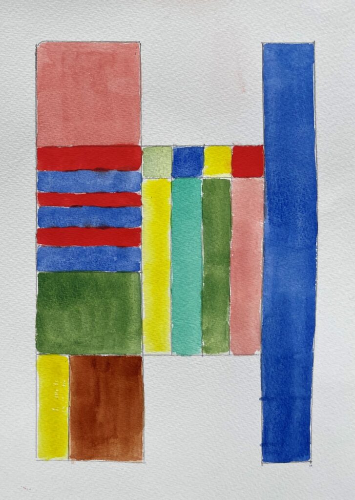
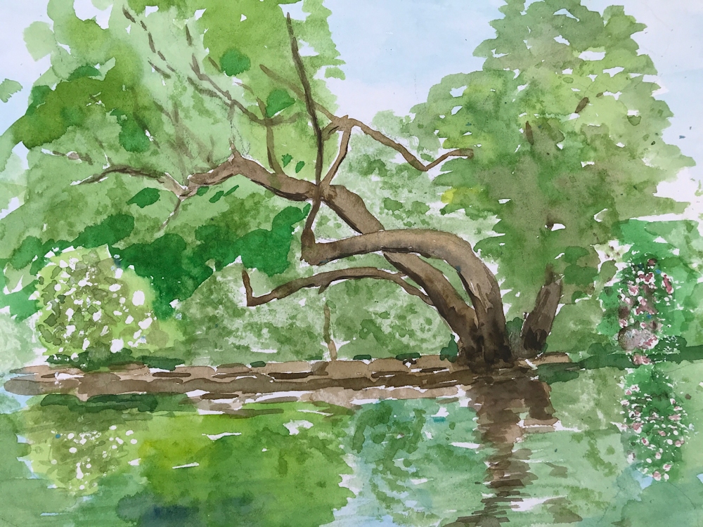
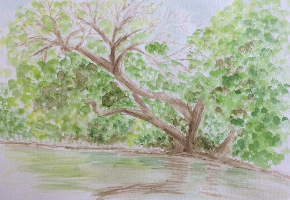
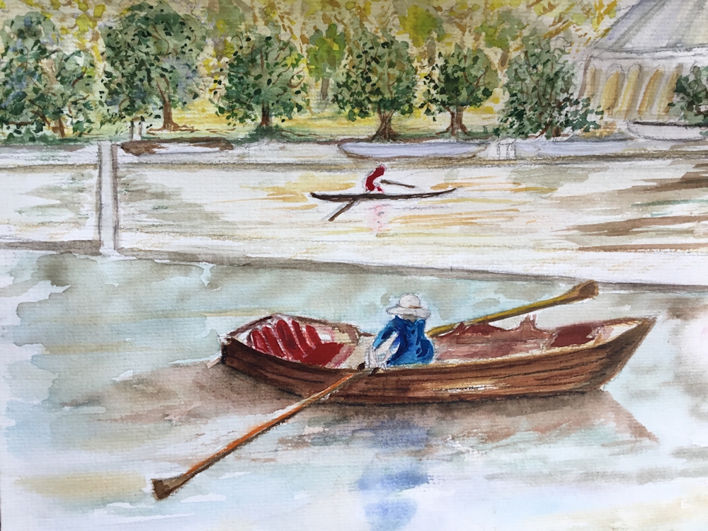
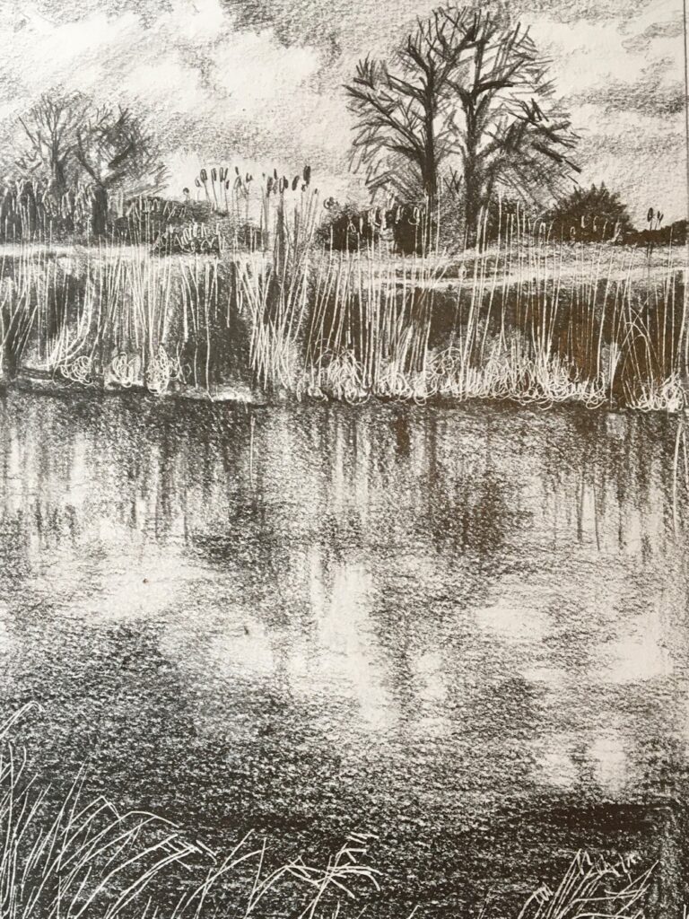
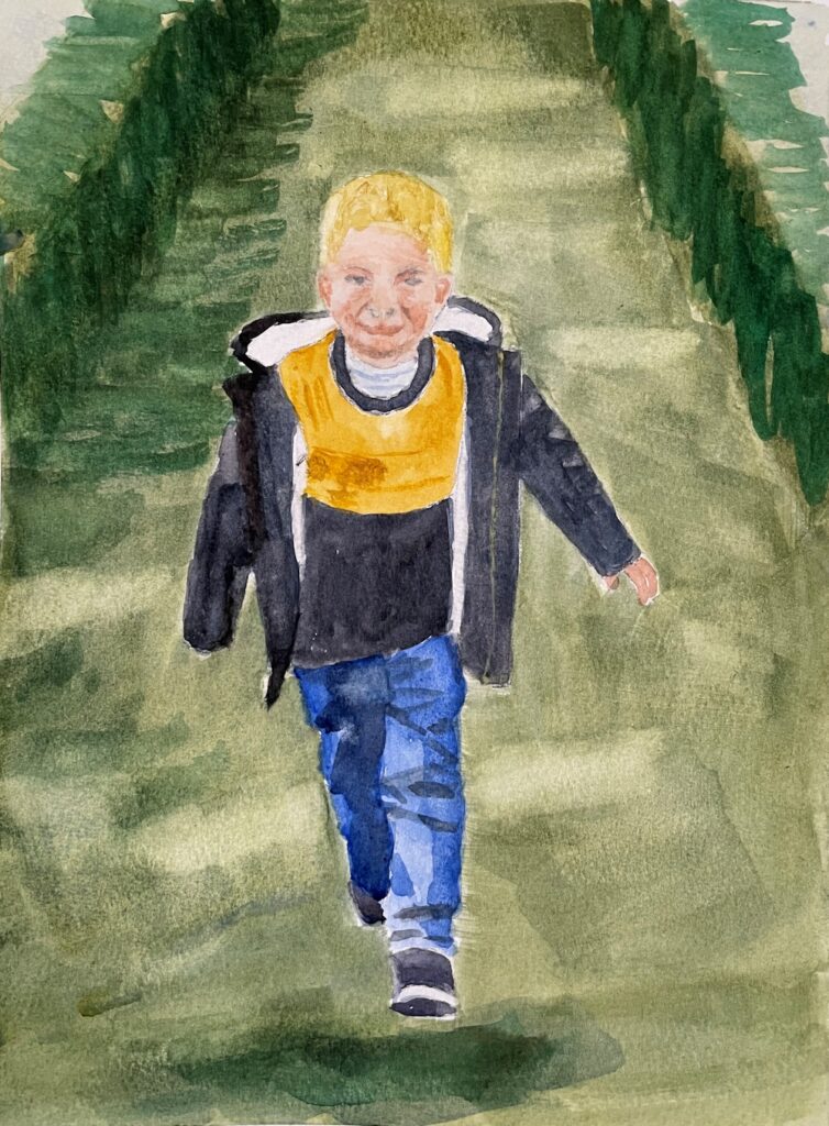
Watercolour by Maricarmen
Charcoal by Heather
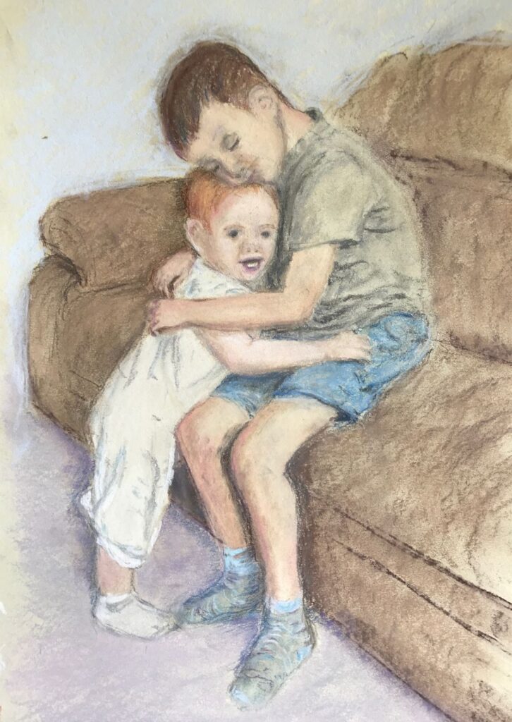
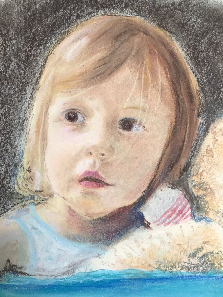
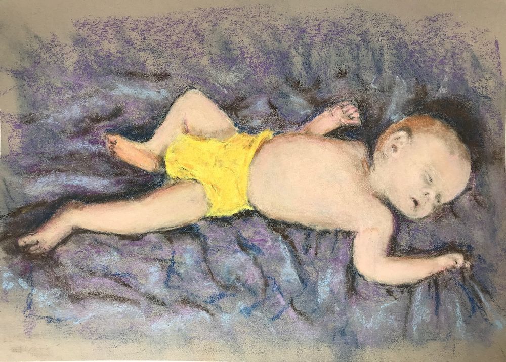
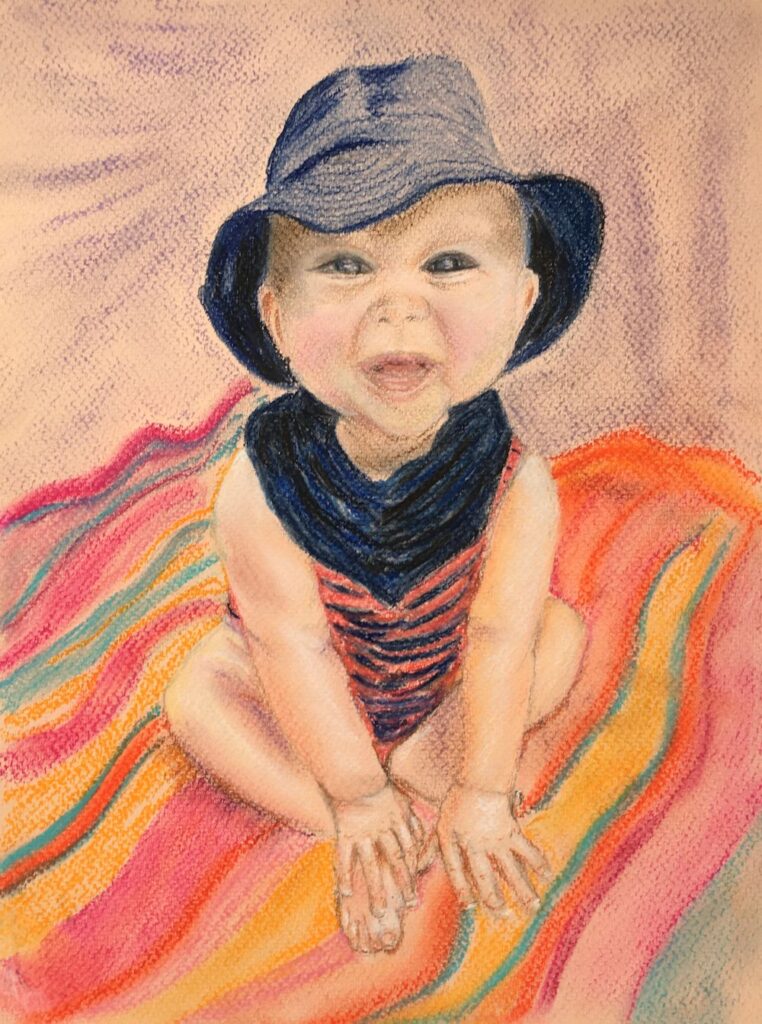
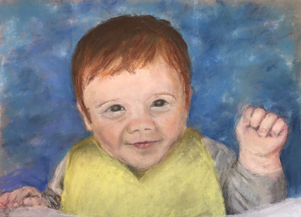
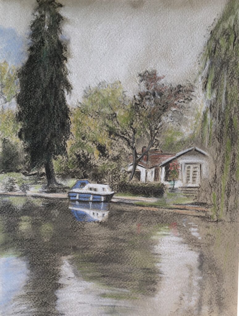
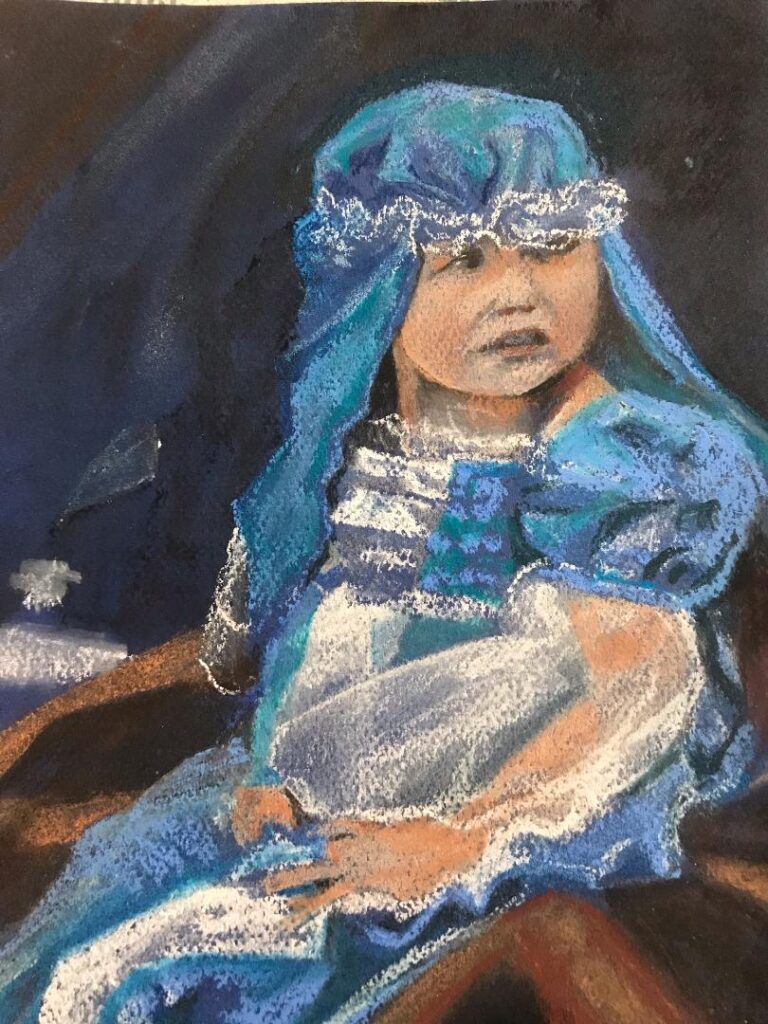
Pastel by Mali
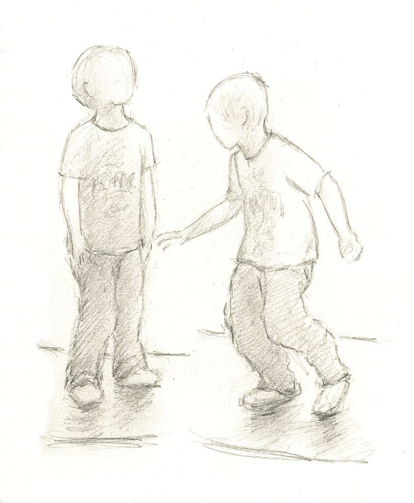
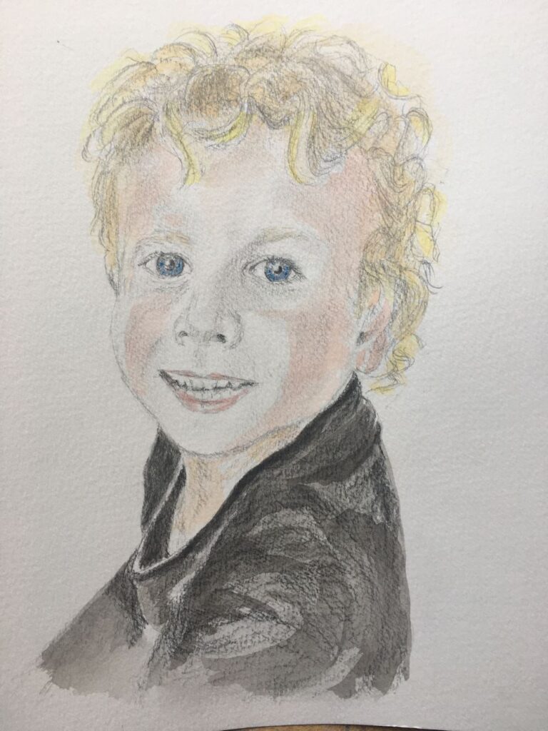
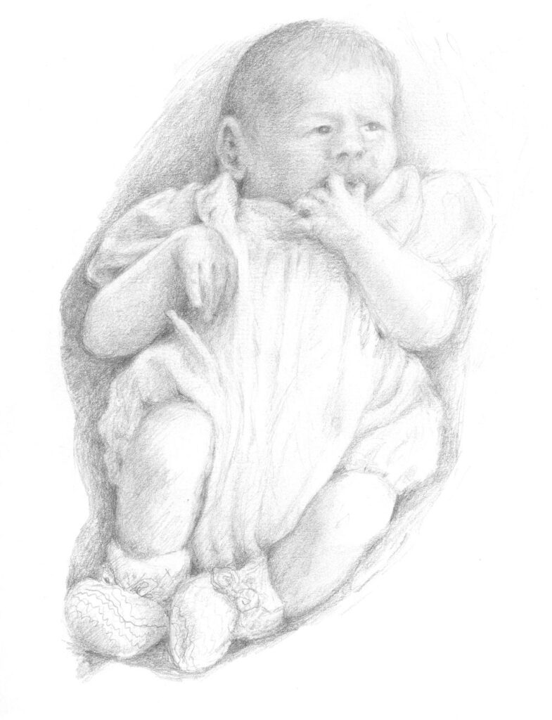
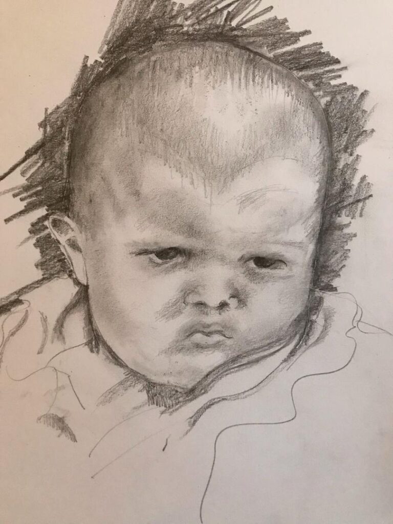
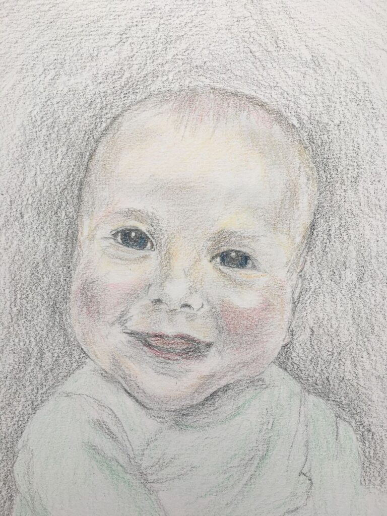
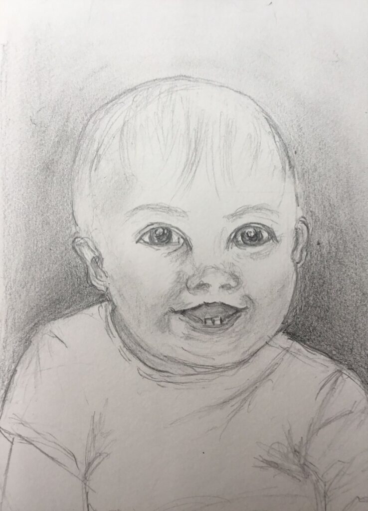
Pencil by Heather
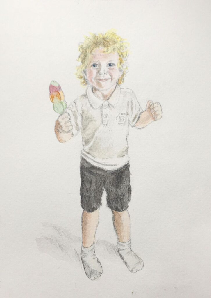
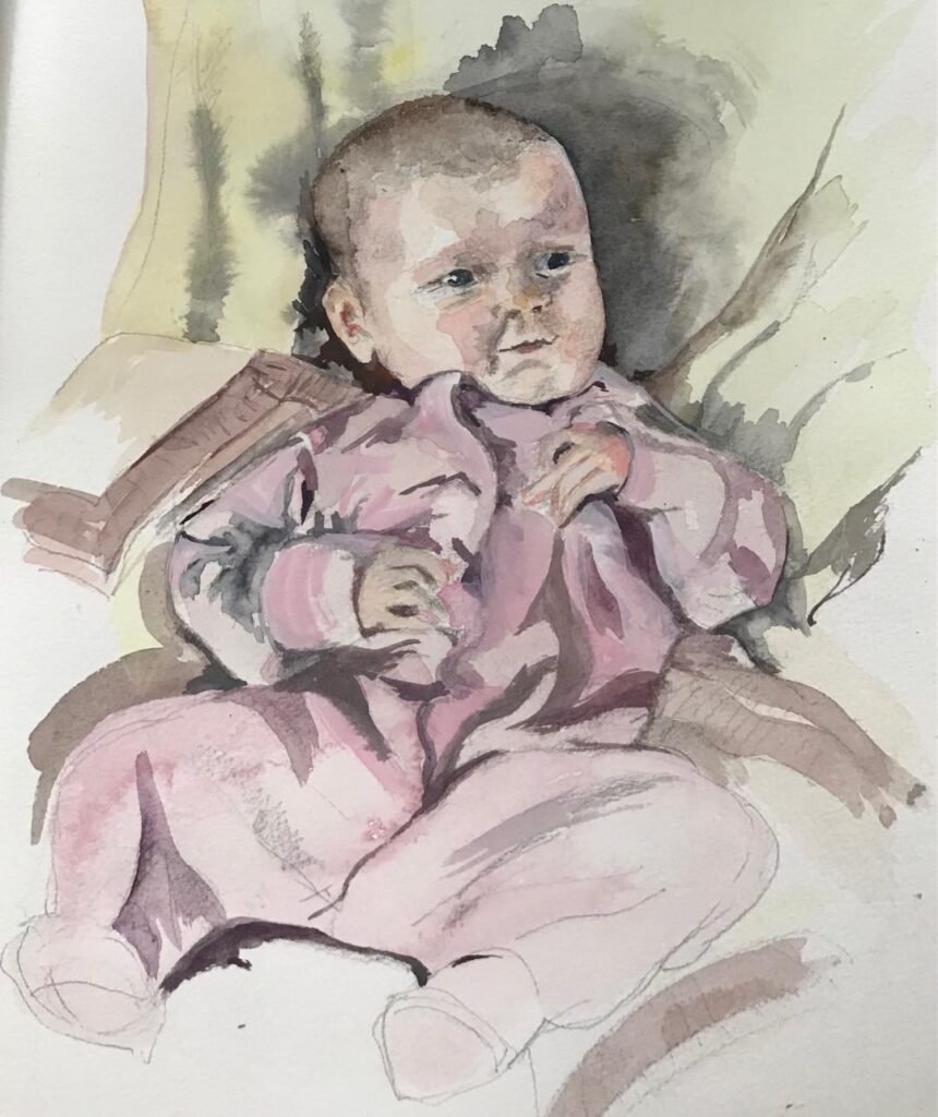
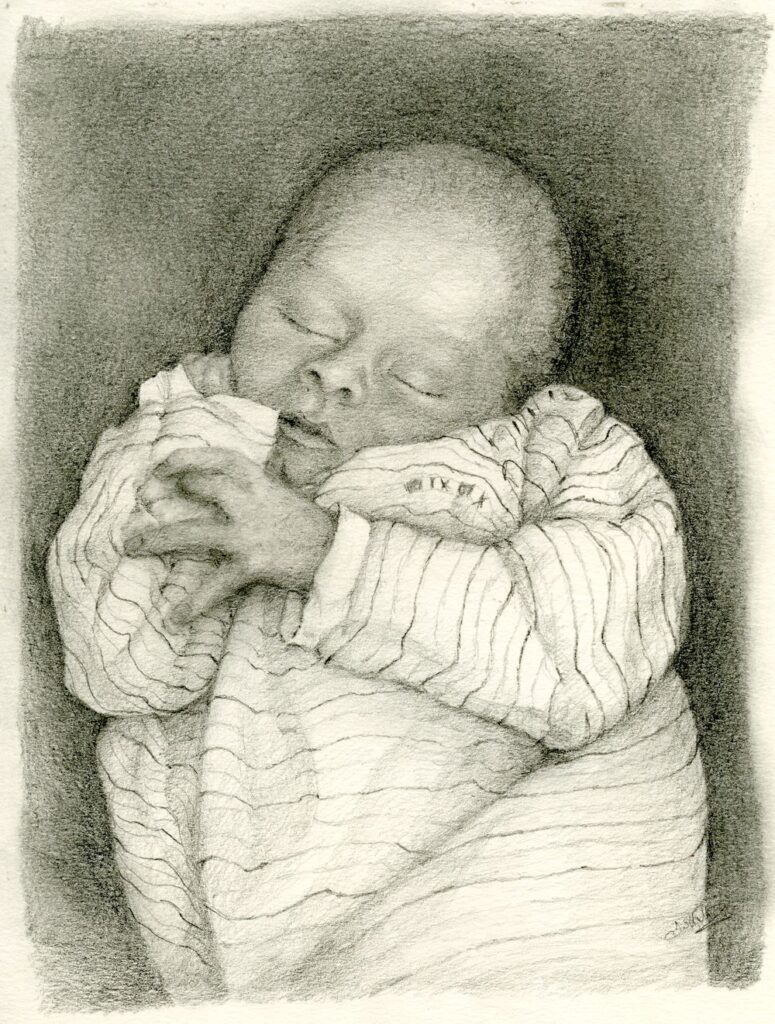
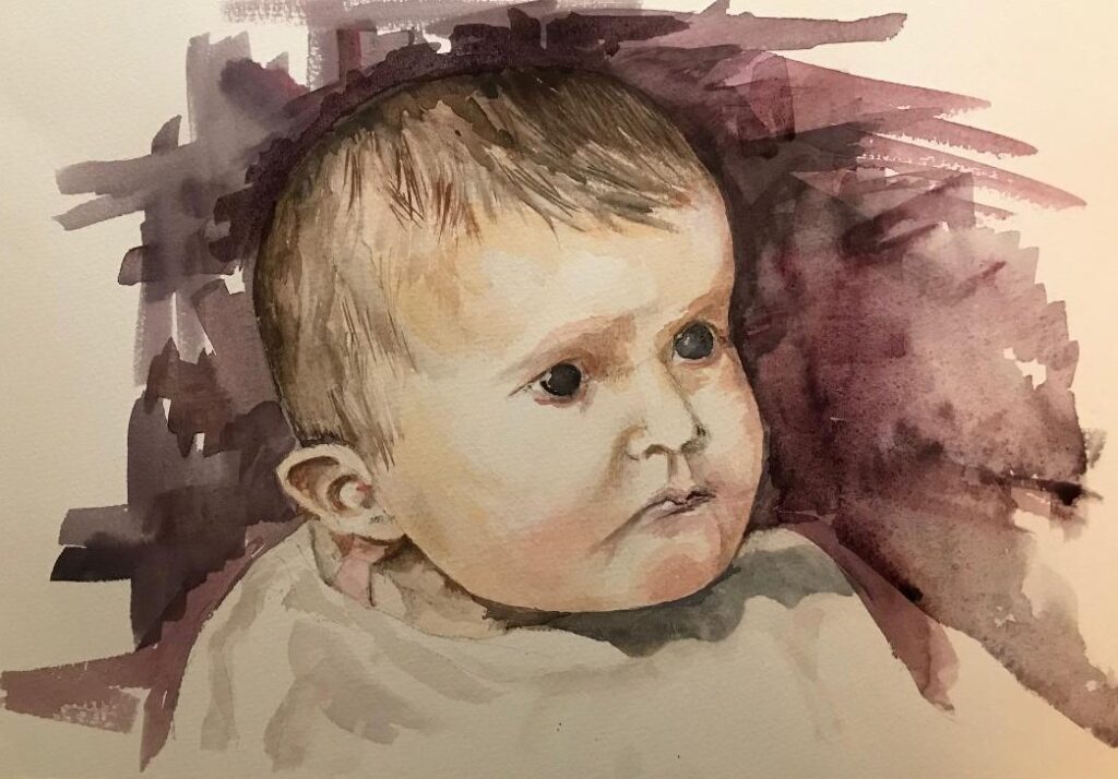
Pencil finished with Watercolour washes by Heather
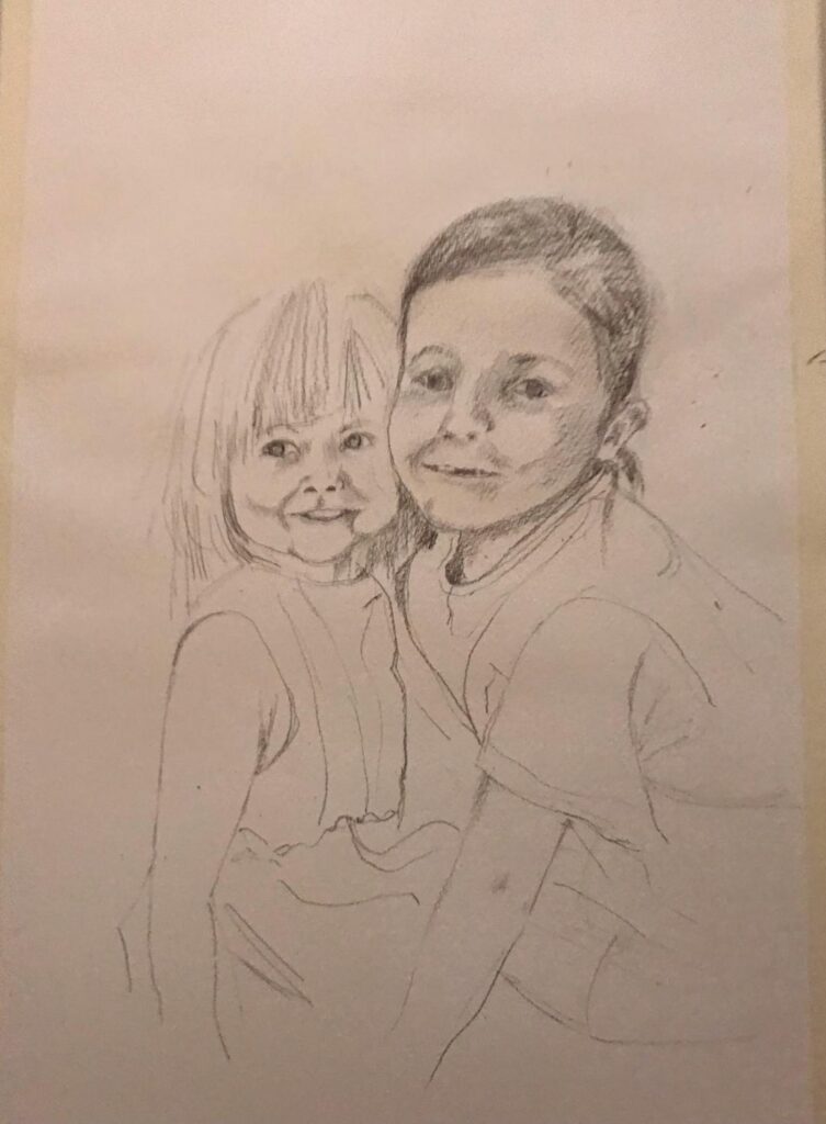
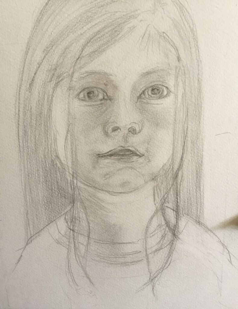
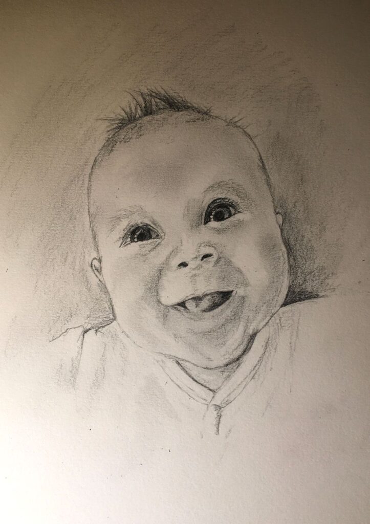
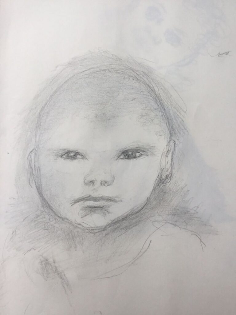
Pencil by Sarah
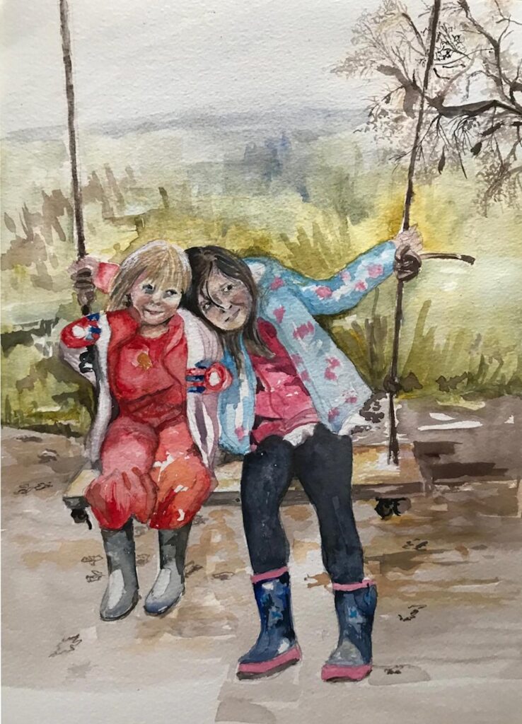
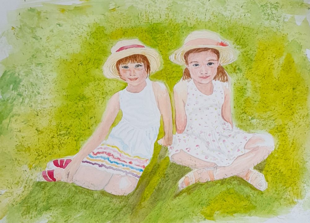
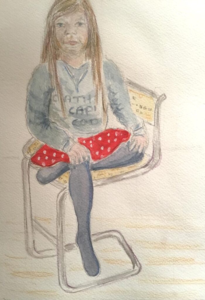
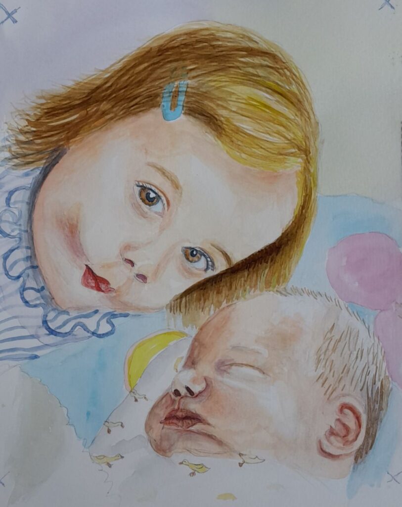
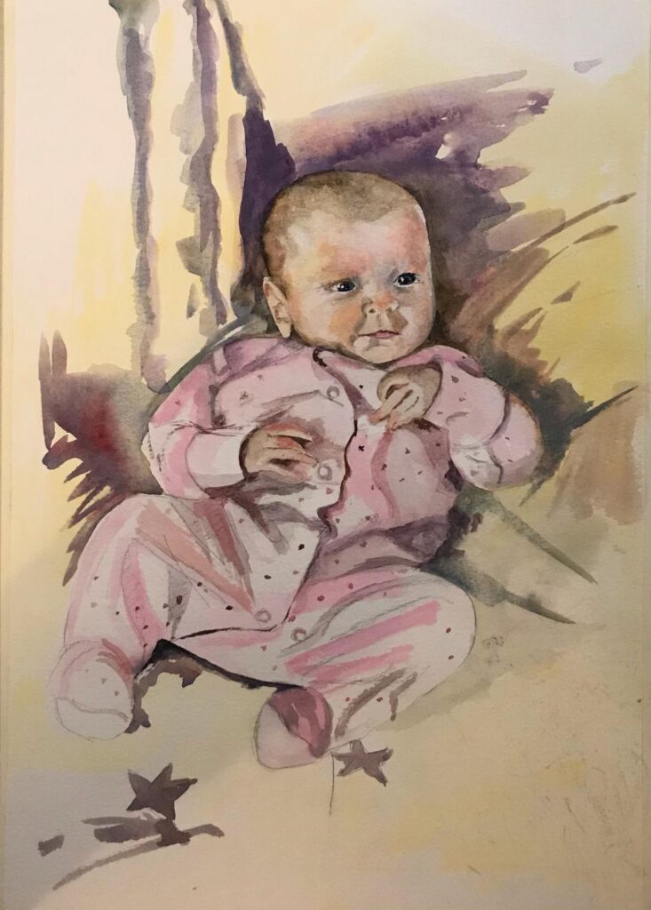
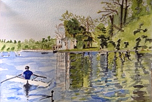
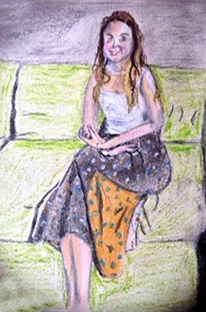
Watercolour by Sarah
Watercolour by Ann
Babies and Young Children: Week 3
September 8, 2021
Pencil
This week the challenge is to draw or paint a young child’s head in profile and/or full face. The features especially the chin and nose begin to show the character they will gradually develop into later. While it is often very difficult to identify and adult from a new baby photo it becomes slightly easier from the age of two or three.
Some wonderful examples can be seen on Jo’s Pinterest board at;
https://www.pinterest.co.uk/jhall1282/portraits/young-children-heads/
Your drawings and paintings:
Pastel by Mali
Sketch by Sarah
Watercolour by Sarah
Watercolour by Maricarmen
Pencil and Watercolour by Heather
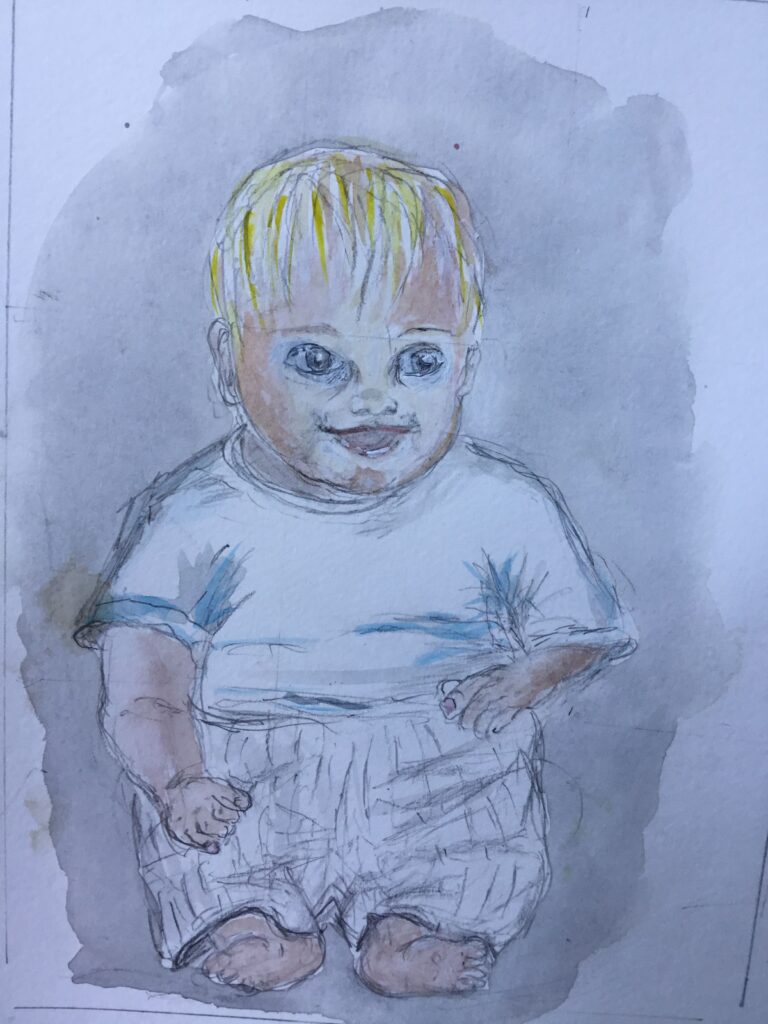
Pencil by Ann
Babies and Young Children: Week 2
September 1, 2021
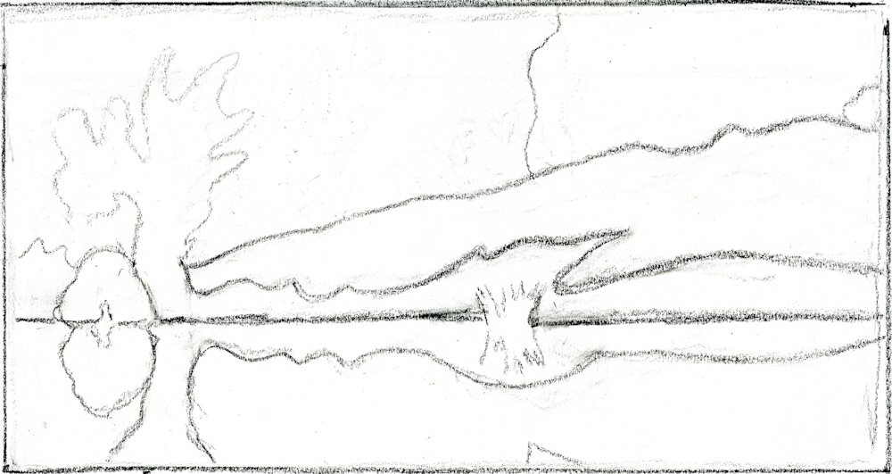
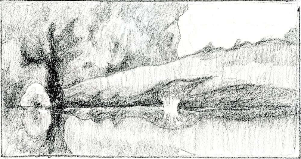
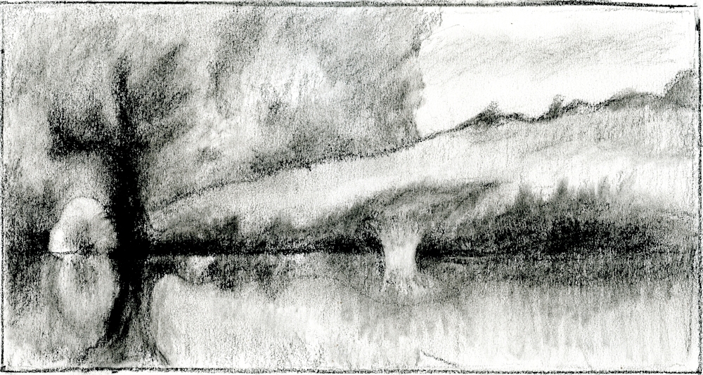
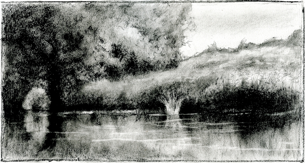
Demonstration from week 1.
The medium is pastel pencil and Pan Pastel. Last week the head was drawn and the main body shapes and clothes indicated. At the next session the rest will be completed. Note how lightly the initial drawing was made to allow for alterations.
I usually start with the head shape then add the other main shapes of body and limbs. Make a note of the general shape of the whole form and any useful negative shapes.
It is often useful to drop a vertical line through the whole form to help you place the head and limbs at the correct angles to each other. For this study a vertical from the widest point of the head (skull not the ears) on each side would give a guide to how the limbs should be placed. These verticals would also aid checking the drawing by measuring the heights of the various main parts..
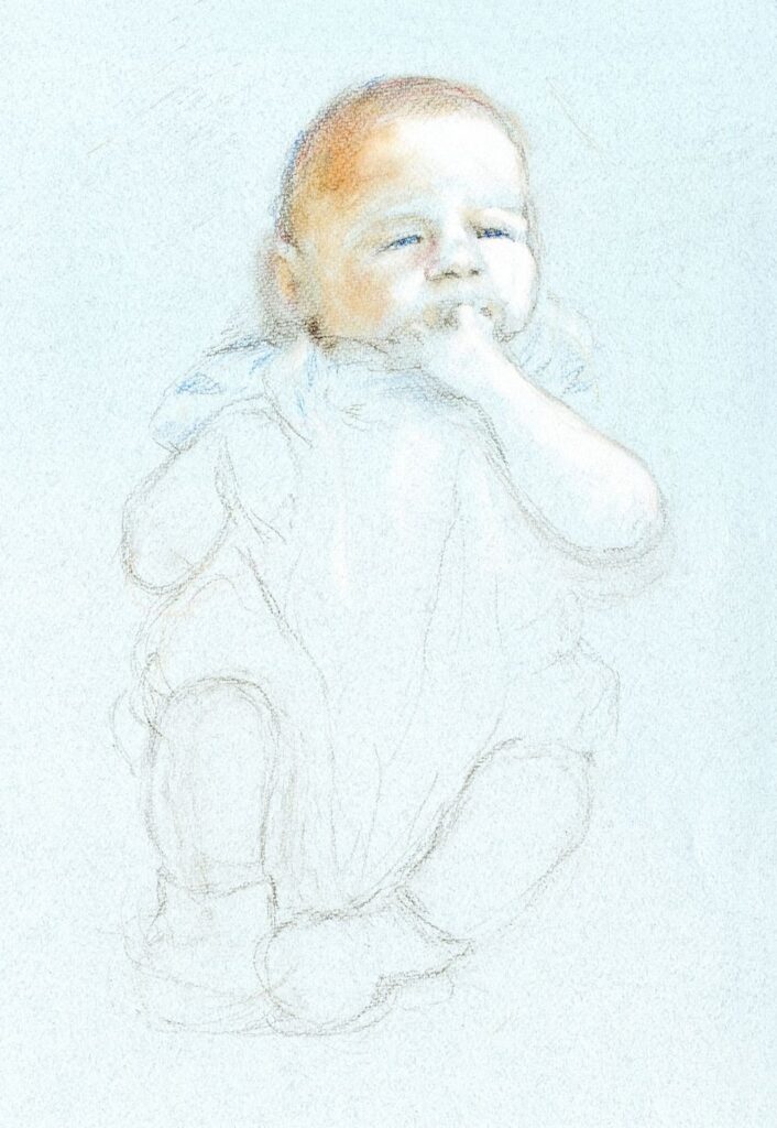
This week we’ll consider making a painting or drawing a whole baby and suggest your subject is no more than one year old, or perhaps a better guideline would be between newborn and crawling, but not yet walking.
Pencil
Pencil
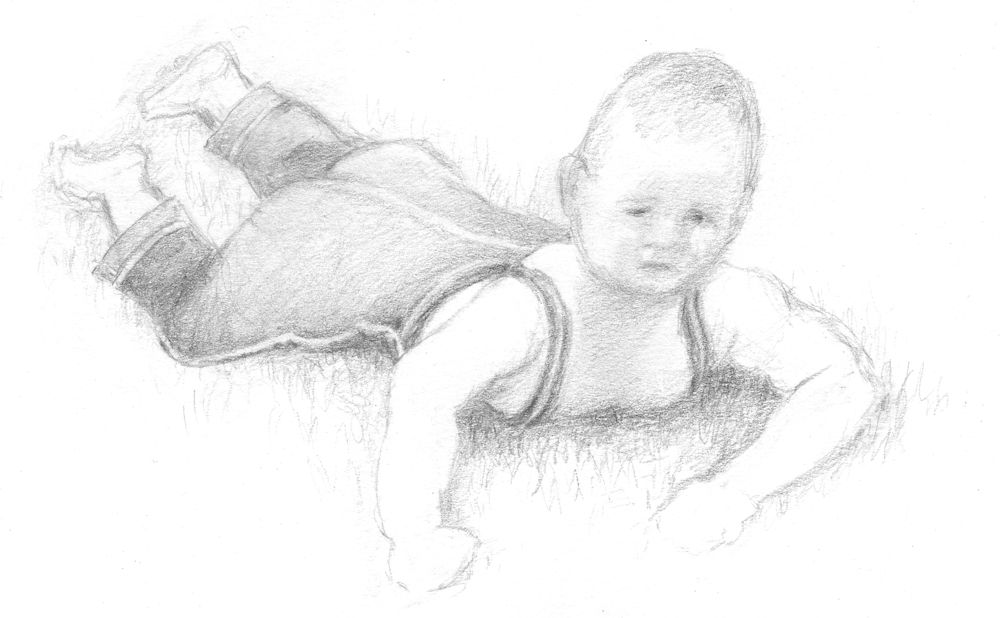
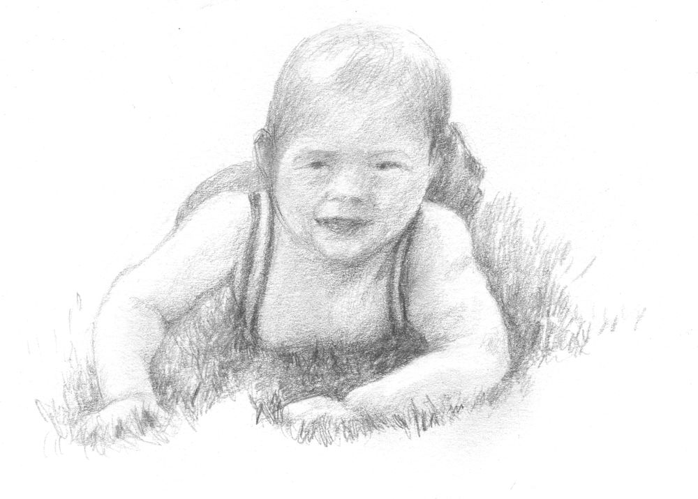
Babies have a tendency to thrash their limbs about when awake so it is often easier to work from photos but if you have a resident crawler, or baby that is starting to support himself do try and sketch from life, even if all that is achieved is a few hasty lines. This will help your observation and visual memory enormously. It will also help you to identify errors in more considered drawings at a very early stage.
However the easiest way with babies is to draw them while sleeping!
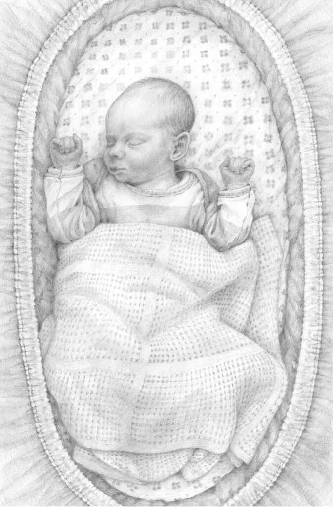
Pencil
Note how you can imagine the baby’s form beneath the blanket.
Do have a look at some of last week’s references again and perhaps practise drawing a few baby feet!
https://www.pinterest.co.uk/jhall1282/portraits/babies-and-infants-drawing-tips/
https://www.pinterest.co.uk/jhall1282/portraits/babies-and-young-children/
If you you would like to why not try a parent or even a grandparent and baby painting. Mary Cassatt painted many of these and a few examples can be found at:
https://www.pinterest.co.uk/jhall1282/portraits/baby-and-parent/
Your paintings:

Watercolour by Sarah
Watercolour by Sarah
Watercolour by Ann
Sketch by Ann
Pastel by Heather
Babies and Young Children: Week 1
August 26, 2021
Pencil
Over the next four weeks we’ll look at drawing and painting babies and young children, looking at infant heads the first week then whole baby forms and go on to consider toddlers and young children to about four years old for the second two sessions. With drawing and painting babies and children the structures and tones need the same attention as in other portrait studies but an additional challenge is the soft touch needed to convey the softness and delicacy of children’s skin both with the tones and the colour.
Pastel, pencil, charcoal and watercolour will be used for the demonstrations but you are welcome to work in your preferred medium.
Pencil
Note Toby had long spindly fingers that soon fleshed out into plump little baby ones!
Drawing baby heads.
The facial features and skulls of babies are not fully developed and their proportions are different from adult heads. The facial features are smaller in regard to the space they occupy and only the iris of the eye is fully developed giving many babies that cute large eyed look. The nose being of cartilage grows at a different rate to the bone of most of the skull and at the baby stage the nose is often slightly upturned. The eyebrows are relatively lower than for an adult and the chin is smaller and tucked in so that it protrudes rather less than the lips.
1. Find a photograph of a baby’s face that is looking straight toward the camera and work out the proportions of the face from the tip of the chin to the top of the head. If you can see them also note the position of the top and bottom of the ears.
2. Do the same for a baby’s head seen in profile and also work out how the ears are positioned.
3. Draw and/or paint a baby’s head from your own reference. Note whether the features lie on a curve if the head is looking up or down and pay special attention to how the proportions of the various elements change. For example if the head is viewed from slightly below, more of the chin will be seen compared to the forehead and top of the head.
As with adults the eyes will be about one eye width apart. Unlike adults the baby nose and chin are shorter. As with everything when you are making a representative drawing draw what you see not what you believe to be there.
Next week we will consider the whole baby figure. However babies often play with their hands, sucking thumbs and chewing fingers, so also try to have a look at baby hands for this week’s session.
Some useful references can be found on the following Pinterest boards.
The first board (below) has useful guides to the proportions of infant to adult figures and also to drawing baby and toddler heads, hands and feet.
https://www.pinterest.co.uk/jhall1282/portraits/babies-and-infants-drawing-tips/.
The second board (below) has a large collection of paintings and drawings of babies and young children. Some of these are simply beautiful studies. Others as in the Leonardo references at the end give information on the foetus before birth, and the drawings by Kathe Kollwitz give an idea of the plight of mothers and young children dispossessed by war and deprivation. Think about the study you wish to make, the character and mood of the child and circumstance. This will lead you to create a very personal work.
/https://www.pinterest.co.uk/jhall1282/portraits/babies-and-young-children/
First it is good to make as many drawings as you can from life and photographs to give you a good understanding of the structures and enable you to be more credibly creative. The blog posts will mainly feature drawing and colour will be demonstrated during the practical sessions. Do send a drawing or finished painting for review this week, and any work made during the session will be posted for review the following week.
Your finished drawings or paintings:
pastel by Mali
by Sarah
Watercolour by Sarah
by Heather
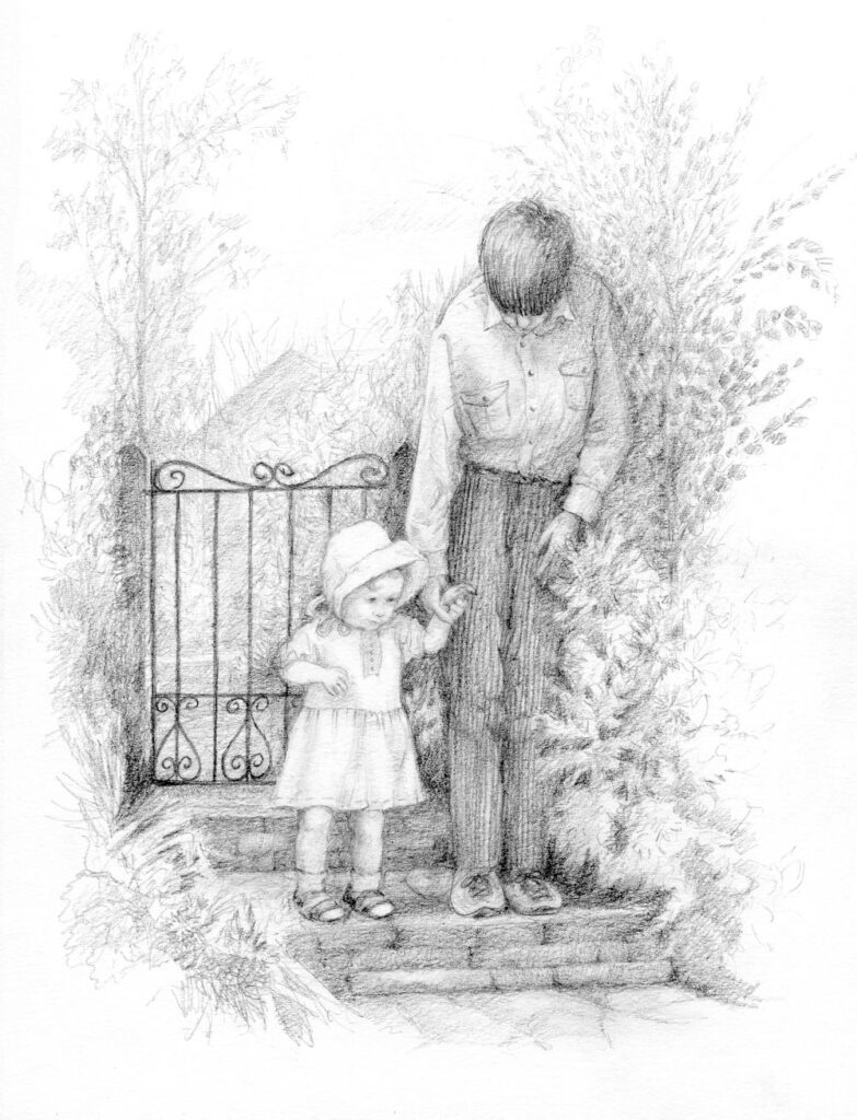
by Ann
by Ann
Watercolour by Maricarmen
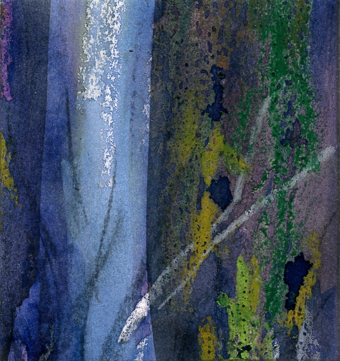
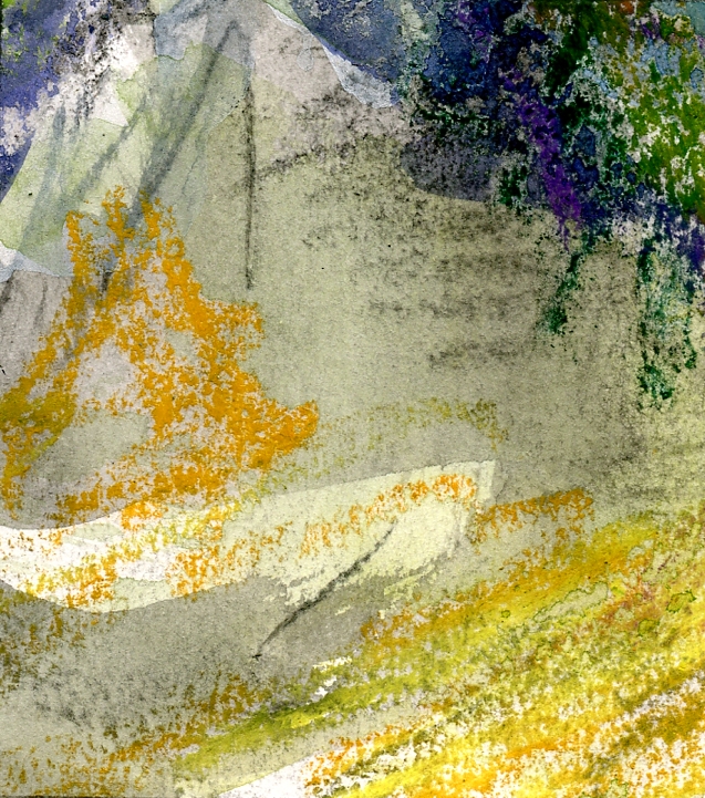
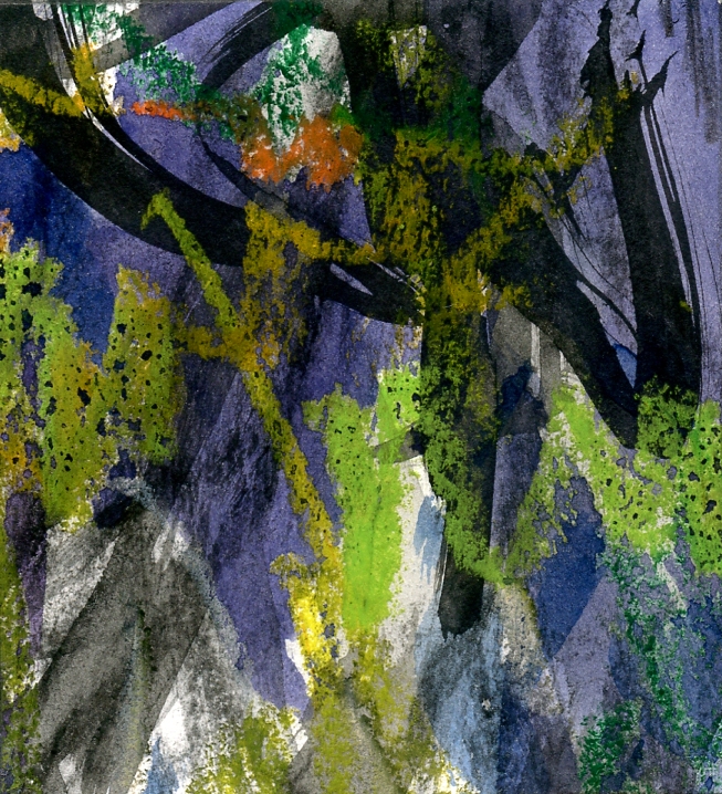
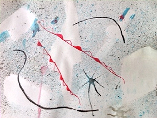
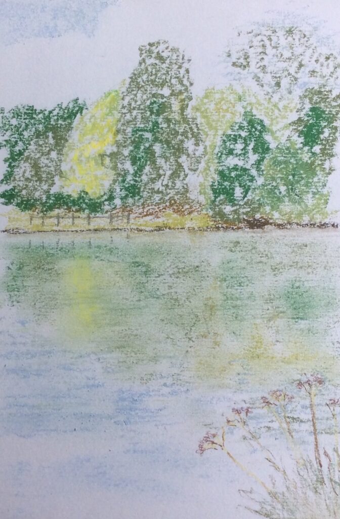
Starting Points for Abstraction Week 4: Emotion and Intuition
July 13, 2021

Intuitive drawing and mixed media
Jackson Pollock quote:
« One day, a critic wrote that my works didn’t have a starting point or an end. He wasn’t looking to pay me a compliment but he did”, said the artist.
Intuitive Watercolour
It is no surprise that some of the most famous artists with abstraction as the greater part of their work are either musicians or have both a passion for and knowledge of music. It is after all the most abstract of the arts and has a huge power to communicate emotion from laughter to despair.

Intuitive Drawing and Watercolour
Colour and music
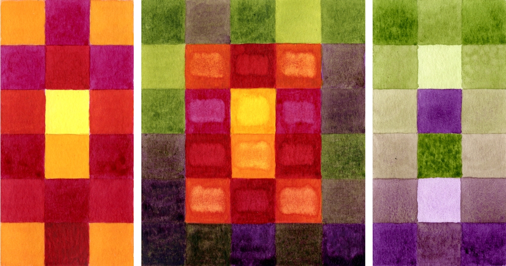
These include; Rothko, Kandinsky, Klee, Mondrian, Pollock. Individual works are often described as sorrowful, rhythmic, playful, loud, adjectives you could just as easily use for music. Several worked in an abstract style with the conscious intent of finding in art and equivalent language to music. Klee likened the colours in a paint box to musical notes. Kandinsky heard colours. When he saw yellow he heard the exuberance of the trumpet. Pollock’s action paintings are full of the rhythm of his movements as he dripped his paint. Some of Klee’s works appear as symbols on lines almost resembling staves. Kandinsky used musical terms such as Improvisation, composition, fugue when assigning titles to his works. Klee’s most abstract grid paintings contained variations on a theme; rows of different hues would be reversed or more subtly changed to create movement.
Pencil and wax crayon
Thought about this one.
Think of music that makes you feel; sad, happy, relaxed, excited, thoughtful, serene etc.
What colours do you associate with these?
Practical
Look at works by Jackson Pollock, Lee Krasner, Mark Rothko, Patrick Heron and William Baziotes
https://www.pinterest.co.uk/jhall1282/abstraction/jackson-pollock/
https://www.pinterest.co.uk/jhall1282/abstraction/lee-krasner/
https://www.pinterest.co.uk/jhall1282/abstraction/mark-rothko/
https://www.pinterest.co.uk/jhall1282/abstraction/patrick-heron/
https://www.pinterest.co.uk/jhall1282/abstraction/william-baziotes/
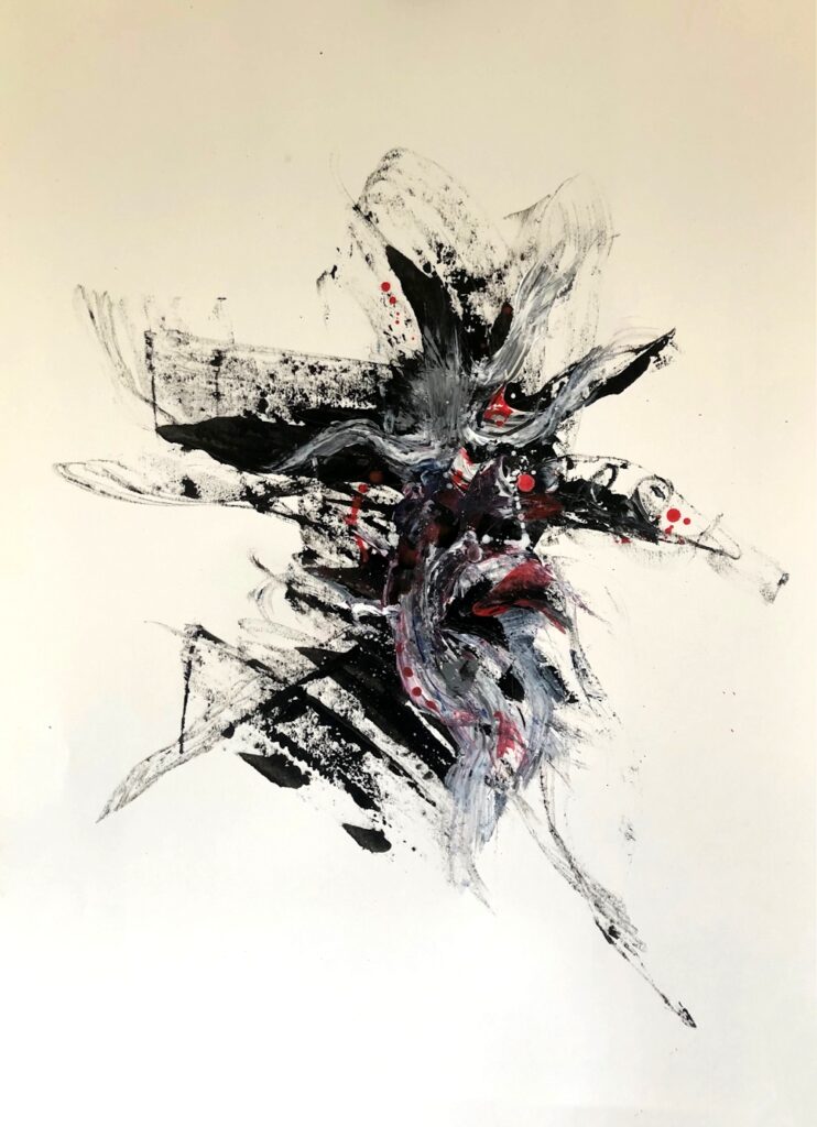
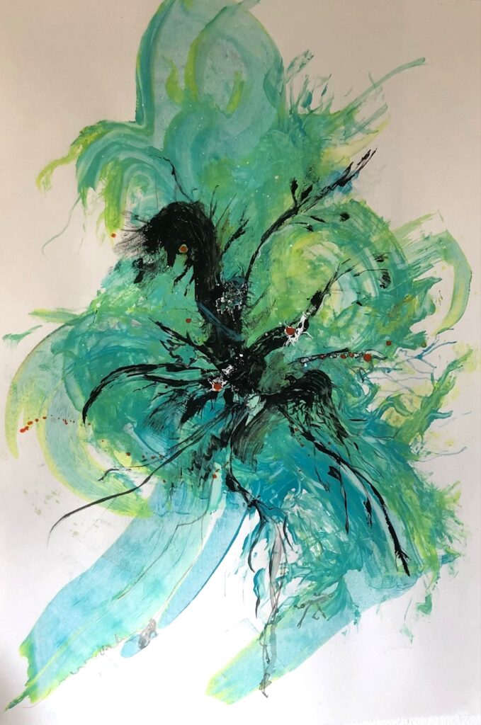
Then use line and/or colour to make a work with a definite emotion in mind. This may be inspired by a piece of music, person or experience. It may be an emotion in the sense of sad, happy etc. or the thrill of a roller coaster, exhaustion after running, any experience that you feel inspired to translate into colour and/or line.
The Action painters like Pollock made a start and added each step intuitively. It is for you to choose whether to plan or just to start and see where you pencil or brush leads you. Music is useful as it has a rhythm that can be expressed by line. Try experimenting with music mimicking the rhythm first with a broad brush and then on the same paper with a narrow brush or a rigger. If you are feeling less brave try pencil or crayon.
During the session we will do short exercises exploring how different lines and colours can express very different emotions, followed by developing one of the resulting drawings as a more considered work.
Have the following ready ;
Inexpensive A4 paper (cartridge or copier paper); a soft pencil or dark coloured pencil; a dark or bright wax crayon; your choice of medium and an appropriate support for developing the painting inspired by your drawing.
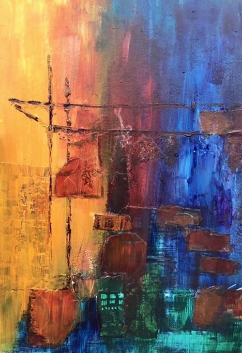
Your paintings:
Pastel on Watercolour over textured Gesso
by Malcolm

PVA and ink by Sandra

by John
In the Deep Sea
by Elizabeth

The Olgas Western Australia
by Elizabeth
Starting Points for Abstraction Week 3: Starting from Observation and Memory
July 6, 2021
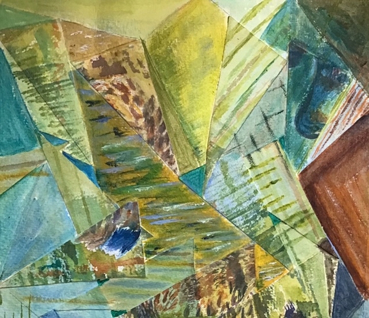
Starting an abstract painting from observation or memory is something we looked at in passing when considering Paul Klee’s abstractions of the landscape and towns of Tunisia. Although many of these were based on loose grids they never lost sight of some of the motifs he saw. They were however considerably transformed.
Here are a few ideas you may like to explore this week. Choose just one and work on some of the planning ahead of next week’s session. Each one could constitute a sizeable project. Links to reference artists on my Pinterest boards are given in the text.
1.Simplifying a direct Observation or using a loose Grid
Find a landscape or building reference sketch (preferably) or photograph and work on simplifying the shapes till the identity of the place is considerably reduced. The final work should remind you of the place but should be far from a highly representational picture. The colours and scale of the parts may be changed but do not have to be. Figures or animals inhabiting the landscape should be be simplified in the same way and where there are groups of figures try representing them as one shape. If you didn’t make a grid composition in Week 1 that may be a good thing to try this week.
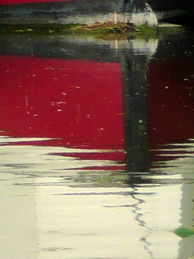
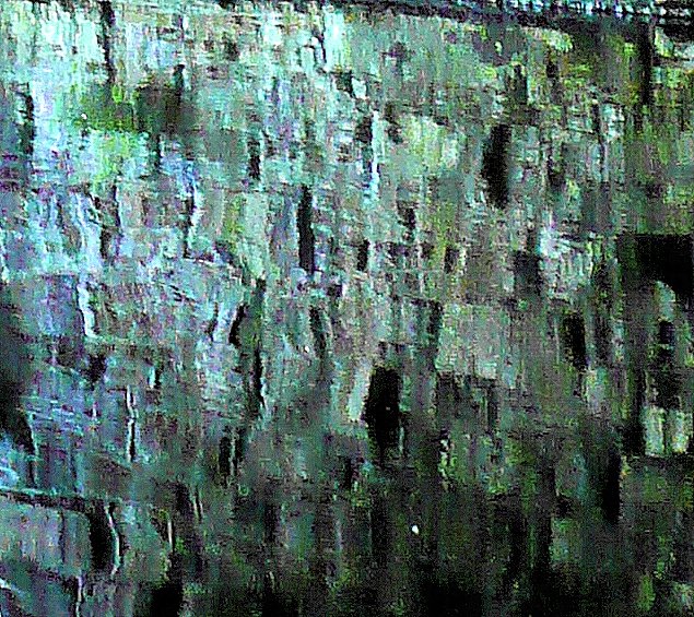
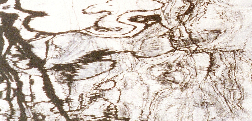
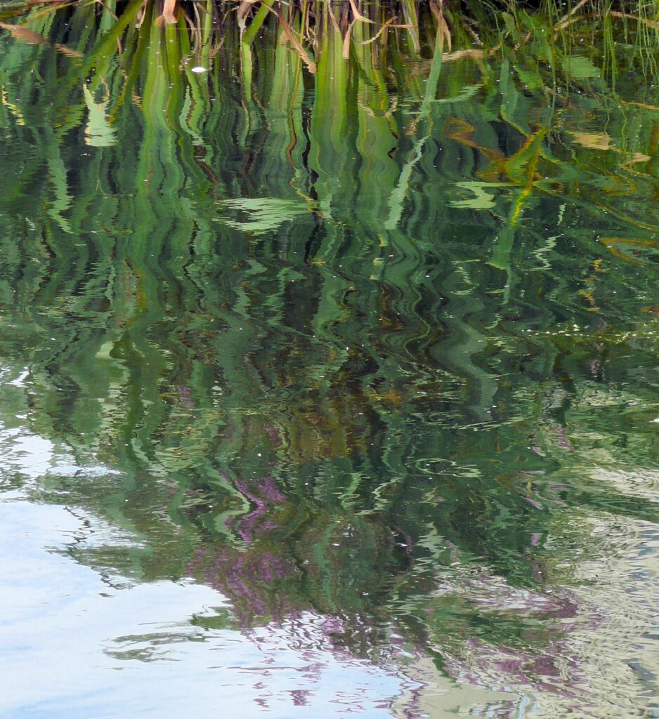
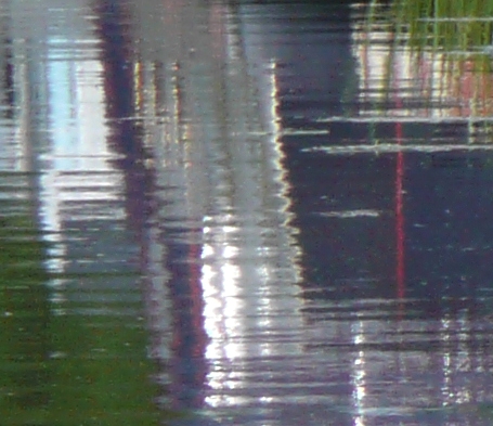
2. A Closer Look
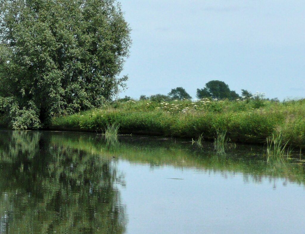
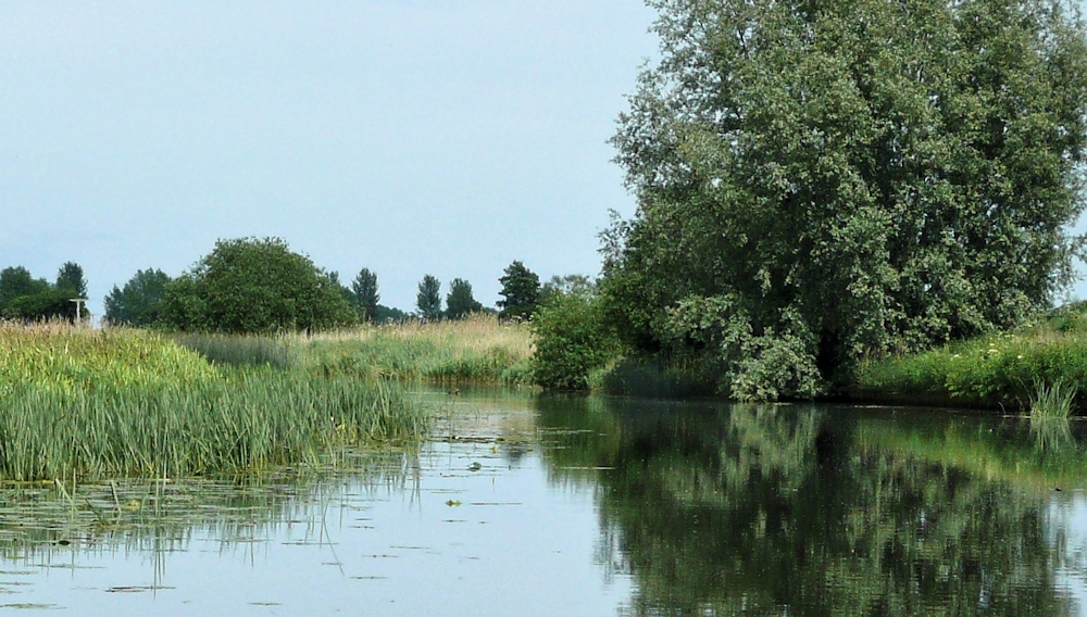
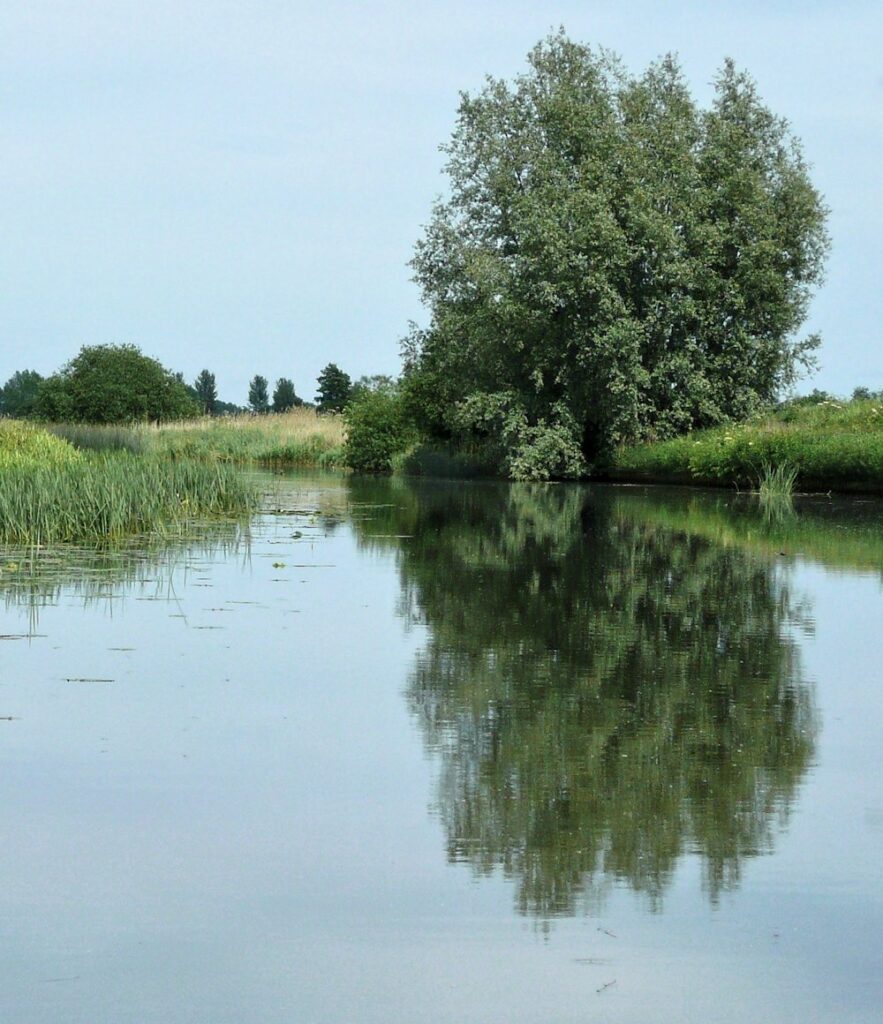
Abstract shapes can often be found by looking closer; at natural forms where surface patterns emerge in minute detail and at reflections in water. This can be pretty much direct observation but the images can appear totally divorced from the bigger picture and painted as pure pattern and shape. Below are a few photographic details from the landscape.

3. Memory
You could make an abstract painting based on a memory of a place or experience. Memories are often charged with emotion as well as being a visual mental record. The former was hugely important to Kandinsky and we will discuss that further during the last session when we take a brief look at abstract expressionist painters so you may like to leave this one till Week 4.
Kandinsky’s path to abstraction was rooted in love for his native Russia; village life, Moscow and the folk lore. Many of his earlier works show this vividly and the accent on colour and mood was clear. He heard sounds when he saw colour. For Kandinsky yellow was an exuberant trumpet and later in life he designed ballet sets for for Mussorgsky’s Pictures at an Exhibition. It is no surprise that some of his works were also titled in musical terms like Improvisation, Composition Fugue etc but there was also Deluge, …. and other exciting works that stemmed from different experiences.
https://www.pinterest.co.uk/jhall1282/abstraction/wassily-kandinsky/
4. Still Life
William Scott painted abstracted still life subjects reducing them to their bare essentials and playing with perspective. Far simpler than cubist paintings you may like to work in a similar way to Scott or emulate a cubist painting with a simple set up of your own objects
https://www.pinterest.co.uk/jhall1282/abstraction/william-scott/
5. Figures and Animals; simplification
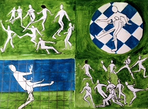
If you would prefer to work from figures or animals look at Picasso’s drawings showing a bull in a series of works in which the bull is reduced to very basic shapes.
https://www.pinterest.co.uk/jhall1282/abstraction/picasso/
Kandinsky made some drawings of a dancer reduced to geometric curves and angular lines. The lines and arcs described her movement as she danced. In the absence of a live model similar schematic drawings could be made photographs of ballet dancers, judo fights,or footballers etc.
https://www.pinterest.co.uk/jhall1282/abstraction/wassily-kandinsky/
A group of drawings could be put together so that that the lines overlapped or drawings could be made from groups of footballers or rugby players interacting. It would be easiest to design the work first then transfer it to the support for painting. You may also like to work out which lines would be the thickest and if colour was used to which areas it should be applied and how.
6. Contour and blind contour drawing
If you have any rapid sketches of birds, animals or plant forms from life you can use their shapes and rearrange them to form an interesting pattern that can be blocked in initially with flat colour. This becomes even more interesting where shapes overlap and you could work with transparent colour to show this or by changing the tone or colour of opaque paint.You could also make some blind contour drawings and use them in the same way. These are made by looking at the subject while you are drawing but not looking at your paper.

These could be traced and arranged to overlap or cut up as we did this week and used as a starting point for an abstract painting.
Your paintings:
by Virginia
by Virginia
A Memory by Sandra

by Sandra
by Malcolm
The Gannet Spies, Dives, Gulps and Flies
Ink by Malcolm

by John

by Heather

by Elizabeth
by Elizabeth
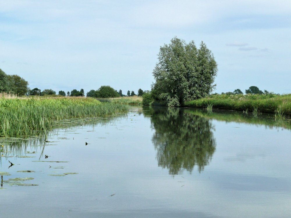
Starting Points for Abstraction: Week 2 Chance, Recycling and Intuition
June 29, 2021

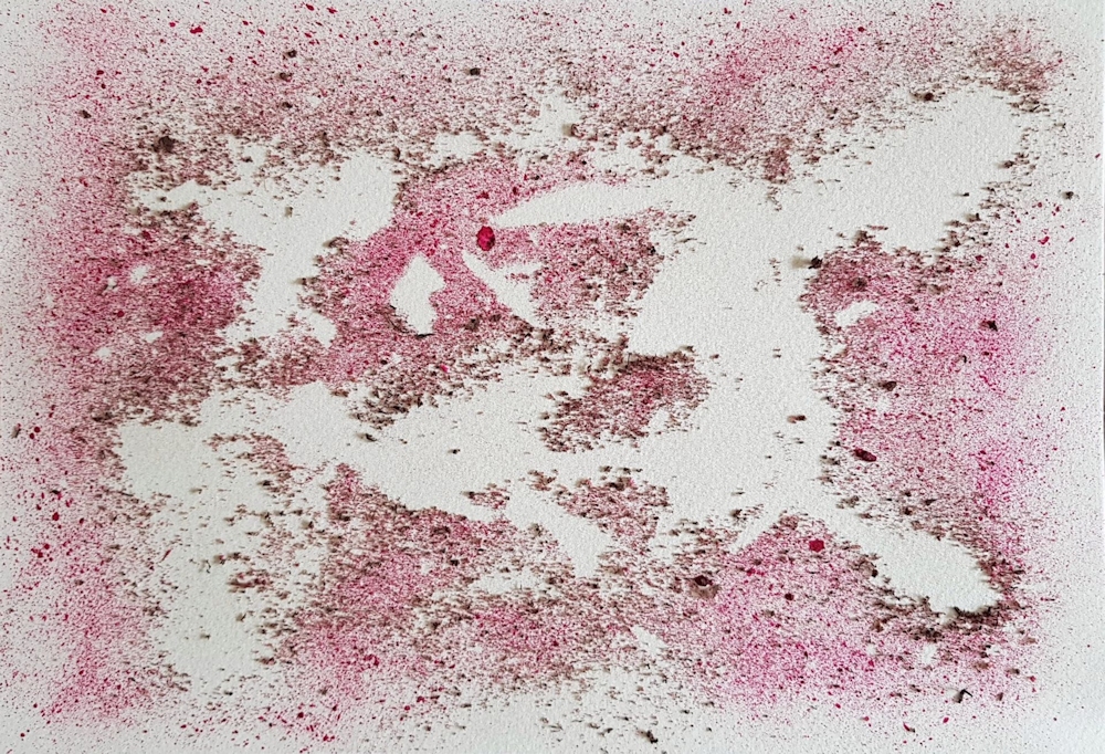
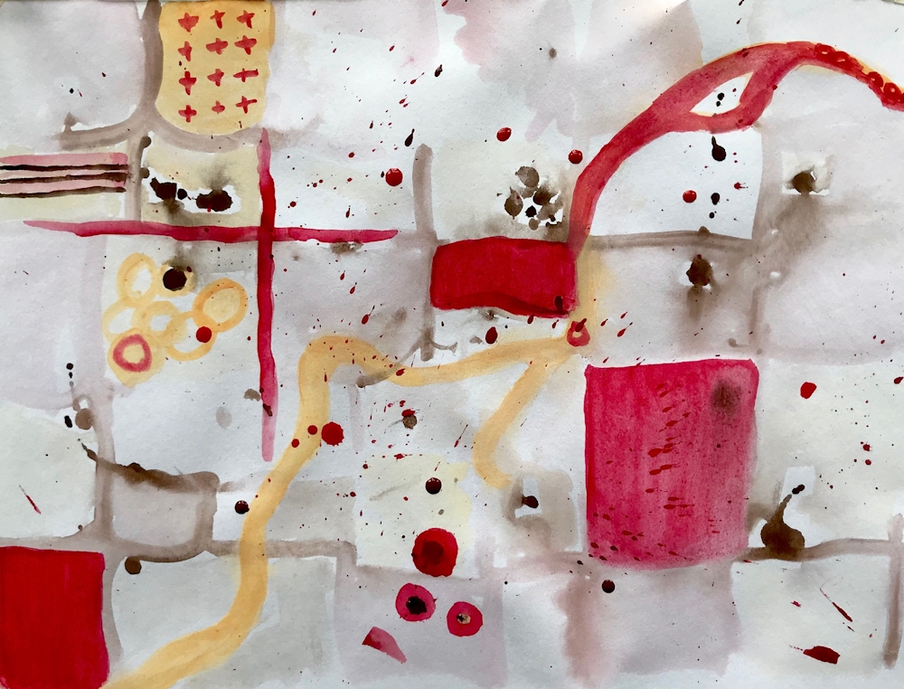
Pieces of paper kitchen towel were torn into larger and smaller shapes, about ten in all and dropped on to a piece of watercolour paper. They were left as they fell, overlapping or not overlapping. Using an old toothbrush acrylic ink was spattered over the whole. A wooden skewer was used to draw out a few lines from the larger spatters and then left to dry completely before removing the pieces of paper towel.
Chance and Recycling
Jean Arp, one of the leading artists of the Dada movement used chance for several of his works. He tore up papers and collaged them where they fell. Some of the works appear too ordered for this to have been the whole story and I suspect he may have put some torn shapes into a hat or equivalent and placed them on the support intuitively as each was drawn out of the hat in a random sequence. He also tore up a woodcut made in 1920 into several pieces and rearranged them on a support in 1954. For Arp this was the artwork. For us it may be or it may be that such methods could be employed as the starting points for developing an abstract painting.
You could certainly do this with a failed painting or with a copy of a suitable good drawing or painting. The pieces could be cut into regular pieces and rotated till you felt a successful arrangement had been achieved or you could shuffle them and place them in a grid in the order that you drew them out. You are in charge of whether to work mainly with chance or mainly with design and whether to develop the work further by adding other media.
The pieces could also of course be dropped on the support and glued where they fell. If a collage was not required it would be easy to make a series of photographs of several dropping events with pieces from the same art work. The resulting photographs might suggest an interesting painting or be art works in their own right separately or collectively. Old greetings cards, magazine pages etc. could be similarly recycled.
Some of the fragments are below and are interesting in their own right as well as being perhaps the inspiration for further abstract works.

A few are shown in detail below;


Exploring Negative Shapes
The technique below can be as designed, intuitive or suggested by a natural form as you wish. Anything from geometric shapes to tea cups or branching trees can be fun to investigate. They can remain as flat areas of colour or be blended for some great intertwining effects.


No blending.
The two coloured shapes were blended including where they crossed the white shape.
In the finished drawing all shapes were blended leaving some of the white shape unblended. Similar effects could be achieved in acrylic or watercolour using glazing techniques.
The paint left on your palette;

At the end of a painting session it is all too easy just to slide unused paint into a trash can or let it congeal uselessly on the palette. Why not just get a brush or palette knife and spread it almost without thinking on to a sheet of thick card or paper. (you are also allowed the think about it but not with the aim of making it look like a tree or a bird or a flower.) It may do but don’t intend it. It may turn out that it is your first Colour Field work! But my guess is that it may need further development.
Abstract Expressionists are subdivided into two groups of rather different artists
The Action Painters such as Jackson Pollock
https://www.pinterest.co.uk/jhall1282/abstraction/jackson-pollock/
and the Colour Field Painters such as Mark Rothko, Clyfford Still, Barnett Newman.
https://www.pinterest.co.uk/jhall1282/abstraction/colour-field-artists/
Although never listed with these American artists perhaps Patrick Heron should be included here for his colourful gouache paintings.
https://www.pinterest.co.uk/jhall1282/abstraction/patrick-heron/
Practical:Our next practical session will involve using chance, recycling and intuition for beginning an abstract painting or drawing.
Choose to work on one or more of the following;
Aim to have a drawing/painting copy or original to cut or tear up, perhaps a large magazine image. It does become more personal to use your own drawing though. You will also need a support for painting on and your usual paints.
1.Old drawing/painting: either cut up and rotate pieces till they make an interesting arrangement or shake and draw randomly from a container laying them in a grid one by one in the same order that they are drawn out. You may collage the pieces and work over them with more paint or drawing or photograph/trace them and use the image as the basis for your painting.
2. Chance; dropping cut or torn paper on to a support, spatter with paint, remove the paper when all is dry and develop the painting intuitively.
3. Recycled paint; Use what is left on your palette by just painting it out on to a piece of card or paper, perhaps with some intent like putting the pale colours in the middle or the brightest colours in the middle or irregular bands of colour, varying the sizes of colour patches ( this happens naturally as more of some colour than others remain). Colour mixing also happens depending on the mixes on the palette and how much they become blended as they are painted out. This should be done prior to the session so that the development process can take place at next week’s session.
Your paintings;

From cut and rearranged pieces of a river painting with added paint
by John
by Virginia
Collage of a cut, rearranged pen and ink drawing with added colour
by Heather
Collage from rearranged pieces
by Liz
Collage by Sandra

by Malcolm
by Sandra
Reorganizing a drawing, painting or photographic image can be a useful starting point to look at the shapes and forms in a more abstract way.
The simplest form of this is to rotate a landscape through 90 degrees.
by Virginia
Masked shapes, spattered and worked into intuitively
by Liz
by Malcolm
by Malcolm
by Liz
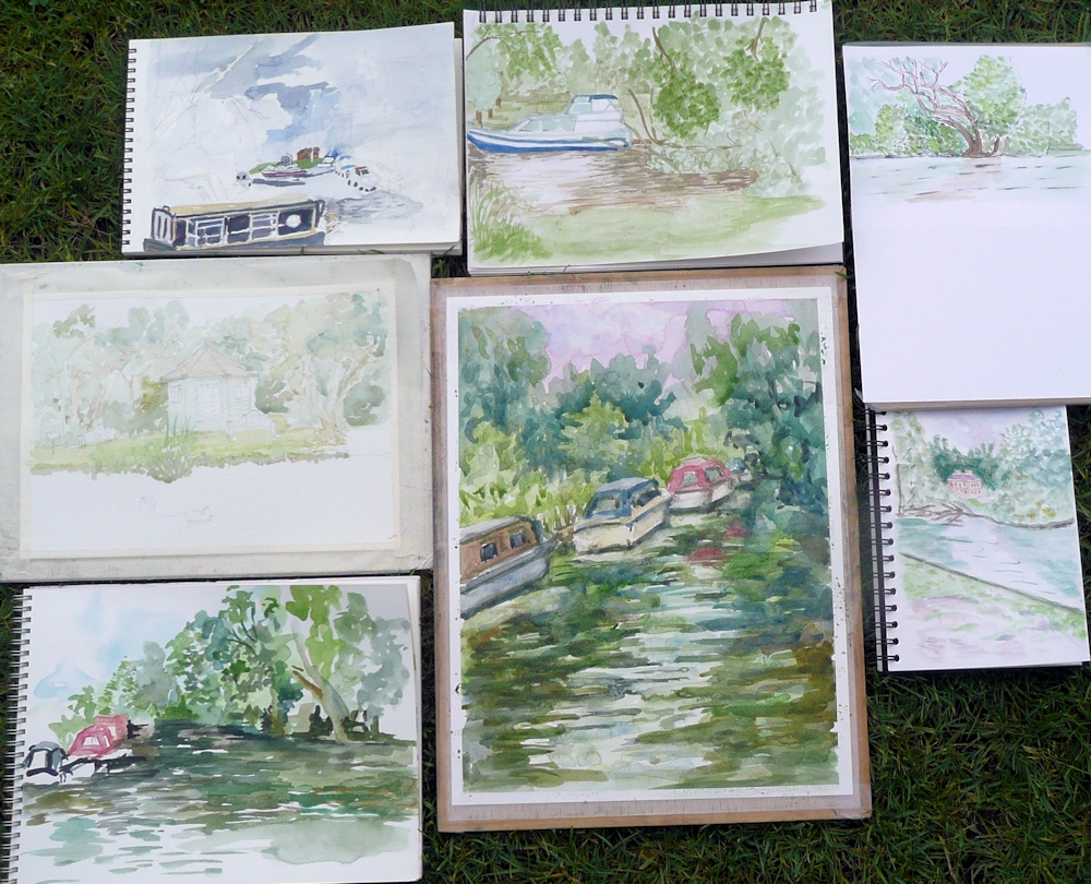
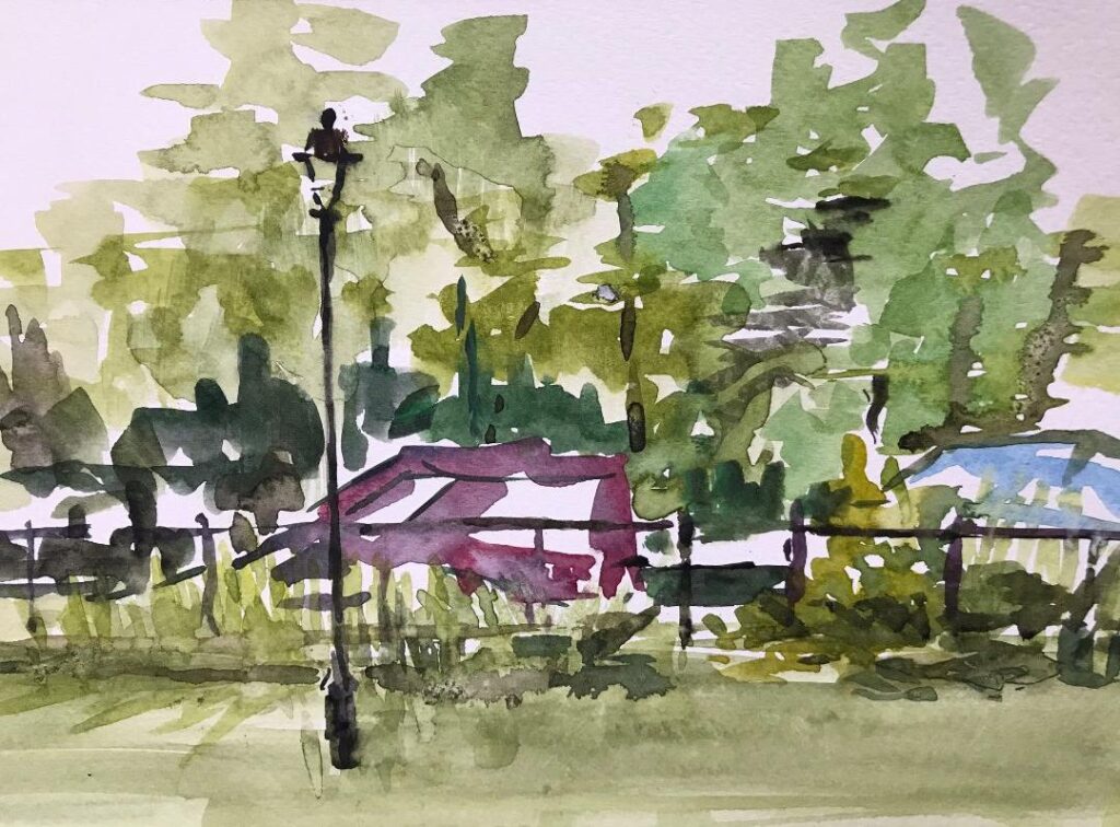
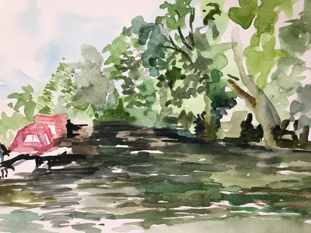
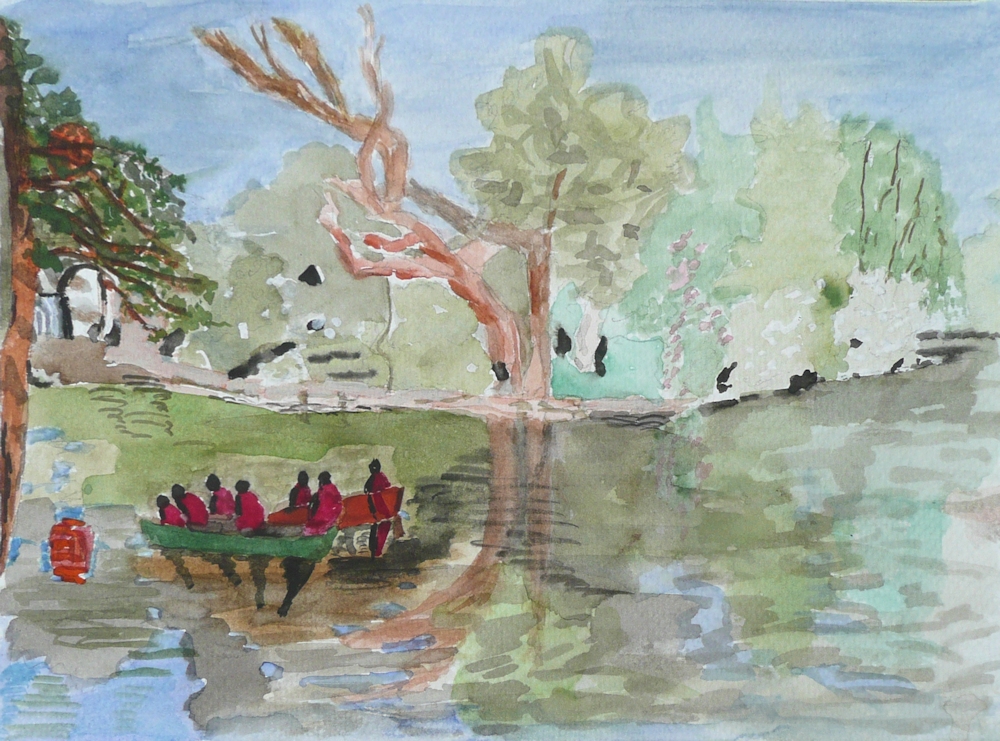
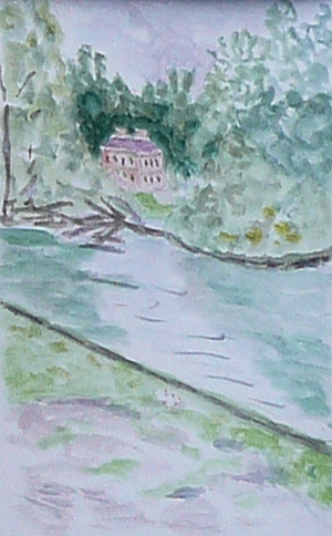
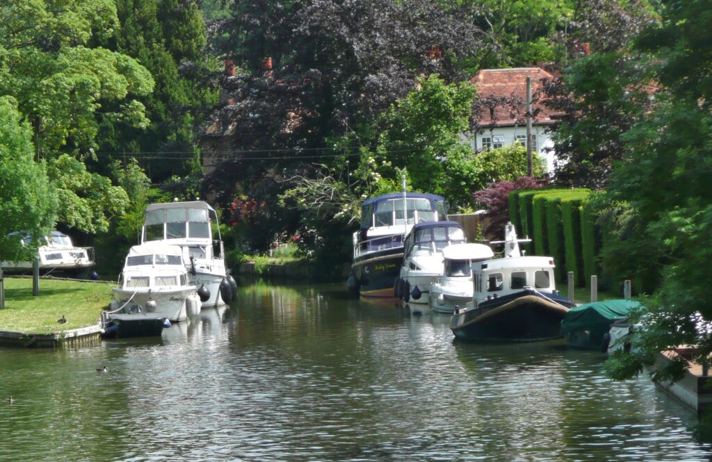
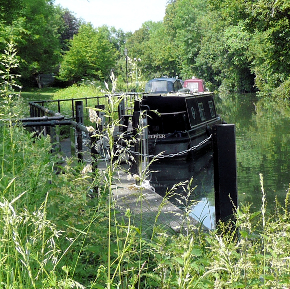
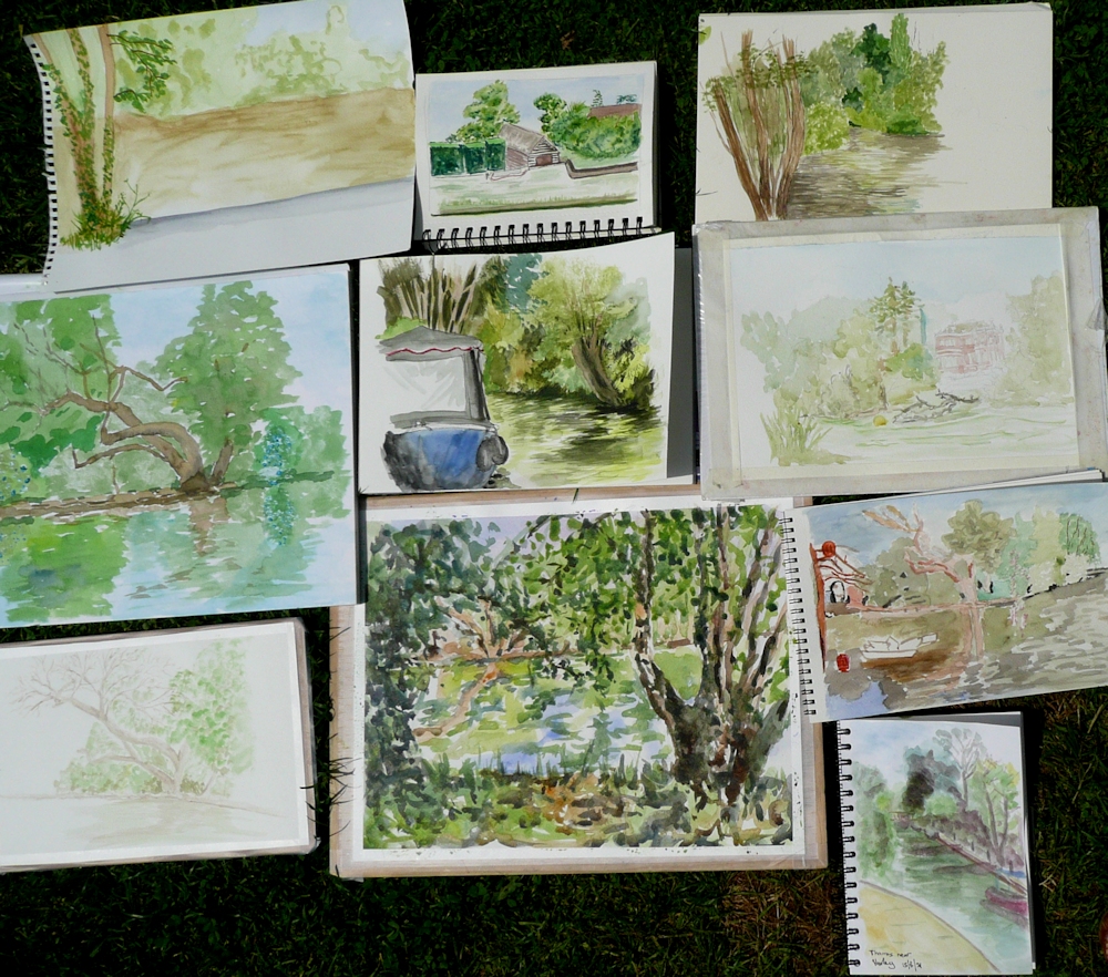
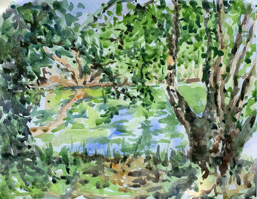
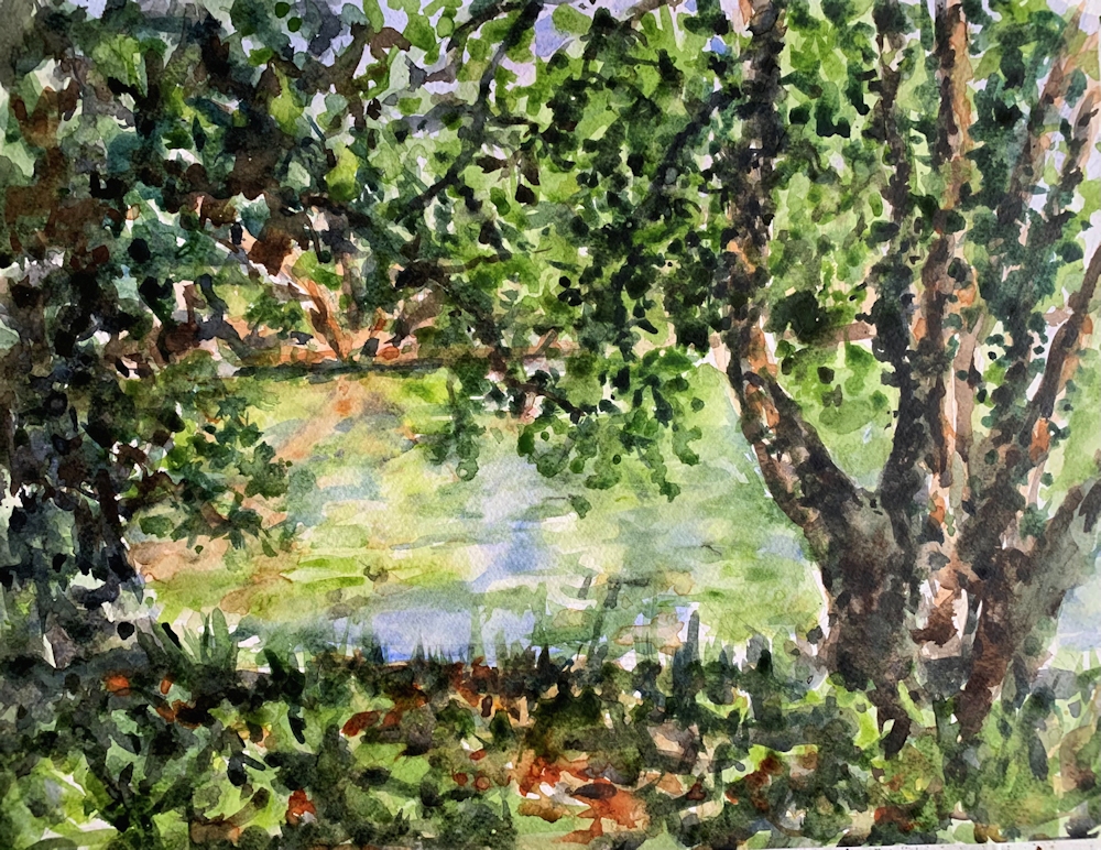
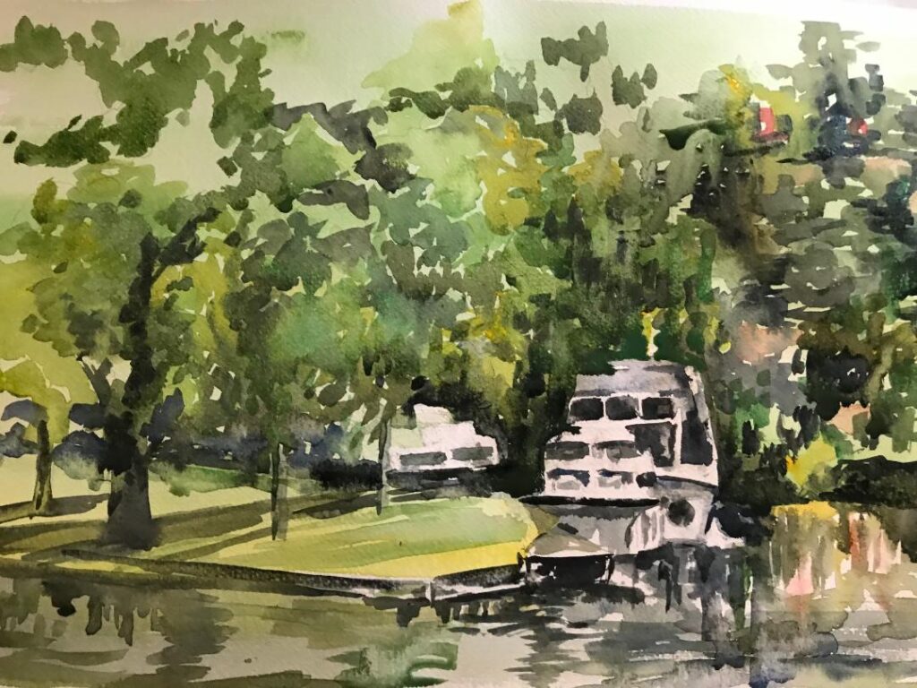
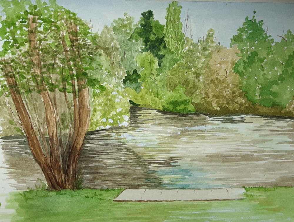
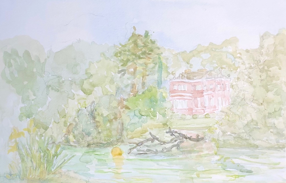
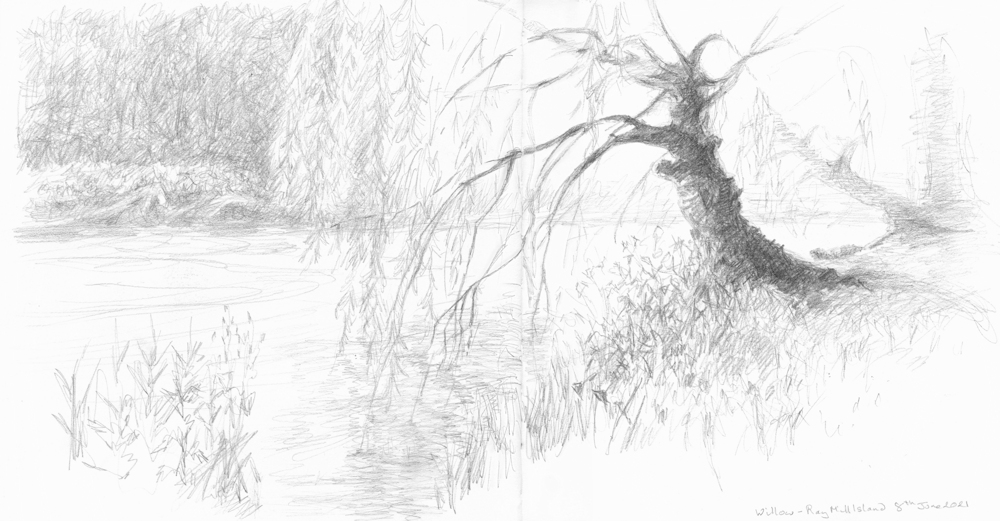
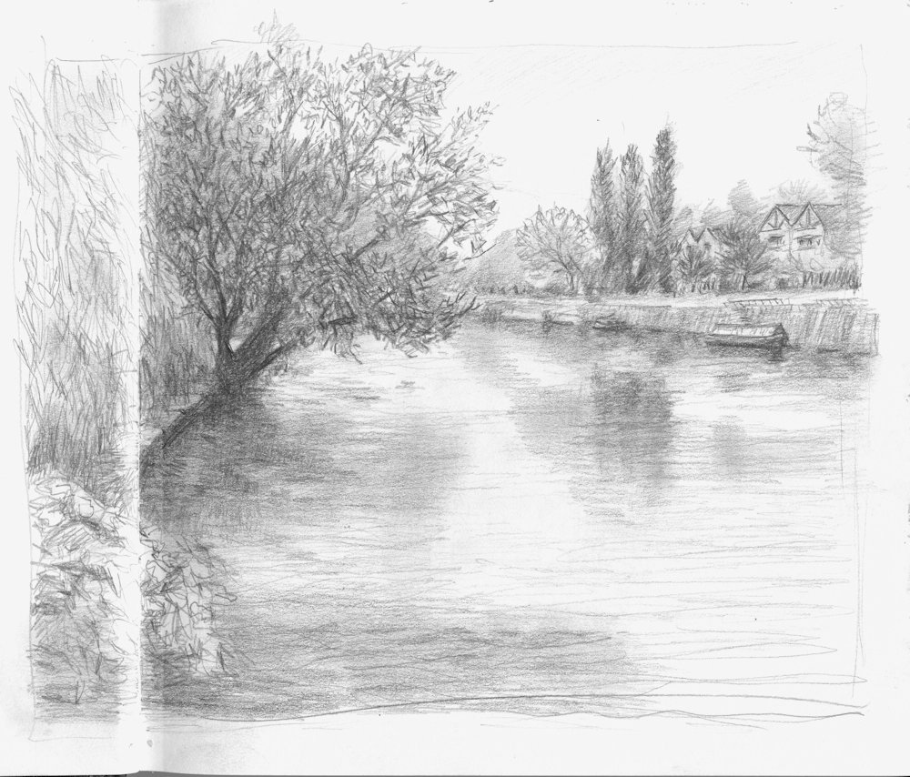
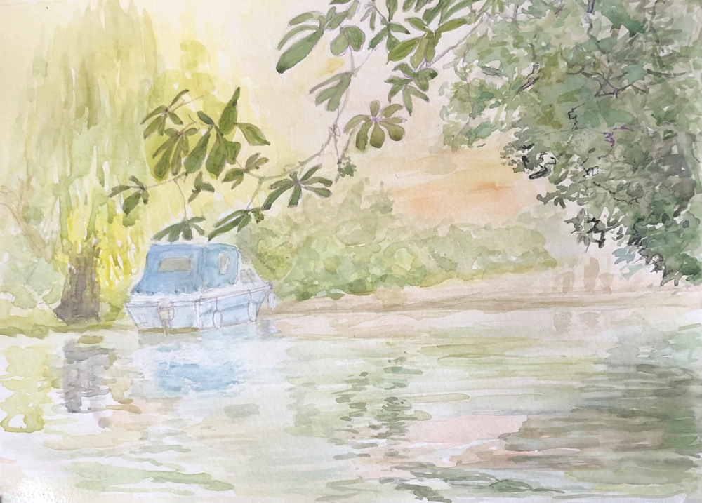
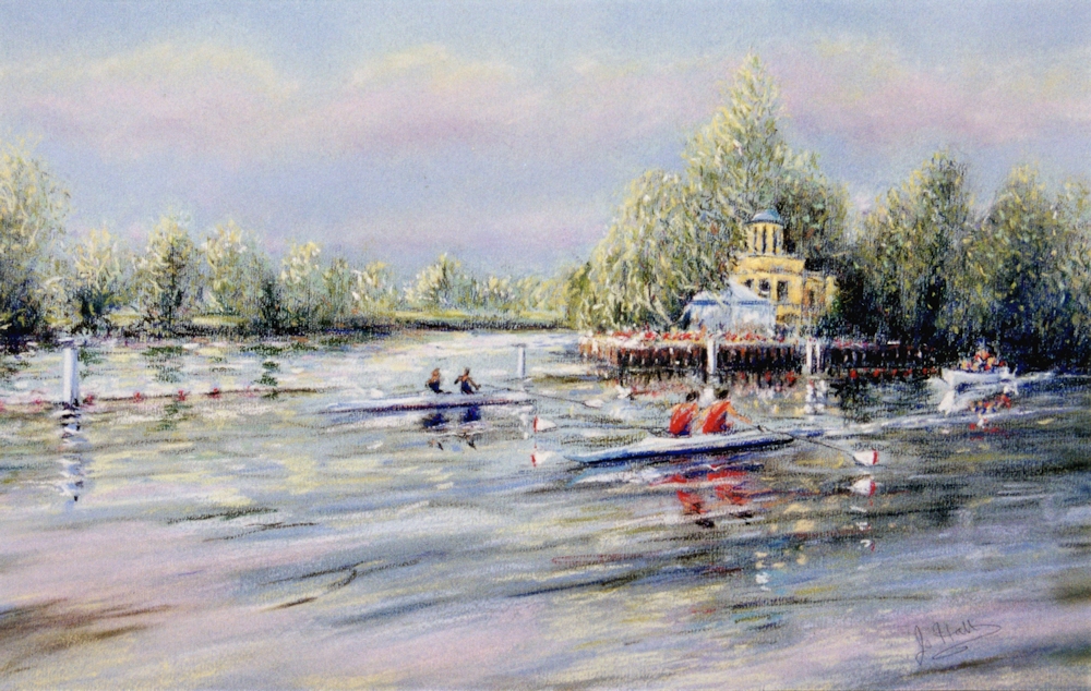
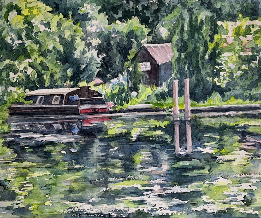
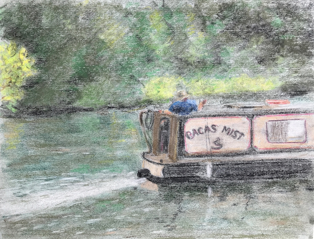
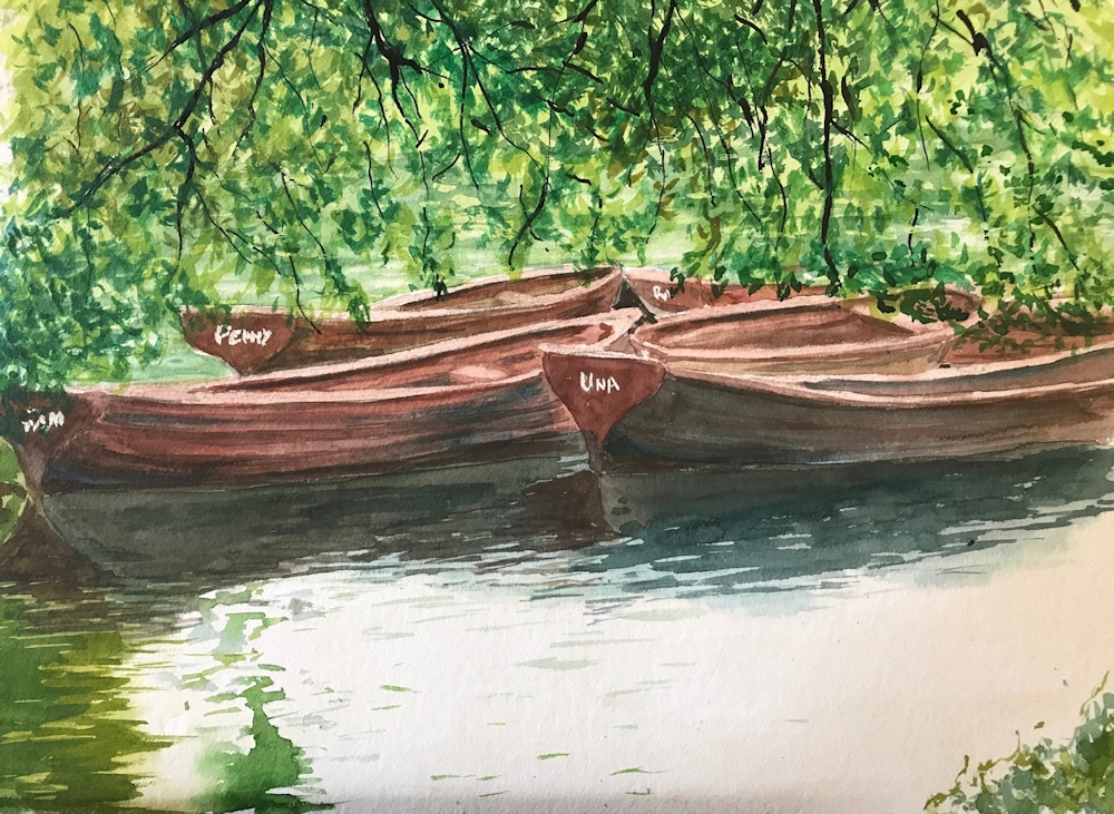
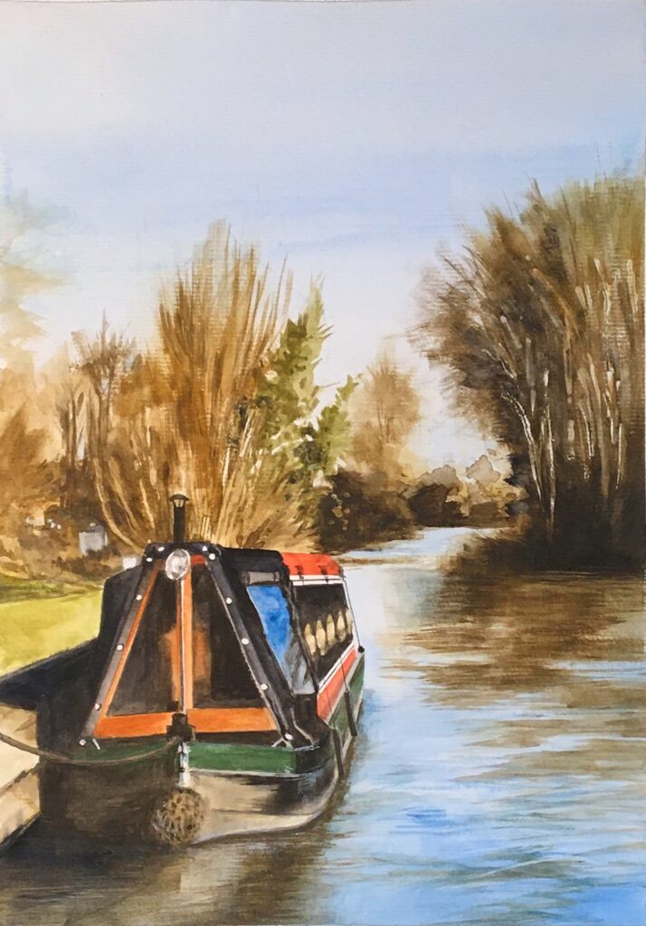
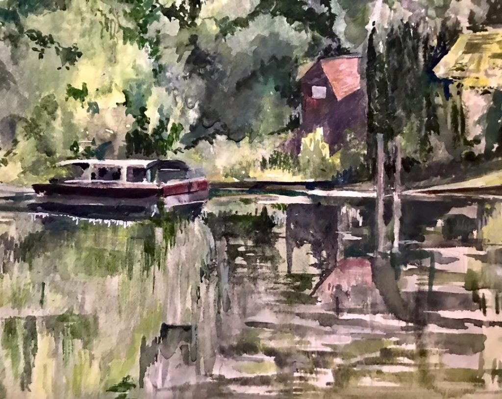
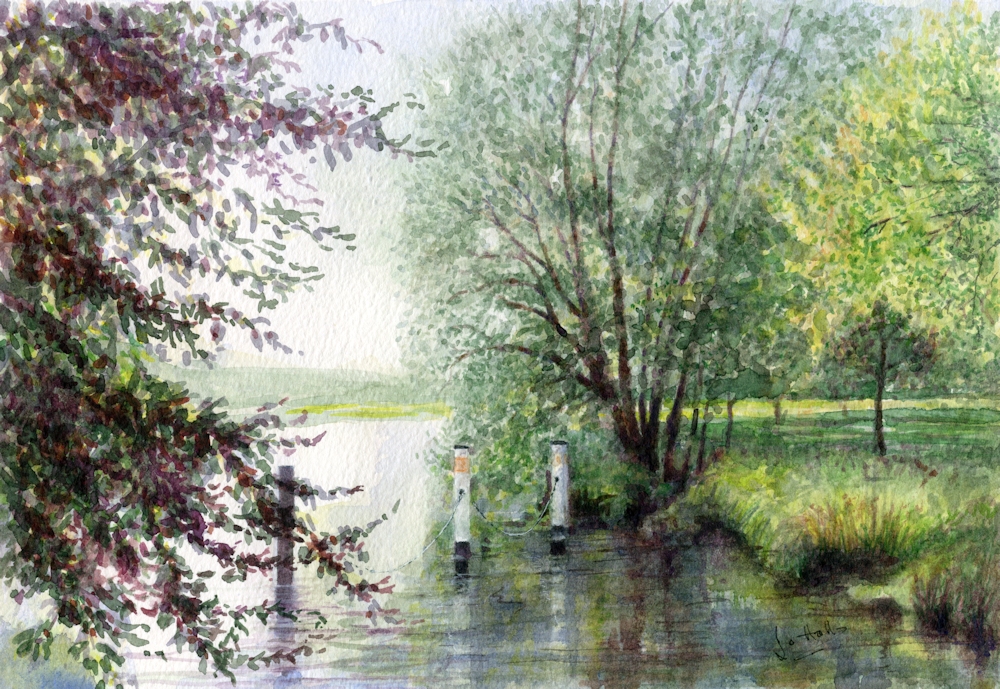
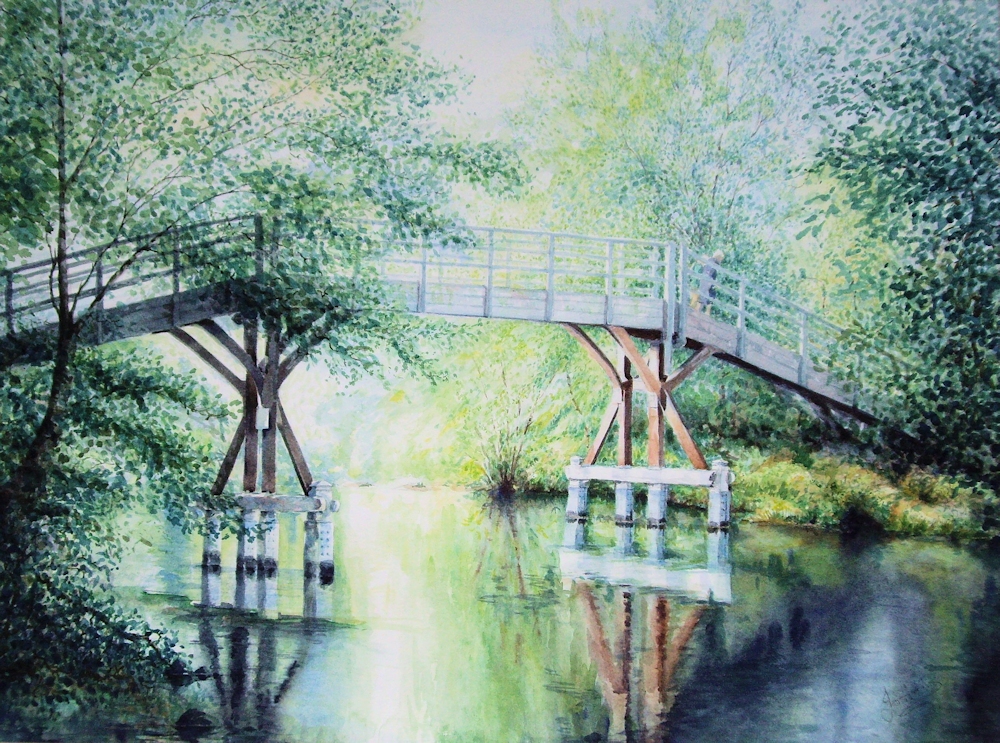
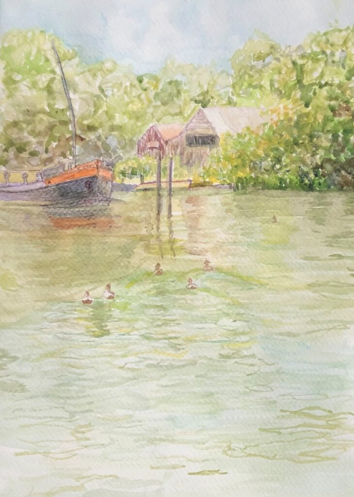
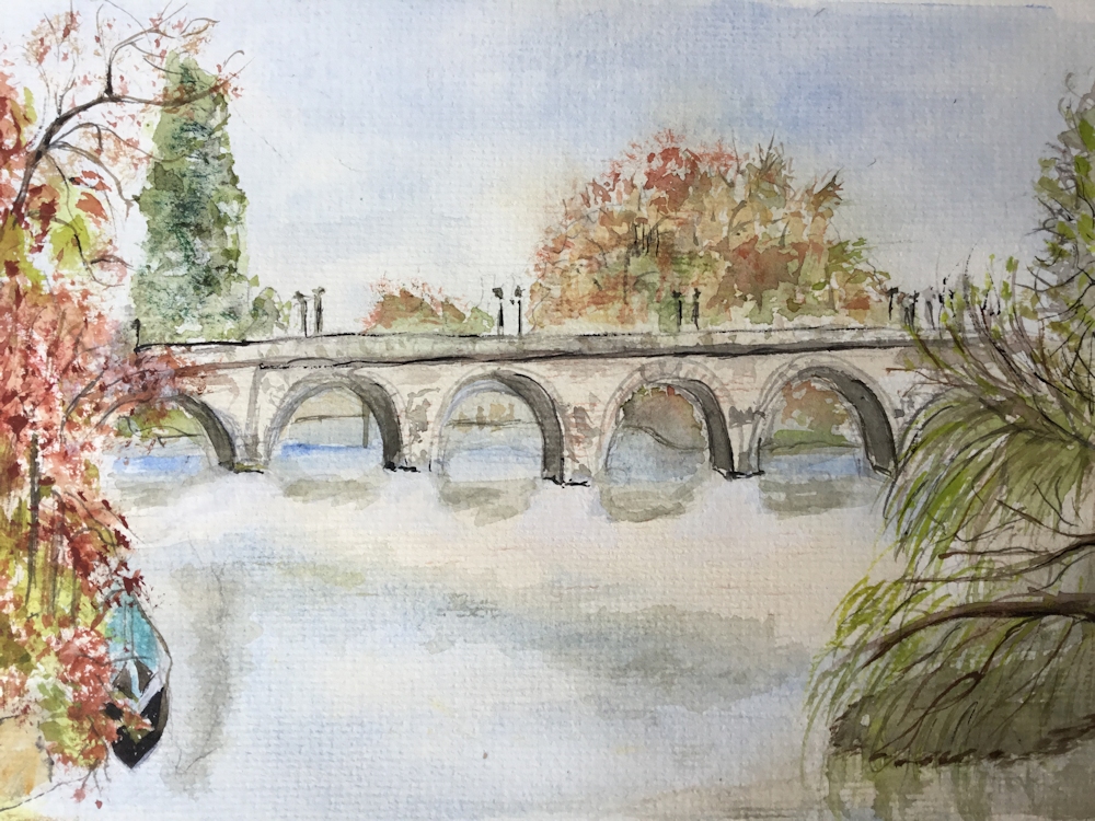
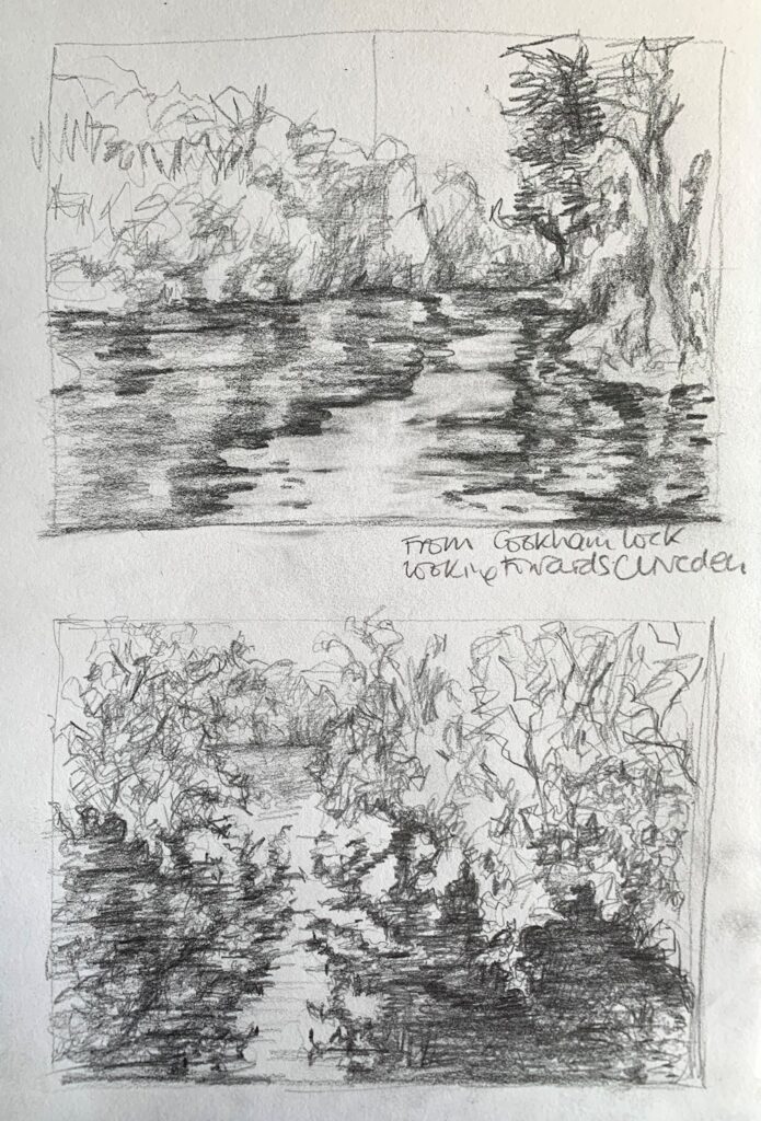
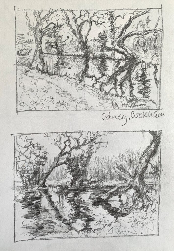
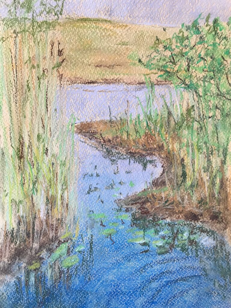
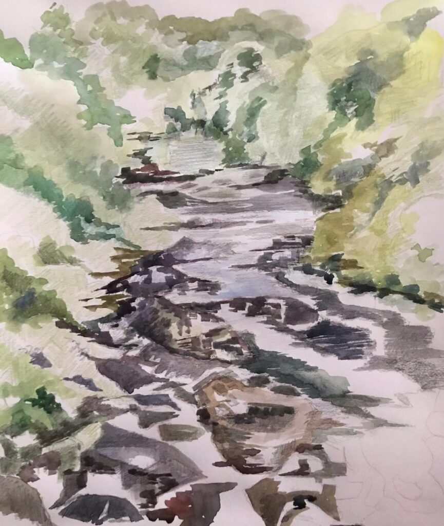
From the Riverbank: Week 6 Hurley
June 28, 2021
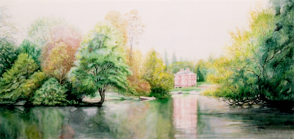
Watercolour
These are the results from everyone painting or drawing at Hurley in very different weather conditions from the previous week, while I visited all the drawing locations and took a few photos plus made the briefest of sketches. The view of Harleyford Manor was painted in 2000 from location sketches and was about 27 inches wide so a bit large to paint on site!
Your paintings:
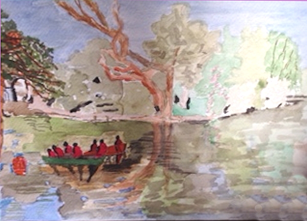
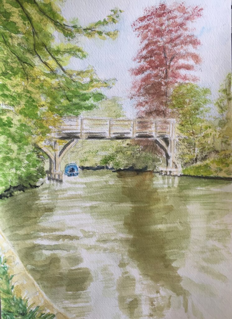
Watercolour by Sarah
Watercolour by Sarah
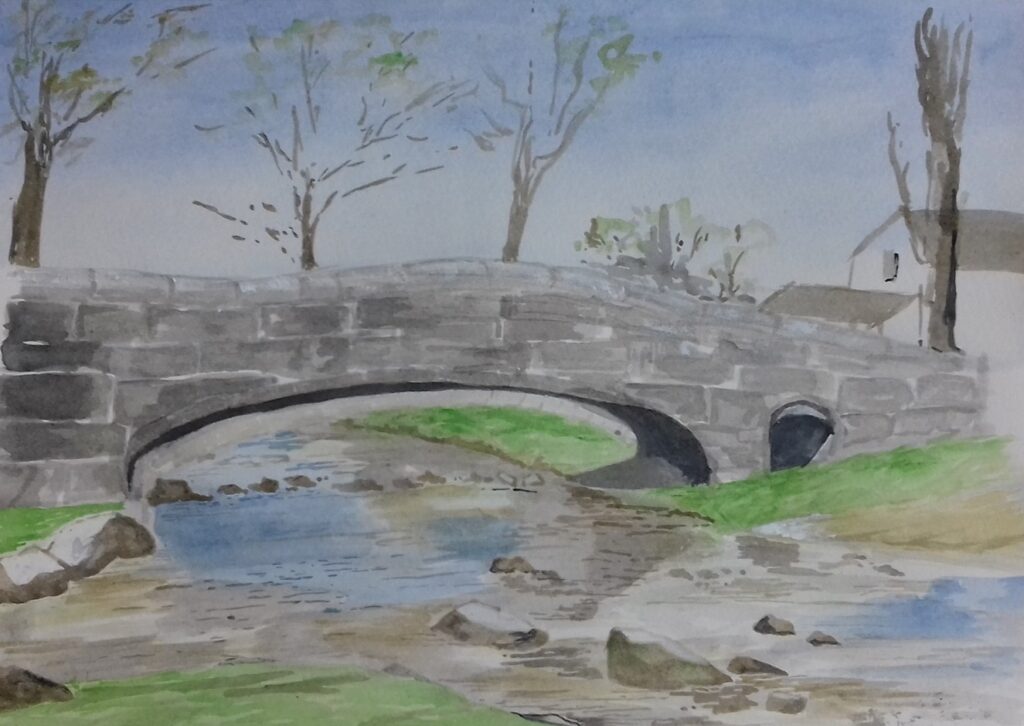
Watercolour by Elizabeth
Watercolour by Elizabeth
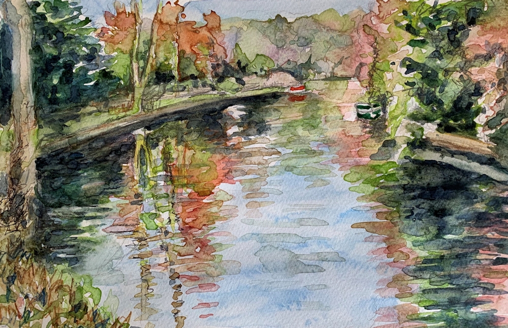
Watercolour by Jan
Watercolour by Virginia
Watercolour by John

Watercolour by Liz
Starting Points for Abstraction: Week 1: Ideas and Rules
June 21, 2021
Why would any one paint an abstract work?
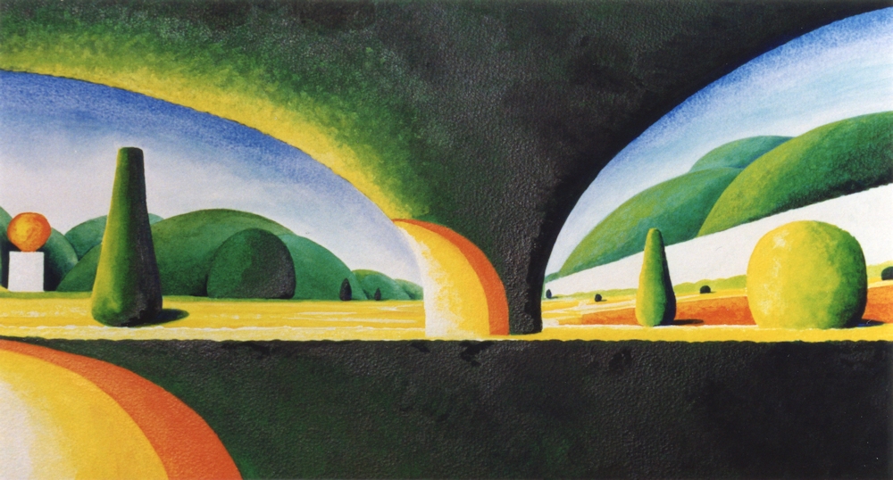
Acrylic on paper
Abstract based on observation, simplification and exaggeration of forms
The fast answer is to express an idea, an emotion or reaction without direct reference to tangible objects.
The reality is that many abstract paintings do reference recognisable things but they are significantly transformed. Given that in painting objects are already transformed from three dimensions to two it does not seem surprising that abstract art at its purest has no relation to objects but that there is a continuum from highly representational art at one end, to paintings with simplified or altered forms, and at the other end more radical abstraction where the shapes whether organic or geometric bear no relation to objects.
However being set free from objects does allow the artist to express mood with colour, with jagged or smoothe lines, slow or fast lines, lines made slowly, hesitantly or at speed, or shapes that are geometric or organic with hard or soft edges.

Watercolour
Intuition: This painting began as the wavy line across it. Some candle wax was rubbed rather randomly across and layers of watercolour washes some wet and some applied with a sponge. There was no initial idea just a get on with it and paint shapes, spots and introduce colours that seemed to be a next best step at each stage till it seemed time to stop. The title was given after the work was made.

Acrylic on paper
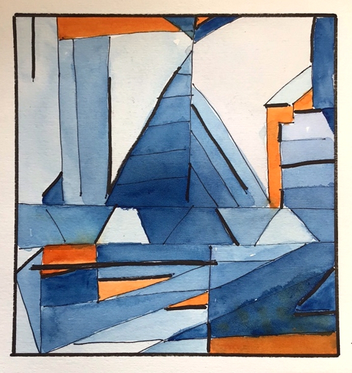
Idea: interpretations of scale/scales made visible by geometric shapes
Musical scales are the little stairways of rectangles; metronomes without pointers the three outside small triangles; the central part is filled with a balance and there are further triangles of different size; only the colour is intuitive but seeks to find a balance for each side
The most useful analogy is with music, the most abstract of the arts. It is not surprising that many artists have written on this subject. Music can be described as joyful, frivolous, melancholy, sublime, romantic, loud, soft, tender. So it is expressive without direct reference to objects.
What else? Various kinds of music have different rules within which they are made made; scale, rhythm, pattern, variation etc.
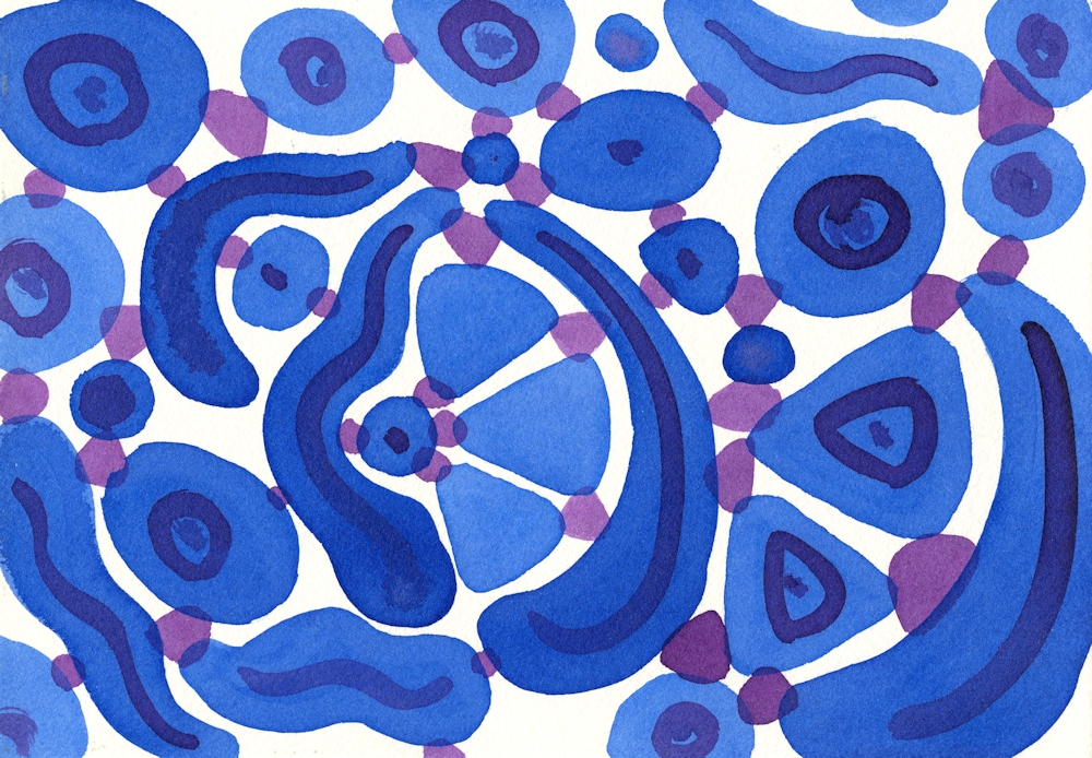
Acrylic ink on paper
Rules and Intuition A more intuitive study but where the artist chose to restrict one colour to the larger shapes and purple to the smaller connecting shapes producing a sense of movement. The final result was not envisaged at the beginning. The blue shapes were placed one at a time till the rectangle was filled and then connected by the purple shapes.
Music is created by a composer and interpreted by musicians so that the often written score/composition can be made audible.
Any composition will be a result of the composer’s imagination, intuition and skill within the rules of his/her musical culture and that culture will develop as the composer’s thought processes discover new ways, new rules etc. only limited by his/her imagination and will to experiment.
Watercolour
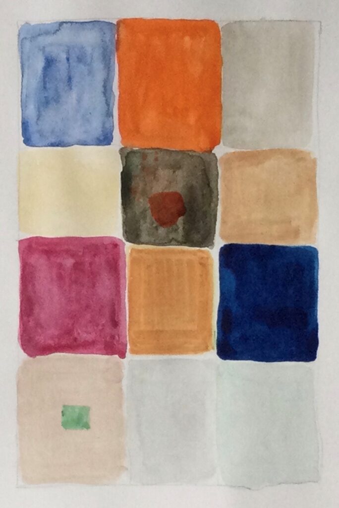
Rules and Idea; The idea is to represent the outside and the inside of the fig separately and combined. The rule is to make coloured squares to do so. The aim is to show the coolness of the exterior compared to the richness of hues within.
Music has an audience which receives and interprets the music. Painting has an audience that similarly receives and interprets. Figurative (representational) art works can be appreciated for their skill, the stories they tell, and often evoke an emotional response. They obey rules to varying degrees; of perspective, tone, and shape of the objects within a composition.
Music does this without reference to objects, though natural sounds, of the cuckoo, for instance may be incorporated into the music. The artist may also wish to produce works which rely less on the appearance of objects, producing expressive works freed from tangible subject matter.

Acrylic paint sticks and acrylic ink on paper
A part accident and part intuitive composition; some of the paint was dripped on to a wet surface and lines extended through pale areas with a brush handle.
In this way Paul Klee described a paint box as the artist’s equivalent to a keyboard. He is deserving of study as possibly more than any artist Klee investigated the processes behind making abstract and imaginative works which may start with an idea or observation but do not have to. One can institute rules for development of the work or work very intuitively and over the next four weeks we will scratch the surface of some of these ideas.
The practical challenge for this week;
Reference the works of Paul Klee on the Pinterest Board at:
https://www.pinterest.co.uk/jhall1282/abstraction/paul-klee/
and Piet Mondrian at
https://www.pinterest.co.uk/jhall1282/abstraction/mondrian/
Make your own rules and then create two or three small paintings with expressive colours to set the mood of each. The paintings may be as small as 6 x 6 inches if working in gouache or watercolour, and larger if working in acrylic and all should be variations using the same rules. You may of course work larger if you prefer.
Make your own rules and write them down, or use one of the suggestions below;
1.Work with a grid however loose or tight and use colour and texture to suggest a remembered place or event.
2.Make a square or rectangle. Fill it with the same geometric shape at different sizes. They may overlap and be at any orientation. Colour using a limited palette or shades of one colour.
3.Fill a rectangle or square with groups of parallel straight lines at various angles to each other. Each line should meet another line at each end. No lines should extend the whole length or width of the rectangle or square. Fill the shapes with a harmonious colour scheme except for one complementary area. Reference Klee’s work ” Forest Architecture” or “Castle to be built in the Forest”.
4. Similar to 3. but the lines may be curved
Use colour to set the atmosphere/mood of each painting. Your own rules may include using different organic shapes connected by lines or shapes or shapes that are enclosed or partly enclosed by other shapes. The possibilities are endless. After a few quick doodles go for one set of rules and stick to it.
During the practical session we will review the work and look at more intuitive starting points and how these can be developed.
Your paintings;
by Heather

by Malcolm
by Virginia
by Liz

by Liz
by John
by John
by Malcolm
by Heather
by Virginia
From the Riverbank: Week 5 Hurley
June 20, 2021
With just an hour till coffee time everyone set about painting a watercolour sketch of the Thames at Hurley. This is a challenging task at this time of year, busy with all sorts of boats from motor cruisers to kayaks. There was always the option to finish at home or stay a little longer to complete the work or make another painting.
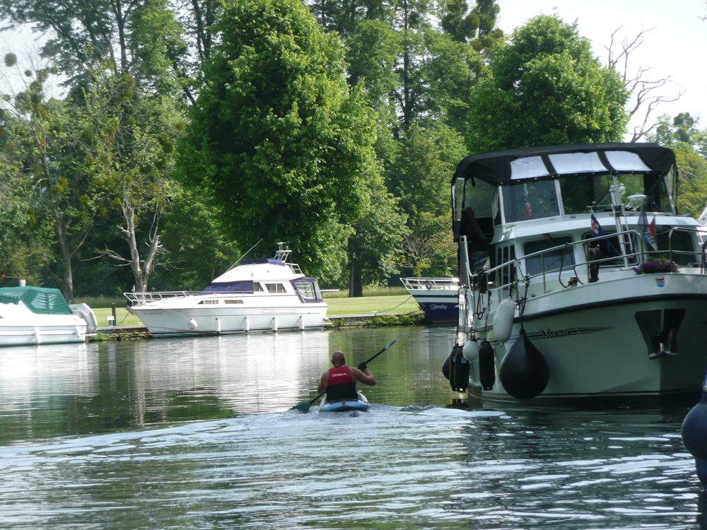
Because of the complexities of boat shapes this challenge necessitated considerable simplification of the shapes and a critical view of the tones. When you add in the fact that many of the boats were moving one can understand wanting to finish at home perhaps referencing a ‘photo. This is OK but there are a few pitfalls.
1.Always take the shot at the eye height you were drawing at. There is often the temptation to stand up if you have been working sitting down and the view will not be the same.
2. Photographs taken in the high light conditions we were on Tuesday, can have too much contrast. The shade areas often looking very dark and very pale areas being ultra white. No worries in your painting to leave the white of the paper for the palest areas. This will give your work a really sunny appearance. If you copy the darkness of your reference in the shade areas you should ensure the differences in tone have sharper cut off points than on a dull day. In sun all shadows will be crisper..
If you need to lower the tone of a whole area this is usually best achieved by putting a wash over the whole of the darker area, leaving just a few tiny paler areas rather than doing it by dabbing away with small brush strokes. Sometimes by referencing your photo and on site watercolour, it can be better to to work another picture taking these tones into account with the first washes as this can be difficult on site in very sunny conditions.
Exactly how dark to make your shadows can also be greatly governed by your intention. The reality as in the first photo below was that the shadow area behind the canoes was so dark it was hardly even textured. You may choose the dark to offset the colour of the canoes for a dramatic effect, or you may choose the softer effect of seeing more of the texture and colour of the background as in the modified second photo below .
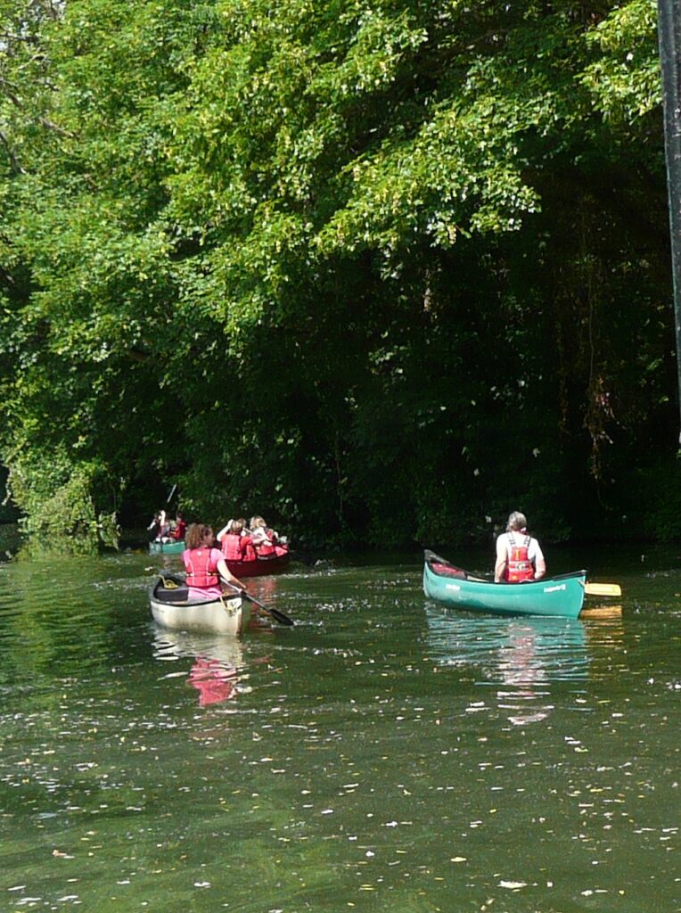
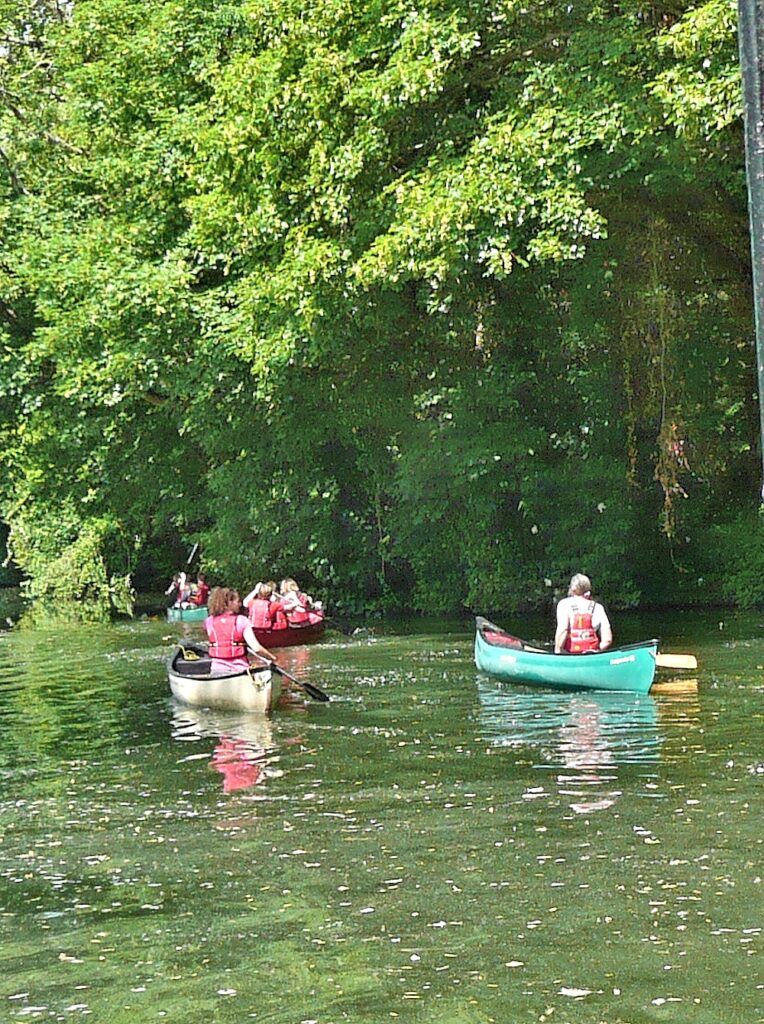
3. There is also a temptation to add washes to the water that soften the edges too much. Last Tuesday the weather made for very clear reflections and waves and that should be reflected in your paintings. Again this was made difficult as in places the water appeared very green. Where a paddle hits the water you can always give a little sparkle to the splash by scratching out with a sharp point. Wait till the rest of the painting is complete before attacking the paper in this way.
This week we’ll be at Hurley again and probably in very different light conditions. Notice any differences especially if you visit the same spot to paint. We’ll also talk about colour, especially the water and reflections.
Your paintings;
On Site at Hurley
Completed Afterwards
Jan has left some light spots in the foreground and on the tree foliage and trunk so the painting is still lively. The darker than original foreground and trees/foliage, has made a good contrast with water. A little of the freshness of the first painting has been lost but I can see the reasons for making adjustments.
Watercolour by Mali
Ink and wash by Barbara from a photograph
Watercolour by Elizabeth
Watercolour by Sarah from Photograph
Watercolour by Liz
by Virginia
From the Riverbank Week 4: Sketching near Boulter’s Lock
June 8, 2021
Such a treat today to be sitting outside drawing subjects we have become familiar with using photo reference. Before publishing I added more tone to these sketches from memory.
Have already spotted a couple of areas that need adjusting.
The heightened contrast reflects the very bright sunlight we worked in. I’m now going to discover the ‘photos taken at the same venues which I know will have too much contrast, so no good as photos but a very good reminder of the importance of tone in composition.
Your Sketches and Paintings from Sunny Maidenhead;
Watercolour by Maryon
by Ann
by Barbara
by Jan
by Mali
Watercolour by Virginia
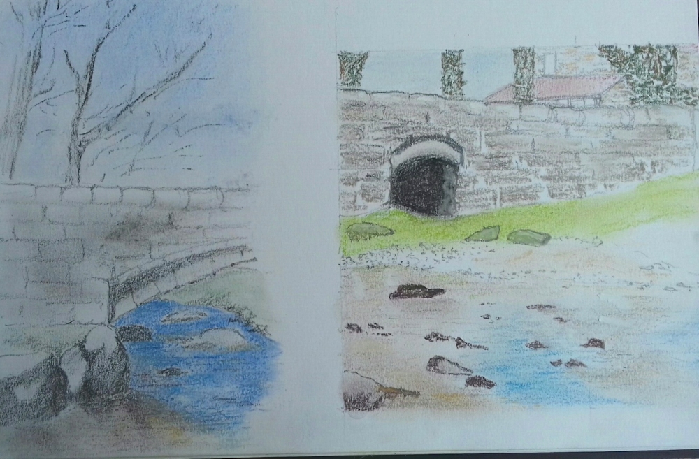
Pencil and Coloured Pencil by Elizabeth
by Sarah
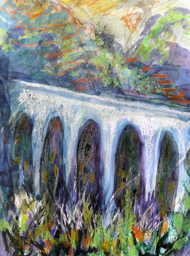
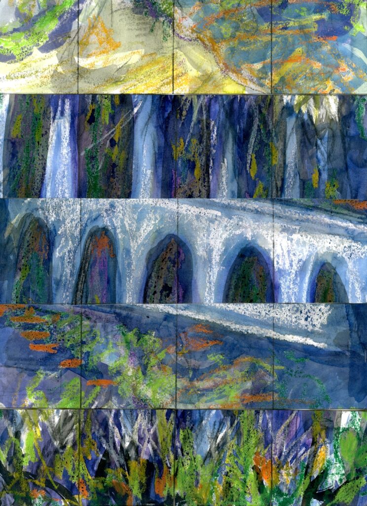
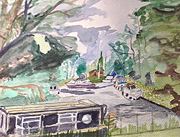
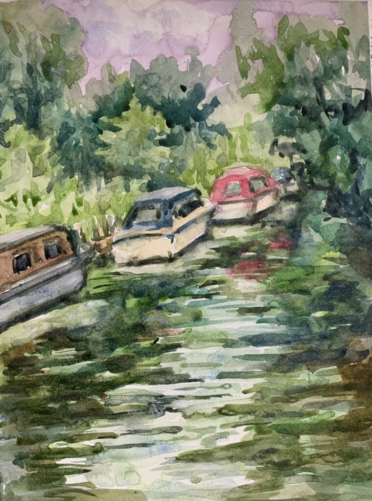
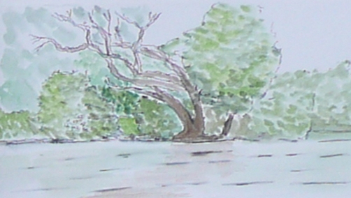
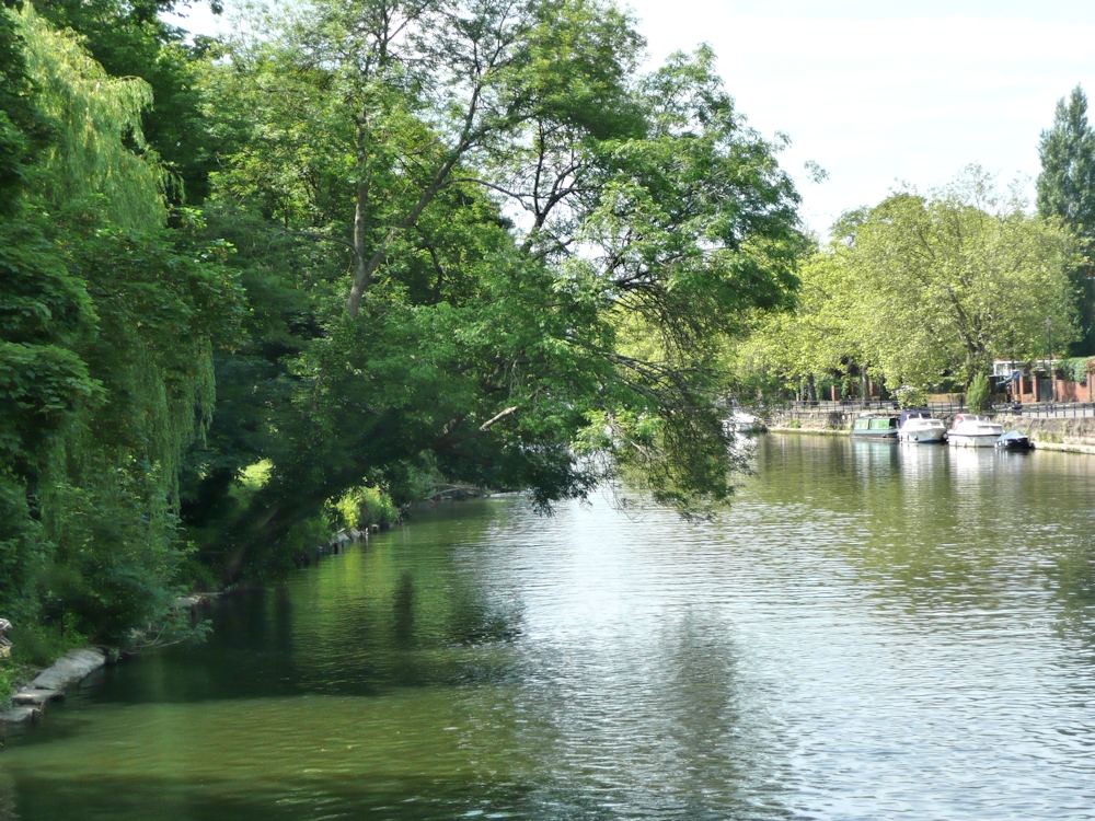
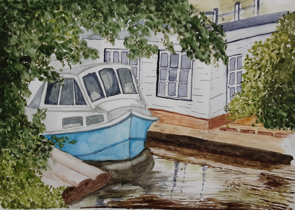
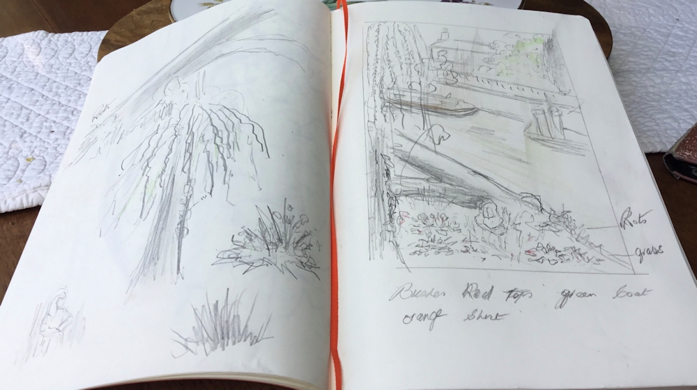
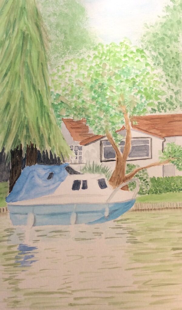
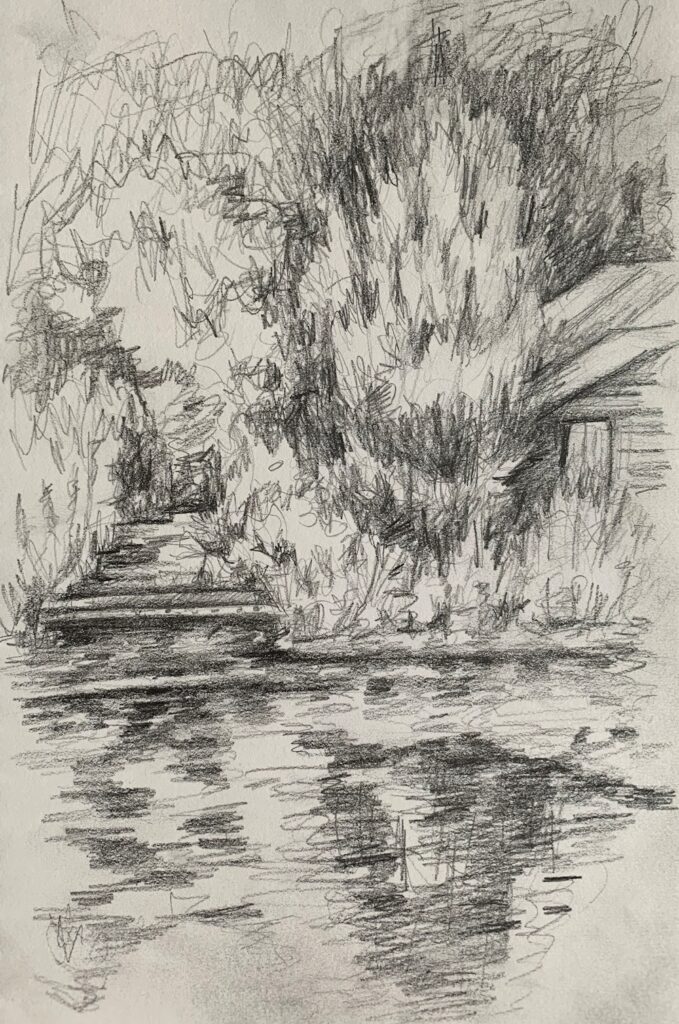
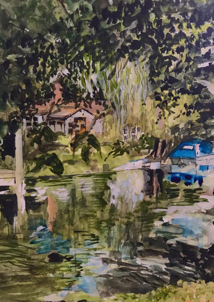
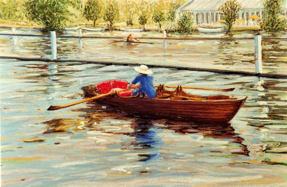
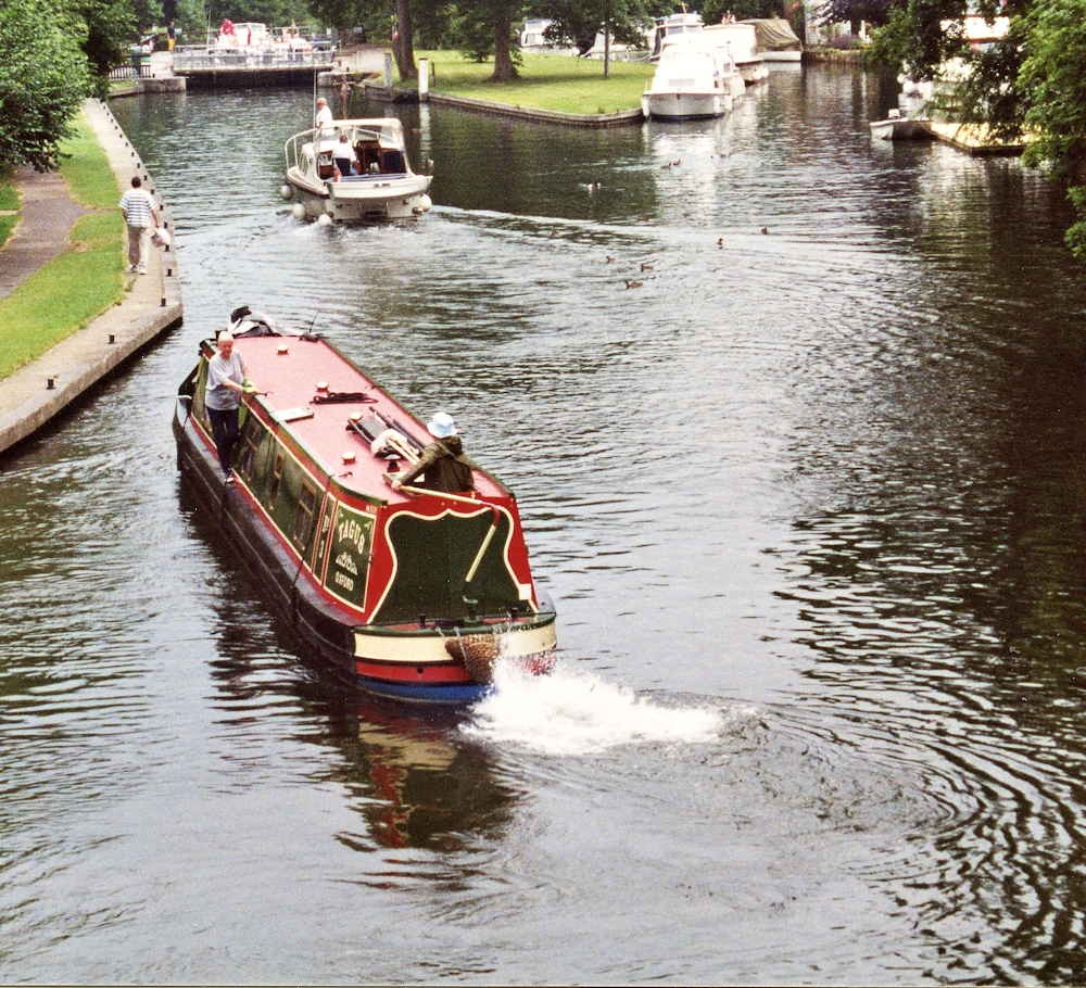
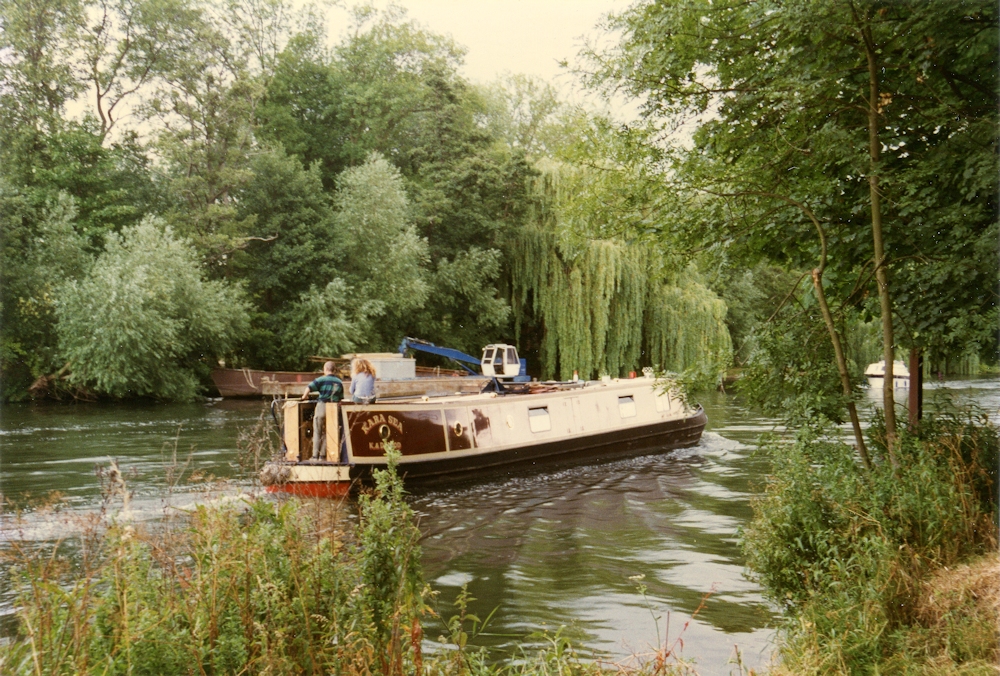
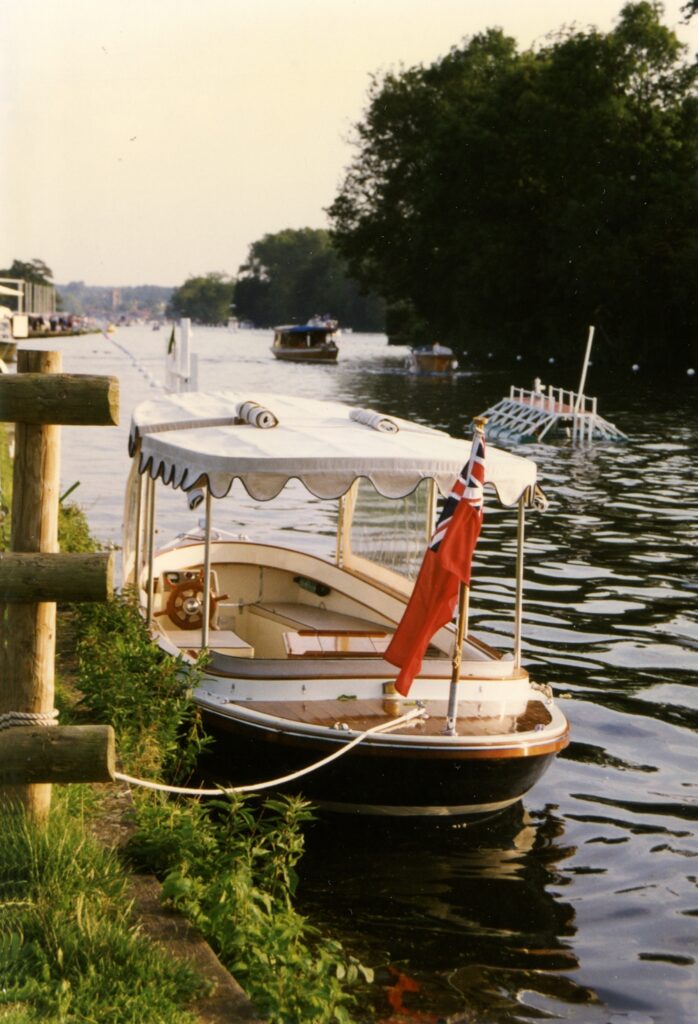
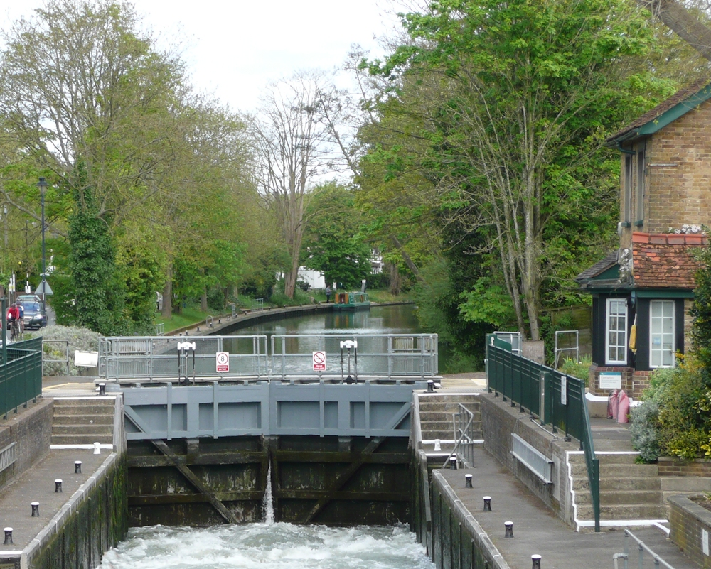
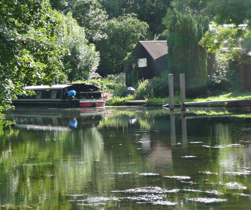
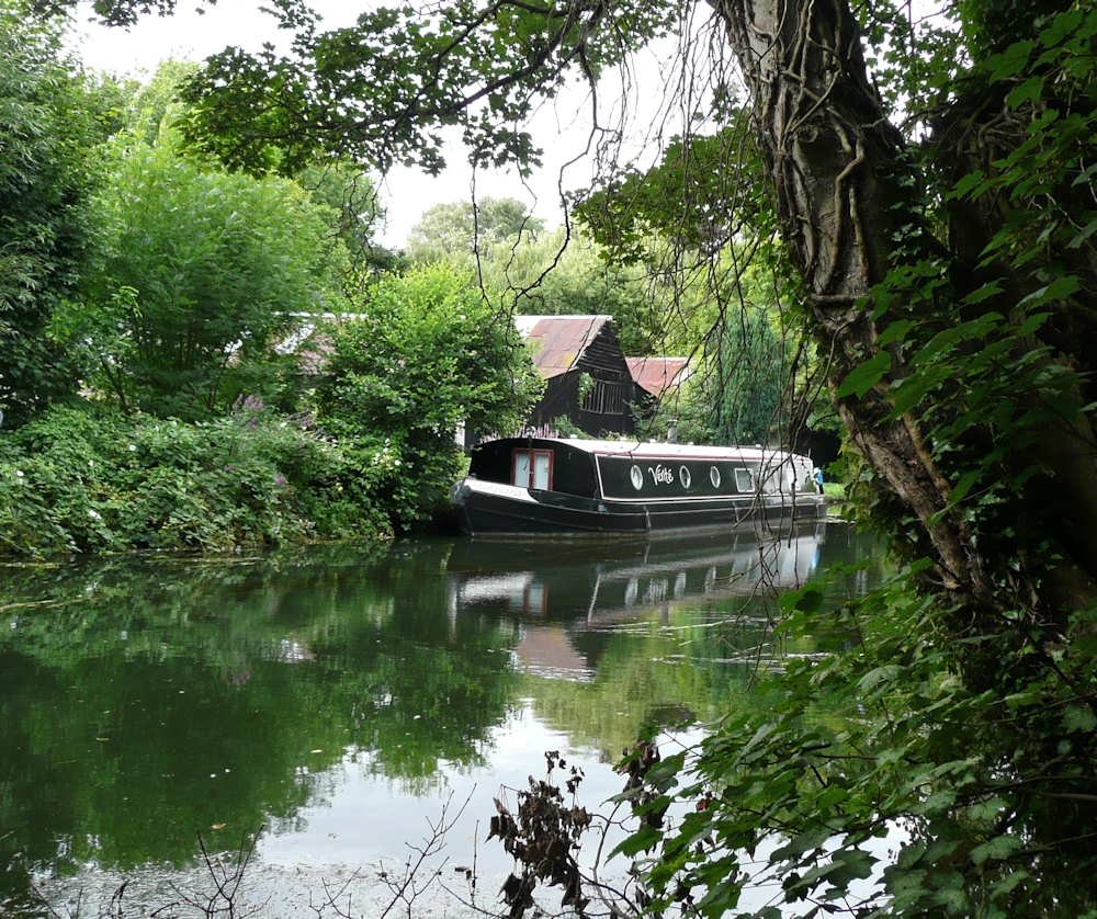
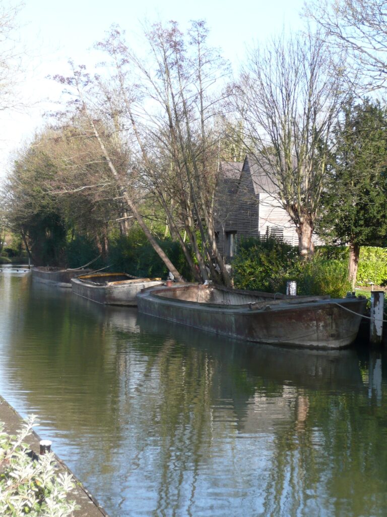
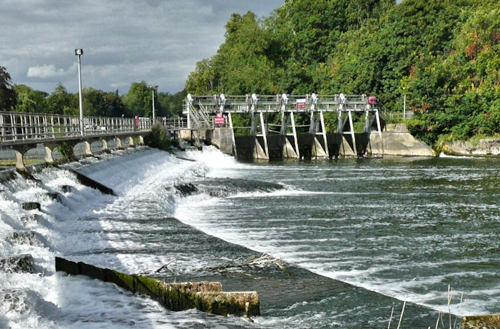
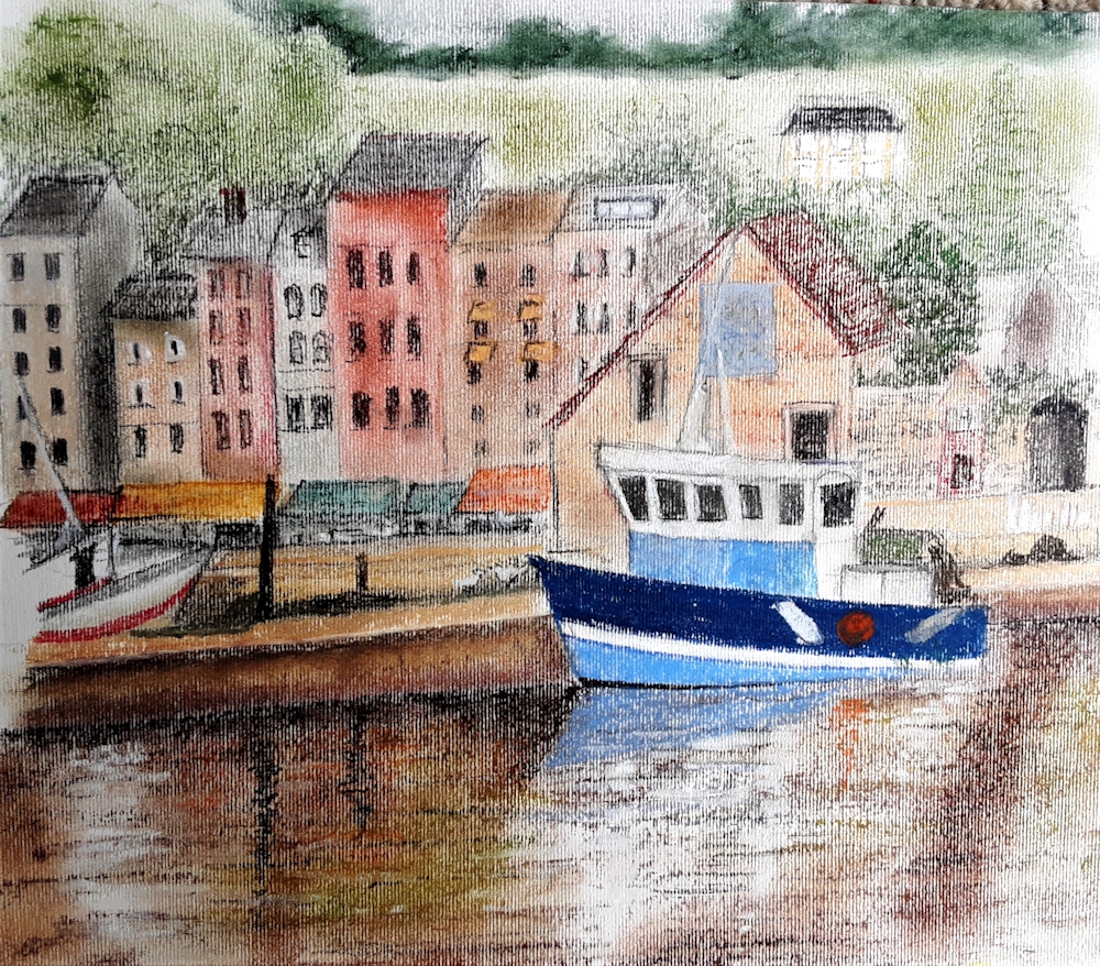
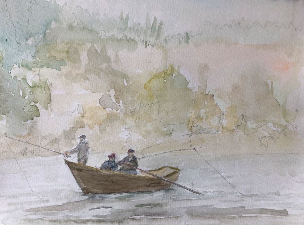
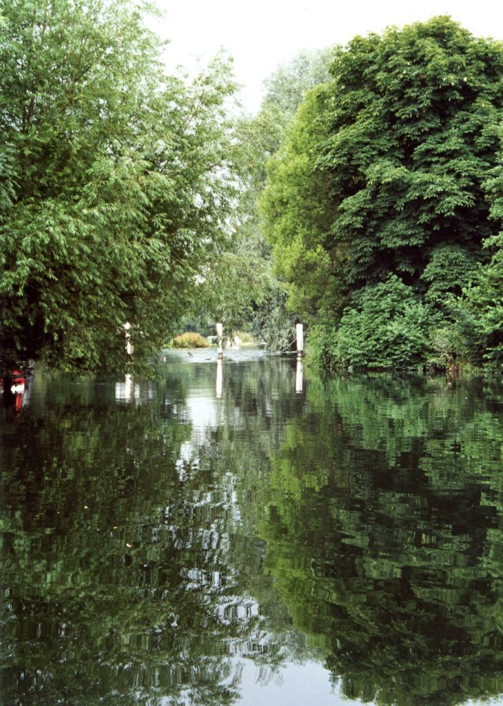
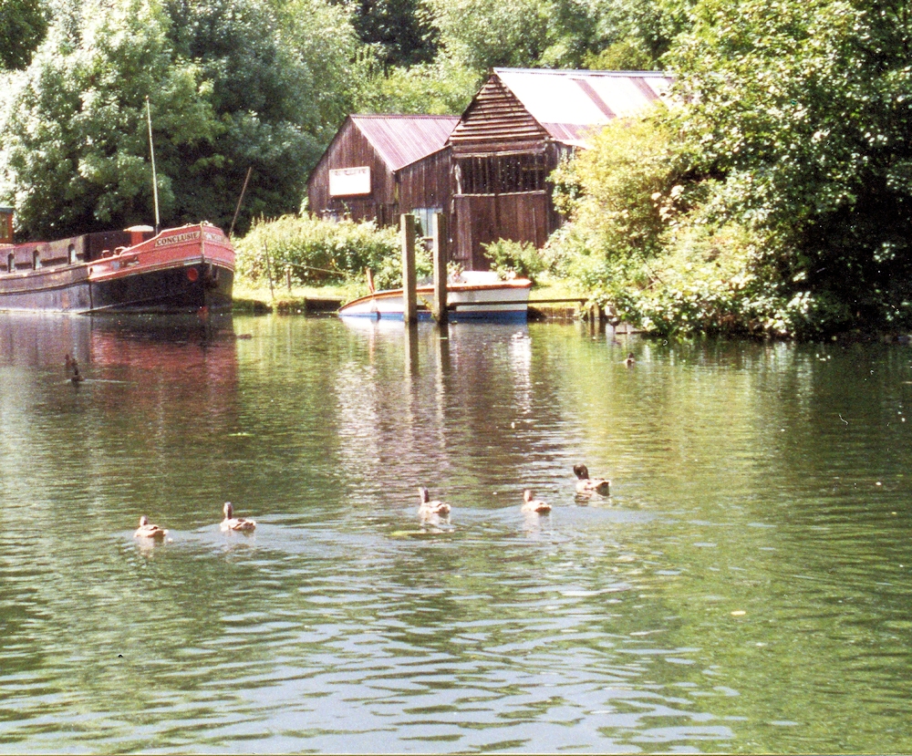
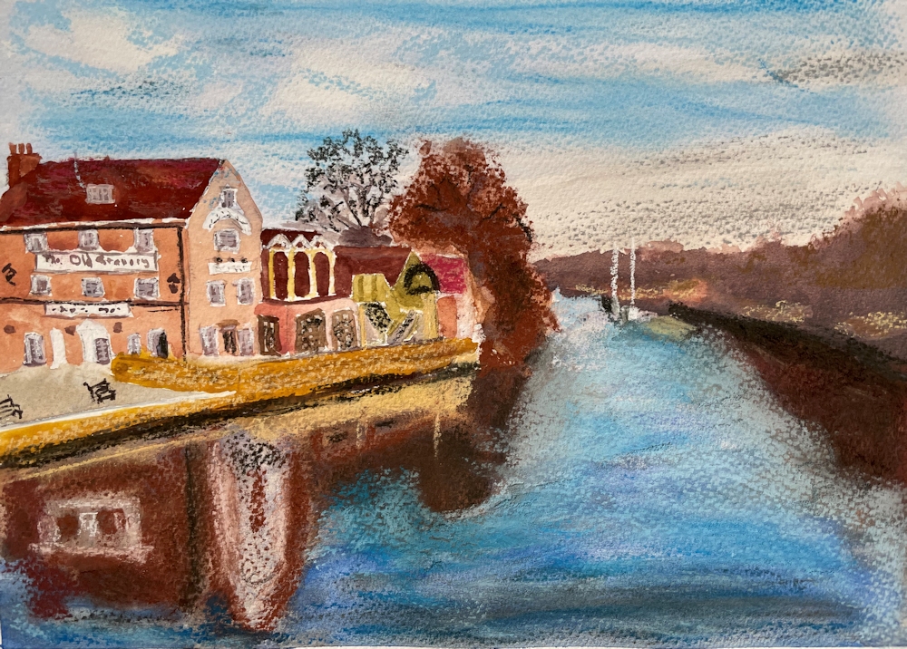
From the Riverbank Week 3: Boats, Boathouses and other Structures
May 23, 2021
Pastel
The challenge this week is to make a painting of boats and/or constructions on the river including weirs, locks, boathouses from sketches made from the riverbank. If the weather makes working by the river difficult why not look at any photos you may have of boats threading their way through the twists and turns of the Thames. It’s more difficult to draw a moving target from life so becoming familiar with the structure of boats and their effects on the water surface is easier from photographs.
However if you have the opportunity, it’s much more rewarding to work outside with a sketchbook. Start with the static objects and develop your confidence, and then try drawing the main shapes of boats and their wakes as they pass by,as swiftly as you can. With a little practice a real notion of movement can be achieved.
Pastel
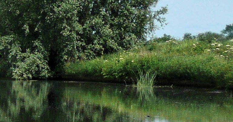
A few photographs of local parts of the Thames with moored and moving craft are below.
Photo
Think about the river and its banks, the relation of the boat to the water surface (the waterline, reflections and if moving the bow wave and wake, or if a motor boat how the water may be churned up by a propeller at the stern). The patterns of waves may extend far beyond the immediate vicinity of the boat.
If you attempt to draw or paint a lock, perhaps looking down from a bridge as you can at Maidenhead. Try drawing the large shapes of the lock first so that you get a feel for for its structure and aim to show its perspective. That will help you when you place a boat in it. Think of the lock as a big rather long box so the end away from you appears smaller. Then look at the water level in the lock and how the boat sits in it.
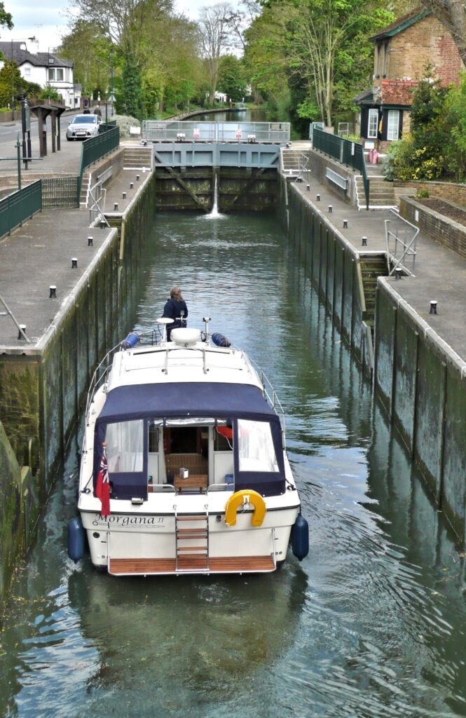
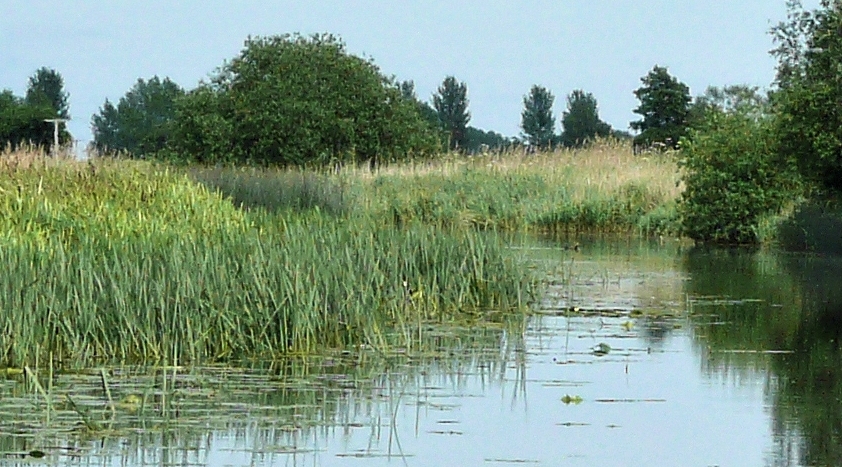
Photo
Photo
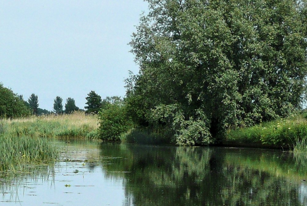
There are also occasions where boats are included as only a small element in a river landscape work so just as observing and drawing from human forms, observing and drawing boat forms will help you to be able to just ‘drop in a boat’ to enliven a composition.
Photo
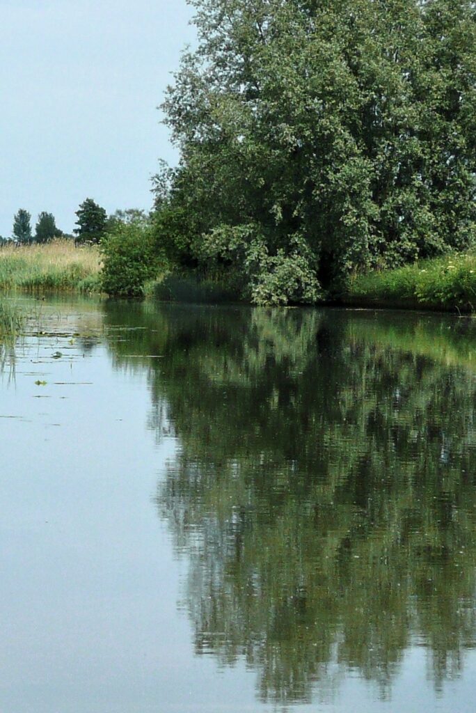
Photo
Photo
Photo
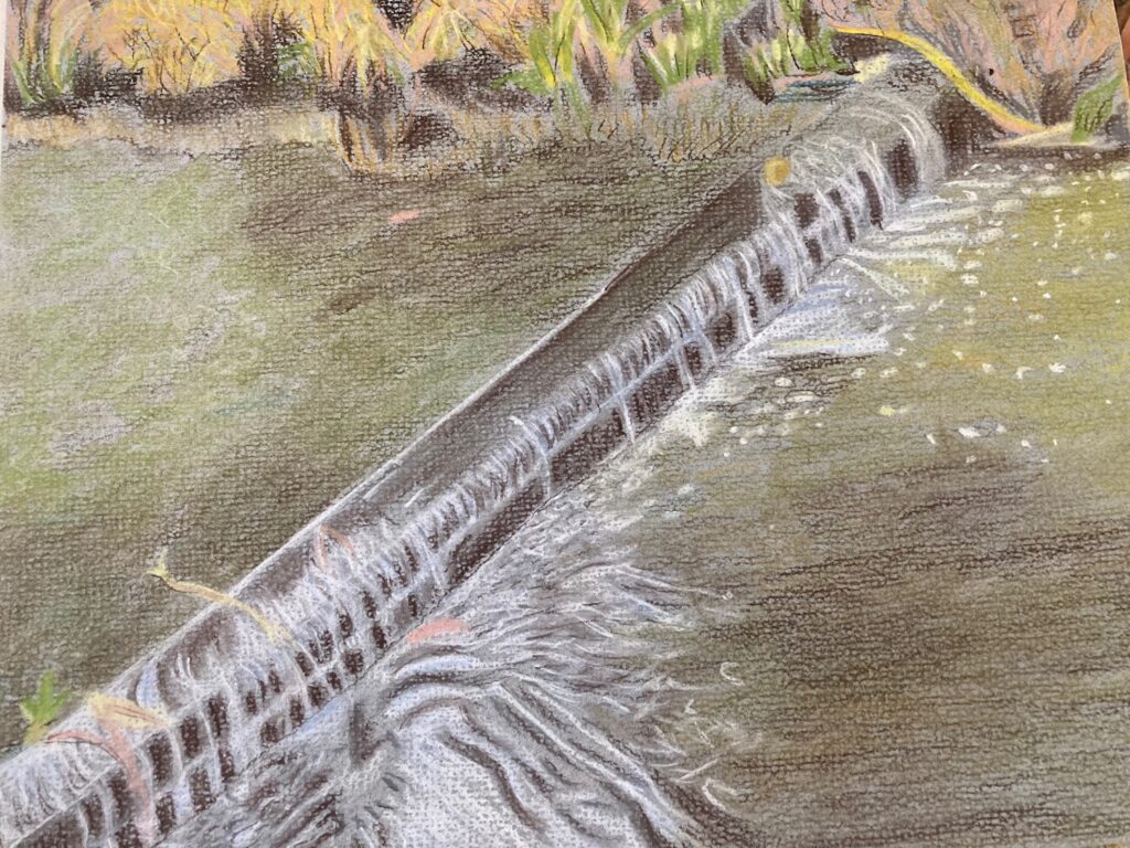
Also included are boathouses and a couple of old rather abandoned looking dredgers and the turbulent water of the weir at Maidenhead.
Photo
With the weir draw its underlying structure lightly before indicating the frothy water tumbling over it. Hopefully we’ll be sketching outside but if not feel free to use any of these references or find a boat scene you would like to paint.
Some examples of paintings of boats and locks etc can be found on Jo’s Pinterest board using the link below:
https://www.pinterest.co.uk/jhall1282/from-the-riverbank/boats-locks-weirs-and-buildings/
Your Sketches and Paintings:
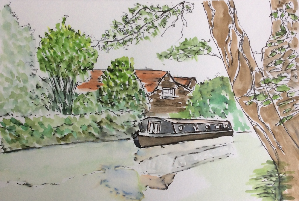
Watercolour by Jan
by Liz
Watercolour by Virginia
almost finished
Watercolour by Ann
Watercolour by Ann
by Elizabeth

Pastel by Barbara
by John
Pastel by Mali
Watercolour by Sarah
From the Riverbank Week 2a: Some Photo reference in case of rain!
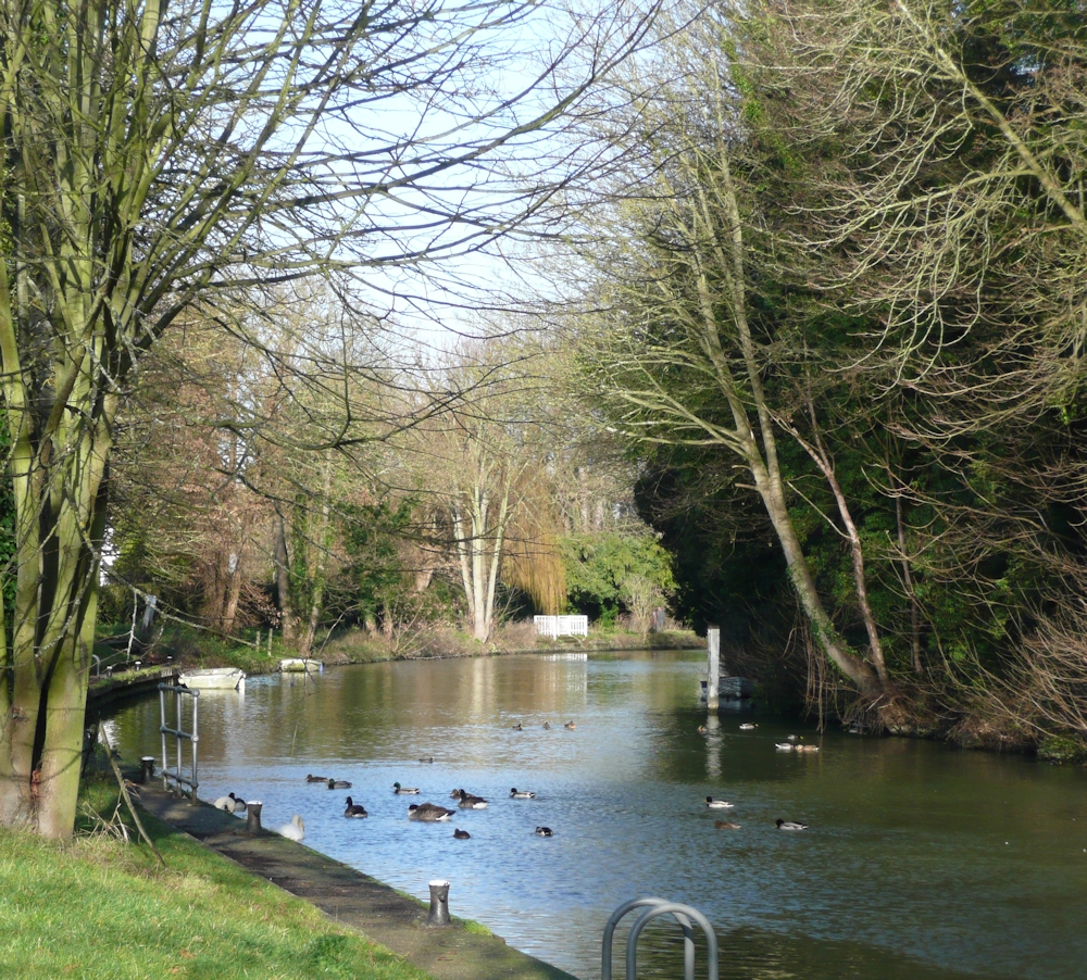
May 16, 2021
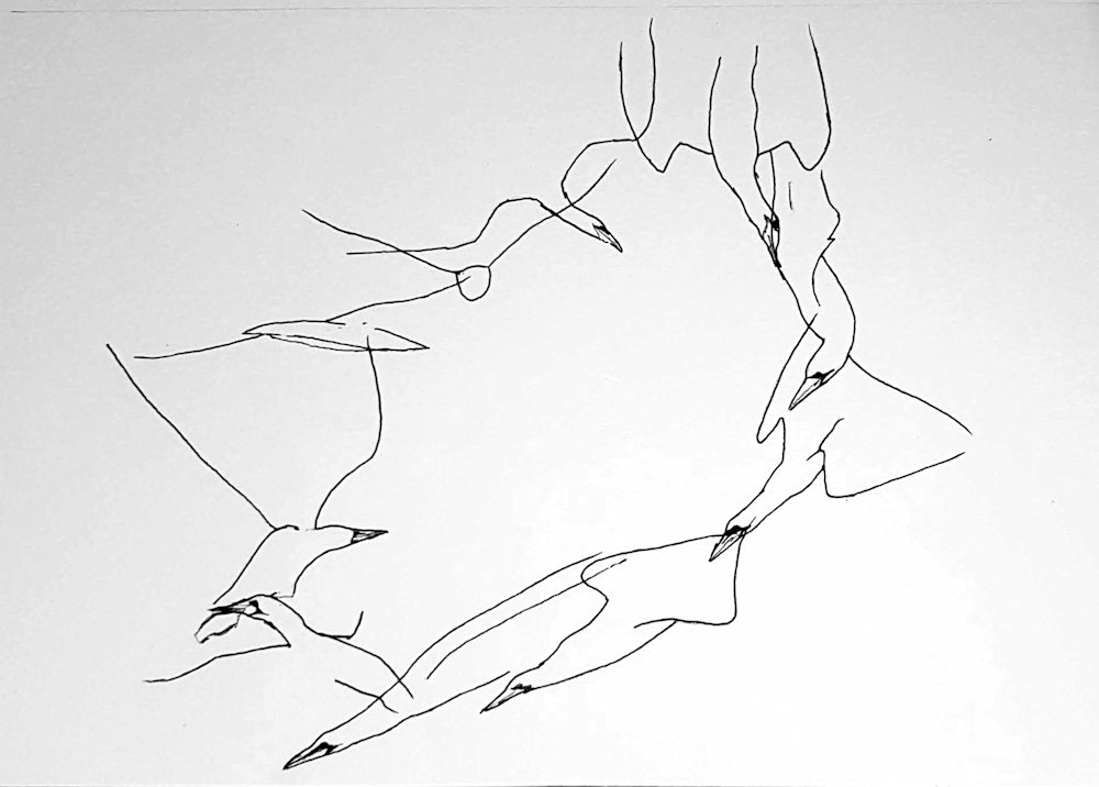
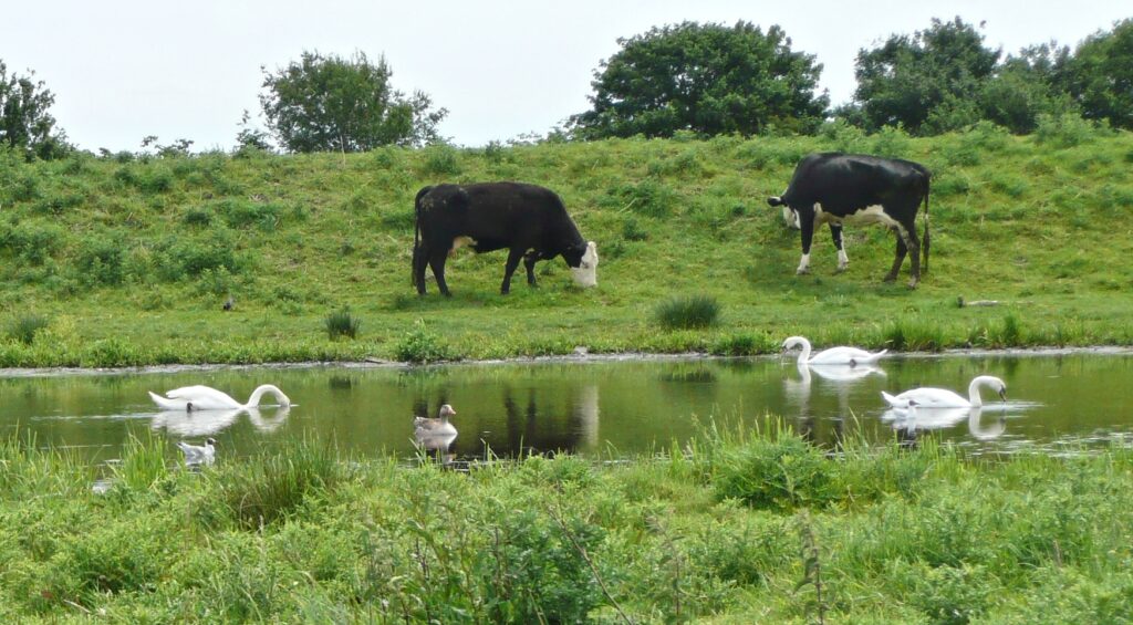
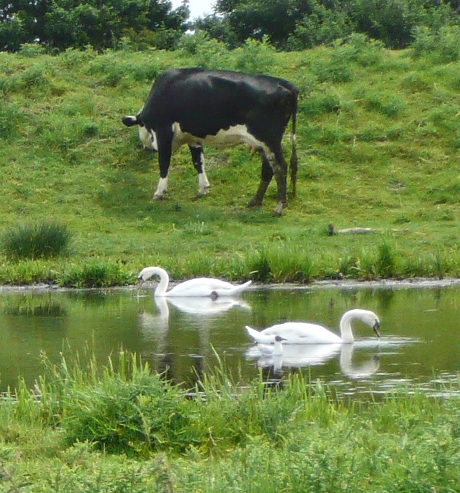
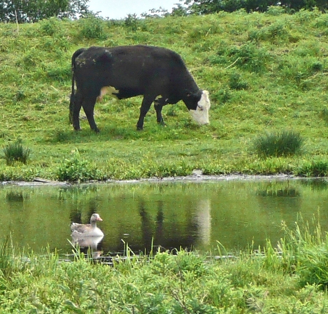
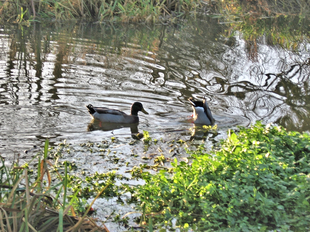
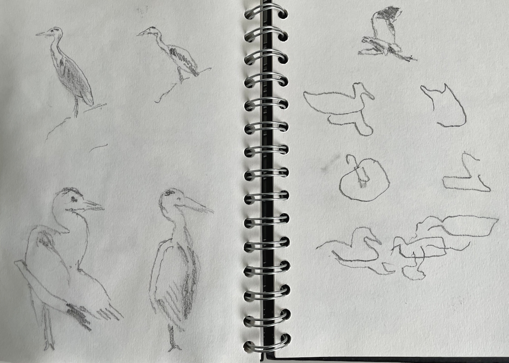
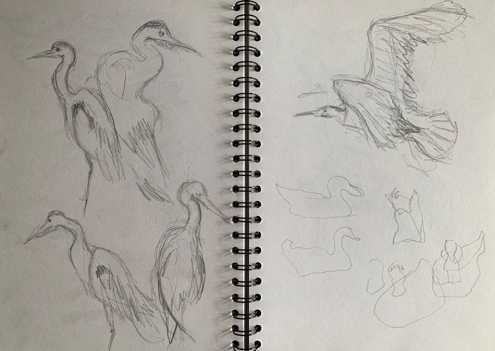
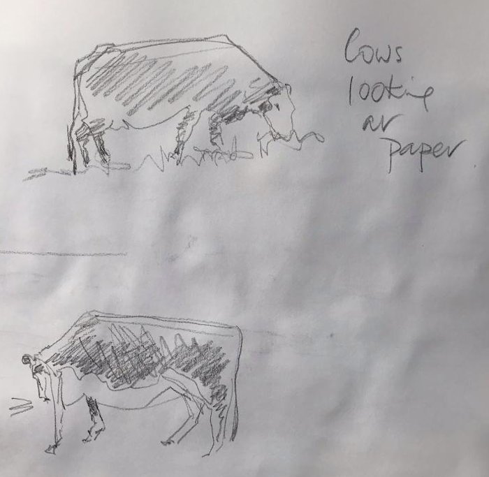
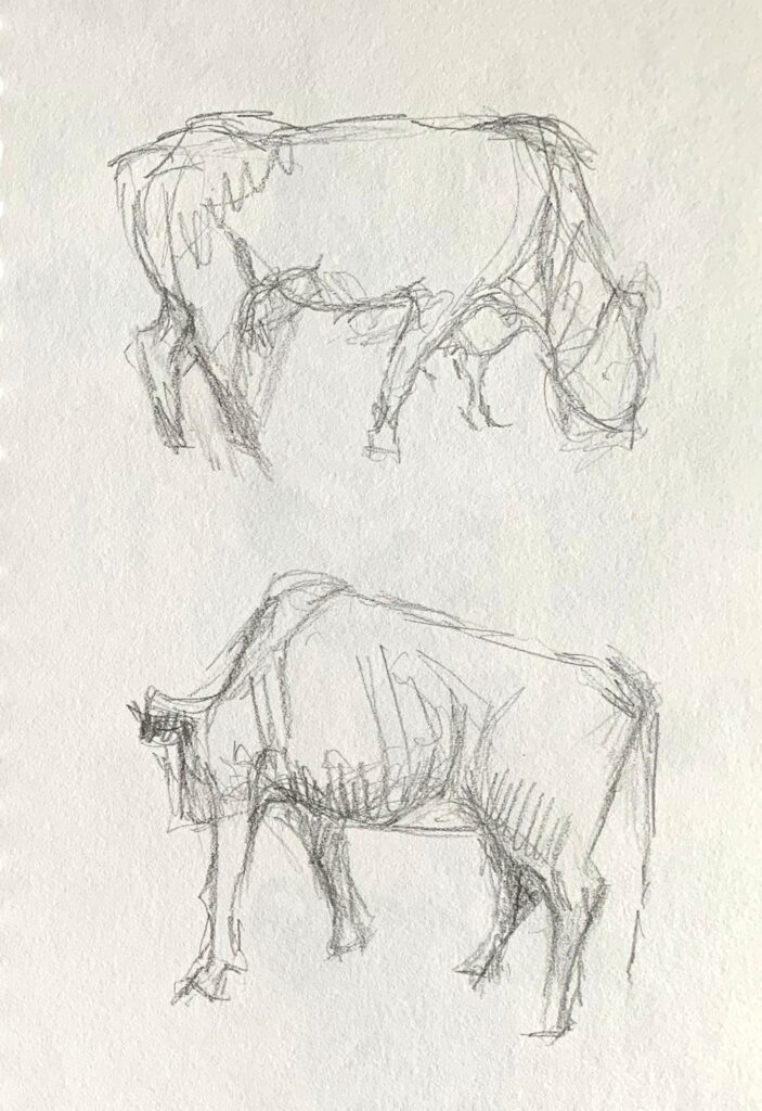
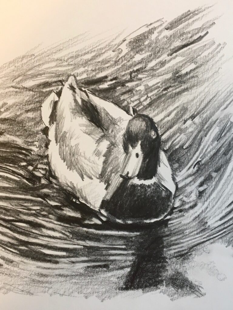
The Weather forecast is miserable for this week so here are some photographs of river birds and a few cows for inspiration, a contingency in case of rain on Tuesday.
As anything that moves is a challenge in real life, becoming familiar with bird and animal shapes will be helpful before sketching them outside. We can work in real time together either from the following references or using your own. We’ll choose a bird or a cow and make rapid thumbnail sketches in real time; four or five to a sketchbook page so don’t think too large. I will be using a stopwatch! You will see from the reference that you should be able to make several sketches of the same or a similar bird in different poses.
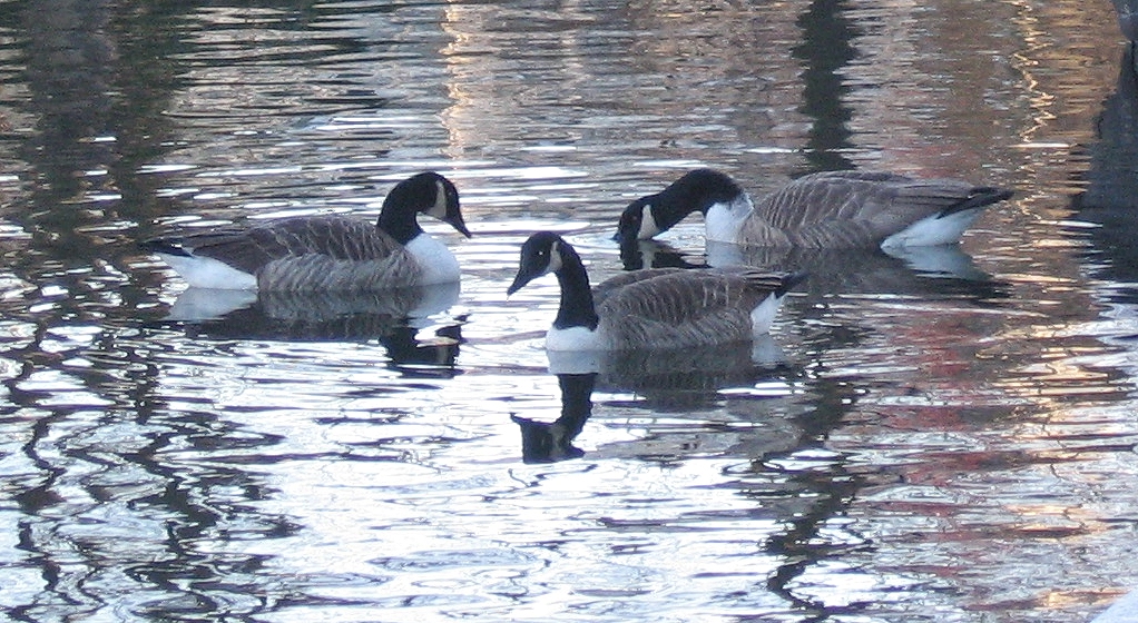
Where birds in groups overlap each other, as in the cygnet photos it can be useful to treat them as a single shape and then sort out the individuals. They move in amazing ways, with mother swan looking out for them all the time.
After a few warm up sketches we can move on to a more considered drawing or painting, making a good start that can be finished during the session or in your own time afterwards. This work may either be a painting that has the creature as the main subject, or a work where the beast or bird is placed in its landscape setting.
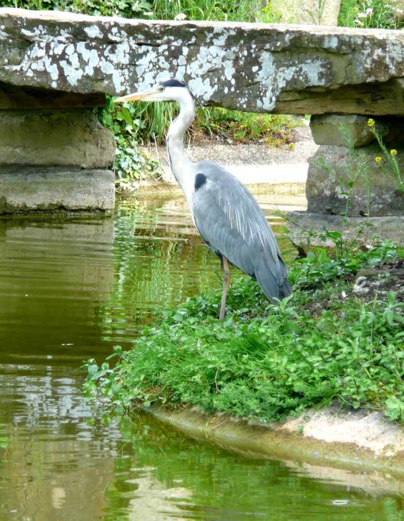
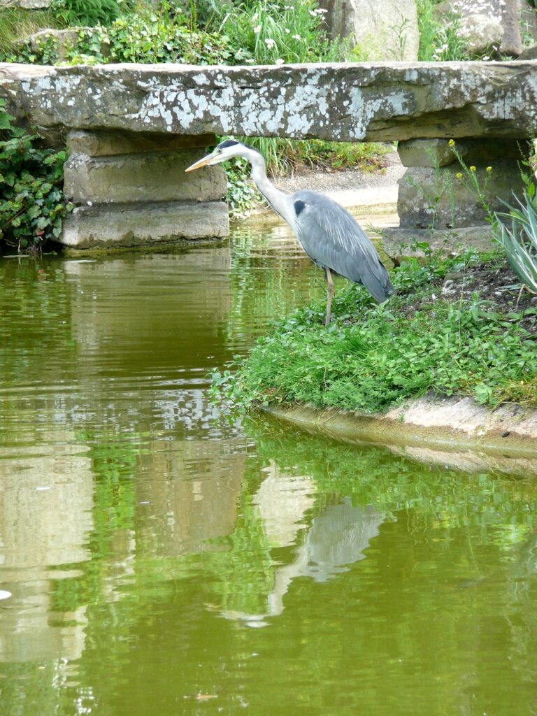
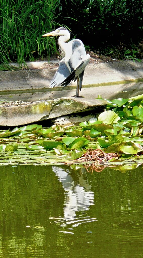
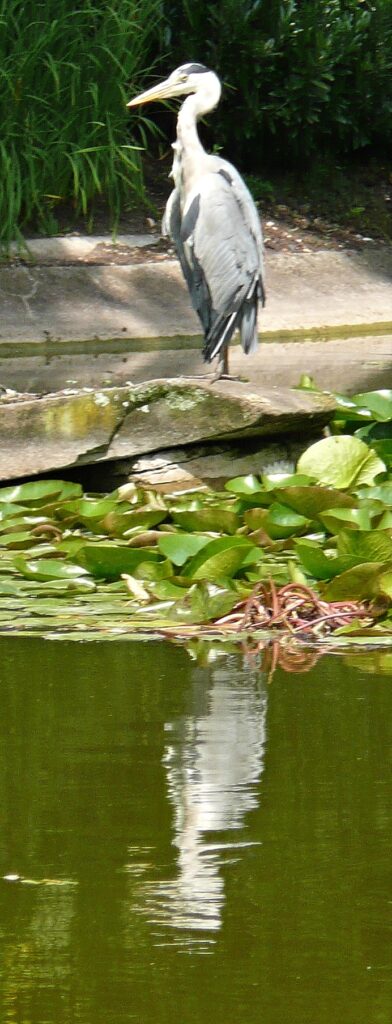
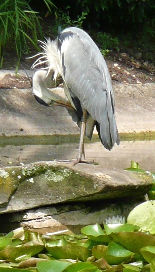
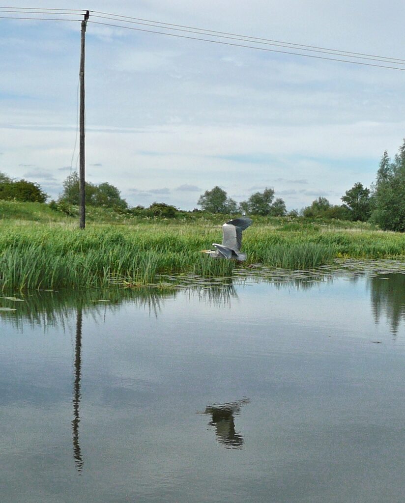
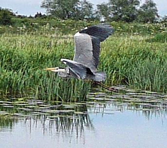
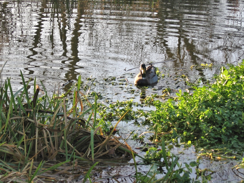
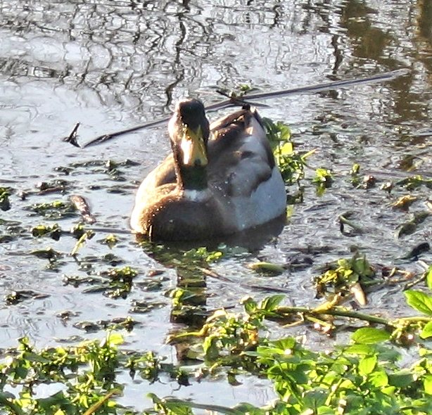
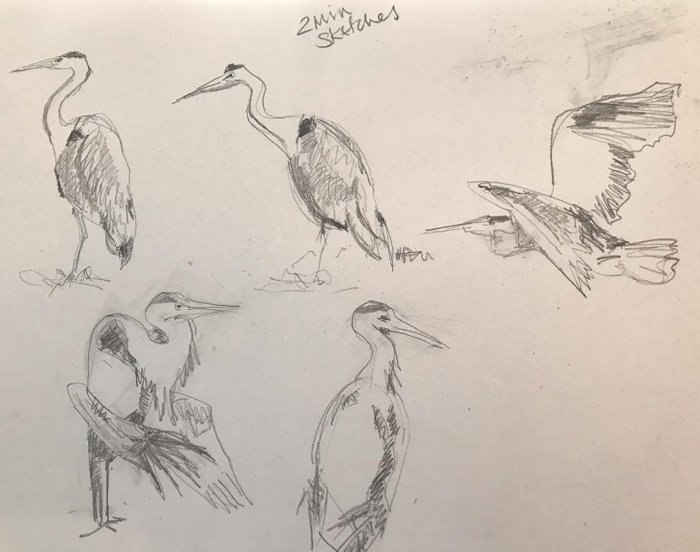
Most of the heron images are from the water garden at Cliveden where the carp fry are easy prey for a hungry bird. I watched and sketched this one before resorting to record his antics on camera. but sadly never caught him actually catching a fish.
Your paintings and sketches:
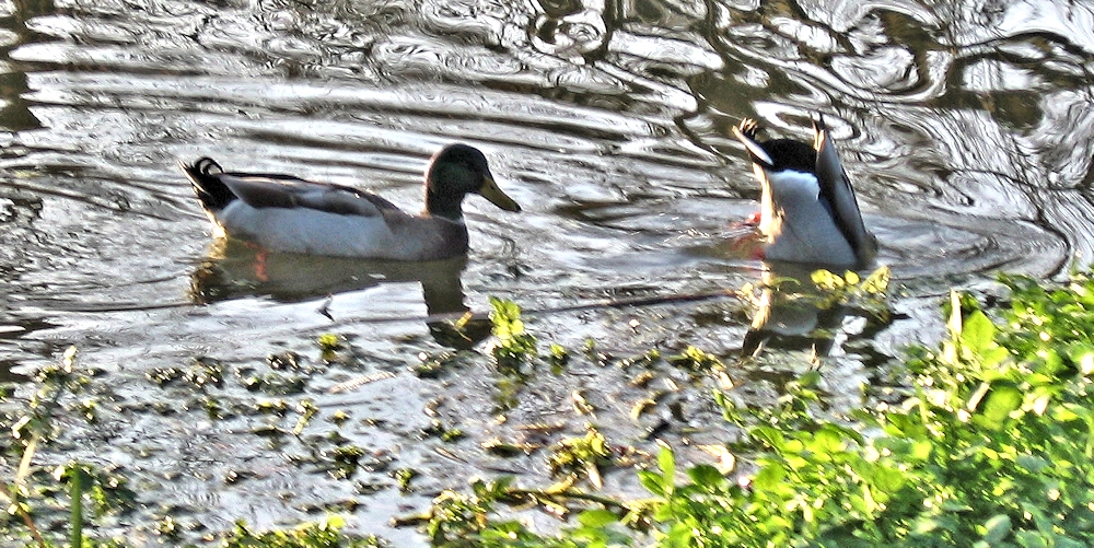
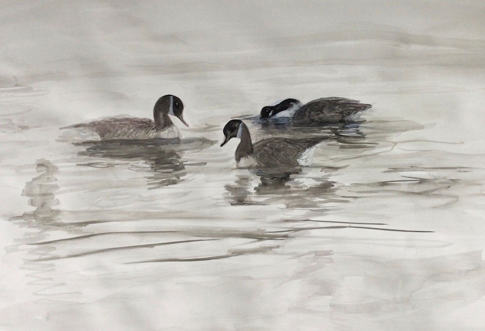
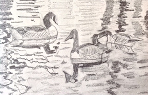
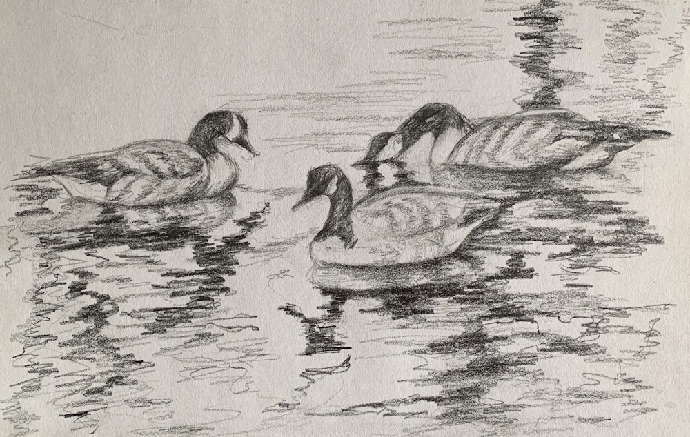
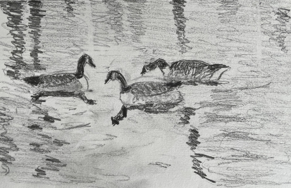
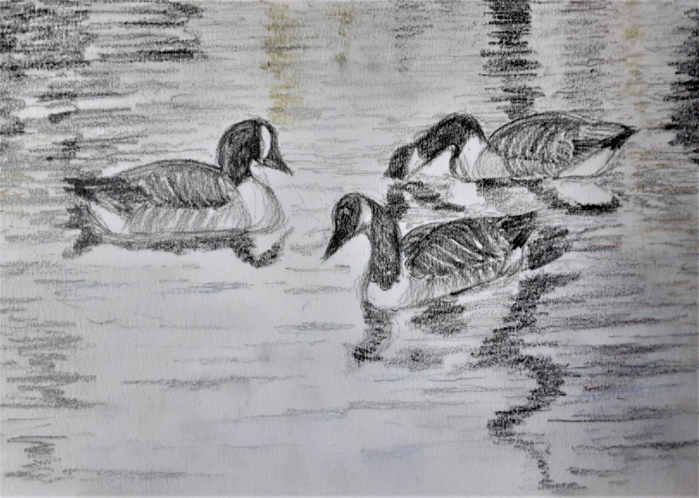
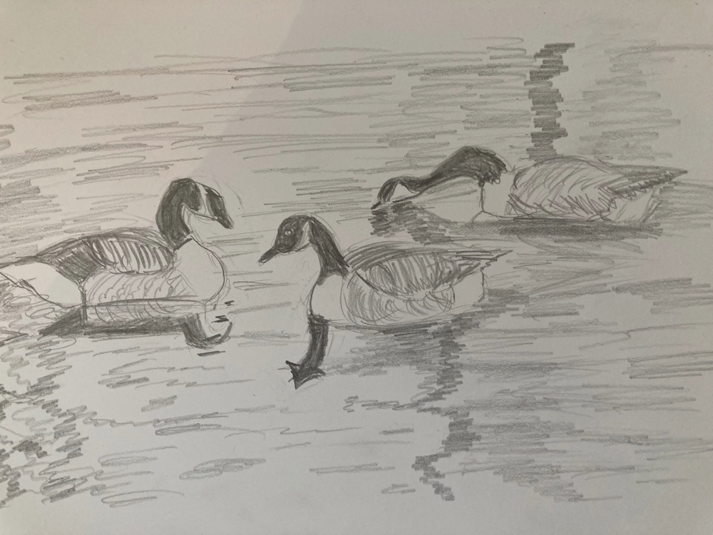
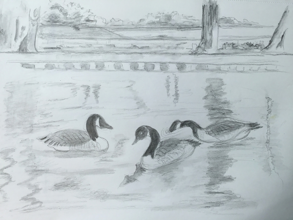
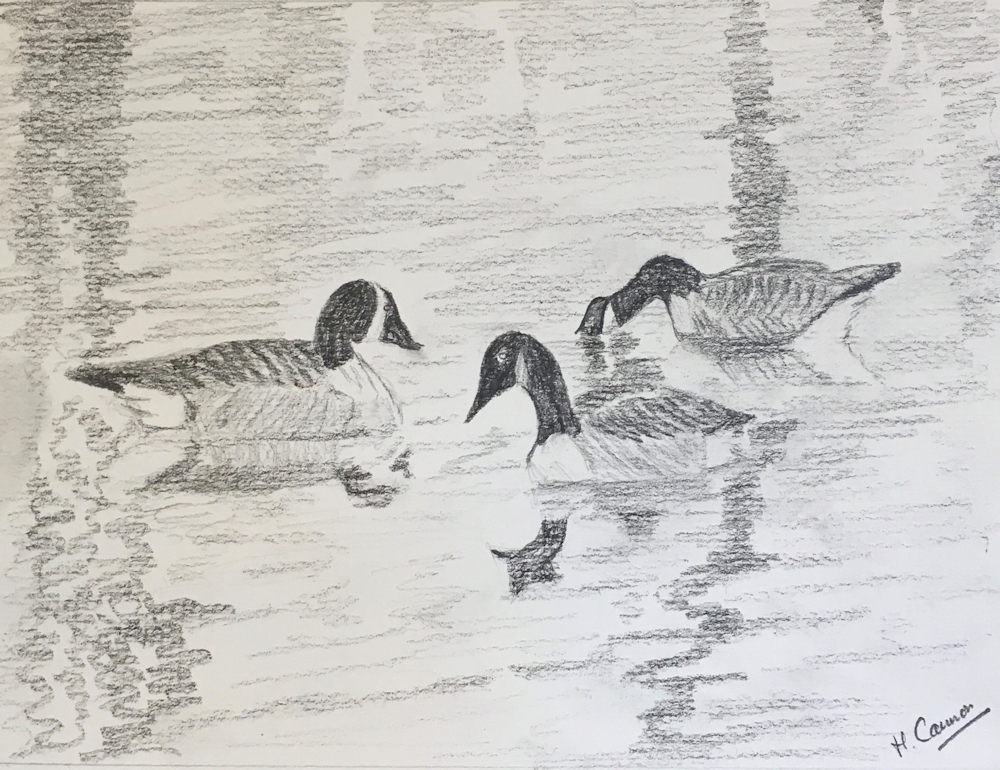
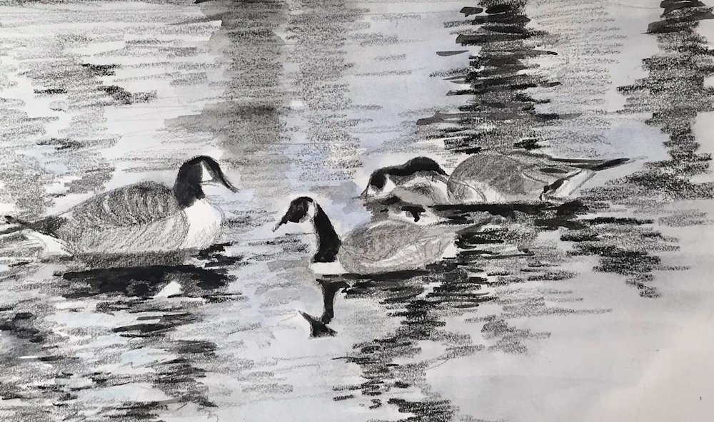
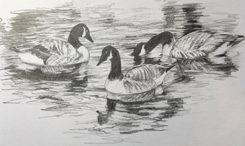
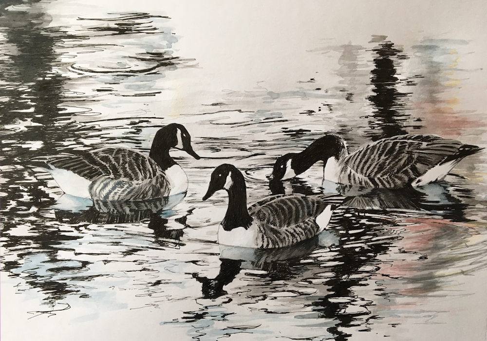
This week’s drawings include two minute drawings and two minute blind contour drawings, where looking at the image but not the paper was permitted. There are also 30 minute or longer drawings from the Canada Goose image posted just before them.
Drawings below were 30 minute drawings from the image above
by Virginia
by Elizabeth
by Jan
by John
by Liz
by Shane
by Ann
by Heather
by Sarah
Pencil by Maryon
Acrylic and Ink by Maryon
Two minute drawings and blind contour drawings:
by Sarah
by Jan
by Sarah
by Jan
From the Riverbank 2: Out in the Open
May 11, 2021
This week we’ll think about working outside, developing work from sketches or diving into a painting if you are feeling brave. The world outside can seem quite daunting if you are not used to working in the open and the complexity of some scenes can be overwhelming unless ways can be found to home in on a subject and isolate it from the surrounding “noise”.
Using a camera as a view finder is one way but limits you to composing with one shape. A better way is to take two L-shaped pieces of card which you can view the landscape in endlessly varied formats. Quite a good idea to tape these together once the desired subject and format has been found, preferably with a removable masking tape or similar.
To home in on a suitable composition it’s a good idea to make a few composition and tonal sketches first. Exploring a scene in this way focuses the mind on what most interests you and aids observation and drawing skills enormously. Last week we explored photographs in a similar way.
Below is a way of recording shape and tone in a sketchbook. Charcoal pencil was used in this case but if I had used pencil three or four small sketches could be made on a sketch book page.
This time make small sketches not worked up drawings to decide on the composition. This is a good exercise whether working directly from the landscape or preparing for a work to be completed in the studio. There is a good case for making both tonal sketches and making colour notes, not necessarily in the same sketch. If there is time separate sketches of any details you may need for the final work can be made. A camera of course is useful but because nature does not always arrange itself in the most interesting or pleasing way, small personal sketches are often a good guide to what should and should not be included.
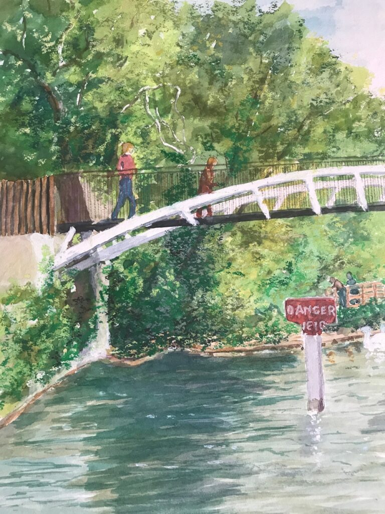
A silly example would be if I wanted to make a picture of a coot with its reflection. I would think very hard before including or excluding a sign in red paint behind the bird saying DANGER WEIR which was only slightly camouflaged by a nest in front of the sign. If the sign and its reflection was making the painting much more exciting than just the bird, putting the bird in context with that part of the river, it may be good to include. If it did no more than draw attention away from my principal subject or led the eye out of the picture the sign would have to go. Then again I would have the same problem with the coot if my focus was river signage.
1. Equipment for working outside; minimum for preparatory sketches
Sketchbook, drawing implements: pencil, pen, eraser, small camera and view finder, light weight folding stool
Optional: a few of any kind of coloured pencils or a small box of watercolours , brush, water, water pot; for making colour notes
2. Equipment for working outside; for painting directly from the landscape
Sketchbook, drawing implements: pencil, pen, eraser, small camera, light weight folding stool;
Watercolour painters: Watercolours, pan box useful if working at a fairly small scale as usually have an integral palette, water and water pot, brushes, paper towel (few sheets), small natural sponge (if you have one), drawing board with stretched paper/ heavy weight paper well taped down or small block of paper
Pastel painters: small box of landscape colours (Sienna, green dark, green bright, ultramarine blue dark and light, white, yellow, yellow ochre, crimson, cadmium red middle tone, dark grey or black, purple. These colours are only a suggestion. Handful of pastel pencils if you have any), pastel paper and a board, clips or tape to attach your paper, small can fixative spray, craft knife, pencil sharpener, Blu-tac or putty eraser, few sheets paper towel
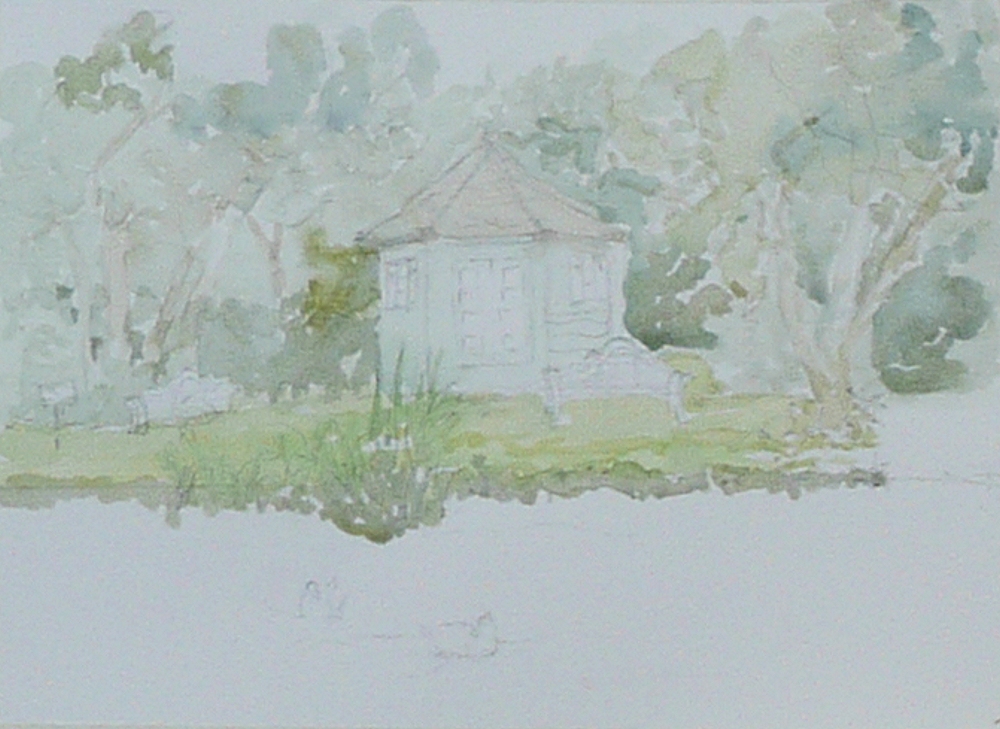
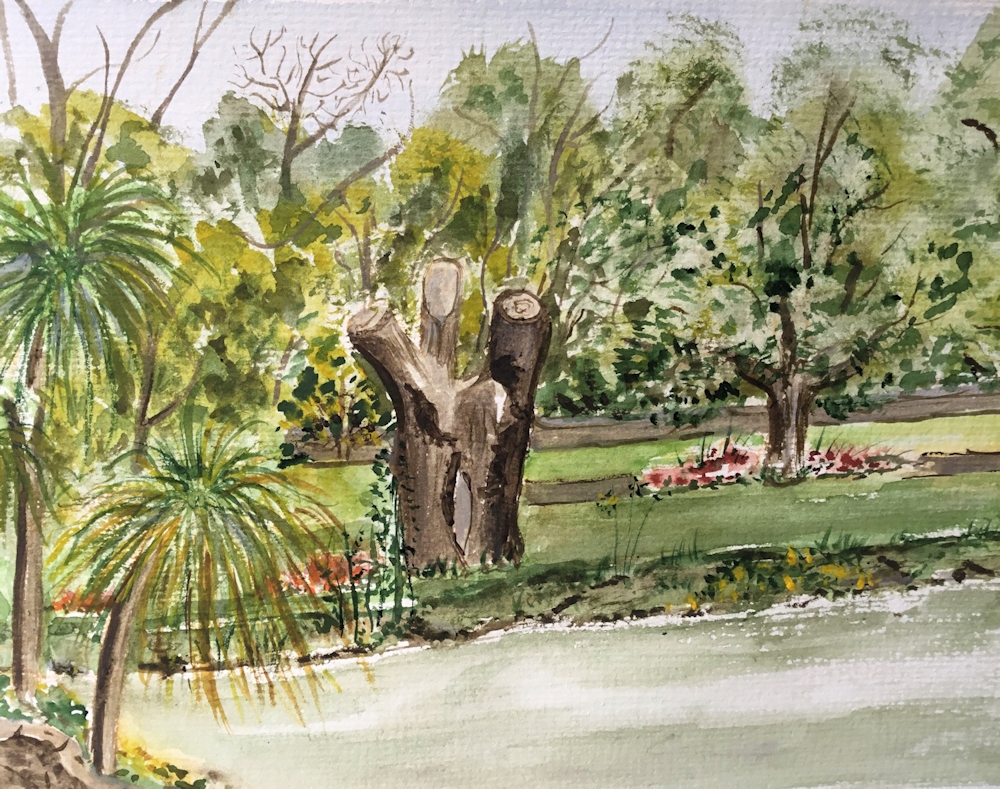
If the weather is stormy the challenge will be to paint wildlife or agricultural scene from the riverbank. This could include willows, cows birds, nests waterlilies, reed banks.
Outside the challenge will be to make a composition including one or more of the following; trees, boats and boathouses, lock gates and their reflections, or a weir for the fearless! Be selective; one well painted boat or tree is better than a scribble of a fleet or forest! It would be good to take on board the tonal balance of reflections and objects. Reflections are not always darker than the real object but often are. See how the sky is reflected and how ripples catch the sun, as we will see next week sometimes very literally.
For inspiration visit my as yet unsorted Pinterest Boards at:
https://www.pinterest.co.uk/jhall1282/from-the-riverbank/
Your paintings:
From the Riverbank Week 1: A Challenging Surface
May 4, 2021
Watercolour
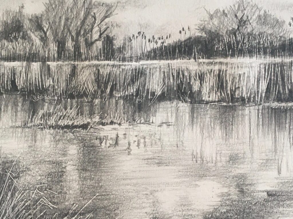
Over the next six weeks we’ll be drawing and painting anything that can be seen from a riverbank. The first session will be online but if you do have the opportunity to sketch your subject by the river and paint afterwards that would be brilliant. We’ll start by considering water, waves and reflections and go on to explore the riverbank vegetation, birdlife, bridges, weirs and locks that can be seen locally.
Watercolour
Some words that sprang to mind when thinking about water were flowing, calm, reflection, spray, fierce, roar, crash, wet, wave, ripple, current, whirlpool, eddy. By the Thames locally, the extremes in appearance of water going over the weir at Maidenhead and the wonderful reflections of trees in the very calm water that can be seen from the towpath just a couple of hundred yards upstream, reveal what a varied and challenging subject this is.
Photo
Large ripples in foreground give very distorted reflections.
See how little patches of sky are reflected and the large tonal differences in this picture: the palest areas are the small poles in the middle distance and the darkest are in the trees and their reflections.
We may often notice the reflections of boats, trees, poles etc. in and on the water but the sky is perhaps the most important element, being reflected not only in calm water but in every ripple and almost always brings an element of fleeting and shimmering light to the surface. The Impressionists found good ways of depicting this, using strokes of different colours and tones alongside each other to create shimmering effects.
Photo
Criss cross ripple patterns in the wake of the ducks.
Ripples appear smaller in the distance and eventually look like a shimmering tone on the water.
If you can, get to a riverbank and watch the water. Better still make some sketches of what you see. Take two L-shaped pieces of card with you so you can use them as a view finder. These are more versatile than a camera as they enable the isolation of very tall thin slithers of the landscape or extreme panoramic views, as well as squarer and more conventional landscape shapes for your composition. In the sketchbook try several small sketches in different formats concentrating on the shape and tones of what you see.
If you can’t get out this week try exploring different compositions within one photo reference.
Photo
The following images were all cropped from this one photo. You may like to do something similar; crop a reference photo in different ways and make a tonal sketch of each. Choose the most successful for your painting. Choosing and isolating the elements you wish to paint is an important part of painting outside and why a sketchbook is invaluable to try out different composition ideas. I was amazed at what lay hidden in this reference taken mainly for the very subtle cloud cover and its reflection.
I am forced to admit this photo was taken from a boat and not the bank but the various crops show the great choice we have from the quite dark composition of crop 4 to the light airy feel of the original photograph.
Start to think in terms of shape and tone. Instead of thinking I am drawing a tree and its reflection say to yourself,” I can see a large dark oval shape. Below it is a similar dark shape that fragments into elongated light and dark shapes when the wind blows.” If you can stay long enough, observe different patterns on the water surface as a boat passes, and when there is wind or no wind. Try to translate these into drawing. Can you observe differences in size between ripples near you and those further away?
Observe and note whether there is a difference in tone between the sky and its reflection and do the same for reflected objects. As you can see from the photo taken on the Cam, the sky there was almost the same tone as its reflection but this is not always the case.
When you have found a composition that pleases you either paint or make a more considered drawing. Both the observation of the water surface and the composition exercise will be good preparation for the outside drawing/painting sessions.
Have fun and experiment!
Perhaps look at a few Impressionist paintings!
Your Drawings and Paintings:
Pastel by Shane
Watercolour by Virginia
Drawing by Maryon
Drawing by maryon
Drawing by Maryon
Watercolour by Ann
Pastel by Barbara
Watercolour and Pastel by John
Watercolour by Liz
Watercolour by Jan
Coloured pencil and watercolour by Sarah

Watercolour by Sarah
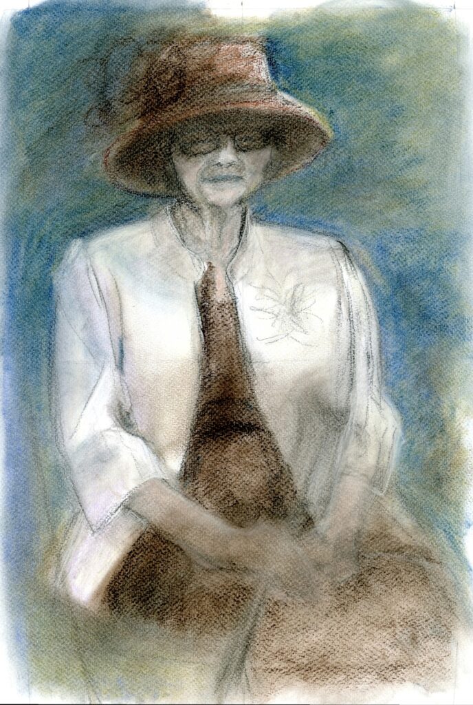
More than head and Shoulders:Week 4
April 27, 2021
The Three Quarter Portrait
This is a very popular portrait crop where the figure is cropped substantially below the waist and down to about mid-calf. It is an easier shape to fit to a canvas than an elongated whole standing figure and works especially well for women with long skirts.
Find a suitable reference or crop a whole figure reference to produce a three quarter length portrait. As you include more and more of the figure the head will be relatively smaller and the features will have to be painted rather differently; not so differently if you are working at a large scale but significantly less detailed at a smaller scale. The head is usually still the focal point of a portrait study so a good structure for the head and an indication of the main facial features are still essential.
Points where the figure crossed the lines could be marked and distances and angles checked making scaling up of all the main shapes easier.
This initial stage has been fixed quite heavily and more layers of pastel will be added. The final layer of pastel will be fixed only very lightly.
The amount of detail with which the facial features are painted depends on several things;
- The size at which the work is being painted, obviously the larger scale the more detail that is possible
- The head should not usually be very much more detailed than the rest of the figure despite its role as the focal point. If the head is worked to a high degree of finish and the rest of the figure is not there is a risk that the painting will have no unity. In the worst case the head may appear so differently treated it may look as though it has come from a different painting
- The over all look of your finished work; this is related to 2. If you wish your work to have a highly finished and detailed look, it should all be treated in that way. At the same time as in all paintings some areas should have more emphasis than others and there should be a focal point, in the case of portraiture usually the head. This may be achieved by more detail or greater tonal contrasts in certain areas but each area should relate to the rest of the painting to give the work unity. Look at how Modigliani achieves this and compare his works with those of Rembrandt.
Some portraits concentrate on the likeness and character of the sitter, while others may be more simplified or abstract. A glance at portraits by Rembrandt, Goya, Sargent, Matisse and Modigliani will give you an idea of just how varied the ways of depicting the clothed human figure are. Some examples can be found on the following Pinterest board:
https://www.pinterest.co.uk/jhall1282/portraits/three-quarter-portraits/
Your paintings:

Acrylic by Mali
Acrylic by Malcolm
by Angela
Acrylic by Heather
Watercolour by John

Watercolour by Liz
Soft Pastel and Oil Pastel by Elizabeth
Pastel by Sarah
More than Head and Shoulders: Week 3
April 19, 2021
The Half Figure: selecting and cropping

This image needs no cropping but I would omit the shoulder and arm of the other boy on the right.
This week you are invited to paint a figure including arms and hands but extending no further down the figure than about the waist. You may already have a suitable reference that needs no cropping or you may have a whole figure reference which needs cropping to carry out this week’s challenge. As a rough guide cropping works when it is not exactly at the elbow or cutting through part of a hand or foot. I have tried to show this in the illustration below.


You will however, always find notable exceptions from well known artists who perhaps have enough magic and experience to make the seemingly impossible work. Some great examples can be found on Jo’s Pinterest board, link below.
https://www.pinterest.co.uk/jhall1282/portraits/to-about-the-waist-or-including-a-hand/


Photographed in Afghanistan by Alisha
Week 3 Project
Choose a photo reference. Try to find a reference that illustrates the persons character or situation. You should feel something about the image. Decide by making thumbnail sketches, whether and what cropping would result in a good composition for a portrait that references the figure to about the waist. Try to include at least one hand. Some paintings of half figures have the subject at a table, sewing, drinking or reading. Make careful decisions about the background including only what is necessary or relevant.
As with the whole figure, work out the sizes of the dominant shapes and how they relate to each other. Look at the negative spaces. Either use a grid or at least a vertical and horizontal line across your image and your drawing so that you can check measurements and angles; making sure that your picture space is in the same proportion as the part of the image included in your work.
Really look at the posture of the person and ask questions.
Is the head at an angle?
Is the person looking to one side?
How does this affect the neck?
Can you imagine how the head connects to the spine?
Are the shoulders at the same height?
What are the arms and hands doing?
Are there negative spaces related to the position of the arms?
What angles are made by the arms and hands?
Are the arms bearing any weight as when leaning on a table?
Looking and answering these questions will inform your work.
Your Paintings:

Acrylic by Malcolm

Watercolour by Sarah


Acrylic by Heather

Acrylic by Elizabeth

Watercolour by John

Acrylic by Liz, unfinished


Pastel by Angela
More than Head and Shoulders: Week 2
April 13, 2021

Try a Different whole Figure:
This week try a different figure. If you tried a standing figure this week try someone sitting and perhaps choose someone wearing different clothes; perhaps a more flowing dress or someone in uniform. You may like to paint a child holding a doll or someone with a guitar. There are a few photo references here and ways in which other artists have painted similar figures can be found in the same Pinterest boards as last week.
For the seated figure:
https://www.pinterest.co.uk/jhall1282/portraits/the-whole-figure-seated/
and for the standing figure:
https://www.pinterest.co.uk/jhall1282/portraits/the-whole-figure-standing/


If I were painting this subject I would include the whole of the foot by extending the space at the bottom of the photo, NOT by trying to cram the foot into the existing space!
After next week’s review session we’ll discuss composition choices when working from only part of the figure and how to crop references to provide an interesting picture. For week three we will choose to include the figure down to about the waist and look at the ways arms and hands may be arranged. For week 4 we’ll be considering the three quarter length portrait so you may like to start looking for suitable references for these weeks.
The Project for week 2:
So for the Week 2 challenge find a significantly different kind of whole figure reference to your choice for last week, possibly uniformed, sitting or standing, perhaps holding a doll or musical instrument.
Check the overall height and width of your figure at the widest points. You may like to construct a rectangle around the figure so that you can transfer that rectangle to a space within your support. This will help you not only to get the proportions right but help you decide exactly how much of the total area you wish the figure to take up to make a pleasing composition. It will also help to avoid the situation of cropping an extremity at an unintended point or worse trying to shorten something artificially.

You will have to measure the height and width of your figure in the reference photo and then multiply each length by the same amount to transfer the figure to your support at the size you wish while maintaining the correct proportions. You may also use a grid as we did for the portrait heads. This method allows a good check for the proportions and is a good starting point if you would like to work with the negative spaces.
Also consider the negative spaces, for example between the legs if they are apart. Think hard about what items should be included in the background. An artisan carpenter might have his tools or an academic his books for example. Try to show the person’s character and age by the way they stand or sit and their interests by the surrounding props.
Your Paintings:

Watercolour by Sarah


Pastel by Heather

Watercolour by Ann

Pastel by Liz


Acrylic by Elizabeth

Pencil and coloured pencil by Mali

Watercolour by Mali

Acrylic by Malcolm

Watercolour and wax resist by Angela

Watercolour by Sarah
I included this one as it’s a good example of how the figure can be cropped successfully to give an exciting composition of less than the whole figure, which will be the challenge for next week.
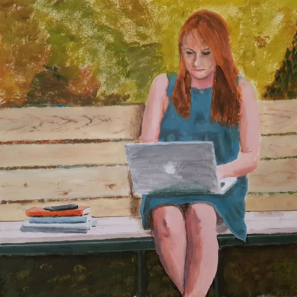
Painting Portraits from Photographs 2: More than Head and Shoulders
April 6, 2021
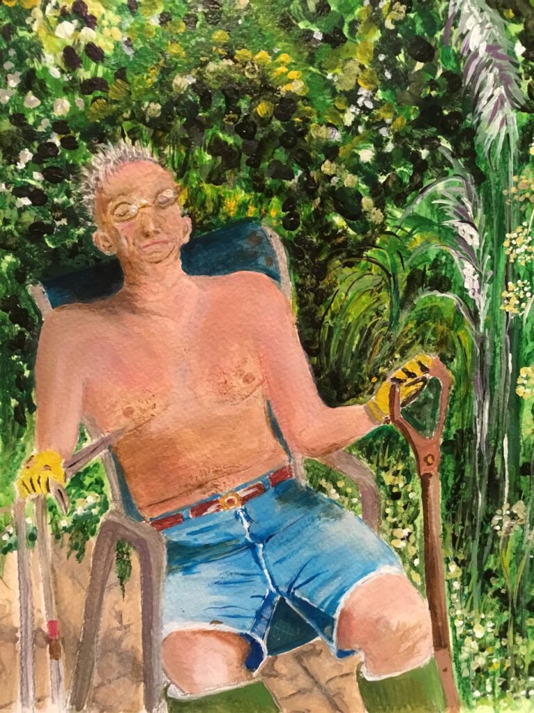
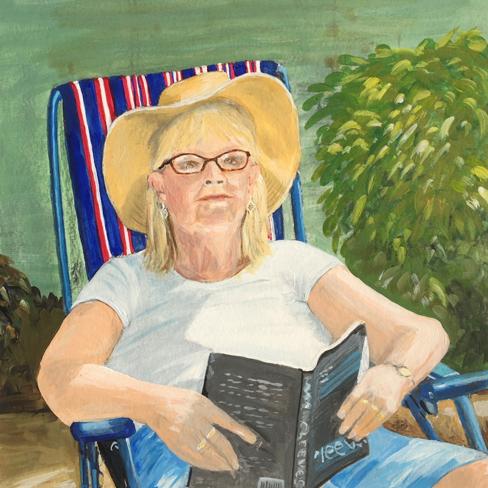
Week 1:The Whole figure

Over the next four weeks we’ll consider painting rather more of the clothed figure than just the head and shoulders. Choosing reference photo is the first challenge. You may have one of a complete stranger or you may have or can take a picture of a family member reading a book or even asleep. At least they won’t be giving you a great big beaming smile. For this week include the whole figure either seated or standing in your reference. The aim will be to get really used to looking at the various elements of the figure because understanding figure itself will help us understand how clothing drapes across the body. Usually there are a lot of clues especially with more tailored and tight fitting garments but the particular pose that presents itself can also give invaluable clues that will help you make a believable portrait.
In subsequent weeks we’ll look at suitable cropping points so that successful compositions can be made of to the waist and also three quarter length studies. We’ll also consider figures wearing uniform, formal regalia or traditional costume less familiar to us, but for all of these a general understanding of the figure, its proportions and the way it moves will inform all the work done.

Look at the standing reference first; in an adult the head is about one seventh of the total height but in a child this ratio is considerably more. In the photo above it is between one sixth and one fifth.
Follow an imaginary line from the top of the head down the spine to the pelvis and think about what happens when you get to the legs. With a standing figure the neck will be directly above the foot bearing most of the weight and if the weight is being evenly shared between both feet will be directly above a point between the feet. If your figure is leaning against a wall notice if this changes anything.


Look at how far the arms extend down the body if they are down and how far again if they are folded or the angles made if they are on the hips or if one arm is on the hip what is happening with the other arm.

Look at the tilt of the shoulders and the hips if these can be identified. Thinking about how the body moves will help. Look at the knee in relation to the direction in which the foot points. If you stand fairly upright with your feet together and then turn one foot out a bit the knee follows it and so the knee points in the same direction as the foot. When sitting this is also the most relaxed position for the foot, but of course if you cross your legs you will find the foot has far more freedom but still feels more comfortable when pointing the same way as the knee.
Try to find out how your own joints limbs and back behave, then look at your reference again and think through what is going on.

With the sitting reference, look at the relation of the sitter’s form to the form of what they are sitting on whether it’s flat ground, a grassy slope as for the Afhan girl heading this post, or some kind of seat. It can be useful to make a sketch of the chair, bench or stool, but remembering that the soft parts of some chairs will be altered by the sitter as above. The appearance of the figure, especially the fore-shortening of the upper leg will be very different depending on whether you are viewing the person from the side or the front. The height of the chair in relation to the person’s leg length will also result in a very different posture for the sitter. If a tall person sits on a low bench they will either stretch their legs out or bend their knees up bringing the feet closer to the chair. Just think about things like this when looking.
You may like to look at how other artists have portrayed standing and sitting figures so do have a look at the following Pinterest boards.
For the seated figure:
https://www.pinterest.co.uk/jhall1282/portraits/the-whole-figure-seated/
and for the standing figure:
https://www.pinterest.co.uk/jhall1282/portraits/the-whole-figure-standing/
Then it’s high time to have a go!
Choose to work either from a standing or a seated figure and make a few thumbnail sketches first, before launching into your first painting. Work so that you make note of the tones in the composition as well as the shapes of the forms. Try to imagine you are in the presence of the sitter and that the figure actually exists in three dimensions rather than the two dimensional image you are referring to.
Composition
After that decide how much space your figure will occupy in your painting. Look at the overall height and width of the figure and how much of the background and what of its features you wish to include or exclude. Sometimes an indication of the space around the figure and the objects within that space helps the composition while at other times there are things in the background which are irrelevant and may detract from the main focus: the figure being portrayed.

The medium is up to you; pastel and acrylic are possibly more forgiving than watercolour but whichever medium you choose once you have established the main shapes, take note of the tonal balance as well as the colour. If you choose to work in watercolour you may like to Google the portrait watercolours of Charles Reid, and Hans Schwarz, and of course Singer Sargent also produced some wonderful watercolour portraits.
Your paintings:


Watercolour by Sarah

Acrylic by Ann

Soft pastel by Elizabeth

Watercolour by Elizabeth

Mixed media by Liz

Acrylic by Malcolm

Acrylic by Heather

Pastel by John

Coloured pencil on cartridge paper by Angela

by Mali
Painting portraits from Photographs: Week 4
March 17, 2021

Pastel
This is the last of the head and shoulders portrait challenges and this week it would be great to try a portrait that is different from any attempted so far. If you haven’t yet tried to paint a very elderly person or a hatted person perhaps try that. Alternatively you could try a profile or near profile view or someone with amazing hair.
If possible choose a reference where the subject is not smiling. No one could possibly sit and keep up a broad grin for forty minutes and portrait studies from photographic reference look far more natural if the subject has a pose that could realistically kept for a long period.
If you decide on using a grid make sure that you take only the information that is really necessary to get the large shapes right. If you draw freehand in charcoal either as an under drawing for pastel or acrylic try to work tonally just indicating all the main forms and observing closely how the light reveals their form. Observe whether the head is tilting back or forward Remember to measure the total width and height of the head and to position the eyes and ears correctly.

If painting someone in a hat look at how the hat shades the face and how soft edges are under the hat.

This one imagined the light was directly from above. Observe shadows carefully, not only of the hat itself but of the shadow of the head falling on to the shoulders and chest when the light is from the side or from above and from one side of the subject.
If you are going to attempt a profile you may like to look at a few examples on the Profile section of my Portraits Pinterest Board, link below:
https://www.pinterest.co.uk/jhall1282/portraits/profile/
There was also interest in attempting a portrait where colours represent tones. You can find several Fauve portraits and the work of the contemporary artist Jessica Miller who works in this way in the Fauve portrait section of my portraits Pinterest board, link below:
https://www.pinterest.co.uk/jhall1282/portraits/fauve-portraits-and-revealing-the-head-in-unnatura/
Have fun!
Your Paintings:


Pastel and pastel pencil


Pastel by Shane

Pastel by John

Charcoal by Elizabeth

Acrylic by Elizabeth

Charcoal by Liz

Acrylic by Liz

Drawing by Sarah

Watercolour by Sarah

Drawing by Sarah

Pastel by Sarah

Watercolour by Maricarmen

Acrylic by Malcolm

Heather has used a sienna coloured paper.
