Posca Paint Markers
October 4, 2017
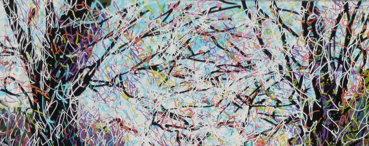
Graffiti Spring (detail)
Recently I was invited to trial a starter set of 18 Posca Paint pens. Not having used these paint markers before and not being at all used to working with marker pens, my experiments were a bit of a voyage of discovery. I liked the little caddy that contained the pens. Once the wrappers were off it was easy to get the pens primed to flow. Great to have all the nib sizes but nearly panicked when I found there was no brown, no grey, no dark red and no ochre or yellow green. This was more than compensated for by the silver and gold and the inclusion of three brush pens. The brush pens were great although only gold has been used so far. Glad the pump button at the end of the brush pen has a shield so that it can’t be depressed by accident if the cap for that end of the brush is left off.
- Scribbling and Blending
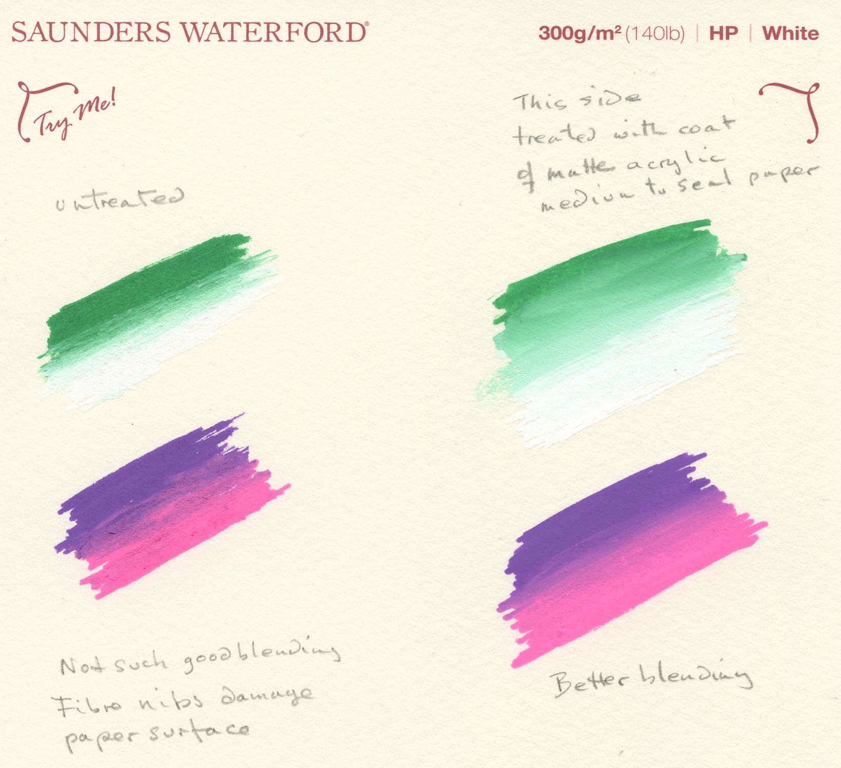
My first test was to scribble with the pens to find out their colours, covering capacity, and to get used to the ink flow on cheap copier paper. Then I looked at the blending possibilities on a sample of 300gsm Saunders Waterford hot pressed paper and a much rougher sienna coloured Fabriano Tiziano which I sometimes use for pastel. Blending was very limited on both as the ink sank into the paper. Also in the case of the Fabriano paper especially, the pens damaged the paper surface when I tried to blend before the paint dried.
By coating the paper with matte acrylic medium I achieved much better blending results as the medium provided a non-porous surface so that the paint did not sink into the paper and remained wet just long enough for limited blending. The medium dries clear so that the colour of the paper still shows through.
So with a relatively rough paper, treating to give a non-porous surface is essential.
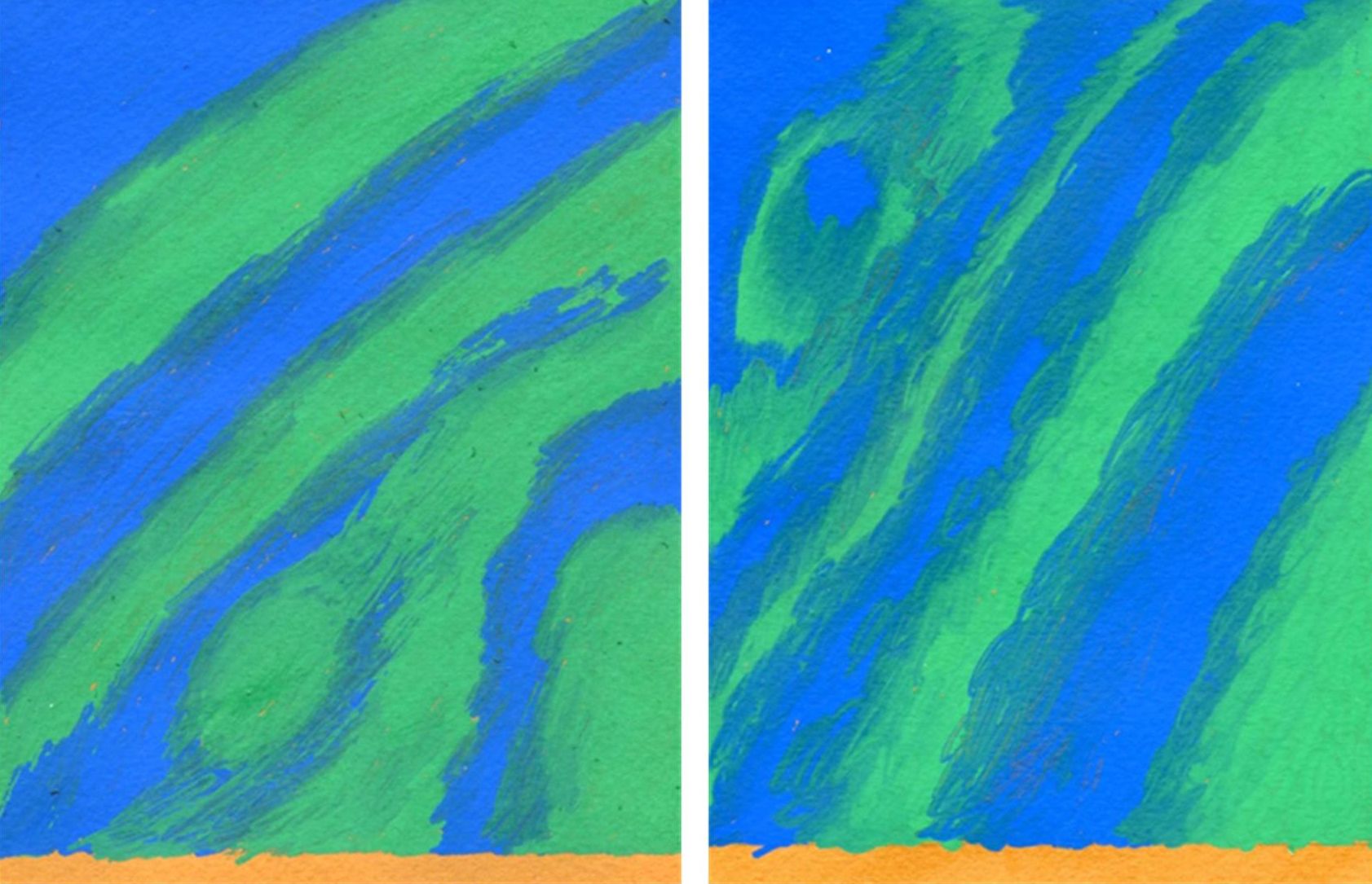
Blue and green pens on sienna coloured Fabriano Tiziano Paper Left untreated, Right coated with acrylic matte medium
2. Layering
After that I tried some layering of colours choosing a dark green off-cut of mount board. No attempt to blend was made but tests on a tiny piece suggested it had a smooth and relatively non-porous surface to work on. First of all I established the large tree trunks with the broad chisel pen followed by blocking in the sky with the white chisel pen. After that I scribbled some light blue into the sky. Next the tree branches were marked out with the smaller chisel shaped black pen using its broad and narrow nib edges to get some variation into the branch widths; see detail at top of post. Finally all the colours and bullet shaped nibs were scribbled over the top to suggest the waterfall and foliage. I called the piece Graffiti Spring!
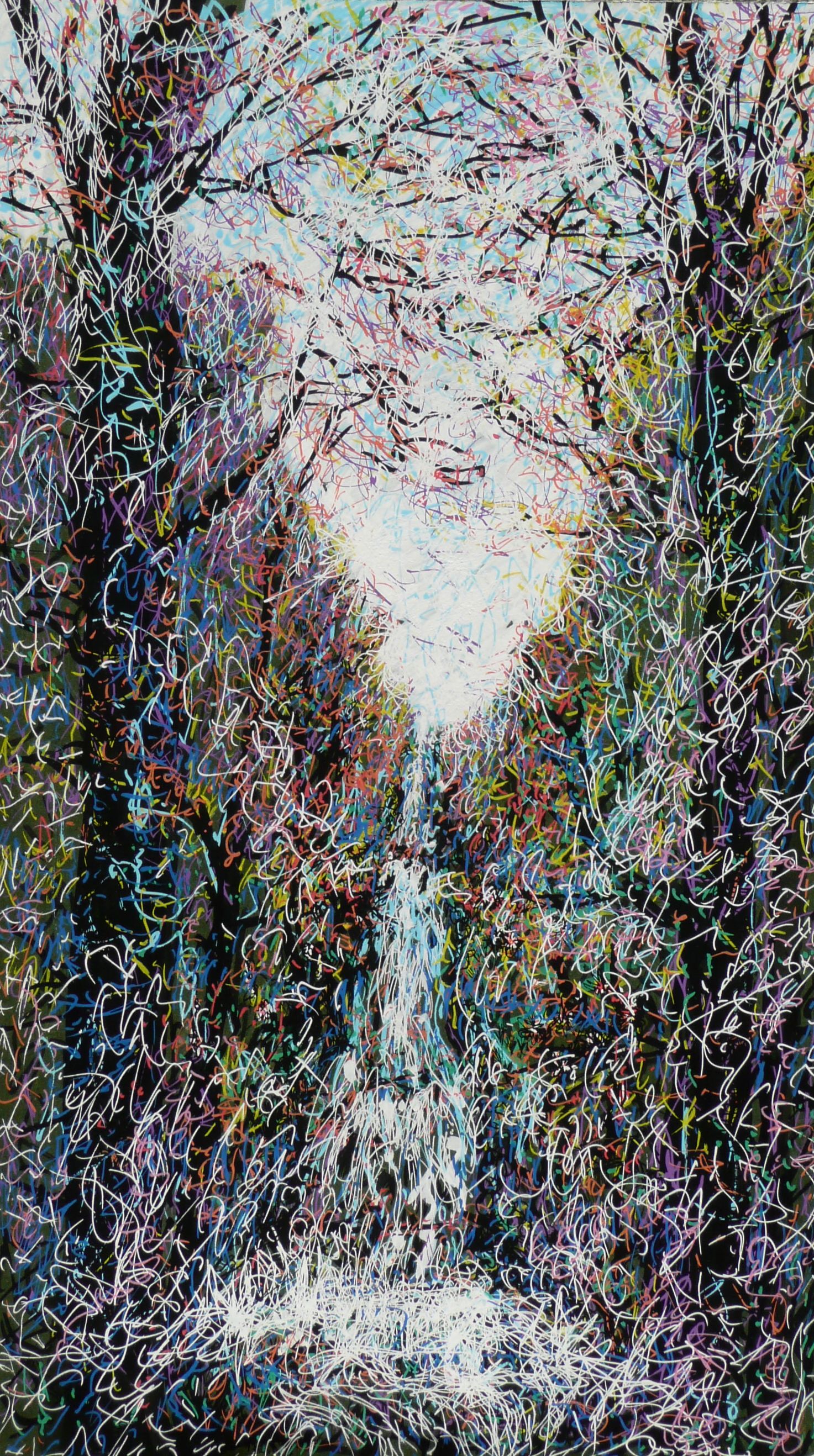
Graffiti Spring
I chose a smooth very dark blue Canford paper obtained from Cass Art for the next two drawings, which when tested accepted layers of colour with no damage to the paper. The first was a jelly fish made with the finer nibs and the second a cartoon style image of sea anemones. I did long for a transparent colour to wash over the pens to make the image more 3-dimensional but may do this at a later stage with acrylic paint.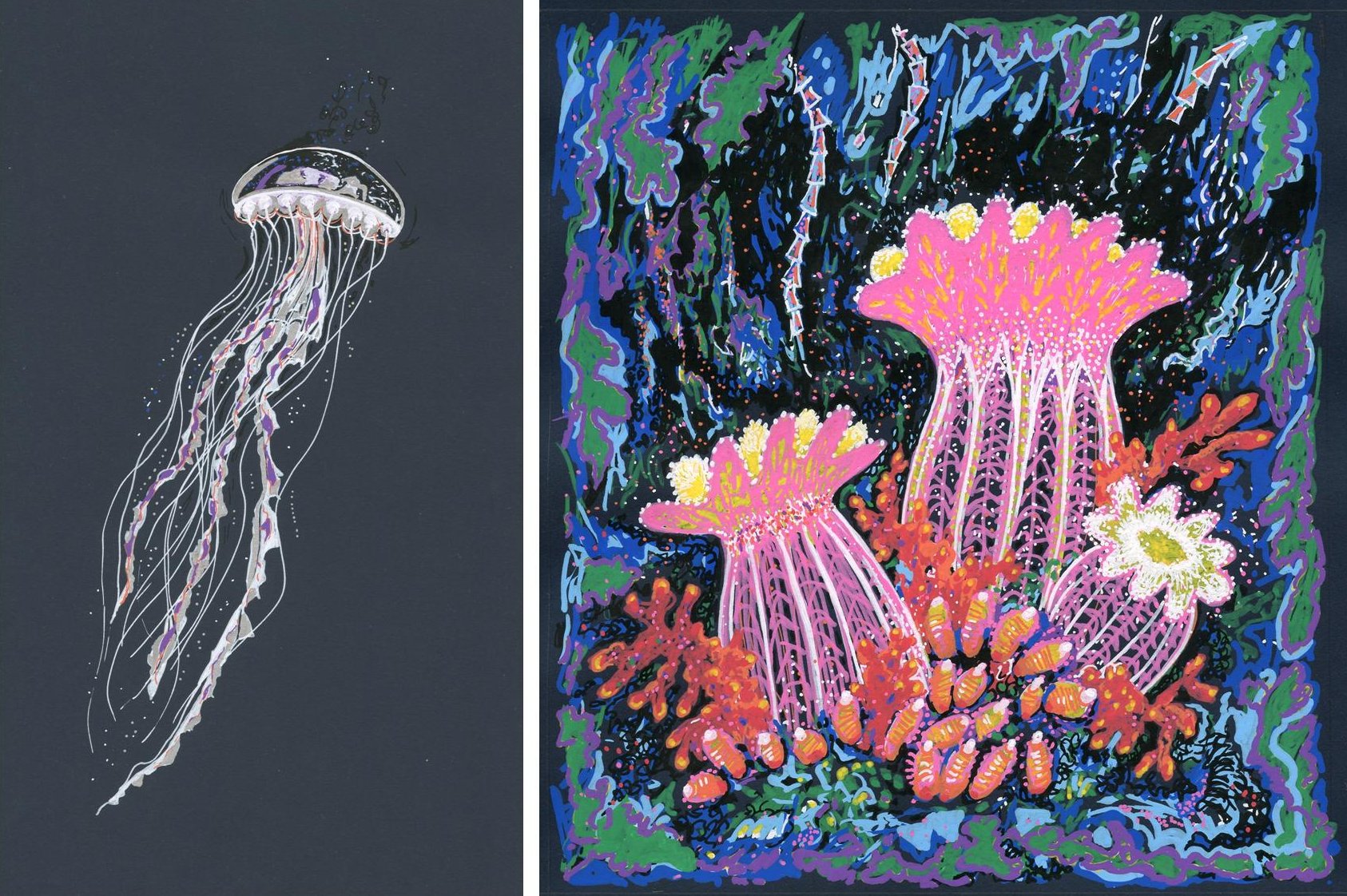
For my next drawing I decided to work from a sketch made on 22nd August at the current ‘Matisse in the Studio’ exhibition at the RA. I was amused by two little ivory figures from the Lega region of the Congo. The drawing was made on the same Canford paper but in brown. One half was coated with a layer of black using the broad chisel pen. The figures were then drawn in white and shadow areas of the figures indicated with the fine silver pen and a touch of light blue. Outlines and markings were added with black and finally a tiny amount of Burnt umber watercolour used to ‘tidy up’ the figure on the right. The title is Waiting for Matisse.
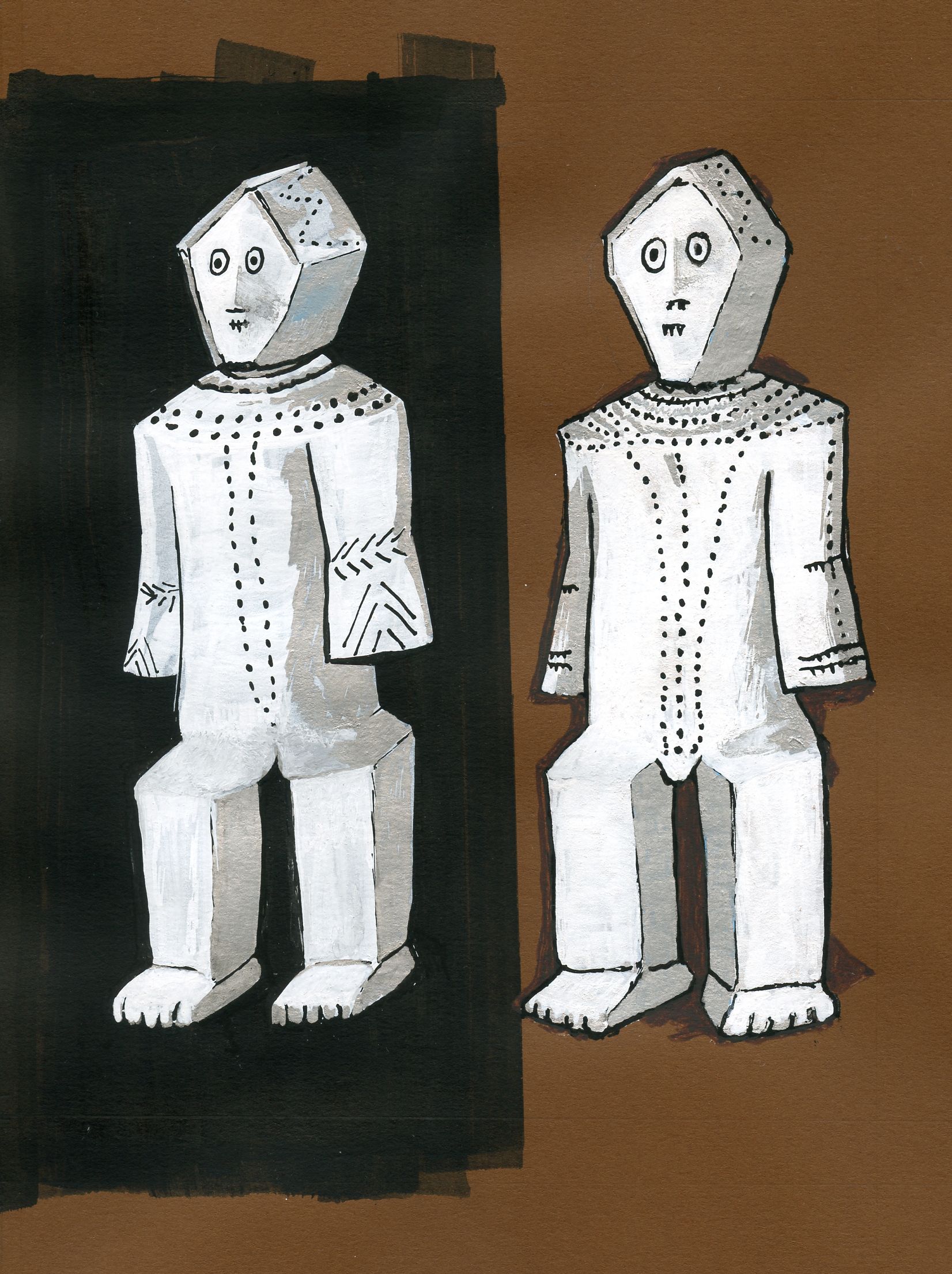
Ivories from the Lega region of the Congo or “Waiting for Matisse”
- Working on Wet Paper
For this I returned to comparing paper coated with a layer of matte acrylic medium with untreated paper. First I tried looking at drawing into wet with blue and green medium bullet tips on Sienna coloured Fabriano Tiziano paper.
The untreated paper below was washed with water and the pens applied to the surface producing some beautiful feathery lines needing a light touch not to damage the paper. Successful ‘dropping in’ of subsequent colour required adding more water.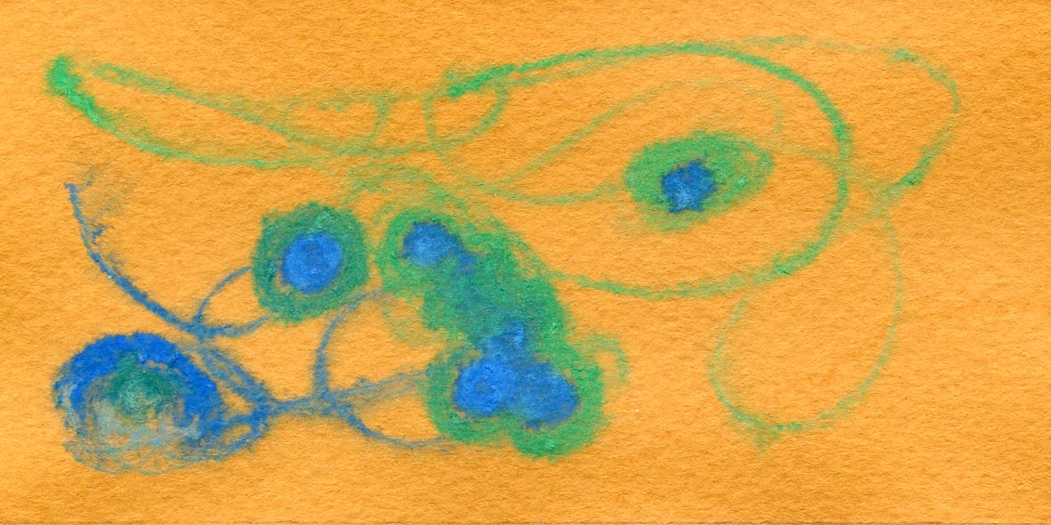
Washing a similar paper that had been treated with acrylic medium, see below, resulted in an almost uncontrollable wash of ink from the pen and dropping in could be achieved as the paper dried. Interesting back runs could be made and as the paint dried, in places the white chalk that makes the ink/paint opaque separated out, again making an interesting result that could be harnessed for future art works. 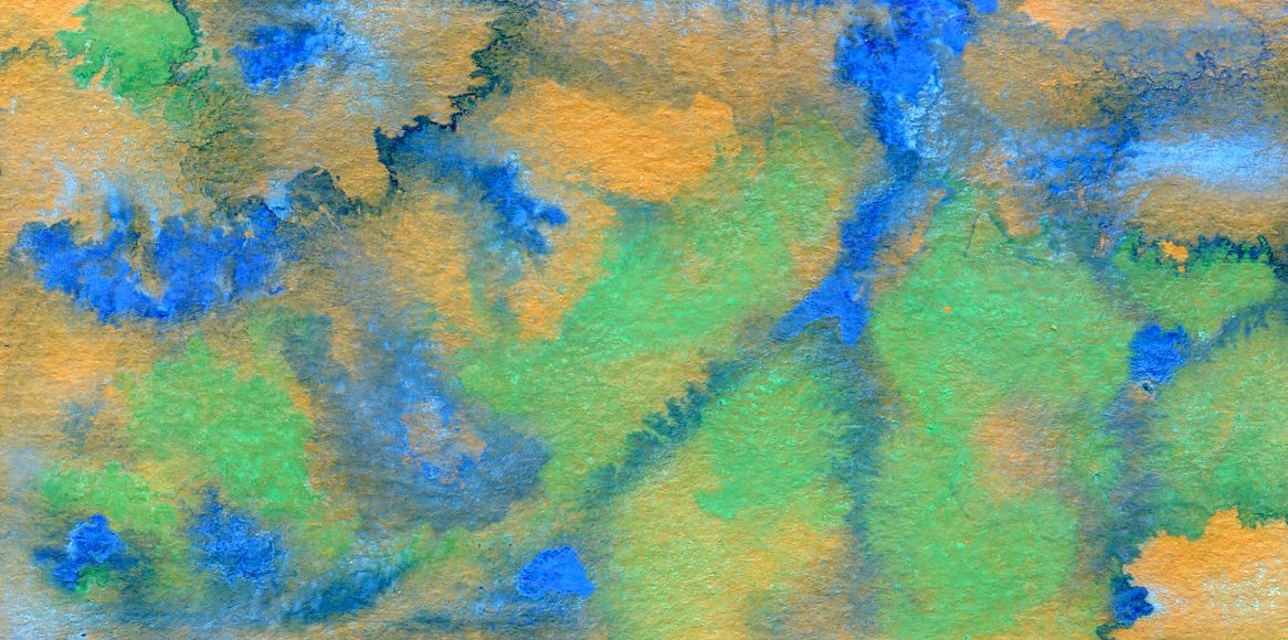
Finally I made some more experiments working into white wet paper. All were on an inexpensive NOT paper, Fabriano Accademia weight 260gsm. In the first trial on untreated paper, I wetted the surface then applied lines of pigment. This was followed by dropping in more pigment, rewetting the paper when required, and finally when the surface was dry, working more colour on to the paper. Sadly even the initial lines badly damaged the paper.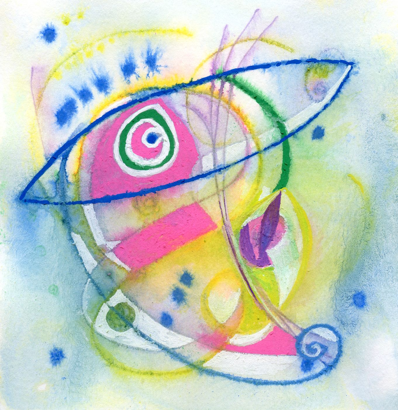
I then made further trials by coating the same paper with matte acrylic medium as before and enjoyed controlling the washes and dropping in more paint.
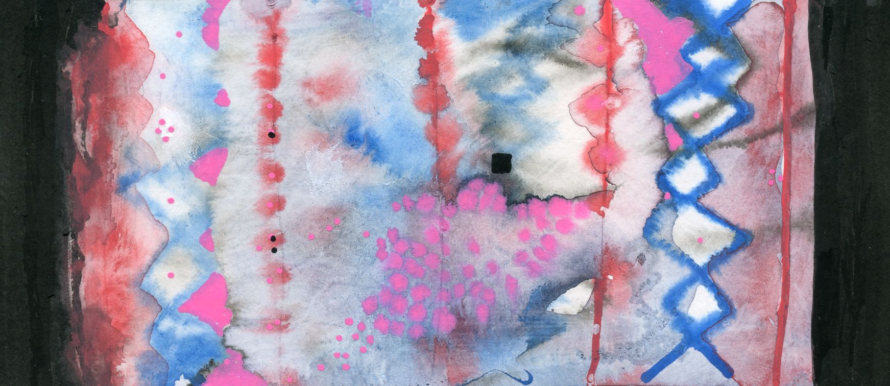
The large pink drops were added when the paper was still damp. The tiny pink and black dots black edges and little black square were added once the paper had dried.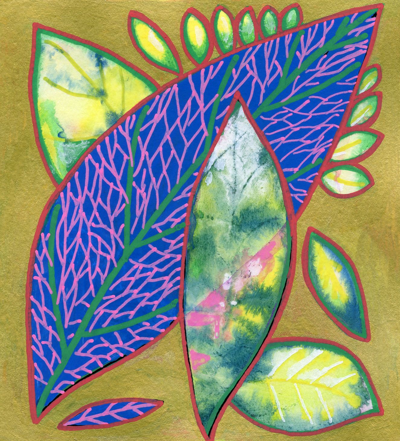
My final experiment combined layering and working on wet paper. The same white paper treated with matte medium was used. It was nearly a total disaster as I failed to control my overly wet washes. It was then the fact that I could wait for the paper to dry, select the areas I liked and overlay the rest with solid colour that I began to realise the merit of the good covering capacity of the pens. I coated the areas to be eliminated with the gold brush pen and then blocked in the large leaf with the blue pen. Then with the green, red, pink and ultrafine black pens I completed the line work.
I thoroughly enjoyed testing the pens. I found it quite a challenge working with a limited palette and think some of the other colours, especially a grey pen, would have been useful; I just used silver instead. However I did appreciate the different nib shapes and sizes and love the gold brush pen. The brush was well pointed and kept its shape even after being closed and opened several times.
Looking forward, perhaps a limited range of transparent colours would be useful to add subtleties of tone.
Because I use a large range of papers for my own work and for teaching, trialling Posca pens on different paper surfaces, wet and dry, was of special interest. I learnt a great deal about a medium I might not have used at all and will certainly be using the pens in future, so I’m grateful to SAA and Posca for the opportunity. When I make time I am looking forward to trying them on other surfaces, especially wood and stone, besides incorporating Posca paint pens into mixed media works.