Category Archive: Drawing Techniques
Portrait Drawing Week 6: Putting it all Together and Hair
July 19, 2023

Watercolour by Jo
This week we’ll put it all together with an accent on hair. Just as vegetation clothes the underlying topology of the landscape, hair clothes the head, so it’s important not to lose track of the underlying structures of the head. In the portrait above the hair was depicted largely as masses of tone with linear marks showing the direction in which individual hairs lay. I drew several studies of Lucy and photographed her before painting the final portrait in watercolour.
Except for Lucy, above, and the drawing of the young redhead further on in this post, all of these portraits were drawn directly from life.

Pastel by Jo
For a moustache to look convincing make sure the underlying shape of the upper jaw is drawn correctly.

Charcoal by Jo
Similarly with a beard, draft in the jaw line and position the ears correctly, before overlaying the beard. With a particularly dense beard you may just have to draw the beard in relation to the mouth and ears. Getting the tones of the main masses of hair in will help to make it look convincing.

Pencil sketch by Jo
This young woman was drawn rapidly on the Jubilee Line on my way to North Greenwich. Here the head shape was drawn before adding the hair and headset.

Sanguine and sepia conte crayon by Jo
This young girl has featured in a previous blog. I decided to just suggest her plaits rather than draw them in great detail. Again it was important to establish the overall head shape and position the ears before adding the hair. The hair was worked tonally before adding a suggestion of individual hairs in a fairly loose manner.

Pastel by Jo
Note how in this portrait the facial features are framed by the hair, earrings and blouse collar. Also I have been fairly adventurous with colour, accentuating the blueness of the shadow areas. Have fun with your portraits this week! Use whatever medium you like and concentrate on hair, or a head with a covering hat, cap, headset or other!
Your drawings:

Three crayon technique by Roger

Sanguine by Virginia

Three crayon technique by Vivienne

by Kate

Pastel by Mali
Everyone was allowed to spend up to 15 minutes on each of the sketches on the sheets below;
Very well done as there were some challenging angles and head gear!


Portrait Drawing Week 5: Mouth and Chin
July 13, 2023

Pastel by Jo
This week we’ll look at the mouth and chin. The first thing to note is that the upper jaw is fixed so when the mouth is closed it is the muscles alone that enable us to smile and also to appear relaxed or concentrating. Fred in the drawing above looks as though his interest has been caught by something, he’s concentrating rather than smiling or looking sad. Notice the curve where the lips meet and the shadows below the lower lip and on the chin. This curve between the lips appears very different on the smiling lady below, as the muscles of her face pull the corners of her mouth up.

Pastel by Jo
To understand what happens when we let out a yell or sing have a look at the link below where you will find an excellent drawing of the skull with jaw closed and with it dropped, and also shows the appearance of the face in these two positions.
https://www.pinterest.co.uk/pin/448248969177542053/

Pencil by Jo
See how when the jaw drops it hinges
backwards and down toward the neck.
Below is a link to another rather more fun image showing the hinging of the jaw and various facial expressions.
https://www.pinterest.co.uk/pin/663155113905951759/
In the pastel portrait of Beth below, her mouth is slightly open. Do resist the temptation to try to draw every tooth you can see, very often just a suggestion of teeth and of the dark areas at the sides of the mouth is much more effective than the hard look of teeth drawn in full detail. This looks especially bad if the rest of the face is treated in a softly drawn manner to convey the smooth softness of a child’s face.

Pastel by Jo
So this week I would like you to make at least one study of a closed mouth and one of an open mouth.Then produce a portrait painting or a three crayon study where the mouth is a little open or wide open. You may choose to work in any medium but do pay particular attention to the teeth and go very gently, especially if you are drawing a young person.
There are instances of course, where you may want to depict a real grimace in which case you can afford to be as bold as you like!
Your Paintings/Drawings:

Pastel by Mali

Studies by Mali

Pastel by Mali

Studies by Vivienne

Three crayon portrait by Vivienne

by Virginia

by Roger

Portrait Drawing Week 4: Nose
July 5, 2023

Three crayon technique on grey paper
by Jo
This week we tackle the nose. Several of you will have tackled the nose in profile view last week. That is possibly the easiest view, so this week after making a few studies of noses I suggest you make a portrait where you are directly facing the model or a three quarter view.

Red chalk by Jo
First of all it may be useful to consider the structure and anatomy of the nose. As with ears noses vary a good deal but all have the same basic anatomy. Only the upper part is bone, the nasal bone, which connects with the skull at its upper end at the glabella, and at each side with the maxilla (don’t even try to remember the names unless you are into crosswords, Trivial Pursuit and the like). The rest of the nose consists of cartilages which form the lower part of the nose and the “ball” of the nose. Two wings of fatty tissue connect with the cartilage on either side of the nose ball, and wrap around the base of the nose forming the nostrils.
In many adults a bump part way down the nose can be seen where the bone meets the cartilage. As with other features this is usually a much smoother transition in young children.
A good picture of the anatomy of the nose can be found at
https://www.pinterest.co.uk/pin/448248969177398119/
There is a six minute video at the start of this post by Stan Prokopenko explaining how to simplify the nose into four main planes sides, top and base and how the nose appears in relation to the rest of the head when the head moves from side to side and up and down.

Charcoal sketch by Jo
Not a perfect drawing but dramatically lit

Pencil drawing by Jo
Note the very different nose shape and the lighting.
Make several studies of noses and how they appear from directly in front and in three quarter view. Note how the nose protrudes from the general mid-line of the head. Then draw a nose when the head is tilted up so that the nostrils are visible and down with the chin tucked in. If possible draw from the same person, otherwise work from whatever reference you can find. These should be sketches that show the structure so no need to work them up. Lastly make a portrait drawing where the nose is dramatically lit from the side or at least from an angle that produces strong areas of light and dark on the nose in question.
For inspiration on how other artists have tackled the nose look at my Pinterest Portrait board at https://www.pinterest.co.uk/jhall1282/portraits/
Hope you enjoy the nose!
Your Drawings:

by Virginia

by Virginia

by Mali

by Mali

by Vivienne

by Roger

by Roger
Portrait Drawing Week 3: Ears
June 28, 2023

Three crayon technique by Jo
Note how far back the ear is and its
relation to the line of the jaw.
Curiously our ears are not as symmetrical as all that. The ears below are from the same person. There is a general pattern but they are different. If you have a friend who will sit for you or will allow you to photograph such a delicate part of their anatomy that would be great. Not only will you spot the differences but you will get used to drawing ears of both sides of the head.

Many people find it easier to draw faces in profile facing one way than facing in the opposite direction. It’s the same with ears!
Also because we don’t peer directly at our ears in the mirror we are not nearly as familiar with the strange contours we will discover this week!
This week the challenge is to draw a pair of ears and then to draw a portrait head in profile where the ear is totally exposed so earrings are in, but covering locks are not. If you have time do some quick sketches where the ear is only glimpsed or draw what you can see of them when the head is straight toward you or in three quarter view.

Pencil by Jo
When drawing the ear you may like to think of it as two curves traveling in opposite directions.

Pencil and ball point pen by Jo
Start by drawing the main outer curved shape and a straight line to indicate where the ear meets the skull. You may find the arrows help you sort out the main structures.
I tend to draw the outer round shape lightly and then indicate the straighter line where the ear joins the head. The ear is usually at a slight angle and the lower part of the ear attaches the head just above the hinge of the lower jaw. You can feel this by placing your fingers just below the ear and lowering your jaw.
There are some ear references in the “Portrait Techniques” section of my “Portraits” Pinterest board at
https://www.pinterest.co.uk/jhall1282/portraits/portrait-techniques/
Do look at some of the other portrait sections and note how artists have depicted ears when the head is in different positions.
Your Drawings:

by Virginia

by Virginia

by Vivienne

by Vivienne

by Roger

by Mali

by Mali
Portrait Drawing Week 2: Eyes
June 21, 2023

This week we are looking at the eyes, their structure, how they lie shadowed in their sockets and how they appear when the head is seen from varying angles. Look back especially at the drawings of Watteau, Sometimes the eyes are just marks suggesting the eyes and at other times in more refined drawings much of the structure can be seen. Also look at other portrait heads and note the difference in appearance of eyes of children and older people.

From the front you are not so aware that the eye is ball shaped and lying in a socket. However the eyelid, especially when the eye is closed does look curved to fit the eye. This is seen even more clearly when the eye is seen in profile view as below, as can the spherical form of the eyeball.

Practical:
1.Firstly draw an eye and its surrounding socket when you are looking at the face almost straight on. Then try the same when the head is in profile view. Try both when the head is looking up and down.
2.Draw both eyes when the head is looking up, and down. Notice that there is approximately one eye width between the eyes when the face is viewed directly from the front. For your model, best would be to draw from life. If not work from photos of the same or different people. If you have time draw both eyes and how they track what they are looking at when the head is relatively still. How do the eyes appear when looking from side to side and up and down?
You may use any drawing medium and the aim will be to fill a sheet of A3 size with eye sketches.
3.After this warm up you may like to paint or draw a portrait, using your knowledge to place the eyes well, and give particular care to the fact that as the eyes are sunk into the eye sockets they are often shaded relative to the rest of the face. Some of your sketches may be quite detailed. This does not mean they need to be detailed in your portrait choose to work them in the same style as the rest of the drawing or painting.
Your Drawings:

by Vivienne

by Roger

by Virginia

by Kate

by Kate

by Mali

by Mali

by Mali
Magic of Black Week 6; Imagine and Experiment
March 29, 2023

White Posca pen and interference watercolour over a very light application of white pastel pencil
by Jo
This last challenge in the series is to use your imagination to make a story drawing and/or to experiment further with materials, perhaps using them together as in the image above.

Sampler by Jo
Before this series of challenges using black paper I had hardly used interference watercolours but had used some metallics. As you can see in the sampler above they can almost appear like stain glass windows when separated by small areas of black. You may like to design your own window or paint a bird with iridescent wings.

by Jo
To draw the jellyfish the upper part was drawn first and the bright base where the tentacles attach. The tentacles were then drawn with a very relaxed arm to produce a smooth and fluid line. It is best to practice this first. To prime a Posca pen the first time it is used, or during the drawing process if it does not flow freely; just shake the pen to mix the paint then press the nib down gently on a spare piece of paper. The nib will retract into the barrel. Release the pressure. If necessary repeat till ink seeps into the nib and the ink flows freely again. Always shake the pen first before using.
In the sea anemone drawing look at how opaque the paint pens are and how when dry layers of different colours can be built up. This is a rather cartoon like/decorative piece but it helped me find out how the different colours could work together. These pens are excellent for making areas of flat colour as well as for line and small bright marks like dots.

Coloured pencil by
Jo
The dandelion head is made with soft coloured pencils and is an easy exercise to try which I cannot take credit for. Choose a fairly smooth black paper to work on. Simply draw the stalk with a white, a pale yellow green and a brown pencil. Lightly mark out a circle with its centre where the stalk ends. Lightly draw a yellow green area at the centre before drawing lines mostly in white radiating outwards. Start each stroke at the centre easing of the pressure toward the edge of the seed head. These lines should vary in length some ending only a short distance from the centre and others extending to the edge. Then the little white “stars” can be added with fast short strokes. Adjust the colour with a little yellow green or brown in places and there is your dandelion clock!

Soft pastel and Iridescent soft pastel
by Jo
For the sea dragon which is related to the seahorse, a white pastel pencil was used to draw a feint outline which was drawn into with a pale cream pastel before picking the features out with an iridescent soft pastel.

Oil pastel, iridescent and metallic oil pastel over a little soft pastel and a little line work in white pen
by Jo
In the image above some areas were worked with thinly rubbed in soft pastel. A little line work in white ink was then applied before going in with oil pastel. Again the iridescent oil pastel was used as the final sparkle.
Hope you have enjoyed the last six weeks challenges and that working on black paper has been a fun and exciting way to experiment with different media.
Your Paintings;

by Heather

by Heather

by Mali

by Mali

by Kate

Design by Pam

by Kate

Brusho and white Posca pen by Liz

by Pam
Magic of Black Week 3: Night Scene
March 8, 2023

Pastel on Black paper by Jo
Note how the tree trunks are “not drawn or painted”.
All the drawing is in the spaces between.
Working on black paper lends itself well to drawing and painting night scenes just because they are DARK. Lights from street lamps, moon and stars can be depicted simply and dramatically.

Watercolour by Jo (unfinished)
The main lines were lightly marked with pastel pencil. Masking fluid was applied to all areas that were to remain black. The paper was dampened then washed with layers of blue and green interference watercolours using a large mop brush. These washes were modified with smaller brushes. The painting was allowed to dry thoroughly before removing the masking fluid.
Pastel and pastel pencil, or gouache or acrylic would work well. Paint pens could be useful for the odd bright pop of colour. Happy for you to experiment and mix the media. When working with pastel white gouache can be used to accentuate highlights. Pastel can also be applied as over gouache or paint pens where a softer effect is needed. Most watercolours are too transparent for effective work on black paper but mixing with a little permanent white increases opacity and the effect is similar to working in gouache.
Work from a reference or your imagination. In either case think very carefully about which areas you wish to leave as untouched paper or with a thin veil of colour and which areas need to stand out brightly. Whether working in pastel or gouache it can be useful to mark out the major areas of the composition very lightly in pale pastel pencil just to give a road map. Deal with the mid tone areas and then add the brightest areas of light as the finishing touches.

Tiny pastel by Jo 4 x 5 inches
Here the tower is left as mainly untouched paper.

Pastel and Pastel Pencil by Jo about 4 x 5 inches
Note the arrangement of light and dark areas, use of line and use of broken colour. In this drawing the trees trunks and branches were drawn first before laying in the misty areas. The leaves were then added as bright dots and dashes of white and near white broken colour.

Pastel by Jo
This red cloud is an imagined galaxy full of white stars. Each star is made to look luminous by making its immediate surround dark giving a huge contrast with the star embedded in the light to mid tone dust cloud.

Pastel and Pastel Pencil by Jo
Here the moon is made to look luminous in the same way as in the previous image except the full moon is surrounded by a small ring of untouched paper then a halo of mid tone. Note the reflected light on the cloud, the reflection in the water and the moonbeams lighting up the landscape.

Photo by Jo
Imagine how it would be to use this photo as a reference and how all black areas could be represented as untouched black paper, while making the lights brilliant.
Also identify the main areas of mid-tone.

Photo by Jo
This could also be painted on black paper reserving the black of the paper for the palm trees and telegraph pole. How could you deal with the wires? Night scenes like this and the photo above could be painted in pastel or gouache.
This week is really an introduction to painting the negative spaces between the trees and other objects that block the light. it’s also a great opportunity to make lights that appear truly luminous in your paintings. Happy for you to work from the photos above, from your own reference or from your imagination using any medium.
Practical
1.Choose a night scene photo reference or work from imagination.
2.Work our your composition on a small piece of black paper and do some experiments to find which medium or media will suit your subject best. Mixing the media may produce an exciting result.
3.Map out the composition very lightly with a pastel pencil on the paper selected for the final work and then create a work where some of the paper is left untouched or is visible beneath translucent layers of colour.
Your Paintings:

Acrylic over Black Gesso
by Pam

Pastel
by Liz

Gouache
by Liz

Gouache on Black paper
by Heather

by Kate

Gouache by
Mali

Pastel
by Mali

by Mali
Magic of Black: Week 2 Dots Lines and Shapes
March 2, 2023
White gouache on black paper by Jo
This painting is entirely made up of tiny dots and dashes
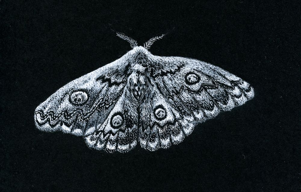
This week we’ll explore making patterns of dots, lines and shapes to create texture or to make illustrative or imaginative drawings. If you are working with very small marks don’t attempt a large piece. The moth drawing above was only about five inches by 3 1/2 inches. If you decide on exploring shapes this can be as large or small as you like but for a large piece use large brushes or chunky materials to suit the scale.
Happy for you to experiment with seeing a scene in plan view. As in the drawing below.

Gouache by Jo
Note how the dots have been used to make patterns of eddies in the river. The scene is as if in plan view so the green circles are trees. The palest dots have been used to mark out the main areas.
The composition relies on the shapes; the arrangement of the large areas and the arrangement of the colours and tones of the dots. There is no attempt to create an illusion of three dimensions but there is a sense of movement.
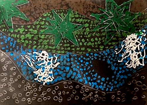
Dots
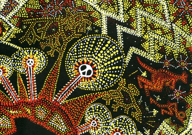
Shapes, dots and lines have been used in very ancient rock art and also the more recent and intriguing dot paintings of aboriginal artists in Australia. I took inspiration from both rock art and dot paintings for the “Ring of Fire” drawing below. The dots are used in two main ways; firstly to fill shapes and secondly to form lines to mark out the main areas/motifs of the composition. They can also be arranged in lines making decorative patterns as in the haloes of the lightning spirits below which are filled with radiating lines of dots. Unlike the Meander drawing where the dots are placed close to each other over the whole work, in the drawing below the black paper between the dot motifs plays a much more significant role in the composition.

Gouache by Jo
This dot painting combines ancient cave painting motifs of lightning spirits with a dot technique. Gouache was used and applied with a small round brush held vertically to make each dot.
Note how the colours are used to produce pale and mid tones on the black paper.
Gouache by Jo
Note how the spaces between the dots play a significant role.
Patterns of lines
Similarly lines can be used to form patterns within a composition or as the basis for its structure separating one area from another. By altering the density of marks across a shape both lines and dots can also describe form as we saw from the scribbling marks in the previous post.
These can be free and organic or more geometric: experiment!
Another consideration is perspective and acuity. If you reduce the size of marks so that those at the bottom of the paper are large and gradually become smaller the further up the paper they occur they usually read as being more distant rather than smaller in size. Imagine a long shingle beach. The stones closest to you are seen as distinct individuals; further away they form an irregular pattern, further still they are seen as a texture but can no longer be sees as distinct entities; yet further away they will just be a colour in the distance.
Decide whether you would like the marks to speak for themselves or whether you would like to add thin veils of watercolour or pastel as in the image below.
Mixed media on black paper by Jo
White marks were made freely with a white paint pen then dilute washes of permanent white gouache added and also some black India Ink marks for the trees. Finally, coloured washes of green and yellow ochre watercolour were applied.
Shapes
Try working intuitively with shapes on black paper. You may work in white or colour. If you don’t have any gouache colours, just add some permanent white gouache to your watercolour mix to make it more opaque. If you already have some gouache paints you won’t have to add white unless you need a paler tint.
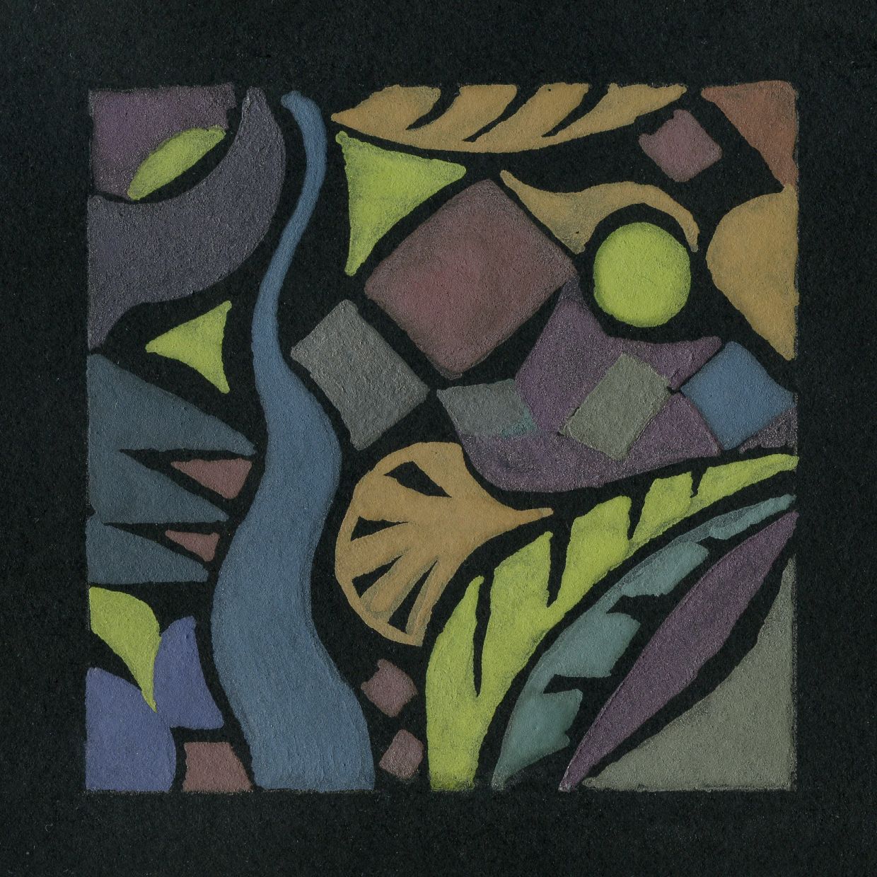
This tiny sampler 2 1/2 x 2 1/2 inches was painted with some Derwent Graphitint pans which proved to be very opaque.
For this week’s project you may like to work intuitively or be inspired by natural forms. You may also like to look at the following Pinterest Boards on pattern and rock art.
Rock Art
https://www.pinterest.co.uk/jhall1282/magic-of-black/rock-art/
Abstract Pattern
https://www.pinterest.co.uk/jhall1282/magic-of-black/abstract-pattern/
Patterns of Nature
https://www.pinterest.co.uk/jhall1282/magic-of-black/patterns-of-nature/
Materials you will need
Black paper; white gouache and brushes or white ink or paint pen, watercolour or gouache colours;
You could alternatively work in pastel pencils or pastel or mix the media.
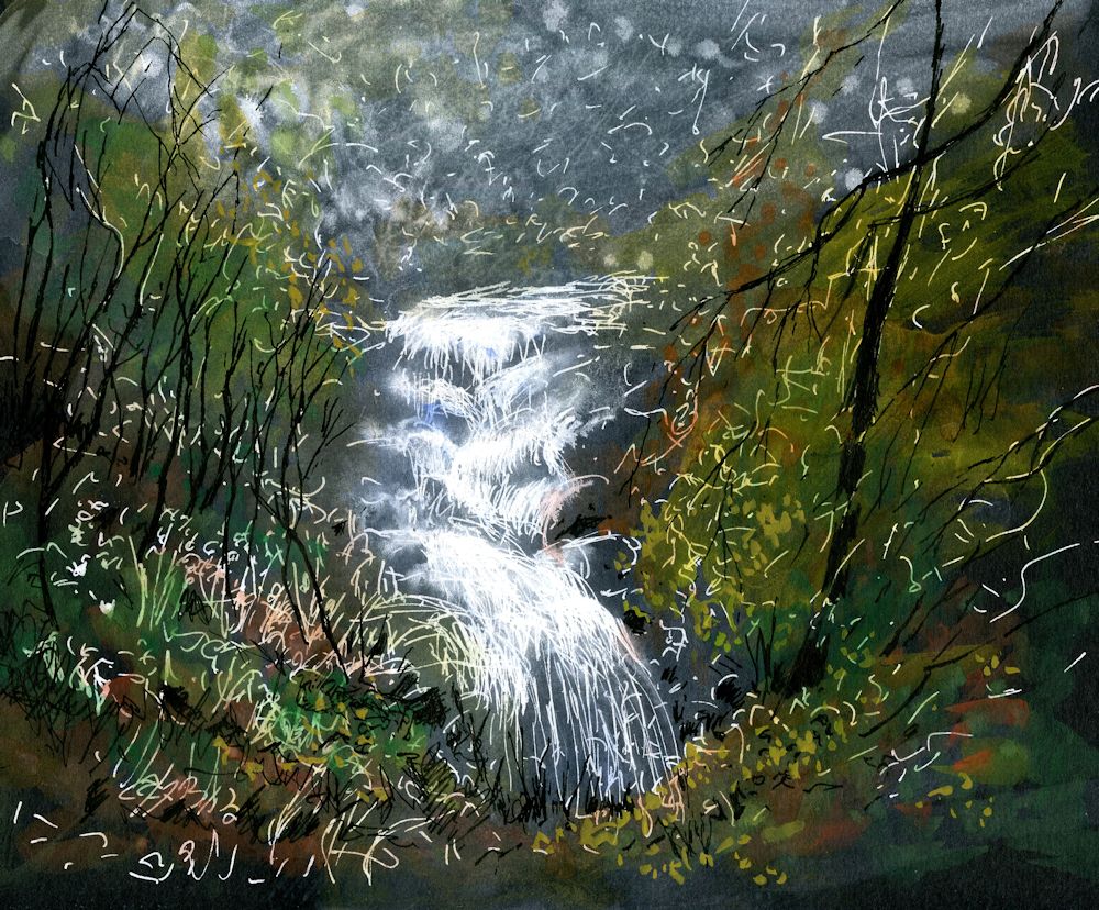
Have some India Ink ready as it can be used to reinstate black as in the waterfall drawing.
1.Experiment with making patterns of dots, lines and shapes. Aim to work a small sample of each and using all three together.
Then do either 2 or 3
2.Make an abstract or near abstract composition of lines and/or dots and/or shapes. Some lines and dots may overlay areas of colour. Try to make the black support an important element in the work. The work may be very free and organic or more geometric. The rock art and abstract Pinterest boards may give some useful inspiration.
3.Make a finished drawing/painting inspired by natural forms or landscape. Think about what drawing marks will suit your subject and composition best. Use at least one of the techniques described. The marks and shapes may “speak for themselves” or you may like to add veils of colour with dilute watercolour or pastel to soften them.
Your paintings:

by Pam
by Pam
by Liz
by Liz
by Heather

by Heather

by Heather
by Mali

by Mali

In line and filled shapes
by Kate

by Kate
Magic of Black Week 1: Drawing and Mark Making
February 21, 2023

White paint marker and watercolour on black paper
by Jo
Note the use of scribbling technique and restrained addition of watercolour washes. To see more of the scribble detail right click the image to open in a new tab,
Over the next six weeks we’ll explore using wet and dry media on black paper. We’ll look at the drama of working in near monochrome as in the castle drawing above and more decorative and fun ways of working. Facing a blank black sheet instead of a white one requires a radical rethink as to the effect marks on the paper will make. Somehow it can be less daunting than the scary white sheet!
For most sessions black paper will be used but you may like to consider using an off cut of black mount board which makes a great support for detailed work in gouache, or perhaps canvas or board coated with black acrylic gesso.
Topics will include; mark making (especially the first two weeks), drawing and painting with wet and dry media including soft pastel and/or watercolour; negative painting; making a decorative notan with positive and negative shapes; and using pearlescent and/or metallic paints or inks if you have any. For those who enjoy working in fine detail we’ll also discover the effectiveness of starting with a black support.
For this week’s project you will need either a white paint marker (Posca or similar) or a pen and white acrylic ink. Alternatively a white gel pen, or white gouache or thinned white acrylic and a fine brush. You will also need some watercolour, a tube of permanent white gouache and perhaps a couple of soft pastels or pastel pencils. best to read, find the materials and experiment.
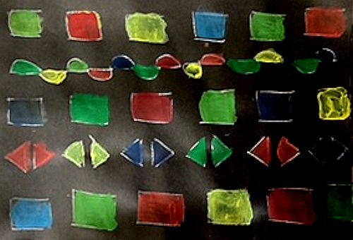
1.Open and closed shapes;
Lines can be used to show the boundaries of shapes. Where a line completely encloses a shape the shape is often referred to as a closed shape as in the letter “O”. Where the line fails to completely enclose a shape the “shape” is often describes as an “open shape.” In reality an open shape is just a line as when you draw the letter “U” or “V”, but all these lines can be harnessed to create pattern within larger shapes as in the surface of the fish drawing below.
Draw or paint some open and closed shapes on an A4 sheet. Fill some of these with more open and closed shapes. Allow to dry then try painting thin veils of watercolour to fill some of the shapes. You could also try surrounding some shapes with a different colour of watercolour or pastel. Experiment with straight sided and curved shapes. Try to leave some of the surface unpainted.

A shape that is completely enclosed by a line, like a circle or square is considered to be a closed shape. Shapes like the letter “U” are not completely closed and can be considered as open shapes. Open shapes are best considered as lines which may be straight, irregular, zigzag, wavy etc.. Here the pattern on the fish is composed of mostly closed shapes and dots. The small shapes that are not completely closed are open shapes.
Note how effective the use of pastel surrounding the large fish shape is.
2.Draw a closed shape (e.g. pear or fish shape or an abstract shape like a circle,)
Scribble with white lines so that the shape is densely marked on one side and the marks gradually become less dense toward the other side lending a form to the shape (this might be top to bottom if you choose a fish shape! When dry overlay a veil of watercolour or pastel over all or part of the shape. Try something similar if you have time using hatching and cross hatching instead to show the form. In practice sometimes the rather organic texture of the scribble would be preferred and at other times hatching techniques are best. I’m a compulsive scribbler and when using pencil usually prefer continuous tone rather than hatching BUT we all work differently and either way the marks made by any individual are unique and contribute toward their style of drawing.

3.Make a more considered drawing, still life, land form or natural form like a pepper or fish using similar techniques.

The scribbling technique can be very useful for rocky landscapes or to show the form of a fruit like an apple. Open and closed shapes can be useful for the patterns on a variety of natural forms and vegetation. If using very wet watercolour, black watercolour paper would be best for the more considered drawing but any black paper or a reasonable weight would be fine for mark making and pastel or small areas of watercolour.
Your Drawings:

by Mali

by Mali

by Mali

by Heather

by Pam

Acrylic pen and watercolour
by Pam

Acrylic pen and watercolour
by Pam

by Liz

by Liz

by Liz

by Kate

by Kate
Drawing with Bling: first experiments with Silver Point
April 13, 2020
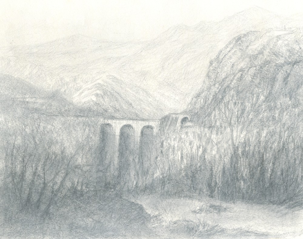
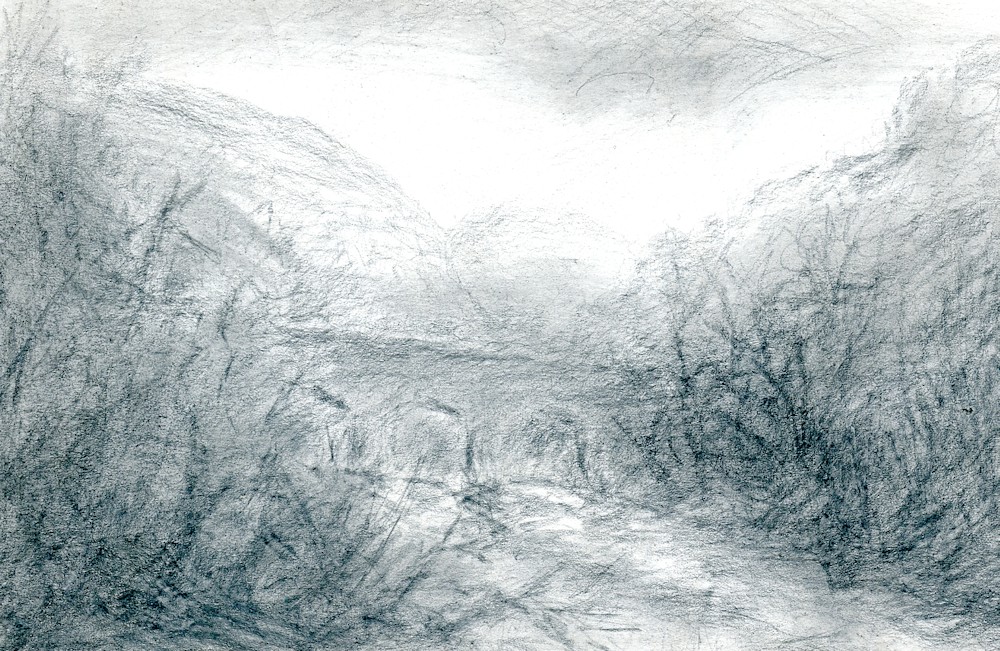
This scene is inspired by a bridge and tunnel in the Ceno Valley, Northern Italy.
Unbelievably this is ACT 4 the fourth Art Challenge Tuesday since I was able to give classes. Hope you enjoy this one.
Silver point was a very popular technique for drawing in the fifteenth and sixteenth centuries. The drawings were made with a silver wire in a holder on a ground prepared with gesso, which provided a tooth for the silver particles to be deposited. It is easy to experiment with silver point with materials you are likely to have in your art equipment and around the home.
Take a piece of heavy-weight watercolour paper, preferably Hot Pressed 300gsm or more, but NOT will do, or even a small off cut of mount board. Apply two layers of Chinese white, or as I used, permanent white gouache; the first coat should be dilute and the second much stronger. You may wish to prepare paper with more layers of white; the aim is to provide a fairly uniform surface before starting to draw. When dry the support is ready to use. For a large scale drawing it is advisable to stretch the paper first to avoid cockling but for your first small scale experiments that should not be necessary. The sketch above was about 7 x 10 inches and the one at the end of this post only about 7 x 5 inches.
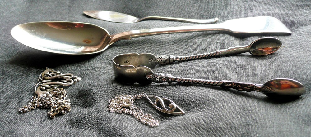
The Family Silver: objects used for the drawings!
Next find your drawing tools; silver jewellery, silver spoons, butter knives and sugar tongs, even EPNS cutlery will work. In fact most kinds of metal including gold will leave some sort of mark on a prepared paper. Drawing with silver leaves quite a delicate trace of the metal but after time this will tarnish and produce a darker and warmer drawing. Start by finding what marks you can make with various tools and then make a drawing.
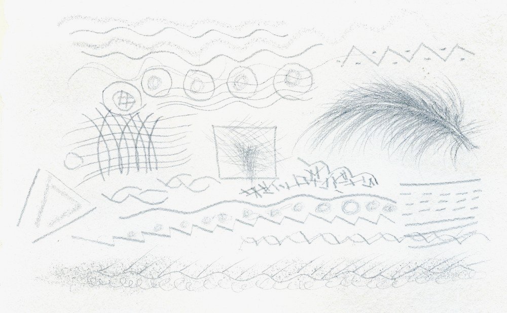
First marks
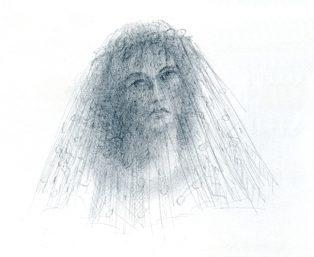
Woman with Veil
Silver point over permanent white gouache
The images are my first rather crude attempts. I am also going to make some drawings with silver wire and surfaces prepared with a casein chalk gesso manufactured for use with silver point. Traditionally, surfaces would have been sized with rabbit skin glue, then coated with several layers of gesso and sanded, so that an even surface was achieved that still had enough tooth for drawing with a silver tool. Spoons and found implements do not give the control that a wire in a holder would, but do provide an interesting variety of broad and more delicate marks, so have fun drawing with your bling or the family silver!
Your Drawings:
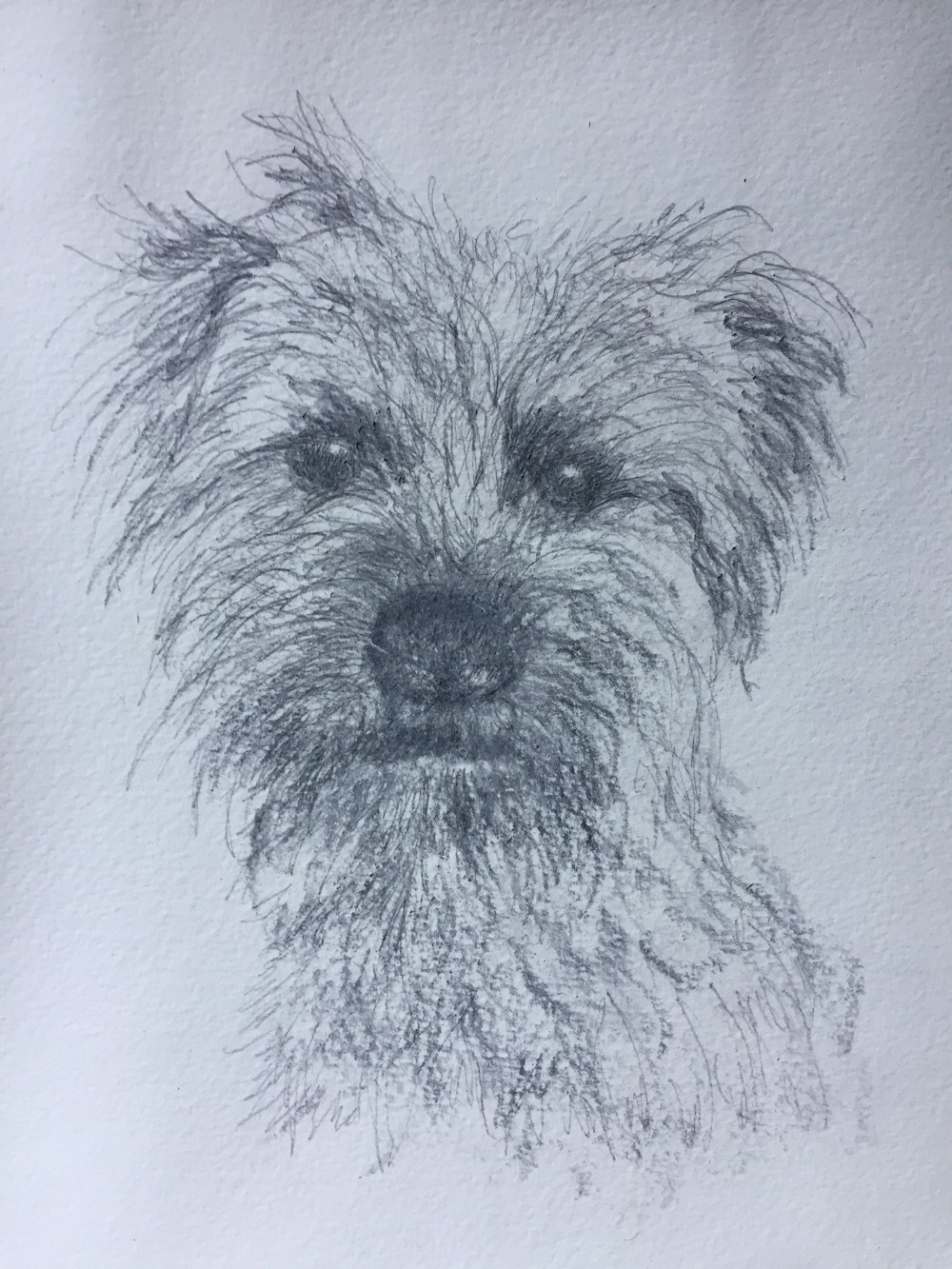
Jane’s Terrier: silverpoint

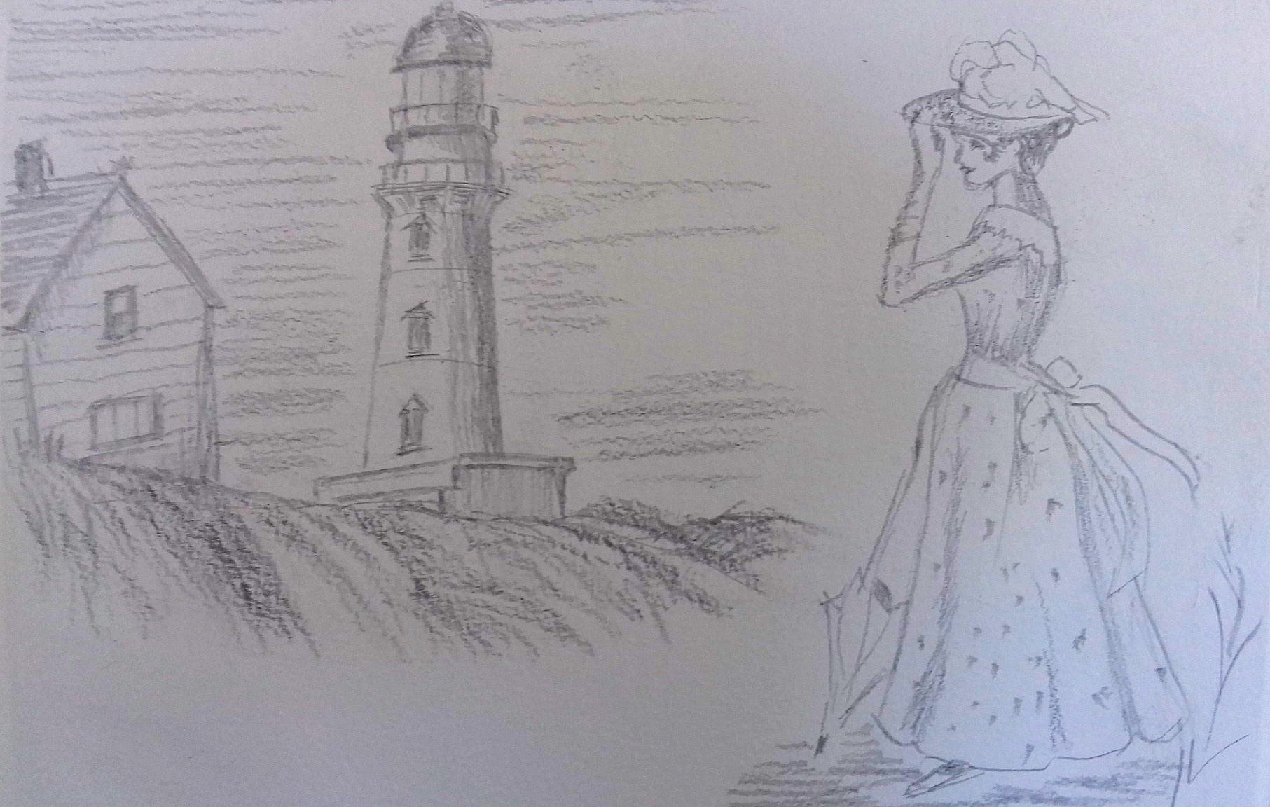
Delightful Lady; brave line work as this technique does not allow erasure!
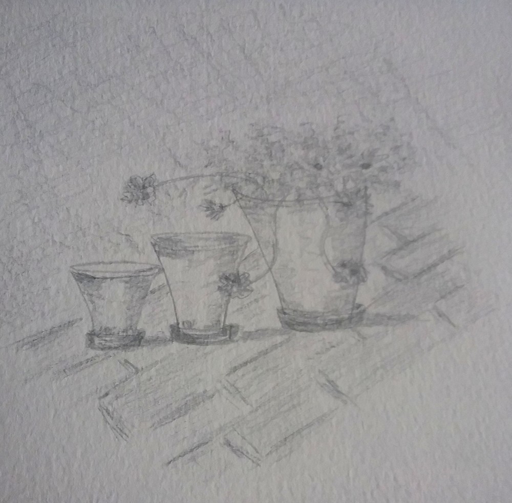
Flower Pots
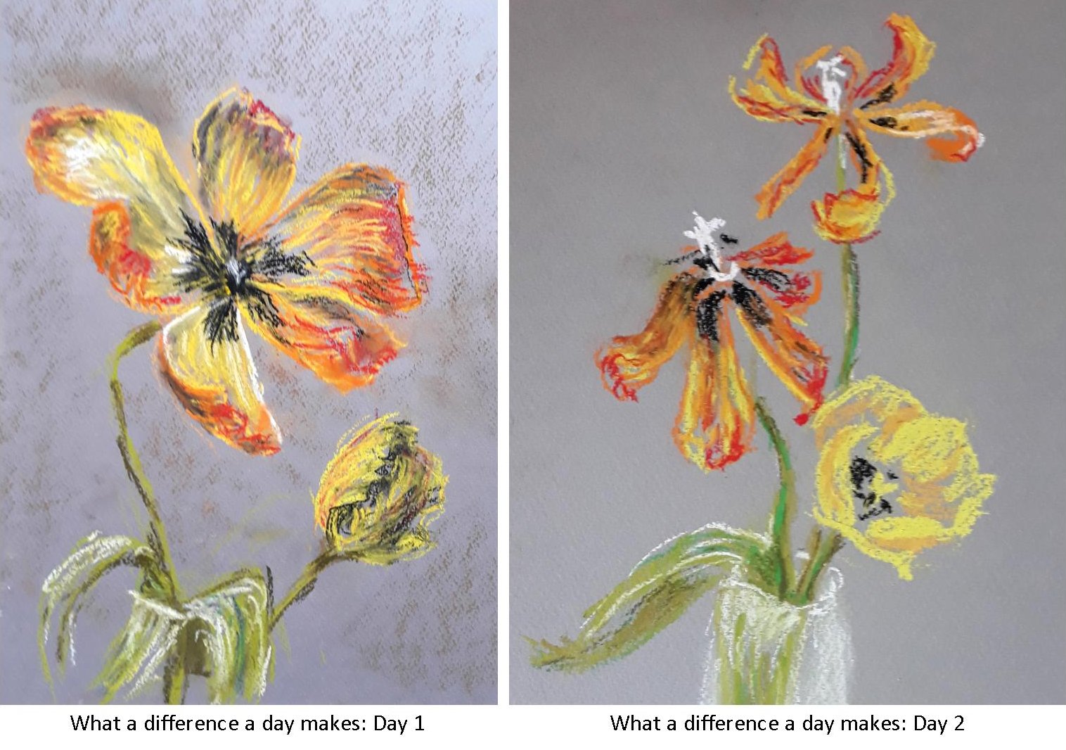
Draw a Flower at Different Stages of Opening: charcoal and pastel
March 30, 2020
This week’s challenge is to find a flower and draw it from bud to full flower. You may still have daffodils and there are loads of primroses, periwinkles and flowering shrubs and very soon we will have tulips. Look especially at the relation between the stem and the flower head and the axis of the flower. The daffodil in bud follows a line almost straight from the stem and then the stem bends down sharply as the flower opens. The trumpet starts as a cone behind the petals and is aligned with the new stem direction. Look at how the petals attach near the base of the trumpet and how seen from the front the petal tips lie on a circle. As you turn the flower head around the tips lie on an increasingly shallow ellipse till you see the flower in profile.
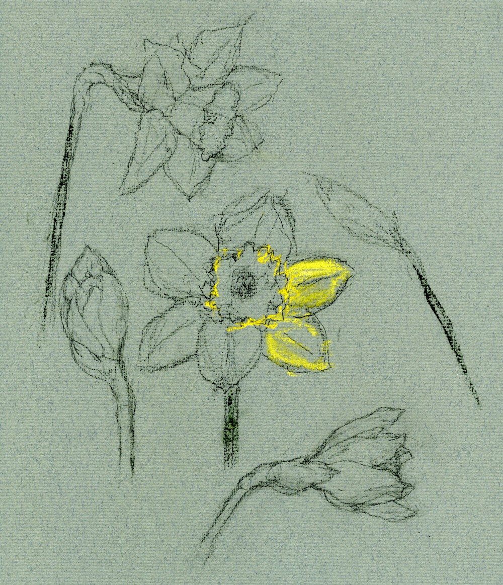
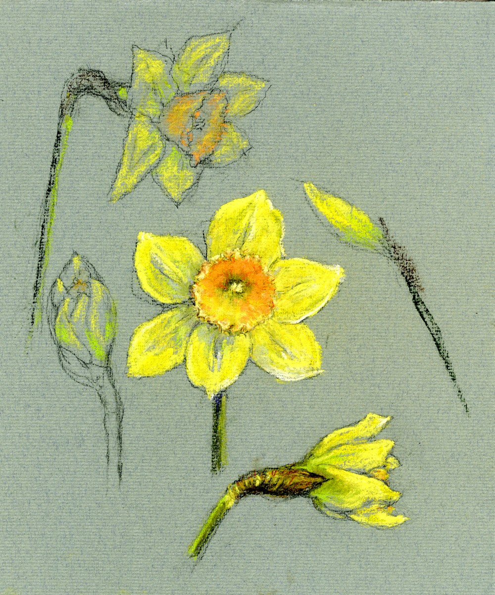
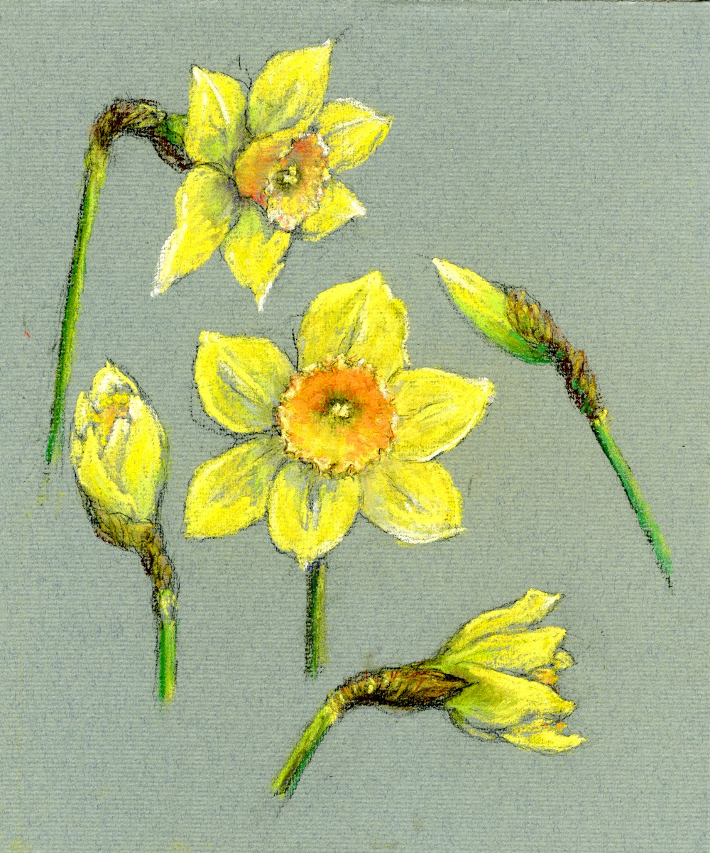
In June we’ll see the poppies emerge doing the opposite, their buds dangling till they open then turn up to face the sun! The daffodil example was drawn in charcoal on green Ingres paper and then layers of soft pastel were applied to finish.
The Response: Your Drawings