Cast Shadows 2 Interiors
June 28, 2020
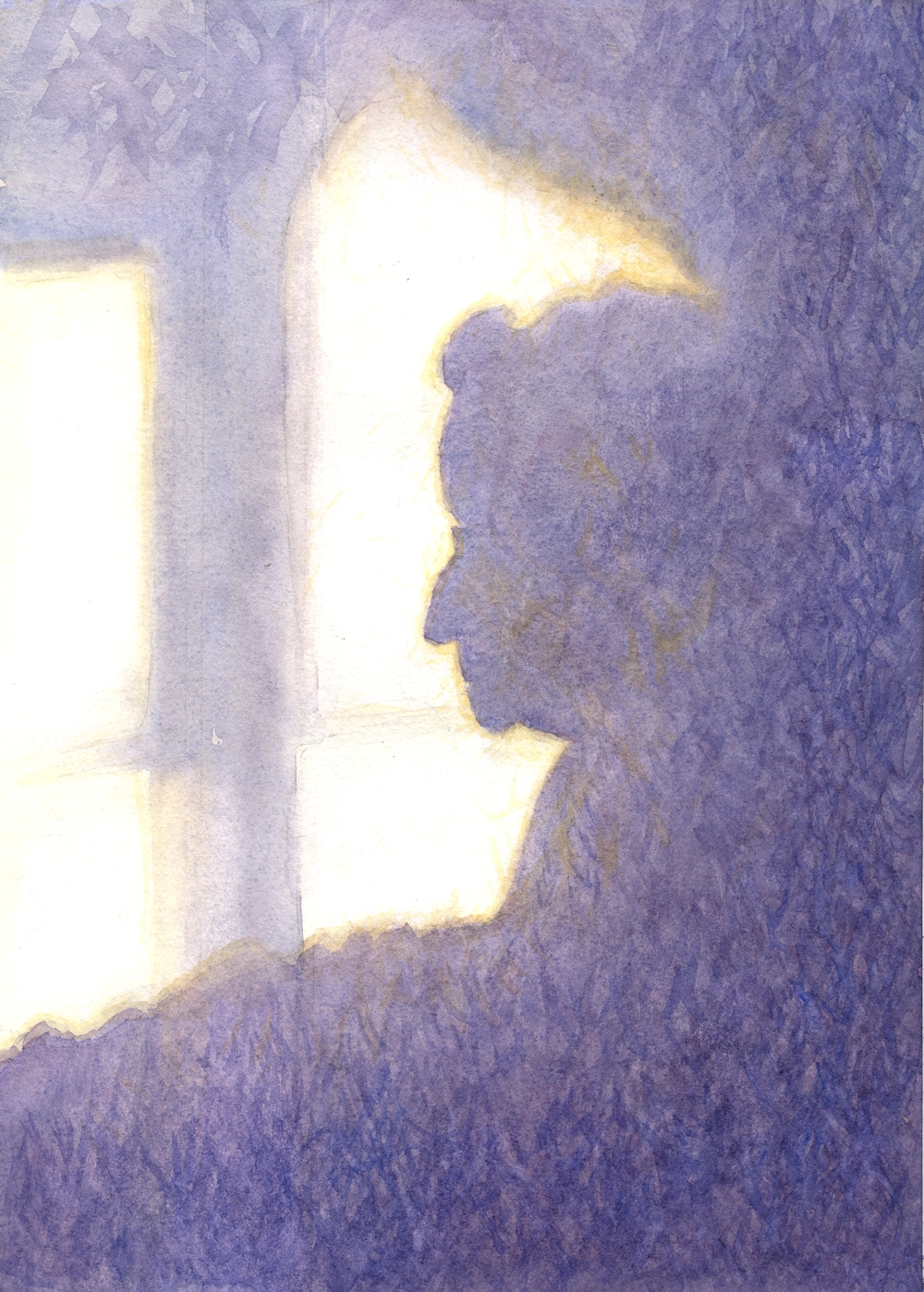
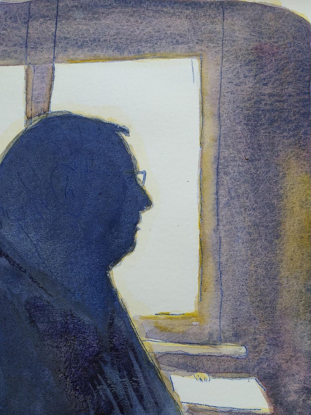
Vida’s Shadow: watercolour
This week’s project is to produce a painting of an interior that includes cast shadows so I’m starting by showing you one way of tackling shadows in watercolour. It’s in place of the short live demo I would usually give my workshop participants and I hope it will be helpful. Artists for reference and some ideas for painting interiors appear later in the post.
There are several ways of painting shadows and the colours used will depend on what you see and how you wish to interpret what you see. We saw last week that some artists choose to work in an extremely representational style while others are more inventive with colour and tone. Very often you will only need one colour mix for a shadow, sometimes the colour of the object mixed with a colour that will mute the colour slightly e,g, a purple object may need a purple gray shadow. In daylight on a bright day shadows are often bluish reflecting the colour of the sky.
The watercolour above is the shadow of my Mum. It appeared while we were having lunch, not the best time to get the paints out, so a photo reference was used. Below you will see three stages of making the painting. If I had been tackling a shadow of a tree or a simple object I would probably have just used a brush and a much freer approach but I was working small (about 25cm x 15 cm) and wished to end up with a recognizable profile.
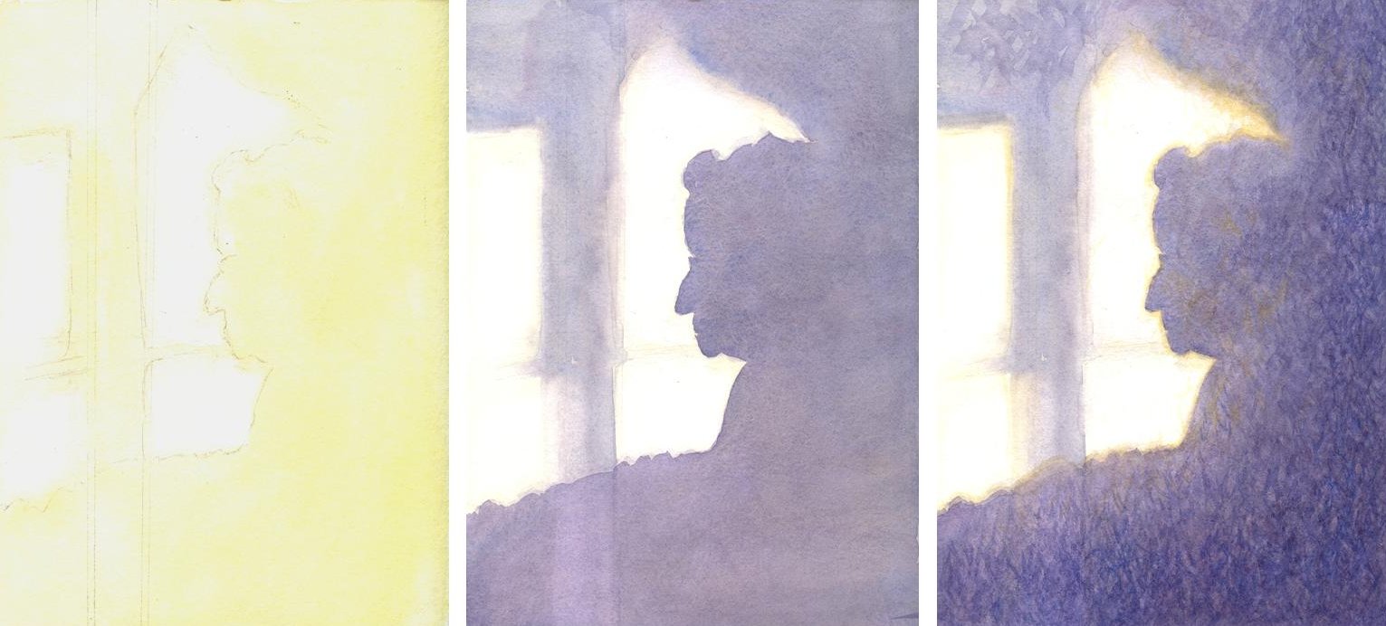
Vida’s Shadow: 1. First wash of yellow ochre 2. washes of ultramarine, crimson alizarin and a little ochre 3. edges softened more ochre added and texturing with small brush strokes of a similar mix but with more blue in places.
1. A light pencil line was drawn around the edges of all the shadows. I noticed a distinct yellow halo to the shadow so I decided to lay down an Ochre wash over the whole of the shadow area and extending outside the drawn line. Because I wanted this to be soft I moistened the area to be painted with a sponge first. Sadly the edge of the Ochre wash does not show up well on the image.
2. I then mixed a large puddle of Ultramarine, Alizarin Crimson and a little Yellow Ochre to make a muted purple gray wash. This wash was taken over the whole of the shadow area which I softened in places with a tissue while wet, and also lifted out the lower part of the vertical shadow of the window frame. When this had dried I took another wash of a similar mix over the shadow area on the entire right side so that part of the shadow remained lighter in tone as observed.
3. I softened some edges of the head with a hardly damp brush and added more Ochre to the silhouette shadow and some of the window frame. The wall on which the shadow was cast was a textured wallpaper. I could have stopped after adding the Ochre but decided to texture the shadow using rapid strokes of a small brush wet on dry and adding more tone toward the right and bottom of the shadow. Most of this was done with a purple grey mix as before but more blue was added in places and some strokes of Yellow Ochre were added within the shadow area to unify the painting and give extra warmth.
When tackling an interior think of it as a landscape. With landscape painting it is always important to think first of the topography of the land before adding its clothes of vegetation and man made enclosures, buildings etc. With an interior, think first about the structure of the part of the room you will be referencing before you populate it with furniture etc. Is it a straight wall or are you looking into a corner, or are you including the whole of an end wall and at least some of both sides? Does the ceiling play a part in your composition? If there are windows and/recesses, or fires and chimney breasts place them next and then the lights, carpets furniture etc.
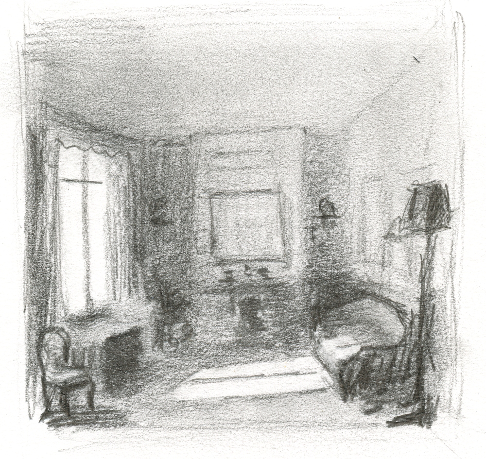
Thumbnail 1: fictional room with cast shadows (and wonky ceiling!)
To get an idea of the tonal balance before starting on a more considered work it’s a good idea to do a couple of thumbnail sketches. The two examples are about three or four inches across. Just enough to get an idea of shapes, sizes and tonal values. Thumbnail 1 shows a cast shadow from a window on to a floor and sofa, where the middle of the window frame makes a dramatic shadow. There are also cast shadows in the rest of the room although not so dominant; the shadow under the chair on the extreme right and the diffuse shadow of the cupboard on the right. The darkest corner is on the right as is the darkest wall, apart from the window which is the brightest area.
Thumbnail 2: Diffuse Shadows in my Dining Room
The brightest area is the sunlit window recess and the top of the sideboard on the left. The shadows are all diffuse; under the table; under the chair in the corner; light shining through a window to the left before the doors opening to the dining room results in a diffuse diagonal shadow of the wall above the doors cast on to the carpet.
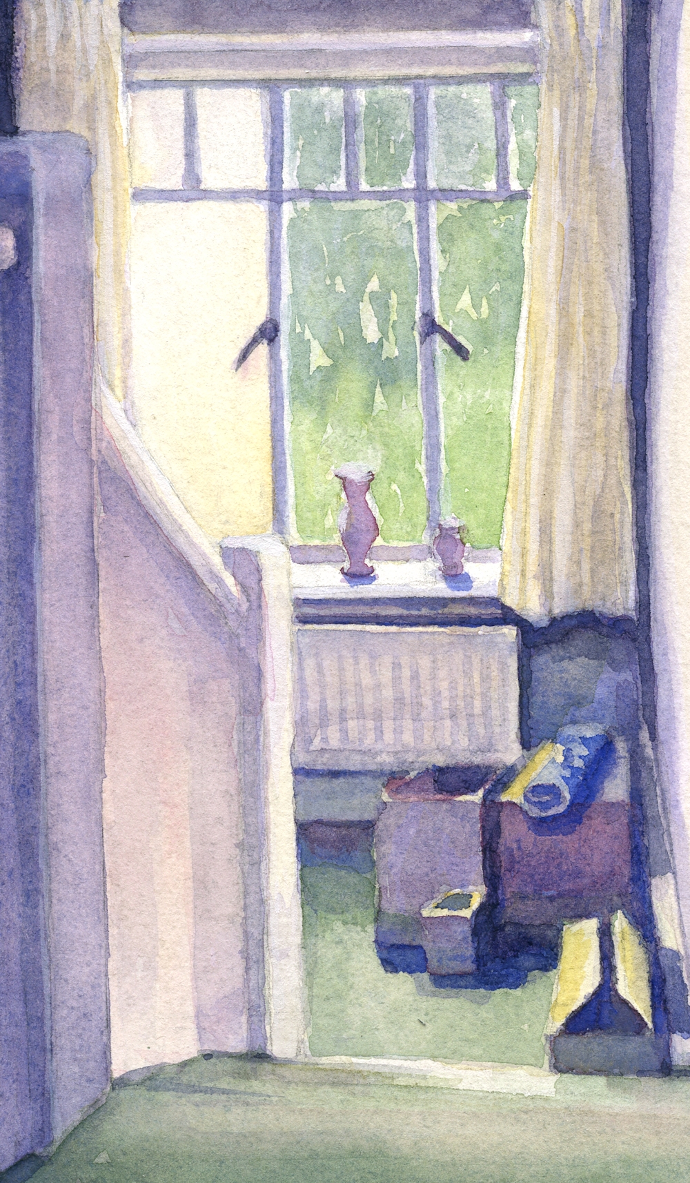
The Half Landing at Morar: watercolour sketch
The brightest area in the watercolour sketch is the window sill. The pale yellow area filling the left window is a brightly lit outside wall. There are cast shadows; of the pots on the sill; under the sill; round the radiator; on the carpet from the boxes and on to the skirting board on the right from the boxes; on the carpet from the wall and radiator; also more subtle shadows are cast from the handrail and newell post on to the blocked in bannister. This situation is not as dramatic as in the first thumbnail sketch or the cast shadow of my Mum’s profile but these are the sorts of shadows you are likely to encounter in any interior setting.
The Challenge
This week I would like you to make a painting of an interior with cast shadows that form a major element in the composition. Do start by making thumbnail sketches of possible compositions and also to check that you have understood the tonal balance with regard to the shadows, light source and objects, baring in mind that if strong sunlight is entering a room the wall with the window or door letting the light in is probably dark, and that the transparent glass allowing the light in is very often the brightest area so the greatest contrasts in tone may be on the same wall. I would like to see the finished work and perhaps the thumbnail sketch that formed your ideas for the painting. Choose either to work from an interior you know well; a room in your home for instance or make your own version of a painting by one of the artists references on my Cast Shadows Pinterest board.
https://www.pinterest.co.uk/jhall1282/cast-shadows/
Reference Artists; a slightly eclectic mix, of the contemporay artists do look at works by Karnes, Couloumy and Willis
The Copenhagen Interior School artists;
Wilhelm Hammershoi 1861 -1933
Carl Holsoe 1863 – 1935
Peter Wilhelm Ilsted 1864 – 1916
These three artists produced works with subtle colours with an air of stillness and mystery. Hammershoi is the most well known and used the figure, often his wife Ida in compositions that provoke questions in the mind of the viewer as do some of the rooms. Among the paintings are wonderful shadows cast by sunlight from windows.
Edvard Munch; night interiors
Edward Hopper
Mark E Karnes; an American artist; wonderful monochrome brush drawings and paintings of his home and neighbourhood
Jan van der Kooi
Anne Francoise Couloumy; a little surreal
Suzanne Moxhay; combines photography with painted surfaces
David Hockney
John Lidzey; watercolours
Lucy Willis; watercolours
Your paintings;
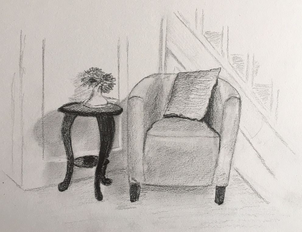
In the Hall; pencil tonal sketch by Heather
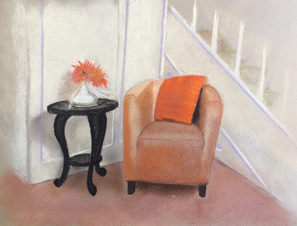
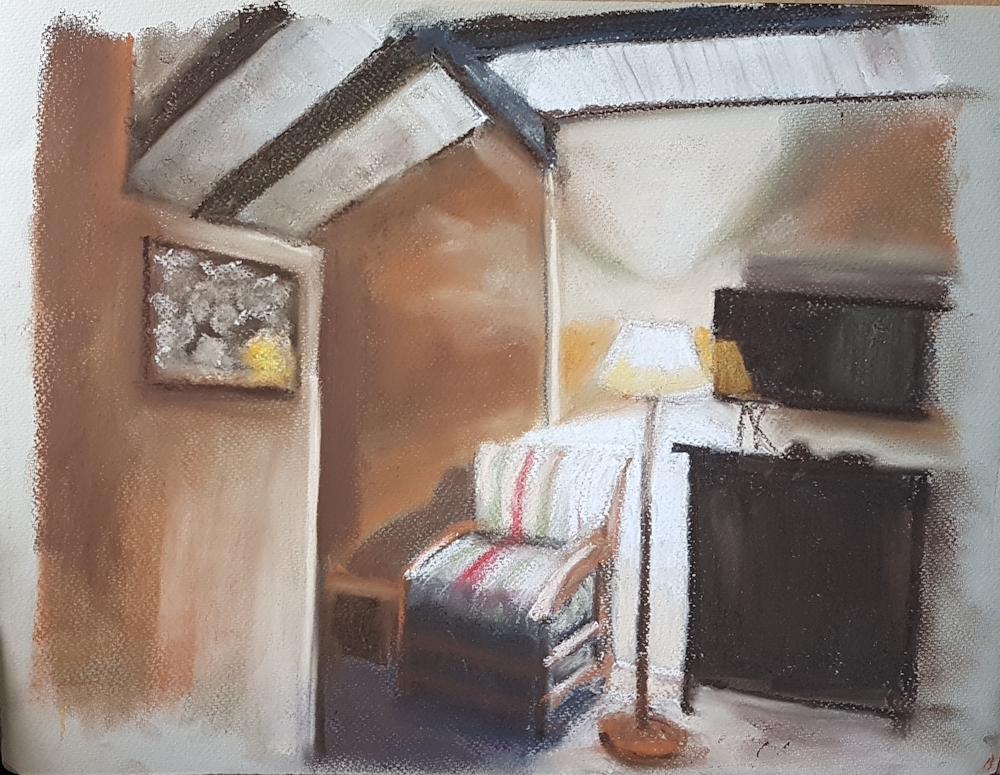
In the Hall: pastel by Heather
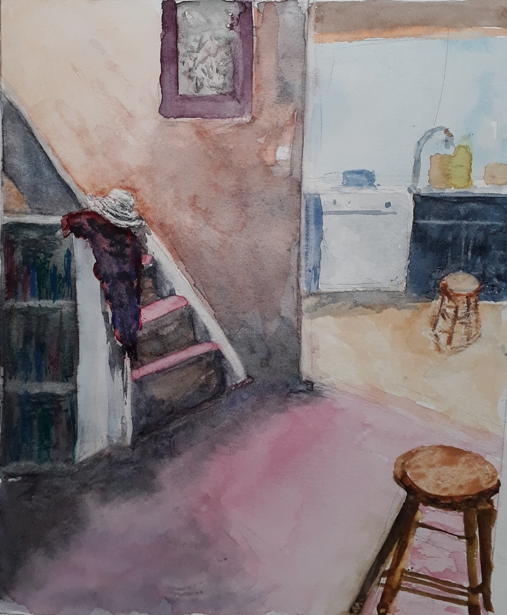
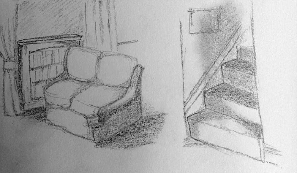
Hall and Kitchen: watercolour by Vivienne: Note diffuse cast shadows at the bottom of the stairs and of the bookcase beside the stair, slightly sharper shadows of the coat on the bannister and stool and dishwasher in the kitchen.
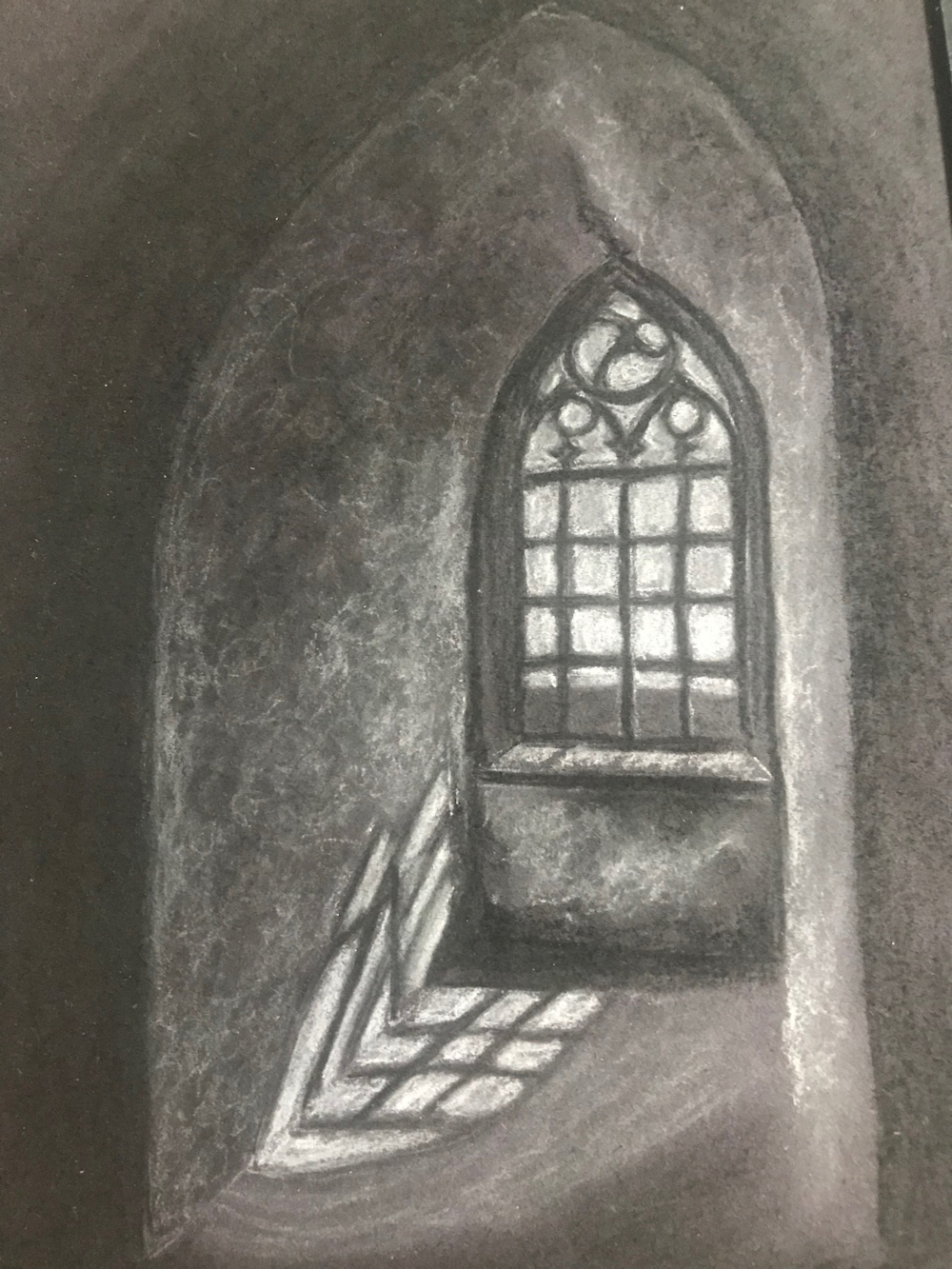
Arched Window by Shane
After Hammershoi by Ann
Window Shadow: watercolour by Angela
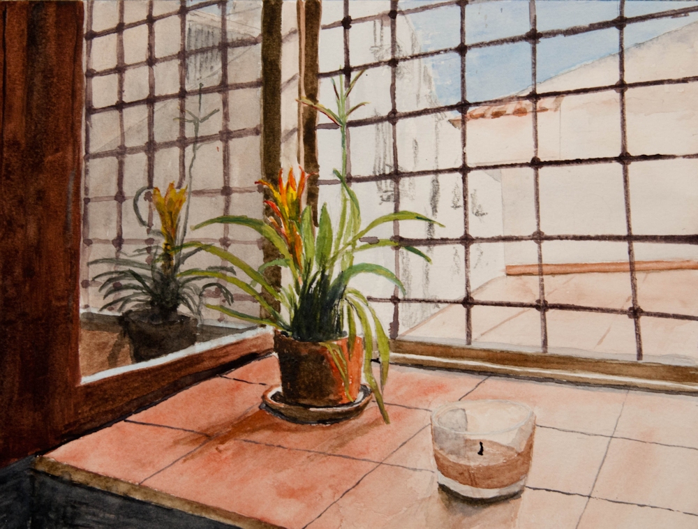
A Window in Palermo by Roger: This painting includes a strong reflection and shadows. Note the diagonal reflections of the leaded light widows on the side of the frame, and that the reflection of the horizontal bars continue in a straight line only interupted by the window frame. Because anything reflected is seen as if receding into the distance note the decreasing size of the metal framework and of the plant in the reflection. The plant and candle both have their shadows cast on to the tiled window sill. There is also a very strong shadow of the window on the sill bottom left.
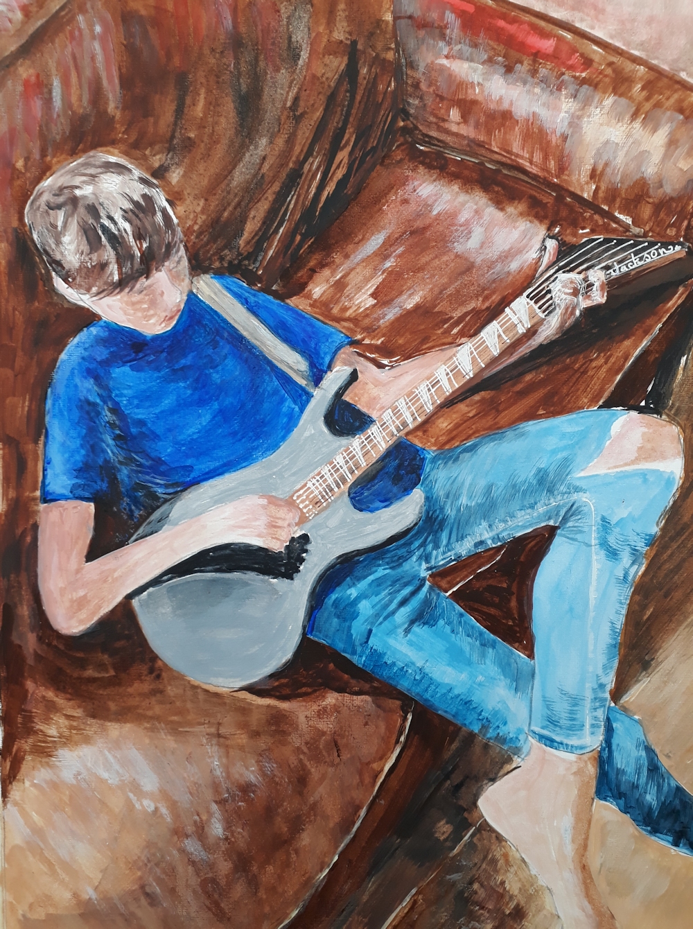
Ben playing his new guitar by Vivienne: Note the strong shadow cast by Ben’s hand and arm on the guitar and sofa, the shadows cast by the guitar on to Ben and the sofa, shadow cast by his head on to his T-shirt and also the arm of the sofa on to the seat. There are a few other shadows too!
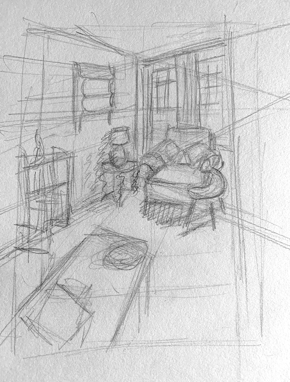
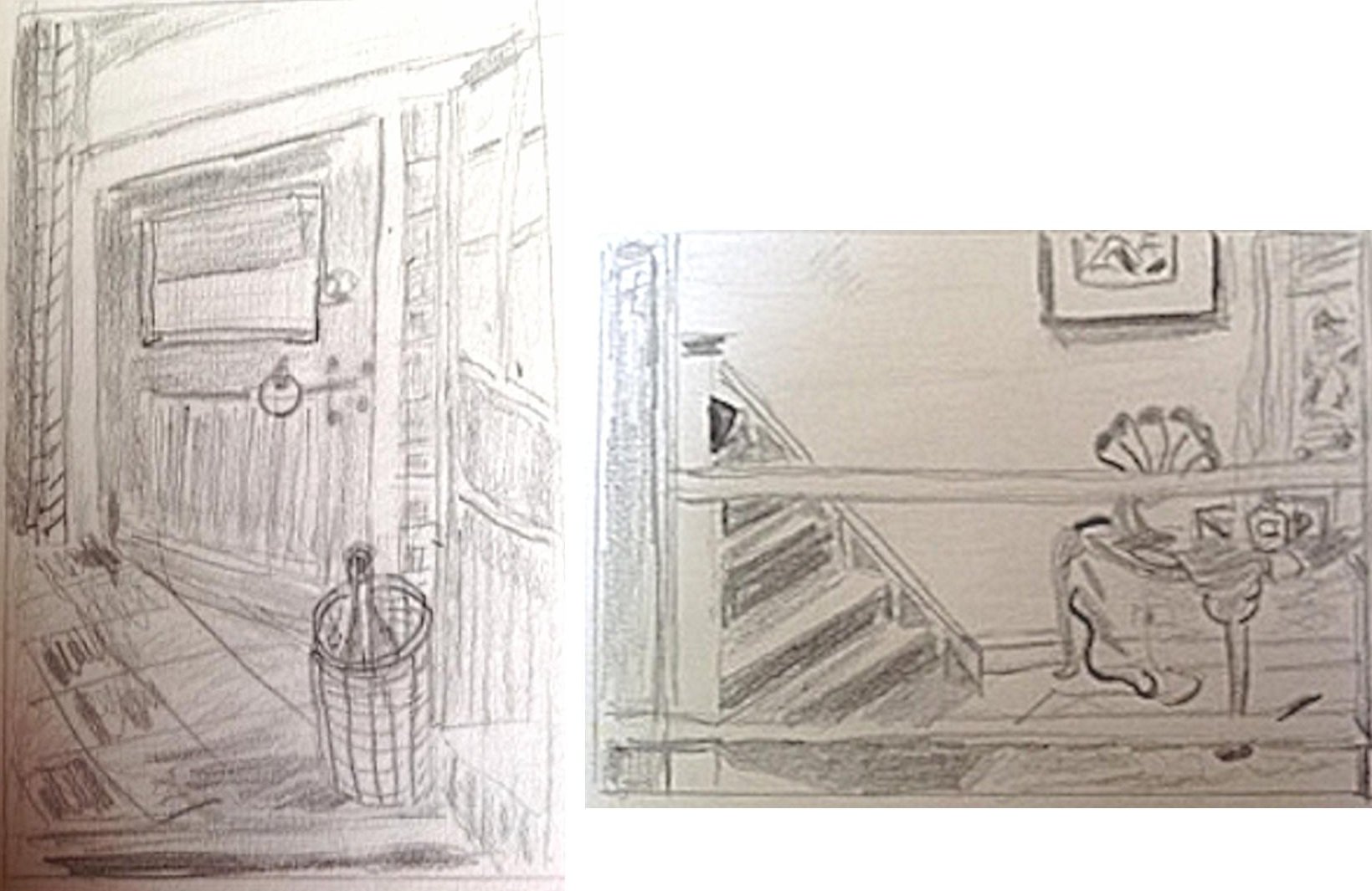
Sketch to work out perspective and placement by Jan
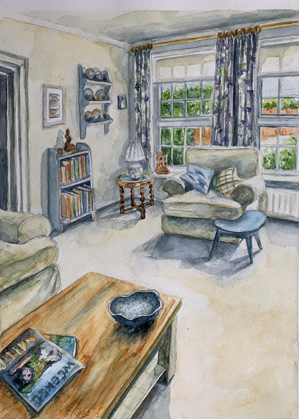
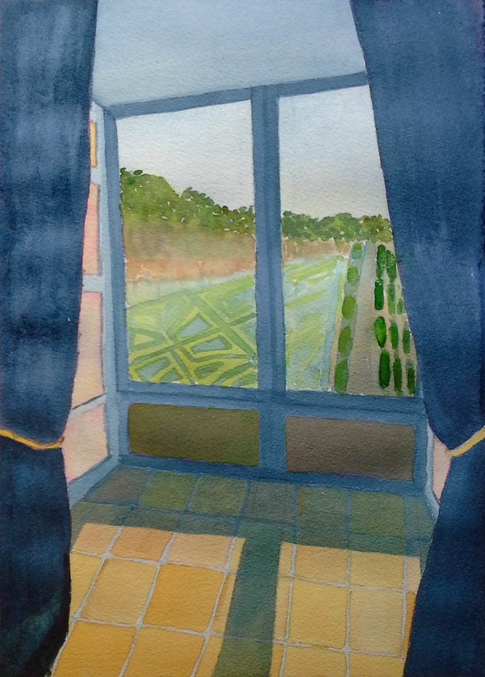
In the Drawing Room: watercolour by Jan
Two sketches by Liz
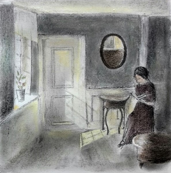
Girl Reading after Ilsted: drawing bt Liz
Sketches by Elizabeth
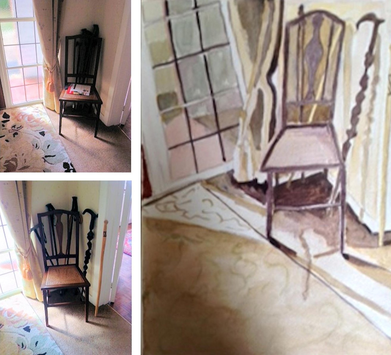
Chair in the hall: watercolour and references by Elizabeth
Watercolour by Maricarmen inspired by a painting by Jan van der Kooi
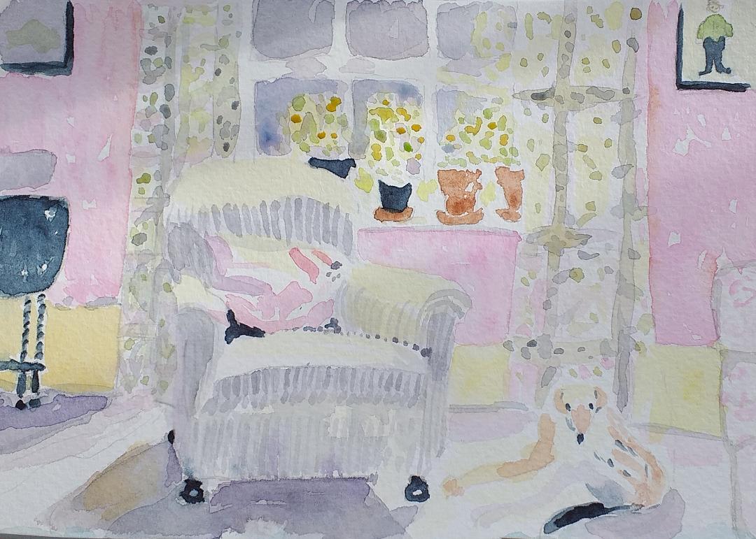
Armchair after Lucy Willis by Maricarmen
My Husband’s Shadow: watercolour by Maricarmen
Inside the log cabin, Yosemite: pastel by Ruth
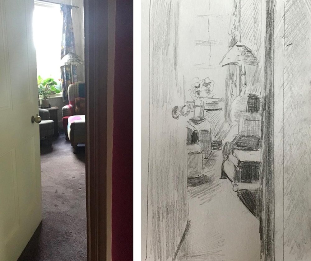
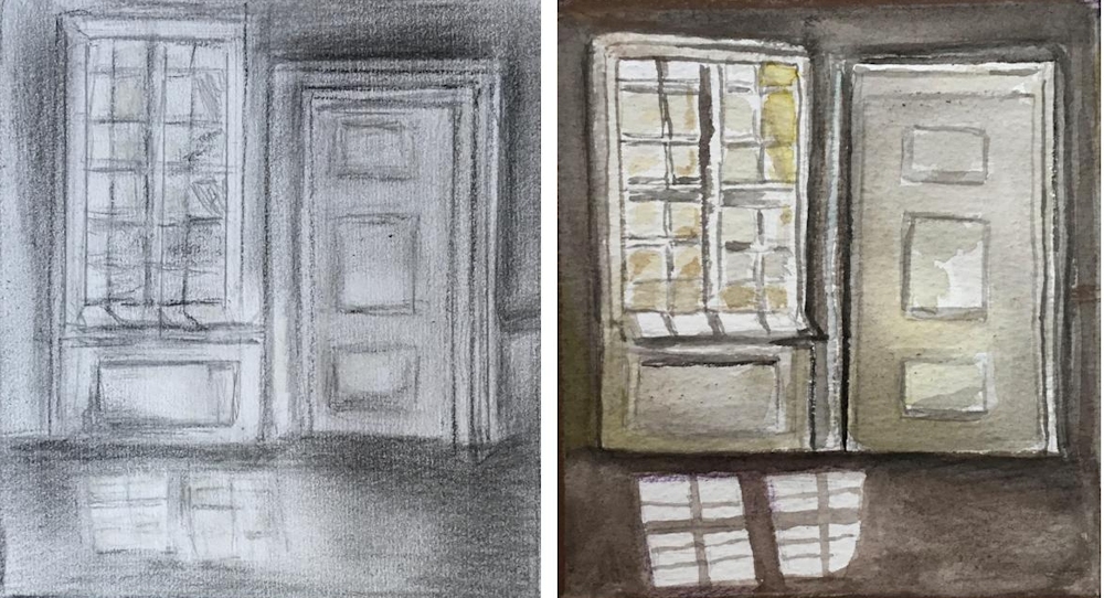
Through the Door: photo reference and sketch by Sandra
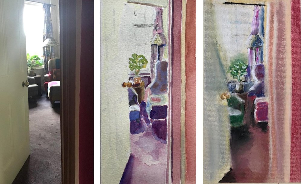
Through the Door: photo reference, watercolour and pastel by sandra