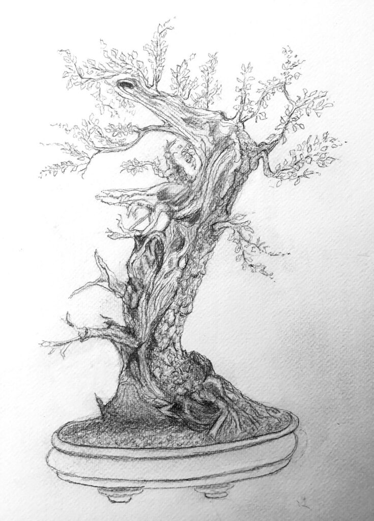
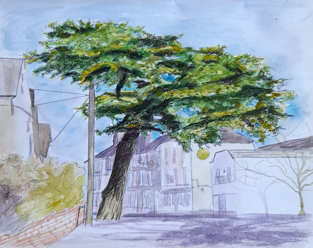
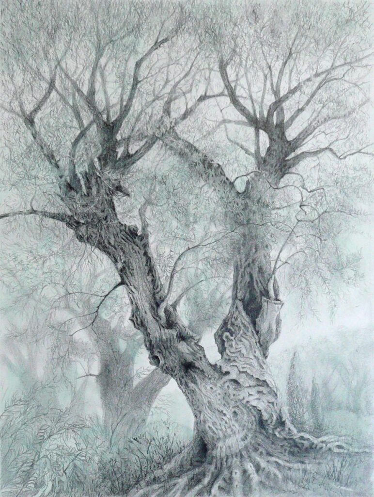
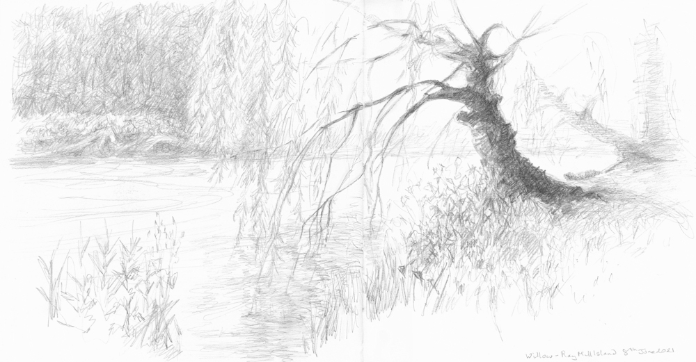
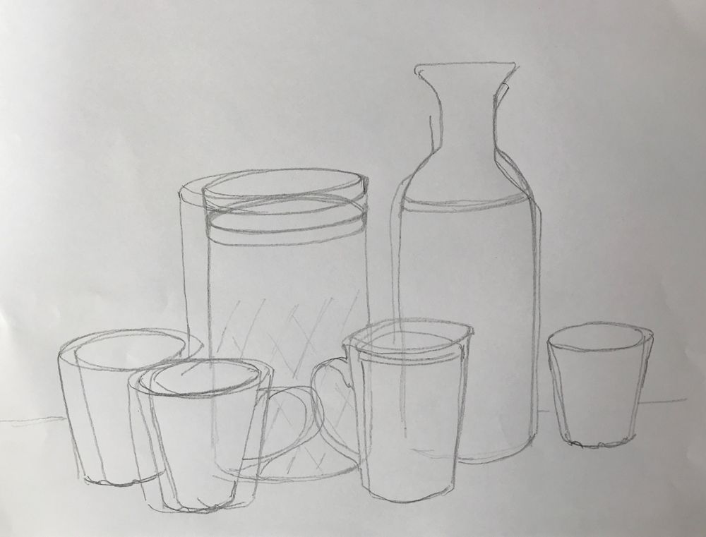
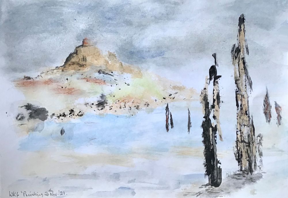
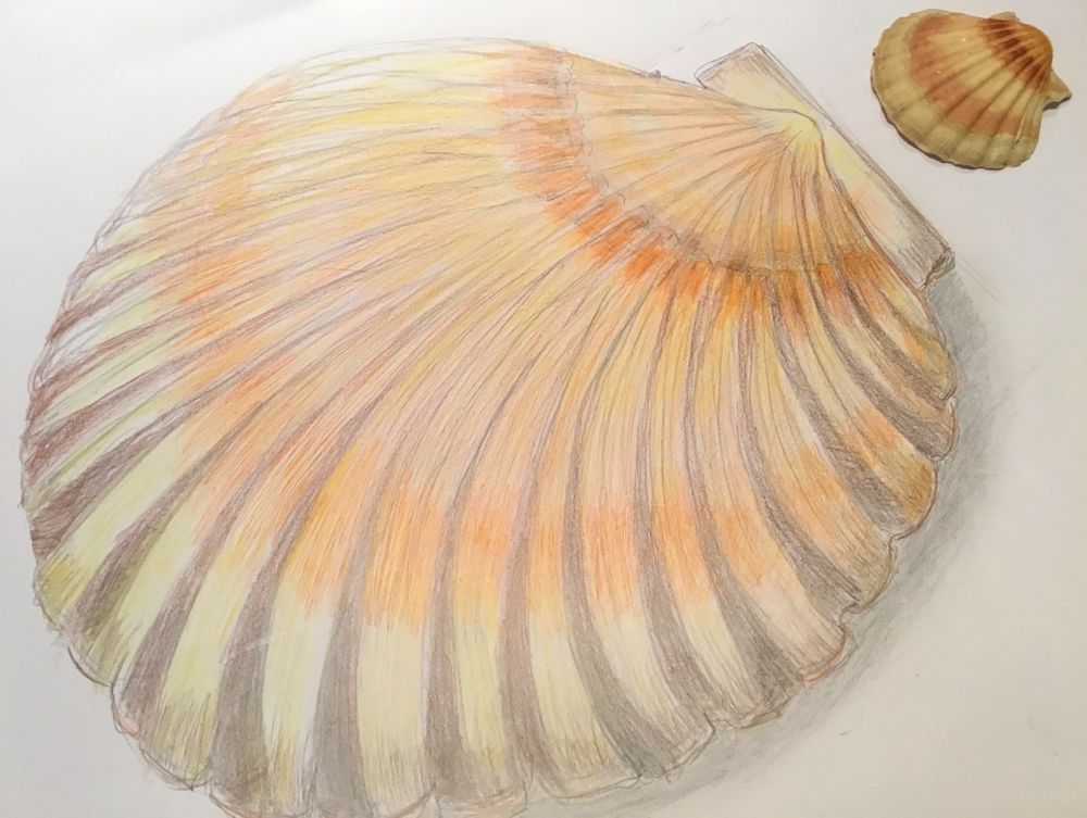
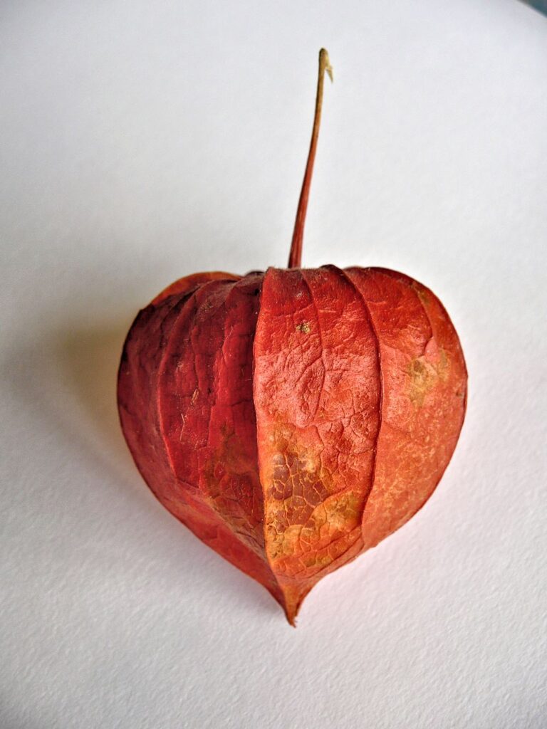
Drawing Trees Week 4: Woodlands
March 16, 2022

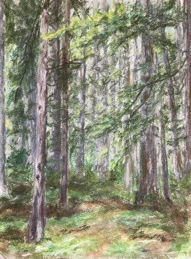
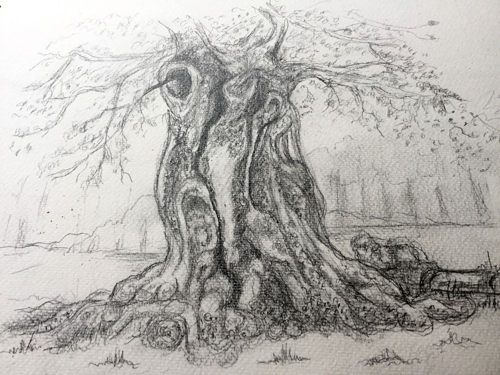
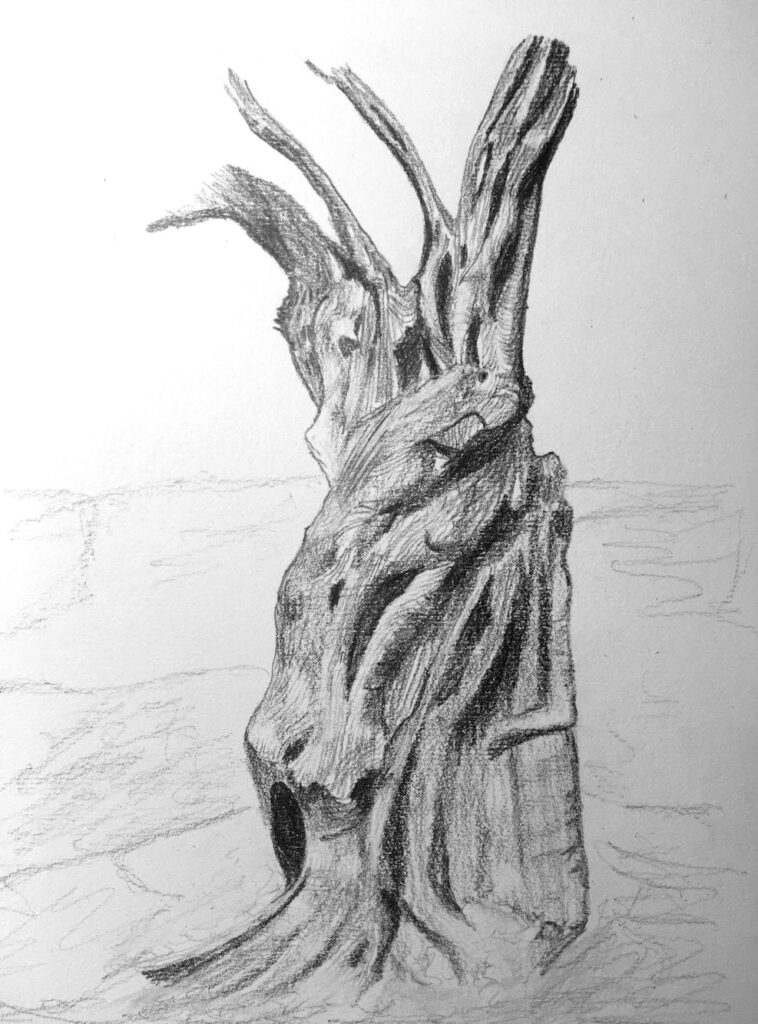
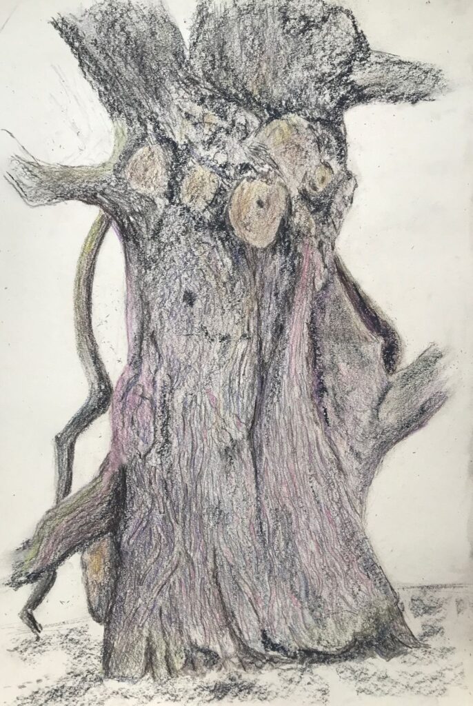
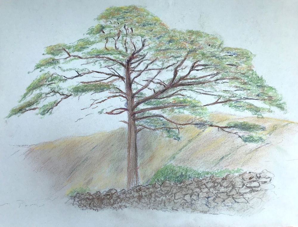
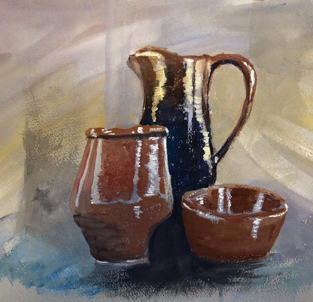
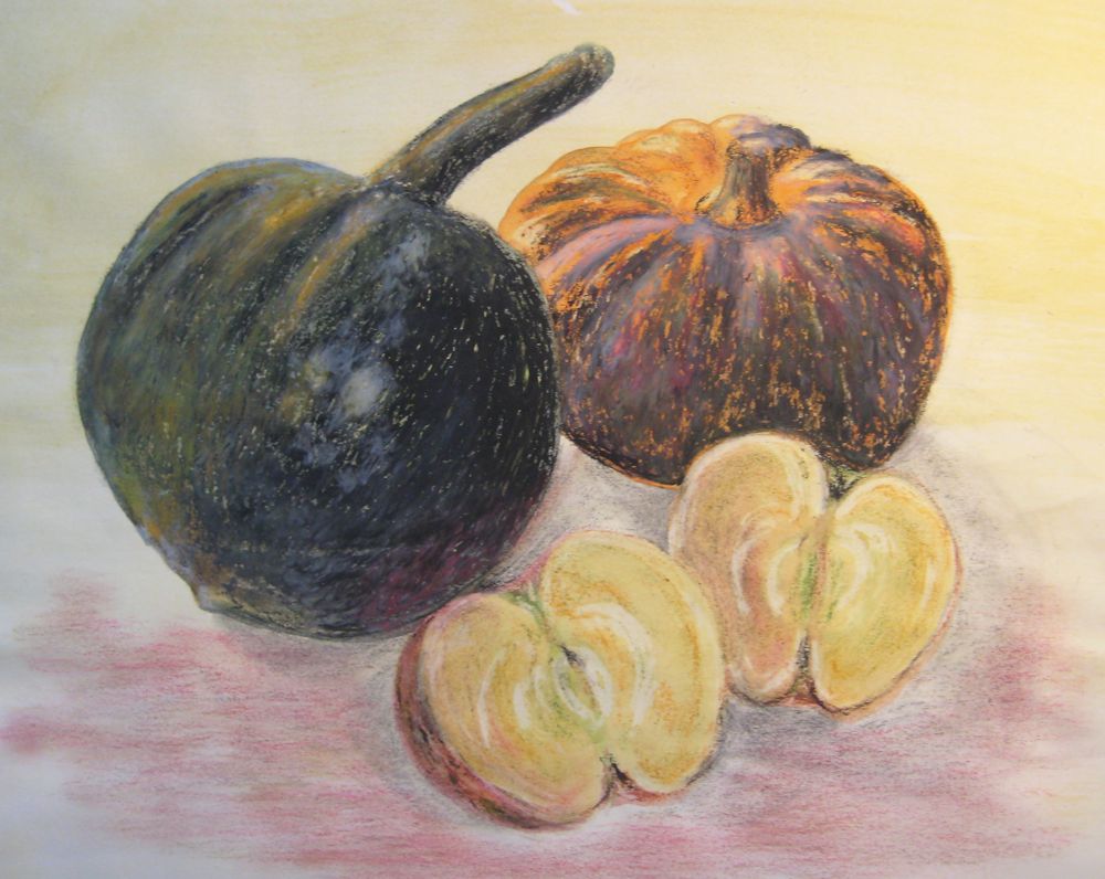
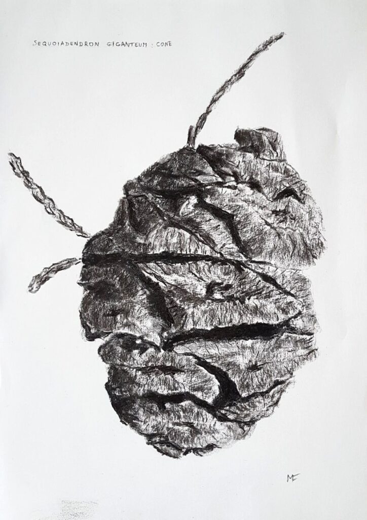
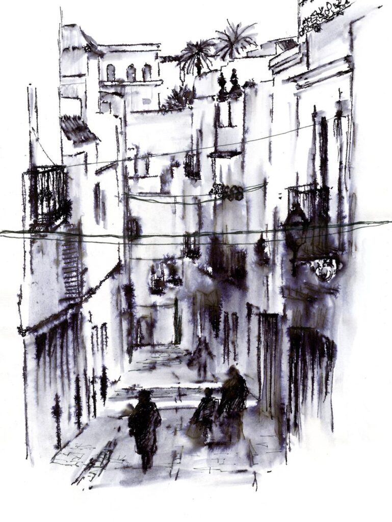
Pastel
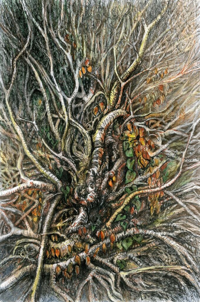
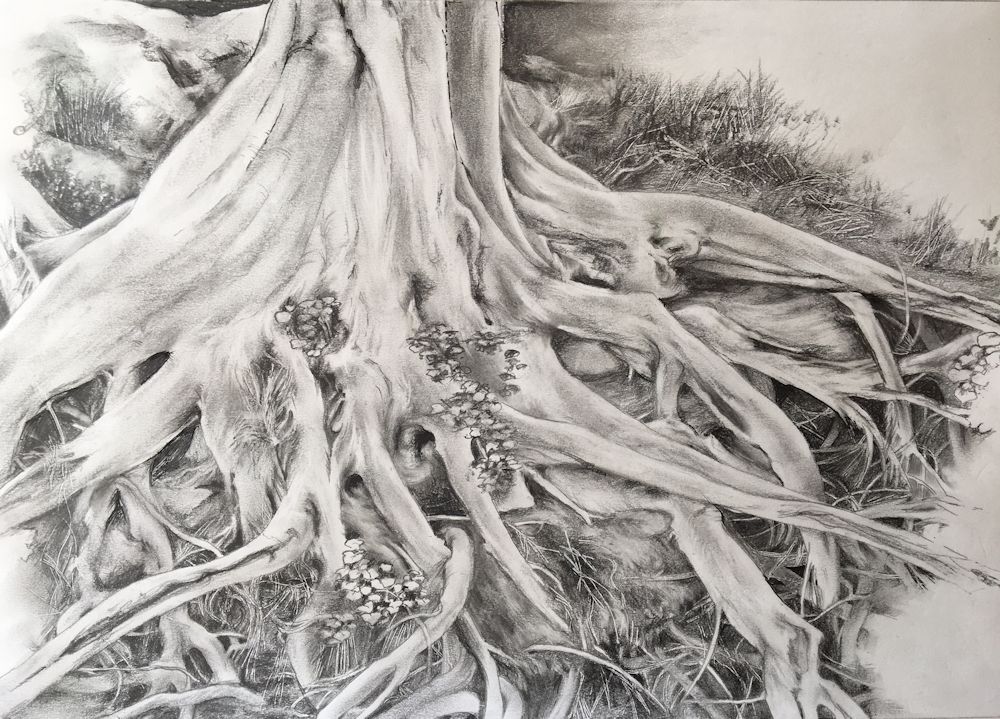
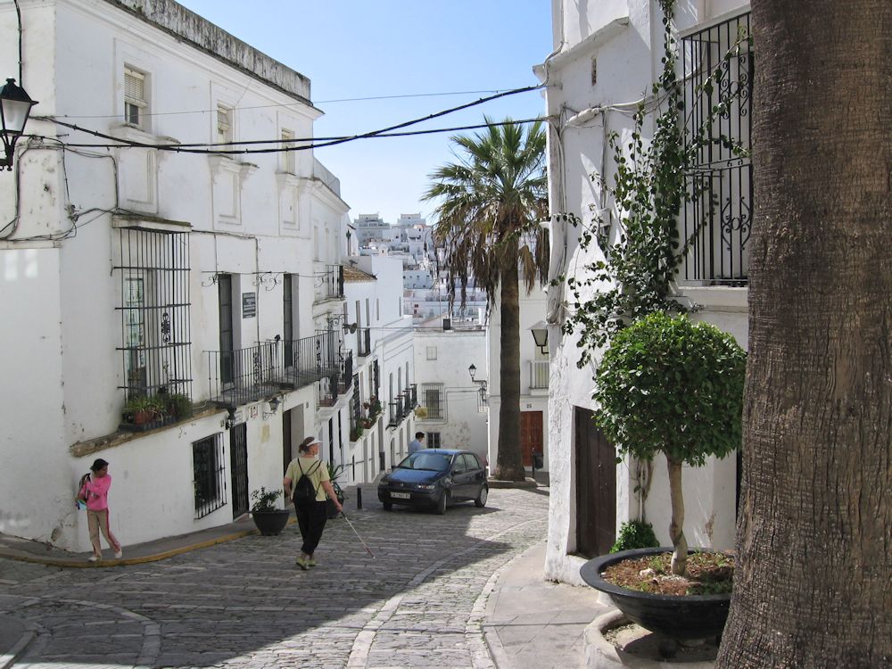
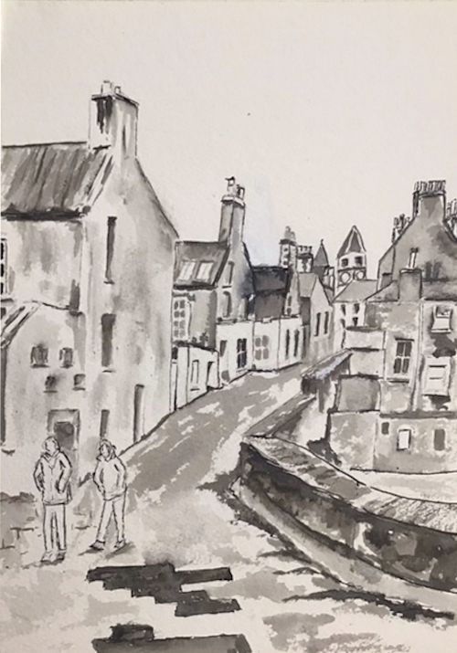
This week’s challenge is to paint or draw trees in a woodland setting. The woodland floor may be a significant part of the painting as in the pastel painting of Judy Woods above. This is a mainly beech wood on a slope, with many ancient trees with haunting shapes and and exposed roots. It seems to breathe mystery.
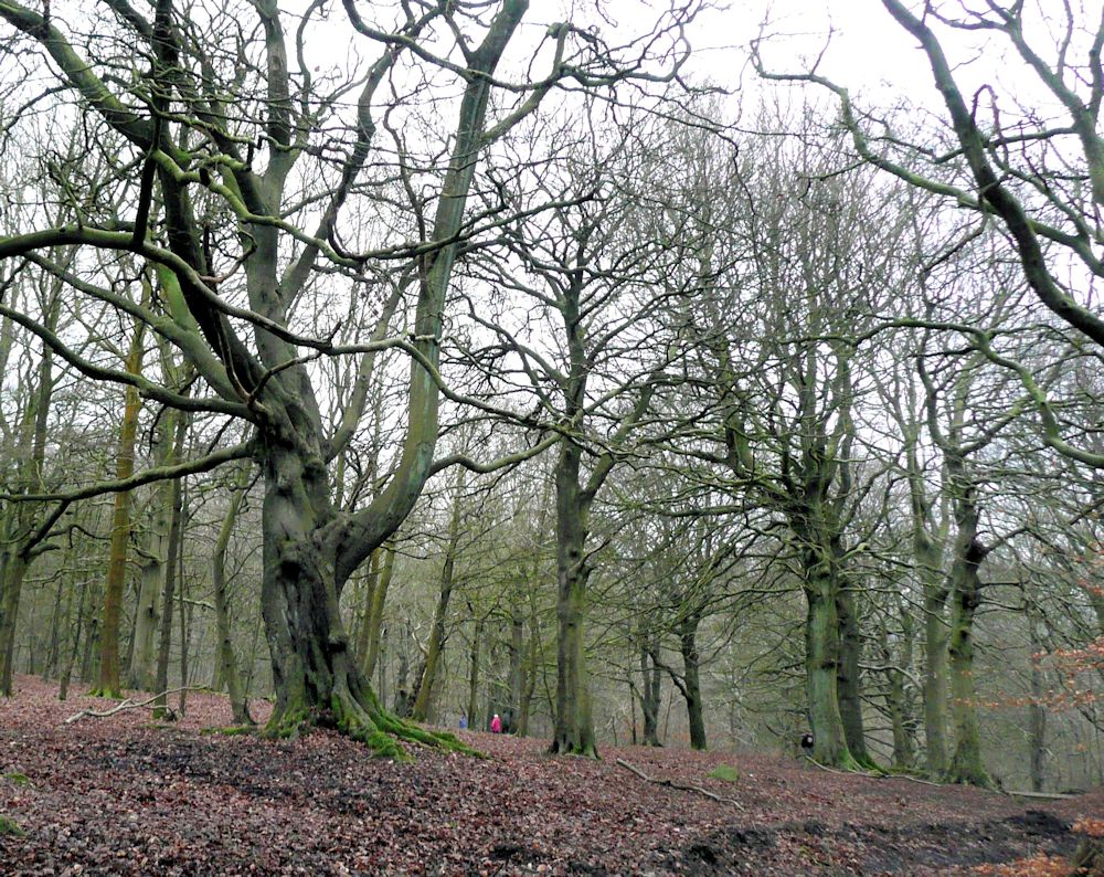
Photo by Jo
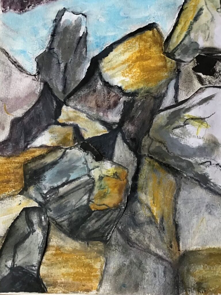
Another mysterious wood with an entirely different character is Wistman’s Wood on Dartmoor. Here stunted oaks encrusted with moss and ferns emerge from boulders of granite.
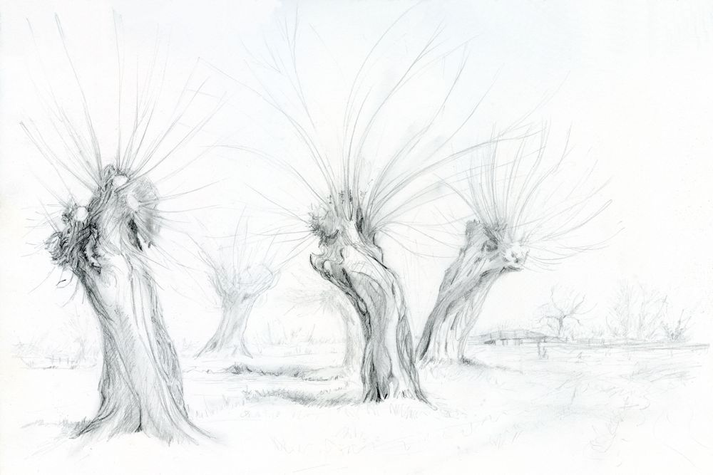
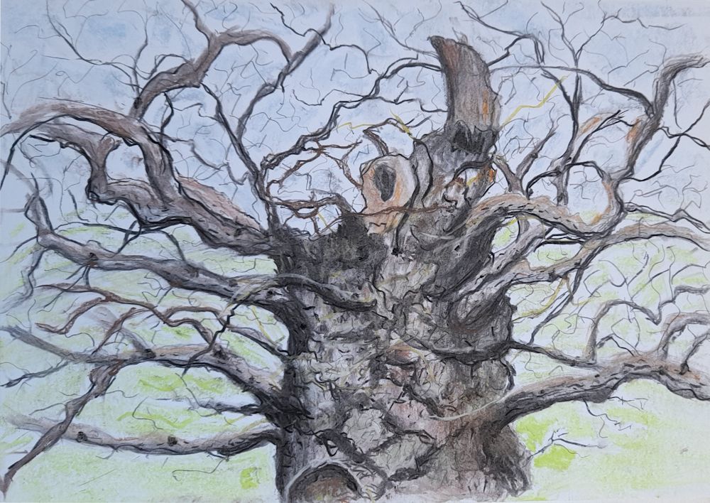
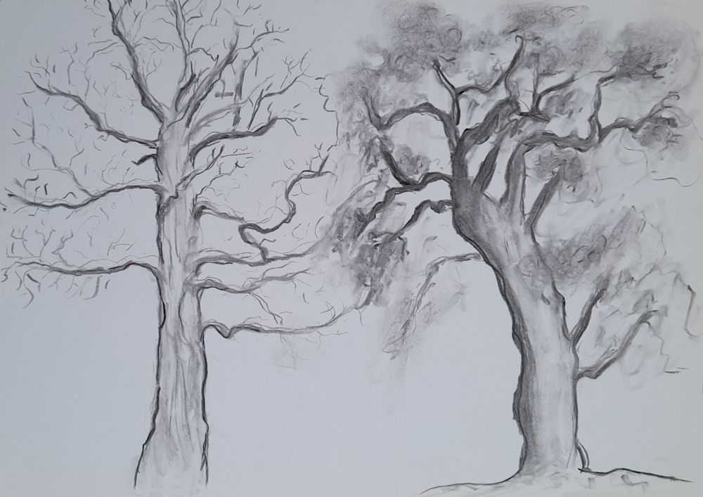
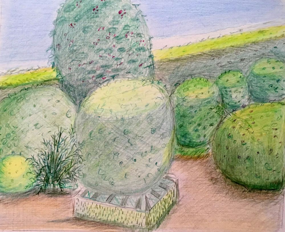
Over the last three weeks we have been exploring the shape and structures associated with a variety of trees. In a woodland there will be other considerations as the background may be full of the myriad twigs and small branches of more distant trees. There may be an under-layer of shrubby plants and the floor of the wood is often far from featureless, so part of this week’s challenge will be finding a way to describe the backdrop for the main trees in the composition.

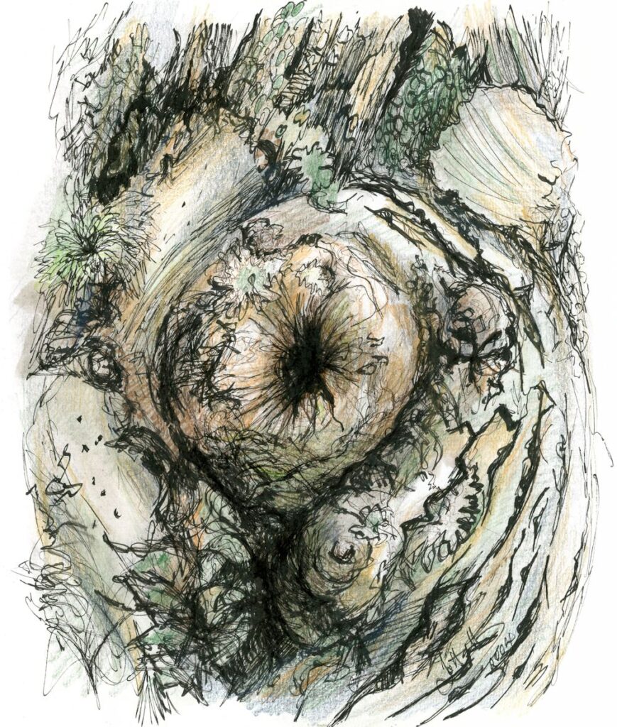
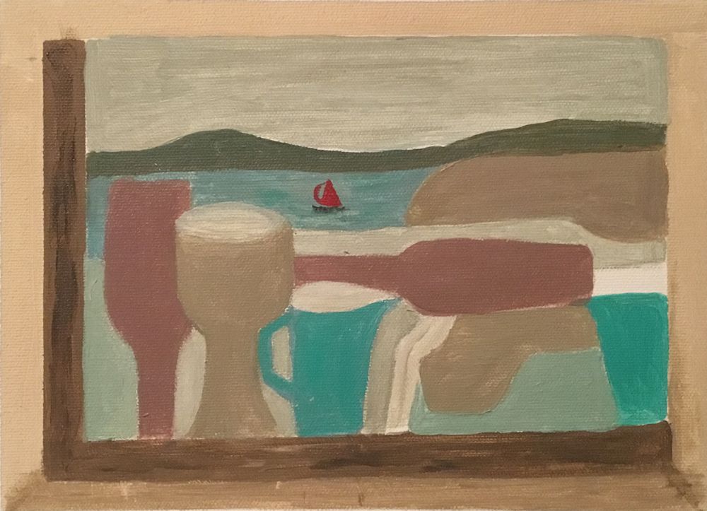
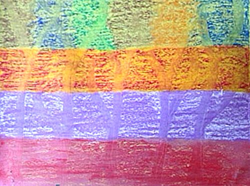
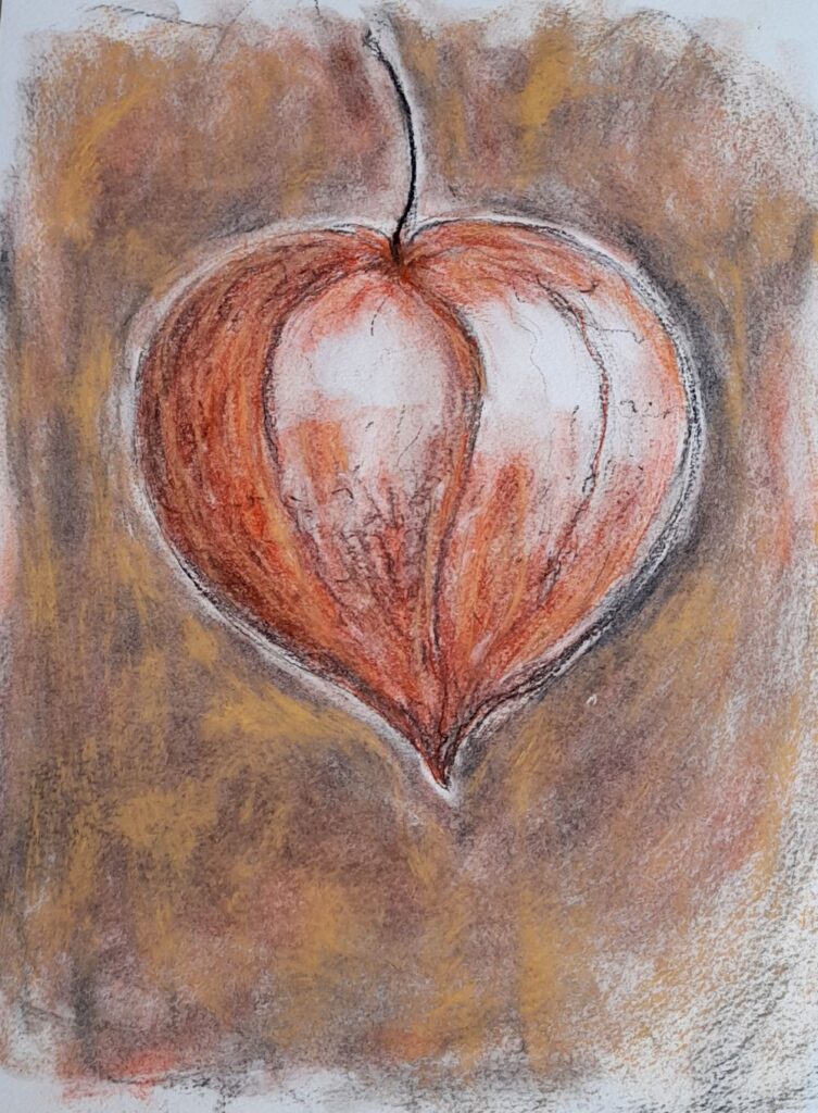
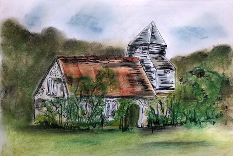
Pastel on reddish brown paper
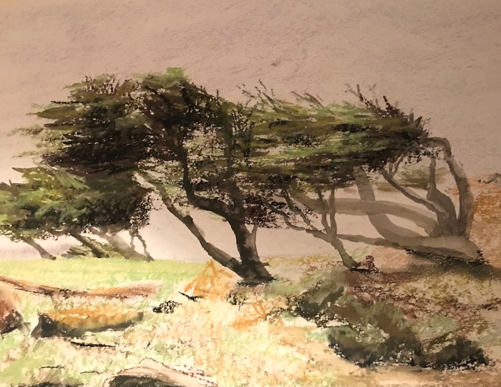
This painting spotlights a single tree with a backdrop of the other trees near the Suffolk coast North of Southwold. The most distant trees are almost a texture of overlapping strokes of pastel pencil. This is a small scale work about A4 size.
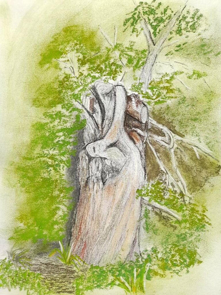
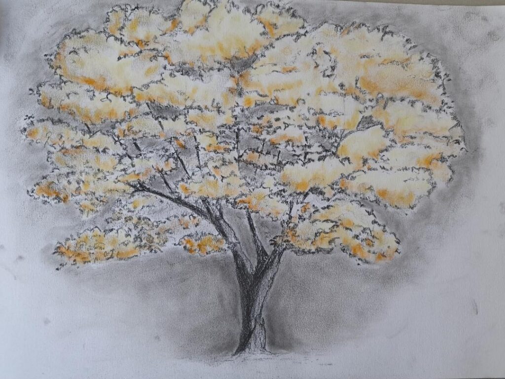
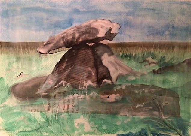
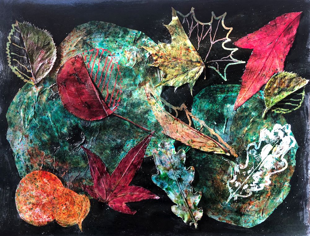
Your work may have a single tree or a group of trees as it’s main focus or as in the two examples below be a tapestry of the tree shapes and colours.

In the valley of the Nuns outside Funchal, Madeira a tapestry of blackened Pines and fire bleached Eucalyptus was seen against red rocks about a year after the event. Below a green layer of he undergrowth was already returning.
Charcoal and pastel on terracotta coloured paper 50 x 70cm

Another tapestry of trees, this time Pines and Birches
Pastel on brown/grey paper
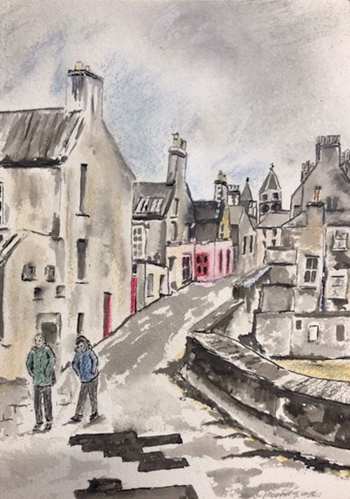
Perhaps start by coming to grips with the shapes of your chosen woodland, by doing some small preliminary sketches. Think about the composition possibilities at the same time, then plan out your final composition. Think about which medium would suit your purpose and how you are going to use the medium. Also look at the tonal range; is it generally light and airy or dark and mysterious. Then think about the colour. Ask questions; which colours predominate and are there any small areas of colour that add to the composition by their purity, or by their contrast in tone and hue to their surroundings. In the photo of Judy Woods the little speck of a red anorak draws our attention and at the same time gives a sense of scale!
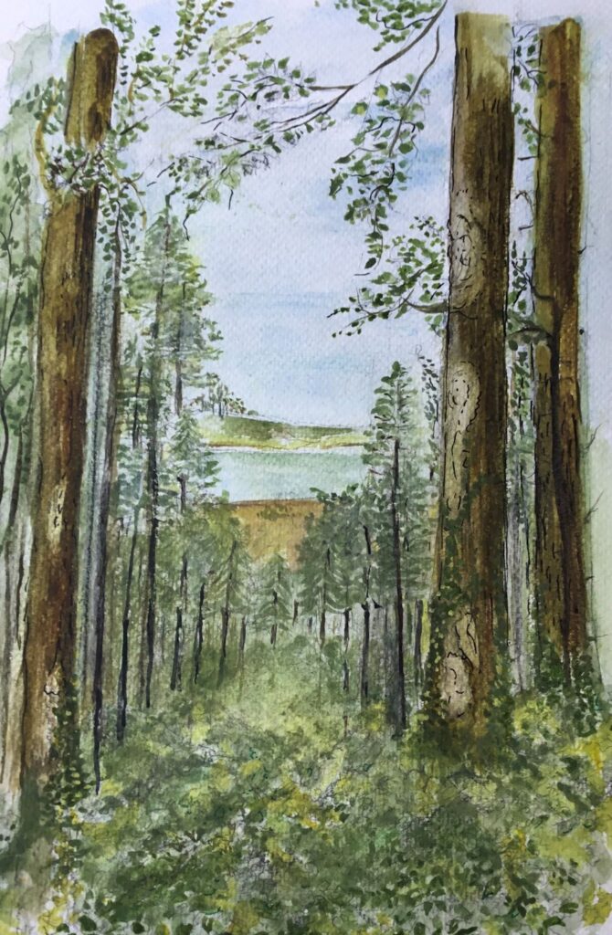
Your paintings;
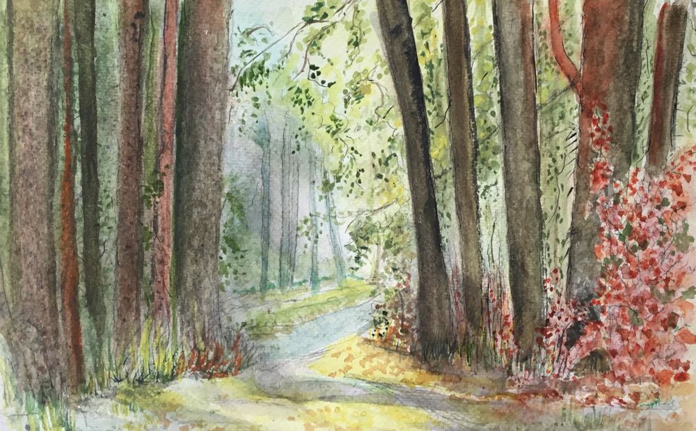
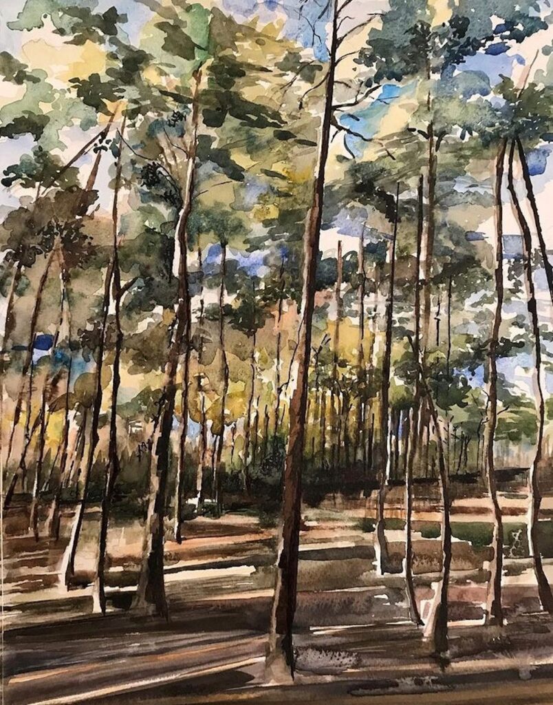
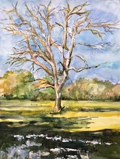
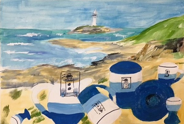
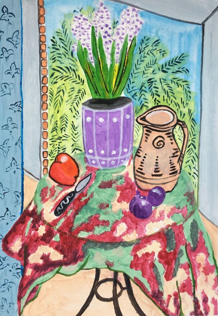
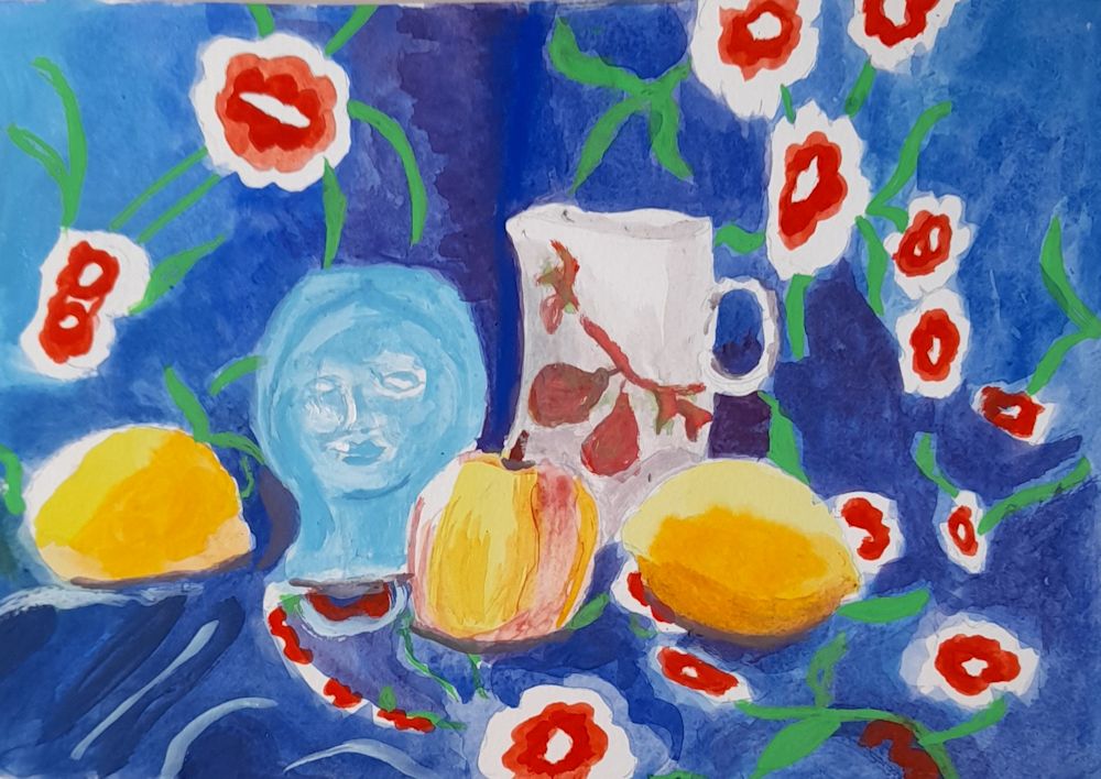
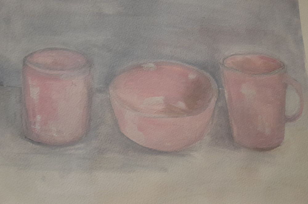
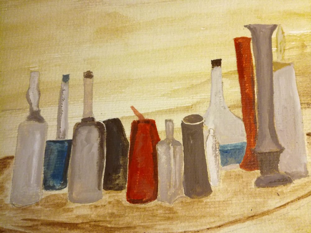
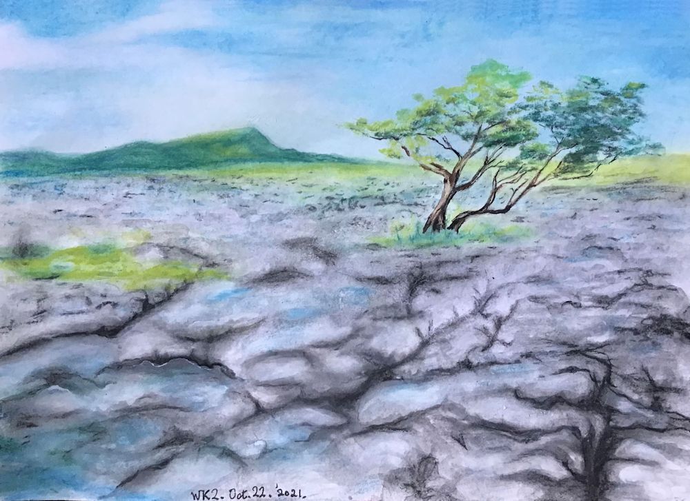
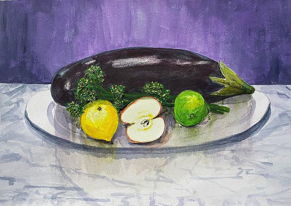
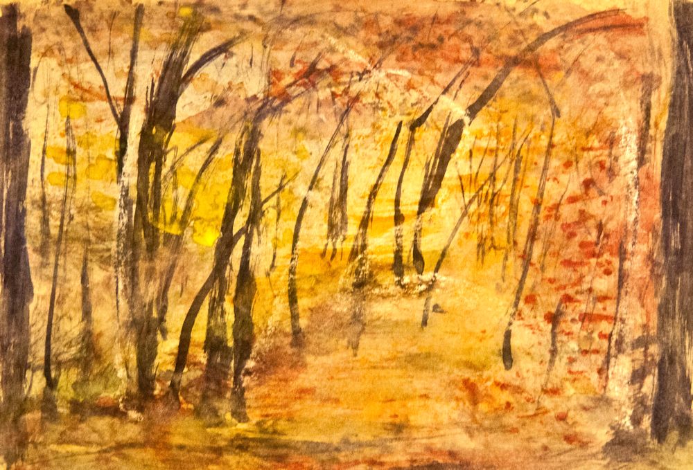
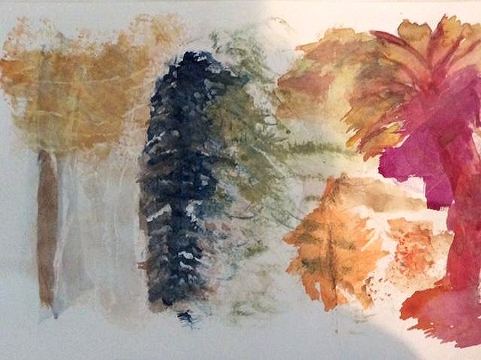
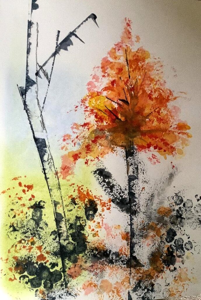
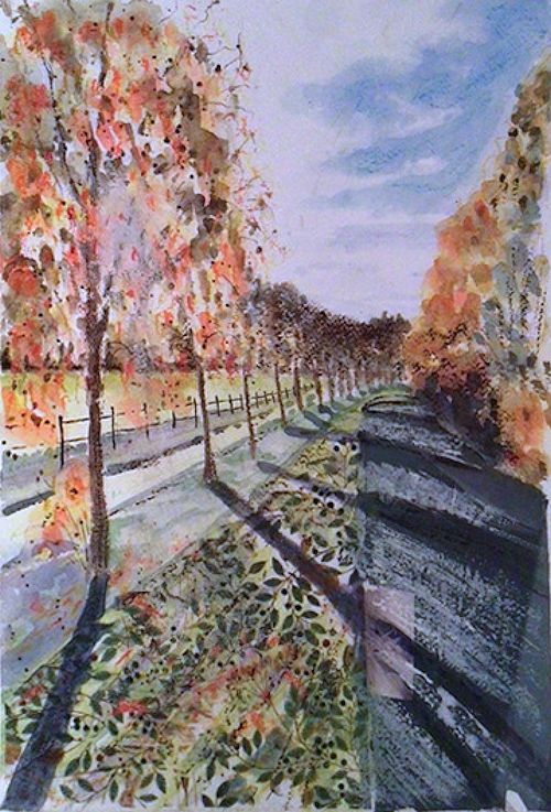
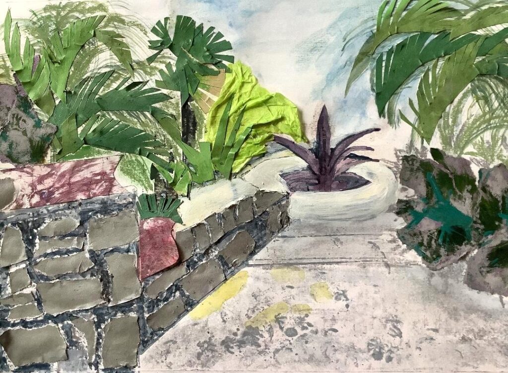
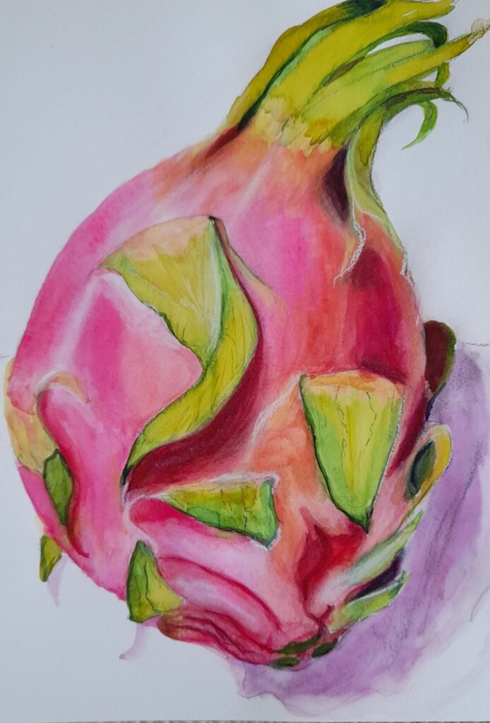
Watercolour by Ann
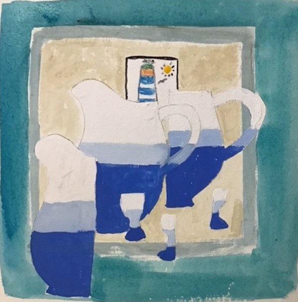
Watercolour by Ann

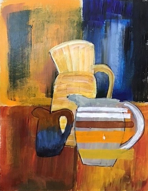
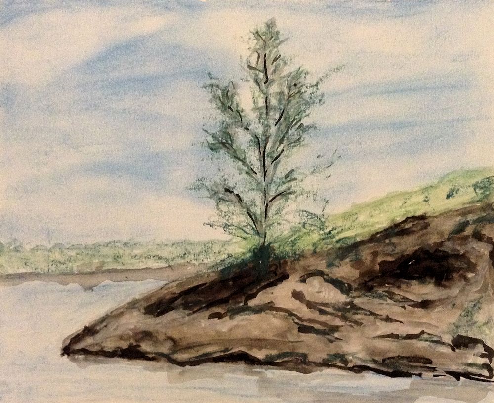
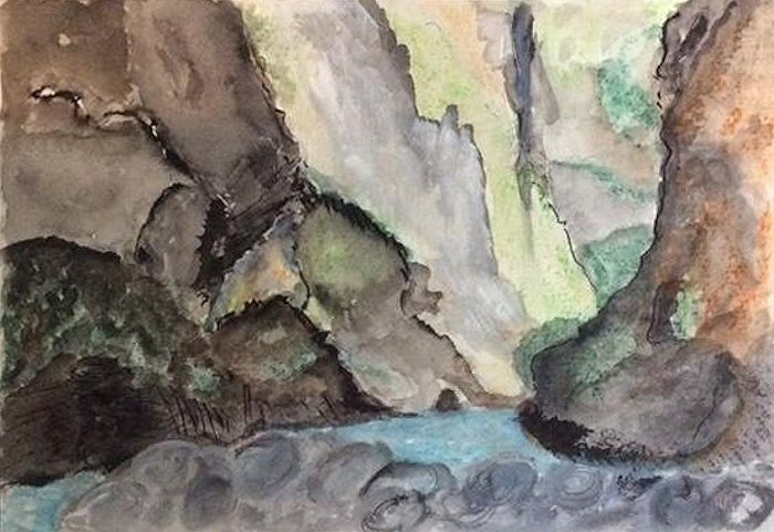
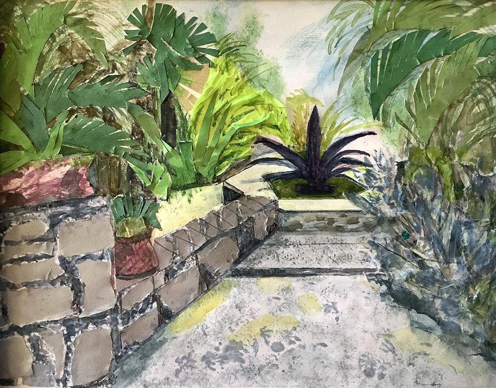
Watercolour by Anne H
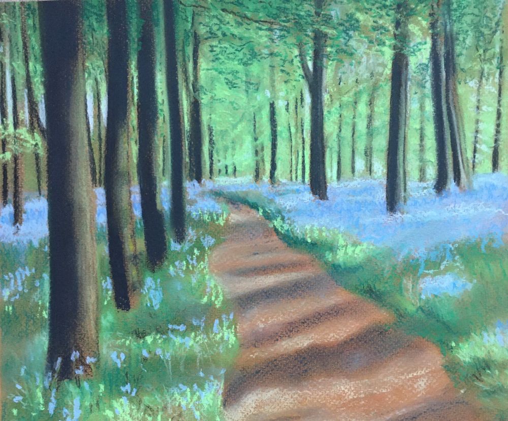
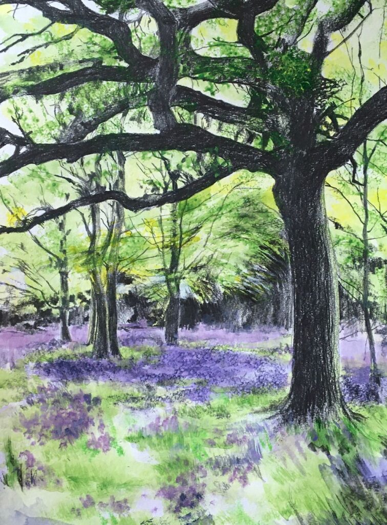
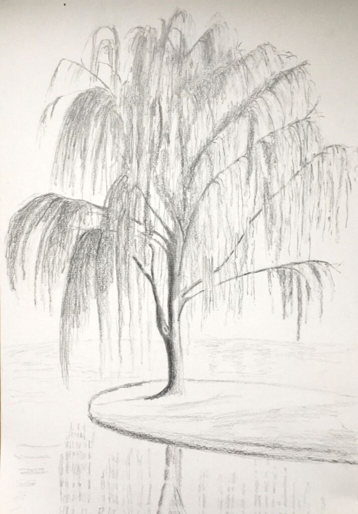
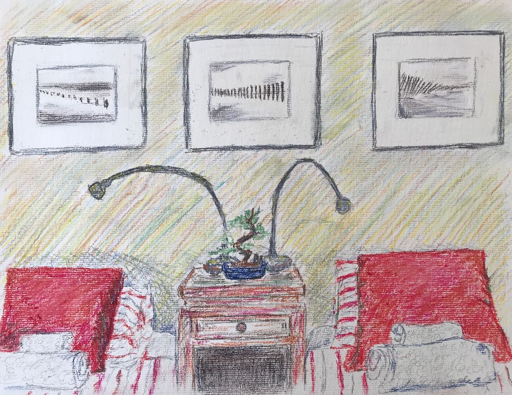
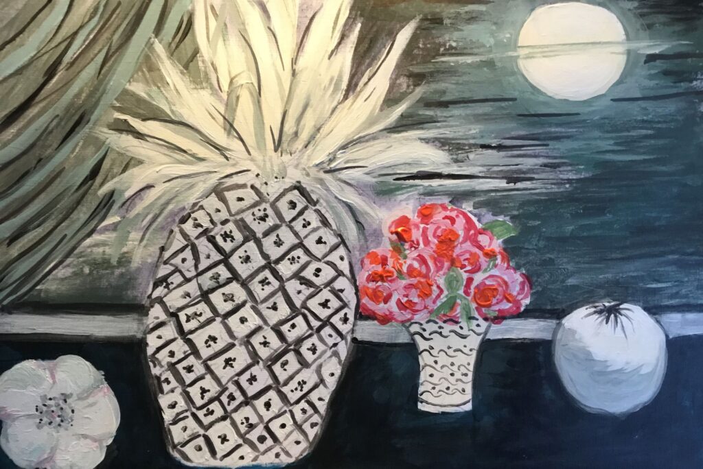
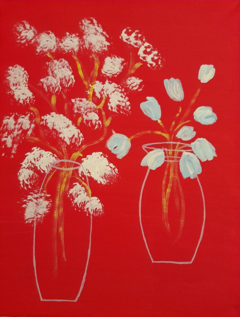
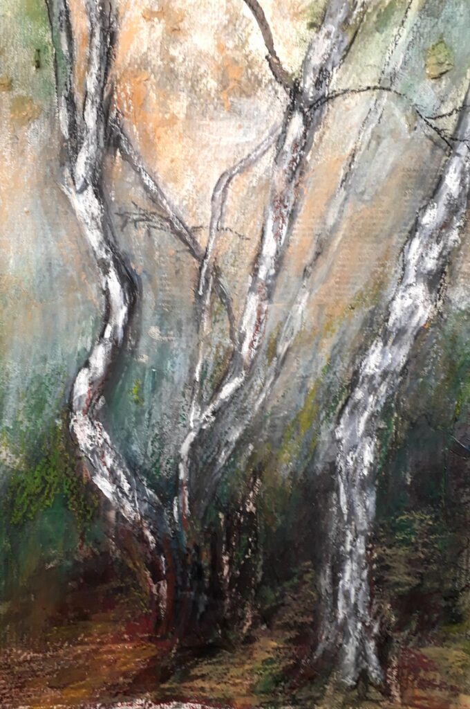
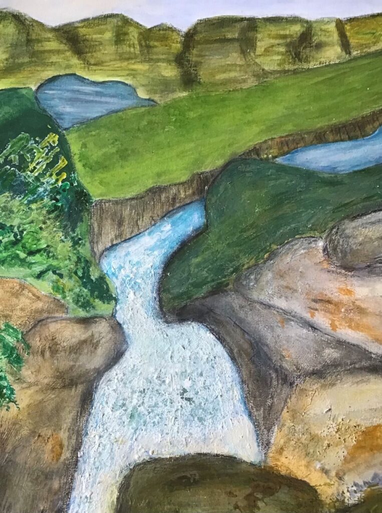
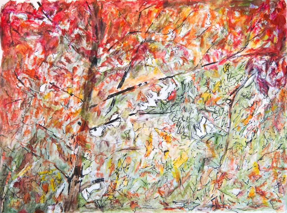
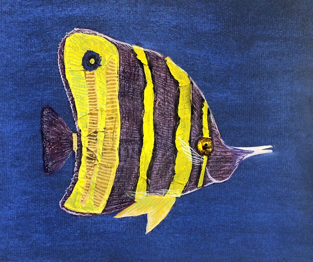
Pastel by Heather

(detail)
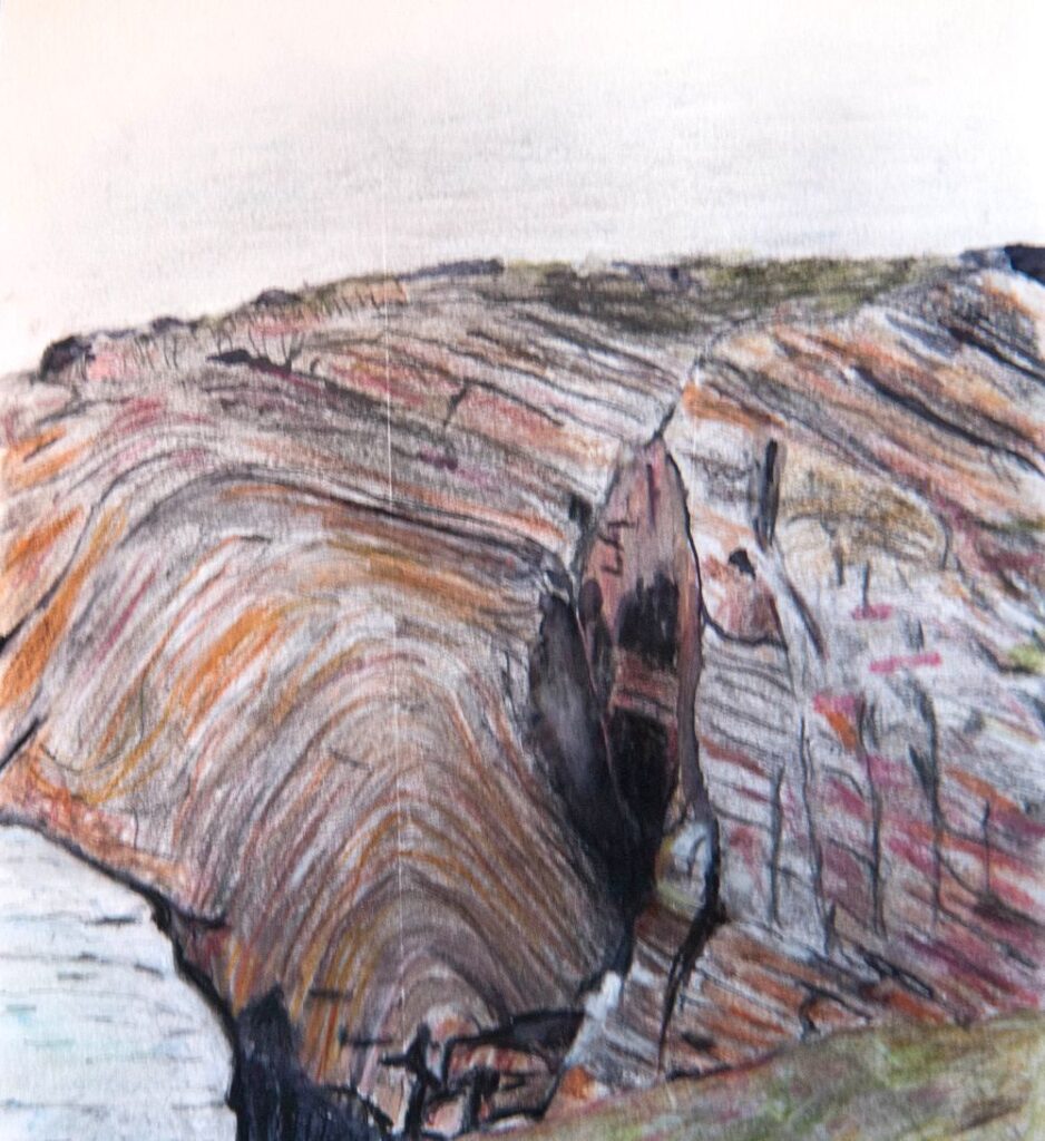
Watercolour by Maricarmen
by Kate

by Anne C
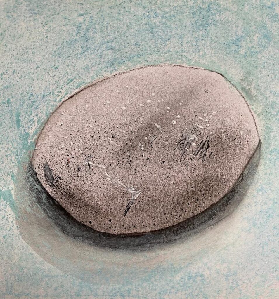
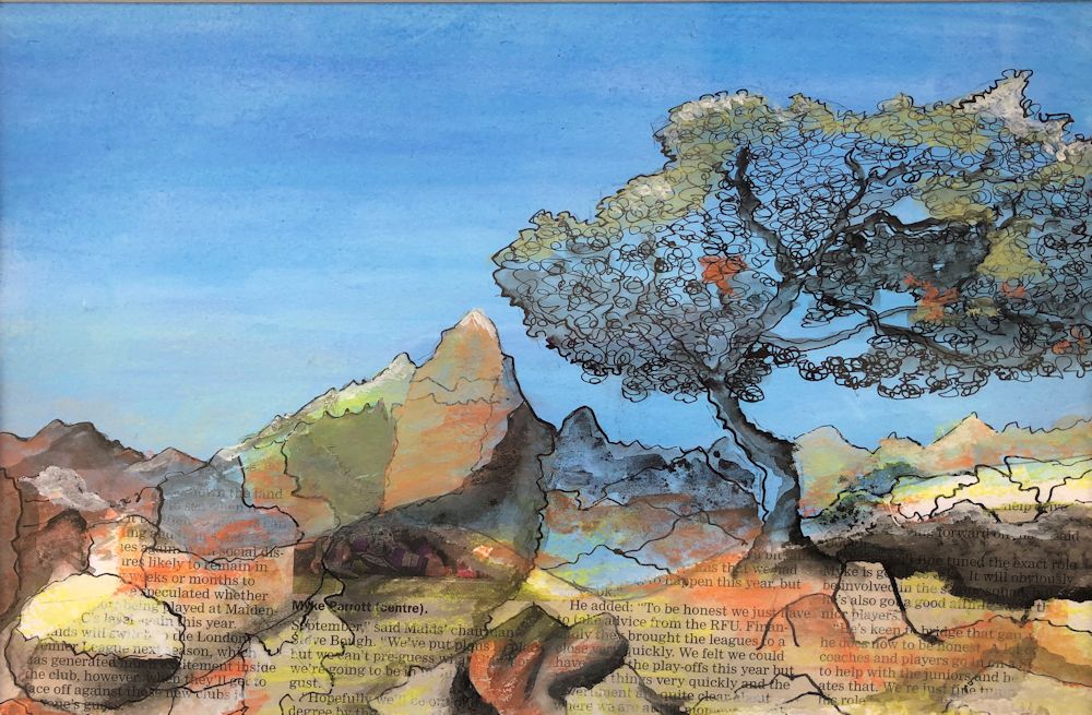
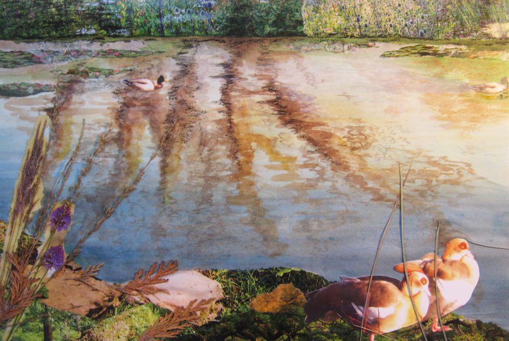
Watercolour and Pastel by Mali

Watercolour and pastel by Mali

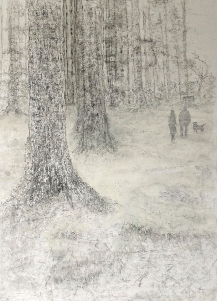
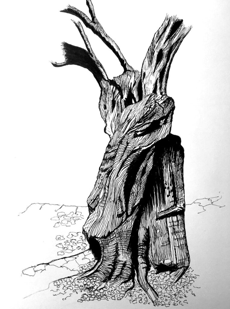
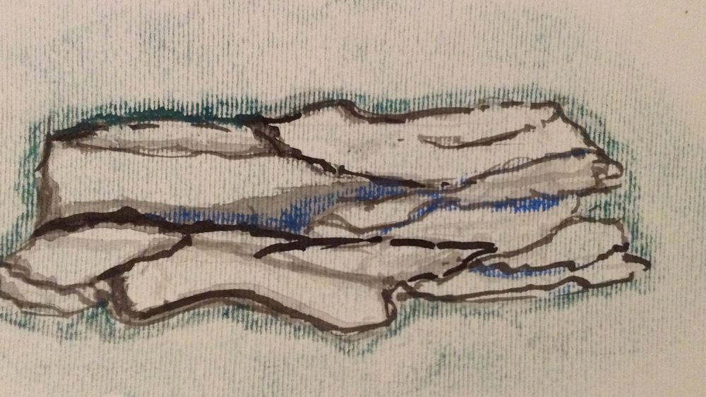
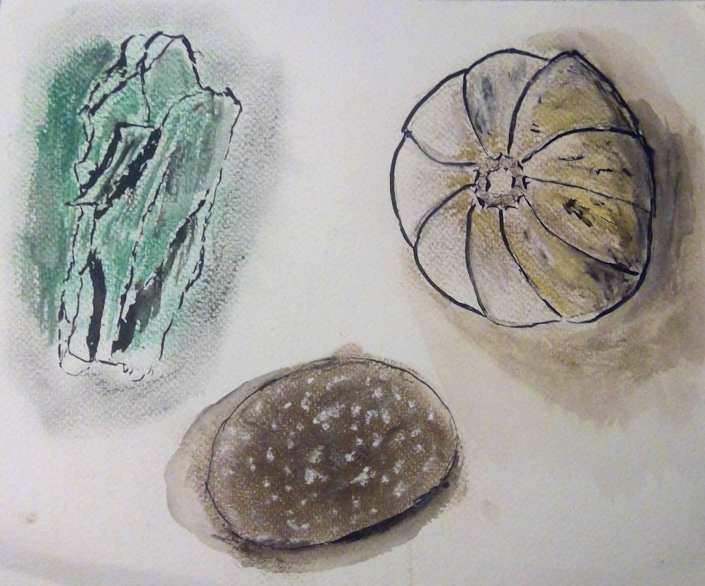
Ink drawing by Sarah
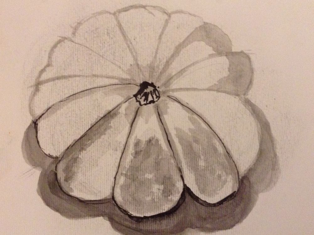
Watercolour by Sarah

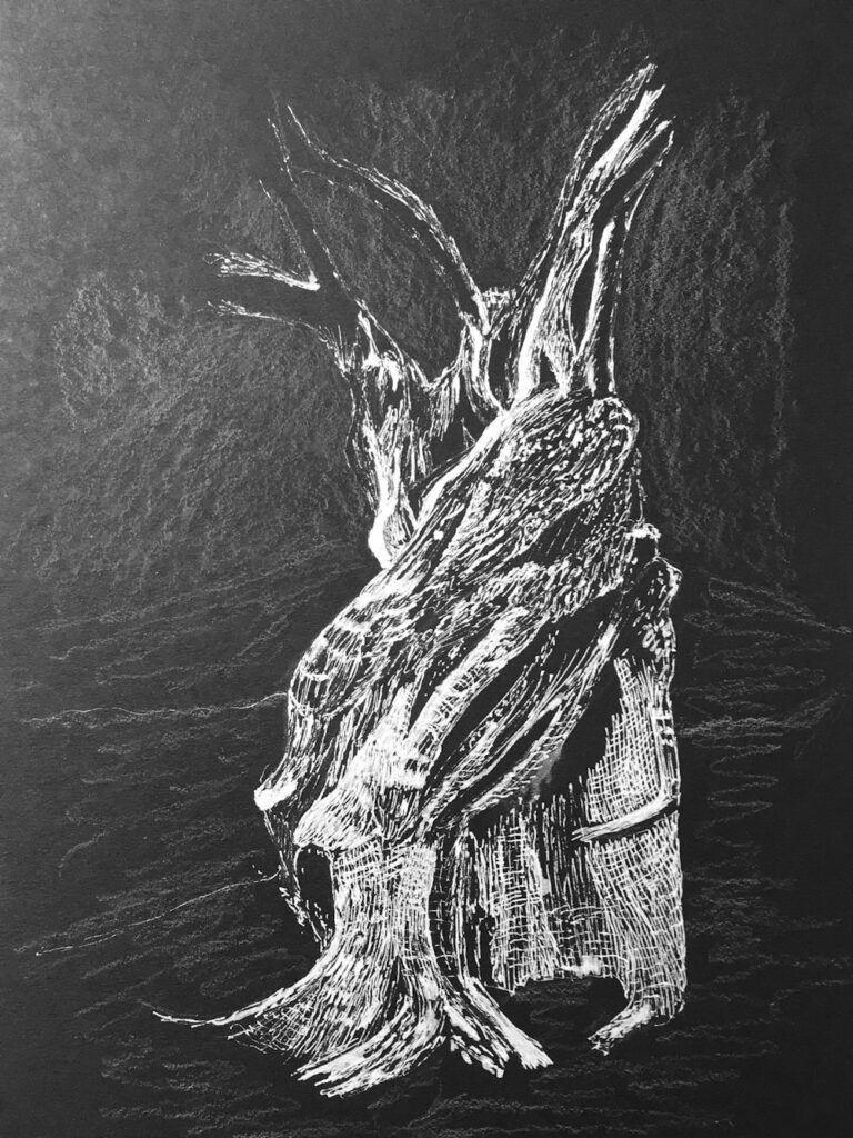
Pastel by Liz
(unfinished)
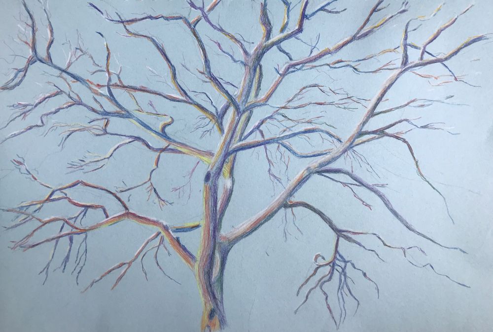
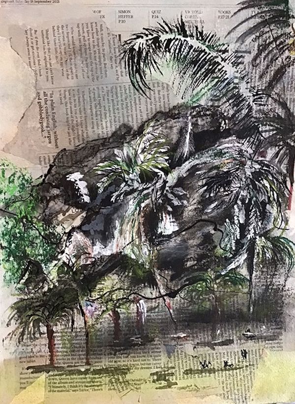
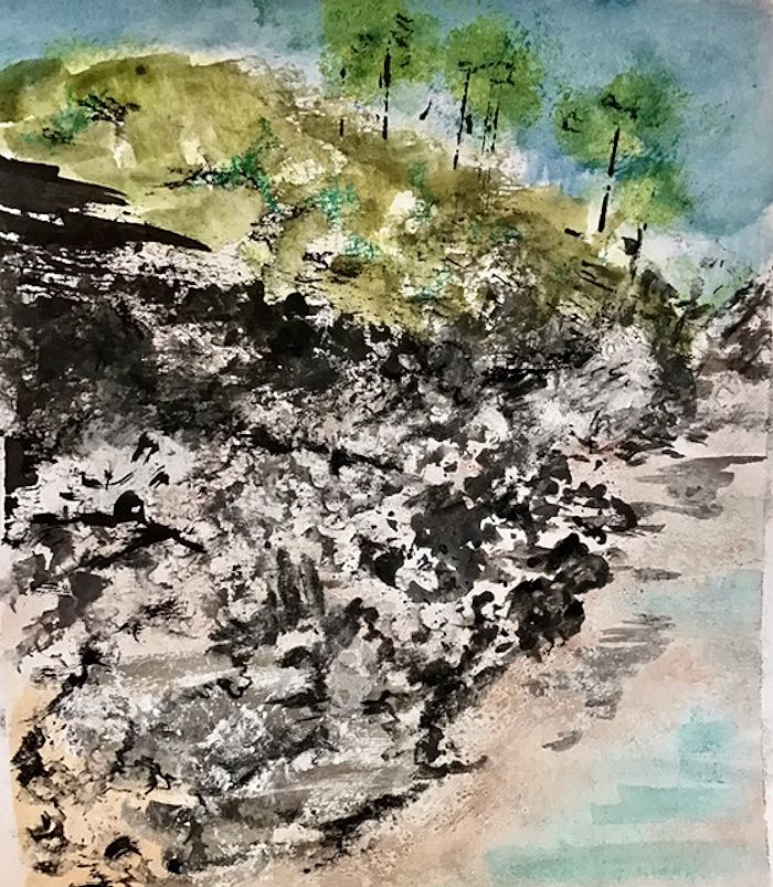
Mixed media by Maryon
by Virginia
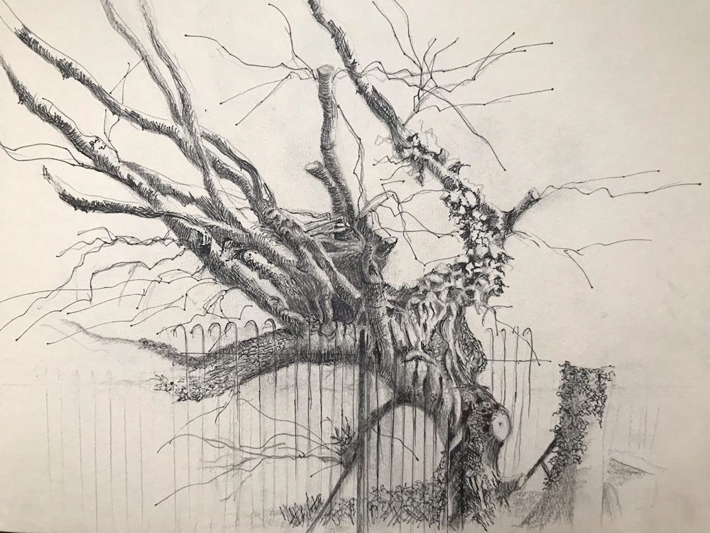
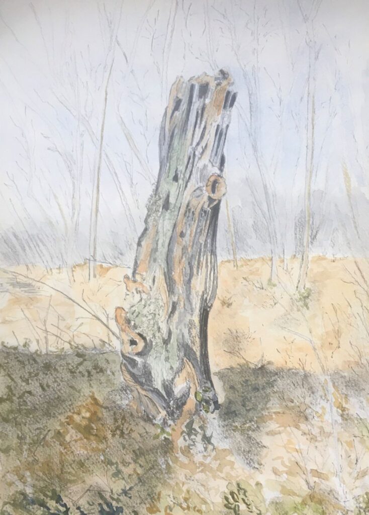
Drawing Trees Week 3: The Struggle for Life
March 9, 2022
becoming twisted and split as in the photo below.
Note the sense of movement in these forms.
Sketched by Jo near Flatford Mill on the Stour
Storms, Lopping and other Struggles for Survival
Very few trees reach their perfect natural form. They are either hemmed in by others, damaged by storms and animals and of course, lopped, pruned, and coppiced by people.
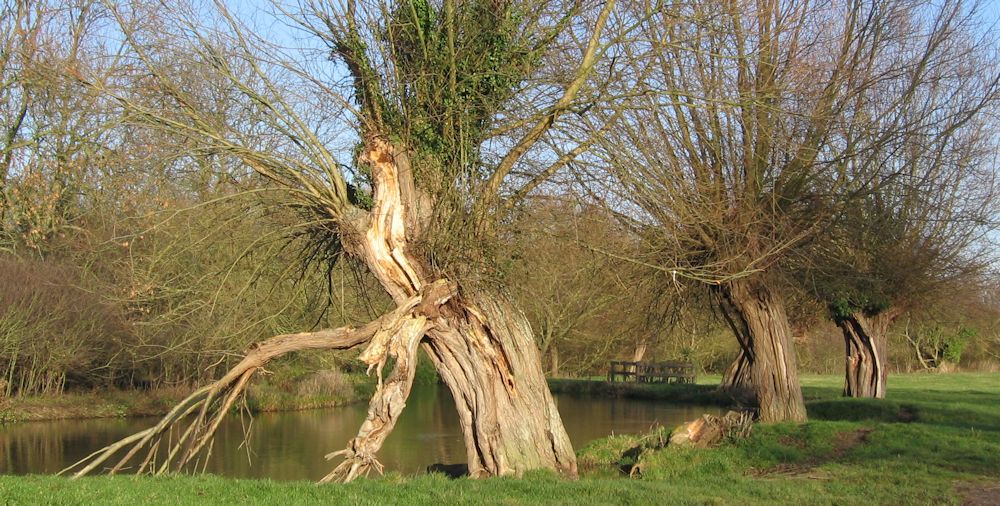
Part of the same walk as the sketch above
Photo by Jo
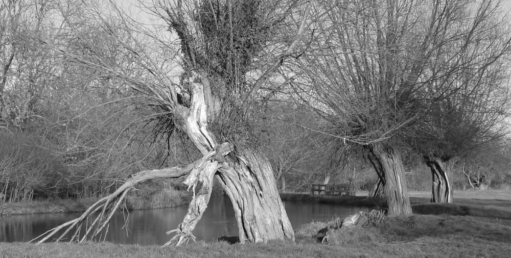
Whether you are drawing or painting in colour, remember that the tones are vitally important to the composition. Note the palest and darkest parts of this image.
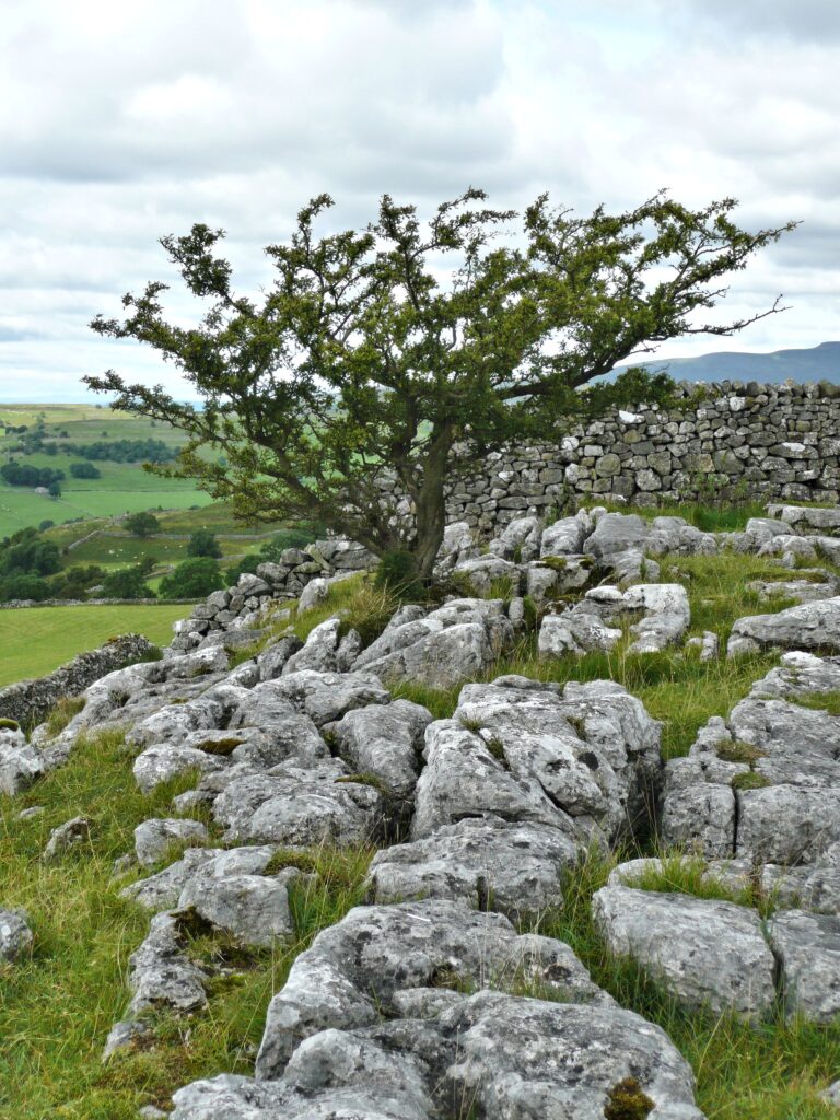
Photo by Jo
Ink and Watercolour
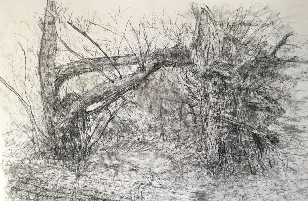
This is a tangle of overgrown ivy roots rather than the aftermath of a storm uprooting a tree. The challenge of depicting overlapping is much the same though.
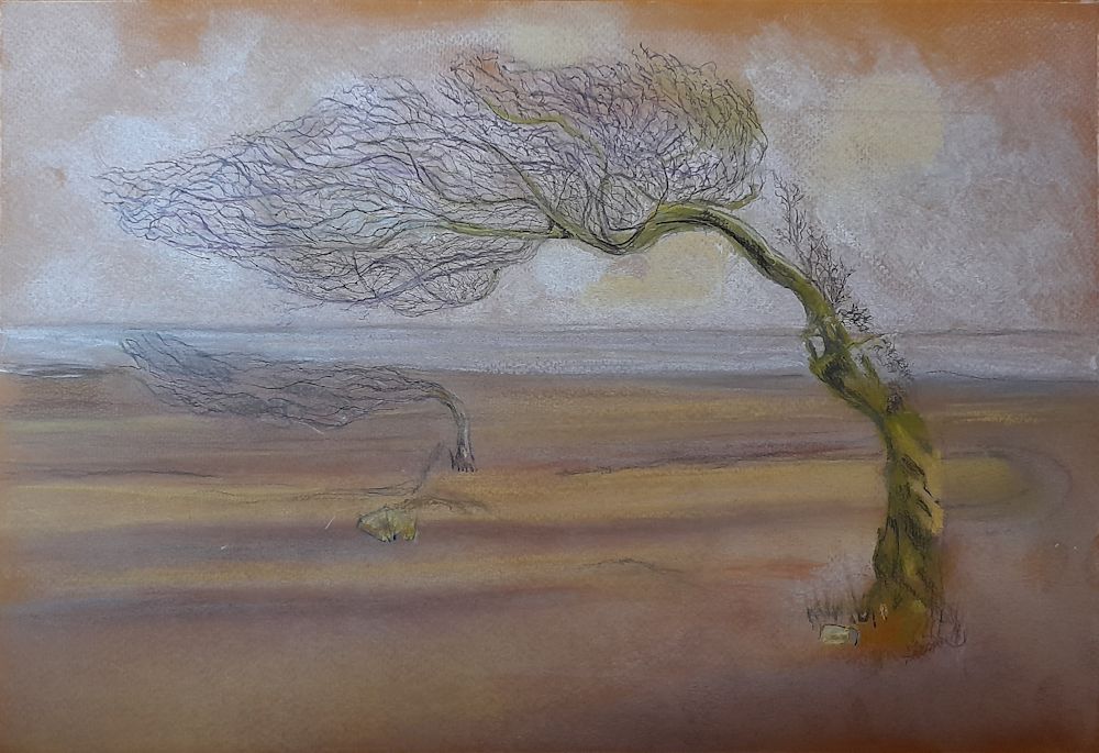
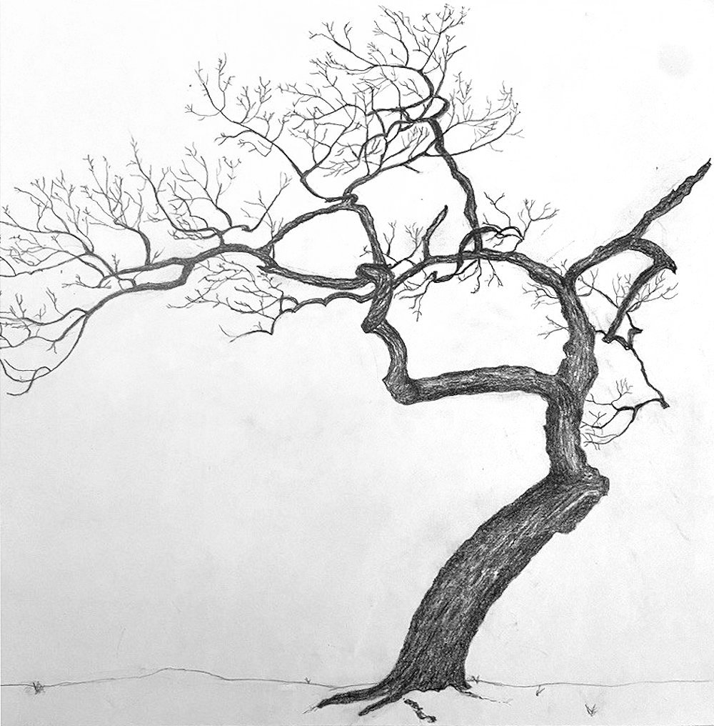
Project : Draw a tree that has been caused to struggle for survival by; a challenging environment, lopping, a harsh prevailing wind, lightning damage, being uprooted etc.
Trees stuck by lightning can literally be torn apart but wind damage can be just as severe and result in the tree being uprooted and the tangle of roots made visible. Like branches these root tangles overlap and thread through each other even more so than branches above ground.If a tree near you has come down do get out with your sketchbook and a camera. Make sketches and/or photograph from several viewpoints before homing in on a composition for your final drawing.
The drawing may be a whole or part of a tree but should tell something of its history; probably a whole tree where it has grown with a distinct list to one side because of a prevailing high wind, but in the case of a fallen tree, perhaps just the exposed roots. Either way try to make an interesting composition.
Other suitable subjects would be stunted trees growing out of stoney ground, or choked by Ivy.
Your drawings:
by Virginia
by Kate
by Mali
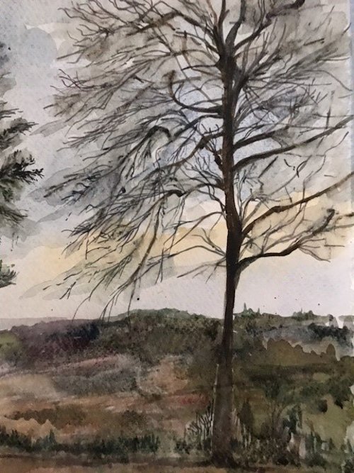
Pencil by Sarah
Pencil and Watercolour by Heather
Pencil by Ann
by Maricarmen
Seen by a dry river bed, Umfolsoi Game Reserve, South Africa
by Maryon
Soft charcoal, graphite sticks and embossing tool
pencil by Anne C
by Liz
by Anne H
by Anne H
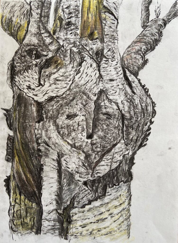
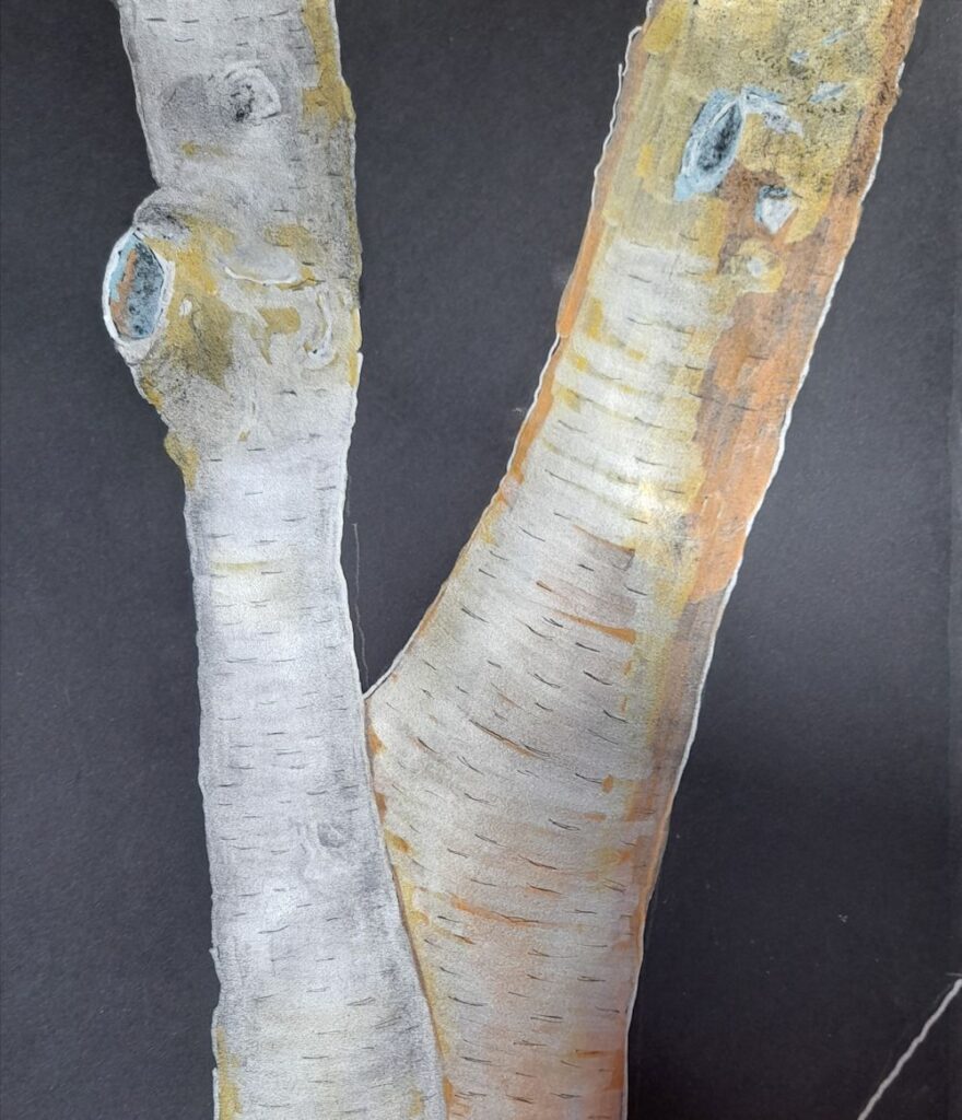
Drawing Trees Week 2: Scars, Bark and Branching
March 3, 2022

Ink, pastel and white gouache on green paper
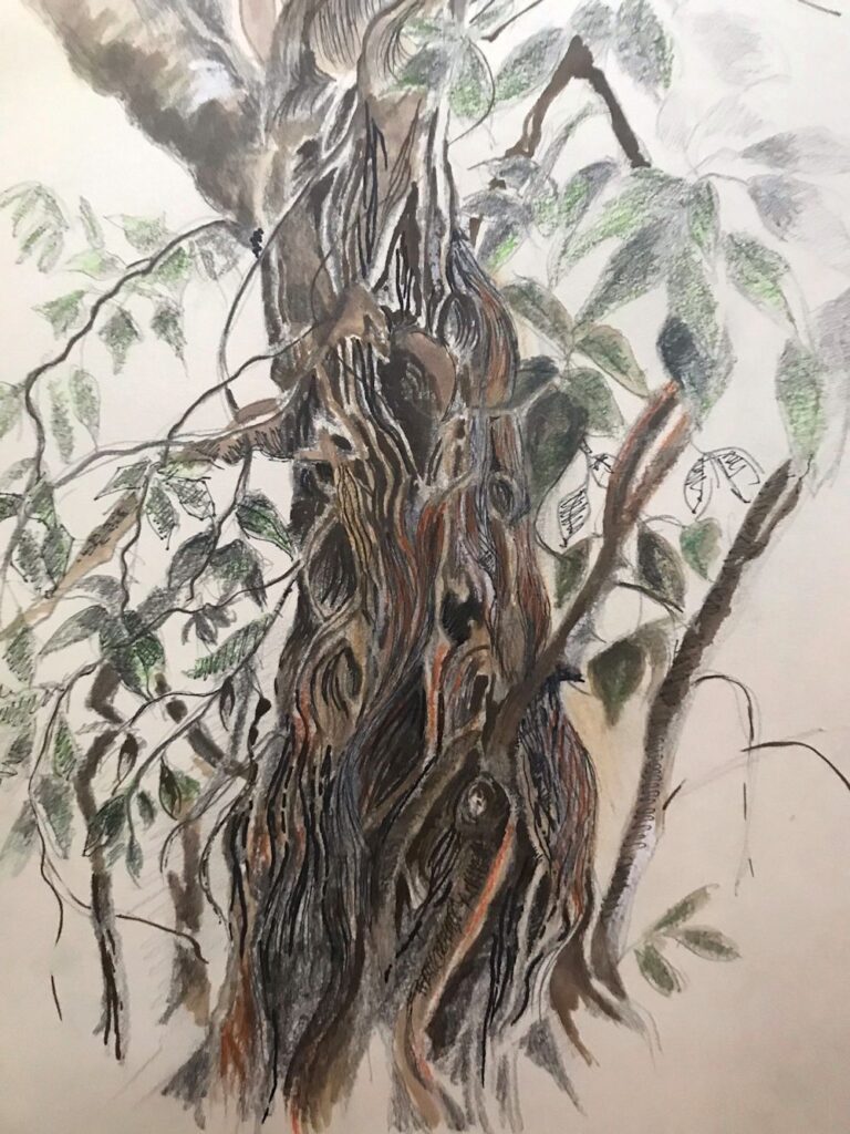
This week we’ll get close up and look at more of the textures and structural details of trees. So we’ll look at their natural marks, bark patterns and branches, and also at healed wounds.
If you are fortunate enough to have a garden with trees you may like to embark on a project discovering its marks and structures. Perhaps start with the trunk and it’s bark and any scars from lopping or pruning, and observe how the patterns of bark change where a branch develops.
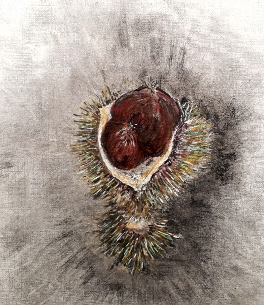
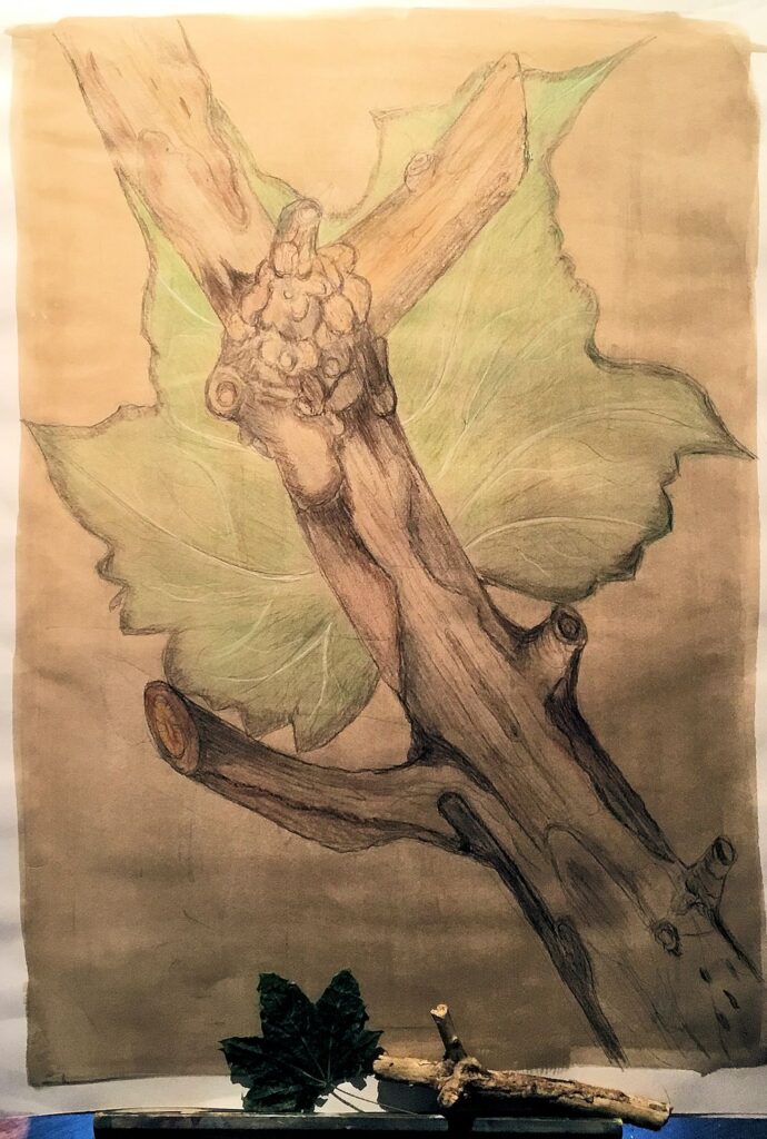
See how many small branches emanate from the stubs left behind when a branch is cut off. Sometimes this leads to huge thickenings as in the drawing of the Spanish Chestnut trunk above.
If you don’t have a garden try finding a tree nearby or work from photographic reference.
Ink and coloured pencil
Years before this became our apple tree, a major limb had been excised and the scar overgrown with lichen and moss.
A feast of texture!
Project : Make visual notes of at least two of the following in your sketchbook and then make a considered drawing of a part of the tree that sustains your interest. It’s not a comprehensive list so feel free to add your own ideas.
1.Branches: observe whether these follow any sort of pattern, or in the case of palm or banana trees how do the leaves emerge and what happens to the dead leaf bases?
Photo by Jo
2.Bark patterns and marks as they appear on the main trunk and branches; also some trees shed bark pieces, some of the pines do and pieces can be gathered and drawn indoors. More detailed studies of these can appear quite abstract.
Photo by Jo
3.At branch points sketch how the pattern of the bark changes where new growth emerges
4.Scars and new growth
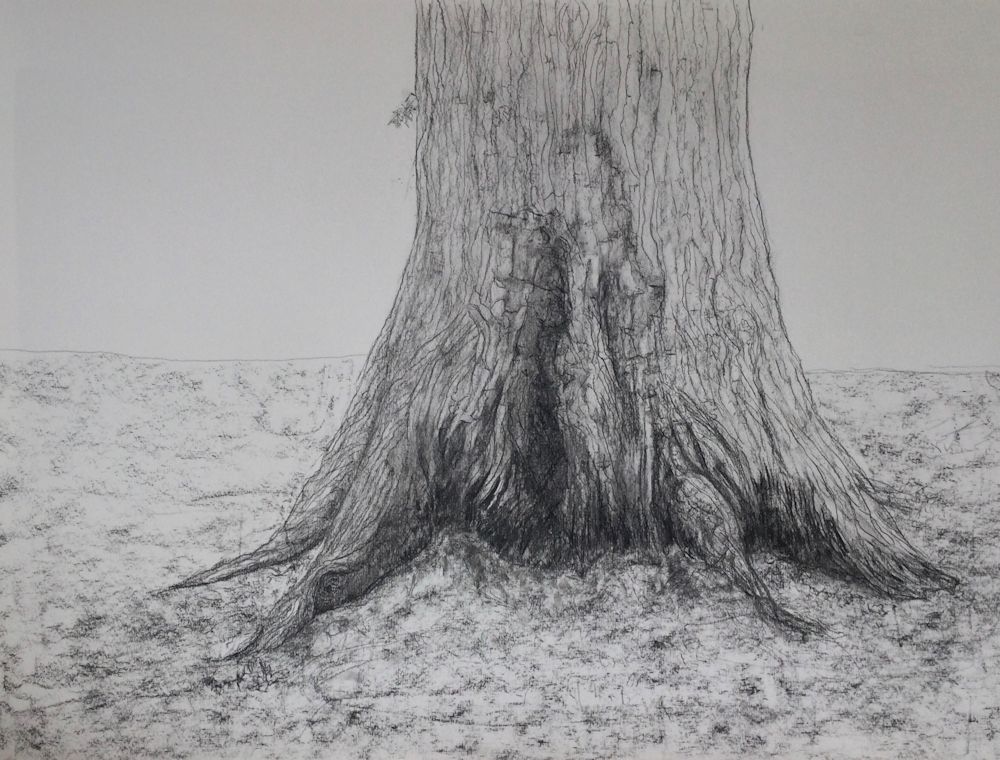
5.Exposed roots at the base of the trunk
6.Make notes of other life like lichens and moss that cover the bark in places introducing different textures or patterns.
You will have gained a huge amount of information about the tree in this drawing exercise and have found mark making equivalents for some of the patterns and textures observed on the way. Finally make a drawing of a tree, choosing not to draw the whole tree this time, but a part you find particularly interesting.
Your drawings:
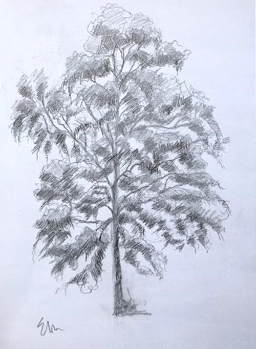
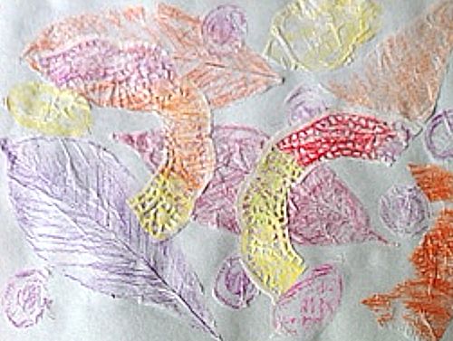
Mixed media drawing by Sarah
6B pencil, black ink and walnut ink, pastel pencil

Pencil by Sarah
Pencil by Ann
Pencil by Ann
by Maricarmen
How surreal: I feel the oak is watching us!
Graphite on A3 paper by Maryon

Pencil by Anne C
Heather has drawn from the same reference in three different media!
See below;
Pencil by Heather
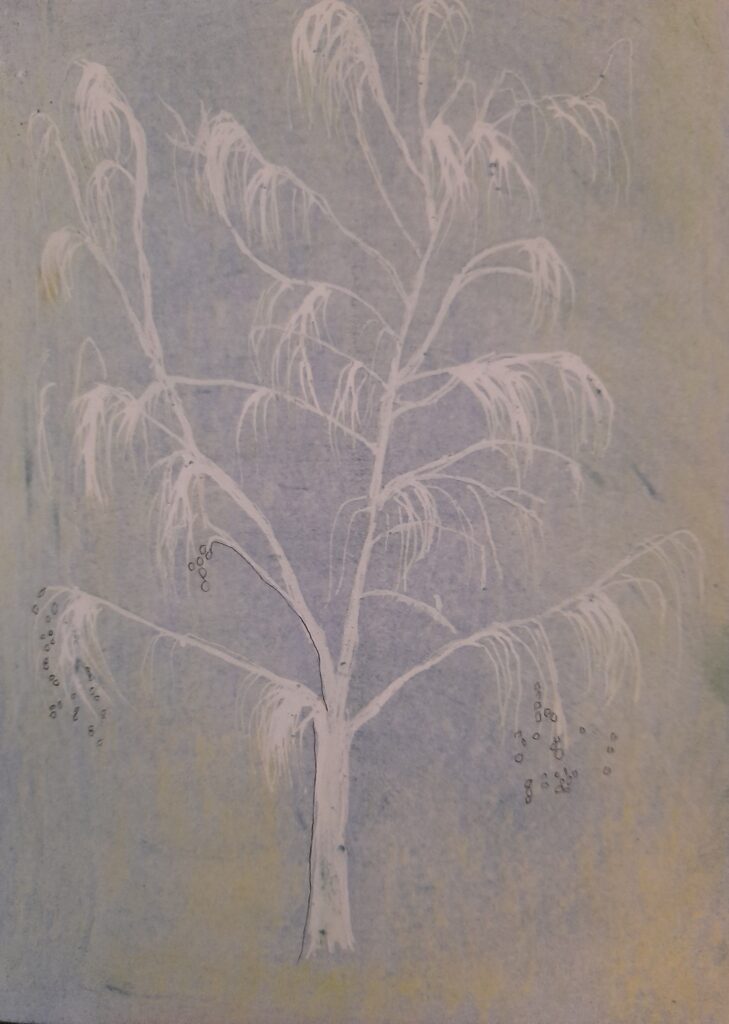
Black ink on white paper by heather
White ink on black paper by Heather
by Mali
by Mali
by Mali
by Anne H
by Kate
by Virginia
by Liz
Drawing Trees Week 1: The Whole Tree
February 23, 2022
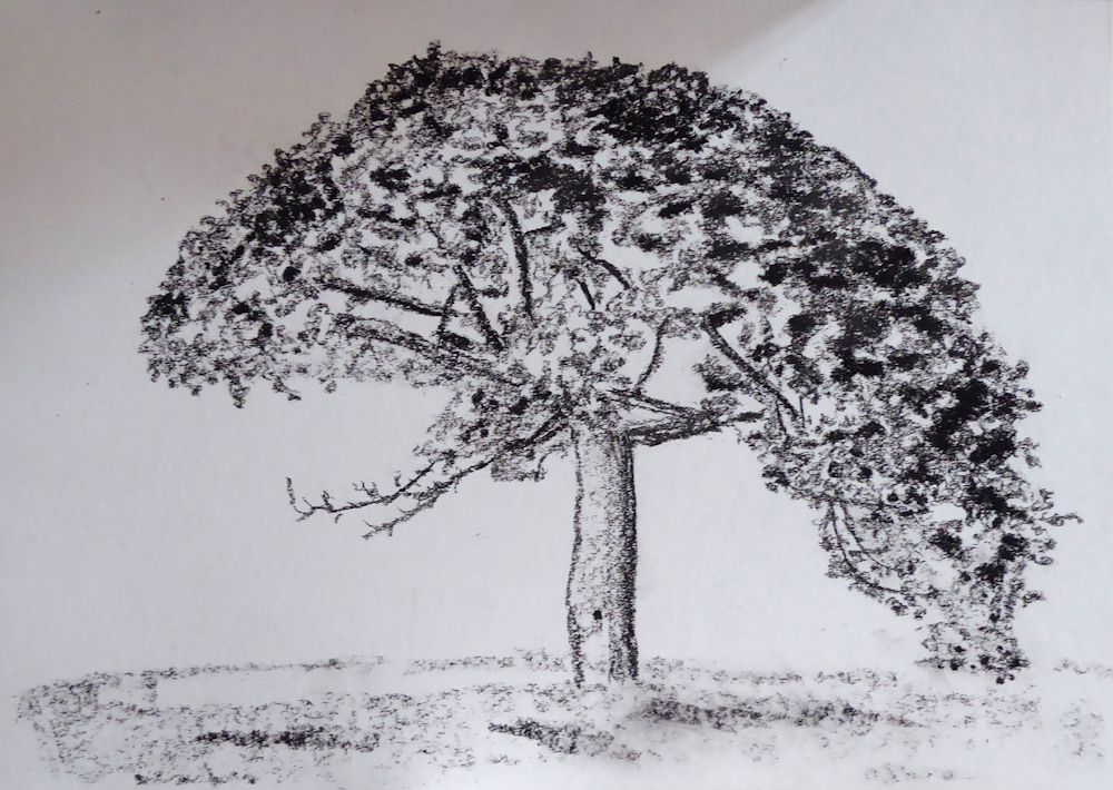
Pencil and Pan Pastel by Jo
Drawing and painting trees is a huge topic but as trees are very often featured in landscape painting as well as being exciting subjects in their own right, it seemed a good idea to explore depicting their structure and character.

Sketch by Jo
Leaf masses drawn with side strokes of pastel
The first session will focus on strategies for beginning to draw whole trees. In week 2 we will take a closer look at; bark, burrs, and branching, then in week 3 draw lopped or fallen trees and exposed root tangles. For the three remaining weeks we will explore trees and their landscape settings for which you may continue with drawing materials or work in colour with pastel or water-based media.
Do look at the following Pinterest board, link below, for some inspirational ideas for drawing trees in literal, atmospheric and more abstract ways.
https://www.pinterest.co.uk/jhall1282/trees-in-art/
Some very basic notes on drawing trees are below followed by a list of the exercises for the first session. If you are already experienced in drawing trees just make a quick composition sketch and launch into a tree portrait using your choice of drawing medium.
Pastel and charcoal by Jo
Memory drawing
We’ll start by looking at the overall shape of different trees and the first challenge will be to see how much you have already observed. Take a piece of paper, and from memory make small drawings of any kind of tree you can think of; e. g. cypress, oak, palm, fir etc. Do this rapidly then think about what gives each individual tree its character.
This may be;
The overall shape and symmetry (fir trees)
Angle at which the branches spread out (oak)
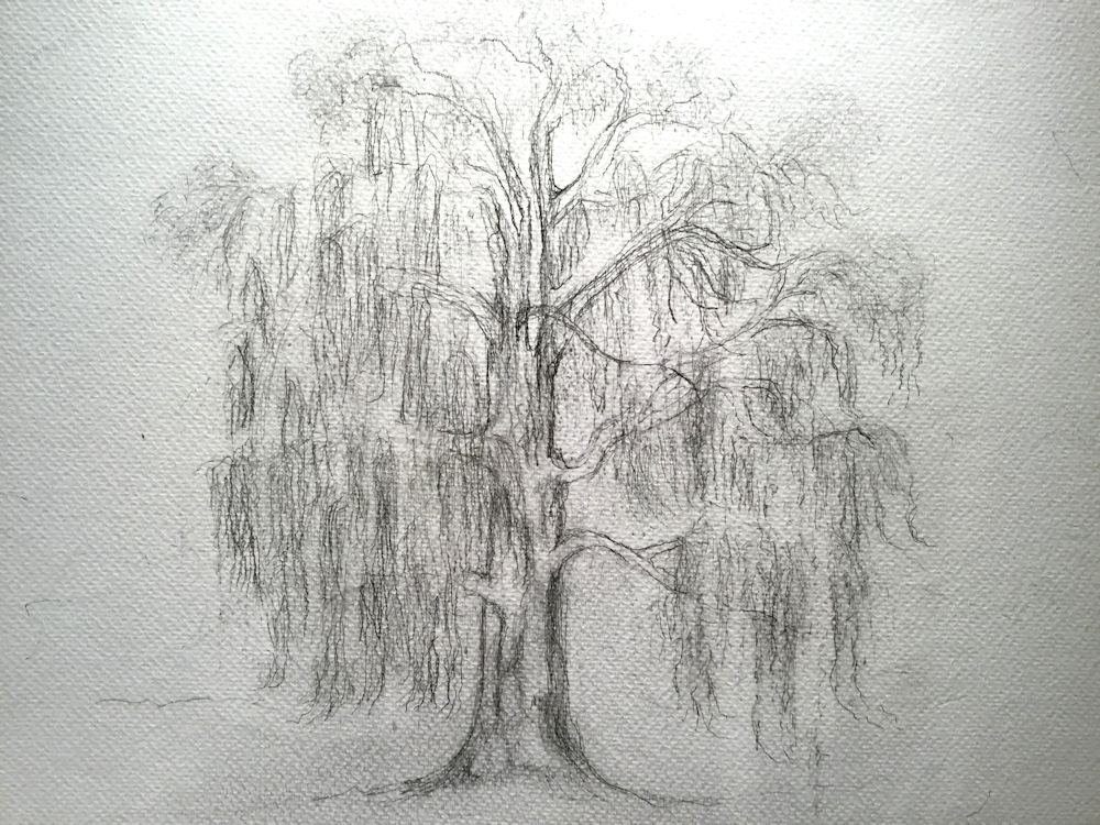
How branches are so flexible and long they bend downwards (weeping willow)
Way in which individual leaves fan out from the trunk (palm trees)
Or
A mixture of some of the above characteristics and many more.
See practical session for materials and paper size.
Pencil sketch
Now look at a real tree, outside or from a photo, and observe it, questioning what gives this tree its particular character. The notes below don’t describe the only way to start a drawing but give a very straightforward method for coming to grips with a variety of tree forms.
Starting to draw
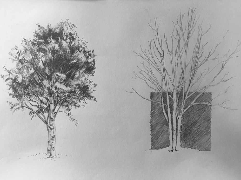
It can be useful to mark where the trunk is and indicate the main branches lightly and then mark out the general outline of the whole tree by a series of light dots and dashes. In this way you will ensure the overall proportions are right and the girth of the main trunk can be drawn the correct width.
When drawing a deciduous tree in Summer or an evergreen the next stage is to indicate the shapes of the main masses of leaves. These can then all be shaded lightly and more densely shaded on parts of each leaf mass that is in shadow. In the example below light is mainly from above. The lower parts of each leaf mas is darker than the upper side and the whole of the lower part of the tree is darker than the top. Look out for the differences in tone when one side of a tree is in direct sunlight.
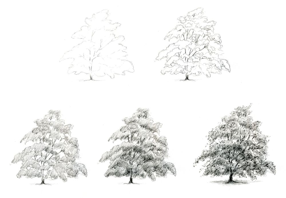
Drawn with an HB pencil
Think about how you might draw a palm tree or a fir tree
Adding texture and detail
After that you may like to texture the foliage suggesting rather than drawing leaf shapes, and also texturing and drawing any useful detail on the main trunk and branches. For instance, when drawing a silver birch tree, it would be essential to add the distinctive dark marks on the main trunk and branches but may look fussy if similar marks were added to all the branches.
Only if you choose to draw a tree with really large leaves like a palm or banana tree will you be drawing individual leaves and associated structures such as dead leaf bases in any detail, so although the strategy will be similar you will be looking at the overall shapes of large leaves instead of clouds of leaf masses.

Ink sketch by Jo
The best way to familiarise yourself with trees is to have a small sketchbook A5 or even A6 that will tuck into a pocket or handbag and draw with a pencil or ball point pen on every occasion you meet a tree, whether you only have two or the luxury of twenty minutes to sketch!
Practical
Use cartridge paper A4 or A3 and any drawing medium; pencil, ball point, pen and ink, conté crayon, thin charcoal stick or charcoal pencil,
1.Memory drawing: use an A4 or A3 paper and make several drawings of as many different kinds of tree as you can from memory. These should be tiny, two or three inch high thumbnail sketches, all to be made within about 15 minutes.
2. Drawings of two different trees or the same deciduous tree in winter and summer. This time work from observation, direct or from a photo reference. Take each drawing to the stage where the masses of foliage have been blocked in with directional shading or the tiny branch ends have been suggested. Both drawings to be made on the same sheet but still fairly small, between five and eight inches high. Take about 20 minutes for this
3. Make a tree portrait of the tree of your choice at a much larger scale to fill an A3 or larger sheet. The size may partly depend on the drawing medium i.e. smaller for pencil work A4 to A3 and larger A3 to A2 for a study in charcoal or conté crayon. If toned paper is used white may be used for the lightest areas. Working larger and for longer will enable you to draw more details. Add only what helps to communicate the character of the tree and strengthens the composition. Make sure the overall proportions and structure are in place before adding texture and detail, and constantly review the tonal balance of the drawing as you work. Larger paper may be used for a pencil drawing if you are working with very soft pencil in a loose way or have a lot of time to spend on a detailed study.
Spend between an hour to an hour and a half on this or longer if you are producing a highly detailed work.
Your drawings:

by Anne H
Pastel by Mali
Charcoal and white pastel by Mali
Charcoal by Anne C

by Maricarmen
Charcoal by Maricarmen
Charcoal and pastel by Liz

Charcoal by Ann


by Virginia

HB pencil on A4 paper by Maryon
HB pencil on A3 paper by Maryon

Charcoal and graphite sticks on A3 paper
by Maryon
Charcoal by Heather

Charcoal by Heather
Pencil by Sarah (before session)

pencil by Sarah
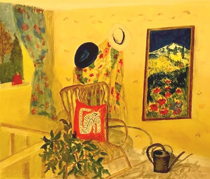
Still Life Week 6: Looking with David Hockney
February 11, 2022
Coloured Pencil Sketch by Jo
For the last week the challenge will be to make a still life drawing taking inspiration from the coloured pencil and crayon drawings of David Hockney, born in 1937. He made a number of still life drawings in the late 70’s, sometimes of tables in restaurants and also of plants in pots, including a very representational drawing of a yellow jacket, hat and a suitcase on a chair.
Examples of these can be seen on my still life Pinterest board at
/https://www.pinterest.co.uk/jhall1282/still-life/hockney-david/
together with examples of Hockney’s etchings, lithographs and i-Pad drawings.
Some are relatively simple drawings, for example the two peppers, but note the proportion of white space and that it appears “right”. One deceptively uncomplicated but elegantly drawn composition is of a double bed with a green cover where an astonishingly even tone of green has been laid down.
It’s worth studying these works for the techniques used in drawing; where Hockney used line and where he hatched or scribbled or made other marks that show us what he was observing. Look for fast frenetic marks as in the drawing of peppers and where he uses slower marks.
Is it possible to tell what the artist is feeling? Look at that smooth green pasture of a double bed for instance. Look out for instances where Hockney works up some areas more than others, literally drawing our attention to what he thinks is important.
Also study the structure of the compositions and where composition relies more on line and form and where composition depends more on colour and shape for impact.
These days we are probably more familiar with Hockney’s later i-Pad drawings of still life subjects and you are invited to take inspiration from Hockney for your coloured crayon or coloured pencil drawings. Worry not if you have no access to coloured pencils, just draw with a graphite pencil or pencil plus pastel or pastel pencil.
I hope to add my as yet unfinished work, inspired by the other artists we have taken inspiration from over the last few weeks, to this post. meanwhile I am very much looking forward to seeing your Hockney inspired drawings.
Your Drawings inspired by David Hockney:
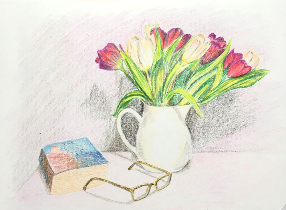
Coloured Pencil Drawing by Heather C
by Pam
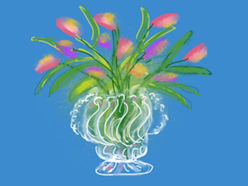
i-Pad drawing by Maricarmen
i-Pad drawing by Maricarmen
by Maricarmen
Coloured pencil drawing by Heather N
Coloured Pencil by Ann
Coloured Pencil by Ann
Pencil drawing by Virginia
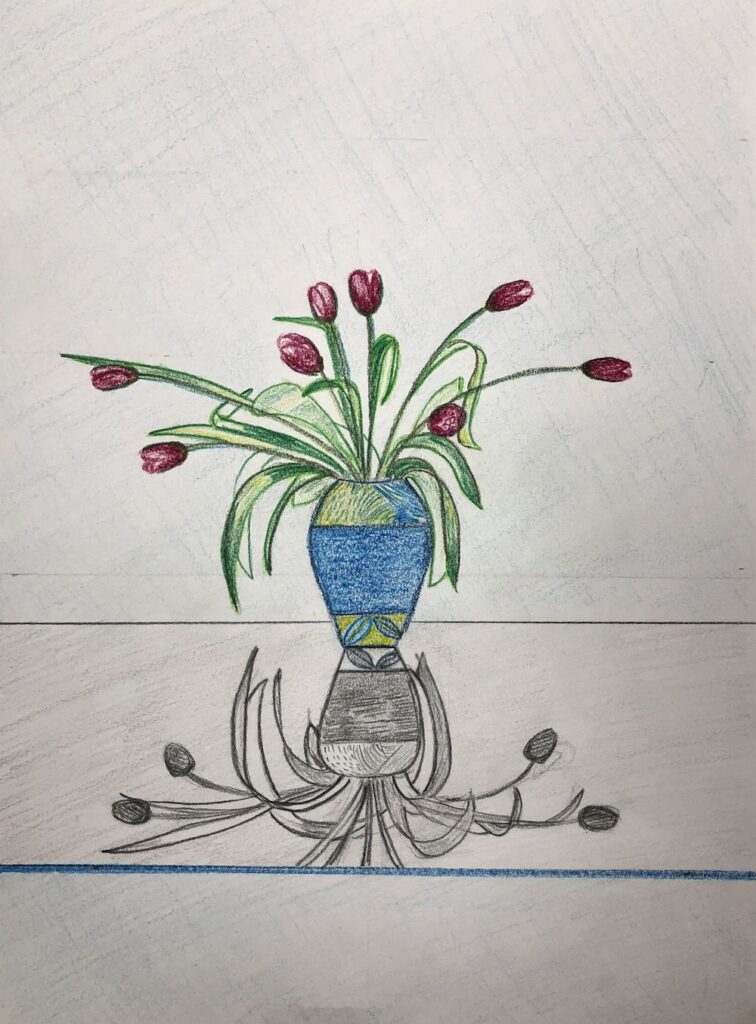
Pastel Pencil by Mali
Coloured Pencil by Anne
Pastel Pencil by Mali
Rotring Pen drawing by Sandra
Still Life Week 5: The Magic of Mary Fedden
February 2, 2022
Mary Fedden OBE, RWA, RA was born in Bristol 1915 and remained a popular and acclaimed painter till her death in London in 2012. Fedden knew from an early age that she wanted to be a painter and trained at the Slade from 1932 to 1936, a pupil of the theatre designer Vladimir Polunin.
After her time at the Slade Fedden worked on portraits and stage designs for the Sadler’s Wells Theatre, followed by teaching in Bristol till World War 2 broke out when she served in the Land Army, the WVS and as a driver for NAAFI in Europe.
She admired the early works of Ben Nicholson and his wife Winifred and also the still life paintings of Anne Redpath and the French painter Henri Hayden. She also received commissions for many mural works including one for the TV pavilion at the festival of Britain.
It was after the war that Fedden developed her own way with painting flowers and still life subjects and I believe was still greatly influenced by a sense of drama from her stage design days. Fedden’s still life works seem to me very theatrical, like little sets for the objects that they contain. These sometimes have landscape or window backdrops and the shapes are somewhat flattened as in Nicholson’s early works. She certainly breathes magic and wonder into quirky and ordinary objects alike. In one painting a teapot and an Auricularia has a background of an erupting volcano and a zebra in the middle ground! Such juxtapositions abound in her work and one can only imagine the stories behind them. Some examples can be seen on the Pinterest Board, link: https://www.pinterest.co.uk/jhall1282/still-life/fedden-mary/
Fedden did work in oil but favoured working in gouache, especially on rough textured hand made Indian papers. Her compositions were not set in stone from the beginning, rather she would make a few guidelines and improvise as she went along. She had a wonderful vocabulary of brush strokes and painted exclusively in the studio from the many drawings made in her sketchbooks. Do look at the short U-tube clip to watch her painting. Link: https://www.youtube.com/watch?v=BxOOKRhllPw
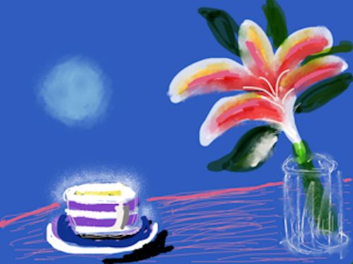
Many works also include some elements of collage. As well as quirky objects subjects often included a light source, a candle or lamp to dramatic or rather romantic effect as in “lilies at Moonlight”..
Looking at the works of Mary Fedden gives an interesting link with Ben Nicholson whose early work was one of her influences and next week’s artist, David Hockney who was one of her pupils at RCA.
For more of Fedden’s work see the link to “115 works by Mary Fedden” below:
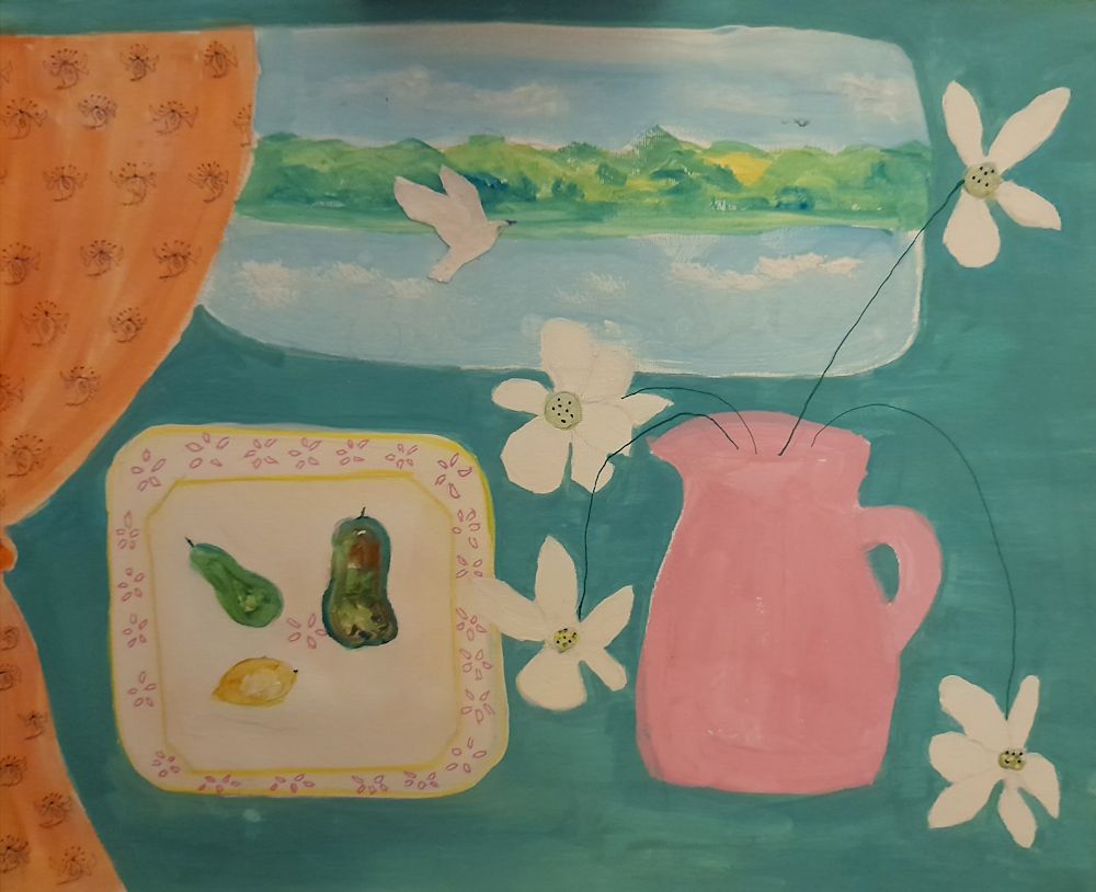
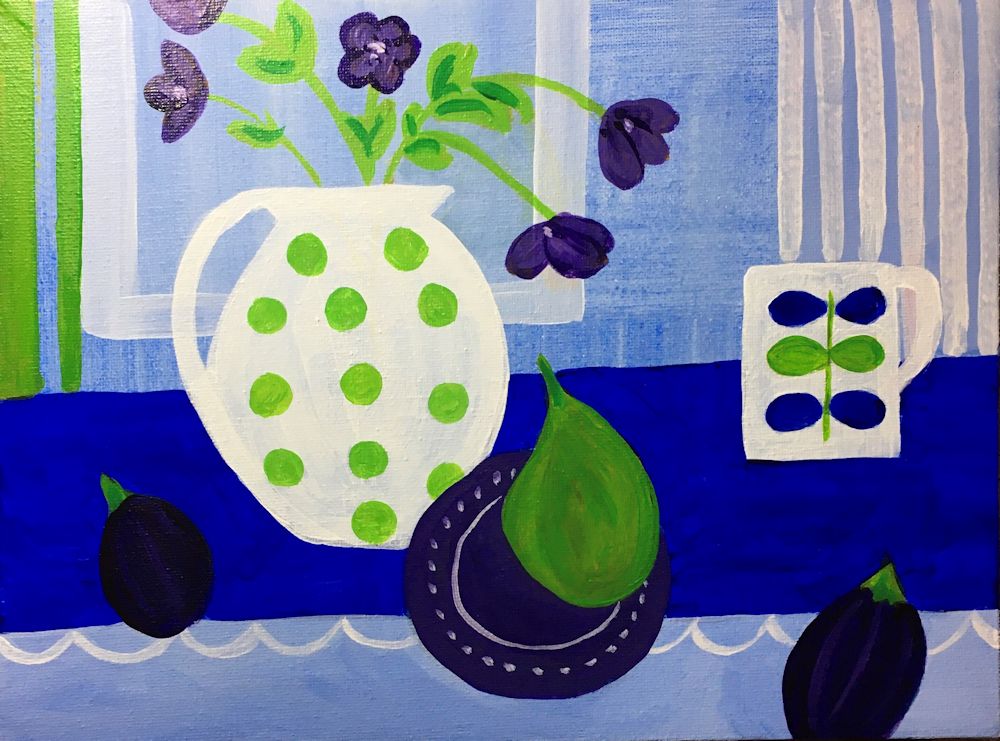
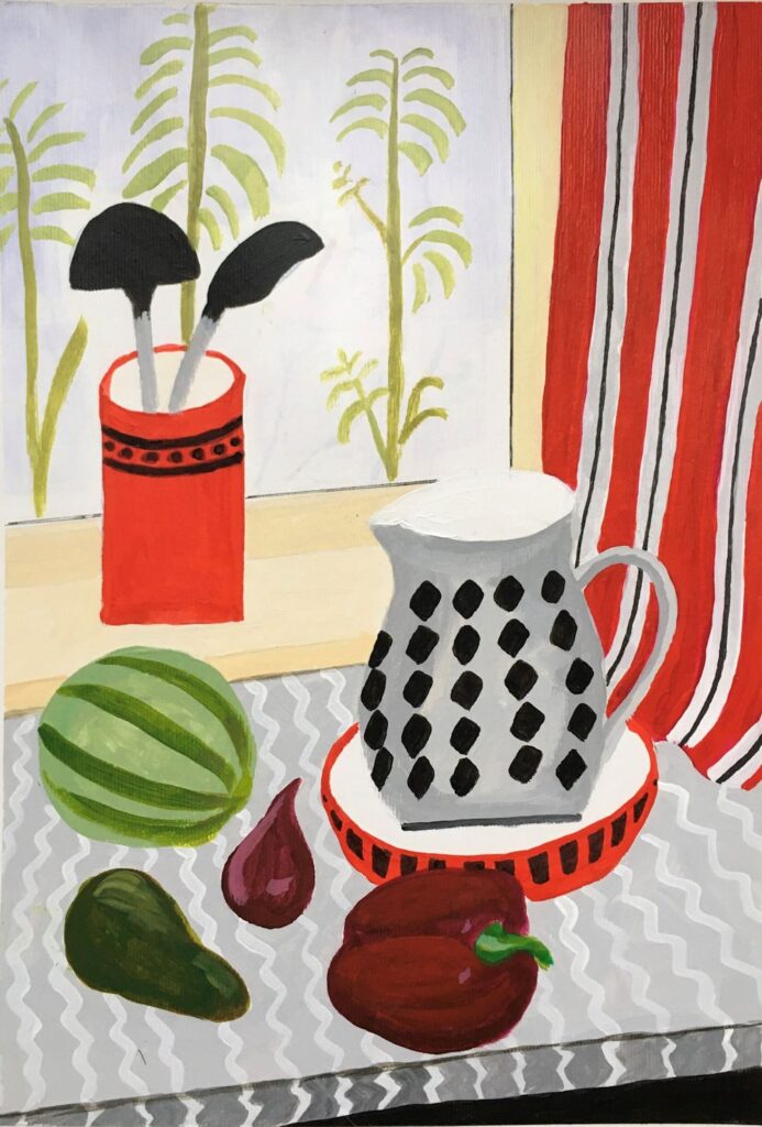
Your challenge this week is to find an unusual gathering of objects and make a magical still life study from them. Think about the setting and especially the tonal balance in your painting as well as the colour. Suggested media: gouache, watercolour or acrylic with perhaps a collaged element.
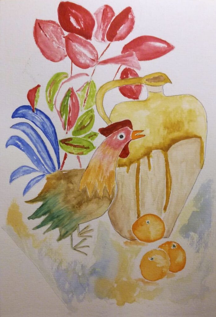
Your paintings:
by Sandra
by Sandra
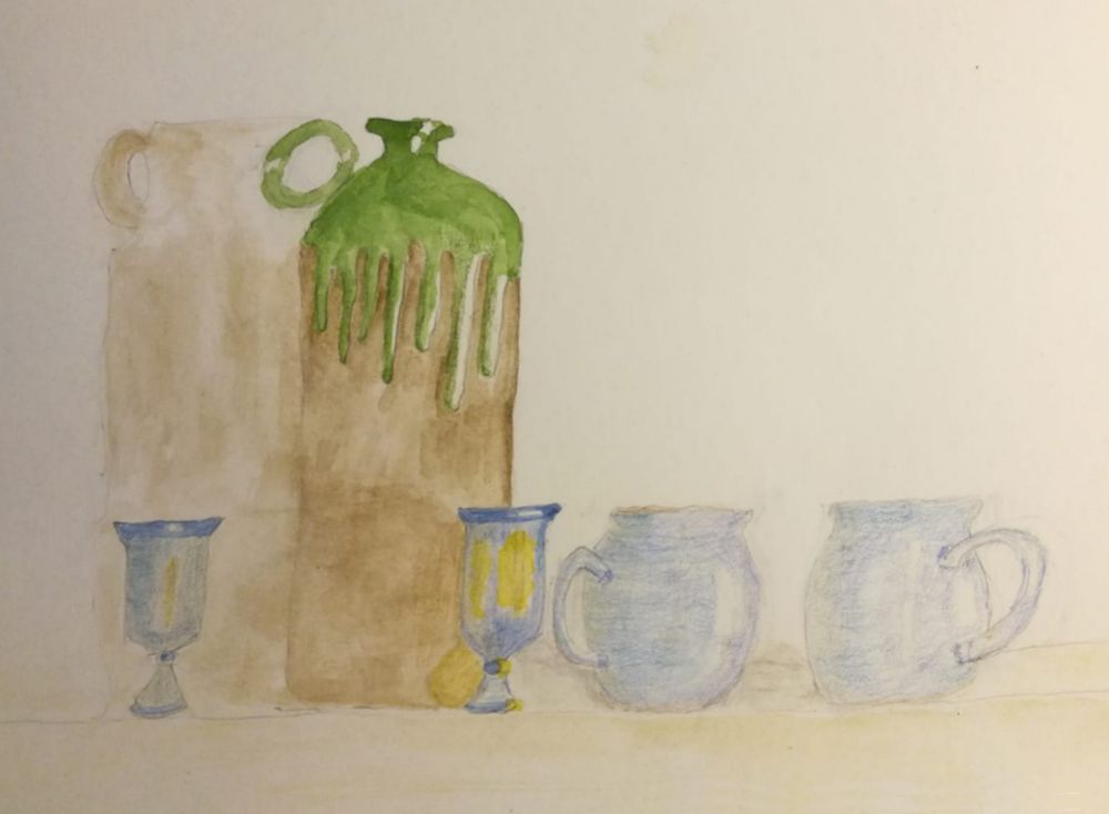
by Mali
by Maricarmen
by Anne
by Virginia
by Kate
by Heather C
by Heather C
by Heather N
by Ann
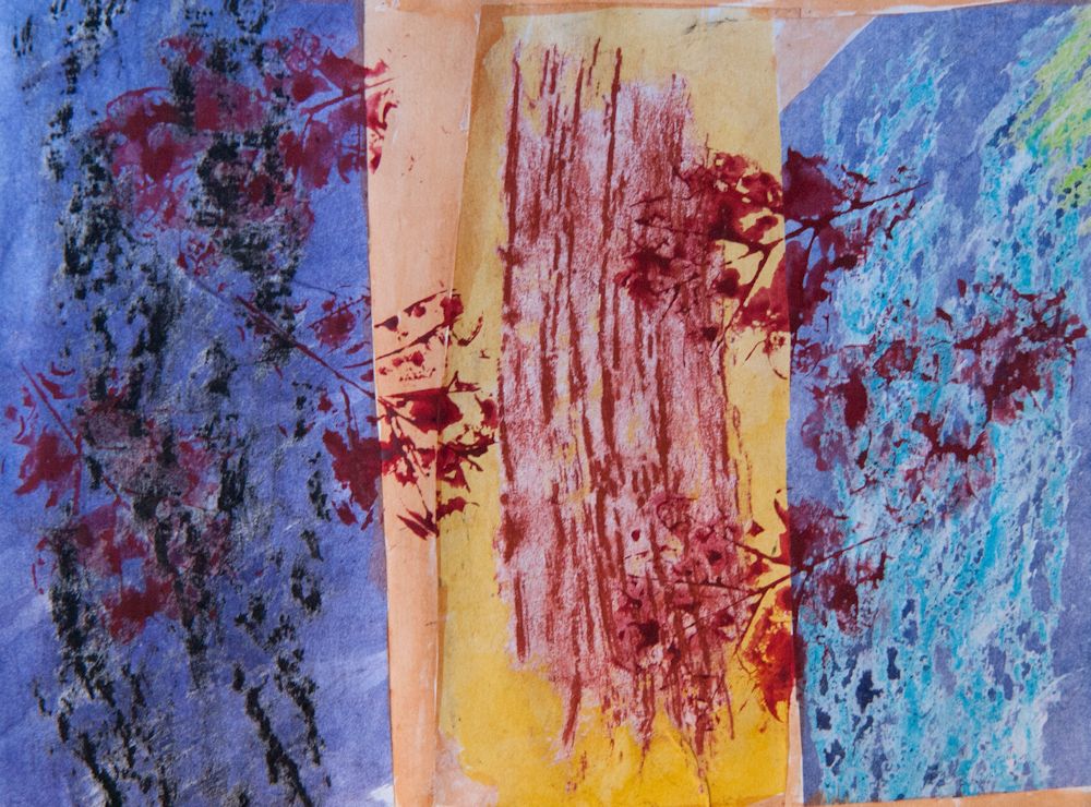
Mixed media with collage by Pam
Still Life 4: Abstraction and Ben Nicholson
January 26, 2022
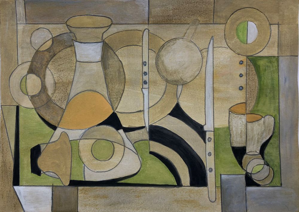
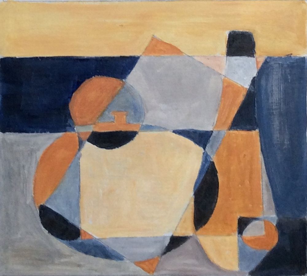
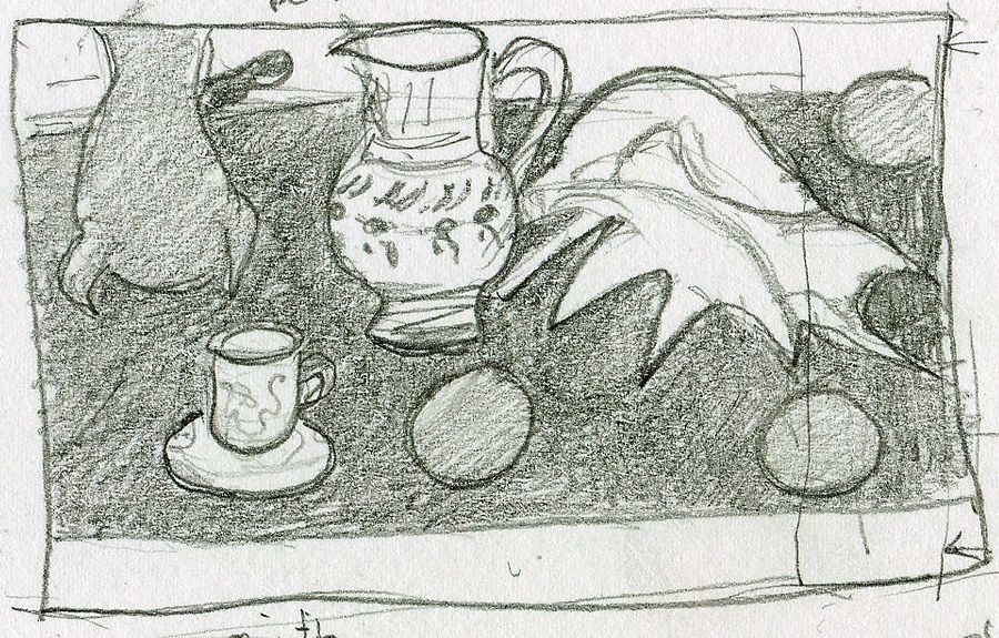
Pencil drawing by Jo
This is Jo’s composition based on shapes from the photo below.
At next week’s class Jo will demonstrate a painting in colour using a similar starting point. The practical suggestions in this post will help you to make a composition including some of the cubist techniques used by Ben Nicholson.
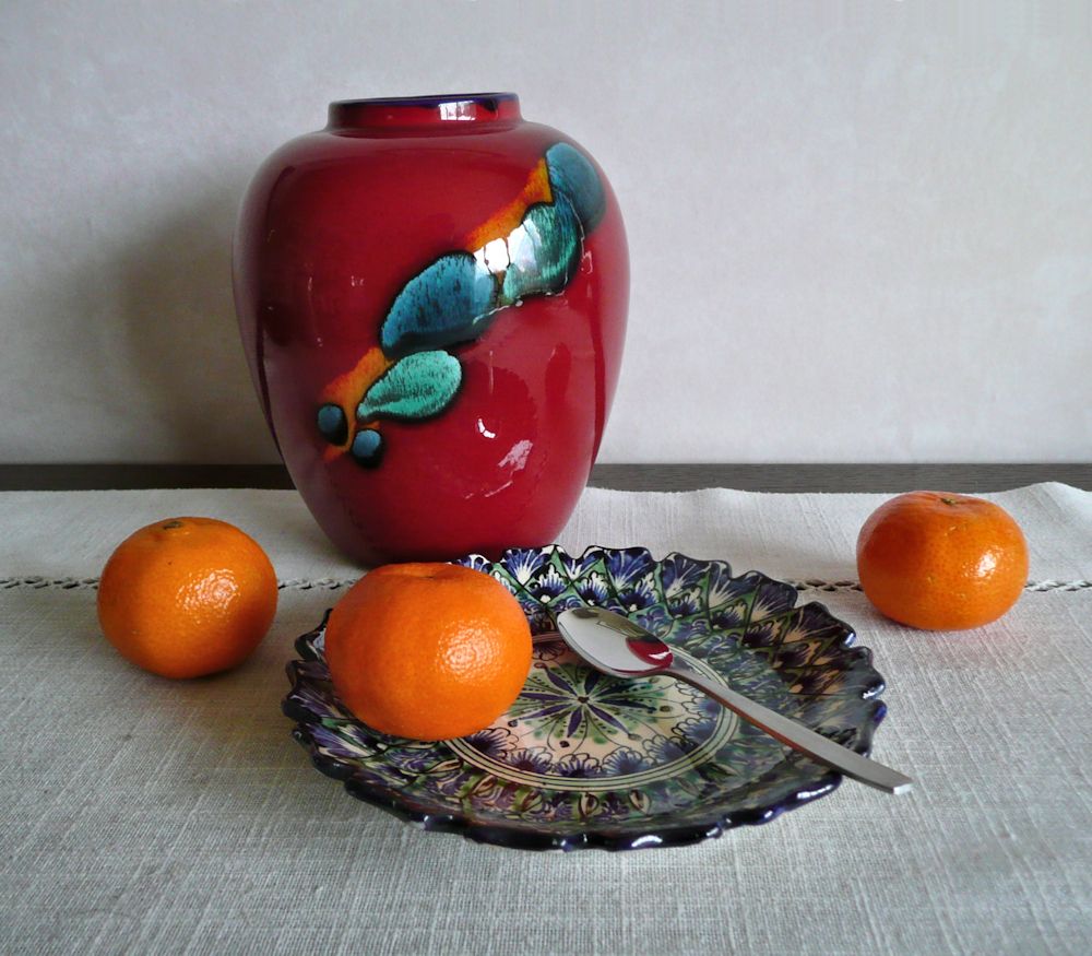
Vase and Saucer with Spoons and Oranges
Ben Nicholson was born in 1894 to artists Sir William Nicholson and Mabel Pryde. He attributed his interest in Still life to his father but trod a very different artistic journey, visiting the studios of Picasso, Braque, Hans Arp and Brancusi in the 1920’s and becoming intrigued with cubism. Cubist techniques of overlapping shapes and seeing objects from more than one viewpoint simultaneously, became firmly established in Nicholson’s still life work to a greater or lesser degree for the rest of his life.
He started training at the Slade in 1910 but left after a year. His contemporaries there included Paul Nash, Stanley Spencer, Mark Gertler and Edward Wadsworth. However, after spending time in the studios of Picasso and Braque, cubism became the main focus of his output in the 30’s. This was especially so during wartime when he and Barbara Hepworth moved to St. Ives. Ben was asthmatic so unable to join the services and for a time he and Hepworth worked well together and Hepworth said they were each other’s best critics. Nicholson’s compositions often took in other influences besides cubism as can be seen from either Googling his work or the Pinterest board, link below. Sometimes a cubist still life may have a backdrop of a Cornish landscape as viewed from a window
https://www.pinterest.co.uk/jhall1282/still-life/nicholson-ben/
We are principally engaged with Nichoson’s still life work which gradually became more abstract. In the 20’s he painted a wooden box with a rather flat depiction of a jug and mug where shape and colour and flat darker tones make up the compositions inside the lid and on top of the box. In 1930 he painted a simple composition of a mug and a little bowl. The forms overlap but the way in which the stag decorating the mug is painted tells us another story. The stag is shown as a flat motif superimposed over the other objects and overlapping the bowl and background. It gives us a different view of the decoration than would be seen if we were looking at it as seen on the curved surface of the mug.
This overlapping technique can be seen even more clearly in Nicholson’s drawings of three pears where he has drawn one pear over another as if we could see all those edges when viewing the set up. Also look at his compositions of objects arranged on table tops. Then try one or more of the following;
Challenge 1. Overlapping
Find a small group of overlapping objects (e.g. a couple of mugs, a bowl with some fruit) and draw as if you can actually see all the edges that you cannot see. Fill the shapes with tone or colour to make an interesting composition.
Nicholson takes this idea a whole lot further towards more extreme abstraction. He plays with shapes placing them at different scales and places in his picture than they are in reality or even could be in reality. Notice how in the table top still life studies the table top is up ended. In other works, perhaps only half a bottle or vase is seen, or shapes are repeated, tilted or reversed, and elsewhere coloured rectangles of deep or pale tones are introduced.
Challenge 2. Different Viewpoints in the same Composition
Make a composition using the cubist technique of being able to see works in the same picture as if seen from at least two directions, for example, a piece of fruit on a plate where the fruit is drawn as seen but the plate is seen as if you were looking down on it, or do something similar to what Nicholson does with the decorative stag motif.
Challenge 3. Rearranging Shapes and Repeating Shapes at different Scales
Make a cut out of a jug, goblet or egg cup at two sizes. Cut two of each, one on pale and one on a coloured paper. Cut at least one shape in half and play with the shapes on your support till you find a pleasing composition.
Remember you can;
tilt or reverse the shapes; use the negative shapes from which you made your cut outs; fit one shape inside another where the scales are very different; partly overlap shapes.
Glue to a support (this should be a heavier weight than your cut outs: multimedia paper or heavy watercolour paper should be OK). If any of your shapes have been cut from white paper consider painting a background colour on your support before glueing the pieces down. When everything is stuck down and dry, assess whether more drawing or painting is required. This may mean altering the colour or tone or adding texture or pattern to some areas.
You may prefer to play with the shapes and then draw or paint a composition based on your preferred arrangement instead of making a collage. The important thing is to play with shape and scale, tone and colour.
Challenge 4. Make your own composition
Either use some of Nicholson’s techniques for your own composition or paint your own version of one of his works.
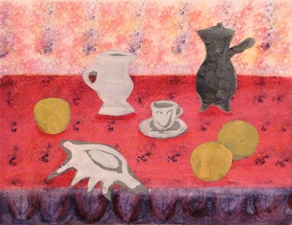
Your paintings;
by Pam
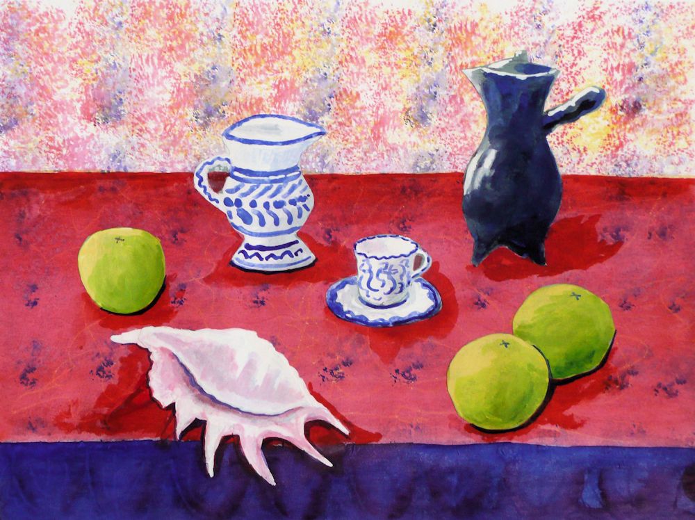
by Heather N
by Heather C
Gouache by Maricarmen
Gouache by Ann
by Ann
by Mali
by Anne
by Sandra
by Sandra
by Sandra
by Kate
by Virginia
by Virginia
Still Life 3: Rearranging Matisse
January 19, 2022
Rearranging Matisse sounds like heresy, but is in fact a useful exercise because it illuminates the possibilities that arranging and rearranging objects bring. Matisse had a different interest in still life to Morandi. Matisse consciously sought to communicate what he felt about objects, and as early as 1908 told his students, “To copy objects in a still life is nothing; one must render the emotion they awaken in him”, whereas Morandi writes “The only interest the visible world awakens in me concerns space, light, colour and forms.” Morandi was far more interested in communicating what he saw with his eyes.
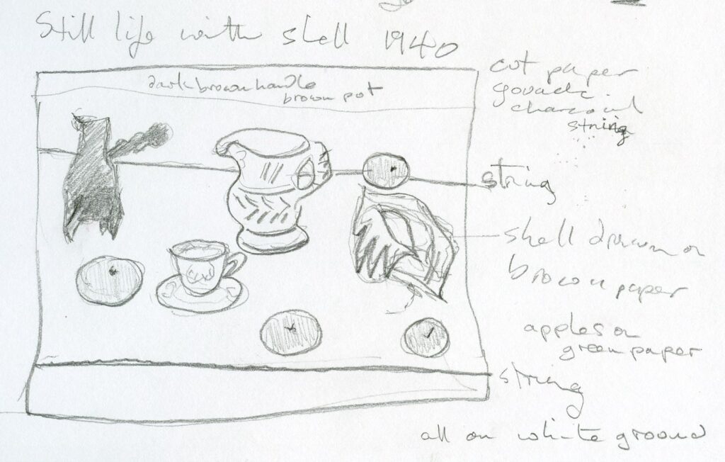
The illustrations in this post include my version of “Still Life with Sea Shell on Black Marble” 1940. Matisse had some difficulty in finding a suitable composition for these objects and resorted to using cut outs of apples and string to mark the table edge before arriving at the final study. Matisse only ever intended this as a study for a final work but it is a method you may like to try. As you will see I have rearranged his objects after very rapidly noting the development of this work at the “Matisse in his Studio” exhibition at the Royal Academy several years ago. I also took serious liberties with the colour of the background and table top.
“Still Life with Sea Shell on Black Marble” is included in my Still Life Pinterest Board: Section Matisse, link given below:
https://www.pinterest.co.uk/jhall1282/still-life/matisse/
Both artists used their objects as “actors” arranging them on “the set” and often using the same actors in different works. Both were interested in the relationships between objects but while Morandi searched for the nuances of light, shade and spatial relationships, Matisse also wished to bring objects and their associated memories into the equation. This extended to bringing a unity to arrangements of objects he had collected on his journeys or that he had grown up with, and throwing their surroundings and sometimes fruit and flowers into the mix. In Morandi’s still lives one never sees a still life before an open window or had any idea of how Morandi’s room was furnished whereas for Matisse the environment in which his objects existed often formed an integral part of the composition.
Matisse used vibrant colours purposely to communicate emotion, something totally alien to Morandi’s simplified but more observation based still lives with their muted colours depicting simple vessels. Curiously, Morandi’s work does give us emotion, as a sense of calm unity pervades his work without seeming boring in any way. However for those seriously interested in colour Matisse offers continual inspiration.
Matisse leads us through compositions that rely less on form as revealed by light than by shape and the juxtaposition of colour. Objects become simplified and patterns exaggerated so that we see emotion celebrated through a more abstract way of seeing.
Here are a few photographs of objects chosen for their shape and colour with some rearrangements! which may give you a few ideas for setting up. My ‘photos don’t include glimpses from windows or interiors but you may have just such a setting for your composition.
This week the challenge is to arrange colourful objects that may be everyday and/or have have personal significance for you and then make a colourful still life composition, using colour and shape in the spirit of Matisse. Alternatively you are invited to make your own version of a still life by Matisse.
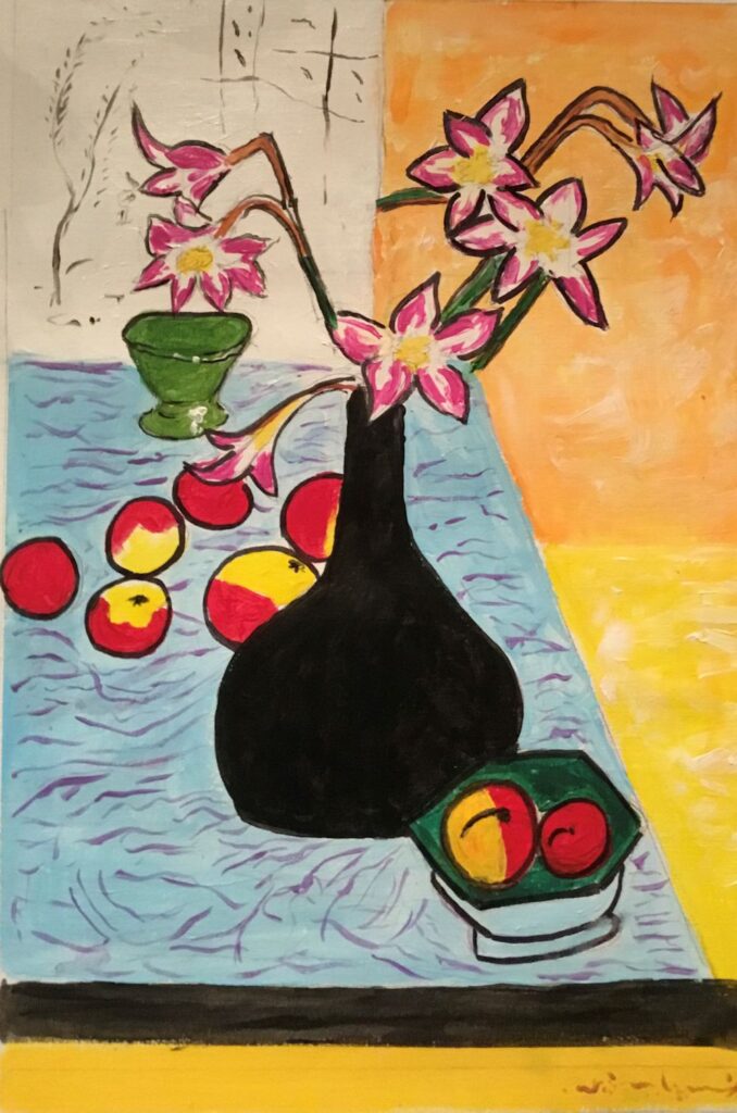
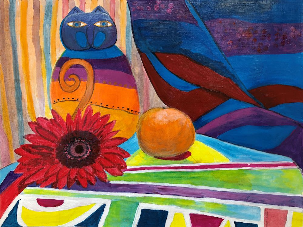
Your Paintings;
by Heather C
Acrylic by Sandra
Pastel by Mali
Acrylic by Mali
Oil by Virginia
Acrylic by Heather N
by Anne
by Ann
by Pam
by Maricarmen
by Kate
Still Life 2: Learning from Morandi
January 12, 2022
From a medium sized sitting room in Bologna, overlooking a small courtyard with trees Giorgio Morandi (1890 -1964), lived and worked painting everyday objects. These objects inhabited his shelves and became arranged and rearranged for his drawings, oil paintings, watercolours and etchings.
He admired artists of the Renaissance, Giotto, Masaccio, Uccello and Piero della Francesca and also Cezanne, Chardin, described in Morandi’s words as “the greatest of all still life painters ” and Corot, who he though of as the master of stillness. This last seems of most relevance as Morandi’s paintings of simple things give a sense of timeless calm to the viewer.
The author Horst Bienick wrote “Giorgio Morandi only painted jugs and bottles all his life but in these pictures he said more about life, about real life, than there is in all the colourful pictures around us.”
The quotes above are from ” Morandi” edited by Ernst-Gerhard Guse and Franz Armin Morat published by Prestel 2008. You will find a selection of Morandi’s works posted on the Morandi section of my Still Life Pinterest board, link below:
https://www.pinterest.co.uk/jhall1282/still-life/morandi-giorgio/
All Morandi’s works are based on intense observation simplifying forms and understanding how light reveals forms and how shadows can hide form and soften edges so that one form melts into another. The photos are all of my everyday objects and were taken to illustrate this.
In a letter of 6th January 1957 Morandi writes, “The only interest the visible world awakens in me concerns space, light, colour and forms.”
The way in which Morandi simplifies forms is most evident in his pencil drawings. The line is slow and deliberate, tracing the contours of what he sees. Areas of tone are added with diagonal hatching. In the watercolours, areas of tone are washed in as seen, immediately simplifying the forms and lending an abstract quality to these closely observed works. Morandi pays equal attention to the spaces between objects and the shadows the objects cast, as he does to the care he takes with the objects themselves.
Try arranging a few everyday objects in different ways. make simple line and tone drawings. Where edges between objects cannot be seen treat them as one form. Look at the images below and note the difference that changing their arrangement makes. You may like to draw from these but if you can, find your own subjects and draw from life.

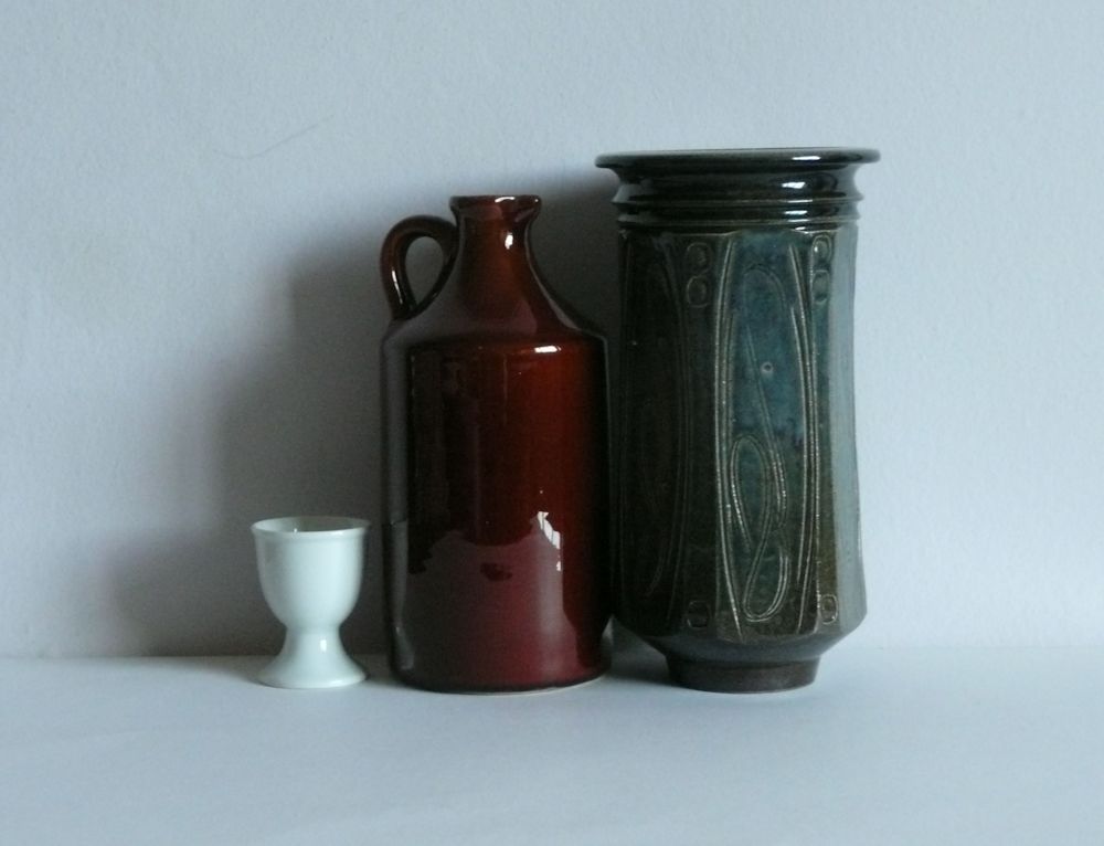
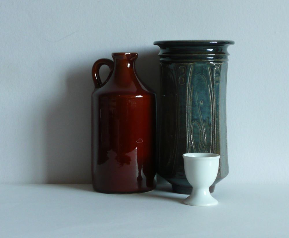
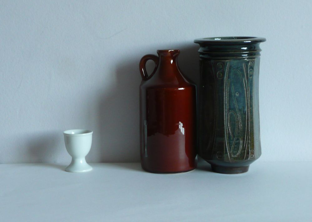
Notice the appearance of the egg cup in the images below and also what happens to the edges where one dark ceramic is close to another.
During the session we will make either several watercolours or an acrylic painting in the spirit of Morandi.
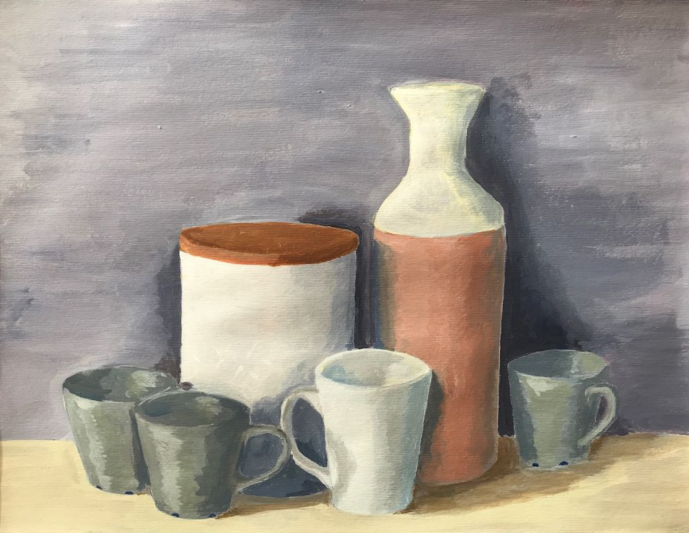
Your paintings:
Acrylic by Mali
by Ann
Pencil over acrylic background by Ann
by Ann
Gouache by Sandra
Gouache sketch by Sandra
Acrylic by Maricarmen
by Kate
by Anne

by Pam
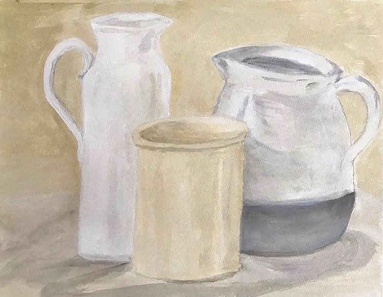

Oil by Virginia
Still Life 1; Painting in the spirit of Sir William Nicholson
January 4, 2022
Over the next six weeks our challenge will be to paint still life paintings in the spirit of William Nicholson, Giorgio Morandi, Henri Matisse, Ben Nicholson, Mary Fedden and David Hockney. These artists were chosen because of their very different approaches to still life subjects and also the different media and objects favoured by each.

Our first artist, Sir William Nicholson(1872 to 1949), is perhaps the most traditional of these artists. Alongside painting in oil, Nicholson was a printmaker using woodcut, wood-engraving and lithographic techniques and produced many book illustrations, posters and set designs for the theatre. For more detail on this look at the Wikipedia article; link below
https://en.wikipedia.org/wiki/William_Nicholson_(artist)
Encouraged by James McNiell Whistler, after about 1900 Nicholson ‘s efforts were concentrated on painting. By this time he had already become well known as a portrait artist but is probably more celebrated today because of his still life works and poetic landscapes.
William Nicholson’s landscape and still life paintings were also greatly admired by his son Ben Nicholson whose work we’ll be looking at in a few weeks’ time.

My Still Life Pinterest Board samples a few of William Nicholson’s still life paintings and shows his enormous aptitude for painting lustrous, metallic and glass objects, depicting their highly reflective surfaces with deft brushstrokes that look fresh and convincing.
https://www.pinterest.co.uk/jhall1282/still-life/nicholson-william/
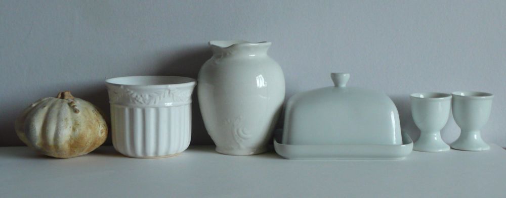
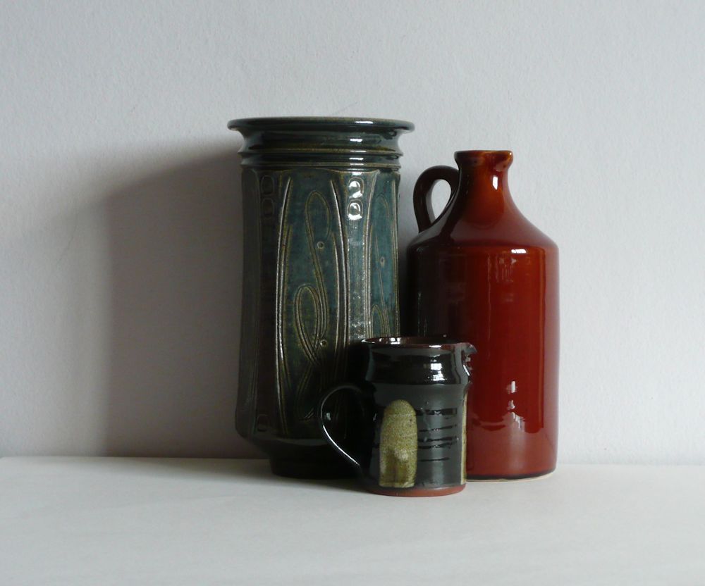
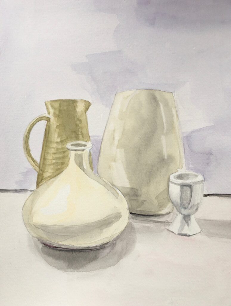
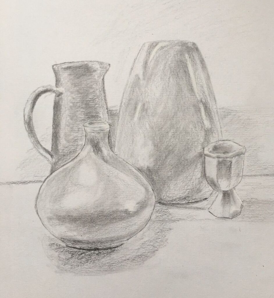
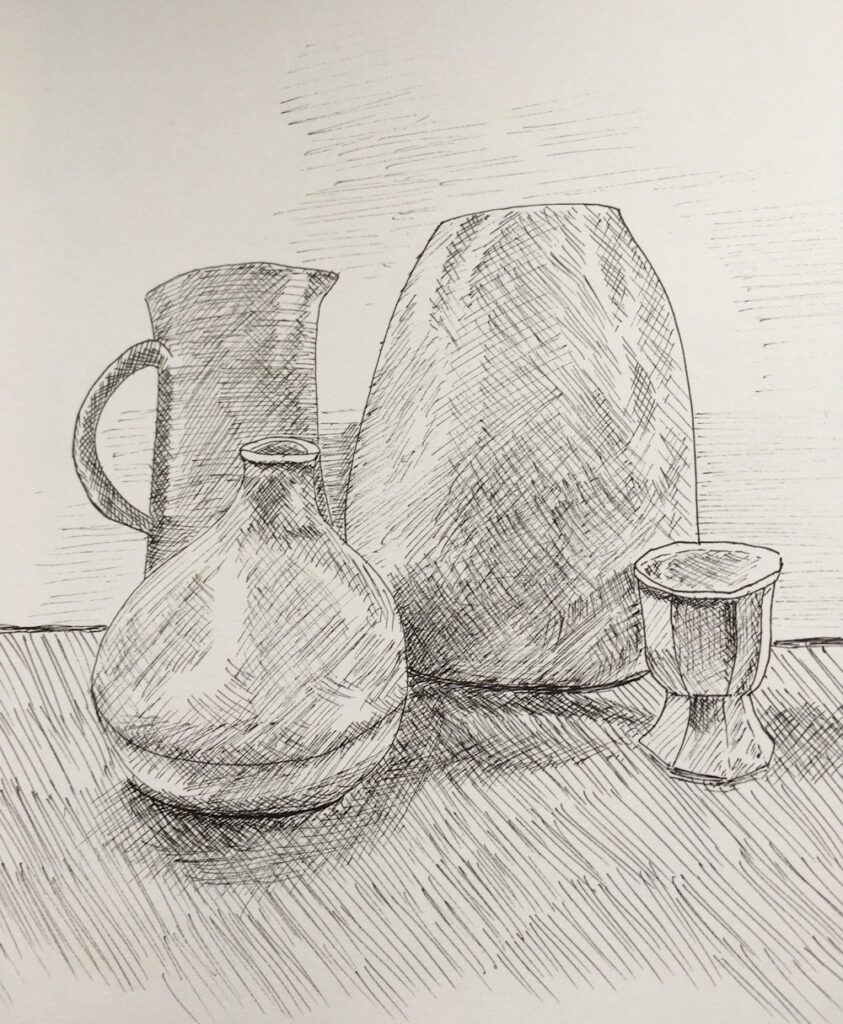
The challenge is to either paint your own version of one of Nicholson’s works or to set up a still life including similarly reflective objects to those depicted by Nicholson. The photographic illustrations in this post indicate some of the kinds of objects you may like to find for your own studies for which acrylic, pastel or gouache would all be suitable media. I will demonstrate in acrylic but if we have any oil painters amongst us that would be the best!

If you have time, familiarise yourself with your chosen objects, drawing them from a few angles and then decide on the composition. Nicholson often chose a very simple set up; just one or two main objects as in The Gilt Tankard which hangs in Clarence House or Still life with Glass and Spoon.

or take the easy route and crop a photograph.
We’ll discuss starting and developing paintings at the beginning of the practical session. meanwhile you may like to think about the following;
If working in acrylic or gouache, I like to start by start by drawing in the main shapes with a brush, then lay in the dark and mid tones. Some may prefer a pencil line to indicate the composition but there is always the risk of becoming too detailed too soon, on the other hand there may be elements such as cutlery handles where some accurate drawing will be useful. Another way to start is to make an under-drawing in charcoal and fix this well before blocking in the main shapes. With all media, work on the large shapes first making sure the tones are right before depicting the smaller shapes and details.


Note the slightly green colour of the glass.

When painting transparent vessels, note whether they are empty or contain liquid. Are there differences in how objects placed behind the vessel appear when seen through empty or water filled parts of the vessel? What do you notice about the water in the jar facing the light compared with the water in the jar on the same side as its shadow?
Starting with a background that is near the colour and tone of the reference setup results in very harmonious, peaceful works. You may at some stage like to paint the same picture over a much more vibrant ground. For the lemon and rosemary in a jar, a sienna or even bright red could be chosen.
Acrylic, pastel and gouache are all opaque media or can be used opaquely, so the sharp details of pale reflections and highlights can be added as the final touches.
Have a good look at each photograph observing not only the obvious reflections but also where colour is more subtly reflected onto the different surfaces. You may have already done this but right clicking on each image will give you the option to open a larger version in a separate tab.
Your Paintings;

Acrylic by Heather C
Acrylic by Heather C

Acrylic by Mali
Pastel by Mali

Acrylic by Ann

Acrylic by Maricarmen

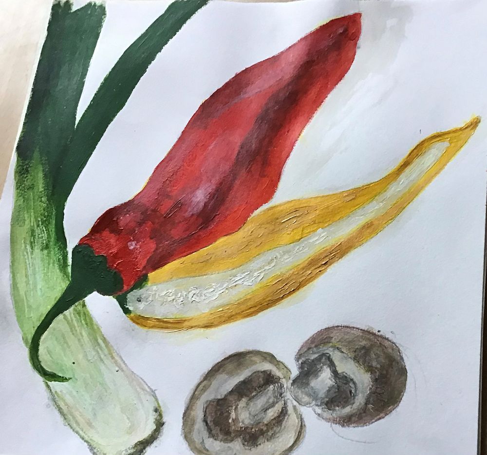
Coloured Pencil by Anne

painted on blue card by Heather N

Acrylic by Heather N

Acrylic by Sandra

by Pam

Acrylic by Virginia

Acrylic by Kate

Acrylic by Maryon
Natural Forms and Landscape in Mixed Media
December 6, 2021
Eton Wick Course Student Work: Experiments and Final Compositions
This is a cumulative course in which new techniques and media were added to those already used. At any stage students were free to add elements of collage.
Week 1 Natural forms; Charcoal, Ink and Pastel (dry or with water)

Ink and Charcoal
By Margaret
By Margaret
By Felicity
By Chris C
By Chris C
Week 2 Landscapes:
Ink, pastel, charcoal pastel
Mixed media collage
Collage and mixed media by Felicity
Week 3; Wax Resist, Natural Forms Wax Crayon, Oil Pastel, Watercolour, Ink

wax and watercolour
Depth of apple colour built up in layers, also note shadow of the bowl is a pink wash over green crayon.
Collage and mixed media by Felicity
Wax crayon and watercolour by Margaret
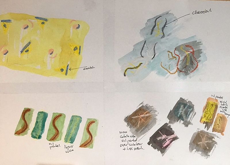
by Sandra D
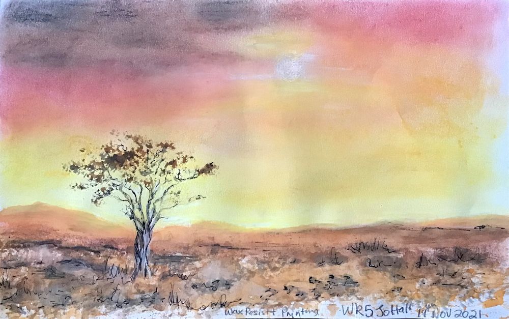
Week 4: Wax Resist: Landscape
by Pam C
Muriel B
By Chris G
By Chris C
by Chris c
Acrylic and Collage
by Roger O
by Margaret
Mixed media collage
by Sandra D
by Tina H
by Tina H
Week 5: Experiments with printers like sponges, rollers, bubble wrap etc. Natural Forms
By Chris G
by Diana E
By Diana E
by Tina H
making use of printers and wax resist by Pam C
Weeks 5 and 6: Experimental, Natural Forms and Landscapes with Printers and Collage
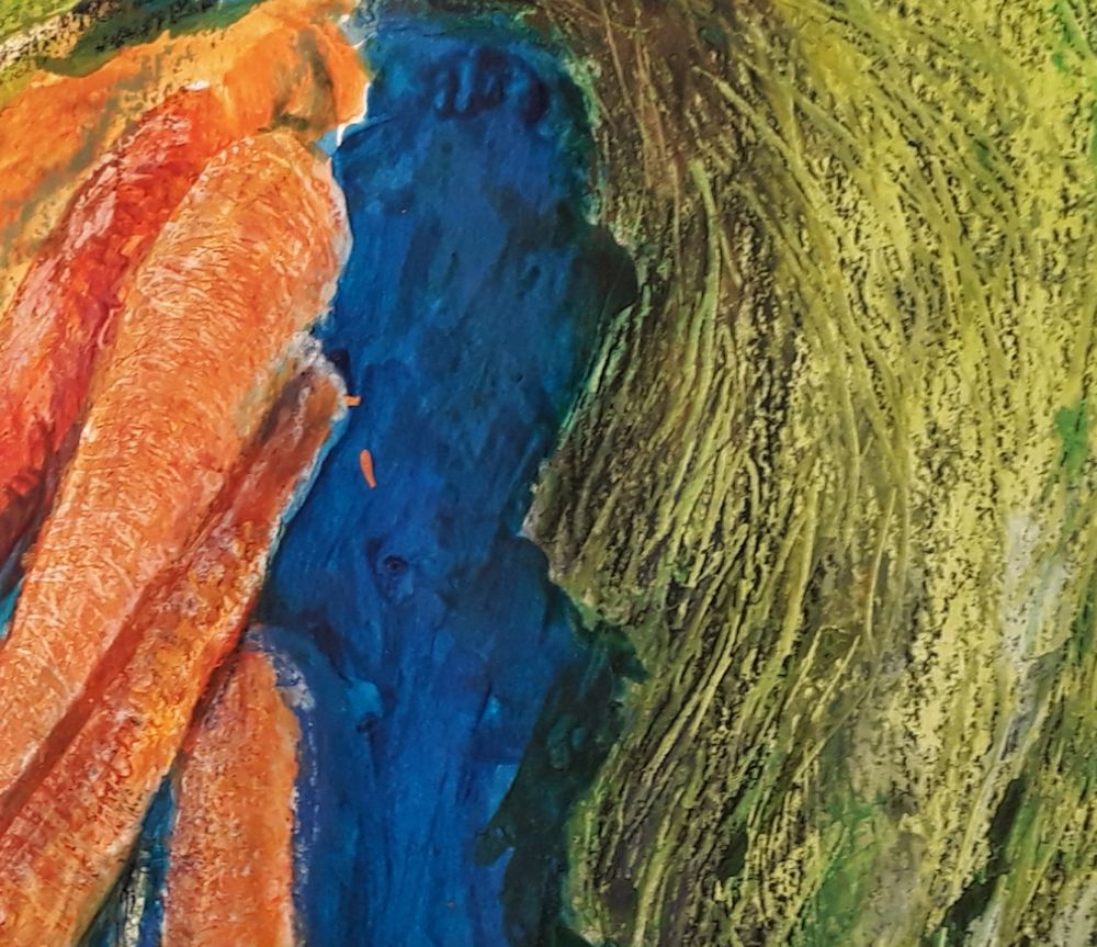
Mixed media; printing ink applied to corrugated cardboard and bubble wrap with a roller. These were then used as printers for the stone work and walls.
by Muriel B
By Felicity
by Jan B
by Margaret
Collage and mixed media by Chris G
by Roger O
by Sandra D
by Trixie M
by Diana
By Diana
by Vivienne
By Jan B
By Jan B
by Pam C
By Roger O
By Chris C
By Chris C
by Sandra D
By Vivienne O
by Vivienne O
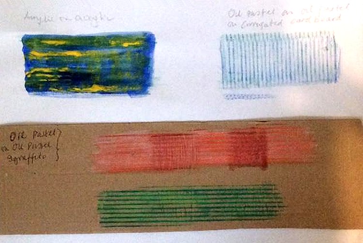
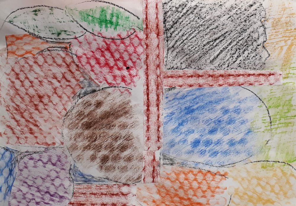
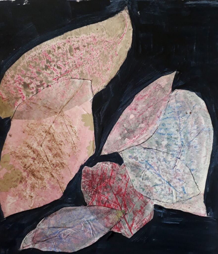
Week 7: Experiments with Frottage and Sgraffito
on black paper by Pam C
Sgraffito: oil pastel over acrylic paint
Frottage and collage by Diana
by Elizabeth P
By Elizabeth P
By Roger O
By Muriel B
Note the sgraffito marks on the leek
by Tina
by Vivienne O
By Vivienne O
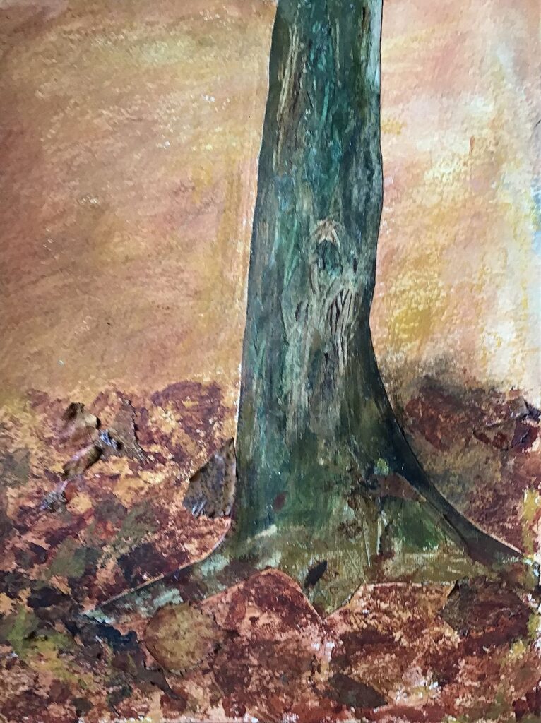
Sgraffito on the trunk and frottaged and collaged leaves
Acrylic, collage and oil pastel sgraffito technique
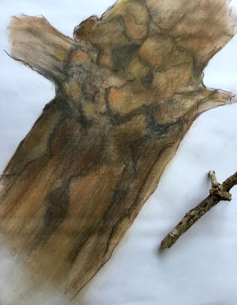
Drawing Larger than Life: Week 4 Toned ground or different medium
November 27, 2021
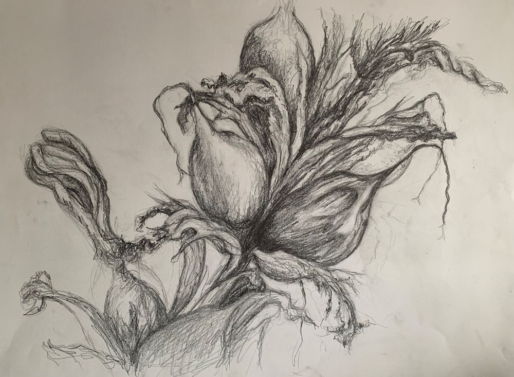
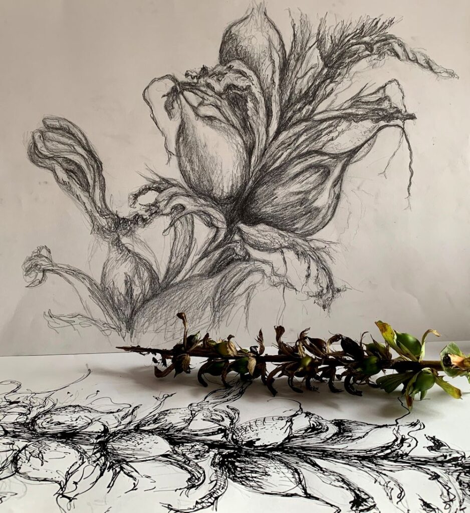
Dry and decaying: drawn on A2 medium grey paper in charcoal and white conte crayon
This week I ‘m encouraging everyone to use a coloured or grey A2 paper or to pick up a different drawing medium to that used so far. There are plenty to choose from; charcoal, ink, pastel or conte crayon etc. Coloured, grey or even black paper can help you think in different ways about tone; using the paper as a mid tone for example or working on black paper where the artist supplies the mid and pale tones.
The following images were all drawn on white paper using a variety of media.
Charcoal

Graphite and tinted graphite blocks and pastel pencil
Brown conte crayon
The subject is the same as last week, any small natural form that has to be greatly enlarged to fill an A2 or even A1 sized paper.
Your Drawings;

On green paper by Sarah

Blue-black Quink, bleach and pastel by Heather
by Ann
Quink, masking fluid and a touch of white pastel
Quink, masking fluid and white pastel
By Sandra
by Maricarmen
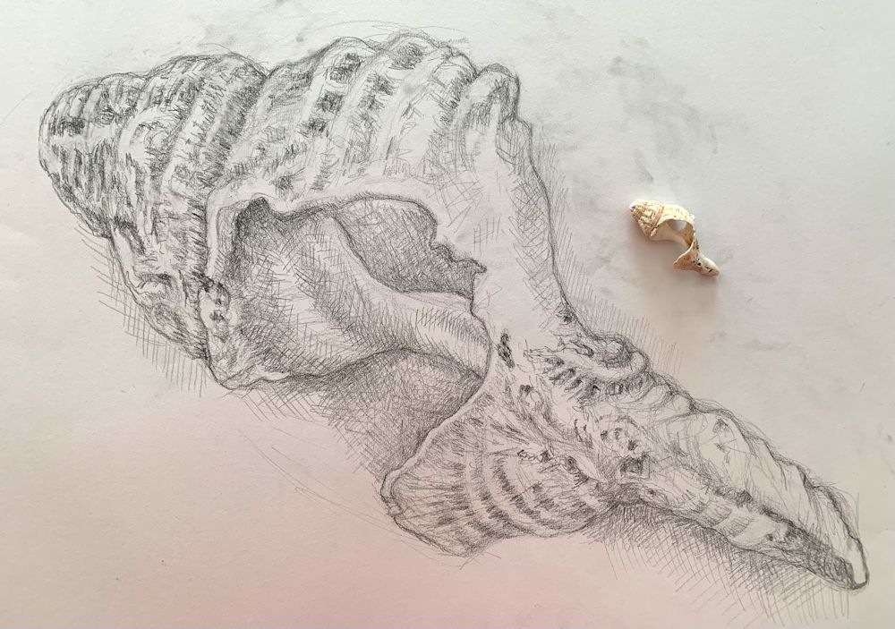
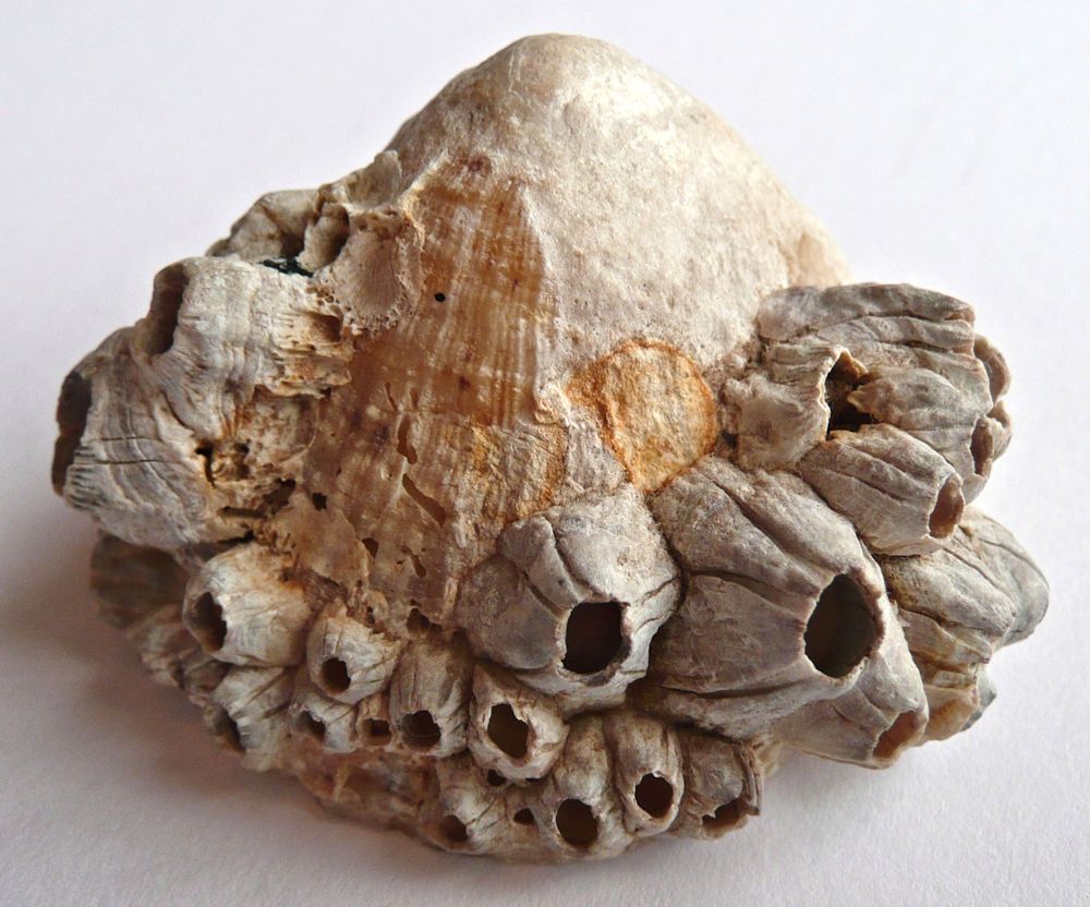
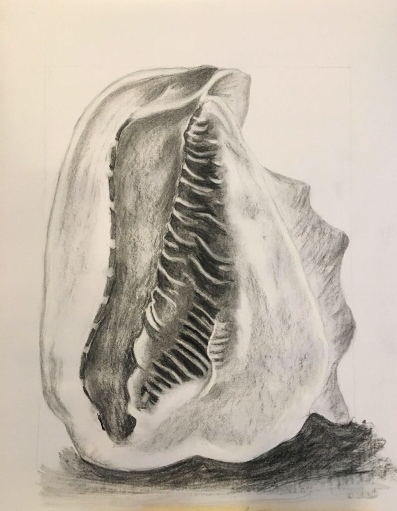
Drawing Larger than Life Week 3: More Challenging Sculptural Forms
November 18, 2021
This weeks challenge will be to draw a more challenging form. The drawings should show the three dimensional form of your chosen object and also communicate surface structures and patterns with mark making.
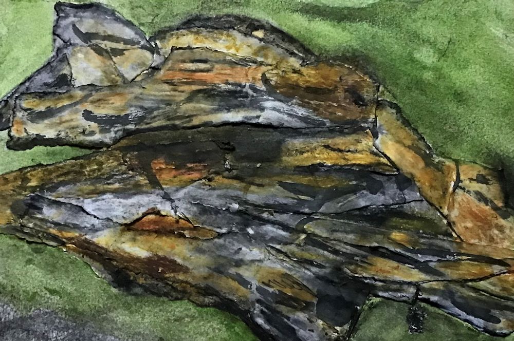
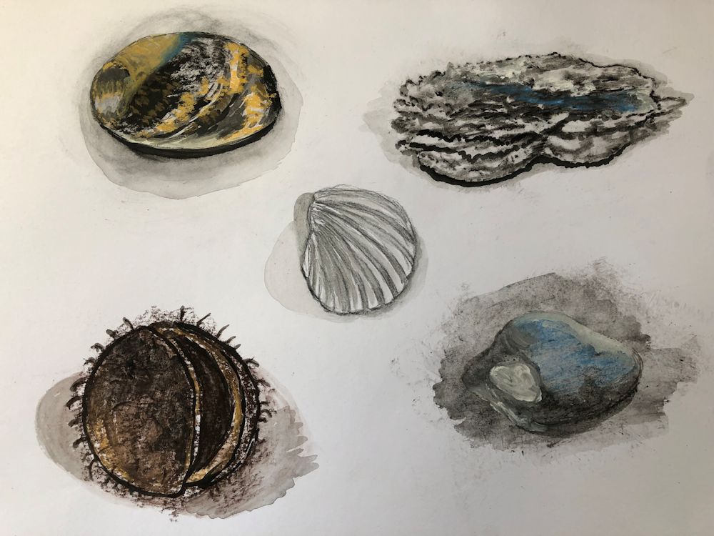
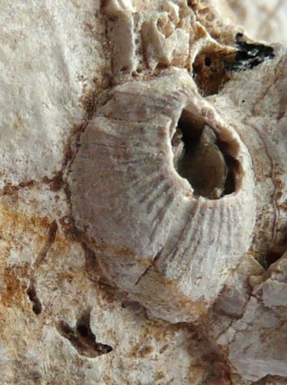
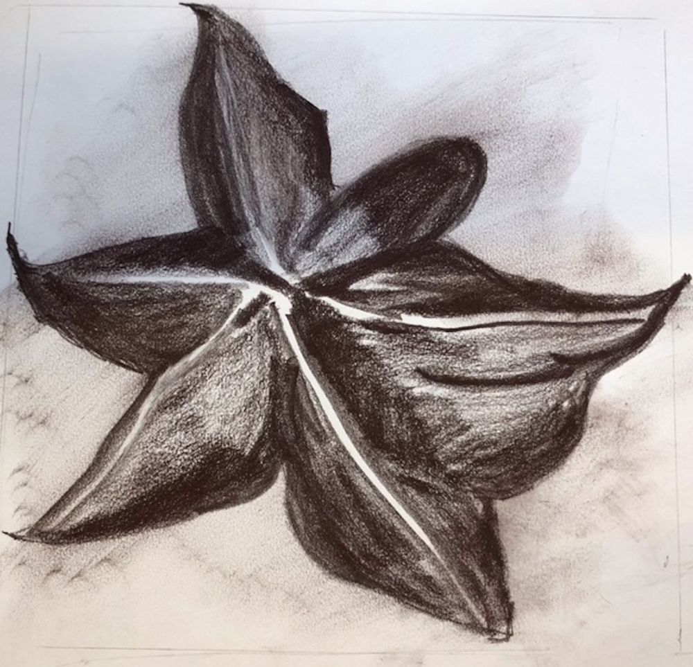
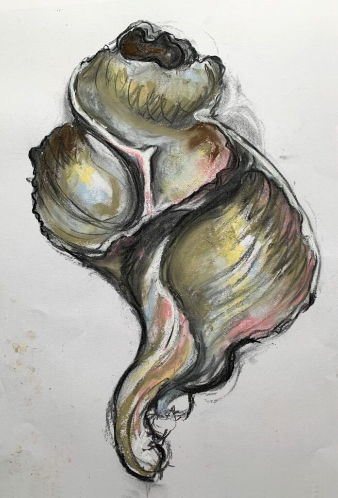
Barnacles on a simple sea shell like a limpet as in the photos above and below would be an interesting choice as you can home in on just one barnacle or the whole limpet shell with it’s whole population of barnacles.
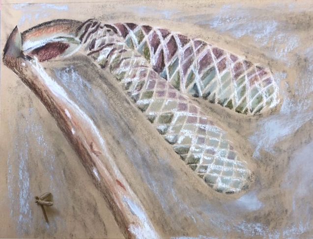
Another choice might be a small pine cone or a detail of a large one. I have included my crib sheet to help with drawing various natural forms at the end of this post. They are all drawn at a tiny scale and your challenge as last week is to fill a sheet at least A2 in size with your tiny object.
Another idea would be a skeletonised seed head or twig where the structures usually hidden below the surface are revealed.
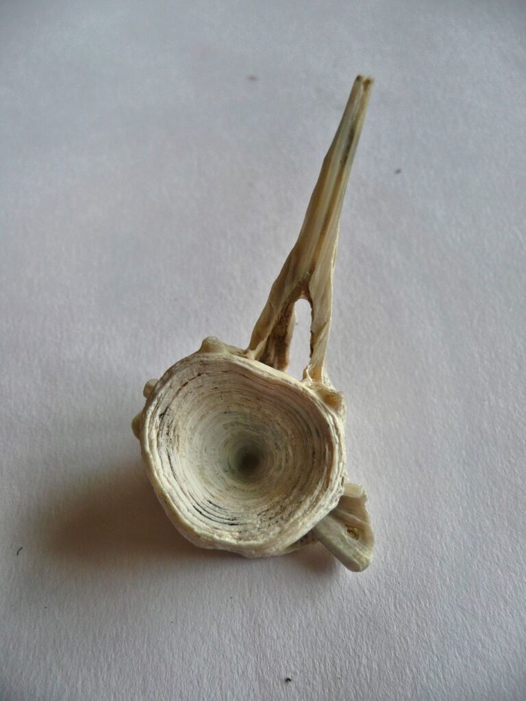
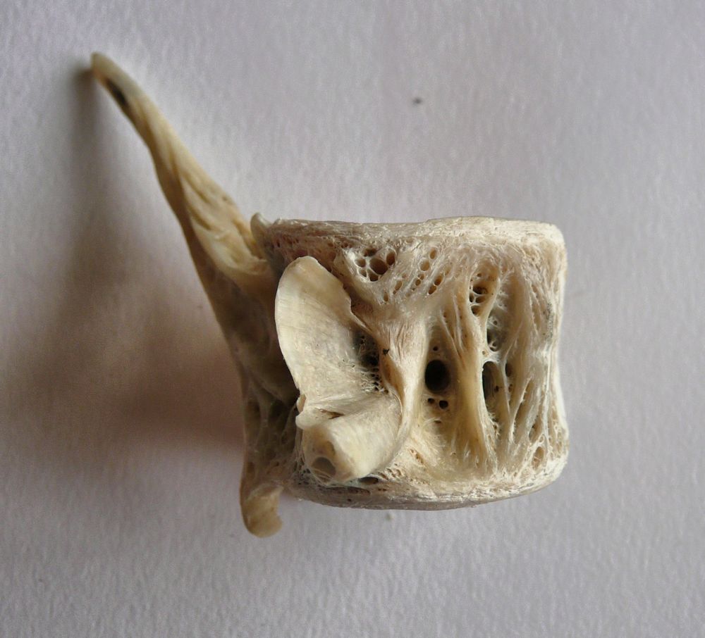
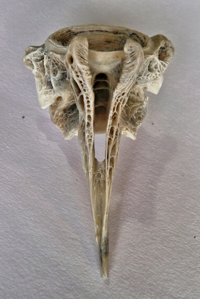
Lastly, bones can also make very interesting subjects and the series of photos below show the same vertebra from a species of fish with dorsal spines seen from different angles. Information on the fish would be much appreciated! The viewpoint of the object you choose to draw will be very important this week. You may even like to do a series of drawings of the same object over the next two weeks.
I’m sure you can make up some of your own.
There is one error at least! The axis of a pear is usually pretty straight even if the stalk bends!
Your Drawings;
All on A2 paper
Grey pastel ground,white acrylic ink, gel pen and brown pencil
by Sandra
Black Quink ink and bleach
by Sandra
Graphite pencil by Jan
Graphite stick 9 and 6B pencil by Jan
Reference for scale, together with graphite and ink drawings
by Jan
Charcoal and pastel by Ann
Charcoal by malcolm
Charcoal and graphite by Maryon
Charcoal by Heather
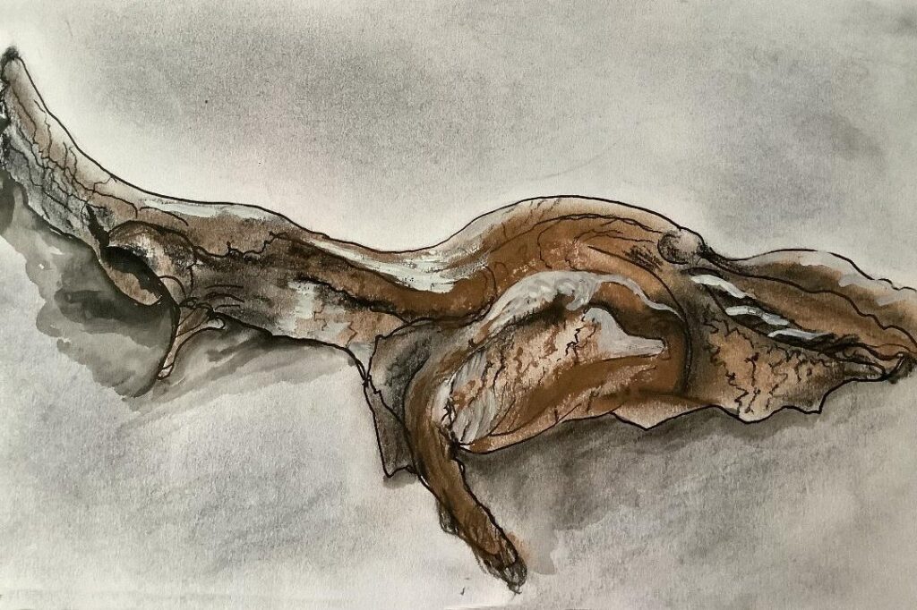
by Sarah
by Sarah
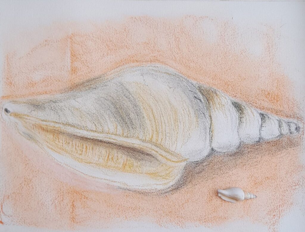
Watercolour by Maricarmen
Charcoal by Virginia
Drawing larger than Life Week 2: Flatter forms and Mark Making
November 10, 2021

Photo
Last week we looked at small but sculptural forms and how to make them look three dimensional. This week we’ll look at flatter or low relief forms with a view to depicting their character by mark making and line.
Look for an axis or a point from which a pattern of lines or curves radiate outwards and indicate this on your paper. Look for, in the case of a leaf as above, the point from which the veins radiate and draw them with regard for the angles between them.
To ensure your drawing is large enough make sure that at its widest and highest points these touch the sides of the imaginary rectangle enclosing the whole form. Best to do as last week and draw this rectangle feintly on your paper. Most natural forms are not completely symmetrical, nor will the point from which, as in the Ivy leaf above, will the point from which the veins radiate be necessarily the lowest point of your drawing even if the stalk is missing.
Leaves of course take many shapes, and the arrangement of veins may be along a central axis as in the holly leaf at the end of this post. Once you have drawn the main shapes of you object and added some tone where needed, you can then come to grips with the fun part, hopefully loads of interesting mark making. As ever practice various marks on some spare paper, on the bare paper and over areas of tone. Sometimes it can give a soft effect to tone the paper by light hatching over marks.
Try making dull marks with a blunt or rounded stick or pencil. Also try making well defined marks with a very sharp pencil or by either sharpening a stick of your medium to give a sharp edge. Keep a small piece of sandpaper handy for this. How much you suggest surface textures and patterns and how much you copy faithfully from the object is very much your choice and will depend on whether you wish to create an impression of the object’s character or go for ultimate realism.
Here are a few more photos of the sort of reference suitable for this week’s challenge.

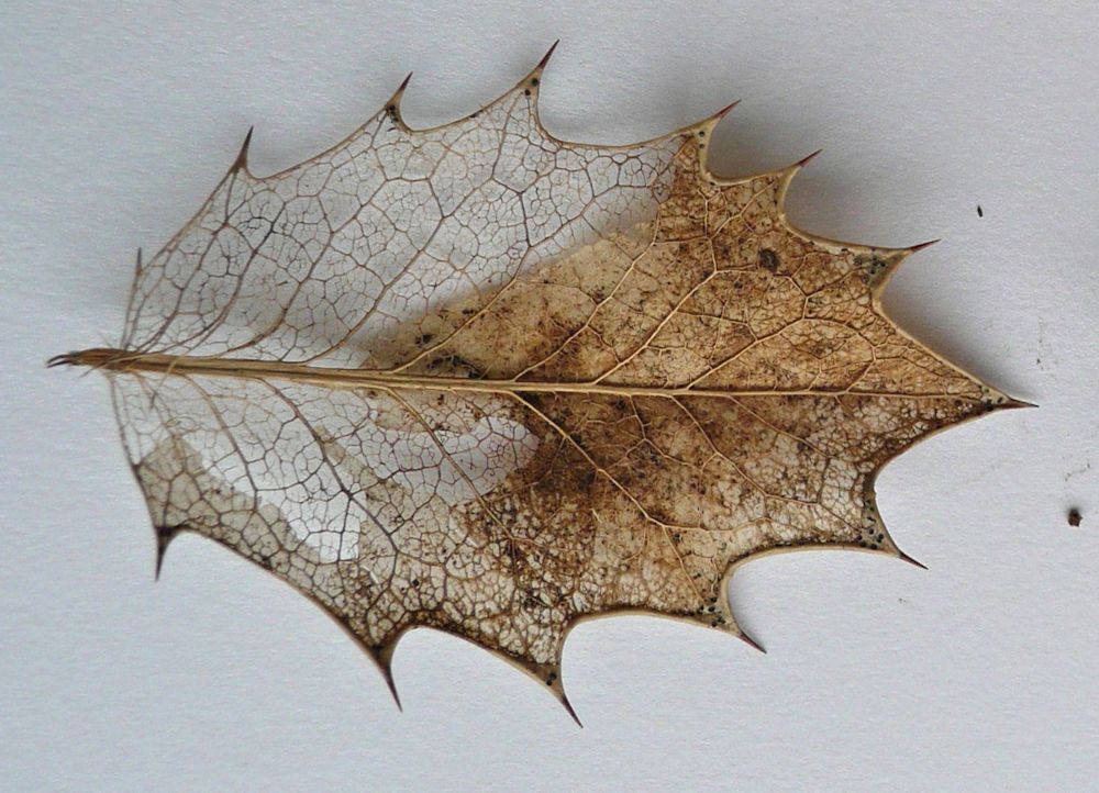
Note its weathered surface and how different it appears to its lower surface. You may like to try drawing both surfaces of similar objects.

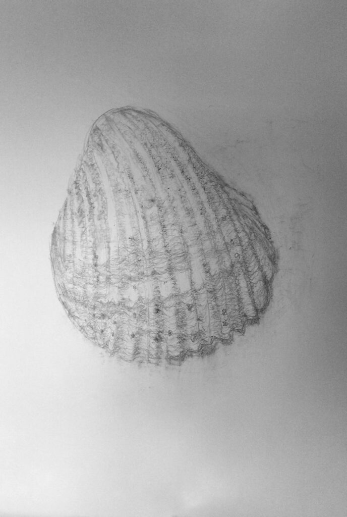
Your Drawings: All on A2 paper

Charcoal by Sarah
by Ann
by Ann

by Maricarmen

in carpenters’ pencils and graphite stick
by Maryon

Graphite, charcoal and sienna pencil by Jan

Graphite by Jan

by Virginia
Charcoal by Sandra
Drawing Larger than Life: Week 1, Natural Forms Sculptural
November 4, 2021
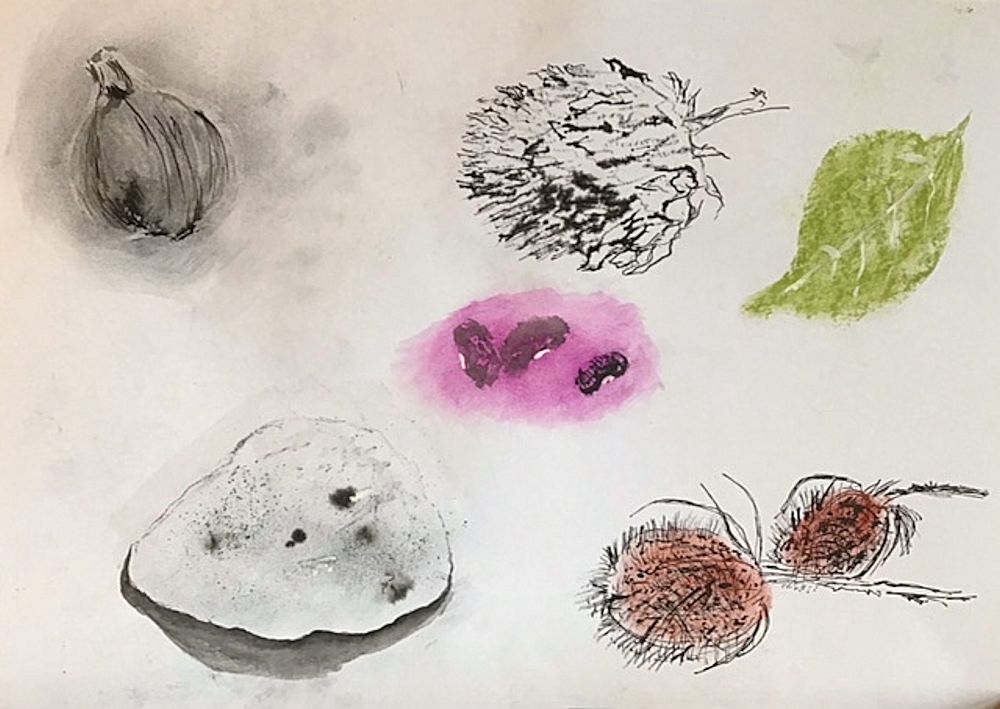
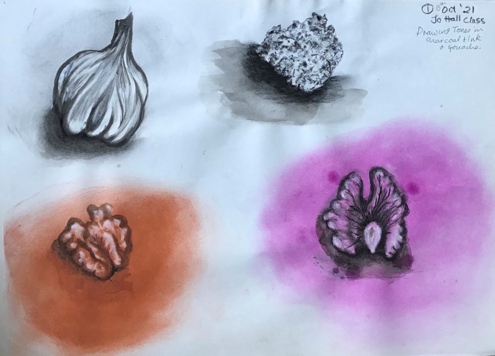
This is the first of four posts about drawing objects larger than life. As a former biologist I have always been amazed at the variety of structures and textures to be found in the natural world and had the opportunity to study their fine detail. However it is just as important with small things to start drawing their general shape and form in the same way as you might begin a drawing of a much larger object. I have chosen four examples see photographs below, which would lend themselves to being drawn much larger than life size. This week they are forms that have a very sculptural feel to them and the aim will be to depict their three dimensional form.
It may be helpful to reference the drawings of walnut halves by the sculptor Peter Randall Page link to his website below;
https://www.peterrandall-page.com/drawings/walnut-i-xii-2/
Many of his drawings are over 1 metre in size.
We are so used to scaling down to draw from the landscape or whole human form that it is quite a challenge to draw something tiny between about 2 and 10 cm on its longest side on a large sheet of paper. Ideally I would like you to work on an A2 sheet but absolutely no smaller than A3.
Once an object has been chosen, spend some time examining it from several angles. Think about its overall dimensions and when you have decided on a view to draw mark out a rectangle on the paper that its sides will just touch. This will help you place the object on the page and also indicate the size at which you will be drawing.
You may like to hold the object in your hand but if working at an easel I generally prefer to attach the object to a piece of paper and work with it on or beside my drawing paper. Try to ensure this is at a comfortable place for you to observe and then draw and minimise any change of direction of your gaze every time you look back from your drawing to the object and back again. You should, especially in the early stages of the drawing spend mire time looking than drawing. Masking tape or Blu-tak is usually sufficient to anchor a small object unless it is very heavy like a fossil or stone.
Choose drawing media according to the size of the paper support and the kinds of mark you wish to make. For instance you may like to start drawing very broadly with a graphite stick or chunky charcoal for the overall shape and tone and then go in with a smaller form of the medium, graphite pencil or thinner charcoal or charcoal pencil for more detailed work. If you have any you could also experiment with coloured graphite and/or coloured charcoal sticks and pencils. Another good choice would be conte crayon that you can use on its side like a pastel or make strokes with the end. Conte crayon is harder than most pastels but is chalky and can be moved a little on the support. All these media can also be brushed with water but as always, it is advisable to experiment first on a separate paper before using on the final drawing.
Some forms will have a definite axis as in the Physalis above. In this case the axis of stalk to tip is curved and proves a useful anchor for your drawing. The nectarine also has an axis but it is much more asymmetrical. However all the pits and furrows relate to this axis.
Once you have established the general shape and form of the object you can start to home in on some of its detail. In the nectarine stone this may be the contours of the pits and furrows on its surface. With the Physalis lantern, after establishing the main shape and tones between the main veins, this will probably be indicating the smaller veins with more linear marks and looking at some of the smaller changes in tone within each section.

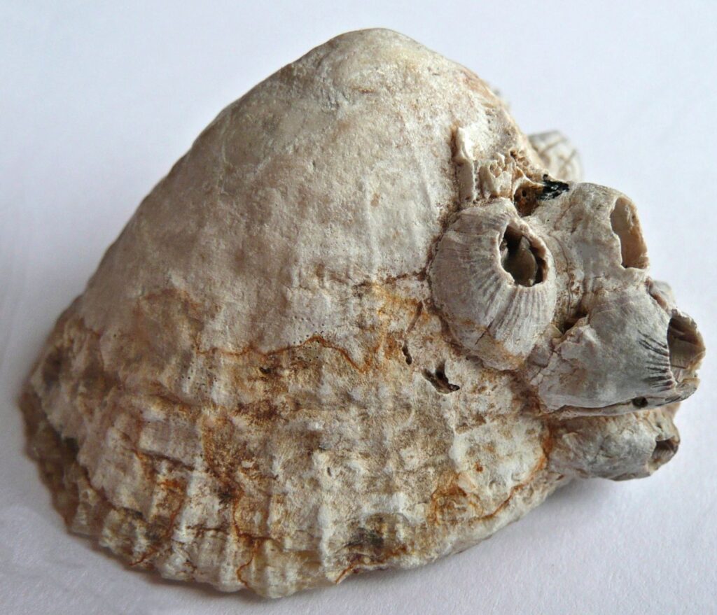
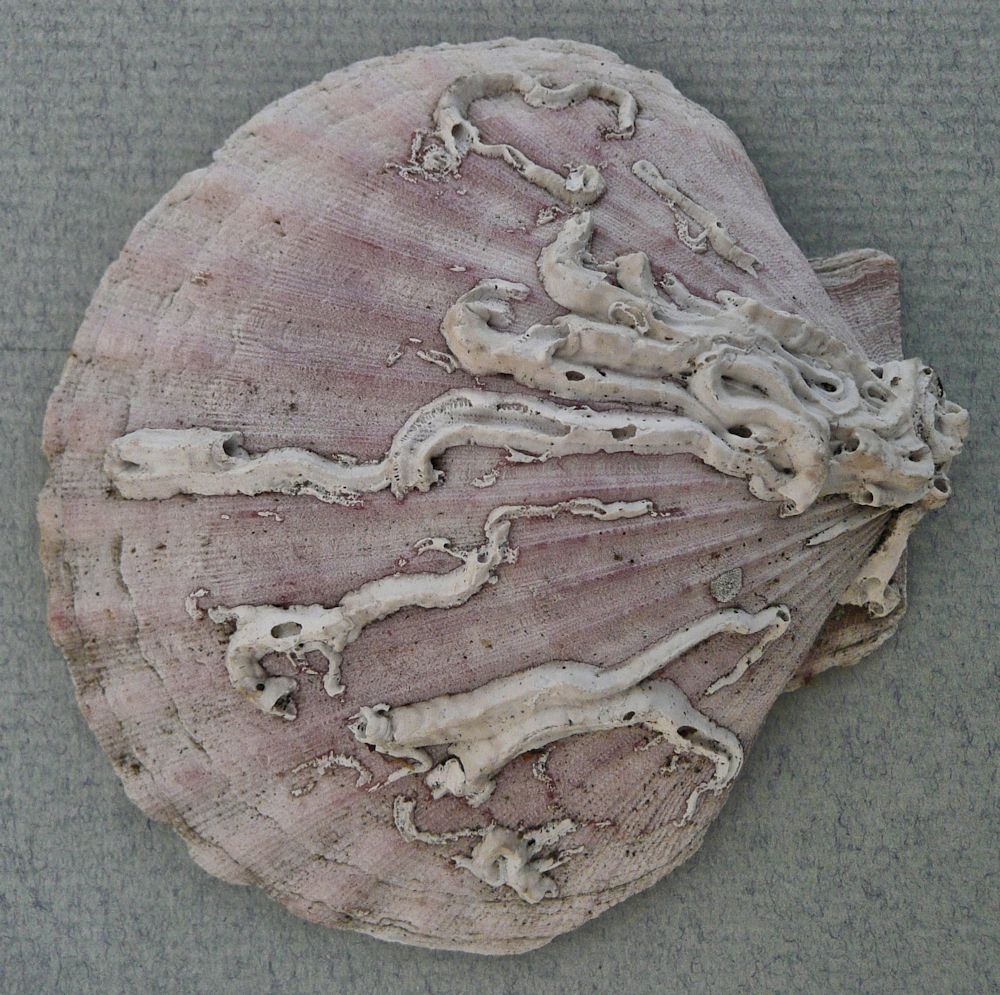
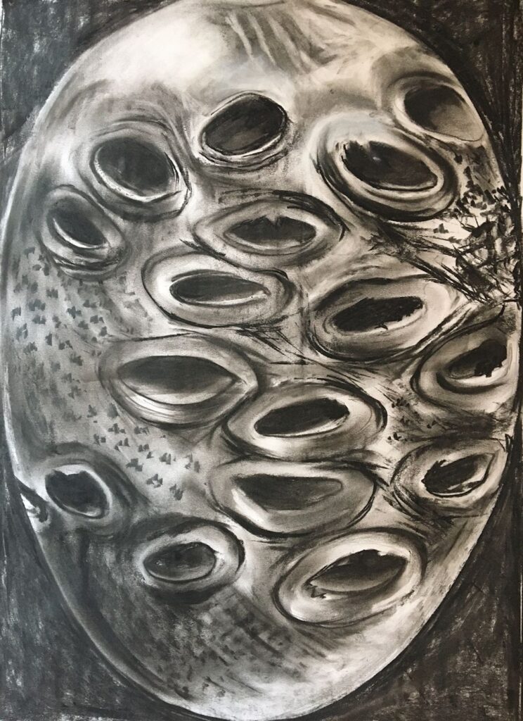
With other objects like the shell with barnacles below, try sketching in the main shape and then look for the curved ridges on this little oyster’s weathered shell. Many of these are hidden by the barnacles that populate its surface. These ridges represent growth spurts and centre on the narrower end of the shell where it is covered by the pot shaped barnacles. Where there are few clues to the underlying structure just map out the main areas and work tonally. In the case of the shell below imagine or even draw in lightly the surface the barnacles are sitting on before drawing them. Note the other textures and structures on the surface and decide whether or not they are relevant to the drawing. The amount of detail as in every drawing is the artist’s decision.
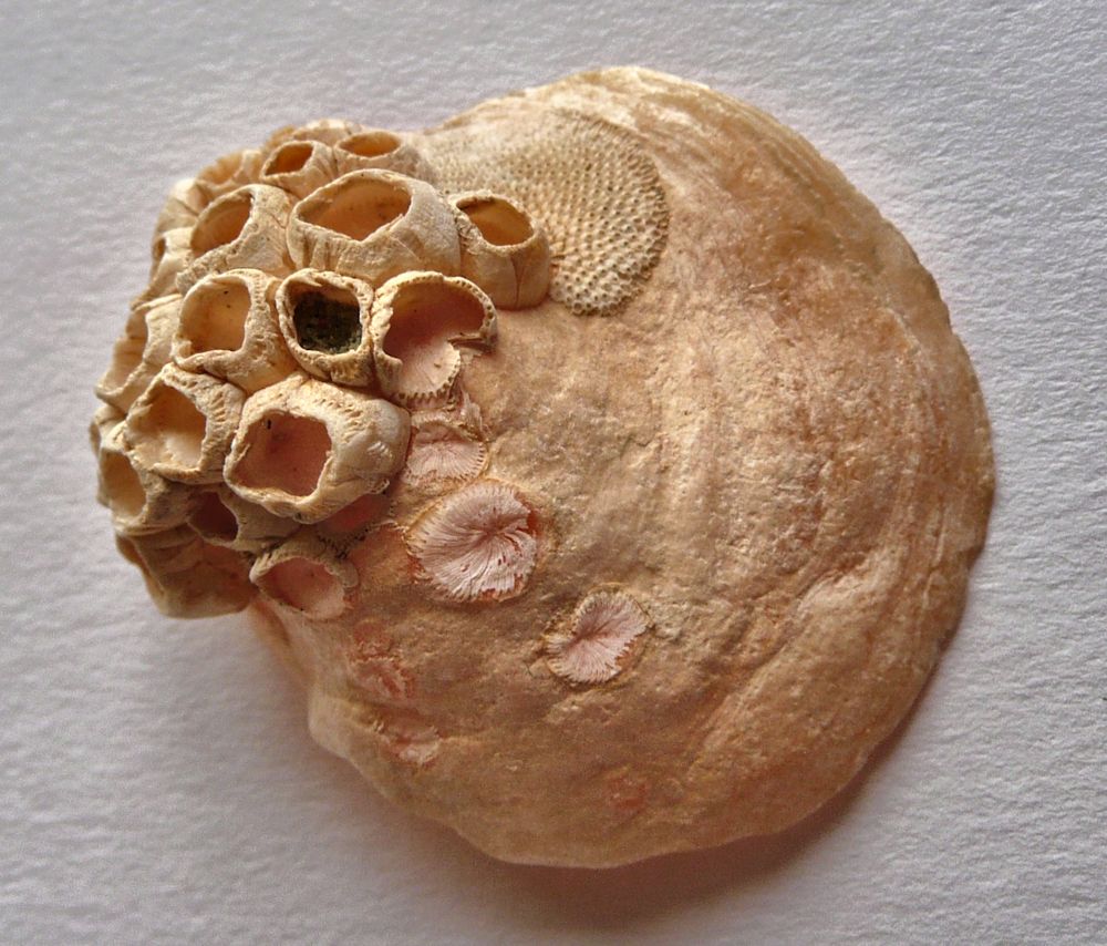

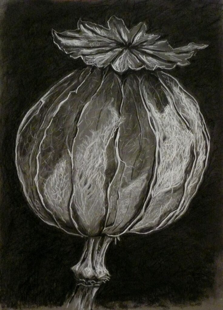
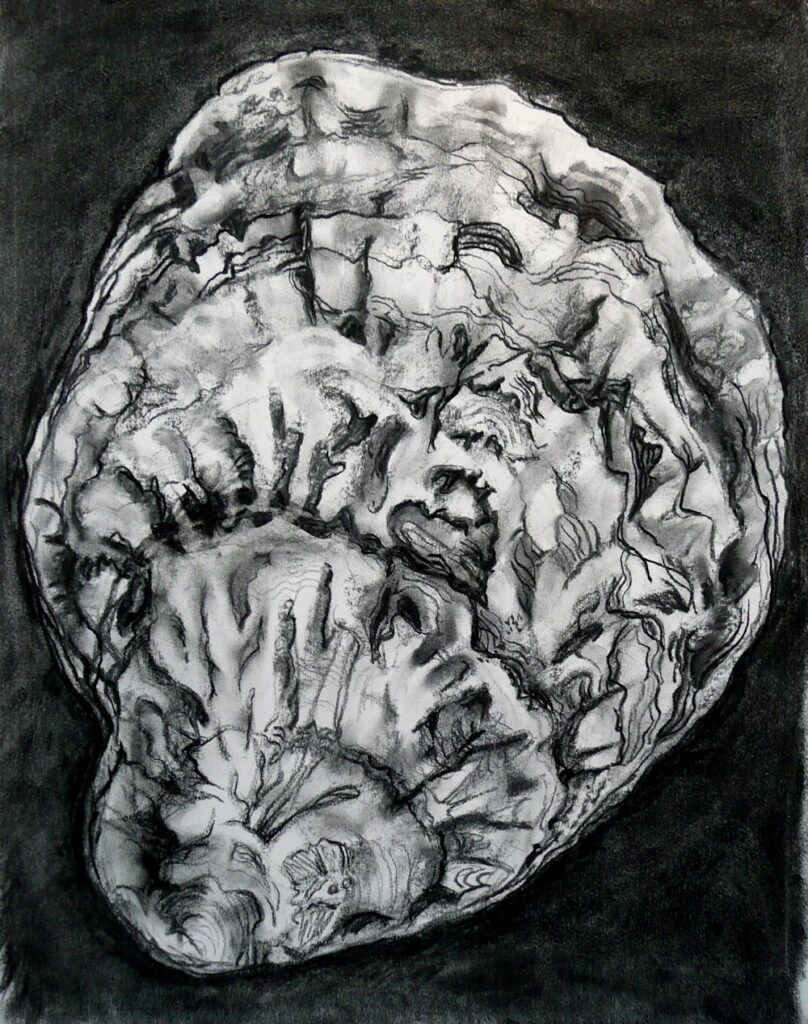
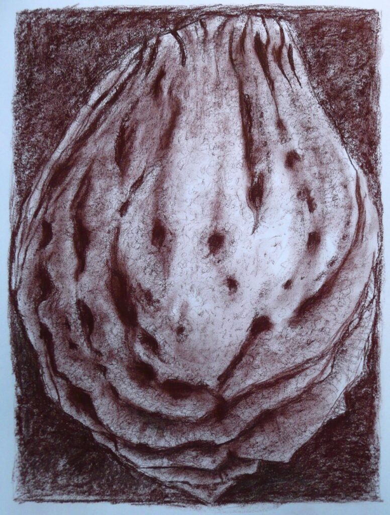
Size about 5cm across
Your Drawings: All drawings on A2 paper unless caption reads differently

4cm long flower-head with bracts
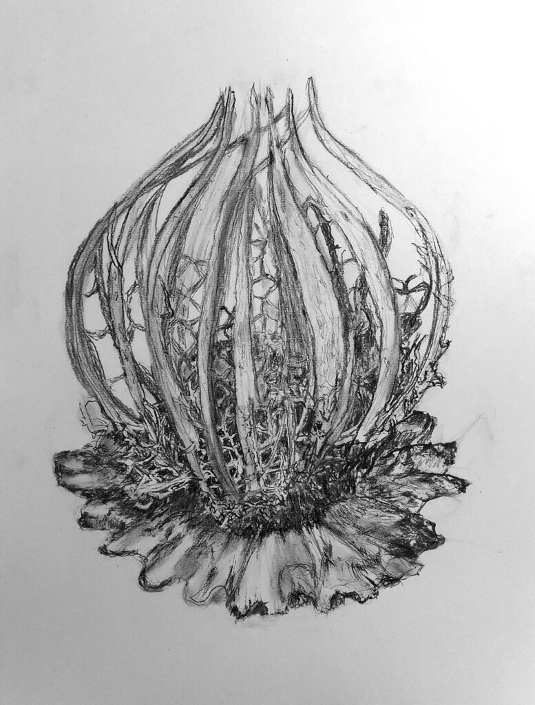
Charcoal and pastel pencil by Malcolm

Charcoal and pastel by Sarah

Coloured crayon and charcoal pencil by Sarah

Coloured crayon and charcoal pencil by Sarah
by Heather

by Sandra
by Sandra
Turned on a lathe to a smooth egg shaped form
Charcoal on A1 paper by Maryon

by Ann

Charcoal by Virginia
Graphite by Virginia

Pastel, pastel and conte pencil and charcoal by Virginia
by Maricarmen
by Maricarmen
Charcoal and pastel by Jan
Charcoal and pastel by Jan
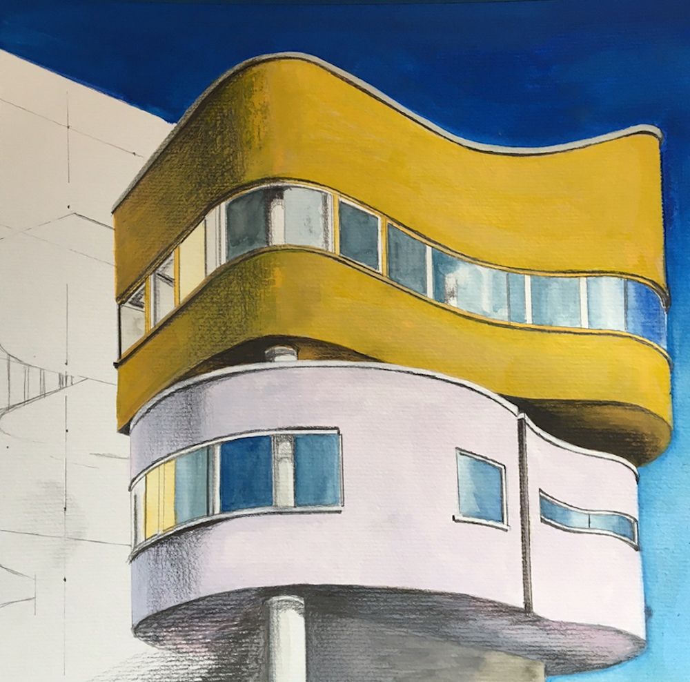
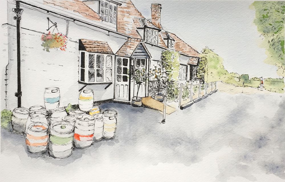
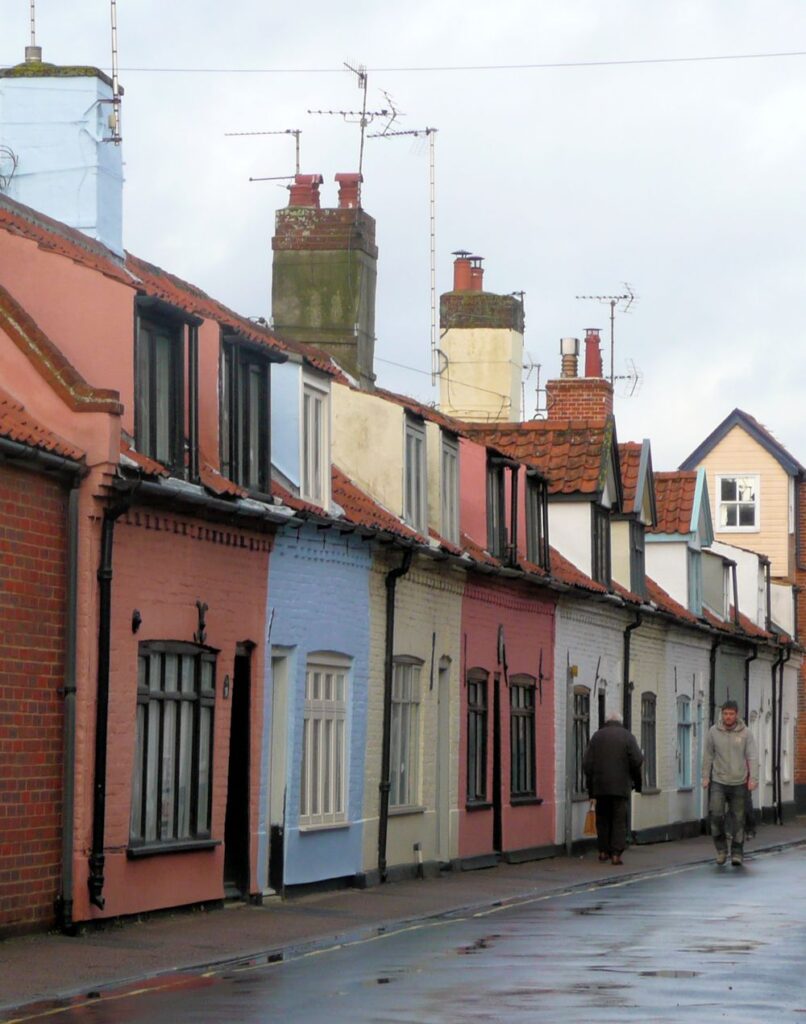
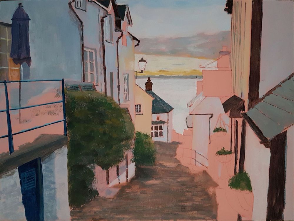
Buildings Week 4: Quirky or Eccentric
October 27, 2021
Photo
This week’s challenge is to draw or paint a quirky building. The only definition I can give is that it should be a building you find strange, amusing or eccentric. One example that I could not resist is above. As the road name suggests this little lane does indeed coil round and ends so that you are forced to retrace your steps to exit. There is also a sheer drop on the other side of the house.
Below is a house that at first sight looks pretty conventional till you notice the bricked up windows and the fact that there is a strange attachment to the house next door and a very tall chimney.
Photo
When you see the rear it appears to be a very strange house indeed.
I kept wondering what was beyond the mysterious white door beside the steps! Was this part of the original house before the extension and concrete steps were added?
I wonder what you will find for this challenge?
My demonstration will be from one of the images above.
Remember the basic observation of perspective is just as important this week. Also you may have to deal with shapes that are far from square and conventional, so imagining how the structure is in three dimensions may help with your drawing. If you can, choose a building you know, and have seen from several viewpoints.
Your paintings:
Gouache and graphite by Maryon
Pastel by Mali
Ink and pastel by Sandra
Pastel pencil by Malcolm
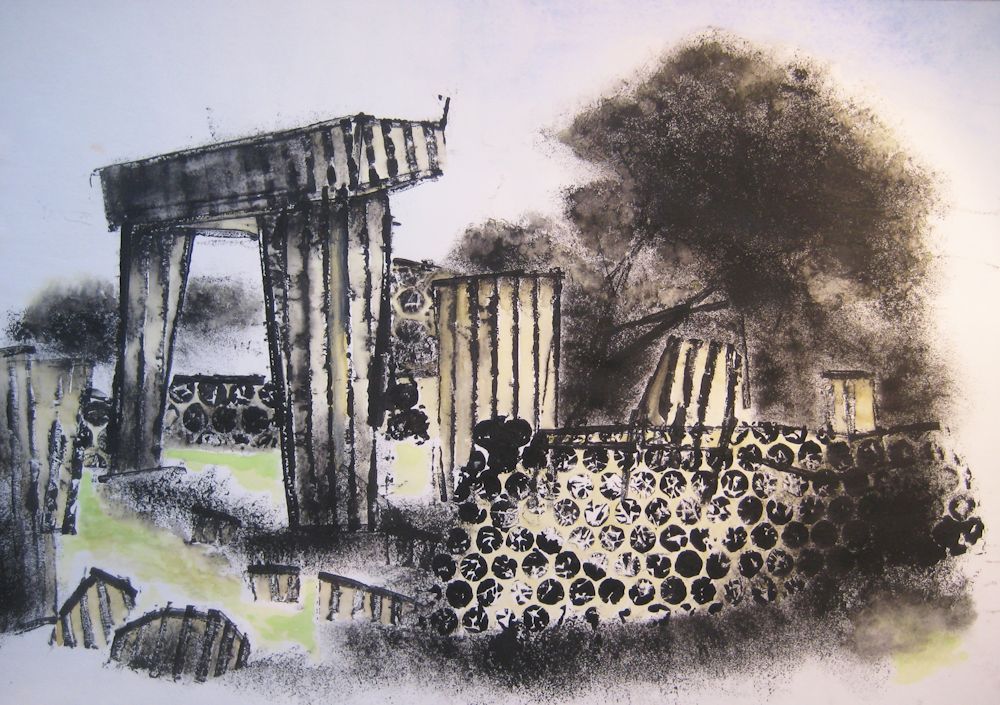
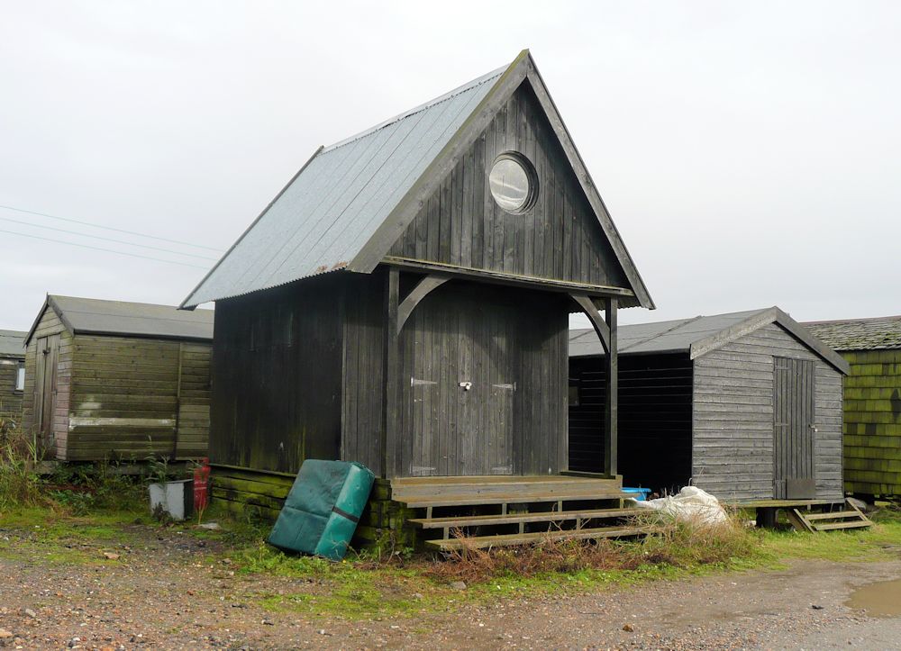
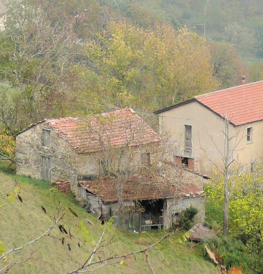
Buildings 3: Architecture with a Cultural or Community Interest
October 20, 2021
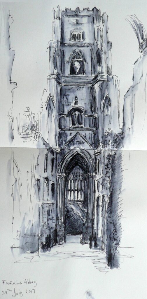
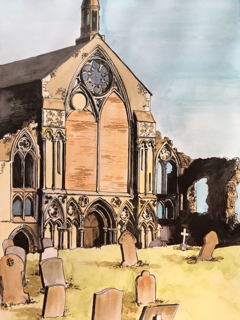
Because the abbey is a ruin parts of the outside and of the interior of this tower are visible at the same time.
The sketch was made on site with non-waterproof ink brushed with water which is a great way to record tone with the minimum of equipment; just a pen, in this case a Rotring Art Pen, a water brush and a sketchbook.
This week we’ll consider a single building, a theatre, church, castle, or a mosque, in use or ruined, that has a particular appeal to you. It is always best to choose a place you know, have walked around, hopefully sketched and photographed as you will have a memory of how it felt to be there not just the nuts and bolts of the structure.
Just a few of the many ways artists have tackled buildings can be seen at the Pinterst Board below
https://www.pinterest.co.uk/jhall1282/buildings-in-art/culturalcommunity-buildings/
It includes Impressionist paintings, works by John Piper and also by the contemporary artist David Tress and a few others. These artists use both different materials and different approaches to painting architecture. Perhaps try making several sketches from your reference and while you are drawing think about what you want to communicate about the place.
Is it the architectural details that interest you and how much should you include? Are you excited by the textures and patterns or graffiti on the walls. Do you want to suggest the mood or time of day with the lighting and colour? What do you feel about this building; is it joyful and uplifting or sad and lonely. Are you overwhelmed by it’s size etc. How much of its surroundings will you include and/or do you wish to paint only part of the building?
By making these initial sketches, especially if you have references from different viewpoints of the same building, you will also familiarise yourself with all it shapes and angles and become much more aware of how it is constructed. Last week’s session should help with this.
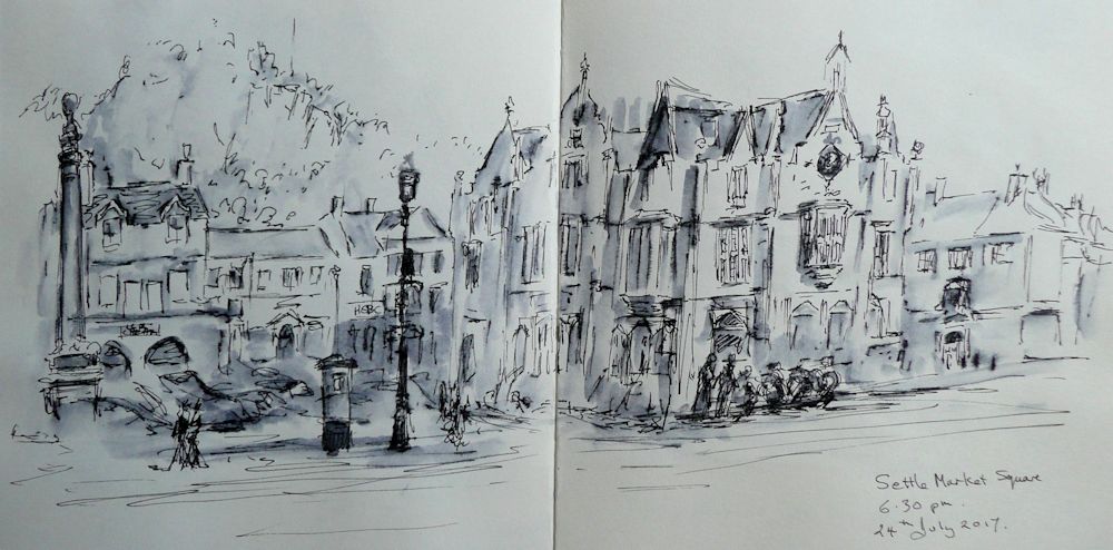
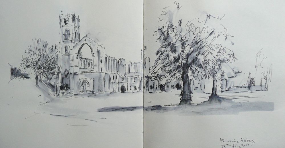
Most of this very loose sketch is taken up by the huge and rather gothic building with turrets and bay windows beside the market place. I sketch . I took photos and left to make dinner. My camera will capture the detail but my sketch will supply the quirky grandeur of the building and its surroundings.
If you have time look at the many paintings Monet made of Rouen Cathedral at different times of day. Enjoy looking at more works by John Piper and David Tress and then set about your own building work! Have fun!
Your paintings:
by Mali
Mixed media by Sandra
Ink and watercolour by Maryon
Acrylic by Malcolm
Ink and watercolour by Ann
Ink and Watercolour by Heather
Ink and Watercolour by Ann
Drawing by Heather
Buildings 2: Viewpoint
October 13, 2021
Gouache and watercolour on grey paper
The Importance of Viewpoint
This week we explore looking at buildings with regard to the artists viewpoint.
First look at the Pinterest board at:
https://www.pinterest.co.uk/jhall1282/buildings-in-art/town-square-or-street/
Think about the viewpoint from which these works were made. Was the artist looking up at or down on the street. Also look at whether the scene is on level ground or a slope. What happens to the horizontal structures e.g. window ledges and door lintels in relation to the ground when the buildings are on a slope?
Ink and wash
In drawing a straight street it may be useful to understand how single point perspective works. Where a group of buildings or single buildings are being drawn it is also useful to come to grips with two point perspective. In many situations where buildings are at different angles to each other measurement or estimating the relative sizes of the forms becomes increasingly important. The following diagrams describe how the most basic forms of perspective work.
Single point perspective: If perfectly parallel rows of houses are situated facing a road that is also perfectly straight it would be perfectly feasible to draw construction lines as guides for the drawing which employ the use of single point perspective.
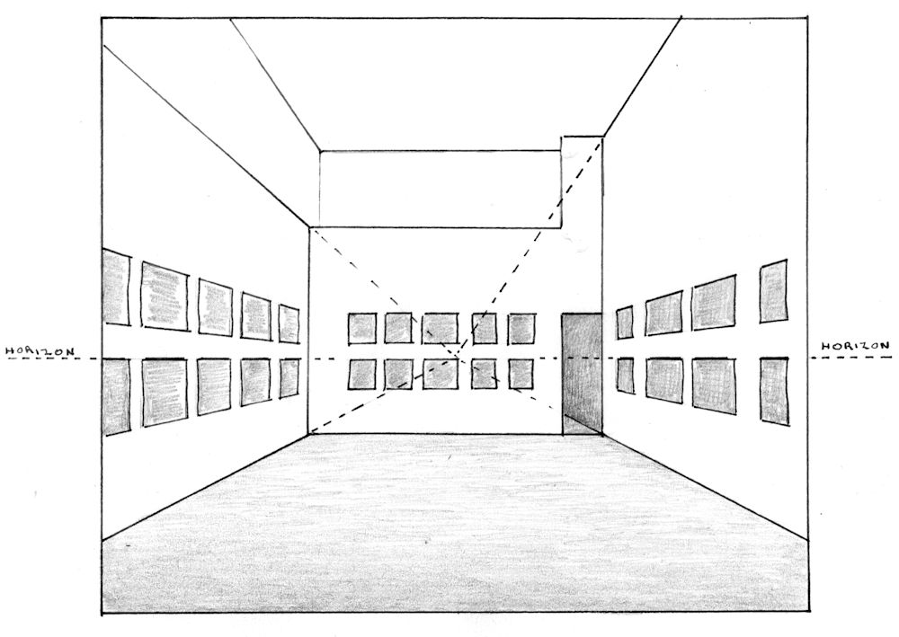
In a perfect street as that described in the text the straight road with a perfect row of houses on either side could be constructed in the same way.
However streets have a tendency to bend and buildings are not always built at Only straight sections lend themselves to this approach. New vanishing points have to be constructed for every bend in the road.
Because buildings are often on streets that bend, and built at different angles to each other, you will often have to resort to measuring the main heights and widths of the large shapes and then home in on how best to draw the smaller details.
Two point perspective: Sometimes where one building dominates the scene an idea of how two point perspective works will give a starting point from where you can estimate and or measure the rest. Below are diagrams that will help you analyze what is happening when a building is seen from below, from a slightly higher elevation and from a point above the building.
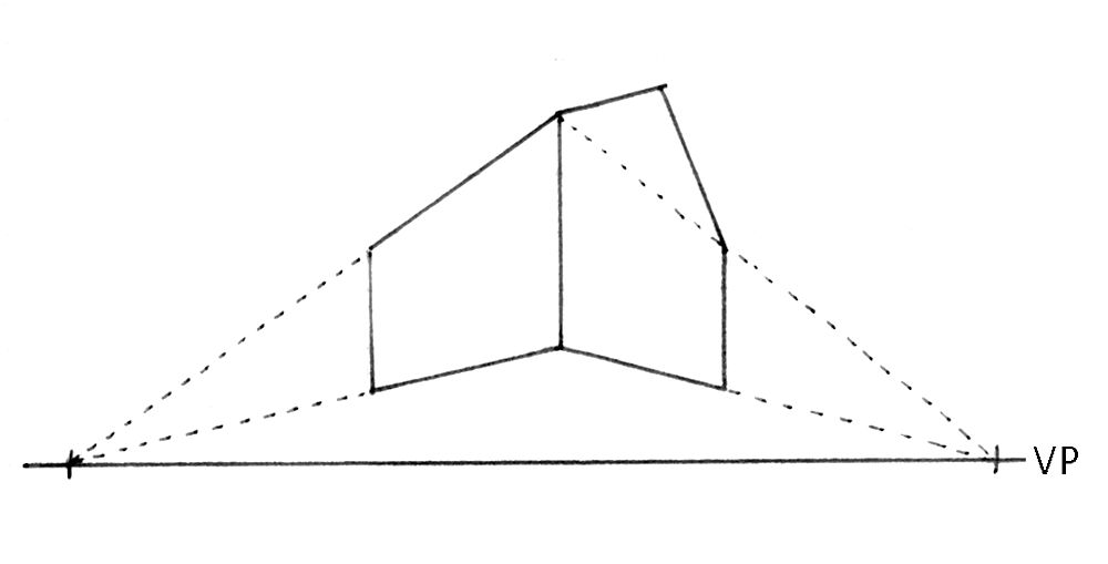
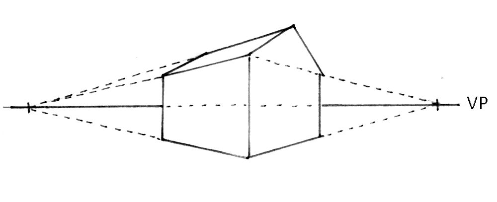
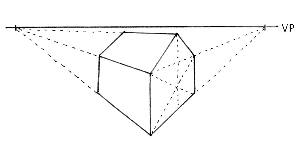
Understanding how perspective works will help you sort out the drawing if something looks out of place, and will supply you with some tools to make necessary adjustments with individual buildings and with some street scenes. More often buildings are not at convenient angles to each other and it will be your skills in observing, making actual or mental measurements (estimations of relative sizes and angles) that will be most useful for drawing clusters of houses. The best way to learn is by sketching wherever possible on site (the best way), or from photographic reference. Continually ask yourself questions about relative heights and widths and angles.
Note what is missing on all four sides of the image on the right. I have also lost some of the foreground and the hill has become flattened out. Look also at the foreground shadow. Sketching on site is hugely valuable as decisions about what to include are made and most distortions as in the left hand image are largely eliminated.
If I were drawing this scene from the photo reference I would think very hard how to either use the distortions making the picture slightly surreal or manage them in a way that accommodated all the items I wish to include, and most importantly maintaining the impression of a very steep ascent..
When things get very complicated as when looking across at a sea of dwellings just enjoy the pattern of shapes and colours and have fun with them.
This week: choose to paint a rather straight street of regular houses or a single building or group of buildings in which one building dominates. Think about how single and two point perspective can help in constructing the drawing and/or help you check your preliminary drawing before developing the work further. Alongside this think hard about how important a part measuring dimensions and angles will be.
Your Paintings:
Rothschild Avenue Tel Aviv
Ink and Watercolour by Maryon
Acrylic by Malcolm
Acrylic by Malcolm
Drawing by Mali
Pastel by Mali
by Maryon
by Sandra
by Sandra
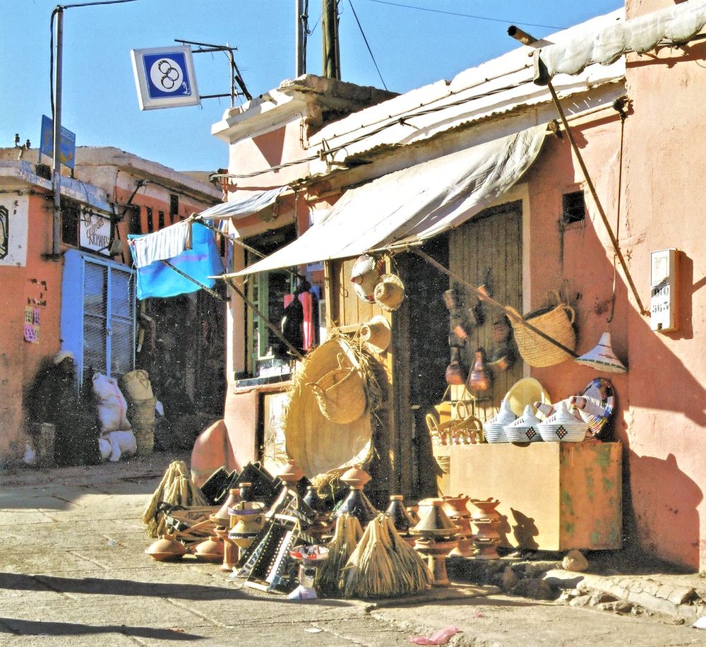
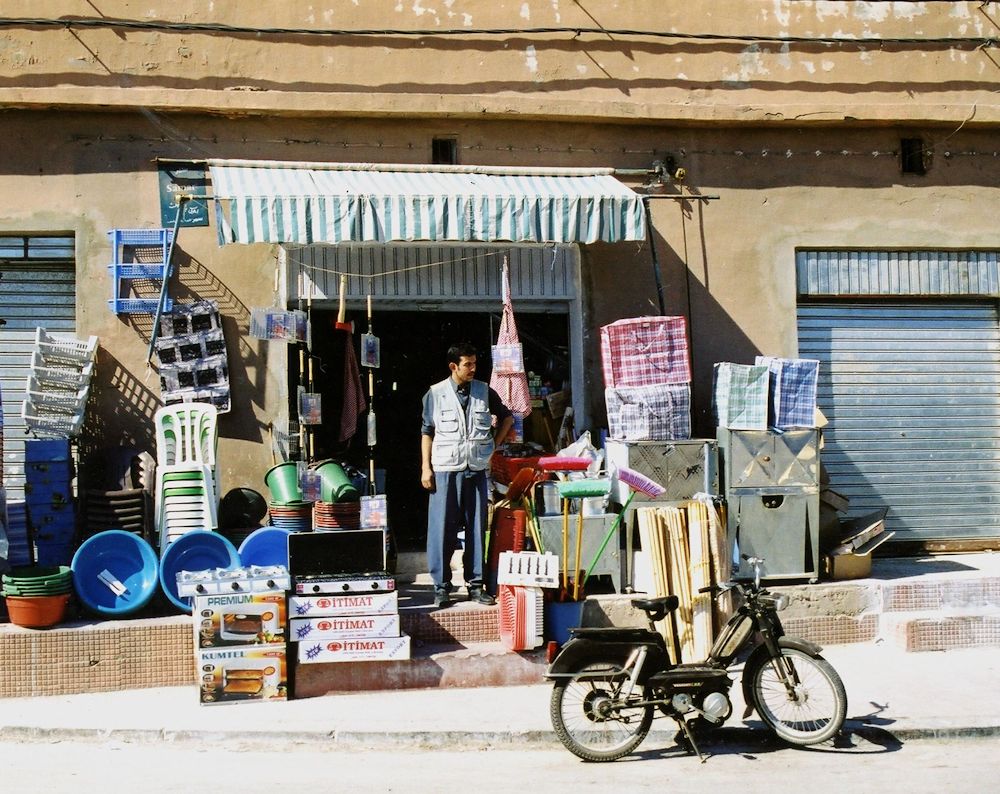
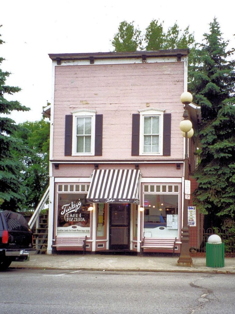
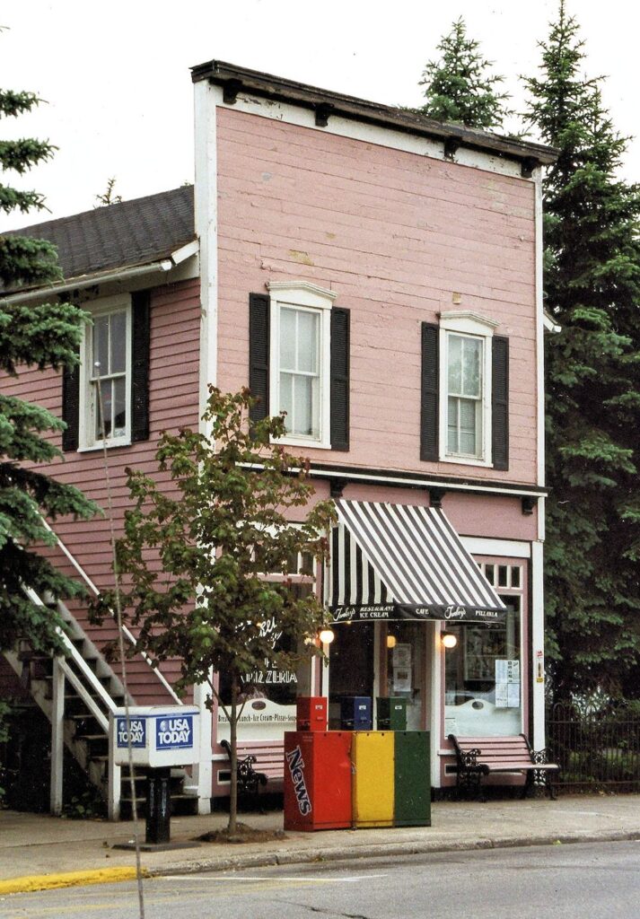
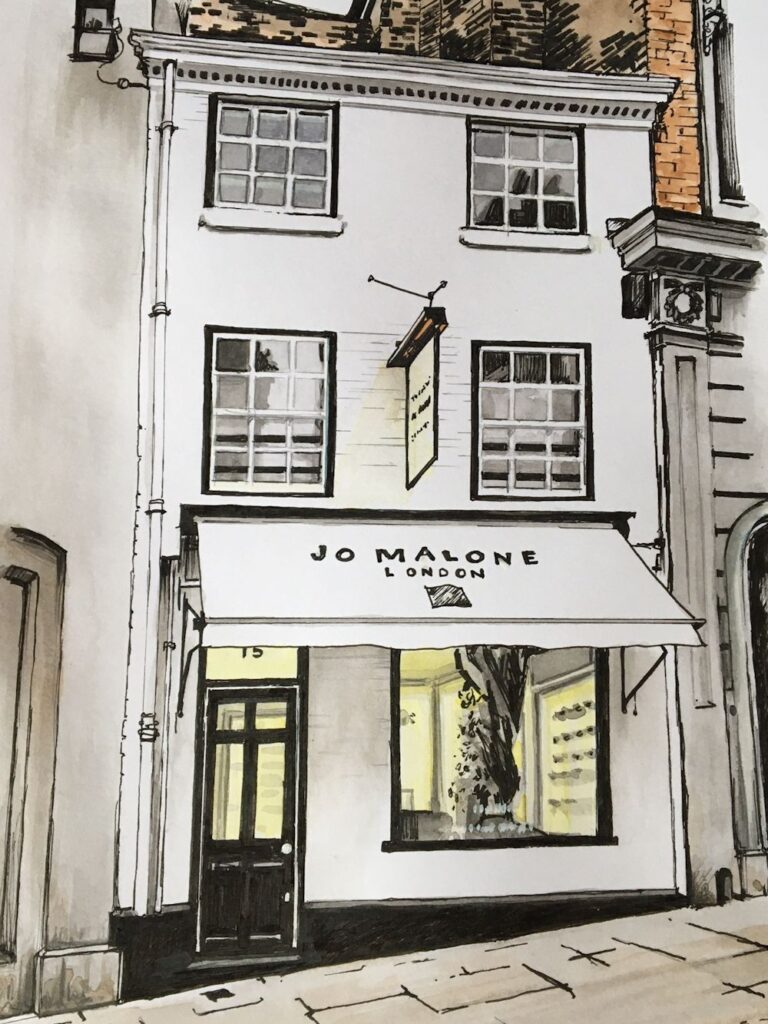
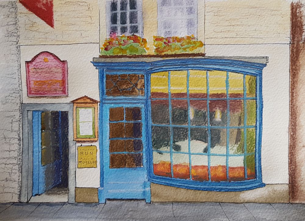
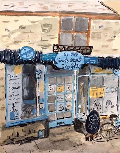
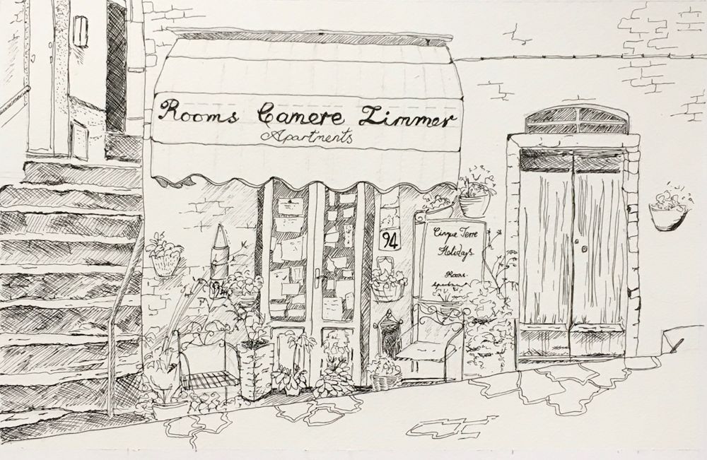
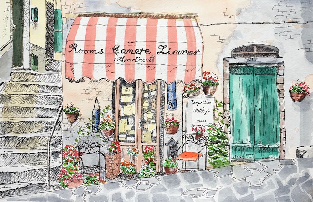
Buildings: Week 1 Shop and Bar Fronts
October 7, 2021
Ink and Watercolour
This drawing of a shop front includes the whole façade of the building with a suggestion of the trees behind and the vaguest idea of what is on either side of the shop front. There is a good sense of the light but very little detail of what is in the shop window. These are all choices you will have to make when considering your composition.
This is the first of four drawing and painting challenges looking at different aspects of drawing and painting buildings in towns and villages. Have a look at the Pinterest Board;
https://www.pinterest.co.uk/jhall1282/buildings-in-art/shop-fronts/
You will find a varied selection of works of bar and shop fronts from painterly works by Maurice Utrillo, Edward Hopper, Stephen Magzig and Brett Amory to the illustrative and very graphic coloured drawings by the contemporary artist Eleanor Crow. Not included are the wonderful drawings of Lucinda Rogers; well worth Googling!
A study of a shop is a well defined subject and seen from front on there is little perspective to worry about so it may thought to be an easy place to start. However there are still a lot of composition choices to make and of course some perspective issues as with with a corner shop, for instance. The photo references below have been chosen to illustrate just some of these choices.
Photograph
Here only the shopfronts and pavement are included. There are many possibilities for composition here;treating the two establishments separately; including or not including the tree; editing the foreground shoulder bottom left and/or the back of the bus on the right etc.
Over all composition: It is very much the artist’s choice what to include of adjacent buildings and also how much of the building above the shop front and how much of the pavement or road outside the store.
Photograph
Blue sky, much sun, great cast shadows and contrasts!
Tone: look at the dark areas. If a shop has an awning, what is below may be very shadowed. Doorways are often in slight alcoves and relatively dark. Really look at the pattern of light and dark across your reference sketch or photo. There may also be significant cast shadows. Contrasts of tone will be much greater on sunny days while cloudy days result in rather flat lighting so communicating this will give your work the atmosphere of the day, as well as depicting the objects.
Photograph
Look at the important part cast shadows play in the composition, especially that of the awning
Some of the most fun to paint are stores where the produce spills out over on to the pavement like a rather complicated still life and/or when the seller can be seen. I think of these shops as halfway to being a market.
Photograph
With trash can and street lamp, dull day.
Photograph
A different view with tree and news stands. Note the lower tone of the side of the building and the general pattern of light and dark, also the brilliance of the “welcoming lights” claiming our attention.
Whether and which street furniture to include; street lamps, waste bins, newspaper stands, traffic lights and other street signs etc.
People and traffic; decisions on whether to include pedestrians and window shoppers and parked bikes or vehicles.
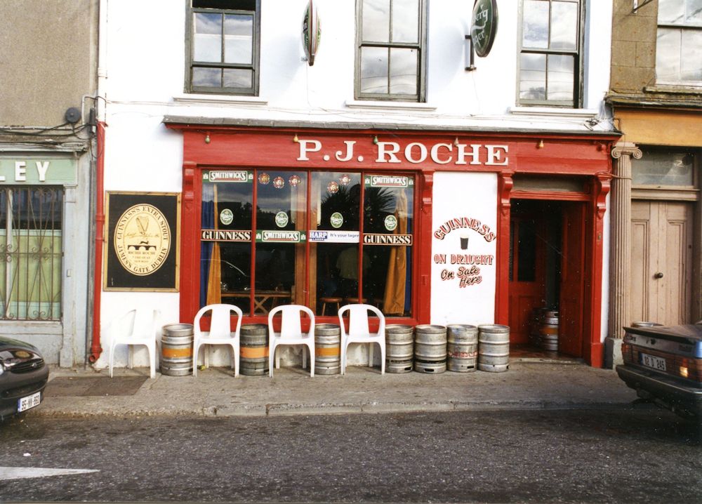
Photograph
Seems a bit cluttered to me!
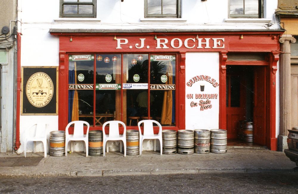
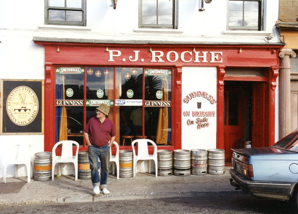
Photograph
Would consider cropping to just below the window sills. Undecided about the car but it does lend credence to this being a busy street and love the pedestrian.
Store signage, lettering, closed and open signs and how much detail to include of the wares on show.
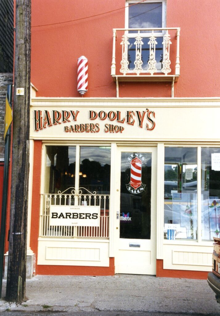
Photograph
Plenty of lettering and pattern here! Might use my imagination to complete the shop front on the right to experiment with a rather symmetrical composition.
Deciding on the detail of lettering is another choice but it should be in keeping with the rest of the work. If you are a calligrapher this will come easily to you. If not and you wish to make very careful lettering or even rather free lettering don’t be afraid to get a ruler out just so that you keep your lettering or scribble to the right height. If you are working the rest of the painting quite loosely it is usually best to work such details in the same way. Remember that loose does not mean inaccurate so be aware of the relative sizes of windows, doors,etc. and always remember to check the verticals.
Next week we will look a little at perspective, measuring and estimating by eye. This week should give you a good feel for looking at relative proportions and thinking about composing from your reference.
Your Drawings and Paintings;
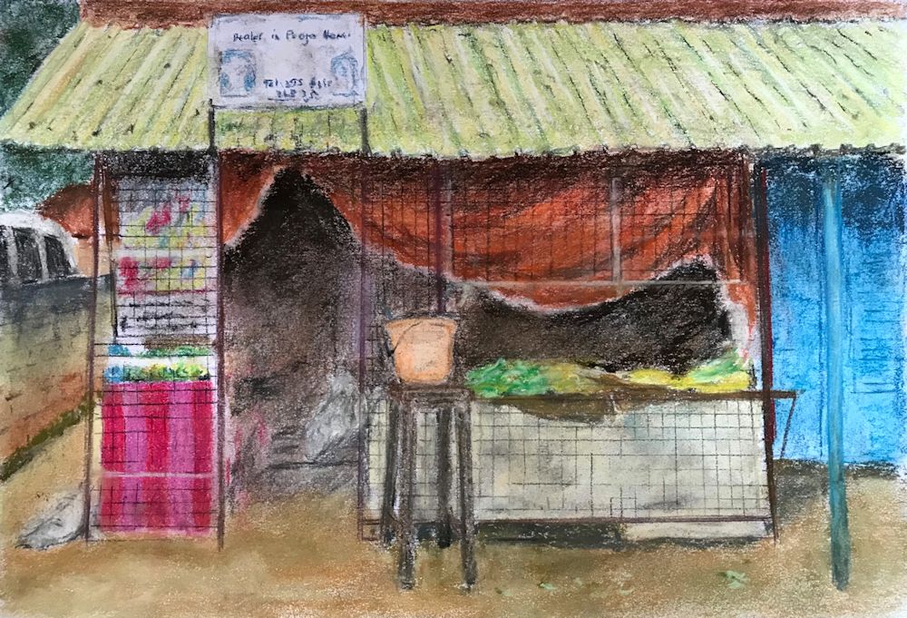
by Mali
by Maryon
by Malcolm
Watercolour by Sandra
Ink Drawing by Heather
Ink drawing with watercolour wash by Heather
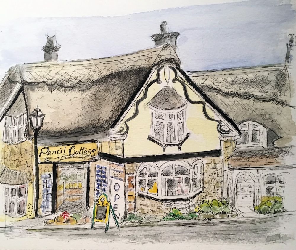
Ink and watercolour by Ann
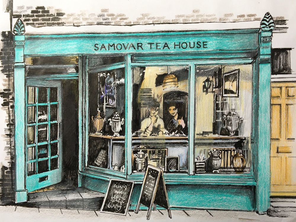
Ink and Watercolour by Maryon
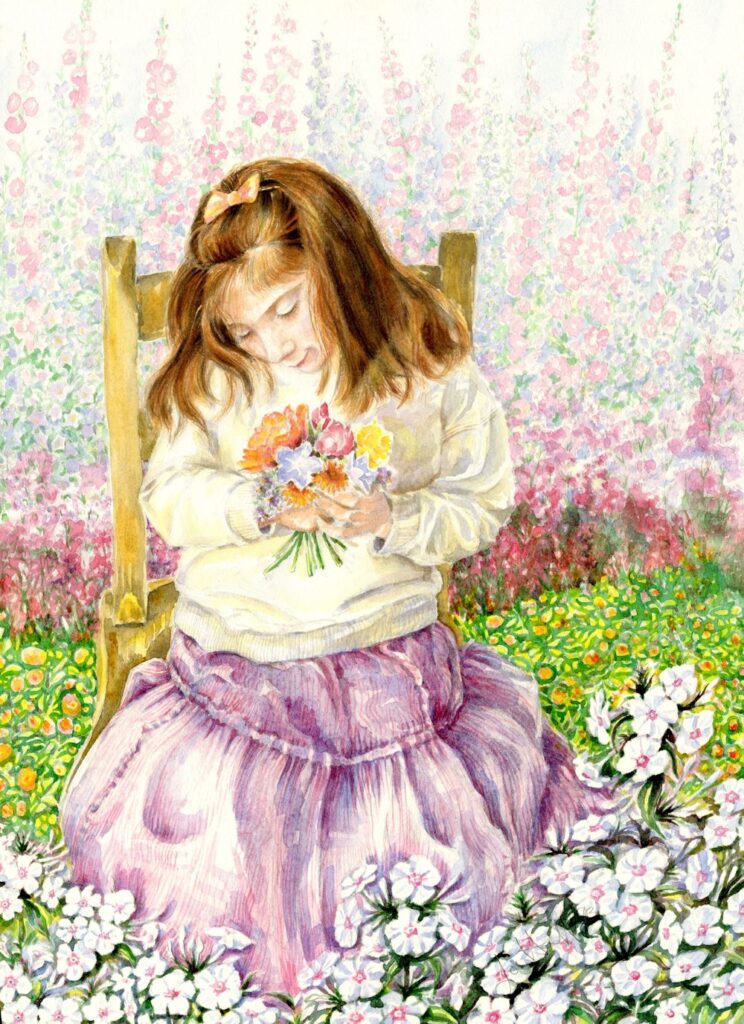
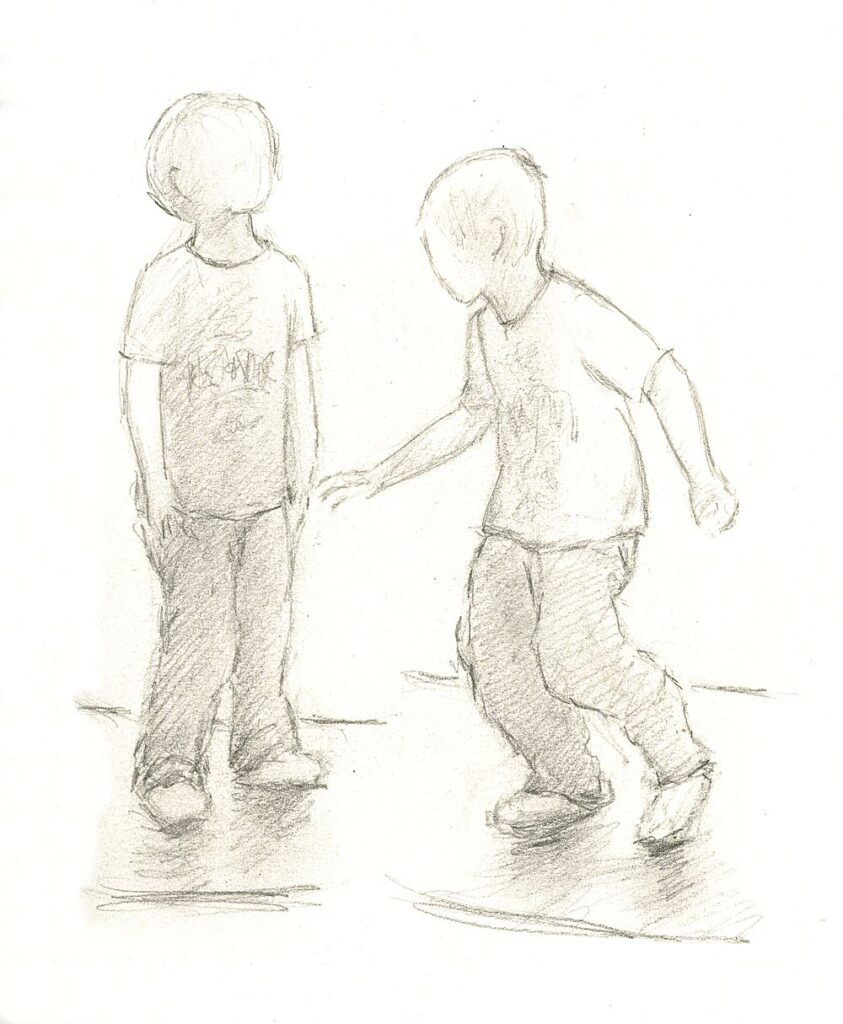
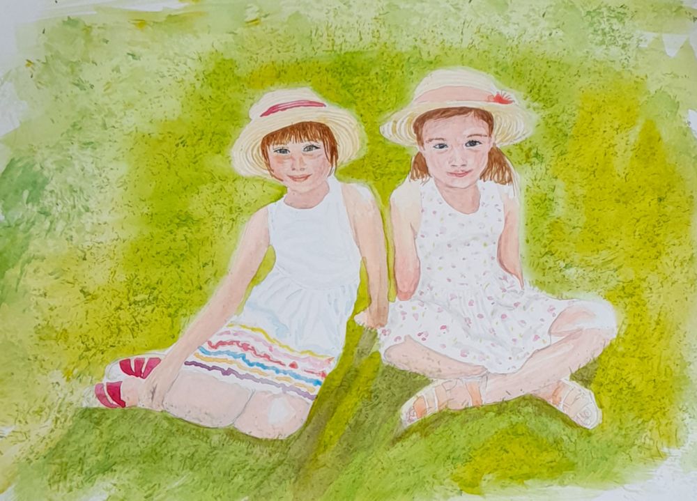
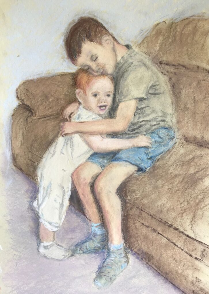
Babies and Young Children : Week 4
September 17, 2021
Pencil
This week’s challenge is to draw or paint the whole figure of a child, a child with another child, or a parent and child study. If you are fairly new to drawing I would advise drawing a single figure for your painting and to practice making as many small sketches of children whether from life or from photographs as you can, to train your eye to be accustomed to the fact that children’s heads are larger in proportion to their height than adult heads.
Watercolour
Not a whole figure but put into a context.
When painting young children either standing or involved with some activity it is useful to drop a perpendicular line from the highest point on your reference to work out the proportions of the body and the angles that the shoulders, hips and limbs and their relative lengths. Also put a perpendicular on your drawing paper. Some measuring will help you to see and draw taking into account any foreshortening that may occur as when an arm is pointing directly at you! If you prefer to draw completely freehand before painting, check the accuracy of your drawing by dropping a perpendicular from the same point as done for your reference.
As always also look for any clues from negative spaces that will help you get the proportions and lengths right.
With clothed figures, especially full skirts and baggy trousers try to imagine the limbs beneath them and their relation to the spine. Look at whether one shoulder is higher than the other and how this works in relation to the neck.
Pencil
The little sketch above is of six year old Toby balancing on a wobble board. Note how in the figure on the left both feet are bearing some of his weight and if a line is dropped from his neck it would fall between the two feet. In the figure on the right most of his weight is on his right foot (left in the image) and a line dropped from his neck shows the neck to be positioned directly above the load bearing foot. Try to draw simple line drawings from life or ‘photos of standing children standing with the load shared between their feet, and also where the load is mainly on one foot. Then try to draw some children in the same way when they are actively engaged in a sporting or other activity where they are in motion.
If you have the opportunity and wish to draw a group of children together especially where their forms overlap, treat the group as one whole shape before homing in on the individuals. Work lightly at first so that you can adjust as you look at your subject more critically as the drawing progresses. Lastly make sure you take more time looking than drawing so that all the main shapes are correct before committing yourself to painting.
In the initial stages of painting look very critically at the direction of the light and how this affects the tones that reveal the form of the child. Look also at how light can affect the darkest local colours, for example even a black T-shirt can appear quite pale on the side that is turned toward the light but retain its dark appearance where turned away from the light source.
Lastly look at shadows cast by the child’s form; e.g. a shadow of the head falling on to the child’s neck and shoulder; shadows below the feet which will help anchor the figure to the ground; and in some cases the shadow of the whole figure against the ground or cast on a wall etc.
For examples of drawing and painting children look at the Pinterest Board below:
https://www.pinterest.co.uk/jhall1282/portraits/babies-and-young-children/
Your Paintings:
Watercolour by Maricarmen
Charcoal by Heather
Pastel by Mali
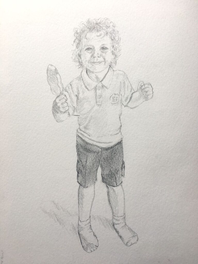
Pencil by Heather
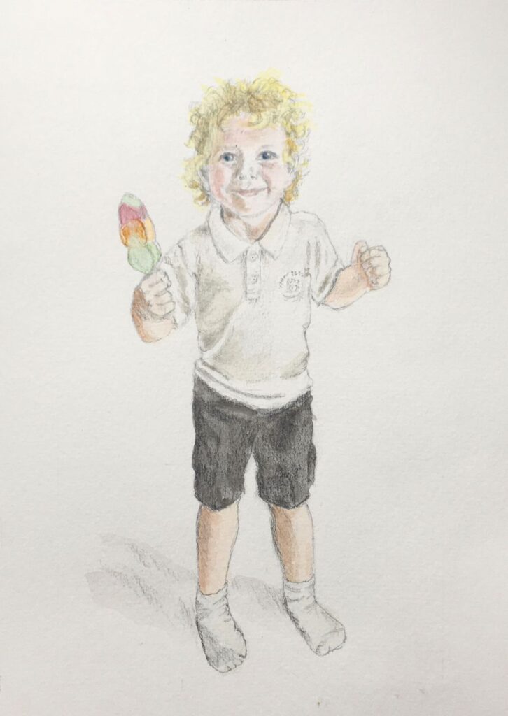
Pencil finished with Watercolour washes by Heather
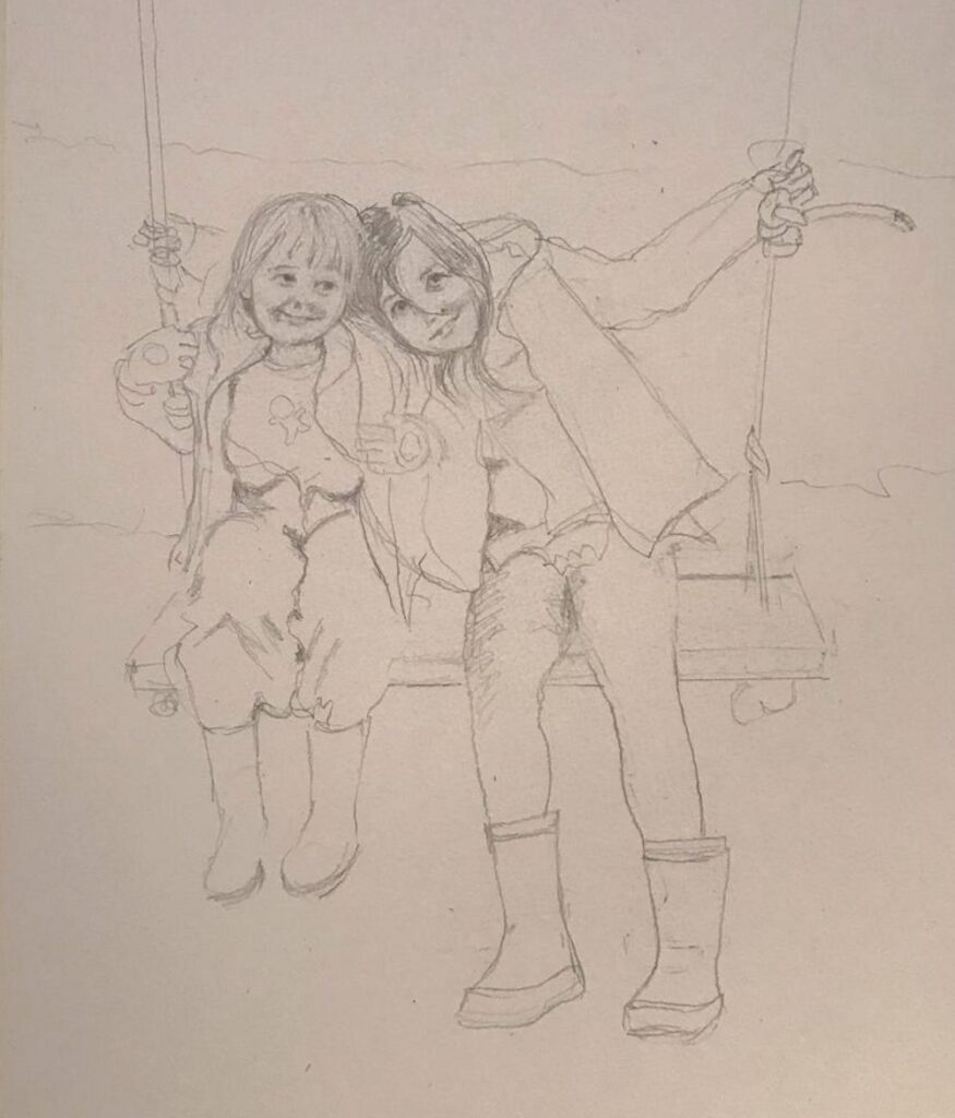
Pencil by Sarah
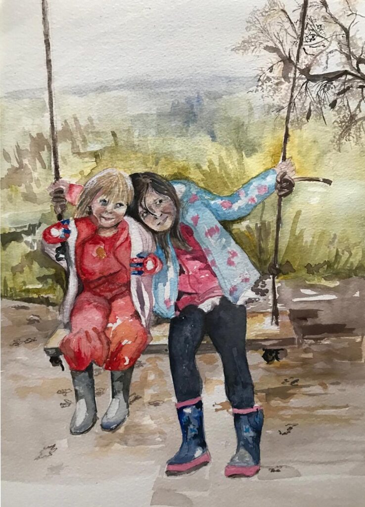
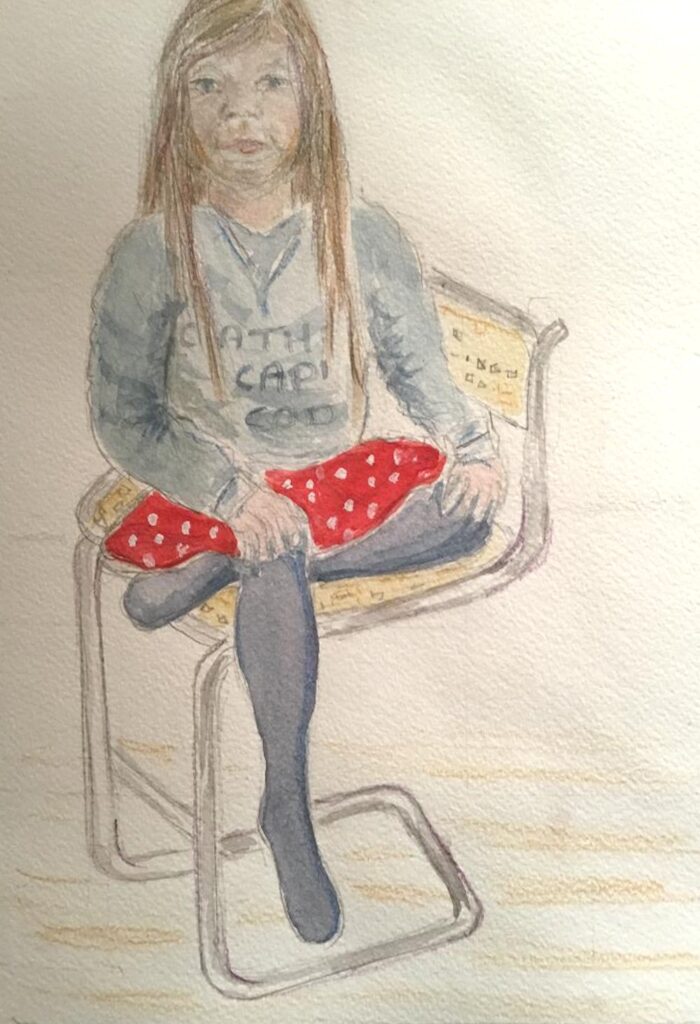
Watercolour by Sarah
Watercolour by Ann